All posts by Mr Toft

Filters

Author:
Category:

AUTUMN PLANNER: community

Week 1: 7-13 Sept 
Complete Zine making on migrant communities

Welcome back after summer break!

Before we begin our next creative phase we need to complete our 16-page zine. Follow these instructions and complete the following blog posts:

DESIGN & LAYOUT

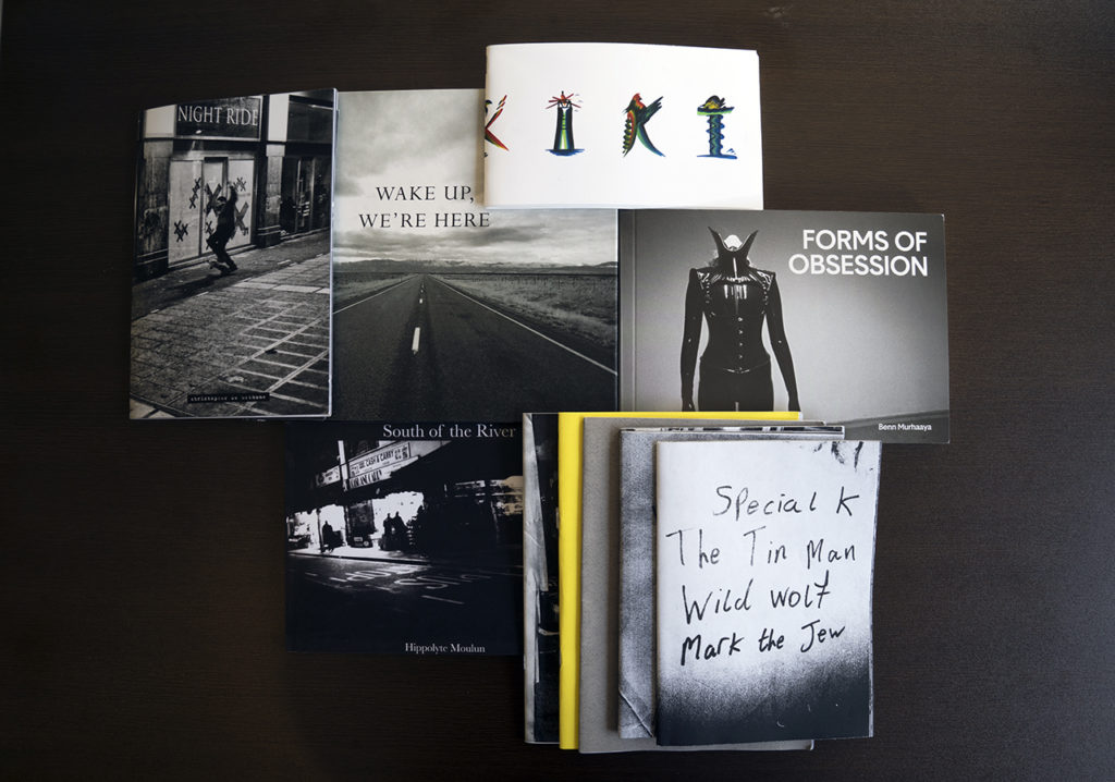
RESEARCH > ANALYSIS: Research zines and newspaper design made by artists and photographer that will provide visual stimulus for your page design. Produce a mood board and consider the following in your analysis:

  • How you want your design to look and feel
  • Format, size and orientation
  • Narrative and visual concept
  • Design and layout
  • Rhythm and sequencing
  • Images and text
  • Title and captions

InDesigndocument set-up
Create new document
width: 148mm
height: 210
pages: 16
orientation: portrait
columns:2
column gutter: 5mm
margins: top, bottom, inside, outside: 10mm
bleed: top, bottom, inside, outside: 3mm

EXPERIMENT & DEVELOP

  • Create 2-3 examples of alternative layouts for your photo-zine using Adobe InDesign and complete a visual blog post that clearly shows your decision making and design process using screen-prints.
  • Make sure you annotate!

See examples of previous students blog charting his zine design process, here.

https://hautlieucreative.co.uk/photo20al/wp-admin/post.php?post=31481&action=edit

PRINT & EVALUATE

Print, fold and bind final photo-zine and hand in for assessment.

Write an overall final evaluation (250-300 words) that explain in some detail how successfully you explored the first part of the IDENTITY & COMMUNITY project. Consider the following:

  • Did you realise your intentions?
  • What did you learn?
  • Zine; including any contextual references, links and inspiration between your final design and theme, incl artists references.
Week 2: 14 -19 Sept 
Introduction to NFT – Develop concept
6 weeks project

DEADLINE: 22 OCT (last day before h-term)

NFT ART PROJECT: In the first half of the Autumn term we will explore the theme of COMMUNITY. Your outcome will be to collectively make a combined work of art to be exhibited both as a physical piece and also be minted as an NFT (non-fungible token) as part of the exhibition: 2 LIVES that will open at Connect With Art – Exhibition Space in St Helier later this autumn.

PRODUCTION: 6 groups with 3-4 students in each
FORM: 3 minute animated film sequenced together from 6 x 30 sec individual clips.
6 digital images linked to animated film.
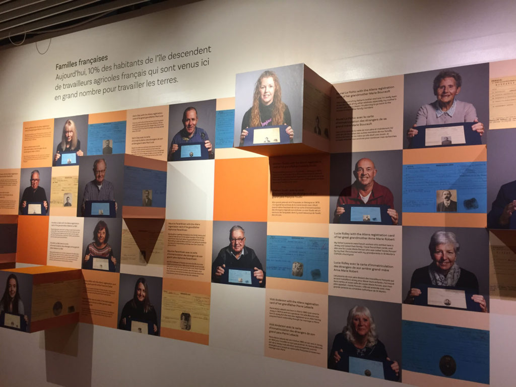
CONTENT: Include elements from People Make Jersey exhibition panels, St Helier photoshoots and new original material produced in response to research and creative workshops
PROCESS: Embroidery, stills photography, moving image, stop animation and digital media
SOFTWARE: Photoshop, Premiere, Blender (3D modelling), AI Machine Learning

WORKSHOPS
Tue 14 Sept: Launch with creators and curators of 2 Lives NFT Art exhibition, Francesco Vincenti, Claudia Runcio & Yulia Makeyeva.
Tue 28 Sept: Embroidery: Tapestry and Narrative lead by Yulia Makeyeva, artists and founder of Connect With Art.
Wed 6 Oct: Introduction to Animation: led by Liam Nunn, professional animator.
Wed 13 Oct: Advanced Animation: led by Liam Nunn.

2 LIVES – NFT Art Project
EXHIBITION: Either projection of 3 minute film or 6 framed images.
NFT: Either 6 video clips (30 sec) or 6 digital images.
Proceeds used to produce a 52 page newspaper supplement IDENTITY & COMMUNITY later in the academic year.
UTILITY: Each group to discuss and decide on what utility they wish to offer as part of their NFT offering.

COLLABORATION

GROUPS: 6 groups with 3 – 4 students in each. Each group produce a 30 sec animated film and 1 digital image following these steps:

  • Develop a concept
  • Make a storyboard
  • Plan recording/ shoots
  • Experiment with imagery, sound and text using different analogue & digital processes supported by creative workshops
  • Edit a 30 sec animated movie
  • Design a digital image (A2) based on your film
  • Present final film and digital image

In each group you need to allocate responsibility to take on the the following roles:

Producer > project manager
Photographer > cameraman
Editor > designer

BLOG – complete the following blogposts

CONCEPT: Our life is between reality and NFTs, between tangible and virtual worlds. We all have 2 lives; offline and online. Now these lives are blended.

FILM: As a collective (all yr 13 photography students) your task is to produce a 3 minute animated film made from 6 individual clips of 30 seconds each re-appropriating the exhibition panels from the People Make Jersey exhibition, with inspiration from the Bayeux Tapestry or the Occupation Tapestry, and other contemporary art and digital media.

DIGITAL IMAGE: Based on the material used to make your animated film, create a digital image that will be printed as a physical object or minted as an NFT. The image and the film must relate to each other and be a considered response to your interpretation of the theme of COMMUNITY. You can think of the digital image as a film poster for your movie but without the credits and more of an artistic stand-alone image that intrigues people to want to watch your film and invites them to bid for it on an NFT platform.

The final film and digital image must be a creative response that will provide an interpretation of the following question:

What will the future of Jersey look like as a community in the metaverse?

A community of the future will celebrate diversity, equality and inclusion and propose a new digital world; a metaverse where everyone is equal regardless of class, race, gender and age. A digital ecosystem that transcends all virtual identities into a utopia for peace, prosperity and progress.

  1. MIND-MAP: As a group consider the central question above and produce a mind-map with associated words and concepts.
  2. MOOD-BOARD: gather visual inspirations that reflects on your mind-map above
  3. STATEMENT OF INTENT: Reflect and review your mind-map and mood-board AND produce a statement of intent that clearly defines how you wish to interpret the theme of COMMUNITY as a 30 sec animated film and digital image. Follow these steps:

CONCEPT: What will the future of Jersey look like as a community in the metaverse?
Describe in:

  • 3 words
  • A sentence
  • A paragraph

CONTENT: How will you make your film?

  • Images > new photographic responses, video recordings, animation, analogue/ digital montages
  • Archives > exhibition panels (People Makes Jersey), images from internet, public records, private collections, family albums
  • Sound > consider how audio can add depth to your film, such as ambient sound, sound fx, voice-over, interview, musical score etc
  • Text > letters, documents, poems, online messaging

RESEARCH – analyse and contextualise to develop your concept

You may want to re-visit the exhibition; PEOPLE MAKE JERSEY to identity specific themes or subjects to explore, such as

ISLAND IDENTITY: The Government of Jersey is currently consulting the public about what makes Jersey special. Watch a film, recently produced and explore more about ISLAND IDENTITY here.

The ISLAND IDENTITY project has produced a website and a report that has identified distinctive qualities of island life in Jersey. You may wish to explore one of those more in-depth as a concept for your film and digital image. They are:

Constitution & Citizenship
Communities
International
Economy
Education & Sport
Heritage, Culture & the Arts
Enviroment

Here is a Summary Report – which you may want to skim through when developing a concept for your COMMUNITY film project.

There is also a Photography Competition associated with the theme of ‘DEFINING JERSEY’ – aiming to gather a variety of submissions which emphasise the diverse aspects of Island identity.

Photos should aim to capture what makes you proud to live in Jersey, particularly focusing on belonging and community. Entries may seek to highlight the individuality of our Island, as well as your own unique experience here.

Entries should be submitted either by emailing islandidentity@gov.je or by Instagram, tagging @islandidentity.je and using #DefiningJersey.

The closing date for submissions is 20th September.

Week 3: 20 -26 Sept 
Research NFT – Research and Analysis

Contextual studies and artists references
complete the following blogposts

  1. CONTEXTUAL STUDY 1: Research NFTs and digital art. First study 2 Lives exhibition and supporting documentation that will provide you with a good overview and understanding of NFTs and digital art.
  2. ARTISTS REFERENCES. For inspiration select at least two artists references. Explore discuss, describe and explain key examples of their work relevant to your project. Compare and contrast their approaches, outcomes and follow these steps:

    1. Produce a mood board with a selection of images and write an overview of their work, style and approach to digital art.

    2. Select at least one key image/ film clip/ video frame and analyse in depth using methodology of TECHNICAL>VISUAL>CONTEXTUAL>CONCEPTUAL

    3. Incorporate quotes and comments from artist themselves or others (art/ media /film critics, art/ media/ film historians, curators, writers, journalists etc) using a variety of sources such as Youtube, online articles, reviews, text, books etc.

    4. Make sure you reference sources and embed links to the above sources in your blog post.

3. PLANNING & RECORDING. Plan your first photographic shoots/ video recording in response to your research, concept and project. Your recording must be completed by Tue 29 Sept as we return to school after the Corn Riots bank holiday.

SEE FULL PROGRAMME HERE for the CORN RIOTS FESTIVAL – there may be some event here that you want to attend and record as it is mostly about bringing a community together. READ article here CORN, MORTGAGES AND RIOTS

People Power Protest! | Visit Jersey

JERSEY MUSUEM: PEOPLE, POWER, PROTEST! The exhibition explores how the right to protest has shaped and influenced the Island that we know today, from historic protests, such as the Corn Riots, to more recent protests such as Extinction Rebellion and Black Lives Matter. Jersey has a fascinating history of protest in the Island and the theme of the exhibition coincides with the 250th anniversary of the Code of Laws that was introduced in response to the Corn Riots.

Web Exhibition People Power Protest.jpg

RESEARCH – contextual studies and artists references

2 LIVES – NFT ART PROJECT

Jersey’s first Art Exhibition that connects Art and Finance, through the introduction of NFTs.

This project is destined to shape the future of the Art world, leveraging NFTs as a tool to create new opportunities and communities.

2 Lives was created by Francesco Vincenti & Claudia Runcio who came to live in Jersey in 2020. Their vision is to create a format for future NFT exhibitions that can be replicated around the world in different shades and configurations.

What we want to leave in Jersey is a seed and a promise of prosperity, a moving platform on which creators, artists, business professionals and students can grow.

  • 2 Lives will consist of a traditional art exhibition, but in the metaverse…The entire project also aims to educate visitors about NFTs to present opportunities and ideas to artists, curators, collectors, business professionals, students and creators.
  • 2 Lives is a new platform for artists to create, showcase and sell their work.
  • 2 Lives is an homage to the island of Jersey through a selection of renowned artists and their stories.

What is an NFT?

NFT means “Non-Fungible Token” representing a digital file/item.

A token is an object built on the Blockchain, non fungible means unique. In fact every NFT has got its own identity and characteristics. Every digital file can be an NFT. And anything else can be an NFT.

What is the Metaverse?

The Metaverse is the complete virtual twin of our physical world

The Metaverse is the total amount of all the digital assets that live in the web and on the blockchain, creating a digital ecosystem.

The Metaverse is a collective virtual shared space, created by the convergence of virtually enhanced physical reality and physically persistent virtual space, including the sum of all virtual worlds, augmented reality, NFTs and the Internet.

NFTs in Art?

The NFT era is a new renaissance for artists.

NFTs for artists are the means by which they can create and sell their own art, setting up easily a profile in any NFT marketplace, keeping independence from someone else managing their business.

Not only NFTs allow new opportunities for the rising market of digital art and artists, they also can be helpful for traditional artists.

READ more supporting material here produced by Francesco Vincenti and Claudia Runcio.

NFT Resources > Inspirations

The NFT Podcast is where you can start your NFT Education. The goal is onboarding anyone interested into NFTs. New episodes every week! Hosted by Francesco Vincenti, with marketing and media experience in wearables, digital and education industry. I’m building NFT projects and events in art and finance with real-life utility for tokenholders. So far Francesco has produced 38 podcasts. Listen to Episode #3 Zack Ritchie: NFTs Communities, NFT Resources, Inspirations for Digital Artists | NFT Podcast.

Zach Ritchie is a Digital Cartoon Artist from Malta in a challenge to create daily art for 1 year.

The NFT Film Ever Made: NFTs have exploded. Prompting a wild free for all on one side with numbers you can scarcely believe and deep and justified skepticism on the other. But the problem is most have only the most rudimentary understanding of what NFTs are and what they can do. The goal of this film making the most comprehensive, wide-ranging NFT film ever, one that covered everything – art, music, fashion, defi and the metaverse.

FEWOCiOUS talks about the importance of drawing on his own story and how NFTs have created a ‘moment’ for young artists ‘Someone just tweeted a video of me freaking out,’ says the artist Victor Langlois, aka FEWOCiOUS, whose new series of unique NFT works, paintings and ephemera goes on sale with Christie’s in June. ‘I feel like I’m in a dream or something.’
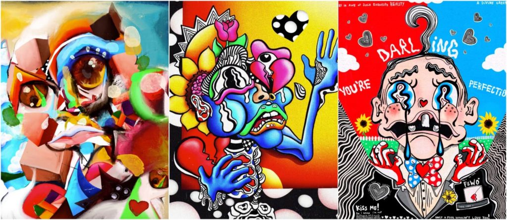
Known as one of the world’s leading digital artists, the 18-year-old has staged multiple successful solo releases, as well as two groundbreaking NFT space collaborations — with digital fashion brand RTFKT Studios, and collaborators Odius, Parrot_ism and Jonathan Wolfe — leading to sales in the millions. His latest project, Hello, i’m Victor (FEWOCiOUS) and This Is My Life, offers five unique works that detail the journey through his teen years so far, growing up as a transgender male in an abusive household. The works will be on offer at Christie’s beginning 25 June.

VeeFriends is the name of Gary Vaynerchuk’s NFT collection. He created VeeFriends to bring to life his ambitions of building a community around his creative and business passions using NFT technology and their smart contract capabilities. By owning a VeeFriend NFT, you immediately become part of the VeeFriends community and get access to VeeCon. 
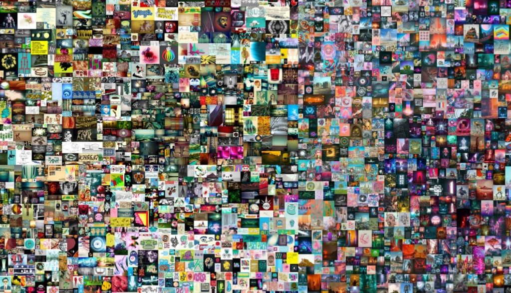
Beeple, The First 5000 Days

BEEPLE: Mike Winkelmann, better known as Beeple, has sold the most expensive digital artwork in history, The First 5000 Days, sold at Christie’s auction house for $69 million. It’s part of an explosion in the market for NFTs — tokens that prove ownership of things like digital art that you can’t even touch. READ MORE HERE

CryptoPunks are 10,000 uniquely generated characters. No two are exactly alike, and each one of them can be officially owned by a single person on the Ethereum blockchain. Originally, they could be claimed for free by anybody with an Ethereum wallet, but all 10,000 were quickly claimed. Now they must be purchased from someone via the marketplace that’s also embedded in the blockchain.
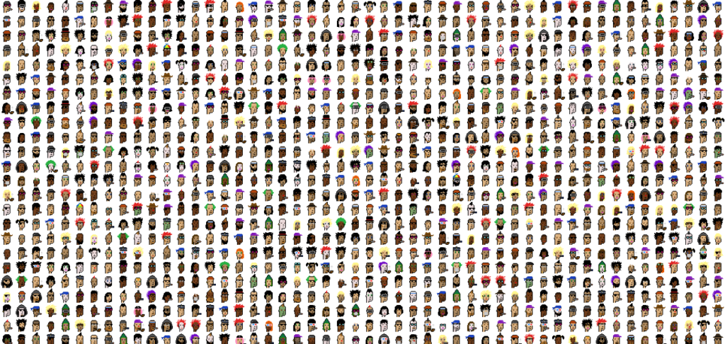
CryptoPunks

What is a CryptoPunk?

The CryptoPunks are 24×24 pixel art images, generated algorithmically. Most are punky-looking guys and girls, but there are a few rarer types mixed in: Apes, Zombies and even the odd Alien. Every punk has their own profile page that shows their attributes as well as their ownership/for-sale status (here’s an example). READ MORE HERE
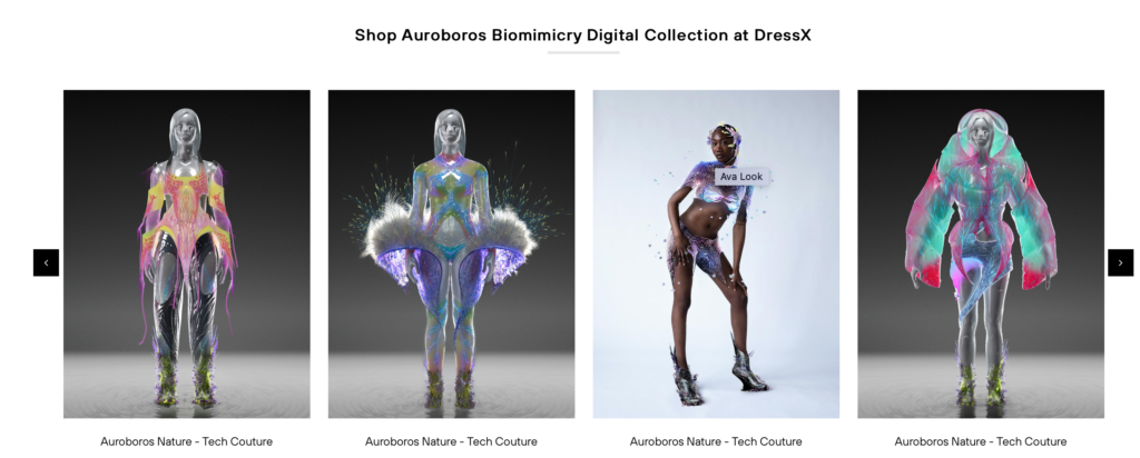
DressX: NFT as fashion. L.A.-based digital fashion start-up DressX has entered a partnership with NFT (non-fungible token) marketplace Crypto.com, where it will release limited-edition styles to members of the site.

“It’s an exciting moment because with this partnership we’re opening up a new life and value for NFTs, and a new distribution channel for AR fashion,” said DressX cofounder Natalia Modenova of teaming up with Crypto.com.

The curated platform for collecting and trading NFTs by celebrities and creators in art, design, entertainment and sports — including the Aston Martin Formula One Team, BossLogic, Lionel Richie, Mr. Brainwash and Snoop Dogg — was founded in March 2021.

A DressX jacket, inspired by Elon Musk’s SpaceX program, will be in the first digital fashion drop on Crypto.com Aug. 29

INSPIRATIONS – contemporary art and digital media

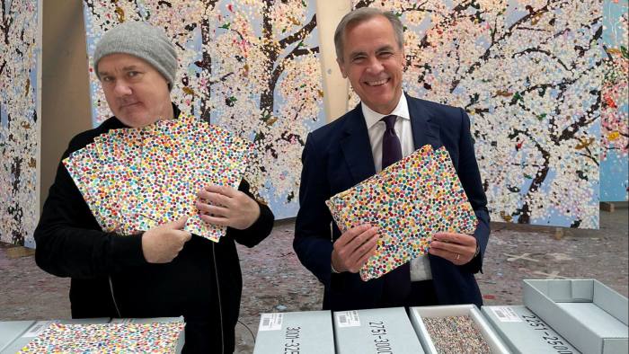
DAMIEN HIRST: The Currency, is the first NFT collection by British artists Damien Hirst. Reimagining the way NFTs are used, The Currency is a collection of 10,000 NFTs which correspond to 10,000 unique physical artworks which are stored in a secure vault in the UK. The works are now brought to life through their launch on the blockchain. Starting with the creation of the physical artworks in 2016, The Currency explores the boundaries of art and currency—when art changes and becomes a currency, and when currency becomes art. Successful applicants will all initially receive NFTs. Ultimately, you have to decide between the digital NFT or the physical artwork, both of which are artworks in their own right. Whichever you pick, the other gets burned. READ MORE HERE

In an exclusive video, the artist and former Bank of England governor Mark Carney discuss the venture, which forces buyers to choose between physical and virtual work. READ full article HERE on Financial Times.

WILLIAM KENTRIDGE: Drawing as animation
William Kentridge is a South African artist best known for his prints, drawings, and animated films. These are constructed by filming a drawing, making erasures and changes, and filming it again. Watch him HERE talk about his process of repeatedly erasing and reworking charcoal drawings to create his well-known stop-motion animated films.

William Kentridge’s studio in Johannesburg is a ‘vital physical and psychic space’ where he conceives and develops his ambitious projects and artworks. In this film he talks about how flexible charcoal is and how you can change the composition ‘as quickly as you can change your mind’. He also shows us around his studio where ideas conceived as drawings become animations, performances, and installations.

Watch Kentridge in the process of him making an animation from charcoal drawings.

William Kentridge describes Johannesburg, South Africa, providing a social and historical context for his animated films, including “Johannesburg, 2nd Greatest City after Paris” (1989).

DAVE EVANS: Davy Evans is an award winning multi-disciplinary artist and designer based in Brighton. With a background in graphic design, Evans fuses practical effects and digital techniques to create ethereal abstract imagery. He often manipulates light and liquid to replicate colour, form, and distortions inspired by natural phenomena.’ EXPLORE HIS WORK HERE
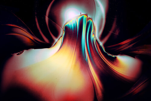
Dave Evans: Streams

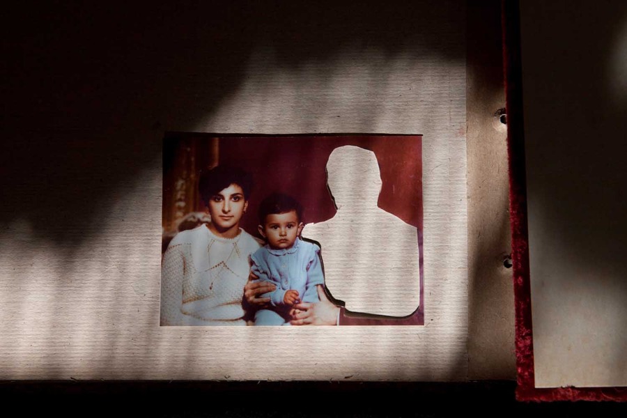
CAROLLE BÉNITAH is a French Moroccan photographer. Her work explores ideas of memory, family and the passing of time. Often pairing old family snapshots with handmade additions, such as embroidery, beading and ink drawings, Bénitah seeks to reinterpret her own history as a daughter, wife and mother. Here is LINK to the gallery that represents her with a brief description of her work. Read also an interview with Benitah HERE.

With each stitch I make a hole with a needle. Each hole is a putting to death of my demons. It’s like an exorcism. I make holes in paper until I am not hurting any more. 

—Carolle Benitah
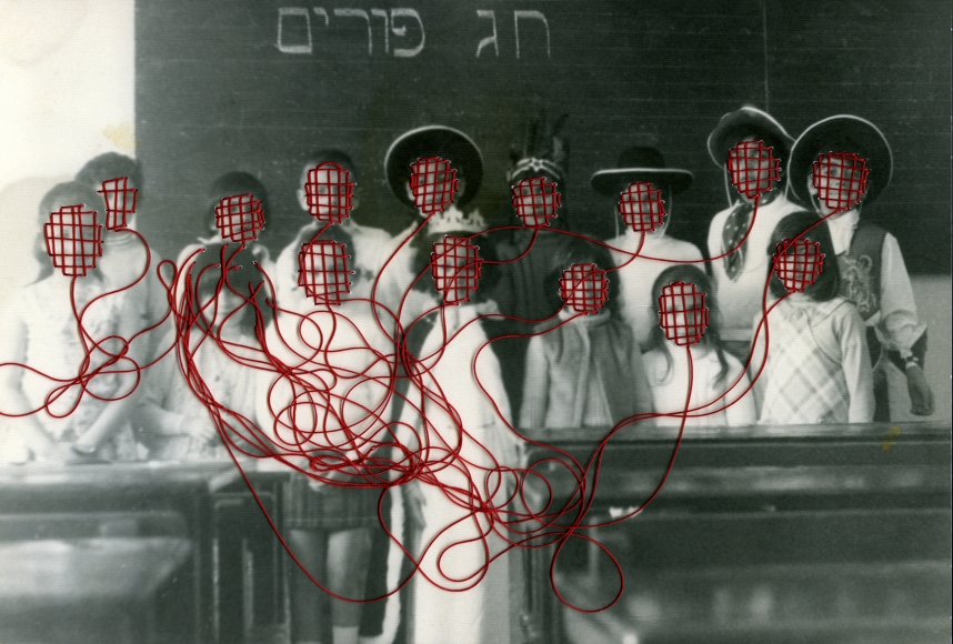
Carole Benitah, Photo-Souvenirs

PENELOPE UMBRICO Sunset Portraits from Sunset Pictures on Flickr, 2010 – ongoing
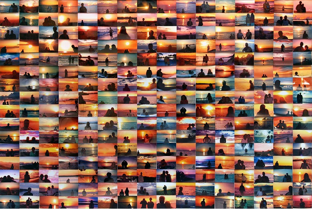
The images in Sunset Portraits from Sunset Pictures on Flickr are from the same source as the Suns from Sunsets from Flickr. For Sunset Portraits I found images where technology of the camera is exposing for the sun, not the people in front of it, thereby erasing the subjectivity of the individual. I use the entire photograph for this work, thinking of the relationship between the collective and the individual, the individual assertion of ‘I am here’ in the process of taking the photograph, and the lack of individuality that is ultimately expressed, and experienced, when faced with so many assertions that are more or less all the same.
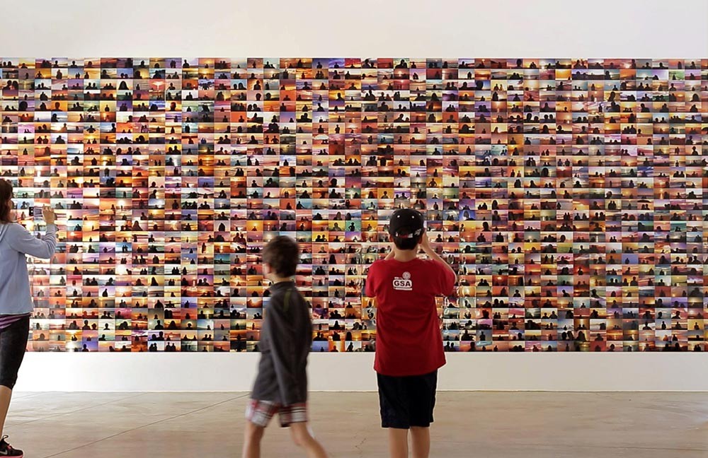
Sunset Portraits from 13,243,857 Sunset Pictures on Flickr on 10/08/13, 2013 1,539 machine c-prints Each 4in x 6 in
Installation view at Orange County Museum of Art, CA
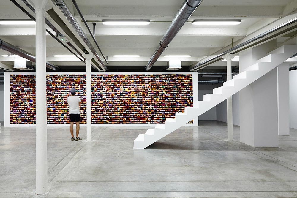
Sunset Portraits from 27,700,711 Sunset Pictures on Flickr on 05/04/15, 2015 1,625 machine c-prints. Each 4in x 6 in
Installation view at Sextant et plus, FOMO, Marseille, France
GUSTAV REJLANDER: Two Ways of Life 1857

GUSTAV REJLANDER: The Two Ways of Life was one of the most ambitious and controversial photographs of the nineteenth century. The picture is an elaborate allegory of the choice between vice and virtue, represented by a bearded sage leading two young men from the countryside onto the stage of life. The rebellious youth at left rushes eagerly toward the dissolute pleasures of lust, gambling, and idleness; his wiser counterpart chooses the righteous path of religion, marriage, and good works. Because it would have been impossible to capture a scene of such extravagant complexity in a single exposure, Rejlander photographed each model and background section separately, yielding more than thirty negatives, which he meticulously combined into a single large print.

Oscar Gustav Rejlander is best known for his work “Two Ways of Life,” a masterpiece for which he used over 32 different negatives. It took him around six weeks to create it and over 3 days to produce a final print. Rejlander pioneered the painstaking technique of combination printing—combining several different negatives to create a single final image. In 1857 he used this technique to produce his best-known photograph, an allegorical tableau entitled The Two Ways of Life, created using over 30 separate negatives
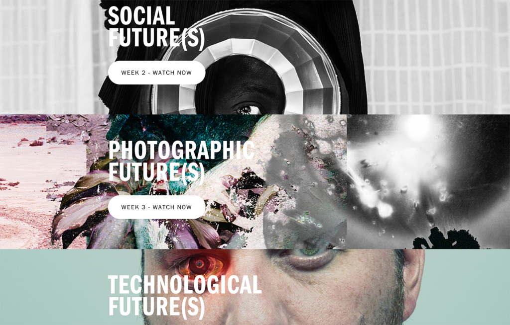

BELFAST EXPOSED: Future(s)
Taking “Future(s)” as its theme, this years festival tackles issues as diverse as climate change, migration, the advancement of technology, government surveillance and the power of protest, to explore how the future is shaped by our actions in the present. Rather than presenting a singular vision of what this future might be or look like, the festival instead offers up a speculative, imaginative glimpse into the myriad possibilities of what might lie ahead.

The festival is divided into 4 different ‘futures’ – you may want to use them as a theme or find inspiration from one of the many artists selected to exhibit work in response to the theme of FUTURES

ENVIROMENTAL FUTURES
SOCIAL FUTURES
PHOTOGRAPHIC FUTURES
TECHNOLOGICAL FUTURES

Many of the exhibitions and events in this year’s festival are underpinned by the particular urgency of rethinking our future in light of events of the past year, which have not only altered the course of humanity, but have also deepened and illuminated stark inequalities in society at large. 

In our era of pandemics, global migration, political upheaval and technological connection—when perhaps the future has never felt so unclear—the 2021 Belfast Photo Festival offers up a refreshing and provocative programme of exhibitions and events that urge us all to question: What kind of world do we want to collectively create?

Week 4: 27 Sept – 3 Oct 
Experimenting & Developing

Embroidery Workshop with Yulia Makeyeva
complete the following blogposts

CONTEXTUAL STUDY 2: Conduct an in-depth study of either Bayeux Tapestry or Occupation Tapestry in Jersey.

ARTIST REFERENCE 2: In addition select an example of work from contemporary artists working with textiles, fabrics and tapestries to construct new narratives around notions of identity and community. See resources below.

EXPERIMENT 1: Embroidery & Narrative
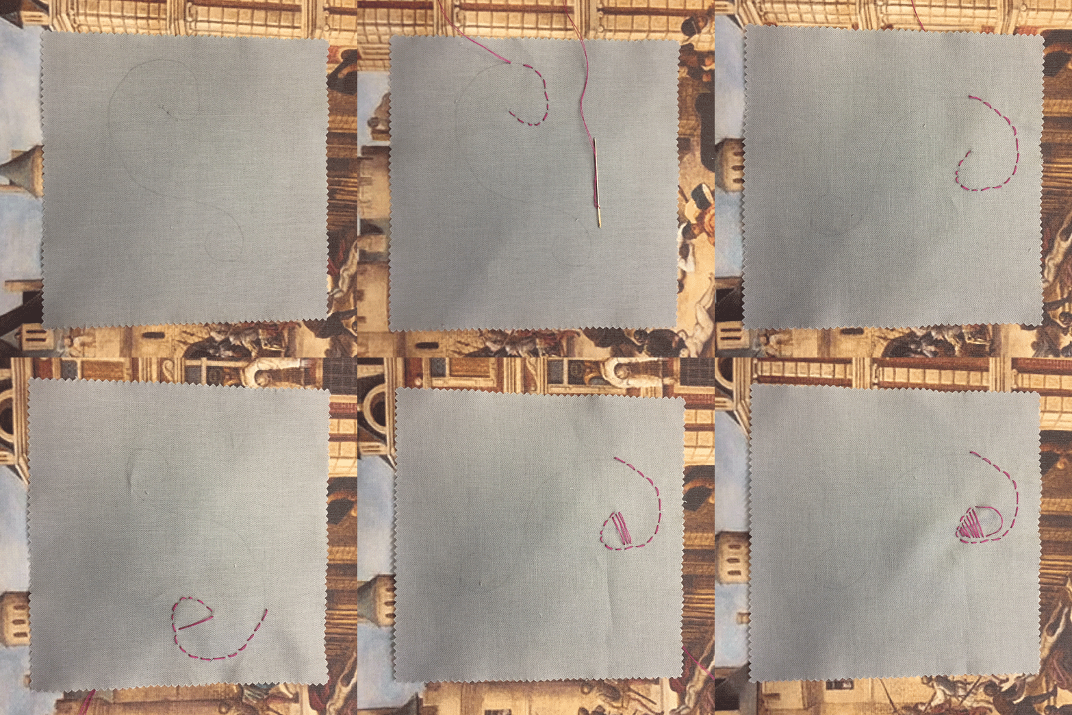
Workshop led by Yulia Makeyeva using a combination of materials to work with such as your images, People Make Jersey exhibition panels and fabrics, textiles, beads, ribbons etc. The aim of this workshops is to combine traditional methods of making art (analogue), such as embroidery and stitching with digital media like photography to create a short stop animation movie as a GIF.

METHOD & PROCESS: Make sure you record an image using your camera or iPhone of every step when manipulating your material, ie cutting our figures, shapes, words and re-stitch to create new connections, relations or narratives. The digital images recorded will be re-assembled as a GIF on a timeline using Adobe Photoshop.

BLOG: Produce a blog post that charts your experimentation of embroidery and narrative using images and annotation to explain creative processes used and method of working. Include an evaluation of your GIF and consider how you could develop and refine this into a short movie.

How to make a GIF in Photoshop
1. Create layer for each image
2. Window > timeline
3. Select > Create Frame Animation
4. Drop Menu > Make frames from Layers
5. Timeline > select Forever
6. File > Export > Save for Web Legacy > reduce image size to 720 x 720 pixels
INSPIRATIONS – embroidery, tapestries, textile artists, comic strips, video installation
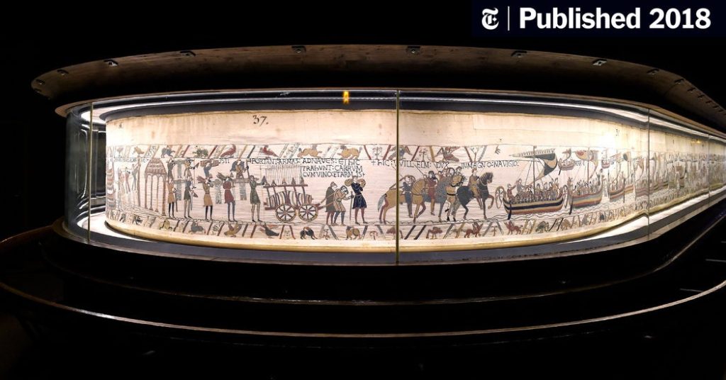
BAYEUX TAPESTRY: The Bayeux Tapestry tells the story of the events surrounding the conquest of England in 1066 by the Duke of Normandy. Crossing the sea in longships, long cavalcades on horseback, shields and coats of mail, fantastic creatures and battlefields: all the details of a great medieval epic unfold before your eyes! READ MORE HERE

The Channel Islands became part of the Anglo-Norman realm when William the Conqueror defeated King Harold and won the English crown at the Battle of Hastings in 1066. Jerseymen, or at least close relatives, serving under their Normandy lords, were said to be present at this historical battle. Just who was and was not at Hastings has been the subject of argument for centuries, but Onfroi, Mauger and Roger de Carteret, the sons of Godefroi de Carteret, are believed to have fought in the battle. It is likely that Onfroi’s son Renaud was the first de Carteret to become established in Jersey, and was thus the founder of the dynasty which ruled Jersey for such long periods over the centuries.

Read more here about new secrets and research uncovered by a Jersey lawyer in regards to the Bayeux Tapestry and an article by local historian Doug Ford about Jersey’s fraught relationship with France and how the island became linked with the English Crown as a result of the Battle of Hastings in 1066.

Political Caricatures

Look at these drawings – a series of seven political caricatures based on a sequence from the Bayeux Tapestry, lampooning Jersey politicians and Leo Trotsky (no 4). by Jersey artist Major Norman V. L. Rybot.
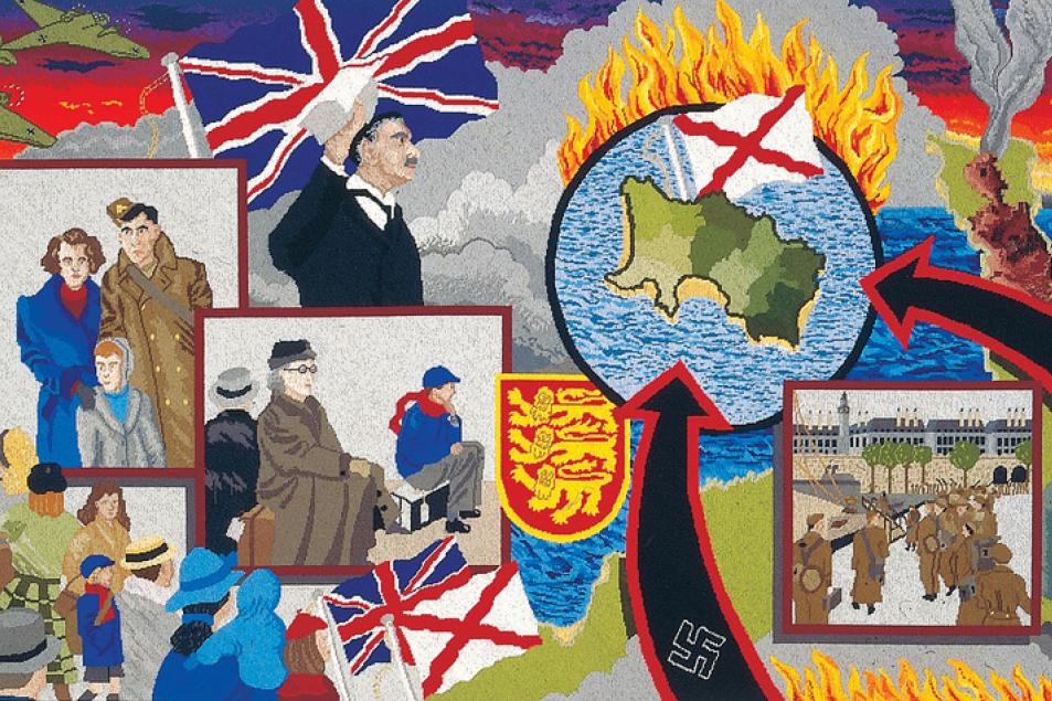
The OCCUPATION TAPESTRY was unveiled in 1995 and has since helped Islanders and visitors to better understand something of this difficult period of Jersey’s history. The award-winning Occupation Tapestry was woven by Islanders to celebrate the 50th Anniversary of the liberation from five years of occupation by the German armed forces during the Second World War. The 13 richly colourful panels of the tapestry, which is housed within the Maritime Museum, depict life and hardship under military rule and were created from the memories and stories of Islanders who experienced it first-hand. 

In 2015, to mark the 70th Anniversary of the Liberation, Jersey Heritage asked Wayne Audrain to design a new 13th panel to capture both the celebration at the heart of Liberation Day, and how Jersey people continue to remember acts of heroism and commemorate the victims of Nazism.

Community spirit runs through the Occupation Tapestry, in what it represents and how it was created. Each of the original 12 panels was created in a different Jersey parish and the 13th panel toured all 12 parishes, offering every Islander the opportunity to sew a stitch.

LISA REIHANA: In Pursuit of Venus [infected] The panoramic video by Lisa Reihana, is a moving image interpretation of the French scenic wallpaper Les Sauvages de la Mer Pacifique.

In Neoclassical France, entrepreneur Joseph Dufour used the latest printing innovations to produce Les Sauvages de la Mer Pacifique (1804), a sophisticated twenty panel scenic wallpaper. Mirroring a widespread fascination with the Pacific voyages undertaken by Captain Cook, de Bougainville and de la Perouse, the wallpaper’s exotic themes referenced popular illustrations of that time. Two hundred years later, Maori artist Lisa Reihana employs twenty-first century digital technologies to animate Les Sauvages de la Mer Pacifique. Enlivened with the sights and sounds of dance and cultural ceremonies, a vast video panorama is populated by a myriad of people drawn from across New Zealand and the Pacific. 
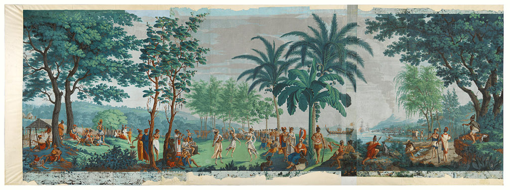
Les Sauvages de la Mer Pacifique (The native peoples of the Pacific Ocean), 1804-5, Mâcon, by Mr Jean-Gabriel Charvet, Mr Joseph Dufour. Purchased 2015 with Charles Disney Art Trust funds. Te Papa (2015-0048-1) – Drops 1 – 10

Separated by two centuries, both the wallpaper and video are set against an utopian Tahitian landscape. While Dufour’s work models Enlightenment beliefs and ideas of harmony amongst mankind, Reihana’s reading of the past is darker and more nuanced. The artist foregrounds the complexities of cultural identity and colonisation by including scenes of encounter between Europeans and Polynesians. 

in Pursuit of Venus is a major video project that has been in development for several years. It reflects the wallpapers utopian ideals, is eight minutes long and presented on two-screens. in Pursuit of Venus has been exhibited in historic homes, art galleries and museums – repurposing each presentation offers new insights and unique presentation opportunities. 

This epic piece of living, moving, animated wallpaper eventually led to her representing New Zealand at last year’s Venice Biennale, where it was described as the best exhibit by critics including those from the Spectator and the Sunday Times.

Read article HERE in the Guardian and watch Lisa discuss the making of her film.
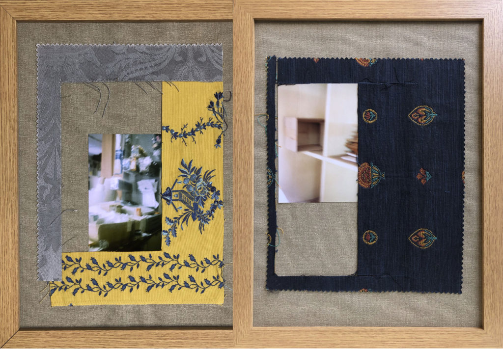
YULIA MAKEYEVA is an emerging multidisciplinary artist. She grew up in Russia and is now based in Jersey, Channel Islands. With a Linguistics degree, an education in Art History, silversmithing and jewellery making background, she turned her full attention to art in 2019. Yulia has always used photography as a means of observing textures, patterns and shapes from everyday objects, constructing unique, sometimes unexpected images. EXPLORE HER WORK HERE
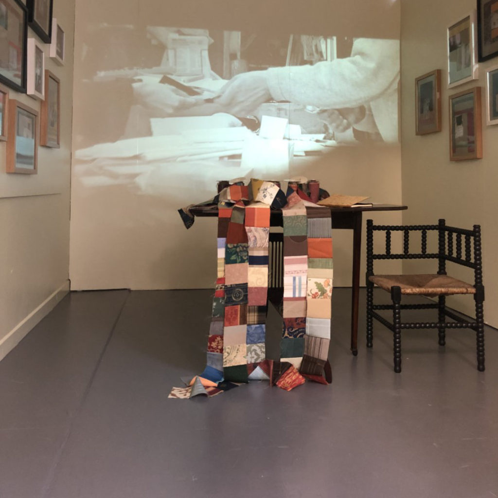
The installation Fleeting is an exploration of human memory and the memory of materials. The turning point of my research was the closure of a long-standing family business, a 176-year-old fabric shop. LEARN MORE HERE.

Yulia is also the founder of Connect With Art an online network that provides a platform for artists and art lovers to connect, interact, meet and discover. It also includes an Exhibition space in St Helier where the work produced by students will be exhibited as part of 2 Lives NFT Art Project.

TAPESTRIES: Learn how tapestries were made in the time of Louis XIV and are still made today. Explore the process of tapestry weaving at the Gobelins Manufactory in Paris, where historical techniques dating to the time of Louis XIV are used to make contemporary works of art.

READ HERE for an overview of contemporary tapestry by Linda Rees.

Before the advent of Facebook and Twitter, Pinterest and Instagram, television, or the daily paper, looking at tapestries was one way to learn about the news of the day, observe fashionable trends in clothing and interior design, and perhaps even make a political statement. READ MORE HERE

GRAYSON PERRY: The Vanity of Small Differences
In The Vanity of Small Differences Grayson Perry explores his fascination with taste and the visual story it tells of our interior lives in a series of six tapestries at Victoria Miro and three programmes, All in the Best Possible Taste with Grayson Perry, for Channel 4.  The artist goes on a safari amongst the taste tribes of Britain, to gather inspiration for his artworks, literally weaving the characters he meets into a narrative partly inspired by Hogarth’s A Rake’s Progress.

Grayson Perry comments: “The tapestries tell the story of class mobility, for I think nothing has as strong an influence on our aesthetic taste as the social class in which we grow up. I am interested in the politics of consumerism and the history of popular design but for this project I focus on the emotional investment we make in the things we choose to live with, wear, eat, read or drive. Class and taste run deep in our character – we care. This emotional charge is what draws me to a subject”.
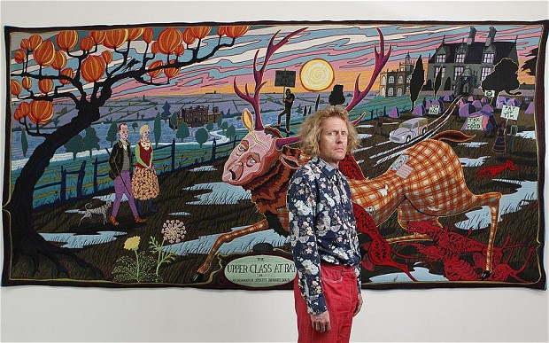
READ MORE HERE

Grayson Perry – All In The Best Possible Taste — Middle Class Taste [2012] – CLICK HERE TO WATCH
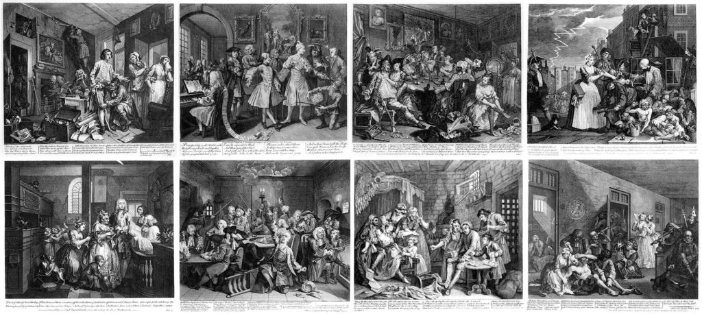
William Hogarth, A Rake’s Progress (original eight oil paintings), 1732-34

BILLIE ZANGEWA: Weaving the personal and political in hand stitched silk collages. Johannesburg-based Billie Zangewa, whose work is currently on show at Lehmann Maupin in New York, talks about her collages of domestic life, which advocate for self-preservation and the demystification of black women. READ MORE HERE
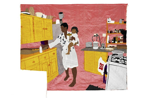
Ma Vie en Rose, 2015

Artist Billie Zangewa welcomes us at her home in Johannesburg, South Africa. As we tour the city, we learn about what inspires and influences her work. From the love for her son, to her experience of silk as a ‘transformative material’ – her focus is largely rooted in the home and plays into what she describes as ‘daily feminism.’

Contemporary artists and prisoners collaborate on unique artworks: Ai Weiwei | Idris Khan | Carolina Mazzolari
Annie Morris | Cornelia Parker | Bob and Roberta Smith
Wolfgang Tillmans | Francis Upritchard.

All proceeds from the sale of the works go directly to FINE CELL WORK. Fine Cell Work is a charity which makes beautiful handmade products in British prisons. Teaching prisoners high-quality needlework boosts their self-worth, instils self-discipline, fosters hope and encourages them to lead independent, crime-free lives.

COMIC STRIP is a sequence of drawings, often cartoon, arranged in interrelated panels to display brief humor or form a narrative, often serialized, with text in balloons and captions. Traditionally, throughout the 20th and into the 21st century, these have been published in newspapers and magazines, with daily horizontal strips printed in black-and-white in newspapers, while Sunday papers offered longer sequences in special color comics sections. With the advent of the internet, online comic strips began to appear as webcomics.
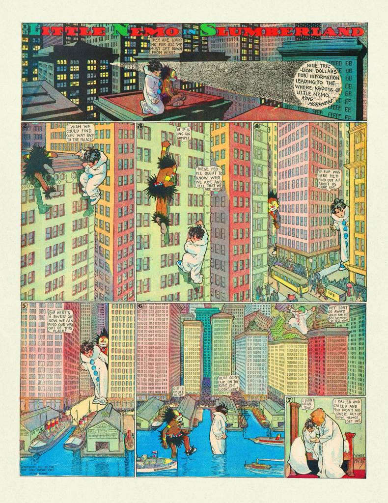
Comic Book Art – From a Cultural Phenomenon to Collectable Art. Here is a good article with a historical overview of comic strips and many good examples.
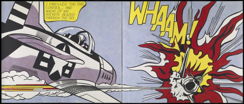
Whaam! 1963 Roy Lichtenstein 1923-1997 Purchased 1966 http://www.tate.org.uk/art/work/T00897

Comic Strip as Art: In the 1960s a group of pop artists began to imitate the commercial printing techniques and subject matter of comic strips. The American painter Roy Lichtenstein became notorious for creating paintings inspired by Marvel comic strips and incorporating and enlarging the Ben-Day dots used in newspaper printing, surrounding these with black outlines similar to those used to conceal imperfections in cheap newsprint.

At the same time Andy Warhol was also using images from popular culture, including comic strips and advertising, which he repeatedly reproduced, row after row, on a single canvas until the image became blurred and faded.

The German painter Sigmar Polke also manipulated the Ben-Day dot, although, unlike the slick graphic designs of Lichtenstein, Polke’s dots were splodges that looked like rogue accidents in the printing room.

In a similar vein, Raymond Pettibon undermined the innocent spirit of the comic strip with his ink-splattered drawings and sardonic commentary.

READ article here Raymond Pettibon: punk with a pencil
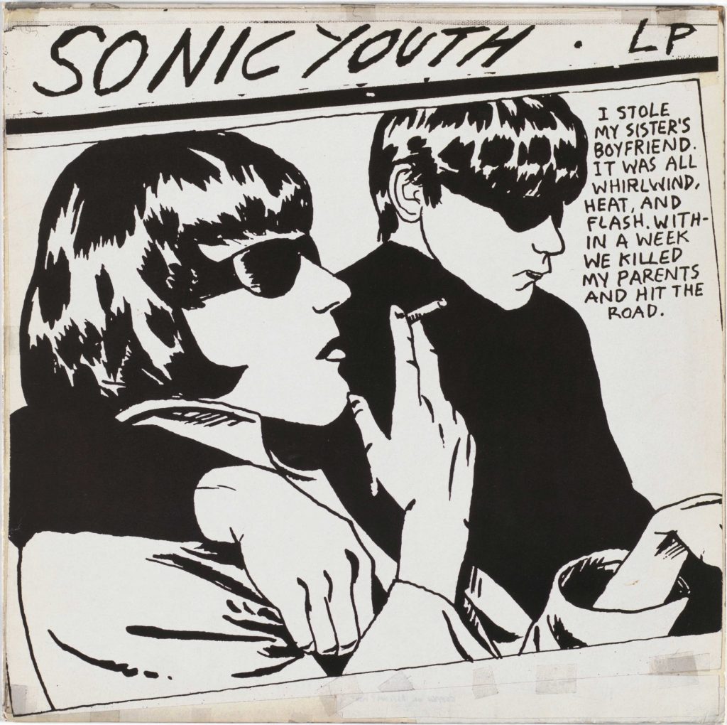
Pettibon’s much-parodied artwork for Sonic Youth’s album Goo

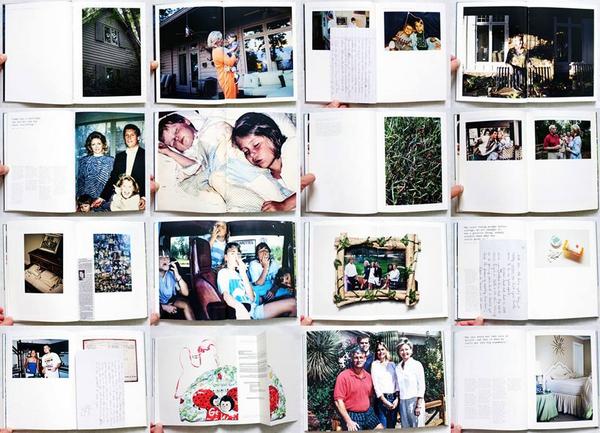
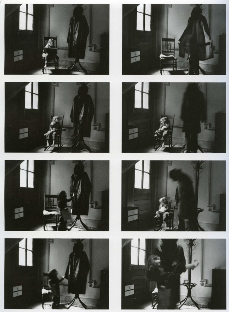
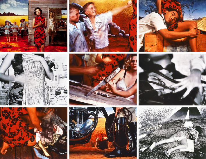
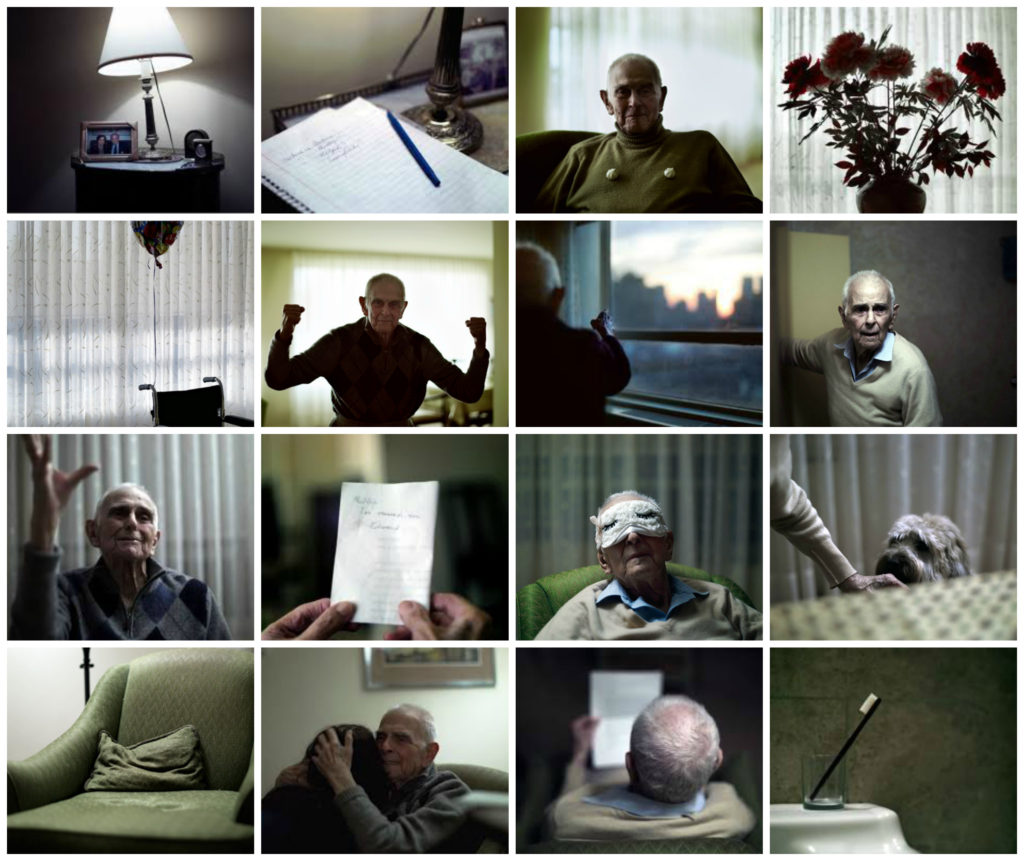
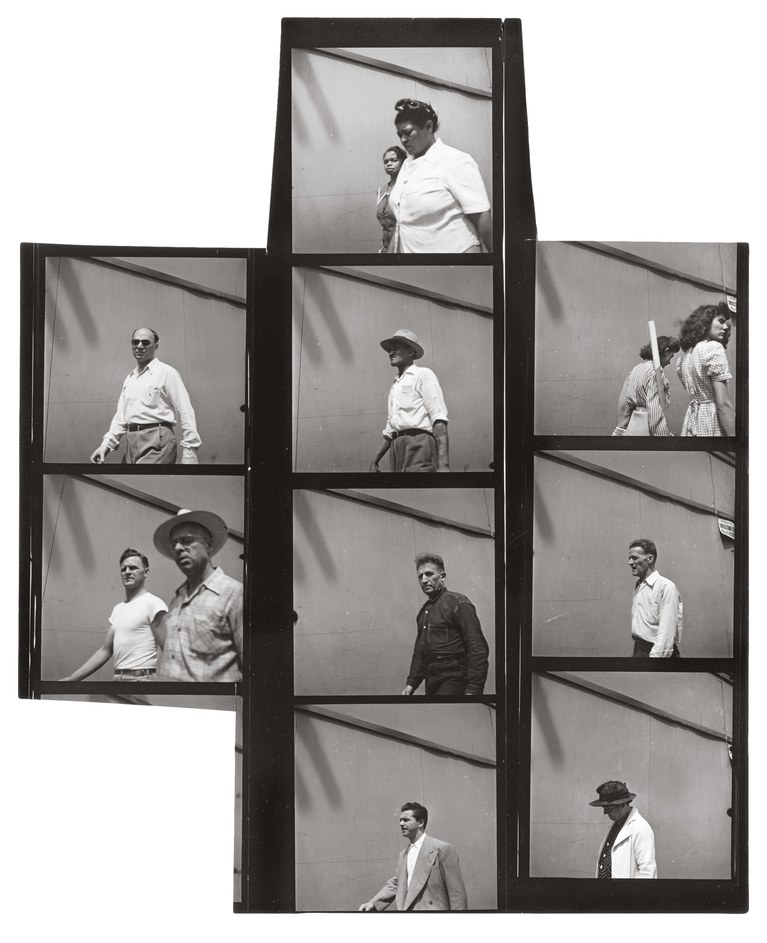
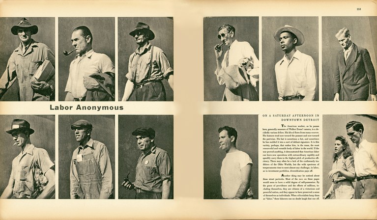
Narrative in photography is often best expressed with ‘image on a page’ as seen in photo-essays in photojournalism or visual stories in photobooks where a narrative is constructed through careful editing, sequencing and design.
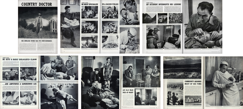
Photo-essay:  Country Doctor, by W. Eugene Smith, LIFE Magazine 1948

https://vimeo.com/124694405

Dealing with the grief that the photographer suffered following the death of her mother, Where Mimosa Bloom by Rita Puig Serra Costatakes the form of an extended farewell letter; with photography skillfully used to present a visual eulogy or panegyric. This grief memoir about the loss of her mother is part meditative photo essay, part family biography and part personal message to her mother. These elements combine to form a fascinating and intriguing  discourse on love, loss and sorrow.

To learn more about Narrative and Photography study this blog post:

Week 5: 4 – 10 Oct 
Experimenting & Developing
Animation Workshop with Liam Nunn
complete the following blogposts

STORYBOARD: Develop ideas into a storyboard that provides you with a clear plan ahead of how you wish to make your 30 sec animated film, including details of individual scenes, shot sizes and mise-en-scene (the arrangement of the scenery in front of the camera) from location, props, people, lighting, sound etc.

What is a Storyboard?

A storyboard is a collection of images that tell a story. Basically it is a sketch of the ideas a person is trying to portray. It is another way of showing a game plan to an individual with interest on what is going on. The visual elements along with the captions allow for the story to be seen by the person reading it. Disney is to be credited with the creation of storyboards since 1920. Ever since then, it has been a great way to share information. READ MORE HERE about constructing a storyboard.

Here is an online tutorial on how to storyboard using Photoshop.

Download a storyboard template here

EXPERIMENT 2: Introduction to animation
Liam Nunn, an artist and professional animator will run a workshop on digital animation using software After Effect. Create a short animation of 5-10 seconds using processes learned and publish on the blog with an evaluation.

Here is a LINK to the presentation by Liam which includes an overview of his career, handy After Effects guide including instructions from the workshop.

INSPIRATIONS – Animation

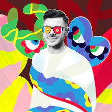
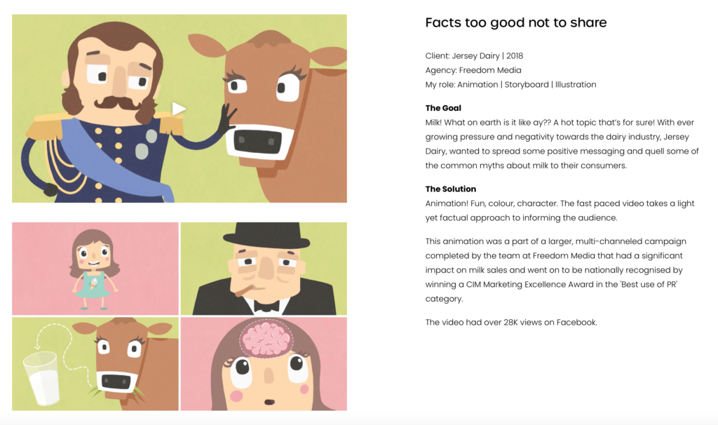
Liam Nunn has spent over a decade smashing the creative industry with precision, energy and finesse. Working with many brilliant people on oodles of ravishing campaigns – including multiple locally and nationally award-winning ones. A multi-disciplined media monster, Liam was once described by a colleague as “quite good but sometimes a bit bizarre.” Wait… 

Fact #1 Liam once illustrated an award-winning dog poo.

Fact #2 Liam is a three-time professional wrestling tag team champion of the world and he probably owns more spandex than you do. Gosh!

Fact #3 Liam produced a whopping 52 weekly self-portraits over the course of a year just for larks. You can see them here.

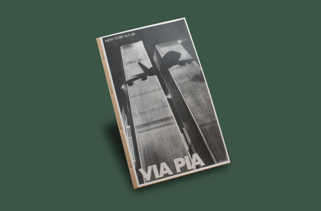
A simple way to create an animation is to transform one image from something visible to something abstract in small increments and record each stage of transformation on camera and re-assemble on a timeline as a movie. As an example see the recent photobook by Via Pia by Tiane Doan na Champassak (1973) a French visual artist. In the last 15 years, he has developed a complex body of work infusing his own photographic production with techniques of appropriation, variation, re-use and repetition. Champassak subjects materials from the internet, personal memorabilia, vernacular photography and magazine cuttings to a large variety of processes linked to the conceptual arsenal of postmodernism, challenging themes such as sexuality, gender identity and censorship. All his self-published books are released under the label Siam’s Guy Books.

Twenty years after the World Trade Center attacks, I looked into how the twin towers had been previously used in advertising as an emblem of New York City, and I came across an advertisement from 1979 for Pakistan International Airlines in Le Point magazine. It was striking to see how the shadow of a Boeing 747 projected on the towers had a totally different impact before 9/11. This publication starts with a photocopy of the PIA ad in Le Point and continues with a photocopy of the previous photocopy, until reaching the total destruction of the image halfway through the book. From there on, we assist at a gradual and inverted revival of the advertising, in a subtle reenactment of the iconic towers.

Week 6 – 7: 11 – 22 Oct 
Animation and Film Editing

Workshop with Liam Nunn
complete the following blogposts

1. RECORDING: Plan and complete principal shoot following your storyboard. Make sure you take a few images behind the scenes of the production and  are using the right equipment; camera, sound recorder, tripod etc. Once shooting is completed follow these instructions:

  • Save recorded material (images/ video) in folder on local V:Data Drive
  • Process footage and/or images using either Premier or Photoshop
  • Review and evaluate your shoots as they develop
  • Identity weaknesses and strength 
  • Plan and re-visit for a new shoot that adds value to what you already have.

You have to ask yourself:
Am I satisfied that I have enough images/ material?
What are you going to do differently on next shoot? 
How are you going to develop your ideas?

  • Single image / sequence
  • GIF
  • Animation
  • Film
  • Combination (all of the above)

FILM INSPIRATIONS: See films produced by students last year as part of their LOVE & REBELLION project.

M:drive/ departments/ students/ image transfer/ Love & Rebellion/FILMS

2. EDITING:
Still-images: Edit and adjust using Lightroom and export as high-res jpgs ready for import into Adobe Premiere/ After Effects.

Moving-image & Sound: Introduction to Adobe Premiere
• Organisation: Create a new project in Premiere
• Begin editing still-images/ video/ audio clips on the timeline
• Adjust recordings in Colour / B&W appropriate to your intentions.
• Video: experimenting with editing and sequencing using relevant transitions and effects
• Sound: consider how audio can add depth to your film, such as ambient sound, sound fx, voice-over, interview, musical score etc. • Title and credits: Consider typography/ graphics/ styles etc. For more creative possibilities make title page in Photoshop (format: 1280 x 720 pixels) and import as a Psd file into your project folder on the V-Data drive.

Links to Royalty-free music:
Search YouTube Audio Library
MixKit – excellent site for music, ambient sounds, sounds FX etc
Epidemic Sound

Sound effects:
M:\Departments\Media\Students\Sound FX

3. BLOG > PROGRESS REPORT: Produce a blog with screen shots showing how your film is developing, commenting on editing and sequencing still-images, video and sound etc.

WED: Animation Workshop
Liam Nunn will return and provide more support for those of you who wish to learn more creative tools in After Effects when editing your animated film.

UNDERSTANDING FILM EDITING:
NARRATIVE, CINEMATOGRAPHY, SOUND, MISE-EN-SCENE, EDITING 

As the academic year progresses we will continue to explore narrative in photography, literature and cinema. Here is a blog post that will provide you with an in-depth understanding of narrative and theories around visual storytelling. To learn more

Here is a link to a blog post about Film Editing including practical and theoretical examples of Narrative in Cinema and Film Language.

THEORY

For more details see Dr McKinlay’s blog on Narrative in Cinema and The Language of Moving Image which look more specifically at some of the recognised conventions and key terminology associated with moving image (film, TV, adverts, animations, installations and other moving image products) which will help to create your own moving image product. Remember the key is to know what the rules are before trying to break them.

The following recognised conventions should help students to deconstruct key moving image media texts and will also help students to create their own moving image products, working within or against these conventions. Remember the key is to know what the rules are before trying to break them.

As alluded to, when looking at moving image products, it is useful to make a link to NARRATIVE THEORY as most often the key ideas, codes and conventions that are put to use for moving image products, are usually put together to serve ideas around NARRATIVE. For example, character, theme, motivation, empathy, ideology and so on.

Here are a few things to consider when working with Moving Image. (These are extracts from Dr McKinlay’s blog posts above)

PROCESSES > TECHNIQUES > EFFECTS > INSPIRATIONS

The Kuleshov effect is a film editing (montage) effect demonstrated by Soviet filmmaker Lev Kuleshov in the 1910s and 1920s. It is a mental phenomenon by which viewers derive more meaning from the interaction of two sequential shots than from a single shot in isolation. Through this phenomenon we can suggest meaning and manipulate space, as well as time.

Chris Marker: La Jétte

Chris Marker, (1921-2012) was a French filmmaker, poet, novelist, photographer, editor and multi-media artist who has been challenging moviegoers, philosophers, and himself for years with his complex queries about time, memory, and the rapid advancement of life on this planet. Marker’s La Jetée is one of the most influential, radical science-fiction films ever made, a tale of time travel. What makes the film interesting for the purposes of this discussion, is that while in editing terms it uses the language of cinema to construct its narrative effect, it is composed entirely of still images showing images from the featureless dark of the underground caverns of future Paris, to the intensely detailed views across the ruined city, and the juxtaposition of destroyed buildings with the spire of the Eiffel Tower. You can read more here about the meaning of the film and it is available on Vimeo here in its entirety (29 mins)

Mark Cousins: Atomic, Living in Dread and Promise

A narrative can also be made constructed entirely of archive footage as in Atomic, Living in Dread and Promise, a film that shows impressionistic kaleidoscope of our nuclear times – protest marches, Cold War sabre-rattling, Chernobyl and Fukishima – but also the sublime beauty of the atomic world, and how x-rays and MRI scans have improved human lives. The nuclear age has been a nightmare, but dreamlike too. Made by director and film critic, Mark Cousins and featuring original music score by Mogwai, it was first broadcast on BBC4 as part of Storyville documentary. Your can read a Q&A with Cousins’ here where he discusses the making of the film.

Week 8 – 9: 1 – 12 Nov 
Complete Animated Film and Digital Image
DEADLINE:
12 Nov

FILM: Once you have finished editing your film export from either Adobe Premiere or After Effects as an mp4 file and upload to Youtube account or use Microsoft Stream and embed on Blog. Follow these instructions:

  • In Premier: Click on Sequence > Render IN/OUT
  • File > Export > Media
  • Export Settings: Format H.264
  • Output Name: use title of your film and save to V:Data drive
  • Click Export at bottom

  • In After Effects:
  • Select Format H.264
  • Select YouTube 1080p Full HD
  • Select match source to correctly scale the composition

  • Using Microsoft Stream: Open up Office 365
  • Go to All Apps and select Stream
  • Create > Upload Video
  • Browse to upload your exported film from V:Data drive
  • Write a short description, choose thumbnail and publish
  • My Content > Videos > embed film into Blog post with evaluation

  • In Youtube: Set up an account at home (www.youtube.com)
  • Click Create (top right corner) > Upload video
  • Select file > your exported film from V:Data drive
  • Write a short description and choose thumbnail
  • Once uploaded, embed film into Blog post with evaluation.

Save final film as an mp4 file here:
M:\Departments\Photography\Students\Image Transfer\IDENTITY & COMMUNITY|NFT/ FILM

DIGITAL IMAGE: Using Photoshop produce an image based on your film in dimension A2 (420 x 594mm), 300 pixels per inch. Save final image here:

Save final image here:
M:\Departments\Photography\Students\Image Transfer\IDENTITY & COMMUNITY|NFT/ IMAGE

STATEMENT: Write a 100 words statement that describe the concept and meaning behind your film and digital image for the 2 Lives exhibition. You can use your statement of intent as a starting point. See example below. Save as the format displayed below.

Title: Online / Offline
The concept behind our NFT video is that two friends each have two separate lives; one offline and online. Our video shows how anything can happen on an online medium, but real connection and friendship occurs in real life. As technology develops relationships of all kinds are growing apart. An example of this occurred in the height of the Covid-19 pandemic lockdown. People only experienced contact with family members in the same household and the only way to speak to people outside was via an online medium. This effected the mental health of everyone and looking back on the first lockdown we can see how much we relied on technology to keep connected with family and friends.

Creators: Oliver Shiplee, Matthew Brown, Michael Kenealy and Reuben Jeanne

Save statement here:
M:\Departments\Photography\Students\Image Transfer\IDENTITY & COMMUNITY|NFT/ STATEMENT

EVALUATION
Write an evaluation (250-500 words) that reflects on you artistic intentions, film-editing process and collaborating as a group. Include screen-prints from Premiere and a few ‘behind the scenes’ images of the shooting/ production. Comment on the following:

  • how successfully you fulfilled the project brief and realised your artistic intentions as set out in your statement of intent. Reflect on any changes, moderations or refinements.
  • links and inspiration between your final outcome and theme of COMMUNITY, including artists references.
  • analysis of final outcome, both film and digital image.

BLOG: Check all blogposts are completed to the best of your ability with quality analysis and evaluations, use if images and video to illustrate and hyperlinks to resources and contextual references. The work produced here will form the basis of your Autumn Assessment & Report. See Check list below.

Summer Project

During the summer it is important that you keep training your eye and practice making images. Below are two task COMMUNITY (photo-assignment) and another FAMILY ARCHIVE (research) that you can work on during the summer break which will prepare you for the next academic year in September.

Publish all your work on the blog before returning to school on Tue 7 September. Best of luck!

PHOTO-ASSIGNMENT: How might you represent the best aspects of the community you belong to – or even set out to develop a stronger sense of community via photography?

You can either decide to continue to revisit an area of St Helier that represents a migrant community or approach this photo-assignment in a new way that is linked more directly to your own community of where you live.

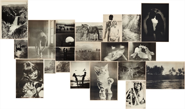
Imagine you were the official photographer of your street, neighbourhood, town or city. You have been commissioned to create a sequence of photographs celebrating the spirit of this place and its people. These images will be published in various forms – in a free newspaper, on posters in bus shelters, on postcards , on advertising hoardings etc. You are limited to 10 pictures in total. Make a larger body of images, then edit these down to just 10. Arrange in a sequence or collage. What story do they tell? What are the challenges of an activity such as this and how might you set out to overcome these? 

There are different approaches to how photographers work with a community. Either as a outsider looking in or as an insider who is part of that community. The best work often emerges from photographers who work with a social group that they are familiar with or have a personal connection to. A community can be defined as a group of people who share the same values, cultural codes and perform certain social rituals. This group could be family and friends or an estate or a neighbourhood. It could be a recreational activity or a sport.

BLOG > PHOTO-ASSIGNMENT

  • Produce at least 3 photo-shoots!
  • Review and evaluate your shoots as they develop
  • Identity weaknesses and strength
  • Plan and re-visit for a new shoot that adds value to what you already have.

You have to ask yourself:
Am I satisfied that I have enough images/ material?
What are you going to do differently on next shoot? 
How are you going to develop your ideas?

These images could become part of Personal Study that we will develop later in the autumn term. You could produce another photo-zine based on this summer project and any work that you produce will be assessed as part of your Personal Investigation (coursework) awarding you marks based on skills, knowledge and understanding of photography as a tool for communication in narrative, sequence and design.

INSPIRATION: IN PROGRESS

IN PROGRESS: Laia Abril – Hoda Afshar – Widline Cadet – Adama Jalloh – Alba Zari at the RPS Gallery (20 May – 31 October 2021) commissioned by the RPS as part of Bristol Photo Festival. They are designed with students in mind, particularly visitors aged 11 to 18. However, they can be enjoyed by all and easily adapted for a younger (or older) audience.

The Royal Photographic Society is an international educational charity committed to bringing photography to everyone. Founded when photography was in its infancy in 1853, today the RPS is a world-leading photographic community with a membership of 10,700 photographers worldwide. The RPS Gallery is situated in the photography hub at Paintworks, Bristol, UK.

This exhibition is a celebration of contemporary photography at its most diverse, dynamic and progressive. Five distinct solo exhibitions are presented together. Aaron Schuman, the curator, has selected these photographers to collectively represent some of the varied and exciting approaches being taken towards photography now.

Contemporary photography often involves an “expanded” practice – ways of thinking, making and presenting that extend beyond established disciplines and photographic traditions to more fluid and responsive ways of working. Contemporary artists may have a critical or questioning attitude to photography and its histories – a less dogmatic, not-so-fixed understanding of what it means to be a photographer. Contemporary photographers can also be excited by new modes of production and distribution, and new ways to tell their stories. 

The images on show in this exhibition provide some clues about the direction in which photography is travelling. It makes for a fascinating show for young creatives to explore and respond to.

CONTEXTUAL STUDIES: Produce a blog post where you REVIEW the exhibition IN PROGRESS and consider the following:

  • What does the title ‘In Progress’ suggest about the nature of the work on show?​
  • What connotations does the word ‘progress’ have for you?
  • In what ways do you think photography has changed in the last 5 years? What new concerns, agendas, or motivations might contemporary photographers have now, or in the near future?
  • What are/were your expectations for this exhibition? What are your expectations for any exhibition of photography? Are there certain images, themes or ways of presenting that you would expect to encounter? In what ways might this exhibition support or contradict your expectations?

EXTENTION: ARTISTS REFERENCES


Produce an in-depth study of one of the artists in the exhibition Laia Abril, Hoda Afshar , Widline Cadet, Adama Jalloh or Alba Zari.

LAIA ABRIL: On Menstruation Myths


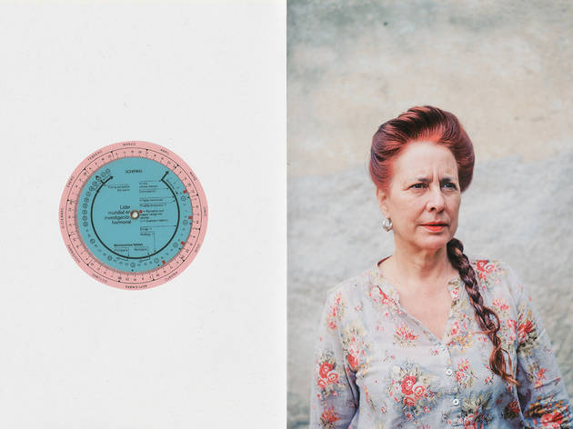
Are you sick?” I remember being asked when I was a teenager. People were questioning whether or not I was on my period. Even though I wasn’t supposed to exercise or swim —or apparently make mayonnaise; I never actually perceived those myths as affecting my daily life. However, I remember learning that society had mandated that getting my period should remain a secret. The same ritual that was supposed to symbolize that I had “become a woman,” came with an unbearable pain that was normalised. — Laia Abril

Abril’s work ‘On Menstruation Myths’ is a chapter of a larger body of work entitled ‘A History of Misogyny’. The artist explores the misunderstandings, silences, miseducation and physical pain associated with menstruation. Abril admits to having found the subject of menstruation personally embarrassing. ​She asks questions about what it means to be a woman, why menstruation is a source of shame, why some young women are denied their basic rights and why myths about menstruation have such deep cultural roots. Abril deliberately creates aesthetically appealing images in order to persuade viewers to spend time with them and read the accompanying text. It is important to her to have both men and women see the work since menstruation is a human rights issue. The combination of blue and red is a kind of visual game since, for many years, advertisers of sanitary products chose blue, rather than red, to indicate menstrual blood. Abril searches for appropriate visual metaphors that synthesise her ideas and arouse curiosity. 

For discussion:

  • What kind of research has the artist done in order to explore this subject?
  • Why is the subject of menstruation such a source of embarrassment and shame?​
  • What challenges might the artist have faced in choosing to make images about menstruation?
  • How has the artist chosen to visually present a potentially alienating subject? Which of these do you find most intriguing, appealing, uncomfortable, effective or informative?
  • What are the potential advantages or disadvantages of tackling (addressing, representing, depicting) a subject indirectly – using objects or associated images as visual metaphors or representations?
  • Do you think photography has the power to educate and change both opinions and public policy? Can you think of alternative examples where this has happened? What issues or injustices might your own photography explore or address?
  • Have your views or knowledge of menstruation been altered by seeing this work?

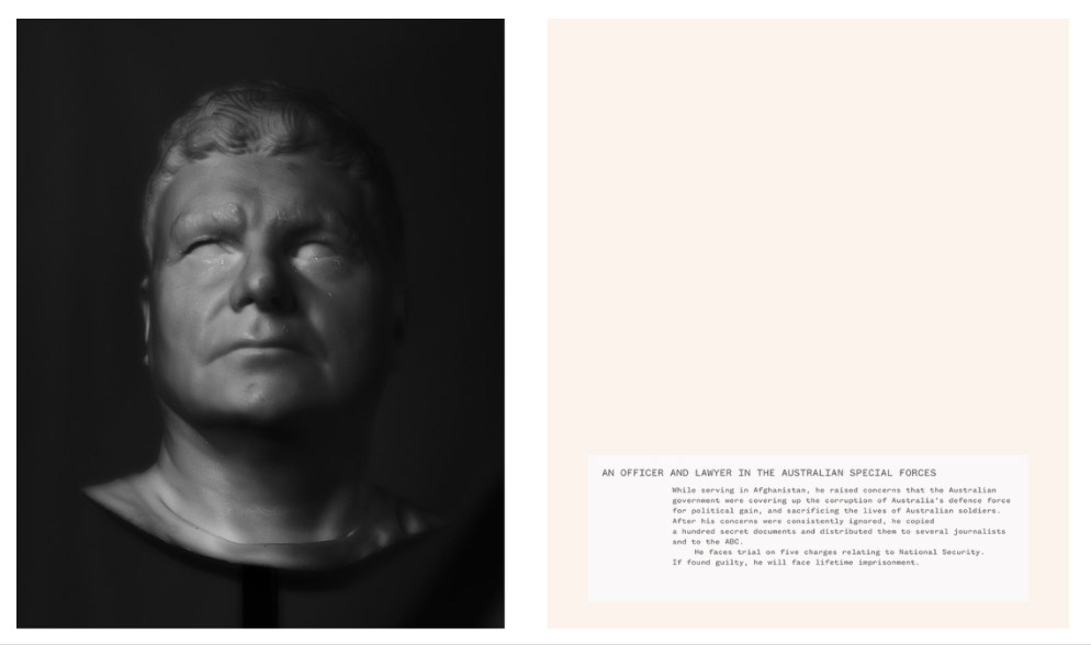
Hoda Afshar: Agonistes

The whistleblower is the modern tragic figure in our current society. For me it was about the character, not the individuals, it was about their actions, and at the heart of it, there was something that reminded me of the Greek tragedies. That’s why I chose the title Agonistes, because this is a Greek word that means personal injury and an inner struggle.
— Hoda Afshar

The 110 synchronised cameras used by Afshar to photograph her subjects.

For discussion:

  • Why do you think Afshar chose not to photograph her subjects directly? What risks are involved for both photographer and subject in this project?
  • What role does research play in Afshar’s practice?
  • Why might a contemporary photographer using new technologies choose to reference ancient ideas and methods of working?
  • In what ways do Afshar’s photographs (of 3D-printed portraits) compare or differ from ancient-classical Hellenistic sculptures
  • What do you notice about the way the sitters are filmed in the accompanying video?
  • Why is the accompanying text (caption) for each picture so important?
  • Why do you think the artist was so fascinated and troubled by the fate of these whistleblowers? What issues does she expose through the exhibition of these images?
  • Have you ever spoken-out regarding an injustice to others; shared a wrong-doing with the hope of positive repair and action? If so, how did you feel? And how would you then feel about being photographed and presented in an exhibition? Why might someone choose to photograph you for this?

Widline Cadet: Seremoni Disparisyon (Ritual [Dis]Appearance)

Most of the photographs are of Black women and greenery and these abstract landscapes.
— Widline Cadet

Widline Cadet was born in Haiti and lives in the United States. Her work explores cultural identity, race, memory and immigration through photography, video and installation. ‘Seremoni Disparisyon (Ritual [Dis]Appearance)’ is a series of self-portraits, sometimes featuring Cadet but also using friends and family to stand in for her. Female figures are placed in natural settings. Repetitive gestures, shapes and props tie the images together. Backdrops, poses and an element of abstraction remind us of the constructed nature of photographic images. The pictures are suffused with a warm glow, an idyllic sense of calm and graceful positivity. Women support one another, literally and metaphorically.

Widline Cadet – ‘Seremoni disparisyon #1 (Ritual [dis]appearance #1)’, 2019

For discussion:

  • Serious hopefulness” is a phrase Cadet has used to describe the intention behind her photography. What does this phrase suggest to you? Can you see evidence of this combination of seriousness and hope in her images? Is it possible to identify specific aspects – subjects, gestures, interactions, relationships, expressions, colours, and so on – that might be considered more (or less) serious or hopeful? Are black and white photographs more serious and/or less hopeful than colour images?
  • How would you describe the relationship between figures and landscapes in these photographs?
  • The title of this series of photographs is quite complex. What does it suggest to you? What types of ritual are presented in the pictures? What or who is both appearing and disappearing?
  • When a person’s face is concealed (or part-concealed) within a photograph, what possibilities (or problems) can arise for the viewer? Does this concealment have the potential to provoke more (or less) intrigue, mystery, empathy or emotion?
  • How and where would you choose to represent yourself through photography? If you had to choose someone else to stand-in as a representation of you, who would you choose and why?

Adama Jalloh: Process​

Street photography has trained my eyes and my ears […] even if I haven’t seen something, if I hear it that’s when I’m preparing to take a shot […] it’s interesting how my body reacts to certain things, how alert I am
— Adama Jalloh

Jalloh describes her photographs as ways to keep memories alive. She grew up in south London and makes photographs on the street. She explores cultural traditions, religious beliefs, clothes and hair styles, sensitively drawing attention to intimate moments and relationships. Jalloh appreciates her local environment, documenting the lives of ordinary citizens, creating (over time) a rich archive of everyday interactions. These images are a way to create a collective memory bank of moments, a love story about belonging, charisma, survival and joy in the city. Jalloh’s photographic memories belong to the whole community. It’s important for her to bond with her subjects. Jalloh is an insider (to borrow Abigail Solomon-Godeau‘s term), a trusted witness rather than a cultural tourist. She collaborates with her subjects, allowing them to present  version of themselves to her camera without judgement.

For discussion:

  • Jalloh uses the word “intimacy” a lot to describe the quality of her images. In what ways are her photographs intimate? What other qualities do they have?
  • How reliable are photographs in conveying the experience of a photographer in a particular moment? Can photographs evoke particular – or new – sensations, sounds, smells, tastes, emotions or anxieties? 
  • How does photography help to develop our understanding and appreciation of places and people, known and unknown?
  • What kind of person comes to mind when you think of a street photographer? How does Jalloh challenge/confirm this stereotype?
  • What skills or personal qualities do you need to be a street photographer? How might these skills vary when in different cities, countries or cultures?
  • What (if anything) distinguishes a ‘street photograph’ from other images taken in the street, such as a photograph of a building, or a person posing for camera?
  • Why do you think the majority of Jalloh’s images are black and white? What are the advantages or disadvantages of photographing in black and white?

Alba Zari: Occult​

I don’t think about photography as a “I have a camera; I will shoot some pictures because…”. Sometimes I see someone that looks interesting and think “I’d like to take some pictures of them” but I don’t bring my camera with me. I think photography is like a story, a concept, so if I find an interesting story I write and research before shooting it.

— Alba Zari

Alba Zari – Archive of the Children of God

Zari was born in Bangkok and has studied in Italy and the USA. Her current project ‘Occult’ tells the story of The Children of God, originally a hippy cult from the California of the late 1960s which has now spread across the world. The cult believes in ‘free love’ but this includes instances of the sexual abuse of children, incest and prostitution. Zari’s grandmother and mother were both members and she was born into the cult. Her research has taken place in London but she intends to travel to shoot the images in Berlin, India and Thailand. The work draws on her family archive, propagandist comics, texts and videos, and archive images of other members of the sect taken from the internet. Zari assembles fragments of text and images, clues to a larger narrative. She investigates the cult’s propaganda machine, contrasting the public image of belonging, joy and faith with the story of one family’s troubling experiences. She also draws attention to the fate of other women and children outside her own family. Zari reveals the capacity of photographs to tell lies but how they can also be made to reveal the truth. The combination of text and image is central to the work.

For discussion:

  • Zari’s practice is rooted in both personal experience and research. What are the potential problems, advantages or disadvantages of this combination? How objective – not influenced by personal feelings or opinions – should (or can) research be? 
  • How does Zari combine archival material with images she shoots herself? What kinds of stories does she tell? Which of her images, above, might you consider the most reliable or truthful? What words help to explain some of the differences between these images and approaches?
  • How would you describe Zari’s attitude to the medium of photography?
  • How accessible – easy to understand or connect with – are these selected images, above? How does encountering them as a collection influence your understanding or experience? Do they appear fragmented, like pieces of a jigsaw puzzle? How might the sequence, scale or context in which you encounter them alter your interpretation? (Note: the images above have been selected from available online resources and organised here by PhotoPedagogy rather than the artist). 

Some suggested activities:

NOTE: The activities within this resource are designed to be accessible for all and therefore can (mostly) be completed with basic art materials and a digital camera.

  • Gather, review and research a selection of photographs that are meaningful to you. They could be pictures you admire, pictures from a family album, photographs of friends, favourite images you have made and look at regularly. What stories do they tell about you, directly or indirectly? How might you make this collection more – or less – truthful or peculiar? How might you present these in a playful or profound way, for example, using various scales; concealing or revealing aspects; adding accompanying texts? How might you share these pictures with others – a slideshow, a film, an exhibition or a zine/book, for example? 
  • What would you like to understand better (and how might photography help you to do this)? Make a list of topics/issues that you find mysterious, troubling, urgent … but which you know little about. Do some research and make a dossier of your discoveries. Once you have amassed some information in various forms (photocopies, notes, lists, links to videos, printed images etc.) try to make some photographs of your own. You may decide to stage these images, filling in the gaps and inventing scenarios that don’t already exist. Alternatively (or additionally), you might attempt to document aspects of the story, capturing evidence of the issue you have researched in the real world. 
  • Experiment with making a series of self-portraits in which you don’t always personally appear. Look again at the work of Widline Cadet. She sometimes uses friends and family members to stand in for her. You could try this too. But how else might you represent yourself? Consider using objects (props), settings (backdrops), lighting, costumes and other theatrical devices to present a (fictional) version of you. You might wish to experiment with old photographs of you as a child, manipulating, disrupting and/or re-presenting them in some way. How can you convey a sense of who you are without relying on a conventional self-portrait? 
  • How might you represent the best aspects of the community you belong to – or even set out to develop a stronger sense of community via photography? Imagine you were the official photographer of your street, neighbourhood, town or city. You have been commissioned to create a sequence of photographs celebrating the spirit of this place and its people. These images will be published in various forms – in a free newspaper, on posters in bus shelters, on postcards , on advertising hoardings etc. You are limited to 10 pictures in total. Make a larger body of images, then edit these down to just 10. Arrange in a sequence or collage. What story do they tell? What are the challenges of an activity such as this and how might you set out to overcome these? 
  • Re-tell in photographs a story or scene remembered from your childhood. Adama Jalloh sometimes finds scenes in her everyday life that remind her of her childhood. You may be able to do something similar, perhaps revisiting childhood locations that are meaningful to you. Alternatively, you could re-enact through staging (collaborating with relatives or friends) a childhood memory. You might even take part in this yourself, directing (rather than taking) the photograph. You could experiment with using different types of text as captions or accompanying information. You might choose to revisit a street, park or area of personal significance, or perhaps reconnect with an old friend or family member. 
  • Stage a collaborative pop-up exhibition. How might you team up with classmates, friends or even family members to present a group show? What shared or distinct ideas might you bring together? Where might be an appropriate – or unexpected – place to exhibit your collective efforts? Rather than worrying about expensive framing or gallery-like spaces, consider easily accessed environments and existing resources, such as displaying within classroom or corridor spaces or floors, or upon outside walls, fences, benches or washing lines. Beyond working as artists and photographers to prepare, what other skills and roles might you need to embrace? How might your exhibition be a force for good, or positive change or connections, within or beyond your group of friends, family, school or community?

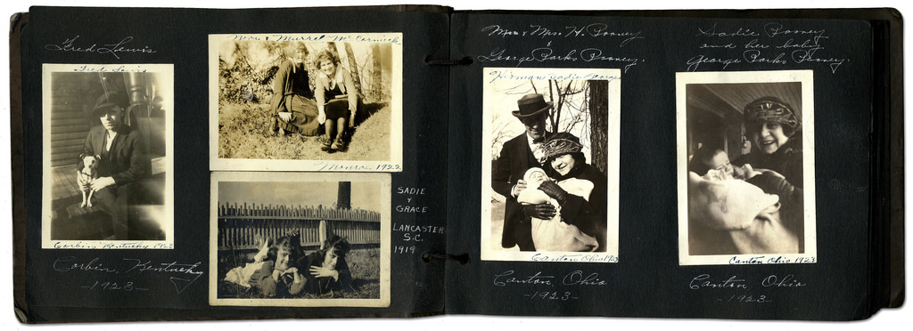
FAMILY ARCHIVES: Explore your own private archives such as photo-albums, home movies, diaries, letters, birth-certificates, boxes, objects, mobile devices, online/ social media platforms and make a blog post with a selection of material that can be used for further development and experimentation using a variety of re-staging or montage techniques .

Archives can be a rich source for finding starting points on your creative journey. This will strengthen your research and lead towards discoveries about the past that will inform the way you interpret the present and anticipate the future. See more Public/ Private Archives

For example, you can focus on the life on one parent, grand-parent, family relative, or your own childhood and upbringing. Ask other family members (parents, grand-parents, aunties, uncles) if you can look through their photo-albums too etc.

7151127821_271a21418a_b
Family photo-albums
Pictures appear on the smartphone photo sharing application Instagram on April 10, 2012 in Paris, one day after Facebook announced a billion-dollar-deal to buy the startup behind Instagram. The free mini-program lets people give classic looks to square photos using "filters" and then share them at Twitter, Facebook or other social networks. AFP PHOTO THOMAS COEX (Photo credit should read THOMAS COEX/AFP/GettyImages)
Digital images stored on mobile phones, uploaded on social media etc.

TASKS STEP-BY-STEP GUIDE: 

  1. Either scan or re-photograph archival material so that it is digitised and ready for use on the blog and further experimentation.
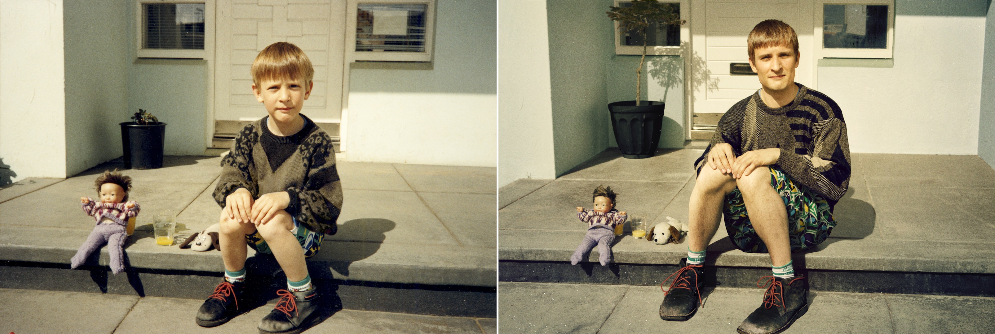
  2. Plan at least one photo-shoot and make a set of images that respond to your archival research. This can be re-staging old photos or make a similar set of images, eg. portraits of family members and how they have changed over the years, or snapshots of social and family gatherings.
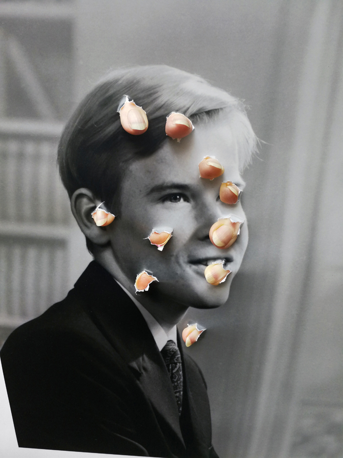
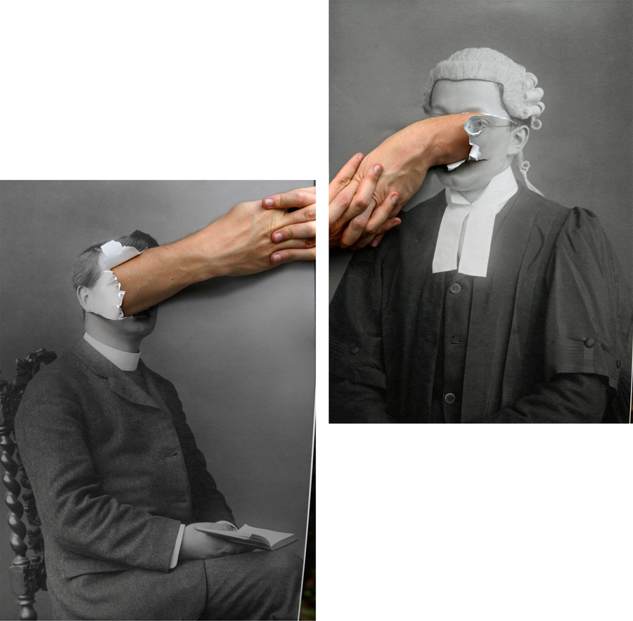
  3. Choose one of your images which relates to the theme of family (e.g. archive, family album, or new image you have made) and destroy the same image in 5 different ways using both analogue and digital method techniques. Eg. Reprint old and new photos and combine using scissors/ tearing and glue/ tape. In Photoshop use a variety of creative tools to cut and paste fragments of images to create composites.

Extension: Choose a second image and destroy it in 5 new or other ways.

Jonny Briggs: In search of lost parts of my childhood I try to think outside the reality I was socialised into and create new ones with my parents and self. Through these I use photography to explore my relationship with deception, the constructed reality of the family, and question the boundaries between my parents and I, between child/adult, self/other, nature/culture, real/fake in attempt to revive my unconditioned self, beyond the family bubble. Although easily assumed to be photoshopped or faked, upon closer inspection the images are often realised to be more real than first expected. Involving staged installations, the cartoonesque and the performative, I look back to my younger self and attempt to re-capture childhood nature through my assuming adult eyes.

Thomas Sauvin and Kensuke Koike: ‘No More, No Less’
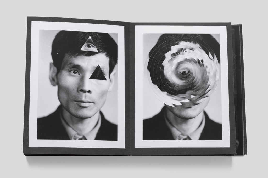
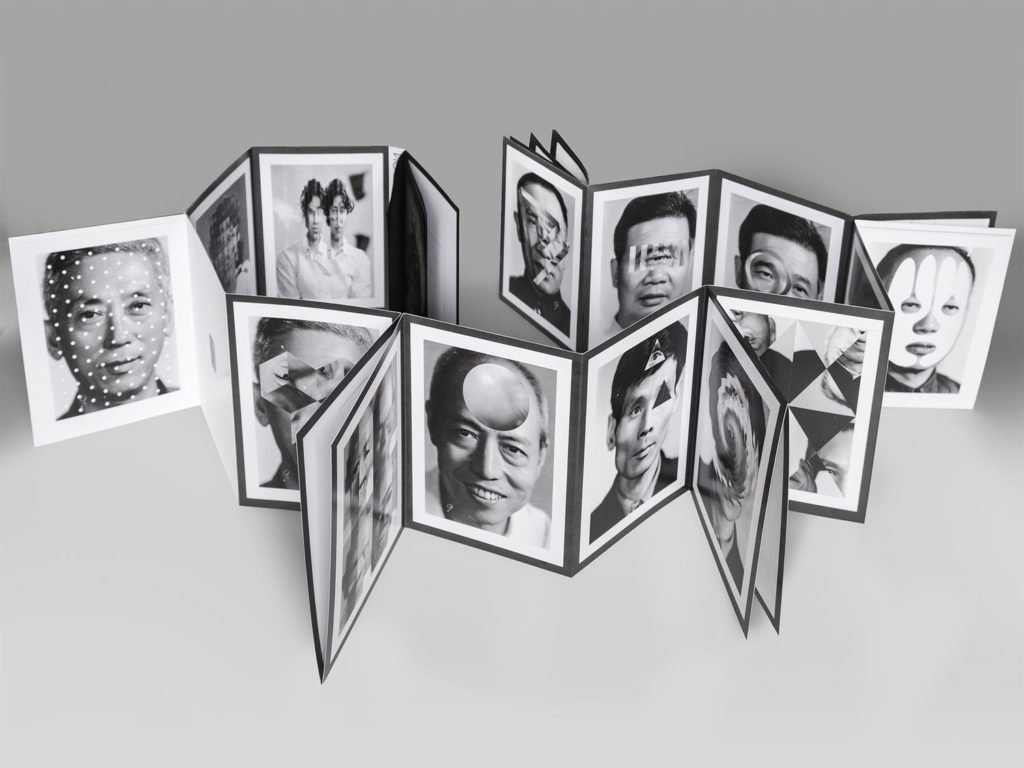
In 2015, French artist Thomas Sauvin acquired an album produced in the early 1980s by an unknown Shanghai University photography student. This volume was given a second life through the expert hands of Kensuke Koike, a Japanese artist based in Venice whose practice combines collage and found photography. The series, “No More, No Less”, born from the encounter between Koike and Sauvin, includes new silver prints made from the album’s original negatives. These prints were then submitted to Koike’s sharp imagination, who, with a simple blade and adhesive tape, deconstructs and reinvents the images. However, these purely manual interventions all respect one single formal rule: nothing is removed, nothing is added, “No More, No Less”. In such a context that blends freedom and constraint, Koike and Sauvin meticulously explore the possibilities of an image only made up of itself.

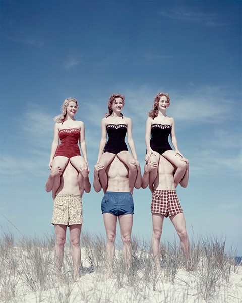
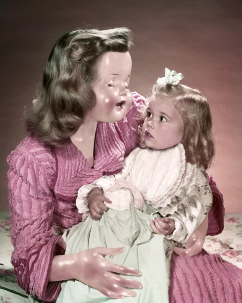
Veronica Gesicka Traces presents a selection of photomontages created by Weronika Gęsicka on the basis of American stock photographs from the 1950s and 1960s. Family scenes, holiday memories, everyday life – all of that suspended somewhere between truth and fiction. The images, modified by Gęsicka in various ways, are wrapped in a new context: our memories of the people and situations are transformed and blur gradually. Humorous as they may seem, Gęsicka’s works are a comment on such fundamental matters as identity, self-consciousness, relationships, imperfection.

Mask XIV 2006

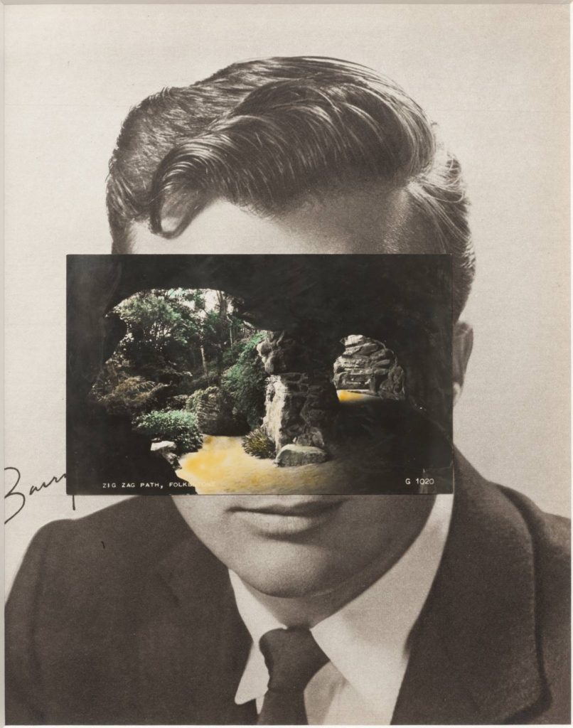
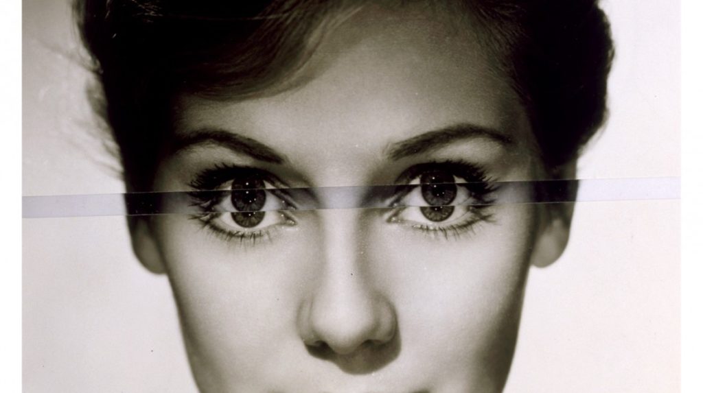
John Stezaker: Is a British artist who is fascinated by the lure of images. Taking classic movie stills, vintage postcards and book illustrations, Stezaker makes collages to give old images a new meaning. By adjusting, inverting and slicing separate pictures together to create unique new works of art, Stezaker explores the subversive force of found images. Stezaker’s famous Mask series fuses the profiles of glamorous sitters with caves, hamlets, or waterfalls, making for images of eerie beauty.

His ‘Dark Star’ series turns publicity portraits into cut-out silhouettes, creating an ambiguous presence in the place of the absent celebrity. Stezaker’s way of giving old images a new context reaches its height in the found images of his Third Person Archive: the artist has removed delicate, haunting figures from the margins of obsolete travel illustrations. Presented as images on their own, they now take the centre stage of our attention

There are different ways artists and photographers have explored their own, or other families in their work as visual storytellers. Some explore family using a documentary approach to storytelling, others construct or stage images that may reflect on their childhood, memories, or significant events drawing inspiration from family archives/ photo albums and often incorporating vernacular images into the narrative and presenting the work as a photobook.

Rita Puig-Serra Costa (Where Mimosa Bloom)  vs Laia Abril (The Epilogue)> artists exploring personal issues > vernacular vs archival > inside vs outside

Rita Puig-Serra Coasta, Where Mimosa Bloom
Laia Abril, The Epiloque

Carole Benitah (Photo Souvenirs) vs Diane Markosian (Inventing My Father) > family > identity > memory > absence > trauma

Carole Benitah, Photo-Souvenirs
This is the closet thing I had to an image of my father. A cut out of him in my mother’s photo album.

Ugne Henriko (Mother and Daughter) vs Irina Werning or Chino Otsuka > re-staging images > re-enacting memories

Ugne Henriko, Mother & Daughter

Read article in The Guardian

Irene Werning,Back to the Future
Chino Otsuka

essay: archives

What Are Archives?

In the course of daily life, individuals and organizations create and keep information about their personal and business activities. Archivists identify and preserve these documents of lasting value.

These records — and the places they are kept — are called “archives.” Archival records take many forms, including correspondence, diaries, financial and legal documents, photographs, and moving image and sound recordings. All state governments as well as many local governments, schools, businesses, libraries, and historical societies, maintain archives.

archives-016

Using the Photographic Archive as a Resource for Research and Ideas

For your Personal Investigation you have to engage with a notion of an archive. Archives can  be a rich source for finding starting points on your creative journey. This will strengthen your research and lead towards discoveries about the past that will inform the way you interpret the present and anticipate the future.

Public archives in Jersey

Jersey Archives:  Since 1993 Jersey Archive has collected over 300,000 archival records and it is the island’s national repository holding archival material from public institutions as well as private businesses and individuals. To visit click here

Jersey Archive can offer guidance, information and documents that relate to all aspects of the Island’s History. It also holds the collections of the Channel Islands Family History Society.

Societe Jersiaise: Photographic archive of 100,000 images dating from the mid-1840s to the present day. 35,000 historical images in the Photographic Archive are searchable online here.

Societe Jersiaise also have an extensive library with access to may publications and records relating to the island’s history, identity and geography. Click here

005721

Archisle: The Jersey Contemporary Photography Programme, hosted by the Société Jersiaise aims to promote contemporary photography through an ongoing programme of exhibitions, education and commissions.

The Archisle project connects photographic archives, contemporary practice and experiences of island cultures and geographies through the development of a space for creative discourse between Jersey and international practitioners.

Link: http://www.archisle.org.je/

Private archives:Family photo-albums, objects, letters, birth-certificates, legal documents etc.

7151127821_271a21418a_b

Digital images stored on mobile phones, uploaded on social media etc.

Pictures appear on the smartphone photo sharing application Instagram on April 10, 2012 in Paris, one day after Facebook announced a billion-dollar-deal to buy the startup behind Instagram. The free mini-program lets people give classic looks to square photos using "filters" and then share them at Twitter, Facebook or other social networks. AFP PHOTO THOMAS COEX (Photo credit should read THOMAS COEX/AFP/GettyImages)

HOMEWORK TASK
Essay: How are archives a repository of knowledge?
DEADLINE: WED 11 OCT

Write a 1000 word essay and answer this question: 

How do archives function as repositories of knowledge?

To answer this question you need to reflect on the Photo-Archive’ presentation by Patrick Cahill on Wed 29 September at the Société Jersiaise.

In addition, research at least one photographers from the list below in the photo-archive and choose one image that references some of the early photographic processes, such as daguerreotype, calotype, salt paper prints, wet plate collodion, albumen prints, autochrome and colour transparencies as part of the origins and evolution of photography and include it in your essay.

Use this simple essay structure:

Hypothesis: How are archives a repository of knowledge?

Opening quote: choose appropriate quote from key texts below.

Introduction (250 words): write a brief overview of the Societe Jersiaise Photographic Archive; its origin, development, scope, context and early photographic activity in Jersey. What can we learn about Jersey from looking at pictures of the past? Within this context consider also more broadly, what archives you keep and how you organise them eg. images on your mobile, text messages etc. and what knowledge they provide about you as an individual and society at large.

Pg 1 (250 words): Choose one photographer from the archive and provide a brief overview of his/ her practice in context of the essay question. Describe what knowledge we can gain from studying his/her images and photographic work.

Pg 2 (250 words): Choose one key image for analysis using model of photo literary below. Discuss photographic methods and processes used in the image making process. Again consider how this image provide new information.

Conclusion (250 words): Refer back to the essay question and consider; how we can learn from images of the past? And, how they may inform us about our social history (branch of history that emphasizes social structures and the interaction of different groups in society)? Reflect also on how archives and images from the past may help you to develop your own photographic project around theme of Nostalgia. How would you respond as photographer to what you have learned?

RESOURCES AND READING

For a better understanding of photo archives, origins of photography and associated photographic theories please read and study the following documents and hyperlinks to texts. In your essay try and identify relevant quotes, or paraphrase or summarise an idea, theory or concept that you can use from these literary sources that add context and either support or disapprove your own argument.

Image analysis: use Photo Literacy as a method of analysis: of TECHNICAL>VISUAL>CONTEXTUAL>CONCEPTUAL

Essay writing: For more help and guidance on how to write a good essay, including how to use Harvard System of Referencing, click here

Societe Jersiaise Photographic Archive: Here is a link to Intro to the Photo Archive which you all must read in order to answer the essay question above. In addition, here is a pdf of how to search the online catalogue and request images from the photo-archive.

Below is a link to a bit biography about some of the main photographers in the SJ collections. To view images and select key image for analysis go to this folder here;

M:\Departments\Photography\Students\NOSTALGIA\SJ Photo-Archive

SJ Photo-Archive – historical context
Henry Mullins
William Collie
Ernest Baudoux
Clarence P Ouless
Francis Foot
Charles Hugo
Edwin Dale
Percival Dunham
Thomas Sutton
Albert Smith
Emile F Guiton

Archislecontemporary approach
Michelle Sank: Insula
Martin Parr: Liberation
Yury Toroptsov: Fairyland
Tom Pope ( I am not Tom Pope, You are all Tom Pope)
Jonny Briggs (Unpalatable Truths)
Tanja Deman (Sunken Garden)
Lewis Bush (Trading Zones)

Martin Toft: Atlantus, Masterplan and Becque a Barbe

Emile F. Guiton > Autochromes: The founding father of the Societe Jersiaise Photographic Archive was also a very accomplished photographer who experimented with early colour photography in the beginning of the 20th century. Read this essay by Archivist Patrick Cahill on Guiton’s still-life images of flowers in a vase and other domestic scenes using Autochrome – the first commercially available colour process.

Read Patrick Cahill’s: The Autochromes of Emile GuitonDOWNLOAD

National Science and Media Museum: History of the Autochrome: the Dawn of Colour Photography

Archives in contemporary photography: Also read text about the resurgence of archives in contemporary photography by theorist David Batearchives-networks-and-narratives_low-res, make notes and reference it by incorporating quotes into your essay to widen different perspectives. Comment on quotes used to construct an argument that either support or disapprove your own point of view.

Origins of Photography: Study this Threshold concept 2: Photography is the capturing of light; ​a camera is optional developed by PhotoPedagogy which includes a number of good examples of early photographic experiments and the camera obscura which preceded photography. It also touches on photography’s relationship with light and reality and delve into photographic theories, such as index and trace as a way of interpreting the meaning of photographs.

Photography did not spring forth from nowhere: in the expanding capitalist culture of the late 18th and 19th centuries, some people were on the look-out for cheap mechanical means for producing images […] photography emerged experimentally from the conjuncture of three factors: i) concerns with amateur drawing and/or techniques for reproducing printed matter, ii) light-sensitive materials; iii) the use of the camera obscura
— Steve Edwards, Photography – A Very Short Introduction

Debates about the origins of photography have raged since the first half of the nineteenth century. The image above left is partly the reason. View from the Window at Le Gras is a heliographic image and arguably the oldest surviving photograph made with a camera. It was created by Nicéphore Niépce in 1826 or 1827 at Saint-Loup-de-Varennes, France. The picture on the right is an enhanced version of the original which shows a view across some rooftops. It is difficult to tell the time of day, the weather or the season. This is because the exposure time for the photograph was over eight hours.

What is a daguerreotype?

The daguerreotype was the first commercially successful photographic process (1839-1860) in the history of photography. Named after the inventor, Louis Jacques Mandé Daguerre, each daguerreotype is a unique image on a silvered copper plate.

In contrast to photographic paper, a daguerreotype is not flexible and is rather heavy. The daguerreotype is accurate, detailed and sharp. It has a mirror-like surface and is very fragile. Since the metal plate is extremely vulnerable, most daguerreotypes are presented in a special housing. Different types of housings existed: an open model, a folding case, jewelry…presented in a wooden ornate box dressed in red velvet. LD a theatre set designer

The invention of photography, however, is not synonymous with the invention of the camera. Cameraless images were also an important part of the story. William Henry Fox Talbot patented his Photogenic Drawing process in the same year that Louis Daguerre announced the invention of his own photographic method which he named after himself. Anna Atkins‘ British Algae: Cyanotype Impressions of 1843 is the first use of photographic images to illustrate a book. This method of tracing the shapes of objects with light on photosensitive surfaces has, from the very early days, been part of the repertoire of the photographer.

  • Henry Fox Talbot – Latticed Window, 1835

In the month of August 1835, William Henry Fox Talbot produced the first photographic negative to have survived to this day. The subject is a window. Despite the clear connection, it is an entirely different image compared to those of his colleagues Niépce and Daguerre. Those are photographs taken from a window, while this is the photograph of a window. From the issue of realism, we shift here into an extremely modern outlook which today would be likened to conceptual and metalinguistic discourse. While the window constitutes the most immediate metaphor to refer to photography, Talbot doesnʼt use it but more simply he photographs it. He thus takes a photograph of photography. The first to comment on this was the author himself, writing a brief note (probably added when it was displayed in 1839) on the card upon which it is mounted. The complete text reads:

Latticed Window (with the Camera Obscura)
August 1835 When first made, the squares of glass, about 200 in number could be counted, with help of a lens6

In 1978, the German photographer Floris Neusüss visited Lacock Abbey to make photograms of the same window. He returned again in 2010 for the Shadow Catchers exhibition at the V&A to create a life-sized version of Talbot’s window (below right).

That 1978 photogram was the start of our adventures in creating photograms of large objects in the places where we found them […] we took our equipment to Lacock Abbey and made a photogram of a fixed subject. This particular subject was for us not just a window in a building but an iconic window, a window on photography, opened by Talbot. The window is doubly important, because to be able to invent the photograph, Talbot first used photograms to test the light sensitivity of chemicals. His discovery became a window on the world. I wonder what percentage of our understanding of the planet we live on now comes from photographs?
— Floris Neusüss

The idea of photographs functioning like windows makes total sense. Like the camera viewfinder, windows frame our view of the world. We see through them and light enters the window so that we can see beyond. Photographs present us with a view of something. However, it might also be possible to think of photographs as mirrors, reflecting our particular view of the world, one we have shaped with our personalities, our subconscious motivations, so that it represents how our minds work as well as our eyes. The photograph’s glossy surface reflects as much as it frames. Of course, some photographs might be both mirrors and windows. If you’re interested in thinking a bit more about this you might want to check out this resource.

identity & community – summer planner

IDENTITY & COMMUNITY

For the first part of our new project we will focus on a sense of people and place in relation to how St Helier has developed in response to migrant settlements in the past and present.

The learning outcomes for students are to:

  • Gain historical insight of waves of immigration in Jersey; how it impacted the economy and contributed to the island’s unique identity. 
  • Learn about individual stories and how different migrant groups enriched Jersey’s cultural diversity and ethnicity.
  • Explore geography of St Helier townscape in a series of photo walks through historical and contemporary migrant communities and neighbourhoods.

Week 1-3: 7 – 28 June
Practice: Photo-Assignment 1: Migrant Communities in St Helier
Theory: Research migrant history of Jersey
Deadline: Complete Task: 1 – 4 by 28 June

1 RESEARCH > ANALYSIS

Write 300-500 words and produce a thorough and detailed blog post with text, images and hyperlinks that reflects on your visit to Jersey Museum to see the exhibition: People Make Jersey.

Try and focus on one particular theme of the exhibition that roused your curiosity and interest. For example religious/ political refugees, economic migrants that arrived to support new industries such as oyster fishing, ship building, construction and agricultural workers, or tourism and recently finance. In addition you could also focus on different ethnic groups or social classes that settled, for example French (mainly from Normandy and Brittany), Irish, Welsh and Scottish, Italian, Spanish, Portuguese and Madeiran, East Eurpeans (mainly Polish and Romanian), Africans and people from the Far East (currently there are agricultural workers from the Phillipenes employed in potato growing). By far the largest group of immigrants to Jersey are British, historically diplomats and expats from the English colonies, military officers and professionals employed in the legal and financial services sector. For centuries wealthy residents have also arrived and today Jersey continues to grant special permits to rich residents, classified as High Net Worth Individual or HNWIs – see Locate Jersey and Jersey Finance for more information. Remember Stuart Fell’s walk and talk around St Helier’s historical town center pointing out how some of these wealthy residents influenced architecture and the build environment.

The exhibition states;

‘Every Jersey resident has an immigration story – whether their family came here 500 years or five years ago. This exhibition explores some of these stories and the ways in which immigration has shaped and influenced the Island we know today.’

Reflect on this statement and find personal connections, where relevant by speaking with members of your family or close knit group of friends. Perhaps your family are economic migrants and/ or you have ancestry from different ethnic minority groups.

Here is a data base of information and different papers on the size and structure of the Jersey population and of migration to and from the Island.

Family History is a journey through our past in which we use archive records to meet the ancestors who have shaped not just our features but also our personalities, values and everyday lives. Learning more about our forbearers or the place in which we live allows us to make a real connection to the past and sometimes understand more about our present circumstances. 

On these pages you can get a flavour of Jersey’s migrant history, why people came to Jersey and why people left and what effect that had in Jersey.   Why people left Jersey for Australia in the 19th century, how the cod fishing industry in Canada had an impact on Jersey’s population and why workers from the UK were essentail to Jersey’s economy.

For more detailed research please visit our Archive and Collections Online or visit the Jersey Archive.

Some information for this site has been re-produced and adapted from Mark Boleat’s Jersey’s Population – A History, which is available to buy from the Société Jersiaise.

Jersey Migration Map

You can read more here about the different waves of immigration to Jersey at Jersey Archive.

There are also individual Migrant’s Stories that may be of interest, such as Edouard Alho who was one of the first Portuguese workers to come to Jersey in 1934 from Madeira to work as a waiter and then a head waiter at the Merton Hotel. In the war years he returned to Portugal, but came back to Jersey in 1948 and married a local girl, Betty. During the 1950s and 60s he saw Jersey tourism grow and the Merton become the largest hotel in the Channel Islands. Edouard retired in 1984, after 50 years service at the Merton Hotel.

For those who want to extend their research and begin to look into your family history, visit Get Started – Jersey Archive

At the exhibition there was a wall which explained how certain typical Jersey surnames originated from. See here for a broader list of names at Jersey Archive. Local Historian, Doug Ford has also written a document: From Langlois to De Sousa – A History of immigration into Jersey, which is worth reading.

House History, here is information how you can research the history of a house.

Jersey Emigration – as an extension you can also find stories and inspiration from those people who left Jersey to find happiness and success elsewhere. Perhaps you have family member, or know of someone who left?

2. ORGANISE > RECORD


On your Media:drive create a new project folder: IDENTITY & COMMUNITY. Inside this folder create a new sub-folder: PHOTO-SHOOTS and save images from your shoot in St Helier.

In Lightroom repeat the same process as above by creating a COLLECTION SET: IDENTITY & COMMUNITY and a COLLECTION: SHOOT 1 inside the collection set above. Don’t begin to do any editing or developing until this is done!

3. EDIT > DEVELOP

In Lightroom use Library mode to edit a set of 12-16 images in three stages by first using P (pick) and X (reject), then star rating and finally colour coding. Use Compare View (two images) and Survey View (3 or more images) and produce screen prints of your editing process.

In Develop mode select your final set of images and show experimentation with:

Cropping – produce variation of cropping the same image (at least 3 different crops) to change the emphasis.

Colour – adjust the image using WB (white balance), Exposure, Contrast, Highlights, Shadows, White, Blacks. Use Adjustment Brush, Gradient Filter and Spot Removal where appropriate.

Monochrome – Follow the same procedure as above with Colour but in Black & White mode.

UPDATE > Here are instructions on how to use, if necessary: LIGHTROOM-CHECKLISTDOWNLOAD

BLOGPOST – for each of the above experiments make sure you produce a blog post with screen prints of the process and export a version of your adjusted image as a JPEG in 1000 pixels to be uploaded onto your blog post with annotation.

INDEPENDENT STUDY: HOMEWORK

PHOTO-ASSIGNMENT 1: 3 shoots in 3 weeks
MIGRANT COMMUNITIES in ST HELIER
– a sense of place
– character of community
– people – portraiture

DEADLINE: Mon 28 June

The assignment is for you to produce another 3 shoots in the next 3 weeks and continue to make photographic responses to historical and contemporary migrant communities and neighbourhoods in St Helier. You can decide to revisit some of the areas that we explored on our group walk last Mon 7 June or choose a different location, site or environment.

The main task is to make more images for your project and develop a sense of discipline and rigour. In most photography, especially within documentary practice it is paramount that you spend time developing a deeper understanding of your subject through research and speaking with people in the community that you are working in. It’s important to develop a relationship and gain their trust which comes from taking your time listening and collaborating.

For this task try and spend at least 1 hour per week visiting the area you have chosen. Walk around slowly, explore the forgotten or overlooked and make images in response to what you see, feel and experience. Use some of the techniques we practised as a group when approaching people for a portrait. The best approach is to introduce yourself (a Hautlieu A-Level photography student) and be honest about your intentions (these images are for my photography project on Identity and Community etc). If you demonstrate that you take an interest in someone it will often pay dividend in producing a better image. You might also learn something about them and the area that you are in. It is also likely that they will introduce you to others or tell you a story that will add meaning or context to your photographic work.

For some of you it may be more appropriate to explore something closer to home, for example if your family are living in a community of migrants, have a business, or work in a sector which in some ways are connected to a particular area or industry. It may also be that you have a job that are linked to a specific profession that has a diverse mix of ethnic groups or associated with a particular social class.

PHOTO WALKS: route suggestions – see maps below

Route 1: Merchant quarter around St Helier Parish Church > Royal Sq, Library Pl, Bond St, Broad St, Mulcaster St, Hill St, Snow Hill, La Motte St, Colomberie > follow onto Ann St, Hillgrove St (French Lanes), Wesley St, Ingouville Pl, Belmont Pl/ St towards Minden Pl, Rue de Funchal walk towards Val Plaisant towards St Thomas Church and follow Route 2 in reverse.

Route 2: French/ Portuguese quarters from Royal Sq walk towards St Thomas Church via Broad St, Pitt St, Dumaresq St, Hue St, Le Geyt St, Devonshire Pl, Great Union Road + side streets with character, such as Journeaux St, Aquila Rd, Poonah Rd, Albert St, Columbus St, Dorset St, Clairvale Rd towards Rouge Boullion and follow Route 3 in reverse.

Route 3: British expats/ wealthy residents (Rouge Boullion) > from Royal Sg walk towards Weighbridge, Wharf St, Commercial St, Castle St, Seale St > past SH Town Hall, The Parade, Cheapside + side streets, Kensigton Pl, Lewis St, Elizabeth Lane towards St John’s Rd, Roussel St/ Mews, Queen’s Rd, Lower King’s Cliffe, Almorah Crescent, Clos de Paradise, La Pouquelaye, Victoria Cres, Clarendon Rd towards St Thomas Church and follow Route 2 in reverse.

IMAGES: explore the following

Your task is to tell a story in a series of images about an area of St Helier with historical or contemporary links with migrant communities. Here are some guidelines and suggestions.

A sense of place > location, site, environment, residential area, communal park, architecture and details, Interior of church, community center, house or home.

Front cover of Future of St Helier newspaper. @ Conor Horgan, 2018. Development near Ann St.
La Collette Flats, Havre de Pas, St Helier
Hue Court, St Helier

Will Lakeman: Social Housing. An ongoing project to document Jersey’s social housing buildings. I lived in one of these with my mum and brother in the mid 90s. It was cheaper, warmer and had better noise insulation than anywhere I’ve lived since – and helped instil in me a lifelong respect for concrete buildings.

Ernest Badoux, Views over St Helier

Ernest Baudoux (1828-1897) was originally from France and worked in Jersey from 1869 at 11 Craig Street and 51½, 56 and 59 New Street. In 1885 he was joined in business by his son, but two years later they sold out to John Stroud, a young photographer from London, who in turn sold his business, including many of Baudoux’s glass-plate negatives, to Albert Smith. Some of these photographs have been attributed incorrectly to Smith and the Photographic Archive of La Société Jersiaise have a project under way to attempt to correctly identify who took each of the 3000-plus images in their collection attributed to Smith.

There are 1385 photographs by Baudoux available on line from the Société’s archive.

Character of community > street scene, decisive moment, staging or performing for the camera.

Parade Yard, or ‘Irish Yard’ (courtesy of JEP)

Here is a link to an entry for Percival Dunham considered Jersey first photojournalist for a very brief period in 1913 and 1914, when he worked for Jersey Illustrated Weekly and then the Morning News, the main competitor for many years for the Evening Post (now the Jersey Evening Post and the island’s only daily newspaper for over half a century). Try and identity individual images as above from a selection of prints from the Societe Jersiaise Photographic Archive that holds over 1000 images by Percival Dunham in their collection.

People and portraiture > You much attempt to make at least 3 good portraits; observed, formal or environmental. For example, a resident outside his/her house/apartment block, shop/ business owner, street portrait/ passer-by. Also consider photographing a couple or make a group portrait

Doug DuBois image from book, My Last Days of Seventeen. 2015

Doug DuBois: My Last Days of Seventeen
The title, “My last day at Seventeen,” was first uttered by Eirn while I was taking her photograph in her parents’ back garden on the eve of her 18th birthday. Although Eirn argues her remark was more properly phrased, “ it’s my last day as seventeen” the sentiment is the same: there is a time in everyone’s life where the freedom and promise of childhood are lost to the coming of age and experience. The process can be gradual or abrupt; it can begin at age 18, 12 or 40. 

The photographs were made over a five year period in the town of Cobh, County Cork in Ireland. I came to Cobh at the invitation of the Sirius Arts Centre in the summer of 2009. Ireland had just begun its sharp decline from the boom years of the Celtic Tiger. I spent my days trying to ingratiate myself with contractors to gain access to building sites that lay abandoned throughout the Irish countryside. I got nowhere.

Dana Lixenberg: Imperial Courts
Imperial Courts, 1993-2015 is a project by photographer Dana Lixenberg about Imperial Courts, a social housing project in Watts, Los Angeles. The project contains work made over a period of 22 years and consists of a book, exhibition and web documentary. Look at the website which include all her photographs and video interviews.

Imperial Courts subtly addresses issues of inequality and injustice while avoiding stereotypical representation. Using multiple platforms, from silver gelatin prints, a carefully edited publication, video installation, and an online web documentary, the project serves as an evocative record of the passage of time in an underserved community. The power of Lixenberg’s work can be found in the intimacy, compassion and quiet confidence of her images, and of the individuals we meet through the series. Read interview here with Dana Lixenberg in the Guardian newspaper

Portrait from the Free Photographic Omnibus: Southampton. Sisters: Lyn & Stella Brasher, 1974

Daniel Meadows: Middle England, 1973-79
Read Fieldwork a study on Daniel Meadows by curator and academic Val Williams.

Niall McDiarmid’s striking street portraits show off the best of London’s changing population—in all its colorful dynamism and growing diversity. Read full interview here with McDiarmid.

https://youtu.be/PBWBTTtXtIg

Above is a link to a unique conversation between British photographers Niall McDiarmid and Daniel Meadows during the final stages of preparing for Niall’s ‘Town to Town’ exhibition at The Martin Parr Foundation in Bristol, UK from 31 January – 12 May 2018.

4. ARTISTS INSPIRATIONS

As well as those listed above, below are a selection of other photographers who are storytellers within a documentary practice and making work about a specific community.

RESEARCH > ANALYSIS: For inspiration select at least two artists references, one from SJ Photo-Archive and one contemporary photographer. Explore discuss, describe and explain key examples from their work on portraiture done in Jersey. Compare and contrast their approaches , outcomes and follow these steps:

1. Produce a mood board with a selection of images and write an overview of their work, style and approach to portraiture.

2. Select at least one image from each photographer and analyse in depth using methodology of TECHNICAL>VISUAL>CONTEXTUAL>CONCEPTUAL

3. Incorporate quotes and comments from artist themselves or others (art critics, art historians, curators, writers, journalists etc) using a variety of sources such as Youtube, online articles, reviews, text, books etc.

4. Make sure you reference sources and embed links to the above sources in your blog post.

5. Plan 3 photographic shoots and responses that links with Photo-Assignment 1: Migrant communities of St Helier

Rob Hornstra and writer Arnold van Bruggen spend five years working in the Sochi Region where the 2014 Winter Olympics where held. Here is a link to The Sochi Project

LaToya Ruby Frazier (The Notion of Family); In this, her first book, LaToya Ruby Frazier (born 1982) offers an incisive exploration of the legacy of racism and economic decline in America’s small towns, as embodied by Braddock, Pennsylvania, Frazier’s hometown. The work also considers the impact of that decline on the community and on her family, creating a statement both personal and truly political


An interview with Alec Soth and Aaron Schumann. Link to his website

Alec Soth (Sleeping by the Mississippi, Niagara, Broken Manual, Songbook), Rob Hornstra (The Sochi Project), Chris Killip (Isle of Man: A book about the Manx), Mark Power (The Shipping Forecast), Martin Parr (The last Resort), Lars Tunbjork (Country besides itself), Oliver Chanarin and Adam Broomberg (Ghetto), Stephen Gill (Hackney Wick), David Goldblatt (In Boksburg), Josef Koudelka (Gypsies), Robert Frank (the Americans), Bruce Davidson (East 100th Street, Central Park, Subway), Esko Manniko (The Female Pike), Mary Ellen Mark (Ward 81, Falklands Road), Ken Schles (Nightwalk), Tom Wood (Bus Odessey, All Zones off Peak), George Georgiou (The Last Stop), Robert Adams (The New West), Lewis Baltz (The new Industrial Parks Near Irvine), John Divola (Three Acts), Gary Winogrand (the Animals), Sebastio Salgado (Workers), W.Eugene SmithAnders Petersen (Cafe Lehmitz), J.H Engstroem (From Back Home – together with Anders Pedersen), Jon Tonks (Empire), Ken Grant (Flock), Vanessa Winship (Schoolgirls, She Dances on Jackson, Black Sea), Lauren Greenfield (Fast Forward, Girl Culture), Ricardo Cases (Paloma al aire), Heikki Kaski (Tranquility), Robert Clayton (Estate), Jason Wilde (Silly Arse Broke It, Guernsey Residency, Estuatry English), Tom Hunter (Le Crowbar), Valerio Spada (Gomorrah Girl), Pieter Hugo (Permanent Error, Nollywood), Alejandro Cartegena (Carpoolers), Janet Delaney (South of Market), Martin Gregg (Midlands) , Lorenzo Vitturi (Dalston Anatomy)

Look up also Picture Agencies/ Photo Collectives:
Sputnik PhotosDocument ScotlandA Fine Beginning (Welsh Photo collective), Magnum Photos, Institute, Agence VUPanos PicturesWorld Press Photo

Week 4-6: 28 June – 15 July
Practice: Zine-lab
Theory: Origins of photography
Deadline: Complete Task: 5 – 8
by 15 July

5. INDEPENDENT STUDY: HOMEWORK
Essay: Archives + Origin of Photography
DEADLINE: Mon 12 July

ARCHIVES: We will begin this journey with a visit to the Société Jersiaise Photographic Archive on Mon 28 June which contains over 100,000 items dating from the mid-1840s to the present day and is the principal Jersey collection of nineteenth and early twentieth century photograph. Archives can  be a rich source for finding starting points on your creative journey. This will strengthen your research and lead towards discoveries about the past that will inform the way you interpret the present and anticipate the future.

At the Societe Jersiaise we will learn about some of the earliest photographic experiments used in capturing images such as daguerreotypes and calotypes in 1839 when photography was invented as a method of recording and fixing light and shadows to produce a recognisable image. In addition we will explore early colour processes in photography like Autochromes and other images held in their collections and use them to construct visual narratives. We will also be reading Jersey’s oldest newspaper in French, Les Chronique de Jersey to learn about life in the island in 19th century, and how this information can help you inform your own impressions of life and society in the past as well as provide you with creative starting points for your own photographic projects.

To show knowledge and understanding of your experience day at the SJ Photo-Archive you need to write an essay. Follow link and instructions here:

SJ Photo-Archive – historical context
Henry Mullins
William Collie
Ernest Baudoux
Clarence P Ouless
Francis Foot
Charles Hugo
Edwin Dale

Archislecontemporary approach
Michelle Sank: Insula
Martin Parr: Liberation
Yury Toroptsov: Fairyland
Martin Toft: Atlantus, Masterplan and Becque a Barbe

6. NARRATIVE & SEQUENCING

Week 4: 28 June – 4 July
6. NARRATIVE & SEQUENCING
Complete the following blog posts

This term we will slowly begin to focus our attention on narrative in photography before continuing to explore visual storytelling more in-depth in the new academic term in the autumn as apart of our project on IDENTITY & COMMUNITY.

In our final year of A-level photography we will study how different narrative structures can be used to tell stories from looking at the origin of photo essays in photojournalism to contemporary photography as well as cinema and literature.

The aim is to produce a 16 page photo-zine in InDesign before the summer based around the images you have produced from visiting different migrant communities and residential areas in St Helier.

NARRATIVE is essentially the way a story is told. For example you can tell different narratives of the same story. It is a very subjective process and there is no right or wrong. Whether or not your photographic story is any good is another matter.

Narrative is constructed when you begin to create relationships between images (and/or text) and present more than two images together. Your selection of images (editing) and the order of how these images appear on the pages (sequencing) contributes significantly to the construction of the narrative. So too, does the structure and design of the photo-zine. However, it is essential that you identity what your story is first before considering how you wish to tell it.

In order for you to understand better how narrative works in photography let’s consider the differences between narrative and story when making a photo-zine. For a more in-depth understanding of NARRATIVE and PHOTOGRAPHY go to blog post below.

Once you have considered the points made between the differences in narrative and story, write the following:

STORY: What is your migrant community story?
Describe in:

  • 3 words
  • A sentence
  • A paragraph

NARRATIVE: How will you tell your story?

  • Images > new photographic responses, photo-shoots
  • Archives > images from SJ photo-archive, family album, mobile
  • Texts > letters, documents, poems, text messages

AUDIENCE: Who is it for?

Most image makers tend to overlook the experience of the viewer. Considering who your audience is and how they may engage with your photo-zine is important factor when you are designing/ making it.

  • Reflect and comment on this in your specification (age group, demographic, social/ cultural background etc.

EDITING: Upload and process images from all your St Helier photo-shoots in relation to PHOTO-ASSIGNMENT 1 using Lightroom.  

Here are instructions on how to use, if necessary: LIGHTROOM-CHECKLISTDOWNLOAD

  • Make a rough edit of 8–10 images from each shoot, both colour and b&w, remember to crop for emphasis, if needed.
  • Produce a blog post where you evaluate your first edit of images, reflect on what story you are trying to communicate and how you can improve and develop your narrative.
  • Edit 20-30 images down to an ordered series of 12-16 images.

SEQUENCING: Print your final set of 12-16 images as small work prints using print Microsoft wizard (4 images per page, 9x13cm) to HAU12PS01/Photography (Laserjet printer in class). Cut images using guillotine and layout on table and begin to sequence them to construct a narrative. Consider the following:

  • Think about your theme or story.
    Think about start, middle and end images.
  • Which images are major (establishing shots, full page, double page), and minor (portrait, detail shots, small images, multiple images on the page etc.)
  • Think about visual relationship between images and their juxtaposition e.g colour, shapes, subject, repetition, landscape, portrait, objects, details etc.
  • What happens or changes over the series of images?
  • Are you using your best images?
COLOUR – SHAPES
This image has an empty alt attribute; its file name is fb4.jpg
SHAPES – GEOMETRY
This image has an empty alt attribute; its file name is MG_8866okok.jpg
REPETITION
This image has an empty alt attribute; its file name is Where-Mimosa-Bloom_03-1024x682.jpg
OBJECT – PORTRAIT

7. DESIGN & LAYOUT

Week 5: 5 – 11 July
7. DESIGN & LAYOUT
Complete the following blog posts

RESEARCH > ANALYSIS: Research zines and newspaper design made by artists and photographer that will provide visual stimulus for your page design. Produce a mood board and consider the following in your analysis:

  • How you want your design to look and feel
  • Format, size and orientation
  • Narrative and visual concept
  • Design and layout
  • Rhythm and sequencing
  • Images and text
  • Title and captions

InDesign
Create new document
width: 148mm
height: 210
pages: 16
orientation: portrait
columns:2
column gutter: 5mm
margins: top, bottom, inside, outside: 10mm
bleed: top, bottom, inside, outside: 3mm

Something to read:https://www.thephoblographer.com/2017/05/05/why-photographers-should-create-zines/embed/#?secret=HLIkCUn4ku

Café Royal Books is a small independent publisher of photography photobooks or zines, and sometimes drawing, solely run by Craig Atkinson and based in Southport, England. Café Royal Books produces small-run publications predominantly documenting social, historical and architectural change, often in Britain, using both new work and photographs from archives. It has been operating since 2005 and by mid 2014 had published about 200 books and zines and they are held in major public collections

https://www.caferoyalbooks.com/

Editions Bessard is a paris-based independent publishing house created by pierre bessard in 2011. Focusing on working with artists, writers and curators to realise intellectually challenging projects in book form.

The new imprint Éditions Emile is named in honour of Emile F. Guiton, the founding father of the The Société Jersiaise Photographic Archive. The first set of publications is a series of small photo-zines comprising of 48 pages with an average of 30-40 images and a short text providing further context. With plans to publish three editions annually, each issue of ED.EM. will take a fresh look at a specific collection within the archive, by pairing it with either another collection or contemporary work, in order to re-contextualise the images, keeping the collections active and relevant for new audiences both in the island and beyond.

EXPERIMENTING > DESIGNING: Show variation of designs

  • Create 2-3 examples of alternative layouts for your photo-zine using Adobe InDesign and complete a visual blog post that clearly shows your decision making and design process using screen-prints.
  • Make sure you annotate!

See examples of previous students blog charting his zine design process, here.

https://hautlieucreative.co.uk/photo20al/wp-admin/post.php?post=31481&action=edit

Week 6: 12 – 15 July
8. PRINT & PRESENT
Complete the following blog posts

8. PRINT & PRESENT

PRESENTATION > EVALUATION: Print, fold and bind final photo-zine and hand in for assessment.

Write an overall final evaluation (250-300 words) that explain in some detail how successfully you explored the first part of the IDENTITY & COMMUNITY project. Consider the following:

  • Did you realise your intentions?
  • What did you learn?
  • Zine; including any contextual references, links and inspiration between your final design and theme, incl artists references.

photobook design

Welcome back!

SPRING TERM – DEADLINES

PRACTICAL WORK: This term you have 6 weeks to complete all work, including essay and photobook or film. This include all relevant blog posts demonstrating your knowledge and understanding of: RESEARCH > ANALYSIS > PLANNING > RECORDING, EXPERIMENTATION > PRESENTATION > EVALUATION.

DEADLINE: MUST complete final photo-shoots/ moving image recordings by end of January 2022

ESSAY: We will continue to spend 1 lesson a week every Wednesdays on CONTEXTUAL STUDIES where you will be learning about critical theory, photo history and contemporary practice as well as developing academic study skills to help you writing your essay. However, it is essential that you are organising your time effectively and setting aside time outside of lessons to read, study and write.

DEADLINE: Essay MUST be handed in Mon 31 Jan 2022

PHOTOBOOK / FILM: For the whole month of January you will be developing and designing your photobook which will include your essay and somewhere between 40-60 images sequenced to tell a story. For those making a film you will spend January editing moving images and sound in Premiere.

MOCK EXAM: 7 – 14 Feb 2022
3 days controlled test (15 hours)
Groups: 13B: MON 7 – WED 9 FEB
13C: THU 10 – MON 14 FEB

DEADLINE: Completion of photobook or film
LAST DAY OF YOUR MOCK EXAM.

PLANNER – Download and save in your folder. Make sure you monitor and track your progress.

Week 15: 5 – 9 Jan
Essay writing: Academic study skills
Contextual Study: Decoding Photography

Wed: Literary Sources

  • Research and identify 3-5 literary sources from a variety of media such as books, journal/magazines, internet, Youtube/video that relates to your personal study and artists references .
  • Begin to read essay, texts and interviews with your chosen artists as well as commentary from critics, historians and others.
  • It’s important that you show evidence of reading and draw upon different pints of view – not only your own.
  • Take notes when you’re reading…key words, concepts, passages
  • Write down page number, author, year, title, publisher, place of publication so you can list source in a bibliography

Here is a BLOGPOST with links to relevant literary texts as pdfs from a variety of sources, such as books and online journals, newspapers and magazines.

Bibliography

List all the sources that you have identified above as literary sources. Where there are two or more works by one author in the same year distinguish them as 1988a, 1988b etc. Arrange literature in alphabetical order by author, or where no author is named, by the name of the museum or other organisation which produced the text. Apart from listing literature you must also list all other sources in alphabetical order e.g. websites/online sources, Youtube/ DVD/TV.

Quotation and Referencing:

Why should you reference?

  • To add academic support for your work
  • To support or disprove your argument
  • To show evidence of reading
  • To help readers locate your sources
  • To show respect for other people’s work
  • To avoid plagiarism
  • To achieve higher marks

What should you reference?

  • Anything that is based on a piece of information or idea that is not entirely your own.
  • That includes, direct quotes, paraphrasing or summarising of an idea, theory or concept, definitions, images, tables, graphs, maps or anything else obtained from a source

How should you reference?

Use Harvard System of Referencing…see Powerpoint: harvard system of referencing for further details on how to use it.

https://vimeo.com/223710862

Here is an full guide on how to use Harvard System of Referencing including online sources, such as websites etc.

Thurs: Essay Question

  • Think of a hypothesis and list possible essay questions
  • Below is a list of possible essay questions that may help you to formulate your own.

Some examples of Personal Study essays from previous students

In what way have Jim Goldberg and Ryan McGinley represented youth in their work?

What Constitutes a ‘Real’ Image?

How do Robert Mapplethorpe and Karlheinz Weinberger portray ‘Lad Culture’ through the medium of portraiture?

In what way does Nick Hedges portray a sense of state discrimination and hopelessness through his monochromatic imagery?

To what extent can we trust documentary photography to tell the truth about reality?

How does Jeff Wal’s Tableaux approach depict a seemingly photojournalistic approach?

Compare how Cindy Sherman and Phoebe Jane Barrett challenge gender stereotypes.

How can something that doesn’t physically exist be represented through photography?

How can photography bear witness to reality?

To what extent does Surrealism create an unconscious representation of one’s inner conflicts of identity and belonging? 

How does Carolle Benitah and Claudia Ruiz Gustafson explore their past as a method of understanding identity?

How has children’s stories and literature influenced the work of Anna Gaskell and Julia Margaret Cameron?

How do Diana Markosian and Rita Puig-Serra Costa express the notion of family history and relationships in their work?

How does the work of Darren Harvey-Regan explore abstraction as an intention and process?

How can elements of Surrealism be used to express and visualize the personal, inner emotions of people suffering from depression?

Fri: Essay Plan
Make a plan that lists what you are going to write about in each paragraph – essay structure

  • Essay question:
  • Opening quote
  • Introduction (250-500 words): What is your area study? Which artists will you be analysing and why? How will you be responding to their work and essay question?
  • Pg 1 (500 words): Historical/ theoretical context within art, photography and visual culture relevant to your area of study. Make links to art movements/ isms and some of the methods employed by critics and historian. 
  • Pg 2 (500 words): Analyse first artist/photographer in relation to your essay question. Present and evaluate your own images and responses.
  • Pg 3 (500 words): Analyse second artist/photographer in relation to your essay question. Present and evaluate your own images and responses.
  • Conclusion (250-500 words): Draw parallels, explore differences/ similarities between artists/photographers and that of your own work that you have produced
  • Bibliography: List all relevant sources used

Week 16: 10 – 16 Jan
Essay: write
Introduction & paragraph 1
Photobook/ Film: Editing images/ footage

ESSAY: Lesson time (Mon-Wed)

Essay Introduction
In this lesson you will write a 45 mins draft essay introduction following these steps:

  1. Open a new Word document > SAVE AS: Essay draft
  2. Copy essay question into Essay titleHypothesis > if you don’t have one yet, make one!
  3. Copy your essay introduction (from Essay Plan) which will give you a framework to build upon and also copy your Statement of Intent.
  4. Identify 2 quotes from sources identified in an earlier task using Harvard System of Referencing.
  5. Use one quote as an opening quote: Choose a quote from either one of your photographers or critics. It has to be something that relates to your investigation.
  6. Add sources to Bibliograpphy > if by now you don’t have any sources, use  S. Sontag. On Photography Ch1
  7. Begin to write a paragraph (250-500 words) answering the following questions below.
  8. You got 45 mins to write and upload to the blog!
  • Think about an opening that will draw your reader in e.g. you can use an opening quote that sets the scene. Or think more philosophically about the nature of photography and its feeble relationship with reality.
  • You should include in your introduction an outline of your intention of your study e.g.
  • What are you going to investigate.
  • How does this area/ work interest you?
  • What are you trying to prove/challenge, argument/ counter-argument?
  • Whose work (artists/photographers) are you analysing and why?
  • What historical or theoretical context is the work situated within. Include 1 or 2 quotes for or against.
  • What links are there with your previous studies?
  • What have you explored so far in your Coursework or how are you going to respond photographically?
  • How did or will your work develop.
  • What camera skills, techniques or digital processes (post-production) have or are you going to experiment with?
  • Use information you gathered in Art Movements & Isms sheet as a starting point for your paragraphs
  • Use 500 words blog post you produced before Christmas in relation to Art Movement and Isms as a basis for this paragraph
  • Select at least two qoutes from your literary sources (see list below) that you can incorporate into your paragraph.
  • Your paragraph must include visual examples of artists making work within that art movement that is relevant to your Personal Study.
  • Complete Paragraph 1 and upload to the blog at the end of lesson

Paragraph 1 Structure (500 words) Use subheadingThis paragraph covers the first thing you said in your introduction that you would address. The first sentence introduces the main idea of the paragraphOther sentences develop the subject of the paragraph.

Content: you could look at the followingexemplify your hypothesis within a historical and theoretical context.  Write about how your area of study and own work is linked to a specific art movement/ ism. Research and read key text and articles from critics, historians and artists associated with the movement/ism. Use quotes from sources to make a point, back it up with evidence or an example (a photograph), explain how the image supports the point made or how your interpretation of the work may disapprove. How does the photograph compare or contrast with others made by the same photographer, or to other images made in the same period or of the same genre by other artists. How does the photograph relate to visual representation in general, and in particularly to the history and theory of photography, arts and culture.

Include relevant examples, illustrations, details, quotations, and references showing evidence of reading, knowledge and understanding of history, theory and context!

How Did Pictorialism Shape Photography and Photographers ?

Realism vs Pictorialism: A Civil War in Photography History

Movements: Straight Photography

Modernism and Postmodernism History

Modernism – TATE Gallery

Postmodernism – TATE Gallery

Postmodern Art

For more help and guidance with writing your essay go to blog post below.

WED 12 JAN: CONTEXTUAL STUDIES
Decoding Photography
• Select one of the questions listed
• Read text in detail, make notes and identify 3 quotes
• Select one image from examples mentioned in text and apply your own interpretation of the photograph by applying theory and critical thinking
• Incorporate the 3 quotes above into your interpretation of the image and make sure you comment on the quotes.

Go to Blogpost here for more details

PHOTOBOOK: Lesson time (Thurs & Fri)

RECORDING: Bring images from new photo-shoots to lessons and follow these instructions

EDITING:

  • Save shoots in folder and import into Lightroom
  • Organisation: Create a new Collection from each new shoot inside Collection Set: PHOTOBOOK
  • Editing: select 8-12 images from each shoot.
  • Experimenting: Adjust images in Develop, both as Colour and B&W images appropriate to your intentions
  • Export images as JPGS (1000 pixels) and save in a folder: BLOG
  • Create a Blogpost with edited images and an evaluation; explaining what you focused on in each shoot and how you intend to develop your next photoshoot.
  • Make references to artists references, previous work, experiments, inspiration etc.
  • Prep for photobook design: Make a rough selection of your 30-40 best pictures from all shoots. Make sure you have adjusted and standardised all the pictures in terms of exposure, colour balance.

    EXPERIMENTING:
  • Export same set of images from Lightroom as TIFF (4000 pixels)
  • Experimentation: demonstrate further creativity using Photoshop to make composite/ montage/ typology/ grids/ diptych/triptych, text/ typology etc appropriate to your intentions
  • Design: Begin to explore different layout options using InDesign and make some page spreads for our newspaper
    (format: 280.5 (h) x 420 mm (w)
  • Alternatively design a photo-zine. Set up new document as A5 page sizes. This is trying out ideas before you begin designing photobook.
  • Make sure you annotate process and techniques used and evaluate each experiment

EVALUATING: Upon completion of photoshoot and experimentation, make sure you evaluate and reflect on your next step of development. Comment on the following:

  • How successful was your photoshoot and experimentation?
  • What references did you make to artists references? – comment on technical, visual, contextual, conceptual?
  • How are you going to develop your project from here? – comment on research, planning, recording, experimenting.
  • What are you going to do next? – what, why, how, when, where?

THURS/FRI: 13 – 14 Jan
PRESENTATION – Work-in-Progress

PRESENTING: Prepare a 3-5 mins presentation on something that you are working on right now in your project. For example:

An idea
An image
A photo-shoot
An experiment
An inspiration
New research
New development

Use blog posts to present in class. As a class we will give constructive feedback on how each student can develop their work and project.

Week 17: 17 – 23 Jan:
Essay: Paragraph 2 + 3
Photobook: Deconstruct narrative, editing & design

ESSAY: Lesson time (Fri)
• Complete Paragraph 2 & 3 and upload to the blog no later than Mon 24 Jan.

PHOTOBOOK: Produce a number of blogposts that show evidence of the following:

1. Research a photo-book and describe the story it is communicating  with reference to subject-matter, genre and approach to image-making.

2. Who is the photographer? Why did he/she make it? (intentions/ reasons) Who is it for? (audience) How was it received? (any press, reviews, awards, legacy etc.)

3. Deconstruct the narrative, concept and design of the book and apply theory above when considering:

  • Book in hand: how does it feel? Smell, sniff the paper.
  • Paper and ink: use of different paper/ textures/ colour or B&W or both.
  • Format, size and orientation: portraiture/ landscape/ square/ A5, A4, A3 / number of pages.
  • Binding, soft/hard cover. image wrap/dust jacket. perfect binding/saddle stitch/swiss binding/ Japanese stab-binding/ leperello
  • Cover: linen/ card. graphic/ printed image. embossed/ debossed. letterpress/ silkscreen/hot-stamping.
  • Title: literal or poetic / relevant or intriguing.
  • Narrative: what is the story/ subject-matter. How is it told?
  • Structure and architecture: how design/ repeating motifs/ or specific features develops a concept or construct a narrative.
  • Design and layout: image size on pages/ single page, double-spread/ images/ grid, fold- outs/ inserts.
  • Editing and sequencing: selection of images/ juxtaposition of photographs/ editing process.
  • Images and text: are they linked? Introduction/ essay/ statement by artists or others.  Use of captions (if any.)

UNDERSTANDING PHOTOBOOKS:
NARRATIVE, EDITING, SEQUENCING
, DESIGN, FORM, FUNCTION 

Earlier in the academic year we looked at narrative in photography. Let’s refresh our memory and revisit some of the theories around visual storytelling.

Narrative – summary

Narrative is essentially the way a story is told. For example you can tell different narratives of the same story. It is a very subjective process and there is no right or wrong. Whether or not your photographic story is any good is another matter. 

Narrative is constructed when you begin to create relationships between images (and/or text) and present more than two images together. Your selection of images (editing) and the order of how these images appear on the pages (sequencing) contributes significantly to the construction of the narrative. So too, does the structure and design of the photo-zine or photobook.

However, it is essential that you identity what your story is first before considering how you wish to tell it. Planning and research are also essential to understanding your subject and there are steps you can take in order to make it successful. Once you have considered the points made between the differences in narrative and story complete the following:

CASE-STUDIES: Let’s explore some examples of images used in photo-essays and photobooks and see if we can identify the story as well as examine how narrative is constructed through careful editing, sequencing and design.

PHOTO-ESSAY: The life of a country doctor in Colorado’s Rocky Mountains

W. Eugene Smith: Country Doctor

“A photo is a small voice, at best, but sometimes – just sometimes – one photograph or a group of them can lure our senses into awareness. Much depends upon the viewer; in some, photographs can summon enough emotion to be a catalyst to thought”

W. Eugne Smith

W. Eugene Smith compared his mode of working to that of a playwright; the powerful narrative structures of his photo essays set a new benchmark for the genre. His series, The Country Doctor, shot on assignment for Life Magazine in 1948, documents the everyday life of Dr Ernest Guy Ceriani, a GP tasked with providing 24-hour medical care to over 2,000 people in the small town of Kremmling, in the Rocky Mountains. The story was important at the time for drawing attention to the national shortage of country doctors and the impact of this on remote communities. Today the photoessay is widely regarded as representing a definitive moment in the history of photojournalism.

Here is a Powerpoint with more information about how to construct a Traditional Picture Story that includes individual images such as:

  • Person at Work
  • Relationship Shot
  • Establishing Shot
  • Detail shot
  • Environmental Portrait
  • Formal Portrait
  • Observed Portrait

Here is a link to an entry for Percival Dunham considered Jersey first photojournalist for a very brief period in 1913 and 1914, when he worked for Jersey Illustrated Weekly and then the Morning News, the main competitor for many years for the Evening Post (now the Jersey Evening Post and the island’s only daily newspaper for over half a century). Try and identity individual images as above from a selection of prints from the Societe Jersiaise Photographic Archive that holds over 1000 images by Percival Dunham in their collection.

  • Select somewhere between 12-15 images from the set and edit and sequence them to construct a specific narrative.
  • Record an image of your sequence and produce a blogpost where you describe the above process.

PHOTOBOOKS: In October of 1958, French publisher Robert Delpire released Les Américains in Paris. The following year Grove Press published The Americans in New York with an introduction by American writer, Jack Kerouac (the book was released in January 1960).

Robert Frank: The Americans

Like Frank’s earlier books, the sequence of 83 pictures in The Americans is non-narrative and nonlinear; instead it uses thematic, formal, conceptual and linguistic devices to link the photographs. The Americans displays a deliberate structure, an emphatic narrator, and what Frank called a ‘distinct and intense order’ that amplified and tempered the individual pictures.

Although not immediately evident, The Americans is constructed in four sections. Each begins with a picture of an American flag and proceeds with a rhythm based on the interplay between motion and stasis, the presence and absence of people, observers and those being observed. The book as a whole explores the American people—black and white, military and civilian, urban and rural, poor and middle class—as they gather in drugstores and diners, meet on city streets, mourn at funerals, and congregate in and around cars. With piercing vision, poetic insight, and distinct photographic style, Frank reveals the politics, alienation, power, and injustice at play just beneath the surface of his adopted country.

Since its original publication, The Americans has appeared in numerous editions and has been translated into several languagesThe cropping of images has varied slightly over the years, but their order has remained intact, as have the titles and Kerouac’s introductory text. The book, fiercely debated in the first years following its release, has made an indelible mark on American culture and changed the course of 20th-century photography. Read article by Sean O’Hagan in The Guardian

MORE PHOTOBOOKS: A few photobooks dealing with memory, loss and love

Yury Toroptsov: Deleted Scene

On a mission to photograph the invisible, with Deleted Scene photographer Yury Toroptsov takes us to Eastern Siberia in a unique story of pursuit along intermingling lines that form a complex labyrinth. His introspective journey in search of a father gone too soon crosses that of Akira Kurosawa who, in 1974, came to visit and film that same place where lived the hunter Dersu Uzala.

Yury Toroptsov is not indifferent to the parallels between hunting and photography, which the common vocabulary makes clear. Archival documents, old photographs, views of the timeless taiga or of contemporary Siberia, fragments or deleted scenes are arranged here as elements of a narrative. They come as clues or pebbles dropped on the edge of an invisible path where the viewer is invited to lose himself and the hunter is encouraged to continue his relentless pursuit.

Rita Puig Serra Costa: Where Mimosa Bloom

https://vimeo.com/124694405

Dealing with the grief that the photographer suffered following the death of her mother, Where Mimosa Bloom by Rita Puig Serra Costatakes the form of an extended farewell letter; with photography skillfully used to present a visual eulogy or panegyric. This grief memoir about the loss of her mother is part meditative photo essay, part family biography and part personal message to her mother. These elements combine to form a fascinating and intriguing  discourse on love, loss and sorrow.

“Where Mimosa Bloom” is the result of over two years work spent collecting and curating materials and taking photographs of places, objects and people that played a significant role in her relationship to her mother. Rita Puig Serra Costa skillfully avoids the dangerous lure of grief’s self-pity, isolationism, world-scorn and vanity. The resonance of “Where Mimosa Bloom” comes from all it doesn’t say, as well as all that it does; from the depth of love we infer from the desert of grief. Despite E.M.Forster’s words – “One death may explain itself, but it throws no light upon another” – Rita Puig Serra Costa proves that some aspects of grief are universal, or can be made so through the honesty and precision with which they are articulated

Yoshikatsu Fujii: Red Strings

https://vimeo.com/102344549

I received a text message. “Today, our divorce was finalized.” The message from my mother was written simply, even though she usually sends me messages with many pictures and symbols. I remember that I didn’t feel any particular emotion, except that the time had come.  Because my parents continued to live apart in the same house for a long time, their relationship gently came to an end over the years. It was no wonder that a draft blowing between the two could completely break the family at any time.

In Japan, legend has it that a man and woman who are predestined to meet have been tied at the little finger by an invisible red string since the time they were born. Unfortunately, the red string tying my parents undone, broke, or perhaps was never even tied to begin with. But if the two had never met, I would never have been born into this world. If anything, you might say that there is an unbreakable red string of fate between parent and child.

Before long, I found myself thinking about the relationship between my parents and . How many days could I see my parents living far away? What if I couldn’t see them anymore? Since I couldn’t help feeling extremely anxious about it, I was driven to visit my parents’ house many times. Every day  I engage in awkward conversation with my parents, as if in a scene in their daily lives. I adapt myself to them, and they shift their attitude toward me. We do not give way entirely to the other side, but rather meet halfway. Indeed family problems remain unresolved, although sometimes we tell allegorical stories and share feelings. It means a lot to us that our perspectives have changed with communication.

My family will probably never be all together again. But I feel without a doubt that there is proof inside of each of us that we once lived together. To ensure that the red string that ties my family together does not come undone, I want to reel it in and tie it tight.

Laia Abril: The Epilogue’

‘The Epilogue’ is the book about the story of the Robinson family – and the aftermath suffered in losing their 26 year old daughter to bulimia. Working closely with the family Laia Abril reconstructs Cammy’s life telling her story through flashbacks – memories, testimonies, objects, letters, places and images. The Epilogue gives voice to the suffering of the family, the indirect victims of ‘eating disorders’, the unwilling eyewitnesses of a very painful degeneration. Laia Abril shows us the dilemmas and struggles confronted by many young girls; the problems families face in dealing with guilt and the grieving process; the frustration of close friends and the dark ghosts of this deadliest of illnesses; all blended together in the bittersweet act of remembering a loved one. Read more here on Laia Abril’s website

Here are  a few lists of Best Photobooks 2020

Photobookstore

Lensculture

Photographic Museum of Humanity

Week: 18-19 -20: 24 Jan 11 Feb
MOCK EXAM  3 days (15 hrs) Mon 7 – Fri 11 Feb Design your Photobook & Complete Ess
ay

In the next three week focus on beginning to edit and collect all your images, archival material and texts, including finishing writing your essay needed to complete your photobook.

ESSAY: Lesson time (Fri)
• Complete conclusion, bibliography, proof read and hand in draft essay no later than Mon 31 January.

INTERIM DEADLINE: FRI 4 FEB
DRAFT PHOTOBOOK LAYOUT

You want to aim for a draft layout and hand in draft version of your essay before your Mock Exam day, then use that day to fine tune design and complete essay.

1. Write a book specification and describe in detail what your book will be about in terms of narrative, concept and design with reference to the same elements of bookmaking as above.

Narrative: What is your story?
Describe in:

  • 3 words
  • A sentence
  • A paragraph

Design: Consider the following

  • How you want your book to look and feel
  • Paper and ink
  • Format, size and orientation
  • Binding and cover
  • Title 
  • Structure and architecture
  • Design and layout
  • Editing and sequencing
  • Images and text

2. Produce a mood-board of design ideas for inspiration. Look at BLURB online book making website, photo books from photographers or see previous books produced by Hautlieu students on the table in class.

3. Create a BLURB account using your school email address. With Blurb you have different options on how you design your book:

a) Using Lightroom to design your book which is integrated with BLURB. Only for use on school computers, unless you have LR at home on your own laptop.

b) Download Bookwright via Blurb onto your own laptop and work offline at home and you can work indecently of school. Here you have full control of layout/ design features. Once completed, you upload photo book design to Blurb

c) Choose online option if you want to work directly online. Very limited layout/design options (not recommended!)

For those who wish to make their own hand-made photobook using Indesign follow the same steps as below in terms of documenting and annotating your design process.  or if you want to customize your Blurb book see me for more details on how to do it.

4. Using Lightroom make a rough selection of your 40-50 best pictures from all shoots. Make sure you have adjusted and standardised all the pictures in terms of exposure, colour balance/ B&W, contrast/brightness etc.

5. Print a set of small work prints (4 to one A4 page) on the Laserjet, cut them up in guillotine and lay them out on the big white table for editing.

6. Decide on format (landscape, portrait) size and style of your photo-book. Begin to design your photo book, considering carefully, narrative, editing, sequencing, page spreads, juxtaposition, image size, text pages, empty pages, use of archival material etc.

7. Add your illustrated essay at the end of your photo book, including title, any captions (if needed), bibliography, illustrations of artists work (incl data) and images of your own responses. Think carefully about font type, size and weighting.

8. Produce screen prints of layout ideas as you progress and add to Blog for further annotation, commenting on page layout/ narrative/ sequencing/ juxtaposition of pictures.

9. Make sure all blog posts are finished including, research, analysis, experimentation, annotation and an evaluation of final outcomes.

9. Final prints: Select a set of 5-6 photographs as final outcomes and evaluate – explaining in some detail how well you realised your intentions and reflect on what you have learned in LOVE & REBELLION project.

10. Save final prints in our shared PRINT folder (no later than 15:00 end of your Mock exam day) in a high-resolution (4000 pixels on the long edge.) Save each images in your name i.e. first name_surname_title_1, and 2, 3 and so on.

M:DepartmentsPhotographyStudentsImage TransferPRINTINGA2 Coursework Prints Spring 2022

Film Editing

Welcome back!

SPRING TERM – DEADLINES

PRACTICAL WORK: This term you have 6 weeks to complete all work, including essay and photobook or film. This include all relevant blog posts demonstrating your knowledge and understanding of: RESEARCH > ANALYSIS > PLANNING > RECORDING, EXPERIMENTATION > PRESENTATION > EVALUATION.

DEADLINE: MUST complete final photo-shoots/ moving image recordings by end of January 2022

ESSAY: We will continue to spend 1 lesson a week every Wednesdays on CONTEXTUAL STUDIES where you will be learning about critical theory, photo history and contemporary practice as well as developing academic study skills to help you writing your essay. However, it is essential that you are organising your time effectively and setting aside time outside of lessons to read, study and write.

DEADLINE: Essay MUST be handed in Mon 31 Jan 2022

PHOTOBOOK / FILM: For the whole month of January you will be developing and designing your photobook which will include your essay and somewhere between 40-60 images sequenced to tell a story. For those making a film you will spend January editing moving images and sound in Premiere.

MOCK EXAM: 7 – 11 Feb 2022
3 days controlled test (15 hours)
Groups: 13B: MON 7 – WED 9 FEB
13C: WED 7 – FRI 11 FEB

DEADLINE: Completion of photobook or film
LAST DAY OF YOUR MOCK EXAM.

PLANNER – Download and save in your folder. Make sure you monitor and track your progress.

Week 15: 5 – 9 Jan
Essay writing: Academic study skills
Contextual Study: Decoding Photography

Wed: Academic Sources

  • Research and identify 3-5 literary sources from a variety of media such as books, journal/magazines, internet, Youtube/video that relates to your personal study and artists references .
  • Begin to read essay, texts and interviews with your chosen artists as well as commentary from critics, historians and others.
  • It’s important that you show evidence of reading and draw upon different pints of view – not only your own.
  • Take notes when you’re reading…key words, concepts, passages
  • Write down page number, author, year, title, publisher, place of publication so you can list source in a bibliography

Bibliography

List all the sources that you have identified above as literary sources. Where there are two or more works by one author in the same year distinguish them as 1988a, 1988b etc. Arrange literature in alphabetical order by author, or where no author is named, by the name of the museum or other organisation which produced the text. Apart from listing literature you must also list all other sources in alphabetical order e.g. websites/online sources, Youtube/ DVD/TV.

Quotation and Referencing:

Why should you reference?

  • To add academic support for your work
  • To support or disprove your argument
  • To show evidence of reading
  • To help readers locate your sources
  • To show respect for other people’s work
  • To avoid plagiarism
  • To achieve higher marks

What should you reference?

  • Anything that is based on a piece of information or idea that is not entirely your own.
  • That includes, direct quotes, paraphrasing or summarising of an idea, theory or concept, definitions, images, tables, graphs, maps or anything else obtained from a source

How should you reference?

Use Harvard System of Referencing…see Powerpoint: harvard system of referencing for further details on how to use it.

https://vimeo.com/223710862

Here is an full guide on how to use Harvard System of Referencing including online sources, such as websites etc.

Thurs: Essay Question

  • Think of a hypothesis and list possible essay questions
  • Below is a list of possible essay questions that may help you to formulate your own.

Some examples of Personal Study essays from previous students

In what way have Jim Goldberg and Ryan McGinley represented youth in their work?

What Constitutes a ‘Real’ Image?

How do Robert Mapplethorpe and Karlheinz Weinberger portray ‘Lad Culture’ through the medium of portraiture?

In what way does Nick Hedges portray a sense of state discrimination and hopelessness through his monochromatic imagery?

To what extent can we trust documentary photography to tell the truth about reality?

How does Jeff Wal’s Tableaux approach depict a seemingly photojournalistic approach?

How can photography bear witness to reality?

Compare how Cindy Sherman and Phoebe Jane Barrett challenge gender stereotypes.

How can something that doesn’t physically exist be represented through photography?

To what extent does Surrealism create an unconscious representation of one’s inner conflicts of identity and belonging? 

How does Carolle Benitah and Claudia Ruiz Gustafson explore their past as a method of understanding identity?

How has children’s stories and literature influenced the work of Anna Gaskell and Julia Margaret Cameron?

How do Diana Markosian and Rita Puig-Serra Costa express the notion of family history and relationships in their work?

How does the work of Darren Harvey-Regan explore abstraction as an intention and process?

How can elements of Surrealism be used to express and visualize the personal, inner emotions of people suffering from depression?

THUR: Essay Plan
Make a plan that lists what you are going to write about in each paragraph – essay structure

  • Essay question:
  • Opening quote
  • Introduction (250-500 words): What is your area study? Which artists will you be analysing and why? How will you be responding to their work and essay question?
  • Pg 1 (500 words): Historical/ theoretical context within art, photography and visual culture relevant to your area of study. Make links to art movements/ isms and some of the methods employed by critics and historian. 
  • Pg 2 (500 words): Analyse first artist/photographer in relation to your essay question. Present and evaluate your own images and responses.
  • Pg 3 (500 words): Analyse second artist/photographer in relation to your essay question. Present and evaluate your own images and responses.
  • Conclusion (250-500 words): Draw parallels, explore differences/ similarities between artists/photographers and that of your own work that you have produced
  • Bibliography: List all relevant sources used

Week 16: 10 – 16 Jan
Essay: write Introduction & paragraph 1

Photobook/ Film: Editing images/ footage

ESSAY: Lesson time (Mon-Wed)

Essay Introduction
In this lesson you will write a 45 mins draft essay introduction following these steps:

  1. Open a new Word document > SAVE AS: Essay draft
  2. Copy essay question into Essay titleHypothesis > if you don’t have one yet, make one!
  3. Copy your essay introduction (from Essay Plan) which will give you a framework to build upon and also copy your Statement of Intent.
  4. Identify 2 quotes from sources identified in an earlier task using Harvard System of Referencing.
  5. Use one quote as an opening quote: Choose a quote from either one of your photographers or critics. It has to be something that relates to your investigation.
  6. Add sources to Bibliograpphy > if by now you don’t have any sources, use  S. Sontag. On Photography Ch1
  7. Begin to write a paragraph (250-500 words) answering the following questions below.
  8. You got 45 mins to write and upload to the blog!
  • Think about an opening that will draw your reader in e.g. you can use an opening quote that sets the scene. Or think more philosophically about the nature of photography and and feeble relationship with reality.
  • You should include in your introduction an outline of your intention of your study e.g.
  • What are you going to investigate.
  • How does this area/ work interest you?
  • What are you trying to prove/challenge, argument/ counter-argument?
  • Whose work (artists/photographers) are you analysing and why?
  • What historical or theoretical context is the work situated within. Include 1 or 2 quotes for or against.
  • What links are there with your previous studies?
  • What have you explored so far in your Coursework or what are you going to photograph?
  • How did or will your work develop.
  • What camera skills, techniques or digital processes in Photoshop have or are you going to experiment with?
  • Use information you gathered in Art Movements & Isms sheet as a starting point for your paragraphs
  • Use 500 words blog post you produced before Christmas in relation to Art Movement and Isms as a basis for this paragraph
  • Select at least two qoutes from your literary sources (see list below) that you can incorporate into your paragraph.
  • Your paragraph must include visual examples of artists making work within that art movement that is relevant to your Personal Study.
  • Complete Paragraph 1 and upload to the blog at the end of lesson

Paragraph 1 Structure (500 words) Use subheadingThis paragraph covers the first thing you said in your introduction that you would address. The first sentence introduces the main idea of the paragraphOther sentences develop the subject of the paragraph.

Content: you could look at the followingexemplify your hypothesis within a historical and theoretical context.  Write about how your area of study and own work is linked to a specific art movement/ ism. Research and read key text and articles from critics, historians and artists associated with the movement/ism. Use quotes from sources to make a point, back it up with evidence or an example (a photograph), explain how the image supports the point made or how your interpretation of the work may disapprove. How does the photograph compare or contrast with others made by the same photographer, or to other images made in the same period or of the same genre by other artists. How does the photograph relate to visual representation in general, and in particularly to the history and theory of photography, arts and culture.

Include relevant examples, illustrations, details, quotations, and references showing evidence of reading, knowledge and understanding of history, theory and context!

How Did Pictorialism Shape Photography and Photographers ?

Realism vs Pictorialism: A Civil War in Photography History

Movements: Straight Photography

Modernism and Postmodernism History

Modernism – TATE Gallery

Postmodernism – TATE Gallery

Postmodern Art

For more help and guidance with writing your essay go to blog post below.

WED 12 JAN: CONTEXTUAL STUDIES
Decoding Photography
• Select one of the questions listed
• Read text in detail, make notes and identify 3 quotes
• Select one image from examples mentioned in text and apply your own interpretation of the photograph by applying theory and critical thinking
• Incorporate the 3 quotes above into your interpretation of the image and make sure you comment on the quotes.

Go to Blogpost here for more details

FILM: (Lesson time (Thurs & Fri)

RECORDING: Produce a number of photographic response to your Personal Study and bring footage from video/ audio recordings to lessons:

EDITING:
• Save media in folder on local V:Data Drive
• Organisation: Create a new project in Premiere
• Editing: begin editing video/ audio clips on the timeline
• Adjusting: recordings in Colour / B&W appropriate to your intentions.

EXPERIMENTING:
• Video: experimenting with sequencing using relevant transitions and effects
• Sound: consider how audio can add depth to your film, such as ambient sound, sound fx, voice-over, interview, musical score etc. • Title and credits: Consider typography/ graphics/ styles etc. For more creative possibilities make title page in Photoshop (format: 1280 x 720 pixels) and import as a Psd file into your project folder on the V-Data drive.

EVALUATING: Write an evaluation on the blog that reflects on your artistic intentions, film-editing process and collaboration. Include screen-prints from Premiere and a few ‘behind the scenes’ images of the shooting/ production for further annotation. Comment on the following:

  • How successful was your photoshoot and experimentation?
  • What references did you make to artists references? – comment on technical, visual, contextual, conceptual?
  • How are you going to develop your project from here? – comment on research, planning, recording, experimenting.
  • What are you going to do next? – what, why, how, when, where?

THURS/FRI: 13 – 14 Jan
PRESENTATION – Work-in-Progress

PRESENTING: Prepare a 3-5 mins presentation on something that you are working on right now in your project. For example:

An idea
An image
A photo-shoot
An experiment
An inspiration
New research
New development

Use blog posts to present in class. As a class we will give constructive feedback on how each student can develop their work and project.

Week 17: 17 – 23 Jan:
Essay: Paragraph 2 + 3
Film: Deconstruct narrative, editing & sound

ESSAY: Lesson time (Fri)
• Complete Paragraph 2 & 3 and upload to the blog no later than Mon 24 Jan.

UNDERSTANDING FILM EDITING:
NARRATIVE, CINEMATOGRAPHY, SOUND, MISE-EN-SCENE, EDITING 

Earlier in the academic year we looked at narrative in photography, literature and cinema. Let’s refresh our memory and revisit some of the theories around visual storytelling.

Blog: Produce a number of posts that show evidence of the following:

1. Research a film and describe its story – including subject-matter, genre and style etc.

2. Who is the film director? Why did he/she make it? (intentions/ reasons) Who is it for? (audience) How was it received? (any press, awards, legacy etc.)

3. Deconstruct the film’s narrative, editing and sound, such as; scenes, action, shot sizes, camera angles and mise-en-scene (the arrangement of the scenery in front of the camera) from location, props, people, lighting, sound etc.
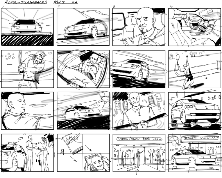
CASE-STUDIES: Look below for examples of films and theory on editing and sound used in understanding cinema and language of moving images.

THEORY

For more details see Dr McKinlay’s blog on Narrative in Cinema and The Language of Moving Image which look more specifically at some of the recognised conventions and key terminology associated with moving image (film, TV, adverts, animations, installations and other moving image products) which will help to create your own moving image product. Remember the key is to know what the rules are before trying to break them.

The following recognised conventions should help students to deconstruct key moving image media texts and will also help students to create their own moving image products, working within or against these conventions. Remember the key is to know what the rules are before trying to break them.

As alluded to, when looking at moving image products, it is useful to make a link to NARRATIVE THEORY as most often the key ideas, codes and conventions that are put to use for moving image products, are usually put together to serve ideas around NARRATIVE. For example, character, theme, motivation, empathy, ideology and so on.

Here are a few things to consider when working with Moving Image. (These are extracts from Dr McKinlay’s blog posts above)

THE CAMERA: Here are some of the key features of the camera in terms of creating a moving image product.

Focus and Depth of Field: The focus is used to direct and prioritise elements in a shot and therefore prioritise certain information. For example, it will determine who the audience should look at (even if we are not listening to them). It may switch our focus (known technically as a pull focus / rack focus / follow focus) between one element and another. Remember that the elements may not be people, but could be objects, spaces, shapes or colours, which may represent an idea, theme, belief etc (see the post on Semiotics)

Shot sizes, angles and movements

  • High angle / Low angle / bulls-eye / birds eye / canted angle
  • Tracking / Panning / Craning / Tilting / Hand held / Steadicam
  • Establishing Shot / Long Shot / Medium Shot / Close-up / Big Close-Up / Extreme Close Up (students often struggle with the first and the last again issues with SCALE, SIZE & SPACE, so practice is really important)
  • Insert Shot

THE EDIT: Moving image products (like other media products: print, radio, on-line) are clearly constructed around the concept of putting one thing next to another. This is editing.

Editing is the process of manipulating separate images into a continuous piece of moving image which develops characters, themes, spaces and ideas through a series of events, interactions and occurrences. As such, it is (usually) LINEAR and SEQUENTIAL, although, it must be remembered that moving image products often parachute the audience into a particular moment and usually leave them at an equally unresolved moment. As such BACK STORY, FORESHADOWING, REPETITION, ELLIPSIS, DEVELOPMENT, ENIGMA, DRAMATIC IRONY and other concepts are really important to always bear in mind. Again NARRATIVE THEORY is really important to an understanding of moving image products.

Moving from Camera to Edit, would be to look at the way camera can frame and position characters and thereby the audience by creating ‘subjectivity‘ and empathy in the way they are constructed. This can be used to deliberately ‘stitch‘ the audience into the text in a deliberate and particular way.

This idea of sewing / stitching the audience into the text was developed by theoreticians of the “Screen theory” approach — Colin MacCabeStephen Heath and Laura Mulvey, so follow this link to find out a little bit more.

SHOT SEQUENCING 1: Shot / Reverse Shot

The Shot / Reverse Shot a really good starting point for students to both think about and produce moving image products. The basic sequence runs from a wide angle master shot that is at a 90′ angle to (usually) two characters. This sets up the visual space and allows the film-maker to to then shoot separate close-ups, that if connected through an eye-line match are able to give the impression that they are opposite each other talking. The shots are usually over the shoulder. Firstly, they include both characters – which are called EXTERNAL REVERSES. As the drama increases, the framing of each shot then excludes the back of the head of the other character and moves in to a much closer over the shoulder shot – which are called INTERNAL REVERSES. Remember that these shots are not creating a direct look to camera. To look directly at the camera creates a very different relationship between the characters and the audience and is a technique that is only used for specific techniques / genres / film-makers.

The basic edit: cut/fade/dissolve

SHOT SEQUENCING 2: Shot progression

Shot progression usually involves the following shots (although not always in the same order). The use of these shots allow the audience to understand SPATIAL RELATIONSHIPS between locations, people, movements etc. The length of shot will determine the drama, empathy, theme etc. The choice of how to sequence each shot will determine the AESTHETIC QUALITY of the product. The next sequence will then follow a similar pattern, which again allows the audience to understand concepts such as SPACE, TIME, DISTANCE, MOVEMENT, MOTIVATION, PLOT, THEME etc.

  • establishing shot / ES, moving to
  • wide shot / WS,
  • to medium shot / MS,
  • to close up / CU,
  • to big close up / BCU;
  • and then back out again

The use of sequential editing (editing one clip to another) allows for a number of key concepts to be produced:

  • parallel editing: two events editing together – so that they may be happening at the same time, or not?
  • flashback / flash-forward – allowing time to shift
  • montage – a series of independent and perhaps unconnected shots to be edited together

CONTINUITY EDITING

Continuity editing can be seen as the opposite of montage editing as the main aim is to create a sense of realism or ‘believability’ known as verisimilitude and has it’s own structure of rules where shots are edited together at particular times or on particular shots. For example:

  • match on action
  • eye-line match
  • graphic match
  • sound bridge
  • 30′ rule
  • 180′ rule

Editing is the process of putting one element / idea next to another. It is known as the Kuleshov effect, in that adding one element / idea to another actually produces a third idea / element, which if constructed well can produce in the audience an idea that isn’t actually present! If this sounds confusing, the basic rule in editing is you don’t show everything literally, you need to use just enough information to provide ideas and suggestions for your audience to develop EMPATHY and INVOLVEMENT with characters, themes, setting, plot. As such, what you leave out known as ELLIPSIS is just as important as what you put in. Again the ideas of SPACE, SIZE & SCALE are really important, because you need to frame your shots with appropriate SIZE AND SCALE and trim your shots so that they are not too long ie creating the appropriate SPACE for ideas, characters, themes, the plot etc to develop.

The Kuleshov effect is a film editing (montage) effect demonstrated by Soviet filmmaker Lev Kuleshov in the 1910s and 1920s. It is a mental phenomenon by which viewers derive more meaning from the interaction of two sequential shots than from a single shot in isolation. Through this phenomenon we can suggest meaning and manipulate space, as well as time.
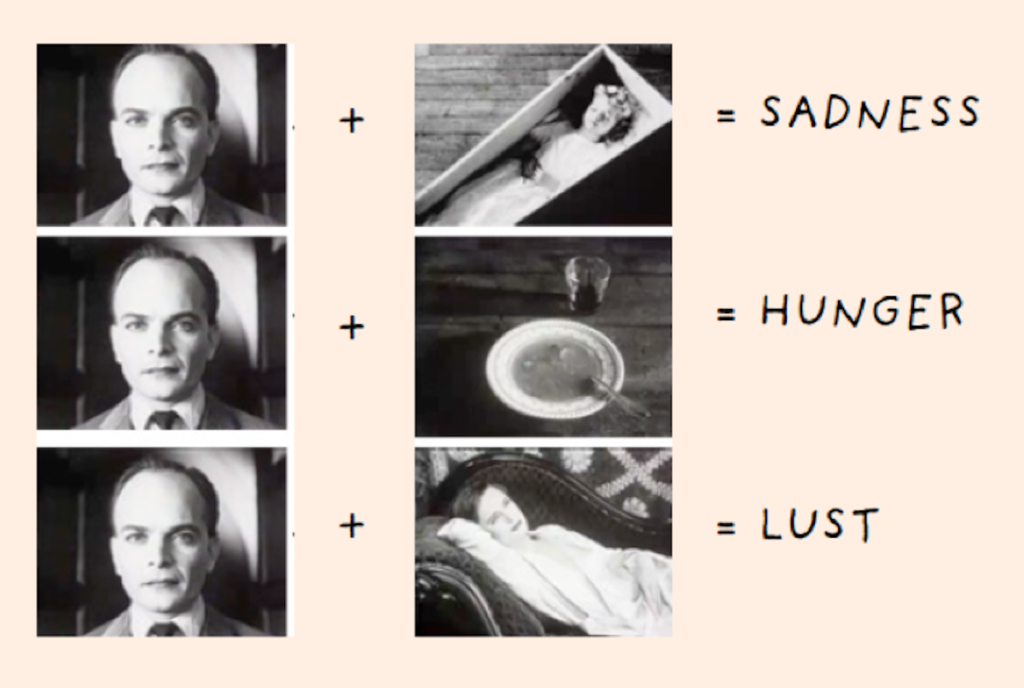
The Kuleshov Effect

Kuleshov edited a short film in which a shot of the expressionless face of Tsarist matinee idol Ivan Mosjoukine was alternated with various other shots (a bowl of soup, a girl in a coffin, a woman on a divan). The film was shown to an audience who believed that the expression on Mosjoukine’s face was different each time he appeared, depending on whether he was “looking at” the bowl of soup, the girl in the coffin, or the woman on the divan, showing an expression of hunger, grief, or desire, respectively. The footage of Mosjoukine was actually the same shot each time.

Kuleshov used the experiment to indicate the usefulness and effectiveness of film editing. The implication is that viewers brought their own emotional reactions to this sequence of images, and then moreover attributed those reactions to the actor, investing his impassive face with their own feelings. Kuleshov believed this, along with montage, had to be the basis of cinema as an independent art form.

Chris Marker: La Jétte

Chris Marker, La Jettee, (1962)

Chris Marker, (1921-2012) was a French filmmaker, poet, novelist, photographer, editor and multi-media artist who has been challenging moviegoers, philosophers, and himself for years with his complex queries about time, memory, and the rapid advancement of life on this planet. Marker’s La Jetée is one of the most influential, radical science-fiction films ever made, a tale of time travel. What makes the film interesting for the purposes of this discussion, is that while in editing terms it uses the language of cinema to construct its narrative effect, it is composed entirely of still images showing images from the featureless dark of the underground caverns of future Paris, to the intensely detailed views across the ruined city, and the juxtaposition of destroyed buildings with the spire of the Eiffel Tower. You can read more here about the meaning of the film and it is available on Vimeo here in its entirety (29 mins)

Mark Cousins: Atomic, Living in Dread and Promise

A narrative can also be made constructed entirely of archive footage as in Atomic, Living in Dread and Promise, a film that shows impressionistic kaleidoscope of our nuclear times – protest marches, Cold War sabre-rattling, Chernobyl and Fukishima – but also the sublime beauty of the atomic world, and how x-rays and MRI scans have improved human lives. The nuclear age has been a nightmare, but dreamlike too. Made by director and film critic, Mark Cousins and featuring original music score by Mogwai, it was first broadcast on BBC4 as part of Storyville documentary. Your can read a Q&A with Cousins’ here where he discusses the making of the film.

Christopher Nolan: Memento

Memento is a 2000 American neo-noir psychological thriller film written and directed by Christopher Nolan. Guy Pearce stars as a man who, as a result of an injury, has anterograde amnesia (the inability to form new memories) and has short-term memory loss approximately every fifteen minutes. He is searching for the people who attacked him and killed his wife, using an intricate system of Polaroid photographs and tattoos to track information he cannot remember.

The film is presented as two different sequences of scenes interspersed during the film: a series in black-and-white that is shown chronologically, and a series of color sequences shown in reverse order (simulating for the audience the mental state of the protagonist). The two sequences meet at the end of the film, producing one complete and cohesive narrative

Telling a story in reverse can be an interesting way to construct a narrative. Both cinema and literature are good at jumping between different time modes, past, present and future. Moving image and sound can enhance these different temporal shifts and written language is good and transporting your imagination from one time zone to another. Photography is mute but different strategies can be employed such as changing from colour to monochrome suggesting a different time or a different set of images. Using old photographs from archives, or found imagery can add complexity too, and including words can support a sequence of images, or add tension between the visual and the textual adding other elements to a photographic narrative.

Memento: Narrative and Postmodernism is also being looked at in Media Studies and if you are studying this subject make sure you include knowledge and understanding learned. Adopting a inter-disciplinary approach to your work is advantageous and being able to use theory and/ or context from other subjects will add value to your overall quality of your work and potentially achieve higher marks.

Theorists like Sergei Eisenstein, D.W Griffiths, Lev Kuleshov, Jean Epstein, John Grierson (also the coiner of the term ‘documentary’), Dziga Vertov, Andre Bazin, and Siegfried Kracauer went into sometimes painful detail to articulate theories about how various film and editing combinations created different forms of meaning. Many of these ideas remain surprisingly robust and useful a century later, and remain the bedrock of much of the theory taught to film students.

MISE EN SCENE

Mise en scene plays a huge role in communicating the tone of a story — but what is mise en scene? In classical terms, mise en scene is the arrangement of scenery and stage properties in a play or film. Today, mise en scene is regarded as all of the elements that go into any single shot of a production. Click below to learn more about mise-en-scene

https://www.studiobinder.com/blog/mise-en-scene-elements-color-in-film/

Four of the most important aspects of mise en scene are: sets, props, costume/hair/makeup, and lighting. Here are examples from filmmakers Stanley Kubrick and Wes Anderson on how to apply color to these four aspects.

VIDEO ART are not following moving image conventions as described above. Instead they are more fragmented in structure and often don’t follow a narrative in a linear sense. Often they are concerned with other elements, such as repetition, parody, chance, play or staging something for the camera. For more help and guidance – see my a previous blog posts here from 2017

Tom Pope, Art and Protests, Jersey Live film stuff

You may explore different approaches to image-making across different genres such as performance, photography, video, multi-media, installation, land/ environmental art, experimental film-making and avant-garde cinema.

See more examples here of video art and experimental films in the blog post from our 90 sec film project on ART & ACTIVISM.

Sound

Moving image depends on sound for much of its’ meaning. It is impossible to overstate how important a role audio plays in the film viewing experience. While it’s perfectly natural to be drawn to the visual side of film making, those striking visuals don’t hold the same weight without strong cinematic sound design to back them up. Whereas a painting is purely visual and a song can be purely aural, cinema combines sight and sound for a unified experience where one bolsters and elevates the other. Click on link below and learn about the role of the sound designer and other sound design jobs, the fundamentals of sound design, and to check out some examples from the movies with the best sound design.

https://www.studiobinder.com/blog/what-is-sound-design-for-film/

What is sound design?

Sound design is how filmmakers flesh out the aural world of a film to enhance the mood, atmosphere, and/or tone. Sound design components include sound effects or SFX sound design, mixing, Foley sound design, dialogue, and music. Sound design is the final and most important element needed to create an immersive experience for the audience.

Examples of sound design in practice:

A sound designer working in the sci-fi, horror, or fantasy genres will likely be tasked with conceiving original sounds for unique sources. What does an alien ship sound like? How do you approach horror creature sound design? All of these are questions a sound designer will devise answers for.

Let’s take a look at District 9‘ssound design as an example. In this scene, the sounds of the mech suit, alien weapons, computerized UI, the spaceship, and the creature vocalizations all required immense creativity in District 9’s sound design.

This is sound design from Neill Blomkamp’s District 9

The Coen Brothers have a keen ear for cinematic sound design. Their filmography is jam-packed with excellent examples of sound design, including some of the best sound design in films. Their work showcases the variety of different directions a sound designer can take the material.

This can range from stylized near-cartoon sound design in something like Raising Arizona to something more psychologically-driven like Barton Fink’ssound design. John Goodman’s ferocious roars, hysterical dialogue, the rush of fire, and the long decay of his shotgun blast, are all sound design examples culminating in one cohesive moment.

Barton Fink sound design in action

In addition to individual sound effects, sound designers also create what are known as soundscapes. You can think of a soundscape as a bed of audio that music, SFX, and dialogue rest on top of. Creative soundscapes are a great way to enhance a film’s sense of atmosphere or style.

Many of the most memorable soundscapes find themselves at home in the horror genre. An eerie soundscape can be a great way to double down on the creepiness of on-screen visuals. The films of David Lynch almost always feature incredibly inventive soundscapes that he often crafts himself.

In this example from Eraserhead, notice how much atmosphere and dread are generated through the powerful and oppressive soundscape. The droning, surreal tones are layered with industrial noises that magnify the bleak nature of the environment surrounding our protagonist and the end effect is staggeringly effective.

Sound editing vs sound mixing

To continue familiarizing yourself with audio post-production and to get a good handle on the distinction between sound editing and sound mixing, read article on the nuances that distinguish them here.

What you hear on a movie’s soundtrack is multilayered. Dialogue, ADR, sound effects, Foley, music — it’s all part of the overall sound design. Putting it all together is a massive job and it’s handled by multiple teams with different taks. So, that brings us to the question of the hour: what is the difference between sound editing vs sound mixing?

Catch a few scenes from iconic movies that delineate between editing and mixing, below. 
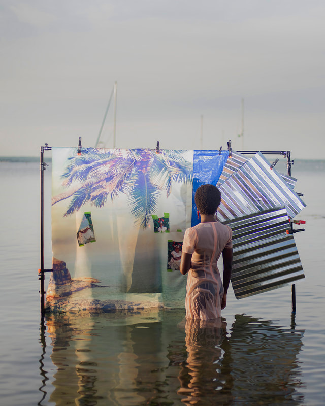
https://www.studiobinder.com/blog/sound-editing-vs-sound-mixing/

What is sound editing?

Sound editing is the creation, recording, or re-recording of sounds.

When you’re on set, capturing quality sound is critical. But the majority of the sounds you hear in the movies are rarely ever captured this way. Often, the main focus on set, is the blocking and staging of the actors, and perfecting the execution of their lines.

Many of the sounds are added in later. The collection and creation of these sounds is sound editing. We’ll get more into the ways artists collect these sounds soon. Once these sounds are added in, then sound mixing can begin. The main goal in mixing is to make sure that all of the sounds, including recorded dialogue, are as seamless as possible.

Let’s dive a little deeper into both sound editing and mixing.

Week: 18-19 -20: 24 Jan 11 Feb
MOCK EXAM  3 days (15 hrs) Mon 7 – Fri 11 Feb 

Finish Editing Film & Complete Essay

In the next three week focus on beginning to edit and collect all your images, archival material and texts, including finishing writing your essay needed to complete your photobook.

ESSAY: Lesson time (Fri):
Complete conclusion, bibliography, proof read and hand in draft essay no later than Mon 31 Jan.

You want to aim for a draft layout and hand in draft version of your essay before your Mock Exam day, then use that day to fine tune design and complete essay.

INTERIM DEADLINE: FRI 4 FEB
DRAFT FILM EDIT

FILM: Lesson time (Mon, Tue, Thurs & Fri)
Produce a number of blogposts that show evidence of the following:

  1. STORYBOARDING: Re-evaluate your own film’s narrative and storyboard including details of individual scenes, action, shot sizes, camera angles and mise-en-scene (the arrangement of the scenery in front of the camera) from location, props, people, lighting, sound etc.

Narrative: What is your story?
Describe in:

  • 3 words
  • A sentence
  • A paragraph

2. RECORDING: Produce a number of photographic response to your Personal Study and bring footage from video/ audio recordings to lessons:

• Save footage in folder on local V:Data Drive
• Organisation: Create a new project in Premiere

3. EDITING:
• Begin editing video/ audio clips on the timeline
• Adjust recordings in Colour / B&W appropriate to your intentions.
• Video: experimenting with editing and sequencing using relevant transitions and effects
• Sound: consider how audio can add depth to your film, such as ambient sound, sound fx, voice-over, interview, musical score etc. • Title and credits: Consider typography/ graphics/ styles etc. For more creative possibilities make title page in Photoshop (format: 1280 x 720 pixels) and import as a Psd file into your project folder on the V-Data drive.

Produce screen prints of layout ideas as you progress and add to Blog for further annotation, commenting on editing and sequencing video and sound etc.

4. EVALUATION: Write an evaluation on the blog that reflects on your artistic intentions, film-editing process and collaboration. Include screen-prints from Premiere and a few ‘behind the scenes’ images of the shooting/ production for further annotation. Comment on the following:

  • How successful was your photoshoot and experimentation?
  • What references did you make to artists references? – comment on technical, visual, contextual, conceptual?
  • How are you going to develop your project from here? – comment on research, planning, recording, experimenting.
  • What are you going to do next? – what, why, how, when, where?

5. BLOG POSTS: Make sure all blog posts are finished including, research, analysis, experimentation, annotation and an evaluation of final outcomes.

6. FINAL PRINTS: Select a set of 5-6 photographs as final outcomes and evaluate – explaining in some detail how well you realised your intentions and reflect on what you have learned in LOVE & REBELLION project.

Save final prints in our shared PRINT folder (no later than 15:00 end of your Mock exam day) in a high-resolution (4000 pixels on the long edge.) Save each images in your name i.e. first name_surname_title_1, and 2, 3 and so on.

M:DepartmentsPhotographyStudentsImage TransferPRINTINGA2 Coursework Prints Spring 2022

theory: literary sources

In this folder here you can find texts to read in relation to a number of subjects and themes below. Some of these files are too large to upload to the blog here so go to the folder below.
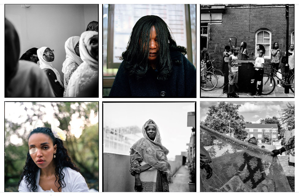
M:DepartmentsPhotographyStudentsLOVE & REBELLIONContextual Studiesreading

Photography
Histories > Identities > Codes > Meaning

Barthes, R. (1984) Camera Lucida. London: Flamingo

Benjamin, W. (1936) ‘The Work of Art in an Age of Mechanical Reproduction’ in Hannah Arendt (ed) (1973) Illuminations. London: Fontana

Documentary
Realism > Representation > Ethics > Truth

A short PPT on Documentary Photography

Sontag, Susan (1977) ‘In Plato’s cave’ in On Photography. London: Penguin Books

Sontag, Susan (1977) ‘Through a Glass Darkly’ in On Photography. London: Penguin Books ch 2

Here some helpful resources on Sontag: On Photography from PhotoPedagogy

Rosler, Martha (1981) ‘In, around, and afterthoughts (on documentary photography)’ in Stallabras Julian (2013) Documentary. Cambridge (MA): The MIT Press.

Here is an introduction to John Tagg: A Burden of Representation (1998). Minnesota: University of Minnesota Press from PhotoPedagogy

Bate, David (2016) ‘The Art of the Document’ in Art Photography. London: Tate Gallerie
How documentary photography now is considered within a fine-art context

Max Pinckers Interview: On Speculative Documentary
How fact and fiction today in documentary photography is blurred

Solomon-Godeau, Abigail (1994), ‘Inside/ Out’ in Photography At The Dock: Essays on Photographic History, Institutions, and Practices. Minnesota: University of Minnesota Press

Here some helpful resources on ethical questions regarding the photographer’s position of being inside or outside from PhotoPedagogy

Photography and truth

Photography and Truth – see blog post with many resources.

Bright, Susan (2019) Is it Real? in Photography Decoded.

See more short essays here in Photography Decoded

Photography & Truth

Issues in Photojournalism

Photojournalism: Truth, Representation, Propaganda, Aesthetics

Richard Billingham

Richard Billingham: Ray’s A Laugh – a photographer who worked on the inside documenting his parents life and relationship.

Interview Richard Billingham

Documentary film: Fish Tank based on his book and parents relationship

Feature film: Ray & Liz

Interview in The Guardian and The Observer by Tim Adams (2019)

Larry Sultan

a Review in the Guardian Newspaper.

https://www.theguardian.com/books/2017/may/02/larry-sultan-pictures-from-home-review

Tableaux Photography
Pictorialism > Narrative > Cinema

A short PPT on Tableaux Photography

Bate, David (2016) ‘Pictorual Turn’ in Art Photography. London: Tate Galleries.
How Tableaux has been influenced by Pictorialism

Aesthetic Theory
Beauty > Sublimity > Judgement

The Concept of the Aesthetic

Read Greek philosopher Plato’s thesis on Beauty

https://plato.stanford.edu/entries/beauty/

https://plato.stanford.edu/entries/plato-aesthetics/

Snapshot Photography
Vernacular photography

Photography and Feminism
Gender Studies > Male/Female Gaze > Self-portraiture

Mulvey, Laura (1973) ‘Visual Pleasure and Narrative Cinema’ in Screen (1975)

Judith Butler is an academic and writer who is an authority on feminism and gender studies, incl queer theory. Her seminal book is: Gender Trouble which we do have a copy of in the Library LRC and in Media. Here is a good overview of her work – make sure you read it all and watch video as well.

Kotz, L. (1998) ‘”Aesthetics” of Intimacy’ in Bright, D. (1998) The Passionate Camera: Photography and bodies of desire. London: Routledge

Photography and Portraiture

Robert Mapplethorpe: The Male Gaze – in pictures. The Guardian

Amelia Jones The “Eternal Return”: Self-Portrait Photography as Technology of Embodiment

Cindy Sherman:

Paoli, J. Deconstruction Woman: The works of Cindy Sherman

Cain, Abigail, A Brief History of Cindy Sherman and Feminism

Owen, Samantha Rosemary (2014) Gender and Vision Through the Lens of Cindy Sherman and the Pictures Generation. University of Vermont

Lots of interviews and video and with Cindy Sherman on MOMA

Have a look at Shannon’s O’Donnells work here and when she was an A-level student?

Francesca Woodman:

Towsend, C. (2006) Francesca Woodman: Scattered in Space and Time. London: Phaidon Press Limited.

> Go to folder with pdf Francesca Woodman essays here: M:DepartmentsPhotographyStudentsLOVE & REBELLIONContextual Studiesreading

Online texts

https://lareviewofbooks.org/article/an-hourglass-figure-on-photographer-francesca-woodman/

Thematic Essay about Francesca Woodman

Have a look at an essay and research by previous student, Francesca Hogan

Jo Spence and Photo-therapy

Jo Spence Memorial Library

Dennett, Terry (2008): Jo Spence’s camera therapy: personal therapeutic photography as a response to adversity

Heath, Charlene (2017). Work, Politics, Survival, British Journal of Photography

Weiser, Judy (2005) Remembering Jo Spence: A Brief Personal and Professional Memoir… PhotoTherapy Centre

Jansen, Charlotte (2020) Is Photography An Effective Form of Therapy? Elephant

Bull, S. (2009) Photography. London: Routledge

Photography and Memory

Kuhn, A. Remembrance: The Child I Never Was in Wells, L. (ed) (2003) The Photography Reader. London: Routledge

Here are a few articles and photobooks on Photography and its relationship with memory. You should read them and references them in your essay.

Colberg, J (May 28, 2012) Photography and Memory
blogger on Conscientious

Frames of Mind: Photography, Memory and Identity
by Anwandter, Patricia Marcella
In Frames of Mind, I have sought to explore the themes concerning the dynamic construction of memory. What do we choose to remember and how do we reinforce it? Who are we in relationship to who we were? Working with a collection of over five hundred images accumulated throughout my life, I have reinvestigated the images and their interrelationship with one another

A Matter of Memory: Photographs as Objects in the Digital Age 
An exhibition at George Eastman House

A review on British Journal of Photography

Barthes, R (1982) Camera Lucida, London: Jonathan Cape

Overview of Barthes book Camera Lucida in Photo Pedagogy
The first half of this article talks about Barthes theory of a studium and punctum. The latter part about a photograph of his dead mother which allows him to think about memory.
Commentary on Barthes book

Rereading: Camera Lucida by Roland Barthes
Article by Brian Dillon in the Guardian, 26 March 2011
Grieving for his mother, Roland Barthes looked for her in old photos – and wrote a curious, moving book that became one of the most influential studies of photography

DEATH IN THE PHOTOGRAPH – critical article in response to Roland Barthes seminal book ‘Camera Lucida’ reflecting on photography.

Photography and Narrative

Family / childhood Photography:

Photography and Archives / Narratives / Memory:

Colin Pantall Landscape, Power and Climate Change

essay writing

DEADLINE: Essay MUST be handed in Mon 31 Jan 2022

ESSAY: In the Spring term will be spending 1 lesson a week every Wednesday on writing and developing your essay. However, you will need to be working it independently outside of lesson time.

Objective: Criteria from the Syllabus

  • Be aware of some of the methods employed by critics and historians within the history of art and photography.
  • Demonstrate a sound understanding of your chosen area of study with appropriate use of critical vocabulary. – use for image analysis
  • Investigate a wide range of work and sources
  • Develop a personal and critical inquiry.

Academic Sources:

  • Research and identify 3-5 literary sources from a variety of media such as books, journal/magazines, internet, Youtube/video .
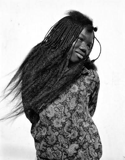
  • Begin to read essay, texts and interviews with your chosen artists as well as commentary from critics, historians and others.
  • It’s important that you show evidence of reading and draw upon different pints of view – not only your own.
  • Take notes when you’re reading…key words, concepts, passages
  • Write down page number, author, year, title, publisher, place of publication so you can list source in a bibliography

Quotation and Referencing:

Why should you reference?

  • To add academic support for your work
  • To support or disprove your argument
  • To show evidence of reading
  • To help readers locate your sources
  • To show respect for other people’s work
  • To avoid plagiarism
  • To achieve higher marks

What should you reference?

  • Anything that is based on a piece of information or idea that is not entirely your own.
  • That includes, direct quotes, paraphrasing or summarising of an idea, theory or concept, definitions, images, tables, graphs, maps or anything else obtained from a source

How should you reference?

Use Harvard System of Referencing…see Powerpoint: harvard system of referencing for further details on how to use it.

https://vimeo.com/223710862

Here is an full guide on how to use Harvard System of Referencing including online sources, such as websites etc.

TUE: Essay Question

  • Think of a hypothesis and list possible essay questions
  • Below is a list of possible essay questions that may help you to formulate your own.

Some examples of Personal Study essays from previous students

In what way have Jim Goldberg and Ryan McGinley represented youth in their work?

What Constitutes a ‘Real’ Image

How do Robert Mapplethorpe and Karlheinz Weinberger portray ‘Lad Culture’ through the medium of portraiture?

In what way does Nick Hedges portray a sense of state discrimination and hopelessness through his monochromatic imagery?

To what extent can we trust documentary photography to tell the truth about reality?

How does Jeff Wal’s Tableaux approach depict a seemingly photojournalistic approach?

Compare how Cindy Sherman and Phoebe Jane Barrett challenge gender stereotypes.

How can something that doesn’t physically exist be represented through photography?

How can photography bear witness to reality?

To what extent does Surrealism create an unconscious representation of one’s inner conflicts of identity and belonging? 

How does Carolle Benitah and Claudia Ruiz Gustafson explore their past as a method of understanding identity?

How has children’s stories and literature influenced the work of Anna Gaskell and Julia Margaret Cameron?

How do Diana Markosian and Rita Puig-Serra Costa express the notion of family history and relationships in their work?

How does the work of Darren Harvey-Regan explore abstraction as an intention and process?

How can elements of Surrealism be used to express and visualize the personal, inner emotions of people suffering from depression?

Essay Plan:

Make a plan that lists what you are going to write about in each paragraph – essay structure.

  • Essay question:
  • Opening quote
  • Introduction (250-500 words): What is your area study? Which artists will you be analysing and why? How will you be responding to their work and essay question?
  • Pg 1 (500 words): Historical/ theoretical context within art, photography, visual and popular culture relevant to your area of study. Make links to art movements/ isms and some of the methods employed by critics and historian. 
  • Pg 2 (500 words): Analyse first artist/photographer in relation to your essay question. Present and evaluate your own images and responses.
  • Pg 3 (500 words): Analyse second artist/photographer in relation to your essay question. Present and evaluate your own images and responses.
  • Conclusion (250-500 words): Draw parallels, explore differences/ similarities between artists/photographers and that of your own work that you have produced
  • Bibliography: List all relevant sources used

Essay questionHypothesis

Think of a hypothesis and list possible essay questions

Here is a list of  possible questions to investigate that may help you.

Opening quote: Choose a quote from either one of your photographers or critics. It has to be something that relates to your investigation

ESSAY STRUCTURE

See below for a possible essay structure. Further help can be found here essay structure or see link here The Royal Literay Fund

Introduction (250-500 words). Think about an opening that will draw your reader in e.g. you can use an opening quote that sets the scene. You should include in your introduction an outline of your intention of your study e.g. what and who are you going to investigate. How does this area/ work interest you? What are you trying to prove/challenge, argument/ counter-argument? What historical or theoretical context is the work situated within. Include 1 or 2 quotes for or against. What links are there with your previous studies? What have you explored so far in your Coursework or what are you going to photograph? How did or will your work develop. What camera skills, techniques or digital processes in Photoshop have or are you going to experiment with?

Paragraph 1 Structure (500 words) Use subheadingThis paragraph covers the first thing you said in your introduction that you would address. The first sentence introduces the main idea of the paragraphOther sentences develop the subject of the paragraph.

Content: you could look at the followingexemplify your hypothesis within a historical and theoretical context.  Write about how your area of study and own work is linked to a specific art movement/ ism. Research and read key text and articles from critics, historians and artists associated with the movement/ism. Use quotes from sources to make a point, back it up with evidence or an example (a photograph), explain how the image supports the point made or how your interpretation of the work may disapprove. How does the photograph compare or contrast with others made by the same photographer, or to other images made in the same period or of the same genre by other artists. How does the photograph relate to visual representation in general, and in particularly to the history and theory of photography, arts and culture.

Include relevant examples, illustrations, details, quotations, and references showing evidence of reading, knowledge and understanding of history, theory and context!

See link to powerpoints: Pictorialism vs Realism and Modernism vs Postmodernism here

Paragraph 2 Structure (500 words) Use subheading. In the first sentence or opening sentences, link the paragraph to the previous paragraph, then introduce the main idea of the new paragraph. Other sentences develop the paragraphs subject (use relevant examples, quotations, visuals to illustrate your analysis, thoughts etc)

Content: you could look at the following...Introduce your first photographer. Select key images, ideas or concepts and analyse in-depth using specific model of analysis (describe, interpret and evaluate) – refer to your hypothesis. Contextualise…what was going on in the world at the time; artistically, politically, socially, culturally. Other influences…artists, teachers, mentors etc. Personal situations or circumstances…describe key events in the artist’s life that may have influenced the work. Include examples of your own photographs, experiments or early responses and analyse, relate and link to the above. Set the scene for next paragraph.

Include relevant examples, illustrations, details, quotations, and references showing evidence of reading, knowledge and understanding of history, theory and context!

Paragraph 3 Structure (500 words) Use subheading. In the first sentence or opening sentences, link the paragraph to the previous paragraph, then introduce the main idea of the new paragraph. Other sentences develop the paragraphs subject (use relevant examples, quotations, visuals to illustrate your analysis, thoughts etc)

Content: you could look at the following…Introduce key works, ideas or concepts from your second photographer and analyse in-depth – refer to your hypothesis…Use questions in Pg 2 or add…What information has been selected by the photographer and what do you find interesting in the photograph? What do we know about the photograph’s subject? Does the photograph have an emotional or physical impact? What did the photographer intend? How has the image been used? What are the links or connections to the other photographer in Pg 2? Include examples of your own photographs and experiments as your work develop in response to the above and analyse, compare, contrast etc. Set the scene for next paragraph.

Include relevant examples, illustrations, details, quotations, and references showing evidence of reading, knowledge and understanding of history, theory and context!

Conclusion (500 words) : Write a conclusion of your essay that also includes an evaluation of your final photographic responses and experiments.

List the key points from your investigation and analysis of the photographer(s) work – refer to your hypothesis. Can you prove or Disprove your theory – include final quote(s). Has anything been left unanswered?  Do not make it a tribute! Do not introduce new material! Summarise what you have learned. How have you been influenced? Show how you have selected your final outcomes including an evaluation and how your work changed and developed alongside your investigation.

Bibliography: List all the sources that you used and only those that you have cited in your text. Where there are two or more works by one author in the same year distinguish them as 1988a, 1988b etc. Arrange literature in alphabetical order by author, or where no author is named, by the name of the museum or other organisation which produced the text. Apart from listing literature you must also list all other sources in alphabetical order e.g. websites, exhibitions, Youtube/TV/ Videos / DVD/ Music etc.

Headshots

Below are some INSTRUCTIONS AND INSPIRATIONS for your headshots in the studio in the next couple of weeks until Easter. These tasks will allow you to continue to experiment with studio lighting and respond to a number of creative approaches to headshots with reference to both historical portraits photographers from Societe Jersiaise Photo-Archive and contemporary practitioners.

TECHNICAL

RECORDING: produce at least 3 portrait shoots in the studio and consider the following:

1. Lighting: soft, hard – use softbox/ reflectors

2. Framing: Headshots

3. Focusing: focus on the eyes

4. Expression: Explore different moods and emotions.

5. Pose: Manner and attitude. Use hands

Camera settings (flash lighting)
Tripod: optional
Use transmitter on hotshoe
White balance: daylight (5000K)
ISO: 100
Exposure: Manual 1/125 shutter-speed > f/16 aperture
– check settings before shooting
Focal lenght: 105mm portrait lens

BLOG

You are expected to show evidence of the following three EEEs on the blog for the work on Headshots.

EDITING: For each portrait shoot produce a screen-shots of your image selection and adjust your BEST 3 IMAGES in Lightroom using basic tools such as cropping, contrast, tonality, colour balance, monochrome. Describe also the lighting setup using an image from ‘behind the scenes’, ie. key light, back light, fill light, use of reflectors, gels etc.

EXPERIMENTING: Complete at least 3 out of these 5 experiments on DIAMOND CAMEO, DOUBLE/ MULTIPLE EXPOSURE, JUXTAPOSITION, SEQUENCE/ GRID AND MONTAGE (see more details below). Make sure you demonstrate creativity and produce at least 3 different variations of the same portrait experiment.

EVALUATING: Compare your portrait responses/ experiments and provide some analysis of artists work and images below that has inspired your ideas and shoots. Use this Photo-Literacy matrix.

INSPIRATIONS

Henry Mullins is one of the most prolific photographers represented in the Societe Jersiase Photo-Archive, producing over 9,000 portraits of islanders from 1852 to 1873 at a time when the population was around 55.000. The record we have of his work comes through his albums, in which he placed his clients in a social hierarchy. The arrangement of Mullins’ portraits of ‘who’s who’ in 19th century Jersey are highly politicised.

Henry Mullins Album showing his arrangements of portraits presented as cartes-de-visite

You can read more here in an extract from Gareth Syvret’s (former photo-archivist) text in ED.EM.03. Henry Mullins / Michelle Sank – on the social matrix. We also have copies of this photozine in classroom for further study and reading.


Henry Mullins started working at 230 Regent Street in London in the 1840s and moved to Jersey in July 1848, setting up a studio known as the Royal Saloon, at 7 Royal Square. Here he would photograph Jersey political elite (The Bailiff, Lt Governor, Jurats, Deputies etc), mercantile families (Robin, Janvrin, Hemery, Nicolle ect.) military officers and professional classes (advocates, bankers, clergy, doctors etc).

His portrait were printed on a carte de visite as a small albumen print, (the first commercial photographic print produced using egg whites to bind the photographic chemicals to the paper) which was a thin paper photograph mounted on a thicker paper card. The size of a carte de visite is 54.0 × 89 mm normally mounted on a card sized 64 × 100 mm. In Mullins case he mounted his carted de visite into an album. Because of the small size and relatively affordable reproducibility carte-de-visite were commonly traded among friends and visitors in the 1860s. Albums for the collection and display of cards became a common fixture in Victorian parlors. The immense popularity of these card photographs led to the publication and collection of photographs of prominent persons.

Here are some spreads from ED.EM.03 Henry Mullins / Michelle Sank – on the social matrix. ED.EM is a photo-zine produced by Societe Jersiaise Photographic Archive that presents a selection of images from its historical collection.

Becque á Barbe: Face to Face: A portrait project about Jèrriais – the island of Jersey’s native language of Norman French. Each portrait is titled with a Jèrriais word that each native speaker has chosen to represent a personal or symbolic meaning, or a specific memory linked to his or her childhood. Some portraits are darker in tonality to reflect the language hidden past at a time when English was adopted as the formal speech in Jersey and Jèrriais was suppressed publicly and forbidden to be spoken in schools.

Juxtaposed with portraits of Jèrriais speakers are a series of photographs of Jersey rocks that are all designated as Sites of Special Interest (SSIs); important geological outcrops that are protected from development and preserved for future public enjoyment and research purposes. The native speakers of Jersey French should be classified as People of Special Interest (PSIs) and equally be protected from extinction through encouraging greater visibility and recognition as guardians of a unique language that are essential in understanding the island’s special character.

Ole Christiansen (Danish): A special preoccupation has been music photography, portraits, but also – often strongly graphically emphasized urban landscapes which is reflected in his portraiture . Ole has over the years provided pictures for a myriad of books, magazines, record covers, annual reports, etc.

THE DEADPAN AESTHETIC

According to sources the origins of the word “Deadpan”  can be traced to 1927 when Vanity Fair Magazine compounded the words dead and pan, a slang word for a face, and used it as a noun. In 1928 the New York Times used it as adjective to describe the work of Buster Keaton.

It is less clear when it was first used to describe the style of photography associated with Edward Ruscha, Alec Soth, Thomas Ruff and many others.  Charlotte Cotton devotes a complete chapter to Deadpan in The Photograph as Contemporary Art and much that has been written since references that essay.

In summary Deadpan photography is a cool, detached, and unemotional presentation and, when used in a series, usually follows a pre-defined set of compositional and lighting rules.

This style originated in Germany and is descended from Neue Sachlichkeit, New Objectivity, a German art movement of the 1920s that influenced the photographer August Sander who systematically documented the people of the Weimar Republic . Much later, in the 1970s, Bernd and Hilla Becher, known for their devotion to the principles of New Objectivity, began to influence a new generation of German artists at the Dusseldorf School of Photography (4). These young German photographers included  Thomas Struth, Andreas Gursky, Candida Hofer and Thomas Ruff. The Bechers (4 & 5) are best remembered for their studies of the industrial landscape, where they systematically photographed large structures such as water towers, coal bunkers or pit heads to document a soon-to-disappear landscape in a formalistic manner as much akin to industrial archeology as art. The Bechers’ set of “rules” included clean, black and white pictures taken in a flat grey light with straight-on compositions that perfectly lent themselves to their presentation methodology of large prints containing a montage of nine or more similar objects to allow the study of types (typology) in the style of an entomologist.

If you want to learn more about the theoretical and philosophical basis for the deadpan aesthetic READ HERE.

Thomas Ruff wanted to mimick the setup for a having a set of passport images taken. Read an interview with him here recently published in the Financial Times

PASSPORT PHOTO

From the UK Government website

FACE:

  • eyes must be open and clearly visible, with no flash reflections and no ‘red eye’
  • facial expression must be neutral (neither frowning nor smiling), with the mouth closed
  • photos must show both edges of the face clearly
  • photos must show a full front view of face and shoulders, squared to the camera 
  • the face and shoulder image must be centred in the photo; the subject must not be looking over one shoulder (portrait style), or tilting their head to one side or backwards or forwards
  • there must be no hair across the eyes
  • hats or head coverings are not permitted except when worn for religious reasons and only if the full facial features are clearly visible
  • photos with shadows on the face are unacceptable
  • photos must reflect/represent natural skin tone

BACKGROUND:

Photos must have a background which:

  • has no shadows
  • has uniform lighting, with no shadows or flash reflection on the face and head
  • shows a plain, uniform, light grey or cream background (5% to 10% grey is recommended)

TYPOLOGY means the study and interpretation of types and became associated with photography through the work of Bernd and Hilla Becher, whose photographs taken over the course of 50 years of industrial structures; water towers, grain elevators, blast furnaces etc can be considered conceptual art. They were interested in the basic forms of these architectural structures and  referred to them as ‘Anonyme Skulpturen’ (Anonymous Sculptures.)

The Becher’s were influenced by the work of earlier German photographers linked to the New Objectivity movement of the 1920s such as August Sander, Karl Blossfeldt and Albert-Renger-Patzsch.

Karl Blosfeldt

BRUCE GILDEN: FACE: Recently you have explored street photography and Bruce Gilden is renowned for his confrontational style and getting up close to his subject. Between 2012-14 Gilden travelled in America, Great Britain, and Colombia and created a series called FACE. Read a review here in the Guardian newspaper and another on Lensculture.

UP CLOSE

In addition to focusing on details of the face try and isolate body parts, gestures, clothing and physical features, such as hands, elbows, shoulders, neck, torso, hip, knees, feet. Your understanding of abstraction in photography; focusing on shapes, colours, light and shadows, textures and repetition is crucial here.

Satoshi Fujiwara: Code Unknown: In Michael Haneke’s 2000 film Code Unknown, there is a scene in which the protagonist’s lover, a photographer, secretly snaps pictures of passengers sitting across from him on the train.

Inspired by the film, I used the same approach to shoot people in Berlin trains. Yet in contemporary society, it is not acceptable to rashly and publicly display pictures of people’s faces that were taken without their permission. Thus, I shot and edited my pictures in a way that makes it impossible to identify the individual people who served as my “models.” To avoid impinging on the “right of likeness,” I used the shadows created by the direct sunlight pouring in through the windows, various compositional approaches, and digital processing to keep their identities anonymous.

When we look at another person, either directly or through another medium, we interpret a wide range of information based on outward appearance (face, physique, clothes and accessories, and movements)—in other words, various codes. By regulating and altering these codes in various ways, I set out to obscure the individuality and specificity of the subjects in the pictures in my series.—Satoshi Fujiwara

David Goldblatt: Particulars: Following a series of portraits of his compatriots made in the early 1970s, photographer David Goldblatt, for a very short and intense period of time, naturally turned to focusing on peoples’ particulars and individual body languages “as affirmations or embodiments of their selves.” Goldblatt’s affinity was no accident: Working at his father’s men’s outfitting store in the 1950s, his awareness of posture, gesture and proportion—technical as it was—formed early and would accompany him throughout his life.

In this series we see hands resting on laps, crossed legs, the curved backs of sleepers on a lawn at midday, their fingers and feet relaxed, pausing from their usual occupations. This deeply contemplative work is framed by Ingrid de Kok’s poetry.

EXPERIMENTATION

TASK

You must produce the following experiments:

  1. DIAMOND CAMEO : Recreate a diamond cameo, similarly to Mullins of which four separate portraits of the same subject are arranged onto the same document in Photoshop.
  2. DOUBLE/ MULTI-EXPOSURE: Either in camera or in post-post-production layer or merge two or three images into one portrait.
  3. JUXTAPOSITION: Select 1 portrait by Mullins and one response that you have made and juxtapose opposite each in a new document in Photoshop. Look for similarities in pose, expression, gestures and overall composition. If you have some environmental portraits from previous shoot try and juxtapose in a similar way that Michelle Sank responded to Mullins portraits in ED.EM.03.
  4. SEQUENCE/ GRID: Select a series of your headshots (between 5-12) and produce a sequence either as a grid, story-board, contact-sheet or typology. Reference Mullins pages in his portrait albums
  5. MONTAGE: Select an appropriate set of portraits and create a montage of layered images in Photoshop as an A3 document.

DIAMOND CAMEO

DOUBLE / MULTI-EXPOSURES

Double or multiple exposures are an illusion created by layering images (or portions of images) over the top of each other. This can be achieved in the camera settings, or on Adobe Photoshop by creating LAYERS and then using BLENDING OPTIONS and OPACITY CONTROL. Artist have used these techniques to explore Surrealist Ideas and evoke dream-like imagery, or imagery that explores time / time lapse.

Man Ray
Alexander Rodchenko
Claude Cahun
Lewis Bush, Trading Zones
Idris Khan, Every…Bernd And Hilla Becher Gable Sided Houses. 2004
Photographic print
208 x 160 cm

Since 1959 Bernd and Hilla Becher have been photographing industrial structures that exemplify modernist engineering, such as gas reservoirs and water towers. Their photographs are often presented in groups of similar design; their repeated images make these everyday buildings seem strangely imposing and alien. Idris Khan’s Every… Bernd And Hilla Becher… series appropriates the Bechers’ imagery and compiles their collections into single super-images. In this piece, multiple images of American-style gabled houses are digitally layered and super-imposed giving the effect of an impressionistic drawing or blurred film still.

JUXTAPOSITION

Juxtaposition is placing two images together to show contrast or similarities. For inspiration look at some of the page spreads from ED.EM.03 where pairings between portraits of Henry Mullins and Michelle Sank are juxtaposed to show comparison/ similarities/ differences between different social and professional classes in Jersey mid-19th century and early 21 st century.

For inspiration look also at the newspapers: LIBERATION / OCCUPATION and FUTURE OF ST HELIER produced by past A2 photography students and the publication GLOBAL MARKET by ECAL.

LIBERATION / OCCUPATION newspaper 25 April 2020
FUTURE OF SY HELIER newspaper 18 Sept 2019
Spreads from Global Market
W. Eugene Smith. Jazz Loft Project

Juxtapose images according to shapes, colours, repetition, object vs portrait

COLOUR – SHAPES
This image has an empty alt attribute; its file name is fb4.jpg
SHAPES – GEOMETRY
Repetition
This image has an empty alt attribute; its file name is Where-Mimosa-Bloom_03-1024x682.jpg
OBJECT – PORTRAIT

SEQUENCE/ GRID

Henry Mullins: Pages and re-constructed contact-sheets from his portrait albums.

Thomas Struth

Shannon O’Donnell: That’s Not The Way The River Flows (2019) is a photographic series that playfully explores masculinity and femininity through self-portraits. The work comes from stills taken from moving image of the photographer performing scenes in front of the camera. This project aims to show the inner conflicts that the photographer has with identity and the gendered experience. It reveals the pressures, stereotypes and difficulties faced with growing up in a heavily, yet subtly, gendered society and how that has impacted the acceptance and exploration of the self.

Duane Michals (b. 1932, USA) is one of the great photographic innovators of the last century, widely known for his work with series, multiple exposures, and text. Michals first made significant, creative strides in the field of photography during the 1960s. In an era heavily influenced by photojournalism, Michals manipulated the medium to communicate narratives. The sequences, for which he is widely known, appropriate cinema’s frame-by-frame format. Michals has also incorporated text as a key component in his works. Rather than serving a didactic or explanatory function, his handwritten text adds another dimension to the images’ meaning and gives voice to Michals’s singular musings, which are poetic, tragic, and humorous, often all at once.

Things Are Queer, 1973
Nine gelatin silver prints with hand-applied text
3 3/8 x 5 inches 
The Spirit Leaves the Body, 1968
Seven gelatin silver prints with hand-applied text
3 3/8 x 5 inches (each image)
Death Comes to the Old Lady, 1969
Five gelatin silver prints with hand-applied text
3 3/8 x 5 inches (each image)
Tracy Moffatt: Something More, 1989

Tracy Moffatt: The nine images in Something More tell an ambiguous tale of a young woman’s longing for ‘something more’, a quest which brings dashed hopes and the loss of innocence. With its staged theatricality and storyboard framing, the series has been described by critic Ingrid Perez as ‘a collection of scenes from a film that was never made’. While the film may never have been made, we recognise its components from a shared cultural memory of B-grade cinema and pulp fiction, from which Moffatt has drawn this melodrama. The ‘scenes’ can be displayed in any order – in pairs, rows or as a grid – and so their storyline is not fixed, although we piece together the arc from naïve country girl to fallen woman abandoned on the roadside in whatever arrangement they take. Moffatt capitalises on the cinematic device of montage, mixing together continuous narrative, flashbacks, cutaways, close-ups and memory or dream sequences, to structure the series, and relies on our knowledge of these devices to make sense and meaning out of the assemblage.

Philip Toledano: Day with my father, 2010

Philip Toledano: DAYS WITH MY FATHER is a son’s photo journal of his aging father’s last years. Following the death of his mother, photographer Phillip Toledano was shocked to learn of the extent of his father’s severe memory loss.

Walkers Evans and Labour Anonymous

Walker Evans: One of the founding fathers of Documentary Photography Walker Evans used cropping as part of his work.  Another pioneer of the photo-essay, W. Eugene Smith also experimented with cropping is his picture-stories

Read more here on Walker Evans and his magazine work and  his series Labour Anonymous.

Hans-Peter Feldmann, Sonntagsbilder (Sunday Pictures). 1976
The complete set of 21 offset lithographs, on thin wove paper, with full margins,
all I. various sizes

Hans-Peter Feldmann: (b. 1941 Duesseldorf). The photographic work of Hans-Peter Feldmann began with his own publications in small print-runs between 1968 and 1975. Often using reproductions of photographs from magazines or private snapshots, which he mixed with his own photographs, Feldmann, like Ed Ruscha, undermined the aura of the unique, “authentic” work of art. With his laconic imagery he seeks to break down conventional notions of art.

Salvatore Dali: The Phenomenon of Ecstasy (1933)

PHOTO-MONTAGE

Photomontage is the process and the result of making a composite photograph by cutting, gluing, rearranging and overlapping two or more photographs into a new image. 

Mask XIV 2006 

John Stezaker: Is a British artist who is fascinated by the lure of images. Taking classic movie stills, vintage postcards and book illustrations, Stezaker makes collages to give old images a new meaning. By adjusting, inverting and slicing separate pictures together to create unique new works of art, Stezaker explores the subversive force of found images. Stezaker’s famous Mask series fuses the profiles of glamorous sitters with caves, hamlets, or waterfalls, making for images of eerie beauty.

His ‘Dark Star’ series turns publicity portraits into cut-out silhouettes, creating an ambiguous presence in the place of the absent celebrity. Stezaker’s way of giving old images a new context reaches its height in the found images of his Third Person Archive: the artist has removed delicate, haunting figures from the margins of obsolete travel illustrations. Presented as images on their own, they now take the centre stage of our attention

Thomas Sauvin and Kensuke Koike‘No More, No Less’
In 2015, French artist Thomas Sauvin acquired an album produced in the early 1980s by an unknown Shanghai University photography student. This volume was given a second life through the expert hands of Kensuke Koike, a Japanese artist based in Venice whose practice combines collage and found photography. The series, “No More, No Less”, born from the encounter between Koike and Sauvin, includes new silver prints made from the album’s original negatives. These prints were then submitted to Koike’s sharp imagination, who, with a simple blade and adhesive tape, deconstructs and reinvents the images. However, these purely manual interventions all respect one single formal rule: nothing is removed, nothing is added, “No More, No Less”. In such a context that blends freedom and constraint, Koike and Sauvin meticulously explore the possibilities of an image only made up of itself.