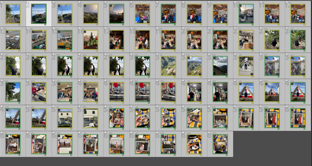
1. Research a photo-book and describe the story it is communicating with reference to subject-matter, genre and approach to image-making.
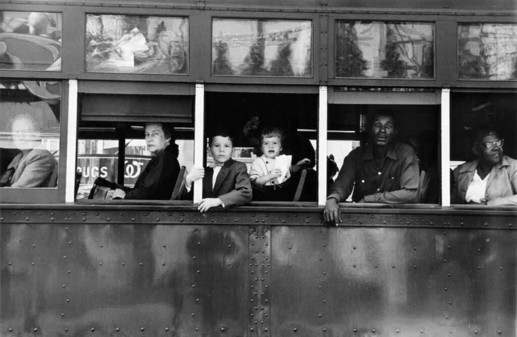
‘The Americans’ – Robert Frank, Published 1958.
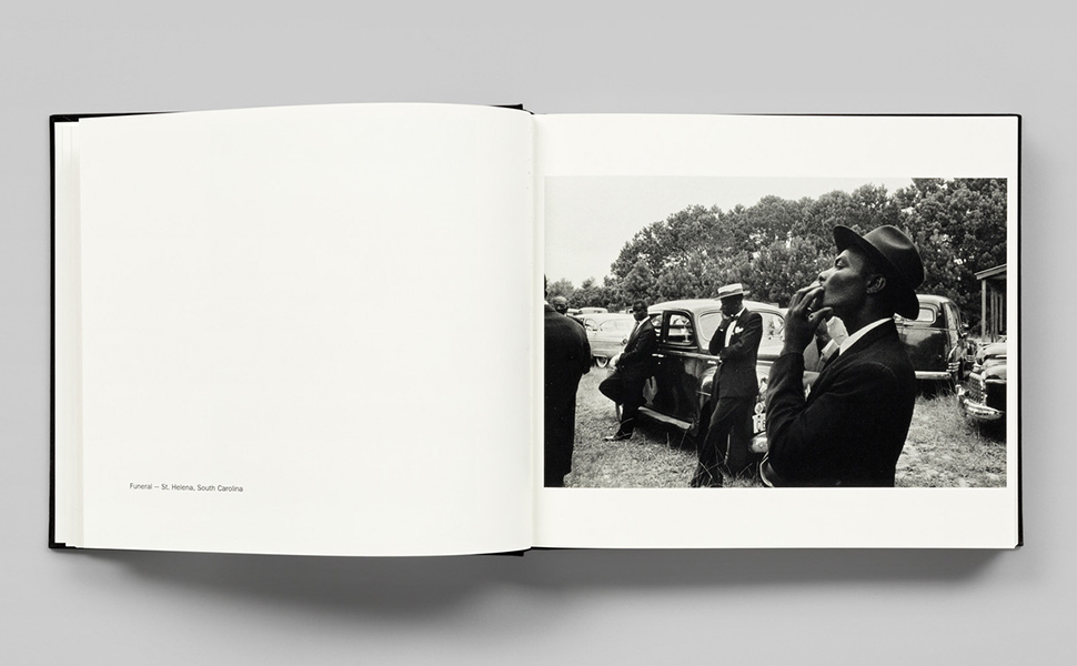
‘The Americans’ by Robert Frank captures his Journey across 48 states of America, photographing the natural sights around the country. Through the candid approach it communicates the “everything-ness and American-ness of these pictures” ( To quote the book). Reminiscent to Henri Cartier-Breton’s ‘Europeans’, it captures street photography of the everyday lives and experiences of those of at the time. Making use of a variety of shot types, the core 3 that are present consist of close-up, mid-shots and long-shots. Like its subjects, Franks’ images consist of many types of light. Natural and unnatural, are used heavily to bring out detail and character to his images, such as with dark shadows of the day forming a stark contrast, or the warm glow of lights bringing attention to his surroundings and subjects of the photograph.
2. Who is the photographer? Why did he/she make it? (intentions/ reasons) Who is it for? (audience) How was it received? (any press, reviews, awards, legacy etc.)
Robert Frank, 1924 – 2019.
“I was very free with the camera. I didn’t think of what would be the correct thing to do; I did what I felt good doing.” – Robert Frank
Robert Franks ‘The Americans’ explores the faces of many personalities across the United States. Travelling from state to state, the written intro from Jack Kerouac narrates his journey, bringing to life the images we later see. With many takes on the reasoning behind his journey of faces, the most popular intention behind Franks work was that he wished to photograph the America, far away from the idealised view of the American dream and instead capture the quiet America, those not given a voice or those that didn’t live in line with the vision of the ‘American way of Life’. In the theory of Frederik Trovatten, Frank within his work wanted to: Embrace imperfection, prioritise emotion over aesthetics, see a story in every frame, develop his own vision and be an observer to the world, not a performer.
In the words of the Museum of Modern Art “In a country that was not his own, Frank assumed the unique position of an outsider and voyeur who unobtrusively captured the tensions of the geographic, economic, racial, and religious diversity of the US.” “Frank captured the nation as a messy corpus, never privileging city or country, black or white, Jew or Christian, rich or poor.”.
Franks achievement through his work earned him a notable reputation in the world of photography, such as within John Szarkowski’s theory of ‘Mirrors’ and ‘Windows’. To quote Szarkowski, Robert Frank’s work “characterises opposite modes of the new photography, with its divergence between those who believe that art is a mirror, reflecting a portrait of the artist who made it, and those who see it as a window, through which one may better know the world.”.
Frank also notably gained awards such as the Guggenheim fellowship in 1955, the 1996 Hassebald foundation international award in photography, the 2002 Edward MacDowell medal and a doctorate in fine arts in 2015 from Nova Scotia college of Art and design University.
3. Deconstruct the narrative, concept and design of the book and apply theory above when considering:
Book in hand: how does it feel? Smell, sniff the paper. – Smells like a new book, with waxy coated paper for the images.
Paper and ink: use of different paper/ textures/ colour or B&W or both. – Black and white text are used, on the same type of paper across the entire book.
Format, size and orientation: portraiture/ landscape/ square/ A5, A4, A3 / number of pages. – The Book is small, with images in around an A5 format, the images are mainly landscape and positioned on the right hand side of the book, with the left, kept as an open space for the photograph title.
Binding, soft/hard cover. image wrap/dust jacket. saddle stitch/swiss binding/ Japanese stab-binding/ leperello – The book is a hard cover, featuring aswiss binding and dust jacket.
Cover: linen/ card. graphic/ printed image. embossed/ debossed. letterpress/ silkscreen/hot-stamping. – The cover is a card like paper that features a printed image of one of his photographs on.
Title: literal or poetic / relevant or intriguing. The title, which is literal in its meaning combines with the printed image to intrigue the spectator to the contents of the book, and how the people are presented.
Narrative: what is the story/ subject-matter. How is it told? – The story/subject matter is that of the American people, not any specific demographic but the mass diversity of races, ethnicity’s, religions, etc.
Structure and architecture: how design/ repeating motifs/ or specific features develops a concept or construct a narrative. – The repeating motif of a star spangled banner is featured commonly through the book, images are also not fixed within one location but jump from different locations ands environment’s displaying a vibrant change in scenery.
Design and layout: image size on pages/ single page, double-spread/ images/ grid, fold- outs/ inserts. – Images are featured on one page each, with white space to the left for the titles.
Editing and sequencing: selection of images/ juxtaposition of photographs/ editing process. Images juxtapose themselves throughout the book, clashing from rural to urban, night to day, not focusing on image style for too long.
Images and text: are they linked? Introduction/ essay/ statement by artists or others. Use of captions (if any.) – Images are linked through their study of the American people, this varies in the people you see and where you see them throughout the book, This is emphasised from the introduction by Jack Kerouac which narrates Franks adventure across the country to capture such.
To what extent are Saul Leiter and Seigfried Hansen influenced by Formalism in their work?
Introduction
“I happen to believe in the beauty of simple things. I believe that the most uninteresting thing can be very interesting,” (Saul Leiter: line 16) Saul Leiter suggest that what goes unnoticed is in fact the most exciting. The fact that we are almost unaware our surroundings of unique shapes and formations, with the only way that we truly see it is through abstract approaches. Throughout my personal study I aim to investigate street photography and how it can be portrayed through various ways. I believe there is more to street photography and that it’s not just a standard photograph of a building, it’s in fact different visual elements such as vibrant colours, unusual shadows, textures, and patterns, to diverse formations and compositions that all intertwine, overall creating these contrasting effects. All these visual elements are otherwise known as formalism, compared to what we see on the streets it shows a very similar effect. The way colours are distinguished between more colours, separated by distinct lines is further represented within the streets whether we notice it or not. My aim is to bring this to life, presenting this through very abstract and diverse approaches, and makes you question the photo as it is so unrecognisable. Siegfried Hansen perfectly describes formalism. His similar approach overall achieves abstract, unrecognisable images, that are so bold and full of colour and life it changes our perspective of our surroundings – viewing things for their details and unique features that define them. Saul Leiter expresses this more excitingly, expressing very hectic and busy images, however are clearly defined through formations, colours, and shadows. I am going to investigate various visual elements such as colour, formations and shadows and how they present their own narrative as we engage in different ways. Producing my own response in a formalist way, will create depth and meaning behind what I capture. More meaning will be revealed as I capture things in an abstract approach for example the colours chosen and formation expressing how uninteresting images can be made more interesting.
P1
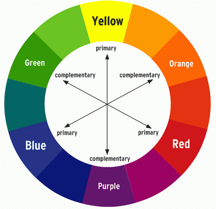
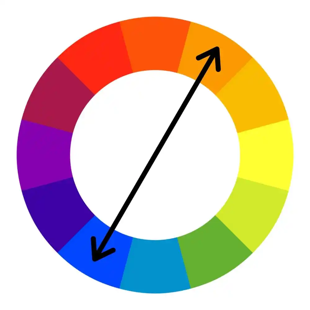
Formalism is a study of art, where compositional elements are presented to us through elements of colour, line, shape, and texture. Rather than focusing on a specific meaning, reason of creation, historical background or context within the photo, (that goes unnoticed), we therefore consider the medium used or visual elements that is presented to us through such expressive and dynamic formations. The colour wheel perfectly represents this, as it greatly impacts formalism. The small sections of colour work together in an orderly way, complementing one another, therefore showing very visual relations between one another. This reveals such intriguing image because you are shown something through the ways in which colour is presented to us. ‘Aestetic pleasure was to be found in the painting itself not its subject,’ stated Mauris Denic (tate: line 8:1890), post-impressionist painter and writer on art.
Formalism is the most important aspect of art, presented through visual aspects rather than narrative content -connecting closely to the outside world. Within this we see a dynamic relationship of colour, brushstroke, line and composition.Isaac Newton developed the colour wheel based on his findings. Proving that white light was not a single entity, instead it was composed of a spectrum of colour combining to make white, suggesting white is a source of colour. Newton’s experiment consisted with passing a thin beam of sunlight through a prism which produced a spectrum of colours – red, orange, yellow, green, blue, indigo and violet. Then by placing an inverted prism in the path of the coloured light beams, which combined the colours producing white once more.
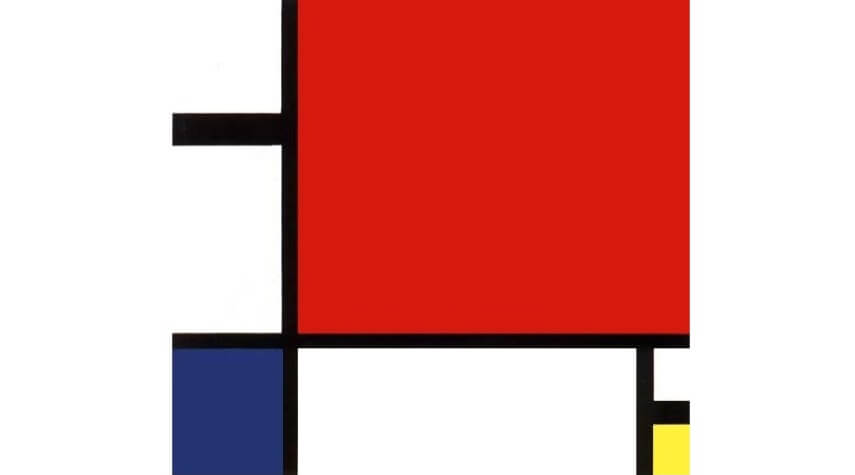
During the early 20th century, Piet Mondrian incorporated an art movement that allowed him to work around his abstract works, which formed a reductive theory – meaning a focus on simplicity rather than intricate/ detailed paintings. Stating in 1914, Mondrian said ‘Art is higher than reality and has know direct relation to reality.’ Describing through his style Mondrian shifted from figurative works to abstract art, explaining how art can reveal a type of reality through dynamic formations and variations, with one being formalism. Mondrian limited his colour use, to the three primary colours; blue, red and yellow, whilst still incorporating black, white and grey which was used as his base/background colours that brough the piece together. Alongside this Mondrian worked in two directions; horizontal and vertical. A confrontational effect is expressed through his art, shown through the specific, orderly layouts to the colours that are filled within each shape which work together to reveal a certain narrative, perhaps one we don’t understand as its just shapes and colour, so therefore it’s open for us to interpret. For me I think it is a very intelligent way of working. From working figuratively to then evolving into very abstract, structured, simple, limited use of colour type of work, but then still painting in a type of way to match the style of his reality (inspiration) I think is really effective as we learn his interpretation and perspective on his world- making it clear that art is higher than reality.
Peit Mondrian – Evening:Red Tree
Piet Mondrian – Composition II in Red, Blue, Yellow
Piet Mondrian proposed a style called Neo-plasticism in which consisted of his own abstract style – primary colours, and horizontal and verical lines.
Mondrian was greatly inspired by impressionist techniques, in which he used particular techniques within his own work – in his own style. During the early 20th century, Mondrian evolved his work by using pointillist and cubist styles, also including other abstract mediums, followed by other techniques he had learnt. Mondrian stated, ‘the more basic the colour, the more inward, the more pure.’ (Piet Mondrian, openign statement) From visualising Mondrians work we notice this more and more, through the abstract use of bold, pigmented colour which perhaps suggests the term basic is in fact the most revealing and captivating form. It is inward in the sense you have to look into it, noticing the true beauty of the dynamic compositions of line, shape and colour, but also pure in the sense of its simple forms.
p2
“Seeing is a neglected enterprise” Saul Leiter (video, first quote)
Immersed within painting and photography since a teenager, Leiter found ways to incorporate both within his work, however his aim was never to create an obvious connection between them as they are still two separate works of art. ‘Photography is about finding things… Painting is different. It’s about making something.’ (Stated Saul Leiter, video)Leiter enjoyed using a brush, making a mark, then another, describing it to be a bit like ‘Jazz’ (Saul Leiter, Video)- you don’t know what your going to do next. In relation to formalism, (expressed through the defining abstract strokes of colour, outlined my more shapes and marks of colour, which instantly lures you in), Leiter expresses this through his own style expressing unique features creating a similar approach as you don’t know what to expect next. The loose strokes of colour creates a similar, mesmerising relationship- a bit like formalism describing how blocks of colour can be fitted together, to reveal an intense yet in-depth image.
An obvious relation is presented through his paintings and photographs, yet his aim is never to create an obvious connection. We can see his style of loose strokes of colour painted compared to what he looks for and how he captures his photos, both achieving very similar, abstract effects. The photographs look like strokes of colour, expressing a painted quality, whilst on the other-hand the paintings create this abstract up-close complexion of colour, making us ‘look twice’ at what it is we are seeing, as the colours and shapes are ‘merged’ together creating a similar feature seen in the photographs. From Similar perspectives, Leiter’s very prominent and abstract marks of colour create an interesting feature that strangely lures you in, as you wouldn’t expect strange (unsymmetrical) highly pigmented strokes of colour to be that engaging. Instead it is the hidden details and minor features, that entices you in – automatically making you see things differently from what they are. This effect continues throughout his photographs, as we’re presented with a confrontational perspective, where unique angles are expressed. It is clear Leiter’s work has a close connection to formalism. The colour creates very contrasting features as there is little of them, and they complement one another. Alongside the riveting lines, shapes, and patterns which are revealed, this therefore creates a captivating aesthetic because you wouldn’t expect all of these different features to work together and reveal hidden effects. It expresses street photography in a different light, meaning it attracts you. Leiter returned to New York in 1940, where he began experimenting with colour photography using slide film such as Kodachrome. Quickly becoming one of the most popular materials used for film; being lightweight, affordable, quick exposures allowed for producing brilliant, intense coloured images. ‘Leiter’s use of colour was subtle, yet impactful,’(Pioneering colour photography- line 4) .This further outlined that only a few colours were in fact needed to create contrasting visual effects. It shows how Leiter had an ability to use little colours, and through his painting knowledge of expressive marks to bold brush strokes further enables him to look at the streets differently -noticing lights, people, or just anything that he came into contact with, that act as his colours.
P3
Siegfried Hansen is a contemporary street photographer focusing on visual links to formalism; colour, geometry, abstraction and cityscape. Hansen looks through these visual compositions focusing on the graphics and colours found within the street. Hansen doesn’t focus on capturing people, instead he looks at the formations and relations found elsewhere, “It shows the Aesthetics of coincidence in a public area, which is full of surprises.” (Seigfried Hansen, line 2) The way coincidental features take form within the images, is what makes them so intriguing creating this sense of an in-depth narrative. The diversity between the lines, structures, and signs combine with the architectural features, complementing one another whilst adapting to his abstract and graphical way of seeing. Hansen has this unique way of revealing surfaces, shapes and colour – that would once go unnoticed often being described as ‘poetic.’ (Leica Camera blog, line 6) Our attention is brought to unique perspectives and angles which would otherwise go unseen, which is similar to a poem. Relating to this poetic theme it gives a sense of rhythm as new things are constantly being revealed to us as it is Hansen’s perspective of the world around him, perhaps showing us a different world.
Conclusion
Saul Leiter and Seigfried Hansen both interpret the theme formalism through their photographic responses in similar yet unique ways. A similarity being shown through how colour and composition is interpreted. Saul Leiter creates very hectic images, filled with life that overall creates this confrontational yet abstract effect making you question what is being photographed. Before photography took over, Leiter was an artist with his main inspiration comming from impressionism. Working with loose strokes of colour and marks that came together creating this abstract composition of colour, it was still present in his photography as similar techniques and skills were used. Followed by the colour came a structural element of lines and shapes which outlined and made the colour more prominent. Whether it being shadows, reflections, people or just interesting formations, they always without fail make to you look twice as it’s never obvious what is being presented. This is enhanced through a layered effect giving depth as when you look into the photo, because a lot is going on, you notice even more interactions of people and geometry that subtly fills the image. This creates a narrative as everything is connecting in ways you wouldn’t know until its being revealed to you.
On the other hand Seigfreid Hansen expresses colour and compositions in a similar way, but instead it’s more simplistic and refined. Hansen automatically focuses in on geometry and graphical elements that form the street, widening our vision of the streets. Hansen’s images display an obvious connection to formalism through this style of simplicity. He takes inspiration from your typical formalist painting, then expresses it in his own style of being found within the streets.
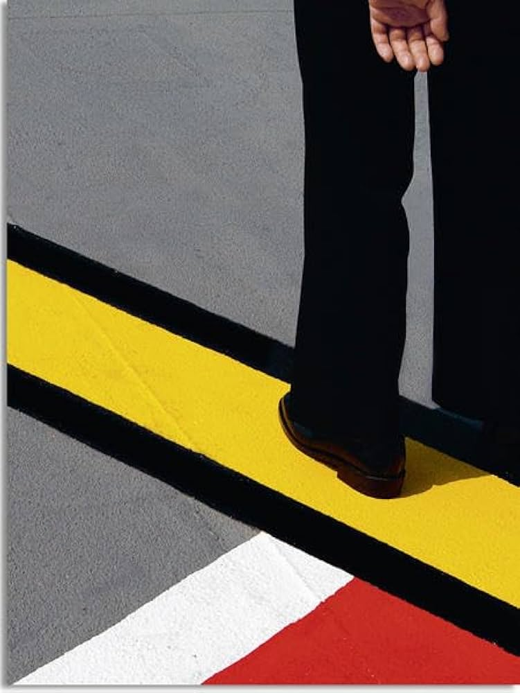
Seigfried Hansen – Hold the lineTraditional Formalist painting by Piet Mondrian
Seigfried Hansen – Hold the line
The simple use of colour, is further expressed within the photographs in a structured form. Capturing from abstract angles gives this direct approach, one you wouldn’t know of before its photographed.
1. Research a photo-book and describe the story it is communicating with reference to subject-matter, genre and approach to image-making.
Siegfried Hansen takes pictured intuitively, using this ability to anticipate unusual situations, transforming them into multi-facetted images.
Hansen traces visual compositions from graphics and colours creating his unique style of ‘street photography,’ without showing faces or bodies. Instead he focuses on graphical ways and formalism elements. It shows both aesthetics and his coincidence within public spaces, as you never know what to expect next.
When I open up the book I see vivid blocks of colour defined through a compositional structure of a street or wall, revealing this in-depth approach as intricate details, texture, and shadows or reflections are revealed. The sharp photos makes us see things differently, altering our perspective as we are presented things from abstract and unusual angles. Closely linking to ‘formalism’. I love the unique layout, as the theme of ‘formalism’ is further expressed throughout. The photographs aren’t always displayed on the pages, they are broken up by plain coloured pages linking into the the previous photograph. I want to further experiment with this concept. We are faced with various and different subjects in each photo, further making us see things differently.
The title ‘Hold the line,’ is further expressed throughout as he photo shows this unique formation of lines, curves, and shapes.
2. Who is the photographer? Why did he/she make it? (intentions/ reasons) Who is it for? (audience) How was it received? (any press, reviews, awards, legacy etc.)
Seigfried Hansen – Hold the Line, Kettle, 2015, Dortmand
About
Street photography
Hardcover, signed
Street photography exists as a genre in incredibly many facets (any aspect that makes up the subject) and manifestations (object or action that clearly shows something abstract or theoretical). It is always about the right time to release the shutter, at the moment of capturing and how accurately to react to the subject. For Siegfried Hansen, street photography is not so much in the nature of reportage and documentation. What he is interested in is graphic elements, shapes, interwoven lines and structures that, when harmoniously related to oneanother, present an abstract image. Whereas in the photographs of key role model: Henri Cartier-Bresson and André Kertész, people play a major role. No more is shown than is needed to create an interesting and balanced combination of people and objects.“
3. Deconstruct the narrative, concept and design of the book and apply theory above when considering:
Book in hand: how does it feel? Smell, sniff the paper.
Paper and ink: use of different paper/ textures/ colour or B&W or both.
Format, size and orientation: portraiture/ landscape/ square/ A5, A4, A3 / number of pages
Pages: 56 Place: Dortmund Year: 2015 Publisher: Kettler Size: 20 x 27 cm (approx.)
Exposed board cover, solid colour pages, thick matte paper, full bleed images, and a mix of portrait (one page for image, followed by a colour) and landscape pages (a double page spread) complement the graphic content.
There is no text throughout as noexplanation is needed, making it a very visual and open for interpretation book.
“this is not about a particular city, but the graphic presence of the city.Through his attentive eye and smart design, Hansen has created a mini city symphony of line, shape and color.” Colin Pental
Title: literal or poetic / relevant or intriguing.
‘Hold the line,’ straight away draws us in as we
We are first presented with a landscape photo for both front and blurb. From the abstract angle and geometric print of clearly defined lines and formations of colour, straight away creates these intense leading lines. Followed by someone’s legs in the top-right-hand corner, who we may guess could be the subject/ focus. I like the fact they’re unrevealed. This simple yet effective front page makes us question the narrative and concept behind the book as we yet to figure this out, as no title is presented.
As you turn the page, we are presented with the metaphor (title) ‘Hold the line.’ We straight away question what is meant by this. This perhaps changes our perspective of a ‘line’ as we question what is truly meant by this. The title sticks with us throughout the book as we notice this more and more, experimenting with how the lines can be further expressed. Features that relate to this complement one another, colour, shadow, space and shape.
Narrative: what is the story/ subject-matter. How is it told?
Hold The Line, doesn’t present an obvious narrative. However the subject of geometric, abstract and unusual compositions of street photography never fails to engage/ immerse you into the book, as you never know what to expect next. I feel Hansen’s unique approach/ style opens us up to a different style of street photography, one that we don’t typically see. Therefore this creates a different narrative, one that is open for the viewer to interpret. For me i like this different approach, seeing how colours are presented and complemented through shapes, shadows, and interesting compositions. This presentes this story of
Structure and architecture: how design/ repeating motifs/ or specific features develops a concept or construct a narrative.
Matt paper, hard back, full bleed,
When you flick through you see the unique structure that is expressed throughout, closely linking to the theme ‘formalism.’ Some double pages are broken up by full colour pages that complement the photo next to it, this is done through different ways. We can see the connection, as for some photos he is revealing a detail/ structural element through his choice in colour revealing this interesting and connecting concept. I feel to have a full colour page to break up certain images, with it having a close connection to the photograph expresses this uniqueness and difference as it reveals
Design and layout: image size on pages/ single page, double-spread/ images/ grid, fold- outs/ inserts.
Their is a unique layout displayed, with a mix between double pages spreads and singles pages. In a way the single pages are actually double pages, as full coloured complementary page colours that break this up up by full colour pages which complement the photo next to it. I find this effect interesting as we can see the connection, as for some photos he is revealing an intricate detail, ( strip of colour) or structural element through this effect, others it’s just a complementary colour.
We can see the connection, as for some photos he is revealing a detail/ structural element through his choice in colour creating this interesting concept.
Editing and sequencing: selection of images/ juxtaposition of photographs/ editing process.
Images and text: are they linked? Introduction/ essay/ statement by artists or others. Use of captions (if any.)
MATT PAPER
UNDERSTANDING PHOTOBOOKS: NARRATIVE, EDITING, SEQUENCING, DESIGN, FORM, FUNCTION
Earlier in the academic year we looked at narrative in photography. Let’s refresh our memory and revisit some of the theories around visual storytelling.
DEADLINE: Essay Introduction Draft MUST be handed in Thursday 18 Dec 2024
DEADLINE: Final Essay MUST be handed in Fri 31 Jan 2025
Copy this essay plan into your own blog post, titled: Essay Draft:
Literary sources: Go to this blog post here: Theory: Literary Sources and copy relevant key texts relating to the subject of your essay and list in alphabetical order in your bibliography. In addition, find your own key texts in relation to artists selected for in-depth analysis in your essay and list these too. These texts could be interviews with the artist, or reviews/ critique’s written by others. See useful online sites/ sources here .
Research and identify 3-5 literary sources from a variety of media such as books, journal/magazines, internet, Youtube/video that relates to your personal study and artists references .
Begin to read essay, texts and interviews with your chosen artists as well as commentary from critics, historians and others.
It’s important that you show evidence of reading and draw upon different pints of view – not only your own.
Take notes when you’re reading…key words, concepts, passages, page number to be used for in-text referencing etc.
Essay Question
Think of a hypothesis and list possible essay questions
Below is a list of possible essay questions that may help you to formulate your own.
Some examples of Personal Study essays from previous students:
Essay Plan Make a plan that lists what you are going to write about in each paragraph – essay structure
Essay question:
To what extend have Ansel Adams and Mark Power explored a sense of place in their work.
How have concepts of childhood, loss and memory been explored in the photo books of Mark Power and Ansel Adams?
“It means putting oneself into a certain relation to the world that feels like knowledge” (Sontag 1977:4)
Introduction (250-500 words): What is your area study? Which artists will you be analysing and why? How will you be responding to their work and essay question?
The areas I’m going to focus on for my personal study will be landscape and documentary photography. I will use the artists Ansel Adams and Mark Power to influence my images I am going to use for my photobook. Ansel Adams photography looks at still life images of plants and flowers and nature but most of his images are landscape images of trees or picturesque mountains. Whereas Mark Powers photography is about documenting certain moments or particular places that are important to people or a place that triggers a memory for them. I’m using these two photographers for my study because I’m going to restage images of my grandads favourite places when he came to visit jersey by using my dad in place of him in the images which is what Mark Powers photography focuses on. I’m also going to take images of the landscape from the location that I go to take the restaged images which is where Ansel Adams photography comes in, so I can lay one restaged image and one landscape photo next to each other in the photobook, to give contrast against both images.
Pg 1 (500 words): Historical/ theoretical context within art, photography and visual culture relevant to your area of study. Make links to art movements/ isms and some of the methods employed by critics and historian. The Historical context of the area I’m going to base my images off of is Romanticism in photography. What is Romanticism, it was a literary and artistic movement that included intense colours, shimmering light and animated brushstrokes in the images and showcased the beauty of landscapes and nature. Ansel Adams photography best portrays romanticism because he photographs the beauty and the innocence of the landscape and how it shows serenity and peacefulness in the image, which links to the photos that I’ve taken because it suggests reflection on his life. The movement of pictorialism links to Ansel Adams because he focused on the beauty of nature and capturing the special elements of the landscape he was photographing. However Mark Power was inspired by the nationalism movement which focused on political and sometimes military elements. What is the nationalism movement, the nationalism movement is a political, sometimes also military, struggle by a national group for statehood or for some measure of independence from or autonomy within a larger political association, such as another state or an empire. This relates to Mark Power because his work focuses on specific themes such as memories and showcasing important places for people.
Pg 2 (500 words): Analyse first artist/photographer in relation to your essay question. Present and evaluate your own images and responses. – The first artist Ansel Adams aesthetics of natural beauty Yosemite NP and photographing the nature and the trees there.
Pg 3 (500 words): Analyse second artist/photographer in relation to your essay question. Present and evaluate your own images and responses. – My second artist Mark Power looks at memory, what is memory, it can either be “the sum of everything retained by the mind” or “a particular recollection of an event or person” his work portrays this by images such as hospital waiting rooms which suggests that its a place that holds a lot of memories for someone or could trigger those memories about that specific place. Mark Power critiques the beauty in photography by creating very blunt images that don’t have beauty and tranquillity in them which juxtaposes against my first artist being Ansel Adams because his work is heavily based on the beauty of nature. Mark Power has created a sense of place in his work by photographing places that hold significant memories for people and photographing images of old abandoned houses where people might of lived in there childhood. My images showcase this sense of place because they hold the memories of my grandads favourite places and where he used to love when he came to the island. These images give a sense of place because they are special and important to me which makes them peaceful and calming places to be to remember him.
Conclusion (250-500 words): Draw parallels, explore differences/ similarities between artists/photographers and that of your own work that you have produced
Bibliography: List all relevant sources used
Photography and Family Family albums > childhood > memories
Anwandter, P. M. (26 April 2006), ‘Frames of Mind: Photography, Memory and Identity’. CUREJ – College Undergraduate Research Electronic Journal (https://bpb-us-w2.wpmucdn.com/portfolio.newschool.edu/dist/2/14941/files/2017/06/FRAMESofMIDNSfulltext-1rxpsdp.pdf) [Accessed Date Accessed] – In Frames of Mind, I have sought to explore the themes concerning the dynamic construction of memory. What do we choose to remember and how do we reinforce it? Who are we in relationship to who we were? Working with a collection of over five hundred images accumulated throughout my life, I have reinvestigated the images and their interrelationship with one another.
Overview of Barthes book Camera Lucida in Photo Pedagogy The first half of this article talks about Barthes theory of a studium and punctum. The latter part about a photograph of his dead mother which allows him to think about memory. Commentary on Barthes book
Rereading: Camera Lucida by Roland Barthes Article by Brian Dillon in the Guardian, 26 March 2011 Grieving for his mother, Roland Barthes looked for her in old photos – and wrote a curious, moving book that became one of the most influential studies of photography
DEATH IN THE PHOTOGRAPH – critical article in response to Roland Barthes seminal book ‘Camera Lucida’ reflecting on photography.
DEADLINE: Essay Introduction Draft MUST be handed in Thursday 18 Dec 2024
DEADLINE: Final Essay MUST be handed in Fri 31 Jan 2025
Copy this essay plan into your own blog post, titled: Essay Draft:
Literary sources: Go to this blog post here: Theory: Literary Sources and copy relevant key texts relating to the subject of your essay and list in alphabetical order in your bibliography. In addition, find your own key texts in relation to artists selected for in-depth analysis in your essay and list these too. These texts could be interviews with the artist, or reviews/ critique’s written by others. See useful online sites/ sources here .
Research and identify 3-5 literary sources from a variety of media such as books, journal/magazines, internet, Youtube/video that relates to your personal study and artists references .
Begin to read essay, texts and interviews with your chosen artists as well as commentary from critics, historians and others.
It’s important that you show evidence of reading and draw upon different pints of view – not only your own.
Take notes when you’re reading…key words, concepts, passages, page number to be used for in-text referencing etc.
Essay Question
Think of a hypothesis and list possible essay questions
Below is a list of possible essay questions that may help you to formulate your own.
Some examples of Personal Study essays from previous students:
Essay Plan Make a plan that lists what you are going to write about in each paragraph – essay structure
Essay question:
What is the relationship between Henri Cartier-Bresson’s theory of the ‘decisive moment’ and subjectivity?
To What Extent Is An Insiders Point Of View Truthful In Documentary Photography?
How can photography bear witness to the ways of life and events of the world?
How can photography bear witness to the world ways of life and events of the world?
What is the relationship between Henri Cartier-Bresson’s theory of the ‘decisive moment’ and subjectivity?
faith fact and fiction reality vs staged
Opening quote
‘To collect photographs is to collect the world’ (Sontag 1977:3)
Introduction (250-500 words): What is your area study? Which artists will you be analysing and why? How will you be responding to their work and essay question?
Essayintroduction: convert draft introduction to final version.
Think about an opening that will draw your reader in e.g. you can use an opening quote that sets the scene. Or think more philosophically about the nature of photography and its feeble relationship with reality.
You should include in your introduction an outline of your intention of your study, e.g.
What are you going to investigate?
How does this area/ work interest you?
What are you trying to prove/challenge, argument/ counter-argument?
Whose work (artists/photographers) are you analysing and why?
What historical or theoretical context is the work situated within?
What links are there with your previous studies?
What have you explored or experimented with so far in your photography project?
How will your work develop.
What camera skills, techniques or digital processes have you used, or going to experiment with?
Below is link to a blog post which will provide you with helpful guidelines if you are struggling to structure your essay or writing paragraphs.
In exploring my faith, religion, and photography, Susan Sontag’s assertion that “To collect photographs is to collect the world” (1977:3) profoundly shapes my approach to this study. Photography, especially in its documentary style, allows us to capture the essence of human experience, offering a window into the diverse and intimate ways people express belief and spirituality. This approach aligns with my own work, where I draw inspiration from Henri Cartier-Bresson, whose work of the decisive moment in documentary photography influences my desire to capture fleeting but profound instances of faith and my journey. Much like Henri Cartier-Bresson’s ability to reveal the underlying truths of human life through spontaneous moments, I look to document the quiet, sacred expressions of my own faith, offering a visual narrative that reflects not just personal devotion, but also the universal experience of spirituality. Through documentary photography, I aim to present these sacred moments in a way that invites reflection on religion and belief, while showcasing the subtle, often unnoticed beauty of spiritual life. I chose documentary photography as I am trying to represent a story behind my photographs. I am going to be taking images showing the stages of how I went from the darkness of being confused, lonely and not knowing what to do in life and the journey of me slowly finding my way to God and starting my walk of faith as a Christian. I am going to represent this journey through various photoshoots that piece together my story in the style of documentary photography. One of my inspiration is Henri Cartier-Bresson and in this essay I will be investigating his theory of the ‘decisive moment’ and its influence on contemporary documentary photography. A second photographer I will be analysing in relation to the decisive moment is Konrad Hellfeuer who explore religion through a documentary approach to image-making. A third artist I will be looking at is Matt Black, a photographer who predominantly explores the subjects of geography, inequality, and the environment in his native region and in related places, using the aesthetics of black and white.
Pg 1 (500 words): Historical/ theoretical context within art, photography and visual culture relevant to your area of study. Make links to art movements/ isms and some of the methods employed by critics and historian.
Documentary photography, as a medium, has been known for capturing the complexities of human existence, where it often frames social and cultural narratives within specific historical contexts. This approach of photography seeks to engage with reality, capturing moments in real time, moments that can only be captured once creating all sorts of stories and representing them through images. In the theme of faith and religion, documentary photography can serve as a powerful means to explore personal and collective spiritual experiences.
Pg 2 (500 words): Analyse first artist/photographer in relation to your essay question. Present and evaluate your own images and responses.
For my personal study, I’m focusing on the work of photographer Henri-Cartier Bresson and documentary photography. I will also look at his ability to represent a deeper meaning and story through different contrasts, shapes, angles, shadows as prescribed in his theory the decisive moment. According to Cartier-Bresson the decisive moment is ‘the simultaneous recognition, in a fraction of a second, of the significance of an event as well as the precise organization of forms which gives that event its proper expression.’ (Cartier-Bresson 1952). My interpretation of his theory is that he makes photographs of situations and people in that moment in time, creating images that would never be able to be replicated.
my image compared to Henri-Carter Bresson
When comparing his work to my own images, I can see how I try to create a similar sense of emotion and storytelling like he does, though I tend to focus more on natural light and environments using the weather and location as it is without manipulating anything whatsoever.
Some more photos from my first shoots and evaluation
In my first shoots, I experimented with capturing moments of genuine expression and emotions of how I was feeling in those moments which I believe aligns with Henri-Cartier Bresson’s goal of showing vulnerability and authenticity. Looking at both his work and my own, I realize how important it is to connect with the subject and take images in certain locations in order to really capture what I am looking for within my theme of faith and religion.
Pg 3 (500 words): Analyse second artist/photographer in relation to your essay question. Present and evaluate your own images and responses.
The second photographer I’m looking at is Arnold Newman, whose street photography captured everyday moments with a raw, storytelling and emotional feel. His use of positioning and angles really gives it a free feeling of being able to take images and capture real life images that can only be lived once, which is something I’ve tried to experiment with in my own work.
My image compared to Arnolds and evaluation
For example, in my second photoshoot, I focused on shooting people in the environment and just capturing people without them noticing, just like both Henri and Arnold did, as they both focus on in the moment circumstances where you can see peoples real emotions within those moments.
More of my images from the second shoot and evaluation
When I compare Arnolds approach to mine, I can see how I still have a lot to learn in terms of capturing that perfect moment of spontaneity. While Arnolds’ work often feels like he was in the right place at the right time, I sometimes feel like I’m more deliberate with my shots as I have tried to replicate a story and the emotions that come with it, of how both myself and someone else would feel when finding their path in faith.
Conclusion (250-500 words): Draw parallels, explore differences/ similarities between artists/photographers and that of your own work that you have produced
Bate, David (2016) ‘The Art of the Document’ in Art Photography. London: Tate Galleries. – A text about how documentary photography now is considered within a fine-art context
Cartier-Bresson, H. (1952). The Decisive Moment. Gottingen: Steidl
Sontag, S. (1977) ‘In Plato’s cave’ in On Photography. London: Penguin Books.
Astres Noirs by Sarker Protick and Katrin Koenning.
1. Research a photo-book and describe the story it is communicating with reference to subject-matter, genre and approach to image-making.
This photobook shows a collection of black and white photographs where the photographs have taken the ordinary and blown it up into dramatic images. Every photograph was taken on a phone and matched to its neighbour through overall shape and contrast. Each page is folded with a handful hiding additional images behind. The images were cumulated by an exchange between the two photographers. Like letters the two would send each other images and bounce off one another’s ideas. One photographer is from India and one from Australia. The pockets hide images and the word ‘disappear’. The book and sentence ‘all colours…within black’ makes somewhat sense but with the additional ‘disappear’ and hidden images, it creates a fuller and more well rounded overall narrative. The book is also a reflection of phone photography. The images were all taken from their own social media pages and the shine reflects the bright screens of the devices.
2. Who is the photographer? Why did he/she make it? (intentions/ reasons) Who is it for? (audience) How was it received? (any press, reviews, awards, legacy etc.)
Sarker Protick is an Indian photographer who overexposes and ‘looses’ colour in his black and white images. Katrin Koenning is an Australian photographer with a focus on the emotional connection with the environment.
3. Deconstruct the narrative, concept and design of the book and apply theory above when considering:
Paper and ink: use of different paper/ textures/ colour or B&W or both.
Since every page is folded they feel much thicker then they actually are. The pages are black and make use of a metallic white ink to make it shine under the light.
Format, size and orientation: portraiture/ landscape/ square/ A5, A4, A3 / number of pages.
The cover uses pure black card with the tile indentented.
Title: literal or poetic / relevant or intriguing.
The title is poetic. In English it translated to black stars. Black holes could be seen as more relevant however the use of stars relates to the brightness of the white and the metallic used for printing ink.
Narrative: what is the story/ subject-matter. How is it told?
There isn’t much of a story to the images. The images document an interaction between the two photographers.
Structure and architecture: how design/ repeating motifs/ or specific features develops a concept or construct a narrative.
Every set of unfolded pages have the same layout. The pictures are squares in the top corners of the pages.
Design and layout: image size on pages/ single page, double-spread/ images/ grid, fold- outs/ inserts.
Each image takes up part of one page. The book makes use of folded pages. The pages would have been folded in half and bound through the centre like normal pages. This makes the pages openable from the bottom corners.
Editing and sequencing: selection of images/ juxtaposition of photographs/ editing process.
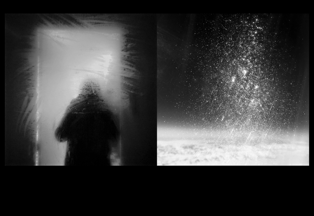
The images are put together mostly in pairs. each pair are related in some way be it general shape or related themes.
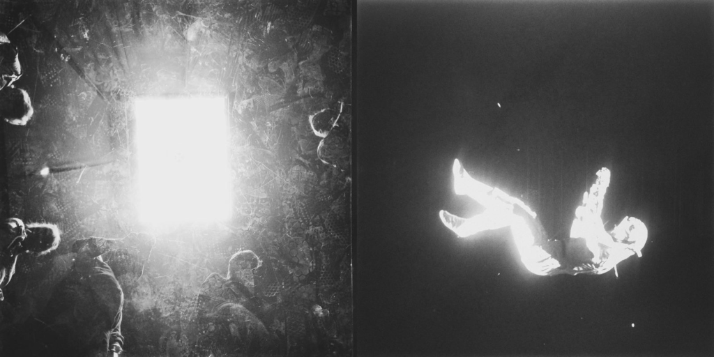
This pair uses the same shape of a triangular shape with the figure and the dirt specs.
This pair have related themes. The astronaut is falling through space and seemingly away from the square on the left which is reminiscent of a star/ship/etc. Had the context of the square been different it wouldn’t seem foreign/alien.
Images and text: are they linked? Introduction/ essay/ statement by artists or others. Use of captions (if any.)
The book doesn’t use many words. In the beginning there is the phrase ‘all colours disappear within black’ which relates to the images being black and white but also the hidden nature of the folded images. There are no captions with the images as these images are abstract and strung together in a narrative that wouldn’t make sense with added context.
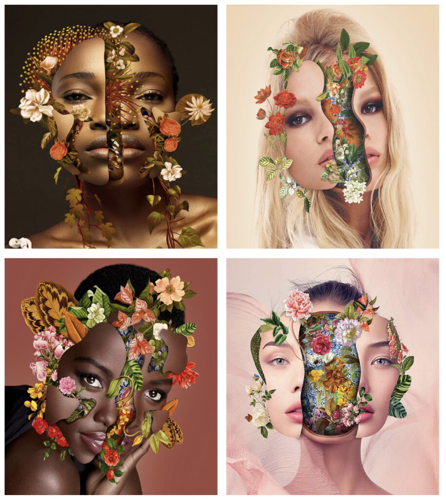
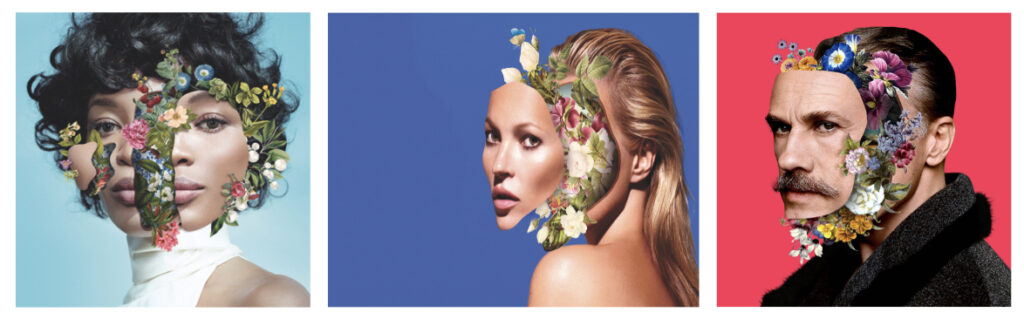
Marcelo Monreal is a Brazilian visual artist and photographer known for his unique approach to digital art and photography. He combines elements of portrait photography with surreal and sometimes abstract digital manipulation. Monreal often incorporates nature, architecture, and surrealist imagery, blending human faces with intricate designs, textures, and natural elements like plants or animals, creating visually striking and thought-provoking compositions. His work tends to challenge traditional boundaries in portrait photography, making him a distinctive figure in contemporary visual art.
Marcelo Monreal’s floral portraits are a captivating series where he merges human faces with vibrant, intricate floral elements, creating surreal and symbolic images. The portraits typically feature human subjects with portions of their faces or features replaced or integrated with flowers, leaves, and other organic elements.
How he links to identity
Marcelo Monreal’s floral portraits deeply explore the theme of identity by merging human faces with organic elements like flowers, leaves, and plants. This fusion reflects the fluid and multifaceted nature of identity, suggesting that it is not fixed or singular but rather something that evolves, grows, and changes—much like nature itself.
1. Transformation and Growth: By incorporating flowers and natural elements, Monreal evokes the idea that identity is a process of continuous growth and transformation. Flowers, which bloom, wither, and regenerate, mirror the way human identity can change over time, influenced by experiences, emotions, and external factors.
2. Connection to Nature: The integration of nature into human features hints at the interconnectedness between people and the world around them. It suggests that identity is not just individual but shaped by the environment, culture, and the broader ecosystem in which one exists. This can be seen as a commentary on how identity is shaped by external influences, both personal and societal.
3. Fragmentation and Wholeness: In many of Monreal’s floral portraits, parts of the face are replaced with flowers or plants, symbolising the fragmented yet cohesive aspects of identity. The way the flowers fill in or replace human features may imply that we are never wholly one thing, but rather a mixture of different elements—some visible, some hidden—that contribute to our sense of self.
4. Symbolism and Emotions: Different flowers carry symbolic meanings, such as roses for love, lilies for purity, or sunflowers for vitality. By associating these flowers with human faces, Monreal invites viewers to consider how identity is influenced by emotions, memories, and personal stories. The flowers may represent facets of a person’s inner life or emotional state, suggesting that identity is not just physical but also emotional and psychological.
In summary, Marcelo Monreal’s floral portraits use nature as a metaphor for the evolving, interconnected, and multifaceted nature of identity. By blending the human form with organic, ever-changing elements, Monreal captures the complexity and fluidity of what it means to be human.
What Marcelo Monreal has said about his project
Marcelo Monreal has shared insights into his floral portraits project, expressing that it is an exploration of the relationship between the human being and nature. In interviews and statements, he has emphasized how these portraits reflect his fascination with the fluidity of identity and the interconnectedness of humanity with the natural world. He views the human face as a symbol of identity, and by incorporating elements like flowers and plants, he aims to redefine traditional portraiture by highlighting the organic and evolving nature of who we are. He sees flowers as metaphors for human emotions, growth, and the cycles of life, and uses them to convey how identity can be shaped by both internal and external forces.
Through this project, Monreal invites viewers to question the boundaries between the human form and nature, suggesting that identity is not static but rather a dynamic process, constantly influenced by both our inner world and the external environment. The blending of the face with nature is also, for Monreal, a way of challenging conventional notions of beauty and exploring the fragility and strength inherent in both humans and the natural world. Overall, Monreal’s floral portraits are a reflection of his desire to capture the complexity of human identity through the lens of nature, symbolizing growth, transformation, and the transient yet interconnected aspects of life.
For these images I was unsure whether to set them in Black and white to match the other images so far or keep them in colour as how they would be seen.
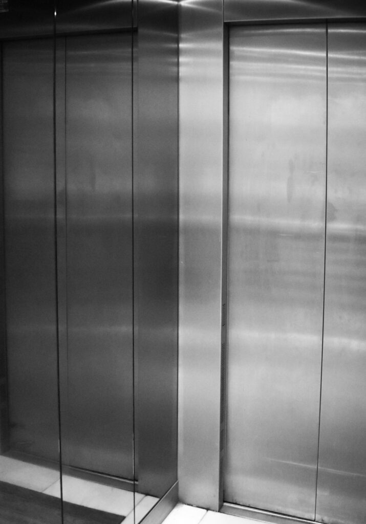
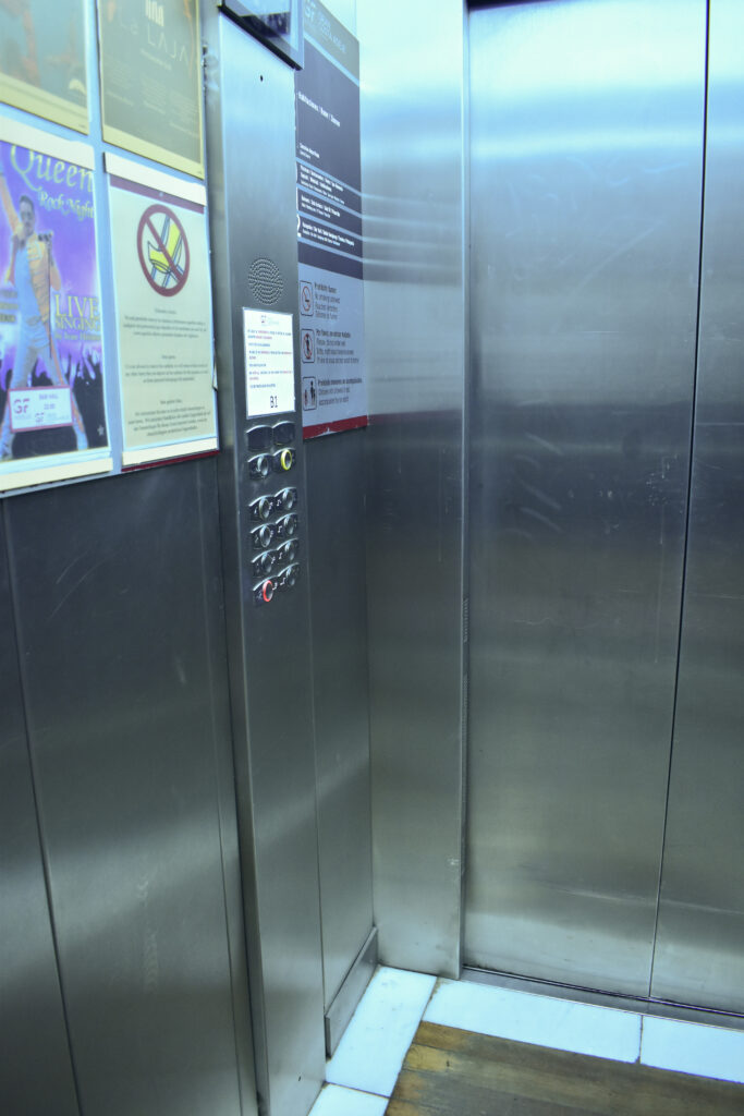
I wanted to remove some of the advertisements from the lift. I used photoshop to generative fill the colourful sheet with some generic writing. The colour looked off however so I masked the sheet and added a tinted layer to create the same yellowing effect.
Overall I think this photoshoot 3 really good images:
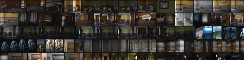
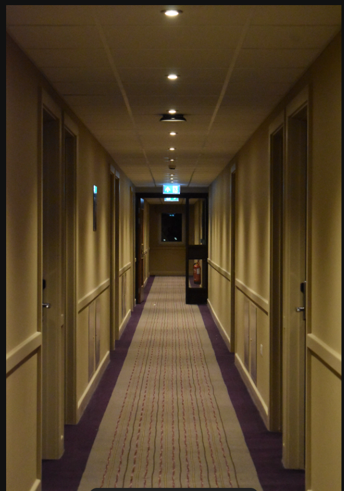
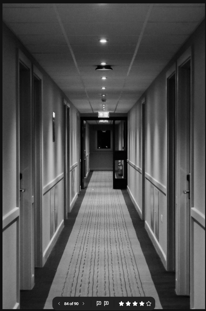
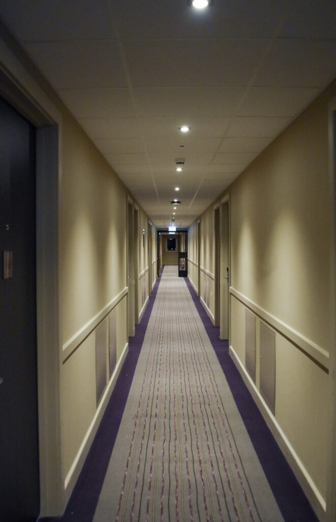
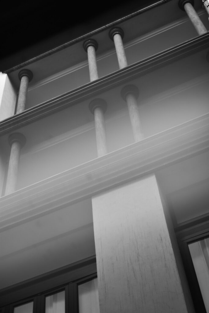
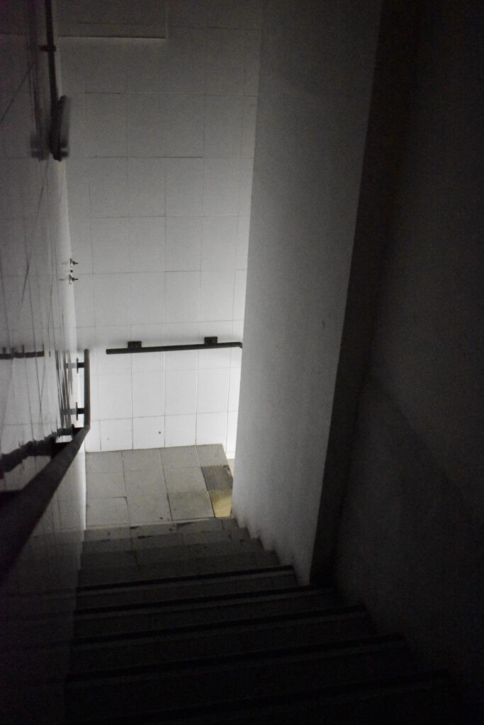
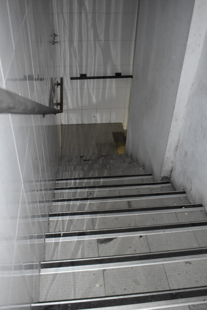
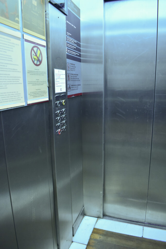
Lifts can be quite frightening for some people for their small space triggering claustrophobia and getting stuck if they break. The lift I photographed broke on me twice with the doors refusing to open and the suspensions jittering which made me really want to photograph it for this photoshoot. The sofa for me showed a liminal space. The yellow walls and past evidence of a person looks odd and fake which I think turned out quite well. I also liked the image with 3 doors pen because it also seems like it could resemble a liminal space. I was torn between this image and another one where the end light was on but the lack of light is more ominous.
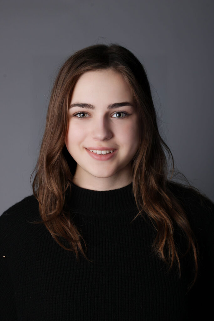
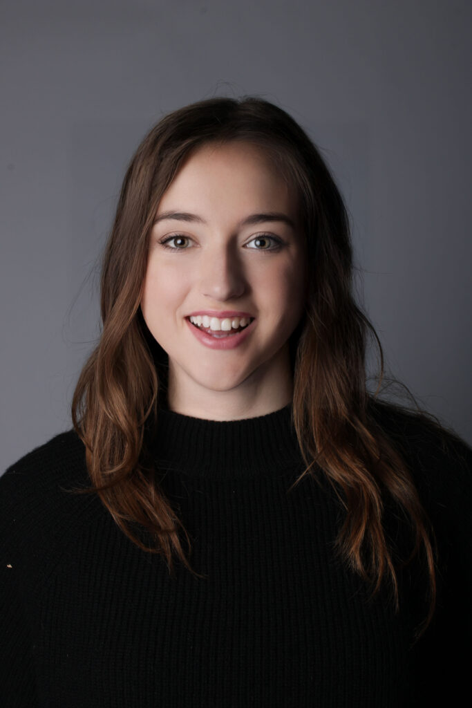
For this part in my project, I decided to experiment with AI which is something I hadn’t explored yet. I came across this idea accidentally when I was trying to change the facial expressions on my models face and noticed that every time it would alter her complete face, making her into a different person essentially instead of just changing a specific facial feature. The AI generation tool made 3 completely different, unique faces from the same model.
I decided to do this idea of experimenting with AI as I felt it linked with my project on identity. Through using the AI generation tool on photoshop, I was able to create completely different people just by adding simple sentences such “make it so that the model is smiling” to which it then completely changed the face as well. This highlighted to me the idea that people can easily hide behind a façade these days as they have access to these easy to use tools that drastically change one’s appearance. Additionally, it emphasised to me the fact that you can’t trust what people really look like online as there are so many filters/ edits people use in order to make themselves come off in a different way: whether that be making themselves look more attractive or wealthier, we are constantly exposed to fake versions of people which then causes unrealistic expectations to be formed about how people should look. I think this shows how easily identity is doctored in the present day and how people often lose their own sense of identity due to the tools that distort who they really are. I like how this idea came out as I think it highlights how social media is often filled with fake versions of people who alter themselves in order to fit in with societal expectations.