DEADLINE: Essay Introduction Draft MUST be handed in Thursday 18 Dec 2024
DEADLINE: Final Essay MUST be handed in Fri 31 Jan 2025
Copy this essay plan into your own blog post, titled: Essay Draft:
Literary sources: Go to this blog post here: Theory: Literary Sources and copy relevant key texts relating to the subject of your essay and list in alphabetical order in your bibliography. In addition, find your own key texts in relation to artists selected for in-depth analysis in your essay and list these too. These texts could be interviews with the artist, or reviews/ critique’s written by others. See useful online sites/ sources here .
- Research and identify 3-5 literary sources from a variety of media such as books, journal/magazines, internet, Youtube/video that relates to your personal study and artists references .
- Begin to read essay, texts and interviews with your chosen artists as well as commentary from critics, historians and others.
- It’s important that you show evidence of reading and draw upon different pints of view – not only your own.
- Take notes when you’re reading…key words, concepts, passages, page number to be used for in-text referencing etc.
Essay Question
- Think of a hypothesis and list possible essay questions
- Below is a list of possible essay questions that may help you to formulate your own.
possible-essay-questions-to-investigate
Some examples of Personal Study essays from previous students:
Essay Plan
Make a plan that lists what you are going to write about in each paragraph – essay structure
- Essay question:
To what extend have Ansel Adams and Mark Power explored a sense of place in their work.
How have concepts of childhood, loss and memory been explored in the photo books of Mark Power and Ansel Adams?
- “It means putting oneself into a certain relation to the world that feels like knowledge” (Sontag 1977:4)
- Introduction (250-500 words): What is your area study? Which artists will you be analysing and why? How will you be responding to their work and essay question?
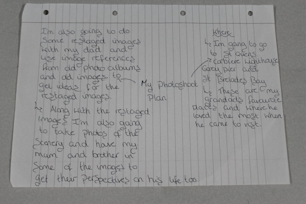
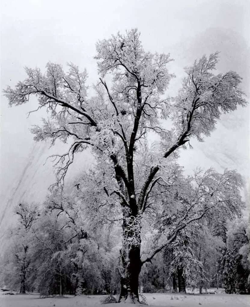
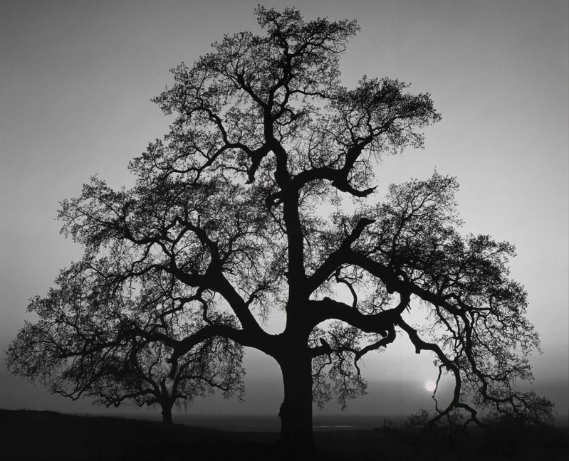
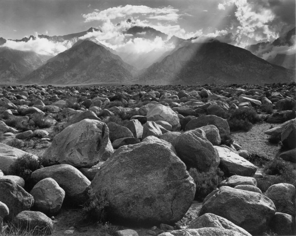
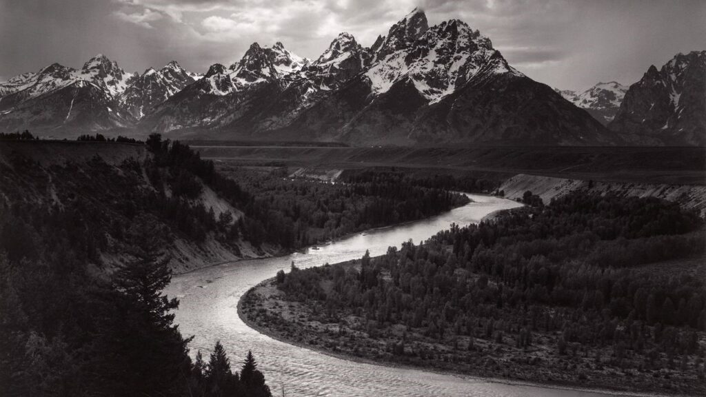
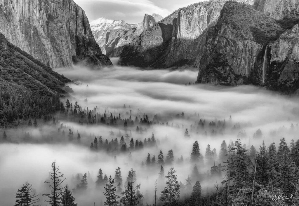
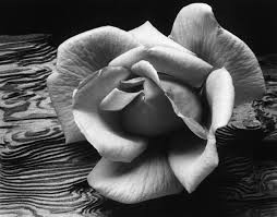
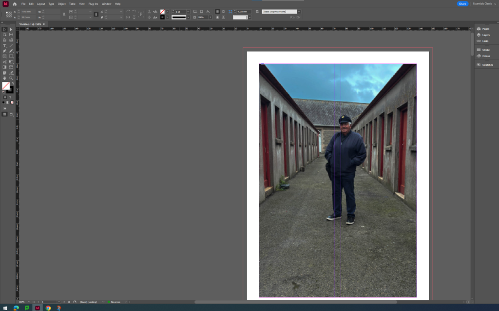
- The areas I’m going to focus on for my personal study will be landscape and documentary photography. I will use the artists Ansel Adams and Mark Power to influence my images I am going to use for my photobook. Ansel Adams photography looks at still life images of plants and flowers and nature but most of his images are landscape images of trees or picturesque mountains. Whereas Mark Powers photography is about documenting certain moments or particular places that are important to people or a place that triggers a memory for them. I’m using these two photographers for my study because I’m going to restage images of my grandads favourite places when he came to visit jersey by using my dad in place of him in the images which is what Mark Powers photography focuses on. I’m also going to take images of the landscape from the location that I go to take the restaged images which is where Ansel Adams photography comes in, so I can lay one restaged image and one landscape photo next to each other in the photobook, to give contrast against both images.
- Pg 1 (500 words): Historical/ theoretical context within art, photography and visual culture relevant to your area of study. Make links to art movements/ isms and some of the methods employed by critics and historian.
The Historical context of the area I’m going to base my images off of is Romanticism in photography. What is Romanticism, it was a literary and artistic movement that included intense colours, shimmering light and animated brushstrokes in the images and showcased the beauty of landscapes and nature. Ansel Adams photography best portrays romanticism because he photographs the beauty and the innocence of the landscape and how it shows serenity and peacefulness in the image, which links to the photos that I’ve taken because it suggests reflection on his life. The movement of pictorialism links to Ansel Adams because he focused on the beauty of nature and capturing the special elements of the landscape he was photographing. However Mark Power was inspired by the nationalism movement which focused on political and sometimes military elements. What is the nationalism movement, the nationalism movement is a political, sometimes also military, struggle by a national group for statehood or for some measure of independence from or autonomy within a larger political association, such as another state or an empire. This relates to Mark Power because his work focuses on specific themes such as memories and showcasing important places for people. - Pg 2 (500 words): Analyse first artist/photographer in relation to your essay question. Present and evaluate your own images and responses.
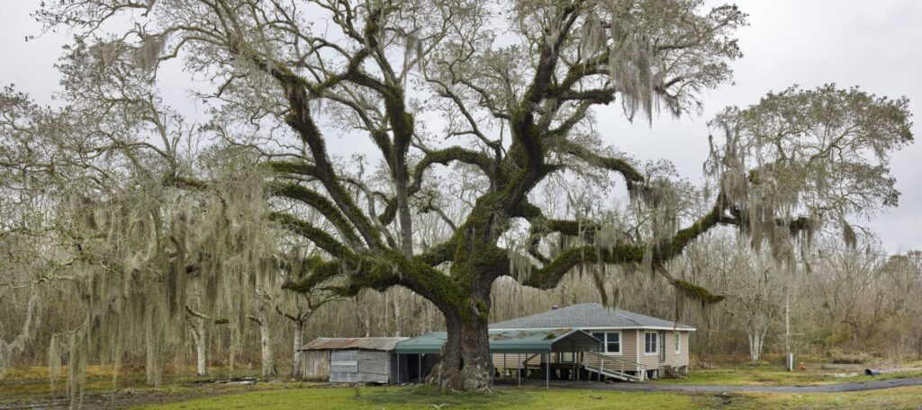
– The first artist Ansel Adams aesthetics of natural beauty Yosemite NP and photographing the nature and the trees there. - Pg 3 (500 words): Analyse second artist/photographer in relation to your essay question. Present and evaluate your own images and responses.
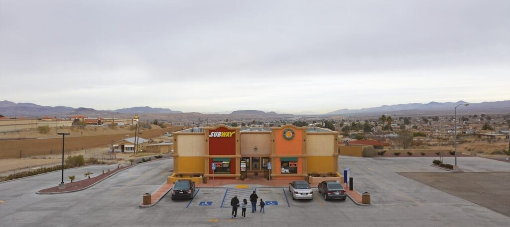
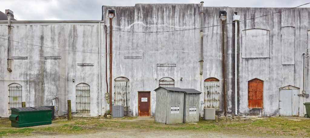
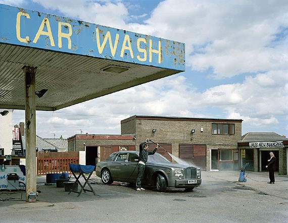
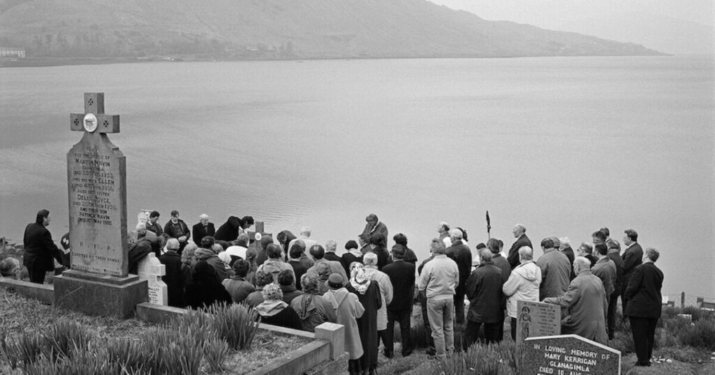
– My second artist Mark Power looks at memory, what is memory, it can either be “the sum of everything retained by the mind” or “a particular recollection of an event or person” his work portrays this by images such as hospital waiting rooms which suggests that its a place that holds a lot of memories for someone or could trigger those memories about that specific place. Mark Power critiques the beauty in photography by creating very blunt images that don’t have beauty and tranquillity in them which juxtaposes against my first artist being Ansel Adams because his work is heavily based on the beauty of nature. Mark Power has created a sense of place in his work by photographing places that hold significant memories for people and photographing images of old abandoned houses where people might of lived in there childhood. My images showcase this sense of place because they hold the memories of my grandads favourite places and where he used to love when he came to the island. These images give a sense of place because they are special and important to me which makes them peaceful and calming places to be to remember him. - Conclusion (250-500 words): Draw parallels, explore differences/ similarities between artists/photographers and that of your own work that you have produced
- Bibliography: List all relevant sources used
Photography and Family
Family albums > childhood > memories
Bull, S. (2009), ‘Phototherapy: The Family Album and Beyond‘ in Photography. London: Routledge.
Kuhn, A. ‘Remembrance: The Child I Never Was’ in Wells, L. (ed) (2003) The Photography Reader. London: Routledge
Hirsch, Marianne, Family Frames: Photography, Narrative and Postmemory. Cambridge, Massachusetts: Harvard University Press. Read Introduction: Family Frames.
There is a set of excellent texts on the photography and family, but there are all too large files to be uploaded on the blog – find text here:
M:\Radio\Departments\Photography\Students\YR 13 OBSERVE, SEEK, CHALLENGE 2024-2025\Essay tools\READING
Howarth, S. (2016) ‘Is My Family Normal?’ in Family Photography Now. London: Thames & Hudson.
McLaren, S. (2016), ‘Thanks for Sharing!’, in Family Photography Now. London: Thames & Hudson
Williams, V. (2013). ‘Who’s Looking at the Family, Now’ in Family Politics, Issue 20. Brighton: Photoworks.
Photography and Memory
Kuhn, A. (2003). ‘Remembrance: The Child I Never Was’ in Wells L. (ed) The Photography Reader. London: Routledge
Here are a few online articles and photobooks on Photography and its relationship with memory. You should read them and references them in your essay.
Colberg, J (May 28, 2012) Photography and Memory
blogger on Conscientious
Anwandter, P. M. (26 April 2006), ‘Frames of Mind: Photography, Memory and Identity’. CUREJ – College Undergraduate Research Electronic Journal (https://bpb-us-w2.wpmucdn.com/portfolio.newschool.edu/dist/2/14941/files/2017/06/FRAMESofMIDNSfulltext-1rxpsdp.pdf) [Accessed Date Accessed]
– In Frames of Mind, I have sought to explore the themes concerning the dynamic construction of memory. What do we choose to remember and how do we reinforce it? Who are we in relationship to who we were? Working with a collection of over five hundred images accumulated throughout my life, I have reinvestigated the images and their interrelationship with one another.
A Matter of Memory: Photographs as Objects in the Digital Age
An exhibition at George Eastman House
– Read a review on British Journal of Photography for a different perspective on the exhibition
Barthes, R (1982) Camera Lucida, London: Jonathan Cape
Overview of Barthes book Camera Lucida in Photo Pedagogy
The first half of this article talks about Barthes theory of a studium and punctum. The latter part about a photograph of his dead mother which allows him to think about memory.
Commentary on Barthes book
Rereading: Camera Lucida by Roland Barthes
Article by Brian Dillon in the Guardian, 26 March 2011
Grieving for his mother, Roland Barthes looked for her in old photos – and wrote a curious, moving book that became one of the most influential studies of photography
DEATH IN THE PHOTOGRAPH – critical article in response to Roland Barthes seminal book ‘Camera Lucida’ reflecting on photography.

