James Welling artist study

Image 1-Choreography 9818, 2015

9818

The photo is a montage of different images layered over one another to create one large abstract image. From the images I can make out I can see dancers, a mountain and windows. Each photos adds another texture turning the photo into a very layered piece. The transparent edges that can just be made out makes it look as if we are looking through glass. The inverted colors of the dancers alienates them as some of their body is not yellow like he rest of the image. This photo is like a piece of art, when looking at this I do not see a photo that has been captured in the moment, it’s a piece of art that has very carefully been put together. The imagery behind and in front almost mimics the dancer. Each edge and corner is sharp like the dancers posture that is very rigid and tense. There is also some curvature from the mountain behind that can also be found where the dancers hand meet as it is like a circle. I like this photo very much it very different to anything I have seen before. It looks as if a lot of thought has gone into the picture making sure meaning is a large part. At first glance it looks like a mess however when studying the photo it becomes to what the photographer was trying to convey. This photographer has done a whole line of works like this in a project called Choreography where he focused of mixing photos of dancers with either one or multiple landscapes.

Image 2 -Glass House 0469, 2009, 2009

0469, 2009

This photo is from a collection of photos from the project called Glass House. Welling has multiple photos of this glass house from different seasons. James Welling has used color filters between the camera and the subject. Welling said he used the word ‘filter’ as a noun and a verb.  In addition to plastic, colored filters, Welling used clear plastic, fogged plastic, clear glass, pieces of glass that were slightly uneven and tinted, and finally a diffraction filter that breaks light into the spectrum. The colors in this photo have been changed and have split the photo into two. The top half red and the bottom orange. The house is slightly off center and surrounded by trees. The change in color matches the change in seasons. Brighter colors are used in lighter seasons and darker colors are used in seasons like winter and Autumn. I like this photo and have used it as inspiration for one of my shoots. I have used different colors to show a spirituality and how certain colors can make a person feel different things.

FINAL PRINTS, PRESENTATION AND EVALUATION

PLANNER for A2 EXAMINATIONS 2018

FINAL PRINTS DATES:
Select your final images for both EXAM and COURSEWORK (if you haven’t completed this already)

Wed 18 April 15:00
prints ready Tue 24 April
Tue 24 April 15:00
prints ready Mon 30 April
Wed 25 April 15:00
prints ready Wed 2 May

EXAMINATION DATES:
Groups 13A and Group 13E 24 April, 30 April & 1 May.
Group 13D 25 April , 2 mAY and 3 May
15 hrs controlled test over 3 days

CLASS LIST + EXTRA TIME
For those of you who have extra time – check when this has been allocated.

A2 Photography Exam 2018

BLOG: End your blog with evidence of the following:

1. Show evidence of how you intend to present and display your final prints – make mock up in Photoshop – for example. a single image or diptych, triptych, predella, size A5, A4 or A3, typology-style grid, collage etc

2. If you have made a photobook – write a book specification and describe in detail what your book is about in terms of narrative, concept and design.  Produce a mood-board of design ideas and consider the following:

  • How you want your book to look and feel
  • Format, size and orientation
  • Design and layout
  • Rhythm and sequencing
  • Structure and architecture
  • Narrative
  • Title 
  • Images and text
  • Colour and B&W (or a mix)
  • Paper and ink

3. Write an overall final evaluation (250-500 words) that explain in some detail the following:

  • how successfully you fulfilled the EXAM brief and realised your intentions.
  • links and inspiration between your final images and exam theme including artists references
  • analysis of final prints/presentation in terms of composition, lighting, meaning, concept, symbolism etc.

see example here: https://hautlieucreative.co.uk/photo16a2e/author/sodonnell05/

4. Go through all your blog posts and make sure that you have completed them all to your best ability, e.g. good use of images/ illustrations, annotation of processes/ techniques used, analysis/ evaluation of images and experimentation

5. Present your final outcomes in window mounts or on foam board, label with name, candidate number, attach velcro and put in a BROWN/BEIGE/YELLOW folder.

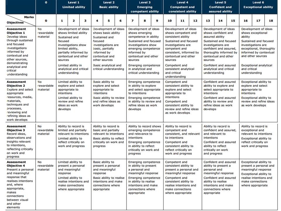
To achieve a top marks we need to see a coherent progression of quality work from start to finish following these steps:

RESEARCH > ANALYSIS > PLANNING > RECORDING > DEVELOPING > EXPERIMENTING > PRESENTING > EVALUATING

The following students have been selected for moderation:

Coursework:
Chiara Buesnel
Alisha Cadec
Elinor Dargie
Ben Fosse
Anna Houiellebecq
Peter Le Gal
Charlie Lucas
Zoe Pannenborg
Josie Robins
Lauryn Sutcliffe
Shaynee Whiteman

Externally Set Assignment: 
Chiara Buesnel
Harrison Cummins
Felicity Flinders
Anna Houiellebecq
Darcy Kelly
Madison Lee
Ethan Moyse
Max Rivers
Jo Searle
Abbie Waller

rinko kawauchi // photo book analysis // illuminance

Illuminance is a series by Rinko Kawauchi about focusing on the tiny gestures and details throughout our day to day lives. She explores the extraordinary in the insignificant things that we would normally ignore or not even notice. All her images within her series contain this spiritual, unique style that she creates effortlessly. She has a feminine touch that you can see in the soft, pastel colours throughout the book. The photobook, Illuminance was published in 2011 and costs £40 to purchase. The form and functions of the book is the first thing we think about when seeing the book.  It is produced as a cloth bound book using Japanese binding to hold it together. The book has a material texture too it because of the use of the cloth cover. This effect makes the book much more interesting because the cloth cover creates a rough texture for the hand to touch and feel. It gives the brain something extra to think about. The book is big and heavy to pick up because it contains hundreds of images by Kawauchi. The pages within the book are thick which improves the quality of the book and makes it feel and look more professional.

The book contains a spiritual and sublime aesthetic that runs throughout the whole series. Each image links to the next somehow. They flow in a sequence that symbolises a story or narrative that Kawauchi is trying to create. The images are about day to day events so the narrative Kawauchi is capturing could be in the time period of a day. She could be using the series of images to symbolise a series of events throughout a day. The images flow really well and link together in a good way because of the use of shape and colour. The pastel colours within each image is highlighted. Although some of the images presented next to each other are contrasting, its the contrast within them that works well together, such as the light and shadow and the line compared the circular shape.

Rinko Kawauchi has  a very contemporary approach to her work. She breaks the rules within photography and creates her own unique perspective of the world. She has an unusual way of framing and she also uses symmetry and patterns to add to her complex series. Her images are very bright and contain a feminine touch which is delicate. As a viewer of the photobook I can tell that Kawauchi adds her own personality and emotion into each image.

Rinko Kawauchi is a Japanese photographer and I believe you can see this in her work. Japan is a very spiritual culture and they care a lot for the body and soul. They view things very differently to the western world. Everything is seen to contain a spirit and an element of beauty, no matter how insignificant it is. When looking through the photobook I can see Kawauchi’s point if view and imagine looking at the image through her mind. She sees more then just a tree or a reflection. She sees remarkable beauty. I think the name Illuminance suits this series really well because it is a word we would use to describe something bright, and something radiating beauty. This is how she describes the objects and scenes she’s captured.

After researching more about the photo book illuminance I came across an article by lens culture about Rinko Kawauchi and her many series such as ‘Search for the Sun’, and Illuminance. The article contains a paragraph describing the series. “Inspired by the subtle aesthetic of wabi-sabi—a philosophy of reduction, modesty and the beauty of imperfection—these luminous images offer an enchanting gaze on the world around us.”  Wabi Sabi is the name of my project which ties in well with my whole theme and research because Kawauchi herself was also inspired by the aesthetic Wabi Sabi.