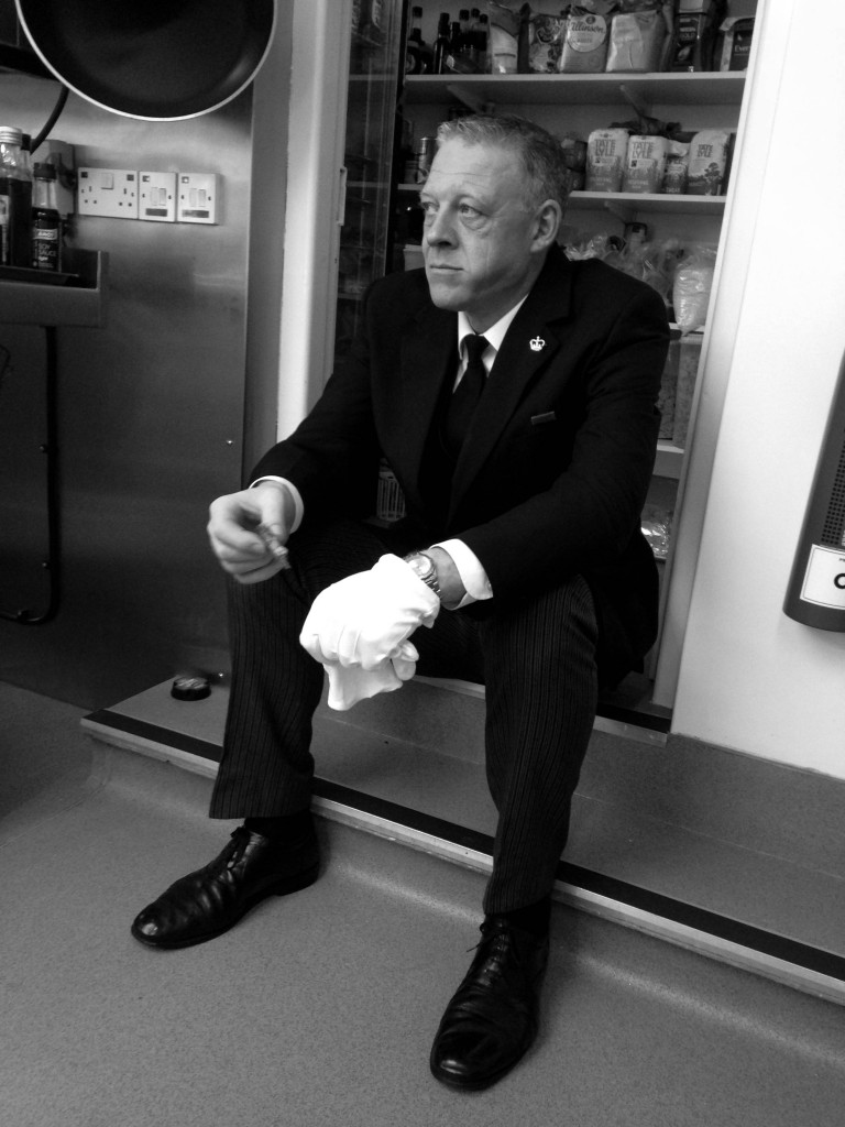
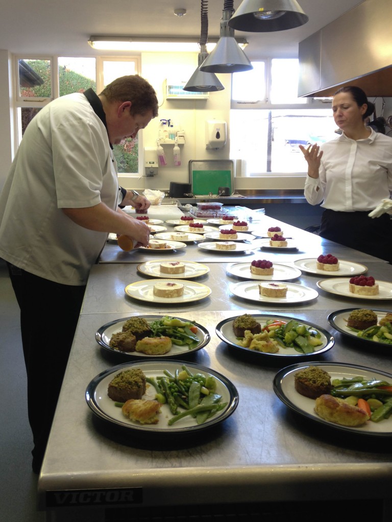
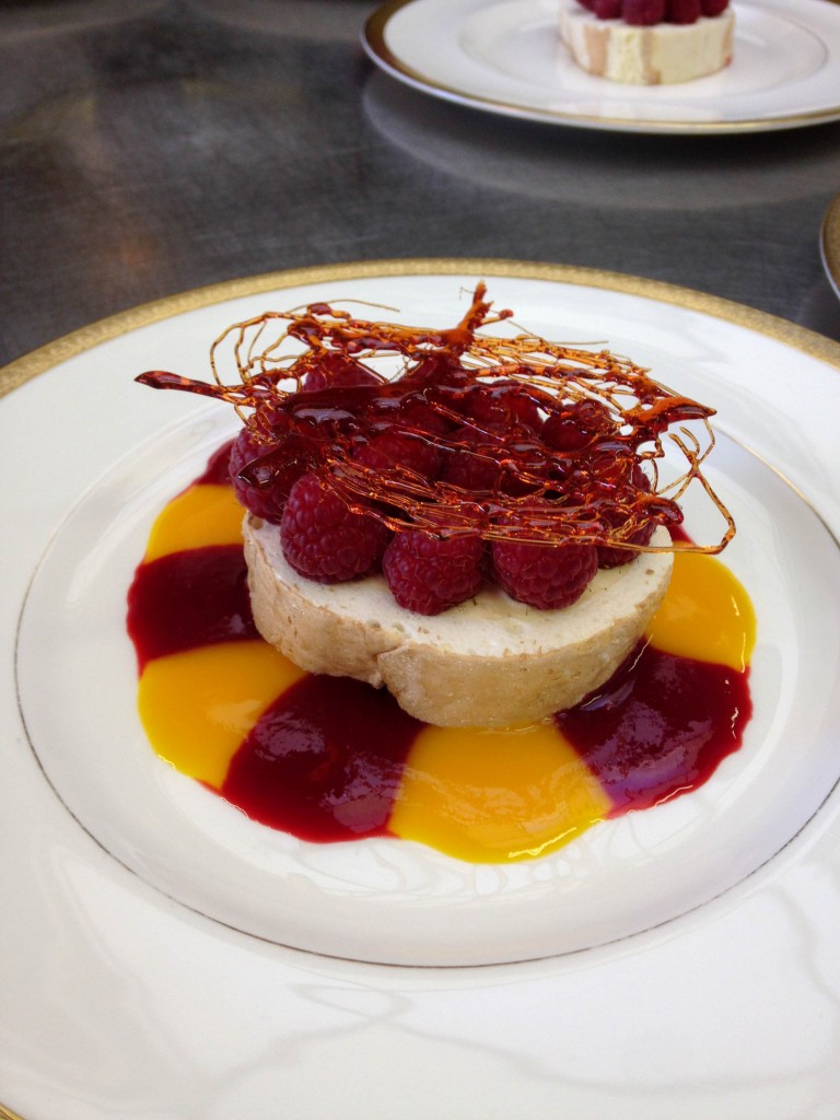
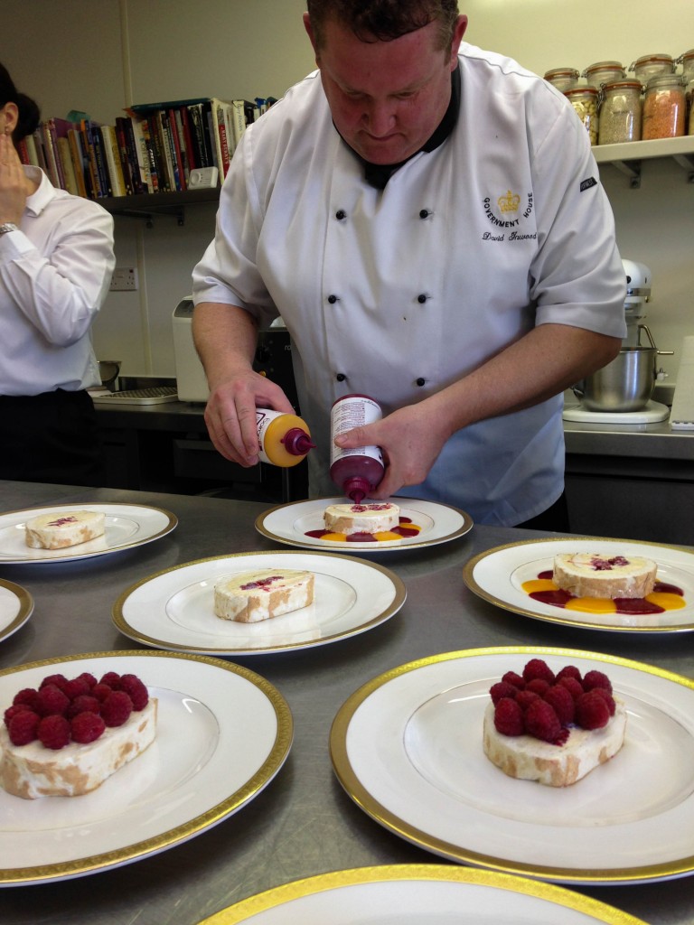
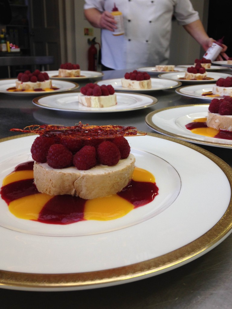
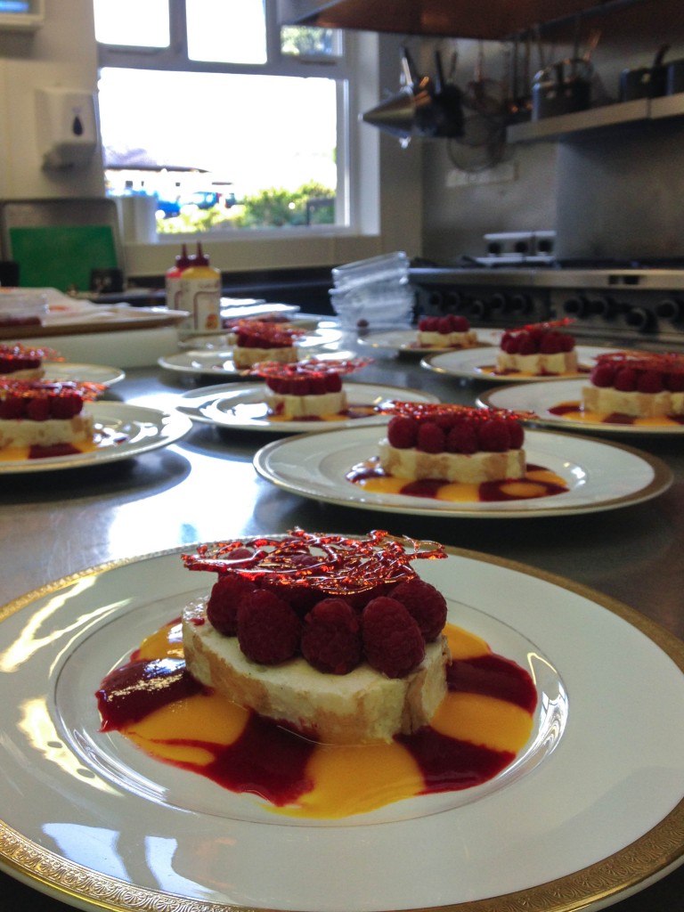
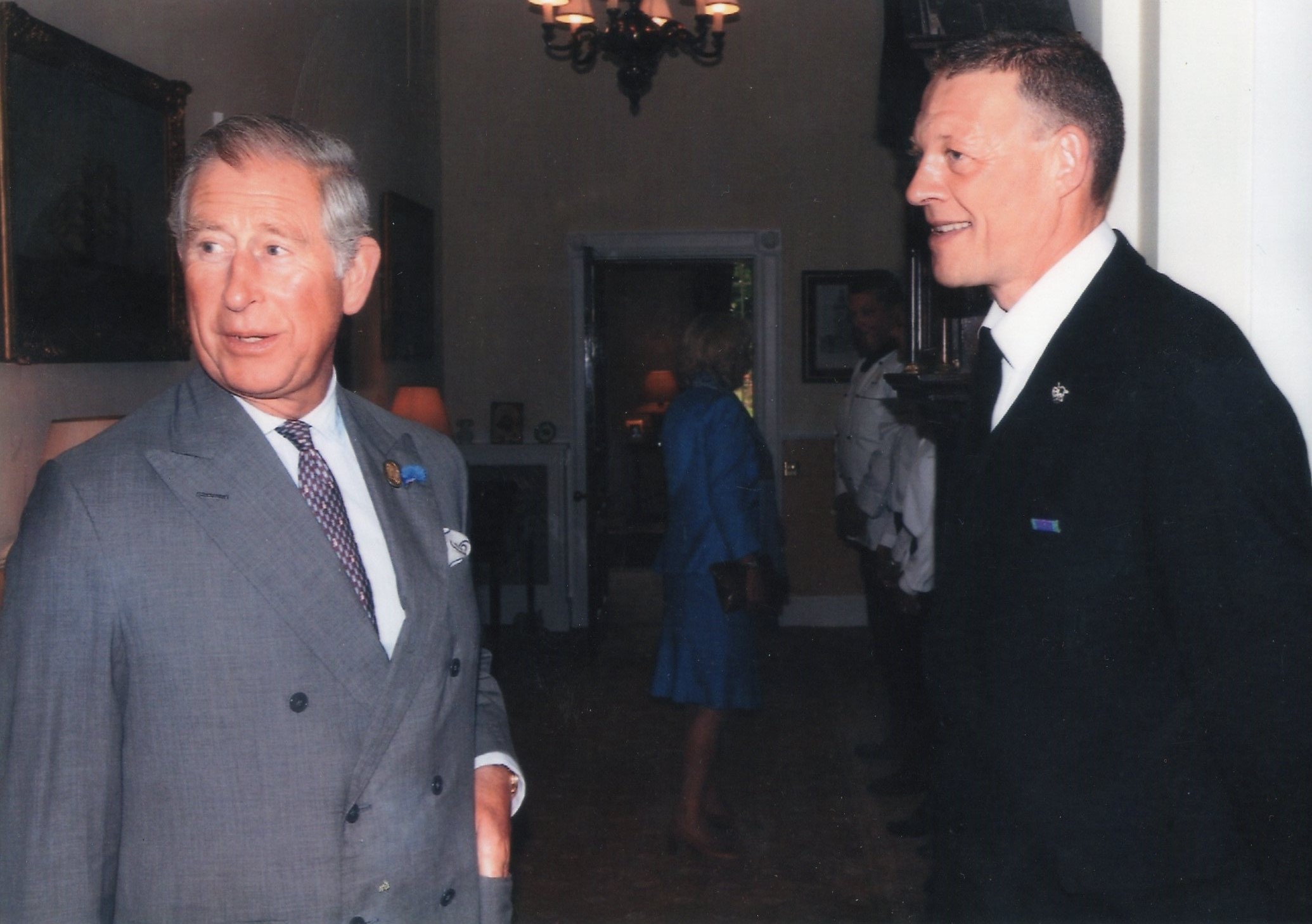
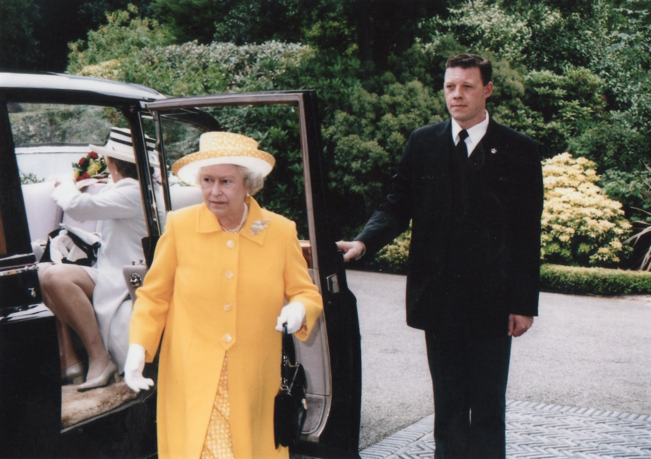
As I work at Government House I have the opportunity to take photographs of what I experience during my shifts. I worked at a lunch party yesterday and as we wait for the bell to ring to collect the plates the chefs prepare the next course, so I took a few images whilst waiting. I used my iPhone so the picture quality isn’t as good as my other photographs. It shows the life behind doors at government house which is an interesting topic.
Picture story design finals
After experimenting with various different designs, I have chosen my final two picture story designs, overall I am pleased with both outcomes.
 The picture story above, was the first one I created, I wanted this one to look more professional and ‘clean cut’. I previously had this design in colour however I chose to change it to black and white because I think It works better and it ties it all together. Although there is no colour I think the black and white makes it look more ‘sophisticated’ and it’s still eye catching. I like the line I have created starting from the top right of photographs of my mum ending with the one on the bottom left, I think this makes the picture stories composition much better and it allows the viewers eyes to travel across the picture story fluidly without jumping from one image to another. I also like the use of photographs of the environment where my mum works because I think it gives the picture story more context and depth. I found writing the captions and the paragraph at the top one of the hardest things to do, however when I got started it became a lot easier. Through out the photographs you can’t see my mums face almost as if I was hiding her identity I think this make it more interesting and mysterious to a certain extent.
This was my second picture story, this one was supposed to be more like something that you would see in a magazine. I had less time to produce this outcome after spending most of my time on the first design, however I am happy with it. I choose to put a background in this one, the photograph is of me and my mum. This photograph is originally a coloured photo however I chose to put it in grey so it wouldn’t be over powering and because it is a memory, almost like a flash into the past. I then put the 4 photographs at the bottom take recently in black and white to establish this difference. I chose to put two photographs of my mum and two photographs of objects of her surroundings to make a pattern and make it more interesting. I used the same text for this one as the previous picture story, however when writing the text I tried to avoid typing over my mums face, so you could see her, which is one of the main differences between the picture stories. Finally, I chose to put a white edge around the title to make it stand out a bit more from the background. This picture is not to overcrowded and much more simple which is what I like about it.
Task 1: Quintissense Exhibition
In advance of our visit, read the Exhibition text below and make notes. Think of at least three questions that you want to find answers to on your visit and write them down. Bring text and notes with you.
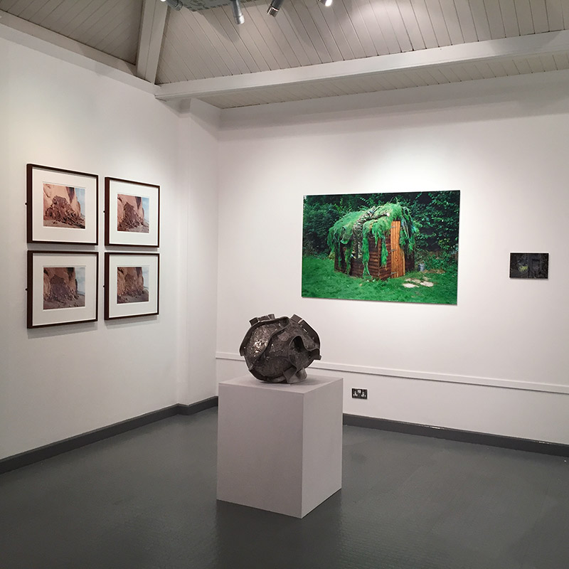
During our research on photo stories and documentation , we looked upon the various ways to document photography in a new, palpable way. Visiting The Jersey Arts Center in early December, we got the chance to view the exhibition ‘Quintessence’. Quintessence is a group exhibition celebrating the first five years of Archisle: The Jersey Contemporary Photography Program.
The Archisle Program, hosted by the Société Jersiaise Photo Archive promotes contemporary photography through an ongoing program of exhibitions, education and commissions. Archisle connects photographic archives, contemporary practice and experiences of island cultures and geographies through the development of a forum for creative discourse between Jersey and international artists. Quintessence selects works commissioned for the new Archisle Contemporary Collection at the Société Jersiaise Photographic Archive since 2011 to celebrate, critique, contrast and discuss what has been achieved over the first five years of the project. Our teacher, Martin Toft is one of the thirteen artists representing his works in the Quintssense exhibition, exploring his project ‘Atlantis’. Other artists include the likes of:
Martin Par/ Tony Ray-Jones / Jem Southam / Michelle Sank / David Goldblatt / Yury Toroptsov / Elsie Wright and Frances Griffiths / Tom Pope / Peter Finnemore / Mark Le Ruez / John Gibbons
Alongside photographs which have been produced in Jersey, Artists such as Jem Southam one of Britain’s leading landscape photographers and David Goldblatt, the seminal documentarist of apartheid era South Africa, have been influenced by the work produced by the archive. Gareth Syvret, the Archive’s leading curator, has singled out Jem Southam as his nominee, prior to studying him since he was a student.
I asked a few questions to Curator, Gareth Syvret about the exhibition:
What did you find was the main themes which run through the show Quintessence?
Has Quintessence changed your perception of Jersey and its cultural diversity? What have you learned from this exhibition?
When curating this exhibition, how did you narrow down which images to select? Was it clear what you wanted to present in the show?
Link to Exhibition text: https://hautlieucreative.co.uk/photo16a2/wp-content/uploads/sites/2/2015/12/Quintessence-Programme.pdf
Link to Media Release: https://hautlieucreative.co.uk/photo16a2/wp-content/uploads/sites/2/2015/12/Quintessence_Media_Release_Jersey.pdf
Link to Task Sheet: https://hautlieucreative.co.uk/photo16a2/wp-content/uploads/sites/2/2015/12/Quintessence-task_sheet.docx
Final Picture Stories
I went with two different kinds of designs for these picture stories to get the most varied spreads and to appeal to more spectators/readers. I went for a traditional newspaper spread taking inspiration from the photo story of The Midwife. I decided to go with this design as it looks really great and I like the idea of making it all black and white with text underneath each image. The second design I went with was a magazine style print which is a lot more modern and I do really like this type of design. I think that it will appeal more to a broader variety of people and age groups as a lot of people nowadays are in to reading magazines.
Newspaper Layout:
For the newspaper layout I decided it would be best to follow two double page spreads to tell my story like my style model as I wanted to develop the story a bit more and for the spectator/reader to be able to visually see as much as possible by adding in plenty of images for them to see and to add more context to the story and the text. I think that this works best as a professional layout and looks good in black and white as well as with all of the captions underneath the images as I think this really makes it that much more professional. I like this design as it is interesting to look at and will hopefully make the reader/spectator want to read on and look at more images. I do think that my title and the text needs to be changed as it isn’t as effective as I would want it to be. I want to change it to the same text as the magazine layout designs as this is the best one that I have written and I think that it works better with the images too.
I prefer this title as it stands out more and seems more interesting to read as it reflects how unpredictable babies are and how much care and attention you need to give them as a parent. I also like the images that I used as they are interesting to look at and give the spectator and insight as to what life is like as a parent having a crazy one year old. I also made the font size of the little captions a lot smaller as that is what it would have been like in an actual newspaper. I like the layout of this design and think that it works well. Overall, this is my favourite newspaper design as it looks the most professional and stands out to me the most. I like the black and white images as it is more like a traditional newspaper layout which I like.
Magazine Layout:
 Here is the final layout of my magazine design. I moved the text and the title to the bottom left hand corner as this is where I had empty space with nothing going on and wanted the focus of the main image to be my niece looking up at her dad. I think that it looks a lot better like this and is more interesting to look at. I like this design as it is the most professional looking out of all of the designs that I have made and looks the most interesting to a spectator. I have also made the font size smaller as it took over too much space and I did want the focus to mainly be on the images rather than to focus in on the text. I think that this balances everything out and it is all evenly spaced out and shaped. I chose these images as I found that they worked well with my text and title showing how fast pace and manic children can be, you have to follow them around constantly to make sure that they don’t get themselves hurt or stuck anywhere. Overall, I am happy with this layout and think that it does tell the story well enough for the spectator to know the story and what is going on within it.

Case Study: QUINTESSENCE
This case study is about developing academic study skills for your next module Personal Study which involves developing a self-directed study based around a hypothesis of your own choice. The final outcome from your Personal Study is to produce a photo-book with a coherent set of photographs (30-40 images) that tell a story or express a personal point of view, including a 2-3000 word essay which relates directly to your hypothesis and body of work.
QUINTESSENCE is a group exhibition celebrating the first five years of Archisle: The Jersey Contemporary Photography Programme (www.archisle.org.je). The Archisle Programme, hosted by the Société Jersiaise Photo Archive promotes contemporary photography through an ongoing programme of exhibitions, education and commissions. Archisle connects photographic archives, contemporary practice and experiences of island cultures and geographies through the development of a forum for creative discourse between Jersey and international artists. Quintessence selects works commissioned for the new Archisle Contemporary Collection at the Société Jersiaise Photographic Archive since 2011 to celebrate, critique, contrast and discuss what has been achieved over the first five years of the project. The exhibition features works by:
Martin Parr / Tony Ray-Jones / Jem Southam / Michelle Sank / David Goldblatt / Yury Toroptsov / Elsie Wright and Frances Griffiths / Tom Pope / Peter Finnemore / Mark le Ruez / John Gibbons / Martin Toft / Finn Larsen
Since its launch in 2011, Archisle has engaged diverse approaches to contemporary lens based media to lead creative research into the condition of islandness, ‘a complex expression of identity that attaches to places smaller than continents and surrounded entirely by water’ (Stratford 2008). Quintessence contrasts works in the Archisle collection in a group exhibition for the first time to analyse the ways in which the Island’s culture and landscape has been interpreted by Jersey and international photographers. The Archisle project recognises that Jersey as a small island community needs to go out and discover the world because the world will not come looking for us! Through internationalism we have developed a growing network of colleagues, friends, influences and inspirations. To reflect these connections, for Quintessence, artists represented in the Archisle collection were invited to nominate colleagues who have influenced or inspired their own visual language.
Curator Gareth Syvret remarked, ‘We do not travel alone; we take with us the histories, knowledge, influences and ideas of others; others we have met and other places we have known.’
As a starting point we will visit the exhibition currently on show at The Berni Gallery, Jersey Arts Centre where Gareth will give a little introduction to his desire to mount this exhibition and discuss possible connections and relationships between exhibited artists.
Meet at Jersey Arts Centre for coffee, Danish Christmas cake and talk
Class 13B Tue 8 Dec Pd 1 – 9:00 am
Class 13E Wed 9 Dec Pd 5 – 2:20 pm
This Case Study has three parts.
First you need to view the exhibition and answer the questions listed below. Second, you need to write a 1000 word mini-essay that reflect your visit and critical engagement with a paring of artists from the exhibition. Third, you must plan and produce a shoot as response to the above.
Deadline and presentation is Mon 14 Dec. Gareth will be assisting me in reading your essay and view photographs and will be providing some feedback for further improvements/ developments.
Present your answers, essay and images in a number of blog posts.
Task 1: In advance of our visit, read the Exhibition text below and make notes. Think of at least 3 questions that you want to find answers to on your visit an write them down. Bring text and notes with you.
Link to Exhibition text Quintessence Programme
Download Quintessence task_sheet
Link to Quintessence_Media_Release_Jersey
Task 2: Upon visiting the exhibition try and answer the following questions.
a) Write down the first thought about the exhibition that enters your head when you walk in?
b) Look at all the images on the walls. Now find a set of images that you like/ don’t like and write short descriptions of them.
Link to folder with exhibited images; M:\Departments\Photography\Students\Resources\Personal Study\Case Study Quintessence\images of exhibited work
c) Using exhibition text, note down artist name, title of work(s), his/her nominated colleague and consider the following:
What are the connections, influences, relationships between your chosen pairing of artists? Look also broader at common themes, subject-matter, form, aesthetics, visual language, methodologies among your chosen artists and across others featured in the show.
Have a closer look at photo books and newspapers on show at the exhibition. This will provide a much deeper understanding of their work.
Link to definition of aesthetics in art
Task 3. Conduct further independent research and write a 1000 word essay.
a) Try and think of an essay question (hypothesis) as a starting point for further investigation.
b) Incorporate your answers to the questions above and any other notes from exhibition text and gallery talk with the Curator.
c) Include direct quotes from sources using Harvard System of Referencing (I will demonstrate how it work).
d) Illustrate your essay with images of artists work from the exhibition. Make sure you include name, title of work, year of production, dimensions, collections (if known.)
Link to shared folder with images from exhibition here M:\Departments\Photography\Students\Resources\Personal Study\Case Study Quintessence
Task 4: Plan a photo-shoot and make a set of images that respond to your chosen pairing of artists and your essay.
a) Upload shoot, process and select best 3 images
b) Show experimentation with images using Lightroom/Photoshop appropriate to your intentions.
c) Evaluate and present images on the blog.
DEADLINE: both essay and photographic response Mon 14 Dec.
A selection of video with featuring exhibited artists where they talk about their work
David Goldblatt on his seminal body of work: In Boksburg
Michelle delivering a lecture on her work
Yury Toroptsov talking about Fairyland the work he produce while IPR in Jersey 2014
Jem Southam on his study of rockfalls
Finn Larsen presenting his work in Greenland over a 25 year period
Atlantus film with interviews
The world according to Martin Parr
From exhibition: Only in England showing work by Tony Ray Jones and Martin Parr
Interview with Peter Finnemore
Tom Pope discussing some his performances
Interview with John Gibbons
Picture Design 2
This is the revised edition of my first design. I wanted to make a much more traditional design template, one which is clearer and more suitable to the type of images I am currently making over the basis of this project. I included the same three images from the first story, however not as a triptych this time.
I felt a lot more confident making this design. I struggled making the the first design and was not happy with it. I learned a lot of skills however and used it as practise for this design
Layout
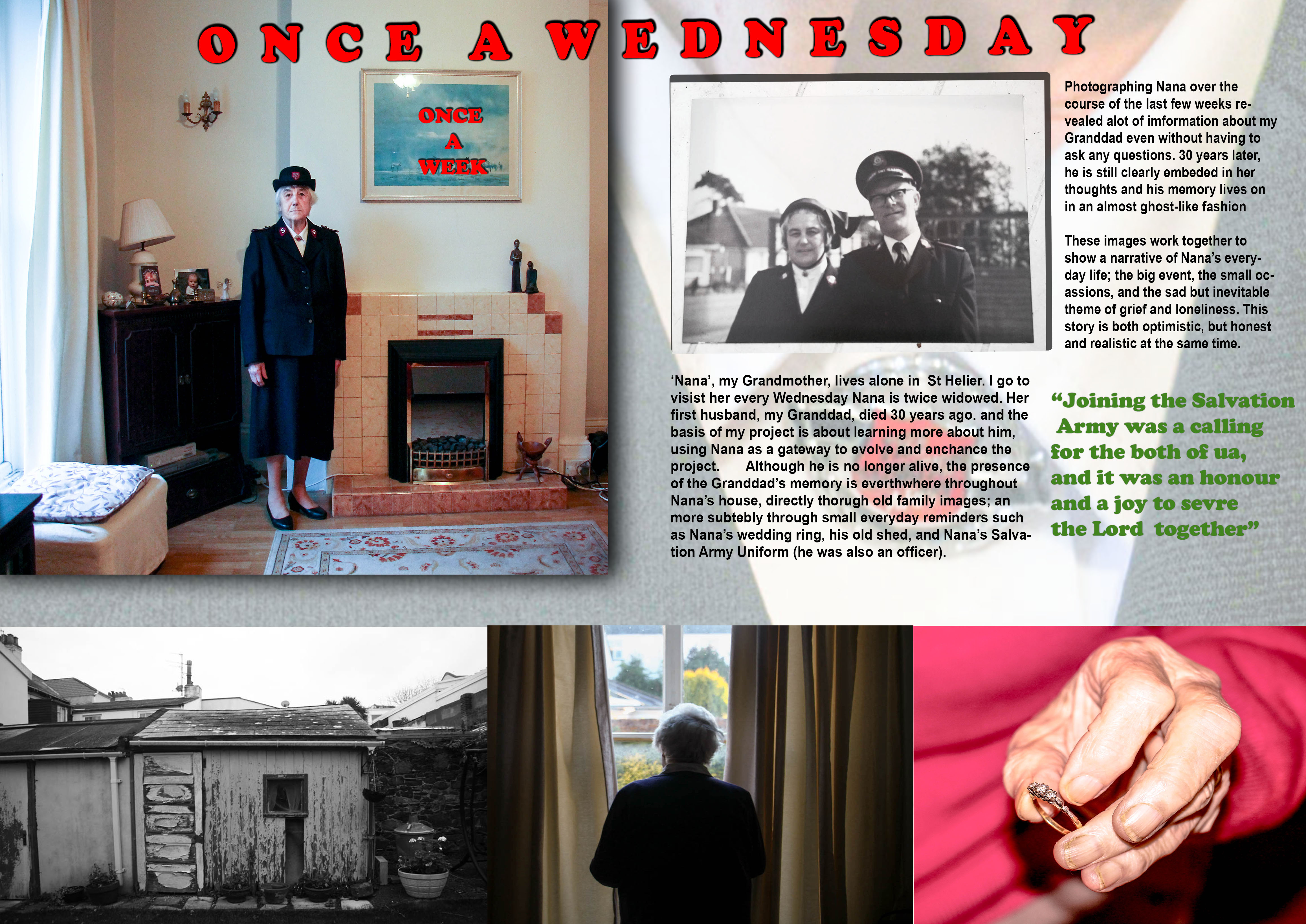
I changed the establishing shot which was originally Nana staring out of the window, to the portrait of her in her Salvation Army Uniform. I decided that this was a strong establishing shot because it directly introdues the theme of the Salvation Army, allowing the link with my Granddad to be easily conveyed as a result. Visually it is also a stronger image
This design, like the previous one, includes a triptych.
- The left-hand image is a picture of the shed in Nana’s Garden – used as the background picture in the previous design. I like this image, especially in black-and-white, because the run-down appearance of the shed in addition to the images high contrast made possible in black-and-white, means the image has a very strong texture, subsequently giving it a powerful and defining presence in the story.
- The middle image is the photo of Nana looking out of her window.
- The right-hand image is the one of Nana holding her ring
I decided for this design not to include any image captions or descriptions. This is because I wanted to create a story which was much more subtle, not giving as much away about the story. Also I felt that in my last design I included far to much writing, and this time around I wanted to simplify the layout.
The relationship shot for this picture is an old photograph of Nana and my Granddad. This links directly to the establishing shot of Nana, the through link of The Salvation Army, as Nana is wearing her Salvation Army Uniform in my portrait of her, and the archive image shows them both on duty, with their uniform on. The Army played an important part in my Granddad’s life and Nana’s also, and so I felt this was a good theme to establish for this story, as it establishes a link between them.
The background image is a close-up shot of Nana’s Uniform. This image confirms the theme of the Salvation Army as the main aspect of the story. Visually it is a good image to use as a background because it allows for text to be written over easily whilst remaining clear.
The use of drop shadow, which I have included for some of the images is effective because it helps to make the image visually stronger. I have done the same for the text in order to make it bold and easy to read, as I found on reflection that the text in the first design was visually quite weak. The red colour of the text further adds to the bold presence.
The quote is a reference to my Grandparents service in the Salvation Army. I chose this quote to make it relevant to the underlining theme of the Salvation Army, further adding context to the narrative.
Evaluation
Overall, this picture story is much more better than the first one. The images flow more on the page and the story and text fits much cleanly on the page. The inclusion of the drop shadow for the images and creates for a three-dimensional perspective, adding strength and depth to the presentation
Picture Design 3
I struggled in the making of my first picture story design. I was just working out the different process and photo-shop skills needed to make a photo-story and so I found the process to be very challenging. I had no clear plan of how to go about making my first design and so tried to be as creative a possible in the designing process, changing my themes and ideas as I went along.
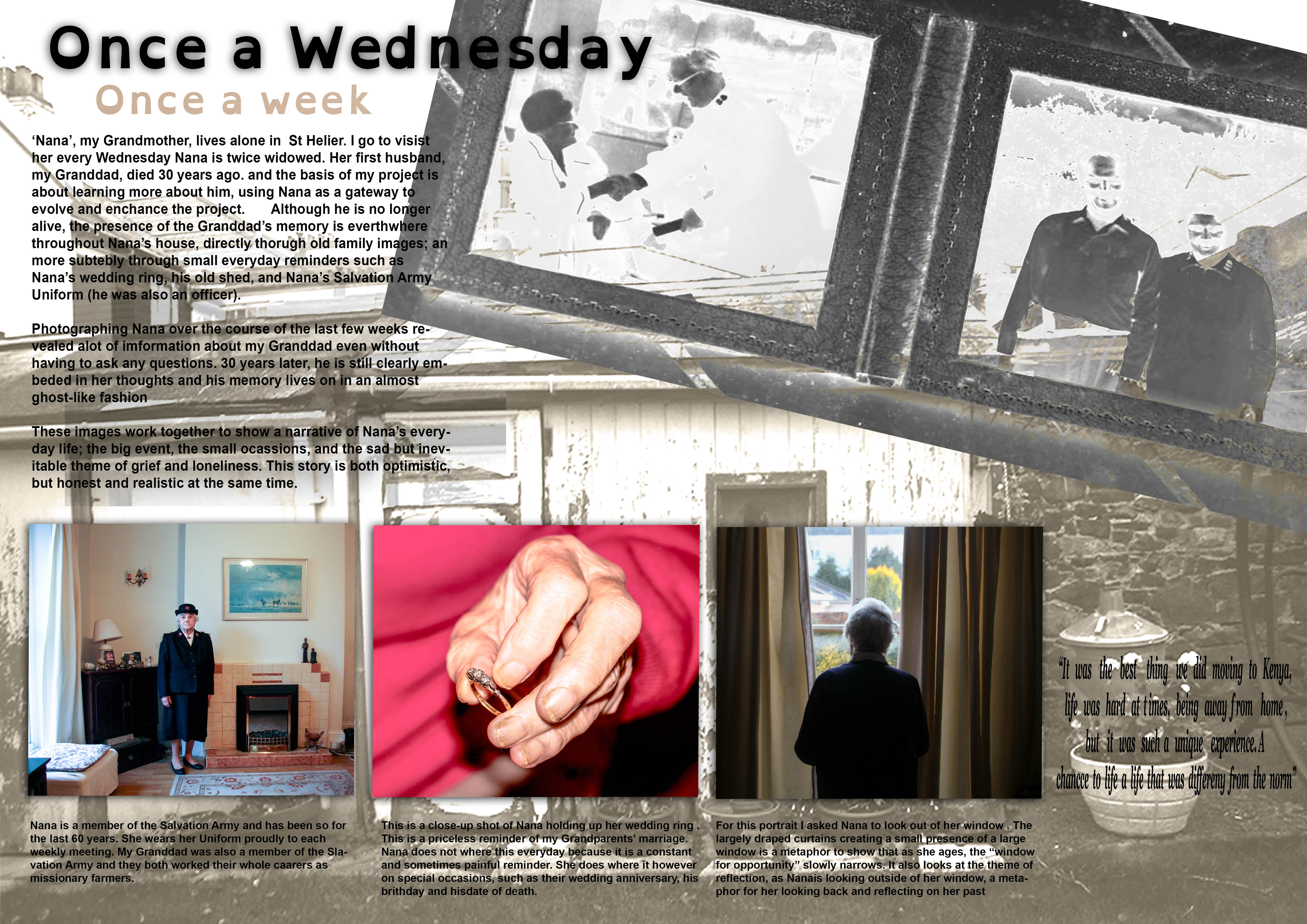
I started of by selecting my title. I decided on the title of ‘Once a Wednesday, Once a Week’ because it was the title I had previously used for by AS Exam Book I made and it works quite well.
Main Images
The three images in this story work as a triptych
Left-hand image: This portrait of Nana in her Salvation Army uniform is an ‘environmental ‘ shot. This is a good image to use as it is a strong and confident portrait that clearly establishes the theme of the Salvation Army. There is a sense of order to this image, it is calm and well considered, and therefore allows the viewer to reflect the theme in a focused way.
Middle Image: The image is a close-up shot of Nana holding her wedding ring which she wore when she was married to my Granddad. The close-up shot is very reflective of the style of Martin Parr (extremely close-up abstract style and with the use of flash), making for a strong, detailed image. Using a similar style to Parr was important in this instance in creating a raw and authentic image. For example, the rugged appearance of Nana’s hands which this style achieves highlights somewhat a biopic of her life, one which has been of hard-work and sacrifice to raise children whilst devoting herself to her work/religion at the same time. This makes the story more realistic.
Right Image: The last image of the series shows Nana staring out of a window in a reflective manner. This image is contains a lot of metaphors which I have explained in the image description. I find that this image works very well as an establishing shot because it is a strong image but at the same time is not too specific and keeps to the subtly of what I am trying to convey
Background Images
The way the background images have been arranged is quite unusual. The old photograph of Nana and my Granddad that I have included has been blended in the layer mode to present it in a silhouette style. This is a feature I have embedded into the story which explores my how Granddad and his memory almost a ghost-like apparition to Nana – still existent but an old and fading memory. The other image, a black and white image of a shed in Nana’s garden, again is presented in a very dream-like manner.
Text
The main body of text briefly explains my project learning more about my Granddad, and the work I have been doing with Nana in relation to this project.
The captions explain my image choices and provide context to the story in a narrative-like way.
I have included a quote which is a comment Nana made concerning the time they spent in Kenya. I included this quote because it explore how Nana often reflects into the past in a fond way.
Evaluation
I have worked hard in making my first design and it has been a good practise. The actual design however is very complicated and a bit confusing in terms of layout, especially the text. For my next design I think it will be a good idea to go for a slightly more traditional picture story, as the type of narrative I want to convey is more suited to this. I also need to reconsider my image selection to be able to give a more directed narrative.
Picture Design 1
Inspiration
It is unquestionable that the death of a loved one is extremely horrible and painful. However the phrase “time is a great healer” is extremely accurate. A reality of life is that people learn to cope with their love ones dying, a difficult but natural process. Grief is not a bad thing, it teaches people to accept that someone is gone and learn to move on with their lives. Grief is personal and subjective process and I believe it is deceptive to show grief as negative and soul destroying. Death is a major taboo in western society, and it is considered wrong or insensitive to grief in a way other than solemn reflection. A lot of non-western cultures, especially in Africa and South America for instance treat death and funerals as a major celebration that is reflective of happiness and joy. In Atzec dominant regions of Mexico for example, they have a celebration known as ‘Dia de los Muertos’, meaning ‘Day of the Dead’, a ceremony in which people celebrate the lives of their passed loved ones in a very open way. This alternative view of death is very interesting.
My thoughts
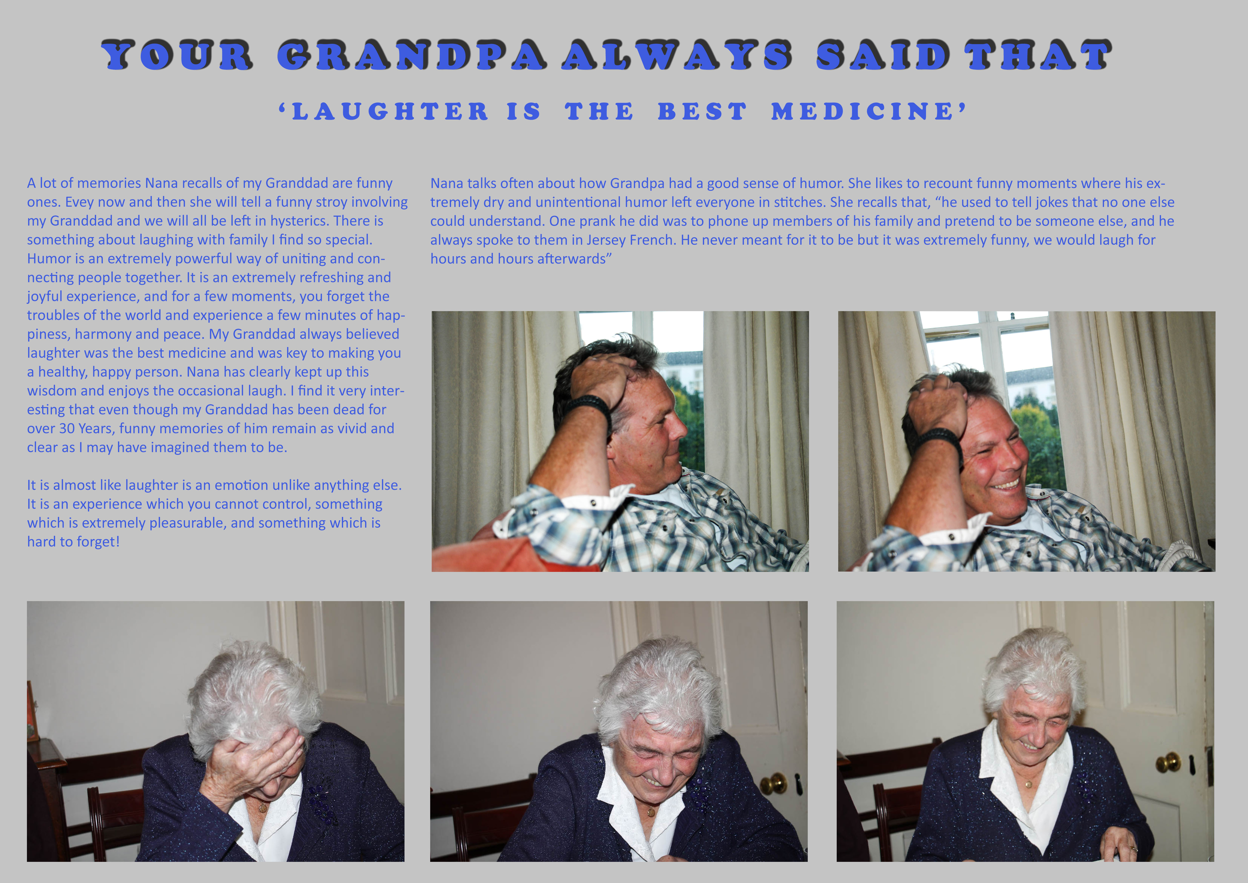
A big issue I have had recently is my representation of Nana in my photographs. A lot of my images seem to represent Nana in a way which is sombre and sad all the time. Whilst it is true that Nana misses him greatly, it is not fair to say that she spends her whole time alone or sad. My Granddad died over 30 years ago. It is simply untrue to say that Nana has spent every single day of this existence sad and unhappy. Instead, she carries his memory on through the joy he brought his family, his achievements and the example he can set for everyone moving forward. Nana has never been uncomfortable talking about him. A large part of her grieving process was and still is laughter. She is always recounting jokes about my Granddad, remembering the life he lived, not that he is no longer hear. This I feel brings her great solace and comfort and so of course be represented in this project.
Analysis
Therefore this picture story is my way of questioning my own style of portraying Nana in this project. Instead of just portraying her as sad for my Granddad’s passing, I want to represent the more pragmatic viewpoint that although she misses him greatly, the thought of him does not actually sadden or distress her. She still has a lot of reason to be happy in her life, a lot of family and a modest amount of close and long-standing friendships. It is important to show this part of Nana’s life as it is a more honest way of presenting the type of person she is, someone who struggles with loneliness and grief, yet at the same time someone who embraces life as something which is joyful and precious.
Summary
I like the idea of what I have done because it is a very simplistic idea. I enjoyed making the picture story and it was refreshing to create images of Nana which are happy and joyful, something I should do a lot more often moving forward in this project. My Granddad at the end of the day was a normal man who liked to have fun. Nana recalls that he always believed, “laughter is the best medicine”, which is what I have based this picture story on. I don’t think he would want his family to think of him in a sad or tragic way. Of course it is sad that I never got to meet him, but and the same time and I think he would be pleased that Nana is keeping his memory alive in a happy and positive way, and that his existence was never something suppressed behind a taboo of the fact he is dead.
Here is an extract from a documentary looking about how the Aztec’s view death. The contrast with how we as western countries view death is startling and interesting to reflect on.
Picture Story Experiments
These images show the progression of what I did with my images on photoshop. I started out trying to create a magazine type article, and experimented with colour, black a white, drop shadows, opacity of images, sizing etc.
When I got to the second draft, I though about doing a 4 xA4 spread, as I had so many images, but then realised that the second page of images didn’t really add all that much to the story, so decided to leave it.

I then tried to experiment with having no drop shadows and harsher lines with the images. Which then progressed to me making a Newspaper article instead of a magazine article.

I then experimented a little with different image layouts and then reached a final decision on how the images would be played out and so I started adding the text.
This was the final newspaper design I came up with, and I personaly think it looks fairly professional. I designed it in the same way as our local newspaper, the Jersey Evening Post is designed, copying the header to make it look more realistic, and using similar fonts and layouts.
When I finished the newspaper, I went back and designed a magazine, although this time I decided to split the page in half and make a clear centre point, as though it was presented the same as it would be in a magazine. This helped a lot with making the design look professional.
Originally the background images and the quote in the bottom right were black and white, but then I decided to keep the colour theme with the banner in the top left, and so made them red, which, for the background images, made the writing easier to read.
Photos for Picture Story
These are the pictures I have decided to use for my picture story. I feel that these were the best images from the weekend and they best represent the whole weekend, with a range of different images.


