Category Archives: Uncategorized

Filters

Author:
Category:

How has the experience of Archisle changed the way I think about my personal study?

Over the last term, I have managed to gain a wide variety of skills which contribute to archive research,  extraction, development and documentation. The creative pathways scheme has gained me vital competences in a creative  media, and has allowed me to feel confident in a workplace which is surrounded by these demands. Gareth Syvret and Karen Biddlecombe have helped me consistently to discover a new perception and insight into my personal study. Me and Karen extracted work from the archive which dated back to the post-war era, then with help from Gareth, we went through the images to see how it collaborated and linked with my project. This gave my project a new window into understanding the depth and relevance of me moving house.

_MG_4490
The first image we came across on the Archive’s computer system. When typing in the name of the house ‘Le Petit Fort’, we managed to come across this extraordinary image which was taken right in front of the house. This image made me think of how far this house has come since the war / post war era, and made me feel empathy towards the tragic and horrifying events which occurred around my house and within the proximity. Gareth and Karen have given me inspiration to explore this is greater depth, and can do this using montage, and merge in Photoshop, possibly to create this image of development and sentiment.

_MG_4491

As a final response, Gareth suggested that it was a good idea to place all the archival material we collected as a chronicle, for the viewer to understand the idea of a process, a space of time and a development, some of the key aspects I wished to consider in my project.

This is an example of how we pieced the final images together:

After this experience, I asked myself a few questions:

How has this experience changed my perception of the Archive? 

When entering this process, I knew little about what the Archive does, and how it works towards the achievements Gareth and Karen co-ordinate. I realised soon after that my own perception of the archive was far from correct.  There are various key aspects to the ‘Archive’ such as the archive itself, with images dating back over hundreds of decades. Sections of this can be used for the demands of Archeologists, Planning commissions, the Jersey Government, botanists, the environmental departments and many more to help with the development of their own investigations and relevance to history. The Library is also used thoroughly for archive extraction and exploration, with facilities like computers which link to the Archives database, which allows people to search using key words material they wish to extract. During my experience with the archive, I was lucky enough to discover some of these key aspects which are encapsulated within the Archive, I have learnt allot during this process.

What do you think when you hear the work ‘Archive’? 

When I hear the word ‘Archive’ I instantly hear the words

” records /  annuals / chronicles / registers /  accounts / papers / documents /  rolls / dossiers / files /  deeds /  ledgers /  history /  information / evidence /  documentation / paperwork / formal muniments.”

The oxford definition for ‘Archive’ is:

“a collection of historical documents or records providing information about a place, institution, or group of people”

The repetition of the word ‘history’ and ‘historic’ elaborates the vast relation to family, architecture and other aspects of society which has been developed over the many years of archival information which is stored at the Societe Jersiaise. Archive has been very relevant towards my project, my key theme ‘family’ has encouraged me to find features which relate to my life changing experience when moving house.

How will these skills be useful to you in a creative / non- creative workplace? 

I feel very much so that I have developed various skills in the creative workplace by the extraction, exploration and editorial processes of images and text presented by the Archive. Gareth and Karen have given me allot of support in the beginning weeks of this process, which then slowly got handed over to me. I was given tasks to do independently, allowing me to feel good about the outcomes I was achieving. Doing simple jobs like printing and filling also made me feel apart of their work force. Developing images in Photoshop, re-sizing and editing gained me skills with the editorial processes which are vital when depicting a certain hypothesis within an image.As well as developing creative skills, I feel I have developed major ‘soft skills’ in the workplace, which would be vital in any work-related area. I feel allot more confident with handling images and media, and genuinely confident to chat and talk to Gareth and Karen. I felt having a good relationship between the two of them incised me to communicate with them better. I felt the privileges of having a responsibility in the workplace made me feel motivated towards my goals of my project, and I became willing to succeed in Archival research and handling of materials. Punctually, turning up to a job encourages you to be more independent, and I felt as this process came along I gained more and more enthusiasm towards my want to succeed as a willing and passionate intern, as I saw the goals I wanted to achieve.

Would you recommend the Archisle contemporary photography programme to other people? Why? 

I would defiantly recommend this programme to anybody who is passionate about archival research and history. I feel it’s an amazing experience which I have gained so many important skills from. Gareth and Karen have been amazing role models in the work place, and they’ve inspired me to “make a mark” on history, encouraging me to think outside the box with my project relating my documentations to real life circumstances. I would of never felt confident working in a creative or non-creatove media without the help and commitment they have done for me, as their provision and time for my contribution has never been so beneficial. I am so grateful for the time and effort they have done for me, and they skills I have gained will help me incredibly in years to come when I pursue a career in any field of work.

 

EVALUATION

Throughout this project of faith, family and community i have found it quite hard to produce images of my mum who i have being taking images of her for, i was taking these images of her mental health issues. I found this a hard thing to take images of as when my mum is upset it is quite difficult for me to try and interfere and take photographs of her, as i feel i am invading her privacy and she does not want me to take them of her. What i learned from this is that it is quite hard to photograph something which is so personal, to myself but also to my mum as it can become quite upsetting when questioning anxiety and panic attacks, as i think it is hard to capture something that someone is feeling on the inside. If i was to do this project again i think that i could improve my photos by taking images of things that my mum is afraid of, or gets anxious about, as i think this would be a good thing to look at, However i do think it is very difficult as it is a very personal matter. 

FAMILY SHOOT – WEDDING/ EXTRA SHOOT

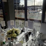
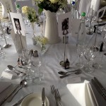
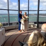
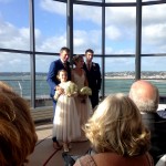
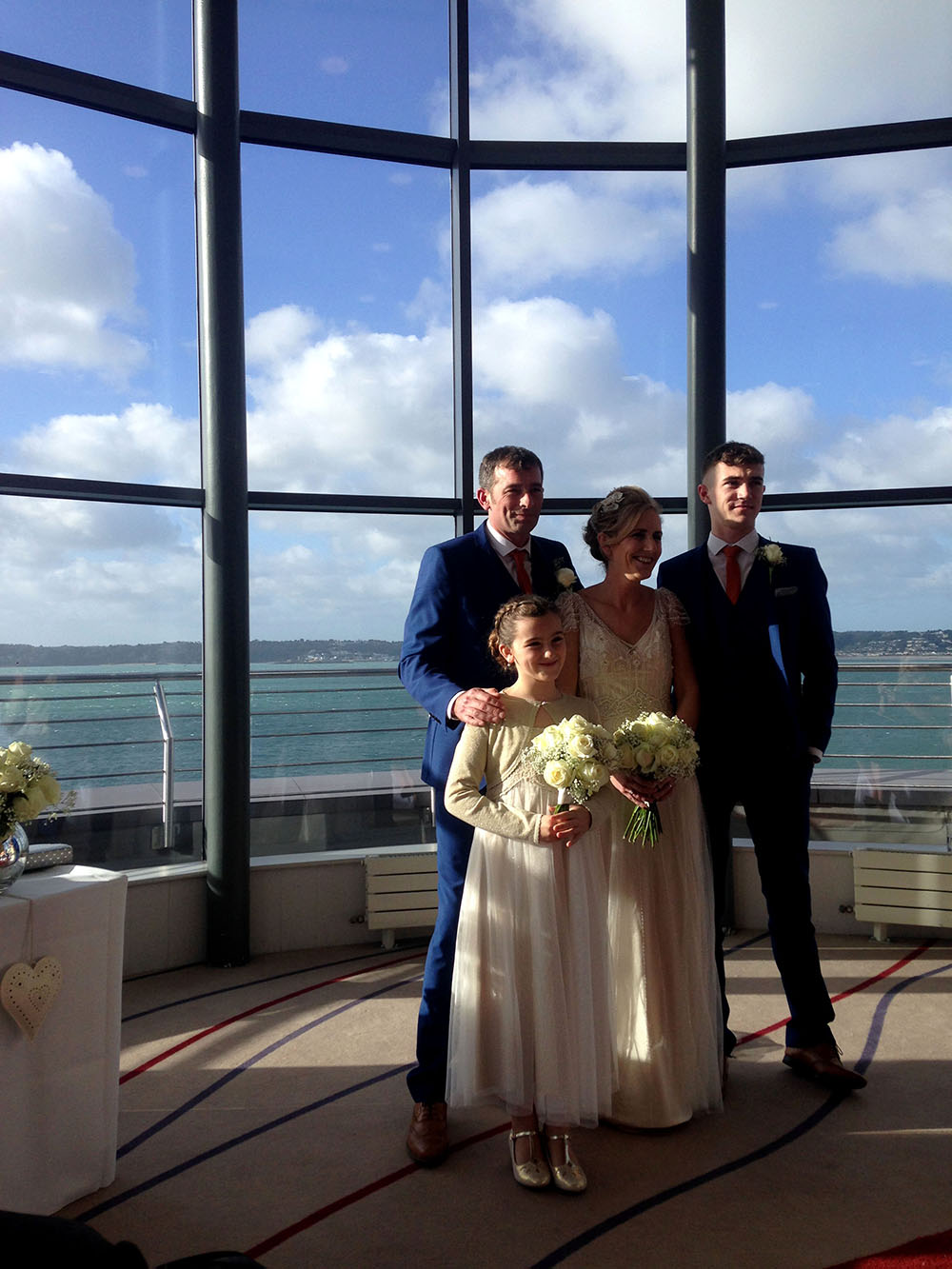
I took these images at a wedding that i was at. I took these images as it was my Aunt that was getting married and this was a family and friends occasion which i thought tied into this project. I took some of these images of the bride and groom but also of the setting to show how beautiful the location was. I took some detailed images of the bridesmaids hair which i thought would work well in a picture story as a detailed shot. 

IMG_8686
Bride and groom with ring boy and bridesmaid

I took this image which is of the family. This is a traditional family shoot that i took, however i think that it is good to have at least one or two traditional wedding images. This image was taken at the reception which was at The Radison and i think that this is a beautiful family portrait. 

IMG_8718

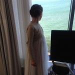
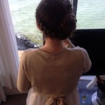
For this photograph that i took of the bride, i took it from behind so that you can see the detail of the back of her dress, this is so it shows how beautiful it is. I think that the lighting in this image could be improved as the bride is in a shadow and there are streaks of light coming through the windows to the left of her. I think that this image shows the idea of family, as this is my Aunt on her wedding day interacting with all of her friends and family. IMG_8816

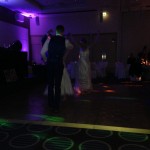
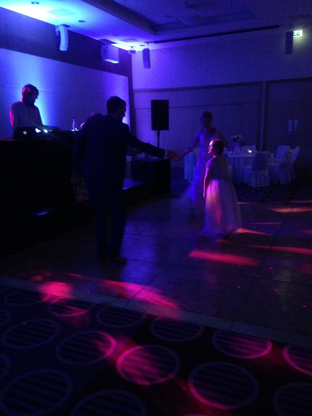
This is one of the images that i took in the night time of the wedding, i did not use the flash for this image as i liked how the lighting looked in this image. I think that the different blues, purples and pinks in the image make this image very ‘cool’ and unique. In this image the bride and groom and the bridesmaid who is their daughter having their first dance on the dance floor, i captured this family moment which i think this image is very warming. 

QUINTESSENCE

Two questions that i would like to find answers too when visiting the exhibition after reading the text are:

Q1: Why did you choose these photographers to be exhibited? 


Q2: Did all of the photographers which you choose explain why they choose the other photographer to be placed alongside their images?

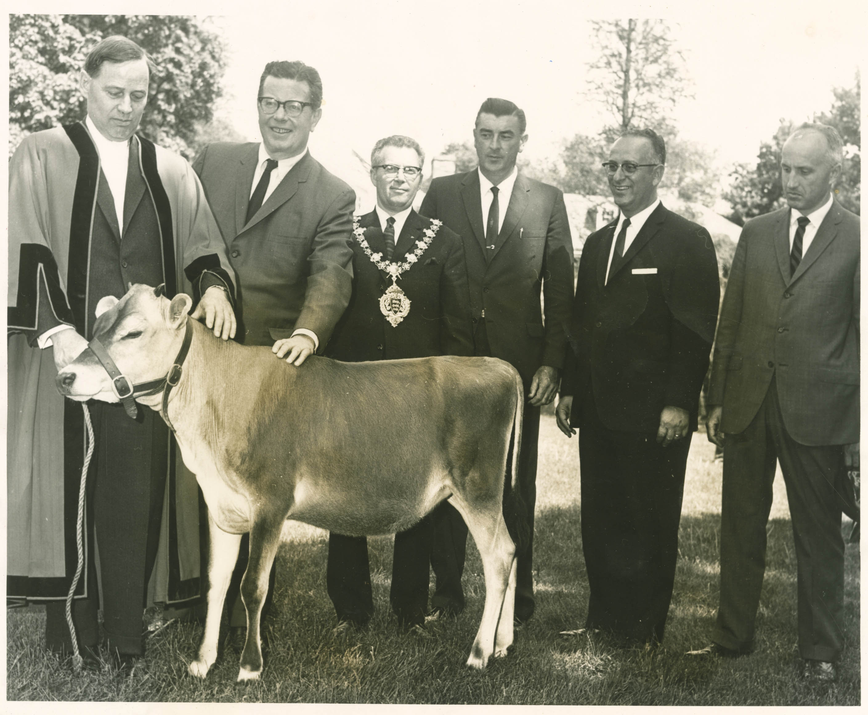
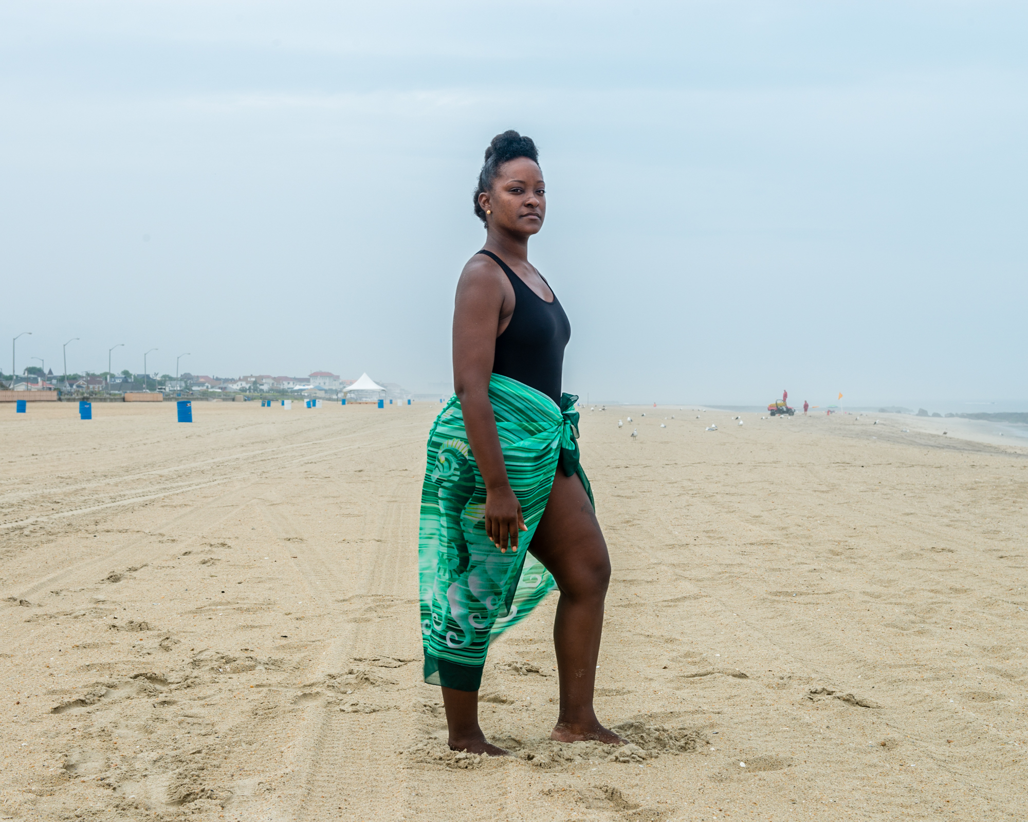
015 1034674_orig Al nr 2_2000 Al nr 4_1000 and_the_earth_a_1-59464e7563bd17e84129851cf666bdabb7f619da

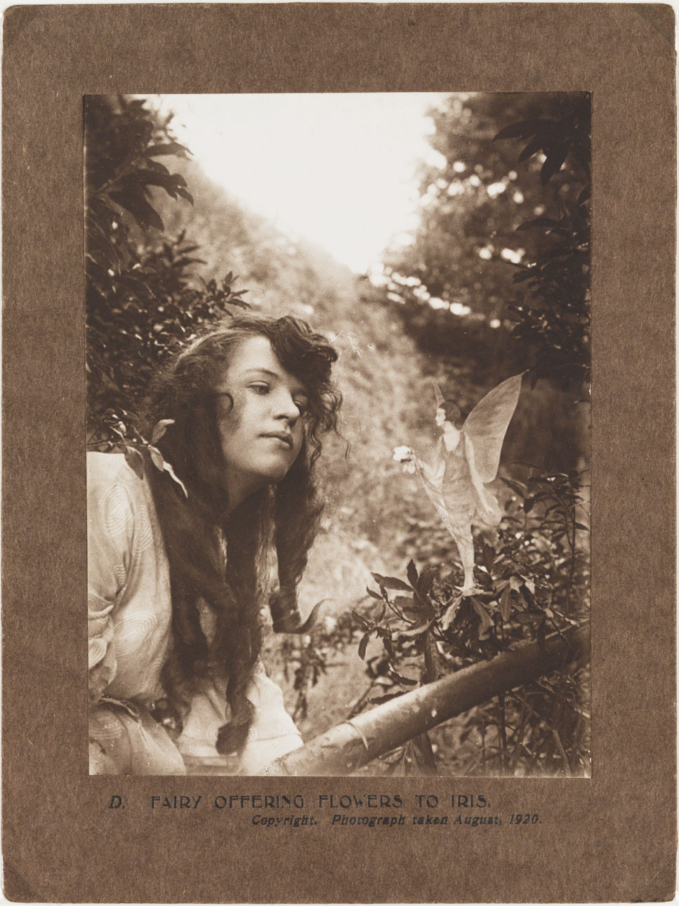
A photograph of Elsie Wright (1901-1988), taken by Frances Griffiths (1907-1986), in August 1920. A fairy stands on a tree branch offering Elsie a small bunch of flowers. After the first two fairy photographs had appeared, 'experts' demanded further proof. Edward Gardner - a leading Theosophist fascinated by fairies who had authenticated the earlier photographs - travelled to see the cousins. Gardner gave Elsie and Frances two new cameras, with secretly marked photographic plates to detect any tampering. He asked them to take more fairy photographs - of which this was one. This fairy's 1920s hairstyle attracted much comment at the time. Sceptics argued that the fairy kingdom was unlikely to be in step with the latest human fashions. The story of the Cottingley Fairies began as a practical joke in Cottingley, near Bradford, West Yorkshire in 1917. The photographs of the 'Beck Fairies', as the girls called them, went on to become one of the most famous examples of image manipulation in photography.
A photograph of Elsie Wright (1901-1988), taken by Frances Griffiths (1907-1986), in August 1920.

David-Goldblatt-FHCB_4-728x735 DSC_0245_Final

GB. Jersey. St Helier. Liberation Day. 2013.

Galinthia album nj12

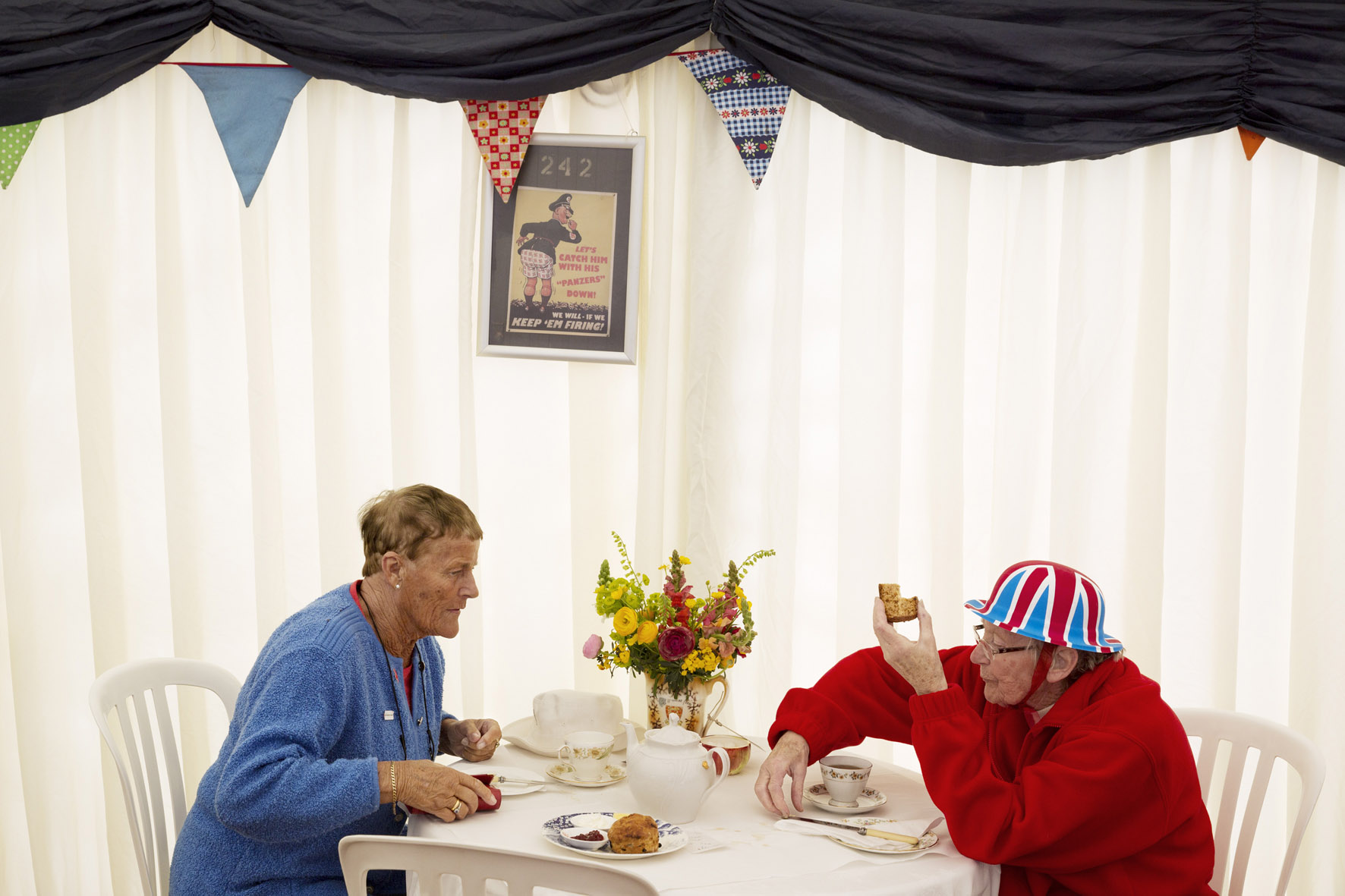
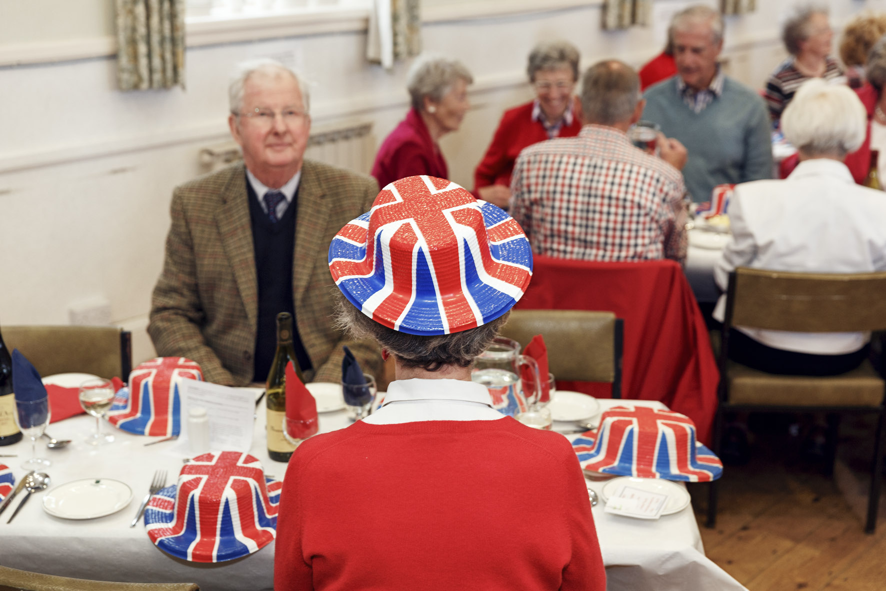
GB. Jersey. Liberation Day Supper at Trinity Parish Hall. 2013.

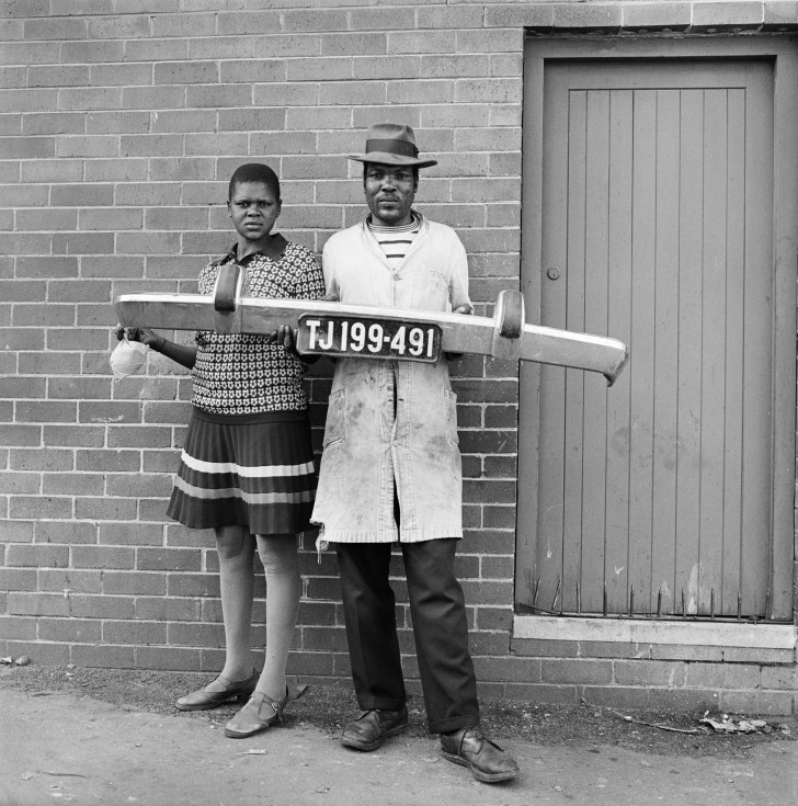
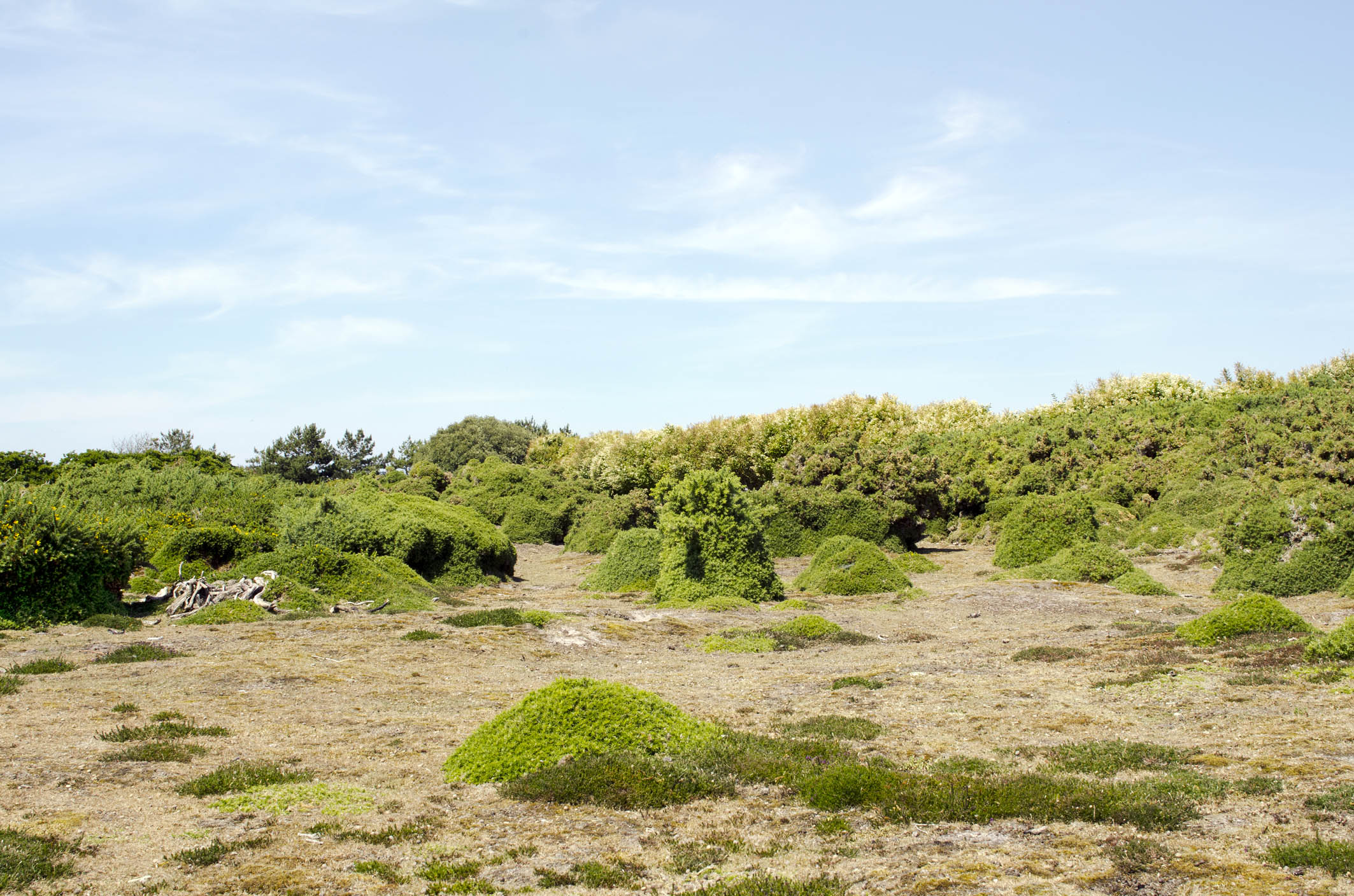
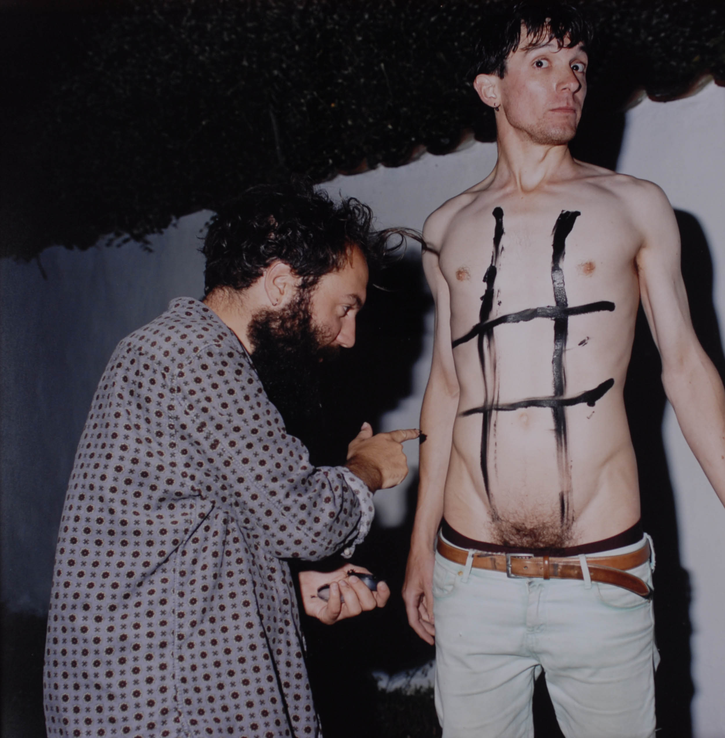
These are some of the images that were displayed at the Quintessence, i choose these images as i think that these were the best images that were displayed at this viewing. I think that these images, whether they were taken in Jersey, Channel Islands or in other places around the world, are interesting to see the different cultural changes in different locations. I think that at this exhibition it was interesting to look at what artist a photographer choose to place their work next to, and what photographer they choose made me think why did they choose that photographer? and was their any specific reason, for instance, did they choose that photographer for their work to be placed by because they inspired their work that they have done as a photographer, or was it because they enjoyed their piece of work that they had done, this is what i thought when i was at the exhibition. As these are the images that i liked at the Quintessence their were also images that i did not like, this was because i thought some of the images were a bit explicit and should not of been displayed at this exhibition, however as these images were taken by Tom Pope i think that, by his nature he was just trying to change the perception of what people think is acceptable to be displayed at an event like this, and for that i think that the images he choose were good images to be placed into the Quintessence. 

Essay:


When thinking of an essay question, things that need to be included are what are the connections, influences and relationships between your chosen pairing of photographers? Common themes, subject matter, form, visual language, aesthetics, methodologies can be looked at to gain a further understanding as to why the photograph choose the other artist to sit by their work but also others that were displayed in the show. 


013 015 1034674_orig Doc1

These are the two images that Tom pope choose of his own images from when he was working with the Jersey Archisle, but also the two images of Peter Finnemore that he choose. 

Q – How has Peter Finnemore influenced the style and genre of Tom Pope’s photography? 

Through researching Peter Finnemore and looking at his style of work, i think that their is a link with Tom Popes, as both work seems to display an idea of fun and play within their pieces of work. I think that both of the artists, Pope and Finnemore seem to have a wild imagination, where they add an aspect of what could be called ‘child’s play’ into their images. I think that through this you can directly see links between both artists which draw connections and show that Tom Pope has been inspired by Peter Finnemore. 
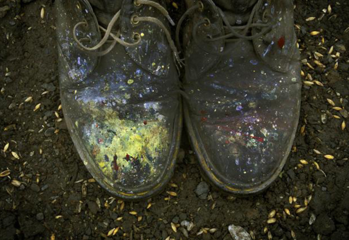
Peter Finnemore’s images seem to be colorful, as of the ones that Pope has chosen of his images to display, i think that Pope choose these two images because he himself found these images very imaginative and liked them himself, but also because i think that Peter Finnemore’s work is one of the artists that inspired Pope to start taking his images. Both of these artists seem to have a similar style, in a way that they bring their humor into the images that they take, whether this is to make their audience laugh, or just for their own amusement. I noticed something which i found quite interesting in both pieces of the artists work, i think that both of these artists seem to take their images in their everyday life, of these that they are doing at the time, not many of the images seem like that have been staged, however a few are staged so that both photographers get the right image that they want. The image called ‘garden shoes’ which Pope chose of Finnemore’s to be displayed is a simple image, this image silently has an idea of fun and playfulness behind the image, i think this because the shoes are colourful and have paint splattered on the images. Within Finnemore’s photographers i think as some of Popes images are, there seems to be an idea of chance within the images, as some of the images would not just occur, the photographer has to be ready, for at any time an interesting idea for a photographer could occur from a location, this is known as a theory called psycho-geography, this is where a location can give a photographer an idea of a photograph to take. 

It can be argued that Pope does not seem to be inspired by Finnemore because some of Finnemore’s images seem to be set up, whereas most of Pope’s images are because of being in the right place at the right time, for this reason i think that there are not direct links between the two artists. Also one of the images that Pope choose to display of Finnemore’s is called ‘Koan Exercises. 2004’ i think that this image shows how both of the artists work is not as similar as it is made out to be, this is because most of these images in this series do not include people, a few of the images in the series do, however i think that this shows how Finnemore prefers to not have people in his images, he likes for a location or a setting to describe what is happening in an image on its own. 

Overall i think that it is clear that there are some direct links between Finnemore and Popes work which shows that Pope has been influenced by Finnemore in that they have a similar genre and style of photographs that they both choose to take, however it is also shown that both of the artists to not share all the same connections, because i would say that their style differs in how they choose to take their images, to a certain extent Finnemore takes his images using the theory of psycho-geography, however i think that most of his images are staged in comparison to Pope’s photography which is all to do with the theory of change. Furthermore it is clear that both artists challenge the perceptions of what people think is ‘normal’ to photograph and they do this through their quirky images that they both take. 


Task 3: Conduct further independent research and write a 1000 word essay

Try and think of an essay question (hypothesis) as a starting point for further investigation. 

Incorporate your answers to the questions above and any other notes from the exhibition text and gallery talk with Gareth Syvret (curator of the show). 

Include direct quotes from sources using Harvard System of Referencing. 

Illustrate your essay with images of artists work from the exhibition. Make sure you include name, title of work, year of production, dimensions, collections (if known). 

Link to shared folder from images included in the exhibition:

Task 2: Response to the Quitissence Exhibition

Upon visiting the exhibition, answer the following questions:

Look at all the images on the walls. Now find a set of images that you like / don’t like and write short descriptions. 

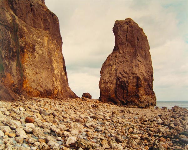
My first set of images which I favoured very highly where the works of Jem Southam’s “Red Mudstone, Sidmouth” (1995 – 1997) as I really enjoyed viewing the vibrant colours and diptych effect.

jem-s.
“Red Mudstone, Sidmouth” (1995 – 1997)

Ironically, I didn’t like Peter Finnemore’s interpretation of Southam’s images, as I felt they didn’t appeal to my style of photography. Finnemore’s works in the exhibition entitled ‘Koan Exercises, 2004’ Performance based photography is Finnemore’s speciality, and in my opinion , I don’t favour it to normal documentary-based photography as its too materialistic and stylised.

The second image  that I favour highly is Martin Toft’s   from the series ‘Atlantus’.

Using exhibition text, note down artist name, title of work(s),  his / her nominated colleague and consider the following:

Artist name:

Title of work (series): 

Nominated colleague: 

Title of work (series): 

What are the connections, influences, relationships between your chosen pairing of artists? Look also broader into the common themes, subject-matte, form, aesthetics, visual language, methodologies among your chosen artists and across others featured in the show. 

Have a closer look at the phonebooks and newspapers on show at the exhibition. This will provide a much deeper understanding of their work. 
Link to definition: 

Task 1: Quintissense Exhibition

In advance of our visit, read the Exhibition text below and make notes. Think of at least three questions that you want to find answers to on your visit and write them down. Bring text and notes with you. 
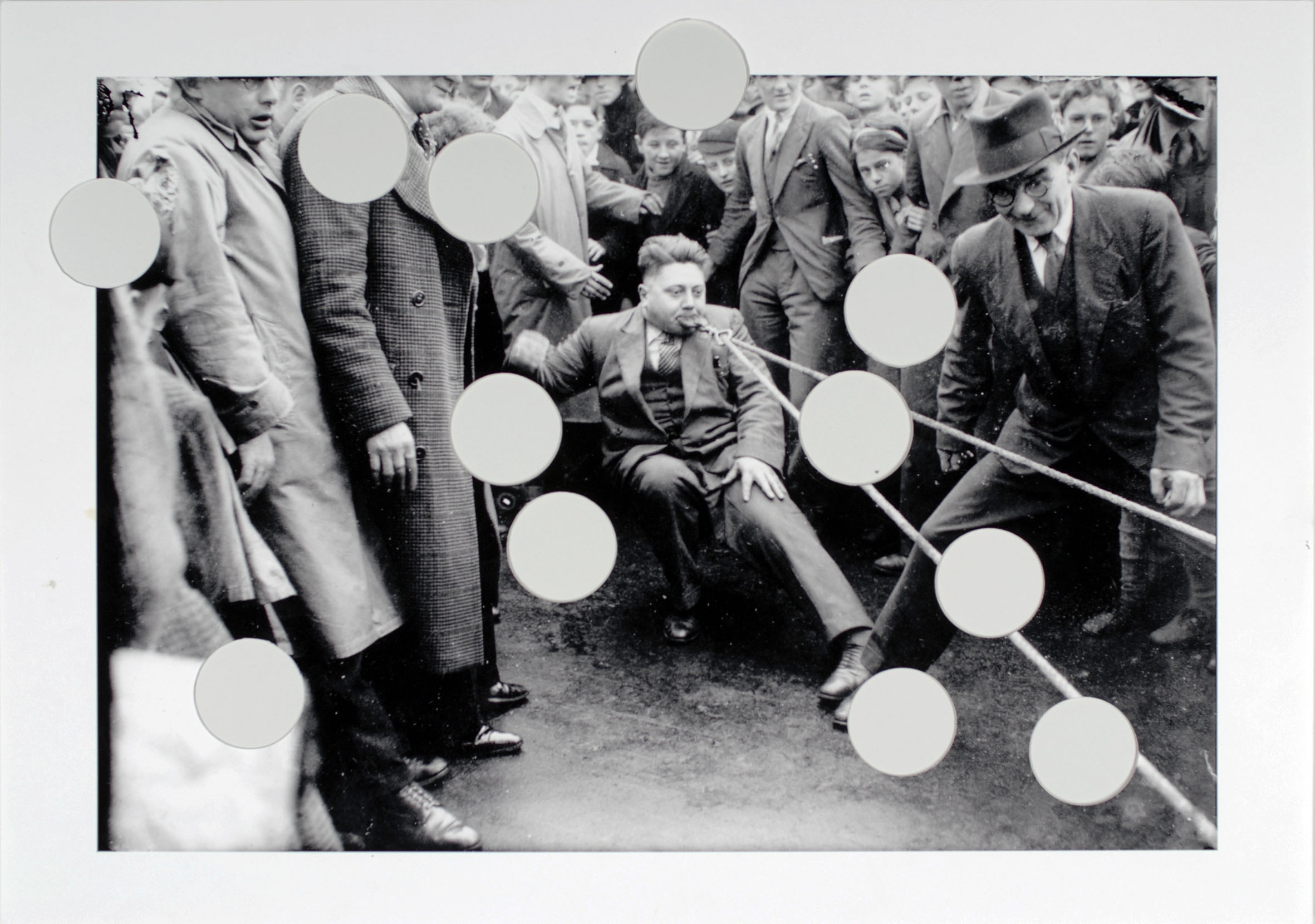
During our research on photo stories and documentation , we looked upon the various ways to document photography in a new, palpable way. Visiting The Jersey Arts Center in early December, we got the chance  to view the exhibition ‘Quintessence’. Quintessence is a group exhibition celebrating the first five years of Archisle: The Jersey Contemporary Photography Program.

The Archisle Program, hosted by the Société Jersiaise Photo Archive promotes contemporary photography through an ongoing program of exhibitions, education and commissions. Archisle connects photographic archives, contemporary practice and experiences of island cultures and geographies through the development of a forum for creative discourse between Jersey and international artists. Quintessence selects works commissioned for the new Archisle Contemporary Collection at the Société Jersiaise Photographic Archive since 2011 to celebrate, critique, contrast and discuss what has been achieved over the first five years of the project. Our teacher, Martin Toft is one of the thirteen artists representing his works in the Quintssense exhibition, exploring his project ‘Atlantis’. Other artists include the likes of:

Martin Par/ Tony Ray-Jones / Jem Southam / Michelle Sank / David Goldblatt / Yury Toroptsov / Elsie Wright and Frances Griffiths / Tom Pope / Peter Finnemore / Mark Le Ruez / John Gibbons

Alongside photographs which have been produced in Jersey, Artists such as  Jem Southam one of Britain’s leading landscape photographers and David Goldblatt, the seminal documentarist of apartheid era South Africa, have been influenced by the work produced by the archive. Gareth Syvret, the Archive’s leading curator, has singled out Jem Southam as his nominee, prior to studying him since he was a student.

I asked a few questions to Curator, Gareth Syvret about the exhibition:

What did you find was the main themes which run through the show Quintessence? 

Has Quintessence changed your perception of Jersey and its cultural diversity? What have you learned from this exhibition? 

When curating this exhibition, how did you narrow down which images to select? Was it clear what you wanted to present in the show? 

Link to Exhibition text: https://hautlieucreative.co.uk/photo16a2/wp-content/uploads/sites/2/2015/12/Quintessence-Programme.pdf

Link to Media Release: https://hautlieucreative.co.uk/photo16a2/wp-content/uploads/sites/2/2015/12/Quintessence_Media_Release_Jersey.pdf

Link to Task Sheet: https://hautlieucreative.co.uk/photo16a2/wp-content/uploads/sites/2/2015/12/Quintessence-task_sheet.docx

Picture Story Experiments

These images show the progression of what I did with my images on photoshop. I started out trying to create a magazine type article, and experimented with colour, black a white, drop shadows, opacity of images, sizing etc.

first double spread - draft 1

When I got to the second draft, I though about doing a 4 xA4 spread, as I had so many images, but then realised that the second page of images didn’t really add all that much to the story, so decided to leave it.first double spread - draft 2 second double spread - draft 1

I then tried to experiment with having no drop shadows and harsher lines with the images. Which then progressed to me making a Newspaper article instead of a magazine article.first double spread - draft 3
first double spread - draft 4

I then experimented  a little with different image layouts and then reached a final decision on how the images would be played out and so I started adding the text.

first double spread - draft 5

This was the final newspaper design I came up with, and I personaly think it looks fairly professional. I designed it in the same way as our local newspaper, the Jersey Evening Post is designed, copying the header to make it look more realistic, and using similar fonts and layouts.

final newspaper double spread

When I finished the newspaper, I went back and designed a magazine, although this time I decided to split the page in half and make a clear centre point, as though it was presented the same as it would be in a magazine. This helped a lot with making the design look professional.

Originally the background images and the quote in the bottom right were black and white, but then I decided to keep the colour theme with the banner in the top left, and so made them red, which, for the background images, made the writing easier to read.

magazine spread final

Demolition Video

Here is a video I made using iMovie of the beginning stages of the demolition process of our new house in 2009. This was the first beginning stage of the whole re-development which has been happening since late 2015.

From this video, I hoped to show time through the two angles I captured. This all-in-all was a pledge to alleviate the theme of development which is a re-occuring theme I’d like to run throughout my project.

https://www.youtube.com/watch?v=wDNoudjyufI