Category Archives: Research

Filters

Author:
Category:

Case Study | Michelle Sank and David Goldblatt

Michelle Sank is the local photographer part of the Quintessence exhibition here in Jersey, as a visitor to the island previously she has a localized body of work. When asked who her influences were and her inspiration Sank said David Goldblatt. He is one of the most well-known photographers across the world.

Michelle Sank website: http://www.michellesank.com/
David Goldblatt website: http://www.davidgoldblatt.com/

About Michelle Sank

Michelle Sank was the photographer in residence at the Jersey Archisle back in 2013. Sank was born in Cape Town, South Africa but moved and has been living in England since 1987. Sank usually makes images of social documentary and tends to focus around issues of social and cultural diversity. While in Jersey Sank worked on social portrait images showing the difference in social classes and the way locals are compared to how they used to be in the Archisle images.

About David Goldblatt

David Goldblatt is a South African photographer and was born in 1930 in Randfontein, South Africa. Goldblatt has an interesting history as he was the son of Lithuanian-Jewish parents who fled from Europe in the 1890s [with their own parents] and Goldblatt lived in South Africa at a time of deep segregation between black and white people. He seemed to challenge this and made images of black people, showing that they aren’t so different. Goldblatt became a full-time photographer in 1962.

More info about Goldblatt: http://www.vam.ac.uk/content/articles/d/david-goldblatt-and-the-v-and-a/

Goldblatt in moMA: http://www.moma.org/interactives/exhibitions/1998/goldblatt/

Comparison | Michelle Sank and David Goldblatt

Q. Through the work of Michelle Sank and David Goldblatt how are we able to see the difference in society and the way our world has changed?

In this essay I will compare and contrast one of Michelle Sank’s chosen images compared to that of David Goldblatt and what social impact they have. I will be comparing the differences in world opinion from the time David Goldblatt made his images [1950s] and to present day when Sank made her images back in 2013.
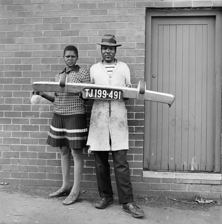
The above image made by David Goldblatt really interests me. I just like the  composition of this image with the two right in the center of the frame and are looking very seriously with a neutral expression into the camera, making the image a lot more personal and as if the pair are actually looking at the spectator. I find this image so intriguing as I wonder why they are holding a bumper to a car with a number plate, suggesting that the man is a mechanic as he is also wearing dirty looking overalls. They could also be stood outside their own house with the door off to the right side of the image. I really like that this image is in black and white, mainly because of the time it has been made, as it makes the image a lot more effective and allows the spectator to focus in on the subjects within the photograph rather than staring a the colour of the door or the colour of the lady’s dress.
Furthermore, I did some further research into the time period that this image was made, 1950s, and saw how South Africa was still a very racist place [it still isn’t completely desegregated today]. In South Africa they segregated everything, much like early 1900s America, there were separate toilets, cinemas, buses, schools etc. This, for me, is a very powerful image as David Goldblatt was a white photographer and it would have been seen as a radical notion to go out and photograph black people, it was seen as wrong to even talk to them at all. I really love the message behind this image showing that black and white people are no different, showing that we all have similar jobs and can work to the same standard there is no real difference between any of us. I think that this holds a strong social message showing how people can change, this photographer went out and made these images on his own free will.
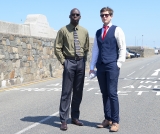
I chose to compare the images above as they both hold significance. The photograph made by Michelle Sank that I chose really went well together and almost complimented each other through their social attributes. The image made by Sank shows how far we as a community and society have re-moulded and adapted our closed minded way of thinking to becoming more accepting beings that realize that everyone is equal. Sank’s image would seem like a revelation if it was shown to those photographed in Goldblatt’s image. This image shows two men, one black and one white, stood next to one another as equals both wearing suits and ties. These men both represent workers and their attire represents this too showing how far we as a society have been able to change and develop our way of thinking. However, if I had no context or hadn’t been comparing Sank’s image to Goldblatt’s then I would not have thought anything of it at all and don’t find it to be a visually interesting image a part from the history and meaning behind the whole thing it isn’t really a strong image to me. I do find it similar in composition to the photograph of Goldblatt’s in both the subjects are slightly off center and to the side of the image but that is just how each of them made their photographs and I don’t think that there is any real relation there.
Likewise, I really do find Sank’s visually boring as there isn’t much going on in the background a part from an empty country road and it doesn’t really give any extra context to who these men are and where they possibly work. As an environmental portrait I don’t like it but what the men are both wearing suits shows what kind of people they are and suggests what they do as a job. I feel like the background is all too perfect with the blue sky and perfect light but with nothing in the background it just looks really quite dull to me. Comparing the two images I much prefer the work of Goldblatt visually and with everything that it represents too. I do like the work of Michelle Sank and like that she makes images showing the different communities and people within our society.
Overall, I feel that these two images alongside one another work really well and do show how society and world view has changed from the 1950s to present day. Through these images the spectator is able to see how far black and white people have come together in the creation of equality of life and jobs. I like these images and think they are strong together and reflect how much has changed in such a short period of history.

Case Study | Tom Pope and Peter Finnemore

I wanted to look more into these two as I have studied the work of Tom Pope and found it really interesting and unique. I find the chosen photographs of Peter Finnemore’s really interesting and engaging, they are strangely unique linking to the work of Pope. I find the two have very unique styles and the idea of performance really shows through their work. Finnemore was Pope’s teacher who he looked up to and was influenced by in photography.

Tom Pope’s website: http://www.tompope.co.uk/index.html
Peter Finnemore website: http://www.peterfinnemore.com/main.html

About Tom Pope

Tom Pope was the photographer in residence at the Jersey Archisle in 2015. He is a performance photographer and is currently living in London after graduating with a Ma in Photography from The Royal College of Art back in 2011.. Pope’s work is very unique and has strong political and social messages behind it. Much of Pope’s work is based around his project of Weak Anarchy and challenging the way we think as a society and what is right and wrong in the eyes of the community surrounding us.

Interview with Tom Pope: 

About Peter Finnemore

Peter Finnemore is a photographer born in Llanelli, Wales. He was one of the first students at the new Fine Art Photography Course, set up in 1984 by Thomas Joshua Cooper, at the Glasgow School of Art, Scotland. Finnemore gained an MFA in Photography at the University of Michigan, USA. Finnemore is a visiting professor in Photography at the University of Derby. He also lives and works in Llanelle, Wales. Finnemore’s work consists of many landscape images, environmental images that show the natural world.


Comparison | Tom Pope and Peter Finnemore

Q. How has Peter Finnemore influenced the style and genre of Tom Pope’s photography?

In this essay I am going to compare and contrast photographers Tom Pope and his chosen artist, from the Quintessence exhibition, Peter Finnemore. I really love the style of Finnemore and wanted to explore it further and find out more about the location of his work as well as how Pope relates to him and how their work differs.
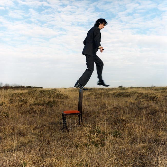
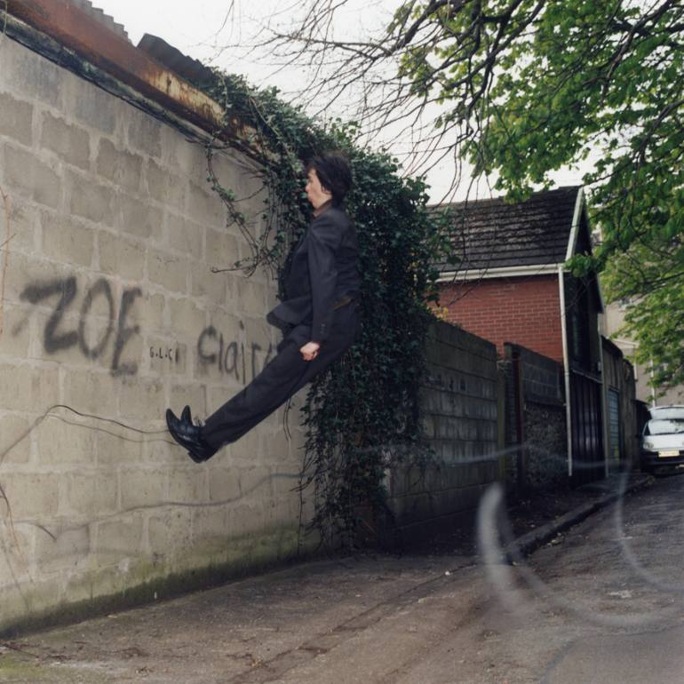
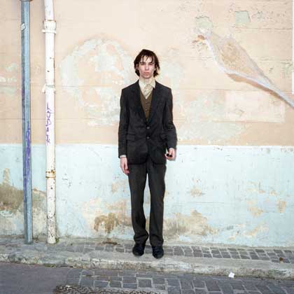
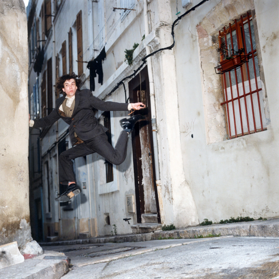
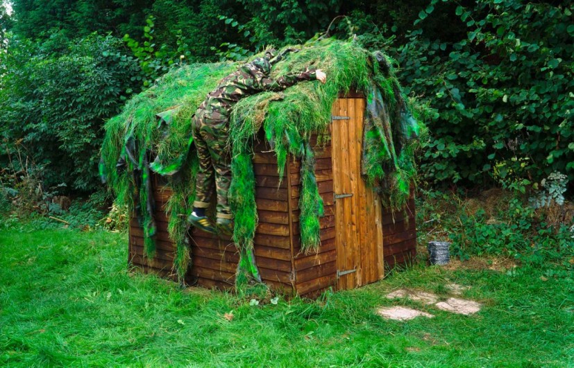
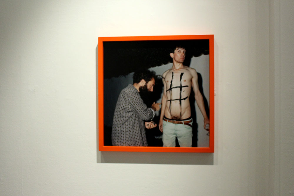
I find that Pope and Finnemore have similar styles of photography. They tend to take the element of performance to the next step and really get into their role and what they want to do. One thing that they differ in is that Finnemore seems to prepare a lot of his work and knows what he wants to do and will usually make all of his images in his back garden whereas Pope tends to have a basic idea of what he wants to do and leaves it all up to chance in one image taken on a film camera and will perform in public and not stop if there are any passersby. Their work differs in the sense that Pope is very classic with the types of cameras that he decides to use and Finnemore is more modern using newer digital cameras as you are able to tell in the different ways that the images above look, with the way they capture the light and everything in the frame of the image.
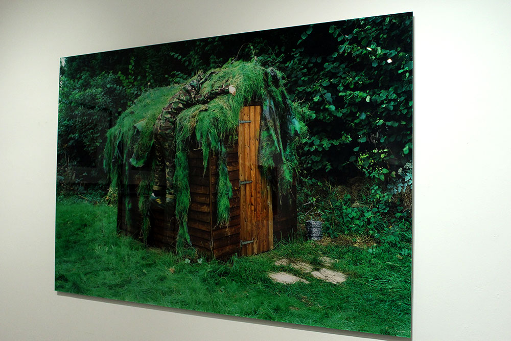
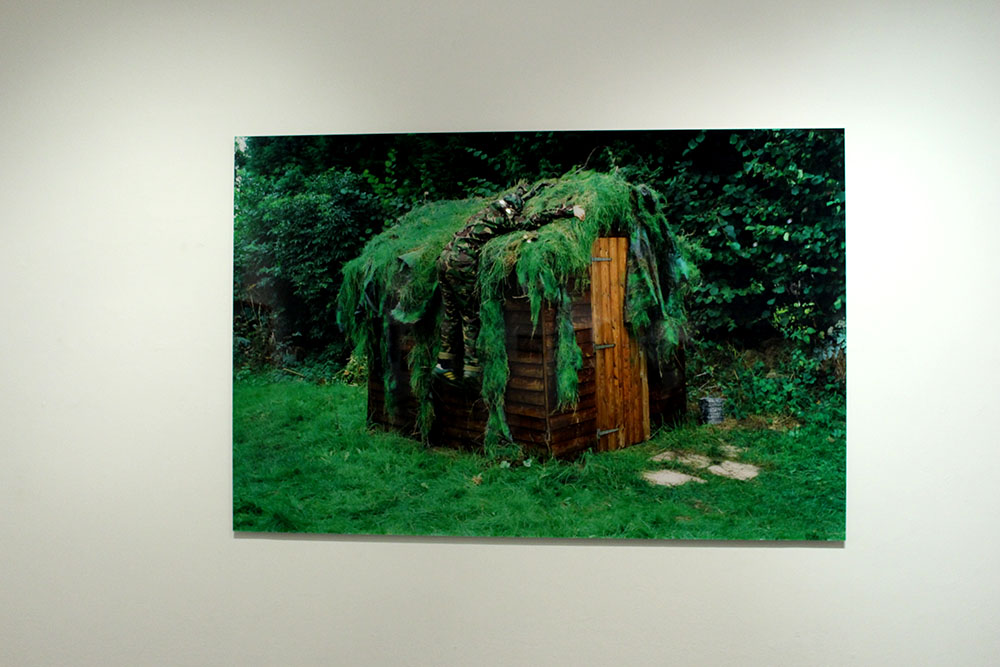
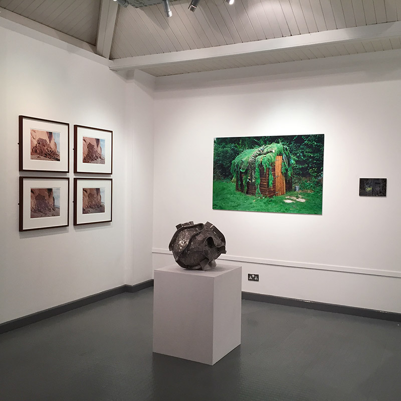
I chose the two images above as they interested me the most. I really love the photograph by Finnemore, there is just something about it that is really intriguing and makes me want to find out more about what is going on in this image and possibly a deeper meaning behind it. It reminds me of war and how during the war, in Jersey, they had to cover up an underground hospital with grass and dirt to make it just look like more land when the enemy flew over looking down and not actually being able to see that something is there. This image really interests me as the subject in the image, a man, blends in with his atmosphere and at first glance I didn’t even notice him at all. I really do find this image engaging as it is so odd and random yet it seems to remind me of war and how the world was at one stage in our recent history. To me it looks as though the subject just jumped at the shed and is clinging onto it to try and hold himself up. It’s also interesting to know that this was all taken in his back garden. Something that I really like about this image is that I am so interesting in it and really would like to find out more about it and if the meaning that I have generated from looking at it is actually the meaning and the message that Finnemore is trying to put across.
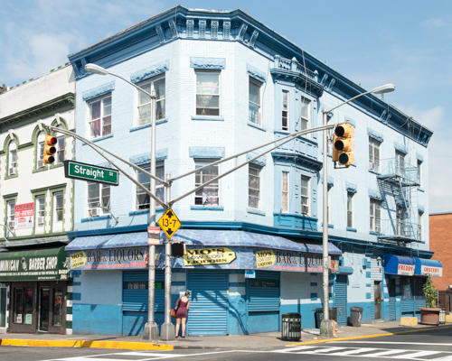
Contrary, I find Popes image very different. It doesn’t really make me think of anything political at all, I like the image but I am unsure as to what influence it has over me. I guess I could say that it makes me think we should all just be as carefree as Pope is and do things in public without worrying or being overly aware of the other people around, to be the real you. This image also reminds me of going on holiday as the lane and the brick flooring just reminds me of a place like Portugal or Spain or even the South of France. I do find this image interesting and almost amusing because of the way Pope is positioned in this image. I also like that he uses film cameras in his work to make everything authentic and when he does do his performances it is all down to chance that the camera will capture the moment that he wants it to really get.
The reason that I chose to compare these two images is because of the way both photographers approach photography as a performance and they do it for themselves and if someone happens to walk past then that performance has been seen by someone else but primarily they will just do it for themselves. I feel like Pope has been influenced by this through Finnemore’s work. Finnemore’s work is more of a poetic symbol in that it is about showing the world his home, his territory and his paradise. He wouldn’t want anyone else to steal his home or to invade his personal paradise. Contrasting to this I find that a lot of Pope’s work is very abstract and unusual but can also be poetic and symbolic of a deeper more political meaning.

Case Study | Martin Toft and Finn Larsen

For this case study I chose to look at Toft and Larsen first as when looking around all of the images these were the ones that really stood out most to me. I found Larsen’s images so visually pleasing and beautiful but I knew nothing about the images and what they represented and was shocked when I found out what they were really about. I love finding out new things in the photographic world and what underlining messages there are behind these types of images.
Martin Toft is the local photographer who nominated Finn Larsen. He is a Danish man and is currently living in Sweden. Toft was 25 years old when he figured out that he wanted to be a photographer and if he hadn’t met Larsen, Toft says that he wouldn’t be a photographer. He basically mentored him giving him a load of photographers photo books to read and study for one week, a box filled, the next week he would go back to see Larsen where they would discuss everything Toft had found out and learnt. They did this every week. This really helped Toft become a better photographer and so Larsen has become one of his biggest influences.

Martin Toft’s website: http://www.martintoft.com
Finn Larsen’s website:
 http://thephotographersprint.com/products-page/finn-larsen/

“The photographs and the art that interest me enter into a global and historical dialogue about how the world looks and how it can be understood. It is about seeing the world, society, the landscape as soberly as possible, without God, sentiments, nationalism, symbols and other abominations.” – Finn Larsen

About Martin Toft

Martin Toft is a local photographer originally from Denmark. He is working as an A Level teacher here at Hautlieu school. Toft has worked on a huge project called Atlantus. This is a project showing the connections and contrasts between Jersey, Channel Islands and New Jersey. Through Toft’s work we are able to see how different and how similar the two are. It is strange that a lot of the world doesn’t even know that Jersey exists and this project in particular is interesting as it explores a place named after Jersey.

About Finn Larsen

Finn Larsen is an international photographer nominated by Martin Toft. He is a Danish photographer now living in Sweden. Larsen graduated as a photographer in 1980. He is a member of the Society of Artists and the Association of Visual Artists in Denmark. He is also a member of the National Organisation of Artists in Sweden. Larsen has published books over the years and has recently worked on a project titled ‘Mansland’ where he made images in Greenland of all of the waste and dump on the island.

Comparison | Toft and Larsen 

Q. What underlining social and cultural messages are held in the work of Martin Toft and Finn Larsen?

In this essay I will compare the similarities and differences between Martin Toft’s photographic work as part of the Quintessence exhibition and his chosen artist Finn Larsen.
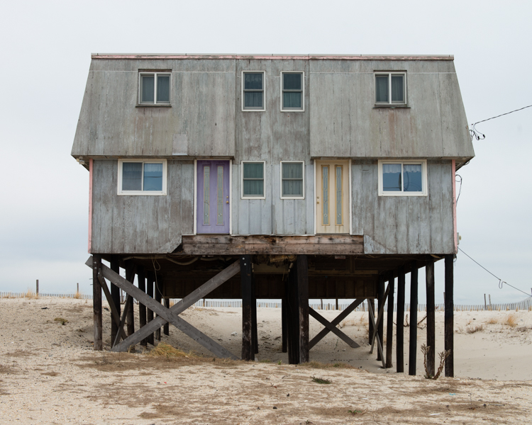
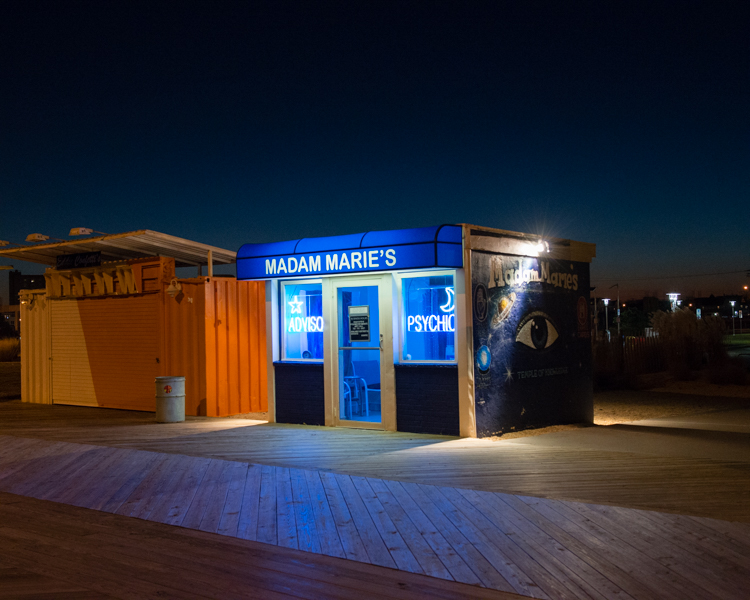
Firstly, I find these two photographers different in their approach and their style. Toft’s project shows people and the environment surrounding those people and how different and similar Jersey and New Jersey are compared to one another. He also looks into the history of these two parts of the world and shows, through his images, how far each place has come and how different it is now compared to in the past, especially in New Jersey. Whereas Larsen’s images are pure landscapes giving little away but with a deep political and environmental meaning behind it. I like both photographers but for very different reasons. I find Toft’s work very interesting in the people he chooses to make his images and their facial expressions, the way they look and feel in front of the camera. Toft’s work shows how a place can be named after another place yet have nothing in common with the original place or it even shows different sides of the spectrum and how they take care of things differently. Contrary, Larsen’s work is more just landscape work with strong political meaning behind them. I find that his work is a lot more subtle in that you wouldn’t guess what is going on in just one image, you would need to see the entire project to understand what is going on. I find his work very interesting as he has some really beautiful images with a deeper meaning that you most likely wouldn’t get if you did not read more into it.
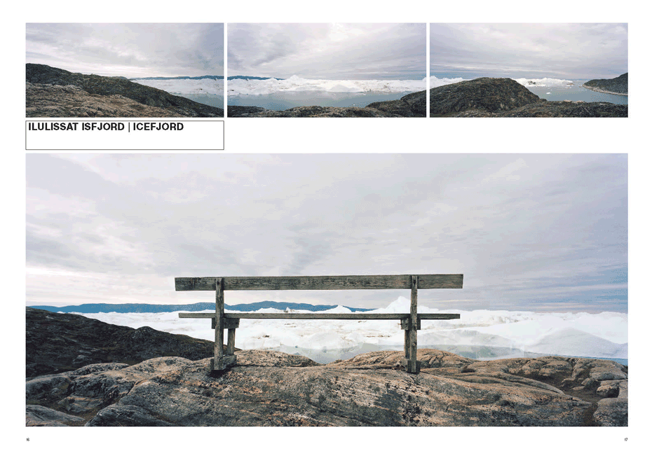
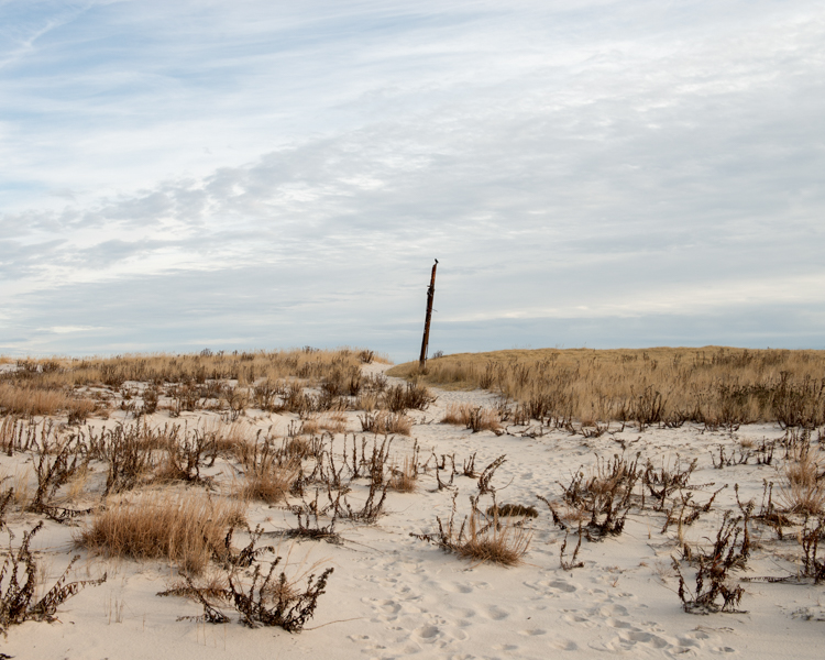
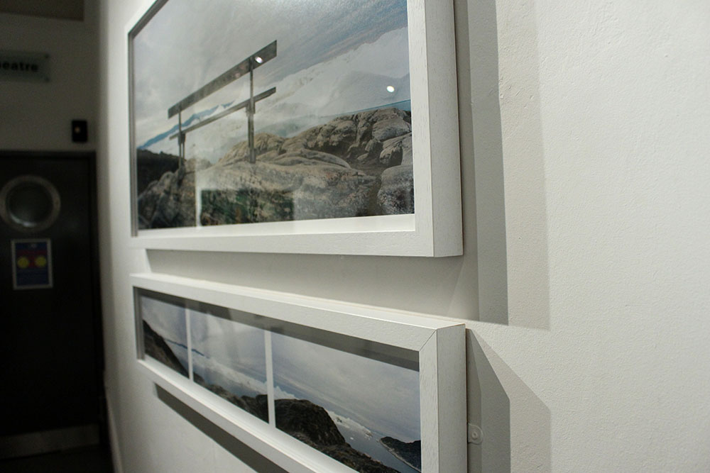
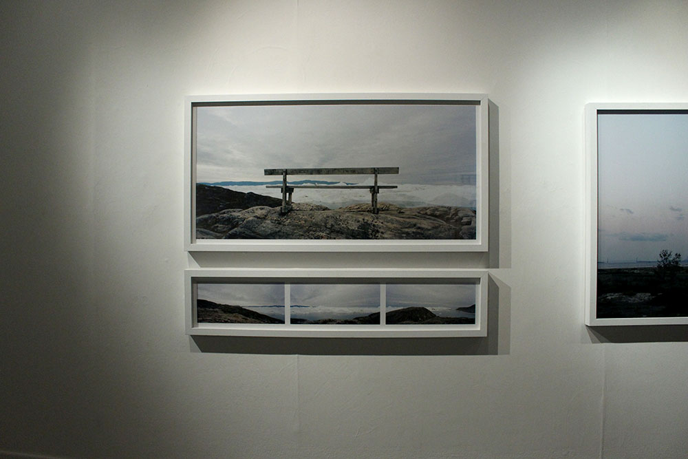
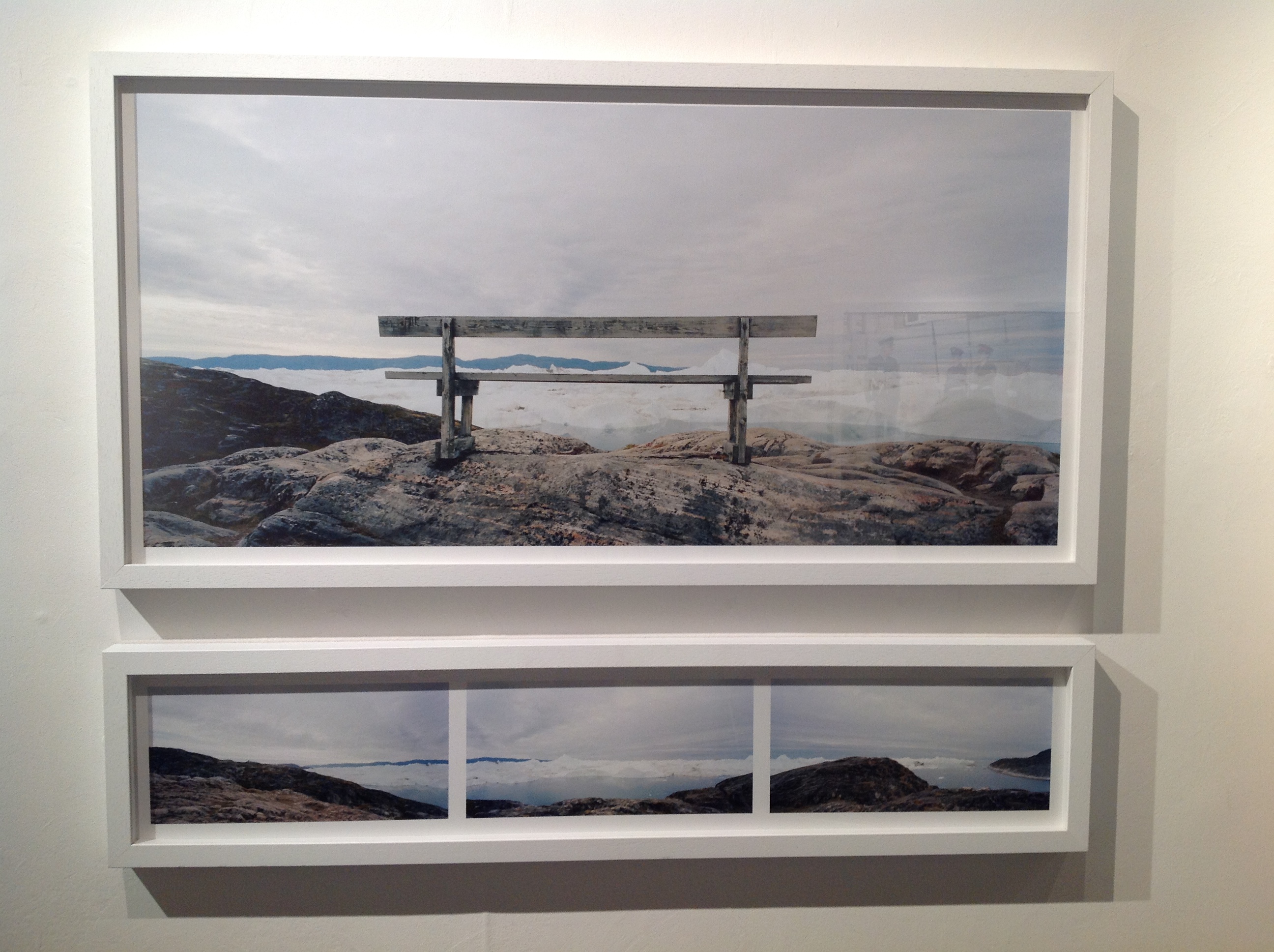
However, I chose to compare the images above as I saw similarities in them visually. In the center of both of these images is an object, Toft’s is a large stick or pole and Larsen’s is a wooden bench. I find that Toft’s image shows the natural beauty of the land, it is simple yet the cloudy skies and the landscape is captivating. On the other hand, Larsen’s image looks,at first glance, like another beautiful landscape image of glaciers in the water with the perfect view from the bench but reading more into this project I found out that just beyond those glaciers is a dump, filled with human waste. It is so sad, to me, to see both of these beautiful landscapes yet our own destructive human nature is slowly destroying that and taking over with these landscapes being ruined by our waste and dumping. I find Larsen’s image very powerful and almost sending out a political message to the rest of the world saying that this beauty is being destroyed and ruined by our wasteful nature.
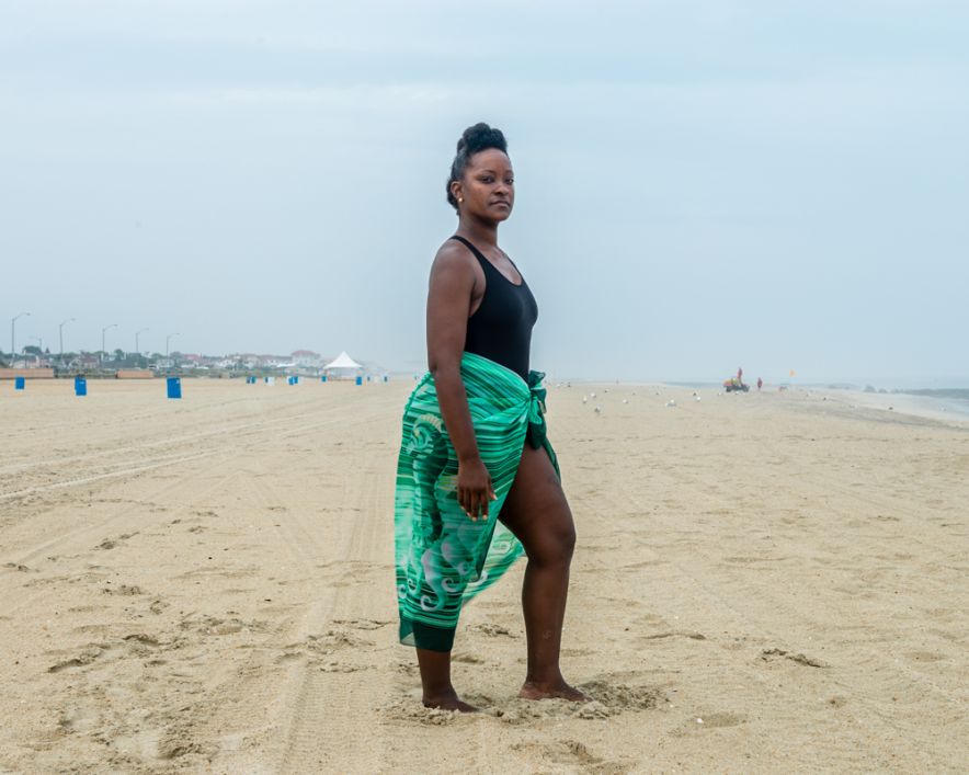
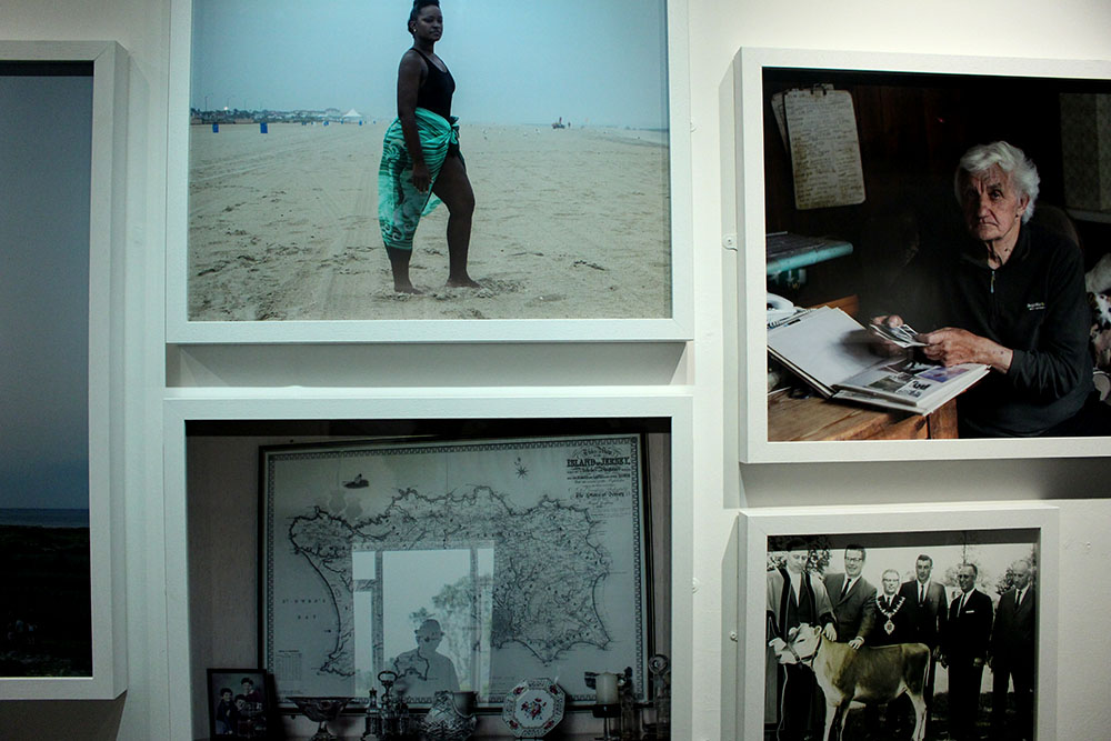
Contrary, better suited for the comparison would be the image Toft made of a black woman at a beach in New Jersey. This image represents a lot. It represents the struggle that black citizens of America went through. This image was made in a place in New Jersey called Asbury Park where black slaves used to stand and serve their white masters over 100 years ago. This is why this image represents a lot and is so significant in how far we have come as humans. In contrast, the image made by Larsen shows how really little we have come in society hiding our waste and dumping our unwanted rubbish behind a beautiful natural glacier. I really like these two images together as they both hold a lot more behind just that one image. It is captivating and interesting and the more you know about the subjects and the behind the scenes of what has gone on in the past or what is going on in the background makes the image even more powerful. I like these two photographers, Toft and Larsen, as their work holds meaning and doesn’t just tell us or show us in that single image, we aren’t given everything yet are left thinking about it and what it could represent. These images aren’t as simple as they look and have generated meaning behind them.
Likewise, a common theme that I am beginning to notice in both Toft’s and Larsen’s work is that it holds a deeper meaning. There is more to it than what you see as a spectator and their images hold so much significance and beauty. Both of their subject matters seem to reflect us as a society. The young black woman stood on the beach represents how far we have come as human beings and being able to bypass ridiculous laws and change the way we think to be broader minded and actually accept everyone as human beings. On the other hand, Larsen’s work represents society in a more negative light. This cant be seen in the beautiful image of his above as it shows the beauty of the glaciers and the sea and the cloudy skies but behind all that there is a disgusting dump filled with our own human waste and it shows how as a community and society we still don’t know how to control our own waste, how to not ruin the natural world that we have. It shows how we as a society are constantly taking over the natural world and making it a corporate one.

timthumb
Martin Tofts photography | Tamika Tolliver, Asbury Park

Personal Study

What is a Personal Study?

The aim of this unit is to critically investigate, question and challenge a particular style, area or work by artists/ photographer(s) which will inform and develop your own emerging practice as a student of photography.

Your Personal Study is a written and illustrated dissertation, including a written essay (2000-3000 words) and a photographic body of work (250- 500 photos) with a number of final outcomes.

This year you have to make a photo book which you design to include both your essay (with title) and a final selection and sequence of your photographs produced as a response to your chosen theme of FAITH, FAMILY and COMMUNITY

In addition, we are also expecting that those of you who want to go above and beyond to achieve top grades will produce a podcast i.e. mini film with sound and images based on the same above

All your usual research, analysis, planning, recording, experimentation and evaluation will be posted onto your BLOG

Link to  Planner & Tracker Monitor and track your progress every  first 5 mins of lessons on Fridays and upload onto the blog

Week 15 and Christmas Holidays: 8th Dec 4th Jan

Objective: Criteria from the Syllabus

  • Essential that students build on their prior knowledge and experience developed during the course.
  • Develop your written dissertation in the light of your chosen focus from the practical part of previous coursework and projects.
  • Select artists work, methods and art movements appropriate to your previous coursework work as a suitable basis for your study.
  • Investigate a wide range of work and sources.

Blog: Produce a number of posts that show evidence of the following:

1.Reflect on your previous projects/modules and write and overview of what you learned. Link your chosen area of study to your previous work, knowledge and understanding based upon your chosen theme of FAITH, FAMILY and COMMUNITY. Include examples of previous work to illustrate your thinking.

2.Select artists/photographers work, methods and art movement appropriate to your chosen area of study. Find 3 different texts to read over Christmas that support your study from a variety of sources (books, articles, journals, magazines, websites, films/dvd.)

3.Write a specification that outlines your main focus, intentions and area of study, including what artists/ photographers you wish to investigate, respond to and write about in your essay.

4.Produce a detailed plan of a 3 photo-shoot for this Christmas holidaysMAKE PHOTOGRAPHS!

Link to folder with more examples M:\Departments\Photography\Students\Resources\Personal Study\student exemplars

A few Personal Studies from last year. 

Bryony SandersonGie us a wee word wi’ yer Mum: The title of this work is phrase I would hear both my Scottish Grandparents say almost every time I answered the phone.  During this project, I focused on my Scottish Heritage and the difficultly living in Jersey has bought to our relationship with my Grandparents.

Bryony’s exam project: Artificial: Being surrounded and fascinated in the prosthetic world through my parents’ occupation, I felt that this to be an appropriate area to explore under the theme flaws and imperfections. From the moment the idea sprung to mind, I knew this was going to be a challenge, being well aware it would push my abilities as an amateur photographer. However, I was firm in my decision to pursue this, making it my goal to depict the power, strength and determination of amputees, and how in-fact, their ‘imperfection’ or ‘flaw’ as some would call it, is certainly not a flaw at all.  Stuart Penn, the focus of my photographs, was such a pleasure to work and a huge inspiration, giving us the powerful message that anything really is possible. I feel honoured to have had the opportunity of taking his photographs and gaining insight into his incredible lifestyle.

Eve Ozouf A Lekker Christmas: For this project I captured the highlights of my family holiday to Durban, South Africa for Christmas 2014. The images were captured in a documentary style, which is my preferred approach as I enjoy capturing family life as well as landscapes where human activity has occurred. The word ‘Lekker’ which I used to describe my Christmas means ‘good’ in the native language of Afrikaans. My photographs show a variety of environments that South Africa has to offer with its vast land including urban built up areas to the deserted African plains. Some images show the ‘Durbanite’ way of life, including where my 14-year-old cousin demonstrates how to use my grandfather’s rifle to shoot the annoyingly noisy ‘Hadeda’ birds. South Africa is full of vibrant colours and textures which I particularly focused on when producing this body of work as a photograph isn’t just about how it looks, it’s how you imagine it feeling. A lot of experimentation was used to bring out different styles of photography including slow shutter speeds to dramatise events such as the bonfire sprites floating towards the sky. For me, these images capture the quality of life South Africa has to offer and should make the viewers want to visit this beautiful country for themselves.

Oliver Sharman You’s Company, Me’s a Crowd is a photo book in an autobiographical form, whereby I am re-enacting events that occurred in my recent life, venturing from visiting my brother at university and the hungover pain this brough, to partying and hanging out with friends in all manner of ways and the aftermath of this. So, here is an insight into me, often eventful life of a teen in the island of Jersey.

Matt Palmer: A Little Bit Longer: Not all disabilities are visible. You could know some your whole life and never know that they have a severe, life-long condition. On Tuesday 14th July 2009, I was diagnosed with an invisible illness; Diabetes Mellitus Type 1, a condition when the pancreas in the body loses the ability to produce insulin independently. Day to day, my life hasn’t changed; however, I have to inject myself four times a day, and manually balance my sugar levels for the rest of my life.

As diabetes is something you cannot see, it was very hard to photograph it. I took inspiration from Elinor Carucci, an Israeli-American photographer who photographed herself with her children from when she was pregnant, through the birth to her children growing up. Her work involves very revealing, close-up self-portraits to capture her emotions. I found this style to be inspiring in capturing one’s self, and adopted this style into my own.

This is the first time I have ever turned the camera on myself. You would think it would be hard, however, it was just like I was being a model for someone else, and since I’m very open, talking about my diabetes, I found it easy to show my emotions. Photographing events from having low blood sugar level in the middle of the night, to a regular check-up at the diabetes Centre, to an eye-screening at the hospital, and the different physiological outcomes I had to injure, all within one week.

Matt Palmer: I Need A Shovel  is the story of my Granddad, the house he has lived in since the 1960s and the clearing out of the house as it is now need to be sold. The name of this project came from my Dad. Him and a couple of others when ahead to my Granddad’s house whilst I went with my Aunt to pick my Granddad up. My Dad had the job of removing the upstairs toilet, which, when it stopped working, my Granddad kept on using it until it overflowed. When my Aunt and I arrived the first thing my Dad said to his sister was ‘I Need A Shovel.’ We all found that line funny when we heard it and then that line just stuck with me.

Lots of people can see little bits of themselves when they see my granddad’s hoarding, be it from collecting newspapers, or postcards, or whatever they’ve collected, it can all be related to what my Granddad has done over the past 50 years.

It is a growing problem. The family need to sell the house as the people next door want to buy the house, however, my Granddad doesn’t want anything to go or be moved. I feel that this could be happening to lots of people across not just the UK but the world. This project will speak to lots of families who are facing the same problem.

Tom Rolls: Angel; The Perfect being?  With this work, I am exploring Angels in relation to the project brief “Perfection/Imperfection” which I chose as part of my A2 final Photography exam. Throughout the project, my aim was to rekindle an idea of the Angelic being in relation to different people’s perceptions; for faith, protection, happiness, balance etc. I spoke with a number of different people about their definition of an Angel and what it meant to them. I interviewed my local church vicar who gave me a very brought insight into angels in both a religious and personal sense. I came away bewildered at the fact that Angels are a very important part of people’s lives, and realised that there is a whole other dimension to the subject. Having researched and gained enough primary knowledge, I began transforming these different perceptions into my own interpretations and pieced together a visual binding of all the ways in which an Angel spoke to me through others. I made a film which documents my journey in the sense of exploring what angels actually symbolise today, and how its image and meaning has changed over time. I hope you will also find this a journey for yourself and come away reflecting on this inner dimension from your own personal viewpoint. Are angels in fact the perfect being, or is it in fact their imperfections which make them so sacred?


Note Taking from Quintessence Handout: Quintessence

 Quintessence Exhibition

Presents work by 14 different artists

  • Exhibiting, as a group exhibition, works from contemporary photography archive
    • Designed for future public enjoyment
  • Creative Partnership with Local and International photographers
    • Expanded and develop over the course of 4 Years
    • “they engage creatively with the idea that it is only through alterity that we come to know ourselves”
  • 6 from Archilse Contemporary Photography Collection (2011-15)
  • All of these Artists have completed projects for Archilse
  • Solo exhibitions from each artist


International Photographer in Residence (IPR) Programme

  • Sank, Toropstov and Pope
  • Brings photographers to live, work and teach in Jersey for 6 months
  • Body of work for exhibition and addition to Archive
  • IPR teach one day a week: over 100 workshops for islanders since 2011
  • Give Jersey community access to educational and professional development by internationally successful artists whilst building contemporary collection of photography in Jersey
  • ‘Quintessence’ marks first five years of Archisle Programme


The 6 Photographers

Michelle Sank

  • Influence from social order of Henry Mullin’s mid-19th Century Portraits

Clement William Henry – Photographed by Mullins

Mr de Quetteville – Photographed by Mullins 


Yury Toropstov

  • Character from ‘Fairyland’, a JBOF Carnival exhibit in 1937 British Pathé film

Tom Pope

  • Mask-making, subversive messages and game playing

files/gimgs/iamnottompopeyouarealltompope/website edit.jpg

Mark Le Ruez

  • Jersey born artist based in Berlin
  • 2014-15 Solo Exhibitions

Rügen #1. - Pigmented inkjet print. 22 x 22 cm


Martin Toft

  • Atlantus: transoceanic photography project between Martin Toft and Archilse
  • 350th Aniversity of Jersey Sir George Carteret naming U.S. State New Jersey after Jersey
  • 5 stories that respond to people, politics, landscapes, industries and indentites of Jersey and New Jersey
  • Binary Opposites: island vs. continental life

Martin Parr

  • World renowned British Photographer
  • Commissioned to Photograph 2013 Liberation Day Celebrations

PAM2013021G00393

GB. Jersey. Liberation Day. 2013.


8 nominated Artists

Gareth’s choice = Jem Southam

  • Jem Southam = Gareth’s Tutor at University of Plymouth
  • Red Mudstone Photographs = formal visual analyses of geological trauma
  • Rocks = “geographically an psychologically definite of island life”
  • Man made effects on environment

Martin Parr = Tony Ray Jones

  • Tony Ray Jones: 2013 exhibition only in England
  • Worked in the past with Ray-Jones’ negatives
  • Inspired very much the now distinct style of Parr

 Martin Toft = Finn Larsen

  • Martin’s Toft’s former mentor
  • Landscape photographer
  • Focuses on issue of changing landscape and climate due to man-made influences

# 02

# 01


Michelle Sank = David Goldbatt

  • South African photographer noted for his portrayal of South Africa during the period of apartheid
  • More recently that country’s landscapes
  • Inspiration for Michelle Sank study of social landscapes

Mark Le Ruez = John Gibbons

  • Irish conceptual artist – born 1949
  • Known for sculptures and ‘steelwork’

And the Earth Changes Shape

Sculpture: And the Earth Changes Shape

Tom Pope = Peter Finnermore

  • Welsh Conceptual Artist
  • Known for performance based, subversive photography
  • Influenced and inspired Pope’s playful, subversive and comical approach to photography and artistic performance


Note Taking from Quintessence Handout – Archisle

Background

  • Launched by Societe Jersiaise Photographic Archive in 2011
  • Promote contemporary photography through ongoing programme of exhibitions, educations and commissions
  • Connecting past with present
    • Archives with contemporary photography


Islandness

  • Starting a debate about how we represent our island through photography
    • Syvret suggests that ‘Islandness’ is not an open debate within Island life and community
  • Island culture = unique from continental views
  • Photographers on an island restricted in terms of context, audience and marketing
  • Project = first in Jersey of its kind: makes the people of Jersey question and embrace unique position of living on an island
  • ‘Archisle’ has potential to grow into worldwide project
    • Jersey host island games 2015: ‘inter-island lock in’ event organised – promoting the Archisle project to a wide audience who share in the concern of ‘Islandness’
  • International Photographer in Residence Programme: Establishing a relationship between local and international photographers


Pioneers of Photography in Jersey

Henry Mullins

  • English Photographer
  • Studio in Royal Square (1948-73)
  • Took over 9,000 portraits of islanders
    • Placed and identified in grid configurations based on social status
    • Interesting record of life in Jersey in Victorian times
    •  Use of photo archives as objective historical documentation

Mullins: Subject, Mr Aubin


Mullins: Subject, Mr Bertram


William Collie

  • Scottish Photographer
  • Experimented with proto-documentary methods
  • Creation of some of the earliest portraits of working class people in existence
  • Some of his images made it into 2007 exhibition of European Photography at Metropolitan Museum of Art, New York


Photography during Nazi Occupation

  • Nazi’s made every Islander be photographed:
    • Archive of 31,000 I.D. cards collected
  • Public Photography banned
    • Claude Cahun: Anti-Nazi activist
      • Photographed islanders as an act of resistance
    • Photographs taken during occupation
      • Explore views of rebellious counter-culture; form of resistance

Invaders: German soldiers with a 25-ton Char B tank used during the occupation of Jersey in the Second World War

Post War Photography

  • Recent photography is Jersey lacking specific focus and context. Archisle wants to change this
  • Jersey change over the course of century
    • 20th Century = farming
    • 21st Century = finance
  • Archisle – 125 Year Project in partnership with JEP
    • Selection of images from Jersey’s largest 20th Century Photographic Archive
    • Trying to promote the use of the archives in an interactive exhibition
    • Capturing Jersey’s progression from a first, second to third island

21 st Century Photography

  • Voice of the Jersey people is important
  • Jersey Archisle wants to promote the invention of specific archives looking into various aspects of Jersey life
    • Archisle Contemporary Photography Collection
    • JEP: form of contemporary photographic record. Hence its relationship with Jersey Archives
      • JEP = approximately 160,000 photos on-line in 11 categories


Summary

  • Identities of subjects and photographers absent in recent contemporary archives
  • Raising awareness of local photographers
  • Engage photographers with the culture of Jersey to create diverse an incisive visual archive


Link to the Official Archisle Website

http://www.archisle.org.je/


Case Study: Quintessence

Archisle Project

The ‘Archisle Project’ was launched in 2011 by Gareth Syvret, the photo archivist at the Societere Jersiaise. The aim of the project is to promote contemporary photography in Jersey through an ongoing programme of exhibitions, education and commissions. Syvret began the project out of concerns over the various restrictions local artists face in terms of context, exposure and marketing of their work. He hopes through the project, the inspire and give opportunities for young and developing photographers of the future, as well as the ordinary island public to be given access the quality, world-renowned international photographers, their work and extensive knowledge.

The project aims to celebrate and promote the concept of ‘islandness’, recognising Jersey’s unique island culture based on its isolated and ambiguous location in the English channel, subsequently being a mixture of Norman and English culture and identity. At the same time it aims to give photographers in Jersey more international exposure through inviting various internally renowned photographers to work, exhibit and teach on the island. This has seen the presence of various internationally acclaimed photographers on the island including Michelle Sank and Magnum Photographer Martin Parr.

The main goals hoped to be achieved through the Archisle Project

  • Promote the use of the archive as a source for creative work
  • Raise the status and context of photographers largely absent in recent contemporary archives
  • Engage international photographers with the culture of Jersey to create a diverse and inclusive visual archive.

Quintessence

The exhibition is a celebration of five years of the Archisle Project. It displays the work of six different artists who have worked for the Archisle project, and subsequently have such work displayed in the Societere Jersaise Photographic Archives. The exhibition was curated by Gareth Syvret, the photo archivist down at the Societere Jersaise, as well as the founder and leader of the Archisle Project.

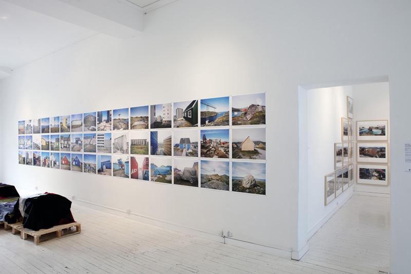
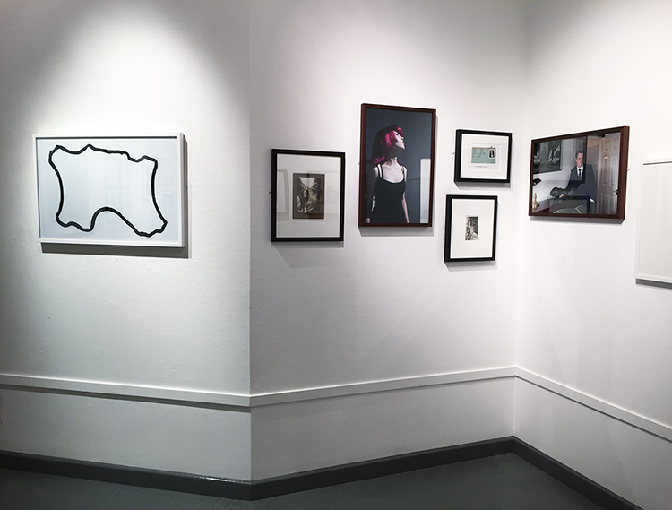
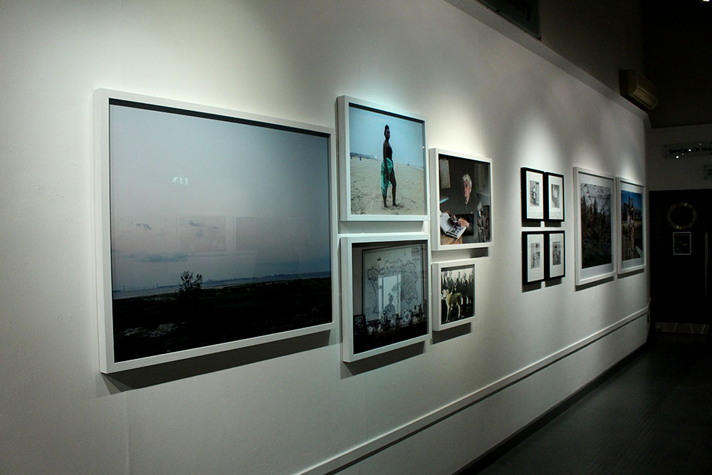
The exhibition is arranged so that each artists work is distinct from one another and their chosen influence is next to that artist. The exhibition as well as being a celebration of the anniversary of Archisle, is also a representation of the growing profile of photography taken in Jersey and by Jersey photographs. The idea to include an influence of each of the artists is a clever way of recognising how locally based/born photographers are looking outside for external influence in their creative process, using the Archisle Project to then respond to this and therefore present the Jersey Public with a new and exciting body of photographic work based on their findings and developments.

  • Mark Le Reuz
  • Martin Parr
  • Martin Toft
  • Michelle Sank
  • Yury Toropstov
  • Tom Pope

These artists have all selected their own artists who they consider an influence.

The artists nominations are:

  • Mark Le Reuz = John Gibbons
  • Martin Parr = Tony Ray Jones
  • Martin Toft = Finn Larsen
  • Michelle Sank = David Goldblatt
  • Yury Toropstov = Elsie Wright and Frances Griffiths
  • Tom Pope = Peter Finnermore

Gareth, the curator,  has cited his own influence, Jem Southam who was  his tutor at Plymouth University, for a body of his own work to be included into the exhibition.

Evaluation

I enjoyed this exhibition a lot. In Jersey it is rare for top international photographers to be commissioned, and it was a very  good experience to see this very high quality of photographic work displayed and taken in Jersey, all for free. It was a very good educational experience as I have previously studied the work of Martin Parr and Yury Toropstov, and so it was very interesting to see life scale prints of their work.

The layout of the exhibition was very well considered and ordered. I liked how their wasn’t too many photographs only display and that the small size of the area was respected to include the right amount of images. In contrast the JEP exhibition was extremely cluttered and it ruined the atmosphere, making the room feel much smaller. This exhibition had just the right amount of images for the size, allowing space for the different sections. i.e. artists and their influences clearly separated.

The idea of placing the work of the artists next to their nomination was a good idea because it allowed for the audience to directly compare and consider the relationship of the artist/influence, their similarities and differences. This was particularity in the case in the work of Martin Parr and Michelle Sank as their respective influences; Tony Ray Jones and David Goldbatt explored very similar contextual themes; Parr and Jones through the concept off ‘britishness’ and Sank and Goldblattt through the concept of social/cultural identity.

Favourite/Least Favourite Images

My favourite piece in the exhibition was Finn Larsen’s image of a bench overlooking an icy landscape. I like this image because I thought it was visually, an interesting e image. I find his representation of the sparse, sublime natural landscape to be very interesting to look at for both aesthetic as well as contextual reasons, as it is very much linked to the environmentalist concept of celebrating the natural world, whilst at the same time recognising its fragility. This idea is more important than ever nowadays and traditional landscape shots of the changing climate are quite often overlooked.

image

My least favourite image if the exhibition was Peter Finnermore’s image of a man climbing up a wooden shed covered in moss . To be honest I didn’t find the image to be particularity interesting., nor did I see the relevance/specific focus it had to the other images in the exhibition. I understood the concept but just didn’t particularity like the image.

image


Tilt-Shift/ Miniature Photography

As I have been looking at large spaces and places where people will gather, I thought I should look at miniature photography, although I probably won’t use this technique within my own photos, I may be able to learn something that will improve the quality of my images and my project.

Tilt–shift photography is the use of camera movements on small- and medium-format cameras, and sometimes specifically refers to the use of tilt for selective focus, often for simulating a miniature scene.

citysrinkers_4 B Tal_2 ef bus

This kind of photography is quite intriguing, because there are some images where is difficult to tell if the image is of a real life scene or a model.

An artist named Serena Malyon took a very different approach to tilt-shift photography, taking paintings by Vincent Van Gogh and editing them through photoshop to create this tilt-shift affect. I think these images are a really good example of how this effect can really change an image and the way the viewer looks at them. This also forces the viewer to look at certain details more than others, and actually prevents other bits of the image to be seen clearly.

tilt-shift-van-gogh-starry-night-detail tilt-shift-van-gogh-red-chestnuts-in-the-public-park-at-arles-detail

tilt-shift-van-gogh-prisoners-exercising-detail tilt-shift-van-gogh-mountains-at-saint-remy-detail

tilt-shift-van-gogh-snow-covered-field-with-a-harrow-detail tilt-shift-van-gogh-the-harvest-detail

Some photographers go to great lengths to make effective tilt-shift images, for example, the art design group Skrekkogle made a giant 50 cents, with the scale 20:1, to make other objects look small. I quite like this idea, because rather than photographing whole models, or real life, they’ve decided to mix the two to make the images even more confusing for viewers.

50c_4-565x313

50c_9-565x385 50c_1-565x313

Olivio Barbieri mentioned that this kind of photography is good for showing off impressive structures, without all the business of crowds and it allows you to see the big picture without having to see the whole story.
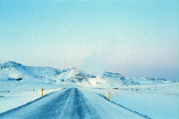
 “I was a little bit tired of the idea of photography allowing you to see everything,” Barbieri says. “After 9/11 the world had become a little bit blurred because things that seemed impossible happened. My desire was to look at the city again.”

08la

Although I don’t think I will be using this style of photography within my project, I may try to experiment with it on a couple of images as I really like the effect, and it could add a different angle to my photo book.


Case Study: QUINTESSENCE

This case study is about developing academic study skills for your next module Personal Study which involves developing a self-directed study based around a hypothesis of your own choice. The final outcome from your Personal Study is to produce a photo-book with a coherent set of photographs (30-40 images) that tell a story or express a personal point of view, including a 2-3000 word essay which relates directly to your hypothesis and body of work.

QUINTESSENCE is a group exhibition celebrating the first five years of Archisle: The Jersey Contemporary Photography Programme (www.archisle.org.je). The Archisle Programme, hosted by the Société Jersiaise Photo Archive promotes contemporary photography through an ongoing programme of exhibitions, education and commissions. Archisle connects photographic archives, contemporary practice and experiences of island cultures and geographies through the development of a forum for creative discourse between Jersey and international artists. Quintessence selects works commissioned for the new Archisle Contemporary Collection at the Société Jersiaise Photographic Archive since 2011 to celebrate, critique, contrast and discuss what has been achieved over the first five years of the project. The exhibition features works by:

Martin Parr / Tony Ray-Jones / Jem Southam / Michelle Sank / David Goldblatt / Yury Toroptsov / Elsie Wright and Frances Griffiths / Tom Pope / Peter Finnemore / Mark le Ruez / John Gibbons / Martin Toft / Finn Larsen 

q1

q2

q3

Since its launch in 2011, Archisle has engaged diverse approaches to contemporary lens based media to lead creative research into the condition of islandness, ‘a complex expression of identity that attaches to places smaller than continents and surrounded entirely by water’ (Stratford 2008). Quintessence contrasts works in the Archisle collection in a group exhibition for the first time to analyse the ways in which the Island’s culture and landscape has been interpreted by Jersey and international photographers. The Archisle project recognises that Jersey as a small island community needs to go out and discover the world because the world will not come looking for us! Through internationalism we have developed a growing network of colleagues, friends, influences and inspirations. To reflect these connections, for Quintessence, artists represented in the Archisle collection were invited to nominate colleagues who have influenced or inspired their own visual language.

Curator Gareth Syvret remarked, ‘We do not travel alone; we take with us the histories, knowledge, influences and ideas of others; others we have met and other places we have known.’ 

As a starting point we will visit the exhibition currently on show at The Berni Gallery, Jersey Arts Centre where Gareth will give a little introduction to his desire to mount this exhibition and discuss possible connections and relationships between exhibited artists.

Meet at Jersey Arts Centre for coffee, Danish Christmas cake and talk

Class 13B  Tue 8 Dec Pd 1 – 9:00 am
Class 13E Wed 9 Dec Pd 5 – 2:20 pm

This Case Study has three parts.
First you need to view the exhibition and answer the questions listed below. Second, you need to write a 1000 word mini-essay that reflect your visit and critical engagement with a paring of artists from the exhibition. Third, you must plan and produce a shoot as response to the above.

Deadline and presentation is Mon 14 Dec. Gareth will be assisting me in reading your essay and view photographs and will be providing some feedback for further improvements/ developments.

Present your answers, essay and images in a number of blog posts. 

Task 1: In advance of our visit, read the Exhibition text below and make notes. Think of at least 3 questions that you want to find answers to on your visit an write them down. Bring text and notes with you.

Link to Exhibition text Quintessence Programme

Download Quintessence task_sheet

Link to Quintessence_Media_Release_Jersey

Task 2: Upon visiting the exhibition try and answer the following questions. 

a) Write down the first thought about the exhibition that enters your head when you walk in?

b) Look at all the images on the walls. Now find a set of images that you like/ don’t like and write short descriptions of them.

Link to folder with exhibited images; M:\Departments\Photography\Students\Resources\Personal Study\Case Study Quintessence\images of exhibited work

c) Using exhibition text, note down artist name, title of work(s), his/her nominated colleague and consider the following:
What are the connections, influences, relationships between your chosen pairing of artists? Look also broader at common themes, subject-matter, form, aesthetics, visual language, methodologies among your chosen artists and across others featured in the show.

Have a closer look at photo books and newspapers on show at the exhibition. This will provide a much deeper understanding of their work.

Link to definition of aesthetics in art

Task 3. Conduct further independent research and write a 1000 word essay.

a) Try and think of an essay question (hypothesis) as a starting point for further investigation.

b) Incorporate your answers to the questions above and any other notes from exhibition text and  gallery talk with the Curator.

c) Include direct quotes from sources using Harvard System of Referencing (I will demonstrate how it work).

d) Illustrate your essay with images of artists work from the exhibition. Make sure you include name, title of work, year of production, dimensions, collections (if known.)

Link to shared folder with images from exhibition here M:\Departments\Photography\Students\Resources\Personal Study\Case Study Quintessence

Task 4: Plan a photo-shoot and make a set of images that respond to your chosen pairing of artists and your essay. 

a) Upload shoot, process and select best 3 images

b) Show experimentation with images using Lightroom/Photoshop appropriate to your intentions.

c) Evaluate and present images on the blog.

DEADLINE: both essay and photographic response Mon 14 Dec.

A selection of video with featuring exhibited artists where they talk about their work

David Goldblatt on his seminal body of work: In Boksburg

Michelle delivering a lecture on her work

Yury Toroptsov talking about Fairyland the work he produce while IPR in Jersey 2014

Jem Southam on his study of rockfalls

Finn Larsen presenting his work in Greenland over a 25 year period

Atlantus film with interviews

The world according to Martin Parr

From exhibition: Only in England showing work by Tony Ray Jones and Martin Parr

Interview with Peter Finnemore

Tom Pope discussing some his performances

Interview with John Gibbons

Picture Story

A picture story is a group of images, roughly ranging from 6-8 pictures. For a picture story to be powerful, it contains 7 types of shots, including:

  1. Person at Work
  2. Relationship Shot
  3. Establishing Shot
  4. Detail Shot
  5. Environmental Portrait
  6. Formal Portrait
  7. Observed Portrait

Person at Work – These photographs are very realistic and usually quite natural. These photographs makes you think about the types of things they do and why they are doing them. They make you think about the context more, and why the context is important.

maxresdefault

Relationship Shot – A relationship shot doesn’t always have to be the stereotypical loving relationship. It can range from love to hate, abusive to affectionate etc. It can also be an emotional thing, such as the relationship between workers, or the relationship between two objects. It is important to notice the key aspect of the relationship, how it works and why are they apparent.

A beautiful wedding image of a bride and groom embracing while the bride is laughing looking at the photographer.

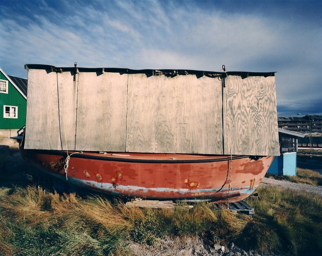
Establishing Shot – This is one of the most important aspect to the picture story. It portrays the main context of the story, giving out detail of where it is and what is happening. It describes key aspects of the story.
Screen Shot 2013-05-14 at 3.06.42 PM_0_1

Detail Shot – These type of images range from doing close-ups of objects to images of people. Commonly, I did detailed shots for some of my portraiture work last year. I think this images are very effective and enabled the audience to focus on the foreground rather than everything that is going on in the picture.

bat-ball-detail

Environment Portrait –  An environmental portrait is a portrait executed in the subject’s usual environment, such as in their home or workplace, and typically illuminates the subject’s life and surroundings. By photographing a person in their natural surroundings, it is thought that you will be able to better illuminate their character, and therefore portray the essence of their personality, rather than merely a likeness of their physical features. It is also thought that by photographing a person in their natural surroundings, the subject will be more at ease, and so be more conducive to expressing themselves, as opposed to in a studio, which can be a rather intimidating and artificial experience.

portfolioindex1

Formal portrait – A portrait is an image of a person’s face that clearly displays their likeness and may often display some aspect of their personality. A formal portrait is not a snapshot but a carefully arranged pose under effective lighting conditions.
formal-portrait2

Observed portrait – These images have more than one person in. The main focus to the image is the person getting a portrait taken, but there is always another person in the image ‘observing’, it doesn’t have to show their face just their presence.

POS1 IL