The Chimney Sweep and The Miller
The Chimney Sweep and The Miller
Back when this short film was made, their technology was limited. Due to this, the camera angles and distanced will be simple, and won’t change. This is because cameras weren’t portable back then, when a camera was built it would have been set up in a certain place and would stay there. That’s why this short film is all filmed using an eye level camera angle, because it’s level with the horizon and easier to set up. The camera distance is also the same, it’s set up as an extra-long short, in order to allow the actors room to move around and fight from one side of the screen to the other.
If this were to be filmed today, I feel like the camera angles would change. Instead of keeping the same Eye Level shot throughout, I would change it every couple second, perhaps using a canted camera angle to show that the miller is mad when he gets knocked by the Chimney Sweep. And then a Worms eye shot to show that one of the characters is more powerful than the other. As well as that, I would implement some camera movements, perhaps following the miller as he walks towards the chimney sweep, and then panning left to towards him. The camera distances would differ as well, going from a close to show the emotion of the characters, to a medium shot when the action is happening.
Depth Of Field
long take shots
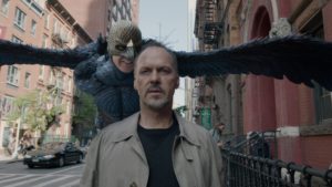
Birdman is most famous for the fact it is shown as one whole continuous long shot, although it is shown like this it isn’t all shot at once as there is some camera trickery, but even then it is a masterpiece because its the first of its kind. through the film there are lots of difficult long take shots, a lot of these scenes have many people doing complicated things and so the directer needed to be very organised so that everything ran smoothly without mistakes and people bumping into each other and messing up the scene, these shots most likely weren’t first try so it could become very frustrating for the actors and people working on the scene.
Cinematography In The Shining
Cinematography In The Shining
The shining (1980) was based on a Steven King novel that was released in 1977. The film was directed by Stanley Kubrick who was an American film director, screenwriter, and producer. The film was visually amazing when released (and still is) because it had lots of new techniques and technology such as the Steadicam.
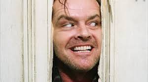
Stanley Kubrick is a perfectionist when it comes to mise-en-scene, The shining was a huge breakthrough in the film industry due to the first real use of Steadicam in cinema, the Steadicam was a device which meant you could film smoothly whilst moving. Having the camera free hand meant it wasn’t on another device like a track .
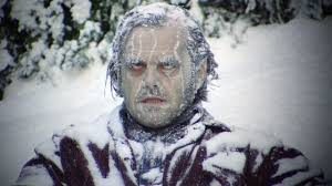
The use of the Steadicam creates a sense of unease for the viewer as it seems like we are following the characters around or someone else is. A perfect example for this is throughout the film (The shining) there are shots where the camera is following Danny on his cart through the corridors although this seems like a harmless idea, through the use of the Steadicam it makes it more sinister. This feature is important for the viewer as there are lots of corners in the corridors and we don’t know what is going to be around the next corner which creates suspense and adds to the horror.
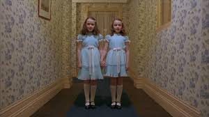
Stanley Kubrick is also well known for his subtle use of symmetry, this subtle feature is aesthetically pleasing for the viewer and in the shining it symbolizes the connection between jack and the hotel, making them a pair. An example of this is where Jack first enters the hotel and one of the waiters Is stepping in sync to him and crosses a square shape on the floor at the exact same time as him, although this is a very subtle feature it explains a lot when you take it into consideration to the rest of the film and especially the photo at the end where we are shown that jack has been absorbed by the hotel. There is also a more obvious symmetry during the shots of the daughters which is very unsettling for the viewer because of the unreal perfection in the shot (2 identical twins standing next to each other perfectly in the middle of a corridor).
Cinematography: Diegesis Activity 1
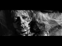
In the opening scene of Kill Bill (Tarantino, 2003) , we can see the use of diegetic gaze, which emphasizes the pain of the protagonist, which we can identify physically and emotively. In relation to the rest of the film, this allows the audience to understand the tribulation the character is willing to endure in order to get revenge.
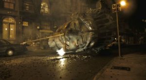
An example of intra-deiegetic gaze is fully identified in Cloverfield (Matt Reeves, 2008), the movie is shot in perspective of a recording made by a victim of the events, and what he captures surrounding him. The effect on the audience this creates is a feeling of empathetic suspense, as the realistic filming style allows the audience to comprehend what it would be like for it to happen to them.
Opinion on Spike Lee’s Viewpoint
- Lee criticised Detroit (Bigelow, 2017) and Django Unchained (Tarrantino, 2012) for being directed by white directors who were “misappropriating” or “misrepresenting” black narratives.
To an extent, Spike Lee’s opinion on the subject can be somewhat appreciated on the grounds that when making a film surrounding historical events, whether fictional or true, directors are solely producing presumption onto the screen, and therefore can be perceived as a misrepresenting form of content.
However, his ridicule on the misrepresentation on narratives seems contradictory in retrospect to the essence of a film, as films are fully subjective to opinion and do not represent the world we live in, in fact more times than not movies find themselves on the other side of the spectrum.
It is a controversial subject, and I can understand why Spike Lee would not be happy with the standing of the directors, however overall I believe that as film creators, we have to understand and appreciate narratives that allow us to see alternate and in some cases fictional perspectives.
camera movements
Camera movements
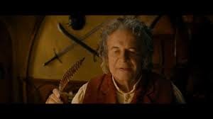
In the opening scene to the Hobbit an unexpected journey, where bilbo is old and begins to write the letter to Frodo explaining his own journey. As he begins to write the camera moves backwards out of the room slowly probably on a Dolly. This symbolises him going back in time. It also shows that we are leaving his character behind for the rest of the story.
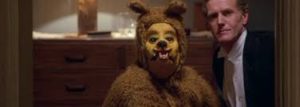
The zoom: In the Shining, when Wendy is walking up the stairs with her bat, she reaches the floor where there is a man in a bear costume in one of the bedrooms. Then suddenly there is a fast zoom into the bears face. This scares the viewer because of the speed of the zoom and the fact the bear is looking right at the camera which seems like it is looking right at us!
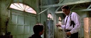
The pan: a pan is where the camera moves from the action and averts away from the main focus. In reservoir dogs this is used when Vega chops the cop’s ear off, after showing a little bit of brutality when Vega slashes at the cop’s face. He then holds his ear and the camera pans out to the top left of the screen. This is a great method because it tells the viewer there is no hope for the victim and what is about to happen is inevitable, as a viewer we are left with no hope or suspicion that the victim may have averted the attack (This method also saves a lot of time and money on CGI or screen play).
stedicam and symmetry
In this shot a Steadicam follows Danny around the corridors on his bike. While also being a symmetrical shot as Kubrick is known for doing it also adds to the story by creating tension and an erie atmosphere. This is done by a combination of the music used and Danny seeming almost worried about something behind him or around him, which with the camera following him it almost puts the viewer in the perspective of the thing Danny is scared of or running from.

The Shining – Symmetry
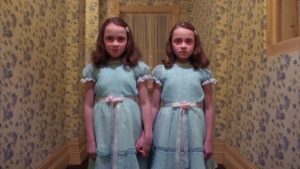
The Shining (1980, by Stanley Kubrick) uses symmetry frequently throughout the film. This particular scene is intriguing because the actors are positioned at the center of the frame, serving as an instant focal point. They are the first thing that the audience see when they look at the scene because of the clever positioning. This would have a strange yet eerie impact on the audience, mainly due to the neat yet intense symmetry of the frame. Everything seems so neat and almost perfect, in terms of the framing and balance, which contradicts the riot and chaos within the narrative.
The twins are centered, which takes our focus away from the corridor walls. But when observing them, we can notice the similar symmetry within the hotel decor, which also furthers the creepy atmosphere within the setting. By showing similarities between the twins’ and the corridor walls symmetry; it is foreshadowed that the twins have become part of the hotel as well, as they are beginning to follow the strange yet intriguing patterns adopted by the ‘Overlook’. Their firm symmetric positioning suggests their role in the center of Danny’s horror. This foreshadow’s their later haunting and frequent appearances within his ‘shining’ ability, showing that they are indeed stuck within the hotel spirit forever
