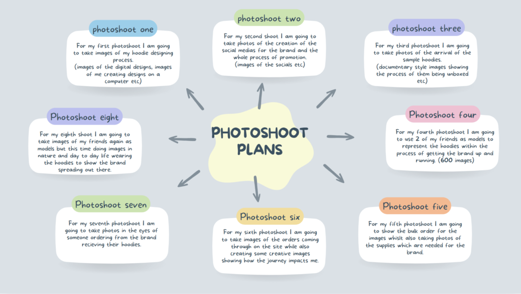

explaining what you focused on in each shoot and how you intend to develop your next photoshoot.
- How successful was your photoshoot and experimentation?
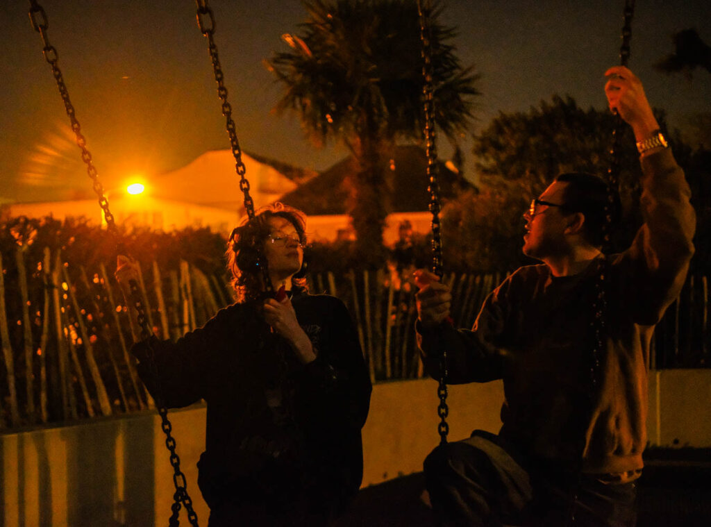
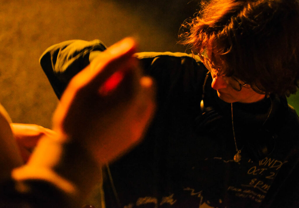
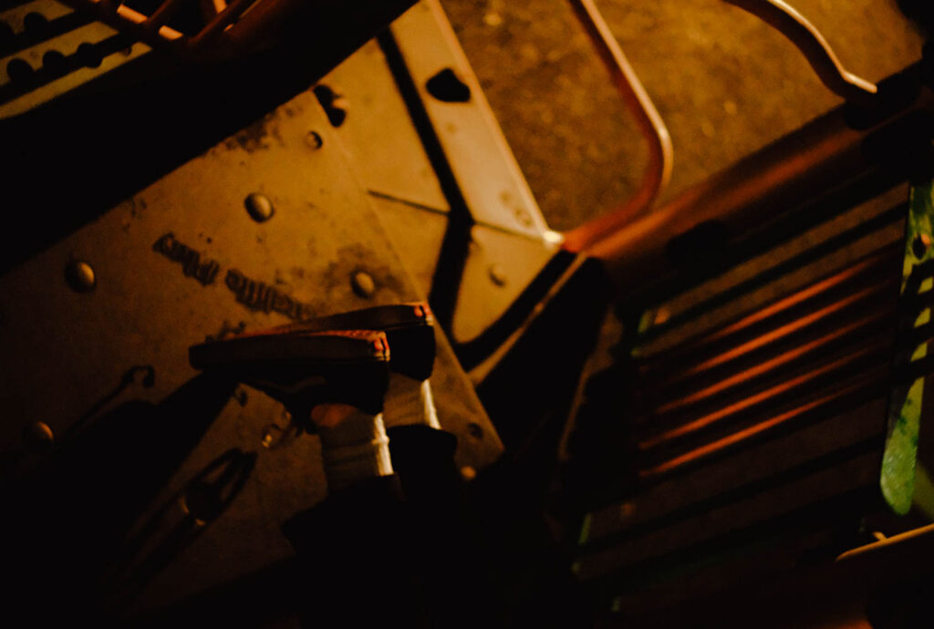
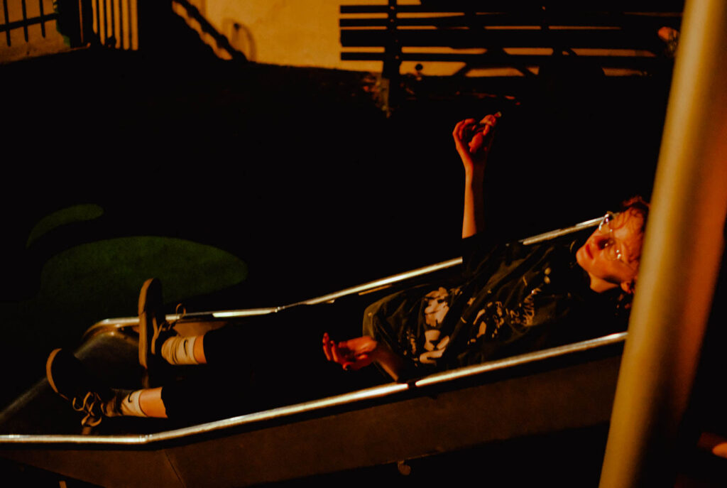
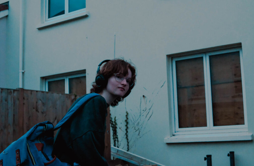
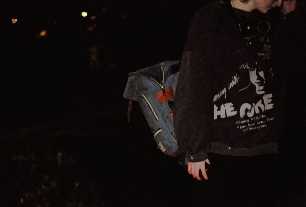
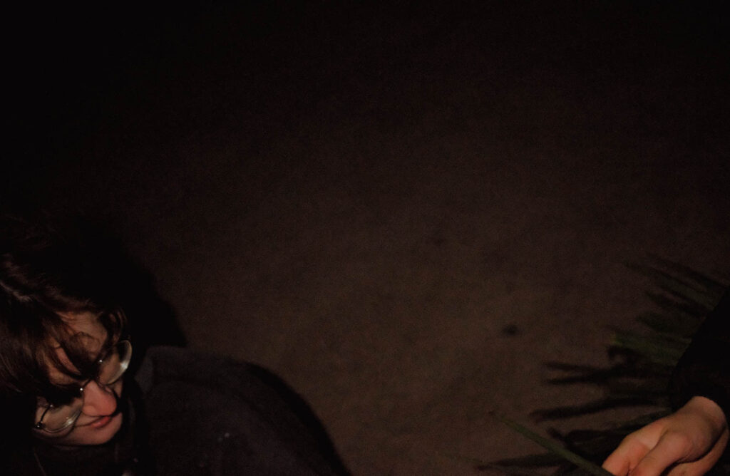
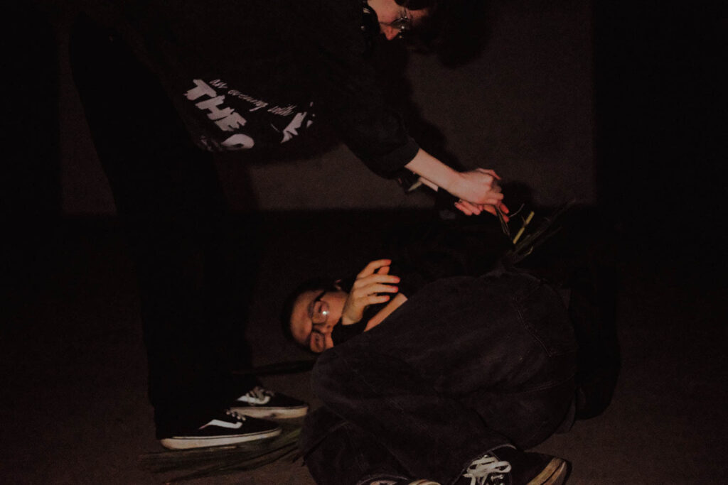
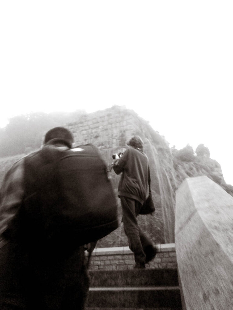
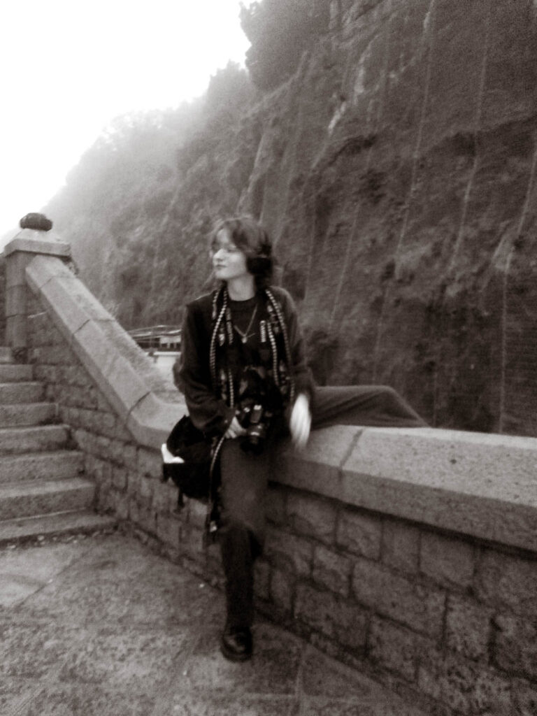
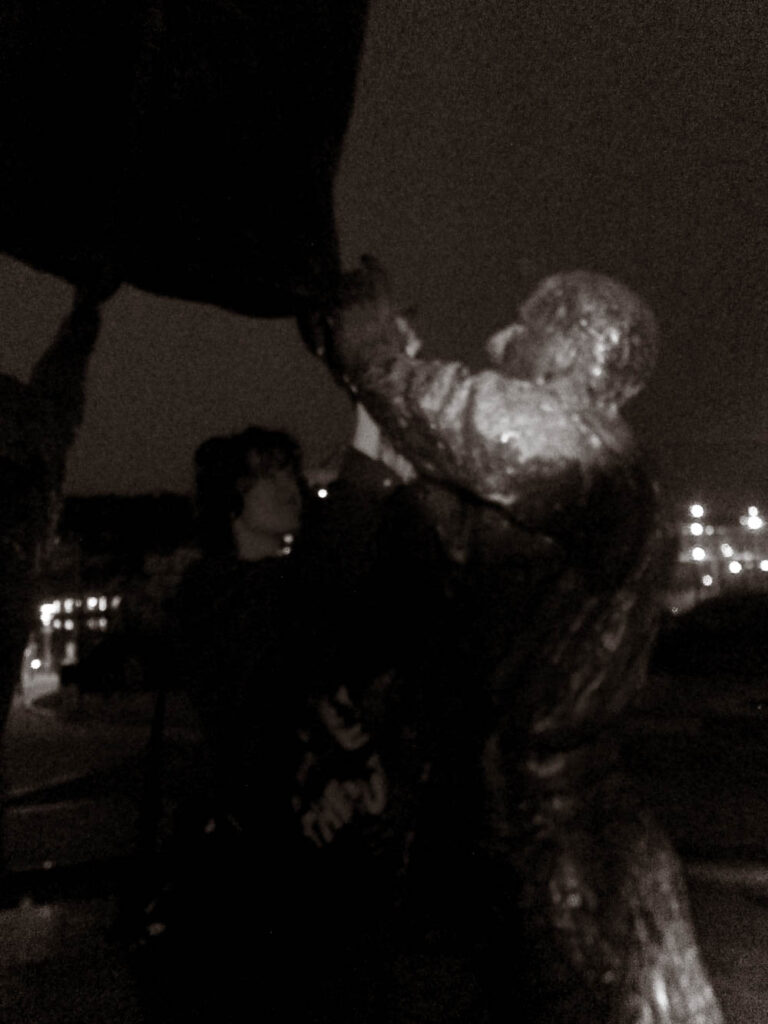
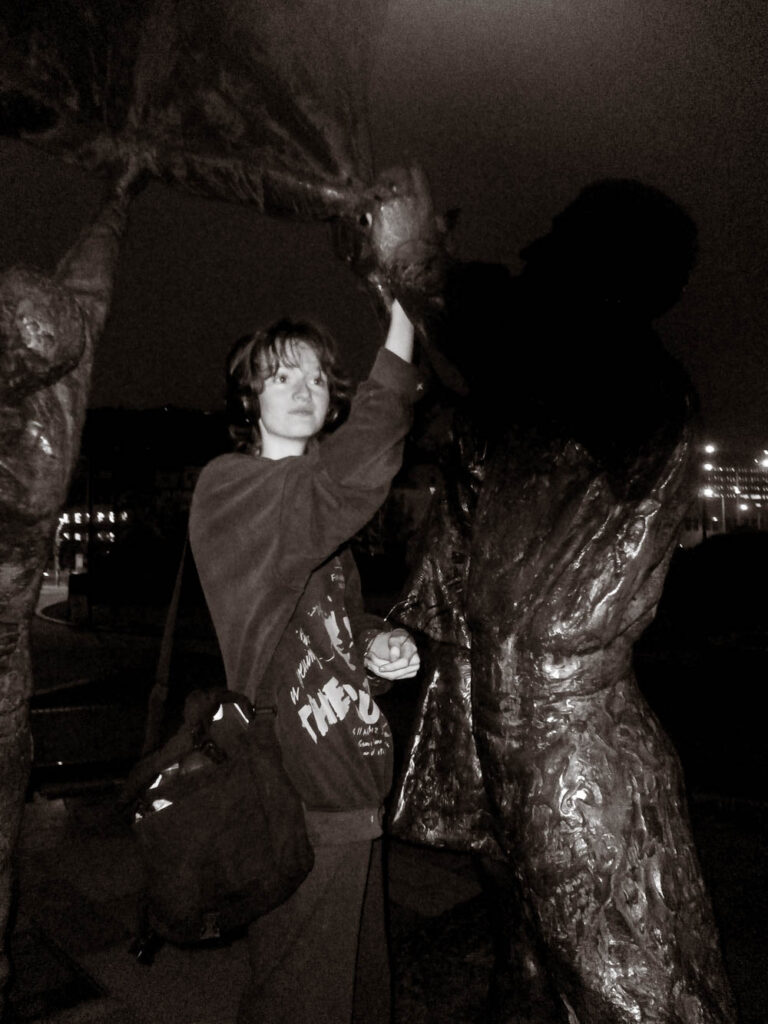
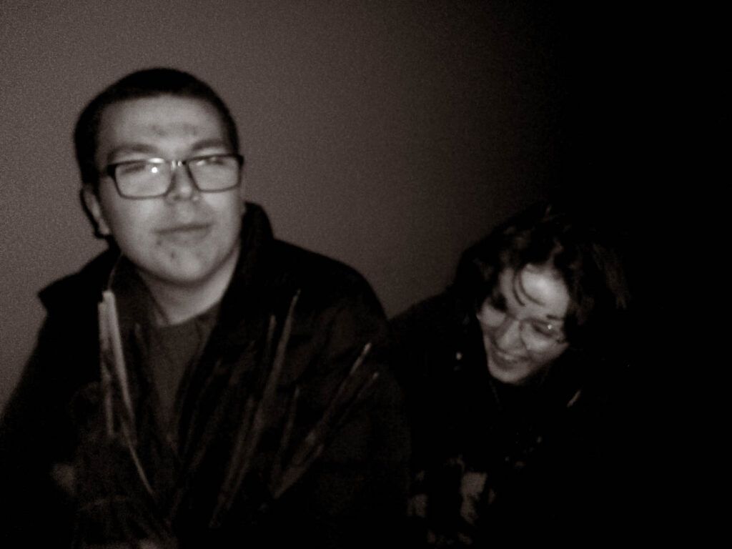
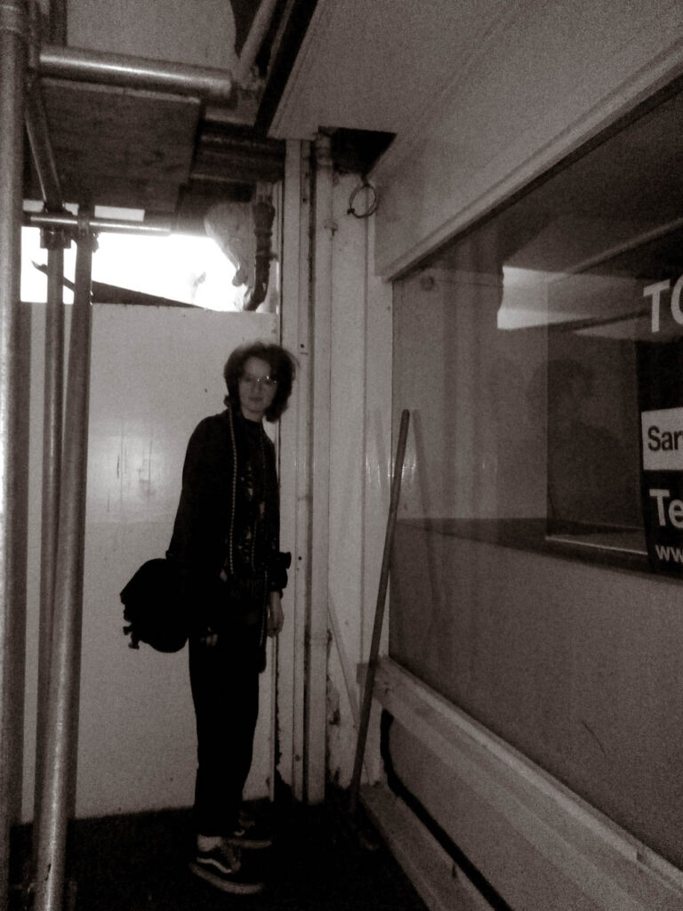
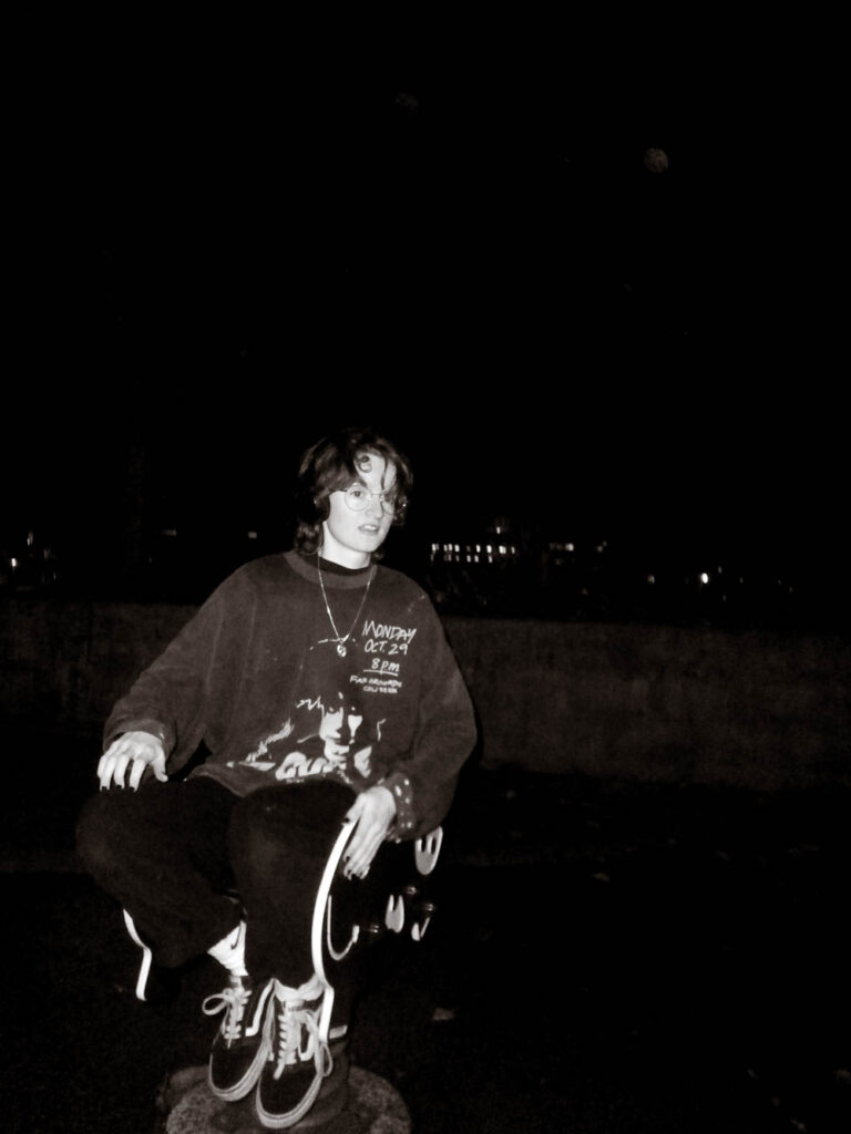
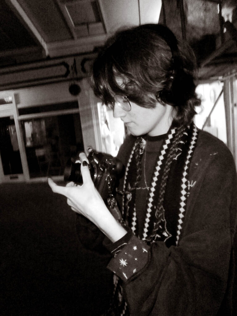
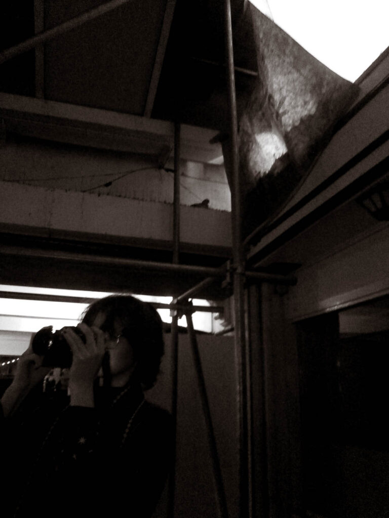
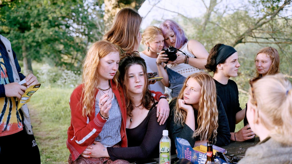
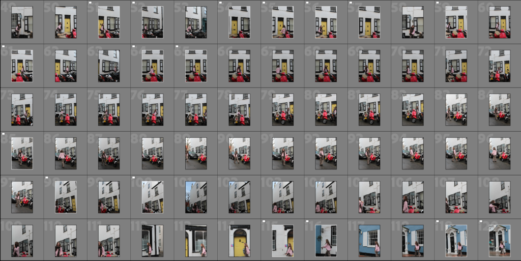
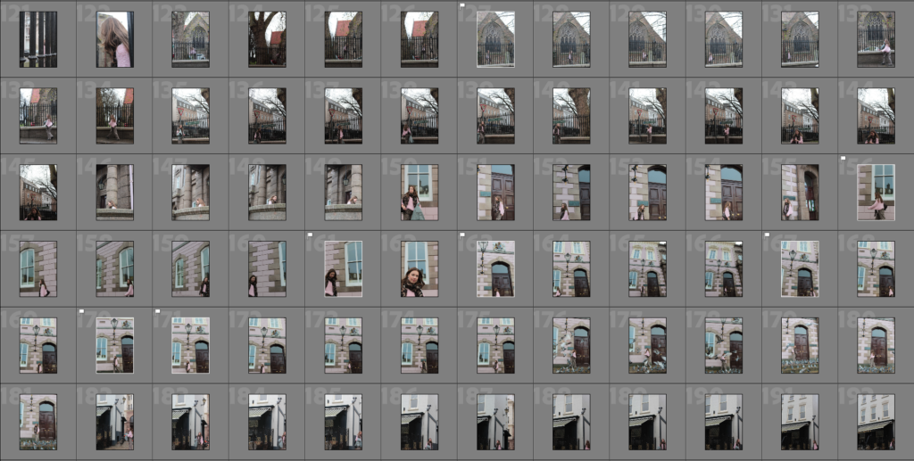
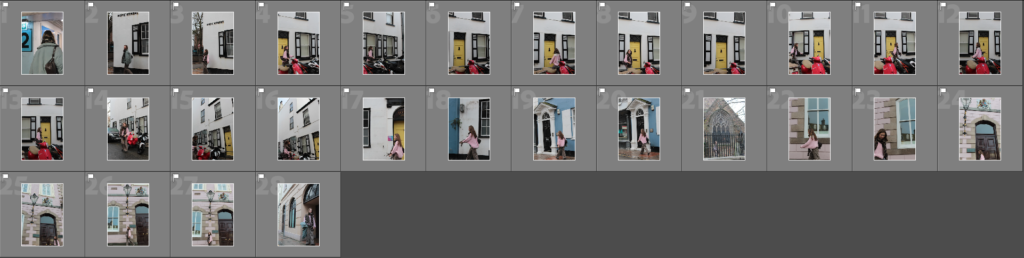
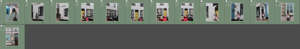
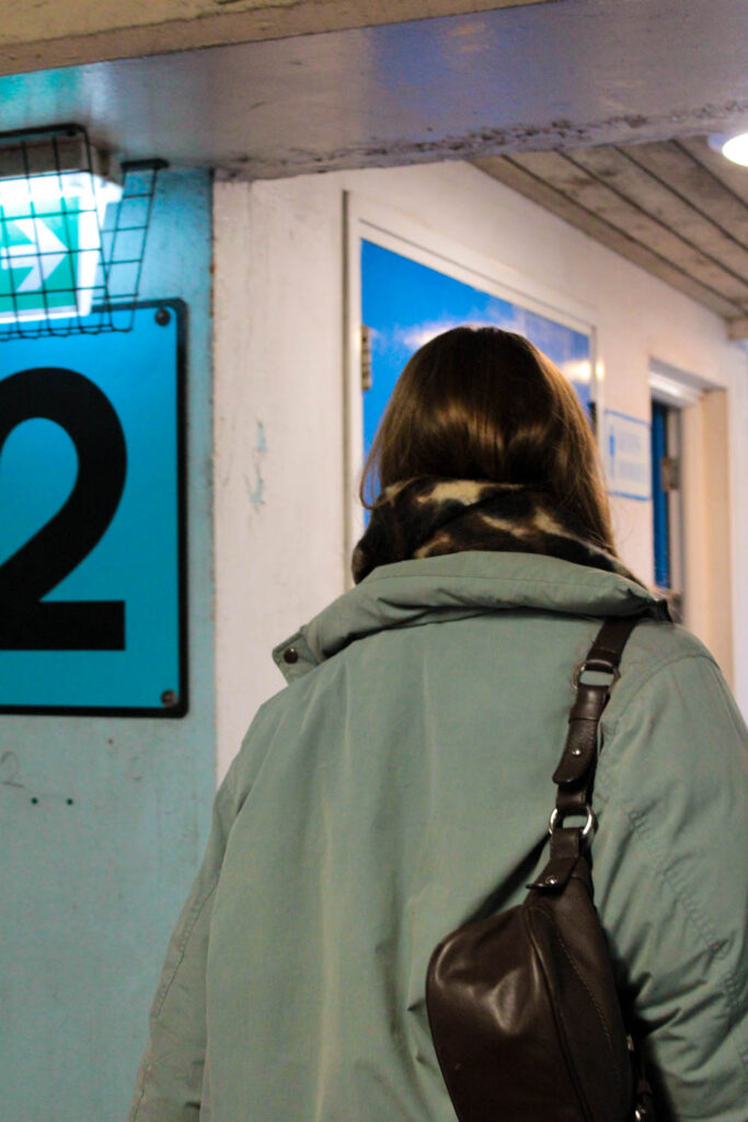
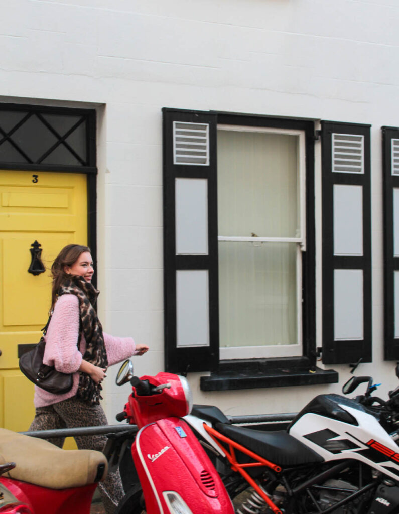
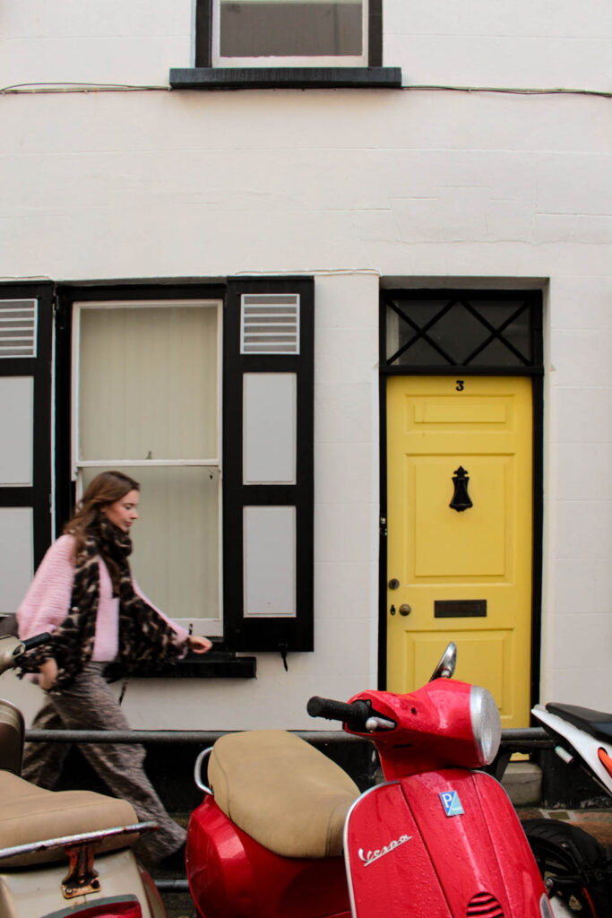
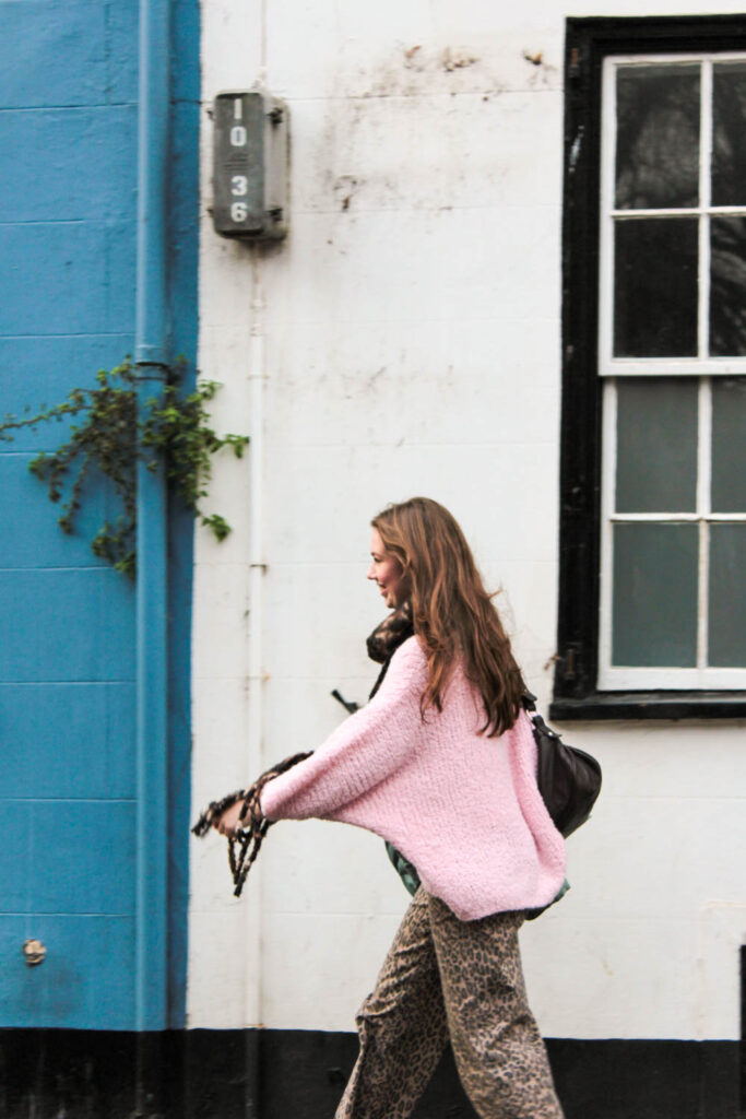
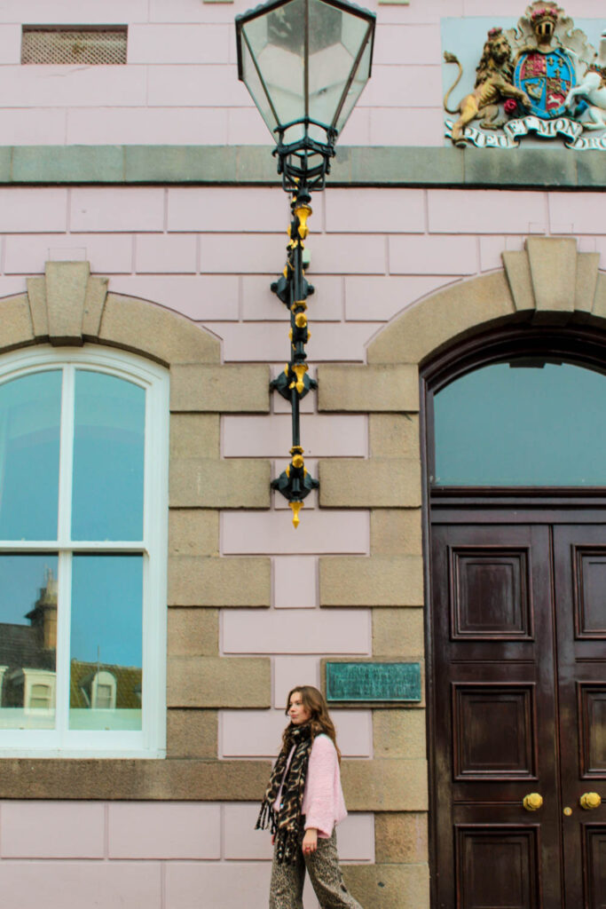
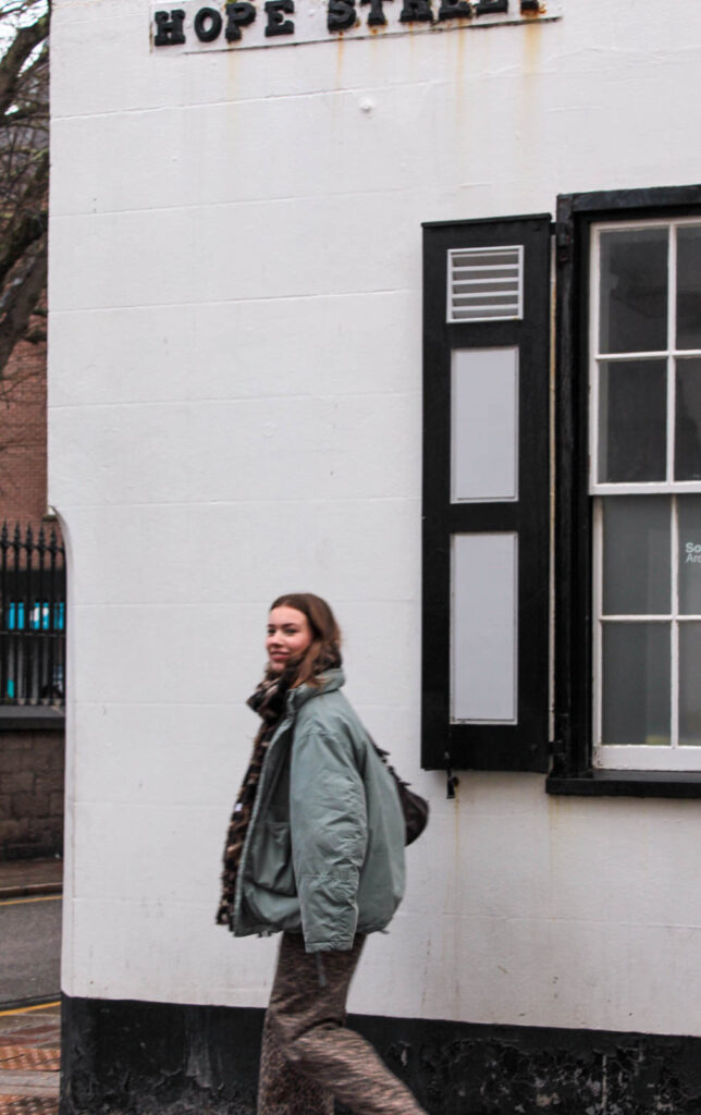
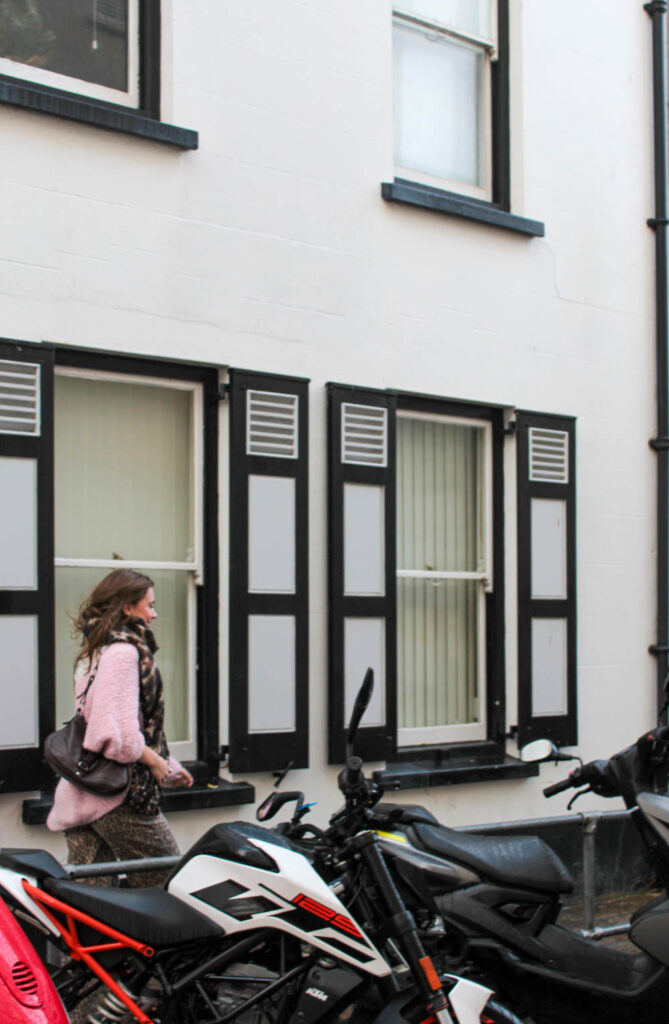
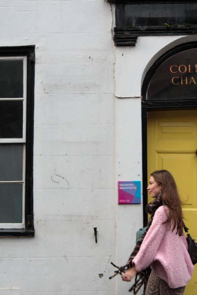
During this photo-shoot I visited various street around St Helier which I felt displayed the perfect relation between colour, pattern, shapes and how a unique composition was created by this. I decided to use someone I know, as I could further stage and direct how I wanted them to pose in front of the compositional background. I found this an interesting concept to experiment with, as features such as lines, shapes, and outlines of colour or an object could be further enhanced against the main ‘silhouette’ of the subject.
- What references did you make to artists references? –
- comment on technical, visual, contextual, conceptual?
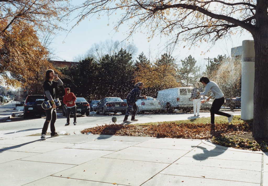
Looking closely a the work of Saul Leiter, his use of visual elements such as colour, pattern, composition, shape, and outlines, all work together to create contrasting, hectic features. Through his use of people as subjects that complement the background, creates this intriguing relationship as
Overall he achieves this unique concept about how he captures these specific moments to the final image. This is what makes his work so unique, never failing to attract the viewer. I love Leiter’s thought processes which lead him to creating such exciting and engaging images; ‘decisive moment,’ ‘the beauty of simple things’ and ‘the most uninteresting things can be very interesting.’ In response I took a close approach focusing on simple features that were in fact the most interesting, as I found what made the images was how it all fitted together through the contrasting colours, with lines/ patterns of random marks/ signs/ letters, defining this. I picked a locations with bold colours and features that made it unique. Leiter’s use of abstract approaches of forms and innovative compositions creates this painterly abstract look, further expressed through visual elements
- How are you going to develop your project from here? – comment on research, planning, recording, experimenting.
- What are you going to do next? – what, why, how, when, where?
intense colour