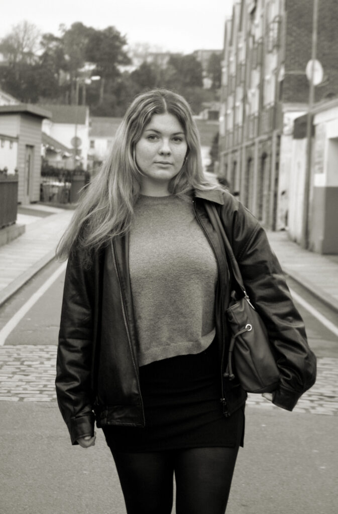
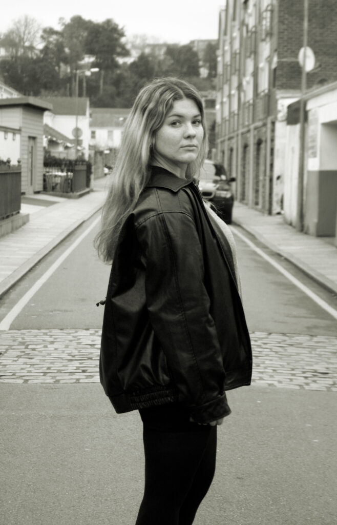
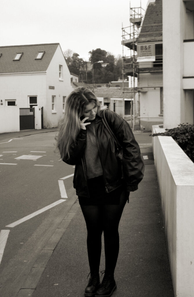
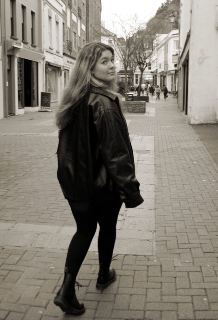
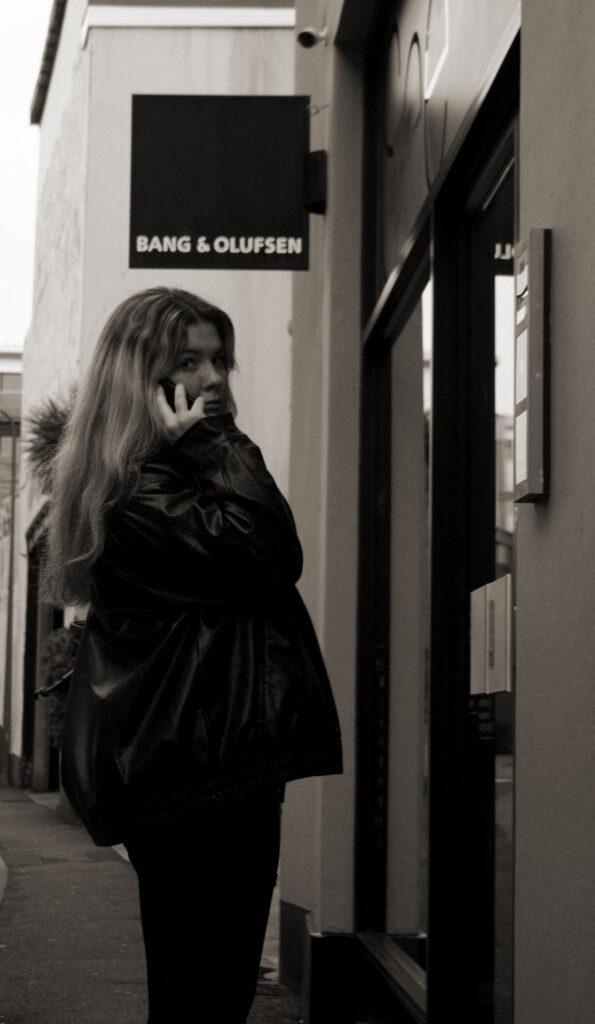
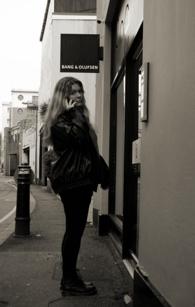
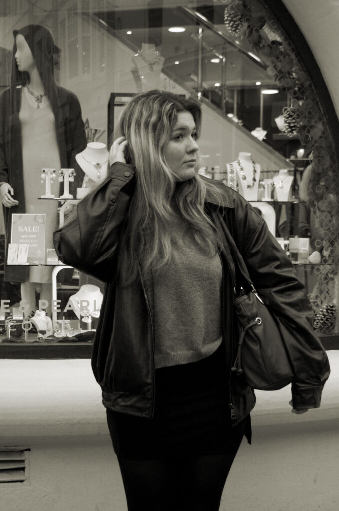
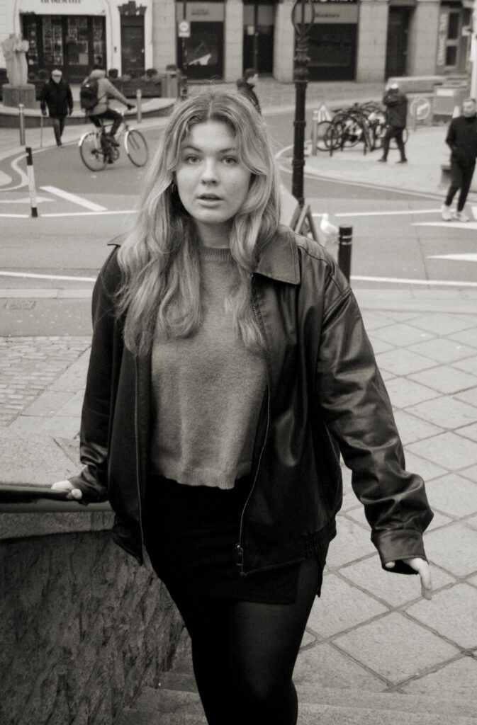
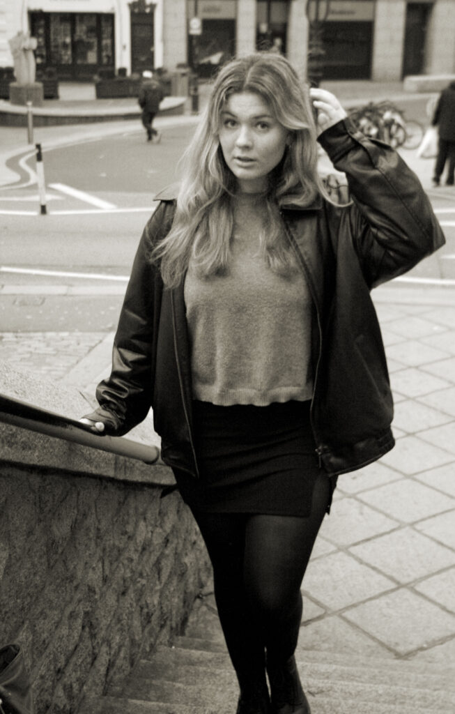
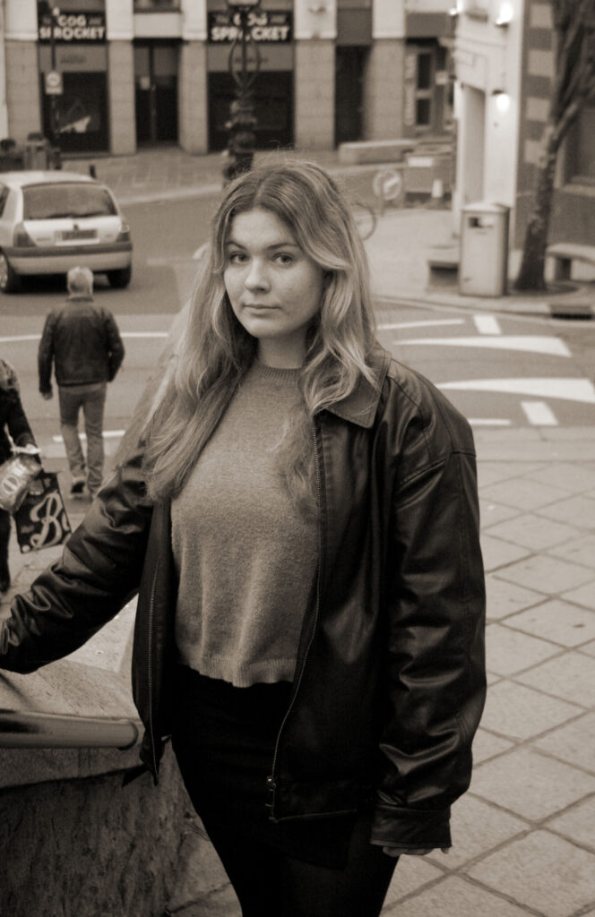
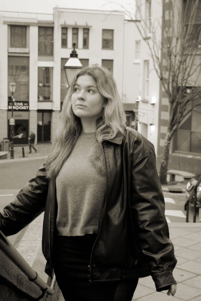
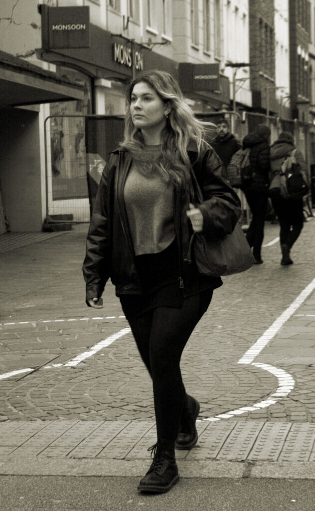
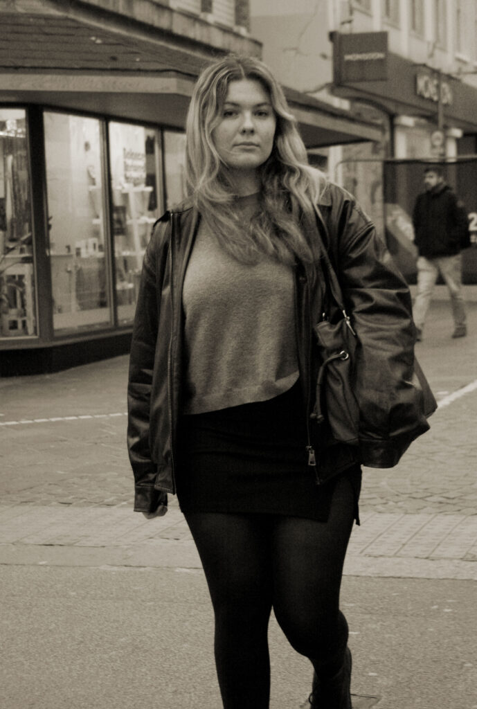
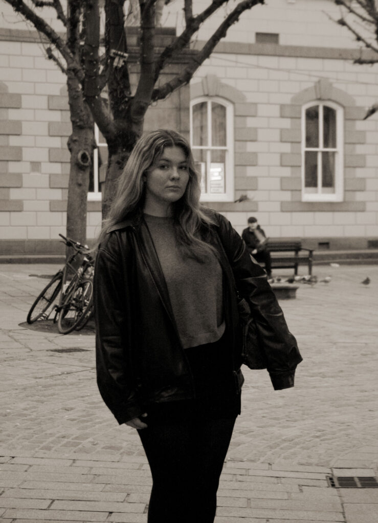
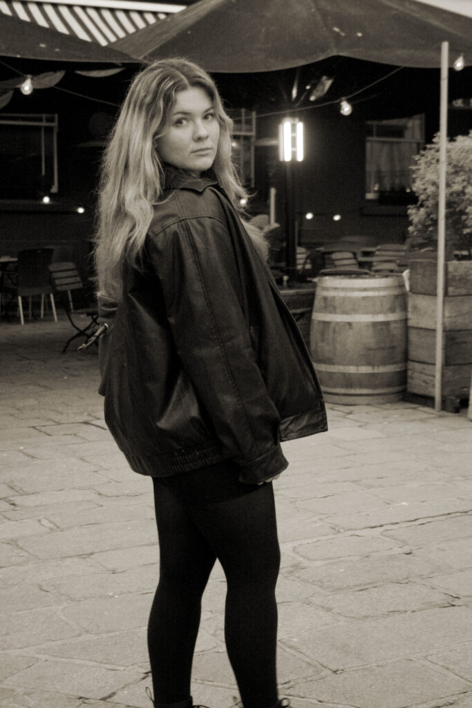
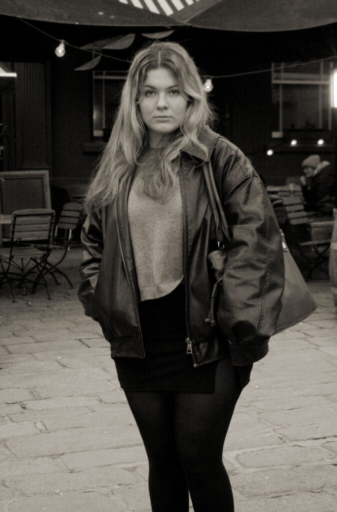
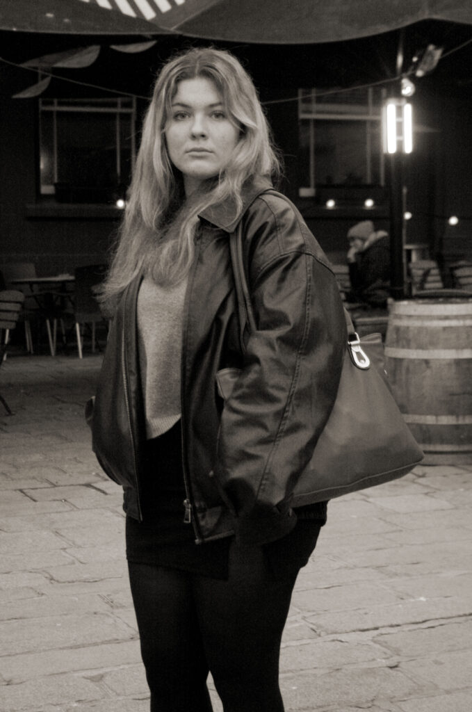
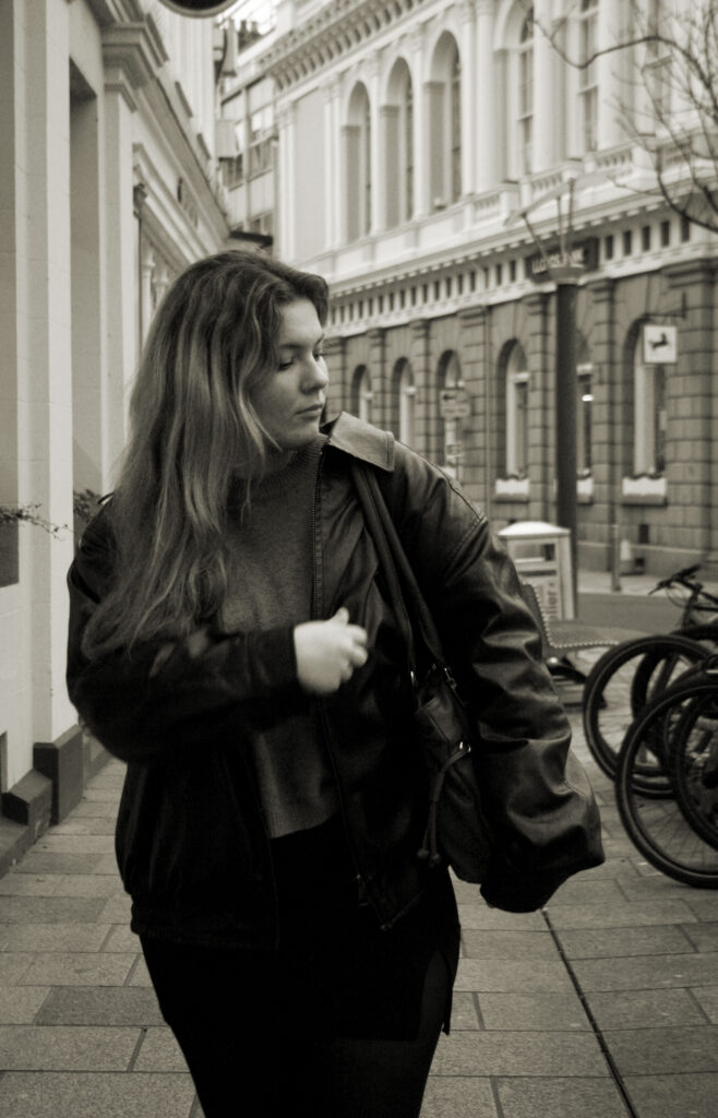
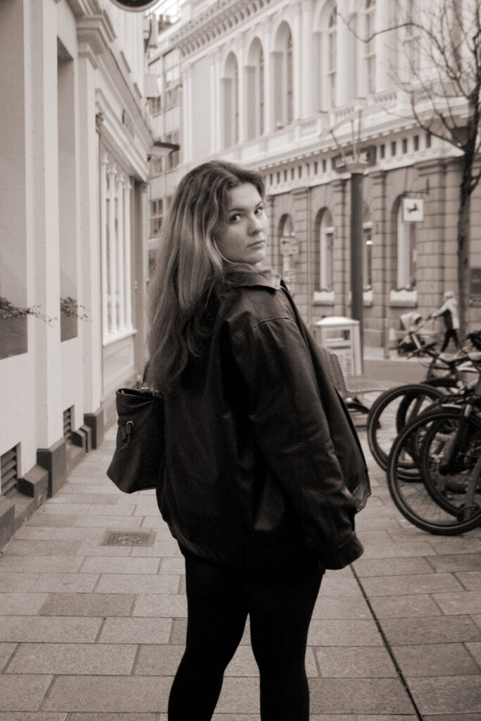
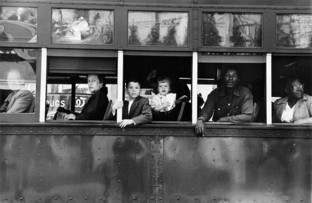
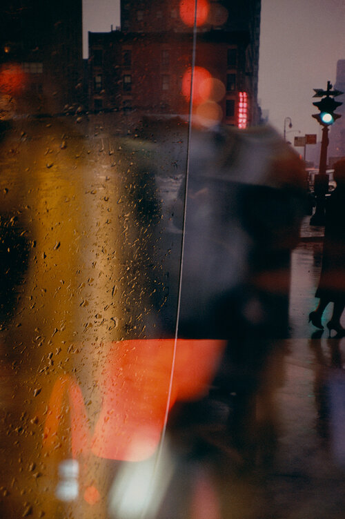
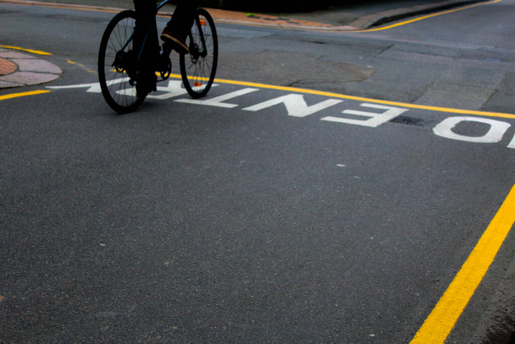
I would say that this photoshoot went quite well as I was able to capture some good images inspired by William Klein. I went around town with my model and tried to get some decent looking background, just like William did in New York, although jersey is a lot smaller and isn’t as posh as New York, I did manage to get a good set of images. My main goal was to try and find a wide cross walk so that I could recreate on of his famous photos, but I found it difficult and was only able to capture small cross walks, which isn’t bad but made it very difficult to make this photoshoot link in with my artist. I asked the model to pose for me in numerous places and even tried to get similar pictures to Klein’s, although it was difficult to get the model to wear a set of outstanding and bold clothes, I would say I still managed to get a similar aesthetic as I had planned to get. Most of the places in Jersey has scaffolding which doesn’t help and tends to make the image look very tacky, but that could a representation of what jersey is and how it is different to New York, jersey is a lot less busier and smaller, the population is lower and there are barely any shops left. This is what my hometown looks like and that is how it’s meaningful to me. After collecting these photo’s I then implanted them onto photoshop to edit the black and white effect just like Klein did to his. Though when I was editing, I realised that I was able to make my images different shades of black and white and add a tint of yellow to it, which made it look more unique and original. I will also be editing some other things on these images, to help present it better when constructing it into a book. For example, my plan is to make it look like a vogue magazine, so I will be implanting the vogue sign on the top and adding more detail to the bottom describing what my book is about. overall, this photoshoot went quite well and helped my get an understanding on the way William Klein photographed and how difficult it is to get decent images when in the middle of town, I did have certain goals when capturing my photographs and didn’t exactly manage to capture all of them but I did recreate one of William Klein’s photo with the model on the stairs walking it, but I did realise when I was photogating I wasn’t able to see the stairs so it didn’t really go as plan, so next time I do a photoshoot I will make sure to have a certain inspiration photograph to recreate and focus on one photograph at a time. I would also like to try and control my lighting a bit better as in some of the photographs they are darker and in others they are lighter, which doesn’t really help to balance the set of photographs I want to put together when contracting my Photobook/ magazine. I did find that when the model wasn’t looking directly at the camera it made the photograph look better, it added a sense of mystery and was overall just different from regular photographs of fashion photography, it almost added a style like Vivian Maier had in her candid photographs, I did also try and add different levelling when taking the photo just like Willian did, he tended to be higher up taking his models from above whereas I did the opposite and tried to get a shot of the models form below. I would definitely like to go back to town and get some more images with the same model wearing different clothing and try to find different surroundings, possibly when its busier as in Williams Klein’s images he always had people in background of his photographs.
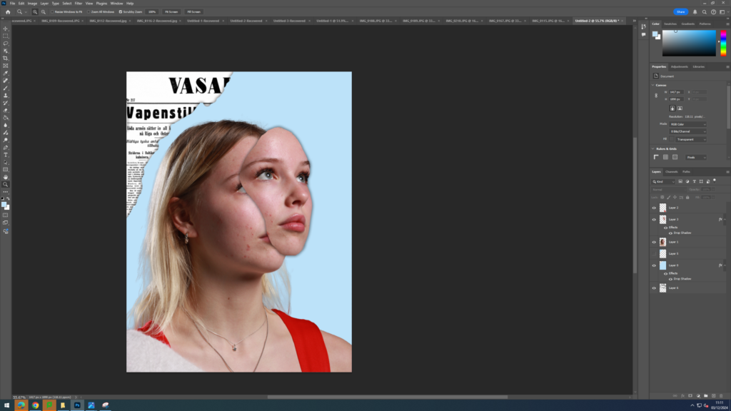
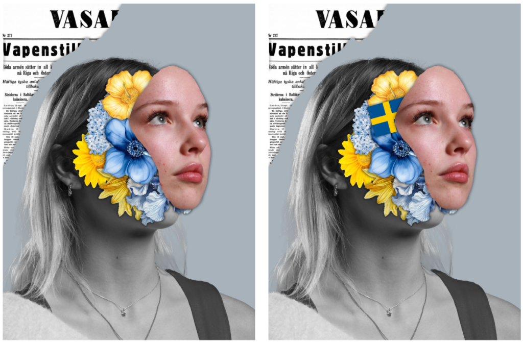
For this photoshoot, I was inspired by Marcelo Monreal. I began the editing process by first selecting an image of my model where she was slightly on her side (which would allow me to bring her face out to the side later). I then used the object selection tool to create an outline around the model then pressed layer via copy. I then dragged this cut out onto a blank white piece of A4 paper.
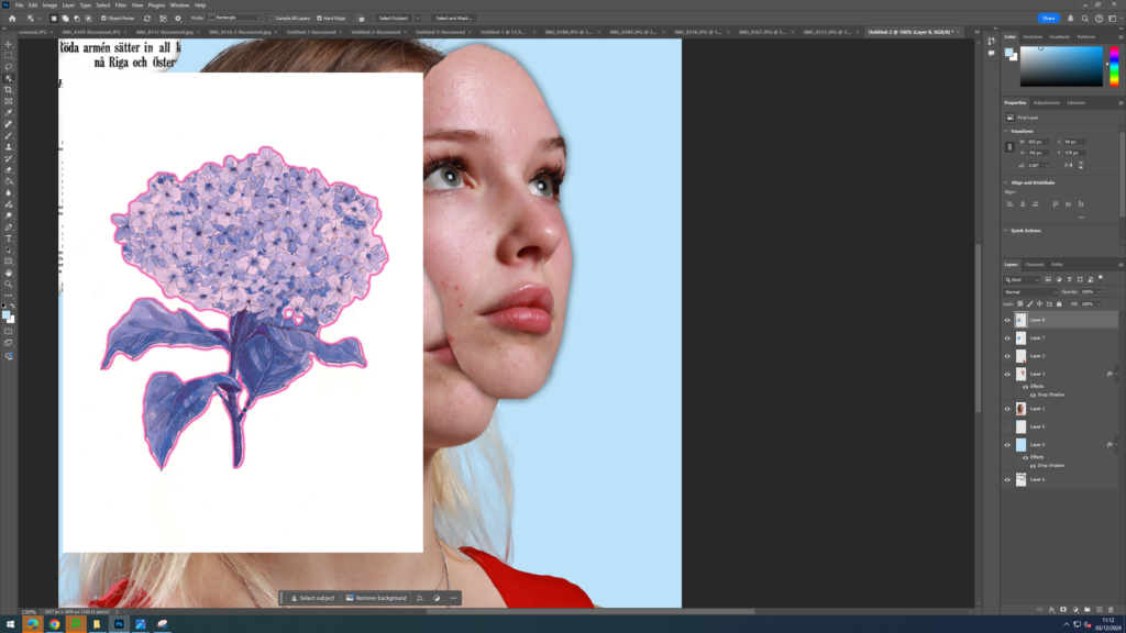
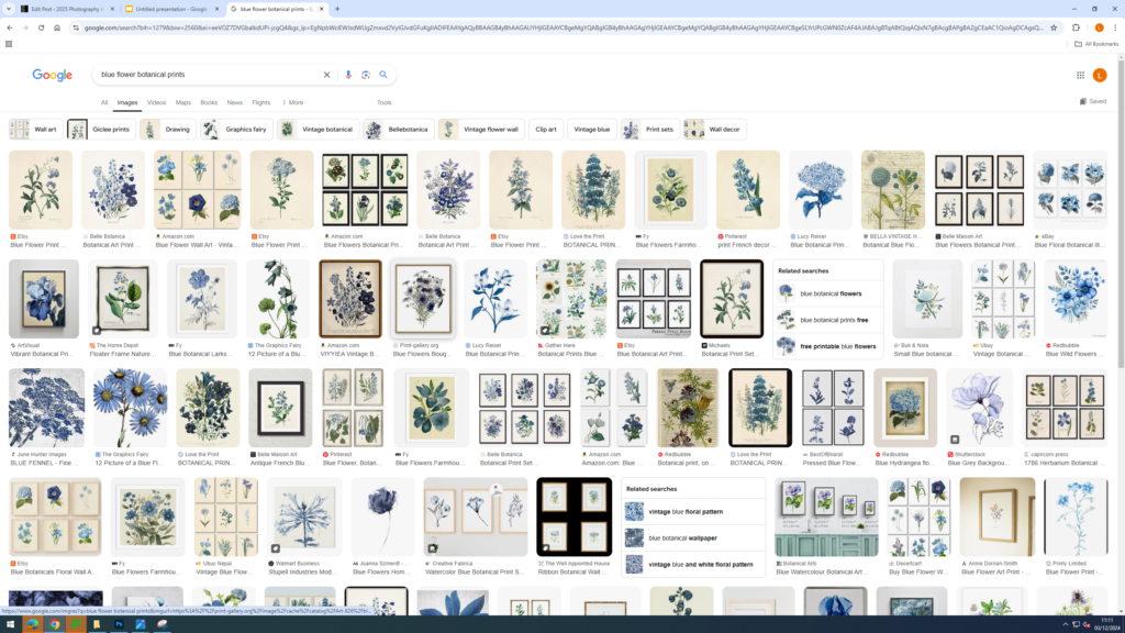
Next I used the lasso tool to make a shape on her face and then dragged out that shape to the side to give the illusion of a mask coming off of her face, revealing her true self. I then went onto google and searched up yellow and blue botanical flower prints. I chose these colours as the model is from Sweden and the colours seen on their flag is blue and yellow. This made my idea more personal and about identity as I incorporated her heritage into the image, which is a part of her identity.
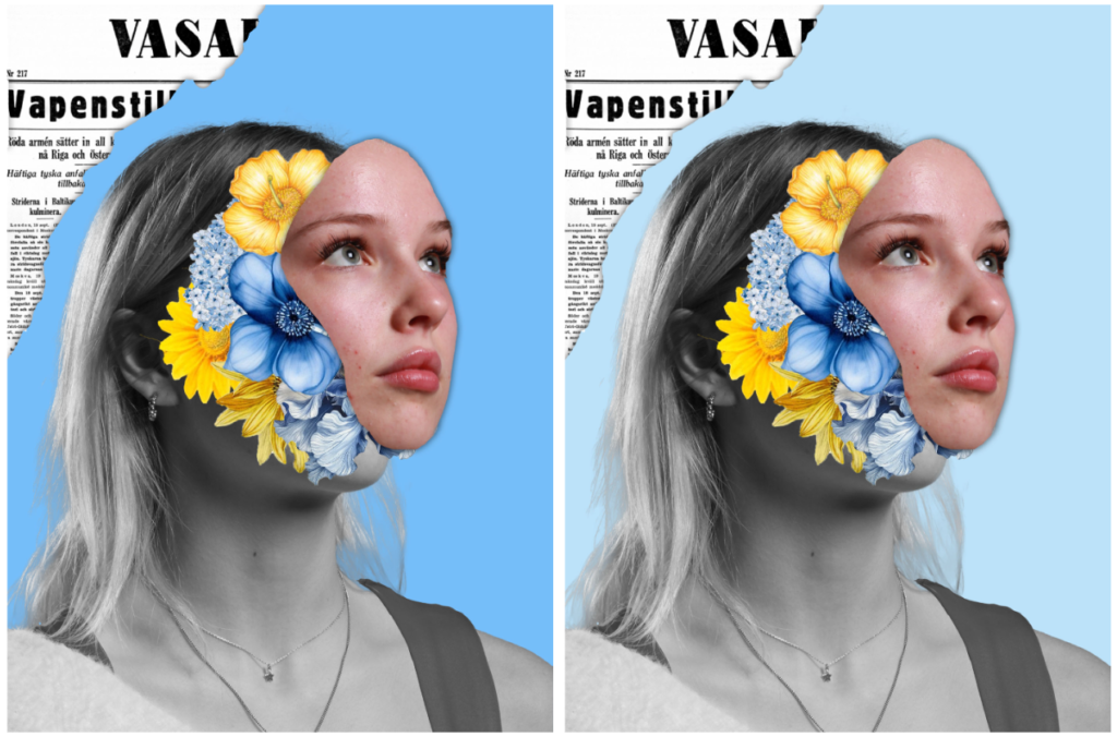
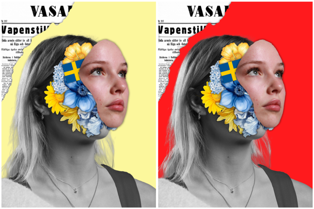
Once I had selected a flower, I used the object select tool to make a cut-out of the flower and dragged it onto the model. Then, I had to bring the flower layer below the face cut out so that the flowers were behind the model. I repeated this step many times until I had the desired amount of flowers. I also experimented with adding a Swedish flag amongst the flowers. Finally, I experimented with different background colours and layouts. Ultimately, I decided to add an image of a Swedish newspaper in the corner in order to emphasise the point of the image being about showing her identity. I then tried different colours for the background eg red, blue and yellow. I think the red background made the model pop the most due to the extreme contrast between the black and white model and the red in the background.
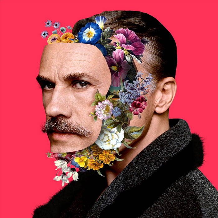
Image that inspired my idea:
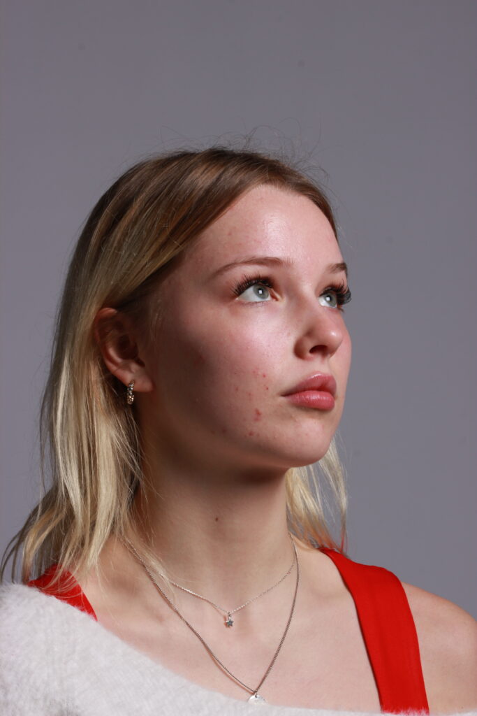
This is the photograph of the model I decided to use and the kinds of flowers I wanted to incorporate in my design.
Overall, I like how this idea came out as I managed to successfully resemble the work of Marcelo Monreal but was still able to add my own personal take on it by making the flowers inside of the models head be about her identity by showing the colours of the Sweden flag (which is where she is from). I also liked the idea of adding a rip into the background and adding an extract from a Swedish newspaper to emphasise the point of image being about her identity in the form of her heritage/ upbringing. Next time I would like to experiment with people from other cultures and instead of flowers, add objects that are associated with that place so it makes it clearer what I’m trying to convey.
In what way does Sian Davey and Nick Haymes explore teenage stereotypes through their work?
Introduction
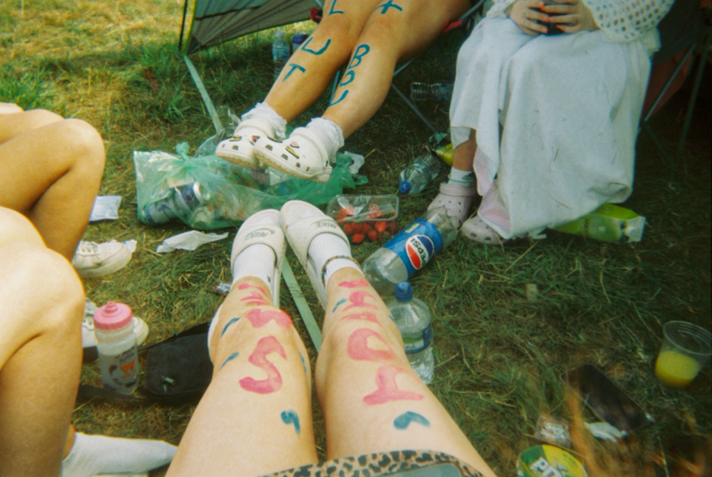
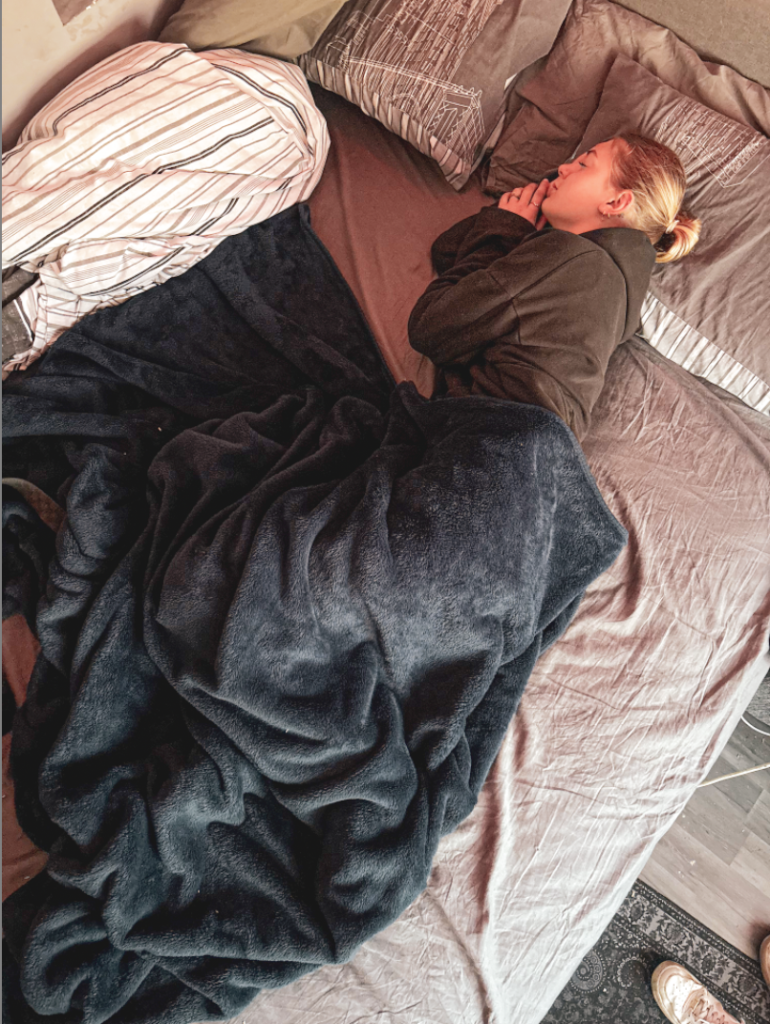
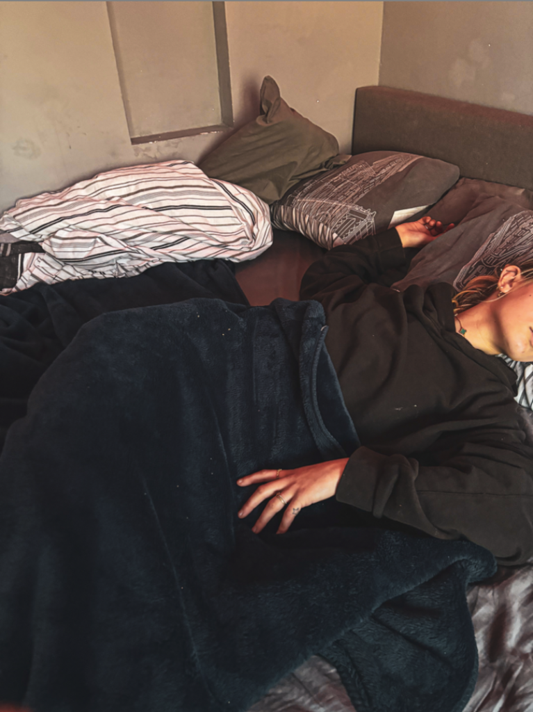
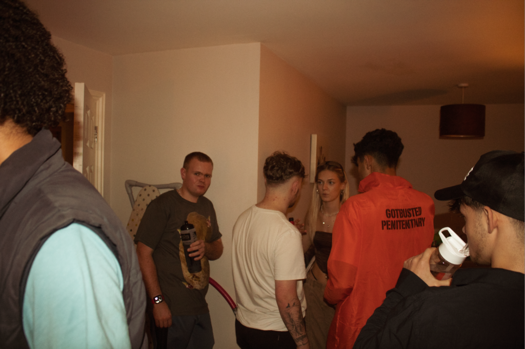
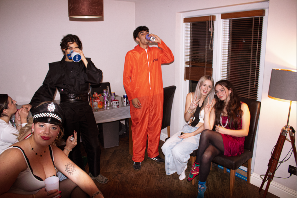
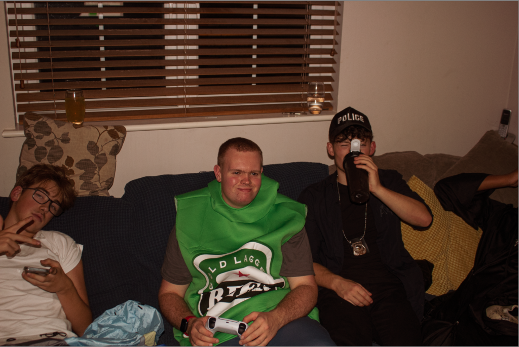
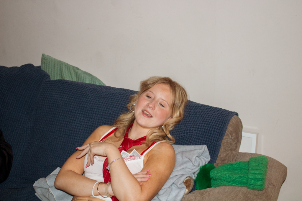
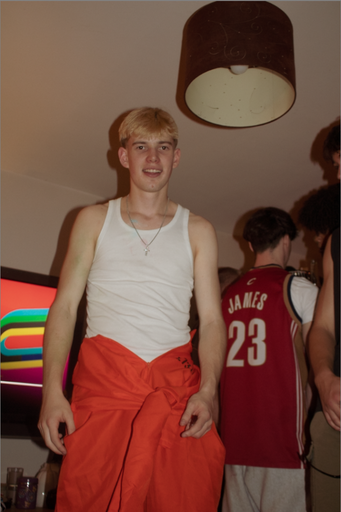
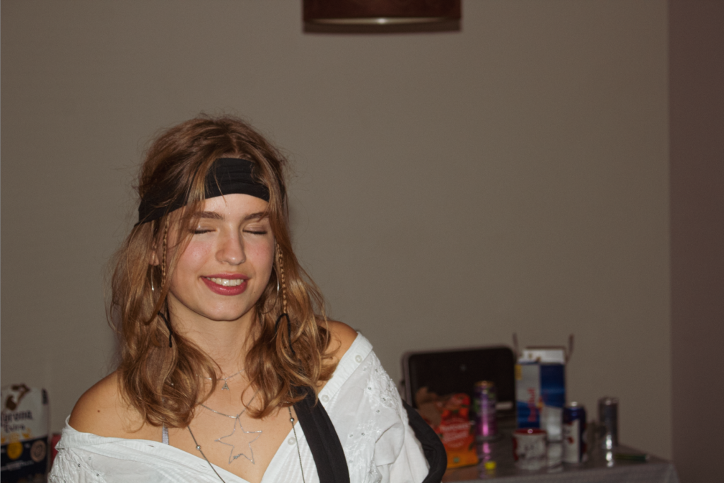
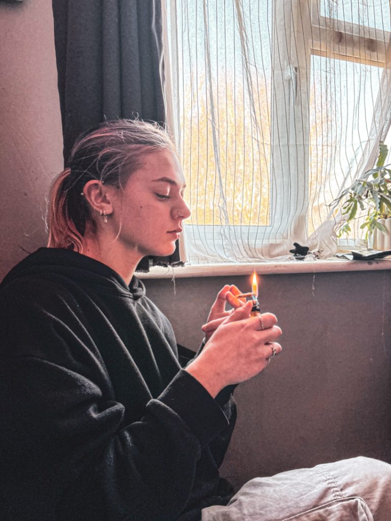
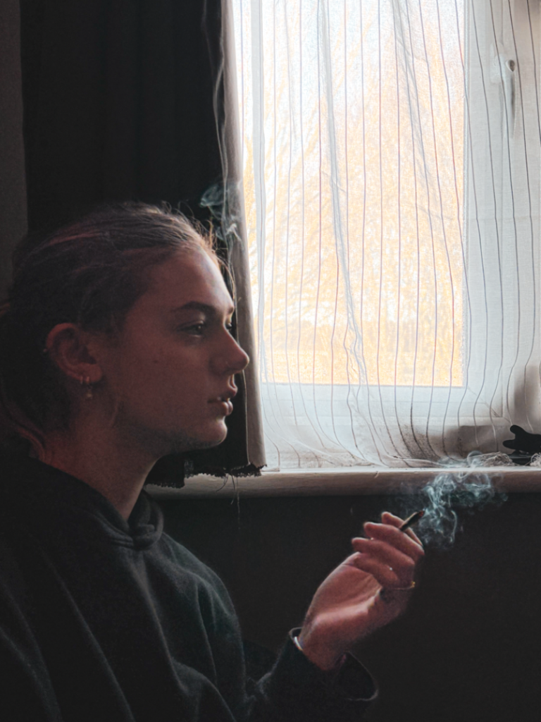
I am studying teenage stereotypes. I chose to study this topic as challenging teenage stereotypes is key as it promotes individuality and expressing yourself, reduces harmful representations, and encourages personal development. When these stereotypes are challenged, teenagers are given the freedom to express themselves without being restricted by unrealistic expectations, allowing them to explore themselves without judgement. These stereotypes often portray teens as rebellious, lazy, or overly dramatic. This can negatively affect their self-esteem and mental health if overthought.
By shutting down these negative concepts, society creates an environment that recognises the abilities of young people, encouraging them to develop in a responsible and confident way. Additionally, challenging stereotypes helps build more respectful relationships between generations, as adults are encouraged and known to see teenagers as complicated but however, are very capable individuals. Inclusivity is shown by acknowledging the diversity of teen experiences. This may vary based on culture and background. It ensures that all teens are given equal opportunities to succeed.
To support my findings in this topic, I researched and looked in to the artists Nick Haymes and Sian Davey. Nick Haymes is a visual artist and photographer born in Stratford Upon Avon (UK), living and working in Los Angeles. Haymes studied fine art, but dropped out in his second year. When using a fake ID under a friend’s name, he in due course studied photography at SVA and ICP. In 2010 Haymes started Little Big Man books and gallery. Davey is a photographer with a background in fine art and social policy, who worked for fifteen years as a humanist Buddhist psychotherapist. She was born in Brighton, United Kingdom, 1964. She is based in Devon, United Kingdom. I will be responding to their work through a photobook. I’ll use these artists as references; explore and recreate their ideas and themes in my own way. I’ll use them as inspiration, analyse their images and find relationships between teenage stereotypes and their work.
Both artists use photography to explore identity, emotion, and the lives of teenagers, challenging stereotypical representations often found in media and culture. Their work draws on themes of emotional depth and personal growth, moving beyond the typical portrayal of teenagers as rebellious.
I intend to respond to Nick Haymes and Sian Daveys work by exploring the styles of their pictures and focus on subjects they focus on. To respond to teenage stereotypes, I want to focus on both sides of these stereotypes. I want to capture moments where teens are fitting these stereotypes, and also rejecting them by showing teens don’t have to fit these stereotypes. I am aware there are many teenagers who are do fit the accusations made, however, many teenagers are different, and don’t fit these stereotypes but are still put in a class where people think we are all the same.
Youth Subcultures
The cultural studies approach, particularly through theorists like Stuart Hall and Dick Hebdige, examines youth subcultures as expressions of resistance. These subcultures, from punk to hip-hop to goth, offer a critique of mainstream society. Teenage subcultures are often stereotyped in the media as rebellious or deviant, yet they also represent forms of resistance to cultural norms, through music, fashion, and language. These representations in photography and art show teenagers navigating tensions between individuality and conformity.
Resistance and Identity Formation: The idea of resistance is central to understanding teenage stereotypes in visual culture. Teens are often depicted as resisting adult authority, whether through the rebellious “bad boy” stereotype or the angsty, misunderstood “teenager” trope. Visual culture often frames them in opposition to adult norms, whether through their style (e.g., punk fashion, goth makeup) or their behaviour (e.g., defiance or disengagement).
‘Identity is never singular but is multiply constructed across intersecting and antagonistic discourses, practices and positions.’ – Stuart Hall
I agree with this statement made by Stuart Hall, as your identity is built with not only yourself, but your surroundings too. I do believe that negative, as well as positive, experiences create what kind of person you become. The people you surround yourself with play a major role in who you are today.
Hegemony: The theory of cultural hegemony, as developed by Antonio Gramsci, is helpful in understanding how dominant ideologies shape and control the representation of teenagers. Stereotypical depictions of teens in visual culture often reflect the values and interests of the adult-dominated culture, reinforcing ideas about how teenagers should behave, what they should desire, and who they are supposed to be.
Before puberty the child’s personality has not yet formed and it is easier to guide its life and make it acquire specific habits of order, discipline, and work. – Antonio Gramsci
I agree with this statement Antonio Gramsci has made as, when you are young, decisions are made for you, there is no feeling of self inflicted power. Adults are more able to control the youths life when young and not as capable.
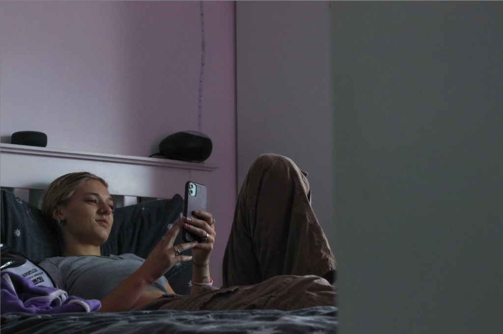
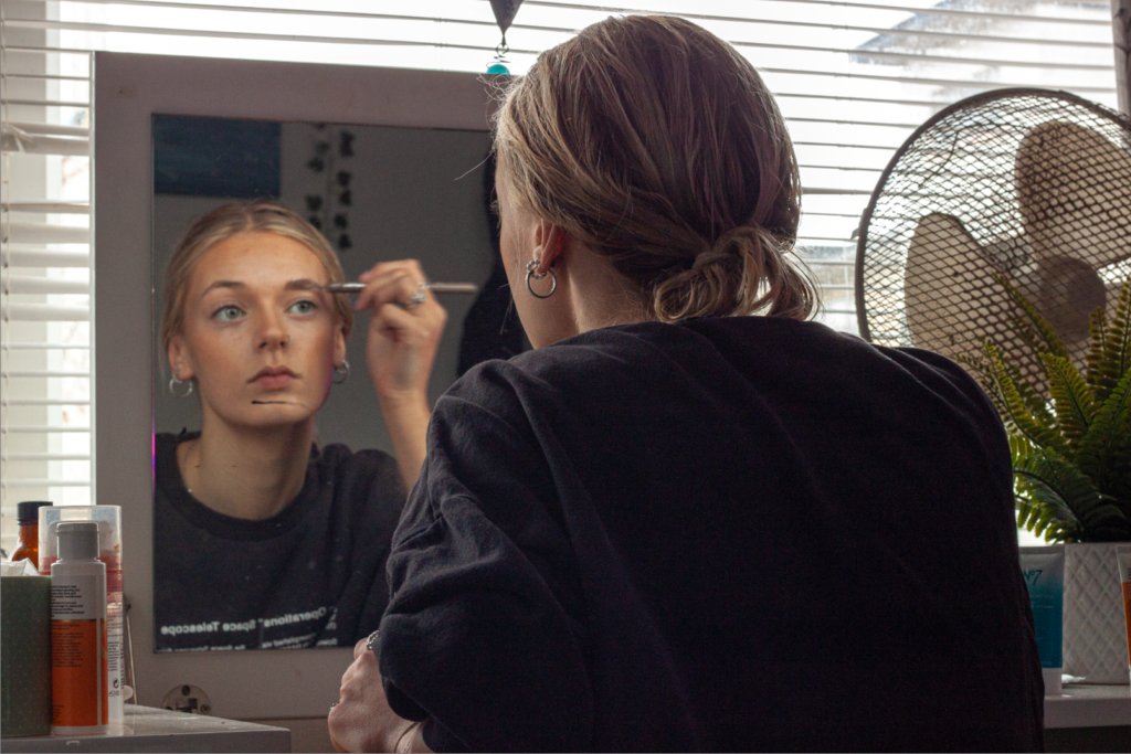
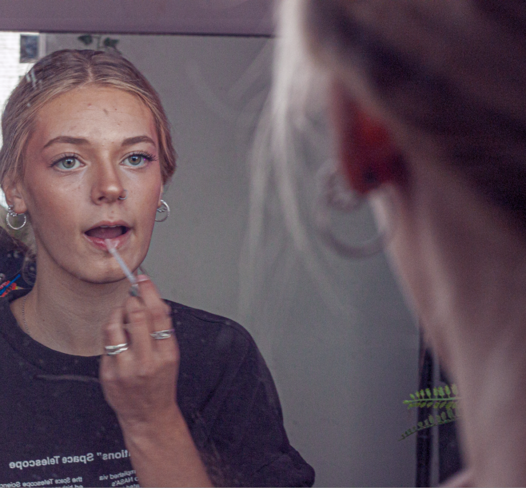
Sian Davey
Sian Davey’s intimate, quiet portraits emphasise vulnerability and the complexity of teenage identity. This approach can be seen as a response to movements in art like Feminism and Humanism which have encouraged a more significant view of personal and social identity, rejecting simplified views of gender, age, and social roles. Davey’s work challenges the stereotypical representation of teens in what adults would call a ‘crisis’, instead focusing on their inner worlds and the importance of growing up. This reflects an understanding of identity that rejects ‘one-size-fits-all’ narratives. Sian Davey had spent years developing a project called ‘Looking For Alice’. This was a documentary photo project about her youngest daughter, who was born with Down’s Syndrome. It won many awards, bringing issues of social policy into the spotlight. She presumed her other children were relieved not to have the camera always on them. In reality, her 16-year-old daughter Martha felt a little left out. That opened the door to another project; one where Davey shifted from parent to photographer. She got to experience what most teenagers keep secret.
My own images:
Nick Haymes
My inspiration for using Nick Haymes as my artist reference was his project “The Last Survivor is the First Suspect”. It is a project captured between 2005 and 2009 by photographer Nick Haymes. It is a record of a drifting community of young friends based mainly between two geographic points; Southern California and Tulsa, Oklahoma. The book’s narrative merges a sense of joy in documenting friendships and bonds, and also a sense of dread that would ultimately peak in a series of tragedies. Living in New York since 2000, Haymes has worked over the last 7 years with some of the most important magazines worldwide: i-D, Dazed And Confused, Index, The Face, Vogue, TeenVogue, Another Magazine, Arena, Capricious and the Journal to name a few. Through these networks he has gained access to a whole scene of diverse worlds and tribes, which then brought Nick’s personal work closer to a particular atmosphere, made of family members, friends, and their inner sceneries. His work captured my eye and I wanted to create work that was similar to his. I like the way he presents his images and captures all the aspects of teenage life.
Conclusion
Similarities: Both artists show the depths of teenage stereotypes. Both Davey and Haymes focus their photography on personal subjects that are close to them, whether that’s family, relationships, or their own worlds. Davey’s work explores themes of motherhood and looking at identity, while Haymes has been known to document the intimacy and complications of his own life. They both present raw, unfiltered emotions and connections that are portrayed through their subjects expressions and in the environments they use. They look and focus on real life settings, so making sure nothing is staged and presenting their work to reflect their topic on teenagers. In relation to my own work, I also took pictures of people who are close to me, my friends. I didn’t use any strangers in my photoshoots. I also used raw, unfiltered images so nothing was set up in my photos. I wanted my project to be natural and not set up, just like most of their photos were.
Differences: Sian Davey’s work is often looking at themes of motherhood, family, and identity. She particularly explores the emotional and psychological experiences of raising children. Nick Haymes’ on the other hand, is often looking at the complications of relationships and youth. His work tends to often convey a sense of emotional uncertainty and the search for feeling like you belong. Their differences are in the tone, style, and range of their projects, with Davey focusing on intimate portraiture, and Haymes exploring emotional landscapes with a more conceptual and environmental lens. In relation to my own work, I feel like I relate to Nick Haymes more. I explored the themes of emotional uncertainty and wanted my photos to create a story of what teenagers are made out to be and look like. I wanted to capture these complications.
Literary sources: Go to this blog post here: Theory: Literary Sources and copy relevant key texts relating to the subject of your essay and list in alphabetical order in your bibliography. In addition, find your own key texts in relation to artists selected for in-depth analysis in your essay and list these too. These texts could be interviews with the artist, or reviews/ critique’s written by others. See useful online sites/ sources here .
Research and identify 3-5 literary sources from a variety of media such as books, journal/magazines, internet, Youtube/video that relates to your personal study and artists references .
Begin to read essay, texts and interviews with your chosen artists as well as commentary from critics, historians and others.
It’s important that you show evidence of reading and draw upon different pints of view – not only your own.
Take notes when you’re reading…key words, concepts, passages, page number to be used for in-text referencing etc.
Essay Question
Think of a hypothesis and list possible essay questions
Below is a list of possible essay questions that may help you to formulate your own.
Some examples of Personal Study essays from previous students:
Essay Plan Make a plan that lists what you are going to write about in each paragraph – essay structure
Essay question:
Opening quote
Introduction (250-500 words): What is your area study? Which artists will you be analysing and why? How will you be responding to their work and essay question?
Pg 1 (500 words): Historical/ theoretical context within art, photography and visual culture relevant to your area of study. Make links to art movements/ isms and some of the methods employed by critics and historian.
Pg 2 (500 words): Analyse first artist/photographer in relation to your essay question. Present and evaluate your own images and responses.
Pg 3 (500 words): Analyse second artist/photographer in relation to your essay question. Present and evaluate your own images and responses.
Conclusion (250-500 words): Draw parallels, explore differences/ similarities between artists/photographers and that of your own work that you have produced
Bibliography: List all relevant sources used
Essay writing: Here is a link to another blog post which will provide you with guideline about how to structure each paragraph in your essay.
How is the work of Sian Davey and Nick Haymes questioning the stereotypes of teenage lifestyles?
In what way does Sian Davey and Nick Haymes explore teenage stereotypes through their work?
Compare how Sian Davey and Nick Haymes challenge teenage stereotypes in their work?
Structure of my essay
*chosen photo* Title – Captured & Misunderstood.
In what way does Sian Davey and Nick Haymes explore teenage stereotypes through their work?
Paragraph 1 – What does your area study? Teenage stereotypes Which artists will you be analysing and why? Nick Haymes and Sian Davey How will you be responding to their work and essay question? Explore and recreate their ideas and themes/photos in my own way. Use them as inspiration. Look at their photos and find relationships between teenage stereotypes and their work.
Paragraph 1 – Historical/ theoretical context within art, photography and visual culture relevant to your area of study. looking at how past events, movements, and theories in art and culture have influenced the way people create and view images. Make links to art movements/ isms and some of the methods employed by critics and historian. teenagers have often been represented through certain stereotypes, like being rebellious, carefree, or obsessed with fashion and social status. These stereotypes are influenced by historical events (like cultural shifts in the ’50s or ’80s) and societal changes (such as the rise of youth culture or the influence of pop culture icons).
Paragraph 2 – Analyse first artist/photographer in relation to your essay question. Present and evaluate your own images and responses. Sian Davey
Paragraph 3 – Analyse second artist/photographer in relation to your essay question. Present and evaluate your own images and responses. Nick Haymes
Paragraph 4 – Draw parallels, explore differences/ similarities between artists/photographers and that of your own work that you have produced
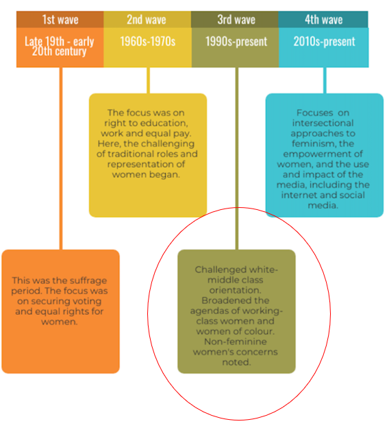
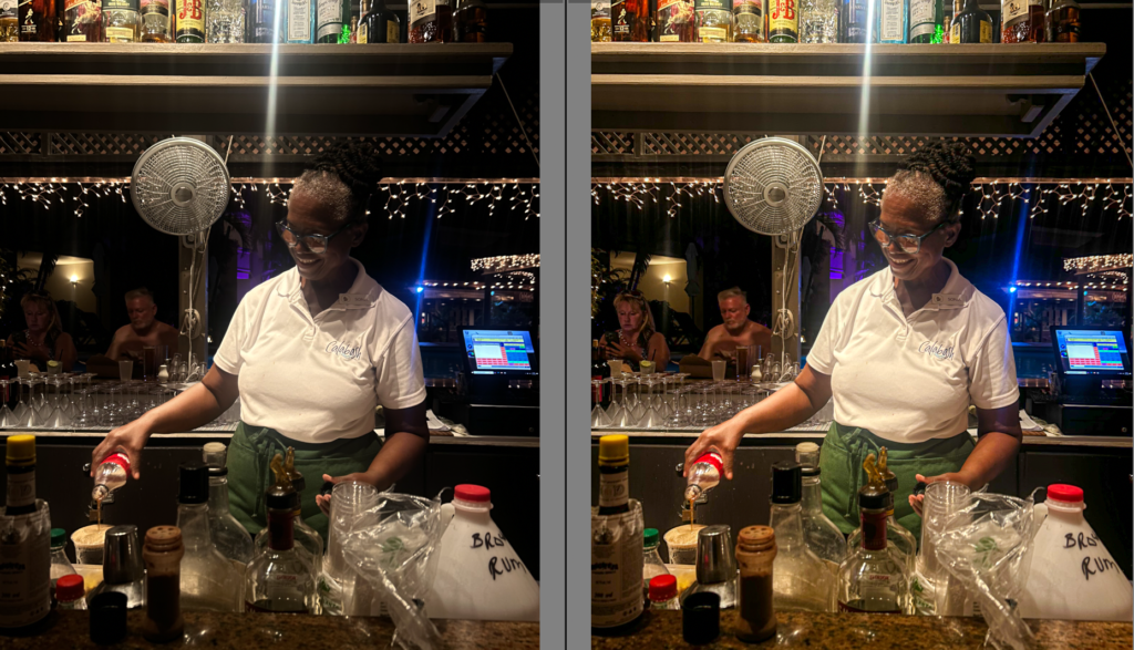
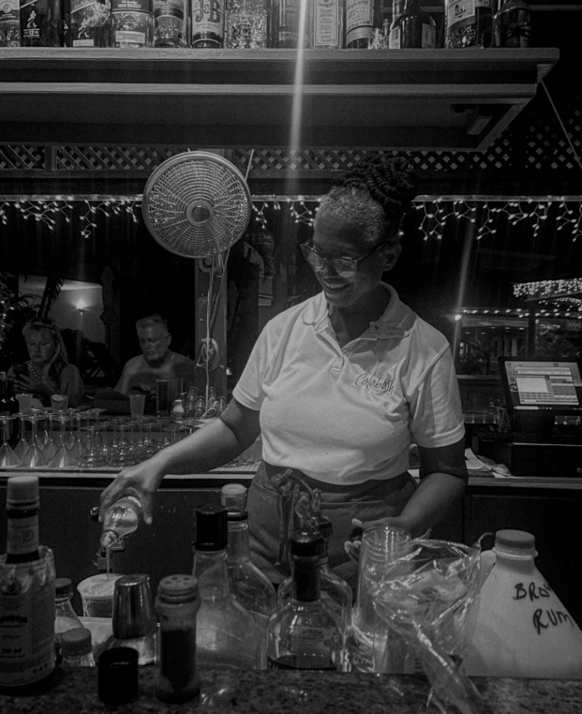
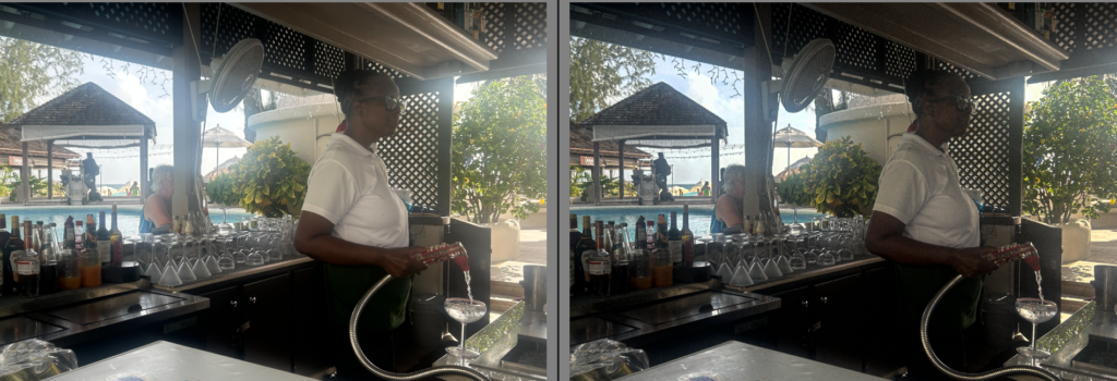
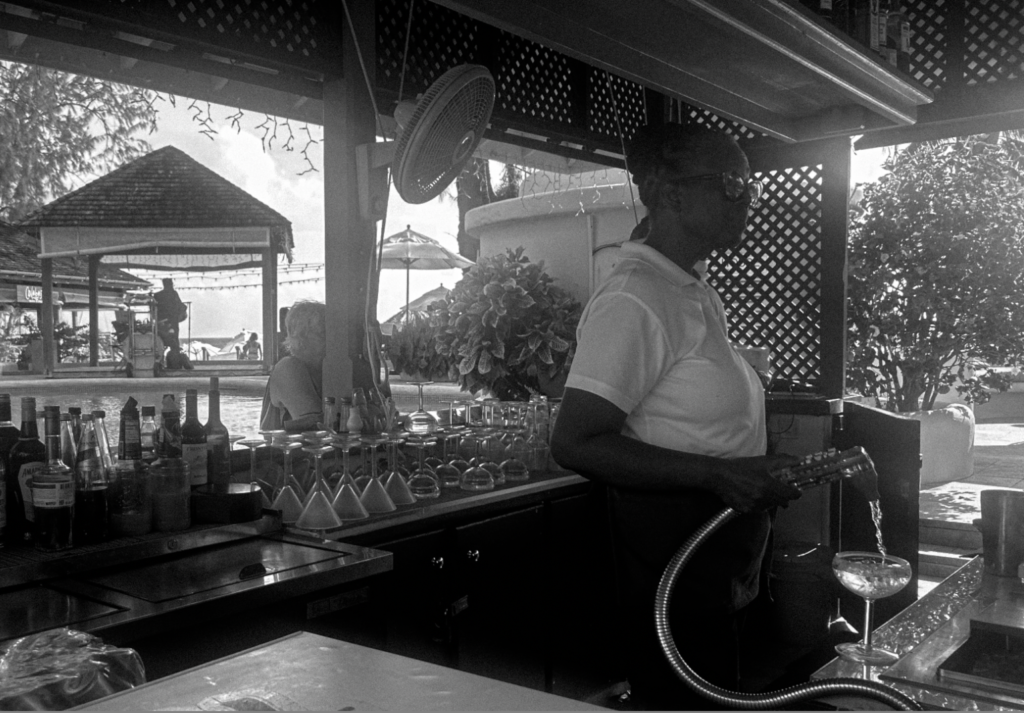
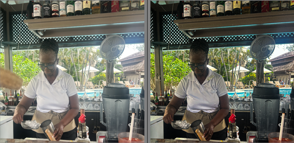
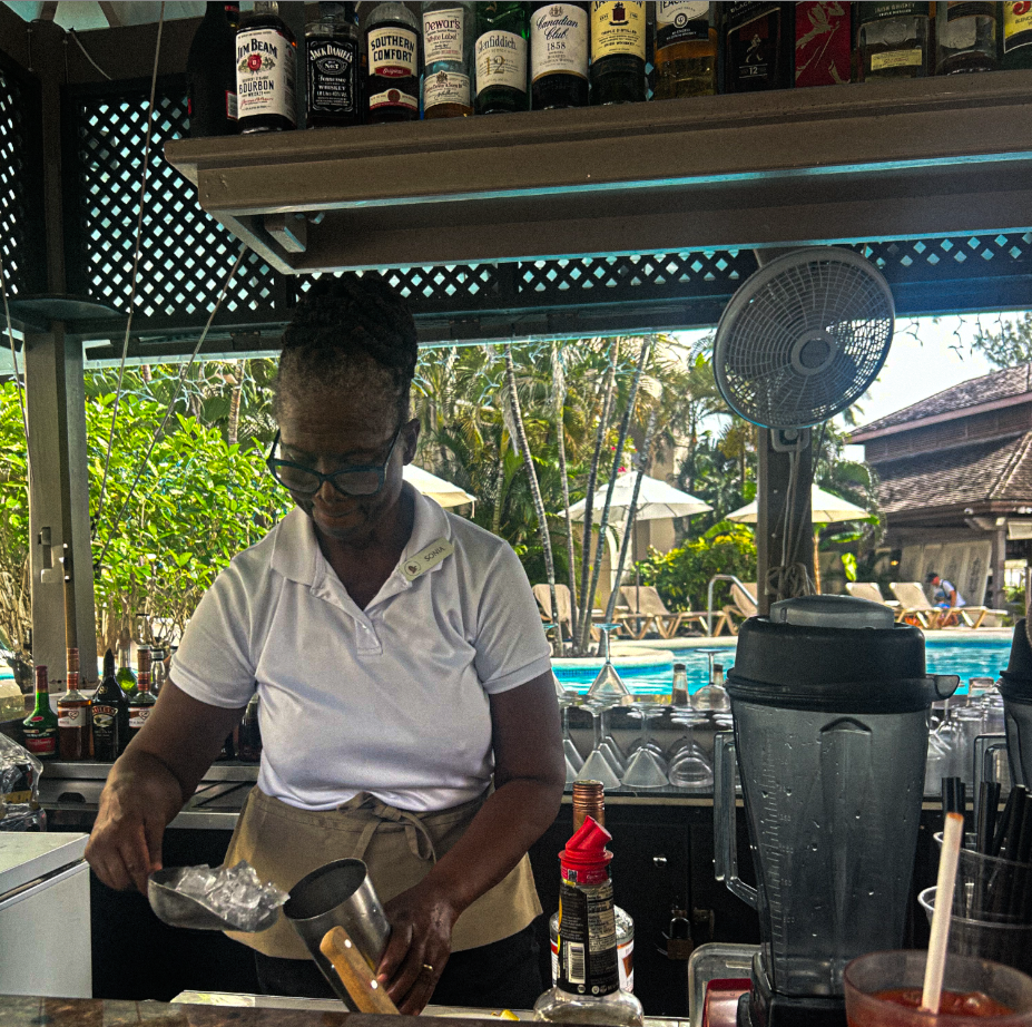
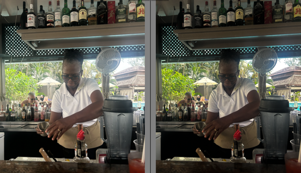
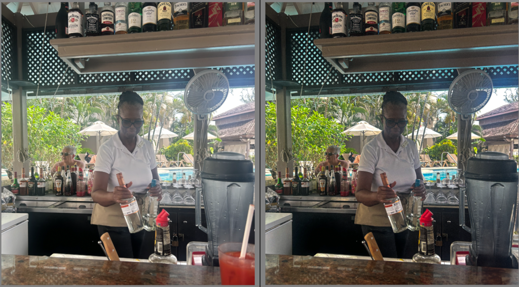
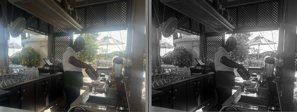
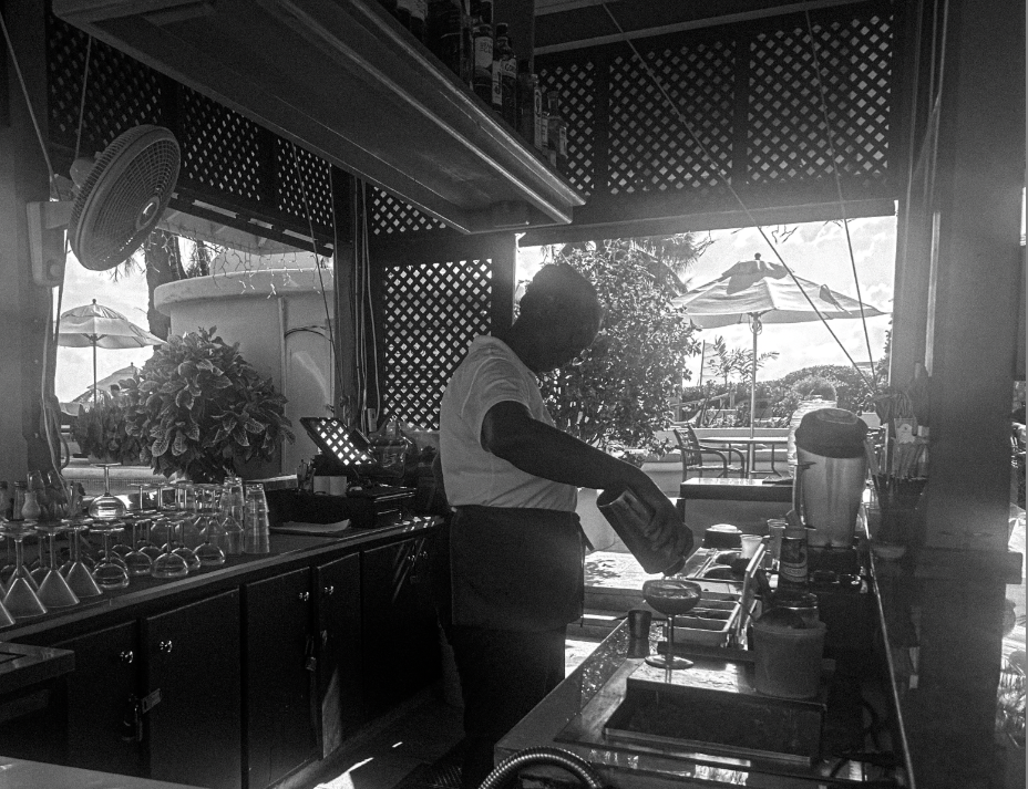
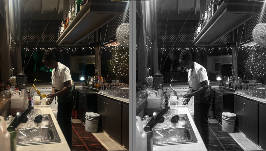
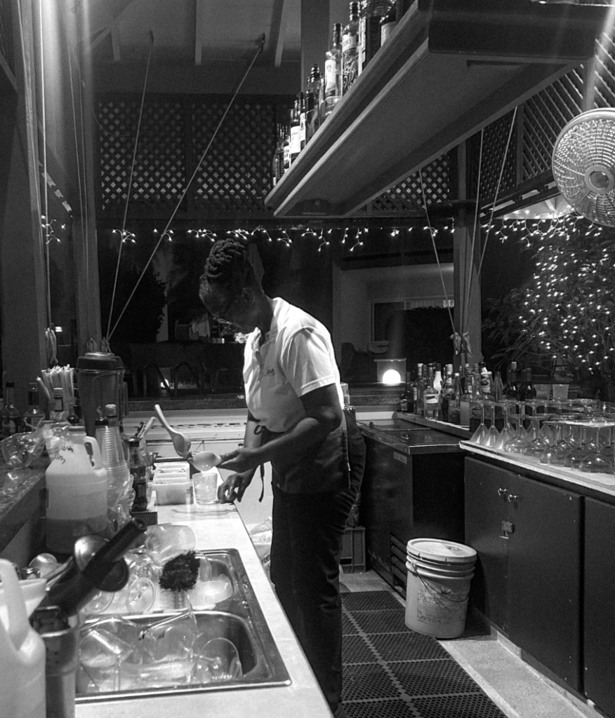
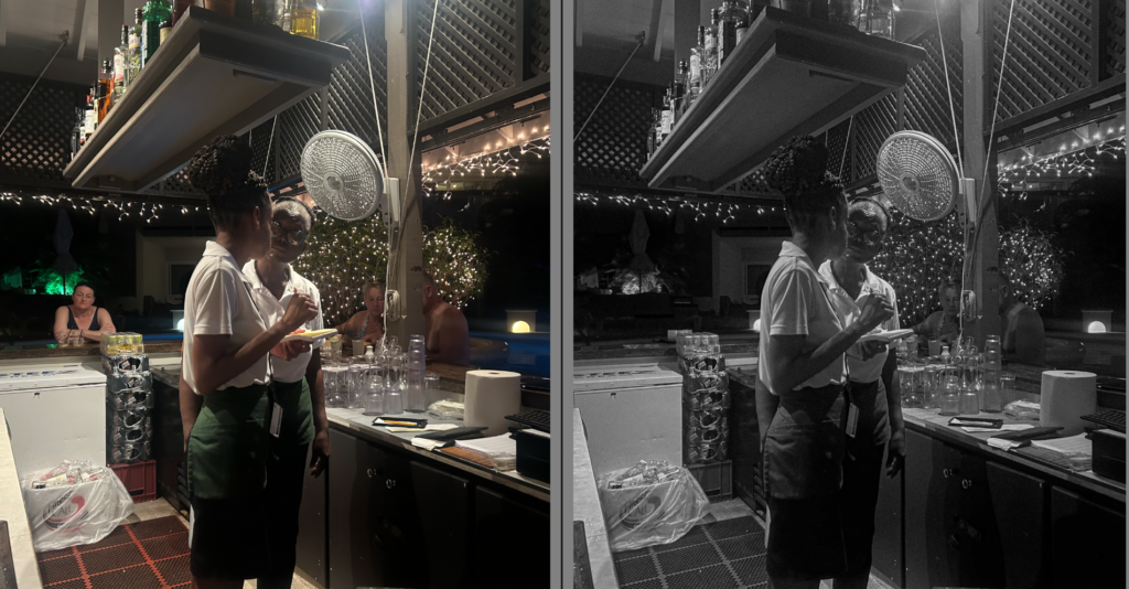
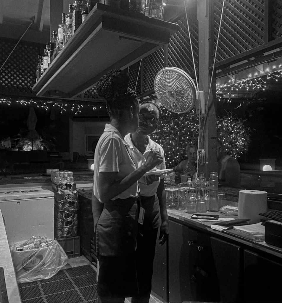
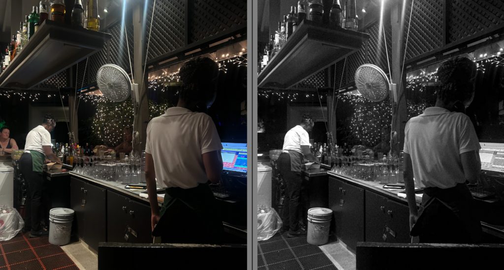
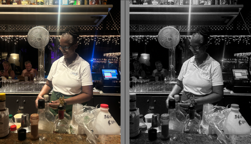
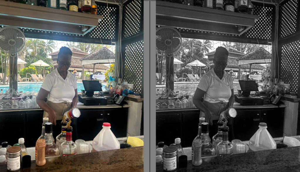
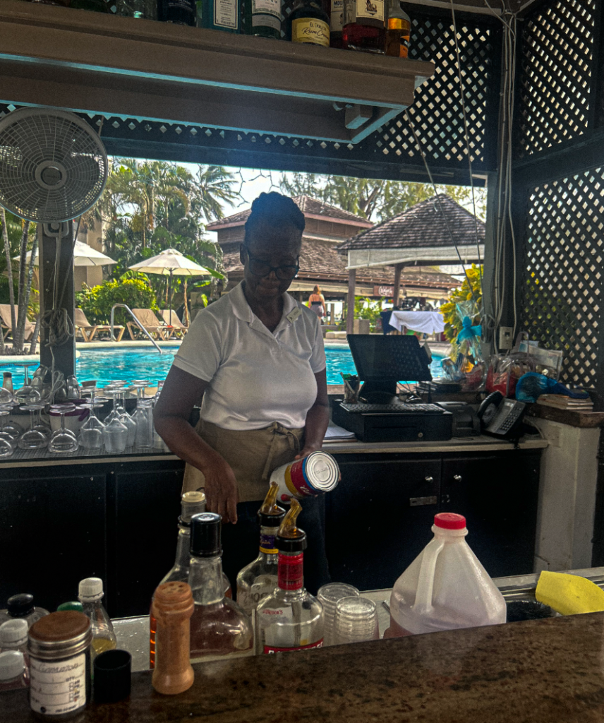
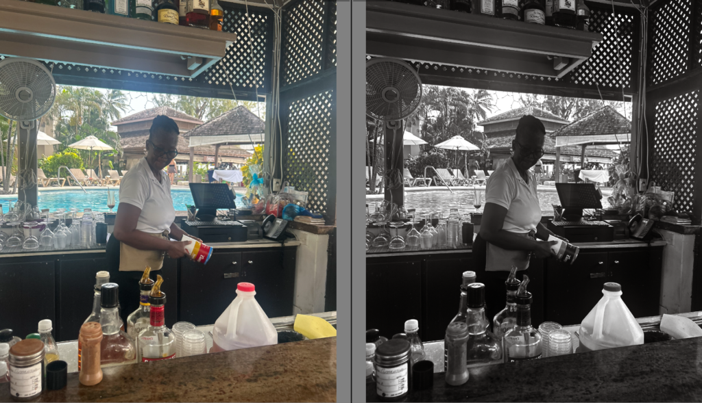
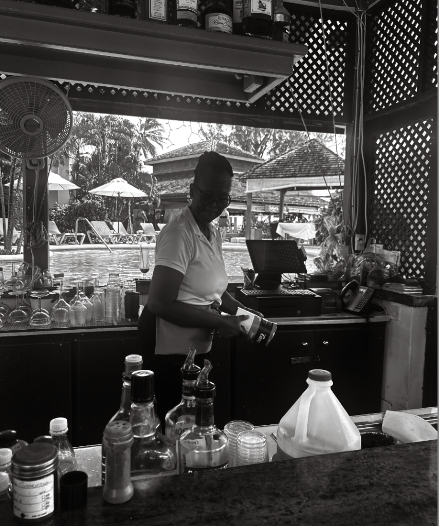
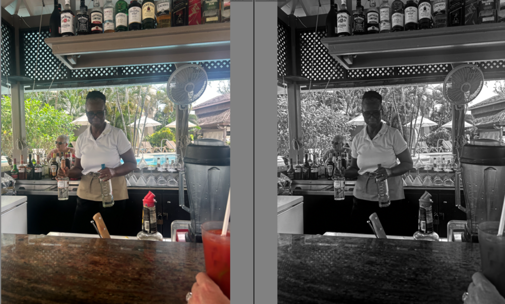
My objective was to take images of women of culture working, or women working to portray the growth women fought for, for equal legalisation, pay and educational rights. Showing this, will also suggest racial growth. I aim to execute this photoshoot naturally in Barbados, and successfully show the culture of the working class locals.
This photoshoot differs to my other photoshoots as my 1st and 2nd wave photoshoot was carefully thought out, planned, used props and was staged. This linked more to Cindy Sherman as she liked staging photoshoots meanwhile making it look natural. This contrasts significantly to this photoshoot as this one relates more to the ‘ decisive moment’ as it is natural and real. I hope that my editing skills can attempt to make it look more vintage as this is suppose to aim around the 1990’s.
STAGES-
Firstly, I began to pick out the images I preferred the most by either flagging or accepting them to make it more efficient when it comes to editing the images I like. The main factors I took into account when viewing and choosing these images was very much lighting, as it was outdoors and difficult to find the correct exposure and where to stand, how realistic and natural the subject looked as she was aware I was taking these images which brings the subject to behave or change her mannerisms. Finally, I kept an eye out for background factors such as people or unwanted drinks which I definitely took into consideration. If this was the case, I could attempt to erase them in Lightroom. Not only this, I could crop my images to make sure every background or foreground element that is wanted and significant is in the frame and vice versa.
Editing
Overall
Some reasons why I like this photoshoot is because it involves racial features and growth, not only gender. I chose to do this photoshoot to emphasize successfully the rights women fought for, especially how black women struggled to gain the same legal rights. In this photoshoot, it represents culture and reveals women working as bartenders. Women working whilst gaining the same pay and recognition truly inspires me. However, I soon realised that it differs from the pattern of the rest of my photoshoot, such as posed and staged photos. Therefore, I learnt that I would like to take a different approach for my third photoshoot showing domestic abuse instead. I chose this theme as it was a major factor in the third wave feminist movement. Instead, I will take photos of my subject with bruises, linking more to Nan Goldin’s work as she experienced similar situations. I believe this will flow more seamlessly in my photobook as it will obtain throughout the same sort of images such as staging, posing etc. Not only this, they will obtain the same person which I believe will show more of a significant growth. However, I do not believe these photoshoots were a waste of time, as they show the theme of racial equality and I learnt more about lightings etc.
1. Research a photo-book and describe the story it is communicating with reference to subject-matter, genre and approach to image-making.
2. Who is the photographer? Why did he/she make it? (intentions/ reasons) Who is it for? (audience) How was it received? (any press, reviews, awards, legacy etc.)
3. Deconstruct the narrative, concept and design of the book and apply theory above when considering:
Book in hand: how does it feel? Smell, sniff the paper.
Paper and ink: use of different paper/ textures/ colour or B&W or both.
Format, size and orientation: portraiture/ landscape/ square/ A5, A4, A3 / number of pages.
1. Research a photo-book and describe the story it is communicating with reference to subject-matter, genre and approach to image-making.
‘The Americans’ – Robert Frank, Published 1958.
‘The Americans’ by Robert Frank captures his Journey across 48 states of America, photographing the natural sights around the country. Through the candid approach it communicates the “everything-ness and American-ness of these pictures” ( To quote the book). Reminiscent to Henri Cartier-Breton’s ‘Europeans’, it captures street photography of the everyday lives and experiences of those of at the time. Making use of a variety of shot types, the core 3 that are present consist of close-up, mid-shots and long-shots. Like its subjects, Franks’ images consist of many types of light. Natural and unnatural, are used heavily to bring out detail and character to his images, such as with dark shadows of the day forming a stark contrast, or the warm glow of lights bringing attention to his surroundings and subjects of the photograph.
2. Who is the photographer? Why did he/she make it? (intentions/ reasons) Who is it for? (audience) How was it received? (any press, reviews, awards, legacy etc.)
Robert Frank, 1924 – 2019.
“I was very free with the camera. I didn’t think of what would be the correct thing to do; I did what I felt good doing.” – Robert Frank
Robert Franks ‘The Americans’ explores the faces of many personalities across the United States. Travelling from state to state, the written intro from Jack Kerouac narrates his journey, bringing to life the images we later see. With many takes on the reasoning behind his journey of faces, the most popular intention behind Franks work was that he wished to photograph the America, far away from the idealised view of the American dream and instead capture the quiet America, those not given a voice or those that didn’t live in line with the vision of the ‘American way of Life’. In the theory of Frederik Trovatten, Frank within his work wanted to: Embrace imperfection, prioritise emotion over aesthetics, see a story in every frame, develop his own vision and be an observer to the world, not a performer.
In the words of the Museum of Modern Art “In a country that was not his own, Frank assumed the unique position of an outsider and voyeur who unobtrusively captured the tensions of the geographic, economic, racial, and religious diversity of the US.” “Frank captured the nation as a messy corpus, never privileging city or country, black or white, Jew or Christian, rich or poor.”.
Franks achievement through his work earned him a notable reputation in the world of photography, such as within John Szarkowski’s theory of ‘Mirrors’ and ‘Windows’. To quote Szarkowski, Robert Frank’s work “characterises opposite modes of the new photography, with its divergence between those who believe that art is a mirror, reflecting a portrait of the artist who made it, and those who see it as a window, through which one may better know the world.”.
Frank also notably gained awards such as the Guggenheim fellowship in 1955, the 1996 Hassebald foundation international award in photography, the 2002 Edward MacDowell medal and a doctorate in fine arts in 2015 from Nova Scotia college of Art and design University.
3. Deconstruct the narrative, concept and design of the book and apply theory above when considering:
Book in hand: how does it feel? Smell, sniff the paper. – Smells like a new book, with waxy coated paper for the images.
Paper and ink: use of different paper/ textures/ colour or B&W or both. – Black and white text are used, on the same type of paper across the entire book.
Format, size and orientation: portraiture/ landscape/ square/ A5, A4, A3 / number of pages. – The Book is small, with images in around an A5 format, the images are mainly landscape and positioned on the right hand side of the book, with the left, kept as an open space for the photograph title.
Binding, soft/hard cover. image wrap/dust jacket. saddle stitch/swiss binding/ Japanese stab-binding/ leperello – The book is a hard cover, featuring aswiss binding and dust jacket.
Cover: linen/ card. graphic/ printed image. embossed/ debossed. letterpress/ silkscreen/hot-stamping. – The cover is a card like paper that features a printed image of one of his photographs on.
Title: literal or poetic / relevant or intriguing. The title, which is literal in its meaning combines with the printed image to intrigue the spectator to the contents of the book, and how the people are presented.
Narrative: what is the story/ subject-matter. How is it told? – The story/subject matter is that of the American people, not any specific demographic but the mass diversity of races, ethnicity’s, religions, etc.
Structure and architecture: how design/ repeating motifs/ or specific features develops a concept or construct a narrative. – The repeating motif of a star spangled banner is featured commonly through the book, images are also not fixed within one location but jump from different locations ands environment’s displaying a vibrant change in scenery.
Design and layout: image size on pages/ single page, double-spread/ images/ grid, fold- outs/ inserts. – Images are featured on one page each, with white space to the left for the titles.
Editing and sequencing: selection of images/ juxtaposition of photographs/ editing process. Images juxtapose themselves throughout the book, clashing from rural to urban, night to day, not focusing on image style for too long.
Images and text: are they linked? Introduction/ essay/ statement by artists or others. Use of captions (if any.) – Images are linked through their study of the American people, this varies in the people you see and where you see them throughout the book, This is emphasised from the introduction by Jack Kerouac which narrates Franks adventure across the country to capture such.
To what extent are Saul Leiter and Seigfried Hansen influenced by Formalism in their work?
Introduction
“I happen to believe in the beauty of simple things. I believe that the most uninteresting thing can be very interesting,” (Saul Leiter: line 16)
Saul Leiter suggest that what goes unnoticed is in fact the most exciting. The fact that we are almost unaware our surroundings of unique shapes and formations, with the only way that we truly see it is through abstract approaches. Throughout my personal study I aim to investigate street photography and how it can be portrayed through various ways and approcahes. I believe there is more to street photography and that it’s not just a standard photograph of a building, it’s in fact different visual elements such as vibrant colours, unusual shadows, textures, and patterns, to diverse formations and compositions that all intertwine, overall creating these contrasting effects. All these visual elements are otherwise known as formalism, compared to what we see on the streets it shows a very similar effect. The way colours are distinguished between more colours, separated by distinct lines is further represented within the streets whether we notice it or not. My aim is to bring this to life, presenting this through very abstract and diverse approaches, which makes you question the photo as it is so unrecognisable. Siegfried Hansen perfectly describes formalism. His similar approach overall achieves abstract, unrecognisable images, that are so bold, full of colour and life it changes our perspective of our surroundings – viewing things for their details and unique features that define them. Saul Leiter expresses this more excitingly, expressing very hectic and caotic images, however when stepping away they are clearly defined through formations, colours, and shadows. I aim to investigate various visual elements such as colour, formations and shadows and how they present their own narrative as we engage in different ways. Producing my own response in a formalist way, will create depth and meaning behind what I capture. More meaning will be revealed as I capture things in an abstract approach for example the colours chosen and formation expressing how uninteresting images can be made more interesting.
P1
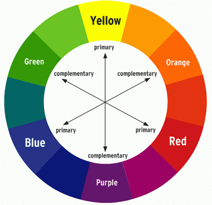
Formalism is a study of art, where compositional elements are presented to us through elements of colour, line, shape, and texture. Rather than focusing on a specific meaning, reason of creation, historical background or context within the photo, (that goes unnoticed), we therefore consider the medium used or visual elements that is presented to us through such expressive and dynamic formations. The colour wheel perfectly represents this, as it greatly impacts formalism. The small sections of colour work together in an orderly way, complementing one another, therefore showing very visual relations between one another. This reveals such intriguing image because you are shown something through the ways in which colour is presented to us. ‘Aestetic pleasure was to be found in the painting itself not its subject,’ stated Mauris Denic (tate: line 8:1890), post-impressionist painter and writer on art.
Formalism is the most important aspect of art, presented through visual aspects rather than narrative content -connecting closely to the outside world. Within this we see a dynamic relationship of colour, brushstroke, line and composition.Isaac Newton developed the colour wheel based on his findings. Proving that white light was not a single entity, instead it was composed of a spectrum of colour combining to make white, suggesting white is a source of colour. Newton’s experiment consisted with passing a thin beam of sunlight through a prism which produced a spectrum of colours – red, orange, yellow, green, blue, indigo and violet. Then by placing an inverted prism in the path of the coloured light beams, which combined the colours producing white once more.
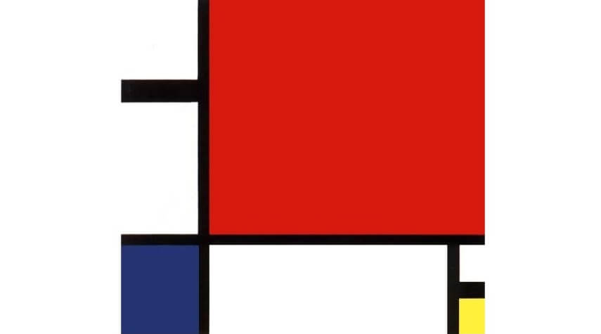
During the early 20th century, Piet Mondrian incorporated an art movement that allowed him to work around his abstract works, which formed a reductive theory – meaning a focus on simplicity rather than intricate/ detailed paintings. Stating in 1914, Mondrian said ‘Art is higher than reality and has know direct relation to reality.’ Describing through his style Mondrian shifted from figurative works to abstract art, explaining how art can reveal a type of reality through dynamic formations and variations, with one being formalism. Mondrian limited his colour use, to the three primary colours; blue, red and yellow, whilst still incorporating black, white and grey which was used as his base/background colours that brough the piece together. Alongside this Mondrian worked in two directions; horizontal and vertical. A confrontational effect is expressed through his art, shown through the specific, orderly layouts to the colours that are filled within each shape which work together to reveal a certain narrative, perhaps one we don’t understand as its just shapes and colour, so therefore it’s open for us to interpret. For me I think it is a very intelligent way of working. From working figuratively to then evolving into very abstract, structured, simple, limited use of colour type of work, but then still painting in a type of way to match the style of his reality (inspiration) I think is really effective as we learn his interpretation and perspective on his world- making it clear that art is higher than reality.
Peit Mondrian – Evening:Red Tree
Piet Mondrian – Composition II in Red, Blue, Yellow
Piet Mondrian proposed a style called Neo-plasticism in which consisted of his own abstract style – primary colours, and horizontal and verical lines.
Mondrian was greatly inspired by impressionist techniques, in which he used particular techniques within his own work – in his own style. During the early 20th century, Mondrian evolved his work by using pointillist and cubist styles, also including other abstract mediums, followed by other techniques he had learnt. Mondrian stated, ‘the more basic the colour, the more inward, the more pure.’ (Piet Mondrian, openign statement) From visualising Mondrians work we notice this more and more, through the abstract use of bold, pigmented colour which perhaps suggests the term basic is in fact the most revealing and captivating form. It is inward in the sense you have to look into it, noticing the true beauty of the dynamic compositions of line, shape and colour, but also pure in the sense of its simple forms.
p2
“Seeing is a neglected enterprise” Saul Leiter (video, first quote)
Immersed within painting and photography since a teenager, Leiter found ways to incorporate both within his work, however his aim was never to create an obvious connection between them as they are still two separate works of art. ‘Photography is about finding things… Painting is different. It’s about making something.’ (Stated Saul Leiter, video)Leiter enjoyed using a brush, making a mark, then another, describing it to be a bit like ‘Jazz’ (Saul Leiter, Video)- you don’t know what your going to do next. In relation to formalism, (expressed through the defining abstract strokes of colour, outlined my more shapes and marks of colour, which instantly lures you in), Leiter expresses this through his own style expressing unique features creating a similar approach as you don’t know what to expect next. The loose strokes of colour creates a similar, mesmerising relationship- a bit like formalism describing how blocks of colour can be fitted together, to reveal an intense yet in-depth image.
An obvious relation is presented through his paintings and photographs, yet his aim is never to create an obvious connection. We can see his style of loose strokes of colour painted compared to what he looks for and how he captures his photos, both achieving very similar, abstract effects. The photographs look like strokes of colour, expressing a painted quality, whilst on the other-hand the paintings create this abstract up-close complexion of colour, making us ‘look twice’ at what it is we are seeing, as the colours and shapes are ‘merged’ together creating a similar feature seen in the photographs. From Similar perspectives, Leiter’s very prominent and abstract marks of colour create an interesting feature that strangely lures you in, as you wouldn’t expect strange (unsymmetrical) highly pigmented strokes of colour to be that engaging. Instead it is the hidden details and minor features, that entices you in – automatically making you see things differently from what they are. This effect continues throughout his photographs, as we’re presented with a confrontational perspective, where unique angles are expressed. It is clear Leiter’s work has a close connection to formalism. The colour creates very contrasting features as there is little of them, and they complement one another. Alongside the riveting lines, shapes, and patterns which are revealed, this therefore creates a captivating aesthetic because you wouldn’t expect all of these different features to work together and reveal hidden effects. It expresses street photography in a different light, meaning it attracts you. Leiter returned to New York in 1940, where he began experimenting with colour photography using slide film such as Kodachrome. Quickly becoming one of the most popular materials used for film; being lightweight, affordable, quick exposures allowed for producing brilliant, intense coloured images. ‘Leiter’s use of colour was subtle, yet impactful,’(Pioneering colour photography- line 4) .This further outlined that only a few colours were in fact needed to create contrasting visual effects. It shows how Leiter had an ability to use little colours, and through his painting knowledge of expressive marks to bold brush strokes further enables him to look at the streets differently -noticing lights, people, or just anything that he came into contact with, that act as his colours.
P3
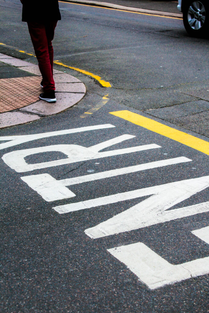
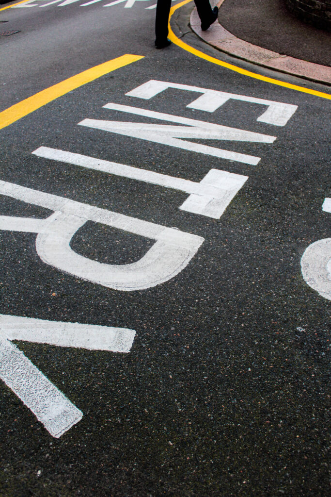
Siegfried Hansen is a contemporary street photographer focusing on visual links to formalism; colour, geometry, abstraction and cityscape. Hansen looks through these visual compositions focusing on the graphics and colours found within the street. Hansen doesn’t focus on capturing people, instead he looks at the formations and relations found elsewhere, “It shows the Aesthetics of coincidence in a public area, which is full of surprises.” (Seigfried Hansen, line 2) The specific way coincidental features take form within the images, is exactly what makes them so intriguing, creating this sense of depth which forms a narrative. The diversity between the lines, structures, and signs combine with the architectural features, complementing one another whilst adapting to his abstract and graphical way of seeing. Hansen has this unique way of revealing surfaces, shapes and colour that would once go unnoticed, to now often being described as ‘poetic.’ (Leica Camera blog, line 6) Our attention is brought to unique perspectives and angles which would otherwise go unseen, creating a similar narrative and purpose, the same way a poem does – as the words are so powerful it makes you think twice of whats being described. In Hansen’s photographs the structure and bold shapes/ outlines create similar effects as we are confronted with it, resulting in us thinking twice. The abstraction within the photographs, confronts us with a new light relating to to a poem. Perhaps amplifying the fact that new things are constantly being revealed to us, explaining Hansen’s perspective of the world around him which could be different to ours.
Seigfreid Hansen takes photographs intuitively, using his ability to anticipate unusual situations then transforming them into multi facetted images. Further displayed in Hansen’s book ‘Hold The Line,’ we are confronted with abstract, unusual perspectives of a situation we aren’t normally shown, displaying a clear link to formalism. Rather than creating a specific meaning or narrative within the photo book, we are instead shown through visuals aspects of colour, composition, pattern, line and space which all work together achieving a formalist style. In response to Hansen’s style I created images with the same abstract, yet defined or structured way.
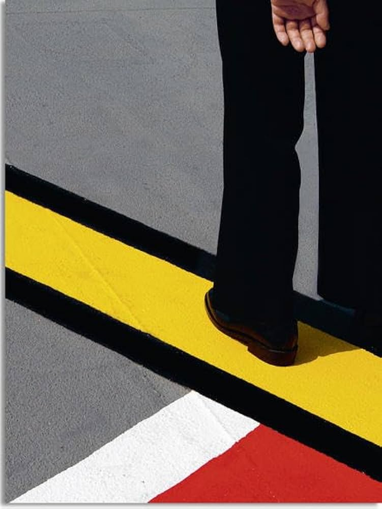
Within this photoshoot I liked this idea of road markings, then further increasing the vibrancy and saturation of colour when editing. Overall revealing unexpected angles and formations, especially as you wouldn’t normally choose to focus on the street ground. Instead this expressed an interesting distraction as shadows of people walking, bike wheels, legs and cars also came into the photograph.
Conclusion
Saul Leiter and Seigfried Hansen both interpret the theme formalism through their photographic responses in similar yet unique ways. A similarity being shown through how colour and composition is interpreted. Saul Leiter creates very hectic images, filled with life that overall creates this confrontational yet abstract effect making you question what is being photographed. Before photography took over, Leiter was an artist with his main inspiration comming from impressionism. Working with loose strokes of colour and marks that came together creating this abstract composition of colour, it was still present in his photography as similar techniques and skills were used. Followed by the colour came a structural element of lines and shapes which outlined and made the colour more prominent. Whether it being shadows, reflections, people or just interesting formations, they always without fail make to you look twice as it’s never obvious what is being presented. This is enhanced through a layered effect giving depth as when you look into the photo, because a lot is going on, you notice even more interactions of people and geometry that subtly fills the image. This creates a narrative as everything is connecting in ways you wouldn’t know until its being revealed to you.
On the other hand Seigfreid Hansen expresses colour and compositions in a similar way, but instead it’s more simplistic and refined. Hansen automatically focuses in on geometry and graphical elements that form the street, widening our vision of the streets. Hansen’s images display an obvious connection to formalism through this style of simplicity. He takes inspiration from your typical formalist painting, then expresses it in his own style of being found within the streets.
Seigfried Hansen – Hold the lineTraditional Formalist painting by Piet Mondrian
Seigfried Hansen – Hold the line
The simple use of colour, is further expressed within the photographs in a structured form. Capturing from abstract angles gives this direct approach, one you wouldn’t know before its photographed.
1. Research a photo-book and describe the story it is communicating with reference to subject-matter, genre and approach to image-making.
Siegfried Hansen takes pictured intuitively, using this ability to anticipate unusual situations, transforming them into multi-facetted images.
Hansen traces visual compositions from graphics and colours creating his unique style of ‘street photography,’ without showing faces or bodies. Instead he focuses on graphical ways and formalism elements. It shows both aesthetics and his coincidence within public spaces, as you never know what to expect next.
When I open up the book I see vivid blocks of colour defined through a compositional structure of a street or wall, revealing this in-depth approach as intricate details, texture, and shadows or reflections are revealed. The sharp photos makes us see things differently, altering our perspective as we are presented things from abstract and unusual angles. Closely linking to ‘formalism’. I love the unique layout, as the theme of ‘formalism’ is further expressed throughout. The photographs aren’t always displayed on the pages, they are broken up by plain coloured pages linking into the the previous photograph. I want to further experiment with this concept. We are faced with various and different subjects in each photo, further making us see things differently.
The title ‘Hold the line,’ is further expressed throughout as he photo shows this unique formation of lines, curves, and shapes.
2. Who is the photographer? Why did he/she make it? (intentions/ reasons) Who is it for? (audience) How was it received? (any press, reviews, awards, legacy etc.)
Seigfried Hansen – Hold the Line, Kettle, 2015, Dortmand
About
Street photography
Hardcover, signed
Street photography exists as a genre in incredibly many facets (any aspect that makes up the subject) and manifestations (object or action that clearly shows something abstract or theoretical). It is always about the right time to release the shutter, at the moment of capturing and how accurately to react to the subject. For Siegfried Hansen, street photography is not so much in the nature of reportage and documentation. What he is interested in is graphic elements, shapes, interwoven lines and structures that, when harmoniously related to oneanother, present an abstract image. Whereas in the photographs of key role model: Henri Cartier-Bresson and André Kertész, people play a major role. No more is shown than is needed to create an interesting and balanced combination of people and objects.“
3. Deconstruct the narrative, concept and design of the book and apply theory above when considering:
Book in hand: how does it feel? Smell, sniff the paper.
Paper and ink: use of different paper/ textures/ colour or B&W or both. Hard Back. Same matte paper throughout, all full bleed pages in colour. Image wrap for front and back page.
Format, size and orientation: portraiture/ landscape/ square/ A5, A4, A3 / number of pages
Pages: 56 Place: Dortmund Year: 2015 Publisher: Kettler Size: 20 x 27 cm (approx.)
Exposed board cover, solid colour pages, thick matte paper, full bleed images, and a mix of portrait (one page for image, followed by a colour) and landscape pages (a double page spread) complement the graphic content.
“This is not about a particular city, but the graphic presence of the city.Through his attentive eye and smart design, Hansen has created a mini city symphony of line, shape and color.” Colin Pental
Title: literal or poetic / relevant or intriguing.
‘Hold the line,’ straight away draws us in as we
We are first presented with a landscape photo for both front and blurb. From the abstract angle and geometric print of clearly defined lines and formations of colour, straight away creates these intense leading lines. Followed by someone’s legs in the top-right-hand corner, who we may guess could be the subject/ focus. I like the fact they’re unrevealed. This simple yet effective front page makes us question the narrative and concept behind the book as we yet to figure this out, as no title is presented.
As you turn the page, we are presented with the metaphor (title) ‘Hold the line.’ We straight away question what is meant by this. This perhaps changes our perspective of a ‘line’ as we question what is truly meant by this. The title sticks with us throughout the book as we notice this more and more, experimenting with how the lines can be further expressed. Features that relate to this complement one another, colour, shadow, space and shape.
Narrative: what is the story/ subject-matter. How is it told?
Hold The Line, doesn’t present an obvious narrative. However the subject of geometric, abstract and unusual compositions of street photography never fails to engage/ immerse you into the book, as you never know what to expect next. I feel Hansen’s unique approach/ style opens us up to a different style of street photography, one that we don’t typically see. Therefore this creates a different narrative, one that is open for the viewer to interpret. For me i like this different approach, seeing how colours are presented and complemented through shapes, shadows, and interesting compositions. This presentes this story of
Structure and architecture: how design/ repeating motifs/ or specific features develops a concept or construct a narrative.
Matt paper, hard back, full bleed,
When you flick through you see the unique structure that is expressed throughout, closely linking to the theme ‘formalism.’ Some double pages are broken up by full colour pages that complement the photo next to it, this is done through different ways. We can see the connection, as for some photos he is revealing a detail/ structural element through his choice in colour revealing this interesting and connecting concept. I feel to have a full colour page to break up certain images, with it having a close connection to the photograph expresses this uniqueness and difference as it reveals
Design and layout: image size on pages/ single page, double-spread/ images/ grid, fold- outs/ inserts.
Their is a unique layout displayed, with a mix between double pages spreads and singles pages. In a way the single pages are actually double pages, as full coloured complementary page colours that break this up up by full colour pages which complement the photo next to it. I find this effect interesting as we can see the connection, as for some photos he is revealing an intricate detail, ( strip of colour) or structural element through this effect, others it’s just a complementary colour.
We can see the connection, as for some photos he is revealing a detail/ structural element through his choice in colour creating this interesting concept.
Editing and sequencing: selection of images/ juxtaposition of photographs/ editing process. Photographs aren’t edited, instead are captured in an abstract confrontational way, which reveal unusual/ unexpected angles.
Images and text: are they linked? Introduction/ essay/ statement by artists or others. Use of captions (if any.)
There is no text throughout as no explanation is needed, making the book very visual and open for interpretation.
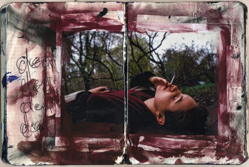
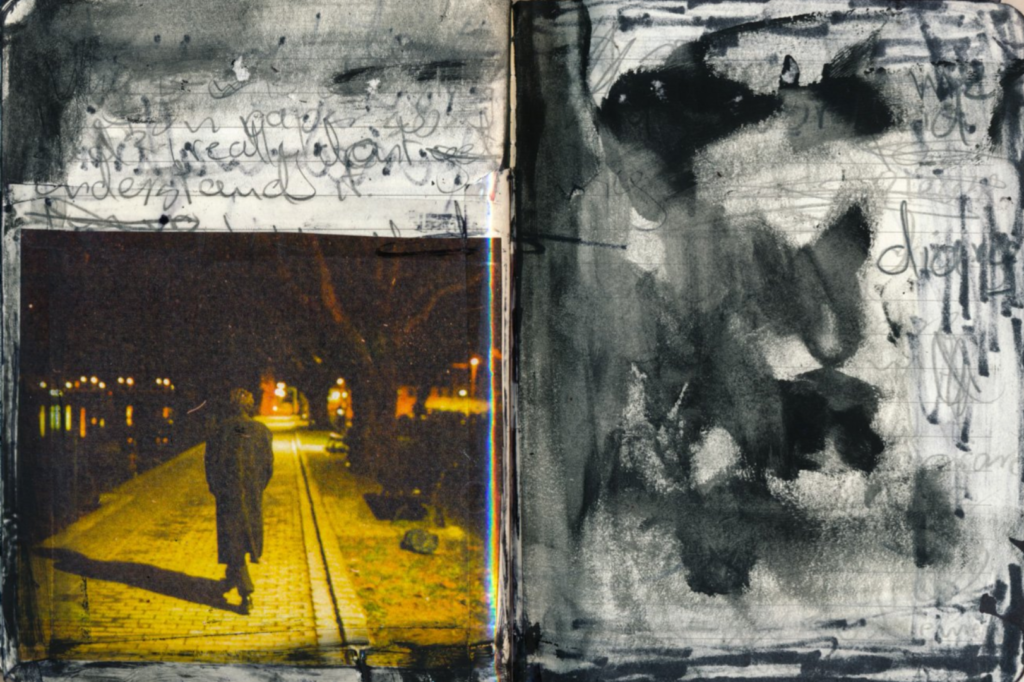
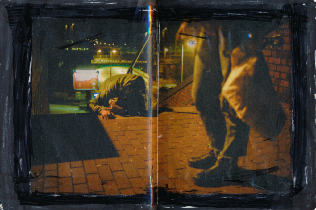
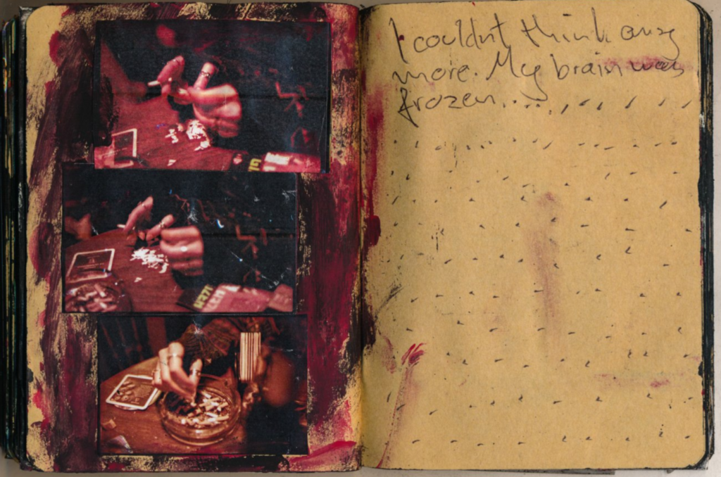
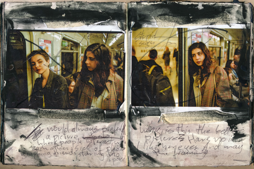
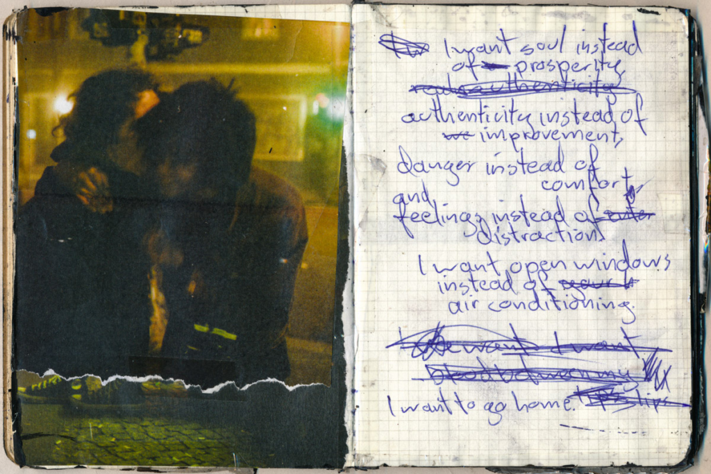
Josh Kern is a photographer who’s currently based in Cologne, Germany. Kern documents his life excessively, leading to a variety of sentimental photographs. His work has a lot of tangibility, as he shoots exclusively with analog film and experiments with an abundance of expressive painting and scrapbooking around his photographs. Many of his photobooks explores the rapture, exhilaration and anguish within the experience and theme of youth.
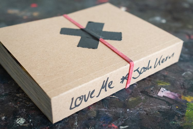
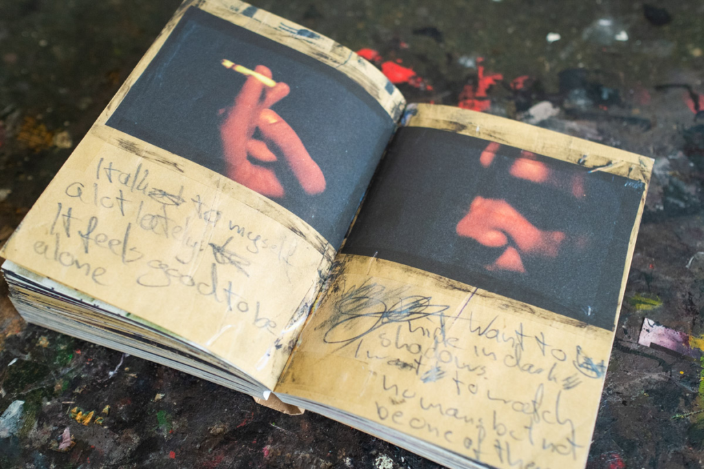
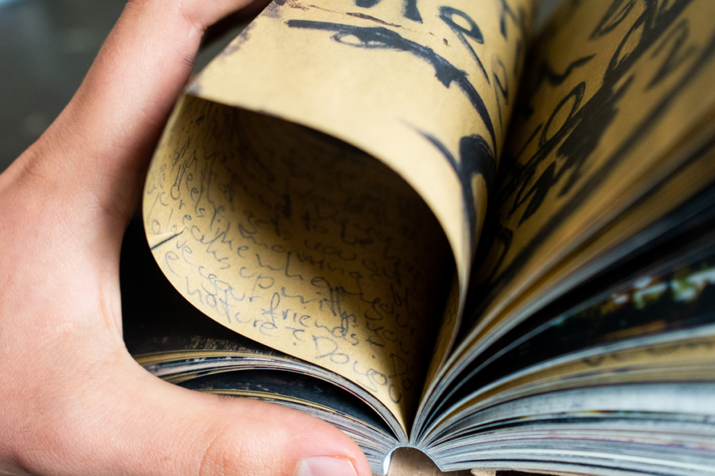
The photobook ‘Love Me’ by Josh Kern explores the personal life of the photographer, as the photos are sequenced together inside of a journal or a notebook. Kern incorporates mixed media into these pages, applying black paint, tearing the photos, taping them down, and writing around or sometimes on the photos.
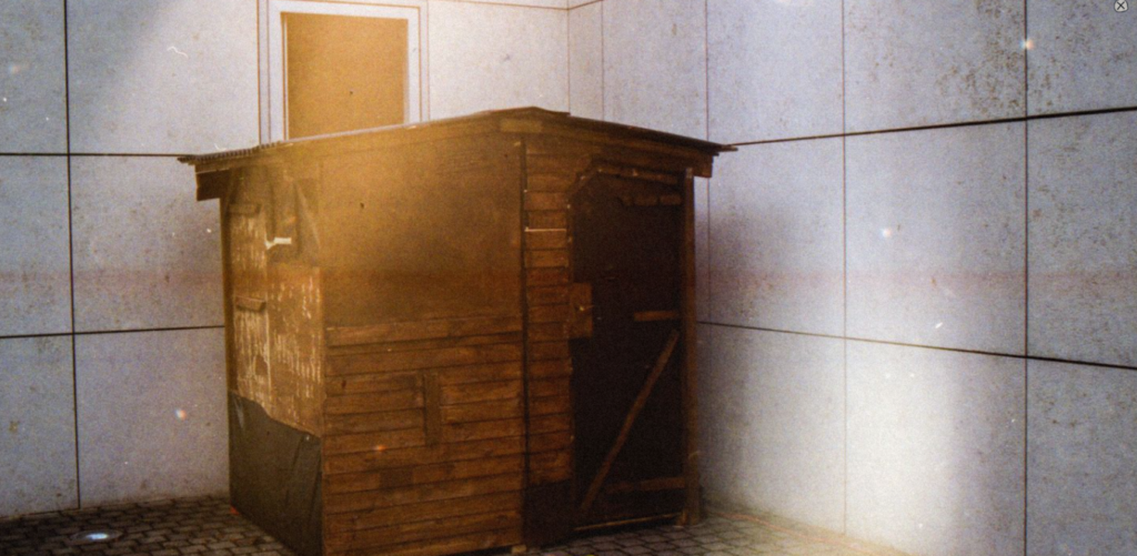
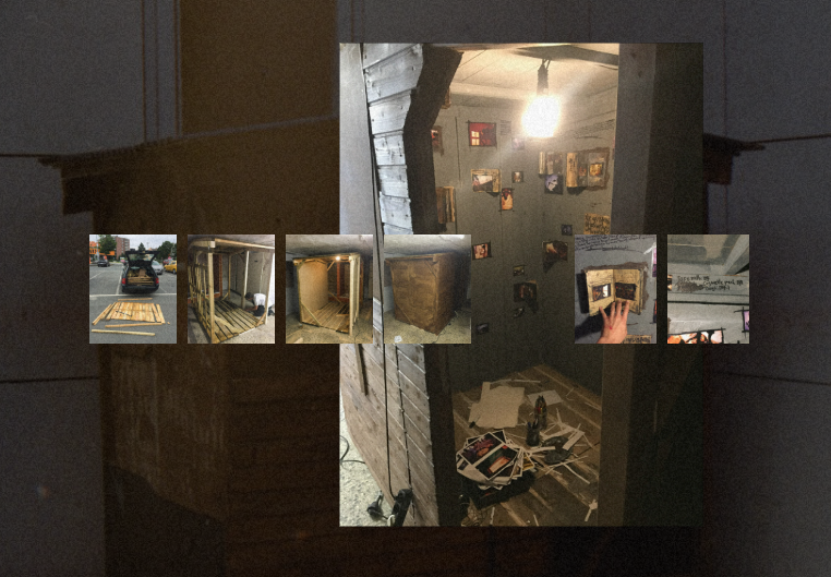
Exhibition of ‘Love Me’
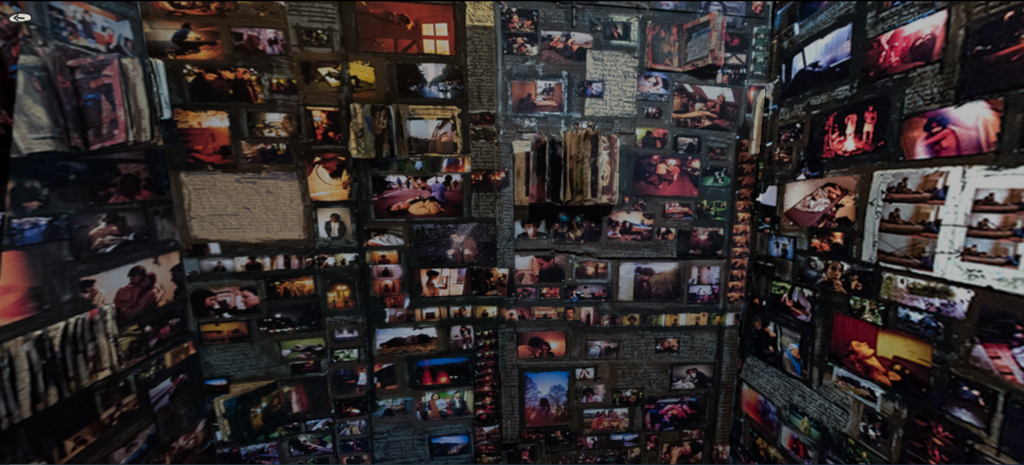
These photos have been exhibited outside of the photobook; in a small shed that he built himself.
Exhibition interior:
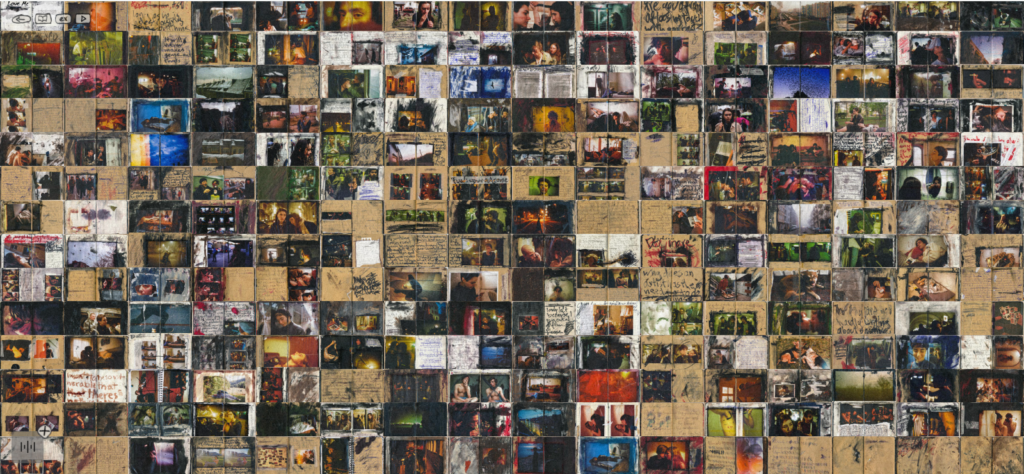
Photobook layout overview:
(Screenshot from Josh Kern’s website)
Josh Kern published 1100 copies of his photobook ‘Love Me’ in May 2020, with 476 pages, 12,5 x 16,3cm (portrait), and Japanese binding. This photobook has many different textures. For example, there are different types of paper used all throughout the book, these colours being the pages of the notebook or paper the artist has included himself, these are primarily off-white or yellow.
Josh Kern has stated about this photobook ,‘By doing all these book attempts I realized that I’m mostly interested in the feeling that the actual act of creating provoked … A few months and a lot of notebooks later, I showed my work to my professor and he asked me to try to make a book only with scrapbook pages. It was such a relief to finally allow myself to work with my notebooks. For some reason I didn’t even dare to think about doing a book only with scrapbook scans before – probably because I was way too afraid to repeat myself after my first book. And by doing so I completely suppressed what I actually wanted to do and what needed to get out of me.’
UNDERSTANDING PHOTOBOOKS: NARRATIVE, EDITING, SEQUENCING, DESIGN, FORM, FUNCTION