1. Research a photo-book and describe the story it is communicating with reference to subject-matter, genre and approach to image-making.
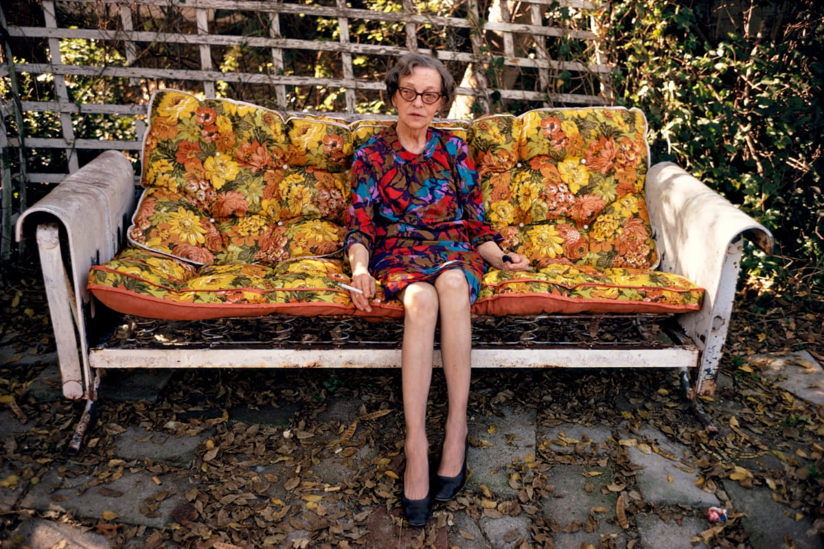
The story is communicating the life of an old man and his love for flowers and his wife who he lost it also shows what life was like for him being in a home by himself without his wife. The first page of images shows a photo album where the only pictures are of his wife and flowers showing his two most precious things in life. The first image was of his wife and the images were in a photo album, suggesting that they were very precious images to him.
2. Who is the photographer? Why did he/she make it? (intentions/ reasons) Who is it for? (audience) How was it received? (any press, reviews, awards, legacy etc.)
The photographers I’m using are Mark Power and Ansel Adams. Mark Power made these images to document the special places that people had strong memories with, these memories could be happy joyful memories or sad and quite solemn memories. For example he took photos of hospital waiting rooms that could be a memory that was sad but important to that particular person. he also took images of landscapes and buildings many of his landscape images are of houses that are abandoned or derelict or places that have been knocked down and are no longer there, suggesting that they could be images of places that used to be special or where that particular person may of grown up in. Power won Terence Donovan Awardand an Honorary Fellowship. Ansel Adams took images of nature and landscapes showing the beauty in the nature world. His work shows romanticism and how he made his images showcase that. Ansel Adams did this because as a child he loved nature and took lots of photos at Yosemite National Park where he first discovered his love for nature. His work is for anyone that appreciates the wonders and the beauty of the natural world. Adams won the Hasselblad Award in 1981 and then won the Sierra Club John Muir Award in 1963.
3. Deconstruct the narrative, concept and design of the book and apply theory above when considering:
How does the book feel/smell ?
The book smells like its very old and worn and it feels precious and special like your holding someone’s life.
Paper and Ink – use of different patterns/texture/colours or black and white for all images.
I want to do coloured images but then have some in black and white to emphasise the solemn feelings about the story. There will be no textures in he book or on any of the photographs.
Format, size and orientation: portraiture/ landscape/ square/ A5, A4, A3/ number of pages.
The photographs will be both portrait and landscape as there are a lot of photos with the surrounding environment there will be filtered through the portrait images of my dad.
The cover will be a hard cover and the stitching will be a saddle stitch. I might put a dust jacket over the hard cover to protect it.
Cover: linen/card, graphic/printed image, embossed/debossed, letterpress/silkscreen or hot-stamping.
The cover will be a card cover and then will have a printed image on the front with debossed writing that I’m then going to make gold so it stands out against the dark colours of the image that’s going to be printed on the front cover.
Title: literal or poetic / relevant or intriguing
The title will be literal and will be relevant but I want to make it as intriguing as I can to make it sound interesting and worth looking at.
Narrative: what is the story/ subject-matter. How is it told?
The story will unfold from the first images, there will be photographs of my grandad in the front pages and then there will be the landscape images and the restaged images throughout the rest of the book.
Structure and architecture: how is it designed/ repeating motifs/ or do specific features develop a concept or construct a narrative.
There will be specific features that construct the narrative and add to the story to help develop what the book will be about.
Design and layout: image size on pages/single page, double-spread/ images/grid, fold-outs/inserts.
The portrait images I want to put on one page but some of the landscape images I want to put on a double page so they are bigger. For the first page I might do a grid of images of my grandad and then the rest of the photos in the book will be one landscape or portrait image on individual pages.
Editing and sequencing: selection of images/juxtaposition of photographs/editing process.
The images will not show juxtaposition but they will contrast against the landscape and portrait images.
Images and text: are they linked? Introduction/essay/statement by artists or others. Use of captions if there are any.
The images and text will be linked together and I will put statements from the artists in the book to help understand the meaning behind the images.
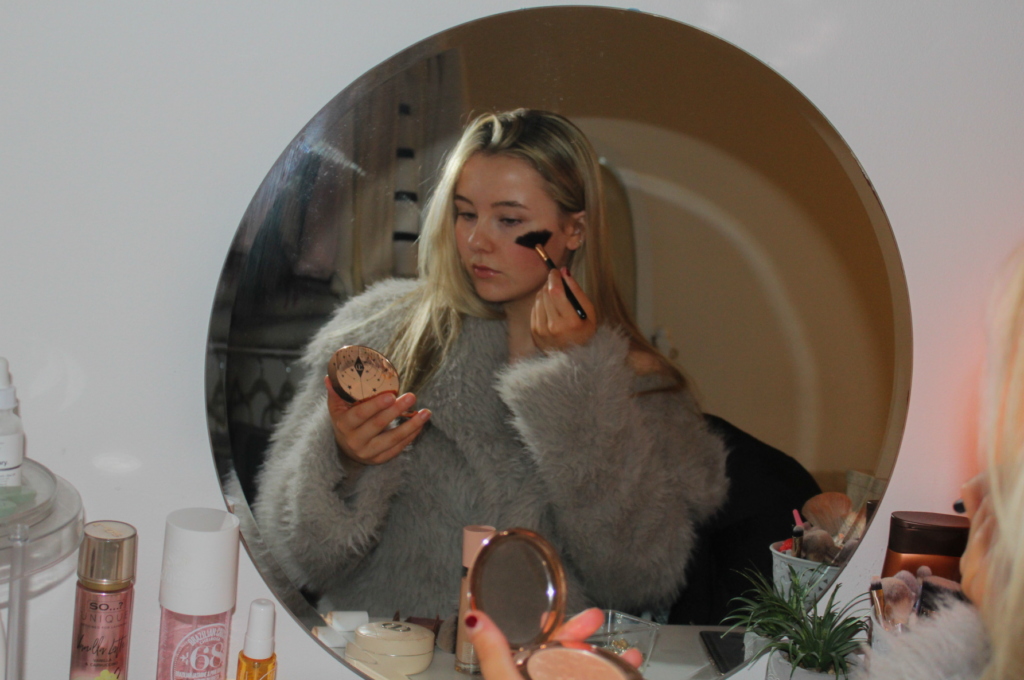
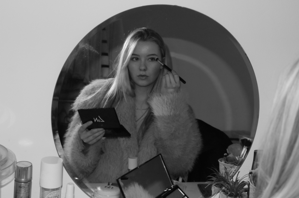
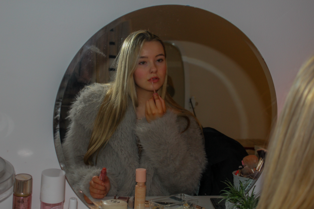
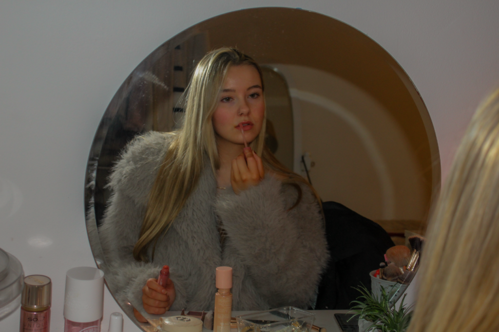
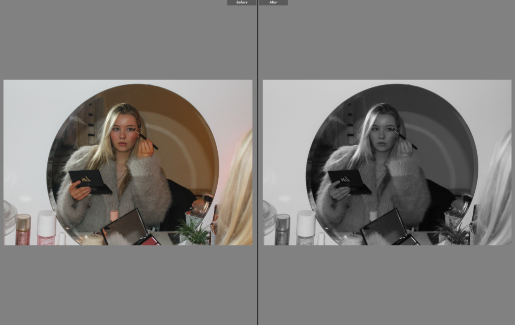
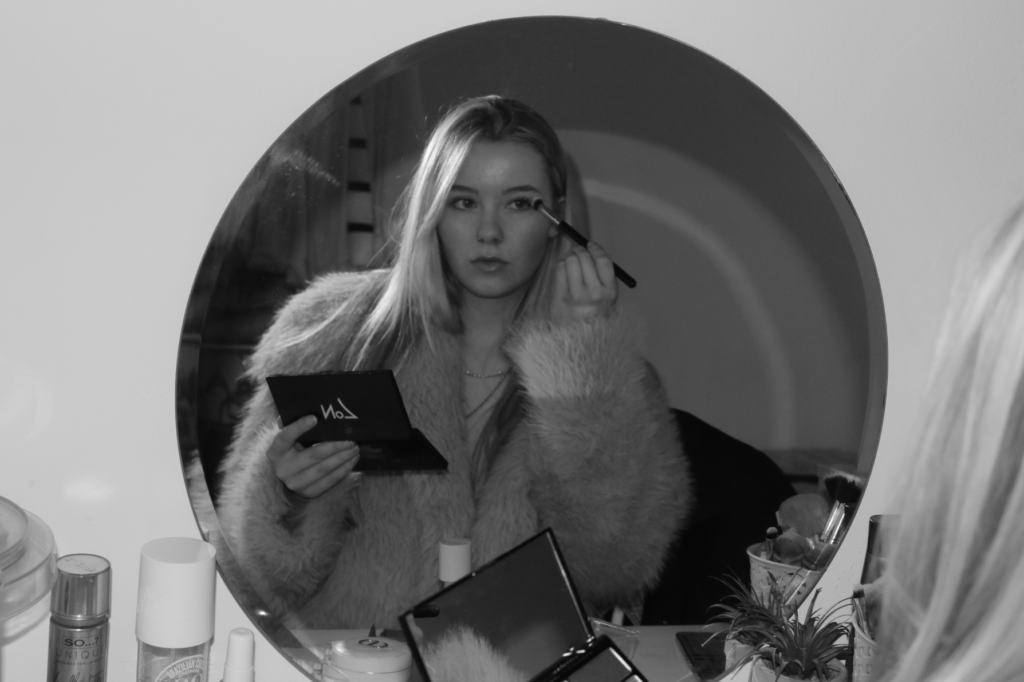
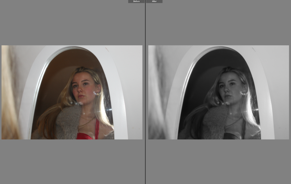
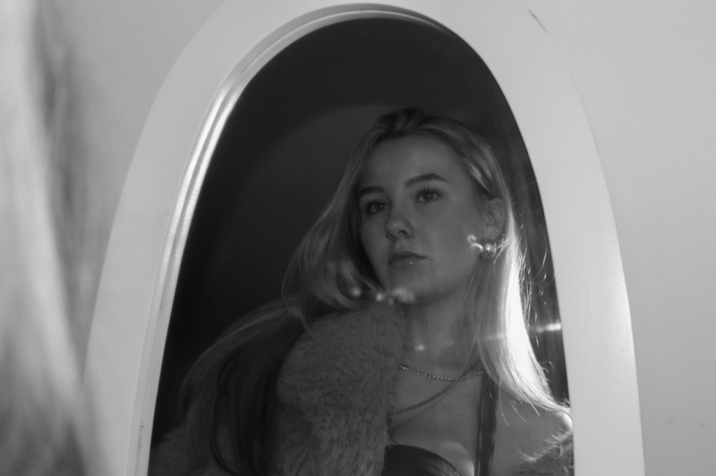
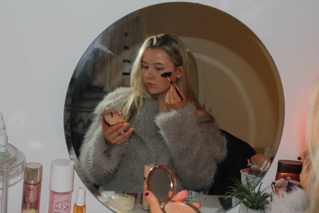
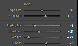
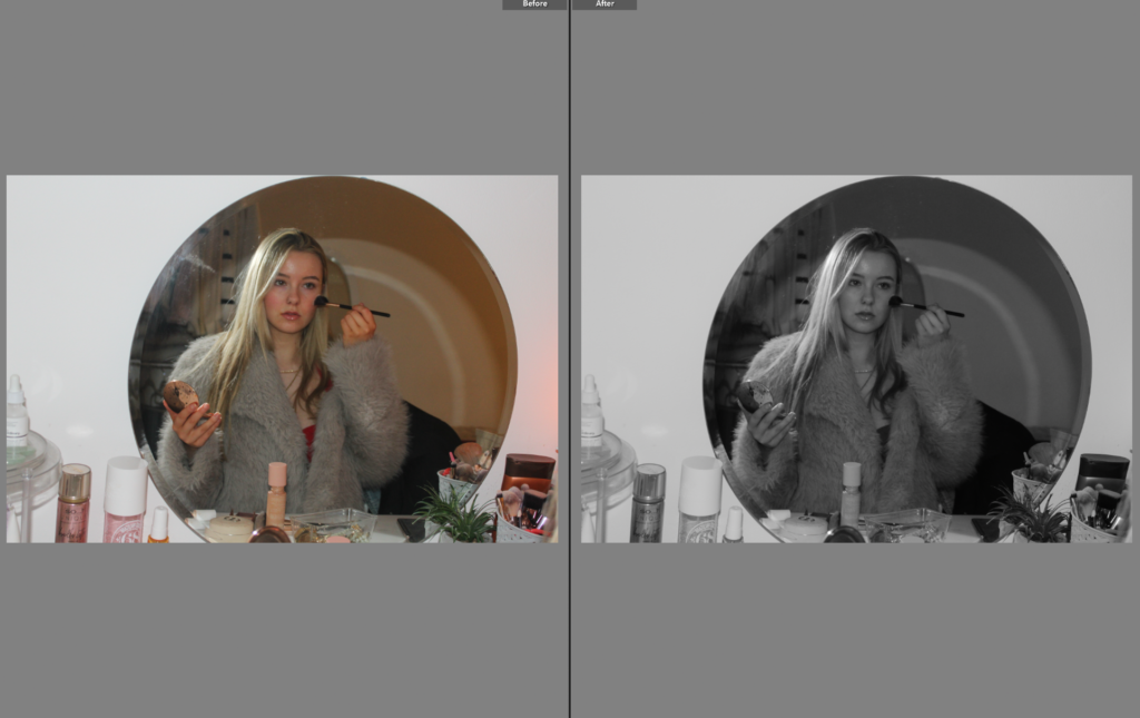
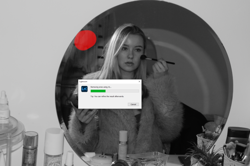
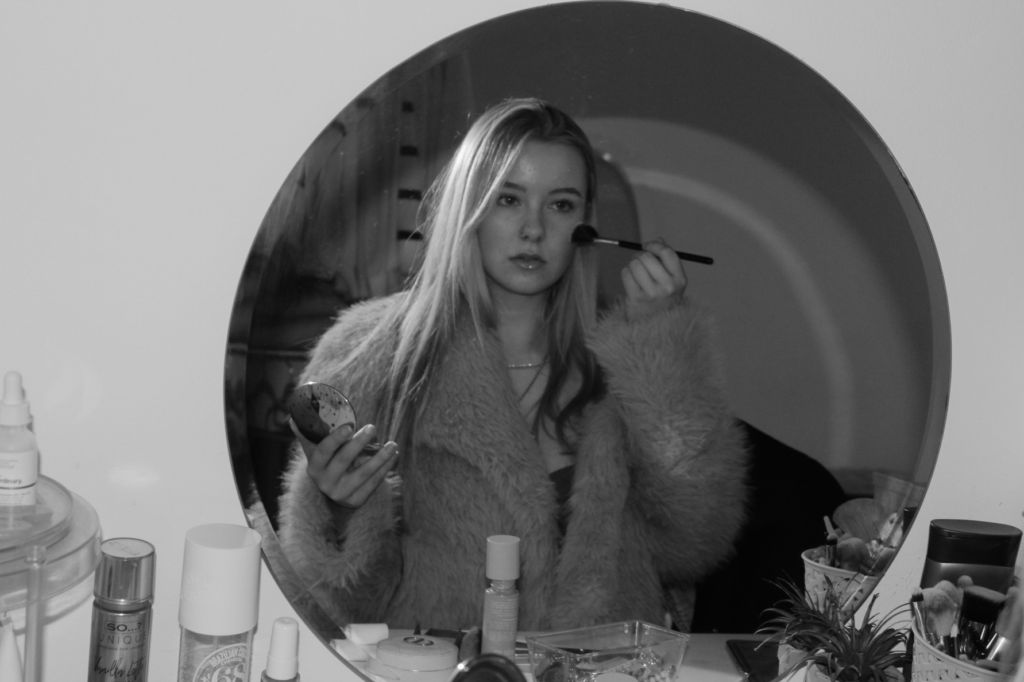
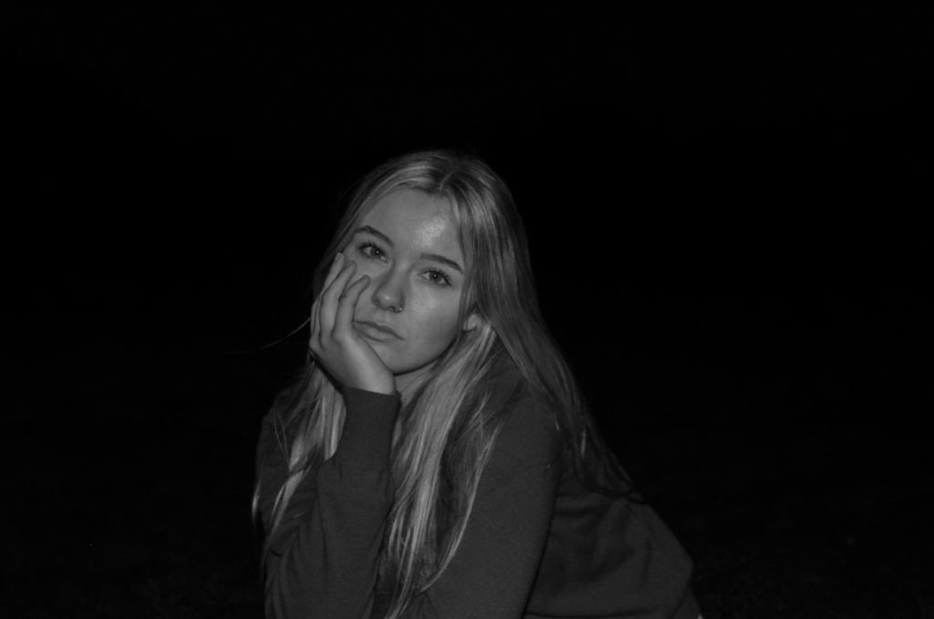
To conclude, I think this photoshoot is my favourite from the five photoshoots I have executed for my personal study project. This is because I took a unique approach compared to my other shoots, as it has a different location and I am portraying a different aesthetic to the others. This photoshoot took inspiration from Ramona Wang, as I have exploited my subject the same way she has, through the use of doing typical female activities to represent the stereotypes. I am wearing a vintage fur jacket over a red dress, which highlights the significance of women existing only to look pretty. On the other hand, a disadvantage of this shoot is that all of my best outcomes look the same or very similar, so I decided to put some in black and white i order to allow them to stand out, and also so that the viewer can pick up the minor differences between each image.
What I think went well:
Subject expression – the facial expressions of the subject are successful as they represent the photographic gaze
The props – the clothing helps add to the dramatic effect and symbolise women being objectified
Portraying typical female activities – links to my themes of femininity and youth due to me getting ready for a night out, and these themes are associated with young women
What I think I could improve:
Range of camera positions – my camera position is the same in most of the images, limiting the uniqueness in each one.
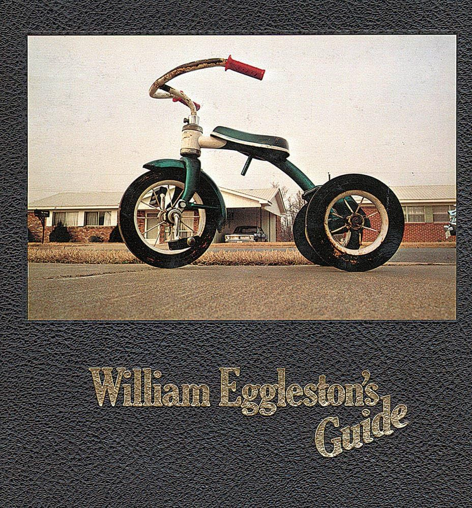
William Eggleston`s Guide, at the time of when this book was published (1976) colour photography was mainly linked with advertisements or just random images instead of professional, serious artwork. William Eggleston`s work was heavily important in showing how colour could highlight or improve storytelling in documentary style photography. This photobook was produced apace with his solo exhibition at the Museum Of Modern Art (MOMA) in New York. John Swarovski, the director of photography at the Museum Of Modern Art, was a key role in making William Eggleston`s Guide catch the public`s eyes. Swarovski helped Eggleston not only by choosing his excellent solo exhibition in 1976 but also helped by writing an introductory essay to the photobook. In this essay, Swarovski states that Eggleston`s work is “perfect” and he also says that Eggleston`s work is “related in iconography and technique to the contemporary standard of vernacular camera work,” highlighting Eggleston`s focus on ordinary subjects.
The photographer is William Eggleston and he created this timeless photobook to capture the ordinary suburban lifestyle of North America at the time period. Nowadays this would be seen as unique and foreign to us due to the contrasting aspects of the decades. He made this collection of photos to present and he stated they were repeatedly inspired by Henri Cartier-Bresson’s pioneering candid, street photography. His intention behind this photo book was to convey his images to the public for the first time. The William Eggleston`s Guide was displayed at the Museum Of Modern Art in 1976.
William EgglestonJohn Szarkowski
Holding William Eggleston`s Guide brings out a sense of importance and curiosity. The cover of the photobook is elegant, well made and still lightweight, making the book easy and comfortable to handle and it makes the viewer interested to view its contents. However the image on the front cover does not portray what is on the inside of the photobook, I think that that the image is quite boring and basic, I also do not like the angle that he has taken the image in, however this might be a statement from Eggleston showing that he is proud of every capture of his. The paper on the interior is smooth with a slightly textured surface adding a physical quality which compliments Eggleston`s images. On the cover of the book, the title is written in gold adding to the rich aesthetic the book has inside and out. The book first interior pages consist of the essay written by John Swarovski which is placed on 8 pieces of green thick paper, with the rest of the pages being glossy white. The images on the white pages are vibrant and the ink used is highly saturated highlighting his incredible use of colour, the colour in his images come to life in the photobook as the printing is done with clarity and detail. The whole photobook is in colour and there is no images in monochrome, this was a key part of the book as colour photography had not been widely known or accepted in the creative space. Eggleton’s photobook is in portrait and is quite big in size, allowing the images to be larger and overall making the photobook more intriguing, the book being relatively large allows readers / viewers to look at the images with a lot of attention to detail as the images are bigger too. This book is quite small in comparison to other photobooks, William Eggleston`s Guide has 112 pages to be exact. The smaller amount of photos entices the viewer to engage more with each image and actually take in each image one by one, revealing Eggleston`s thought behind his image selection. Eggleston made this a hardcover book and had the cover image printed straight onto the hardcover instead of putting a dust jacket on the book and the binding of the book is regular and traditional keeping the focus on the images themselves rather than the book itself. The title of the book: William Eggleston`s Guide is extremely literal, instantly identifying the photographer and classifying the book as a “guide” to his unique way of seeing the world. The title of the photobook fits in with the overall minimal design seen throughout the whole book. The book as a whole captures the everyday life in the south side of America including Mississippi, Alabama, Florida, Georgia and Kentucky. Aside from the introductory essay, the photobook only has small, sly captions which is found at the bottom of each page, this feature of having small captions at the bottom of the page is very minimal, and is done on purpose to keep the attention and focus on the images rather than taking the viewers attention off of the images and onto the writing. The images selected are rather random however they are all showing the same story of the ordinary daily life in south side of America, focusing on the overlooked, dull subjects.
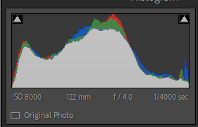
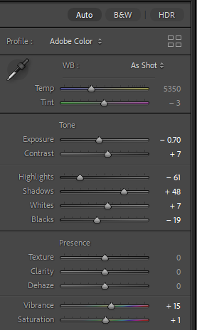
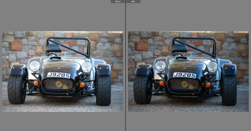
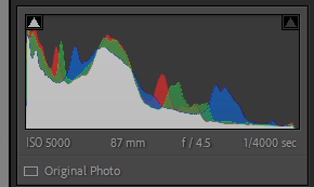
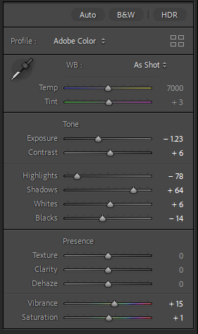
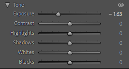
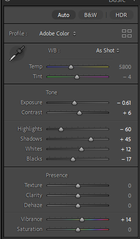
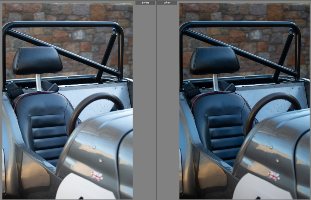
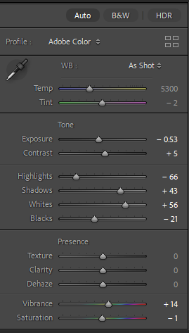
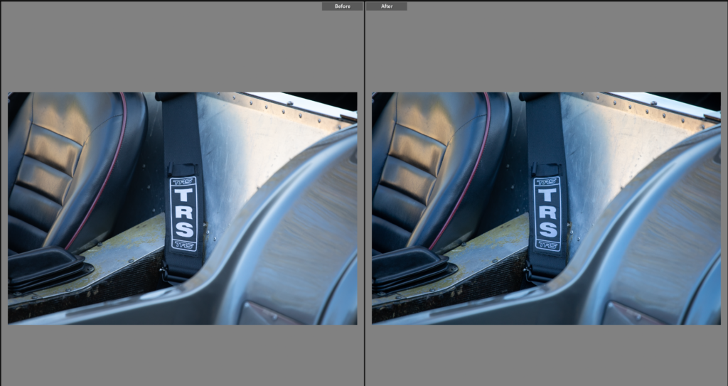
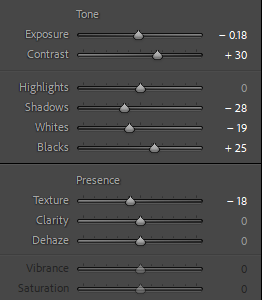
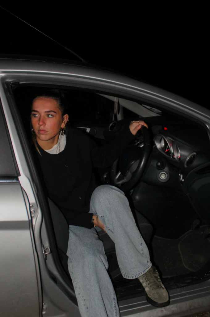
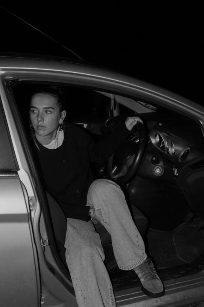
This photo needed the exposure reducing so the car was true to colour. Although this shoot was done in day light I wanted the editing style to be similar to my first photoshoot with the ford escort, my mothers car. Which was done in the dark so I am editing with a style choice of slightly noisy, lower exposed adjustments.
Edit Two
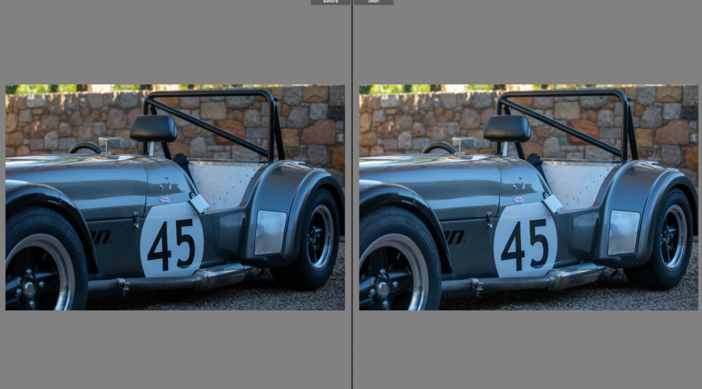
I liked this photo, the angle of the car is appealing, cropping the front of it out and focusing on the seat and number. I lowered the exposure, while increasing the contrast to give the deeper colour on the car.
Edit Three
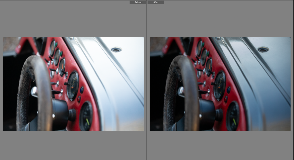
Unlike the previous shots, this one was more abstract, hiding the majority of the car and looking at details that show the cars original owners influence. I lowered the exposure to maintain the editing style, darkening the wheel and bonnet. This made for a better photo, removing some of the glare from the original photo.
Edit Five
This photo is similar to the previous in terms of what is in the shot, however I preferred this angle. After editing both I can make a comparison on which is the more fitting photo. I like the previous photos colours and lighting, but the composition of this photo is much stronger.
Edit Six
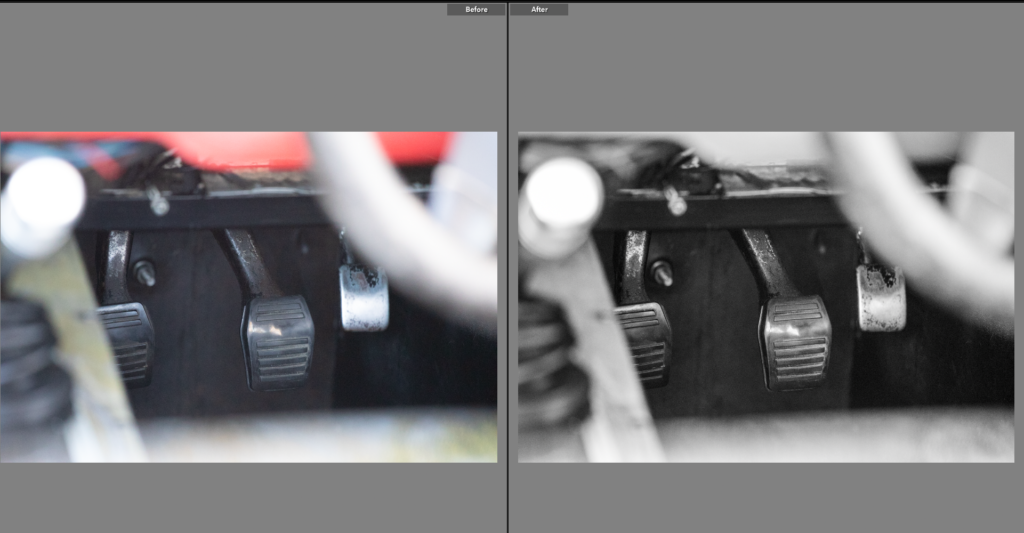
Niche to this style of car is the pedals, often forcing the driver to wear racing shoes due to how close the pedals are. This was an important element of the car for me to show, having been told this fact by my father as this car has previously been his. The colour was good in the original shot, but I found the shot looked busy so chose to use black and white with increased clarity to remove the busyness without removing the tarnish on the pedals.
Edit Seven
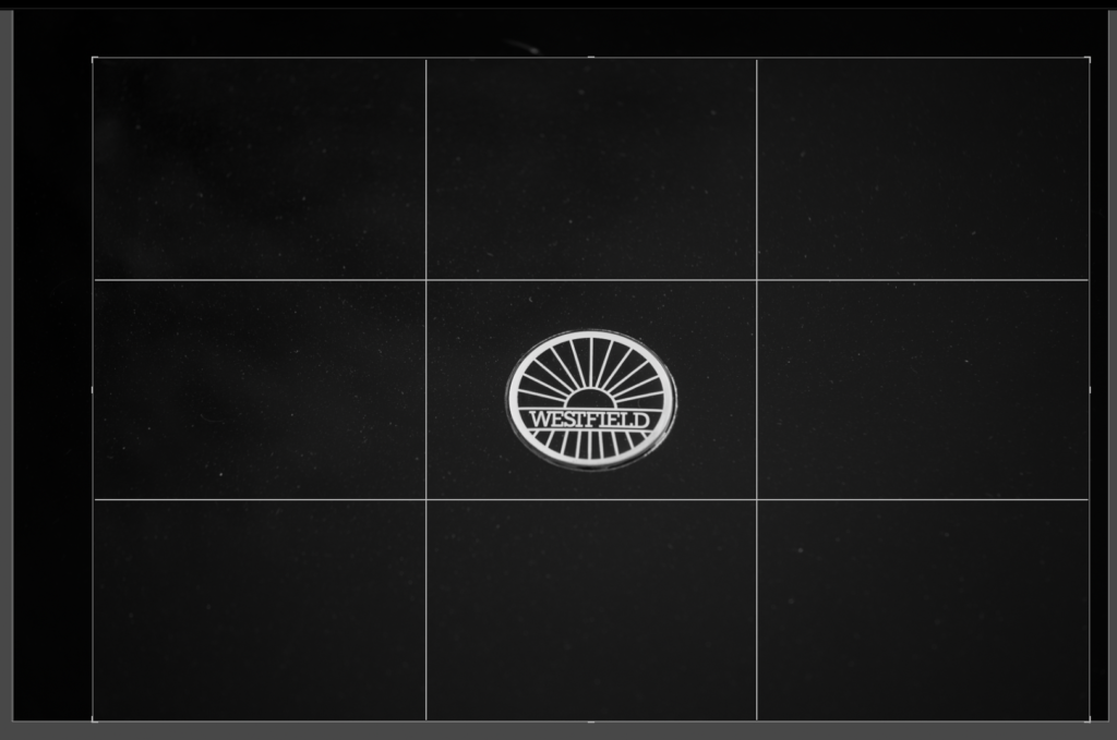
A simple detail can add huge amounts of context to a photoshoot, this is the badge of the car. Another important element within my connection to this car through my father and how he spoke of it when I was growing up. As I’ve gotten older I’ve found key points like this have helped me negotiate the motorsport world.
Edit Eight
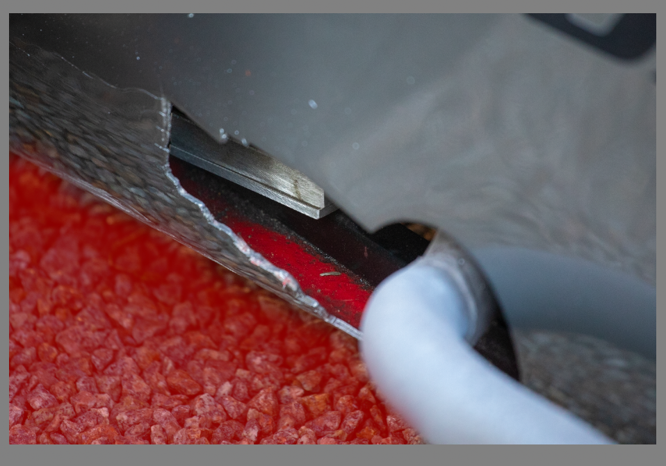
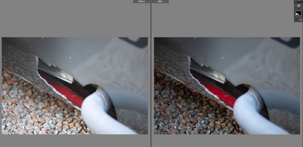
Having seen photos of the car when my father owned it, the car was red. Now the car is gun metal grey, there is some remaining red elements, the leather panel is still red and where the exhaust comes out of the car you can see the remaining red paint. I want to place this image next to an archived image to show the comparison. I needed to reduce the brightness of the gravel alone as it took the focus off he red paint so I used the brush tool having already edited the rest of the image.
Edit Nine
Most of the photos are close crops of the car, showing snippets of parts individual to the car, ones someone who doesn’t know much about the car might not pick up on. I liked this as it shows the roll bar and the drivers seat, linking back to the drivers connection to the car.
Edit Ten
While this photo isn’t significant to the connection, I do like the photo as a whole, introducing us to the car. From the central point of the seatbelt text, showing the viewer it is used to race in, to the leathers texture contrasting well with smooth metal sheets.
Final Photos
These photos were interesting to take as I had to go in with a plan to get similar shots that worked well together. I aimed to edit them in a similar style to the original photoshoot with the ford escort. Using small crops and high contrast images, I created a set of unique, story telling photos. I will be able to pair these with the achieve photos, which were the original inspiration for the photos. The archive photos didn’t have the person in them so I didn’t have a person in these photos. Instead I want to add captions next to the photos, explaining the reason for the photo and adding connection to the photos to the book. By mixing black and white photos with colour, I have referenced the original colour of the car as well as adding dynamic and interesting photos through a mixture of both colour and B&W photos. This shoot is reminiscent of Keith Dotson’s style, I looked at his work of rusty cars in the woods and this is the opposite. However, he used close up shots, small details and unusual angles while keeping eyelevel with the car so I took this approach to create these photos. The overall photos work well together and tell a story about the car, having captured the small details it allows me to make a comparison between the archive photos (when I put them into the book) and how the car is now.
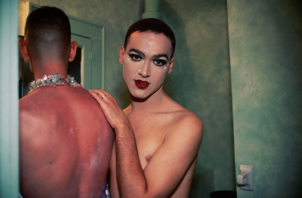
How is sexuality and gender identity explored and represented in photography?
‘This binarism, which is but one of a series that underpins much photography theory and criticism, characterizes – in a manner that appears virtually self-evident – two possible positions for the photographer. The insider position – in this particular context, the “good” position – is thus understood to imply a position of engagement, participation, and privileged knowledge, whereas the second, the outsider’s position is taken to produce an alienated and voyeuristic relationship that heightens the distance between subject and object.’ Abigail Solomon-Godeau, Inside/ Outside 1995
Introduction
Exploring sexuality and gender identity within photographs are usually captured and addressed from an outsider perspective, a viewpoint that is commonly objectifying and misleading. Instead, this intimate proximity, seen through Nan Goldin’s insider delineation of her close community, enables her to portray an extremely personal, and at times, voyeuristic perspective of her lived experiences. This narrative showcases a tableaux and uncompromising representation of Goldin’s and her found family’s feelings and familiarity within the queer community. Being in the same artistic circle as other photographers who predominantly photographed on film New York’s queer subculture, Goldin dedicated these portraits to preserving and capturing the essence of relationships, sexuality, gender exploration, and addiction during the 1970s and 80s. As photography serves as an archive, there are many photographs exploring sexuality and gender identity which are immortalised, especially within the 19th and 20th century as photography began to become a popular and accessible medium of art and documentation. Situated within the fluidity and ambiguous notion of sexuality during these important and representative eras, these relaxed and fluid forms of identity captured within art and photography avoids distinct labelling, imposing a flexible identity of the individual.
Historical and theoretical context
Representation within art, photography and visual culture is to accept responsibility for the portrayal of the subject, and to deepen the understanding of the shared adjacent bond between the subject and the artist or photographer. The dichotomy between a subject’s essence being captured by someone outside their own community compared to inside their community showcases the epitome of “good” and “bad” representation of that person or group.
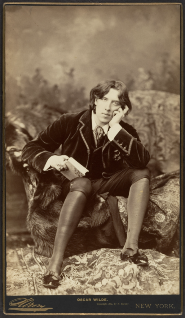
(You need to show evidence that you have read Solomon-Godeau’s key text Inside/ Outside and incorporate a couple of quotes that you can use to agree/ disagree with to develop a critical argument.) Then use the example below with the portrait of Oscar Wilde. )
In circa 1882, the photographer Napoleon Sarony photographed portraits of Oscar Wilde, a poet and playwright in Victorian London, which positioned Wilde in the frame with his usual flamboyant and dandy personality, characteristics of the art movement of aestheticism which valued appearance of art over functions. The society of this time explicitly expressed disdain against sexual debauchery, which included the outlawing of all homosexual acts for ‘gross indecency’ under the 1885 Criminal Law Amendment Act, which Wilde was one of the first and highest importance figures prosecuted and put on trial for. This opens the discussion whether photography not only serves as an art form, but also archival material and an account of history.
image caption, artist name, title, year
Oscar Wilde, Napoleon Sarony, 1882
Nan Goldin
The photographer beholding a position of intimate proximity is vastly evident throughout Nan Goldin’s wide photography portfolio. Goldin was born 12th September, 1953 in Washington, D.C. and has relished in photography since she was fifteen, and in downtown Boston until she was nineteen. Ultimately driven by her need to remember herself and those she loves, Goldin solidified her innate passion of documenting scenes of her subcultural communities she made a home within for herself once moving from Boston to New York in 1978.
‘[Journalists] talk about the work I did on drag queens and prostitution, on “marginalised” people. We were never marginalised. We were the world. We were our own world, and we could have cared less about what “straight” people thought of us.’ (Goldin 1986: )
Utilising a narrative within photographs which conveys a deeply personal bond between Goldin and her subjects, she is often notably recognised for this inner representation of the communities and subcultures she shares space with. In her book The Ballad of Sexual Dependency, she initially shared the photographs within with those photographed in frequently visited clubs and venues, and an immediate reaction from these peers contributed to its growth and ultimately its final presentation. ‘I look at Ballad and see the dynamics of both love and hate, tenderness and violence, as well as all kinds of ambivalence in relationships.’ (Goldin 2012) Whether her subjects were portrayed in these harshly juxtaposing settings; an extremely domestic house or party setting, or at the funeral of her close friend, in a deadpan approach, Goldin addressed her subjects by their first name and most commonly added context on what was happening within the photograph, allowing the viewer to look inside the scene and realise much more of the situation and the lives of these people. Goldin personally engages her subjects with the creation of her art, and although this could have swayed the reception, especially the involvement of queer people in the 1970s and 80s, she does not leave this up for discussion. Her subjects are presented as the artwork, identifying visceral and ambivalent reactions towards her work and deepening the sense of these photographs being deemed as a voyeuristic gaze.
‘People in the pictures say my camera is as much a part of being with me as any other aspect of knowing me. It’s as if my hand were a camera. If it were possible, I’d want no mechanism between me and the moment of photographing. The camera is as much a part of my everyday life as talking or eating or sex. The instant of photographing, instead of creating distance, is a moment of clarity and emotional connection for me. There is a popular notion that the photographer is by nature a voyeur; the last one invited to the party. But I’m not crashing; this is my party. This is my family, my history’ (Goldin 1986: )
In her portraits of her with a previous lover depicted in bed, occupying the lesser portion of the space is where Goldin has positioned herself in the background, behind him. Goldin in The Ballad of Sexual Dependency features
‘As children, we’re programmed into the limitations of gender distinction … But as we grow older, there’s a self-awareness that sees gender as a decision, as something malleable … Rather than accept gender distinction, the point is to redefine it … there is the decision to live out the alternatives, even to change one’s sex, which to me is the ultimate act of autonomy.’ (Goldin 1986:7)
(For other critical perspectives on Goldin and her seminal book- see this special issue of Aperture Magazine and other texts written about her work and its influence.)
Draft Introduction (250-500 words). Think about an opening that will draw your reader in e.g. you can re-formulate the essay question. You should include in your introduction an outline of your intention of your study, e.g. what area of photography, or subject-matter are you exploring? Which artists/ photographers are you going to investigate/ analyse/ interpret? Why does this subject/ work interest you? What are you trying to prove/challenge, argument/ counter-argument? What historical or theoretical context is the work situated within? Include at least 1 or 2 quotes for or against. What links are there with your previous studies, if any? How has this subject and chosen artists/ photographers inspired your own images/ responses? How will your work develop? What camera skills, photographic techniques or processes have you experimented with, or are you going to experiment with?
Literary sources: Go to this blog post here: Theory: Literary Sources and copy relevant key texts relating to the subject of your essay and list in alphabetical order in your bibliography. In addition, find your own key texts in relation to artists selected for in-depth analysis in your essay and list these too. These texts could be interviews with the artist, or reviews/ critique’s written by others. See useful online sites/ sources here .
Research and identify 3-5 literary sources from a variety of media such as books, journal/magazines, internet, Youtube/video that relates to your personal study and artists references .
Begin to read essay, texts and interviews with your chosen artists as well as commentary from critics, historians and others.
It’s important that you show evidence of reading and draw upon different pints of view – not only your own.
Take notes when you’re reading…key words, concepts, passages, page number to be used for in-text referencing etc.
Essay Question
Think of a hypothesis and list possible essay questions
Below is a list of possible essay questions that may help you to formulate your own.
Essay Plan Make a plan that lists what you are going to write about in each paragraph – essay structure
Essay question:
Opening quote
Introduction (250-500 words): What is your area study? Which artists will you be analysing and why? How will you be responding to their work and essay question?
Nan Goldin – outside/inside view of queer communities, issue of representation
history of portrayal and representation of the queer community in photography and the exploration of sexuality and gender identity within visual culture
Pg 1 (500 words): Historical/ theoretical context within art, photography and visual culture relevant to your area of study. Make links to art movements/ isms and some of the methods employed by critics and historian.
History of sexuality and gender identities in photography
aestheticism in art – oscar wilde, napoleon sarony portraits, historical representation
Pg 2 (500 words): Analyse first artist/photographer in relation to your essay question. Present and evaluate your own images and responses.
Pg 3 (500 words): Analyse second artist/photographer in relation to your essay question. Present and evaluate your own images and responses.
Conclusion (250-500 words): Draw parallels, explore differences/ similarities between artists/photographers and that of your own work that you have produced
Bibliography: List all relevant sources used
Quotes: Nan Goldin
‘[Journalists] talk about the work I did on drag queens and prostitution, on “marginalised” people. We were never marginalised. We were the world. We were our own world, and we could have cared less about what “straight” people thought of us.’
‘People in the pictures say my camera is as much a part of being with me as any other aspect of knowing me. It’s as if my hand were a camera. If it were possible, I’d want no mechanism between me and the moment of photographing. The camera is as much a part of my everyday life as talking or eating or sex. The instant of photographing, instead of creating distance, is a moment of clarity and emotional connection for me. There is a popular notion that the photographer is by nature a voyeur; the last one invited to the party. But I’m not crashing; this is my party. This is my family, my history’
‘As children, we’re programmed into the limitations of gender distinction … But as we grow older, there’s a self-awareness that sees gender as a decision, as something malleable … Rather than accept gender distinction, the point is to redefine it … there is the decision to live out the alternatives, even to change one’s sex, which to me is the ultimate act of autonomy.’ (Goldin 1986:7)
‘I look at Ballad and see the dynamics of both love and hate, tenderness and violence, as well as all kinds of ambivalence in relationships.’
inside/out quotes
‘This binarism, which is but one of a series that underpins much photography theory and criticism, characterizes – in a manner that appears virtually self-evident – two possible positions for the photographer. The insider position – in this particular context, the “good” position – is thus understood to imply a position of engagement, participation, and privileged knowledge, whereas the second, the outsider’s position is taken to produce an alienated and voyeuristic relationship that heightens the distance between subject and object.’ (Solomon-Godeau 1995:49)
Bibliography
Sontag, S. (1977) ‘In Plato’s cave’ in On Photography. London: Penguin Books.
Goldin, Nan (1985) ‘The Ballad of Sexual Dependency’
Solomon-Godeau, A. (1994), ‘Inside/ Out’in Photography At The Dock: Essays on Photographic History, Institutions, and Practices. Minnesota: University of Minnesota Press.
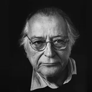
John Szarkowski opened an exhibition in The Museum of Modern Art in New York about photographs being either a Mirror or a Window. John Szarkowski’s theory of images has 5 different categories into making a photograph. The categories are, The thing itself, what you are actually photographing, The detail in the photograph, The frame of the photograph, The time and the time exposure to the image and the vantage point does the photograph give us a new view on the world.
The calotype process that Henry Fox Talbot invented in 1839 could be viewed as window, as it it an image that represent the view of the camera. It is a process where the image is captured on paper as negative, from which a positive image can be mass produced and made cheaply. The daguerreotype, on the other hand is a unique positive image that can not be reproduced. An image is captured on a silver nitrate solution on a metal plate that is then placed in a wooden box in a red velvet casing. because of its reflective surface a daguerreotype could be viewed as a mirror, not only will the reflection of the viewer be seen in the image, but often a daguerreotype were used for portraits as it had superior quality of detail. Unlike the calotype, the daguerreotype is very fragile and delicate. it is also an expensive process compared with a calotype. The distance between them is to be measured not in terms of the relative force or originally of their work, but in terms of their conceptions of what a photograph is. Is it a mirror, reflecting a portrait of the artist who made it, or a window, through which one might better know the world.
Mirrors
The mirror allows us as the audience to peer into the world and thoughts and feelings of the artist.
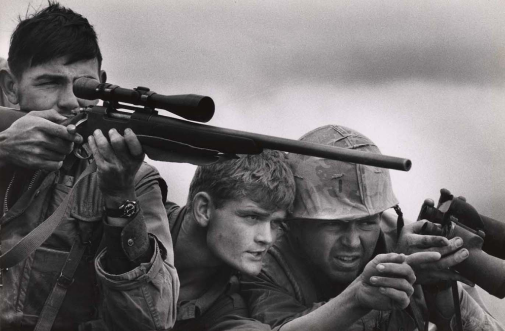
Captions: War Photography: A mirror or a window – brown political review
This is a mirror image because it reflects the persons life and gives an insight into what their life is like. This image is staged and planned to look like these three men are at war but it has been set up in a studio. John Szarkowski said. “a romantic expression of the photographer’s sensibility as it projects itself on the things and sights of this world; or as a window – through which the exterior world is explored in all its presence and reality.” (Philippa James from Mirrors and Windows Momo press release) –
This image reflects the quote by John Szarkowski because it projects the sights of the world in the image and shows what the men’s life life looks like as soldiers in combat at war. Jed Perl said. ‘this radically photographic style hinted at visual and cultural truths that were far removed from the stereotypes which gave form to the Victorian portrait. (Reference Jed Pearl) – In this quote Perl agrees with what Szarkowski said because his images of mirrors showed the hidden truths of peoples life’s and reflected them as a person.
Captions: Jed Pearl
This is a review of one of John Szarkowski’s images that Jed Pearl did and it reflects the person’s life but it is staged in a way that each person is composed and looking at the camera.
Windows
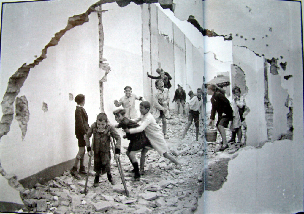
‘A window is through which one might better know the world.’ (Szarkowski 1978). A window shows more depth into a person’s life, so that people get a better insight into what the persons life is about. Window photography creates a barrier between the photographer and the subject. It almost blocks out the photographer from the subjects personal life. The photographer can literally be reflected in the window, which may bring the photographer into the images produced. The window allows an objective view which could show how the photographer is looking into a new or different world.
This image by Henri Cartier-Bresson is a group of “children playing amongst rubble” in Seville Spain 1936. This image literally shows a window that’s been created from a destruction sight when a building was knocked down. It gives an insight into the children’s lives playing among the rubble. ‘the casual, snapshot photography of which Szarkowski is an advocate arrives in general at a similar effect of predictability —a reflection of current taste rather than an original vision —through a different route’. (Pearl 1978) This suggests that Pearl thinks that the image selected by Szarkowski for the exhibition are not original and they are just reflecting on current taste and aesthetics. Pearl has another opposing view on Szarkowski’s he said, ‘Szarkowski pays elaborate homage to the “stripped, essential camera vision” of Garry Winogrand which is suggesting he only does the bare minimum with his photography and that his work is very bland and uninteresting.’ (Pearl 1978) Szarkowski says though, ‘that a window is through which one might better know the world’ (Szarkowski 1978). Which is saying that the images that he creates do not have to be amazing and the most exciting images that anyone has seen but they have to give insight into the world and make you discover things in the images that you might not of realized before. This is what window photography does it gives a different view on the world to help you discover the world and get a better understanding of what peoples lives are like and what other places are like that you might not of known much about previously.
Conclusion
In conclusion photographs can be both windows and mirrors because in John Szarkowski’s theory he said, ‘whatever a photographers intuition or intention, they must be cut and shaped to fit the possibilities of his art’ (Szarkowski 1978), which suggests that images can fit any possibilities. Jed Pearl criticised Szarkowski’s exhibition and said, ‘yet few of the photographs are closely, richly detailed enough, or surprising enough, to be separated from the medium’s past and characterized as new’.(Pearl 1978) This suggests that Jed Pearl thought John Szarkowski’s curation of images selected for the exhibition were not exciting enough and lacked originality.
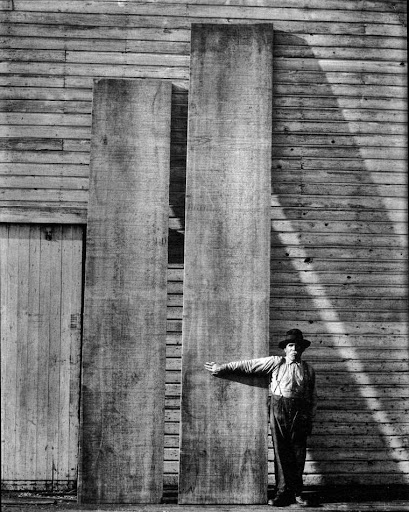
John Szarkowski
John Szarkowski
John Szarkowski’s own photography is very true to life and his work has elements of realism but some of his photography is staged. For example in the image above there is a man standing by a big wooden board pointing to it, which suggests that he has told the man how he wants him to pose for the image. However some of Szarkowski’s images are of the environment and landscapes, which is romanticised. Pearl also reviewd the opening of the Museum of Modern Art in New York in an article called Romanticisms Unruly Hero, that was published 2019. The quote“The sepulchral installation muffles and sometimes even strangles his work. Is this the museum’s idea of what it takes to set a mood worthy of Delacroix’s reputation as the leader of the Romantic movement in France?” (Romanticisms unruly hero 2018) This suggests that Jed Pearl questioned the way the museum was installing the painting and that the way the painting was put up in the museum was giving the wrong intention and not portraying the intention it was suppose to give.
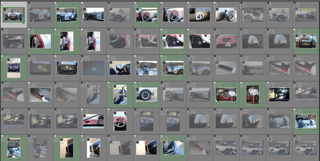
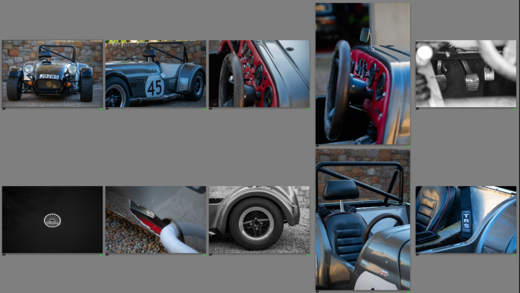
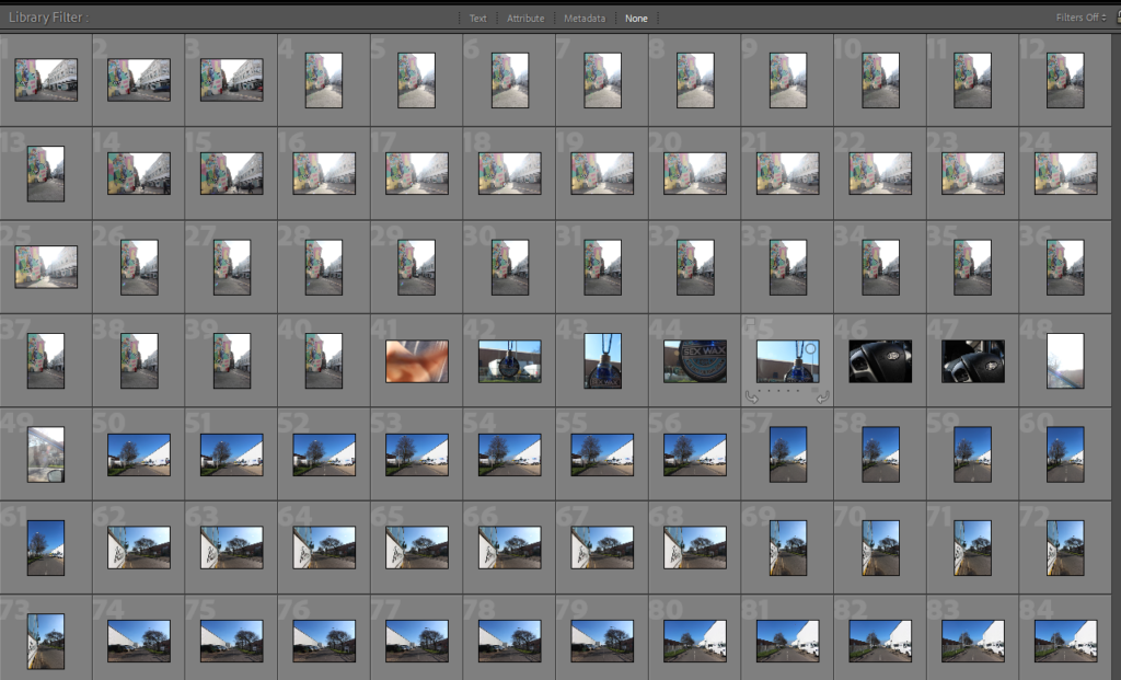
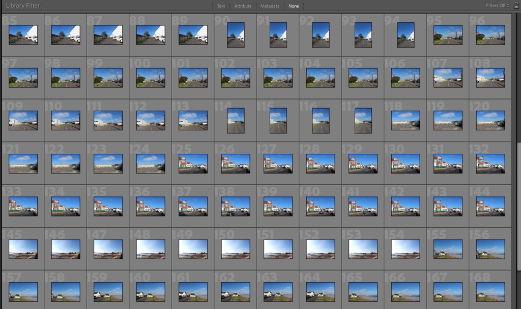
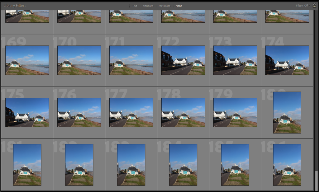
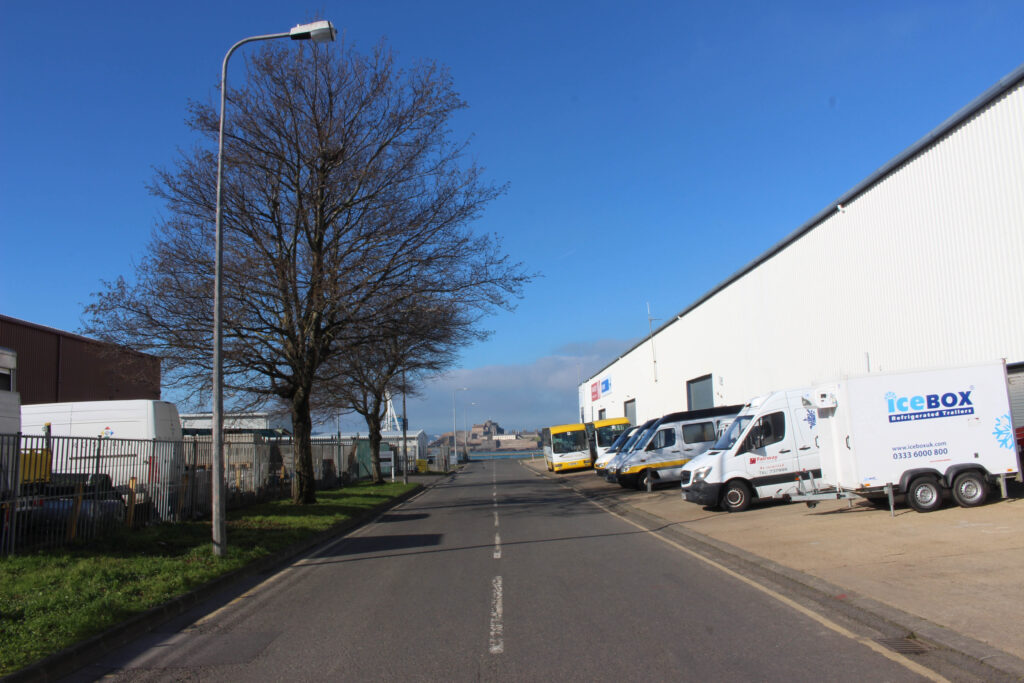
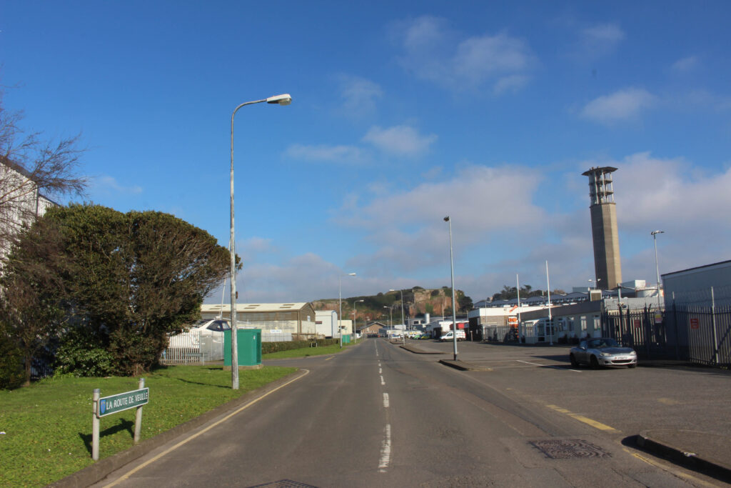
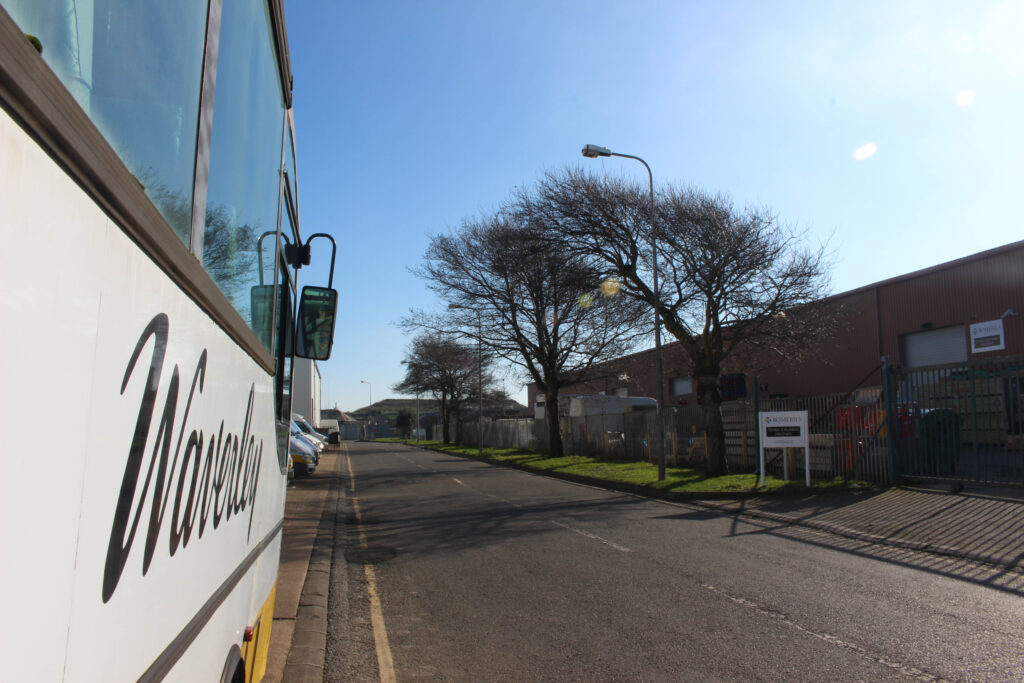
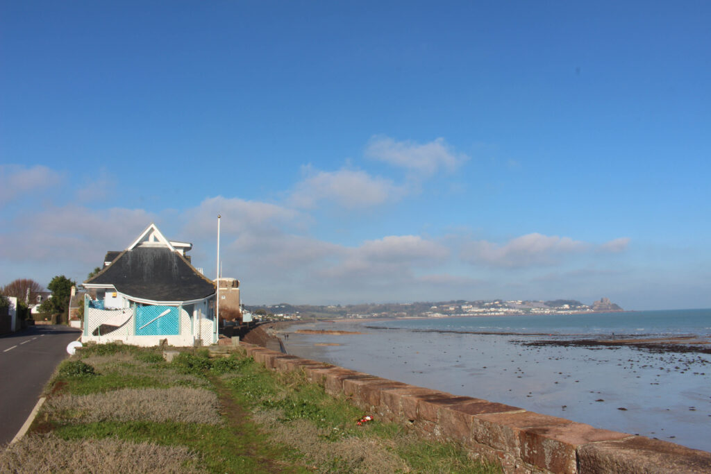
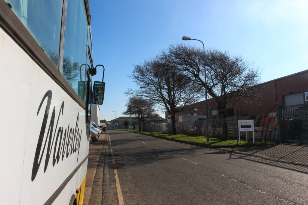
This is the initial contact sheet, displaying every image which was taken during this photoshoot. In total for this photoshoot, I took 186 photographs, these 186 images show off three different locations: St Helier, La Collette and St Clements. For this photoshoot my aim was to capture as much colour as possible, reinforcing the inspiration from William Eggleston and capturing the urban and everyday life during the day with natural light, so I drove around with these three specific locations in mind to find colour and beautiful scenery under the natural sunlight. I went to La Collette as I had taken photographs in that location during the low light, night time settings so I could show the contrast of the same location under two different atmospheres.
Final Selection of Images
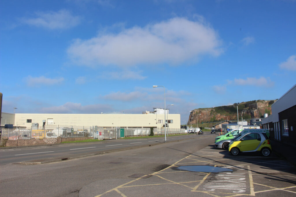
From the initial 186 images, I only chose 7 as my final ones. These 7 in particular were chosen due to the way they portrayed these locations during the day, showing the energy given from the sun and giving a complete different mood / feel in comparison to most photographs taken during the night.
Above is my favourite photograph from this photoshoot taken during the hours of the day, this image is my favourite out of all of them because it is strongly framed and how it perfectly links with the overall theme of my book. I also took a photo in a previous shoot which is almost identical to this one however it was taken during the night, making this image more meaningful in contrast. This photo shows the details of the bus, trees and just the overall industrial setting. The reflection which comes from the bus window could be seen as another layer to the image, possibly showing that there is life outside of the frame. This photo will work great inside my photobook, especially when placed on the same double page spread as the almost identical image at night, reinforcing the theme of the normal becoming abnormal.
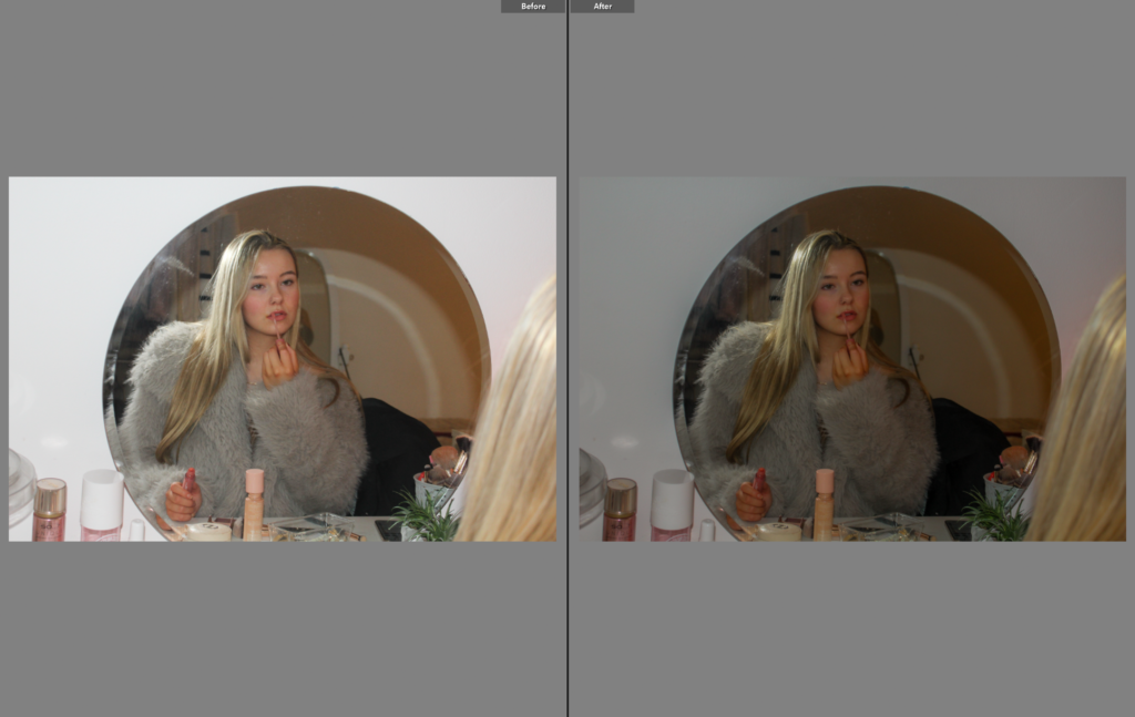
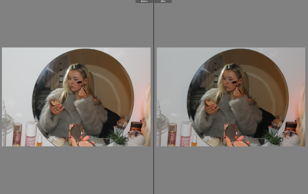
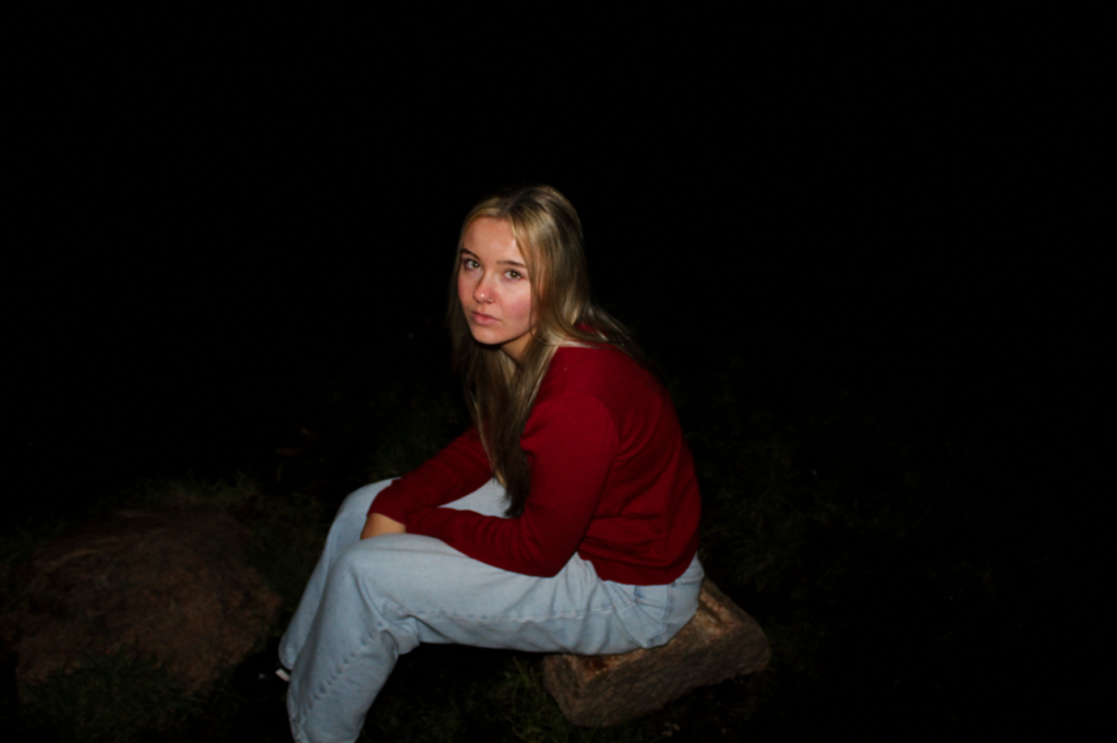
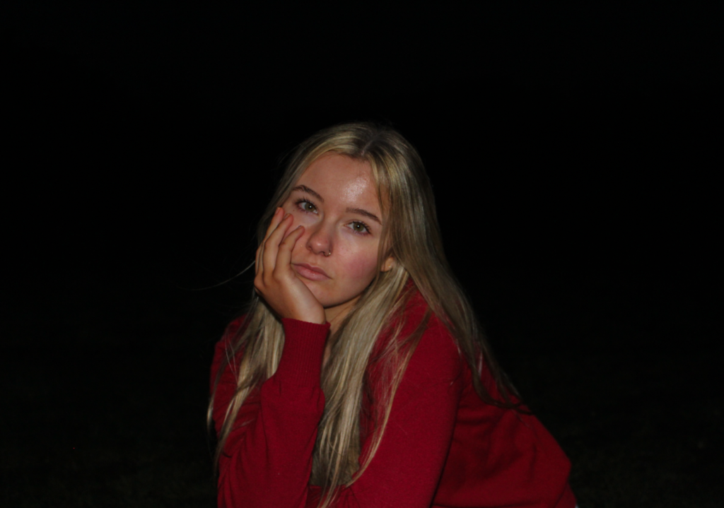
This was my final photoshoot for my personal study, mainly inspired by Ramona Wang. I was the only subject in this shoot, allowing me to explore the themes of femininity and youth through personal experiences fully. In this shoot I focused on capturing traditional stereotypes of young females, and specifically the exploitations of them in photography. For that reason, the location of my shoot was in my bedroom, to create staged images of myself getting ready for a night out. This links to my themes because women are typically associated with looking aesthetically pleasing, and that being our only purpose. I wanted to conform to these ideas by presenting myself in a manor that is seen as feminine, while challenging the ideas around it. As this shoot can be viewed as different to my other shoots, I do not believe that the level of success comes from how feminine my models are portrayed. Rather, I want all of my shoots to be presented in different ways but explaining the same message: looking feminine has nothing to do with being feminine. In my photos throughout this shoot, I performed submissive facial expressions to link to the idea of the male gaze. Moreover, I believe that the way a female would interpret these images is entirely different to how a man would. I believe the female gaze would occur, and women who viewed these images could still potentially see me as a human with intelligence and emotions. Whereas, perhaps males would only view me as an object, and focus on the aesthetic of the image.
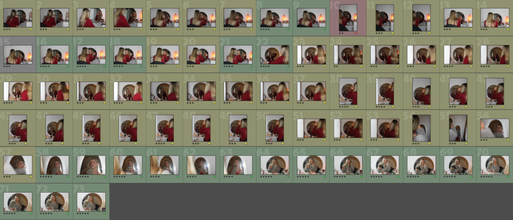
Similar to all my other photoshoots, I imported all my images into Lightroom and created a new folder, under the name “Personal study photoshoot 5”, to allow easy access to this shoot for future references. Again, as this shoot is a lot smaller than the rest of mine, it was easier for me to colour code my images and star them. Very quickly I was able to narrow down this shoot to the most successful outcomes that I would want to use in my photobook. I then edited the flagged images so when I create my photo book I can choose the best edited images.
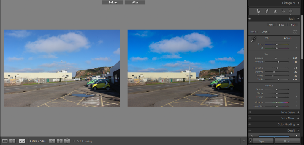
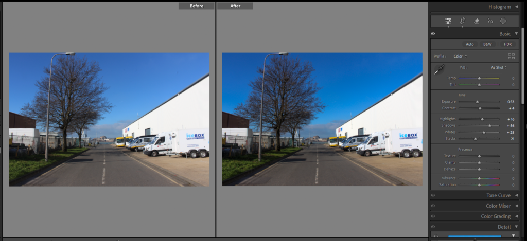
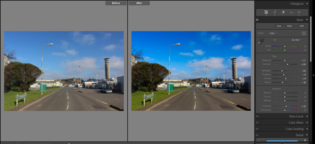
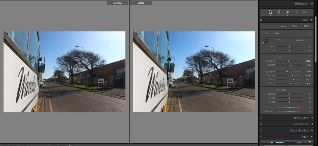
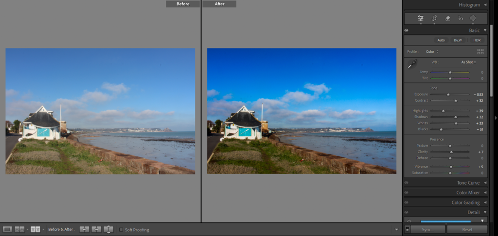
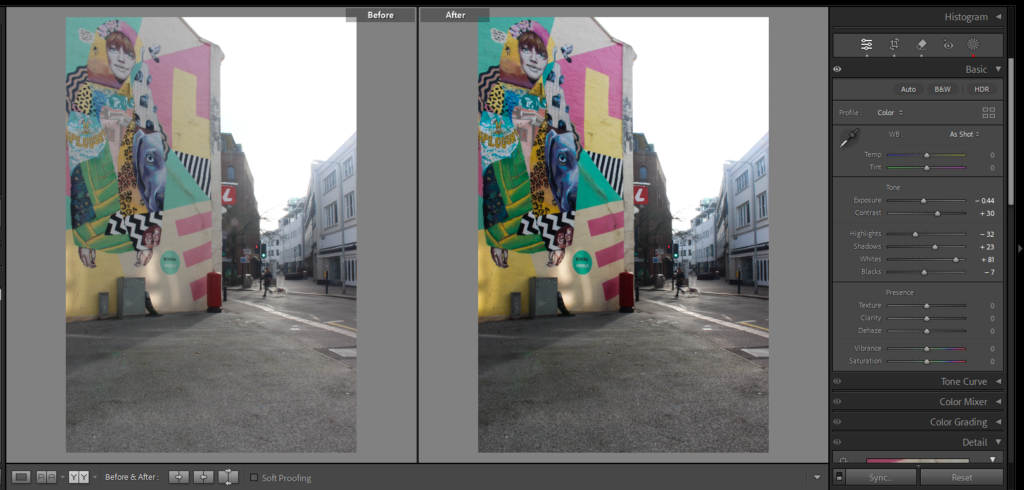
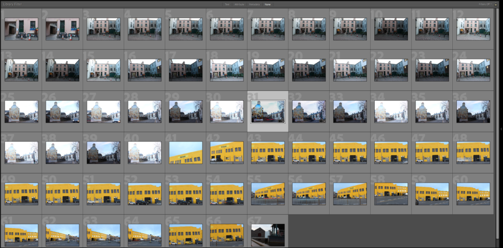
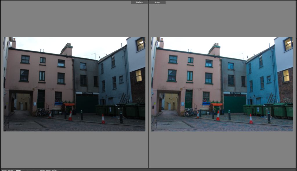
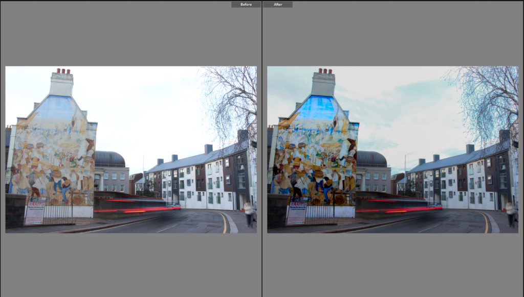
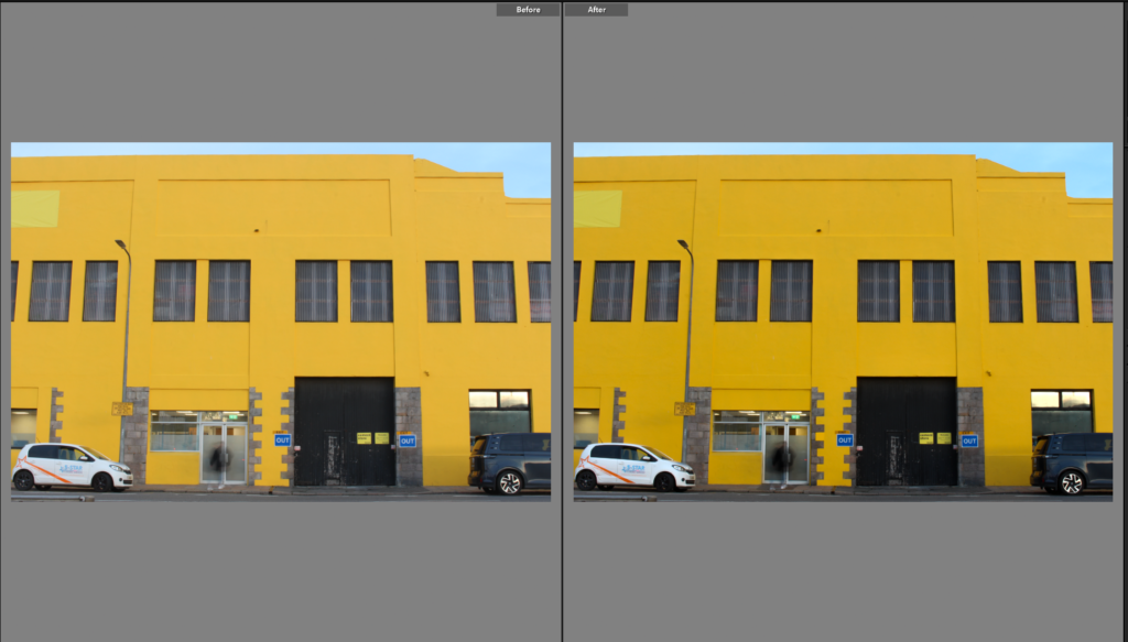
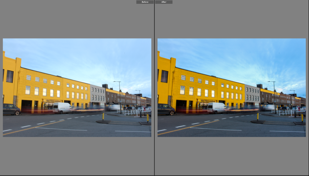
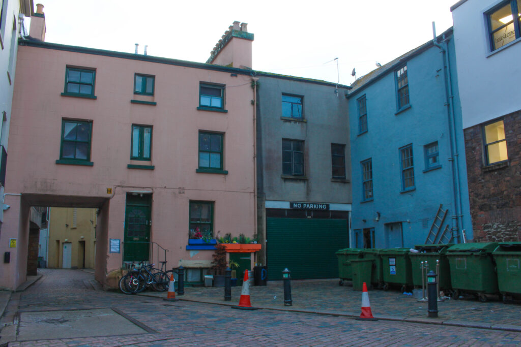
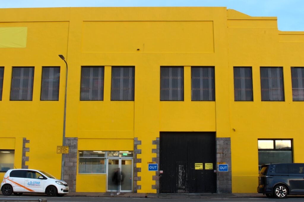
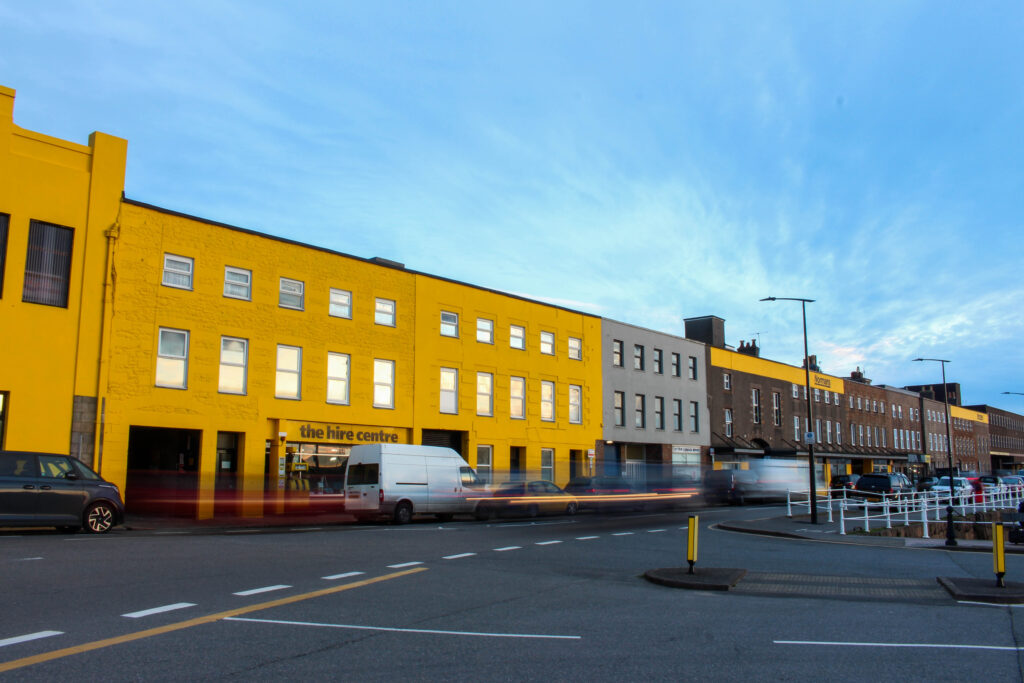
For this Photoshoot, I walked around St Helier looking for vibrant colours, this was heavily inspired by the work of William Eggleston. Eggleston`s use of colour and how he captures the ordinary life inspired how I went about this shoot. My target with this photoshoot was to capture the bold colours within the streets, urban setting which goes unnoticed, bringing attention to these aspects. However, my time was limited because once I had started capturing photographs, the sun had already started setting meaning I had a short period of time with the optimal lighting. During this photoshoot i used a tripod and a shutter release and I decided to use different exposures taking 3 images at a time to then when editing, use photo merge / HDR to make them stand out more. I took advantage of the lighting whilst it was there and, in the end, captured 67 images, each focusing on colour within the urban settings.
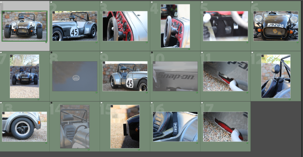
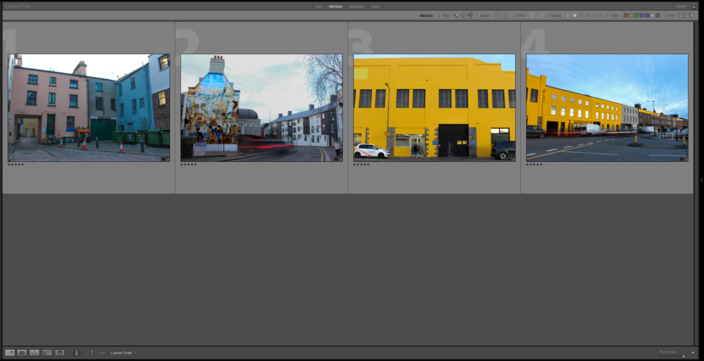
Final Selection Of Images
After looking through all 67 photographs, I only selected 4 images. I chose these four photographs as I think they are the best representation of what my vision was for this photoshoot. Separately, these images stand out for their unique display of colour, composition and generally how it captures the urban environment during the sunlight or daytime. Three of these four images also have motion within them, this is an aspect I really like and fits perfectly with the theme I am exploring as it shows how during the day there is movement and life which strongly contrasts my other photoshoots taken during the night.
Development Of Final Images – Before Editng & AfterEditing
Image 1 Image 2 Image 3 Image 4
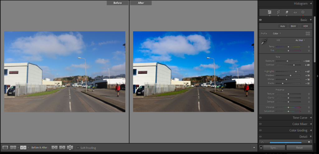
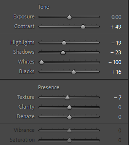
Above is a series of screenshots showing off my final selected images before and after editing, showing how little adjustments can impact the whole image and mood. In all of these photographs the most noticeable edits is the increase in colour saturation this links to Eggleston, he is known for his strong use of colour and he is known for capturing the ordinary in extraordinary ways. To get the same effect that he does I intensified the colour hues and the highlights to make the sky and the colourful buildings more dynamic and interesting. In some of the original photos the lighting is not quite right and looks odd and in order to fix that I adjusted the highlights and exposure.
Image 1
Image 2
Image 3
Image 4
As a whole, I am happy with how the final photos came out. The photos really emphasize the difference between the day and night, the bold, vibrant colours seen throughout all 4 images is what reinforces the contrast between the day and night. Inspired by William Eggleston, this photoshoot was focused on capturing the everyday life, using strong colours and compositions. During this photoshoot I also captured a great amount of motion blur, reinforcing the idea that the day brings life, energy and movement, I think this aspect makes the images tie in perfectly with the theme of my personal study. I think that once the final edits were made, I successfully created compositions which reflect the quality of the daytime, making a strong contrast to the night time focused photoshoots taken for my project.
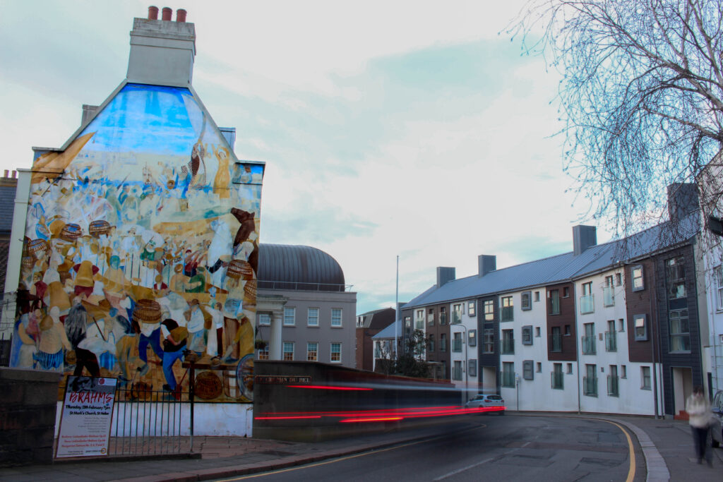
Favourite Image From Photoshoot
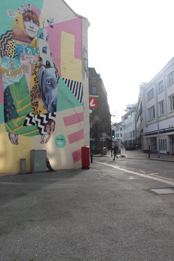
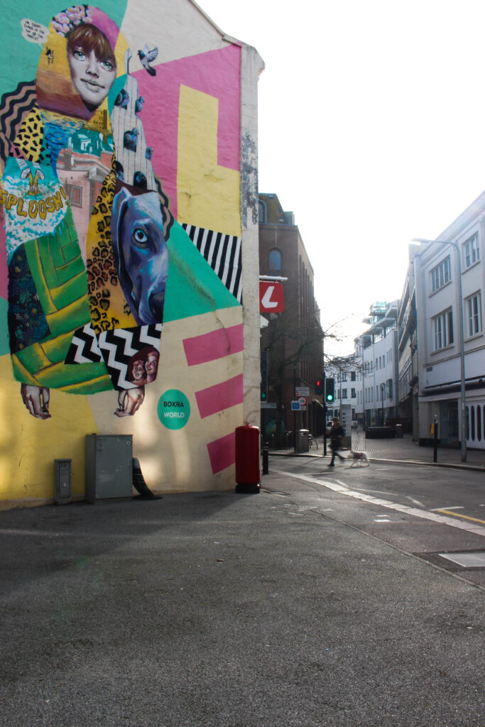
From the four final edited photos, this one is my favourite. What makes this photo stand out to me is the composition, within one frame I captured the urban buildings, the mural and motion blur from the moving car. The mural strongly contrasts with the softer tones of the sky and buildings creating different layers to this image. The image has 3 layers which is the mural, the mural is bold and filled with colour making it a the main focal point of the image, the sky and the buildings in the background create a contrast, making the mural stand out even more and the motion blur made by the moving car adds another layer making the image feel more immersive instead of 2d. The motion blur captured in this photograph adds the element of life, and energy, emphasising the aspects of the day. Overall, I believe that this photograph perfectly links to my day theme, capturing a moment in a colourful urban setting.
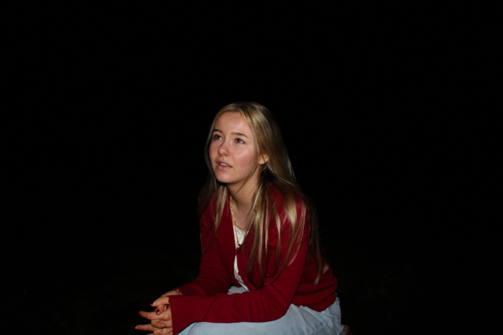
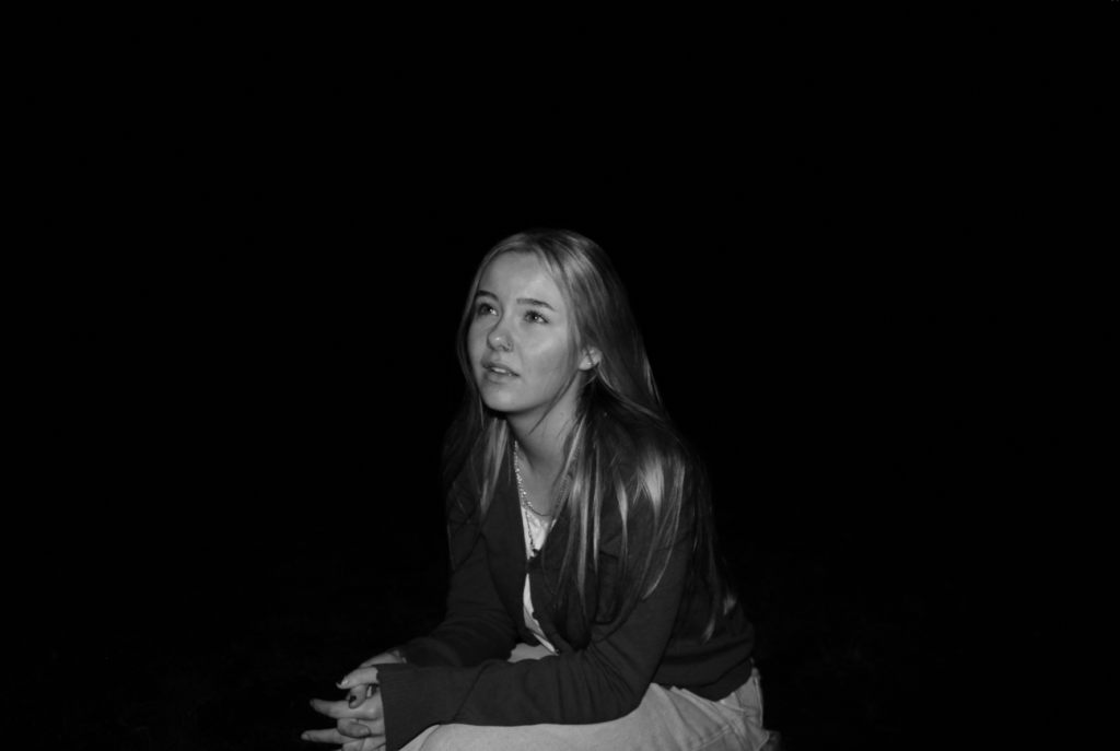
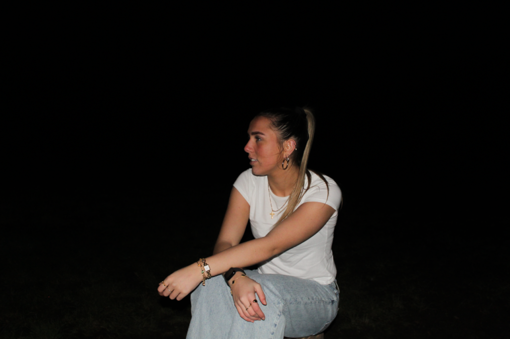
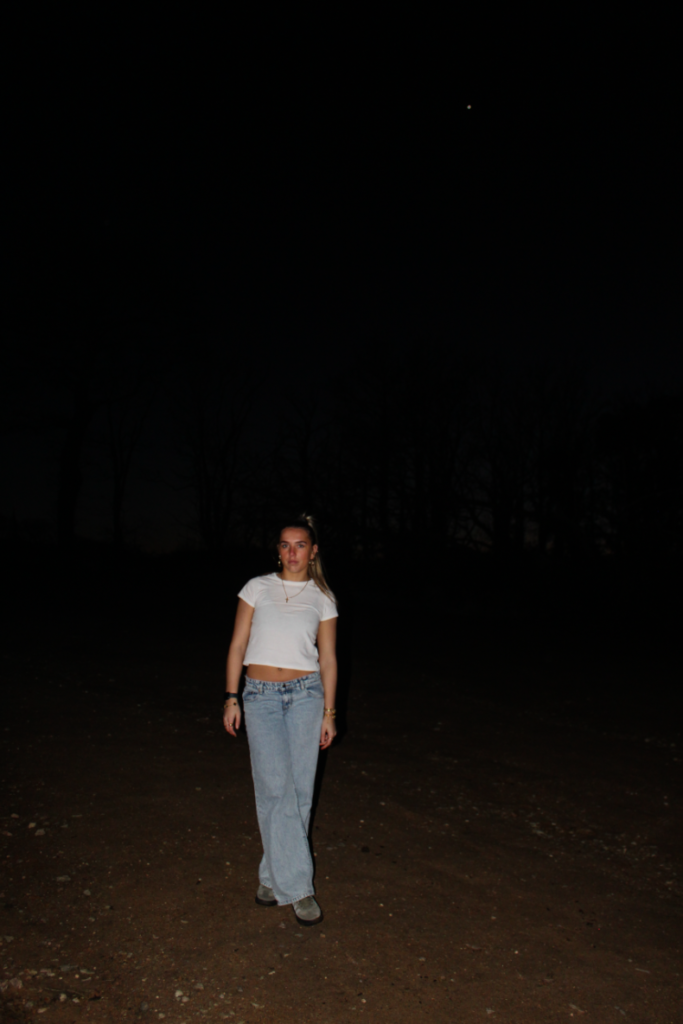
Overall, I think my fourth photoshoot was very successful, despite the limitations of only having 2 main subjects and I don’t want the shoot to appear boring or unappealing. A disadvantage of this shoot would be that there is no specific artist inspiration, which may leave the viewer confused on what my main focus is. However, despite this disadvantage I believe this photoshoot was executed well due to the use of the photographic gaze that me and my other model carried out. This links to Ramona Wang as she photographs females portraying the female gaze to conform to traditional stereotypes of women being objectified for male desire, and I have resembled similar facial expressions to show this.
What I think went well:
The tones within the images – creates a successful contrast between shadows
The lighting – differs from my previous photoshoots as it was shot in the dark – creates drastic
What I think I could improve:
Limited range of different images – most look the same due to only having one other model