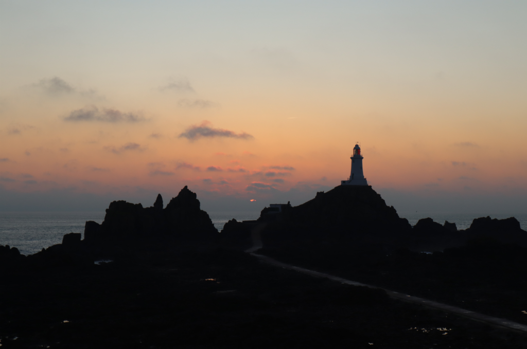
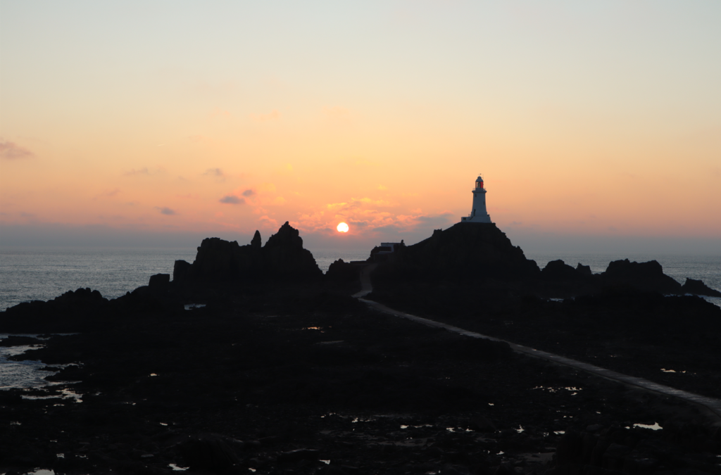
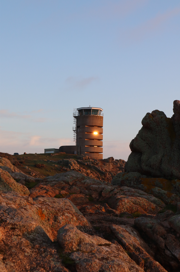
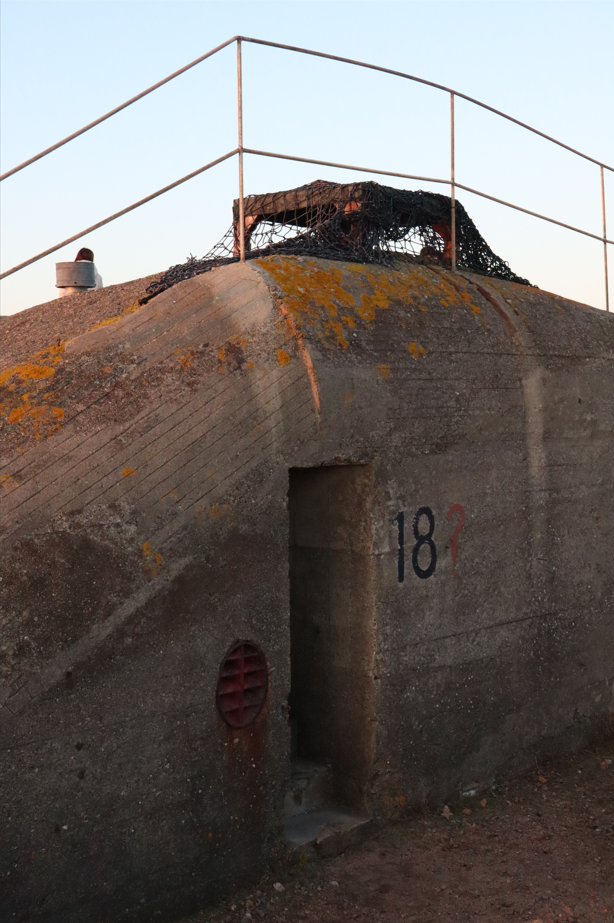
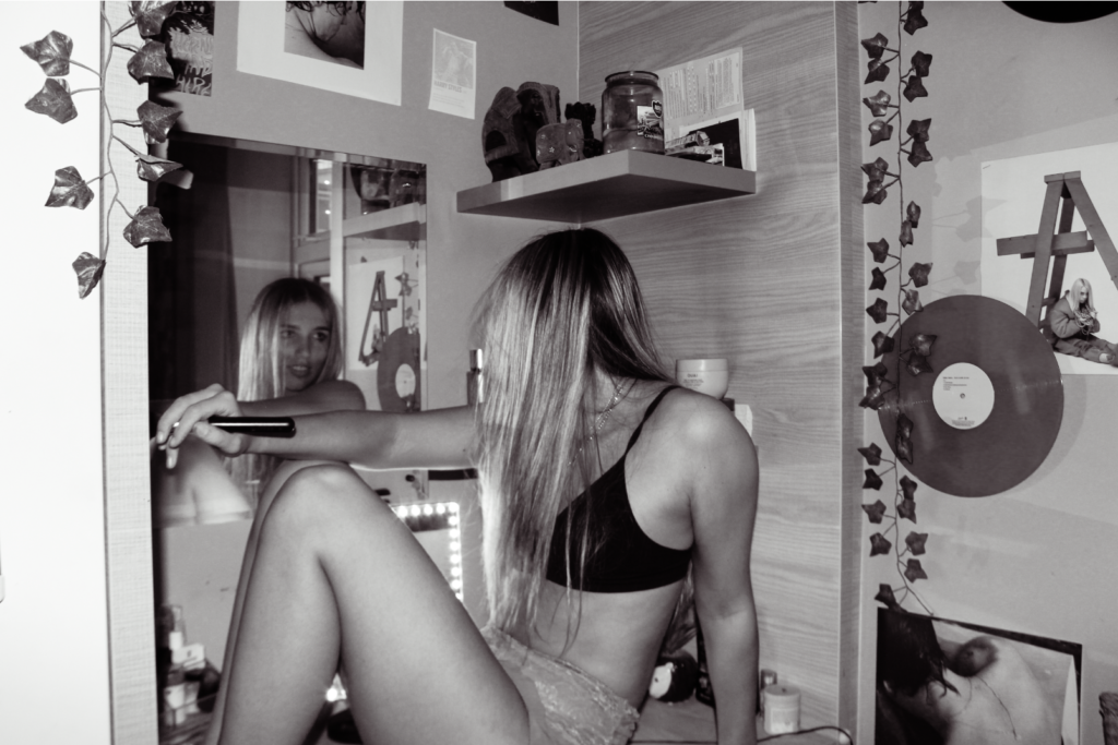
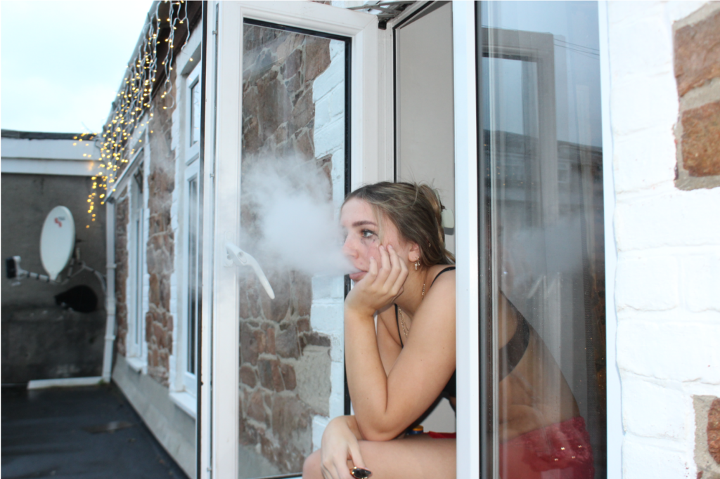
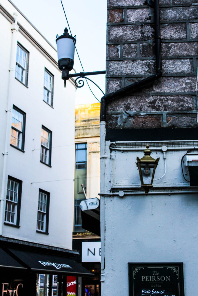
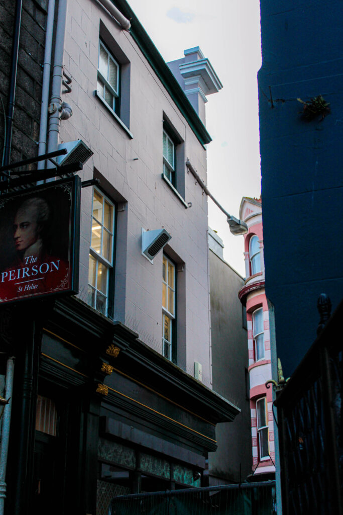
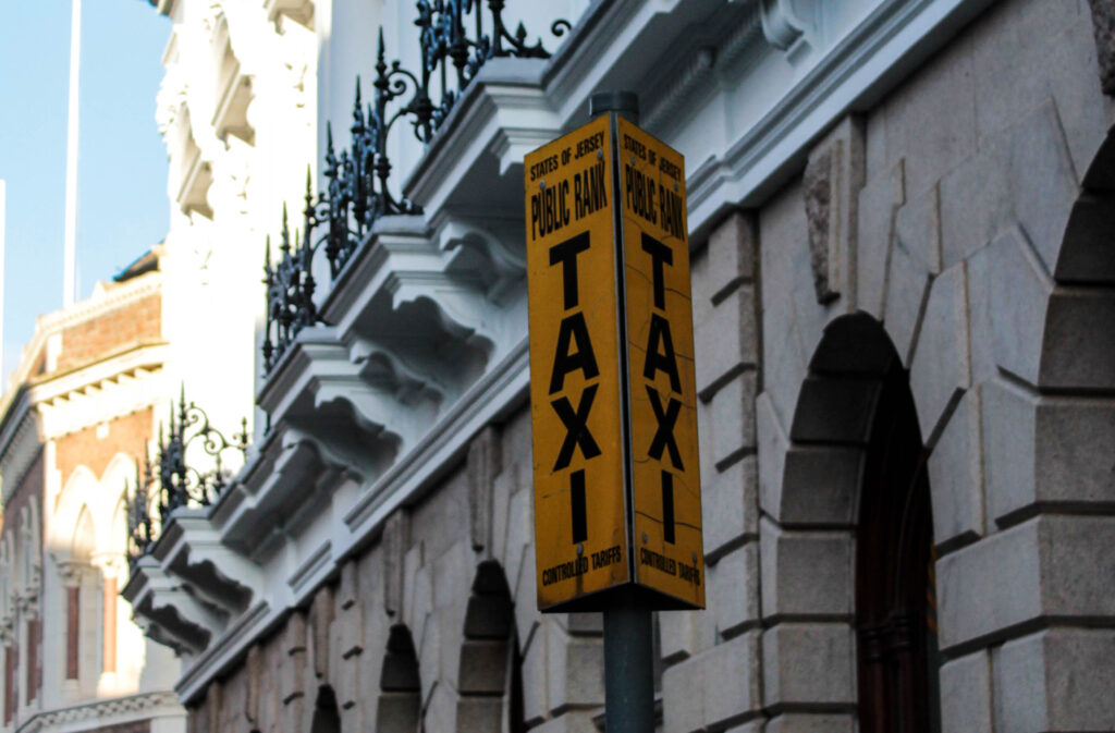
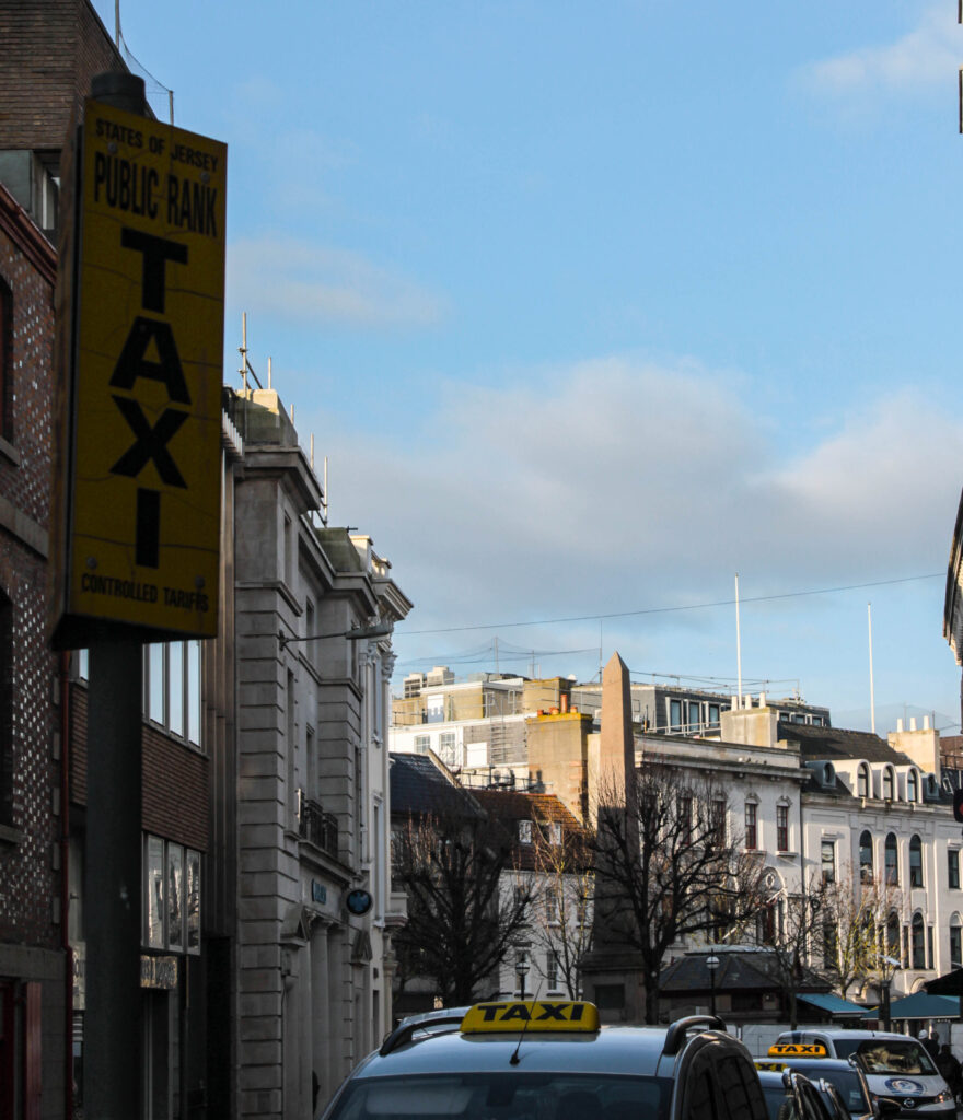
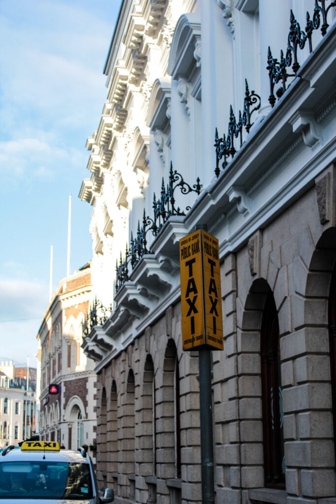
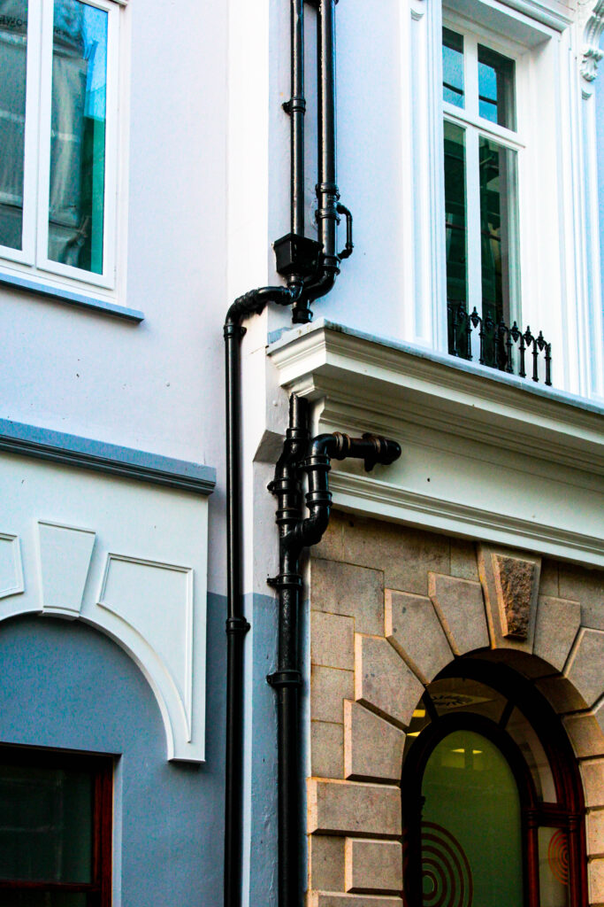
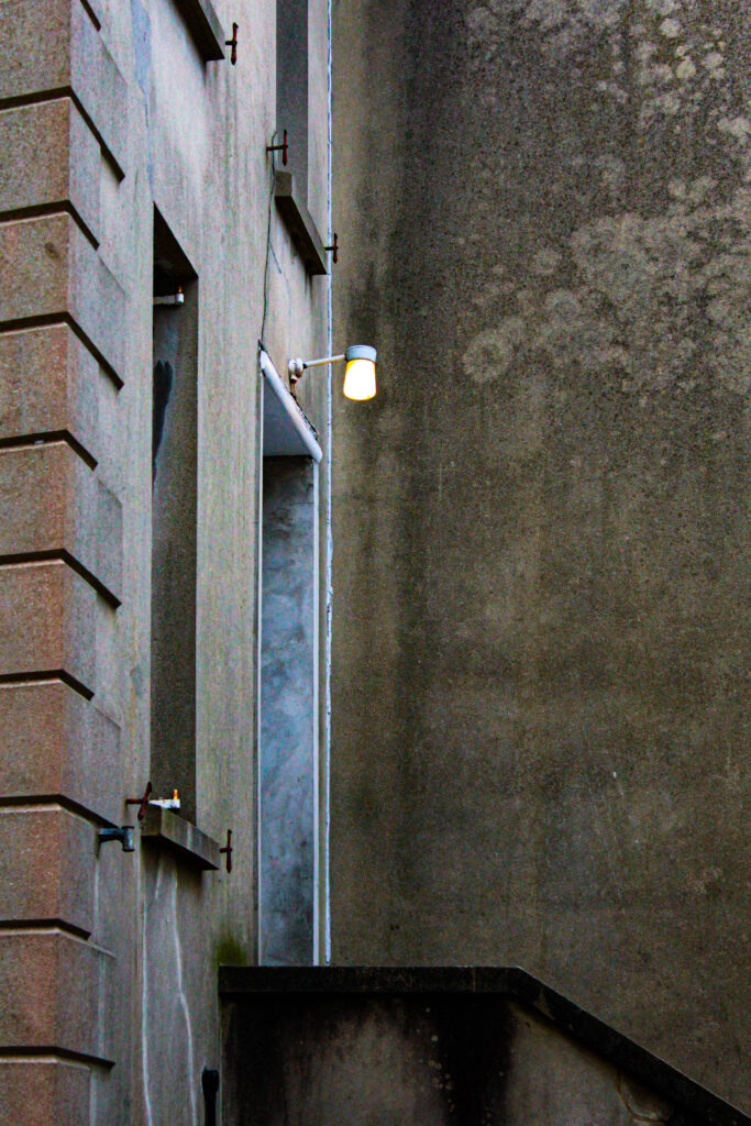
These are the edits of my third and fourth photoshoot:
Snapseed edits –
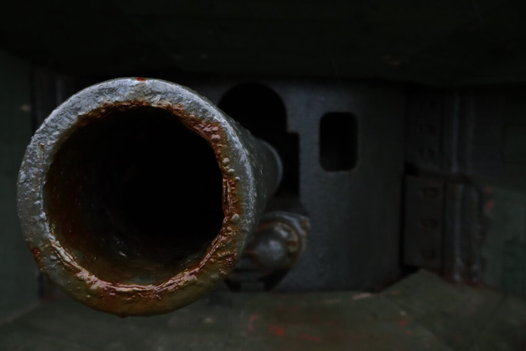
Using the app Snapseed on my phone, I was able to use their filters to create both a realistic depiction and more time-period based aesthetic of some of my images of the bunkers and some more duplicated soldier photographs.
3rd shoot –
4th shoot:
Lightroom & photoshop edits:
Applying the same edit methods as before I created some more images for my shoot. These include photographs from my 3rd, 4th and an additional 5th shoot. These consist of both subject based photographs as well as landscapes.
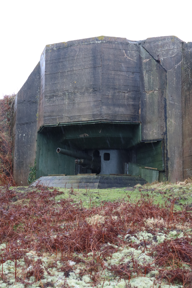
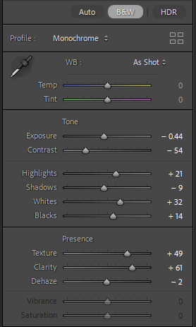
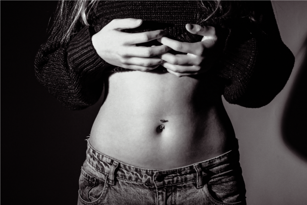
3rd shoot:
Before and After:
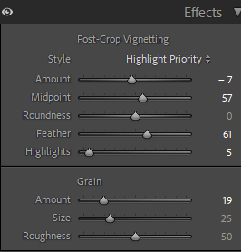
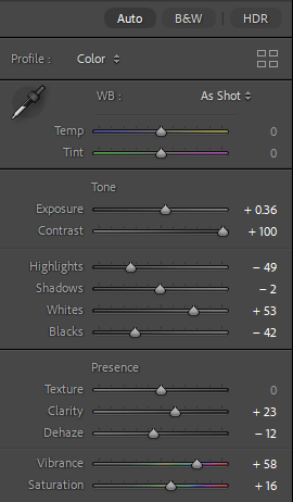
Editing:
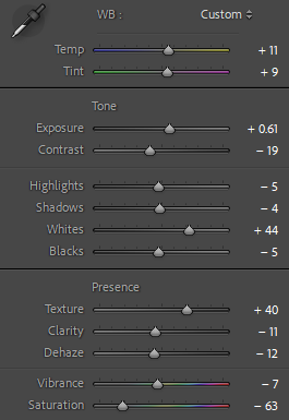
applying the same settings across all these images, this was to create a similar aesthetic across all my images. this would help keep a repetitive theme of images within my work.
Outcome:
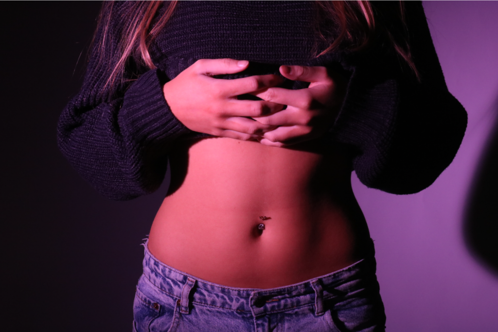
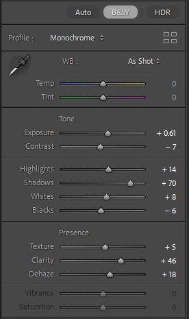
Before and After:
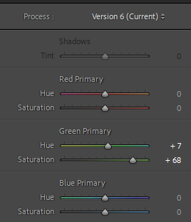
Editing:
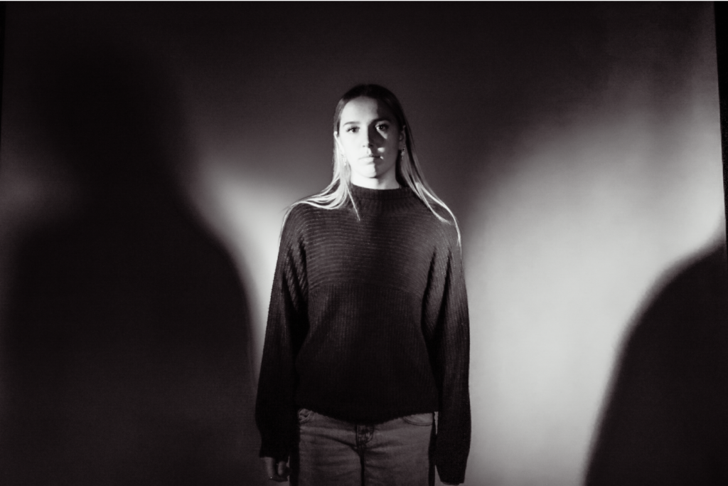
Using these settings this was to create that low-saturation, and dark type of aesthetic that Michiel Peeters creates in his work. With shadows being prevalent within the images, I darkened them through the shadows.
Outcome:
4th shoot:
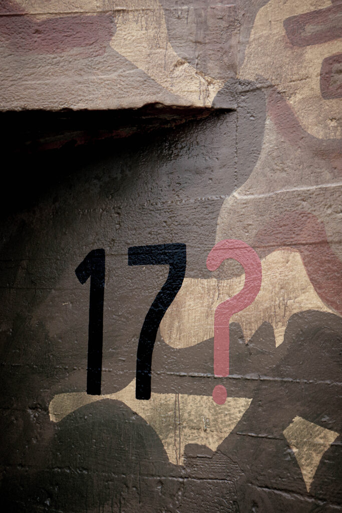
Before and After:
Editing:
Editing these in Lightroom, I aimed to mirror the shadowy and low saturated aesthetic of Michiel Peeters. Syncing all the images to have the same appearance I then made the cloning process using photoshop. Here I was then able to merge my images into one.
Outcome:
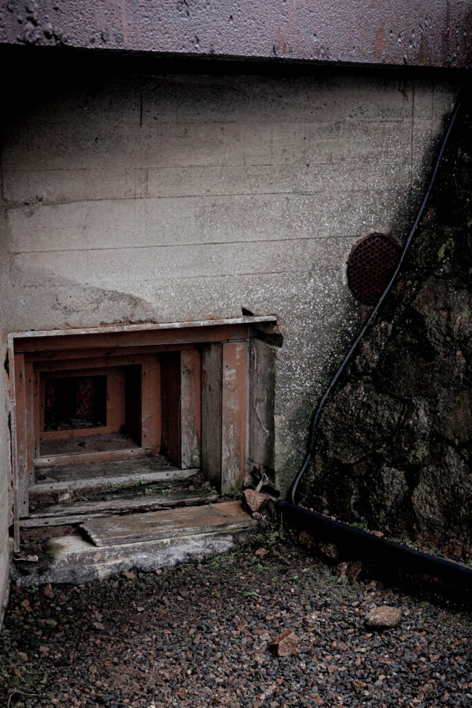
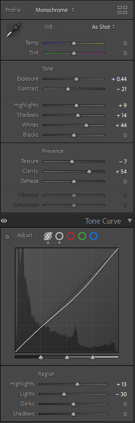
Before and After:
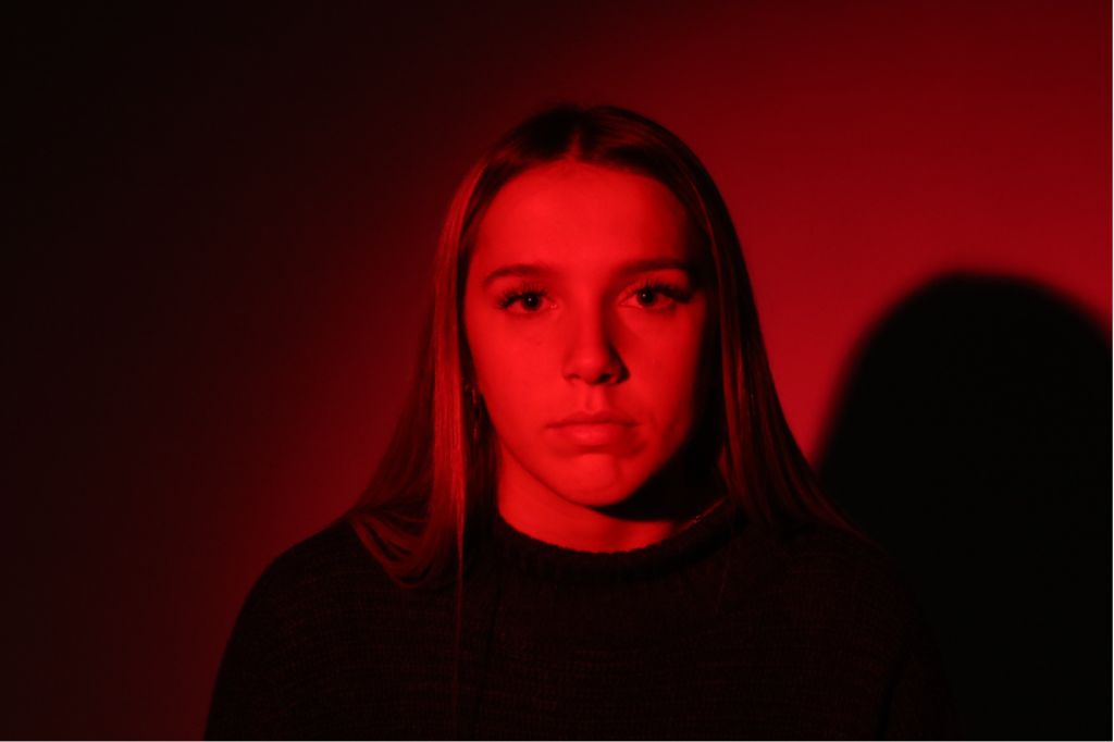
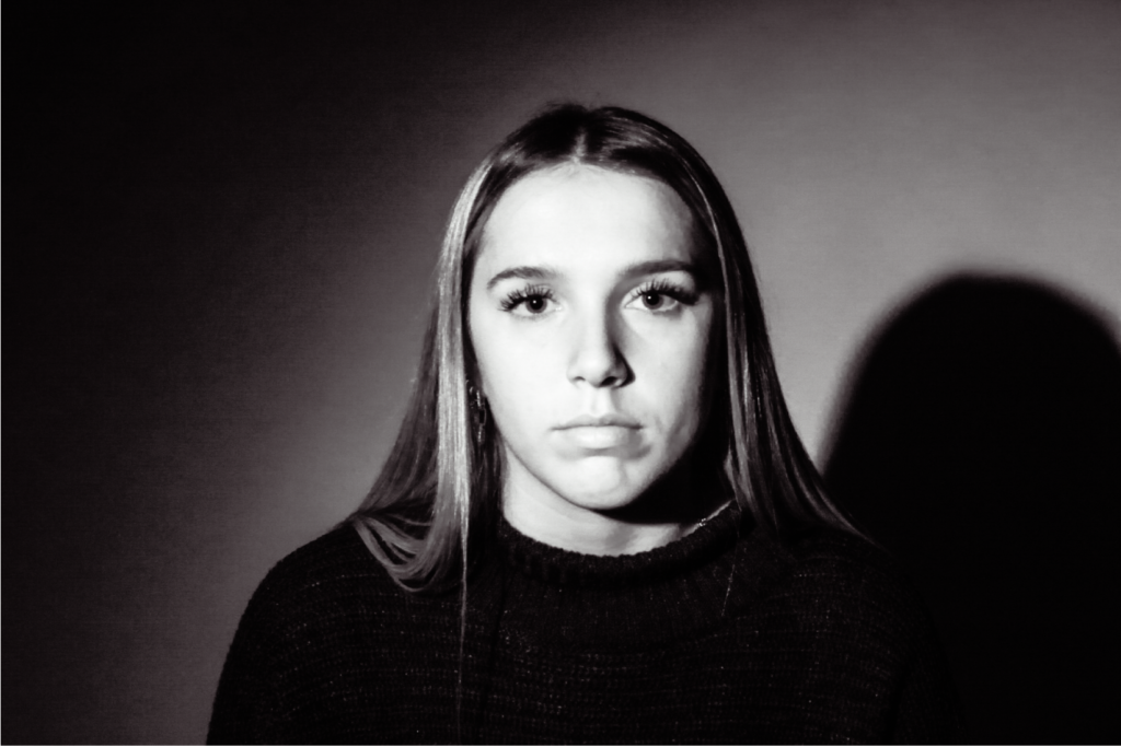
Editing:
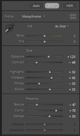
Doing the same as before I lowered the brightness and colour to make the image appear more dramatic and darker in Lightroom, due to me standing in too close of a similar spot I used shadows of another image to move myself other to the other side which I find looks better.
Outcome:
Before and After:
Editing:
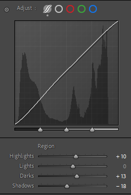
Using Lightroom I was able to use the settings to add more darker parts to the image by adding some contrast, shadows and black. Then by using photoshop I was the able to merge them together.
Outcome:
Before and After:
Editing:
Editing all these pieces together with the same settings, I used the highlight region to darken aspects of the work, lowering the saturation, texture and clarity I followed in the theme of making the image darker. cropping the image, I made it smaller as there was to much open space.
Outcome:
Before and After:
Editing:
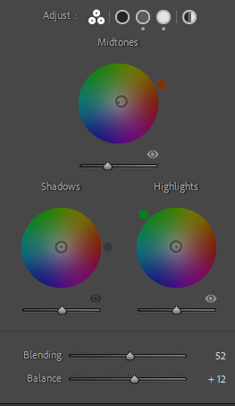
Using the following settings this was to create a merged effect of a vintage image but also using modern image clarity to act as a divide between some of my images.
Outcome:
Before and After:
Editing:
Like the image before, I aimed to create a gritty vintage image but also make it appear modern in its appearance. By using the lighting regions to adjust the images depth I added to this with other settings such as with highlights, saturation and clarity.
Outcome:
Before and After:
Editing:
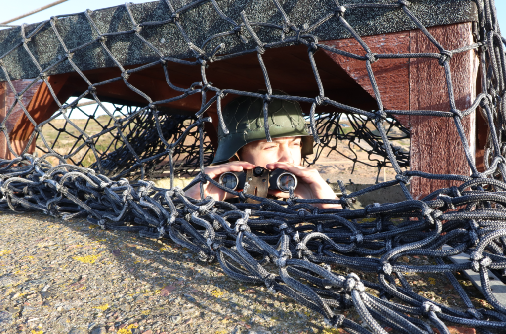
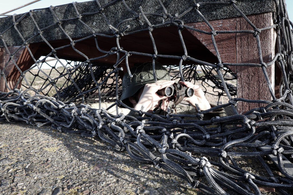
Using Photoshop, I applied the settings of my binocular image to match the aesthetic so these images could work together when applied.
Outcome:
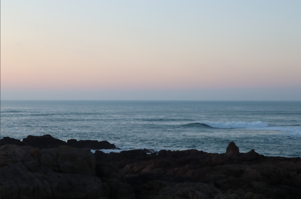
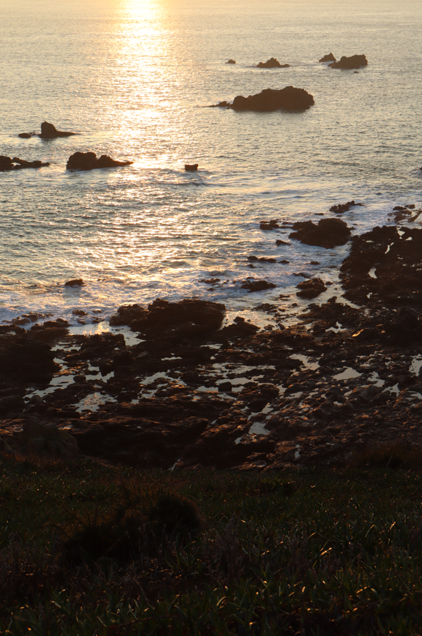
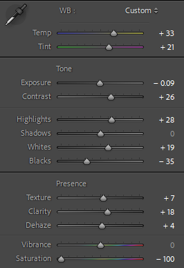
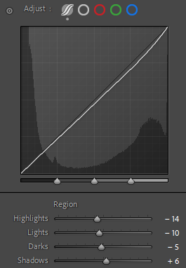
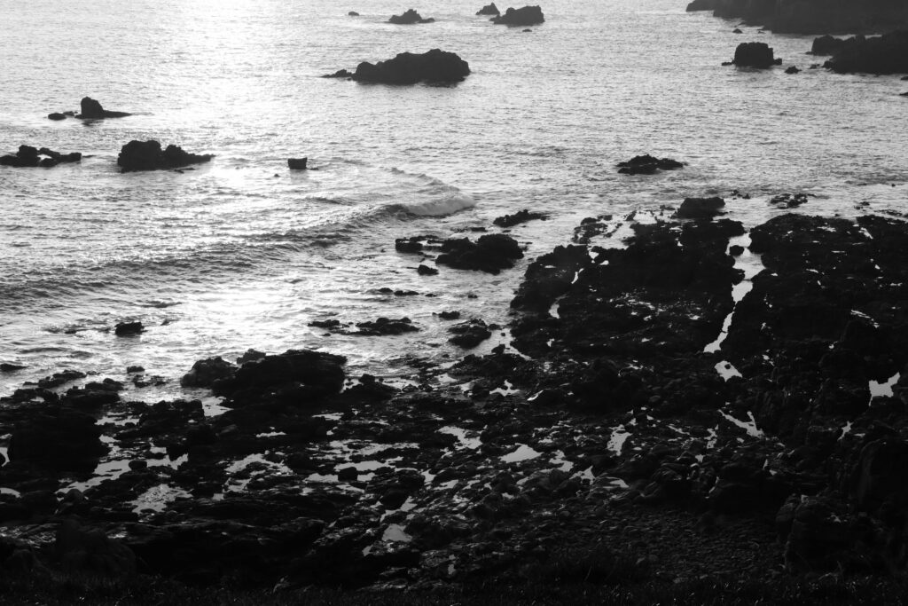
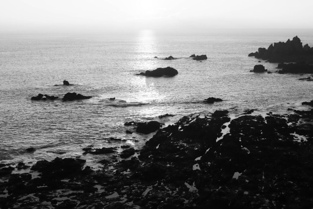
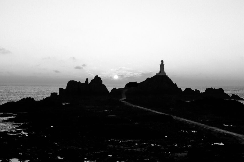
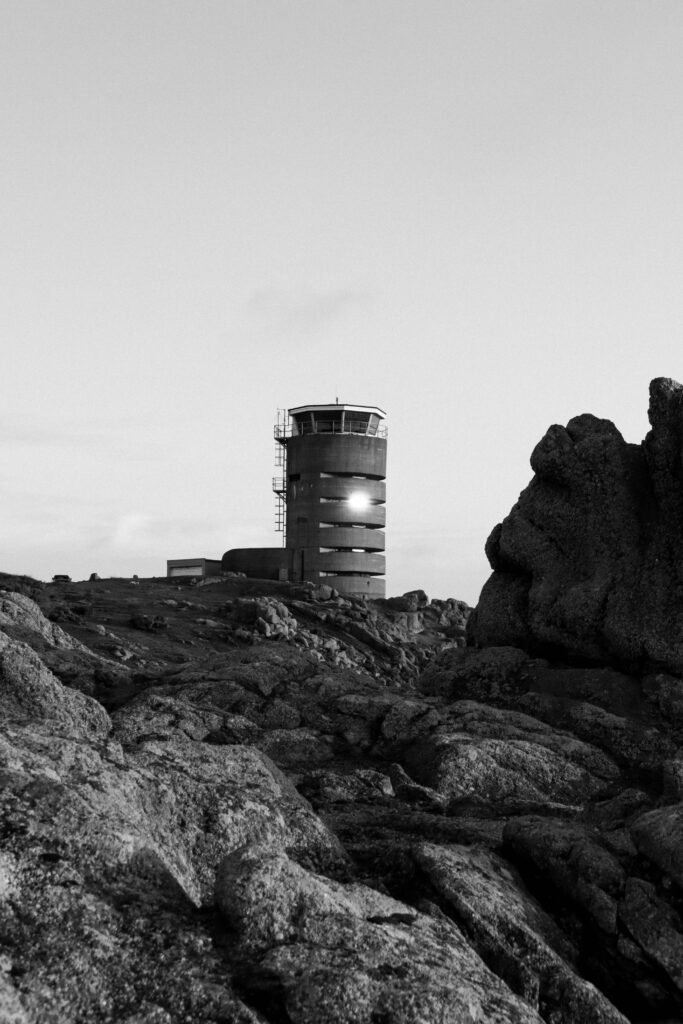
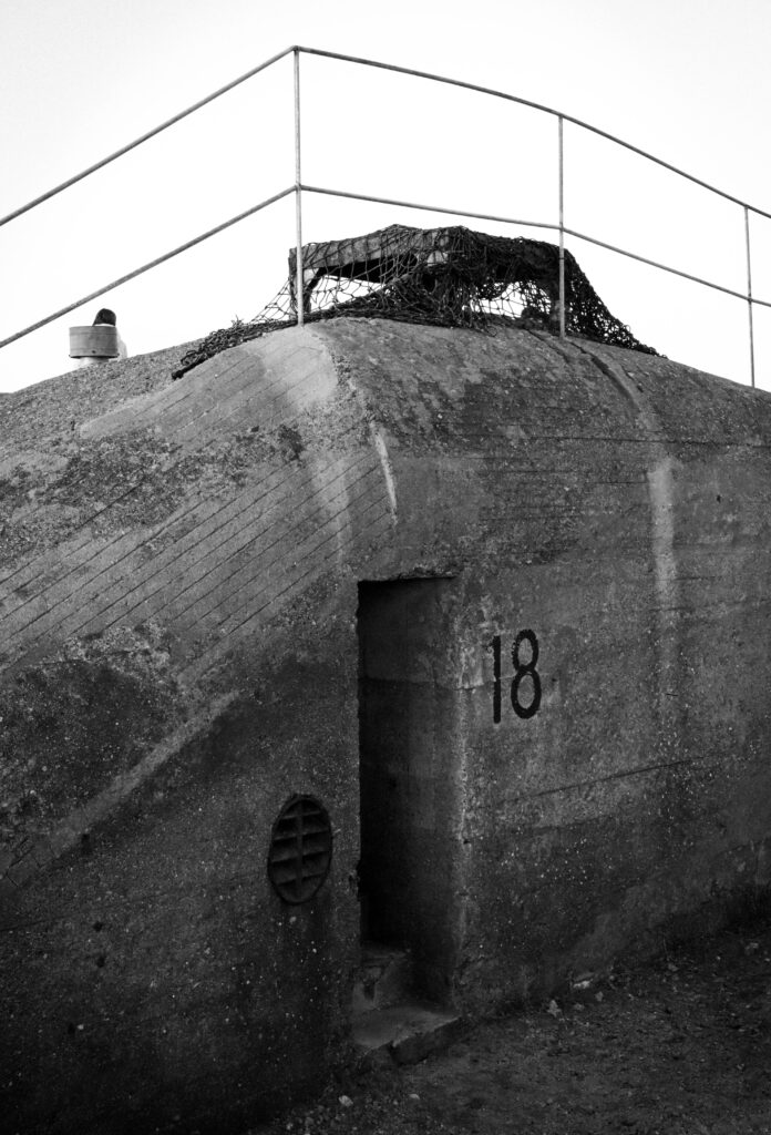
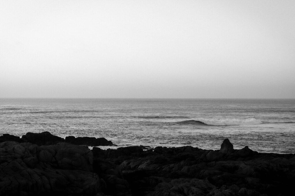
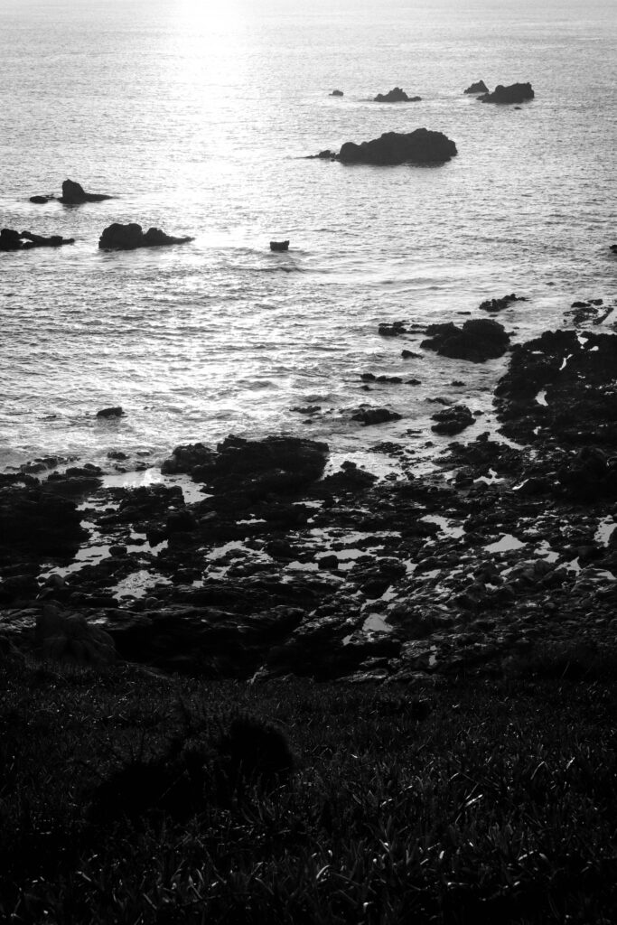
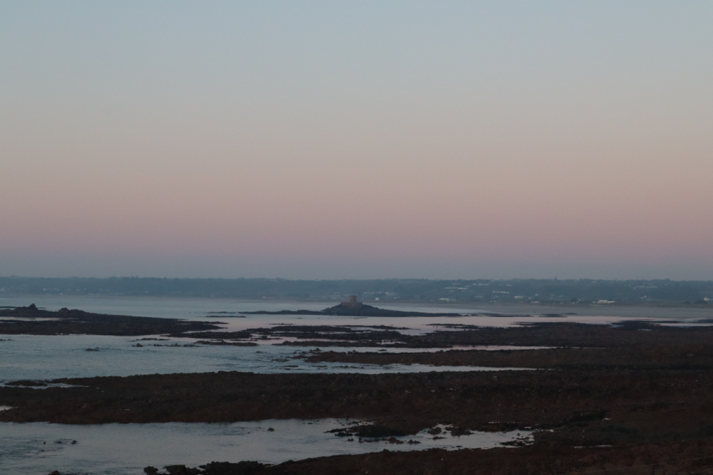
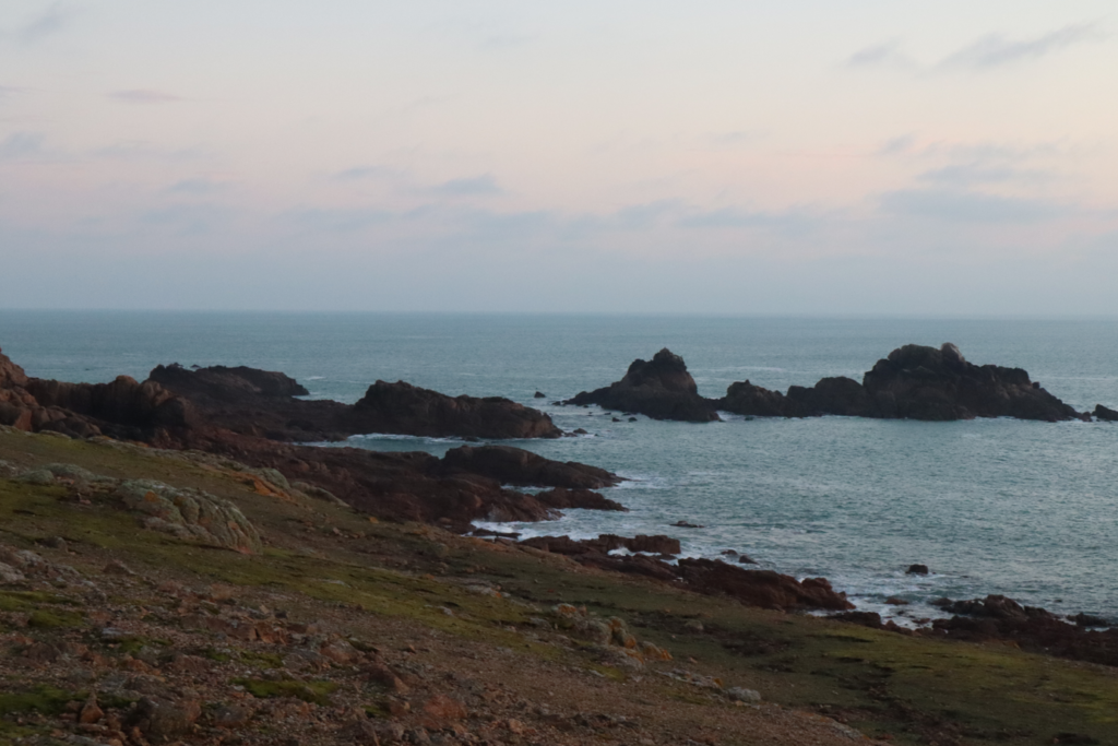
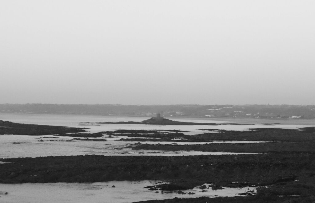
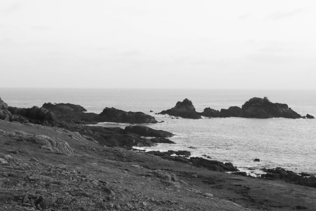
5th shoot:
Before and After:
Editing:
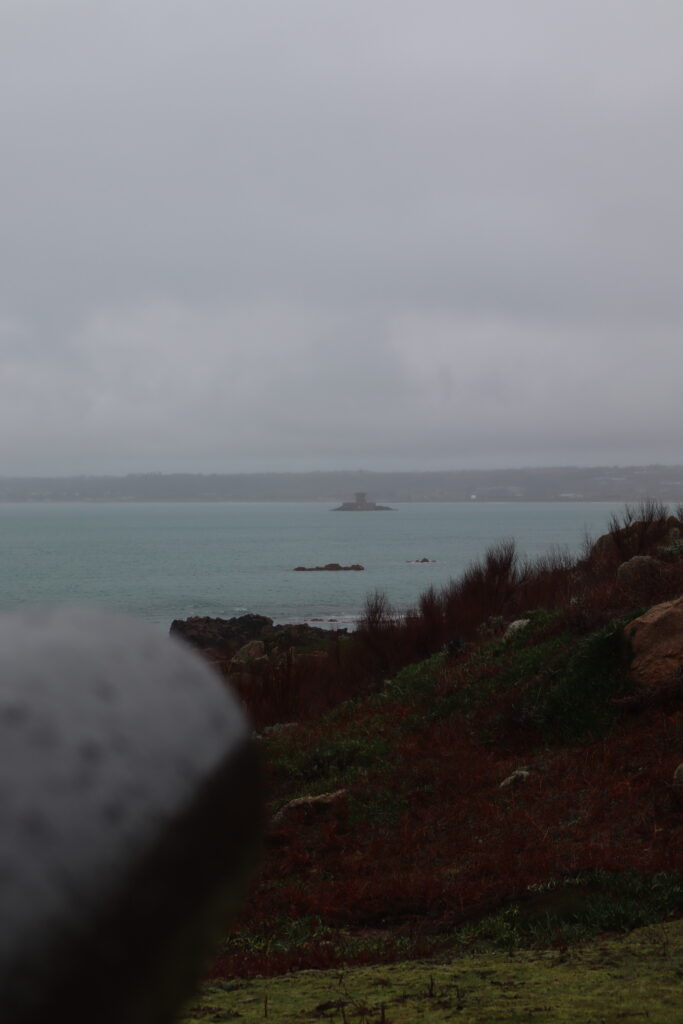
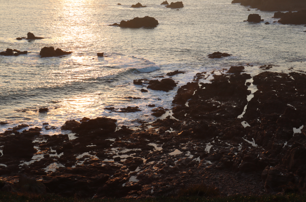
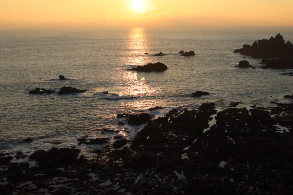
Applying these settings across these images, the aim was to include some observational documentation of the La Corbiere coast for my images, converting them into black and white this was to create an aesthetic of the old photography visual style.
Outcome:
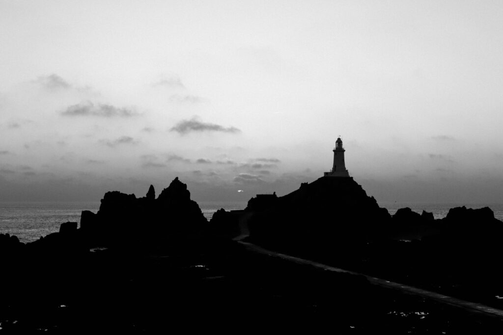
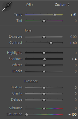
Before and after:
Editing:
Using some minor adjustments to these images, the aim was to replicate the grainy film aesthetic of photographic images from the 1940s.
“Connecting past and present, my composites include old family photos combined with images reflecting how I perceive my heritage today.”-Astrid Reischwitz
“I look for unity between the human body and the nature. The older I grow, the more intense this desire is. By combining images of the human body and elements of nature I am trying to show that we are inter-connected and that our separate existence is impossible.”- Alicja Brodwicz
Essay Question: How can photography change the way we remember and connect people and events?
Exploration of connection holds a deep relation within my ideas of nostalgia, family, documenting and my day-to-day life. In this investigation I explore similar themes and motives portrayed through the work of a range artists. From personal archival images, Astrid Reischwitz work consists of keepsakes from family life that she transforms a visual world in her work of memory, identity, place, and home. Alicja Brodwicz searches for connection within the human body and our unique relationship to nature similarly to Agnieszka Lepka’s work project that explores the similarities of it. I’m hoping to portray in my personal study the familiar elements from each of these artists and my individual reflections of relations and attachment.
Documentary Photography describes photography that attempts to capture real-life situations and settings through the art of archival imagery. Photography’s capacity to capture reality led to an interest in documenting all the aspects of contemporary life. They play an essential role between the past and the present, they can connect us too our own personal histories. It emerged with the increase of the government taking social responsibility and of industrialised war. It’s mission was too serve the increasing need on the part of the democratic governments to justify their social and political policies to the ordinary citizen in the community, which was documentary photography’s main target. By the time of the Civil War, the daguerreotype and its descendants had established a popular following. Documentary photography had expanded in this period of time and was often allocated by art critics to the realm of journalism, an association that carries into the present. This assignment implied that documentary photographers were mere recorders, skilled technicians to be sure, but passive observers of the social scene and definitely not artists. Documentary photographers accepted this description in order to burnish the perceived interest in what’s lifelike and real of their imagery. They presented as fact gatherers and denied having beauty-related or political calendar’s. In this new age, though documentary photography is not dead, as a practice, it is in transition and it faces serious challenges such as facing restrictions of war and more important issues that make a difference in our community. Documentarians were not simple propagandists for the western part of the world but were rather artists that had discerned central patterns of thought and feeling that were emerging in democratic societies. Finding people that took these new value into consideration, the documentary photographer was required to make narratives that would reject fascism, tyranny or totalitarianism. Although defined by content, the history of documentary photography, as with all photography, is the history of its technologies. photographs can be documented from the 1890s from family portraits to wedding portraits to individual ones. Documentarian photography can be identified through the outlook and layout of it whether in a diamond shape or a different irregular one, can be recognised through the colour difference in it when comparing. New technology has always challenged old perspectives by expanding the possibilities of what can be photographed. The emergence of social media platforms and digital camera technology, including smartphones, has been transformative in reinventing and rekindling the practice. My chosen themes of connection, family, identity, nature, and nostalgia can be linked to: Ansel Adams’s famous influence of work documenting natural landscapes through the 1930s stimulating a sort of spiritual connection to nature, as well as the earlier use and discovery of the zone system popularly used throughout the scale of photography, the relation of the connection of nature can be seen in Alicja Brodowicz more recent work when connecting nature vs human-like features. In terms of including archival imagery and photos relating to nostalgia, photographers like Diane Arbus and Christian Boltanski explore dynamics through family in the 1960s as well as using family photographs to explore further themes of memory and remembering human life. Similarly now, photographer Astrid Reistchwitz and Zoltán Kerényi using the power of archival imagery to connect individuals with a more broader social context.
In relation to “How can photography change the way we remember and connect people and events?” I feel as though Astrid Reischwitz portrays her work in this way. Through her image of “Blue” from the Spin Club Stories she places a photograph of a baby in comparison to a modern day taken photograph of a vibrant knitted jumper bordering the archival image and on the left of the archive a photograph of a woven through embroidered traditional pattern on linen this is because it may represent a certain tradition and/or cultural memory Astrid’s felt inspired by when she embroidered photographs. I can see that. She had clear intention for her work to look a certain way taking inspiration from the tradition of spin clubs in Northern Germany. From her past, Astrid grew up in a small farming village, a village that is bound to its history and that stands out through its traditions even today. Astrid’s upbringing probably had a significant impact on how she views and approaches the themes of memory as well as history in her work. The act of embroidering something can be often associated with tradition and domesticity. By immersing photography in this medium, she reinforces this idea that memory is personal in comparison to it being shared and collective. It is something that exists in physical form as well as visual, emotional connection to materialistic cultural. Her intention seems to be that photography can preserve traditions through its art, it can connect generational gaps and it can maintain these connections between the future, present and the past especially. The blend between photography and embroidery speaks as more of a passive recording tool, it becomes a mean of communicating through identity, memory and connections over time similarly linking to the previous themes mentioned. Astrid’s “Stories from the Kitchen Table” can also reminisce the times where of the hardship of farm ship and event during the second world war which still shadows over certain family members Astrid explains, hardship can can still be felt today and through that hardship she tries to represented that as and tell the tales which can give her a chance to reflect and transform her ideas. Researching her work closely, I believe that Astrid’s work can closely be linked to the question “How can photography change the way we remember and connect people and events“. This because it clearly encapsulates her motives for the project of Spin Club Tapestries” and creating her “Stories from the Kitchen Table” presents the topic of photography as an everchanging art form.
In relation to “How can photography change the way we remember and connect people and events?” I feel as though Alicja Brodwicz portrays this in her work. Alicja’s work focuses on references linking to how we view nature and how we connect the natural environment to a living being. Alicja’s clear connections highlight that life is in some shape or another clonnected whether by apparence or by human nature. Through the photographers work she presents an obvious comparsion between skin, veins,bones and other features that are natural to us. As well as exploring these topics Alicja’s work can express an association to memory and her work can become a tool for sensing moments for nostalgia and the present e.g. ageing of skin etc. The different ways light, shadows, trees and seasons could highlight Alicja’s influence and it could possible reflect human emotions such as being growth, decay or even rebirth. Through the aesthetic of Alicja’s work and making her work appear interesting and appealing to the viewers eye, she includes abstract elements where the human form is somewhat fragmented as well as it being intertwined with natural like elements like water, light or a relation to a forest-like setting. Some viewers may feel unsettled by this as it may present human being thought to being closer related to other subjects wheras an opposing audience may feel that capturing this moment of stillness and the close relationship between the two elements as symbolic and as conveying a deeper meaning of existence and meaning of life. The different ways light, shadows, trees and seasons could highlight Alicja’s influence and it could possible reflect human emotions such as being growth, decay or even rebirth. Her focus on family and individuals can relate to how we change the way we remember and connect people and events, this presented in her images through her emphasis of the importance of having these shared experiences and how they shape our sense of self and our close relations with others. In some of her other similar work she present interection between others whether they are distant or intimate. This demonstates that photography can help in a way preserve the relations and present the emotional complexities that may be inlvolved. It may also prompt the audience to reconsider how they percieve people and percieve the natural world, percieving it as an active part of our world and as a partipant in how our memories, identity and experiences change.
Similarly to the other artists my work seems to deepen the viewers understanding of identity, human experience and relationships. Whether the work is focused on memory, natures and subcultures there is common elements of photograhy that can uncover deeper levels of personal and or collective narratives. In Astrid Reistchwitz’s works she documents a specifc subculture wheras Alicja Brodwicz’s work entails a sense of fluidity in human and nature connections. In my work I try and present more intimate and more isolated moments when looking at perosnal histories with present day identities e.g. looking at my familes archival documents and comparing to modern day changes and fluxtations. I want my approach to experiemtent more with abstract elements or conceptual images as using these visual representations may make the viewert feel and be more willing to give emotional and influenced responses. While there are overlaps in in the way my chosen photographers and I approached the themes of memory, identity, relations, nostalgia, connection and inldung the medium and specifc topic that may vary constrastly, it allows for a diverse interpretation of the relationship between people, history and the world around.
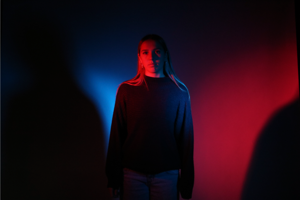
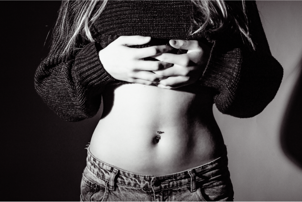
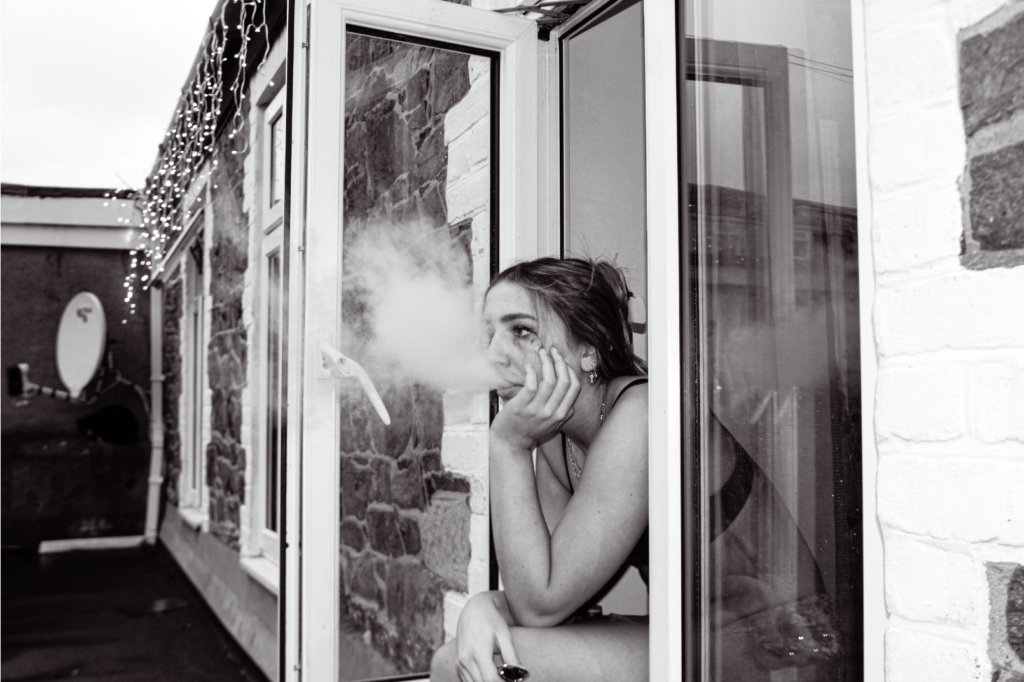
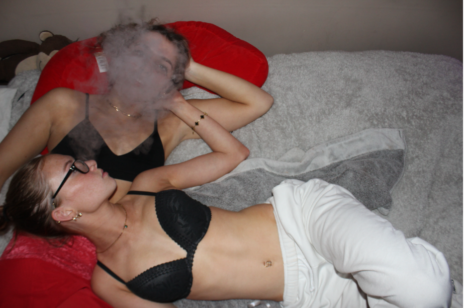
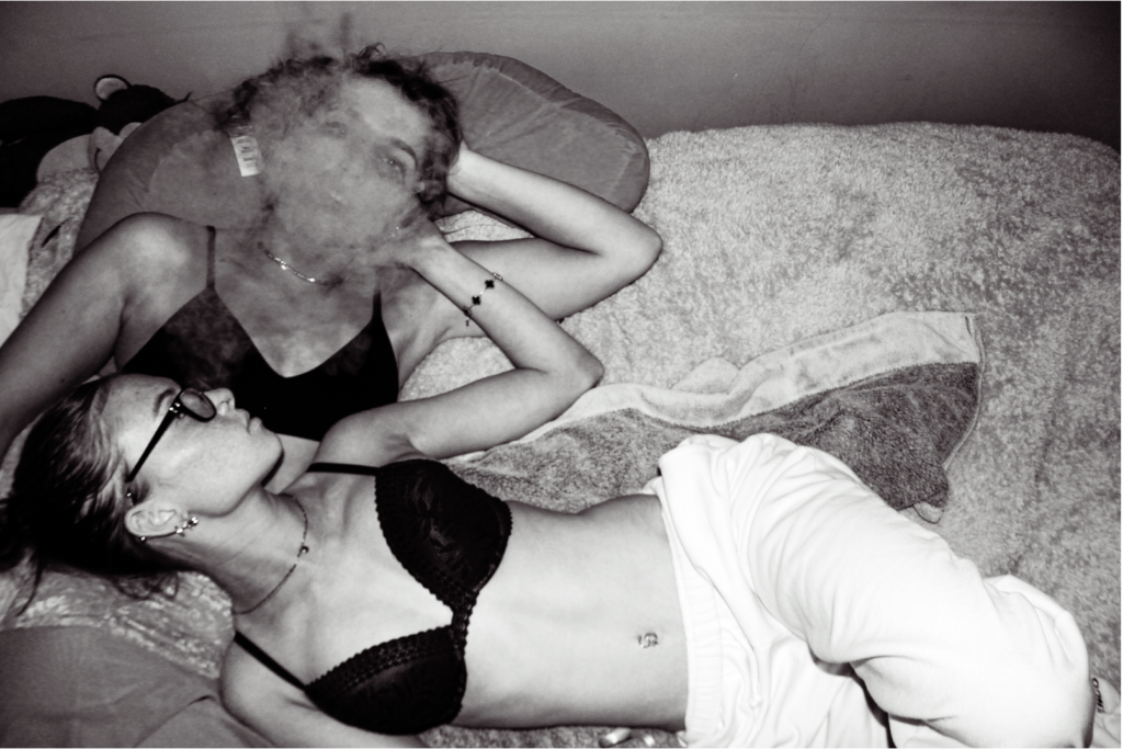
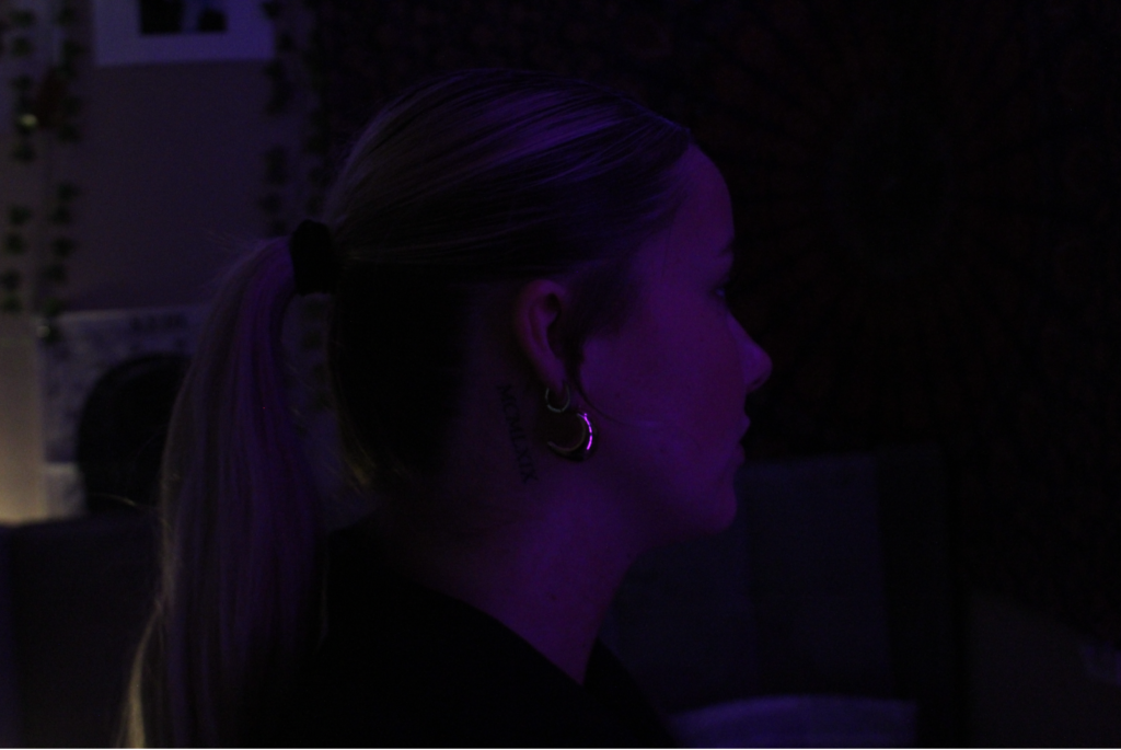
For this photoshoot, I want to elaborate the idea of hardship. Experimenting with different difficulties woman and teenage girls may face. Sticking with the black and white theme, ill edit them with a simple black and white filter and adding a few tweaks with highlights and shadows to perfect the photo edit.
“Explore the dichotomies of the characteristics between the day and the night.”
‘Photographs are perhaps the most mysterious of all the objects that make up, and thicken, the environment we recognize as modern. ‘(Sontag 1977:4)
Introduction
During the day, the natural sunlight brings energy, clearness of the landscapes around and life to the world around us, however, at night the same landscapes/spaces give a sense of mysteriousness, loneliness and emptiness. These changes not only alter the location/setting itself but the emotional impact it has on those who experience it. The contrast between the day and night has a strong effect, with the light and shadow influencing our emotional reactions to the surroundings as well as the way we experience them.
My personal study`s main target is to explore the differences between day and night, particularly targeting how the change of time from day to night creates different moods and portrays different emotions. To explore this theme, the two photographers I have decided to do an in depth study of is: William Eggleston and Todd Hido, these two photographers capture photographs taking into account the use of light, colour and the setting in unique ways. Eggleston`s photography captures the ordinary in extraordinary ways, differently Hido`s style of photography spotlighting isolation and mystery.
In addition, I will include Pierre Putman, whose work compliments both artists by offering a different perspective on the play between light and shadow. Putman’s cinematic photographs focus on solitary dark urban settings, where artificial lighting and glowing lampposts create a dreamlike, interesting scenery, turning empty streets into powerful, emotional stories.
I will respond to their work by featuring both daytime and night-time images, influenced by the work of these three artists, in my final photobook.
Historical /Theoretical context within art
Photography, starting off with being mainly monochromatic images, changed incredibly after The World War II (1939-1945). Initially, colour photography was only seen and linked with advertising, fashion photography and in photojournalism through publications like: Life, The Sunday Times Magazine and National Geographic. These publications made colour photography popular, by showing it to a wider audience; making colour photography more casual to view in the media. Although this type of photography was becoming popular, the world of fine art and documentary photography was slower to accept colour photography, sometimes being viewed as “vulgar” and “brash”. Black and white was always the ordinary, many artists said and believed that the importance and high detail of the monochrome photographs could not be replicated with colour photography, once again spotlighting the initial refusal to accept colour photography.
Although, colour photography at the beginning of its origin was resisted, the 1970s was a crucial period for it. In the 1970s photographers started to utilise and experiment with colour, rather than using colour photography as a tool strictly for representation, they instead focused on how it can create emotional, psychological and visceral depth in their work.
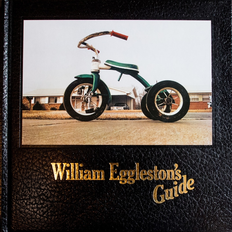
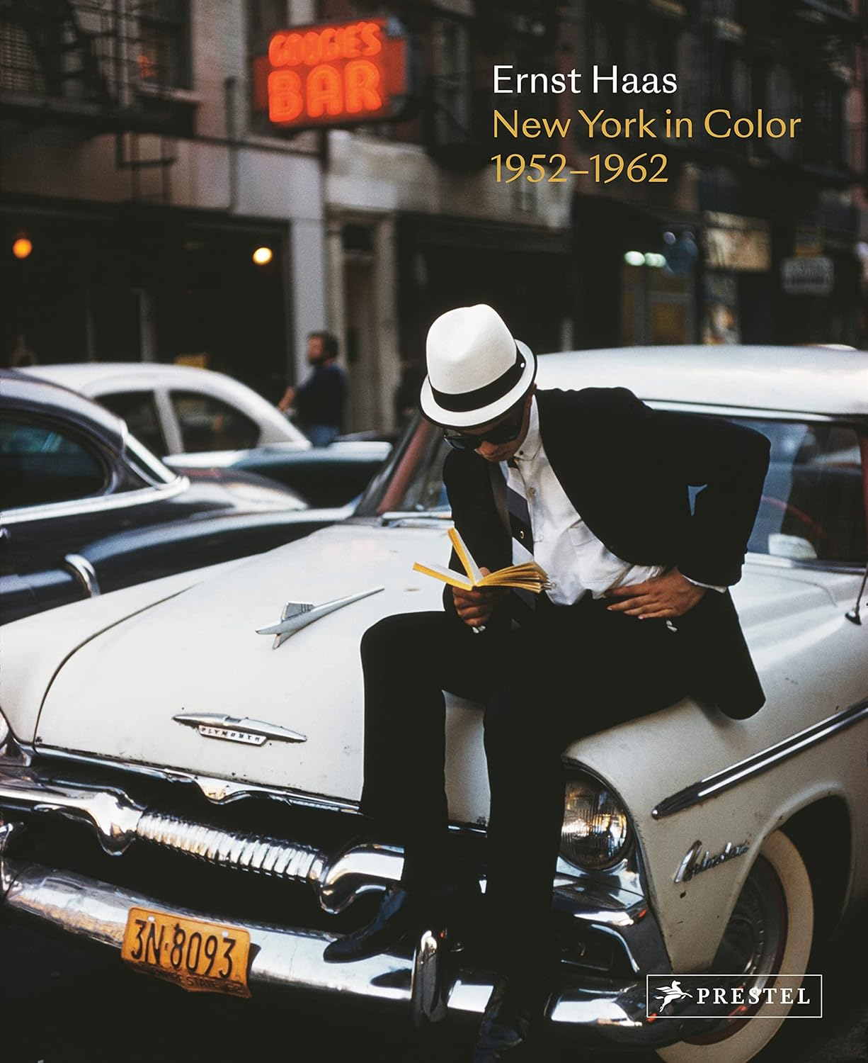
The director of photography at the Museum of Modern Art (MOMA) in New York City, John Szarkowski had a core feature in changing how people perceived colour photography in the art world. Szarkowski helped put together the first solo exhibition which was dedicated to colour, showing off Ernst Haas`s unique work in 1962, this had a huge influence on the acceptance of colour photography in fine art. Another huge influence on the acceptance of colour photography, was Szarkowski’s work with William Eggleston, the 1976 exhibition and the book William Eggleston’s Guide. Eggleston`s work consisted of the dye-transfer printing process which allowed him to one up the “snapshot aesthetic” and made colour photography a tool for reflection of society and an expression of creativity.
William Eggleston`s Guide, 1976Ernst Haas, New York In Color, 1952-1962
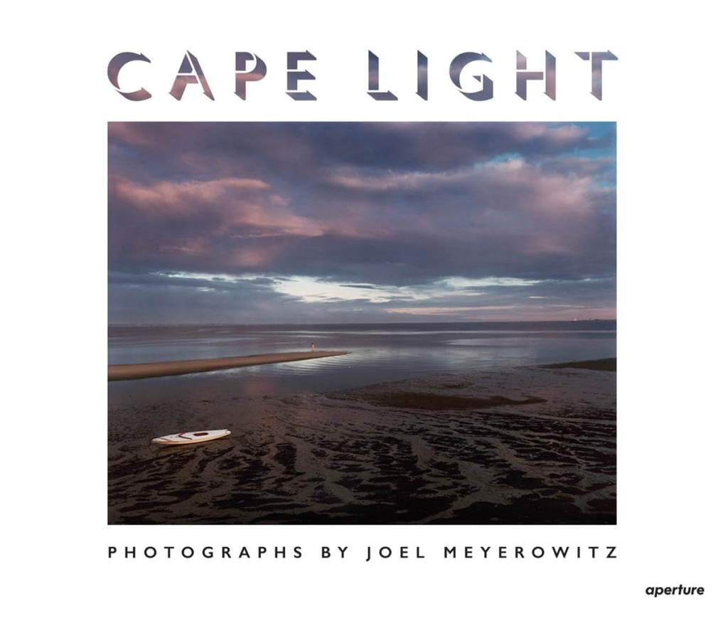
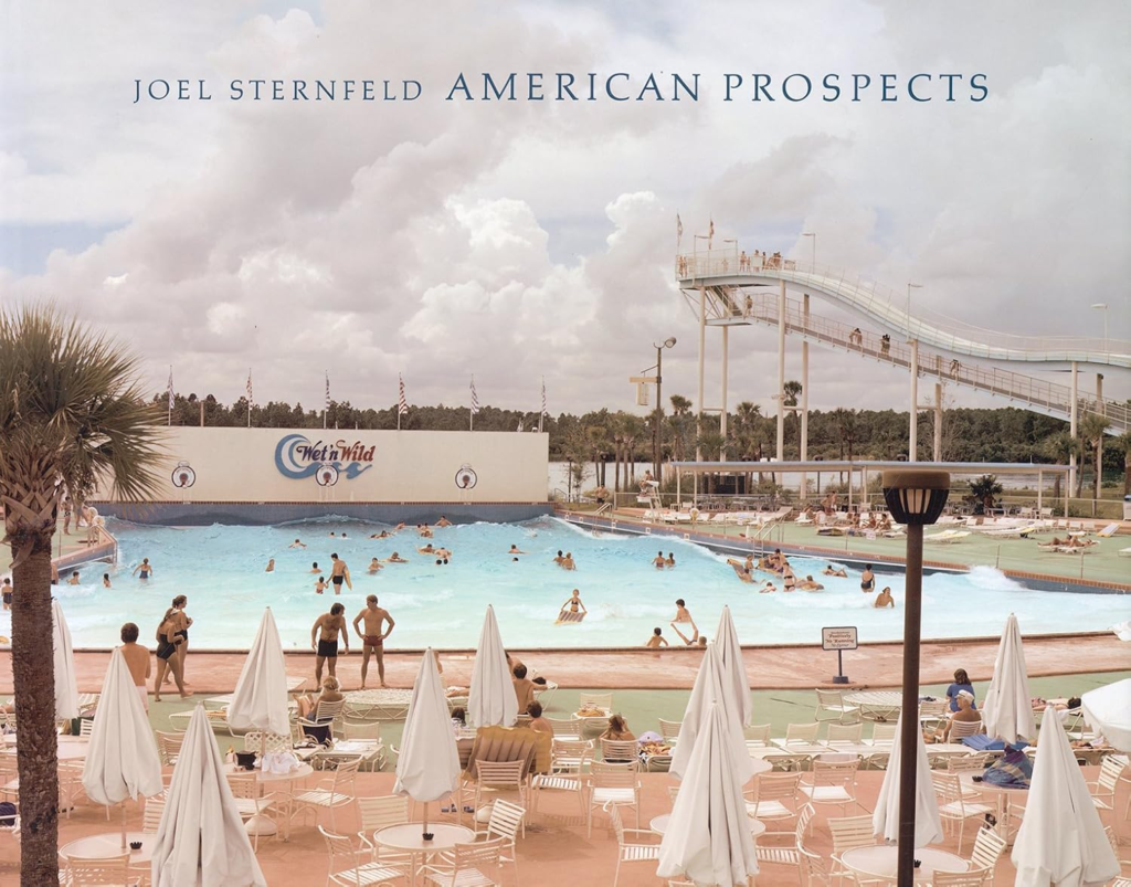
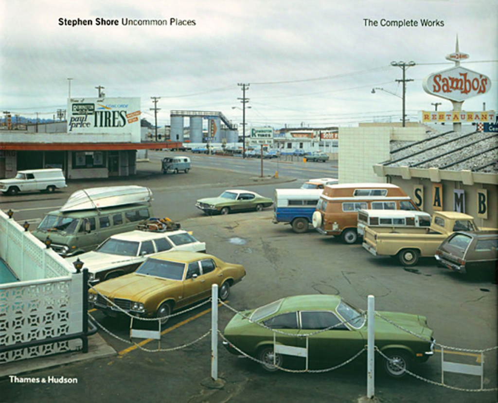
Joel Meyerowitz, Stephen Shore, and Joel Sternfeld were other American photographers who started to use colour to capture the small, little details of the American Landscape. Joel Meyerowitz published “cape light” in 1979, Stephen Shore published “uncommon places” in 1982 and Joel Sternfeld publishing “American prospects” in 1987, these three books show how the traditional camera, traditionally used with black and white film was also used to capture colour, these books became strongly influential for the development of colour photography.
Joel Meyerowitz, Cape Light, 1979Stephen Shore, Uncommon Places, 1982Joel Sternfeld, American Prospects, 1987
In conclusion, the late 1970s and early 1980s had a fundamental change in colour photography, this was mainly because of the hard-working photographers like Eggleston, Shore, Meyerowitz and Sternfeld. The work of these photographers is perfect in showing off how colour can be used to create emotional depth and can create an interesting story, setting up future artists to use colour photography as a powerful form of art.
William Eggleston
Image of William Eggleston
William Eggleston, also known as the “father of color photography”, he has earned this title due to his inspirational work that raised colour from a basic advertisement tool to a serious form of fine art / art. Eggleston challenged the usual standard for art, black and white photography, he challenged this by making the most of dye transfer printing. Dye transfer printing is an expensive process which intensifies the saturation and colour balance of an image, although his images are quite normal and ordinary, they are turned into an incredible piece of work due to his use of colour and the dye transfer printing process aids him to get this lively feel, this is clearly shown in Eggleston`s work.
Set Of Images done with dye transfer process:
Taken By William EgglestonTaken By William EgglestonTaken By William Eggleston
The primary moment where Eggleston started to become more known was in 1976 when he had his initial solo exhibition at the Museum of Modern Art in New York where he showcased his first book, William Eggleston’s Guide. John Swarovski, the director of photography at the Museum Of Modern Art, was a key role in making Eggleston`s Guide acquire public attention. Swarovski helped Eggleston not only by choosing his excellent solo exhibition in 1976 but also helped by writing an introductory essay to the photobook. In this essay, Swarovski states that Eggleston`s work is “perfect”, and he also says that Eggleston`s work is “related in iconography and technique to the contemporary standard of vernacular camera work,” homing in on Eggleston`s focus on ordinary subjects. Many viewers initially criticized Eggleston, saying that his images lacked depth, however over time many recognized the perfect composition`s and his idea behind these photographs, opening a door for artists and photographers to use colour to express their ideas artistically.
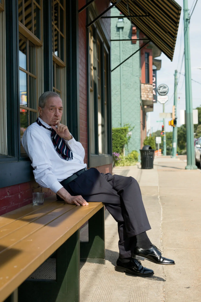
William Eggleston`s work was normally captured instinctually rather than conceptually, meaning he would never plan his photoshoots and would go with the flow. In an interview, Eggleston states “I never know beforehand Until I see it, it just happens all at once”. This quote shows the connection he has with his surroundings, having an impulsive and observational style of photography which still is executed successfully. Eggleston would waste no time with his photoshoots, taking one photograph per subject / focal point.
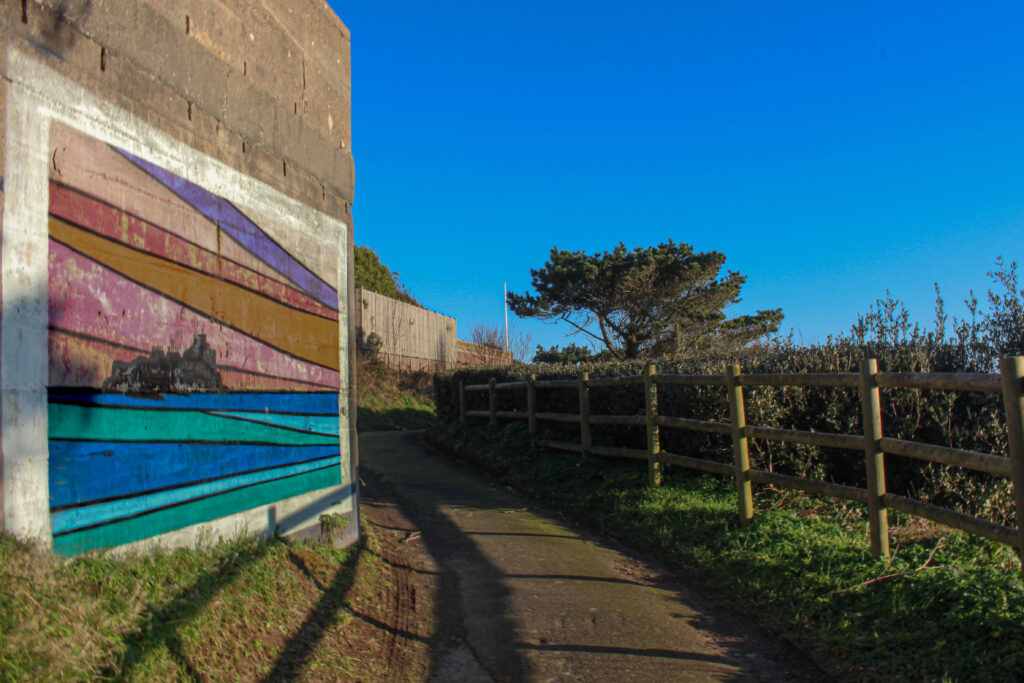
Photograph taken by me
Similarly, when taking my photographs I took the same approach as Eggleston, finding the beauty in things we see every day. Like Eggleston, I did not plan the photograph above; by contrast I came across this setting whilst on a walk and created this response spontaneously. Eggleston`s work has a huge focus on the contrast of colour in everyday life, therefore I also did the same; the vibrant, colourful mural on the plain wall and the bright blue sky showcase the contrast in colours, I was able to capture in this image.
Even though my photo is digital, and Eggleston often used the dye transfer printing technique to achieve the excellent use of colour and the strongly saturated tones shown in his work. My photo shows off the strong vibrant blue sky, the earthly colours of the landscape and the bold mural, almost looking like I have used the same technique as William Eggleston to capture this shot. This ties with Eggleston`s ideology that the colour on its own can form the overall mood and story of an image.
Todd Hido
Todd Hido is a widely famous photographer. He thrives in photography by the way he uses light, colour and the overall location to create a sense of mystery and a mix of emotions. Hido`s work, especially the photographs of urban areas at night, has made him one of the biggest names in modern day photography. Similarly to William Eggleston, Hido also takes photographs of the everyday scenery, however Eggleston mainly focuses on the beauty of the everyday life and Todd Hido does the opposite, capturing the feeling of loneliness, isolation and possible nostalgia.
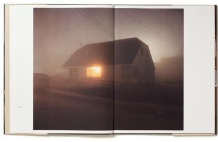
Book Cover – House Hunting – Todd Hido (2001)
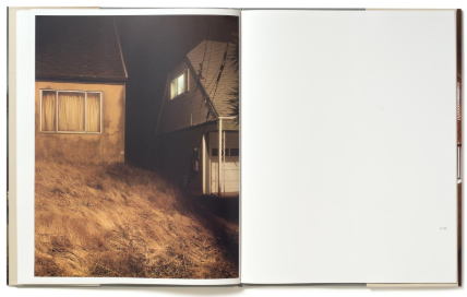
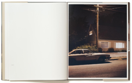
Todd Hido`s best known work is House Hunting, published in 2001. The book consists of long exposure shots taken at night of residential houses, with one single lit up window which is beaming out onto an isolated, dark road / street. The images are very mysterious and do not have a definite clear story behind them, grabbing the viewers’ attention as the viewer will pay more attention to every detail to see what is happening behind the window. Most of the photographs are taken from far away and often through car windshields, to add a blurry, dreamlike effect to his images. Unlike William Eggleston, Todd Hido does not take his photos with precise clarity but does use distortion and softness to strengthen the mood of his work.
Inner Pages From House Hunting (2001) – Todd Hido
The process which Todd Hido goes through during his photoshoots is very much instinctual, he drives around aimlessly looking for locations and areas which he can relate to emotionally. As discussed before this process is also done by William Eggleston where he takes a more spontaneous approach without planning his photographs and collections. Hido`s work is a lot more cinematic in comparison to Eggleston`s, Hido is inspired by filmmakers like David Lynch and Alfred Hitchcock, this inspiration from filmmakers leads to an eerie, dreamlike feature which has a narrative unfolding just behind the frame of the images.
Similarly to my project and what I investigated, Hido`s work explores the themes of solitude, emptiness and mystery. Some of his photographs are connected with his own personal memories of his own childhood and living the American suburban life.
From Bright Black World Book – Todd HidoFrom Normal Becomes Abnormal – Jonathan De Agrela
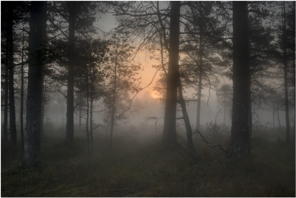
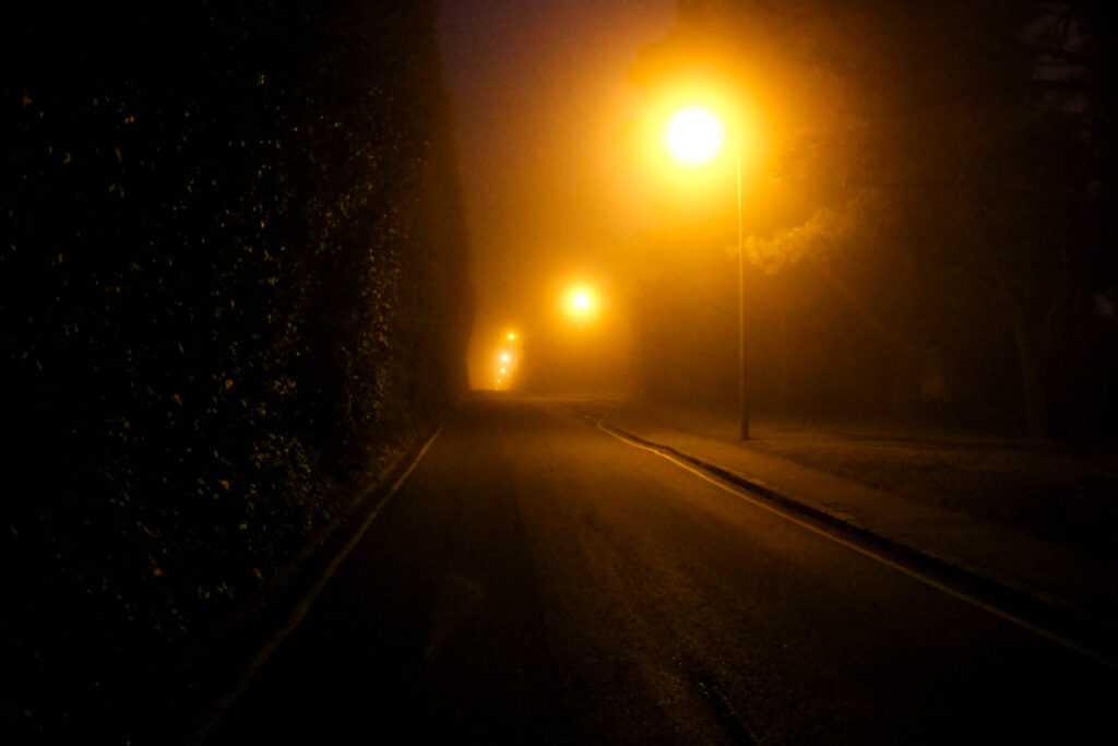
The most obvious similarities between my images and his is the use of light in a space. In this image above by Todd Hido, light is diffused from the sun by the mist, which gives off this dreamlike, misty appearance. The approach makes it difficult to understand background from background, resulting in a sense of depth in a picture. Similarly, in my image shown above, the lights on the road turn into a yellow glowing beam because of the thick fog surrounding it, giving the same dreamlike theme / style which Hido has. The light is directly next to the darkness that is surrounding it, making solitude, loneliness and abandonment more apparent within my image.
Compositionally, both mine and his photograph guide the viewers eyes, this is done using the obvious leading lines. In this image specifically Hido captures the sky as well as trees, however in my work I am using continuous lines created by the lamp posts and roads to add depth in my image. In both the photos, the lack of people and human presence adds to the sense of isolation, allowing the viewer to add their own emotions relating with my picture.
Conclusion
Throughout my project, I have understood how both Todd Hidos and William Egglestons photography has affected me as a photographer in terms of composition, mood and setting. At first, my assumption was that Hidos cinematic approach to light and Egglestons open approach to colour were two extremes of how to approach photography. However, once I had commenced my project, I realized that both photographers make the mood, narrative and the setting a key aspect of their work, which has really influenced my work despite their differences.
In this project, I’ve been inspired to take photos instinctively by Eggleston’s ability to find beauty within the ordinary. I also learn from his work and from his guide (William Eggleston’s Guide) that form can portray feelings and emotion just as powerfully as colour can. In contrast, Hido’s eerie, dreamlike images, like those in Bright Black World, influenced me in regards of light and loneliness, inspiring me to experiment with mood and story in my nighttime photography. Thanks to these photographers, I now have a greater understanding of how light, composition and instinct work together to create effective imagery.
As my perspective developed, I began to realise that the way I work is in between Eggleston`s spontaneous approach and Hido`s careful storytelling style. I originally believed that in order to be excellent in photography, photoshoots had to be carefully planned and conceptualized but after diving deeper into Todd Hido`s and William Eggleston`s work, I now have a better appreciation of instinctual reaction to capture photos.
In future projects or work, I will continue to take inspiration from Eggleston and Hido whenever possible whilst also taking inspiration from other photographers / artists, to create a more advanced style which suits me uniquely.
Bibliography
Websites:
Sontag, S. (1977). In Plato’s Cave. [online] Available at: https://openlab.citytech.cuny.edu/chengphotoarth1100f2019/files/2018/02/Susan-Sontag-In-Platos-Cave.pdf. [Accessed 24 Jan. 2025]
Burroughs, A. (2016). William Eggleston, the Pioneer of Color Photography. The New York Times. [online] 17 Oct. Available at: https://www.nytimes.com/2016/10/17/t-magazine/william-eggleston-photographer-interview-augusten-burroughs.html.[Accessed 26 Jan. 2025]
REBEKAH JACOB GALLERY. (n.d.). William Eggleston. [online] Available at: https://www.rebekahjacobgallery.com/william-eggleston. [Accessed 26 Jan. 2025]
Film Still Photography. (2025). William Eggleston’s Guide. [online] Available at: https://www.filmstillphotography.com/william-egglestons-guide.html [Accessed 26 Jan. 2025]
Atlas Gallery | Fine Art Photography. (n.d.). ERNST HAAS: NEW YORK IN COLOUR, 1952-1962. [online] Available at: https://www.atlasgallery.com/exhibition/ernst-haas-new-york-in-colour-1952-1962. [Accessed 26 Jan. 2025]
Farache, E. (2013). It Was Too Strong: An Interview with Todd Hido. [online] The Paris Review. Available at: https://www.theparisreview.org/blog/2013/11/19/it-was-too-strong-an-interview-with-todd-hido/. [Accessed 28 Jan. 2025]
Hido, T. (2017). Todd Hido On ‘Homes at Night’ and Illustrating Memories in Photography – Interview by Coralie Kraft | LensCulture. [online] LensCulture. Available at: https://www.lensculture.com/articles/todd-hido-todd-hido-on-homes-at-night-and-illustrating-memories-in-photography. [Accessed 28 Jan. 2025]
Grieve, M. (n.d.). Todd Hido’s Bright Black World – 1854 Photography. [online] www.1854.photography. Available at: https://www.1854.photography/2019/01/todd-hido-black/. [Accessed 29 Jan. 2025]
Hido, T. (n.d.). House Hunting. [online] www.toddhido.com. Available at: http://www.toddhido.com/househunting. [Accessed 29 Jan. 2025]
Books:
Jaeger, A.-C. (2008). Image makers, image takers : the essential guide to photography by those in the know. London Thames & Hudson.
Lowe, P. (2019). A chronology of photography : a cultural timeline from camera obscura to Instagram. New York: Thames & Hudson.
1. Research a photo-book and describe the story it is communicating with reference to subject-matter, genre and approach to image-making.
between 1997 and 2002, Justine Kurland travelled across the United States photographing girls living different lives. The story communicates the rebellious life of a teenage girl where she depicts them in rural areas and in the wilderness. Justine Kurland focusses on themes of freedom, rebellion, and the defiance of gender expectations
2. Who is the photographer? Why did he/she make it? (intentions/ reasons) Who is it for? (audience) How was it received? (any press, reviews, awards, legacy etc.)
The photographer is Justine Kurland. Kurland’s main project was called ‘Girl Pictures’. Kurland started this project in 1997 when she was a graduate student at Yale. Kurland decided to focus on teenagers because of their everlasting state of becoming. She wanted to show girls’ lives, centring them by creating an all-female society. Kurland decided to reverse certain stereotypical representations by rather than showing girls as passive or vulnerable, she represented them as strong, confident and free-spirited. The main environment of her images are usually in wild settings like rural or urban places which would be the opposite of a typical environment where girlhood would be imagined to be placed. Kurland shows her opinions and thoughts by using other people to reflect herself onto them. In her work ‘Girl Pictures’ she depicts young woman in wilderness settings and shows the ongoing theme of freedom and rebellion where she often places the individuals (herself) in natural environments.
3. Deconstruct the narrative, concept and design of the book and apply theory above when considering:
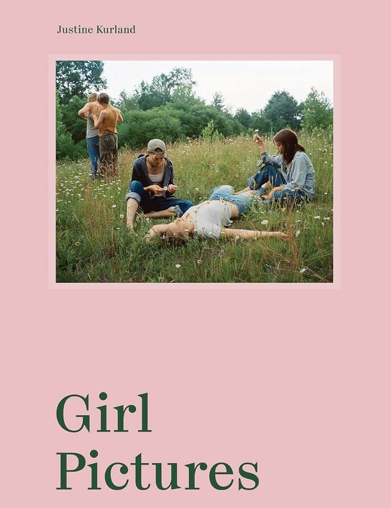
Kurland’s book is a portrait hard cover which is slightly bigger than A4. It has a single photo imprinted on the top half of the book in colour which depicts 5 teenagers in a field. the title of her project (Girl Project) is imprinted on the bottom half of the front cover and it stands out so that when you run your hand across it you can feel where the words are risen above the page. She also has the same on the spine, along with her name. The book is a saddle stitch. Kurland has chosen a single colour for her book which is a light/soft pink. this resembles the stereotypical girl colour and works really well for the theme of her project. If she had used blue it would not have the same effect as it may not match the theme as blue is a stereotypical boy colour. throughout the book, Kurland either puts one phot0 on each side of the page or she puts one big image across the two page spread. these images are glossy and in colour. This theme is consistent apart from the first page where the large image is printed onto pink paper and also in black and white to create a coloured effect to the image. the photo is also textured and not glossy. She also does this at the end of the book as well as the start.
Book in hand: how does it feel? Smell, sniff the paper.
Paper and ink: use of different paper/ textures/ colour or B&W or both.
Format, size and orientation: portraiture/ landscape/ square/ A5, A4, A3 / number of pages.
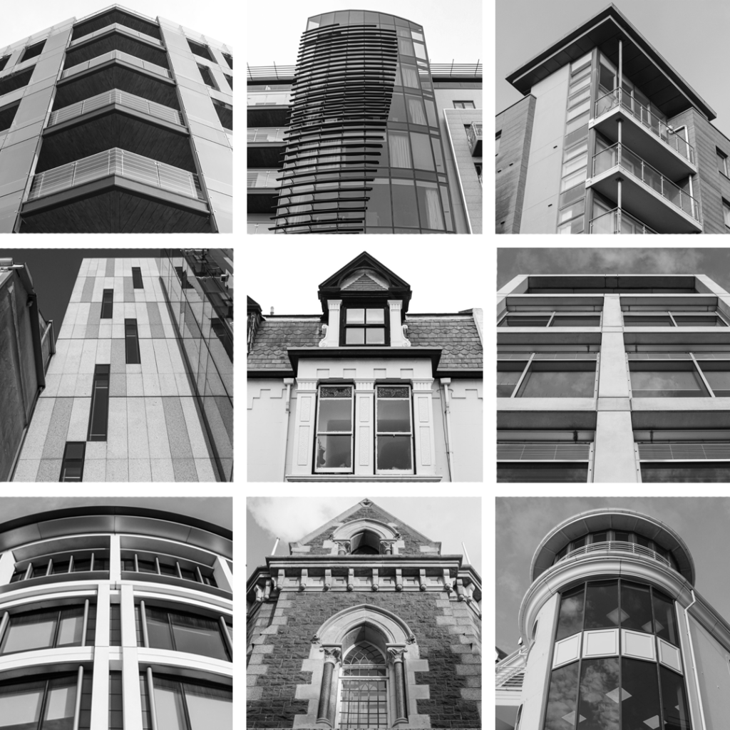
I have decided to make a Typology Study of Railings as I had 9 edited images of them.
Typology 1
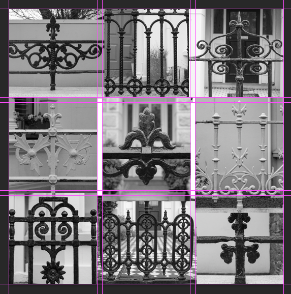
I made this Typology by, firstly opening up a template a made in photoshop. I made this Grid Template during the Portraiture project. I then added each of my images in to Photoshop on top of the grid.
I then played around with the images, deciding on where to put them and this is my final result:
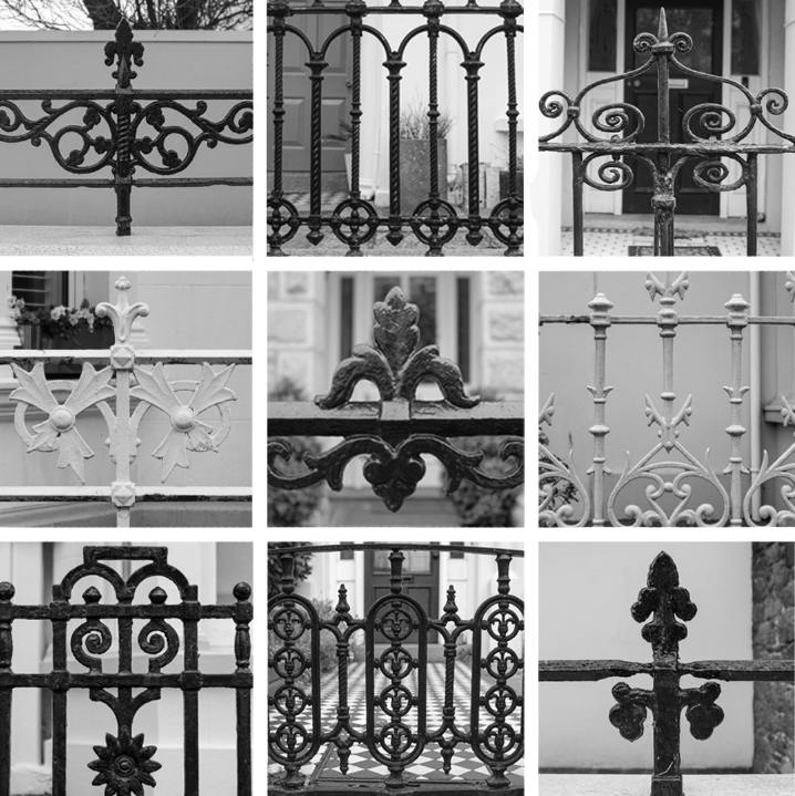
This is my final typology. There is a range of different types of railings which can be categorised together as they all have the same function. I personally think that, if I had more photos of railings to choose from, I could have made this typology better, however, I had exactly 9. This is because I don’t think some of the images are as strong as other and, due to the formatting of my grid, some have been cropped badly.
Typology 2
I then decided to also do a typology of images where I have taken the photo of the building by looking up at it. Here is the final result:
This is another typology which I decided to do. I attempted to form a grid of images that can be linked by the way in which they have been photographed from. The images in this typology have all been photographed from below, looking up at the building. I’m not sure that this typology works as I expected it to as it’s not obvious when you look at it what I was trying to do and the buildings are all of a different architectural style. Furthermore, these buildings all function differently and were made for different purposes. This makes it less of a typology and more just a grid displaying images.
Research and identify 3-5 literary sources from a variety of media such as books, journal/magazines, internet, Youtube/video that relates to your personal study and artists references .
Begin to read essay, texts and interviews with your chosen artists as well as commentary from critics, historians and others.
It’s important that you show evidence of reading and draw upon different pints of view – not only your own.
Take notes when you’re reading…key words, concepts, passages, page number to be used for in-text referencing etc.
Can the recreation of family portraits show how relationships have developed and changed over time?
How connection can be represented in the medium of photography?
How can photography change the way we remember and connect people and events?
Some examples of Personal Study essays from previous students:
Essay Plan Make a plan that lists what you are going to write about in each paragraph – essay structure
Essay question:
Opening quote
Pg 1 (500 words): Historical/ theoretical context within art, photography and visual culture relevant to your area of study. Make links to art movements/ isms and some of the methods employed by critics and historian.
Pg 2 (500 words): Analyse first artist/photographer in relation to your essay question. Present and evaluate your own images and responses.
Pg 3 (500 words): Analyse second artist/photographer in relation to your essay question. Present and evaluate your own images and responses.
Conclusion (250-500 words): Draw parallels, explore differences/ similarities between artists/photographers and that of your own work that you have produced
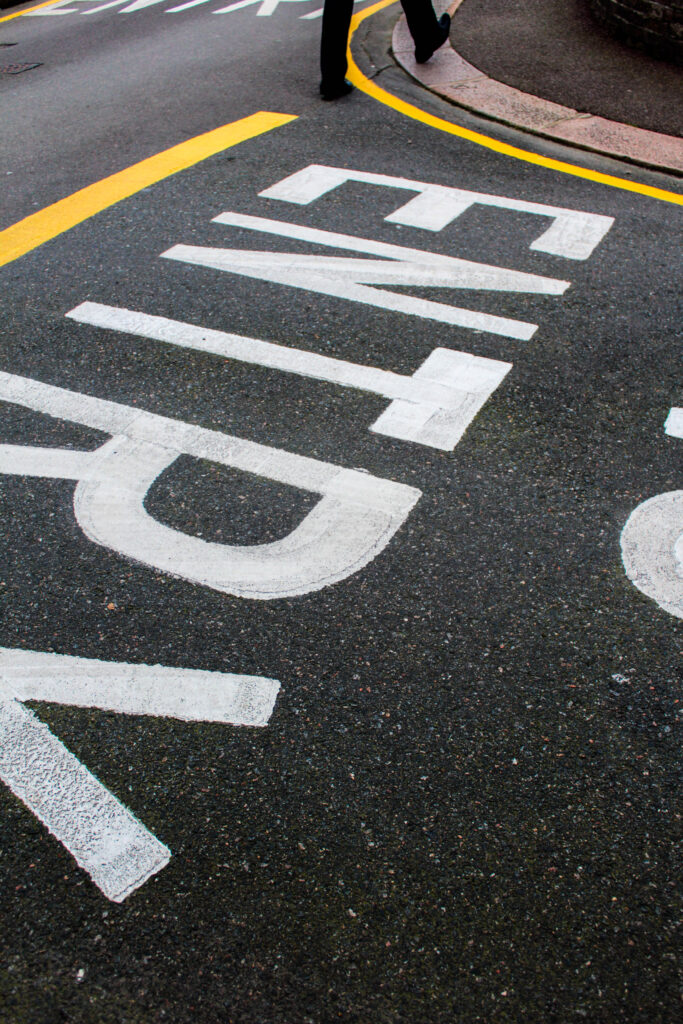
My aim was to capture colour that was revealed through dynamic formations I found within the street. Alongside this unusual shapes, patterns, lines were revealed overall adding more depth.
Favourite Selection:
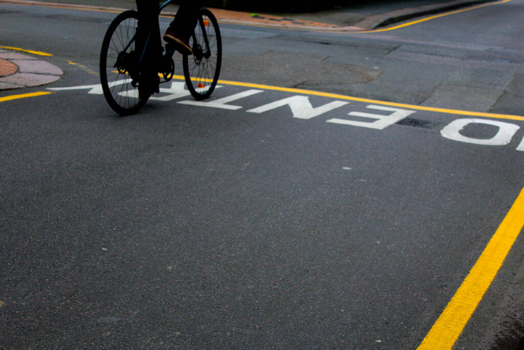
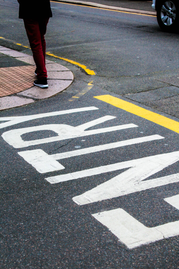
This photoshoot I used the TV setting on the camera which gave me this cool/warmth tone and candid feature. Inspired greately by Seigfreid Hansen and Saul Lieter I fosued on colour and how this could be clearly defyned through the unqiuenes of the features that are revealedd, and would otherwise go unnoticed
I was drawn to the reflections from within the window which created this layered affect therefore creating unique depth and structure. I wanted to express this feature, as I was already drawn to the warmth revealed by the colour then features such as the letters and writing displayed on the shop window, so decided to enhance this and clearly define these features when editing.
I experimented with various camera angles which help to produce images from unique perspectives, one giving a confrontational effect. This meant the viewer could further realise more within the photo and see things differently. Focusing on colour too, this allowed me to create particular/ subtle features that show a story when you look into it, as things are being presented to you from different angles or perspectives. It guides you into the photo, giving depth.
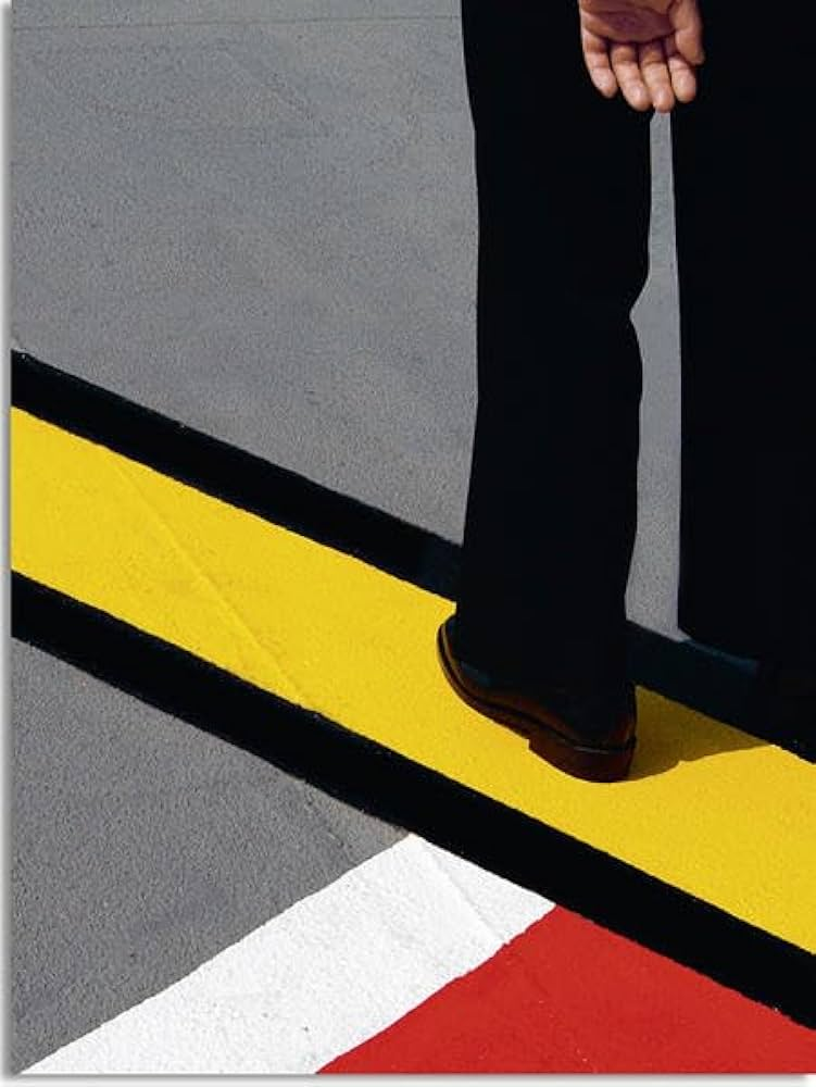
Siegfried Hansen Inspired
Inspired by Siegfried Hansen’s use of simplicity and capturing moments that you would perhaps not notice otherwise, I felt this gave a unique characteristic within the images which is what influenced me to produce images with similar features. It creates this gripping narrative as he has particular ways of expressing formations and shapes through vivid, bold, pigmented colour- overall creating a contrasted, and defining effect. Hansen looks at road markings and particular signs which is what I further looked into. I felt this revealed a certain aesthetic which before captured you wouldn’t notice it. The narrative is expressed through this in particular ways as only the legs of someone is displayed, giving this sense of unknown, whilst also being mesmerised by the visual features (of colour, line, shape, formation.) I edited the images to further enhance the formations in which gave this in-depth contrast, for example I firstly altered the contrast making this an obvious feature, I then altered the black and white levels as this further increased the shadows and pigmented colours
For the photo above, I firstly altered the contrast making this an obvious feature, I then altered the black and white levels as this further increased the shadows and enhanced the pigmented colours so each feature was clearly defined.
Evaluation
How successful was your photoshoot and experimentation?
For this photoshoot my aim was to capture both colour and forms within the streets of St Helier, and how they work together to create this dynamic relationship meaning that when you look at the images your mind is completely mesmerised by the abstraction but also your confronted with something totally different and unusual – perhaps becoming unrecognisable. I took photos from various angles which helped to achieve these effects, but mainly focusing on how I can turn my sights into something complete unrecognisable, by presenting to the viewer a different perspective. My aim was for colour, formations, and shapes to take over, which creates an abstract view.
Overall I think this photoshoot was successful as you are ultimately being displayed something unusual and attractive. Throughout my goal was to capture moments or particular sights I saw in town which I through best described colour, saps, and formations. I felt this was a necessary thing to focus on as its not only until you look closely at something, it is where you notice it (colour). Then from this you notice complementing features such as lines, patterns and shapes.
What references did you make to artists references? – comment on technical, visual, contextual, conceptual?
Siegfried Hansen was one of my main influences. Noticing is simple yet engaging photos where subtle features distract you:
The visual elements are what you notice straight away, colour, shape, texture, form, pattern, and line. Then closely looking into this we see how they complement one another and create this dynamic connection between one another, one that we wouldn’t notice if it wasn’t for the abstract approach we are presented with straight away.
This photo instantly appeals to me. Through the structure to the colours that outline this in a formational way. It is minimalistic yet very revealing. This means the particular way the photo has been captured, to the markings on the road which lead up to the legs of an unknown person. The road markings coincidentally create leading lines towards the legs of an unknown person which automatically create a contrasting affect between this but also the pigmented, pure blocks of colour against the black. This dynamic contrast creates intense depth through the sharp, bold lines.
Relating closely to Formalism, the intense lines, layout, and colour create a close connection, bringing this much deeper meaning. Although the meaning is not presented through a specific subject, its shown instead to us through the visual aspects of the work, which enhances the aesthetic feature. Formalism is a focus on quality of colour, brushwork, form, line and composition which is what influenced Hansen’s style of work. – we can see the close connection. We are clearly presented with the structured /orderly layout expressed by blocks of colour that is then outlined by thick black lines. The visually attractive structure of formalism further complements the legs of the unknow person that comes into the photo from the right, as this creates a unique subject.
How are you going to develop your project from here? – comment on research, planning, recording, experimenting.
What are you going to do next? – what, why, how, when, where?