I began to by selecting my final images which I felt best worked together. Then started experimenting with how I could make the layouts very visual creating this aesthetic of colour, form, shape, and composition throughout.
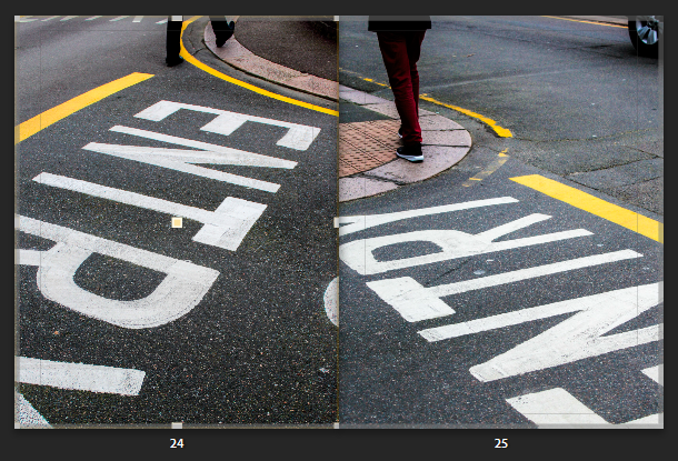
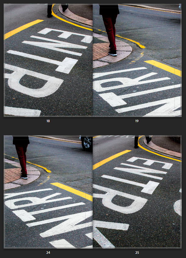
Here I was deciding the layout for these particular pages. I took these photos both in the same area but from different angles, which created this different confrontational effect. The writing could be presented and was displayed from different angles where the lines and formations of the pavements could be realised differently. I felt having both pictures on separate pages presented a nice flow as both achieved very similar yet different perspectives and angles. However I went with both images, presenting on a double page (side by side) as this revealed a much more unique composition. I found the abstract approach complemented the photos individually as your unsure yourself what the writing is suggesting or saying, instead we are drawn to the pigmented, sharp lines and shapes of colour that works well with the compositional arrangement of the streets. However, both photos complement one another, and they different versions of each other.
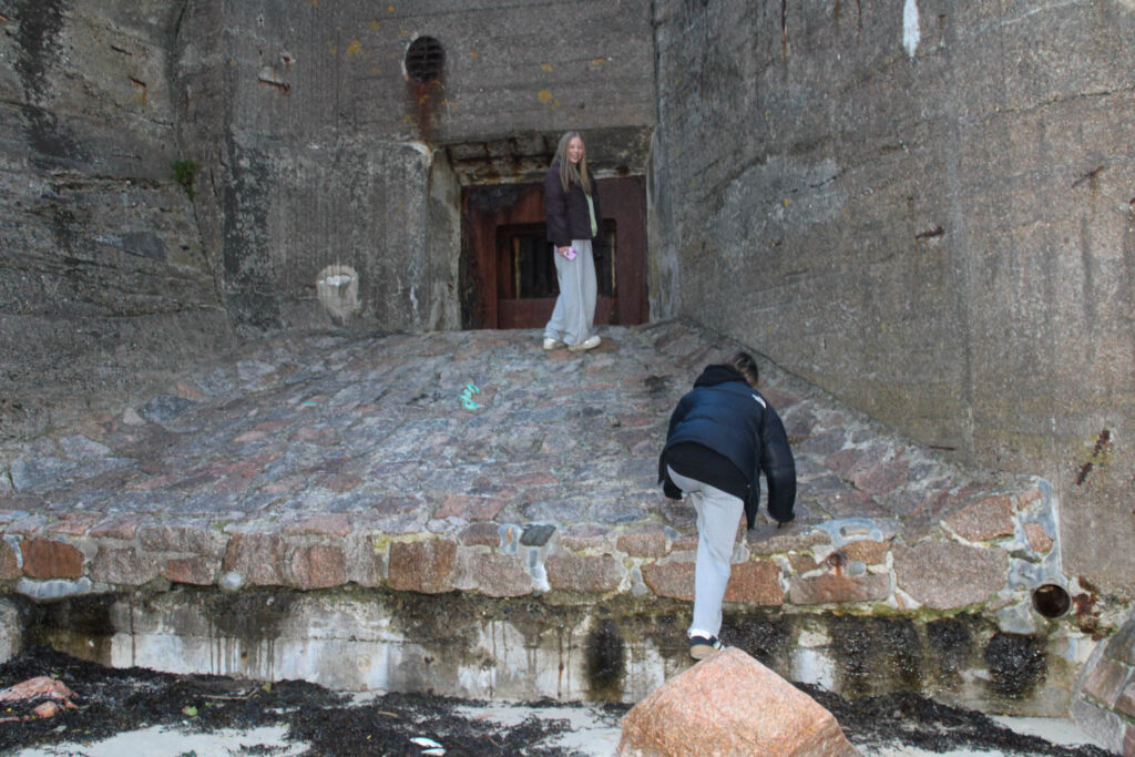
The second double page above was the composition I went with. I felt each photo displayed their own structural formation through the way the person is walking off the page, to the letters and coloured lines. Then the way the photos complement one another side by side, creates intense leading lines in-wards or into the page, instantly gripping your attention as your eyes follow this formation. This creates a slight symmetrical feature (although they aren’t identical images) from the way the photo is angled. The photos was taken from the same place, I stood in the middle then captured to the right of me then to the left of me, both including different people walking away. This creates a nice sequence, one that we wouldn’t notice, until after we notice the abstract feature. This creates even more diverse angles and compositions reiterating their juxtaposing effect side by side.
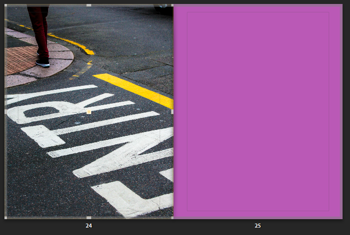
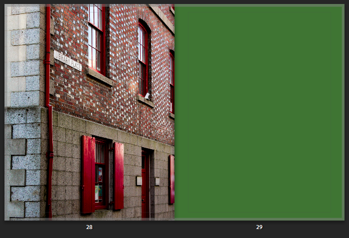
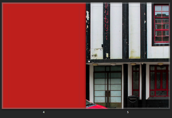
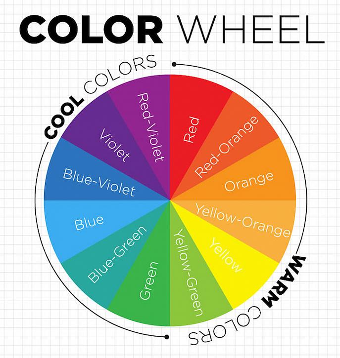
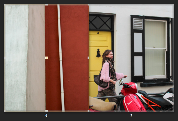
I then started playing around with adding a full colour page, which complemented a stoke/detail of colour I found in my image and wanted to emphasise further. Looking at the colour wheel as guidance this allowed me to easily see which colour complemented on another. For some pages, where you could only see a little detail of colour, I then matched the colour onto the next page, giving this unique relation and comparison. For example for the third photo below, you can see the intricate red detail from the outline/structure of the window and sign, which stands out against the alternating black and white background. So to express this feature further I wanted to bring this out, revealing the colour/ making it more visible as it is an interesting graphical feature- so I matched a whole page. In other photos where the colour was more visible through bold shapes and lines, I wanted to create a contrasting feature so used complementary colours instead as the whole page. I mimicked this particular technique Siegfried Hansen used, as I was automatically attracted to this feature presented in the book, Hold the Line, because it broke up the busyness/hectic feel you would be presented with otherwise, but also describing this interesting narrative throughout as you can see a deep connection in relation to the image.
Complementing colours
Complementing colours
Same colour
For some photos I experimented further with Hansen’s technique of having a whole colour as a page, to then incorporating a more visual and structured version through my photos. I took inspiration from the singular, pigmented colour Hansen used, to then incorporating more than one to give this dynamic relationship, that I could further use to complement my other images (like the photo on the left). So throughout that photoshoot I noticed colourful buildings, and the particular shades of paint used that I could then use instead of editing a colour into the page on Lightroom. I felt this would give a much more interesting feature as I have taken the photo, and related this the image followed after or before.
Like for these pages, I found this wall that already had contrasting features expressed by three two tones. I straight away noticed how the colours where presented through the composition and structure of the building, as you get the strand of white running through alongside the angles and three-dimensional feature. I like this A-symmetrical feature you get, which gives this particular character and interesting depth followed by how the lines are to an angle leading you into the composition. I felt the simplicity of this could relate and complement my other images in a different yet similar way, instead of using a single block colour. As you can See I have exaggerated and brought out the tones found within this image as you can see the texture and intricateness blemishes in the wall, which overall adds character. You can see the relation, as similar tones are displayed. I like how the tones aren’t the same which shows you they can still work together and complement one another as they bring out other features within the photo, such as the yellow coming from the door, and the pink jumper, but also the patterns revealed from the black and white building. It works well as the tone of white in both is highlighted throughout the double page.
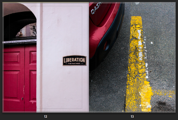
Like-wise for some photos where I was not intending to express the colour, instead it was the formation and angle I took it from, the photograph still expressed the same effect as the full colour page, only adding in extra details and formations – which gave this passionate, energetic, expressive characteristic:
This mix of compositions reveals a similar effect followed by the dynamic structure of the road markings. The similar use of of compositions related to one another as they both express a very dramatic feeling.
Breaking up the pages with colour:
I realised my images were very intense – from colour and composition so I was influenced by the Book ‘Hold The Line’ by Seigfreid Hansen, to add in full coloured pages.
Before
As you can this double age is very hectic and busy as their is lots of bold compositions. Although, I chose images that complemented one other through their colours and structural formations as their side by side, it still portrayed a very chaotic, intense double page – one that worked together but clashed. So increase the aesthetics I added in full coloured pages that broke this up, therefore creating this unique contrasting effect. The colours I chose for the pages complemented the photograph on page next to it, or very little of the colour was visible- therefore this brought the colour out making it visible. I kept the colour pallet simple using complementary colours or primary colours.
After:
Original layout
Front Page:
Final Book Layout
Evaluation:
How successful was your final outcomes (book, film, prints etc)?
Overall, I think my final outcome of creating a book was successful. My aim was to create a book influenced exploring colour. Influencing specifically by the formalist style From this dynamic formations were revealed which is what I think make it unique. Similar to Hold the Line by Seigfried Hansen, the photobook doesn’t express an obvious narrative, instead its open for us to interpret one. I think this is a very clever and different way of expressing a series of images in a book, as we are confronted with different angles and approaches which makes up the narrative. Through an abstract approach that we are straight away confronted with forces you to look beyond, focusing in on the formations and and structural elements of patterns and colour.
Did you realise your intentions?
What references did you make to artists references? comment on technical, visual, contextual, conceptual?
Both Saul Leiter and Seigfreid Hansen explore forms of colour which are defined through shapes and compositions. The similar yet different outcomes is what interested me the most. Seeing how moments and reality can be transformed into images which change your perspective, otherwise revealing moments you wouldn’t expect to see.
I captured the photographs in day light either when it was sunny or cloudy as this revealed two different effects expressed through the shadows and highlights. Focusing in on visual aspects such as colour, shape, pattern, line, texture and composition when out on photoshoots but also when making final edits. The visual elements all fitted together, complementing one another which is why I explored this abstract, confrontational effect. Seigfreid Hansen was my main influence, further shown in my final images in the photobook as he took everyday situations and moments and captured them in a way that revealed a type of structure defined with lines, patterns and colour. This then created contrast of colours and depth. Without expressing an initial narrative, it is left up to you how you interpret Hansen’s work. Leiter uses a similar approach, yet we soon figure out a narrative as subjects such as people interacting are captured. I tried to include this using people I know which created this staged look. In comparison, I then looked at Hansen’s style of abstract snapshots of particular moments, then created photographs in similar styles, with bike wheels and legs coming into the main photograph to give this contrasting narrative. My expliration of colour is expressed through different layouts which come together in the book, complementing one another. Using full coloured pages to break the caotic, intense images up, complemented slight details I wanted to enhance and make clear which would otherwise go unnoticed. Otherwise for some pages, I captured colours myself which included some lines and slight differences like the full coloured pages. This created the same effect as the full coloured pages yet made it more interesting.
How have Todd Hido and Hiroshi Sugimoto used the medium of photography to record and present the intangible?
‘A photograph might be a fixed image but, socially speaking, photography does not keep still.’ David Campany, The Photographic (2004)
A Photograph Is Intangible
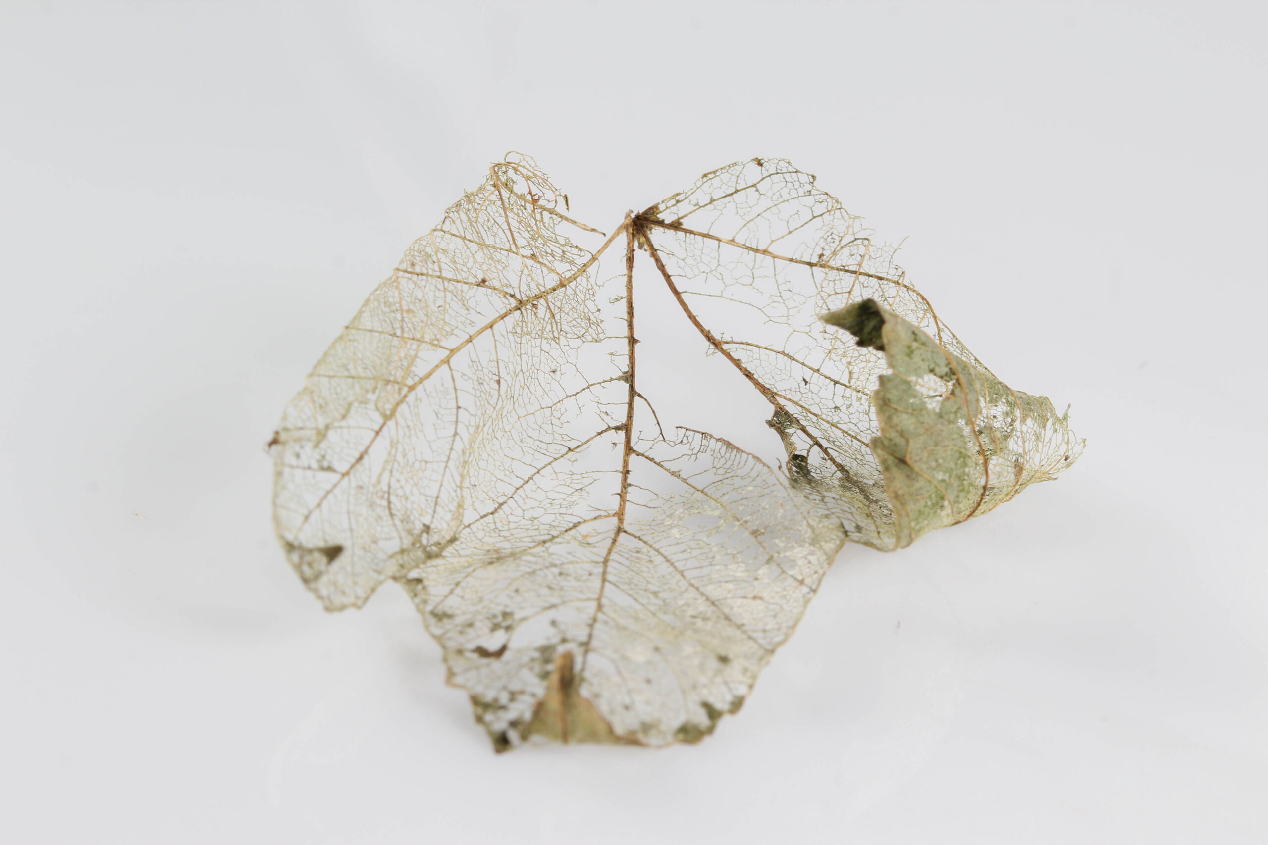
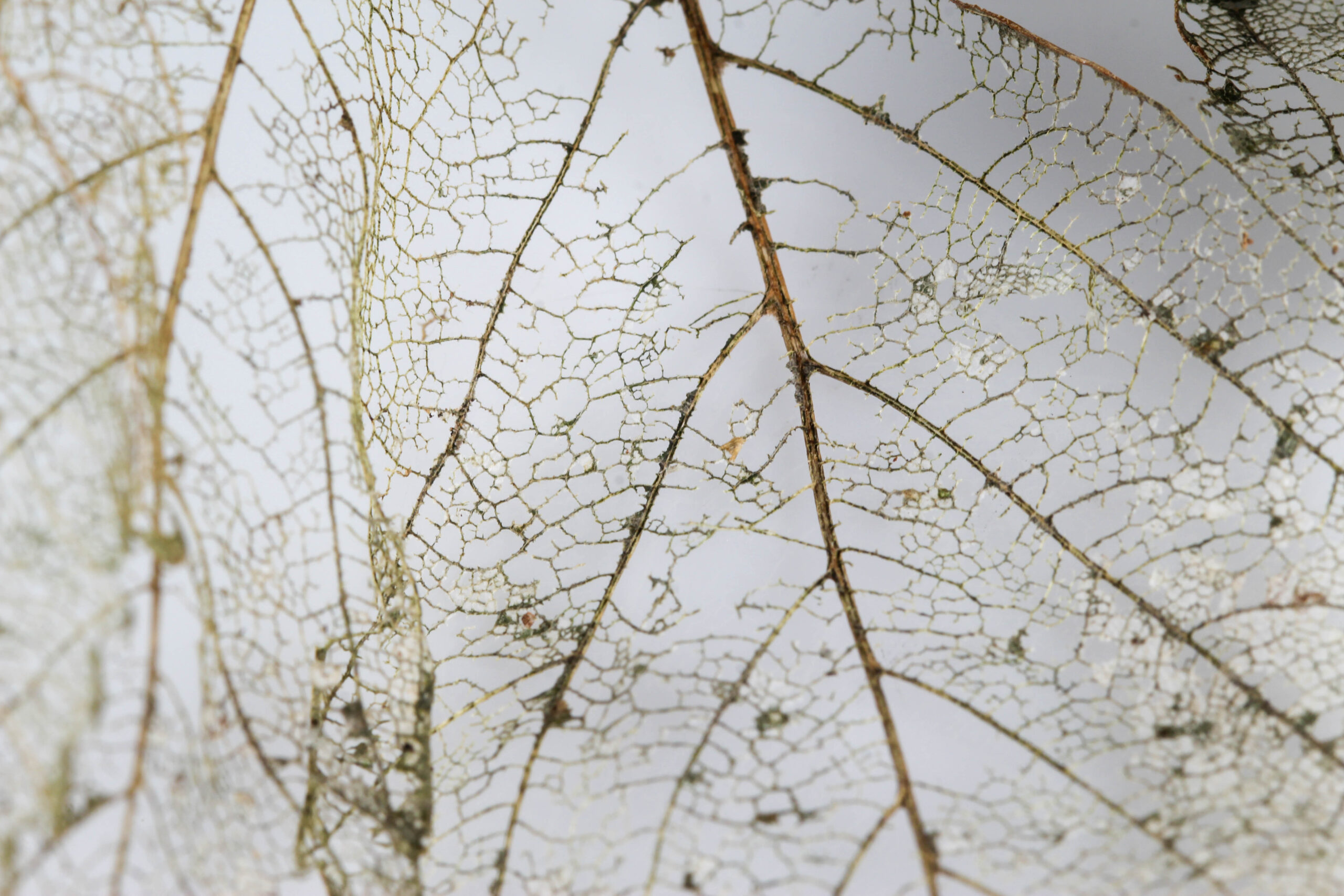
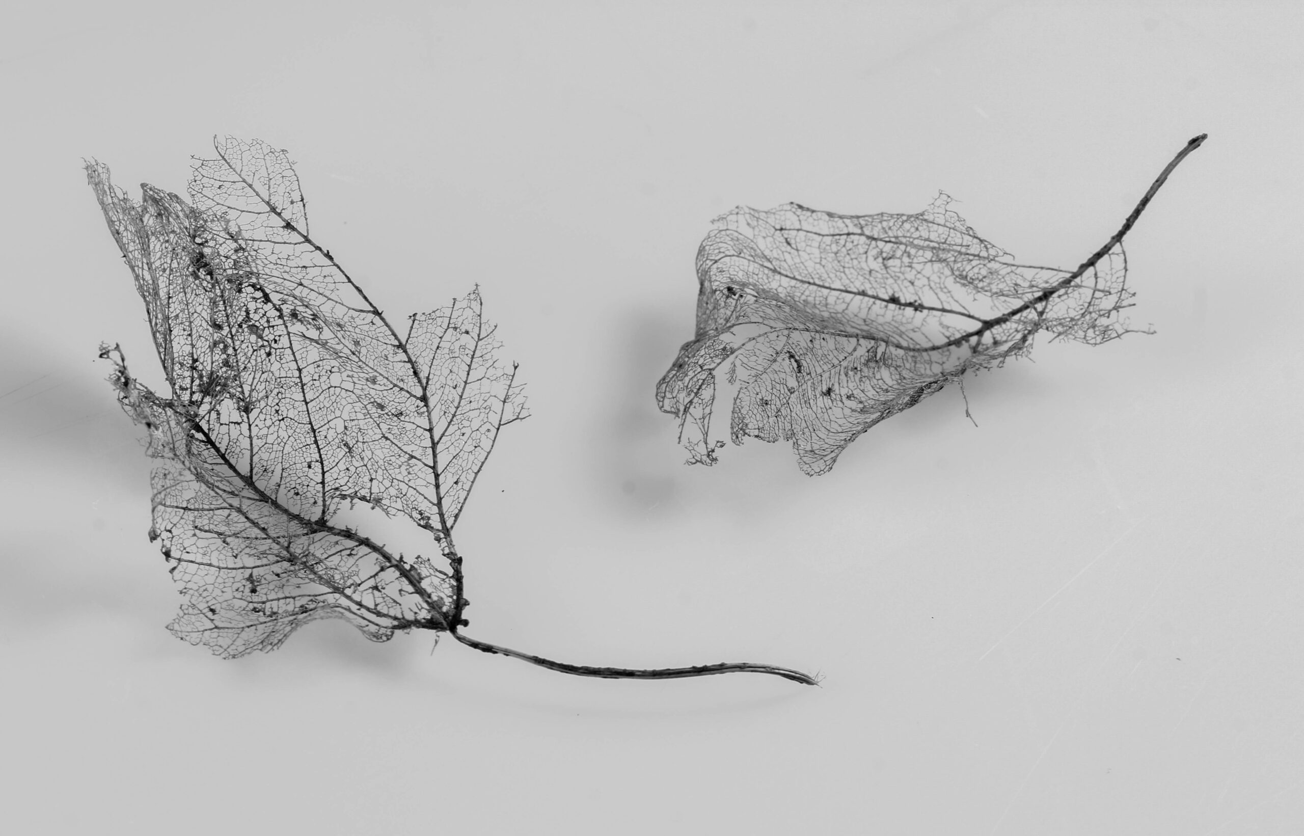
A photographs takes a fleeting moment – the natural atmosphere and emotion – and immortalises it in a still frame. Once taken, that moment can no longer be revisited: it is intangible. Intangibility is the absence of a physical body. While a print out can be held and felt, the subject of the image is now immaterial – a copy of a memory. Take for instance a tourist. He may photograph himself in front of a landmark as “indisputable evidence that the trip was made” (Sontag 1977:9). But once he moves to the next location he cannot return to that same spot, the moment has passed. It does not exist any longer outside the frame. All the same people will exist, the same landmark stands however the exact makeup of that image is only present within the bounds of the frame. “The shutter clicks and the clock jumps to the past” (Stahel 2003:7). Similarly Susan Sontag draws parallels between the shadows in Plato’s Cave and the photograph. The shadows are a believed truth based on bodiless projection used to show the deceptive nature of our own perception. Both these shadows and photographs mislead the viewer into believing they know the ‘full picture’. What’s seen is believed as fact. “The picture may distort; but there is always a presumption that something exists, or did exist” (Sontag 1977:5). On the contrary, a photograph is a physical representation of what did happen, tangible evidence. Photographs are “fixed traces of the light” (Stahel 2003:7). You can hold it, share it and even fix it in a book. Photographs are the physical body of a memory. “any single statement about photography is likely to fail on some level.” (Campany 2004:10). Like anything physical, a photograph has dimensions. A photograph cannot be fully explained in one sentence, they connect emotionally to the viewer. Between even just two people, a photograph’s summary can vary drastically as throughout a photograph’s timeline it will pass through many different hands and the view of many eyes, a result of a physical form. “photography does not keep still” (Campany 2004:7). Unlike a paintings which is someone’s artistic interpretation, a photograph has a high degree of indexicality. It cannot lie or purposefully mislead, it shows what was captured, it is a tool.
Photographing the Intangible
How do you photograph something that doesn’t exist? There is a common consensus that the camera in one way or another killed the paranormal. If something exists there’s a picture so if you haven’t seen it, then it mustn’t exist. Tales of beasts in the woods and monsters in marshes have become increasingly difficult to believe without evidence. For early photographers like William Hope and William Mumler this was a matter of manipulation: using simple double exposure techniques to create ghastly effects. While its impossible to photograph the ghost of a loved one, printing a copy of them achieves a similar effect. Photographer Todd Hido captures feelings of isolation by alluding to humanity without ever showing it. The loneliness of his images utilises familiar imagery to trigger a personal response. Hiroshi Sugimoto turns something familiar into something unrecognisable through distortive blurs. “any single statement about photography is likely to fail on some level” (Campany 2004:10). This is because a photograph on its own has no context. It is an abstraction. Without context any interpretation is valid. In a collection, a narrative can be crafted however the ambiguity is what makes images resonate with the viewer. Any feelings associated with an image are entirely disembodied. “Photographs actively promote nostalgia.” (Sontag 1977:15). If a photograph represents a passed moment of time and nostalgia is the universal longing for the past then photography is the act of presenting nostalgia, intentionally or not. This is most easily seen with family photobooks but any photograph will elicit some level of nostalgia at some point in its timeline.
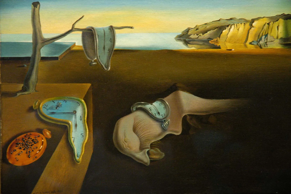
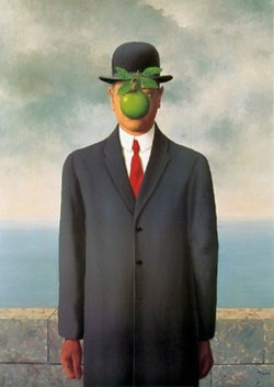
Surrealism and the Uncanny
Salvador Dalí – The Persistence of Memory (1931)René Magritte – The Son of Man (1964)
Surrealism as a concept was named by French poet Guillaume Apollinaire in his play ‘The Breasts of Tiresias’ (1917) where the term meant simply ‘beyond reality’. Surrealism built off of pre-existing art movement such as Automatism: the idea that unconscious behaviours that subject is unaware of as well as Dadaism: art that rejected conventional norms in favour of the absurd. It wasn’t until the First World War had cleared that Surrealism as a movement gained its own footing with poet André Bretons ‘Manifesto of Surrealism’ released in 1924. Following the atrocities of war, the general public questioned beliefs that blindly led them into the atrocities of war and choose to look inwards at themselves, rejecting Formalism: where images are based not on emotion but instead technical elements, and Rationalism: the belief that reason is the most important factor of knowledge, and practice healing methods such as self-examination and psychoanalysis based on works from Sigmund Freud and Carl Jung. Surrealism is the inwards looking movement meant to “revolutionise human experience.” (Tate Modern: 2). A surreal painting combined irrational, unseen aspects with totally rational and familiar imagery to create an end product that could be called hallucinatory or even uncanny. A famous example would be Salvador Dalí’s: ‘The Persistence of Memory’ (1931). This painting used a beach as the background for an a still-life arrangement of objects to sit in front of. The most notable of these objects are the clocks, a mundane object turned surreal by melting and distorting them. Its not just the clocks that are manipulated and changed however: the background is broken up into nonsensical boxes and a tree is growing out of a wooden surface. All these inconsistencies create the appearance of something that could only exist somewhere illogical such as the subconscious. René Magritte’s ‘The Son of Man’ (1964) is a seemingly normal portrait, something familiar and unassuming except for the floating green apple obscuring the face. By obscuring and manipulating something familiar such as the face into something new and foreign with an apple creates a sense of wonder and mystery in the viewer.
The uncanny was coined by neurologist and founder of psychoanalysis, Sigmund Freud. Psychoanalysis is the theory that personality is dependant on our past. Similarly the uncanny was the idea that childhood fears still cast immense fear over the adult mind, a reaction dependant on our past. If a grown adult saw a shadowed figure at the end of their bed the dread experienced would be called uncanny had they been fearful of tales such as the sandman as a child, while it is a reaction of fear, it is also a reaction of recognising some repressed familiarity. The word is now used to simply describe something uncomfortably recognisable and wrong at the same time, an unsettling juxtaposition that does not sit easy with viewers. Take a smiley doodle: the brain will associate it via eye and mouth placement as a face. When looking at a car the same might happen: the brain will see two shapes resembling eyes and something that might enough look like a face to decide that the car its watching you. When faced with a portrait, the brain will tell you that it is a person. If you then manipulated each feature enough that the portrait could no longer be of a real person, the brain will see the overall features and recognise it as a face. At a quick glance you may be fooled however something about it wont be quite right. When facing a doppelganger you will recognise the face as yours, however the nose may be too small to be correct, it would be described as uncanny. The uncanny leaves the feeling of unease and discomfort.
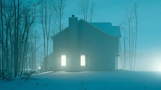
Todd Hido
House Hunting, 2001
Todd Hido creates photographs that could be described as both traditional and bordering uncanny at the same time. Despite the perceived simplicity of these photographs, they expertly embody feelings of realism and discomfort “as though they have been directly pulled from the recesses of your own memory”. (Kraft, 2021: 2) By taking a shared experience or memory and presenting them back to the viewer, the photograph will have created a personal connection on the basis of familiarity, in turn eliciting a stronger emotional connection. These shared memories however are twisted. He takes ordinary houses and transforms them into haunting dreams through soft lighting and quiet composition. This familiarity is required to create feelings of the uncanny, something only achievable by taking the familiar and changing it into something feared- in this case total isolation. House hunting creates a lonely narrative of being stuck as an observer on the cusp of society. While you can see houses and know someone must be present, you don’t see a single person. They’re hiding, from you. The viewers eye is made out to be that uncomfortable felt-presence, someone uninvited watching from somewhere just out of view. Its an uncomfortable yet strangely peaceful atmosphere that extends throughout this body of this project. Additionally this photograph has a muted colour pallet. The whole image is a cool blue toned with only white light and dark trees breaking this monotone pattern. The bleak colour pallet doesn’t elicit any exiting or extravagant reactions; it showcases the dullness of the mundane, a universally relatable topic that will reach a further audience than an American suburb.
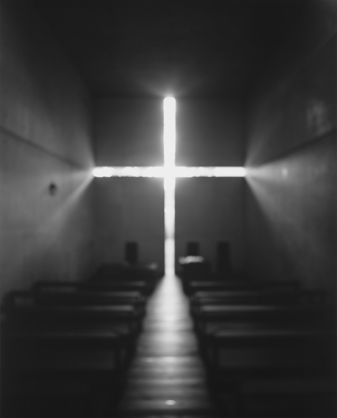
Hiroshi Sugimoto
Hiroshi Sugimoto, Architecture (1997 – 2002)
Hiroshi Sugimoto creates photographs that “dissolves the lines between time, memory, and history” (Fraennkel Exhibition: 1) in his photographs. By creating images that seemingly stand outside the passing of time, they hold a strange sense of power over the reader and create an imposing atmosphere, an important feeling when photographing powerful buildings. This makes the presence of the buildings seem as large as they would physically be in person. In this image, Hiroshi Sugimoto has photographed a church. Churches were and still are, though to a lesser extent, powerful so the imposing atmosphere and emphasised cross shows power over the viewer. Although this image of a minimalist church could easily be associated with current aesthetics and movements, it could just as easily be taken from many points of your own memory and therefore history. Minimalism dependent on the present, its been present throughout modern history. The protestant church has been white and void of decoration to separate itself from Catholicism since its foundation in 1517. The lit cross looks angelic with bright glowing white but also inviting, like a welcoming hand which is representative of both the welcoming and openness of community but also the personal connection people build with their religion. At the same time the emptiness of the frame, the bareness of the room as well as the coldness the loneliness that comes with religious teaching and practices creating a cold and out of reach image. even if you wanted to reach out, it looks so large and far away, making the viewer feel unworthy and small. Additionally the image was purposefully made blurred which creates a dazy and unreal appearance. Like something from right out of your memories.
Conclusion
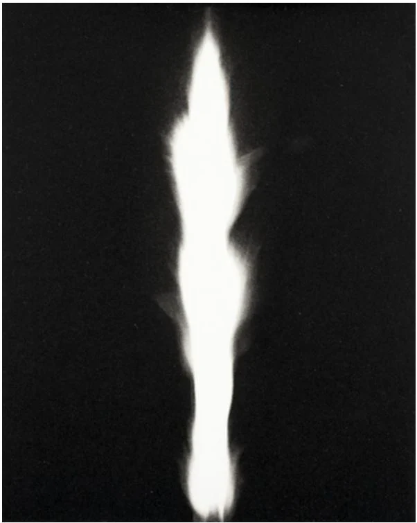
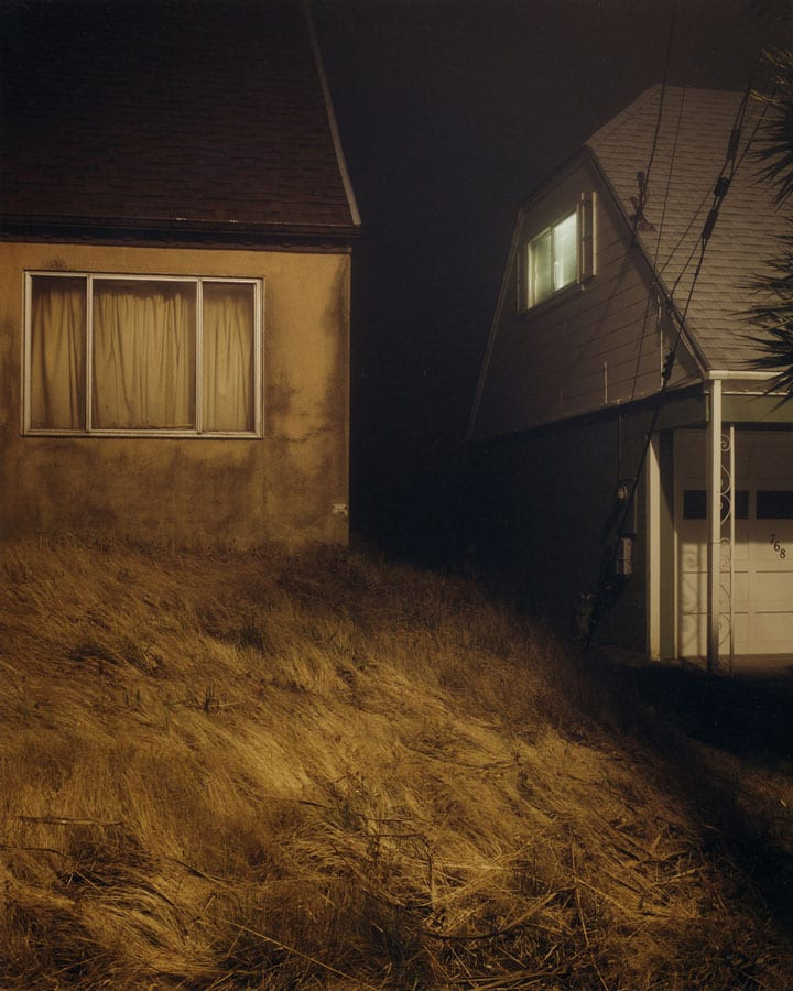
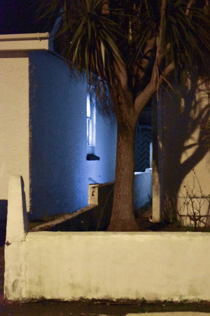
In conclusion, both Todd Hido and Hiroshi Sugimoto have created photographs that capture something seemingly right out of your own memories void of human presence. They have presented the intangible as an intimate emotional response through the use of familiar while also lonely imagery. Todd Hido’s images elicit feelings of nostalgia and loneliness while Hiroshi Sugimoto’s are powerful and intimidating. In response to Hiroshi Sugimoto I produced a number of images inspired by ‘in praise of shadows’ which I believe captures similar feelings of wonder and fear as ‘architecture’. These images create unique and striking shapes from a flame which has associations of danger. While my image didn’t create the same elongated streak, I think the humanoid shape creates an uncanny feeling instead which achieves a similar feeling of unease. As a response to Todd Hido’s ‘House Hunting’ I created a series of images documenting my walk around neighbourhoods at night. I didn’t manage to photograph in heavy fog or mist but I made sure each one showed signs of isolation regardless of the missing mystery of fog.
Hiroshi Sugimoto – In Praise Of Shadows (1998)ResponseTodd Hido – House Hunting (2001)Response
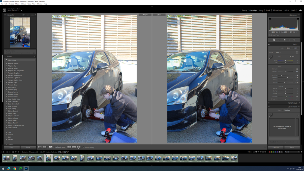
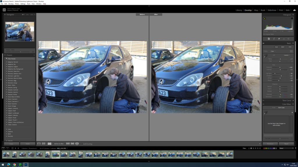
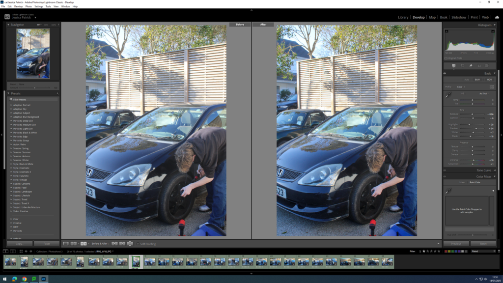
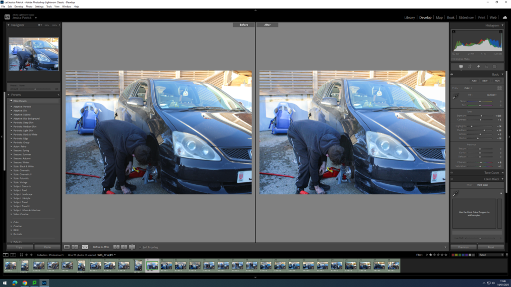
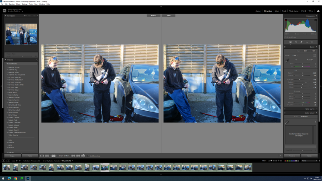
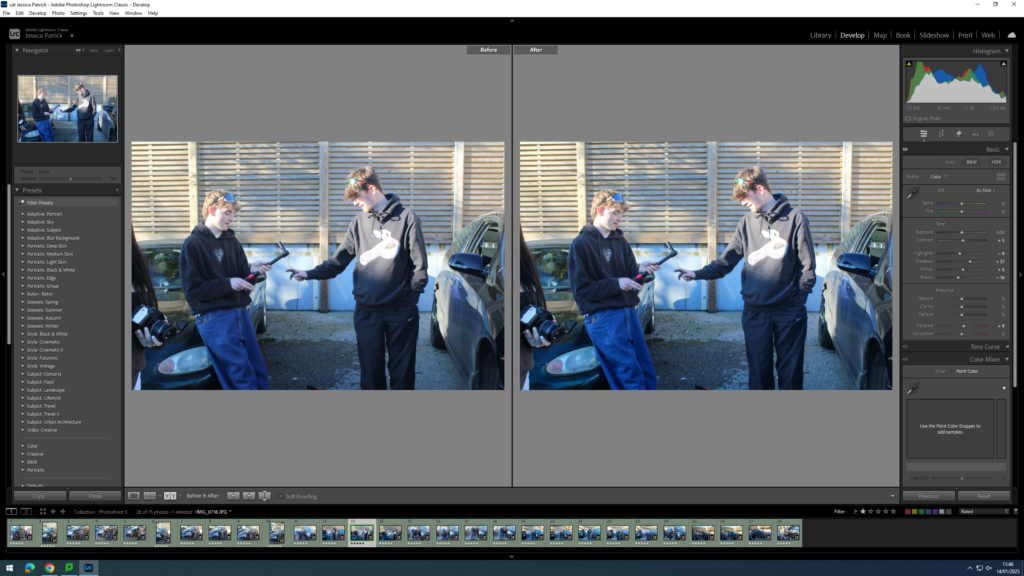
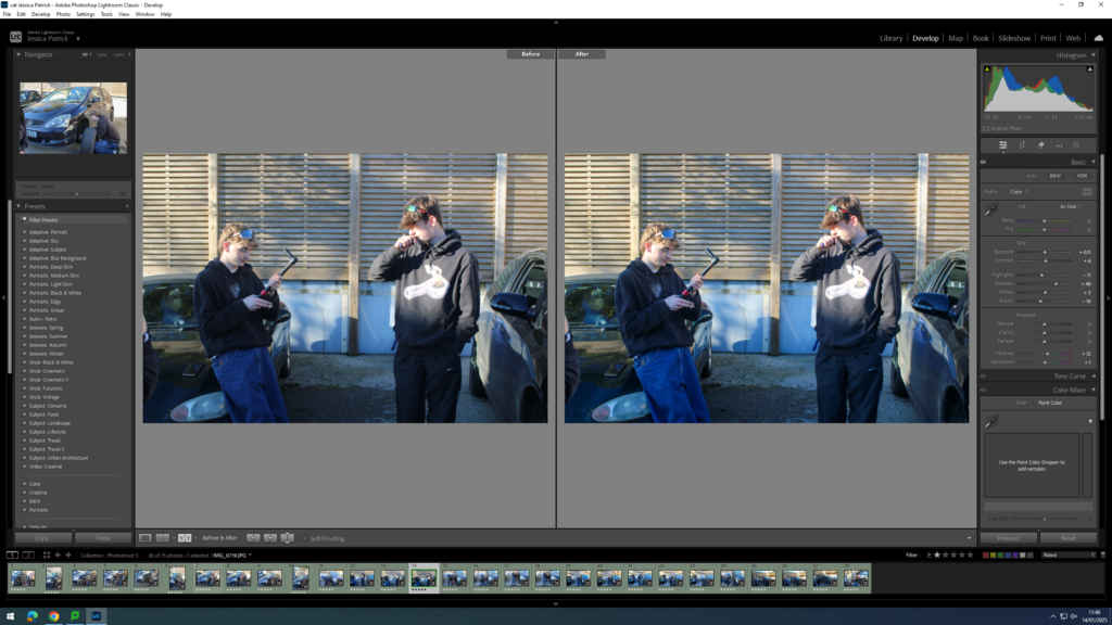
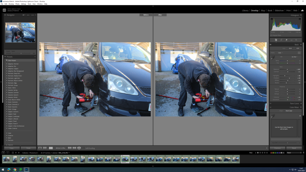
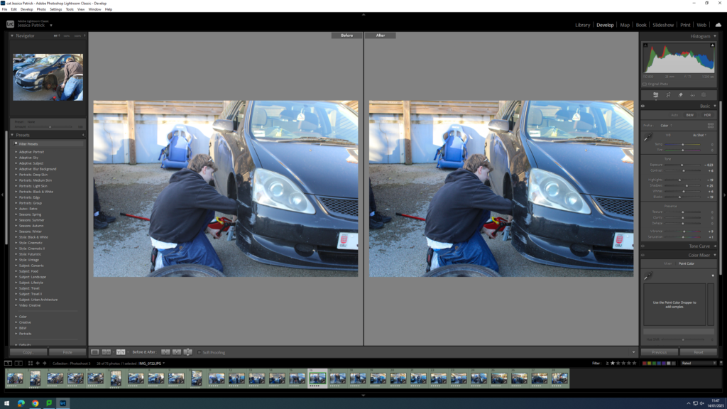
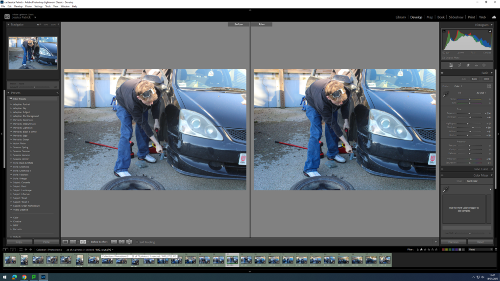
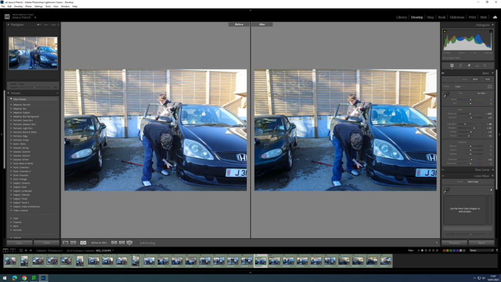
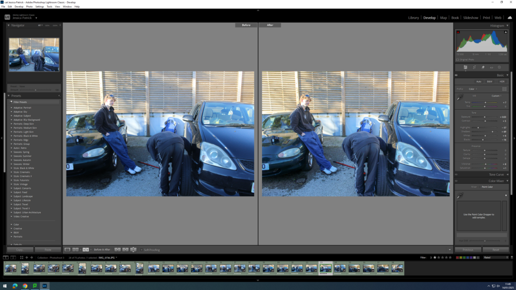
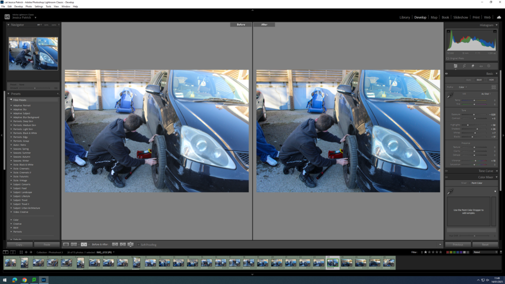
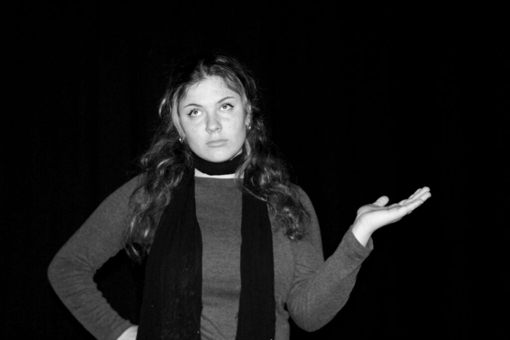
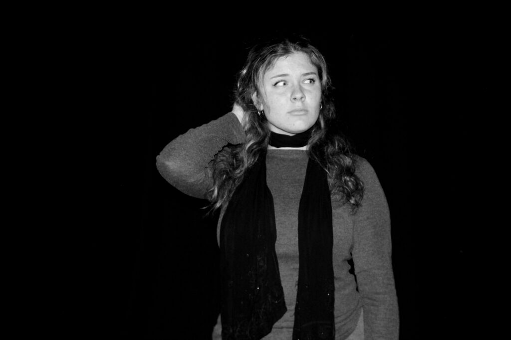
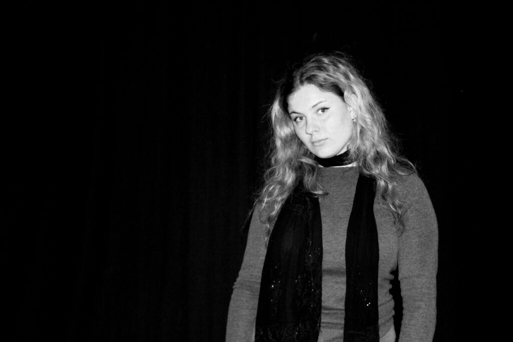
In this photoshoot I wanted to take a more masculine approach, just how Justine Kurland had the girls be more masculine in her book. I took images of my friends fixing/ adding things to there cars. This also relates to my identity and my youth, because my uncle would do this all the time when I was younger and I would watch and try to help.
Contact Sheet
The images that are highlighted green are the images I have chosen to edit, because they have the best composition and lighting.
Edits
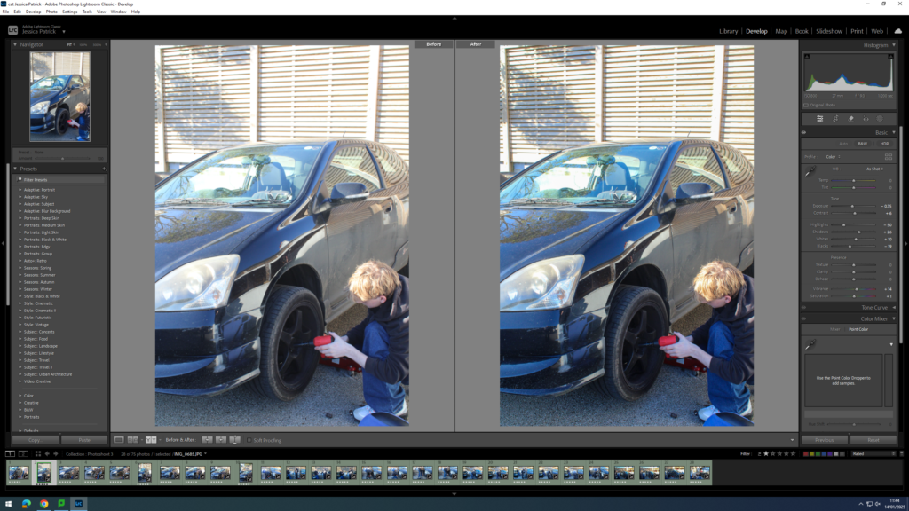
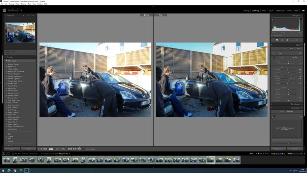
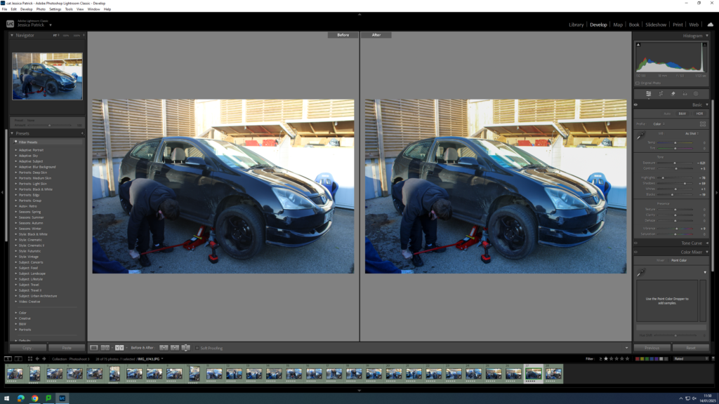
I edited this image by increasing the contrast, shadows, whites, vibrancy and saturation, while decreasing the exposure, highlights and blacks. I did this, so that the image was slightly less exposed, as the lighting was slightly too harsh, due to the sun.
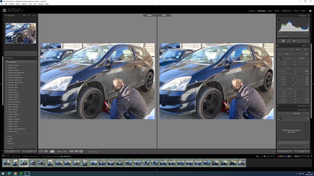
I edited this image, by increasing the contrast, shadows, whites, vibrancy and saturation, while decreasing the exposure, highlights and blacks. I did this, so that the image has better lighting and is more vibrant.
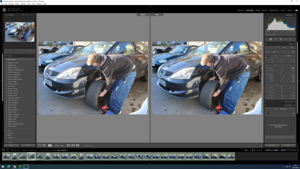
I edited this image by increasing the contrast, shadows, whites, vibrancy and saturation, while decreasing the exposure, highlights and blacks. I did this, so that the lighting was better in the image.
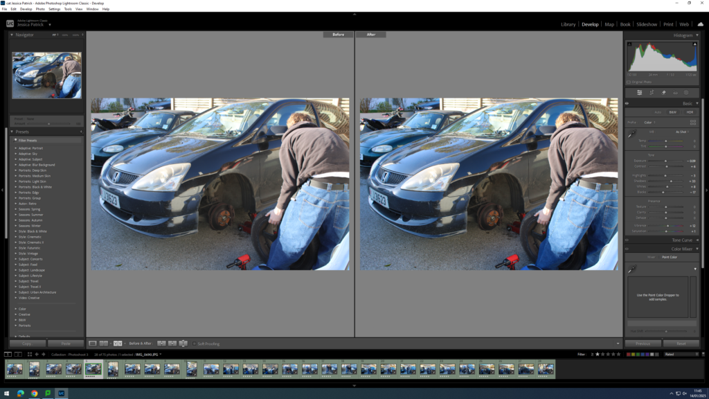
I edited this image, by increasing the contrast, shadows, whites, vibrancy and saturation, while decreasing the exposure, highlights and blacks. I did this, so that the image was more vibrant.
I edited this image, by increasing the contrast, shadows, whites, vibrancy and saturation, while decreasing the exposure, highlights and blacks. I did this, so that the image was vibrant and had better lighting.
I edited this image, by increasing the contrast, shadows, whites, vibrancy and saturation, while decreasing the exposure, highlights and blacks. I did this, so that the image was slightly less exposed.
I edited this image, by increasing the contrast, shadows, whites, vibrancy and saturation, while decreasing the exposure, highlights and blacks. I did this, so that the lighting was better.
I edited this image, by increasing the contrast, shadows, whites, vibrancy and saturation, while decreasing the exposure, highlights and blacks. I did this, so that the image is more vibrant.
I edited this image, by increasing the contrast, shadows, whites, vibrancy and saturation, while decreasing the exposure, highlights and blacks. I did this, so that the image is slightly more exposed, so that the lighting is better.
I edited this image, by increasing the contrast, shadows, whites, vibrancy and saturation, while decreasing the exposure, highlights and blacks. I did this, so that the lighting is better and the image is more vibrant.
I edited this image, by increasing the contrast, shadows, whites, vibrancy and saturation, while decreasing the exposure, highlights and blacks. I did this, so that the image was slightly more exposed.
I edited this image, by increasing the contrast, shadows, whites, vibrancy and saturation, while decreasing the exposure, highlights and blacks. I did this, so that the image is slightly more exposed.
I edited this image, by increasing the contrast, shadows, whites, vibrancy and saturation, while decreasing the exposure, highlights and blacks. I did this, so that the lighting is better.
I edited this image, by increasing the contrast, shadows, whites, vibrancy and saturation, while decreasing the exposure, highlights and blacks. I did this, so that the image is slightly less exposed, so that the lighting is better.
I edited this image, by increasing the contrast, shadows, whites, vibrancy and saturation, while decreasing the exposure, highlights and blacks. I did this, so that the image is more vibrant.
I edited this image, by increasing the contrast, shadows, whites, vibrancy and saturation, while decreasing the exposure, highlights and blacks. I did this, so that the lighting is better.
I edited this image, by increasing the contrast, shadows, whites, vibrancy and saturation, while decreasing the exposure, highlights and blacks. I did this, so that the image is slightly less exposed, so that the lighting is better.
I edited this image, by increasing the contrast, shadows, whites, vibrancy and saturation, while decreasing the exposure, highlights and blacks. I did this, so that the image has better lighting.
I edited this image, by increasing the contrast, shadows, whites, vibrancy and saturation, while decreasing the exposure, highlights and blacks. I did this, so that the image is more vibrant.
I edited this image, by increasing the contrast, shadows, whites, vibrancy and saturation, while decreasing the exposure, highlights and blacks. I did this, so that the image has better lighting and is more vibrant.
I edited this image, by increasing the contrast, shadows, whites, vibrancy and saturation, while decreasing the exposure, highlights and blacks. I did this, so that the image has better lighting.
I edited this image, by increasing the contrast, shadows, whites, vibrancy and saturation, while decreasing the exposure, highlights and blacks. I did this, so that the image is slightly less exposed and is more vibrant.
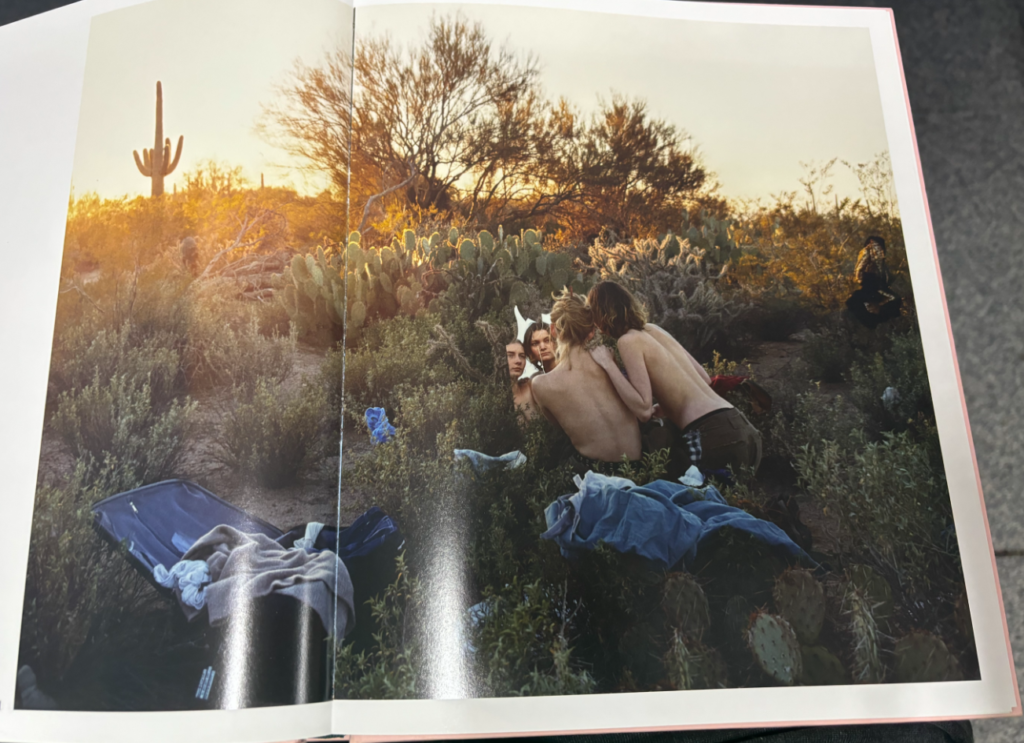
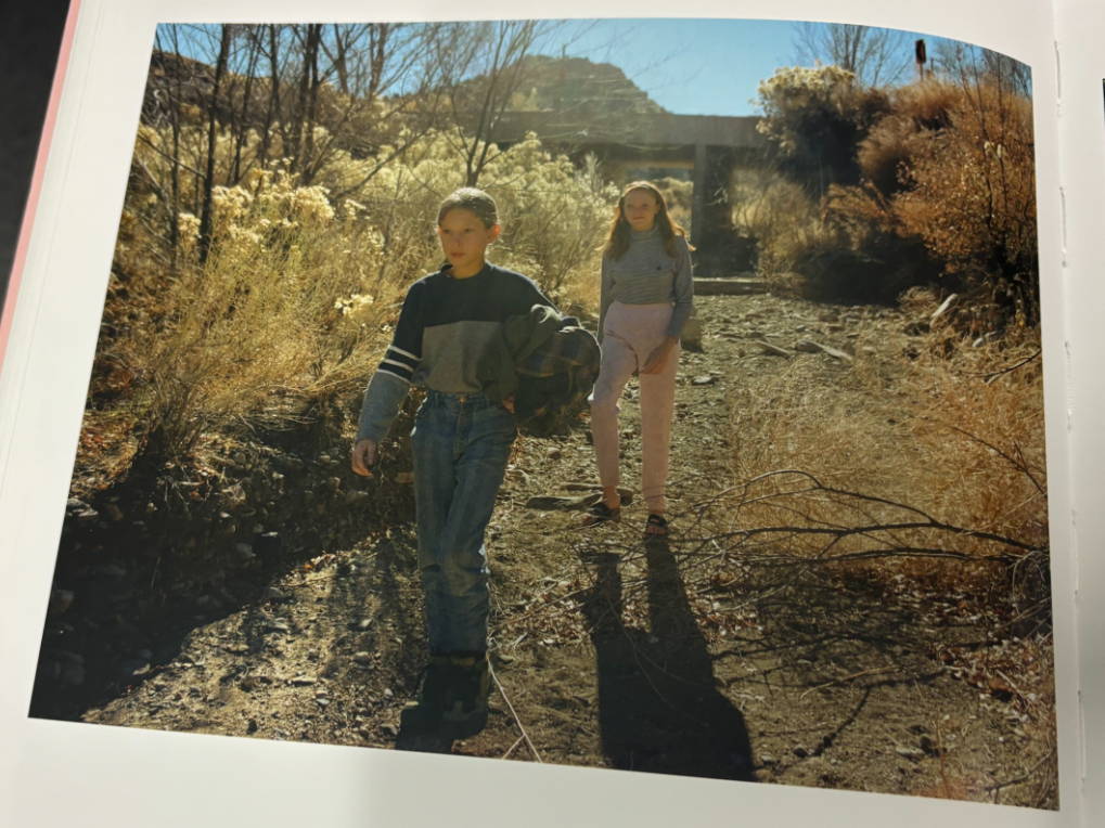
These images relate to Justine Kurland’s work, as they have a similar outdoor and more cloudy weather, rather than a bright summers day. The setting of her images is important, as it sets the story of the runaway teens, so I have experimented with a similar setting to her. However, I have also experimented with more sunny images, because in my youth I did more activities when the weather was better, so I wanted it to fit my theme of my own personal youth.
I have also tried to take on board the concept of the ‘runaway’ girls by having a bag as a prop for one of my models to reach into. The bag is all she has and is and has the contents of what she uses in her everyday life.
In Justine Kurland’s images here you can see a suitcase and a backpack, which sets the scene of the runaway girls, which is what I have tried to replicate using the bag in my photograph and the setting of the photograph. The setting of the photograph looks like a place where homeless people would go to get shelter from the cold and rain, so I thought this setting would be a good place for me to try and recreate the runaway narrative.
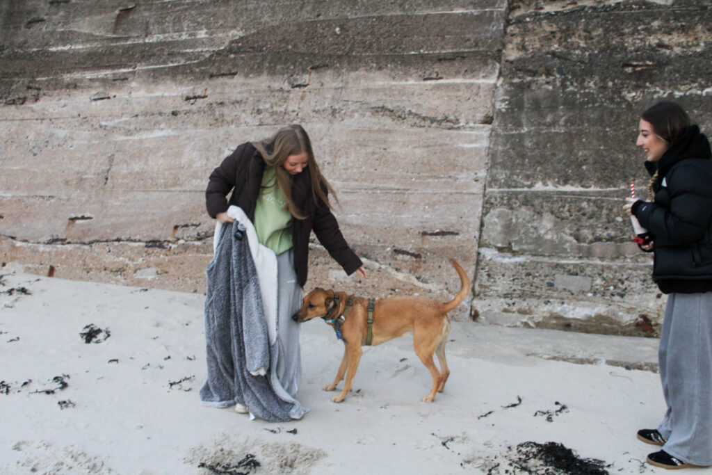
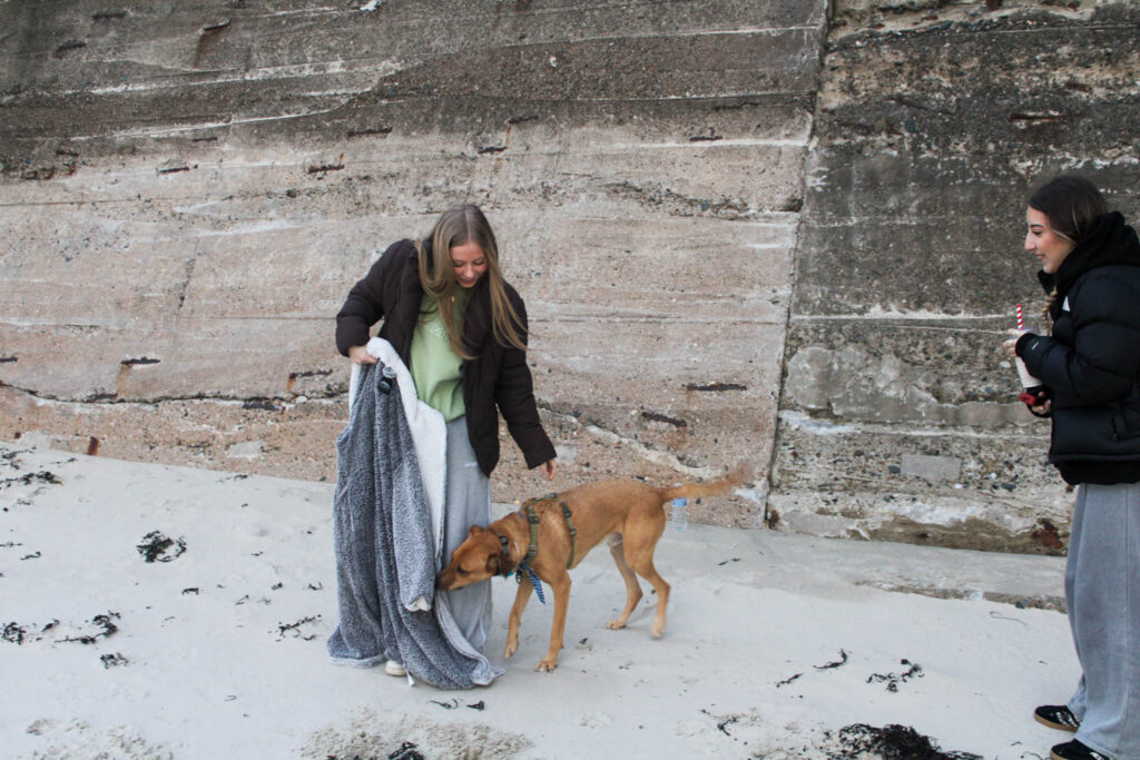
I also wanted to include my dog in the photoshoot, just how Justine Kurland had dogs in a few of her images. I also wanted to use my own dog, as I have grown up with her and she has been a part of my youth and is therefore a part of my identity.
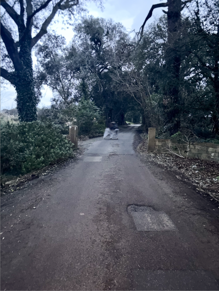
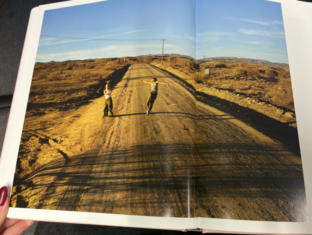
I also created a similar image to the photograph of the girls running down the road.
How does this relate to the themes of youth and identity?
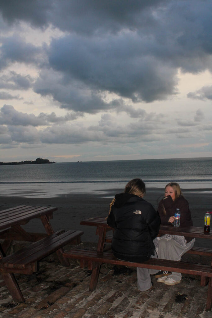
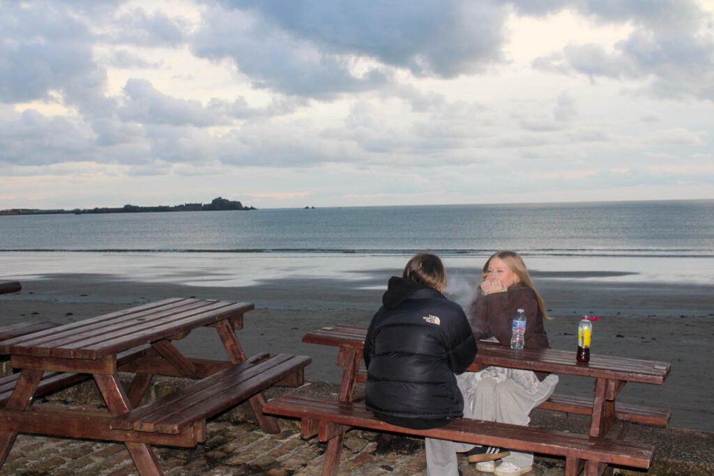
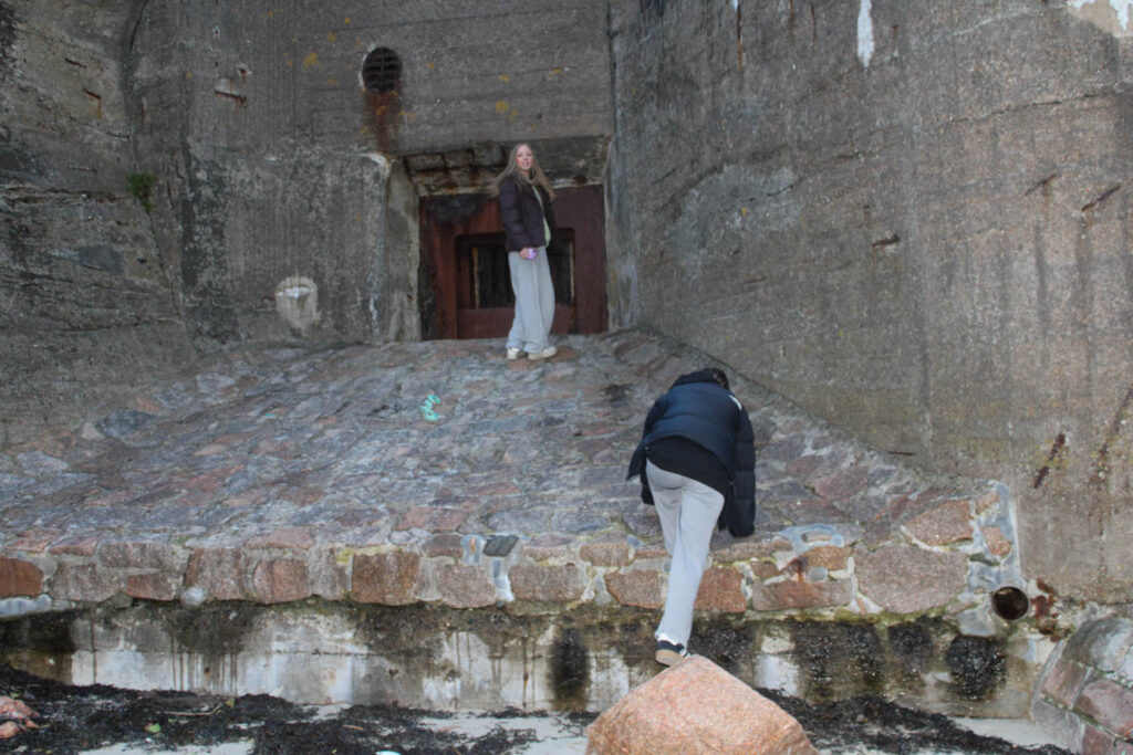
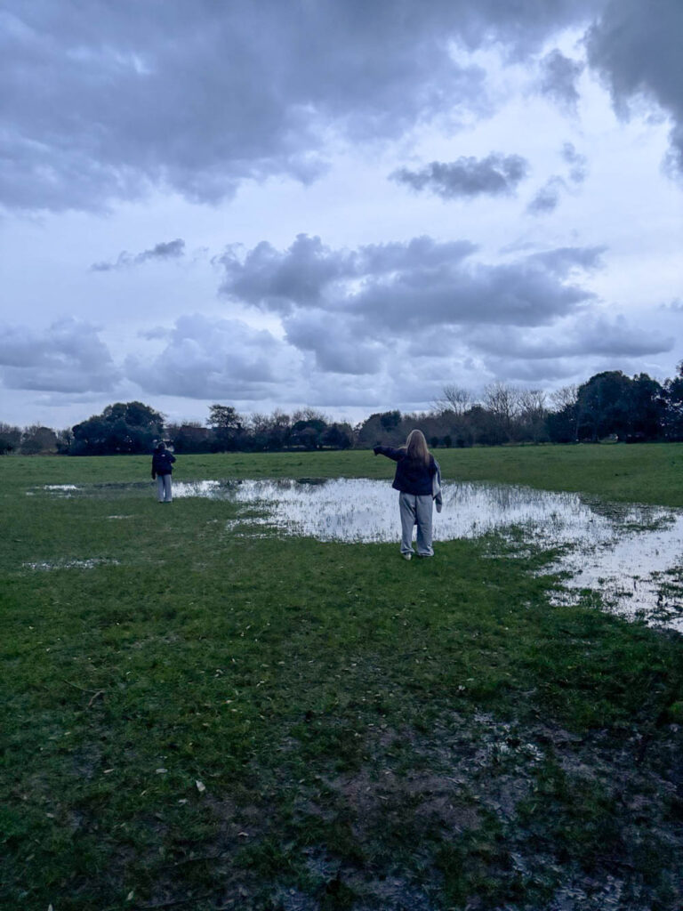
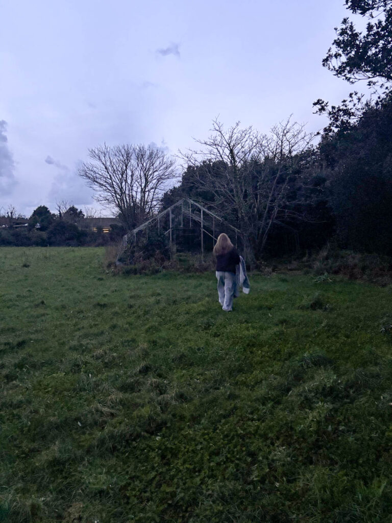
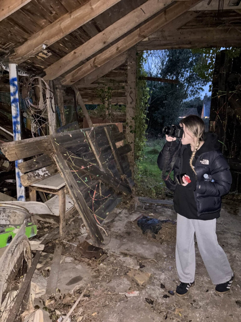
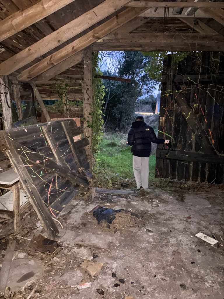
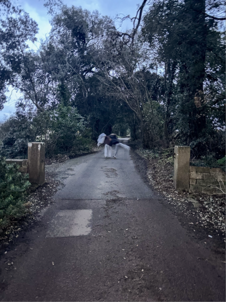
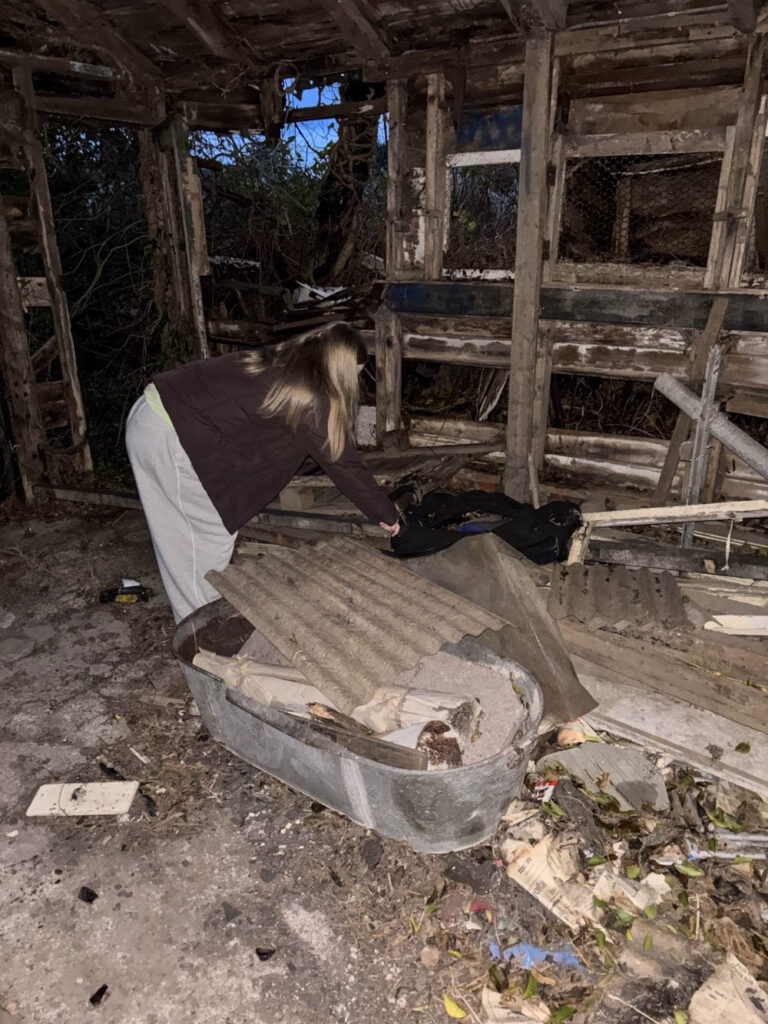
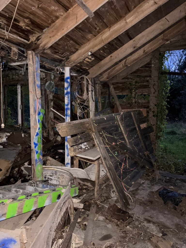
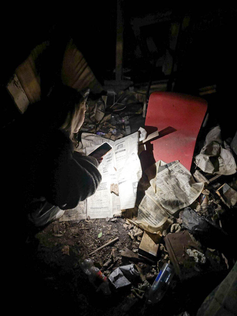
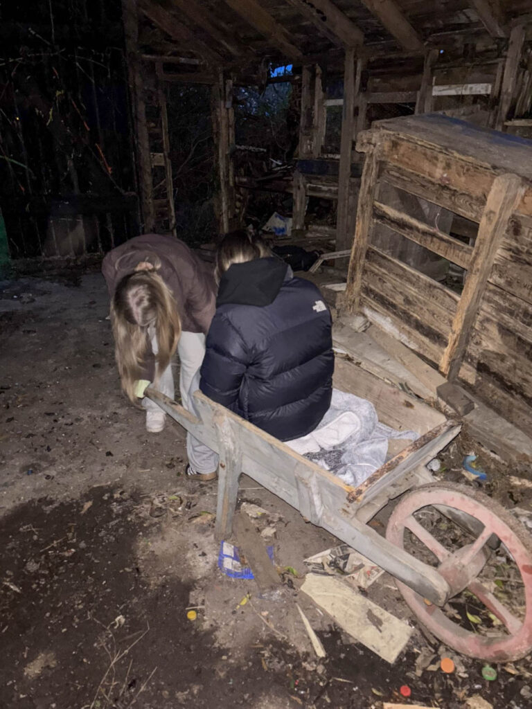
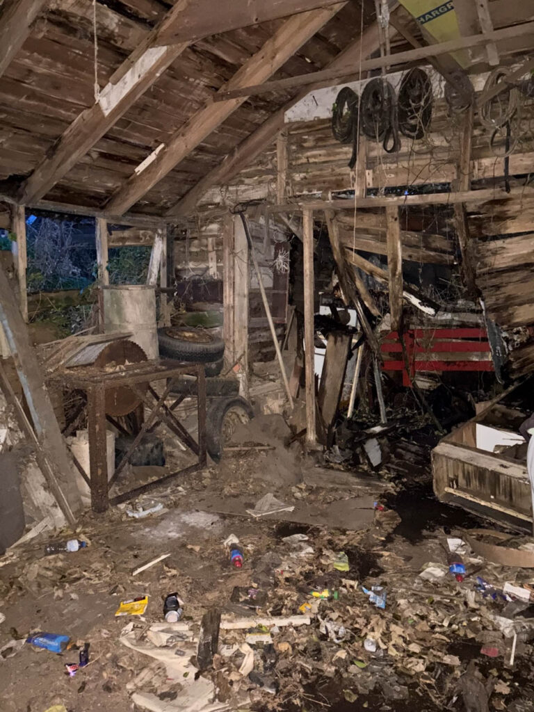
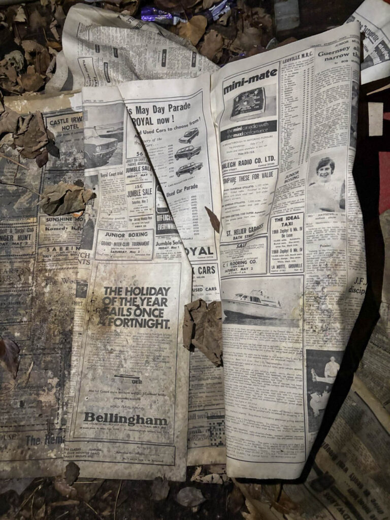
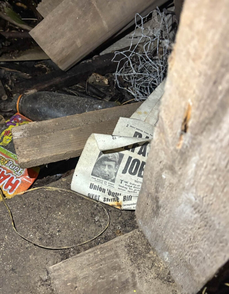
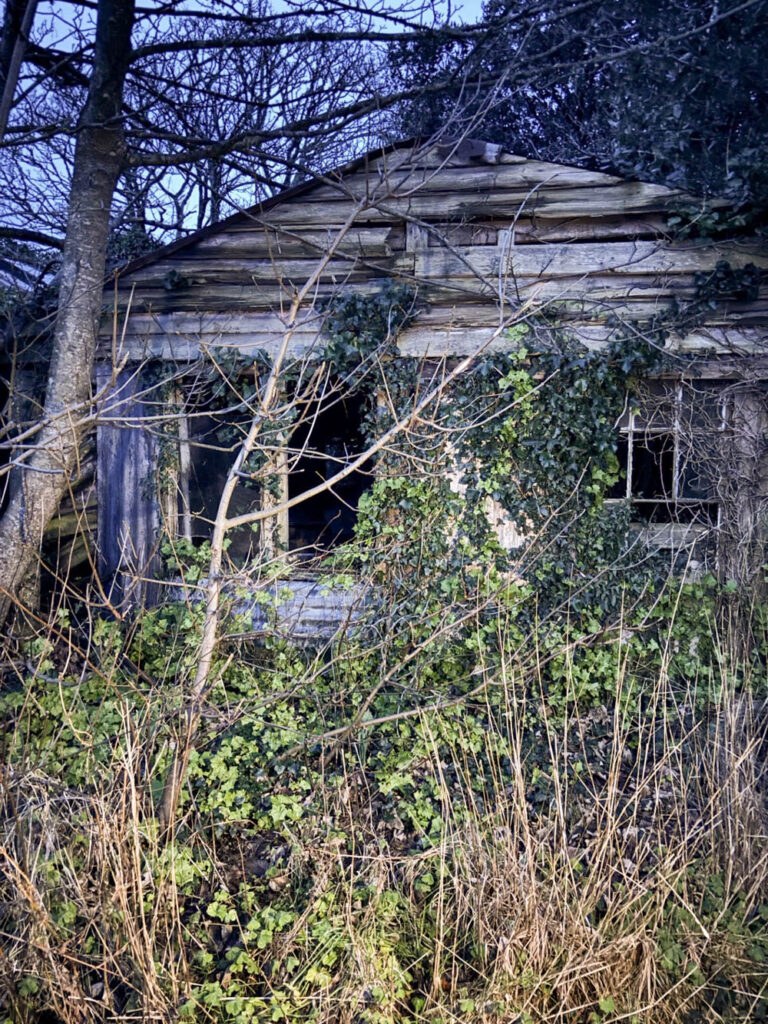
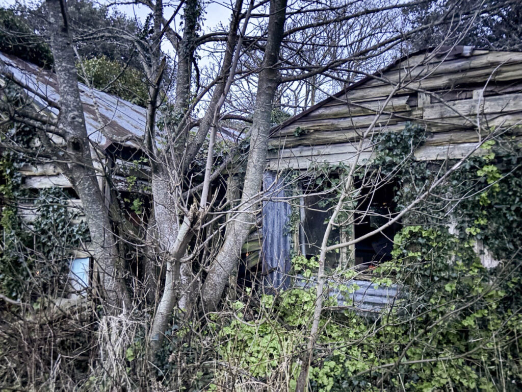
This photoshoot relates to the themes of youth and identity, specifically my youth and identity, because my models and I visited the beach next to kiosk, which is a beach I used to go to a lot when I was younger. I also still go to the kiosk quite regularly now, so it was a great place for a photoshoot for this topic. I had my subjects pose sat on the bench on the slipway, as this is where we sit during summer, as well as up on the rocks. We also visited the shed that we used to go last summer, but it is now a lot more destroyed than it used to be, probably due to the storm, so we weren’t able to sit in their, but I did manage to get some images of us exploring it now. I also managed to get detail shots of the newspapers that were left there, that date back to 1900, which we all used to look at and found very interested during our youth.
In comparison to Jeff Wall
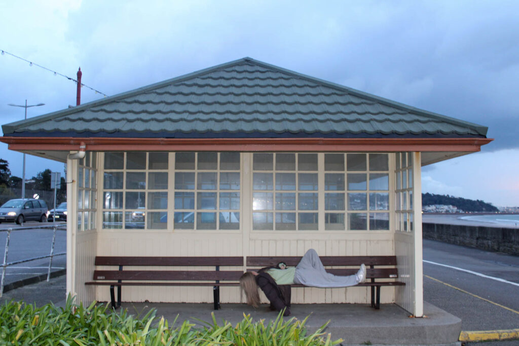
In this photoshoot I explored more simplistic narratives, similarly to Jeff Wall, such as just sitting on the beach, rather than having my subjects do more complex activities, like climbing trees etc. Instead of focusing on the narrative, I focused more on the visual elements in my photographs, just like Jeff Wall does. An example of a visual element that I focused on was texture. I displayed the texture in the photograph below by using the textured setting of the rocks. I also experimented with the tone and colour in this image as well, especially with my editing, by making it more vibrant.
Analysis of 1 Image
In this photograph there was two types of lighting used in this image, which was natural daylight, as well as the flash on my camera. I had to use two types of lighting, because it had started to get dark when these photographs were being taken. There were also high levels of control in this photo, as I manipulated my subjects, as well as the location and distance I was from my subjects. I did this in order to create the best composition I could. However, I had little control over the setting and the lighting, due to it being a natural environment. There are also a lot of darker tones in this image, due to the darker lighting, but because of the camera flash there were some lighter tones, especially in the clouds, which created contrast between the setting and the subjects.
There are also lots of neutral colours in this image, such as grey, blacks, white and beige, so this image isn’t very vibrant. There is also quite a bit of texture in this image, which can be seen in the shapes of the clouds and the footprints left in the sand, which gives the image a more 3D sense. The main viewpoint of this image is the two subjects in the centre of the frame in the foreground of the image.
F Stop: f/4
Exposure time: 1/60 sec
ISO: ISO-800
This image is similar to one of Justine Kurland’s images from ‘Girl Pictures,’ where two subjects are running down a road. My image relates to the themes of youth and identity, specifically my youth and identity, because I used to visit Kiosk beach and sometimes still do with my friends, which is where the setting of this image is, so this image presents my identity, because it presents a part of who I am and what I enjoy doing in my free time.
Photoshoot Conclusion
Overall, I think this photoshoot went well, because I was able to take images with my subjects, as well as being able to take landscape and detailed images, such as the images taken of the newspapers. This will allow me to be able to have a range of differing images in my photo book, so I can have a more aesthetic layout.
I was also able to explore more activities I did in my youth, or still do, which also allowed me to explore my identity during my youth and my identity and how it has changed now. I also got to experiment with my composition a little bit, by positioning and directing my subjects. However, I would like to experiment with that some more.
In this photoshoot I was also able to experiment with my camera skills, including adjusting my exposure, as it continues to get darker and experimenting with shutter speed to create movement in a few selected images.
In my next photoshoot, I would like to experiment with compositional elements a lot more, such as rule of thirds and more visual elements, such as tone and texture etc. I also want to include more compositional methods that Jeff Wall has used in some of his photographs. Next time, I would also prefer to take photographs earlier on in the day, so it is not as dark, so that the lighting is better in my photos, as I would not need to use the flash.
Both contemporary aspects of photography; documentary and tableaux, are paramount for encapsulating a specific scene which conveys a particular time frame in history. Although, the two photographic techniques maintain a common purpose, the method behind using one is a completely different prospect
Essay plan
Introduction (250-500 words)
This essay discusses and compares two aspects of photography; documentary and tableaux, in their unique ability to entice and seduce the viewer to comprehend the story that is being told. Both photographic methods attempt to convey a story in a historical timeframe; documentary photography is often used in reportage (Tate Gallery) in comparison a photograph that uses tableaux can feel pre-planned and hence reproduced. Although, the two techniques maintain a common purpose, the method behind each one is completely different. More recently it has been argued that some photographers such as Tyler Mitchell and Justine Kurland fuse together both the real with the imaginary.
Essayintroduction: convert draft introduction to final version.
Think about an opening that will draw your reader in e.g. you can use an opening quote that sets the scene. Or think more philosophically about the nature of photography and its feeble relationship with reality.
You should include in your introduction an outline of your intention of your study, e.g.
What are you going to investigate?
How does this area/ work interest you?
What are you trying to prove/challenge, argument/ counter-argument?
Whose work (artists/photographers) are you analysing and why?
What historical or theoretical context is the work situated within?
What links are there with your previous studies?
What have you explored or experimented with so far in your photography project?
How will your work develop.
What camera skills, techniques or digital processes have you used, or going to experiment with?
Below is link to a blog post which will provide you with helpful guidelines if you are struggling to structure your essay or writing paragraphs.
What is documentary photography? Photographing people, events, places etc to create an accurate record or story. Traditionally for highlighting issues and for promoting change (Tate reference). However it can also be used as an art form. It is similar to, though not the same as reportage photography.
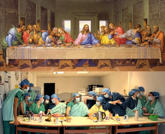
What is Tableaux photography? Tableaux photography is staged, often posed, people in the photographs may be wearing costumes, props may be used along with artificial lighting to create a scene. Tableaux photography is an evolution from art, for example Renaissance paintings depicting scenes from the bible or mythology. People in tableaux photographs are staged such that they appear to be absorbed in their actions or surroundings and unaware of the photographer. (Tate and felix pilgrim).
Above – Last Supper painting by Leonardo da Vinci and tableaux by doctors at a hospital in Paris during the Covid pandemic (artnews.com)
How are they similar/dissimilar?
Documentary supposed to show ‘reality’, whereas tableaux is artificial and posed
Documentary used to record events and can be used to try to influence (for example depression era photographers such as Dorothea Lange (smythsianmag.com)) whereas tableaux is often for artistic purposes, but may also be used for social or political purposes.
Subjects in documentary may or may not be aware that the photograph is being taken, however if they are aware there is a possibility their expression and stance may be influenced by the photographers presence (niemanreports.org). Subjects in tableaux are, by definition, aware they are being photographed, and may be instructed by the photographer to pose in a particular way.
Use information gathered in previous blog posts, or use hyperlinks below, in relation to Art Movement and Isms relevant to your artists references and their work.
Select at least two quotes from your literary sources that you can incorporate into your paragraph.
Your paragraph must include visual examples of artists work within that art movement that is relevant to your Personal Study.
Consider content and instructions below
Complete Paragraph 1 and upload to the blog at the end of lesson
Paragraph 1 Structure (500 words): Use subheading. This paragraph covers the first thing you said in your introduction that you would address.The first sentence introduces the main idea of the paragraph. Other sentences develop the subject of the paragraph.
Content: you could look at the following…exemplify your hypothesis within a historical and theoretical context. Write about how your area of study and own work is linked to a specific art movement/ ism. Research and read key text and articles from critics, historians and artists associated with the movement/ism. Use quotes from sources to make a point, back it up with evidence or an example (a photograph), explain how the image supports the point made or how your interpretation of the work may disapprove. How does the photograph compare or contrast with others made by the same photographer, or to other images made in the same period or of the same genre by other artists. How does the photograph relate to visual representation in general, and in particularly to the history and theory of photography, arts and culture.
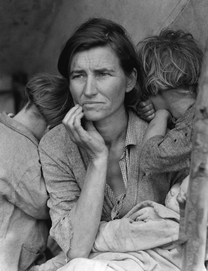
Above Dorothea Lange ‘Migrant Mother’ – example of documentary photograph taken during the Great Depression in USA during the 1930s. The composition draws your eye to her face, which is tired and shows she is worn out.
Paragraph 1 structure (use subheadings) (historical and theoretical context- how is your area of study links to the specific art movement- read key texts from critics, historians and artists, us quotes, evidence back up if can with photo. Explain how image supports the point made, how does the photo compare/contrast .
First photographer (put one of two or own pictures too)
Tom WoODS
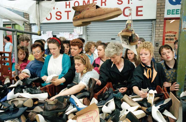
Tom Woods became known as the ‘Photie Man’ as he was often seen around Liverpool and Merseyside in the 80s and 90s taking photographs of the people and events he observed around him. studiointernational.com. Tom Wood’s approach was to document everyday life, normally through candid, street, photography, although in some of his photographs his subjects were aware he was photographing them. Interestingly he says that he is not a documentary photographer, although this is what he has undeniably done: ‘I’m not trying to document anything ….. I’m only interested in good pictures, if it’s a document then it’s a bonus’.
Above – Tom Woods ‘Finding a Pair’ – photograph of women at a second hand shoe stall. use of classic ‘rule of thirds’ composition
Second photographer (put one of two or own pictures too)
paul M smith
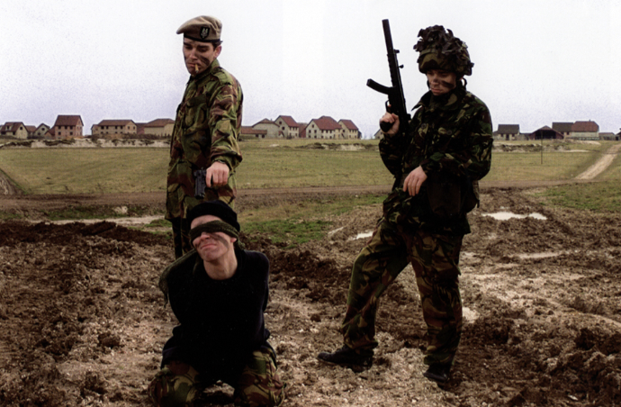
Paul M Smith is a British photographer who has produced several sets of images on the theme of masculinity. While his photographs appear to have the theme of documentary they are actually posed, and a large amount of effort has gone into capturing and editing the images in which, he, is often the only person in the photographs. Thus making these tableaux photographs.
It is interesting to juxtaposition images from his ‘Artist Rifles’ series alongside Robert Capa’s iages from taken during the Spanish civil war. In Artist Rifles Paul M Smith takes self portraits of himself dressed as different soldiers and uses digital photomontage to create fictional military scenes (some of which are relatively graphic, such as execution and burials).
Above Paul M Smith photograph taken as part of his Artist Rifle series. In this photograph each of the soldiers is posed by Paul M Smith himself and the image put together as a photomontage. While having the appearance of a documentary image, it is entirely posed and fictional.
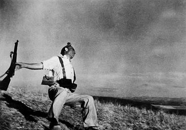
Robert Capa was a war photographer who documented the Spanish Civil War and the Second World War, was an acclaimed documentary photographer. One of his most famous images depicts the shooting of a soldier in 1936. A number of claims have been made that Capa’s description of the location where false and the photograph is likely to have been faked. Nytimes.com.
Between the posed images by Paul M Smith and the documentary footage (perhaps posed?) by Robert Capa, the clear definition between documentary and tableaux is blurred. “Art is always manipulation, from the moment you point a camera in one direction and not another,” (Spain’s culture minister, the film director and screenwriter Ángeles González-Sinde) (nytimes.com)
Above Robert Capa’s The Falling Solider, an image taken during the Spanish Civil war in 1936. Supposedly taken exactly at the time the soldier was shot, however there has been controversy over the accuracy of this picture.
neil leifer- sports documentary
Neil Leifer has been documenting key sporting events in America for 60 years and is responsible for many classic sporting images (nielleifer.com). His style is primarily documentary and portraiture. He has taken many posed photographs of famous sports personalities however it is his documentary photographs that this essay will focus on.
Neil Leifer puts his success down to luck and being in the right place at the right time, however he also emphases the need to recognise that a great shot is there and grab it, even when it may be fleeting: “what separates the top photographers from the run-of-the-mill photographers is that when you get lucky a good photographer doesn’t miss.” (npr.org).
One of Neil Leifer’s successes has been getting the camera in the right spot. He says this takes time and planning. For his famous shot of Ali v Williams boxing match at the Houston Astrodome in November 1966 he arrived four days before the match to set up and test his remote camera mounted in the rafters. He then took the film to the developers and waited for it to be processed “most photographers don’t hang around the magazine’s photo labs, but I would go to make sure they didn’t mess up my film”. (theguardian.com/artanddesign)
So for sports documentary it is important to be think ahead and plan and to control what you can, however it is equally important to be constantly on the lookout for ‘the shot’ and ensure you do not miss it.
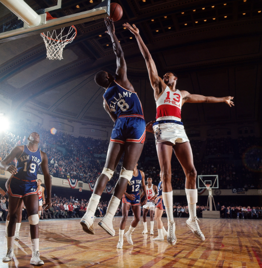
Philadelphia 76ers center Wilt Chamberlain shoots over Walt Bellamy of the New York Knicks during a game at Convention Hall. Philadelphia, Pennsylvania. March 1966 (neilleifer.com)
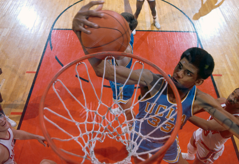
Aerial of UCLA center Lew Alcindor (later known as Kareem Abdul-Jabbar ) rebounding during the 1967 NCAA National Championship game against Dayton at Freedom Hall.Louisville, Kentucky. March 25, 1967. (neilleifer.com)
Miami Heat center Shaquille O’Neal goes up against Antonio McDyess and Ben Wallace of the Detroit Pistons during Game 5 of the 2005 NBA Eastern Conference Finals at American Airlines Arena. Miami, Florida. June 2, 2005. (neilleifer.com)
George McGinnis of the Philadelphia 76ers drives to the lane versus Paul Silas of the Denver Nuggets at The Spectrum. Philadelphia, Pennsylvania. March 9, 1977. (neilleifer.com)
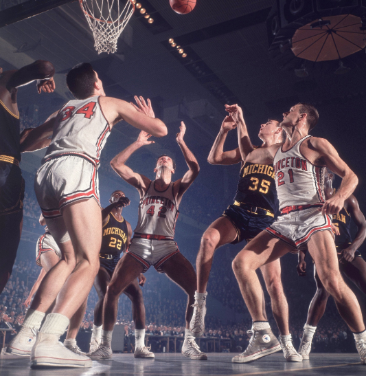
Bill Bradley of Princeton University waits for a rebound during a 1964 ECAC Holiday Festival game versus Michigan at Madison Square Garden. New York, New York. December 30, 1964. (neilleifer.com)
Conclusion
COMPARING THE IMPACT OF DOCUMENTARY VERSUS TABLEAUX PHOTOGRAPHY IN TELLING A STORY
both used for telling a story, documentary should be ‘genuine’ whereas tableaux is fictional, but can be used to recreate past events
what is the impact of the subjects knowing there is a photographer present? Does this affect the outcome and impact the documentary photograph?
What if a documentary photograph, claiming to be real, is considered to be fake or influenced by the presence of the photographer?
The best documentary photographs can still require time with planning and control over the process.
Documentary photographers need to be able to rapid assess what is happening in front of them and be able to identify when a great shot is available and grab it.
When photographing tableaux the photographer will normally have more time to set up the shot, and has the benefit of being able to repeat, or change the shot to achieve the desired outcome.
Things to add:
A few of my own photos
Explain why a tableaux photo or documentary photo is better using examples from photos
Find a good quote using blog
Why are telling stories so important to humans – plutons cave paintings
1. Write a book specification and describe in detail what your book will be about in terms of narrative, concept and design with reference to the same elements of bookmaking as above.
Narrative:What is your story? Describe in:
3 words – Plants, wilting, light
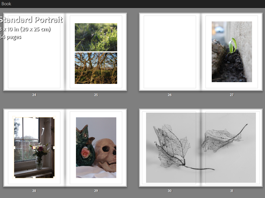
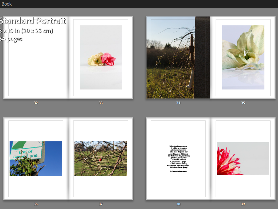
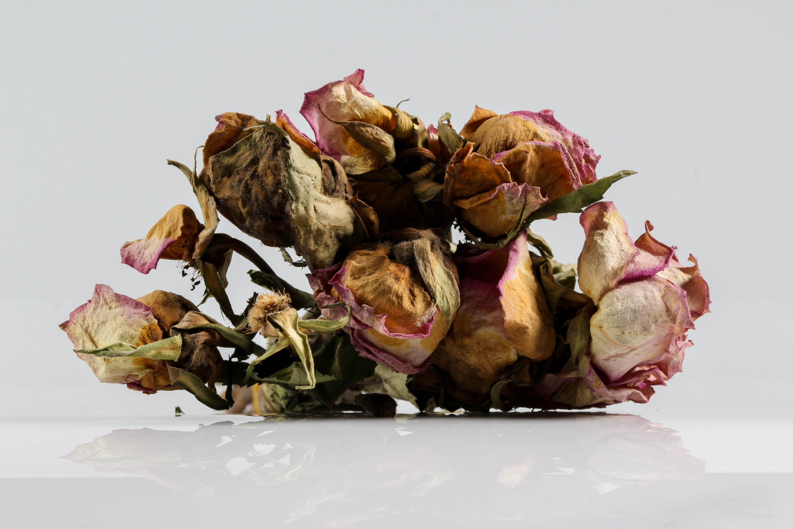
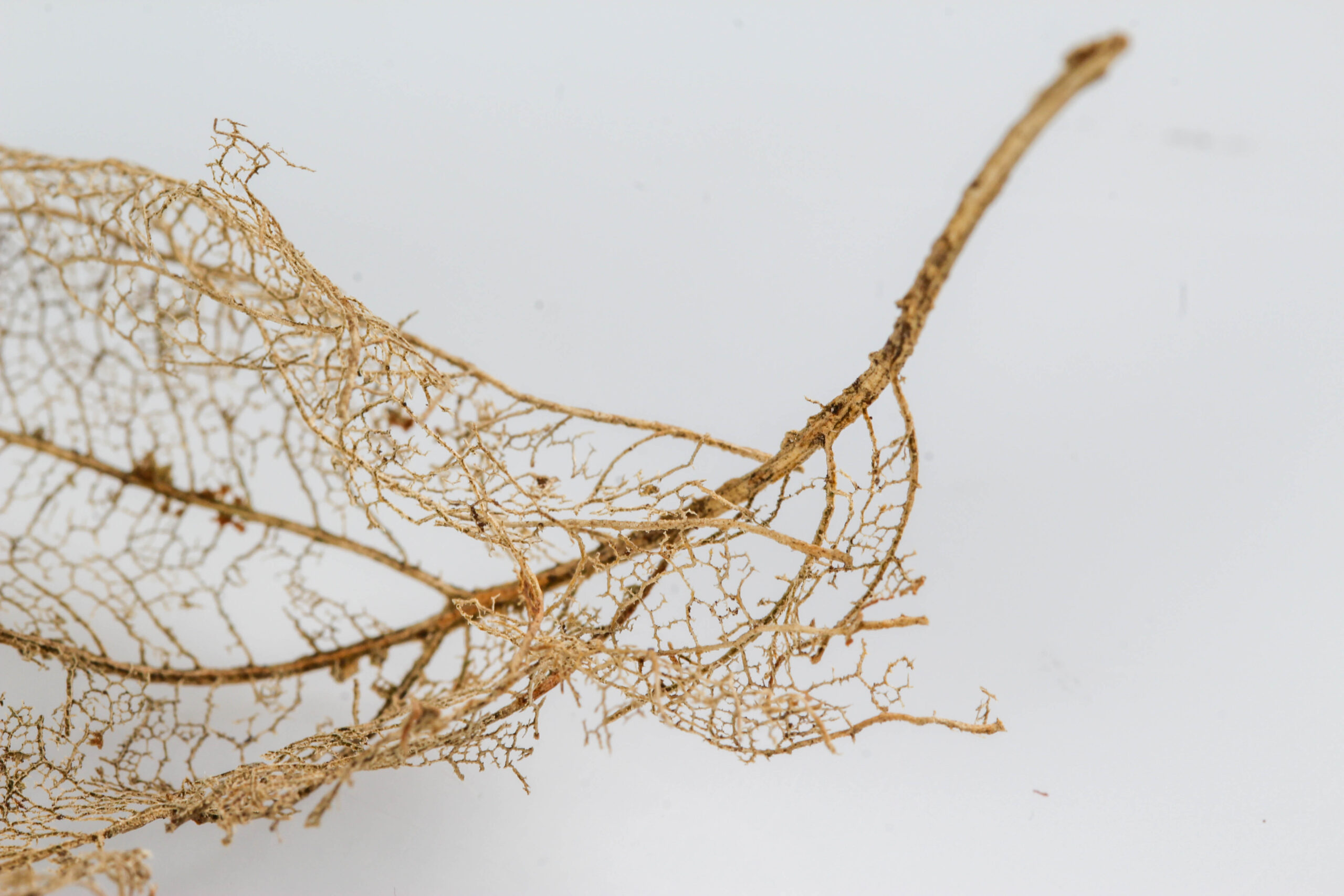
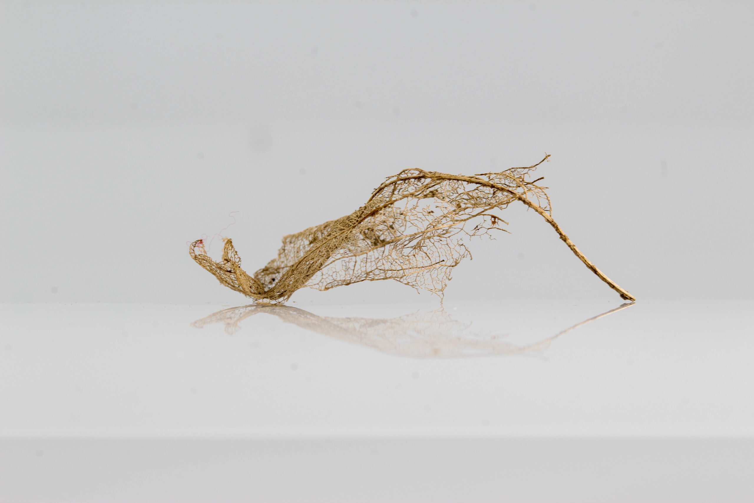
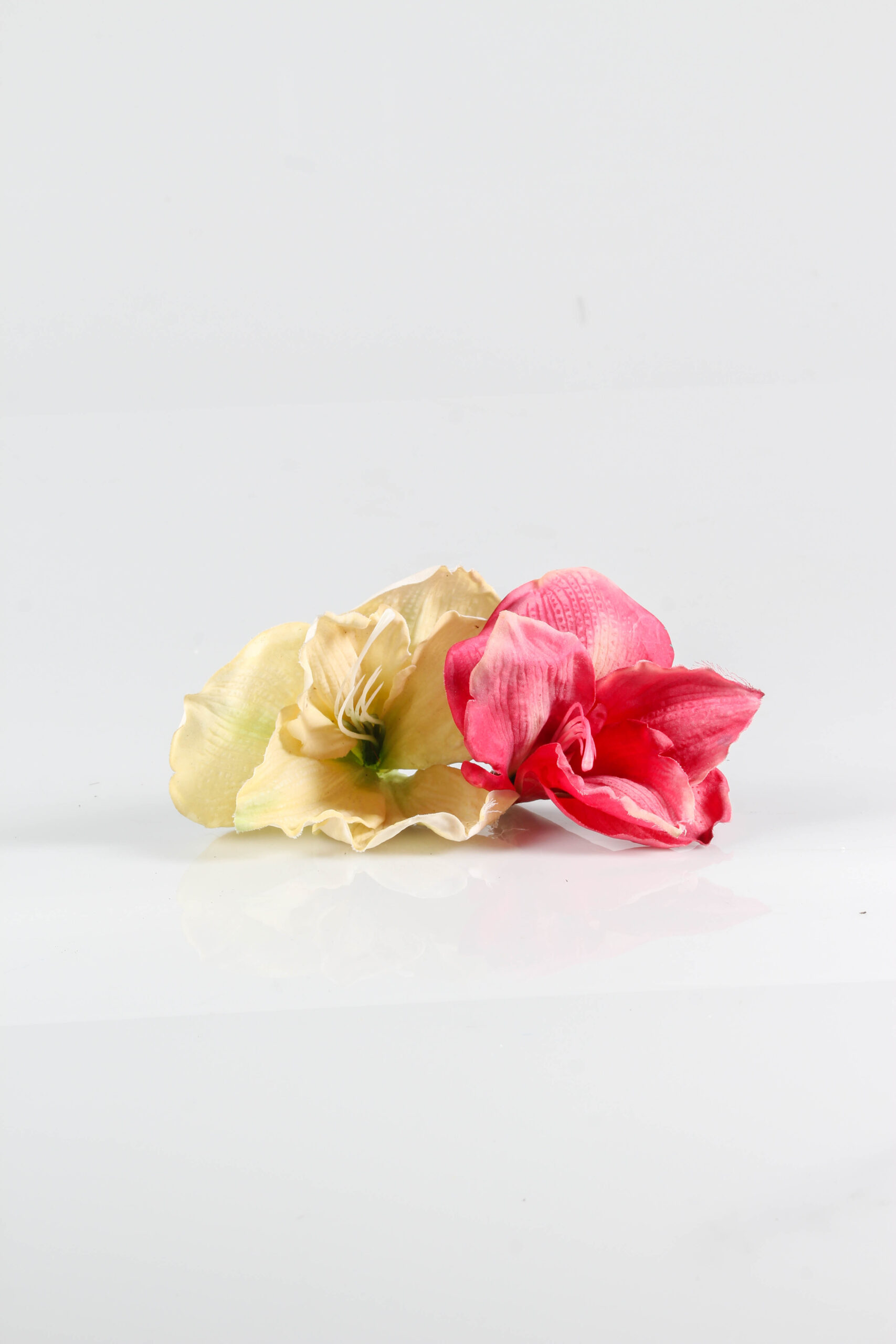
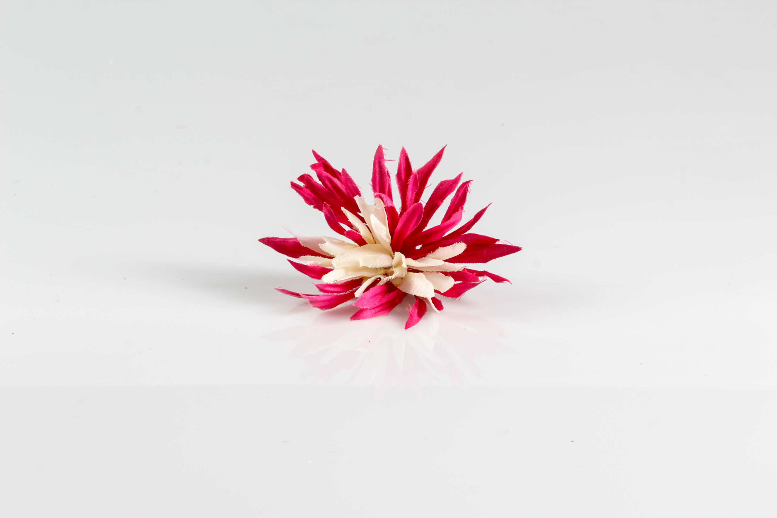
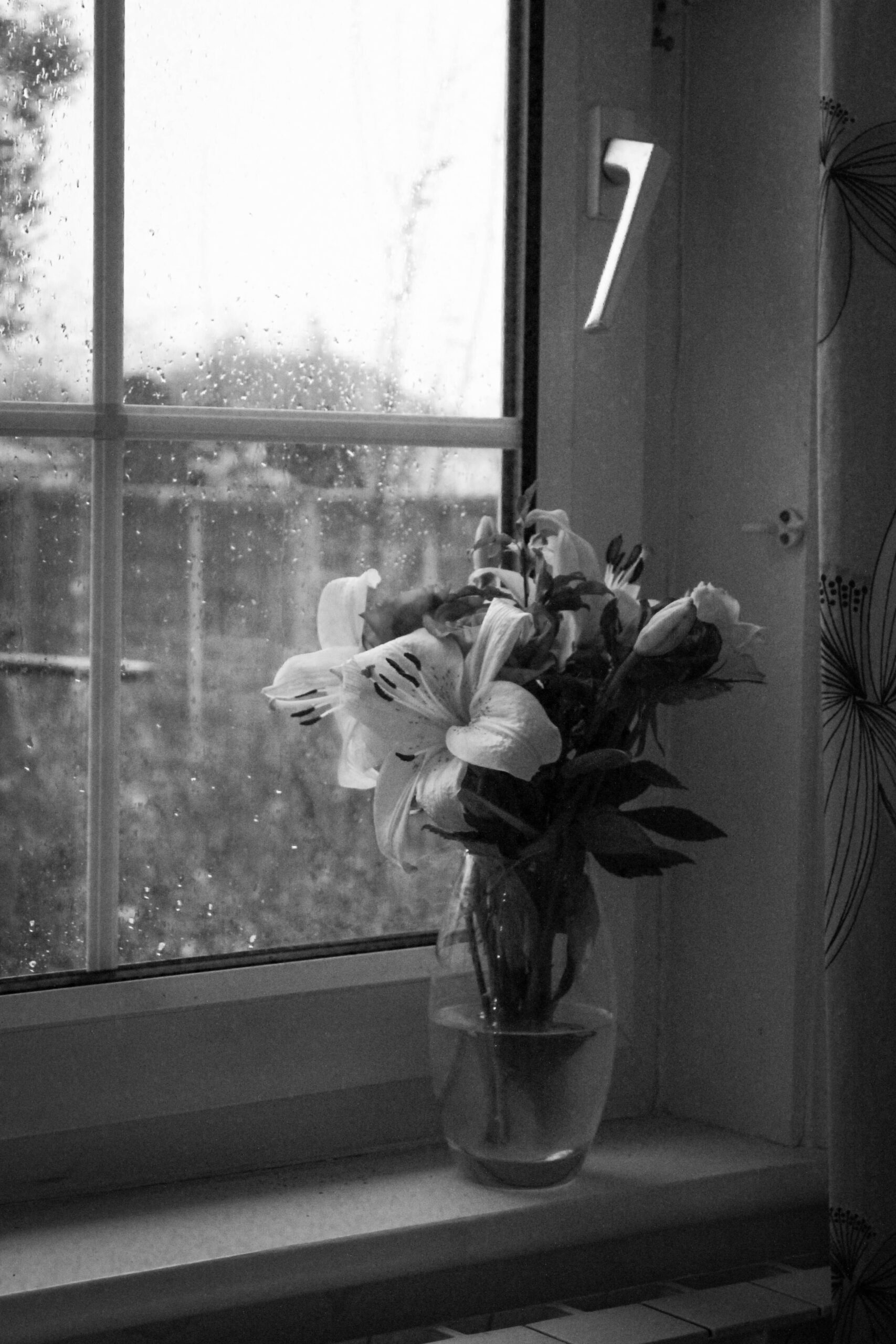
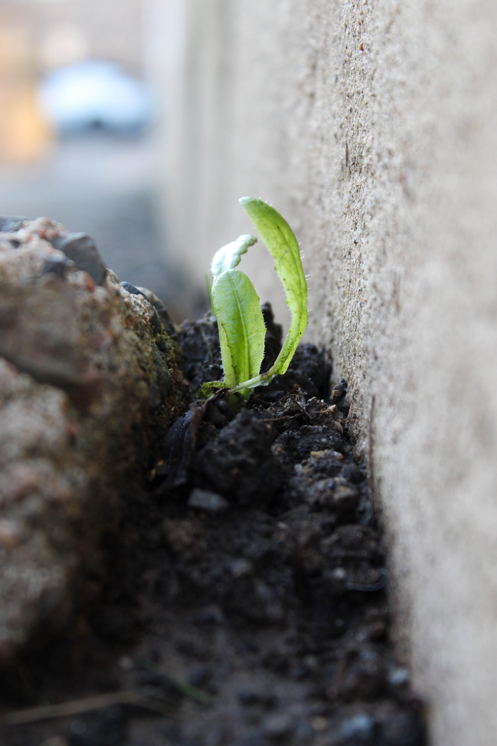
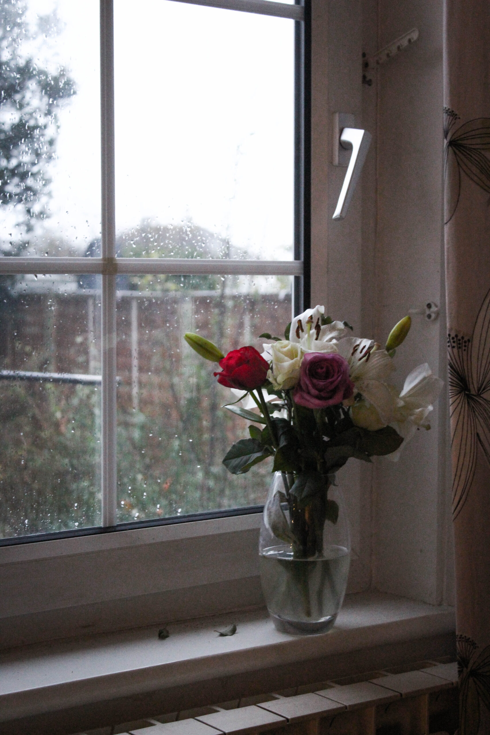
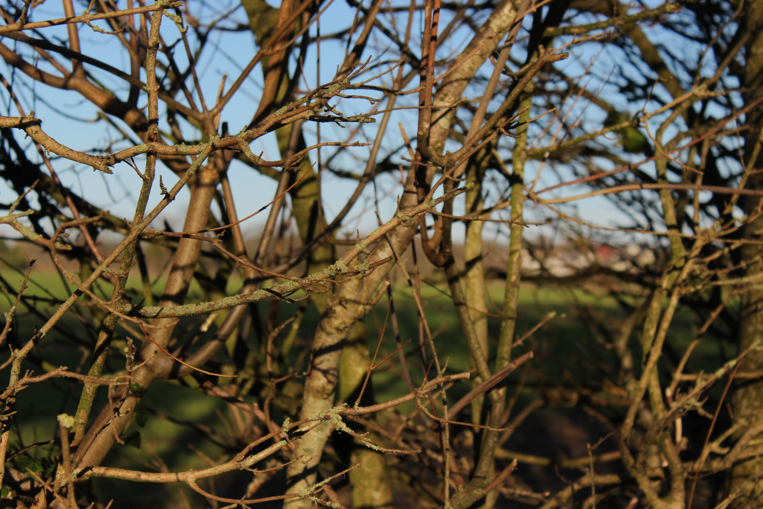
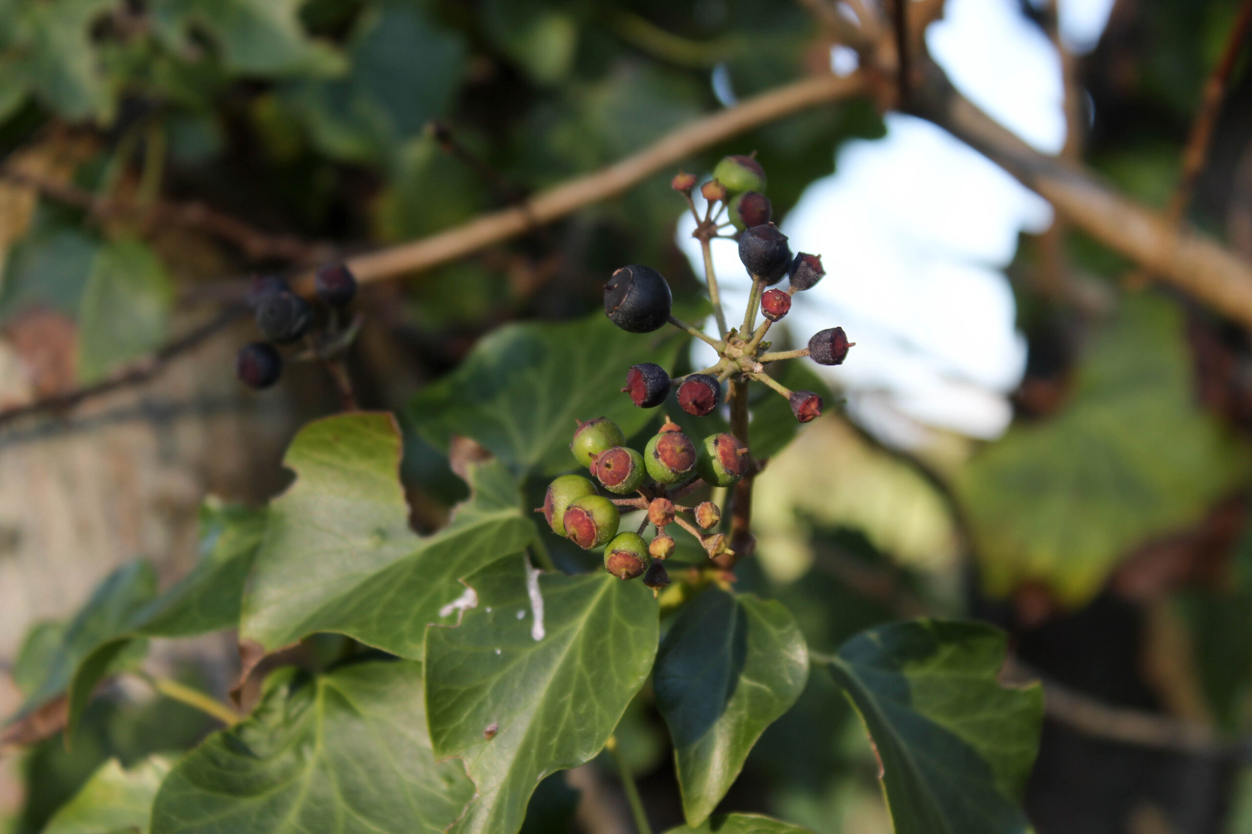
A sentence – My photobook contains pictures of plants, such as trees, flowers and moss, some of which are wilted or dead, and light.
A paragraph – My photobook contains images of flowers, trees, moss and light, these images have a poetic quality to them. The original idea was to explore the idea of floriography, a communication system the goes back to the Victorian era, in which every flower has a meaning. This idea has expanded into a exploration of nature in jersey . It takes you from a vase on a window sill on a rainy day to light shining through the trees and, catching itself on dew and stings of cobwebs strung between branches.
Design: Consider the following
How you want your book to look and feel
Paper and ink
Format, size and orientation
Binding and cover
Title
Structure and architecture
Design and layout
after some time I decided I didn’t like this and changed it around.
Editing and sequencing
Images and text
Images
Texts
“I hear leaves drinking rain; I hear rich leaves on top Giving the poor beneath Drop after drop; ’Tis a sweet noise to hear These green leaves drinking near. And when the Sun comes out, After this Rain shall stop, A wondrous Light will fill Each dark, round drop; I hope the Sun shines bright; ’Twill be a lovely sight.” By W. H. Davies
“A yellow flower (Light and spirit) Sings by itself For nobody. A golden spirit (Light and emptiness) Sings without a word By itself. Let no one touch this gentle sun In whose dark eye Someone is awake. (No light, no gold, no name, no colour And no thought: O, wide awake!) A golden heaven Sings by itself A song to nobody.” By Thomas Merton
“A bursting into greenness; A waking as from sleep; A twitter and a warble That make the pulses leap: A watching, as in childhood, For the flowers that, one by one, Open their golden petals To woo the fitful sun. A gust, a flash, a gurgle, A wish to shout and sing, As, filled with hope and gladness, We hail the vernal Spring.” By Henry Gardiner Adams
“I came to the mountains for beauty And I find here the toiling folk, On sparse little farms in the valleys, Wearing their days like a yoke. White clouds fill the valleys at morning, They are round as great billows at sea, And roll themselves up to the hill-tops Still round as great billows can be. The mists fill the valleys at evening, They are blue as the smoke in the fall, And spread all the hills with a tenuous scarf That touches the hills not at all. These lone folk have looked on them daily, Yet I see in their faces no light. Oh, how can I show them the mountains That are round them by day and by night?” By Jessie B. Rittenhouse
2. Produce a mood-board of design ideas for inspiration. Look atBLURB online book making website, photo books from photographers or see previous books produced by Hautlieu students on the table in class.
‘The duty thus falls upon the snapshooter not to just ‘save’ moments, but to ‘immortalise’ the people who they photograph’ Stephen Bull, Photography 2009
The notion of family is a theme that is closely exhibited within photography from a multitude of perspectives, ranging from the demonstration of healthy relationships, to more negative storytelling through nostalgic cues, being that ‘a photograph can be a site for conflicting memories’ Kuhn (2003:397).Photographers like Yury Toroptsov and Philip Toledano use conceptual methods in their work in order to implicitly give away clues about the events of their childhood. These events are centred around the memory and loss of immediate family, as well as attempts to transform an emotive notion into singular images, for example a visual representation of an intangible feeling. Indexicality is abundant when memorialising family members who have passed away as it conceptualises that the “taking” of a photograph can be thought of as “pointing” to something in the world, being that these photographs are closely related to presence and absence, memory, the past and death. My personal study focuses on the difficulties and struggles of growing up with a family member who, over time, deteriorates from gaining a mental illness, this being my brother who has Bipolar disorder. The family album has been developed in congruency with advancements in technology in order to pass down generational stories in order to commemorate them to serve as souvenirs of the past. My interest stems from how these tributes to past events can be used to evoke emotional stories of personal difficulties.
I find an analysis of Toroptsov and Toledano to be most appropriate here as my work resonates with theirs in a relative manner, allowing me to convey the difficulties of grieving someone who is still alive yet not who they once were. A dominating factor, however, lies in the direct contrast between Toledano’s project of When I Was Sixagainst Toroptsov’s work entitled Deleted Scene. Toledano’s project inhabits a dark tone throughout the photobook where he depicts archival material from his older sister’s life, Claudia, before she died in childhood, and characterises these images through ethereal dream-like images in between to represent disorientated emotions. I found that his still-life images of childhood keepsakes of which belonged to Claudia were able to create tension within his storytelling which is what I aim to do in my own work in order to depict life before my brother fell unwell to enable my viewer to follow the narrative in a chronological way and learn of a vulnerable perspective. Additionally, I wanted to interpret his ethereal images, which can be seen to resemble fluidity of emotion, into a more domestic setting by using a relatively low exposure and low angles. Alternatively, Toroptsov expresses echoes of his father within his home town of Russia in the form of ambiguous images through the formal elements and zooming into the more discrete patterns in his surroundings. I wanted to manipulate this into my work by showing the echoes of my brother in the areas of which we once shared pleasant childhood memories, yet these are sites of nostalgia and grief now. This obscurity that Toroptsov employs will allow me to be subjective and add a morose tone to my images.
The idea ‘snapshots did not reinforce the positive messages of the images, but instead went ‘beyond’ the album to fill in what the photographs did not record: negative memories’ (Bull 2009:94) is something I am also inhabiting in my work through the use of archived images of my brother in childhood and creating digitised alterations to further pursue this idea of change from the person he was remembered as. I looked at the work of Carolle Benitah for this concept as one of my artist references as she redefines herself by using her own archived images from family albums in order to symbolise and hint at different events of her life.
Origin of the family album
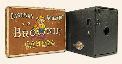
The development of the family album has coincided with new advancements in technology throughout history, for example ‘A Victorian album was itself a series of visual novelties, with the portraits often cut up and arranged in decorative shapes and incorporating drawings and other scrapbook items’ (Holland 2004: 128). Beginning in 1900, Eastman Kodak produced the Kodak box brownie, a basic box camera with pre-loaded film. Retailing for $1 at the time, the simplicity and low cost aspect provided specifically the middle and upper-class with the ability to generate snapshots of each other, friends and pets in order to create physical manifestations of family memories. The Kodak box brownie introduced amateur photography, with one hundred thousand of them being purchased during the first year alone, as an alternative from the difficult, lengthy and expensive processes of professional photographers inhabiting techniques of daguerreotypes and calotypes. Its simplicity began to develop and led to Kodak producing a mass of varieties, where ‘working-class people could present themselves to each other, creating a confident working-class identity’ (Holland 2004: 135)
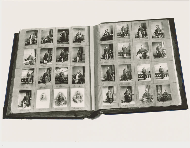
Kodak Box Brownie
The first commercial photographic process of Carte-de-visite, inhabited by Henry Mullins whose work is one of the most prolific within the Societe Jersiase Photo-Archive, is defined by its close-trimmed portraited aesthetic that was intended as a substitute for a visiting card. This small albumen print was produced through the use of egg whites in order to bind the photographic chemicals to the paper, with the image emerging as a direct result of exposure to light. The typical carte-de-visite consisted of one or a few people in a studio setting, sometimes holding personal belongings to be remembered by. The cost-effective aspect meant that they were easy to formulate, making cheap copies of the same photo to be handed out to loved ones, being less delicate too so they did not require velvet-lined cases like earlier forms of photography like the Daguerrotype.
Mullins specialised in carte-de-visites, capturing 9,000 portraits of islanders during 19th century Jersey. His work was highly politicised due to the variations of occupational backgrounds and the containment of the island’s most affluent and influential people at the time. These images consisted of Jersey political elite, such as The Bailiff, mercantile families, military officers and professional classes like doctors or advocates. Mullins gathered all these images and compiled them into an album to document the levels of social class, beginning with the most powerful roles down to the less fortunate.
Henry Mullins, Carte-de-visite album, 1848-1873
Now, the idea that ‘The family album is now being slowly supplanted by the development of social media and the decline of traditional film’ Dennett (2006: 124) is rife within society, being that anyone in the world with access to technology, such as a phone, can practice amateur photography; specifically for the preservation of memories and reminiscence of people and places. These technologies mean that the exchanging of memorial family images is a simpler process now, and is ever-growing in its approach to conserving the loved ones who have passed away or are distant. This chance of amateur photography stems from how ‘Once a technology exists, it may become adapted and introduced into social use in a variety of both foreseen and unforeseen ways’. (Price 2004: 13)
The work of Toroptsov and Toledano use the topics of loss and memory to exorcise personal and internal conflicts in family matters where ‘These silences, these repressions, are written into the album, into the process of its making, and into actual photographs.’ Kuhn (2003:400) in order to express a dark tale for others to relate to.
Yury Toroptsov
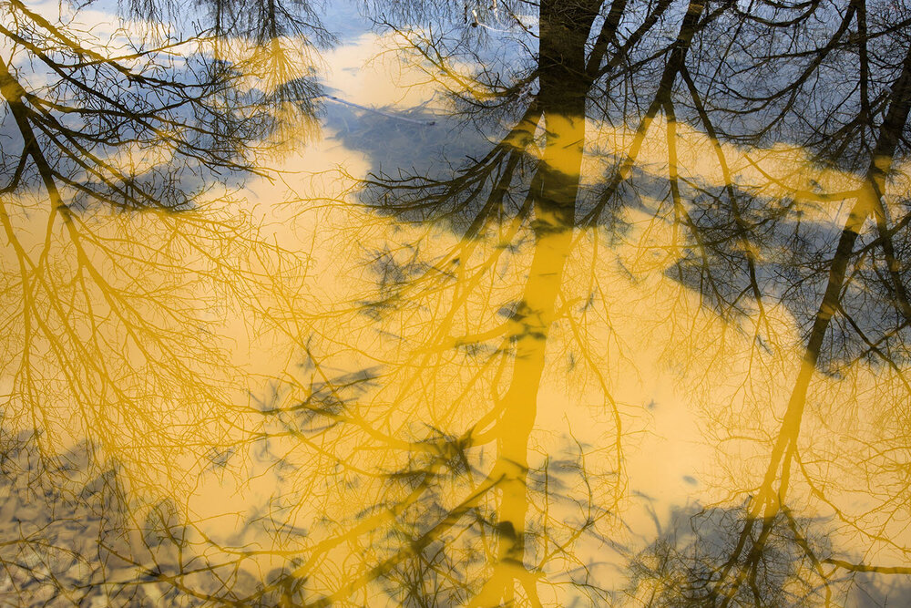
This reminiscence is visible in Toroptsov’s work entitled Deleted Scene where he ventures out into his hometown within Russia, Vladivostok, to capture the echoes of his father within the formal features of the landscape.
Due to his father passing when Toroptsov was just two-years-old, he aims to unravel the neglected recollection of him as he bears little to no memories of the time he spent with him. This lures Toroptsov out into the external environment in order to get to know his father through the fragments of his memory that are scattered in these locations. Knowing that this time was shared with his father, yet unable to relish in the memories to recollect and rewind, is represented through the mysterious tones that he depicts in this photobook. These distinct patterns in rural areas of nature become cinematic through the high contrast within the composition as this adds drama and solemnity to the image to infer to the viewer that there is a dark concept and story being symbolised through the small pieces that build up the environment, just like there are pieces of Toroptsov’s father’s memory which he must seek out in order to know him. Through the ambiguity of the images, he uses an ominous tone within the images which could be metaphorical towards the difficulty of growing up in a single-parent household as something beknown is missing to Toroptsov, however at a younger age he may or not been able to acknowledge that his father had passed.
Yury Toroptsov, Deleted Scene.
The sharp contrast is the most eye-catching feature in this image, the comparison of the saturated yellow lake paired with the dark natural landscape of leaves and sticks displays the composition in a bold and vibrant way to catch attention. These sticks and leaves disturb the smoothness of the block-coloured water and adds texture specifically in the foreground as these are spread across more meaning that the viewer can focus on the individuality of each piece, restructuring the initial sense of tranquillity and order. As this saturated tone of yellow is commonly associated with hazardous signs, this adds a cautionary aspect to the image that conveys emotions of unsettlement, not only because of this association but also because of how unusual this composition is, creating a tone of not everything being the way it should be. This can relate to the psychological feeling of the uncanny, where everything appears correct at face value however there is just something slightly off-putting. Reflections of the surrounding trees are echoed into the yellow swamp below, adding an intricate pattern of lines in a variety of lengths and sizes to layer over one another. This creates a textural perspective to layer over this blanket of yellow that was initially thought to be flat, adding greater depth to the image and makes it come to life in a 3D manner. This layering of reaching arms off the branches of the trees can be interpreted as resembling his fathers connection to Vladivostok, being Toroptsov’s home town, and depicting that his heritage is all around him here. This is an obscure metaphor through the delicate pattern that the branches create which look like the veins within the human anatomy, being an accurate representation of how the blood vessels spread out in a randomised order, intertwine and vary in sizing. This could be Toroptsov’s attempt at trying to show that even if he doesn’t recall his father, he has the ability to honour his memory even if he is ultimately a stranger to him. This provides indexicality to Toroptsov’s work, this being tangible evidence of a things existence as he is shooting geographical parts of his home town. This concept is concerned with how the ‘taking’ of a photograph can be thought of as ‘pointing’ to something in the world.
In my own work, I have found inspiration from Toroptsov to explore this ideology of seeking the “unseen” or picking apart the location as a form of obscure metaphors in memorable places that me and my brother shared our childhood in, however I have included this in a domestic environment instead to show the echoes of my brother at home when he has been admitted to hospital again.
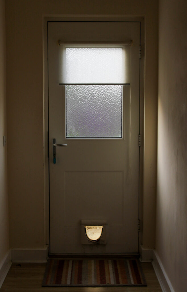
My image
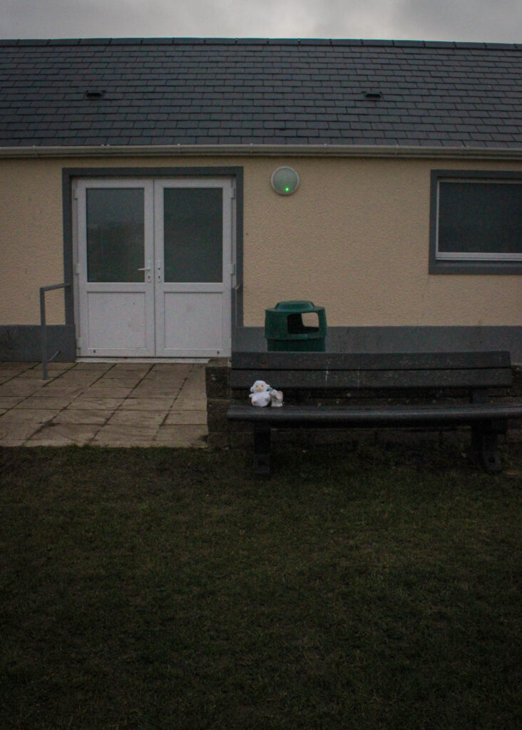
This image is taken of my back door next to my brothers room which he uses regularly due to him being a smoker, however I thought that this would make a strong image, specifically because of the diagonal lighting that goes past the window and bounces onto the wall as when it is paired with the darkened shadows, this creates an effect of gloom and mystery. This image is slightly under-exposed, however this was my aim because I don’t want my images to be too bright as this may convey emotions differing to what I am intending, for example it may make the image look more happy as bright images can be commonly associated with lighter feelings, rather than this solemn tone that I am aiming for. As there is natural lighting coming through the window, this creates a glowing effect in the centre of the image that could be interpreted as seeing “the light at the end of the tunnel” due to the darkness that is in the hallway until it reaches this burst of light. As this window acts as a privacy window due to the texture over it, meaning that the end of my garden is reflected through. Because of the objects in my garden, this has created a purple tinge to glow through which I think contributes to this idea of things getting better over time. This image also connotes ideas of being trapped, for example the cat flap acting as if a portal to the outside world even when the door is locked, however it is evidently too small for a human to go through. I feel that this is very representative of this idea of negative mental health making a person feel helpless and trapped within a consistent cycle of breakdown, treatment and healing that has repeatedly had an effect on my brother for years. This darkness shadowing around the image acts confining, as if the back door is holding in all of this darkness. I think this could clearly represent how mental health is not a physical thing, but more like a fever of the mind that is more difficult to treat in comparison to a tangible injury and disease.
These images depict the out-of-place feeling that loss brings into a family, and while the conceptual difference is that my grief is directed towards someone who is still alive, this use of an ambiguous aesthetic allows me to represent the intangible feeling of missing who my brother once was and how his memory reflects off the walls. I like Toroptsov’s approach of minimalism and formalism because it allows the viewer to familiarise themselves with the person that this memorial is for, and allows the viewer to creep into small snippets of their life for moments at a time through these snapshots.
Philip Toledano
However, Philip Toledano takes an altered approach when immortalising the life of his nine year old sister, Claudia, after she passed away. Being a conceptual visual artist, Toledano creates a narrated photobook entitled When I Was Six that is formulated through a concoction of still-life images and atmospheric “heaven-like” images in order to put the viewer into the shoes of his six-year-old self, exploring the human psyche. The way that the photo-book has been pieced together has been done very thoughtfully, thinking about the dream-like images first comes across as some sort of escape from the reality of Claudia’s death for Toledano, imagining these landscapes that connote emotions of peace, vulnerability and freedom from demons in his mind, even as a six year old who wouldn’t be able to process such a devastating concept. How well would a six year old be able to understand death, such a traumatic and disruptive event? Such a trauma to a six year old would be psychologically altering as Philip Toledano wouldn’t of been cognitively “ready” to acknowledge the passing of his sister, giving him the opportunity to meet his sister through the memories of her left behind in a box in the attic, barely spoken about since this ordeal. These still-life images document artifacts from Claudia’s life, her belongings, such as her school pencil, however this also provides documentation of her life too, such as her certificate of death. On the other hand, these ethereal-looking patterns that Toledano incorporates adds form and depth through the changing of direction and movement, representing the fluidity of emotion that could be portraying the loss of control Toledano had over his own at the time of her passing. Toledano ‘placed the photographs with hand-painted, fantasy scenes in order to create narratives of escapism’ (Bull 2009:93) in order to be retrospective of how he felt at the time of the event.
‘I don’t have any memories of my life after she died, except for this kind of peculiar fascination with space travel and astronomy. I think it was a way of being somewhere else, far from what had happened.’– Toledano tells Time Magazine
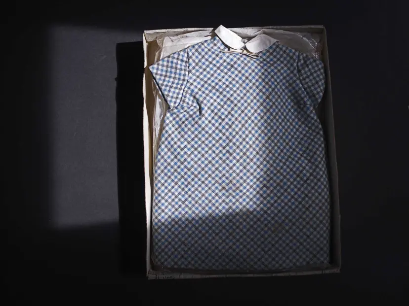
Philip Toledano, When I was six
This image particularly resonated with me, capturing Claudia’s school summer dress from when she was nine, placed neatly and cautiously into what seems to be an adult shoe box with the lid off, accustomed by tissue paper underneath. When the image is initially viewed, the high contrast immediately draws the eye due to the tension between the blocked black background and the checked pattern on the dress. This juxtaposition forms an optical illusion as this variance adds drama, making this burst of colour and the textural aspect of the dress look out of place and adds an aspect of solemnity as this looks so awkward. With the box placed just out of centre and pushed off to the side, this adds a sense of the uncanny – the idea that something isn’t quite right. I also find this where the box isn’t placed exactly straight, appearing to have been just pushed into the lens with no real thought behind it. I consider this to be a purposeful action, possibly to symbolise how this box containing all of the objects that are associated with Claudia, including her school uniform, were pushed aside for 40 years unbeknownst to Toledo, only to be discovered once his parents had passed away. The tissue paper behind the dress is crinkled, showing its age as its been discarded for so long. However, I find that this may resemble the memory of Claudia withering away from within the box over the years, specifically due to Toledano stating that ‘I have no memories of my life after my sister’s death for a few years’. (Toledano tells GUP Magazine) What I find is the most motivating factor within Toledano’s image is the lighting technique he has used. This image has been taken from a bird’s eye view using artificial light, however this lighting is in a squared shape, possibly done by using a specific head on the light above or, if he didn’t have the equipment for this, perhaps using different material to create this square outline as it is not entirely perfect. As the lighting has been pushed to the left side to oppose the dress slightly to the right, I feel that this may be reflective of how young Claudia died, explaining why only a partial selection of the dress has been highlighted by this glow. I also feel that this may be representative of that feeling of emptiness and loneliness that we find after a loved one has passed away, as I said before, showing that the beginning stages of grief may lure someone to begin to question their place in the world, what their purpose is. This could be reflective of the shift in Toledano’s family dynamic when he was younger, demonstrating how Claudia wasn’t mentioned much again due to the heartache, making her life slowly disappear into the darkness.
In my own work, I have created similar image types however I wanted to shoot these in locations relevant to my brothers childhood as I feel that this provides more contextual information that is necessary in making my narrative consistent.
I plan to sequence these together, shooting childhood toys outside my brothers old football changing rooms, because I feel that this symbolises the leaving behind of my brothers memory and how the memories of his childhood remain here unobtainable to him due to the severity of his illness at this time. I used opposing angles and distances for these two images and edited them side by side so that I could ensure they had the same tonal range in order to keep congruity. I set them up on this bench as if they were waiting for somebody to collect them, as if they had been lost, in order to represent how I would sit and wait for my brother. I also think that this is effective due to the way the changing rooms look so dull and lifeless when paired with the muted greenery as the entire image looks depressing and lonely due to it being so empty. I think that this has portrayed how segments of both mine and my brothers childhood is left here as if it is left unsolved or unfinished as times changed so quickly once my brother became unwell.
Conclusion
To conclude, the preservation of family memory is interpreted in many different ways in photography. Photographers like Yury Toroptsov use the formal elements to pick apart the environment around them to reveal the hidden echoes of their passed love one that they may encounter in everyday life. By attempting to understand who his father was through death, this offers a fresh approach to the subjects of memory and loss as Toroptsov must try to depict an image of who he was before his passing, and explores how such an abrupt loss at a young age could unconsciously impact him. On the other hand, more subjective photographers such as Philip Toledano incorporate multiple image types; still-life images and fantasy images. This collection of abstract metaphors connotes the suppression and blocking out of painful memories to resist facing a harsh truth of losing a family member. This explores the psychological repercussions of loss and memory. The family album has developed in congruity with technological changes, meaning the way we preserve memories has advanced too.
These concepts have influenced me to be subjective in my work through trying to visually represent an intangible feeling, however it has allowed me to formulate ideas where I can include contextual cues within the background of the environment by going to specific locations that me and my brother share childhood memories at, even if he cannot recall them as easily as me. With four photoshoots so far, I initially began with a domestic environment where I used not only different angles of low lighting but also incorporated some of my brothers personal items, using different depths of field, through the inspiration of Toledano’s ethereal images which produced some of my favourite images. I followed this by using objects that relate to my brothers childhood as well as the memories we share with each other and shot these in locations related, using dynamic angles to add drama and solemnity to the images to represent how these memories have been lost and discarded. I feel that this has actively been effective in illustrating how my brother has changed from who he once was as his mental illness has worsened, depicting how it feels so grieve someone who is still present.
Finally, I have used the snapshot aesthetic in my use of archival image experimentation, where I have pixelated and silhouetted my brother. Creating adaptations to the image conveys an effective message of protection at such a vulnerable age for what was about to come in the future where he was susceptible to risks within the world through innocence and naivety. These adaptations change the meaning of the images to compare the past to the present, and represents how these core memories are always thought of.
Holland, P (2004), ‘Sweet it is to scan…: personal photographs and popular photography.’ In: Wells, L. (ed.) (2004), Photography: A Critical Introduction. London: Routledge
Price, D (2004), ‘Thinking about photography: debates, historically and now.’ In Wells, L. (ed.) (2004), Photography: A Critical Introduction. London: Routledge
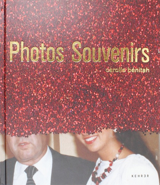
‘Photos Souvenirs’ is made up of multiple photos which have been dug out of photo albums and shoebooks and then sewed and beaded into, often with red thread. This photobook explores Carolle Bénitah’s memories of her Moroccan childhood and adolescence by reworking these images with her skills she gathered after being a fashion designer for ten years.
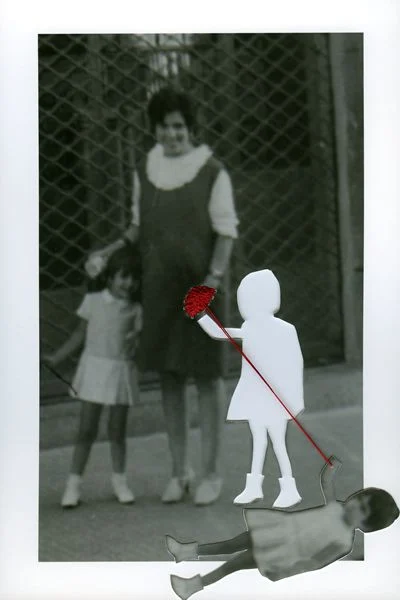
La chute / the fall, from the series Photos-Souvenirs
Carolle Bénitah created her photobook as a way to try to better know herself through investigating and studying images taken over 40 years previously. Bénitah complated what she describes as ‘excavations’ where she dug out old snapshots out of photo albums and old shoe boxs. She focused on collecting snapshots as they relate to memory and loss. Therefore in a way the book was created for Carolle Bénitah herself as a way to bring old memories back.
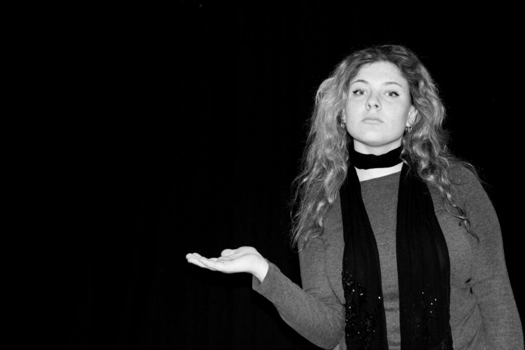
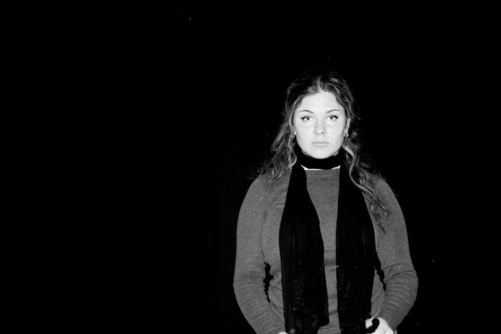
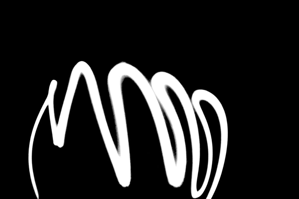
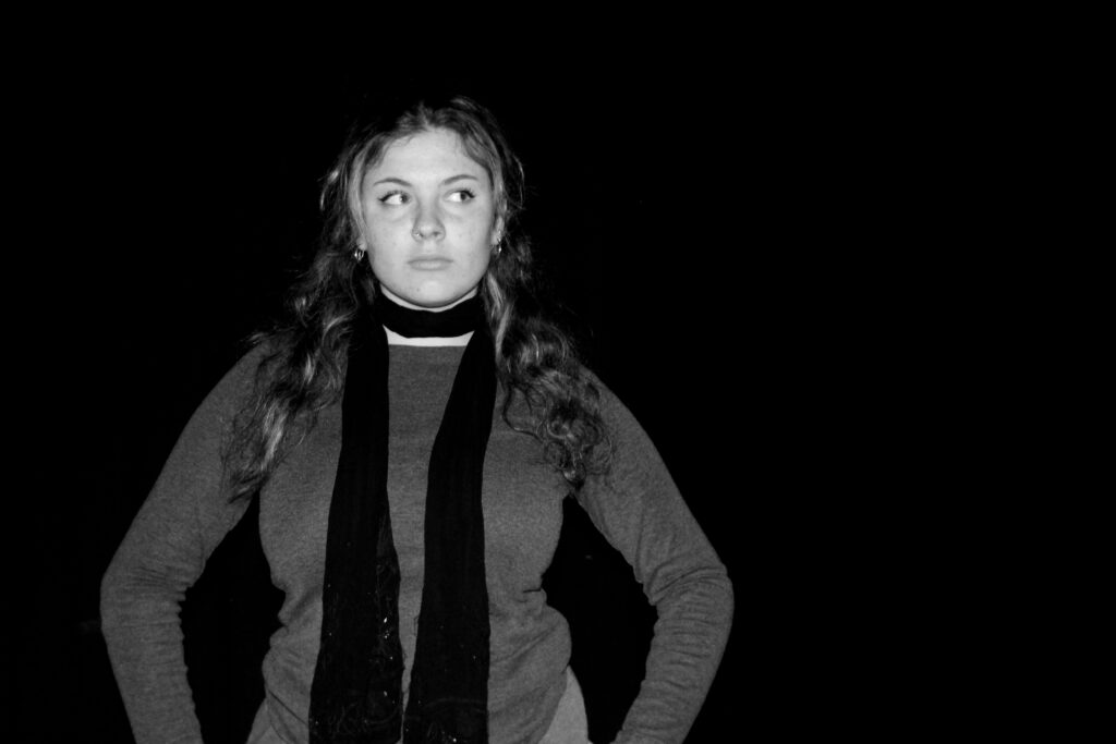
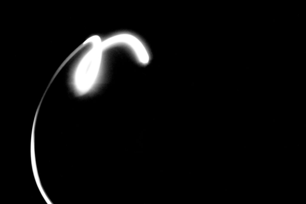
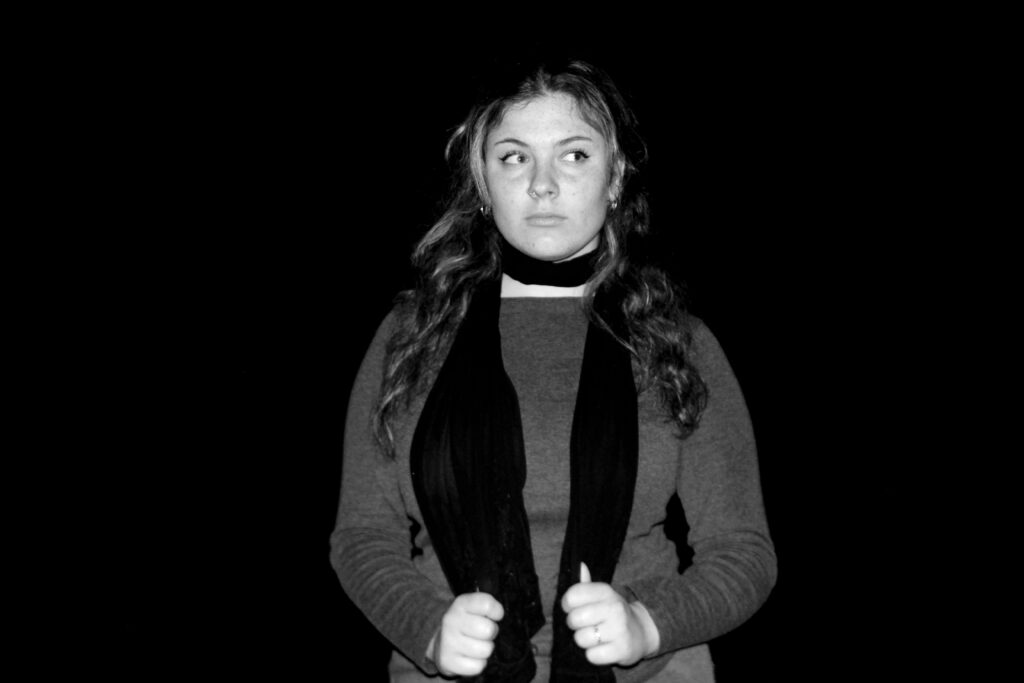
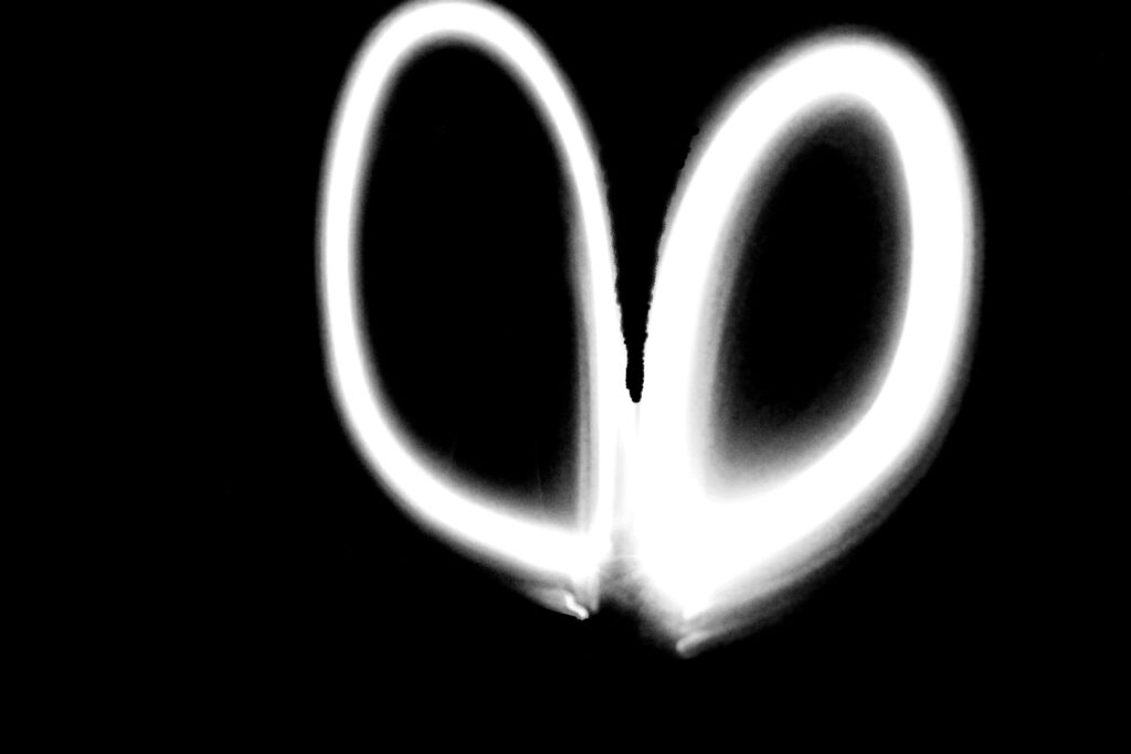
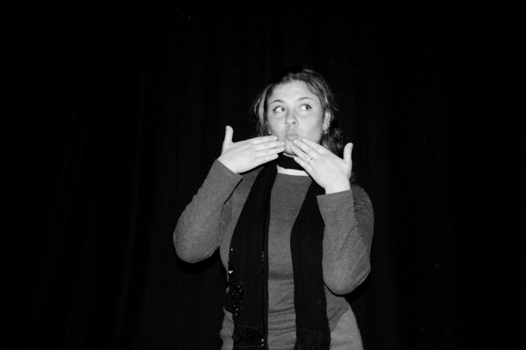
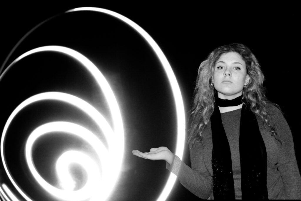
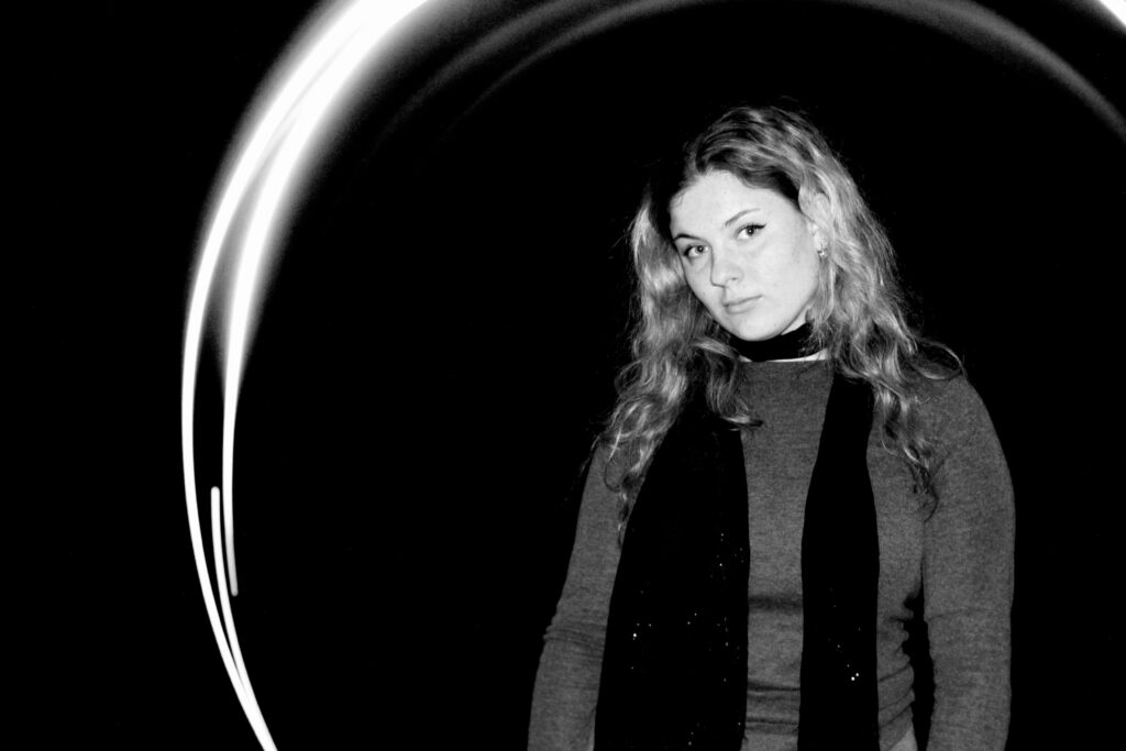
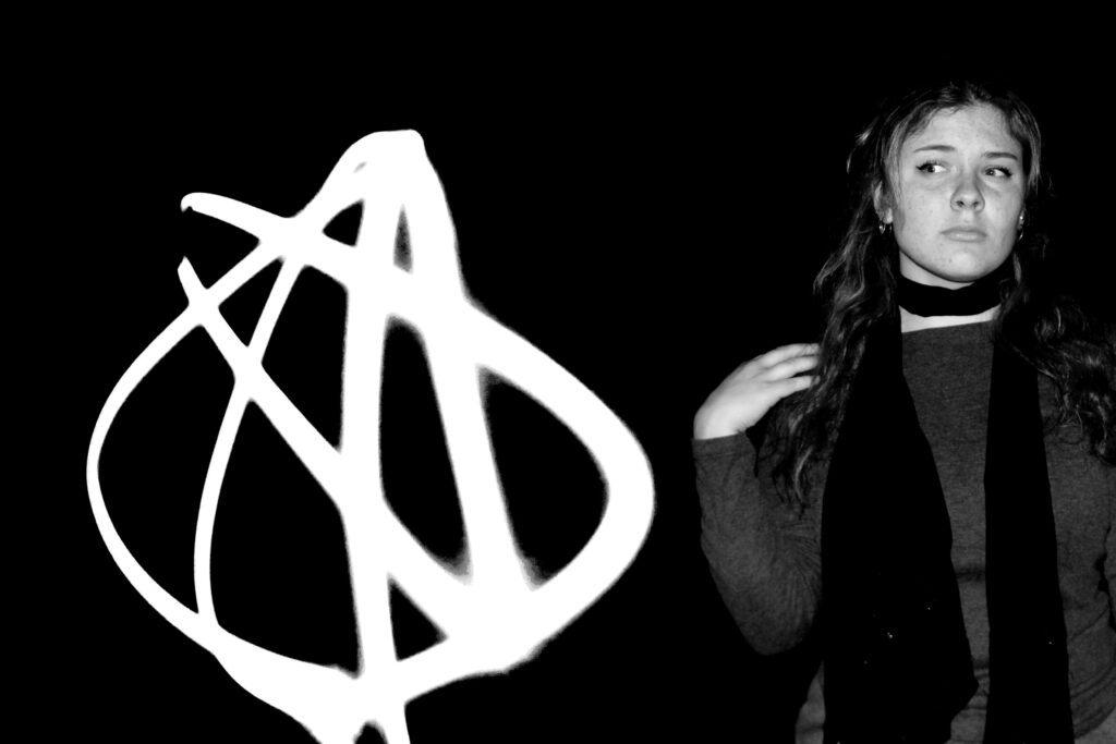
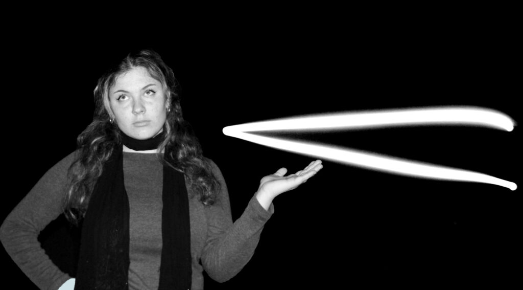
This photoshoot was inspired by William Klein, William Klein is one of the artists i’m inspired by. He does a light drawing photoshoot that is also inspired by fashion, which I thought would be a good experiment to try. This photoshoot was very difficult to do as I had to change the camera to a a low ISO of 100- 200 and change the shutter speed between 10-30 seconds to give me enough time to do some patterns with the light. I used a flashlight as the source of light, and it worked very well. However, it was more difficult to make patterns with the light as there were times when the light would be blurry or overpowered and took control of the whole photograph. I took some basic portraits of the model to be able to achieve the same work as Klein. I not too sure on the way Klein managed to succeed in this photoshoot as it was very challenging, the way I was able to make my photoshoot work as by photoshopping the images together. I had to edit the photos of the light with a very high contrast to be able to have the same look as Klein had achieved. I did try to create the same shapes as Klein did, but it didn’t work as I had planned therefore; I created my own shapes, and I believe it did work quite well. I used my school studio to create these images and didn’t exactly have this photoshoot in mind but thought it would be to try. The last photograph has a shape inspired by William Klein; however, the model isn’t doing the same pose as I wanted to try and make my images more unique. I went on photoshop to edit my photos, I firstly blended merged the images together and make sure the background colour and shade matched. I had to darken the background to make the light stand out more which as a slight shadow to the background, I used the brush tool to erase the light patches in the background. In some of the photos i kept the light shadow as it was harder to remove but it still had a cool effect on the photo. In one of the final pieces, I edited two different shaped lights into one photo which helped to make the image look more detailed and fuller. When doing research on William Kleins light drawing i came across some information ” Klein’s early paintings hints at an influence of the abstracted figural and still life works of Picasso, and by the graphics and designs of Bauhaus and Mondrian that later led to his mural paintings; while his fashion photography encapsulates the raw energy exuded by the streets of Paris.”, it is said that Klein did some fashion photography in the streets of Paris and didn’t really tend to make his light drawing images fashionable, instead it’s meant to capture more of an aesthetic. His work is very unique and has a different effect to his other work, he tends to make his images stand out by making them different to everyone else, for example instead of doing a normal fashion photoshoot in the studios he incorporates the streets instead which adds a minimalistic look.
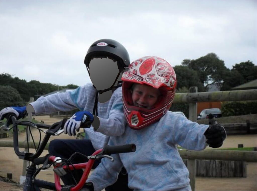
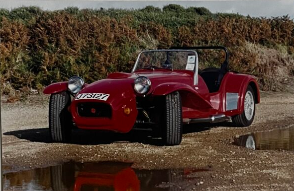
a small insight into my families history and passion for motorsport
Using a book format, featuring photos and small amounts of text showcasing family history and connections within motorsport. And how it has influenced my own passion for motorsport. This will also include archived images from family albums, creating a stronger sense of connection and narrative throughout the book. Using colours, textures, compositions I will aim to make connections between new and old images, for example I will include old photos of dogs in cars to now my dog in my mothers car. I hope to create a book that feels like a family story with enough context even a non family member can see how my parents have influenced me.
Design
How you want your book to look and feel – I want to book to have a smooth, slightly matte look to it, similar to plastics on a bike. This will replicate the car/bikes themselves.
Paper and ink I have selected premium lustre paper as a lot of my photos have deep detail and soft lighting so its important to have high quality ink and paper to preserve the photographs.
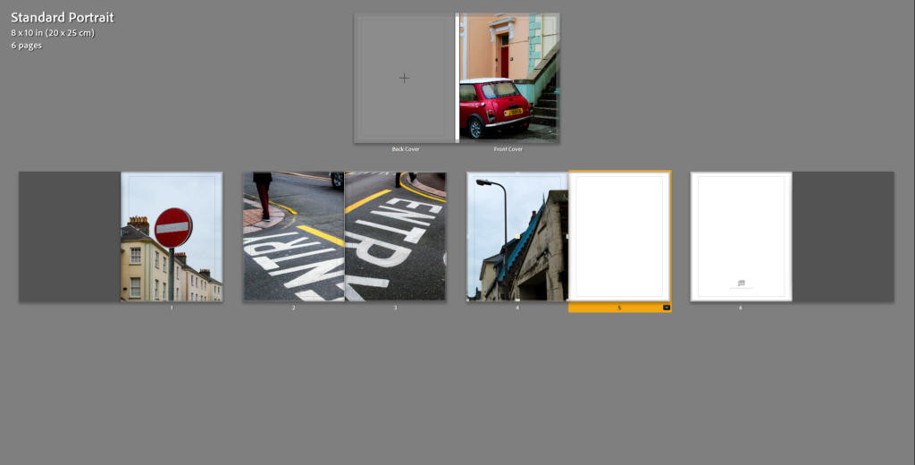
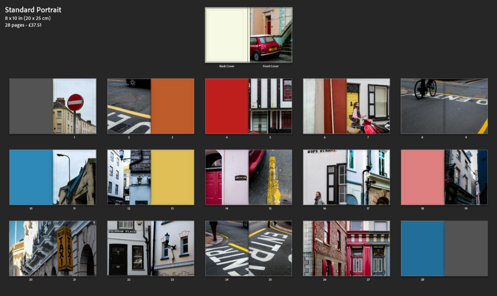
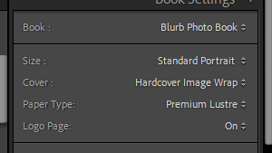
Format, size and orientation I tried a few different book styles, before settling on a portrait 20X25cm book, allowing for my portrait photos to fit well and having to stretch the photos less to spread across a double page.
Binding and cover My cover will be a hardback with a printed photo, while I like the idea of a dust cover I have found they gain greater damage than an image wrap cover.
Title I do not think a title will benefit this book so won’t have one, instead I will have the focus on the cover photo. One that will provide an insight into the book, similar to a titles purpose.
Design and layout – Within the book it will be produced in ‘sections’ using the photoshoots as mini stories within themselves. By doing this I can create a feel for each individual story that has gone into shaping my own passion. At the end I will include a snippet of my own story as a summary of the book.
Editing and sequencing – the editing will remain similar throughout the book, keeping continuity within the narrative. As narrative progresses the bikes will get more modern requiring slightly harsher editing to enhance the colours and textures but this will be a very small element. Highlighting the progress within the sport. A lot of my images will be black and white, low contrast, softly lit. This adds a family album like feel, creating joyous, interesting photos with story rather than harsh tones.
Images and text – there won’t be any text (subtitles and captions) within the book. While I have written an essay I won’t include it as I feel it would only break up the flow of the book. Having no text (other than author name) is unusual for photo books, however I think this suits the style I am going for, family photo album. The way I have taken the photos has allowed for the photos to tell stories without words. For example a comparison I will draw are the two photos below. Creating a connection and story without words.
Comparison between the original colour of the car in archive photos and the cars current colour with the old colour still showing slightly.
Book Design Mood Board
Having looked at blurb I have created a mood board of book covers I like. Most of them are black and white using a simple photo as the cover, something that sums up the book without having too much detail. There is a couple with smaller photos on the cover adding emphasis on the title, however while I like the covers I’m not sure it will suit my book. I also liked the red text on one, it helped the title stand out against the colour photo cover. All of these designs are image wrap covers, the option I will likely use for my book.