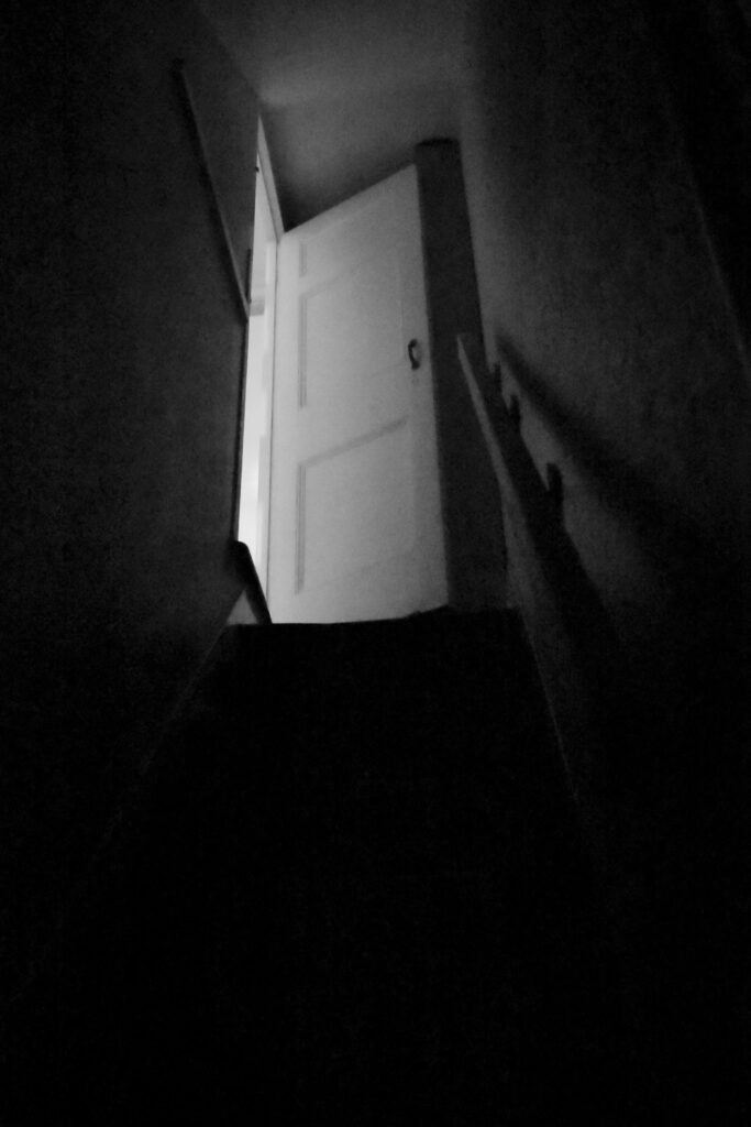
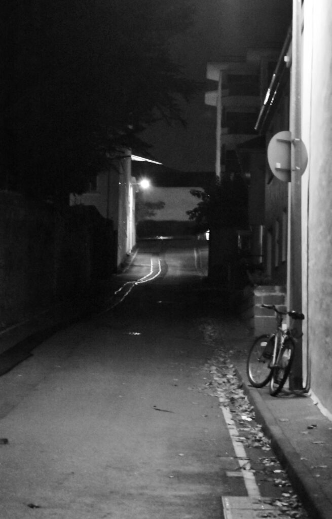
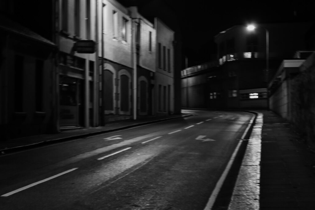
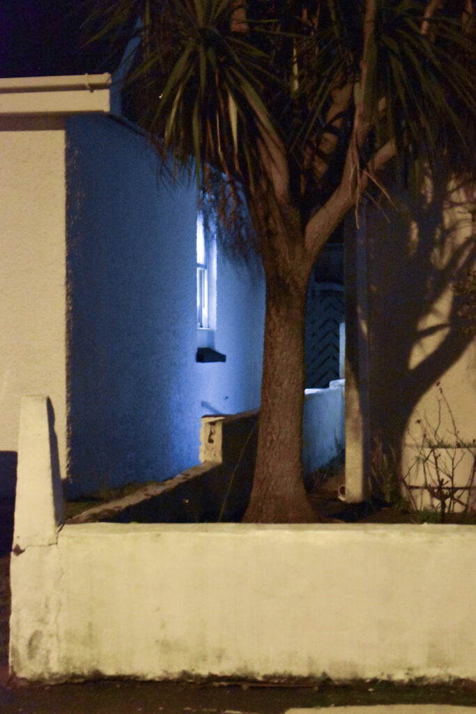
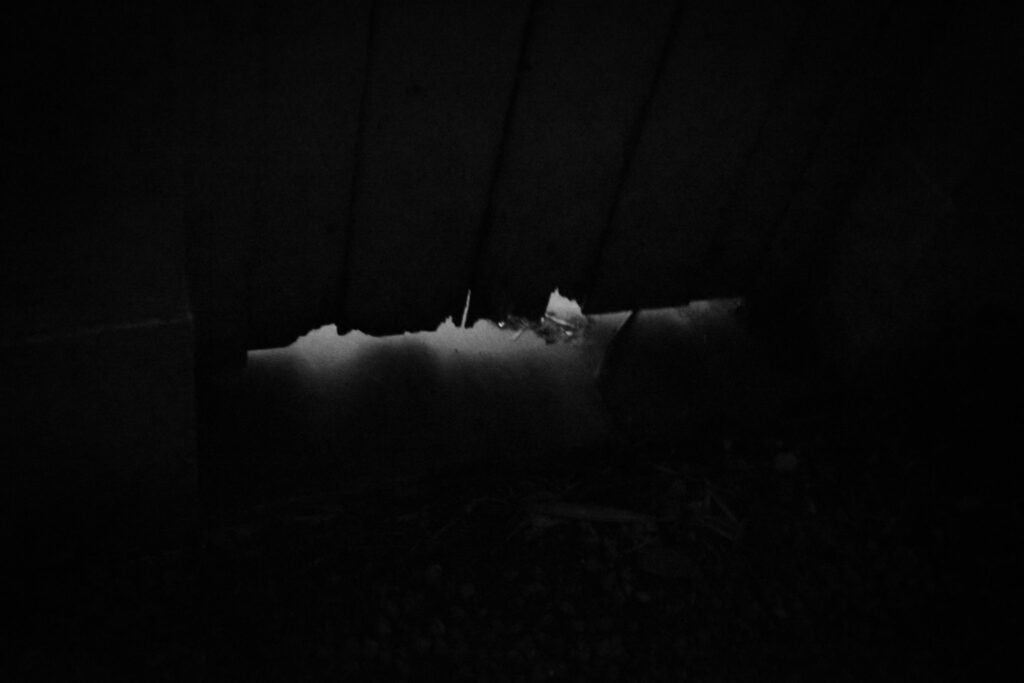
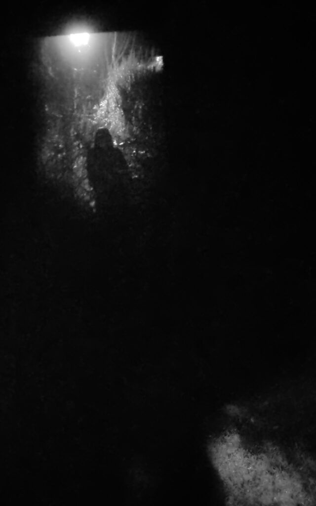
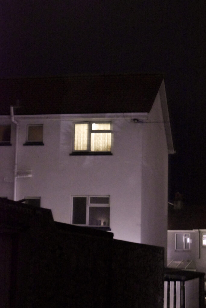
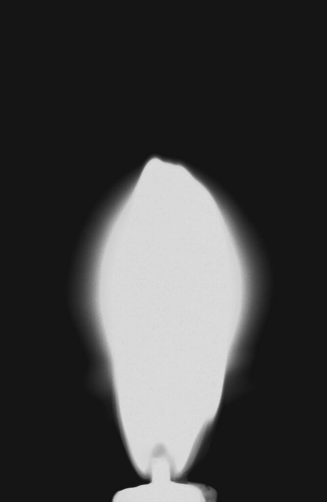
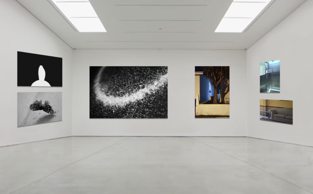
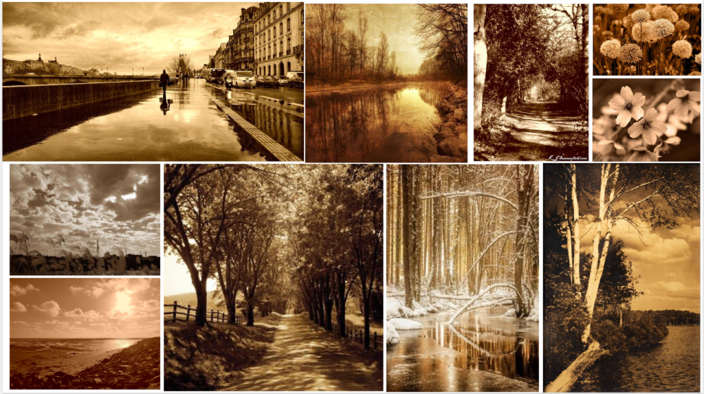
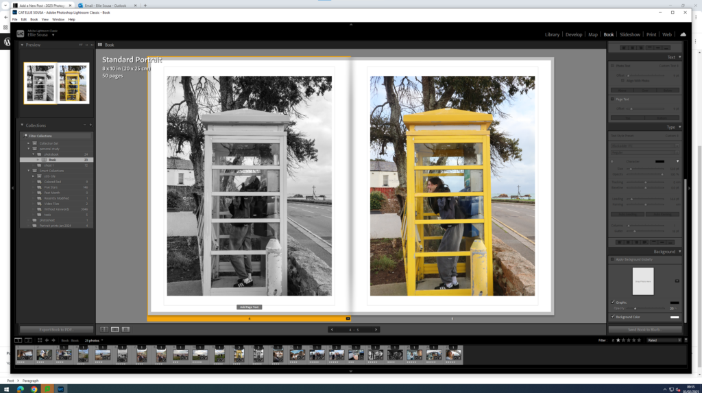
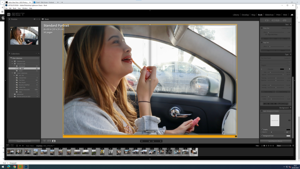
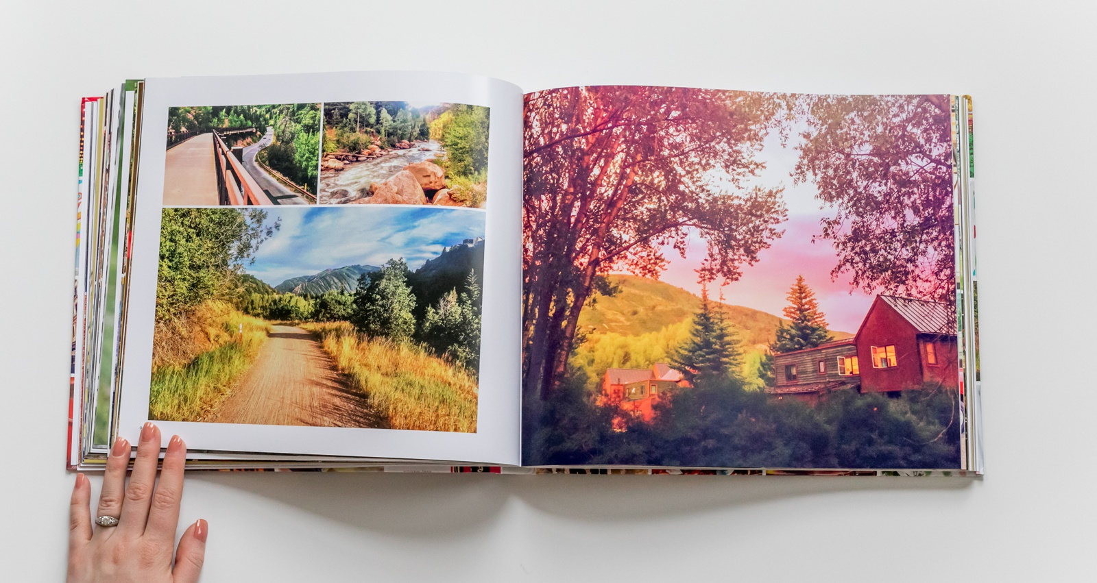
The final 27 images I choose for the photobook were:
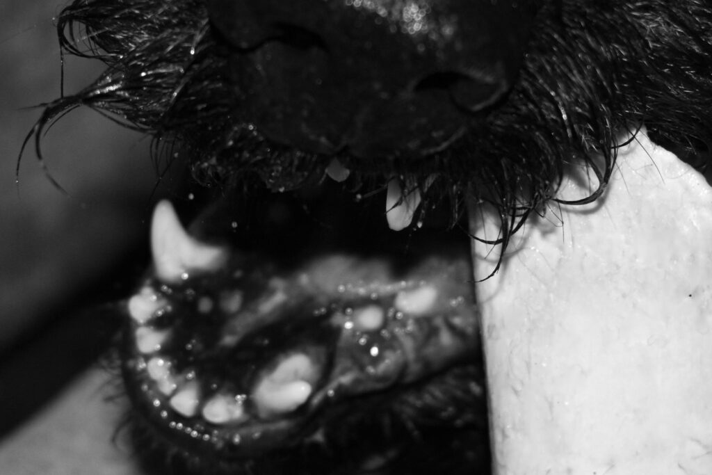
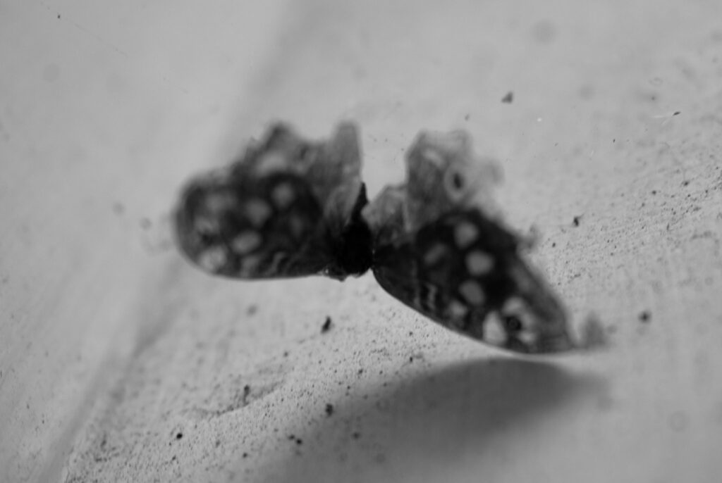
Overall I like interspacing black and white with colour and I feel as though my images create a general sense of discomfort. My favourite images were the figure and moth because of their simplicity. I included a total of 10 coloured images with 5 of them houses. I was worried that maybe there were too many coloured but I didn’t want to remove the colour from any of them either. If I arrange about one colour between every 3 black and white images then I feel as though they might be spread enough.
I decided to use one of the following images on my cover But I wasn’t sure which one.
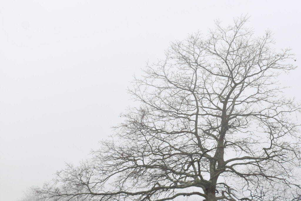
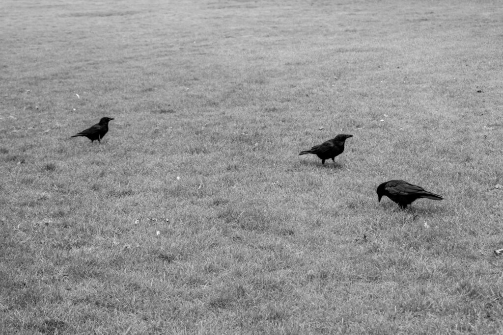
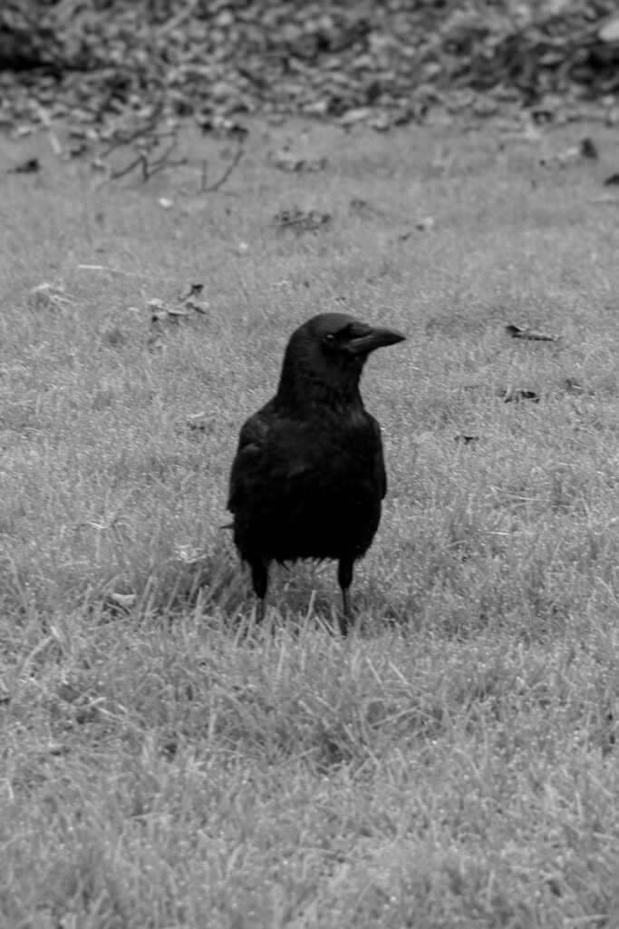
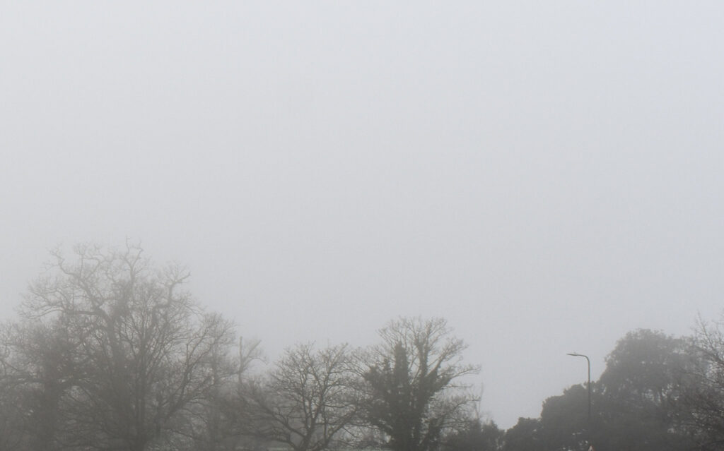
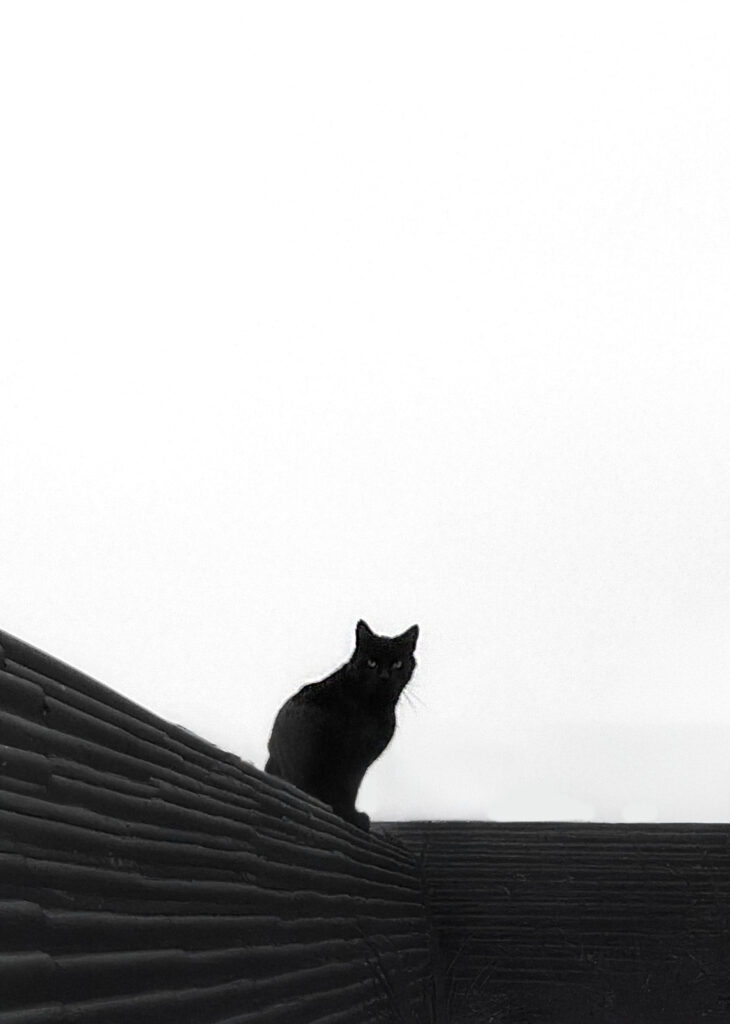
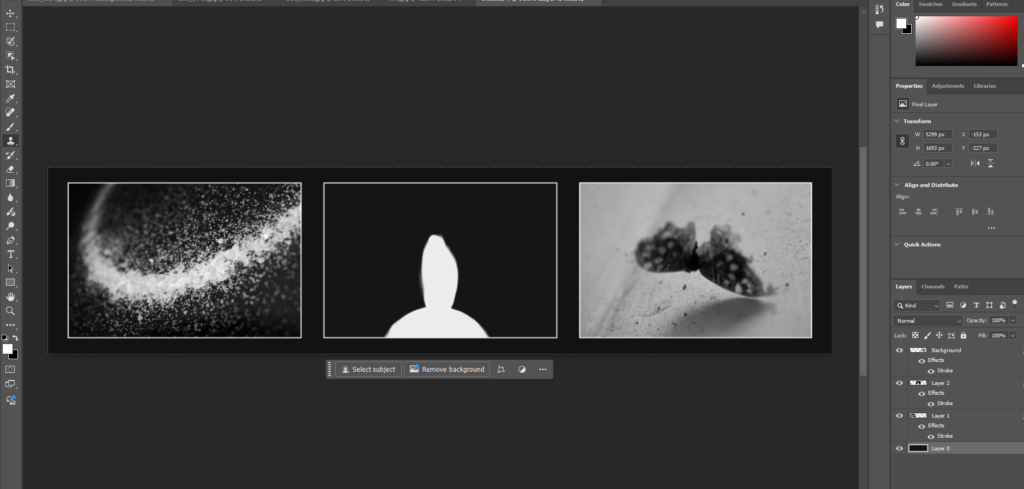
They were all black and white which I liked for the cover and had different effects. The misty trees were more muted and mysterious while the birds and butterfly were more symbolic. I liked the crows because they have certain superstitious qualities but I also like the moth because its wing was broken and it was left essentially paralysed. I felt as though they were both potentially too busy for the cover though and decided to flip and use the tree.
Final Prints
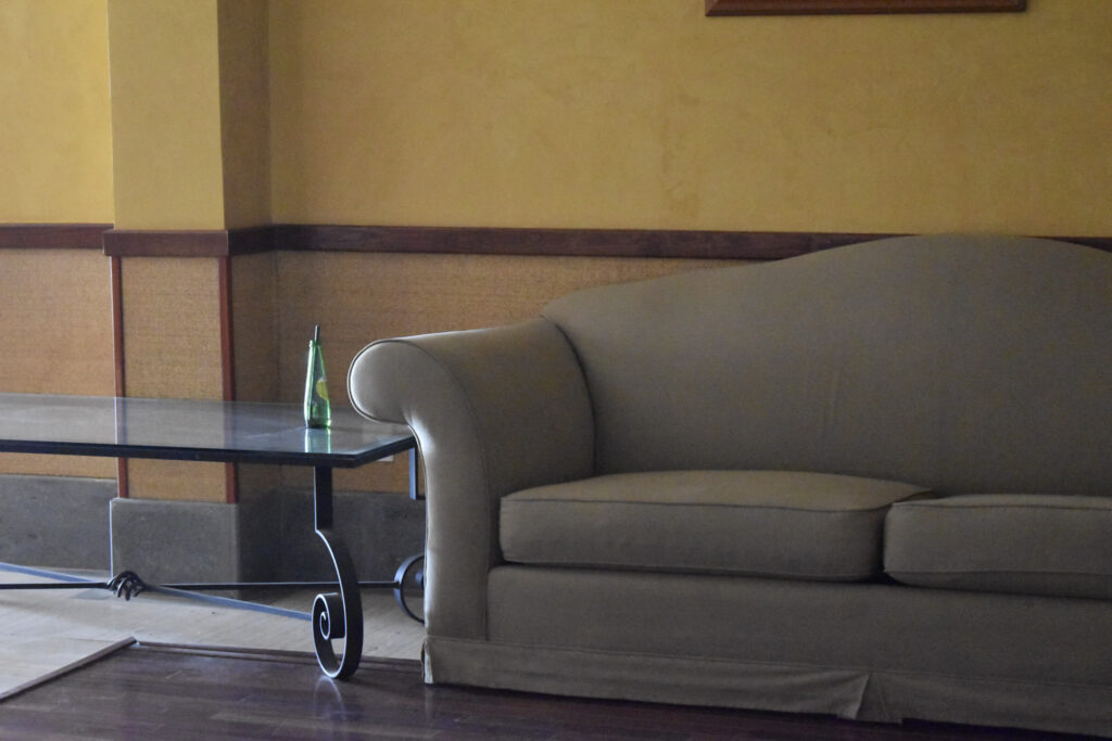
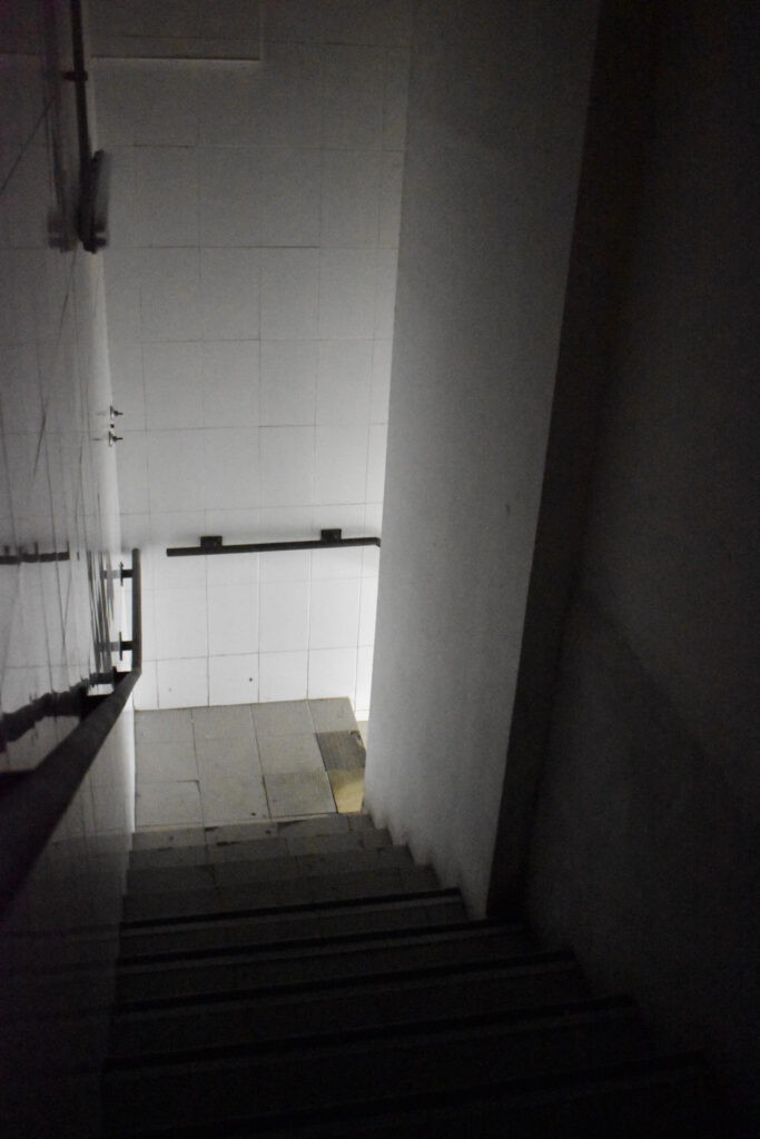
The final images I choose for prints were the following 6:
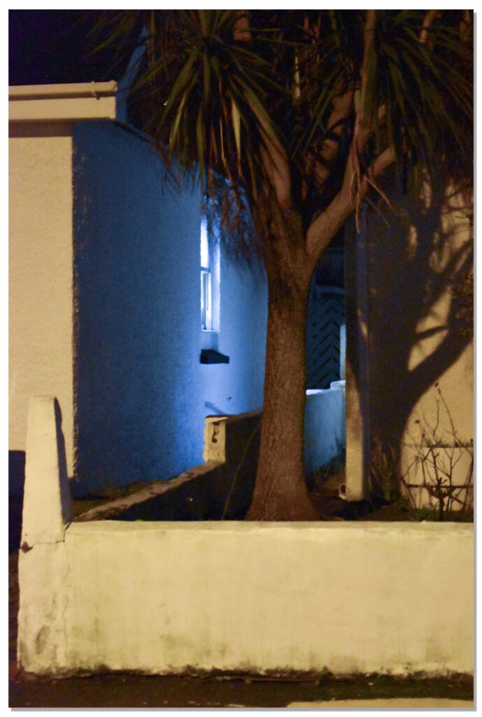
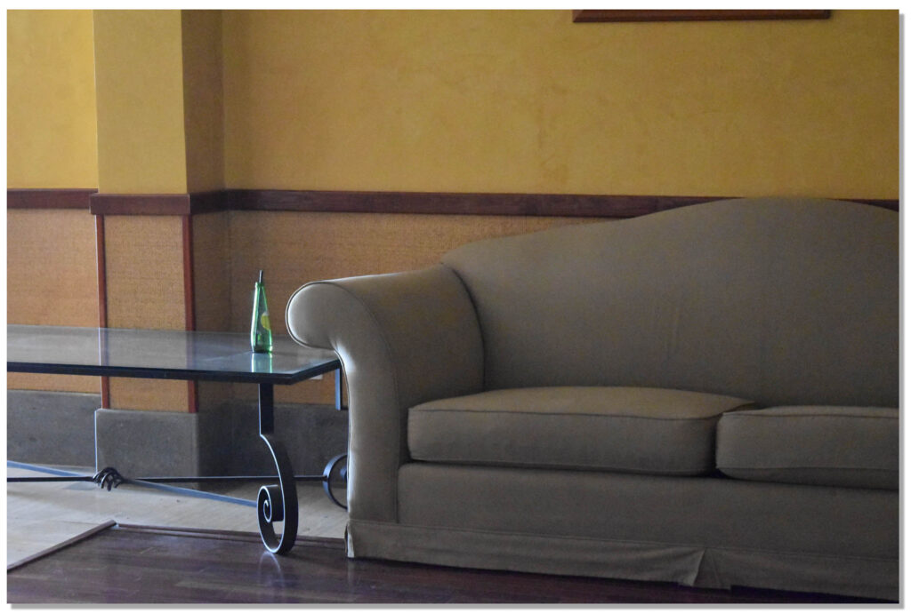
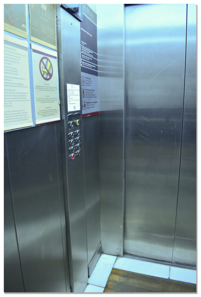
I want a variety of sizes with 4 A4 and 2 A5. The Lift and the sofa will be A5. The figure, moth, salt and house will be A4.
Virtual Gallery
Overall I think some of these images are much stronger than others. I think I needed more images to buff up the photobook and create a clearer narrative. I think I had enough coloured images but I should have more black and white images in comparison. I think I’ve created a strong set of images covering multiple bases of fears from superstitions to more specific scenarios such as broken lifts and aggressive dogs with additional images between to keep it constantly changing.
Print Mock-ups
I decided to mount up in 2 different ways to split the different outcome sets. The first set is the 3 black and white images which I decided to window mount together in a triptych. The second set were the coloured ones which I decided to double mount individually.
I tried arranging both in the horizontal and vertical but I think that vertical turned out the best as it elongates the landscape images. For the final outcome I switched the order of the images. For the second set I was unsure how big to make the borders so I tried both larger ones and smaller ones
I didn’t like how either size of border looked so decided to mount the images borderless on foam board so they would still be raised. I still decided to keep each image mounted individually because they aren’t all the same size or fit together into a proper set
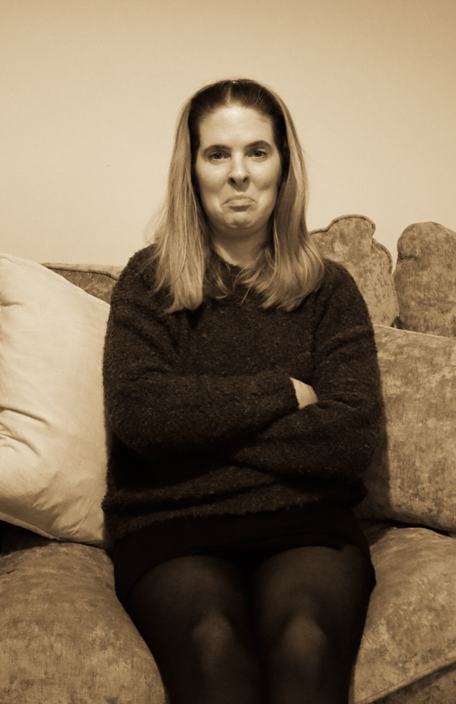
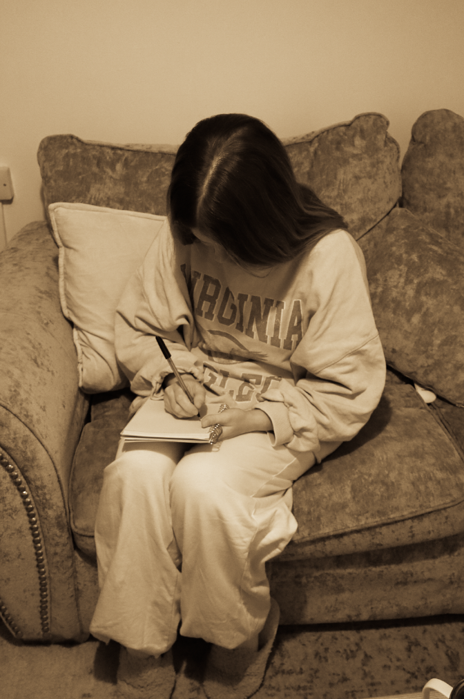
Within my personal project I aim to recreate older images, the sepia effect can cause an image to look aged therefore I think this will be a useful effect to use within my images when restaging them.
Origin of sepia photography
The sepia toning process was first developed in the 19th century as a way to improve the durability of photographic prints. At the time, photographic prints were highly susceptible to fading and deterioration, which made it difficult to produce images that would stand the test of time.
My sepia images:
To create this warm orange tone (sepia) I adjusted the tone curve and experimented to see which would result in this tone.
After I found settings which worked I decided to create my own preset named ‘sepia’ so that I am easily able to apply it to my other images rather than going through the same process again.
How is the work of Cindy Sherman and Nan Goldin questioning the politics of gender and female stereotypes?
“In the past, photographs of women were made by men for a capitalist economy to favour the male gaze and feed female competitiveness” By Charlotte Jansen.
The word ‘Feminist’ is often misinterpreted. Somehow the adjective advocating social, political, legal, and economic rights between women and men, has been constructed into ‘man hater’. My area of study is female stenotypes and how they differ through the years, however my argument is whether female stereotypes are formed by men in a patriarchal society. Initially, stereotypes are inevitable in society as they are a social norm. Unconsciously as humans we make stereotypes, the first reference to stereotype in English was in 1850, as a noun that meant ‘image perpetuated without change’. This predominately suggests the growth women fought for during the feminist movements as their stereotypes changed successfully. However, my other side of my study is that stereotypes for females were caused by inequalities due to a male dominated society as it caused hierarchies. This is because of expectations men have of women from the beginning such as the traditional housewife and their role to serve men. The artists I have chosen to study are Cindy Sherman and Nan Goldin as I believe they effectively portray gender politics and stereotypes. Sherman executed this through dressing up, posing and photographing her self in different scenarios. Sherman effectively critiques the way women are portrayed in popular media, such as film, television and magazines. These images challenge the viewer to question their preconceived notions about identity and the roles society imposes upon women. At first, she photographs herself playing a traditional role men expected women to be, such as a housewife. Not only this, she photographed others and herself suggesting their struggle with their own identity. Nan Goldin, expresses her view on stereotypes through a different sense. Goldin expressed her experience on domestic abuse during a relationship by photographing her own wounds of female empowerment. This makes me think about the key features of stereotypes such as strong vs weak. For example, her image that stood out to me the most ‘Buzz and Nan at the Afterhours, New York City1980′ represented male roles such as dominant and confident in contrast to naïve and vulnerable as women. However, I was mostly inspired by her New York city night club and bar photographs as it expressed intimacy, the isolation of abuse and hierarchy.
I will be responding to both of their work by including all of my inspiration from these artists and putting it in an order of a time line, specifically to the feminist movement waves and how the stereotypes changed through each wave, from the first to the fourth. My first wave photoshoot, my main inspiration is Cindy Sherman and my intention is to express the ‘traditional housewife’ stereotype. This is aimed to focus around early 20th century. The second wave photoshoot is to express more independence but the focus being educational rights, remaining inspired by Sherman. Next, the third wave photoshoot is focused around domestic abuse, heavily inspired by Nan Goldin mixed with Sherman. This is aimed around the 1990’s to the present. Lastly, my photoshoot for the fourth wave is to focus on the expectations on women due to social media. This is focused around the present and what teenagers go through my age, based off personal experience.
Artist Reference – Sherman
Cindy Sherman was known for her stage crafting, posing and role play photoshoots. This evidently linked to an element of drama, theatre, acting and film as her photos are ultimately the opposite of realism and conduct fake scenario’s but portray real themes. Especially in how it critiques and represents female stereotypes. Sherman creates elaborate sets, costumes, lighting, and props, similar to theatrical productions. Her photographs resemble scenes from plays or film stills, as they often depict a climactic or suggestive moment of a story such as 1950’s female stereotypes. Her dramatic and theatre themes comes from subjects expression. Her characters or even herself often display exaggerated facial expressions or gestures, heightening the drama and giving the impression of a moment captured mid-action. Most of the time, she does this through the ‘ male gaze’ to convey the expectations that women were to only serve men. The visual narrative is significantly important as it surrounds the theme of stereotypes and women in the 20th century mostly, however these elements still continue. Each image feels like it belongs to an unseen story. The ambiguity allows viewers to imagine their own narratives, drawing on their understanding of societal stereotypes. The roleplay comes from transforming each subject and even herself. Sherman acts as the sole subject in most of her photographs, embodying various female archetypes. She transforms herself into housewives, actresses, sex workers, society women, and more. This mirrors the performative nature of societal roles women are expected to play. She changes her identity and disguise by using costumes, wigs, and makeup, she completely erases her own identity, taking on fictional personas. This highlights the constructed nature of femininity and gender roles. Her cinematic aesthetic photographs are heavily influenced by film, particularly her famous series Untitled Film Stills (1977–1980). These black and white images mimic publicity stills from 1950s and 1960s Hollywood and European art cinema. She likes to convey ‘ frozen moments’, evidently her photos suggest moments from a larger narrative, much like a paused frame in a movie, leaving the viewer to wonder what happened before or after the shot. She critiques the male gaze by embodying these stereotypes, Sherman confronts the way women are constructed in visual culture, particularly under the male gaze. She reclaims control of these images, playing both the object and creator. Her work suggests that female identity is not singular but fragmented and shaped by societal expectations, media, and cultural roles. In my opinion, Sherman links more to ‘ mirrors’ rather than ‘ windows’ as her images do not fit into the realism category and they reflect Sherman’s experience through being a woman. Tableau is used to describe a photograph in which characters are arranged for picturesque or dramatic effect and appear absorbed and completely unaware of the existence of the viewer which Sherman typically executes.
“A number of questions occur. How does the woman look? Is she forced to share the way of seeing the man, or might there be a specifically female gaze? Can the man too be the object of the gaze? Can such a clear distinction be made between male and female, masculine and feminine? “(Williams in Wells 1987:6)
Artist Reference – Nan Goldin
However, Nan Goldin’s images I am specifically inspired by are her abuse photoshoots published in her seminal photobook, The Ballard of Sexual Independency, which represent the domestic real life violence Goldin experienced through being a woman. This ultimately links to realism as it is Goldin documenting her real life experiences without adding glamour or hiding anything. Instead, her aim was to give other women empowerment to make them feel less alone due to the large proportion of women who do go through this, and are typically seen as weak. This links to stereotypes as it is stereotypical that a woman is not powerful and is weak when they are facing these issues in this society, making a man as dominant and masculine. The term ‘realism’ can mean to depict things as they are, without idealising or making abstract. Not only this, but Goldin’s work is documentary as she wanted to show her lifestyle without covering any facts. ‘Nan’s work is unfiltered and deeply personal about her life. She’s been making artwork herself about her life for decades,’ Poitras explains. ‘She just felt strongly that it was the time to talk about [her sex work] and with the intention of destigmatizing that. There’s so much stigma around sex workers, so much stigma around drug use, there’s so much stigma around domestic violence, etc. And that I think she just felt very strongly that this film could also destigmatize those issues.’ (Chiriguayo 2022) So evidently, there is some major differences but also a few similarities which helps link both these artist together under the pressures of society and women.
Cindy Sherman questions the politics of gender and female stereotypes by stage crafting and fitting herself into the male expected stereotypes. This portrays the political and societal views on how stereotypes are started within females. Therefore, I responded in a similar way to Sherman’s by starting off by exploring societal expectations and then slowly going through the timeline of the feminist movements by showering growth and empowerment. For example, I was heavily inspired by Cindy Sherman’s image conveying the ‘ traditional housewife’ as it significantly portrays the politics and female stereotypes caused by expectations from men that women are to serve men.
Untitled Film Stills (1998)
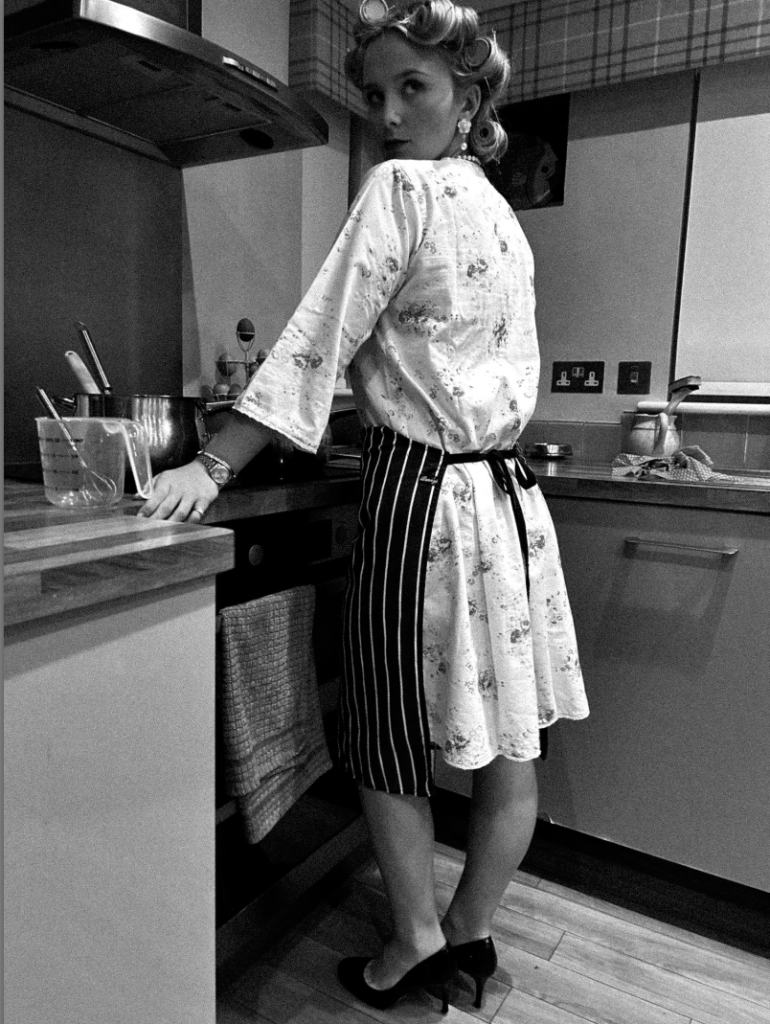
Within my response, I attempted to include similar key features such as the props and clothing. For example, the clothing increases the theme of feminine stereotypes such as caring about appearances such as the hair rollers, heavy makeup and high heels. The apron suggests her role in the household such as cooking for her husband. The ‘female gaze’ is suppose to convey the subject looking over at her husband.
One thing I did not do successfully due to lighting is that you cannot see the subjects hand over her stomach like Sherman’s image which eliminates the key feature of a woman being nurturing and ready for motherhood. Overall, my images are very staged, and link to drama as this is essentially acting through a photograph.
I experimented by changing angles to present the subjects high heels, this ultimately presents that women in the 1950’s had to look ‘perfect’ for the male in the household. This also adds a slight sexual element too it, which women were also seen for only to recreate. The look over the shoulder was significant to me as it shows a busy woman impressing her husband. This is interesting to me as heels can be viewed in different ways depending on the theme of the image. This is because in my third wave feminism photoshoot it is to signify confidence and growth through empowerment. However, in this photoshoot it is seen to impress and serve men’s societal expectations through appearances.
Another example of how Sherman questions the politics of gender and female stereotypes is through how women were seen to stay at home, and not have a right to education and work. This meant that women were viewed only to recreate and serve men through domestic appearances and motherhood. I interpreted this deeply through one of Sherman’s more revealing and sexual images such as;
Untitled Film Still #6
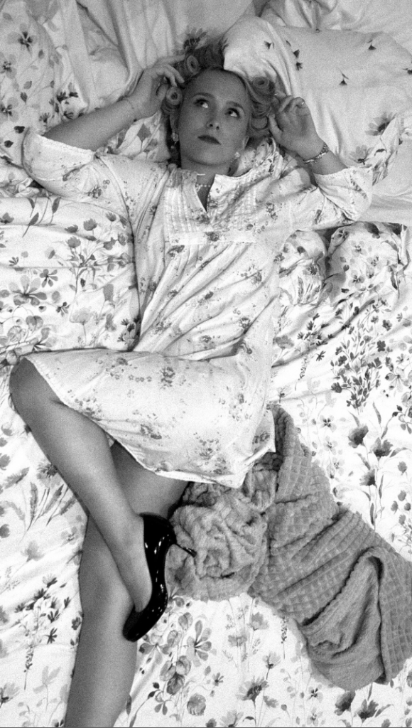
The first thing that caught my attention was the hairbrush in her left hand. I interpreted her aim was suppose to show feminine traits and stereotypes by fitting into the stereotype of women only caring about their appearance and beauty. The fact she is lying in bed, conveys she is waiting for her partner to come home. This is significant to be as Sherman was typically aiming for the 1950s, which was when women did not have equality rights within education and work. Lastly, her little clothing again, adds an element of sexuality as women were often objectified and sexualised during these times. This could symbol her typical role of motherhood and recreation. Overall, I noticed she frequently uses the ‘female gaze’ look which ultimately stands out to me as she is looking up to a potential dominant figure. This is literal as the image is taken from above, and she is laying down much lower. This could be to symbol the extreme dominance men had around the 1950’s and her look is to convey to stay within the role, potentially because it is all women knew.
For my image, I diversified my image by using hair rollers rather than a hair brush to include a similar element. To emphasise this theme of women serving men through appearance and being a mother I made the subject wear high heels to keep a sexual element to it. This is because Sherman executes this element successfully and frequently. The use of posing, such as a high leg really stood out for me. I put it in black and white to make it similar to Sherman’s, but also because my subjects dress was clashing with the bedsheets. This could ultimately symbolise women in the 1950’s as they decided to fit and blend into stereotypes without speaking up, linking to the subject blending into bedsheets. The black and white emphasised the blending. Lastly, the ‘female gaze’ and heavy makeup created the feminine and submissive element to my image. The heavy grain made it have more of a vintage and old aesthetic which is exactly what I was aiming to achieve.
Another example of how both Nan Goldin and Sherman questions the politics of gender and female stereotypes is through the significant key feature of fitting into the stereotype of women caring about their appearance. This is inspiring to me as men do not have the same stereotype, questioning the gender stereotypes.
Untitled Film Still#81
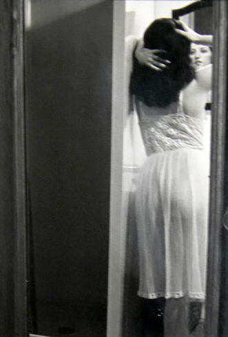
Both of these images give off different aesthetics in my opinion. Sherman’s portrays a sexual element to it such as the night dress and the hair and hands. I like how it is slightly blurry and can hardly see the subjects face. This ultimately creates a mysterious element to it. To emphasize this, most of Shermans images are in black and white which I personally prefer as it makes her images have a vintage and old aesthetic. The angle and placing of the camera makes it look like the image has been taken from the bedroom into the bathroom. However, Goldin’s image is less sexualised through the use of the subjects clothing such as the tank top, which isn’t seen as feminine as the night dress. Goldin’s image is clear, emphasized by the use of colour. Although, they both convey the importance of appearance through women by adding something to themselves by looking in the mirror.
‘Amanda In the Mirror’, Berlin: Nan Goldin 1992
Within my image, I attempted to combine both artists. I did this by my subjects clothing such as the night dress and heels to convey a sexualised image of women, which is often a stereotype. The posing such as the high leg, and the hand on the subject’s lips ultimately portrays this significantly. The use of black and white makes the image look older. Lastly, I added a heavy grain to make it look less clear like Sherman’s and vintage.
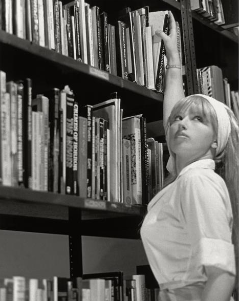
Cindy Sherman questions the politics of female stereotypes through showing the empowerment of women through educational rights. This image inspired me as it signified the growth women gained through fighting for equality rights such as work and education. This linked to the second wave feminism movement which links to my focus for this personal study.
Untitled Film Still #13
One thing that stood out to me was the ‘female gaze’ that Sherman always includes in her images. This is significant as this image shows the empowerment and growth rather than the ‘fitted stereotype’. Her use of clothing in my opinion signifies a sense of independence as it isn’t sexualized or for men. The reach of the book on the highest shelf could symbol her independence and growth of doing things on her own, without the stereotype that females cannot do the same as men. Lastly, it doesn’t look like she is wearing a heavy amount of makeup eliminating the factor of women caring about their own appearances.
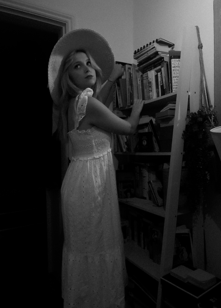
Within my response, my subject is wearing clothing that isn’t sexualised but however is still feminine. I executed this through wearing a long, flowy dress matched with a 1950’s hat. I chose to maintain the ‘female gaze’ whilst my subject was reaching for a book. The use of black and white with a heavy grain emphasizes the vintage and older aesthetic which was one of my objectives. All of my images within response of Sherman are carefully stage crafted, precise posing and relevant props to execute the sense of drama and theatre.
The Ballad of Sexual Dependency series, 1984
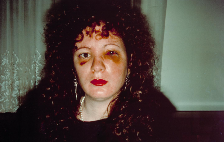
Lastly, Nan Goldin expresses her experience through domestic abuse. This inspired me for my 3rd photoshoot as this was a very important topic during the 3rd wave feminism movement. Therefore, I decided to merge Sherman’s posing and stage crafting with this theme. With an outcome of this,
I executed this by using feminine posing, feminine clothes and heels. However added makeup to add fake abuse onto the subjects face. The black and white relates to Sherman and so does the clothing. The lighting looks over my subject, making her the main focus and emphasizing deeper shadows. My critique is that my subject should have her face turned more so the lighting shines on the bruises etc as it is the main focus of this photoshoot.
In conclusion, there are serval parallels between both artists, being similarities and differences. The main difference that stands out to me is there photography style. Nan Goldin’s style explores in snapshot-style the emotions of the individual, in intimate relationships etc. This contrasts significantly to Sherman’s photographic style as hers links to drama, theatre and stage crafting. This is because she is essentially acting, posing correctly and set up with props to get the perfect image. Sherman’s images are often critically discussed as questions of patriarchy, desire and voyeurism. This makes both artists contrast with one another as Nan Goldin fits more into the category of ‘ windows’ whereas Sherman fits into the category of ‘mirrors’. Sherman focuses on gender roles and stereotypes whereas Goldin is well known for her intimate depictions of the transgender subculture, as well as her images of friends dying of AIDS. However, I was mainly focused by her ‘The Ballad of Sexual Dependency series‘ as it emphasised the documentary and realism factor to her images as she did not glamourize or make her images look better than the reality was. This essentially contrasts to Sherman images as Sherman’s images are glamourized and carefully crafted. Interestingly, Goldin’s abuse photoshoot was taken between 1979 and 1986. Sherman’s untitled film stills were taken between 1977–80. Both of these artists took images around the same time, however Sherman’s was suppose to be focused around the 1950’s hence her use of black and white. This created the vintage and old aesthetic whereas, Goldin’s did not. This could be because Goldin’s images are suppose to be realistic as it fits more into the documentary category. The use of black and white is because Sherman was focusing on old stereotypes and essentially acting to fit into them. Within my own response, I made minor changes such as angles, clothing and props. I aimed to execute things similarly to Sherman’s apart from my 3rd photoshoot (3rd wave) as I merged both Goldin’s and Sherman’s work. I did this by using feminine posing, clothing and makeup by linking to Sherman and still linking to her photographic style of stage crafting her images like they are a film. I did all my photoshoots obtaining this photographic style so my photobook had a sequence that flowed seamlessly. However, my Nan Goldin inspiration for these images was to obtain the theme of domestic violence as this was a massive theme during the third wave feminism movement. This meant that I had to fake abuse that appeared on my subjects face, making the image not real which differs to Nan Goldin’s documentary style. Overall, I believe that I merged both the artists I was heavily inspired by successfully and obtained the key features that had to be included to execute my initial idea of expressing the stereotypes within women through the waves of feminist movements to make my photobook seamless.
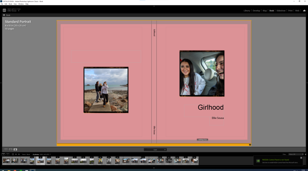
I am creating a soft cover A4 booklet with 20 pages, relating to girlhood.
The front and back cover is going to be one image in the middle of a pink boarder with a black bold title “Girlhood”, the pink will go round the back too, with my name in the top left corner.
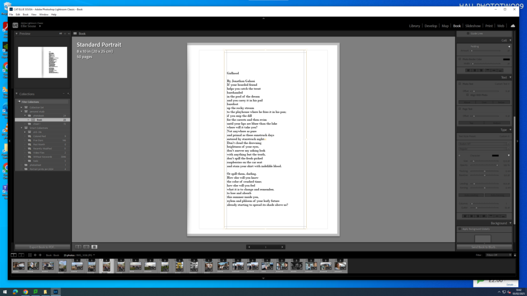
The first page is going to have a poem on it about girlhood.
You can also see the lay out in the top left corner.
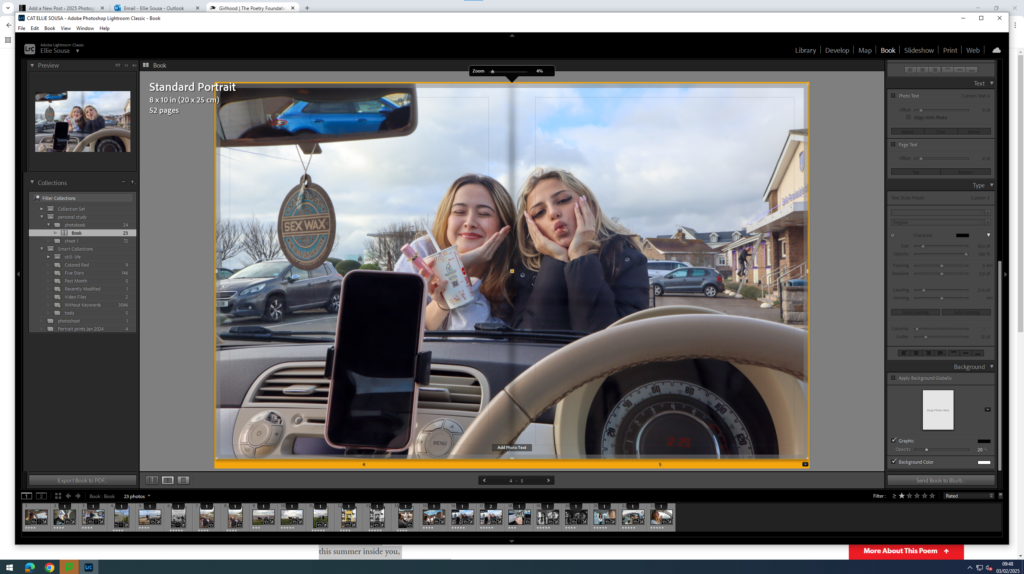
Page 2 and 3 is a whole spread page is one image of two girls posing and leaning in front of a car.
Page 4 and 5 is going to be a side by side comparison of a normal photo and then a black and white image.
Page 6and 7 is going to be one image on the right hand side.
Page 8 and 9 is going to be two images on the right hand side then one full spread on the left.
Page 10 and 11 is a full spread of just one image.
Page 12 to 13, another wide spread image on both pages.
Page 14 to 15, two images on the left an done image on the right.
Page 16 to 17, just one image on the right hand side.
Page 18 to 19, two images on the right hand side with one image on the left, full bleed.
On page 20-23 goes my essay.
Here is the final look on lightroom.
I really like the way the images are set out, I focused on capturing cute girly moments. I used to colour pink colour to show the ‘stereotypical’ girl type. There are different tones and settings, like the beach and a car where the girls are singing and eating food which I think captures the scene of girlhood, the girls are giggling and enjoying spending time together with no boys there. The images are set out in a certain way to try and capture this element of girlhood which adds value to the images.
The lighting is natural with a warm colour temperature and the arrangement of the images is specific to try and capture each image by itself so nothing blends in. There is a sense of repetition within the images as they are all interlinked and are very similar. The idea behind this work is that Gen-Z have a very different lifestyle when growing up, therefore I’m trying to capture this within my images. The essay provides a detalied text of what my project is really about and its very important for my photograph’s and photobook.
To what extent does Cindy Sherman and Justine Kurland explore female stereotypes.
‘To collect photographs is to collect the world’ Susan Sontag, On Photography 1977
To explore stereotypes means to focus on something that is aset idea that people have about what someone or something is like, especially an idea that is wrong. They are able to shape our perceptions of groups of individuals which can lead to misunderstanding and sometimes discrimination. I am going to be looking at the area of female and teenage stereotypes. The artists I want to explore are Cindy Sherman and Justine Kurland. I have chosen Cindy Sherman as she focuses on female stereotypes within her work, her photography is important because of the way it depicts how women are viewed in society. I have also chosen Justine Kurland as her focus in photography is on girlhood. Her images are representations of both childhood adventures and current experiences. Both artists explore the issues with stereotypes and draw attention to it. Both photographers stage their photo shoots instead of them being documentary photographs. Cindy Sherman regularly alters her appearance beyond recognition through make-up, prosthetics, and costumes. To create her images, she assumes the multiple roles of photographer, model, makeup artist, hairdresser, and stylist. She becomes the character in the story she is attempting to portray through her images. Justine Kurland also sets up her images but not with herself, instead using real people she approach in her elaborate staging of photographs. Kurland has used staged tableaux to explore the social landscape of girlhood, life on communes, and life in the wilderness. Both photographers’ images represent mirrors. Mirror images are usually called this when the photographer is trying to demonstrate or reflect something that they feel about themselves. John Szarkowski in his text, said a mirror is ‘reflecting a portrait of the artist who made it’ and ‘a mirror- a romantic expression of the photographer’s sensibility as it projects itself on the things and sights of the world (Szarkowski 1978). These two artists are mirrors as Cindy Sherman is a women herself and is trying to reflect her feelings and opinions on it to the viewers, and Kurland mirrors her own childhood through the use of other girls a representation.
Historical context: Feminism
Both of he artists I am focussing on have images published between 1977-2002. Cindy Sherman’s Untitled Film Stills composes of over seventy black and white photographs made between 1977 and 1980. By 1970, feminists had inspired women and men across the United States. Whether in politics, the media, or private households, the topic of feminism was everywhere. The representation of women in art in the past shared the idea that women were good enough to be painted, but not to paint. They were usually represented for their physical appearance and not as the ones who would do the paintings. Theorist L van Zoomen said, ‘a core element of western patriarchal culture is the display of woman’s spectacle to be looked at, [and] subjected to the gaze of the (male) audience.’ (van Zoomen 2019). I agree with this quote as it was usual for women to be in the paintings and not be the painter, usually posing in certain ways that would be more appealing for a male audience. Historical female photographers include artists such as Julia Margaret-Cameron and Claude Cahun. Cameron (1815-79) revolutionised photography and immortalised the age of the eminent Victorian through her monumental photographs with their muzzy focus and dramatic use of light. Cahun presents herself in a variety of guises, adopting different personas and exploring the fluidity of identity. She dresses as both men and women when exploring the theme of identity and gender roles. A quote she said was: ‘Masculine? Feminine? It depends on the situation. Neuter is the only gender that always suits me.’ (Cahun, Claude (2008). Disavowals: or cancelled confessions. The MIT Press. p. 151.) This shows her link with the theme of masculinity and femininity as she does not care which identity she takes and in a few of her photographs you can see her looking more feminine than others. Cindy Sherman’s work is one of the most direct link with the male gaze in art history. her images show woman in roles hat seem disempowered. she makes the image appealing but also leaves the viewer to interpret certain things which can often be unsettling as they wonder what the real meaning is behind the image.
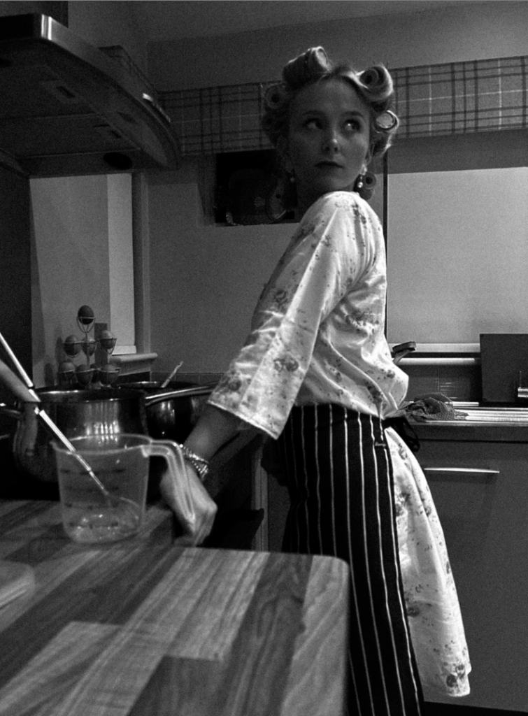
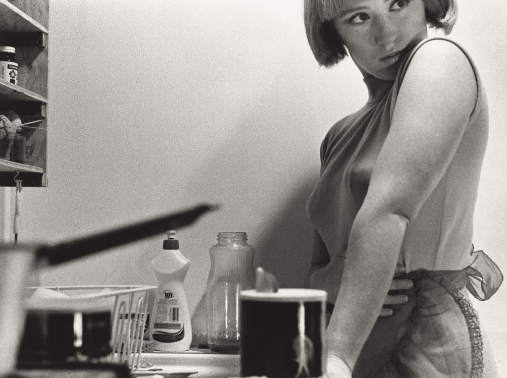
Cindy Sherman Cindy Sherman makes her photos come to life by using herself as the main aspect. She doesn’t merely represent stereotypes, she embodies them in different ways which then draws attention to the roles she plays which captivate the viewers. Sherman is known for creating fictional characters in her photographs, often using props, makeup and clothing to transform her appearance which is seen as an exploration of identity. Sherman uses elaborate makeup and costumes to create transformations in her appearances and characters. This allows her to explore issues of identity, subjectivity and gender, while challenging the conventions of visual representation. Cindy Sherman said,‘I never thought I was acting. When I became involved with close-ups I needed more information in the expression. I couldn’t depend on background or atmosphere. I wanted the story to come from the face. Somehow the acting just happened.’ Being a woman, she is able to share her ideas possibly from her own experience which could make the images more personal to her and important to her. Sherman satirizes the audience’s gaze on the female body and solidifies female aesthetic standards. Cindy Sherman’s work has had a major impact on contemporary photography. Many artists were influenced by her work, and her technique of deconstructing stereotypes and conventional representations is still an important reference for many artists today. Sherman’s work is often credited as a major influence for contemporary portrait photographers. One such photographer is Ryan Trecartin, who manipulates themes of identity in his videos and photography. Now 30, he began taking pictures of himself and his friends role playing and cross-dressing while still in junior high school, when he was also introduced to Sherman’s work. Sherman’s influence on other artists work was known as “The Cindy Sherman Effect”. She focusses on stereotypes to the extent where it has an impact on the community where she considers social and political issues surrounding stereotypes and woman in general such as female representation in popular culture and the performative nature of identity. In the image below, It could be interpreted by the viewer that Sherman is impersonating a stereotypical house wife from the late 1950s or early 1960s. This can be clear by the objects she adds to the image to subtly create this thought. The use of the sauce pan and soap bottle suggest to the viewer that she could be pictured in a kitchen. As well as this, she is also wearing an apron. The construction of the picture hints at a number of possible narratives and is open to a range of analyses. One analysis a viewer could make is a negative event occurring. The black and white can cause an ominous feeling or sense of tension and the tone of the image makes it feels like a dark and scary moment for the woman. she can be seen to be looking over her shoulder and the viewer can interpret that to what they like but it was usually be a negative thing she may be looking at as her eyes look concentrated on something that could be making her scared. Sherman is also seen holding her stomach which could be a usual comfort for a woman so this could further suggest something to make her uncomfortable is going on and further shows how she depicts the theme of vulnerability in her photos.
Cindy Sherman – Untitled Film Stills #03, 1977
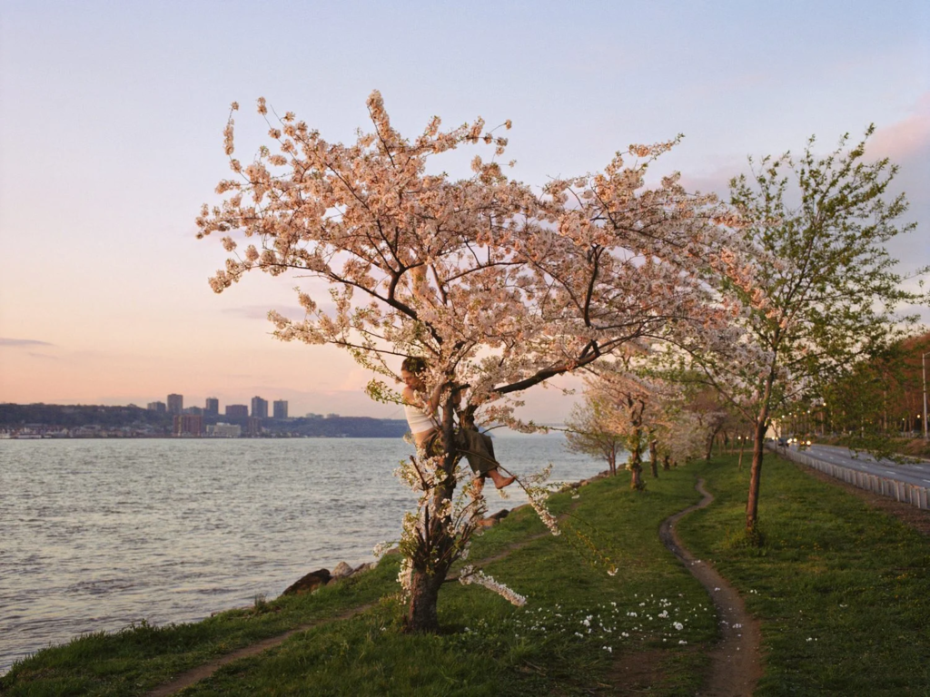
Justine Kurland Justine Kurland focusses on themes of freedom, rebellion, and the defiance of gender expectations. Kurland’s main project was called Girl Pictures. Kurland started this project in 1997 when she was a graduate student at Yale. Kurland decided to reverse certain stereotypical representations by rather than showing girls as passive or vulnerable, she represented them as strong, confident and free-spirited. The main environment of her images are usually in wild settings like rural or urban places which would be the opposite of a typical environment where girlhood would be imagined to be placed. She first photographed a fifteen year old girl called Alyssum who was the daughter of Kurland’s partner at the time. As well as this she also photographed groups of friends who were teenage girls and she staged the images where she depicted life on communes and life in the wilderness. In her project Girl Pictures. writer Rebecca Bengal says, ‘one in six of us will never figure it out. One in six of us will never leave here. One in six of us is bound to disappear. One in six of us, she’ll surprise you’. (Bengal 2020) This quote important as its showing how every teenagers life is different and the decisions they make now will impact where they end up. She represents the stereotype of a teenager who is figuring things out at the same time as going through things. The lighting in the image below is natural and seems to be at either sunrise or sunset. The lighting sets a feeling of calmness to the viewer as it looks tranquil and relaxing. The warming tone also contributes to the idea of tranquillity. In this image, Kurland is photographing her partners daughter, Alyssum. This image shows Alyssum in the centre of the image holding onto a tree. The way she is holding onto he tree creates a sense of fear as she seems to be clinging onto it and not wanting to let go. Her being in the centre of the image I think works really well to create a deeper meaning of the image. the water next to her seems to be travelling one way on the left of the image whereas the direction of the headlights of the cars suggest the road travel the opposite way. as well as that, there’s a pathway on the grass which is also creating a direction. Alyssum’s body faces the road whereas she’s looking over her shoulder at the water which creates the idea that she doesn’t know what direction to go in or what path to take and seems to be lost. This links to stereotypes of young people as its showing the confusion of the mind and having the ability to make decisions for yourself but still not knowing which direction to go. Teenagers could relate to this image as they may also not know what to do or where to go as they enter the part of their life where their decisions have a major impact on their futures.
Justine Kurland, Pink tree, 1999
Conclusion
Both Cindy Sherman ands Justine Kurland are two of the most important photographers when it comes to themes such as identity, gender and roles in society. They have different techniques such as Sherman taking her images as self portraits which have been constructed an staged way. Whereas Kurland takes her images of other individuals and not herself in open naturalistic aesthetics where the environment is a rural wide-space. Though they have differences, their main themes are femininity, gender roles and identity. Both photographers attempt to present themselves in their images when focussing on the theme of identity however they do this in slightly different ways. Sherman uses her identity to show her opinions on the stereotypical female roles through using herself. She embodies them in different ways which then draws attention to the roles she plays and ultimately captivates the viewers. She is able to transform her appearance which is seen as an exploration of identity. Kurland shows her opinions and thoughts by using other people to reflect herself onto them. In her work Girl Pictures she depicts young women in wilderness settings and shows the ongoing theme of freedom and rebellion where she often places the individuals (herself) in natural environments in the wild. Another difference is how they explore identity in different ways. Sherman shows the stereotypical female societal roles in her images where she sticks to showing how woman are viewed where they are presented as disempowered and link largely with the male gaze. Whereas Kurland shows the female identity in opposite ways by depicting girls rebelling and being out in fields and rural areas where hey seem to be empowered rather than disempowered which would usually not be the typical image of a female. Both artists don’t just use their images to represent themselves, they represent everyone who can relate. Sherman represents every woman and Kurland represents most teenage girls. Though the artists approaches to this theme differ, they both manage to challenge the reality of being a woman. With the work I have produced, I would say it is more similar to Kurland’s work than Sherman’s. In one of my photoshoots, it focussed on group of my friends who were all girls. This is already a similarity between Kurland’s work and she also takes images of groups of girls. The settings of hers and my work could be seen as fairly similar as I also used places such as fields to take my photographs and got the subjects of the images to engage in activities such as tree climbing. In terms of Cindy Sherman, as a large majority of my images surround females I am able to compare mine to hers as a similarity. My photographs are images of others which links with Kurland’s work rather than Sherman’s as she tends to do self-portraits instead. I also believe that, like Kurland, my images would be seen as mirrors as I am reflecting my life through the use of my friends. in comparison to this idea, some of my other photoshoots could be seen as windows as I photograph the subject engaging in activities that is normalised for them (for example dancing) and so this would be a window as its taking a look into someone else’s normal activity that I don’t relate to. One of the photoshoots that focuses on one of my friends dancing links to Cindy Sherman and the idea of female stereotypes as dancing could be considered a female stereotypical sport (especially in the past).
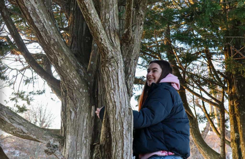
My own image inspired by Justine Kurland (Pink Tree)
Bibliography
Feminist theory van Zoomen, L. (2019). ‘Feminist Theory’ in Dixon, M. Media Theory for A-Level Students. London: Routledge.
Justine Kurland
Bengal, R. (2020) ‘The Jeremys’ in Girl Pictures. New York: Aperture.
Historical paragraph Claude Cahun
Cahun, Claude (2008). Disavowals: or cancelled confessions.
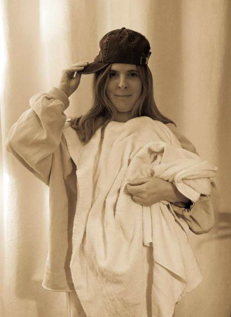
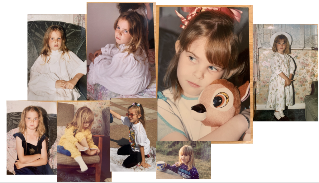
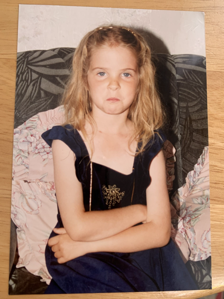
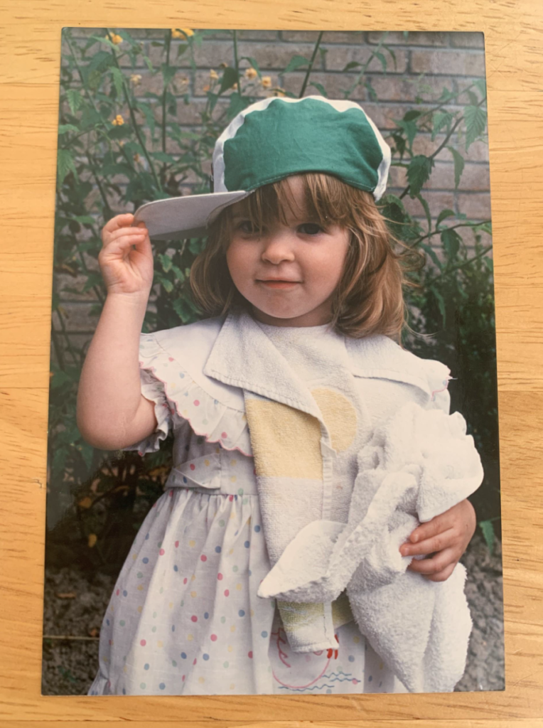
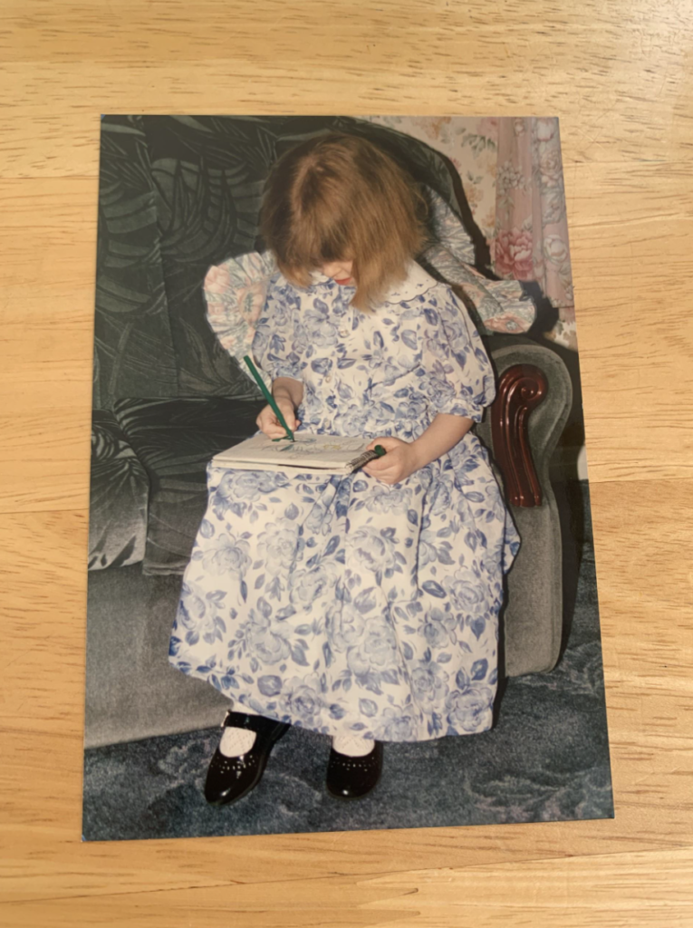
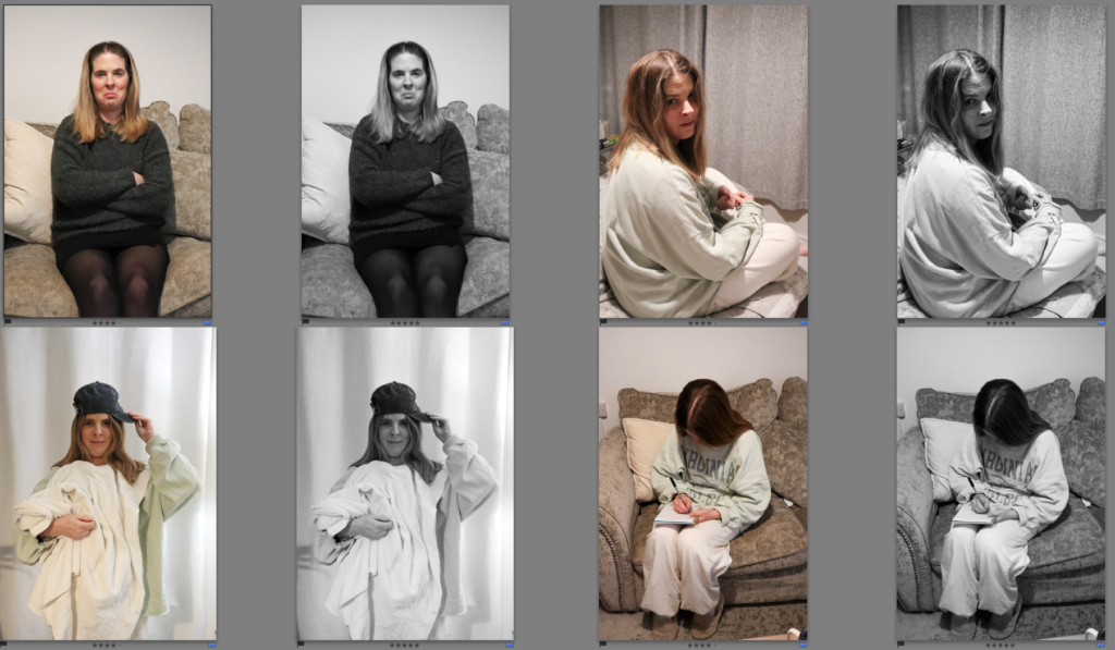
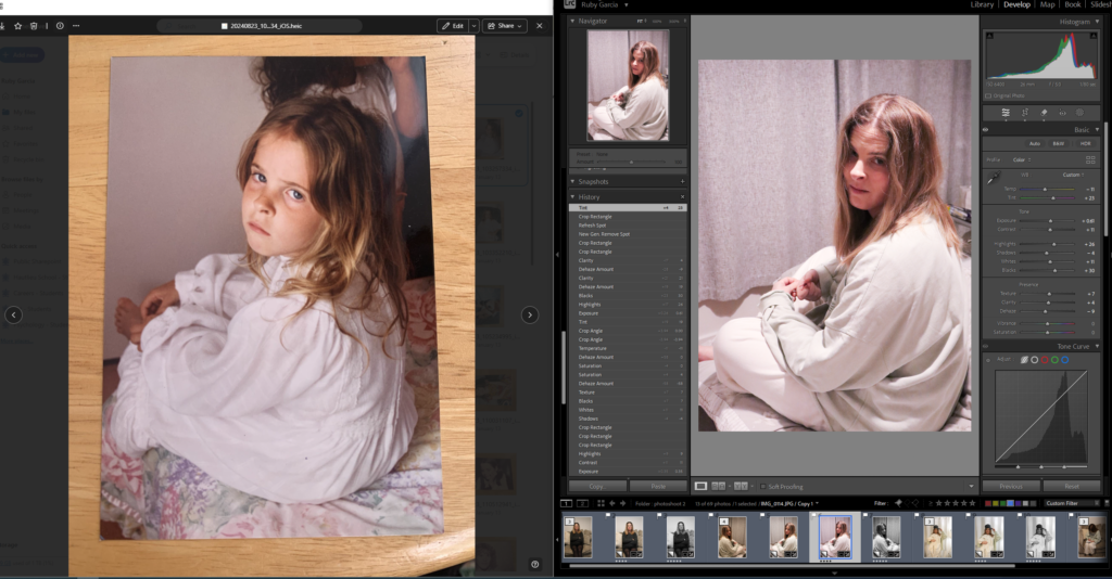
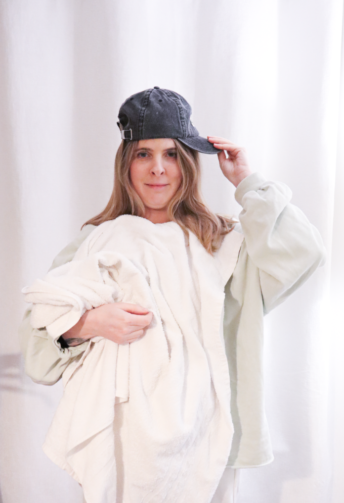
For my second photoshoot I decided to focus on photographing my mum in the same style as older images of her.
Selecting images:
I selected 4 images that I was going to restage. I chose a variety of images with various different angles and poses. When doing my photoshoot I aimed to use similar props to the original images such as the cap.
Photoshoot:
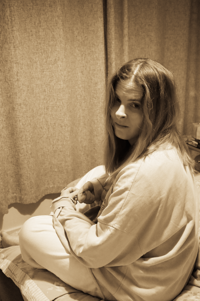
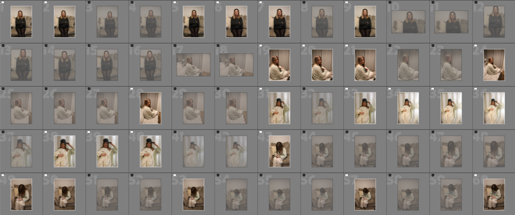
I went through my images and selected my best images as white flags and the ones which aren’t as successful as black flags.
Best images:
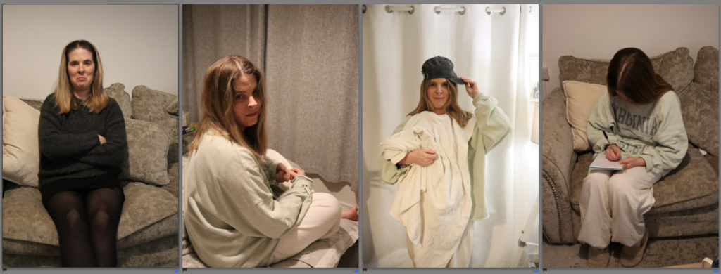
I then went through and chose my favourite image for each category (each photo I recreated). These are the images which I will focus on editing.
Editing my images
I created a total of 8 edits from the 4 selected images, these are basic edits I have created where I have just adjusted basic settings. I also made a black and white copy of each of my edits so I can decide which one I will prefer to use within my photobook.
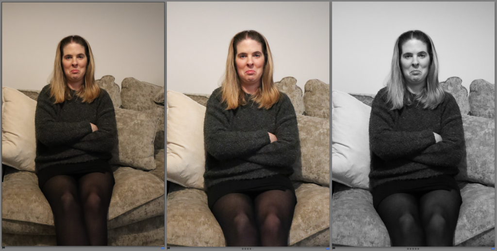
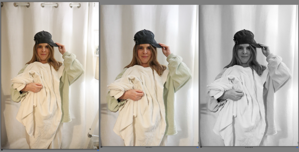
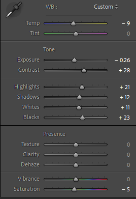
Edit 1:
I found that the before image had a lot of warm tones in it, to fix this I reduced the temperature of the image. I also increased the exposure of it as it was quite dark. I like how this image has turned out as I managed to achieve a similar look to the original image that I aimed to restage.
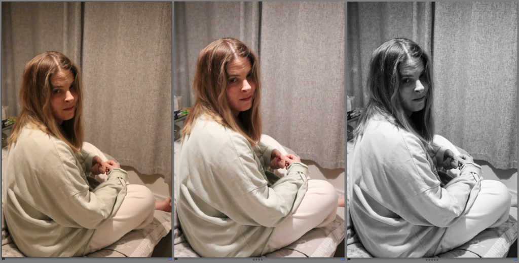
Edit 2:
To make it similar to the original image I flipped the photo horizontal as that is the same way the original photo has been taken. To do this I selected the option ‘photo’ along the top, and then selected flip horizontal. I did similar adjustments to this image like I did for the previous edit as it also had a warm tone to it.
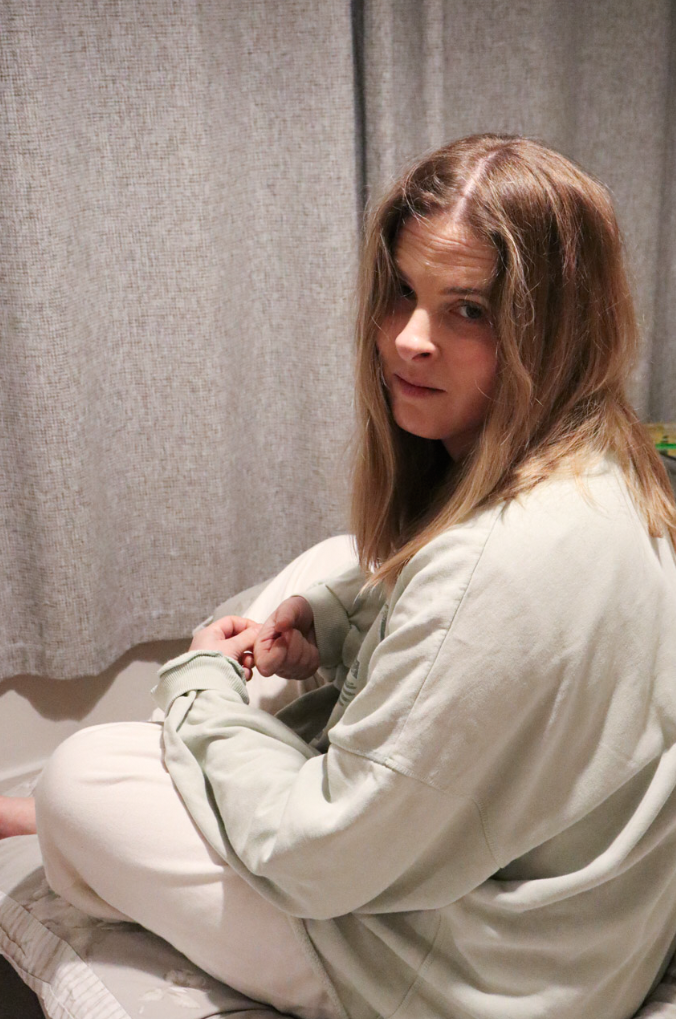
Edit 3:
For this photo I cropped the top of the curtains out as well as most of the shadows on the left. I also cropped out the lamp. I prefer the black and white version of this image to the coloured one as I don’t think the colours go well together in the original image.
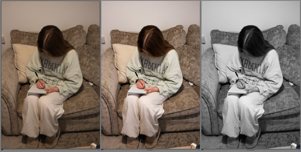
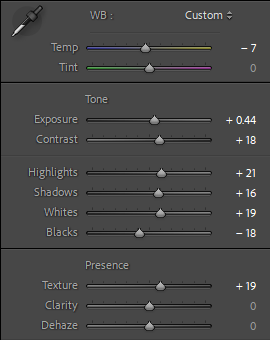
Edit 4:
The unedited image was underexposed as it was quite dark, therefore I increased the exposure and I also increased the contrast to make the image sharper and more detailed.
Experimental edits:
Edit 1:
I set up my screen like this so I was able to adjust the tones of my image to match the original one. I experimented with adjusting the tone to make it more pink/ purple like the original image.
To make further editing easier I chose to create my own preset so I am able to apply it to my other edits.
Other edits with this preset:
Evaluation:
Overall I think this shoot went well as I managed to recreate multiple old images in a similar way. I was also able to edit them in similar ways to the original images.
Research and identify 3-5 literary sources from a variety of media such as books, journal/magazines, internet, Youtube/video that relates to your personal study and artists references .
Begin to read essay, texts and interviews with your chosen artists as well as commentary from critics, historians and others.
It’s important that you show evidence of reading and draw upon different pints of view – not only your own.
Take notes when you’re reading…key words, concepts, passages, page number to be used for in-text referencing etc.
Essay Question
Think of a hypothesis and list possible essay questions
Below is a list of possible essay questions that may help you to formulate your own.
Some examples of Personal Study essays from previous students:
Essay Question : In society, how do females connect with each other through interaction and how do they overcome the stereotypes of gender roles?
Essay Question : Looking at Justine Kurland and Ramona Wang; how do females connect with each other through interaction and how do they overcome the stereotypes of gender roles?
Essay Plan Make a plan that lists what you are going to write about in each paragraph – essay structure
Essay question:
Opening quote
Introduction (250-500 words): What is your area study? Which artists will you be analysing and why? How will you be responding to their work and essay question?
Pg 1 (500 words): Historical/ theoretical context within art, photography and visual culture relevant to your area of study. Make links to art movements/ isms and some of the methods employed by critics and historian.
provide an historical overview of origin of tableaux photography and its links to Pictorialism and Tablaux Vivants – include an example as illustrations. – see text about Tableaux in BIB Provide theoretical context of the male gaze on the female with referenced to examples within history of painting – see texts Girlhood and photographic gaze in BIB
Pg 2 (500 words): Analyse first artist/photographer in relation to your essay question. Present and evaluate your own images and responses.
Pg 3 (500 words): Analyse second artist/photographer in relation to your essay question. Present and evaluate your own images and responses.
Conclusion (250-500 words): Draw parallels, explore differences/ similarities between artists/photographers and that of your own work that you have produced
Judith Butler is an academic and writer who is an authority on feminism and gender studies, incl queer theory. Her seminal book is: Gender Trouble which we do have a copy of in the Library LRC and in Media. Here is a good overview of her work – make sure you read it all and watch video as well.
van Zoomen, L. (2019). ‘Feminist Theory’ in Dixon, M. Media Theory for A-Level Students. London: Routledge.
Sontag. S. (1977) ‘In Plato’s Cave’ in On Photography. London: Penguin Books = ” To Photograph is to appropriate the thing photographed.” “It means putting oneself into a certain relation to the world that feels like knowledge – and, therefore, like power.”
Essay Draft
My area of study is about femininity and how females interact with each other. I look into the female gaze and how woman overcome the gender roles and stereotypes of society. In my personal study I will be focusing on how woman overcome gender stereotypes through rebelling during their teenage life. The artists I have chosen to look at is Justine Kurland and Ramona Wang. I have chosen these artists because they look at how females support each other and how girls feel empowered when they are together. In Justine Kurland’s photoshoots, she expresses through the experiences she did not get to do as a teenager. Justine Kurland uses tableaux photography; this name comes from the words “Living Picture” in French. Tableaux photography is an image or array of images staged in a set environment to convey a narrative. Justine Kurland stages her photoshoots to make the images look like real life and to create a meaning behind each image. Ramona Wang looks at the female gaze and how woman’s empowerment makes them feel comfortable together. I feel as though both artists correlate to my area of study because I am inspired by the way they create their images and how they create a meaning behind each one to portray girlhood. I am going to create my own tableaux photography like Justine Kurland to neglect the gender roles of young females.
Throughout the years there have been many various waves of feminism to encourage equality. There have currently been four waves of feminism, the first one being for woman to have the right to vote which took place in the 19th century and the early 20th century. This all started because females were denied basic rights which led to these movements taking place. Tableaux photography is a technique used by many photographers to convey a narrative through an image or a series of images. The term “tableaux” was first used in an art context in the 18th century by a philosopher, Denis Diderot to describe painting and it comes from the French word “Living Picture”. In Victorian times Tableaux Vivint’s were a popular form of entertainment, this consisted of recreating artworks on stage based on a painting. Therefore, tableaux photography involves a performance before the camera takes the shot, which is usually instructed by the photographer who tells the models what to do and how to pose. In the 1880’s, photographers wanted photography to be artwork, and this led to them using tableaux to mirror paintings and other artwork. – Not finished
Justine Kurland is a contemporary fine art photographer from New York born in 1969. At the age of 15 Justine Kurland left her home to live with her aunt in Manhattan and this was where she found her interest in art. I am inspired by Kurland’s photoshoot titles “Live Dangerously” which is a series of images presented as part of her exhibition in 2004. This project is about revealing bold and dynamic ways that females inhabit nature. The images in her project include teenage girls setting off smoke bombs, skinny dipping, climbing trees and other activities similar to these. Kurland created these images to express the things she didn’t get to experience as a teenager, and she wanted to reveal the things that she wished she had done. She wanted to portray the idea of a coming world where girls were not categorized and where they could find protection and empowerment together and within themselves. She used teenagers in these staged images because she wanted to portray the sense of freedom for females and how they express themselves in the Suburban settings where she chose to take her images. Kurland would travel up and down the country looking for locations to set her photographs in and finding girls on her way because she wanted to create a society of females and how they would react with freedom contrasting from their bedrooms where they are isolated. The locations were chosen carefully to create their own sense of danger and risk and to portray the exploration of identity. She wanted to show how females connected with each other through the female gaze therefore she wanted the girls to care for each other and this turned into a reality of the girls helping each other, feeding each other and resembling protection. Justine Kurland uses tableaux photography when creating her images to convey a narrative for the viewers. In relation to my project, I am inspired by Justine Kurland’s artwork as it shows the empowerment of woman as a collective. I am going to set up my photoshoot in woods and fields and use the tableaux photography technique to stage my images to portray a feeling of girlhood. I am going to ensure that in my images, the relationship between the models is a sense of comfort within themselves and as a society. I will use woods and fields for my photoshoot in relation to Justine Kurland because I want my images to have the perception of freedom where the images show the viewers the things girls are stereotyped into not doing instead of having a sense of carelessness.
Mary Ellen Mark is an American photographer who was known for her photojournalism and documentary photography. Her work is displayed in museums and published worldwide. She was born in Pennsylvania and started photographing things with a box brownie which is a carboard box camera. She discovered a passion for art when she was at school and later attended the University of Pennsylvania where she earned a bachelor’s degree in fine art. Soon after Mary Ellen Mark got a scholarship to go and take pictures in turkey for a year which is where she produced her first book; Passport. She also visited England, Greece, Germany, Italy and Spain to take photographs. When she was in her mid 20’s she moved to New York and started taking pictures of the war, specifically the woman’s role during the war where she was able to capture the raw vulnerability and resilience. One of mark’s most famous projects was called “Streetwise” which was published in 1988. Mark took pictures of the lives of children and teenagers who lived on the street to spread awareness of their struggles to survive, and the stereotypes others have. Mary Ellen Mark tended to photograph things that not many people were aware of like poverty, illnesses and prostitutes, to spread awareness of the poor circumstances in people’s lives.
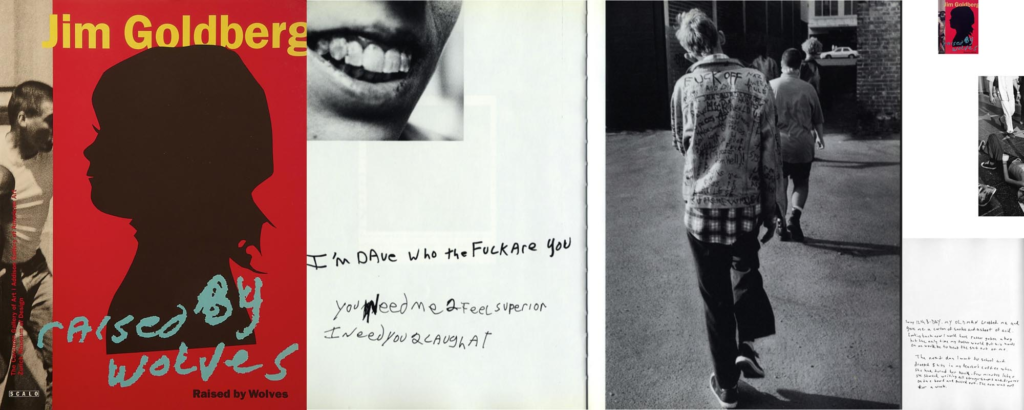
To what extend is autobiography explored in the work of Jim Goldberg and Jo Spence?
‘Since 1970, I’ve been using text and ephemera as well as photographs in order to tell stories of one kind or another. There’s a thread that runs through all the work that is to do with bearing witness. The photographs are about asking questions, though, not answering them.’ – Jim Goldberg. [Jim Goldberg Online] [accessed 29 January 2025]
An autobiography is the story of oneself told by themselves. Autobiographical works can take many forms, from letters, to diaries to self publishing books about yourself. They are not always intended to be published, but sometimes they can answer history, or tell stories of ones who once lived, who did incredible things that went unnoticed. When it comes to autobiography in the forms of art, some artists tend to use their work as an autobiography, This to bring reality what actually goes on in their lives or make themselves more relatable to the one who looks at their work, they humanize themselves in their own creative way. In my area of study I will be focusing on identity, and teenage life, and what it is really like and how it can be seen by everyone else. In a way it is almost like an autobiography but also a biography for all other teenagers who can relate to my photobook. I will be analysing Jim Goldberg and Jo Spence in this essay, they are both photographers that I have looked at for inspiration. They both have an autographical sense to them in their work, Jim Goldberg focuses on others lives but represents his relationship to them through his text, which gives the autobiographical aspect, when Jo Spence uses her photography as a self-representation and self-exploration, which is very autobiographical. I want to analyse both these artists because I find their work not only incredibly touching and amazing, but they also relate to what I am doing and and fit well into autobiography. I will be responding to Jim Goldberg’s and Jo Spence’s work by not only using their images as an inspiration and creative guideline but also writing about the historical, theoretical, and visual cultural relevance to my area of study.
The historical concept of art, is a product of materials, cultural movements, and outcomes. The theoretical concept of art, shows within the philosophies of it that explains what art is, yet like philosophy it also opens even more questions. Art and photography also has lots of cultural relevance. Cultural relevance is taking account of the different cultural backgrounds. Art does this very well. Photography shows cutural relevance with its artists, they go out of their way to make images that can change the view of the world, just by showing all the different cultures. Two artists who show historical concept, theorerical, and cultural relevance, are the ones that I plan to study and write about in this essay, Jim Goldberg, and Jo spence. Jim Goldberg has a historical concept to is work. For example, his work Raised by Wolves is about teenagers who runaway and live on the streets of San Francisco. This has a historical concept as it about what teenagers have gone through, their past, their history and their story, which Goldberg’s gets to explore through photography. Goldberg not only tells history of child welfare and homelessness, but also makes history by talking about it, he shows the world what it is like for some children who dont have an easy life growing up. Jim Goldberg has a theoretical concept in his artwork as well, as he shows documentary work, and storytelling, this makes it theoretical as it plays around with illusions and it’s not meant to be concerned with hypothesis and theories. Now his cultural relevance is again within his book ‘Raised by Wolves’ he shows homelessness and neglect in a different light, as a subject that is overlooked and mistreated by mainstream media. Most people do not want to come to the reality of what it is really like for some children, some people and some cultures. This all relates to my area of study because I will have a historical, theoretical and cultural concepts in my project similarly to how Goldberg presents it his photobook. Jo Spence is the second artist I am studying and analysing in this essay. She also demonstrates historical, theoretical and cultural relevance. Spence shows historical concepts too and presents it through her illness and social class. This is all theoretical, because of the representation of identity she using throughout her work, especially in The Picture of Health. The cultural aspect comes into this as Spence lays out class, gender, and health. Her photography fights against social class “norms.” This also relates to my area of study as I focus on identity, with a touch of gender roles, mainly on women and slightly focusing on social class as a teenager. Just because we are in different classes does not mean that sometimes things going on in our lives cant be similar.
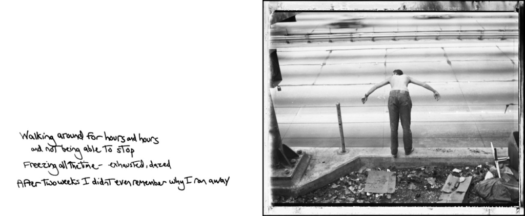
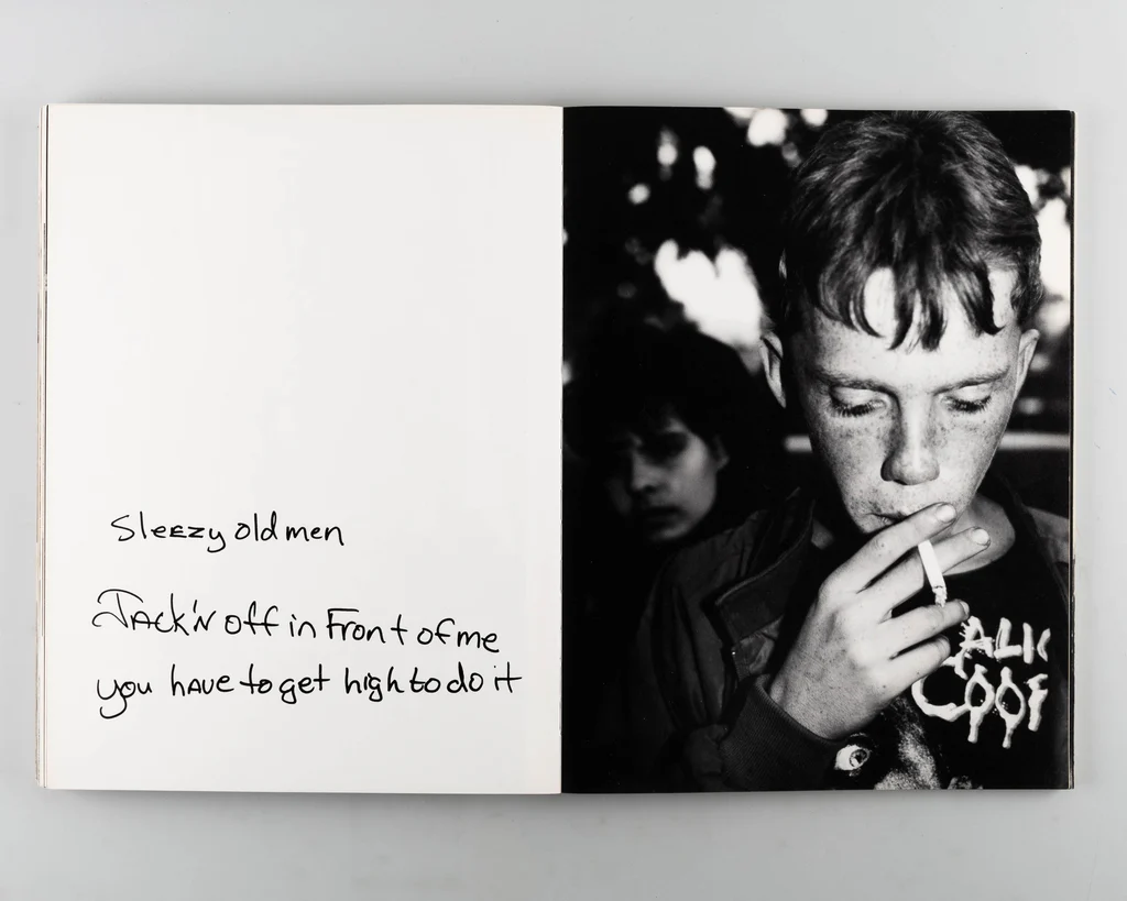
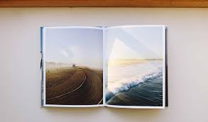
Jim Goldberg is an american photographer, he creates documentary-style photos that explore identity, homelessness, child welfare, and society. He demonstrates this in his photobook Raised by Wolves.’ This is a very impressive and powerful piece of work and I find his work incredibly moving because not only does he tell a relevant story, which took him over eleven years to create, but he adds in his own creative aspect of using written words over his images, explaining children’s stories and using the power of only one little sentence which can tell us everything about an individual in such a moving way. For example, ‘In the transcript Dave admits that he is “making things up” because “It doesn’t hurt as much” (36). Already we know that Tweeky Dave is who he says he is, who the other street children think he is, and not his “real” history.’
Jim Goldberg, page 30 and 31, Raised by wolves. 1995
Jim Goldberg’s work, looks into autobiography by showing peoples personal narratives, using juxtaposition between photographs with his own handwritten text next to them. The texts represents conversations Goldberg had with his subject when he was photographing them. The combination of images and text tell their stories more in-depth, which makes it more biographical. Goldberg does this by collaborating with his subjects, i.e. the young people he meets on the streets, and this represent the individuals own autobiographies. He explores others autobiography but also his own in the position as the narrator. Goldberg’s work is a complex examination into autobiography, which meandering past the dainty ridges into a casual wind, thus creating a ceaseless discourse between self and society.
Jim Goldberg, page 72 and 73, Raised by wolves. 1995
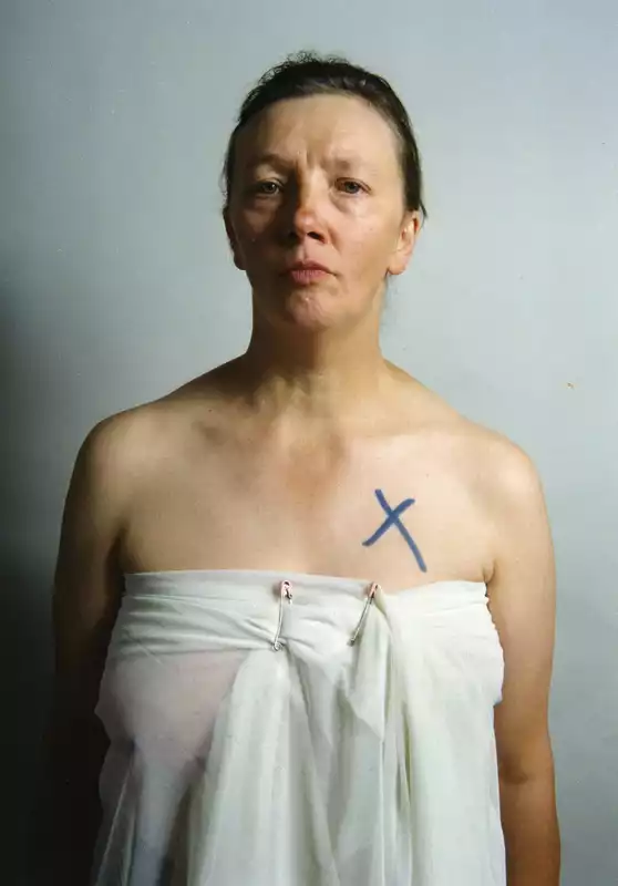
Jo Spence is a British photographer, who also explores identity, and her illness and social class. Spence explores autobiography through photographing her own body and life experiences. Her photography is moving and graphic to document her fight against cancer. she takes images of her body at its natural. It’s influential and inspiring as she shows herself in a genuine and vulnerable place. She turns her personal suffering into an journey of self exploration for not only herself but all the other women who look at her work, and are influenced by it, especially in her series of work The Picture of Health. She uses autobiography as the basis from which to consider the complexities of identity, vulnerability, and agency, employing her life truly as the site for challenging larger societal views on health, beauty, and the body, thus rendering her work a deeply personal yet universally relevant investigation of self.
Jo Spence, A picture of health, 1982
In conclusion, A clear parallel between Jim Goldberg and Jo Spence, is that both the artists engage with autobiography through documentary photography and self-portraiture. Jim Goldberg emphasises others lives, showing marginalised communities whereas Spence used her own body to express the narratives of illness and identity. Her struggle with cancer becomes her own autobiographical experience to contest social expectations of the body and health.
Goldberg and Spence both use photography as a means to confront concepts of identity, self-representations and social norms. Goldberg, for instance allows the stories of his subjects he photographs through texts alongside the images, creating an autobiography of sorts involving their life experiences and his own as the narrator. Spence, centers her own body but also life experience like Goldberg, and creates a personal autobiography. The two artists have worked allowing their own narratives to outline greater social issues.
However, Goldberg uses his photographers voice to tell stories of others. Autobiography becomes a slight biography as Goldberg holds the position of power with his camera that attempts to narrate a visual story, and links this story to his own productive engagement with others. In contrast, Spence is a more direct and stereotypical form of autobiography. She explores her illness and societal expectations by making self portraits of her body and her life. The difference lies in that Spence uses her own body as the central site of storytelling
In summary, Both artists explore autobiography, they demonstrate it in different ways but both very powerful, I plan to have a similar aspect to my final photobook, as I use both these artist as inspiration. I plan on creating an autobiography similar to Jim Goldberg as I will have photos or teenagers an teenage life, and what some teenagers resort to or what we usually do, using ideas from Goldberg, but it will also be similar to Jo Spence because it will be an autobiography on myself as well, because I am also a teenager and I live the same life I am just demonstrating it through other people, yes I don’t do all the same things but as they are my friends and their lives I feel I also relate being part of their lives. Here are some image example to show my similarities.
Jim Goldberg, page 220 and 221, Raised by wolves.1995
Jim Goldberg, page 22 and 23, raised by wolves. 1995.
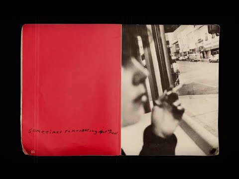
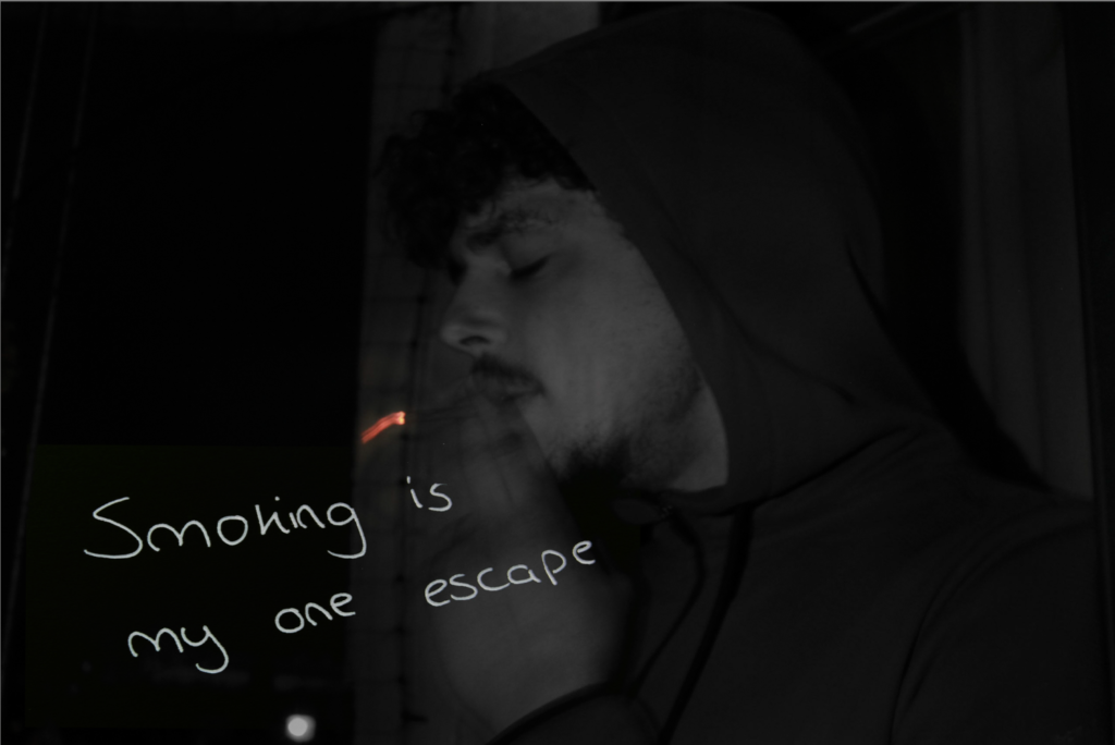
Coco Moore, ‘Escape’ 2025.
Jo Spence, The Final Project, 1991–92, photograph.
1. Write a book specification and describe in detail what your book will be about in terms of narrative, concept and design with reference to the same elements of bookmaking as above.
Narrative:What is your story? Describe in:
3 words
Journey of identity.
A sentence
My book will be covering the complex journey one goes through as they discover who they really are.
A paragraph
My book will explore the transformative journey of identity. It will begin by capturing people in moments of struggle as they face self doubt, confusion, and the torture of trying to fit in with societal expectations. These images will reflect the tension of searching for belonging and authenticity. As the photobook progresses, its perspective regarding identity will shift as I slowly start depicting individuals who are starting to embrace their true selves with confidence and acceptance. Finally, the last page of my book will celebrate the beauty of self discovery and the power of embracing one’s identity. I hope to highlight to the viewer the strength, resilience, and freedom that comes with embracing who you truly are.
Design: Consider the following
How you want your book to look and feel
Paper and ink
My book is going to consist of matte paper.
Format, size and orientation
It will be A4 in size and have a portrait orientation.
Binding and cover
It will have a hard cover with a saddle stitch holding the pages together.
Title
The title of my book is ‘Beneath the surface’
Design and layout
My book will vary in regard to my layout of images. It will consist of some full spread images over double pages or single pages. Additionally, some of my images will be joint together, using different design layouts.
Editing and sequencing
The start of my book will be focusing on people struggling with their identity and hiding behind a facade. Then, towards the end of the book, the images will focus on embracing identity/ discovering who you are.
Images and text
My book will include some text about the artist whose work I replicated and what perspective their work takes in relation to identity.
2. Produce a mood-board of design ideas for inspiration. Look atBLURB online book making website, photo books from photographers or see previous books produced by Hautlieu students on the table in class.
For my photobook, I will be presenting my images in a time chronological order to represent the growth of girls in contemporary society. I will be using the concept of online social media to show how girls have grown up to become different due to the influence of social media.
The first part of my photobook will represent the time in life where girls didn’t rely on social media to make friends or be happy. I will make sure the subjects in my photos are surrounded by colour and a nature setting.
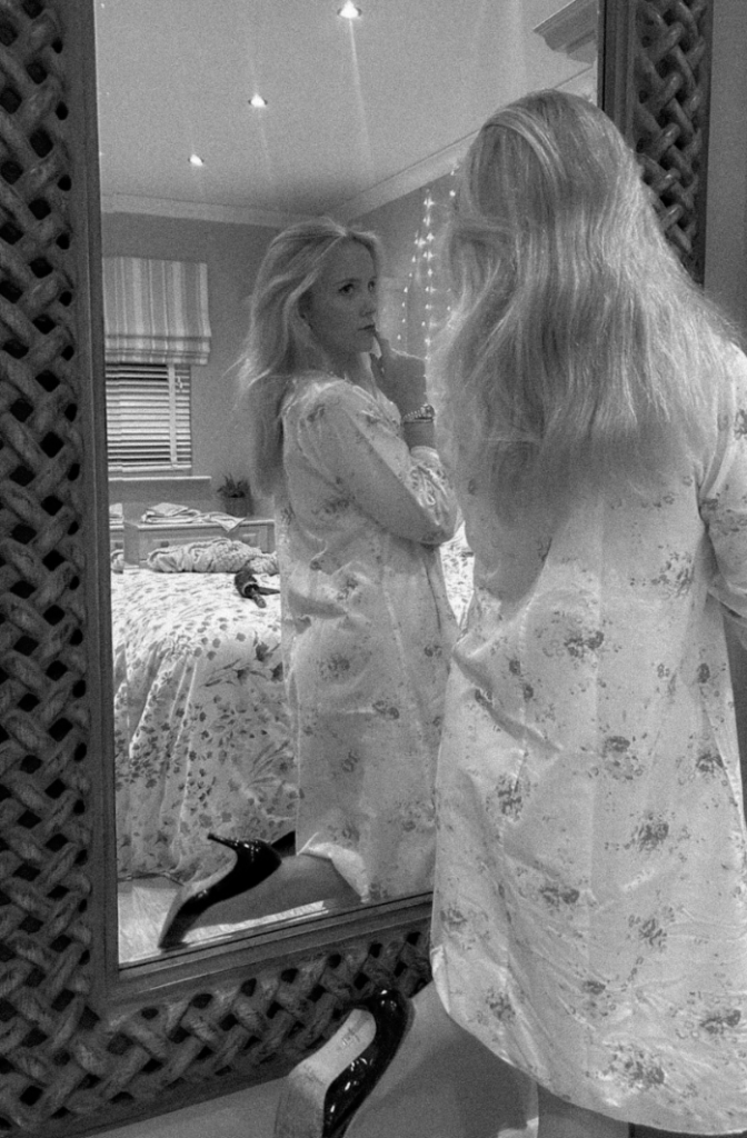
The second part of my photobook will show the affects of social media, like insecurities and having to worry about their appearance. I will show this through my subject looking at her reflection in the mirror with a worried facial expression.
The third and final part of my photobook will represent girls nowadays, where social media and mobile phones have taken over their lives. I will show this through the rebellion of girls who are drinking alcohol and smoking/vaping, as well as showing the friendships and connections between the girls.