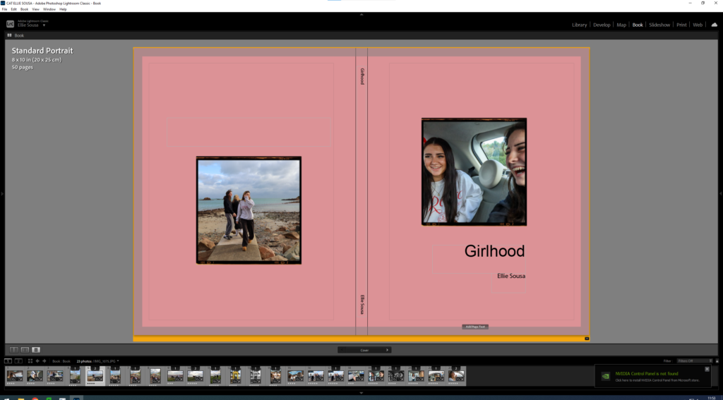
How is the work of Cindy Sherman and Nan Goldin questioning the politics of gender and female stereotypes?
“In the past, photographs of women were made by men for a capitalist economy to favour the male gaze and feed female competitiveness” By Charlotte Jansen.
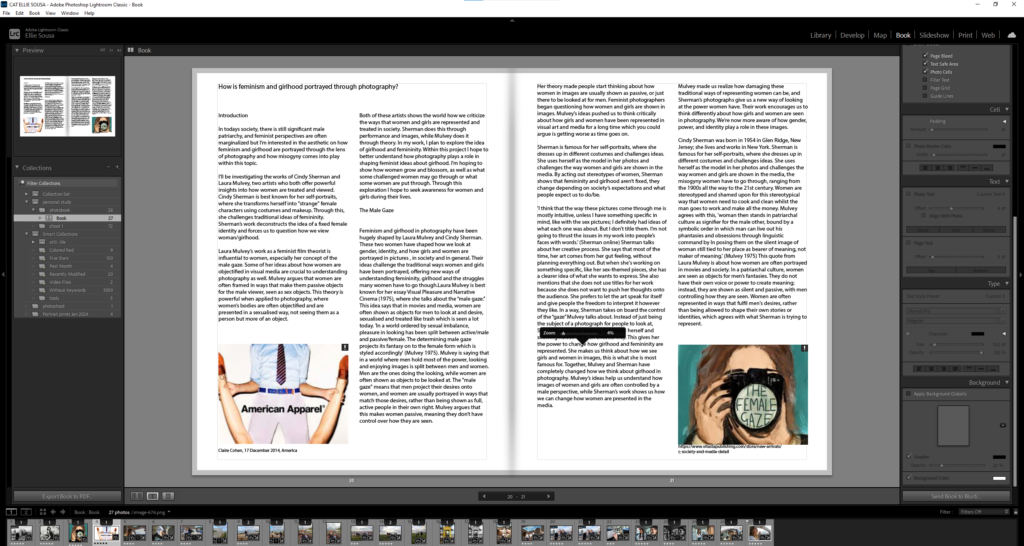
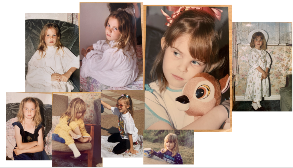
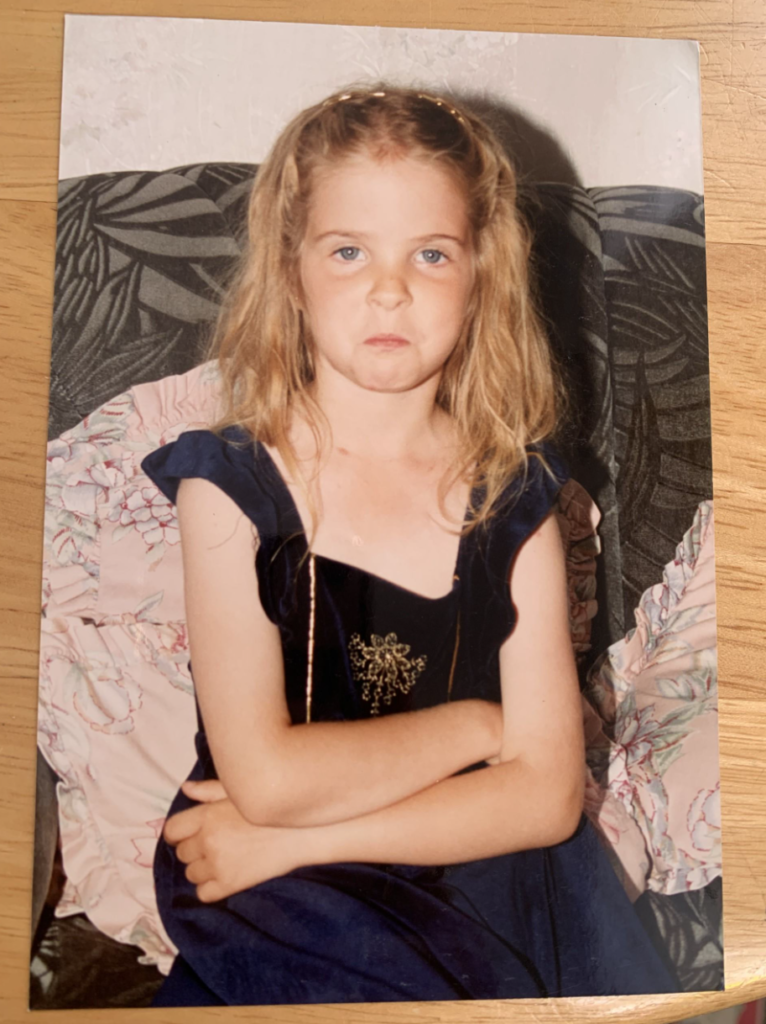
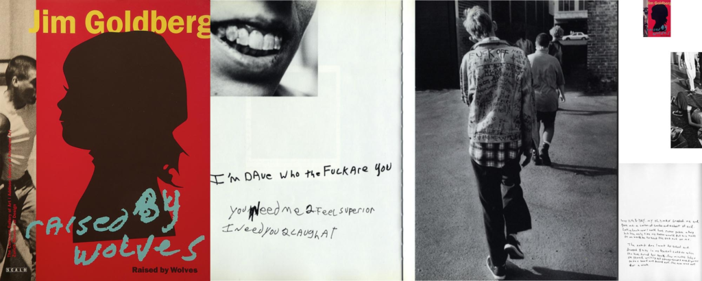
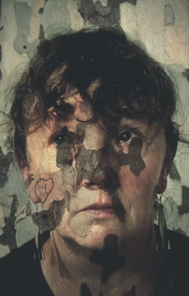
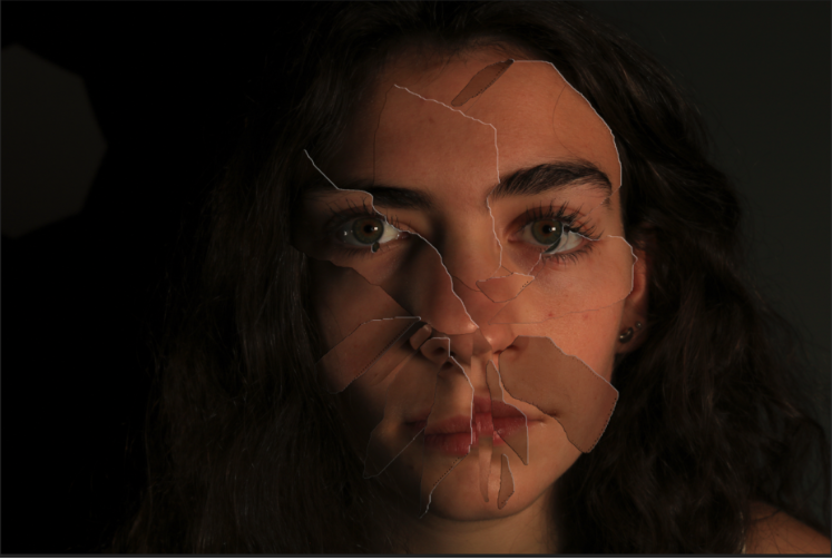
The word ‘Feminist’ is often misinterpreted. Somehow the adjective advocating social, political, legal, and economic rights between women and men, has been constructed into ‘man hater’. My area of study is female stenotypes and how they differ through the years, however my argument is whether female stereotypes are formed by men in a patriarchal society. Initially, stereotypes are inevitable in society as they are a social norm. Unconsciously as humans we make stereotypes, the first reference to stereotype in English was in 1850, as a noun that meant ‘image perpetuated without change’. This predominately suggests the growth women fought for during the feminist movements as their stereotypes changed successfully. However, my other side of my study is that stereotypes for females were caused by inequalities due to a male dominated society as it caused hierarchies. This is because of expectations men have of women from the beginning such as the traditional housewife and their role to serve men. The artists I have chosen to study are Cindy Sherman and Nan Goldin as I believe they effectively portray gender politics and stereotypes. Sherman executed this through dressing up, posing and photographing her self in different scenarios. Sherman effectively critiques the way women are portrayed in popular media, such as film, television and magazines. These images challenge the viewer to question their preconceived notions about identity and the roles society imposes upon women. At first, she photographs herself playing a traditional role men expected women to be, such as a housewife. Not only this, she photographed others and herself suggesting their struggle with their own identity. Nan Goldin, expresses her view on stereotypes through a different sense. Goldin expressed her experience on domestic abuse during a relationship by photographing her own wounds of female empowerment. This makes me think about the key features of stereotypes such as strong vs weak. For example, her image that stood out to me the most ‘Buzz and Nan at the Afterhours, New York City1980′ represented male roles such as dominant and confident in contrast to naïve and vulnerable as women. However, I was mostly inspired by her New York city night club and bar photographs as it expressed intimacy, the isolation of abuse and hierarchy.
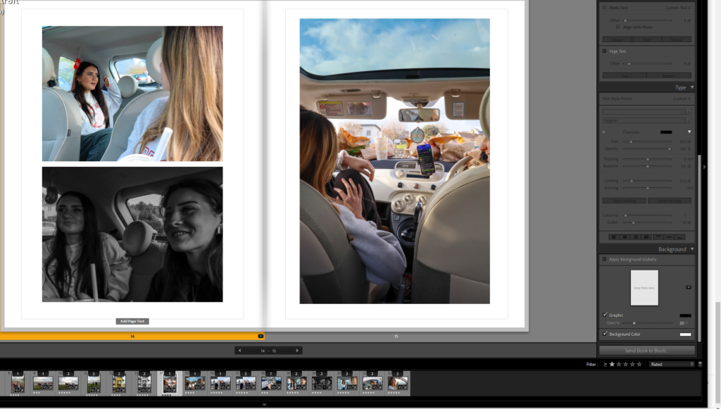
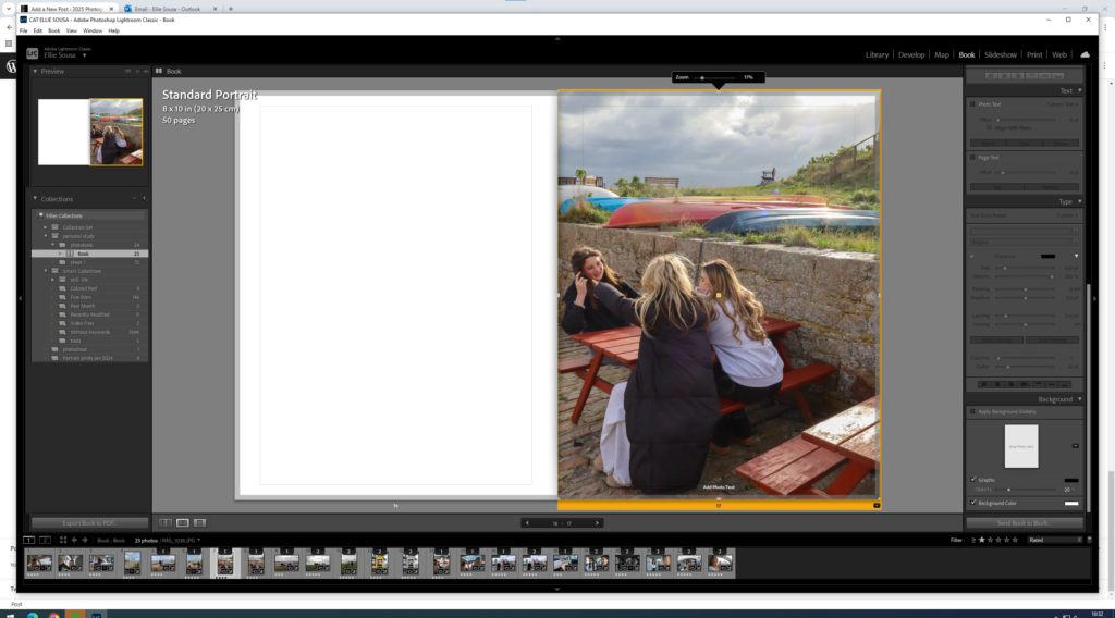
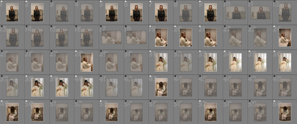
I will be responding to both of their work by including all of my inspiration from these artists and putting it in an order of a time line, specifically to the feminist movement waves and how the stereotypes changed through each wave, from the first to the fourth. My first wave photoshoot, my main inspiration is Cindy Sherman and my intention is to express the ‘traditional housewife’ stereotype. This is aimed to focus around early 20th century. The second wave photoshoot is to express more independence but the focus being educational rights, remaining inspired by Sherman. Next, the third wave photoshoot is focused around domestic abuse, heavily inspired by Nan Goldin mixed with Sherman. This is aimed around the 1990’s to the present. Lastly, my photoshoot for the fourth wave is to focus on the expectations on women due to social media. This is focused around the present and what teenagers go through my age, based off personal experience.
Artist Reference – Sherman
Cindy Sherman was known for her stage crafting, posing and role play photoshoots. This evidently linked to an element of drama, theatre, acting and film as her photos are ultimately the opposite of realism and conduct fake scenario’s but portray real themes. Especially in how it critiques and represents female stereotypes. Sherman creates elaborate sets, costumes, lighting, and props, similar to theatrical productions. Her photographs resemble scenes from plays or film stills, as they often depict a climactic or suggestive moment of a story such as 1950’s female stereotypes. Her dramatic and theatre themes comes from subjects expression. Her characters or even herself often display exaggerated facial expressions or gestures, heightening the drama and giving the impression of a moment captured mid-action. Most of the time, she does this through the ‘ male gaze’ to convey the expectations that women were to only serve men. The visual narrative is significantly important as it surrounds the theme of stereotypes and women in the 20th century mostly, however these elements still continue. Each image feels like it belongs to an unseen story. The ambiguity allows viewers to imagine their own narratives, drawing on their understanding of societal stereotypes. The roleplay comes from transforming each subject and even herself. Sherman acts as the sole subject in most of her photographs, embodying various female archetypes. She transforms herself into housewives, actresses, sex workers, society women, and more. This mirrors the performative nature of societal roles women are expected to play. She changes her identity and disguise by using costumes, wigs, and makeup, she completely erases her own identity, taking on fictional personas. This highlights the constructed nature of femininity and gender roles. Her cinematic aesthetic photographs are heavily influenced by film, particularly her famous series Untitled Film Stills (1977–1980). These black and white images mimic publicity stills from 1950s and 1960s Hollywood and European art cinema. She likes to convey ‘ frozen moments’, evidently her photos suggest moments from a larger narrative, much like a paused frame in a movie, leaving the viewer to wonder what happened before or after the shot. She critiques the male gaze by embodying these stereotypes, Sherman confronts the way women are constructed in visual culture, particularly under the male gaze. She reclaims control of these images, playing both the object and creator. Her work suggests that female identity is not singular but fragmented and shaped by societal expectations, media, and cultural roles. In my opinion, Sherman links more to ‘ mirrors’ rather than ‘ windows’ as her images do not fit into the realism category and they reflect Sherman’s experience through being a woman. Tableau is used to describe a photograph in which characters are arranged for picturesque or dramatic effect and appear absorbed and completely unaware of the existence of the viewer which Sherman typically executes.
“A number of questions occur. How does the woman look? Is she forced to share the way of seeing the man, or might there be a specifically female gaze? Can the man too be the object of the gaze? Can such a clear distinction be made between male and female, masculine and feminine? “(Williams in Wells 1987:6)
Artist Reference – Nan Goldin
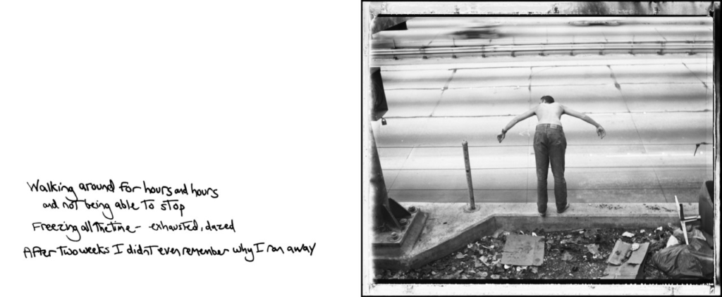
However, Nan Goldin’s images I am specifically inspired by are her abuse photoshoots published in her seminal photobook, The Ballard of Sexual Independency, which represent the domestic real life violence Goldin experienced through being a woman. This ultimately links to realism as it is Goldin documenting her real life experiences without adding glamour or hiding anything. Instead, her aim was to give other women empowerment to make them feel less alone due to the large proportion of women who do go through this, and are typically seen as weak. This links to stereotypes as it is stereotypical that a woman is not powerful and is weak when they are facing these issues in this society, making a man as dominant and masculine. The term ‘realism’ can mean to depict things as they are, without idealising or making abstract. Not only this, but Goldin’s work is documentary as she wanted to show her lifestyle without covering any facts. ‘Nan’s work is unfiltered and deeply personal about her life. She’s been making artwork herself about her life for decades,’ Poitras explains. ‘She just felt strongly that it was the time to talk about [her sex work] and with the intention of destigmatizing that. There’s so much stigma around sex workers, so much stigma around drug use, there’s so much stigma around domestic violence, etc. And that I think she just felt very strongly that this film could also destigmatize those issues.’ (Chiriguayo 2022) So evidently, there is some major differences but also a few similarities which helps link both these artist together under the pressures of society and women.
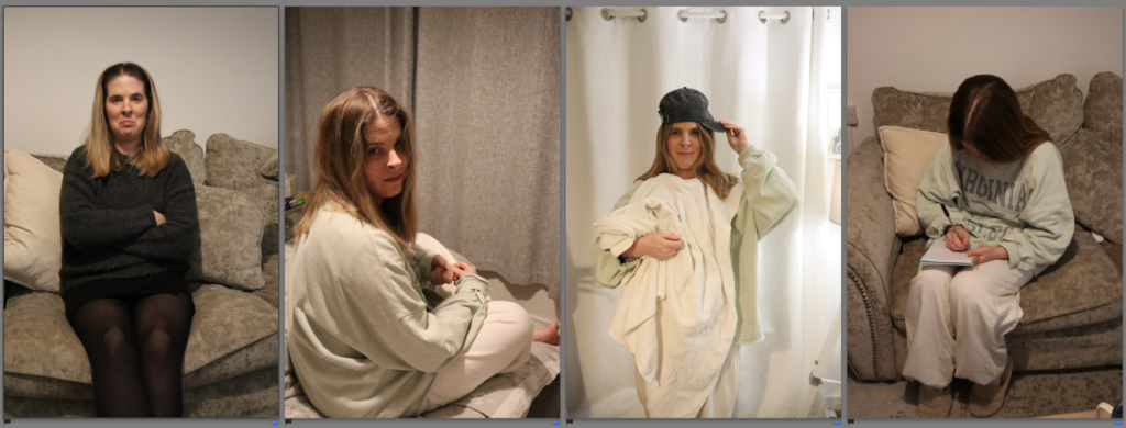
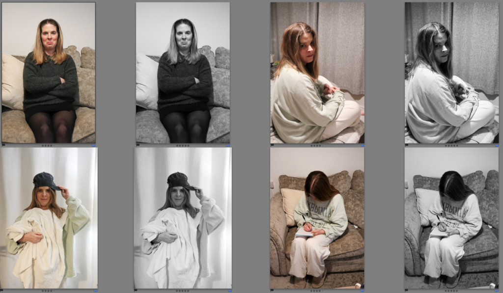
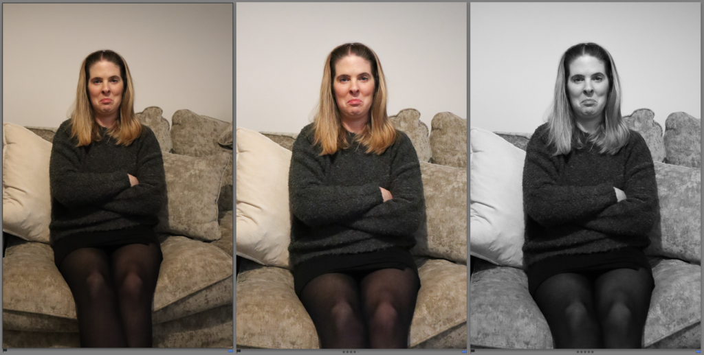
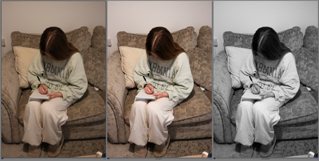
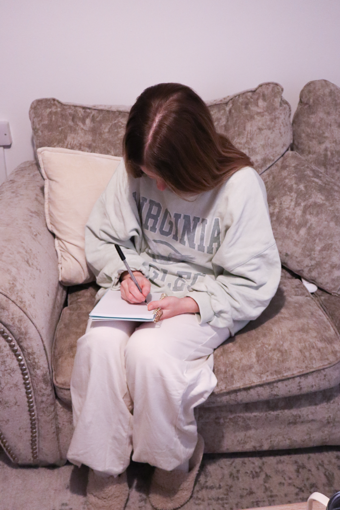
Cindy Sherman questions the politics of gender and female stereotypes by stage crafting and fitting herself into the male expected stereotypes. This portrays the political and societal views on how stereotypes are started within females. Therefore, I responded in a similar way to Sherman’s by starting off by exploring societal expectations and then slowly going through the timeline of the feminist movements by showering growth and empowerment. For example, I was heavily inspired by Cindy Sherman’s image conveying the ‘ traditional housewife’ as it significantly portrays the politics and female stereotypes caused by expectations from men that women are to serve men.
Untitled Film Stills (1998)
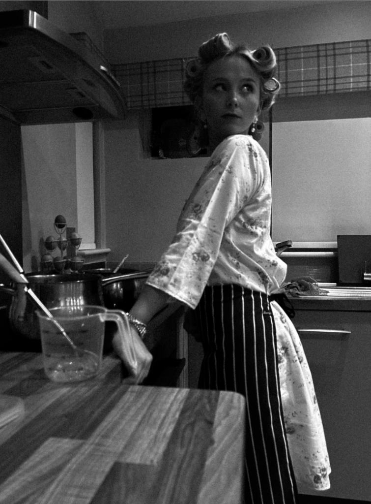
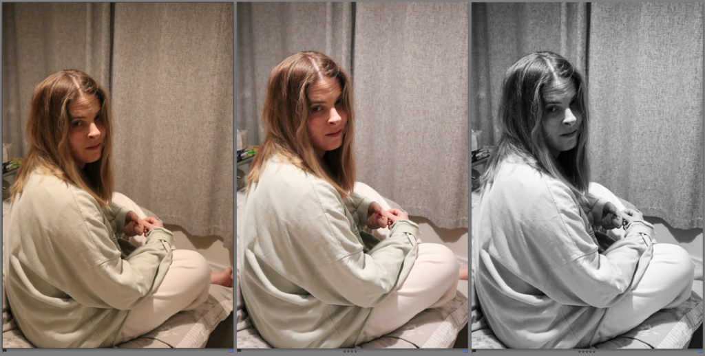
Within my response, I attempted to include similar key features such as the props and clothing. For example, the clothing increases the theme of feminine stereotypes such as caring about appearances such as the hair rollers, heavy makeup and high heels. The apron suggests her role in the household such as cooking for her husband. The ‘female gaze’ is suppose to convey the subject looking over at her husband.
One thing I did not do successfully due to lighting is that you cannot see the subjects hand over her stomach like Sherman’s image which eliminates the key feature of a woman being nurturing and ready for motherhood. Overall, my images are very staged, and link to drama as this is essentially acting through a photograph.
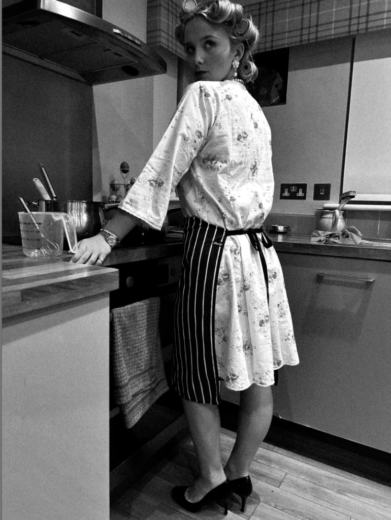
I experimented by changing angles to present the subjects high heels, this ultimately presents that women in the 1950’s had to look ‘perfect’ for the male in the household. This also adds a slight sexual element too it, which women were also seen for only to recreate. The look over the shoulder was significant to me as it shows a busy woman impressing her husband. This is interesting to me as heels can be viewed in different ways depending on the theme of the image. This is because in my third wave feminism photoshoot it is to signify confidence and growth through empowerment. However, in this photoshoot it is seen to impress and serve men’s societal expectations through appearances.
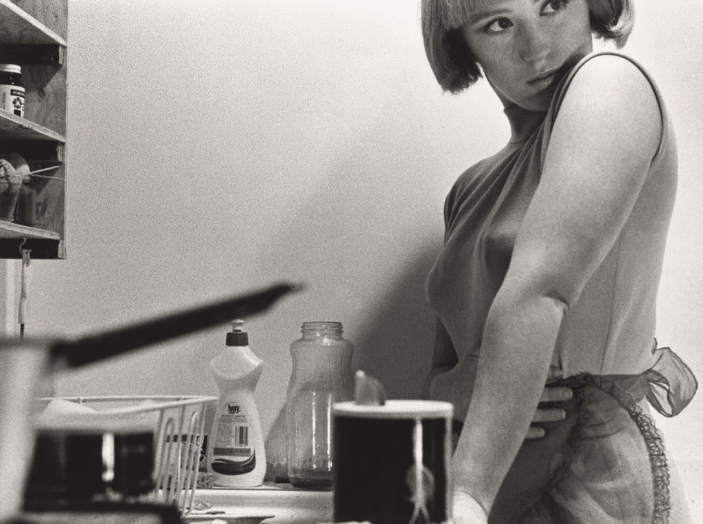
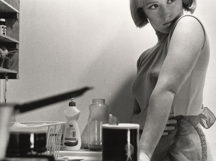
Another example of how Sherman questions the politics of gender and female stereotypes is through how women were seen to stay at home, and not have a right to education and work. This meant that women were viewed only to recreate and serve men through domestic appearances and motherhood. I interpreted this deeply through one of Sherman’s more revealing and sexual images such as;
Untitled Film Still #6

The first thing that caught my attention was the hairbrush in her left hand. I interpreted her aim was suppose to show feminine traits and stereotypes by fitting into the stereotype of women only caring about their appearance and beauty. The fact she is lying in bed, conveys she is waiting for her partner to come home. This is significant to be as Sherman was typically aiming for the 1950s, which was when women did not have equality rights within education and work. Lastly, her little clothing again, adds an element of sexuality as women were often objectified and sexualised during these times. This could symbol her typical role of motherhood and recreation. Overall, I noticed she frequently uses the ‘female gaze’ look which ultimately stands out to me as she is looking up to a potential dominant figure. This is literal as the image is taken from above, and she is laying down much lower. This could be to symbol the extreme dominance men had around the 1950’s and her look is to convey to stay within the role, potentially because it is all women knew.
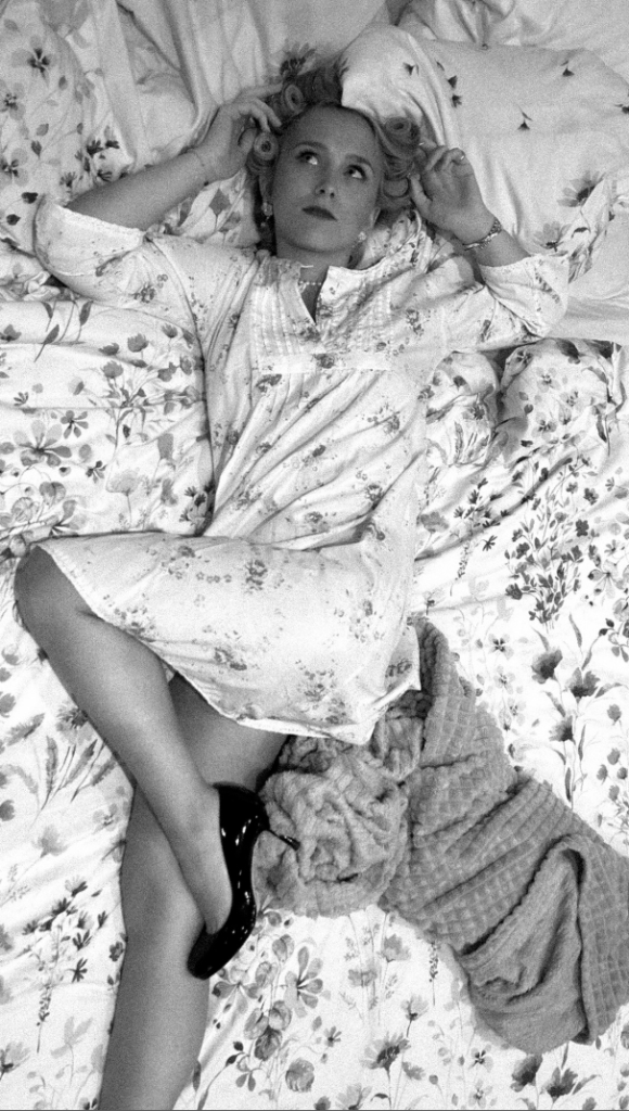
For my image, I diversified my image by using hair rollers rather than a hair brush to include a similar element. To emphasise this theme of women serving men through appearance and being a mother I made the subject wear high heels to keep a sexual element to it. This is because Sherman executes this element successfully and frequently. The use of posing, such as a high leg really stood out for me. I put it in black and white to make it similar to Sherman’s, but also because my subjects dress was clashing with the bedsheets. This could ultimately symbolise women in the 1950’s as they decided to fit and blend into stereotypes without speaking up, linking to the subject blending into bedsheets. The black and white emphasised the blending. Lastly, the ‘female gaze’ and heavy makeup created the feminine and submissive element to my image. The heavy grain made it have more of a vintage and old aesthetic which is exactly what I was aiming to achieve.
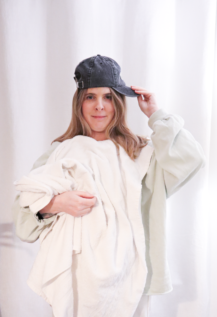
Another example of how both Nan Goldin and Sherman questions the politics of gender and female stereotypes is through the significant key feature of fitting into the stereotype of women caring about their appearance. This is inspiring to me as men do not have the same stereotype, questioning the gender stereotypes.
Untitled Film Still #81
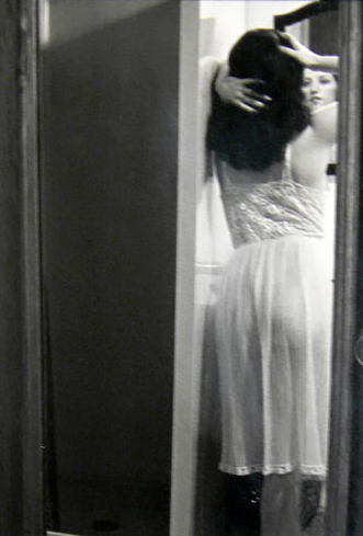
Both of these images give off different aesthetics in my opinion. Sherman’s portrays a sexual element to it such as the night dress and the hair and hands. I like how it is slightly blurry and can hardly see the subjects face. This ultimately creates a mysterious element to it. To emphasize this, most of Shermans images are in black and white which I personally prefer as it makes her images have a vintage and old aesthetic. The angle and placing of the camera makes it look like the image has been taken from the bedroom into the bathroom. However, Goldin’s image is less sexualised through the use of the subjects clothing such as the tank top, which isn’t seen as feminine as the night dress. Goldin’s image is clear, emphasized by the use of colour. Although, they both convey the importance of appearance through women by adding something to themselves by looking in the mirror.
‘Amanda In the Mirror’, Berlin: Nan Goldin 1992
Within my image, I attempted to combine both artists. I did this by my subjects clothing such as the night dress and heels to convey a sexualised image of women, which is often a stereotype. The posing such as the high leg, and the hand on the subject’s lips ultimately portrays this significantly. The use of black and white makes the image look older. Lastly, I added a heavy grain to make it look less clear like Sherman’s and vintage.
Cindy Sherman questions the politics of female stereotypes through showing the empowerment of women through educational rights. This image inspired me as it signified the growth women gained through fighting for equality rights such as work and education. This linked to the second wave feminism movement which links to my focus for this personal study.
Untitled Film Still #13
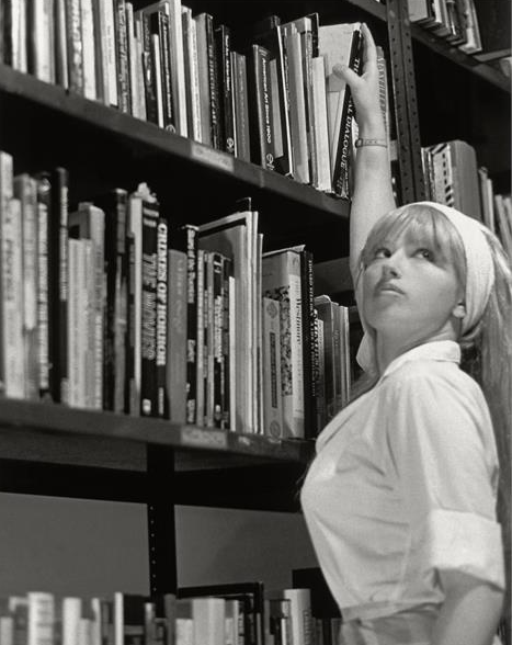
One thing that stood out to me was the ‘female gaze’ that Sherman always includes in her images. This is significant as this image shows the empowerment and growth rather than the ‘fitted stereotype’. Her use of clothing in my opinion signifies a sense of independence as it isn’t sexualized or for men. The reach of the book on the highest shelf could symbol her independence and growth of doing things on her own, without the stereotype that females cannot do the same as men. Lastly, it doesn’t look like she is wearing a heavy amount of makeup eliminating the factor of women caring about their own appearances.
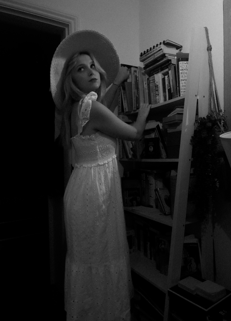
Within my response, my subject is wearing clothing that isn’t sexualised but however is still feminine. I executed this through wearing a long, flowy dress matched with a 1950’s hat. I chose to maintain the ‘female gaze’ whilst my subject was reaching for a book. The use of black and white with a heavy grain emphasizes the vintage and older aesthetic which was one of my objectives. All of my images within response of Sherman are carefully stage crafted, precise posing and relevant props to execute the sense of drama and theatre.
The Ballad of Sexual Dependency series, 1984
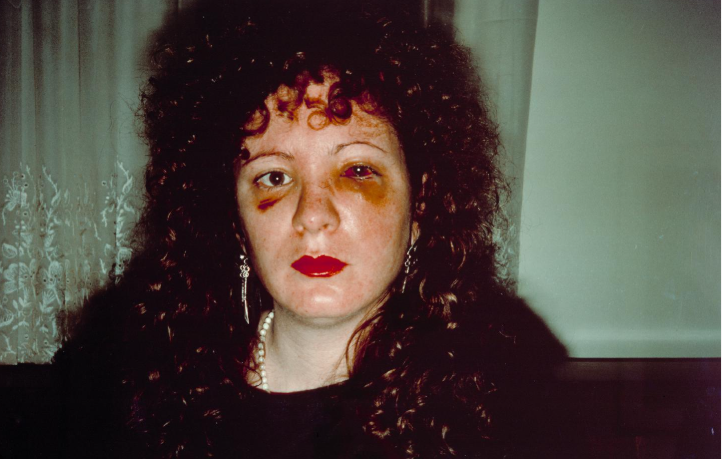
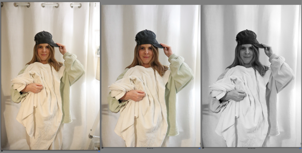
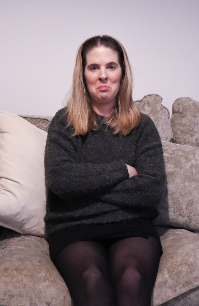
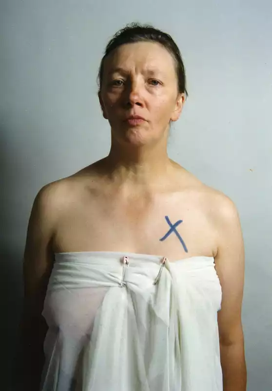
Lastly, Nan Goldin expresses her experience through domestic abuse. This inspired me for my 3rd photoshoot as this was a very important topic during the 3rd wave feminism movement. Therefore, I decided to merge Sherman’s posing and stage crafting with this theme. With an outcome of this,
I executed this by using feminine posing, feminine clothes and heels. However added makeup to add fake abuse onto the subjects face. The black and white relates to Sherman and so does the clothing. The lighting looks over my subject, making her the main focus and emphasizing deeper shadows. My critique is that my subject should have her face turned more so the lighting shines on the bruises etc as it is the main focus of this photoshoot.
In conclusion, there are serval parallels between both artists, being similarities and differences. The main difference that stands out to me is there photography style. Nan Goldin’s style explores in snapshot-style the emotions of the individual, in intimate relationships etc. This contrasts significantly to Sherman’s photographic style as hers links to drama, theatre and stage crafting. This is because she is essentially acting, posing correctly and set up with props to get the perfect image. Sherman’s images are often critically discussed as questions of patriarchy, desire and voyeurism. This makes both artists contrast with one another as Nan Goldin fits more into the category of ‘ windows’ whereas Sherman fits into the category of ‘mirrors’. Sherman focuses on gender roles and stereotypes whereas Goldin is well known for her intimate depictions of the transgender subculture, as well as her images of friends dying of AIDS. However, I was mainly focused by her ‘The Ballad of Sexual Dependency series‘ as it emphasised the documentary and realism factor to her images as she did not glamourize or make her images look better than the reality was. This essentially contrasts to Sherman images as Sherman’s images are glamourized and carefully crafted. Interestingly, Goldin’s abuse photoshoot was taken between 1979 and 1986. Sherman’s untitled film stills were taken between 1977–80. Both of these artists took images around the same time, however Sherman’s was suppose to be focused around the 1950’s hence her use of black and white. This created the vintage and old aesthetic whereas, Goldin’s did not. This could be because Goldin’s images are suppose to be realistic as it fits more into the documentary category. The use of black and white is because Sherman was focusing on old stereotypes and essentially acting to fit into them. Within my own response, I made minor changes such as angles, clothing and props. I aimed to execute things similarly to Sherman’s apart from my 3rd photoshoot (3rd wave) as I merged both Goldin’s and Sherman’s work. I did this by using feminine posing, clothing and makeup by linking to Sherman and still linking to her photographic style of stage crafting her images like they are a film. I did all my photoshoots obtaining this photographic style so my photobook had a sequence that flowed seamlessly. However, my Nan Goldin inspiration for these images was to obtain the theme of domestic violence as this was a massive theme during the third wave feminism movement. This meant that I had to fake abuse that appeared on my subjects face, making the image not real which differs to Nan Goldin’s documentary style. Overall, I believe that I merged both the artists I was heavily inspired by successfully and obtained the key features that had to be included to execute my initial idea of expressing the stereotypes within women through the waves of feminist movements to make my photobook seamless.
Bibliography-
Chiriguayo, D. ( Dec. 05, 2022). Artist Nan Goldin shines light on stigma around abuse and addiction. [online](https://www.kcrw.com/news/shows/press-play-with-madeleine-brand/mahsa-amini-scotus-sackler-johnny-cash/beauty-bloodshed-nan-goldin) [accessed 28 January 2025]
Wells L. (1998). ‘The Photographic Gaze’ in Photography: A Critical Introduction. London: Routledge.