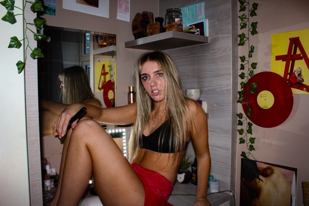
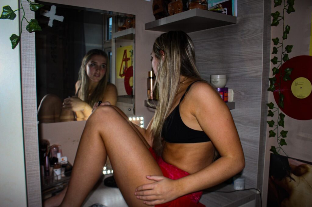
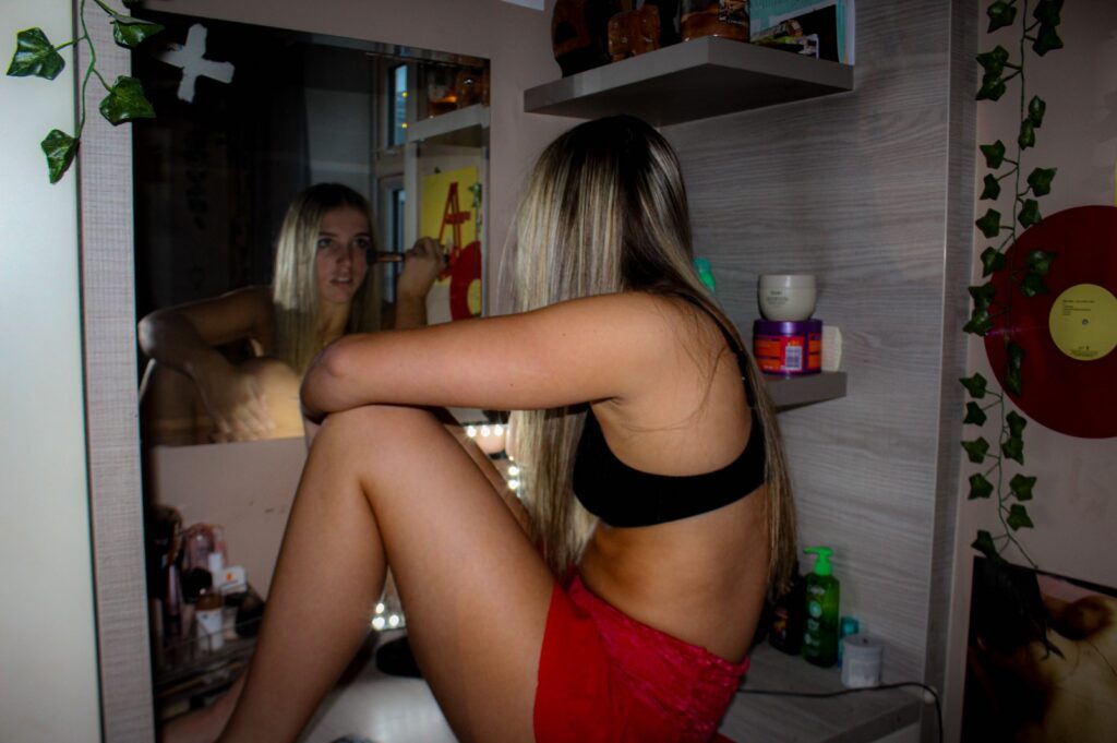
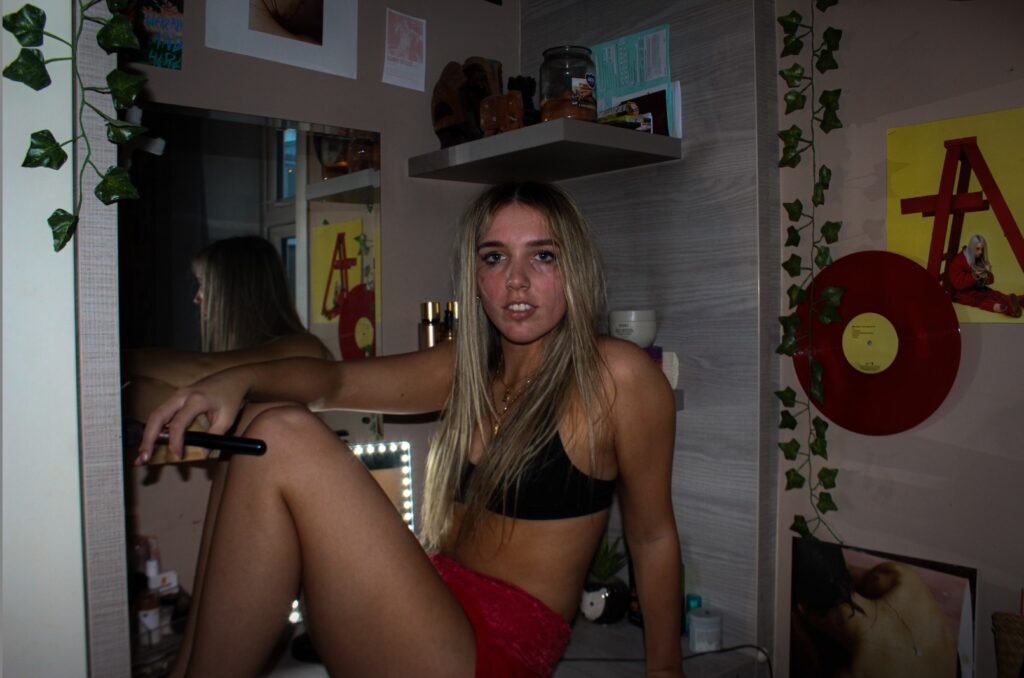
Essay Question: Looking at Justine Kurland and Mary Ellen Mark; how do females connect with each other through interaction and how do they overcome the stereotypes of gender roles?
My area of study is about femininity and how females interact with each other. I look into the female gaze and how woman overcome the gender roles and stereotypes of society. In my personal study I will be focusing on how woman overcome gender stereotypes through rebelling during their teenage life and to also show the emotions girls experience through my images. The artists I have chosen to look at are Justine Kurland and Mary Ellen Mark. I have chose Justine Kurland because she looks at how females support each other and how girls feel empowered when they are together. In Justine Kurland’s photoshoots, she expresses through the experiences she did not get to do as a teenager. Justine Kurland uses tableaux photography; this name comes from the words “Living Picture” in French. Tableaux photography is an image or array of images staged in a set environment to convey a narrative. Justine Kurland stages her photoshoots to make the images look like real life and to create a meaning behind each image. I am going to create my own tableaux photography like Justine Kurland to neglect the gender roles of young females. I have chosen to look at Mary Ellen Mark, because contrasting to Kurland she photographs girls to show the vulnerability they experience and the emotions that females go through alone. In my project, I wanted to show the two differences of girlhood and how they navigate themselves in a world full of stereotypes and gender roles. I am also going to pay attention to the outfits that the girls are wearing in my photoshoots as I believe this plays a big part when creating a sense of freedom and also a sense of isolation in my images.
Throughout the years there have been many various waves of feminism to encourage equality. “Feminist movements in the United States have called for greater political, economic and cultural freedom and equality for women.” https://www.history.com/news/feminism-four-waves. There have currently been four waves of feminism, the first one being to argue for the woman to have the right to vote which took place in the years of 1848 to 1920. This started because females were denied basic rights which led to movements taking place for woman to stand up for themselves. Woman felt that they had the right to have a say in the political decisions that were being made. Woman also wanted the right to own properties and to be able to have an education and employment which lead to more waves of feminism occurring. This led to feminism in photography in the 1970’s when feminist groups started creating their own visual documentation of what it was like to be a female. Over the years this has become more popular in photography because feminist artists are producing images to convey the idea of woman’s rights through emotion and narratives. Justine Kurland is one of these photographers, she uses her art to express her feelings towards feminism. Kurland also uses tableaux photography to create her projects. “Tableaux photography is a technique used in many photographers’ works to convey a narrative through an image or a series of images”. Tableaux Photography. The term “tableaux” was first used in an art context in the 18th century by a philosopher, Denis Diderot to describe a painting and it comes from the French term “Living Picture”. In Victorian times tableaux Vivint’s were a popular form of entertainment, this consisted of recreating artworks on stage based on a painting.
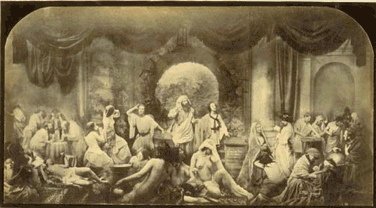
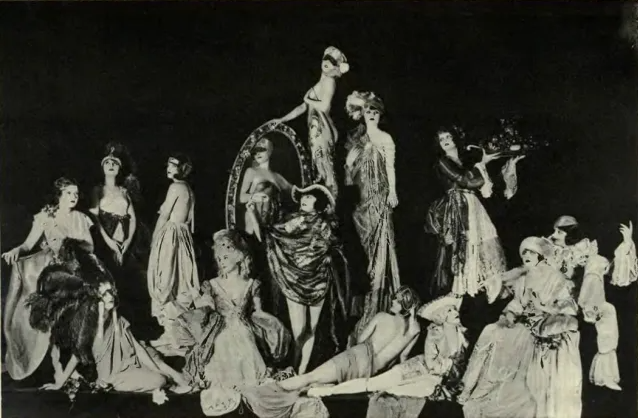
Therefore, tableaux photography involves a performance before the camera takes the shot, which is usually instructed by the photographer who tells the models what to do and how to pose. In the 1880’s, photographers strived for photography to be artwork, and this led to them using tableaux to mirror the paintings and other artworks.
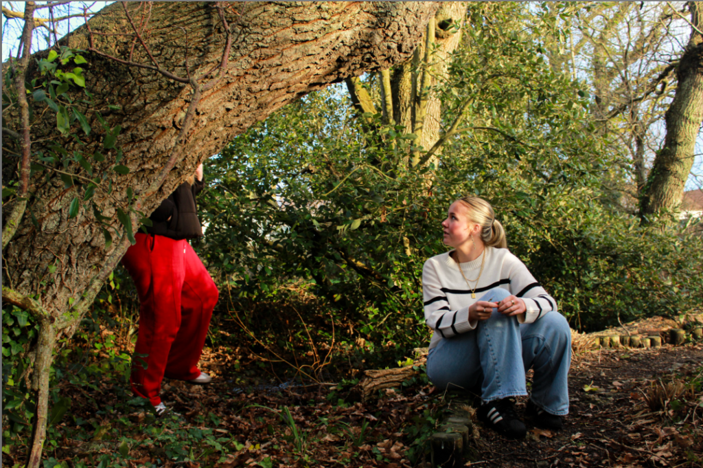
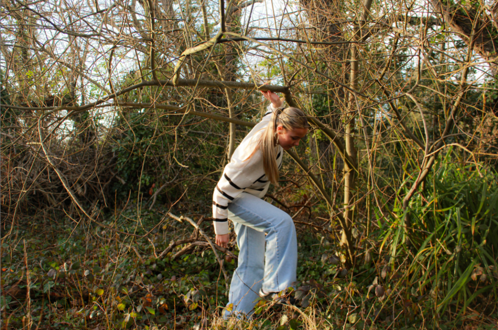
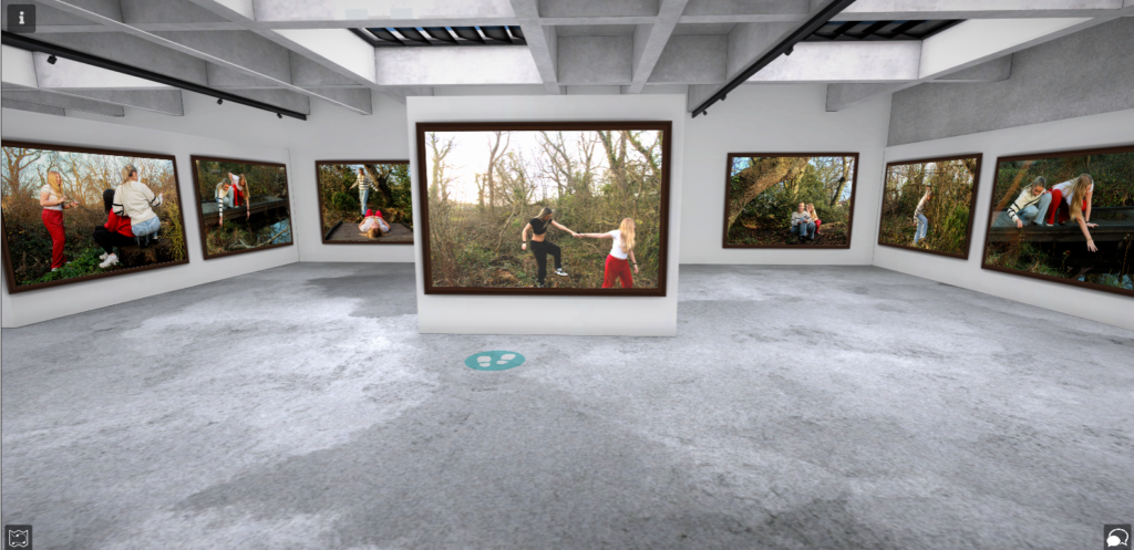
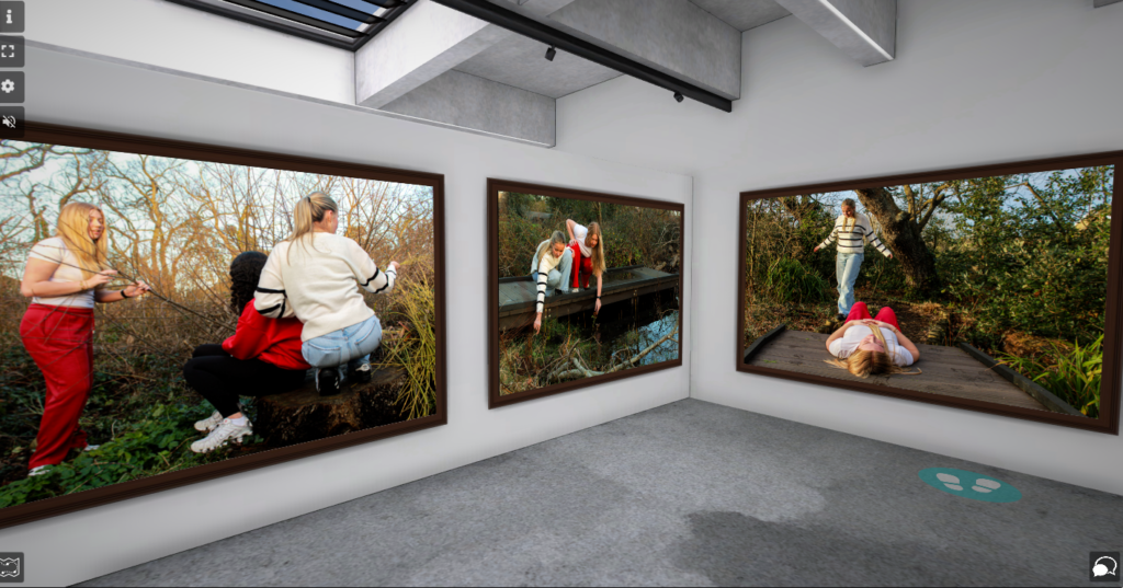
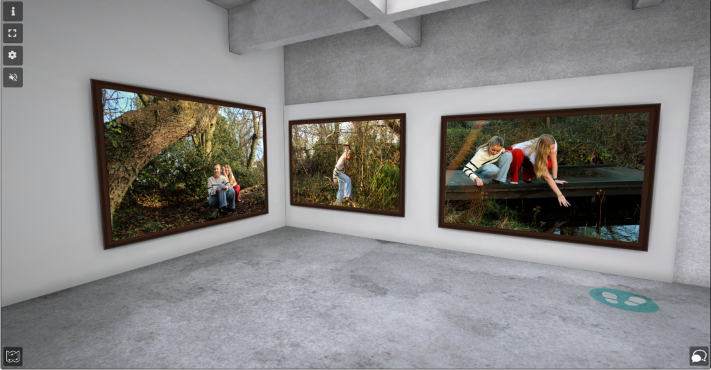
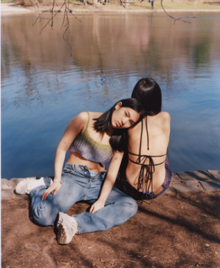
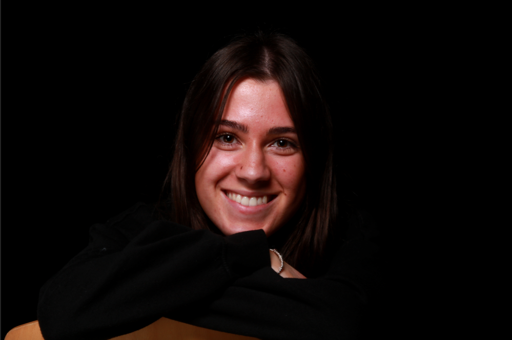
Justine Kurland is a contemporary fine art photographer from New York born in 1969. At the age of 15 Justine Kurland left her home to live with her aunt in Manhattan and this was where she found her interest in art. I am inspired by Kurland’s photoshoot titles “Live Dangerously” which is a series of images presented as part of her exhibition in 2004. This project is about revealing bold and dynamic ways that females inhabit nature. The images in her project include teenage girls setting off smoke bombs, skinny dipping, climbing trees and other activities similar to these. Kurland created these images to “reveal the bold and dynamic ways in which female bodies inhabit and activate the natural world.” https://nmwa.org/art/artists/justine-kurland/, and to express the things she didn’t get to experience as a teenager. She wanted to reveal the things that she wished she had done. She wanted to portray the idea of a coming world where girls were not categorized and where they could find protection and empowerment together and within themselves. She used teenagers in these staged images because she wanted to portray the sense of freedom for females and how they express themselves in the Suburban settings where she chose to take her images. Kurland would travel up and down the country looking for locations to set her photographs in and finding girls on her way because she wanted to create a society of females and how they would react with freedom contrasting from their bedrooms where they are isolated. The locations were chosen carefully to create their own sense of danger and risk and to portray the exploration of identity. She wanted to show how females connected with each other through the female gaze therefore she wanted the girls to care for each other and this turned into a reality of the girls helping each other, feeding each other and resembling protection. Justine Kurland uses tableaux photography when creating her images to convey a narrative for the viewers. In relation to my project, I am inspired by Justine Kurland’s artwork as it shows the empowerment of woman as a collective. I am going to set up my photoshoot in woods and fields and use the tableaux photography technique to stage my images to portray a feeling of girlhood. I am going to ensure that in my images, the relationship between the models is a sense of comfort within themselves and as a society. I will use woods and fields for my photoshoot in relation to Justine Kurland because I want my images to have the perception of freedom and to have a sense of carelessness. I will edit my images in colour because I want my images to be bright to add a sense of happiness and to convey the feelings that girls have when they are together. I will also ensure that when constructing my images that the girls are connected in a way that they are helping each other and being happy to resemble the idea of freedom that Justine Kurland wanted to portray.


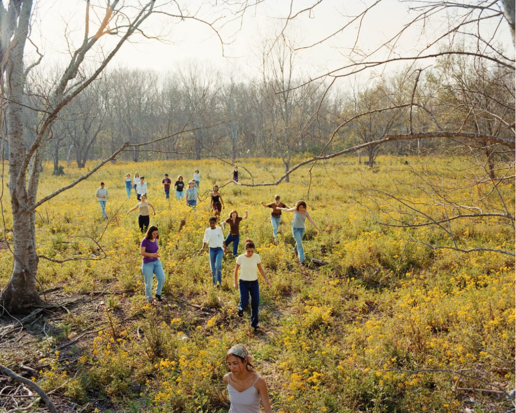
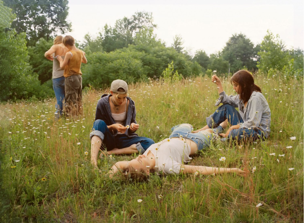
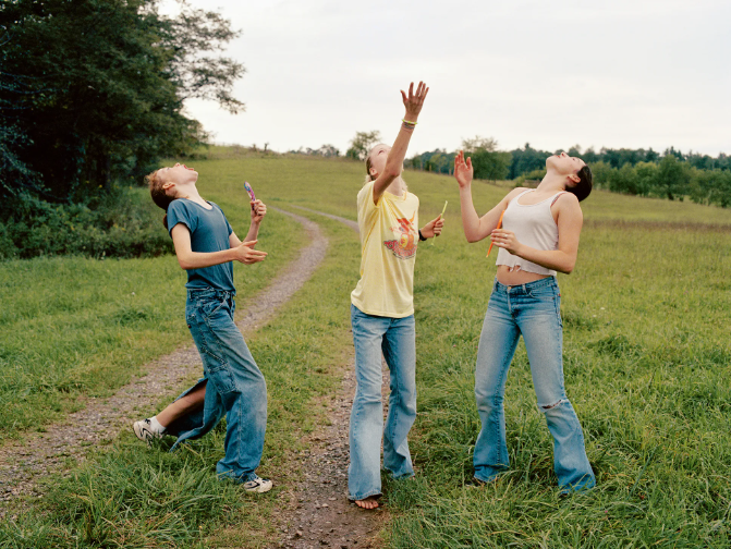
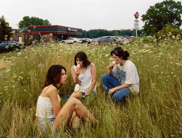
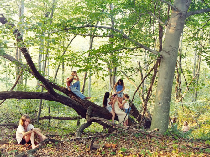
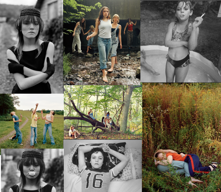
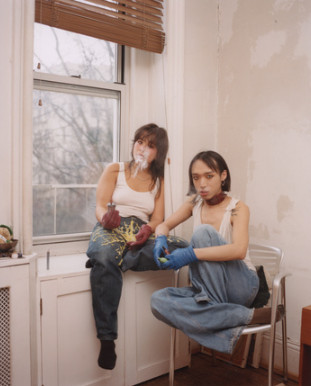
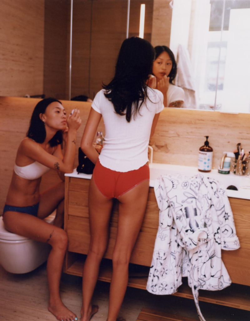
These images are from Justine Kurland’s exhibition named “Girl Pictures”. These were the images that inspired me to take my own. These images show the connection that girls have to overcome the stereotypes that people have which was her aim. The images are all set in woodland areas and fields which portray the freedom of the girls in the image and show the bond that females have in nature when they aren’t isolated and stuck in their bedrooms. In this project all the girls are dressed in basic outfit which has inspired me to do the same when taking my images to show the simplicity of females lives and how they connect with the world around them.
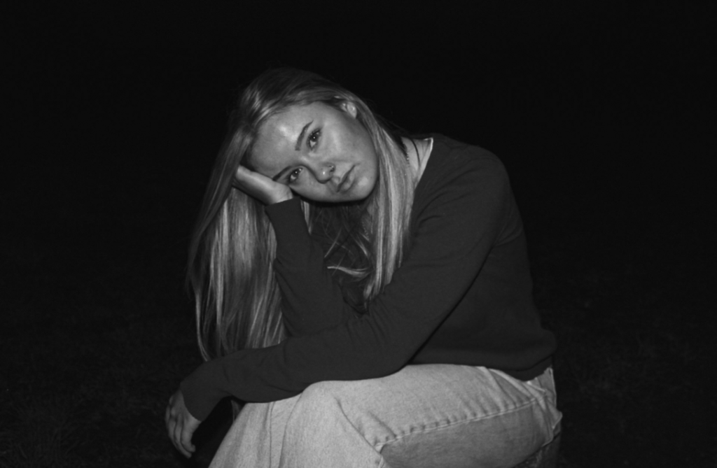
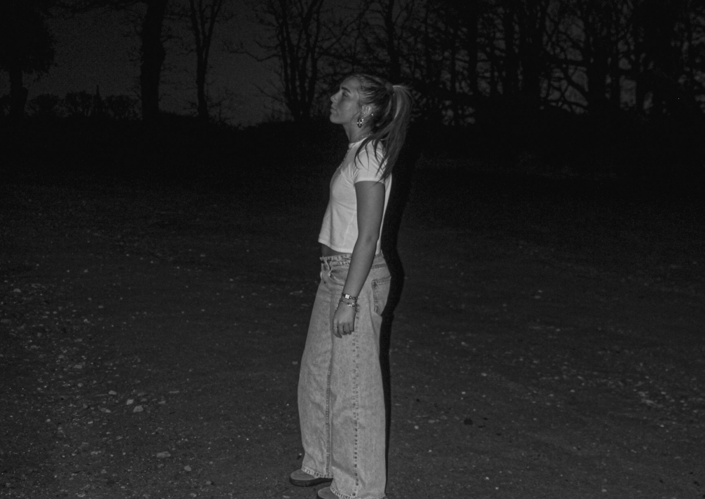
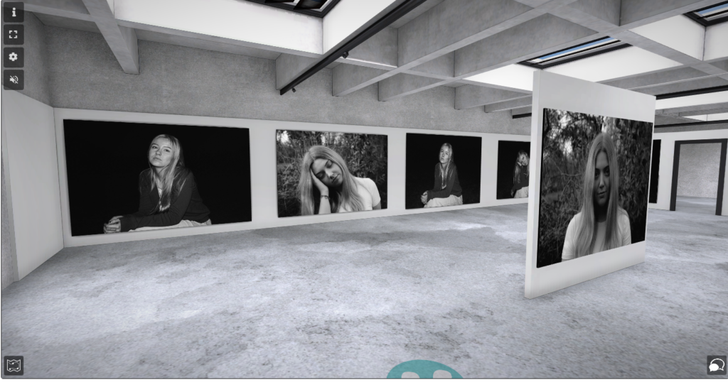
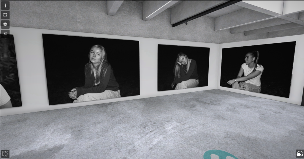
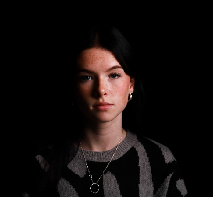
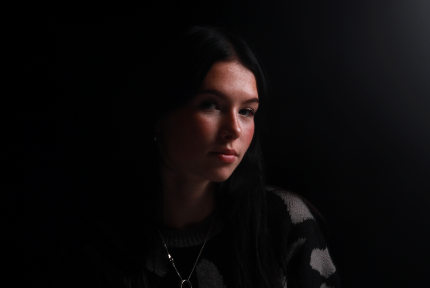
Mary Ellen Mark is an American photographer who was known for her photojournalism and documentary photography. Her work is displayed in museums and published worldwide. She was born in Pennsylvania and started photographing things with a box brownie which is a carboard box camera. She discovered a passion for art when she was at school and later attended the University of Pennsylvania where she earned a bachelor’s degree in fine art. Soon after Mary Ellen Mark got a scholarship to go and take pictures in turkey for a year which is where she produced her first book; Passport. She also visited England, Greece, Germany, Italy and Spain to take photographs whilst on her travels. When she was in her mid 20’s she moved to New York and started taking pictures of the war, specifically the woman’s role during the war where she was able to capture the vulnerability and resilience of the woman. One of mark’s most famous projects was called “Streetwise” which was published in 1988. Mark took pictures of the lives of children and teenagers who lived on the street to spread awareness of their struggles to survive, and the stereotypes others have. Mary Ellen Mark tended to photograph things that not many people were aware of like poverty, illnesses and prostitutes, to spread awareness of the poor circumstances in people’s lives. Mark’s images are mostly portrait, which shows the emotions of girls and how female viewers can relate and connect deeply with the images. Mary Ellen Mark would also take images of girls to show the concept of girlhood, however when producing her images, Mark didn’t intend to connect with the idea of girlhood, but it became apparent that she was connected to her own images when taking them. She discovered that “Her portraits capture individual lives with a familiarity that makes them universally relatable” https://nmwa.org/whats-on/exhibitions/online/mary-ellen-mark-girlhood/. When taking these images Mary Ellen Mark wanted to create a story within the images to show the vulnerability of females in the world and how they perceived through the ideas of gender roles and stereotypes. Her images also convey the fact of navigation and how young girls must find themselves within a patriarchal society which may seem threatening and scary for girls in their youth. When producing my images that are inspired by Mark’s work, I am going to manipulate the images to have a solemn tone to convey a feeling of sadness and worry through the camera lens. This way, I will try and make the images connect with females and young girls that feel threatened by the world. I will also attempt to make the background black to portray the feelings of loneliness and worry that girls in this world feel every day. I want to create a contrast of images in my project between a mix of Justine Kurland inspired images and Mary Ellen Mark’s. I want to show the difference in emotions of girls when they have freedom and when they overcome stereotypes or gender roles in comparison to when they feel isolated or controlled by the patriarchal society that is still apparent today.
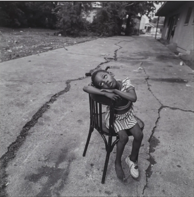

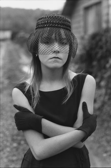
These are the images I am inspired by. The black and white in the images show the sadness within these girls and show that they are simply unhappy. I like how the background of these images are filled with empty space and this could portray the loneliness that the girls feel in the image.
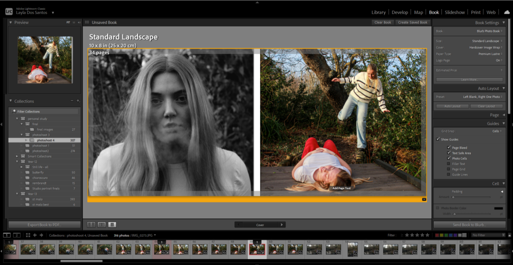
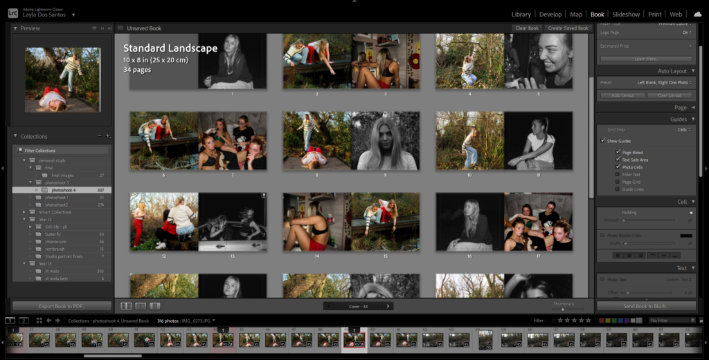
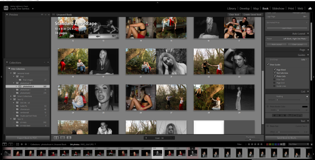
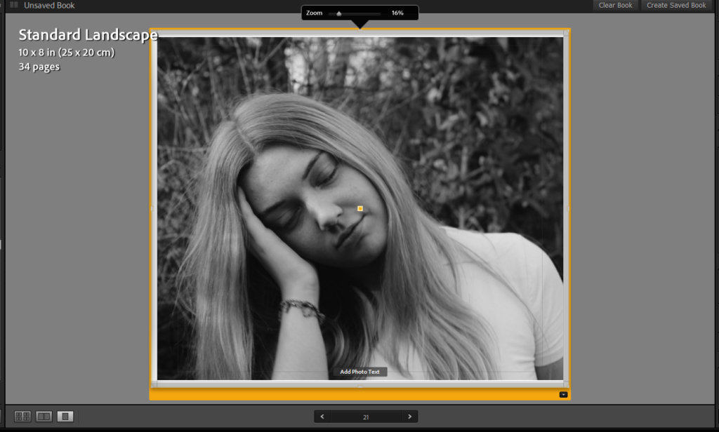
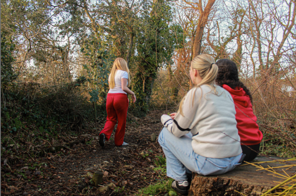
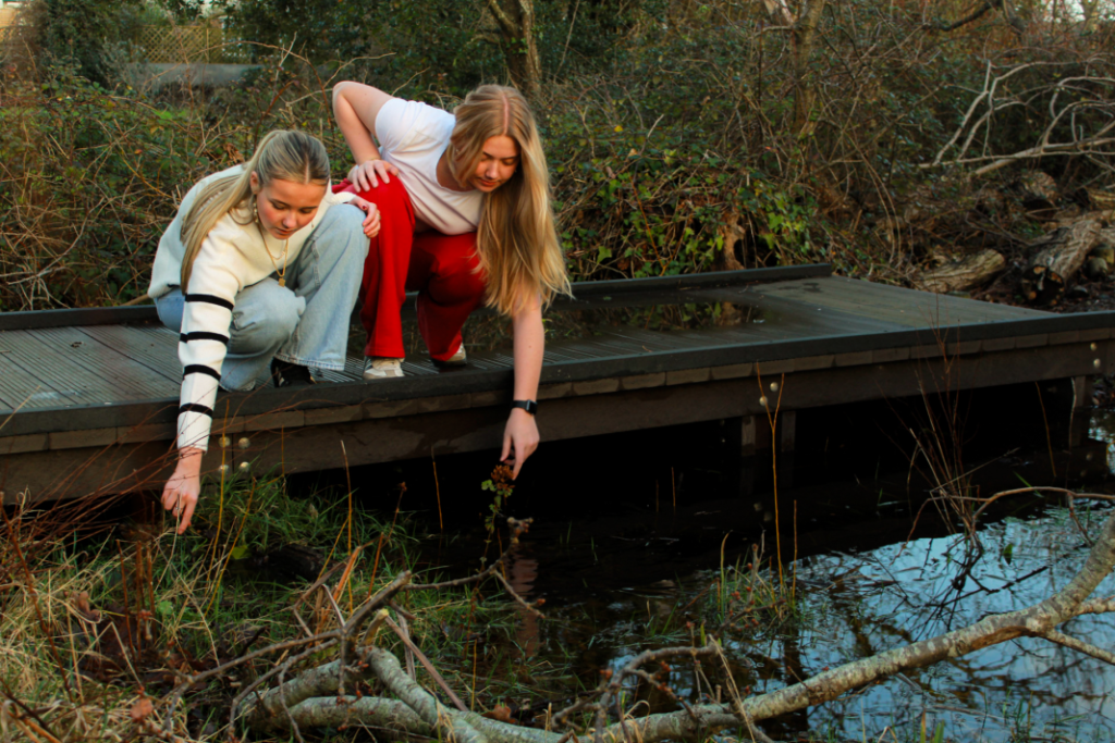
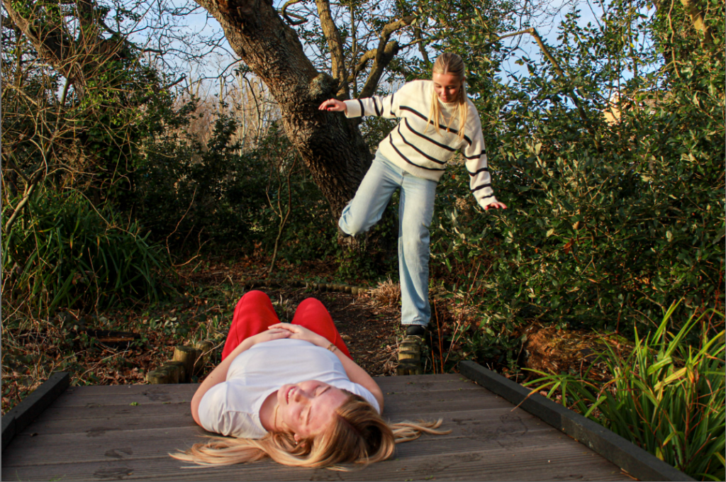
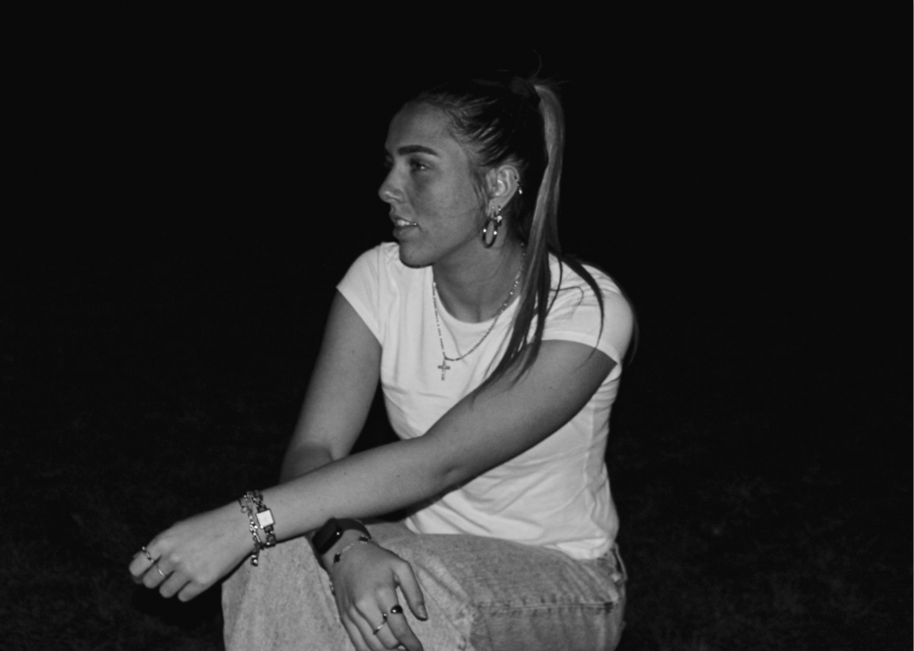
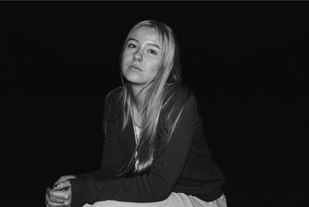
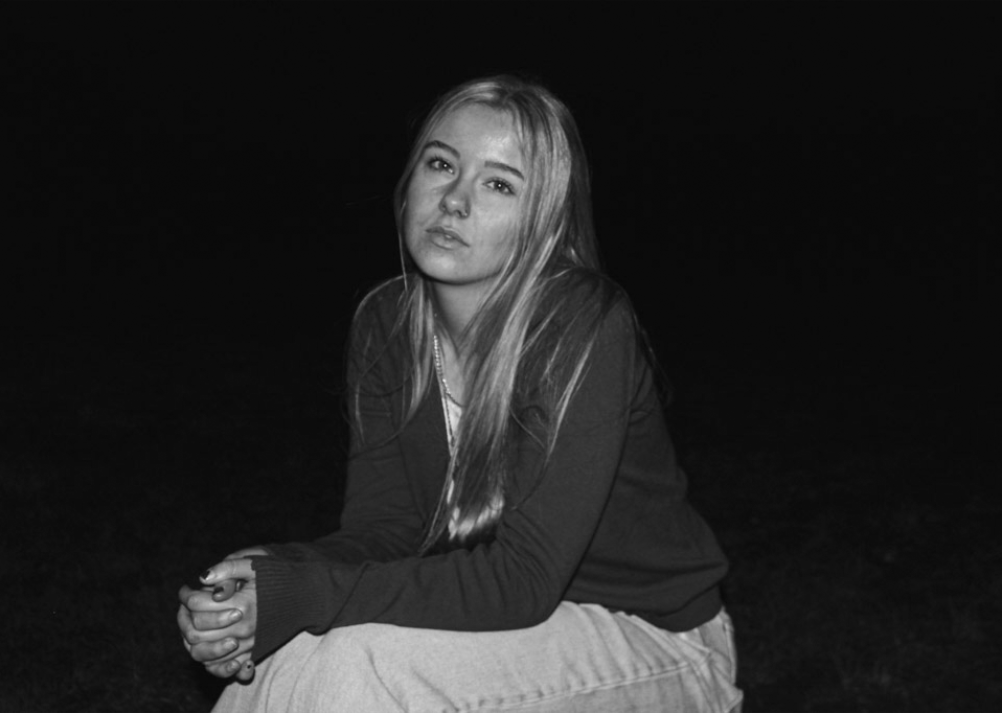
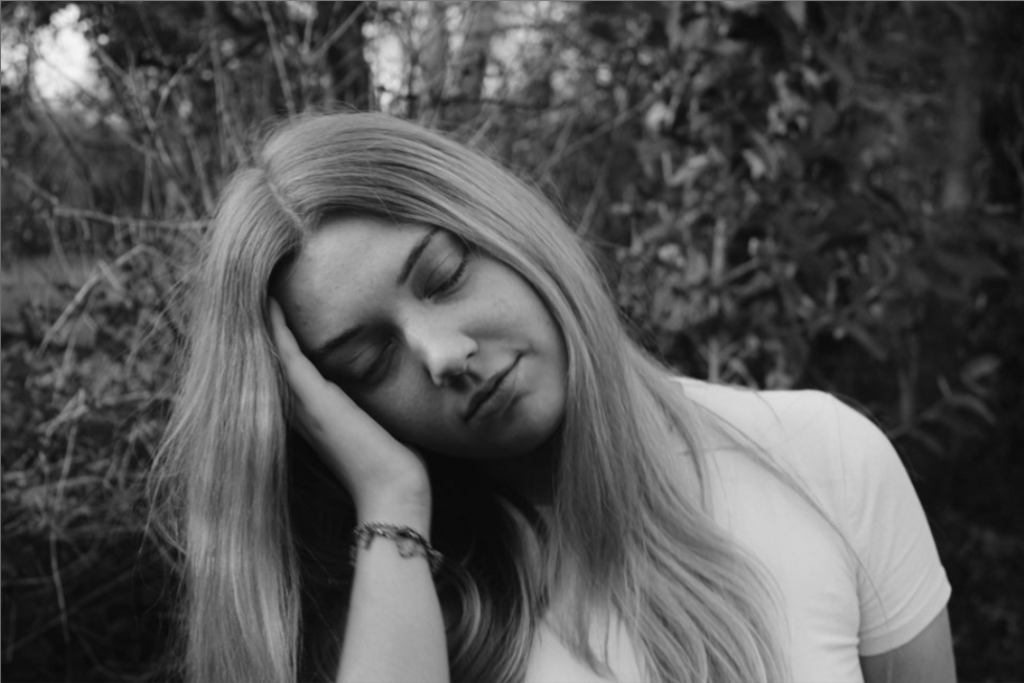
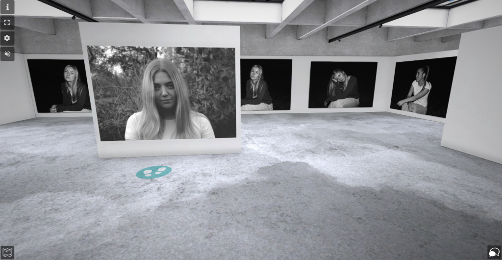
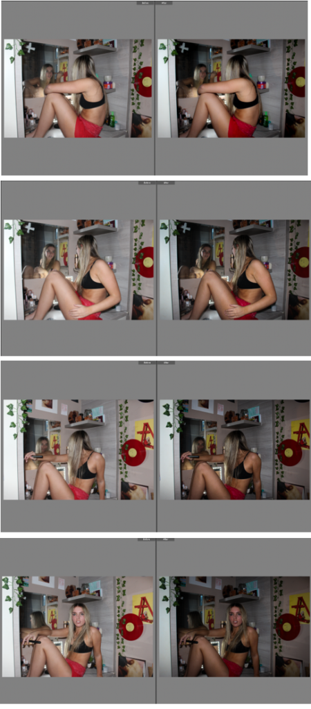
Both artists I have looked at have taken the same approach to overcoming stereotypes and gender roles, however they have explored this subject differently. Mark and Kurland’s work both look at the idea of girlhood and they both portray emotion through their images to convey girls’ experiences through life, however in different circumstances. Mark looks at the complexity of woman’s life and the vulnerability that girls experience in times where life isn’t so easy like the war or woman in poverty to portray to viewers the situations that girls go through that could be scary or even more so traumatic. Whether Kurland looks at the simplicity of woman’s lives because of their freedom in the suburban areas where they are photographed, where they have a sense of freedom and how they have the power to do what they want with their lives. Mary Ellen Mark’s images are all in black and white which correlates to the idea of the complexity of the girls’ lives in her images. She has no colour in her images which show the emotion of sadness through the dark colours in her images. Kurland’s images have lots of colour more so in the background this could be Kurland trying to portray that these girls grew up with a good background which is contrasting to Mark’s images where the background looked derelict and run down. Another difference between Mark’s images and Kurland’s images is the amount of people in the images. In Kurland’s images there are multiple girls which show the bond they have with each other and the connection of friendships, however Mark’s images that I am inspired by are girls on their own. This shows that the experiences they face are lonely and they’ve must navigate themselves through the patriarchal life alone. In my images, which are inspired by Mary Ellen Mark, I have manipulated a dark background surrounding the girl.
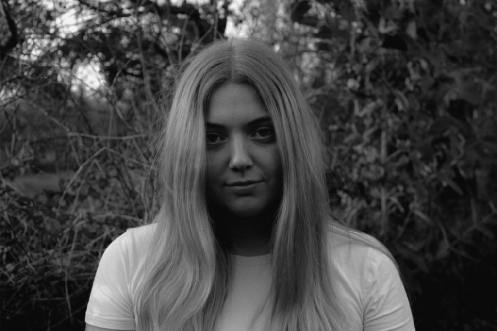


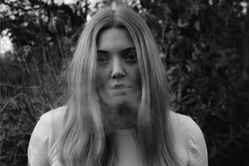
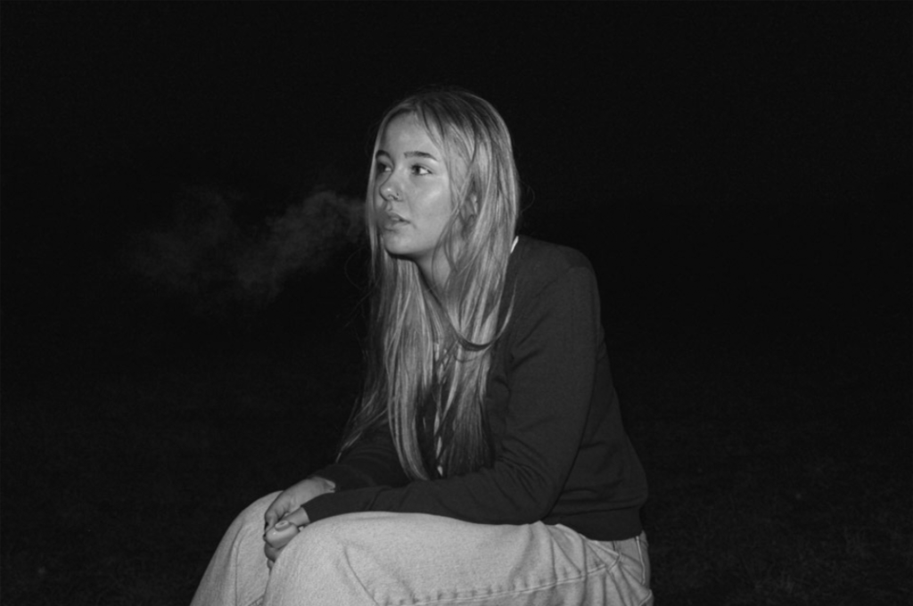
This is because I wanted to convey the darkness in girls’ lives and the struggles that they go through. For my images inspired by Justine Kurland, I have taken the images in a meaningful place where I grew up which is in a woods behind my house.
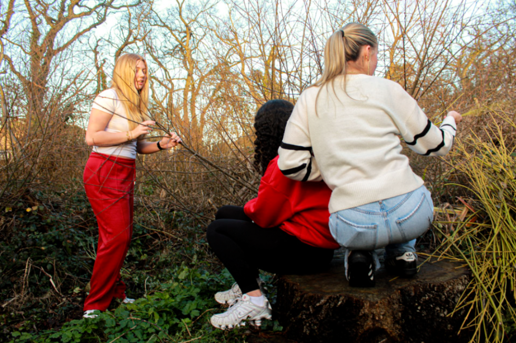
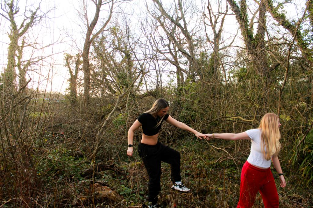


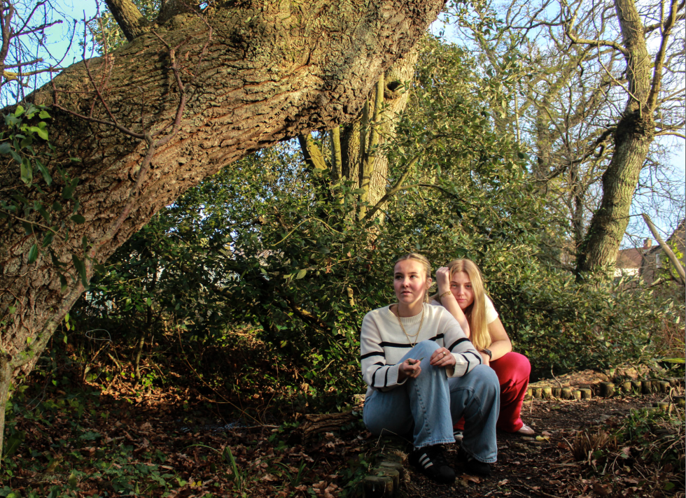
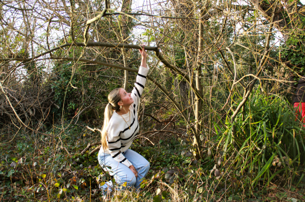
This is contrasting to Kurland’s images as the areas they were taken in don’t have any meaning to her, they were just in the visions she had growing up that she couldn’t experience because of her lack of freedom caused by the gender roles.

