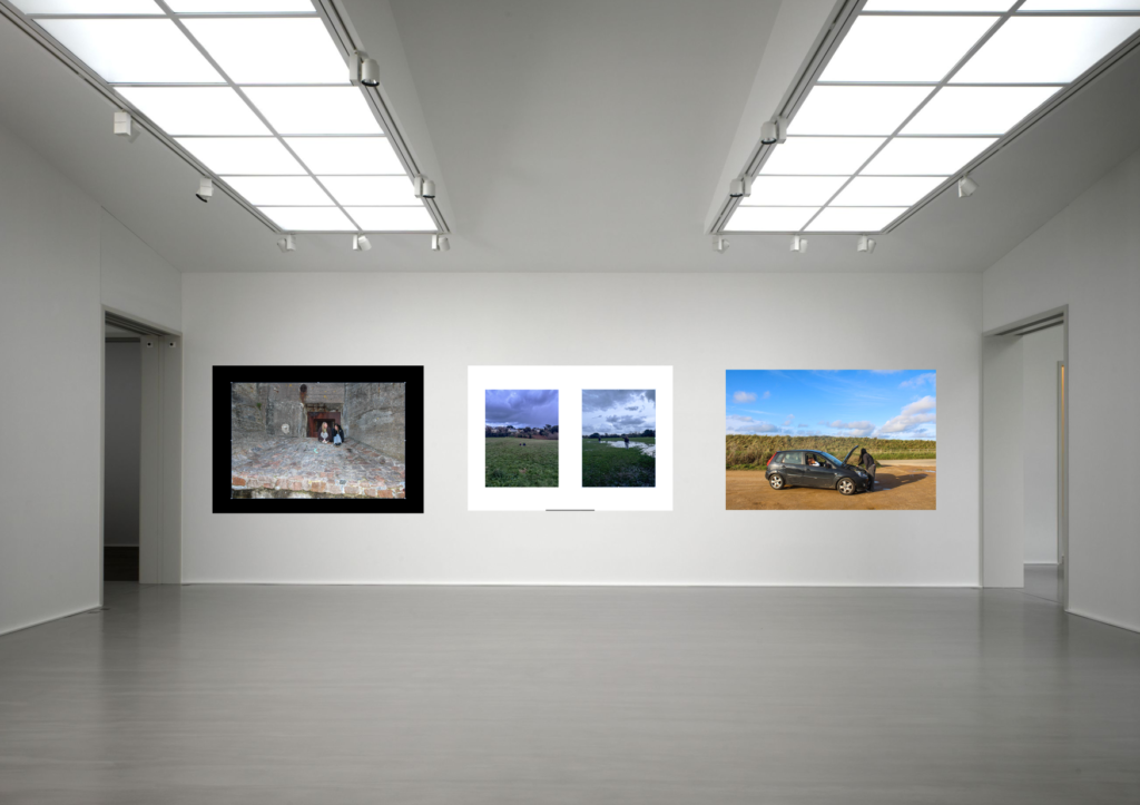
I mounted my images using white foam board, as well as black card. I experimented with different coloured backgrounds and different layouts.
Virtual Gallery
Evaluation
I think the mounting of my images went well, because I was able to experiment with multiples different layouts, with different amounts of images. I also experimented with different coloured backgrounds. I was also able to group images together that compliment each other, so that I could improve the layout and compositions of my mounts.
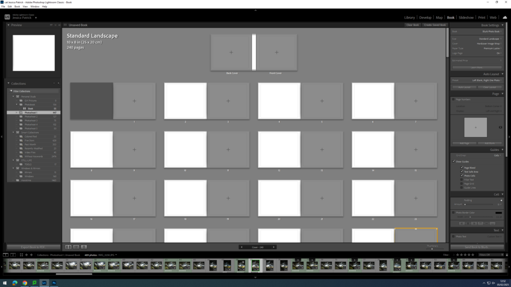
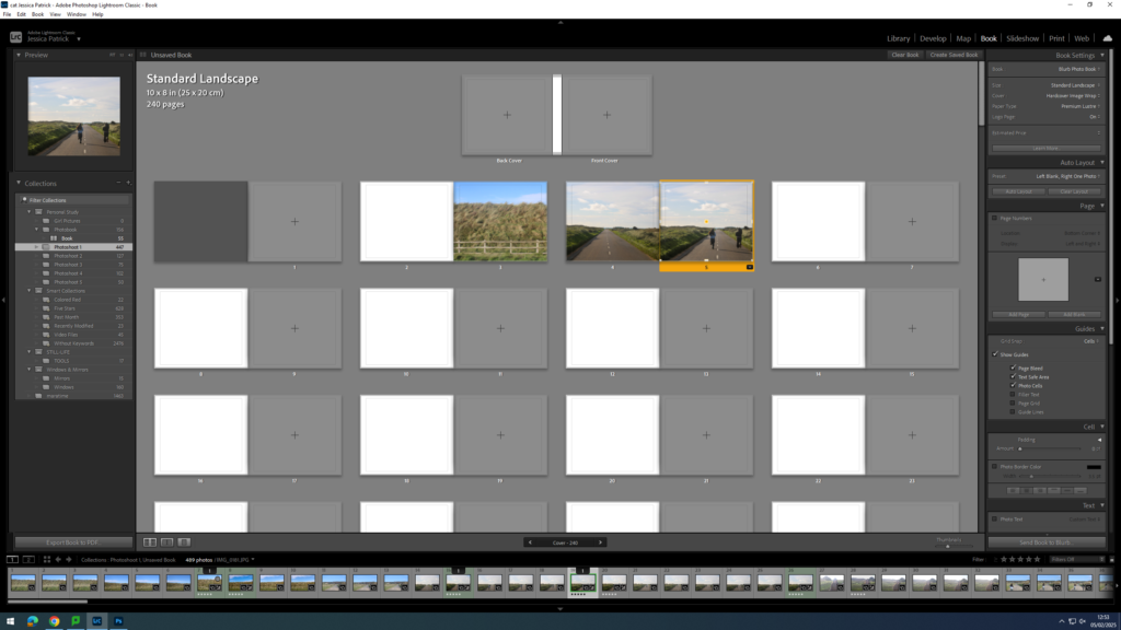
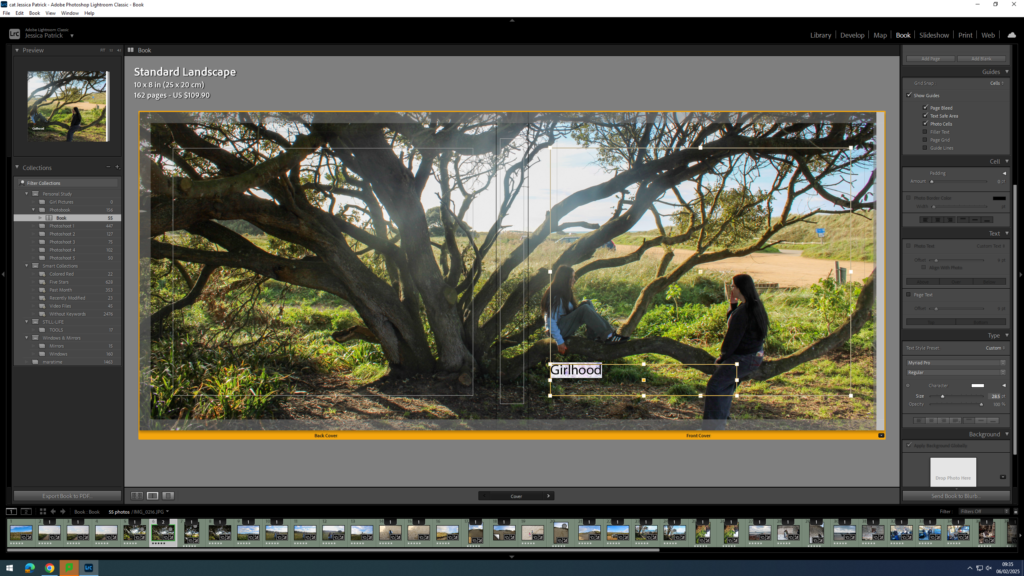
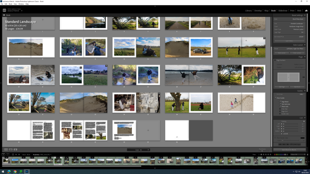
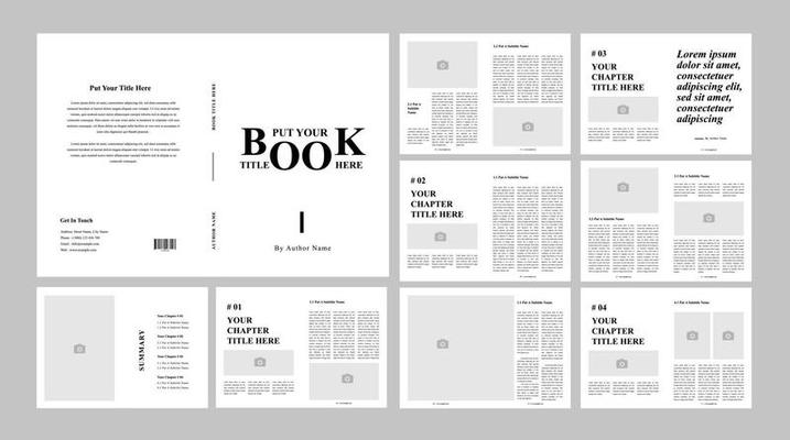
To create my photobook, I used the book mode in Lightroom Classic.
Image Selection
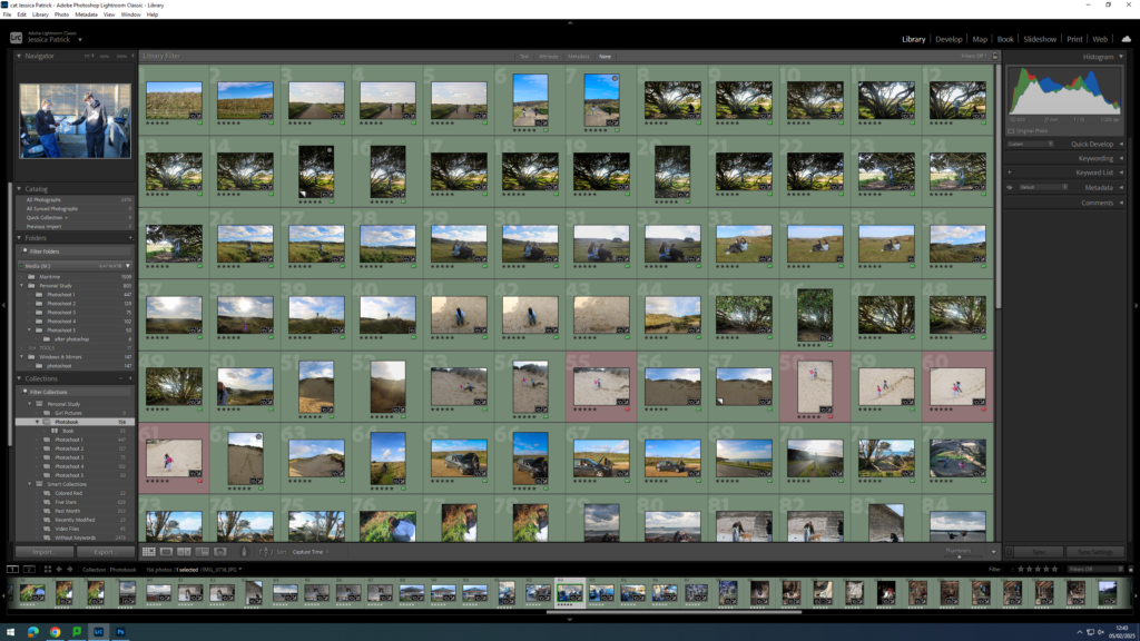
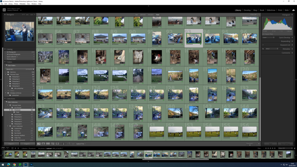
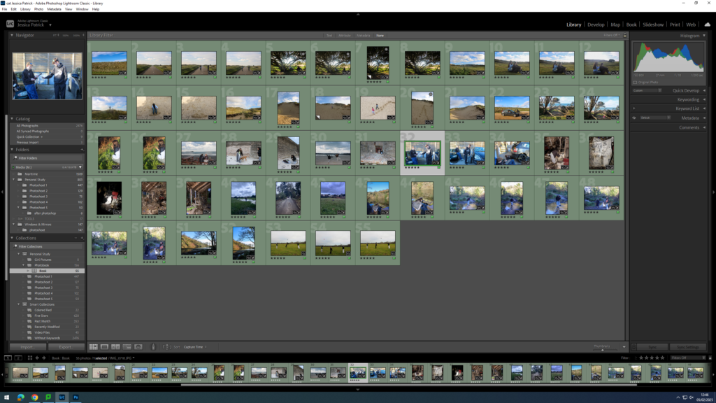
First, I selected all the images, which I have highlighted green and edited in all my photoshoots under this personal study and put them in a new folder called photobook, as they are my best images and the ones I have chosen to use for my book.
Next, I went through my images a removed the images which weren’t in my top 50, as I had selected over 150 images, and this would be way too many pages for my photobook, so instead I aimed for 50 pages.
Setting up my Book
Once I had my finished selection of images, I went into the book setting in Lightroom.
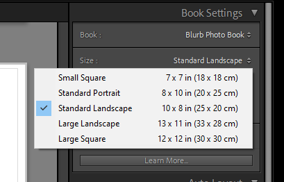
Next, I selected the size and orientation that I wanted my book to be.
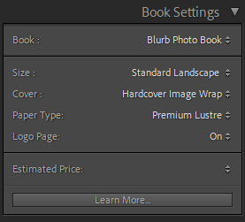
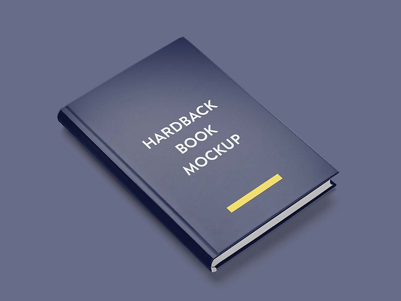
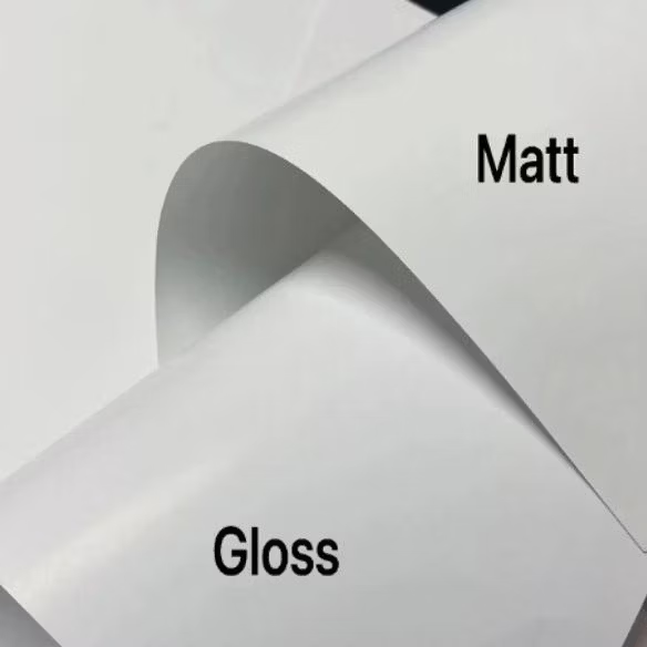
Then, I chose whether I wanted a hard cover or soft cover book, as well as choosing what paper I wanted to use for my book.
I chose a hardcover book, as I feel this would be more aesthetically pleasing for my book. I also chose glossy premium lustre for my paper, which is a glossy paper made for photographs, as I also felt this would be more aesthetically pleasing.
Experimentation
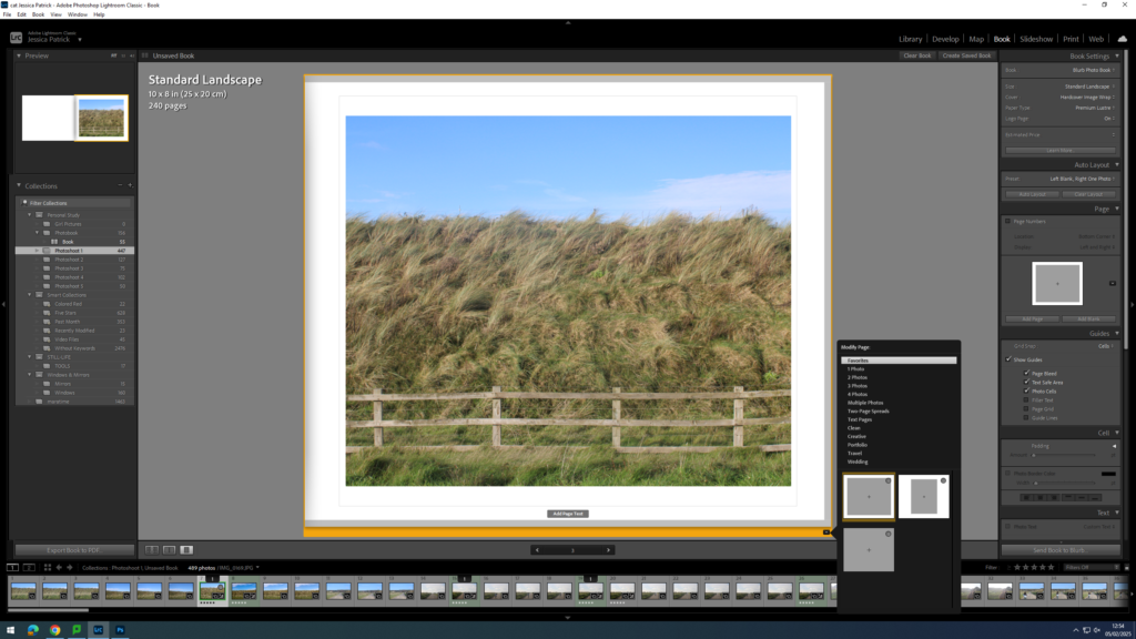
The first thing I did for my photobook, was that I deleted each photo, so that I could start with a blank slate.
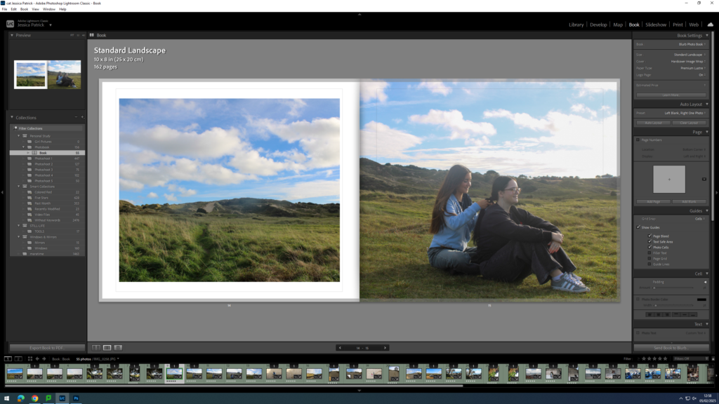
Then, I started experimenting with the layout of my images.
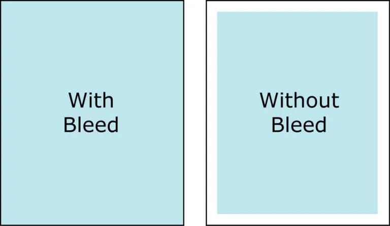
Next, I started experimenting with whether I would like my images to be full bleed, or not.
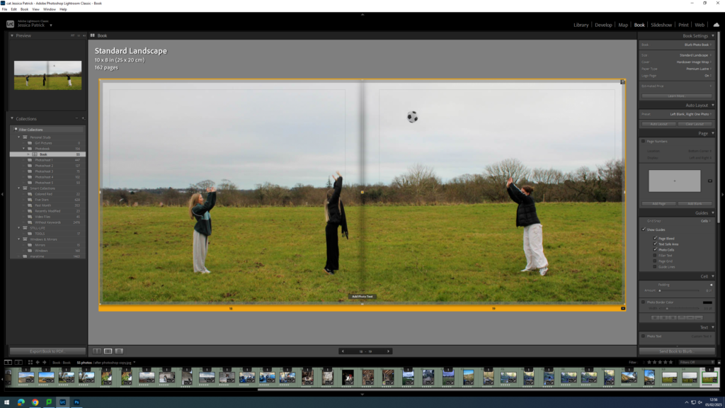
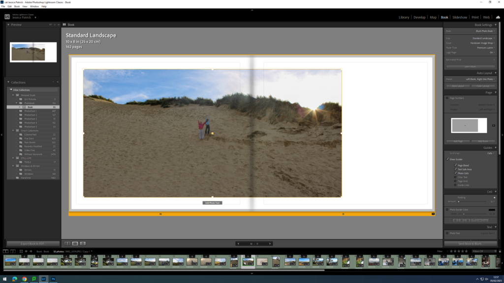
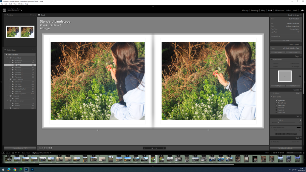
I also experimented with double page spreads.
I also experimented with having a three quarter page spread for a specific photo, because the main viewpoint in the image, which was the subjects, were sat in the gutter, which is not aesthetically pleasing, or what I wanted.
I also experimented with the differing the layout of some of my images and having some of my images with a similar layout.
At the back of my photobook I am also going to include my essay, which I have written based on this study.
Experimenting with Front Cover, Back Cover and Title
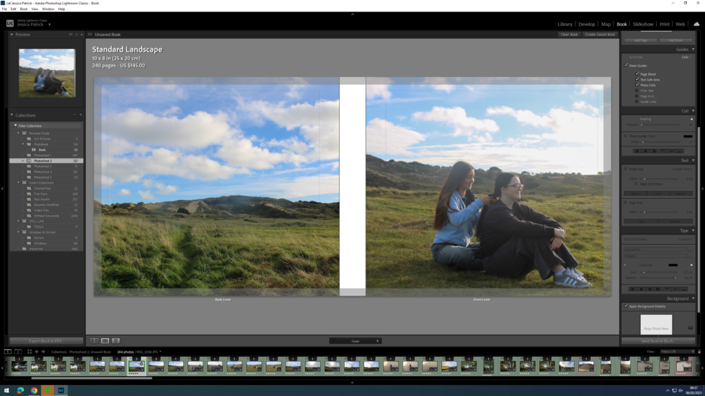
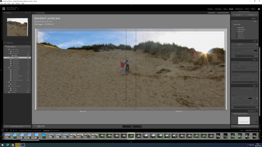
First, I experimented with having a single front cover and a different single back cover.
However, I didn’t really like this and I thought a double page spread for my front and back cover would work a lot better, so I started experimenting with the different images I could use.
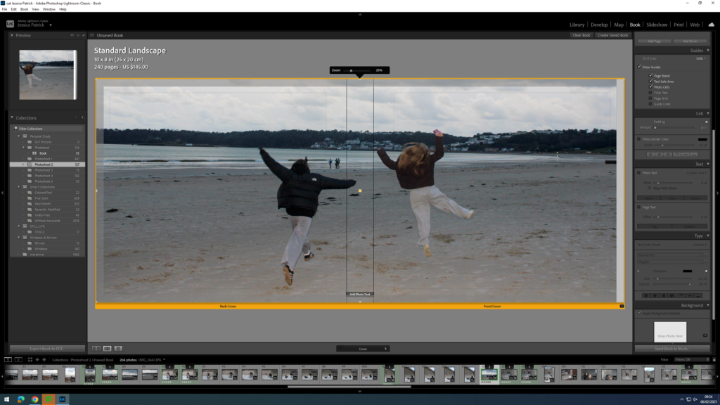
I liked this image, but it didn’t work well as a double page spread, because the main viewpoint of the image is on the spine of the book.
I liked this photo as a double page spread, but thought the front cover may be too boring on it’s own.
The final image above is the one I have chosen to use, because it works well as a double page spread, and the front cover of the book has the main viewpoint on it, so it isn’t so boring.
Once I was happy with the front and back cover image I could start experimenting with my title.
Some title options:
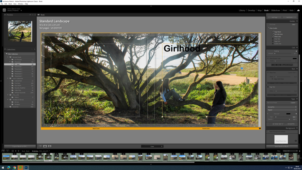
Girlhood
My Girlhood
Girl
The Girlhood
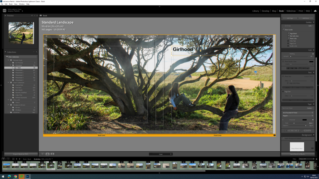
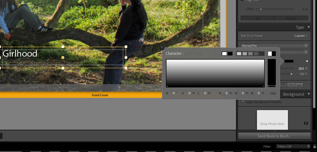
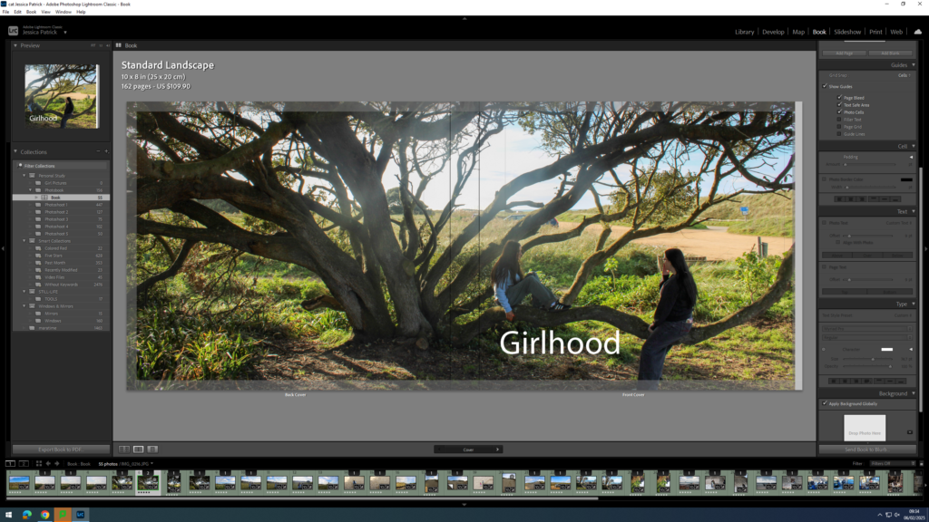
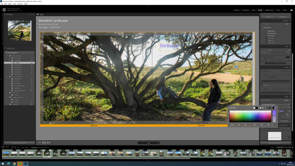
Once I had decided on Girlhood as my title I could start experimenting with the font, size and colour.
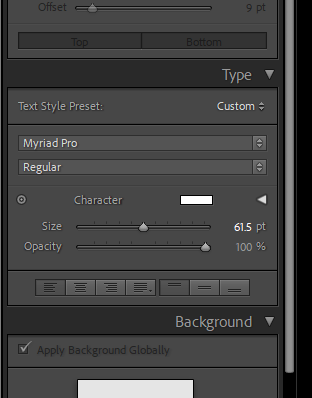
The tools were on the right hand side of the screen and the options were to change the size, opacity, colour and font.
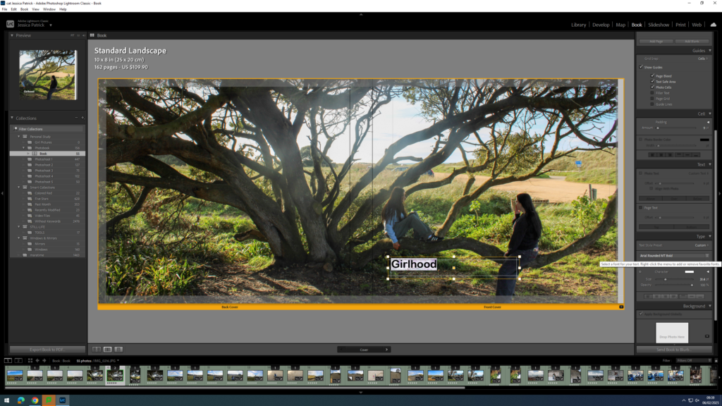
First, I experimented with the placement of my title.
Then, I experimented with the colour of my writing, because depending on my placement the writing couldn’t be seen that well. If my writing was placed at the top of the page black text was better, but if the text was at the bottom of the page the white writing was better.
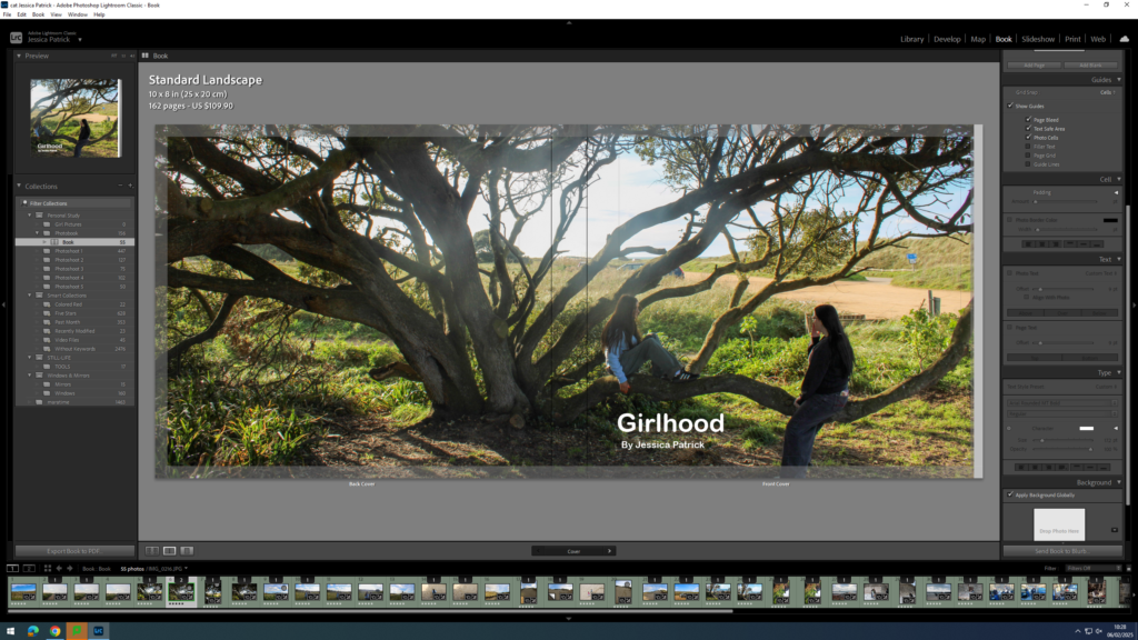
Next, I started experimenting with coloured writing, but ultimately decided on white text.
Next, I experimented with the size of the text.
Finally, I experimented with the font and decided on Ariel Rounded MT bold.
Now, I think the title and my name is too bright with the white ink, so I decided to experiment with the opacity. I set all my writing opacity to 70%.
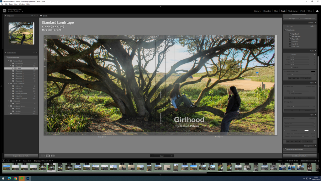
Next, I needed to add my title and name to the spine of my book.
I had to position my title and name where I did on the spine, so that the writing could be seen.
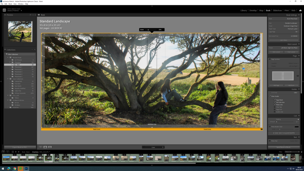
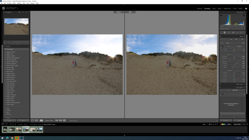
The sky in the centre of my image was too bright, due to shooting facing the sun, so I had to go back into develop mode and select the tool on the very right at the top.
Then, I had to select the sky and lower the highlights and exposure, so the sky was less bright and had some more blue in it.
Adding my Essay
Next, I had to copy and paste my essay in. I used the same font as I used for my title and I had the size on 8pt. My subtitles however are on 10pt and my title is on 17pt.
Then, I had to import the photographs I have used in my essay onto my book in the correct place.
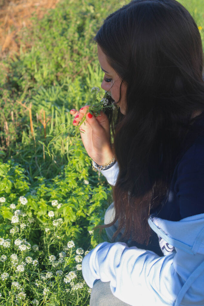
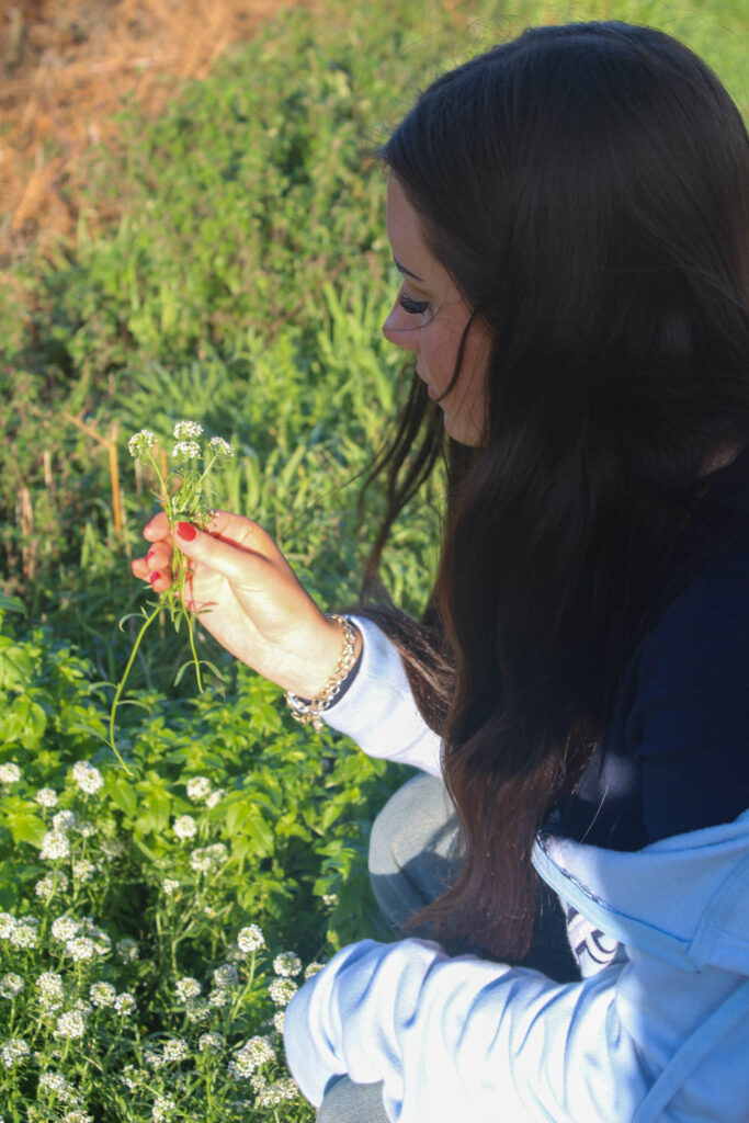
The images which are highlighted green are the images I have chosen to edit, because they are my best images with the best composition and layout. I also chose images with different colours in them, so I could create an image in photoshop with different colours and similar colours.
Edits
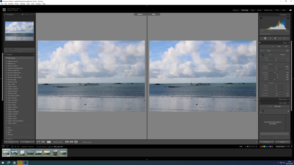
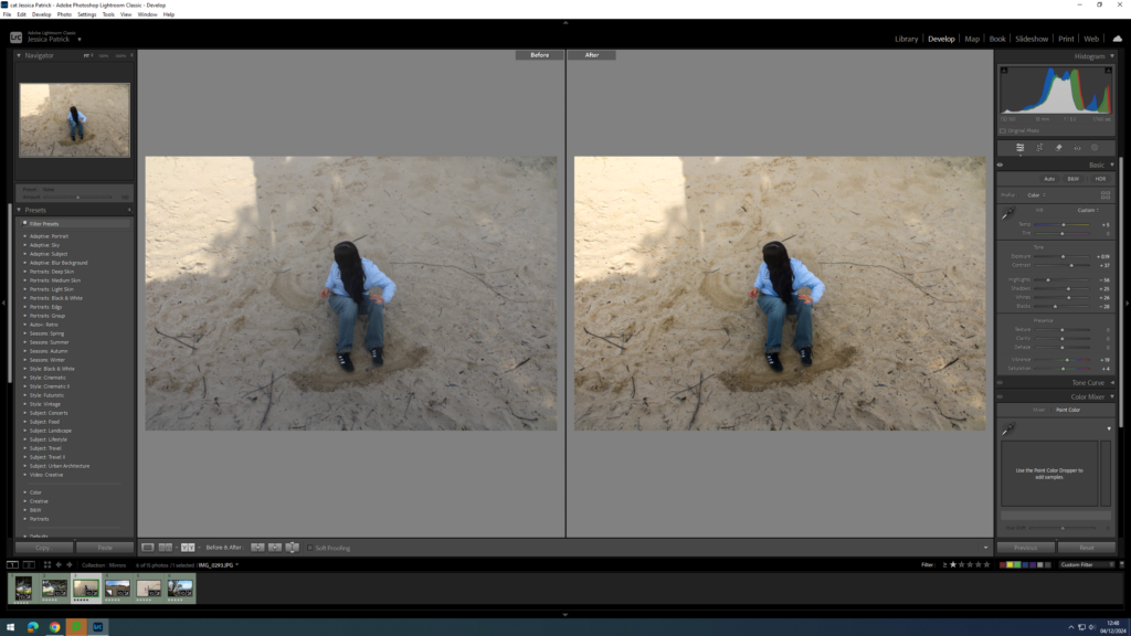
I edited this image by increasing the contrast, shadows, whites, vibrancy and saturation, while decreasing the exposure, highlights and blacks. I did this, so that the image would have slightly better lighting and have more vibrant blue tones.
I edited this image by increasing the contrast, shadows, whites, vibrancy and saturation, while decreasing the exposure, highlights and blacks. I did this, so that the image would have slightly better lighting and be more vibrant.
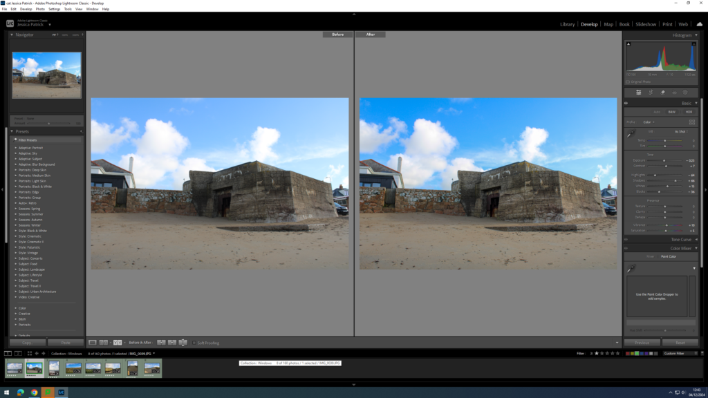
I edited this image by increasing the exposure, contrast, shadows, whites, vibrancy and saturation, while decreasing the blacks. I did this, so that the image would be slightly more exposed so the lighting was better and the image was more vibrant.
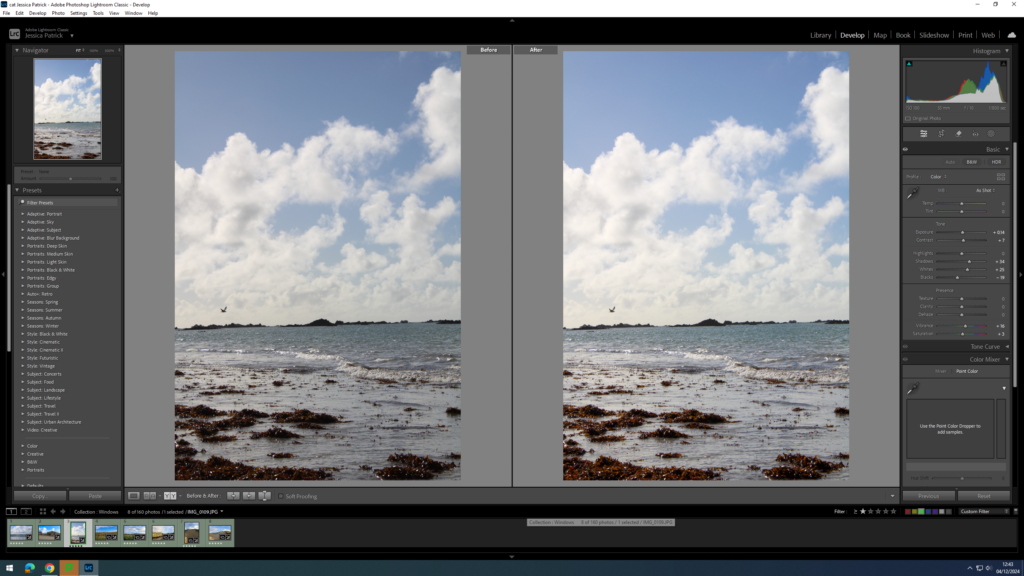
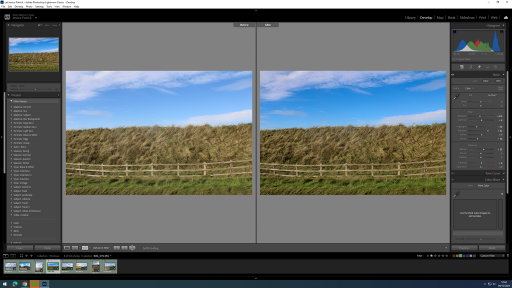
I edited this image by increasing the contrast, shadows, whites and vibrancy, while decreasing the exposure, saturation, highlights and blacks. I did this, so that the image was slightly less exposed, so the lighting was less harsh, and so different shades and tones of the grass could be more visible.
I edited this image by increasing the contrast, shadows, whites, vibrancy and saturation, while decreasing the exposure, highlights and blacks. I did this, so that the image had better lighting.
I edited this image by increasing the exposure, contrast, shadows, whites and vibrancy, while decreasing the highlights, blacks and saturation. I did this, so the image would have better lighting and be more vibrant.
I edited this image by increasing the exposure, contrast, shadows, whites and vibrancy, while decreasing the highlights, blacks and saturation. I did this, so the image would have better lighting and be more vibrant.
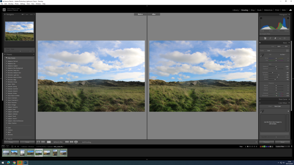
I edited this image by increasing the exposure, contrast, shadows, whites and vibrancy, while decreasing the highlights and blacks. I did this, so the image would have better lighting and be more vibrant.
Mirrors- Contact Sheet
The images which are highlighted green are the images I have chosen to edit, because they have the best composition and layout and display the mirrors theme the best.
Edits
I edited this image by increasing the exposure, contrast, shadows, whites, vibrancy and saturation, while decreasing the highlights and blacks. I did this, so that the image would have more contrast and better lighting.
I edited this image by increasing the exposure, contrast, shadows, whites, vibrancy and saturation, while decreasing the highlights and blacks. I did this, so that the image would have better lighting.
I edited this image by increasing the exposure, contrast, shadows, whites, vibrancy and saturation, while decreasing the highlights and blacks. I did this, so that the image would have better lighting and be more vibrant.
I edited this image by increasing the contrast, shadows, whites, vibrancy and saturation, while decreasing the exposure, highlights and blacks. I did this, so that the image would have better lighting and be more vibrant.
I edited this image by increasing the exposure, contrast, shadows, whites, vibrancy and saturation, while decreasing the highlights and blacks. I did this, so that the image would have better lighting and be more vibrant.
I edited this image by increasing the exposure, contrast, shadows, whites, vibrancy and saturation, while decreasing the highlights and blacks. I did this, so that the image would have better lighting and be more vibrant.
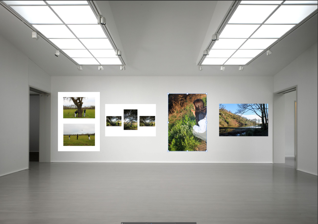
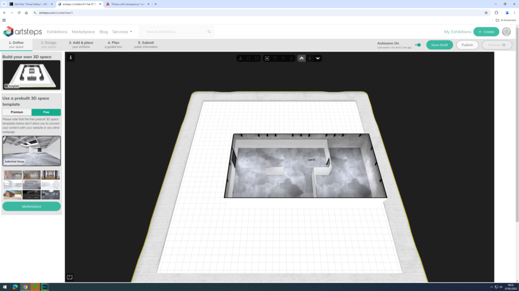
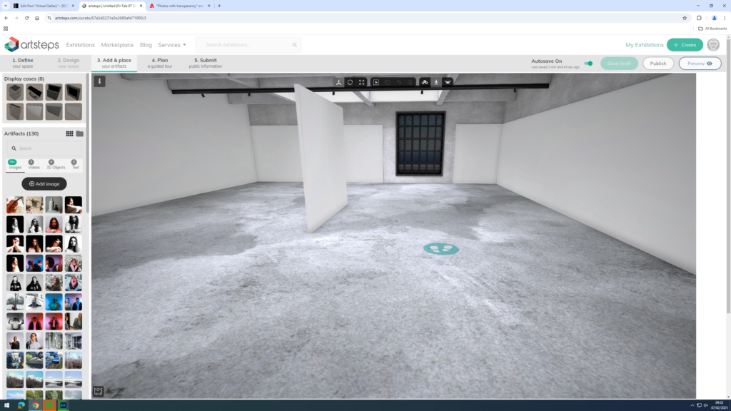
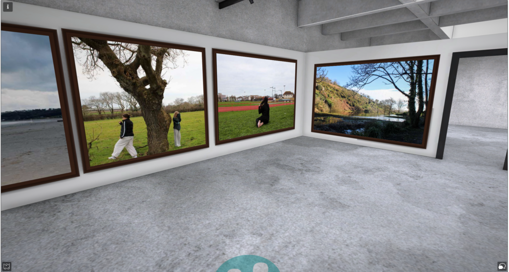
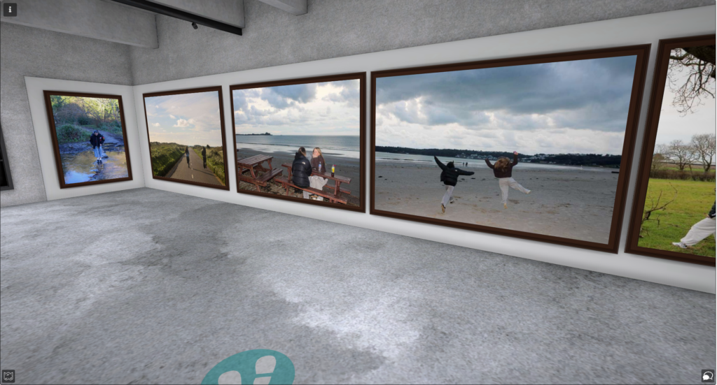
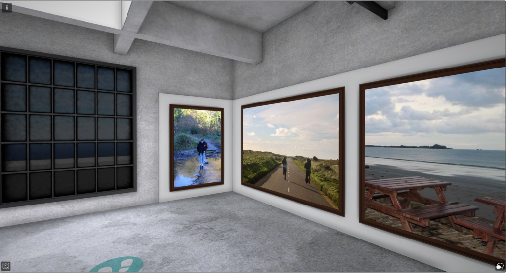
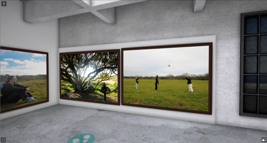
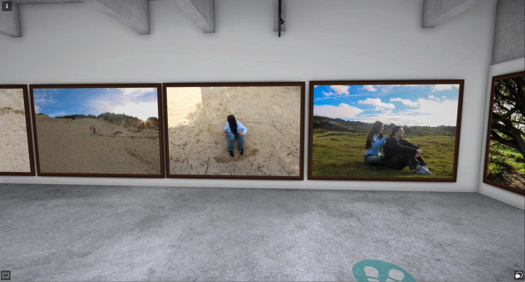
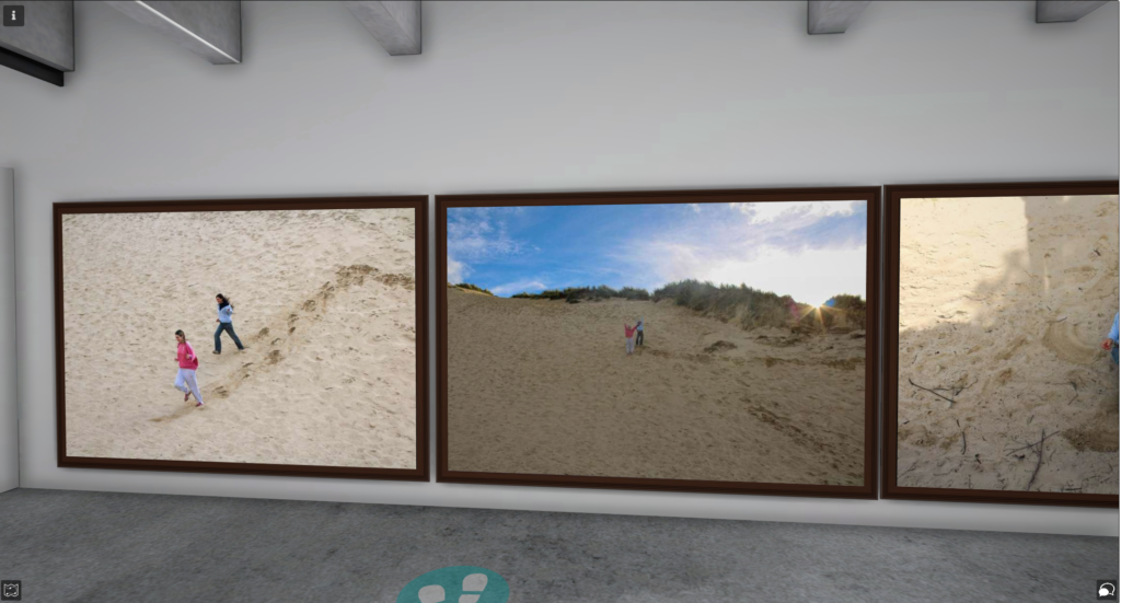
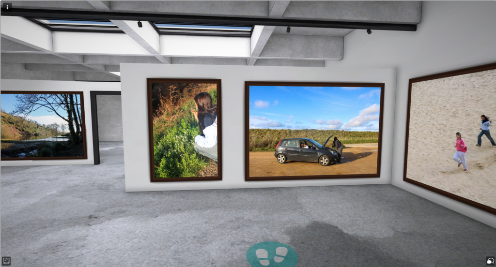
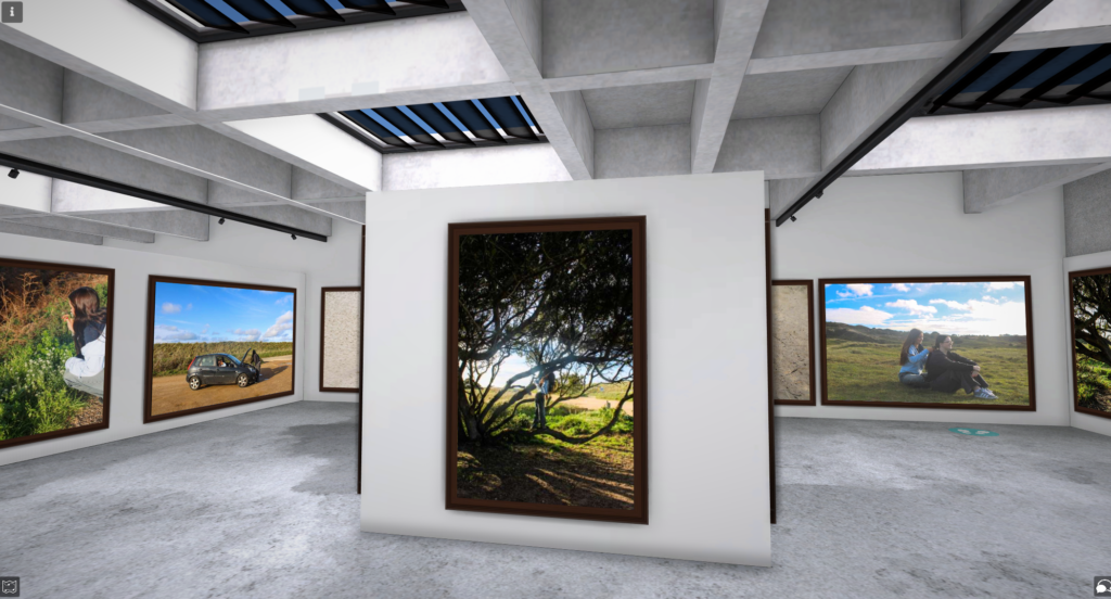
First, I chose which studio I wanted to use for my virtual gallery.
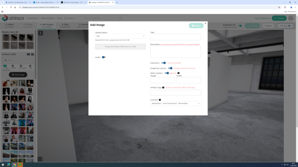
Next, I dragged my images into Artsteps from my documents.
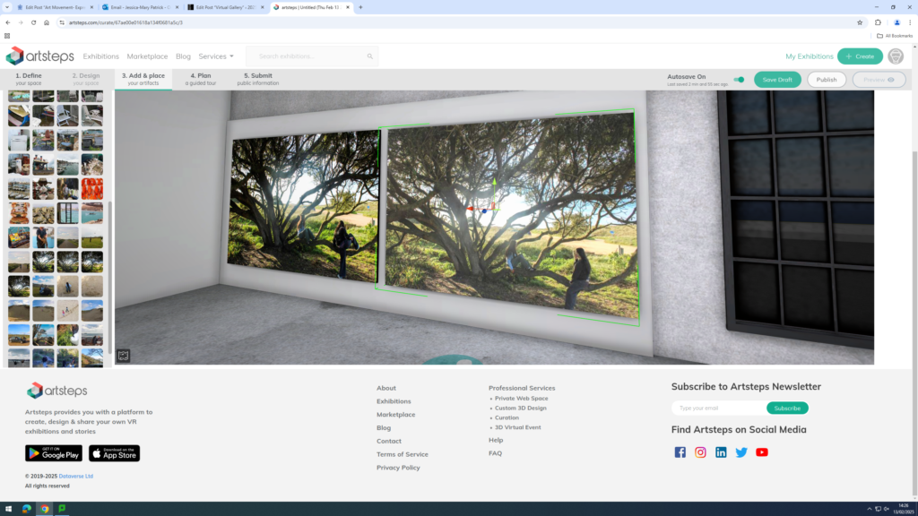
Then, I placed my images where I wanted them in my studio.
Finally, I chose which frames I wanted on my images. I chose the dark brown frame, because I thought it best suited my images.
Final Virtual Gallery
Evaluation
Overall, I think my photoshoots went well, as they displayed the themes youth and identity well, by presenting different activities, which abided by or opposed stereotypical norms. I also presented my youth and identity in particular, as I displayed activities I enjoyed doing in my youth and activities I still do and enjoy now.
I also think my virtual gallery is aesthetically pleasing, because my images go well together and have been displayed well together, similarly to my photobook. I have also used my best images, which I have used in my photobook in my virtual gallery as well.
You want to aim for a draft layout before the Mock Exam begins, then use the two days allocated to fine tune final layout and design.
1. Write a book specification and describe in detail what your book will be about in terms of narrative, concept and design with reference to the same elements of bookmaking as above.
Narrative:What is your story? Describe in:
3 words– Youth and identity.
A sentence– Exploring my identity by reminiscing my youth.
A paragraph– Exploring my identity by reminiscing on different activities I used to do during my youth, or still do now.
Design: Consider the following
How you want your book to look and feel
Paper and ink
Format, size and orientation
Binding and cover
Title
Structure and architecture
Design and layout
Editing and sequencing
Images and text
2. Produce a mood-board of design ideas for inspiration. Look atBLURB online book making website, photo books from photographers or see previous books produced by Hautlieu students on the table in class.
1. Research a photo-book and describe the story it is communicating with reference to subject-matter, genre and approach to image-making.
2. Who is the photographer? Why did he/she make it? (intentions/ reasons) Who is it for? (audience) How was it received? (any press, reviews, awards, legacy etc.)
3. Deconstruct the narrative, concept and design of the book and apply theory above when considering:
Book in hand: how does it feel? Smell, sniff the paper.
Paper and ink: use of different paper/ textures/ colour or B&W or both.
Format, size and orientation: portraiture/ landscape/ square/ A5, A4, A3 / number of pages.
Title: literal or poetic / relevant or intriguing.
Narrative: what is the story/ subject-matter. How is it told?
Structure and architecture: how design/ repeating motifs/ or specific features develops a concept or construct a narrative.
Design and layout: image size on pages/ single page, double-spread/ images/ grid, fold- outs/ inserts.
Editing and sequencing: selection of images/ juxtaposition of photographs/ editing process.
Images and text: are they linked? Introduction/ essay/ statement by artists or others. Use of captions (if any.)
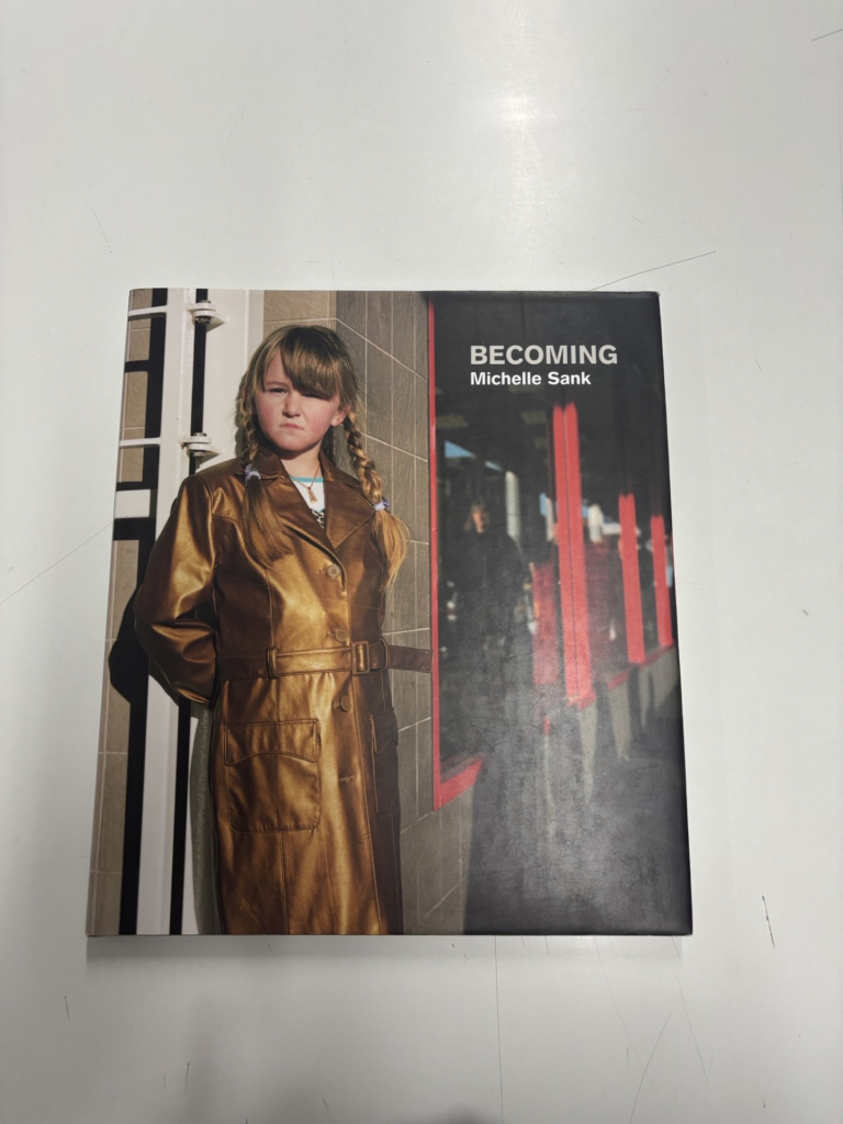
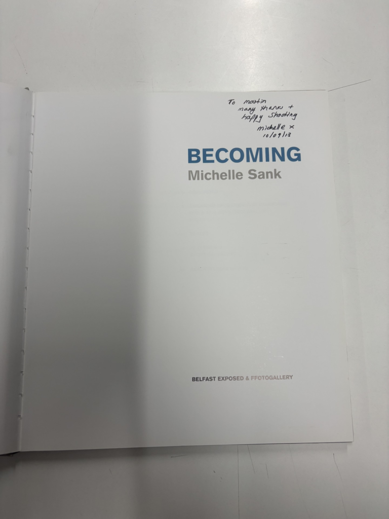
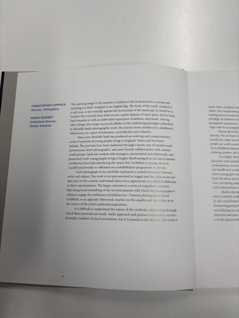
Becoming Michelle Sank
Research into Photobook
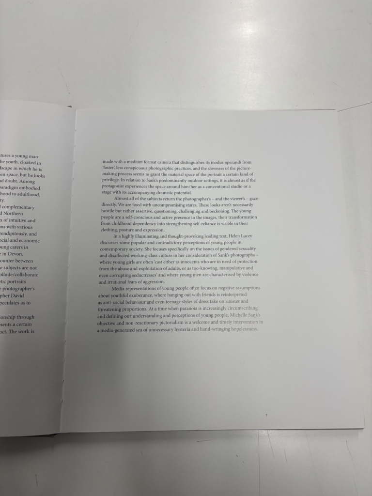
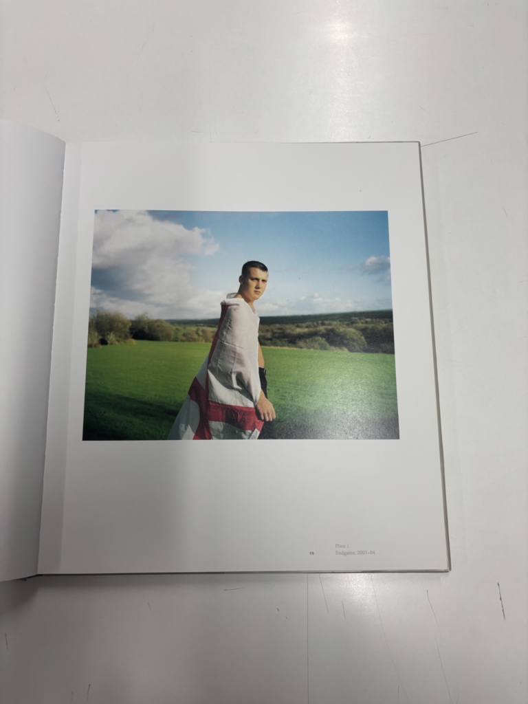
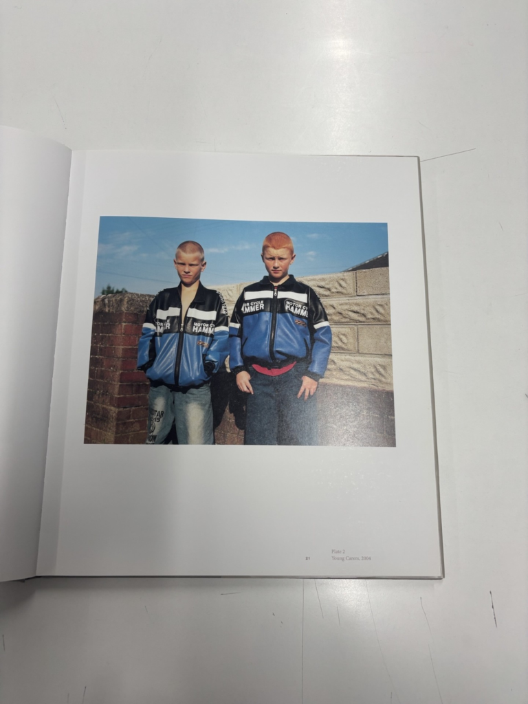
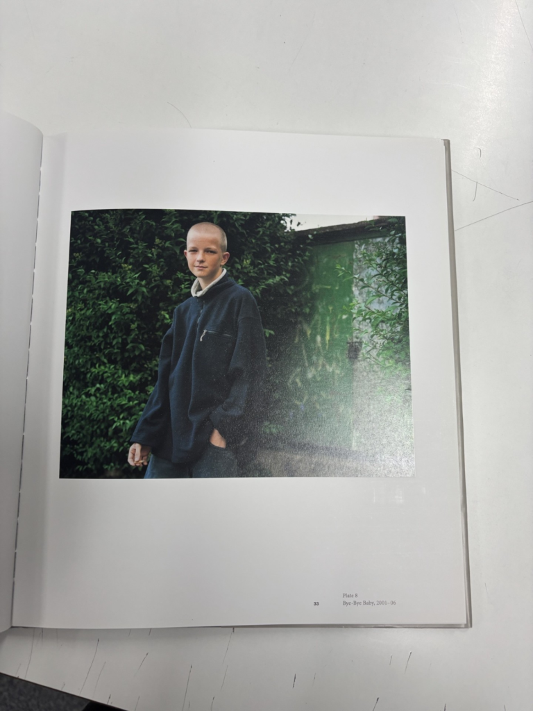
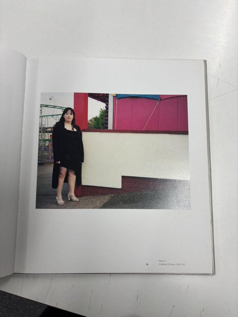
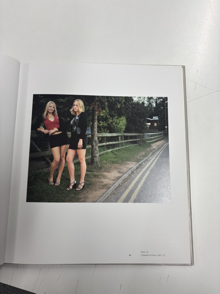
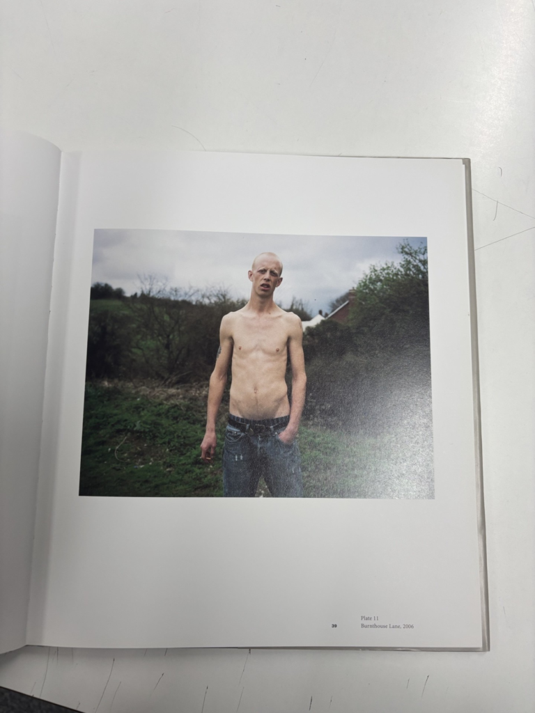
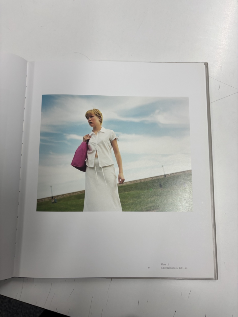
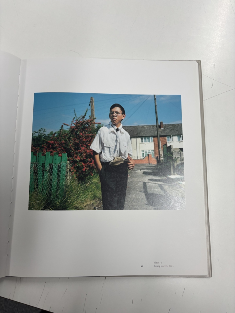
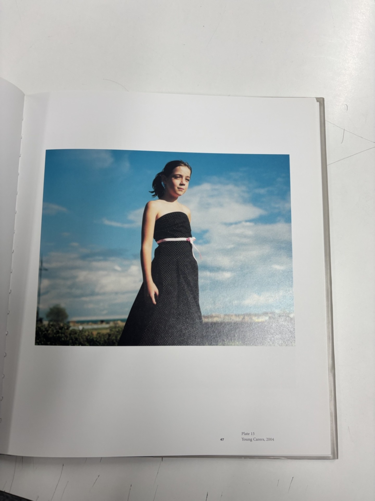
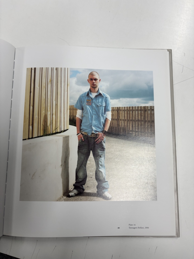
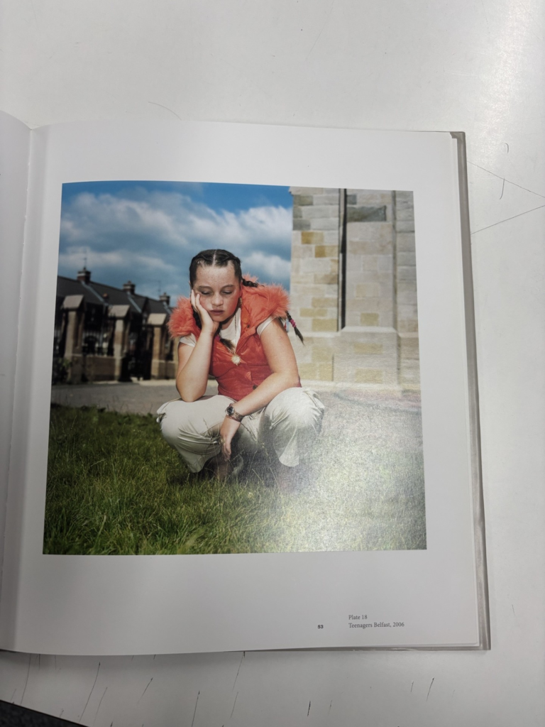
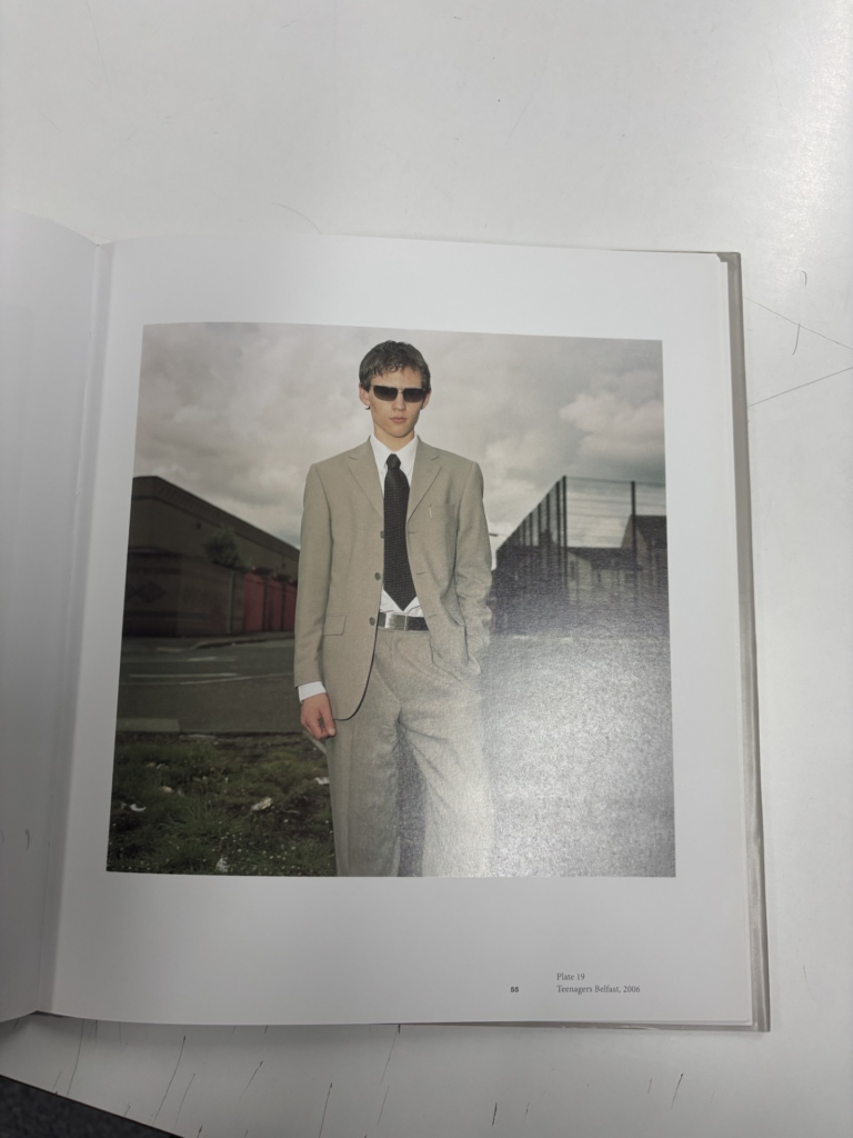
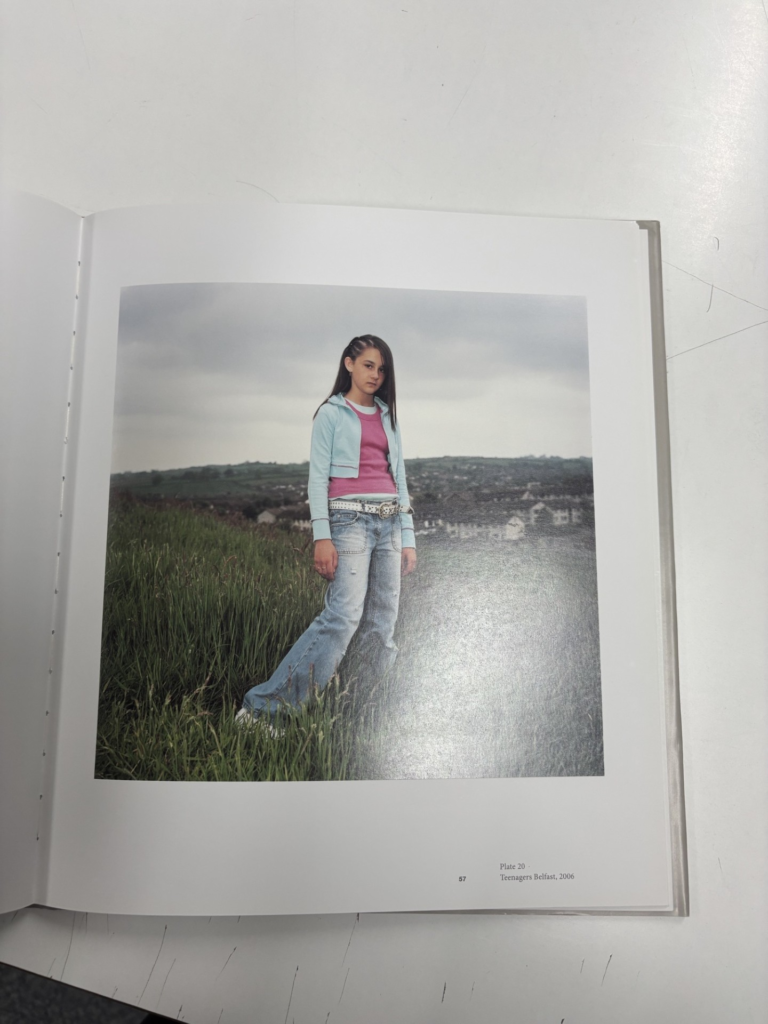
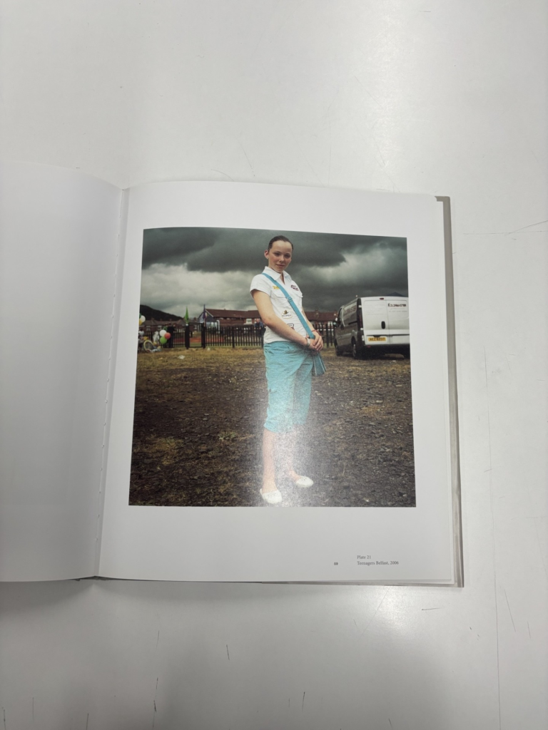
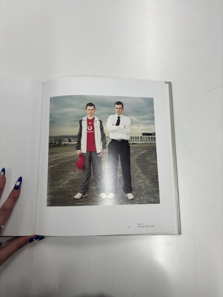
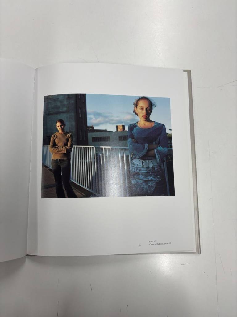
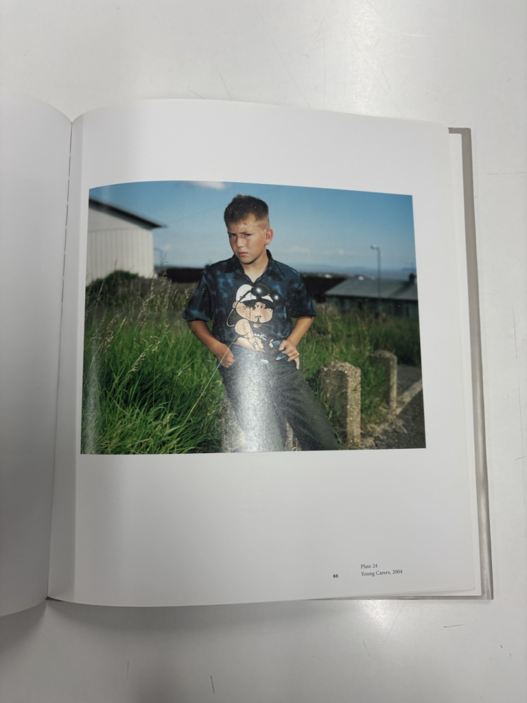
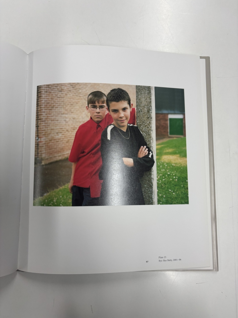
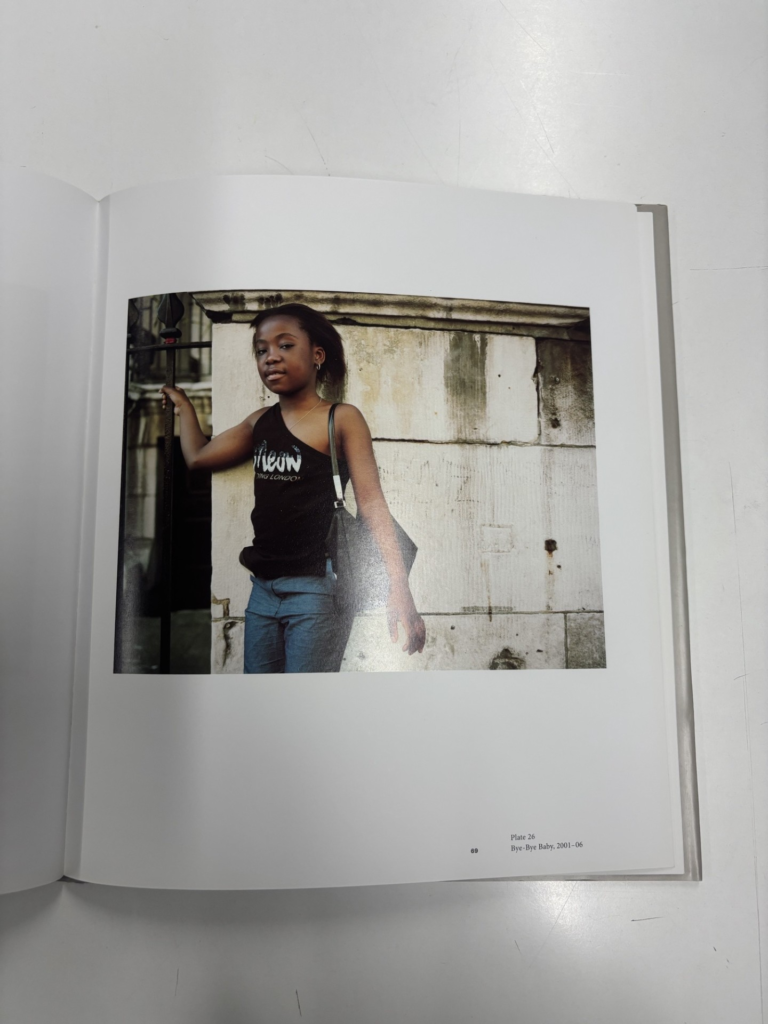
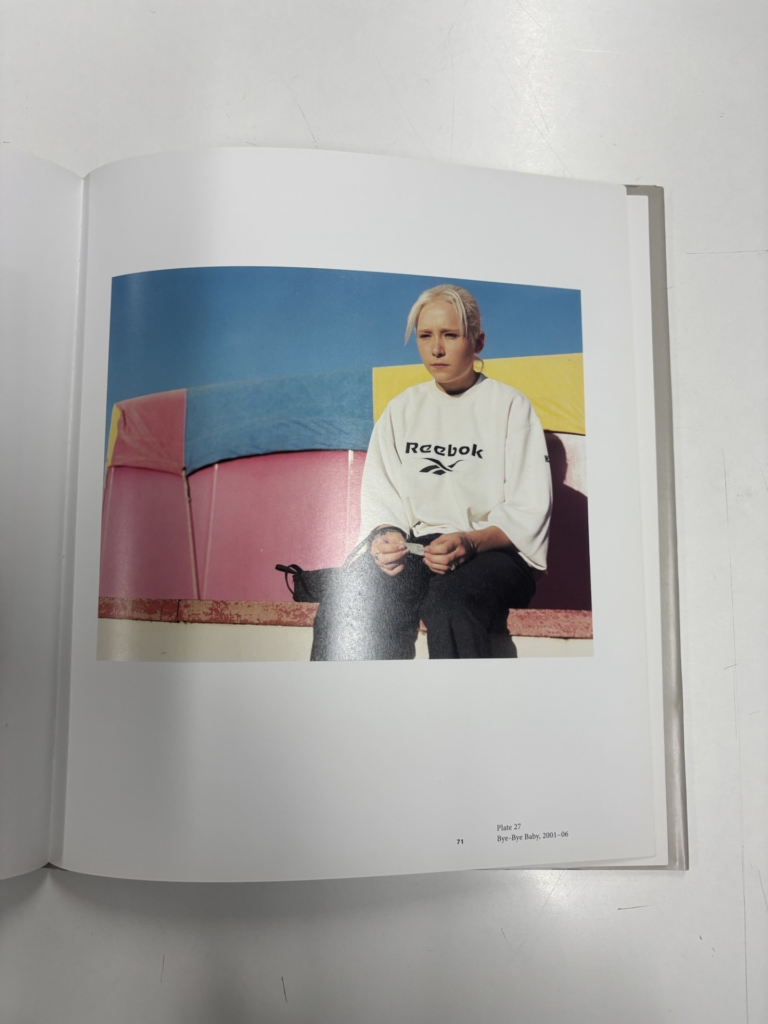
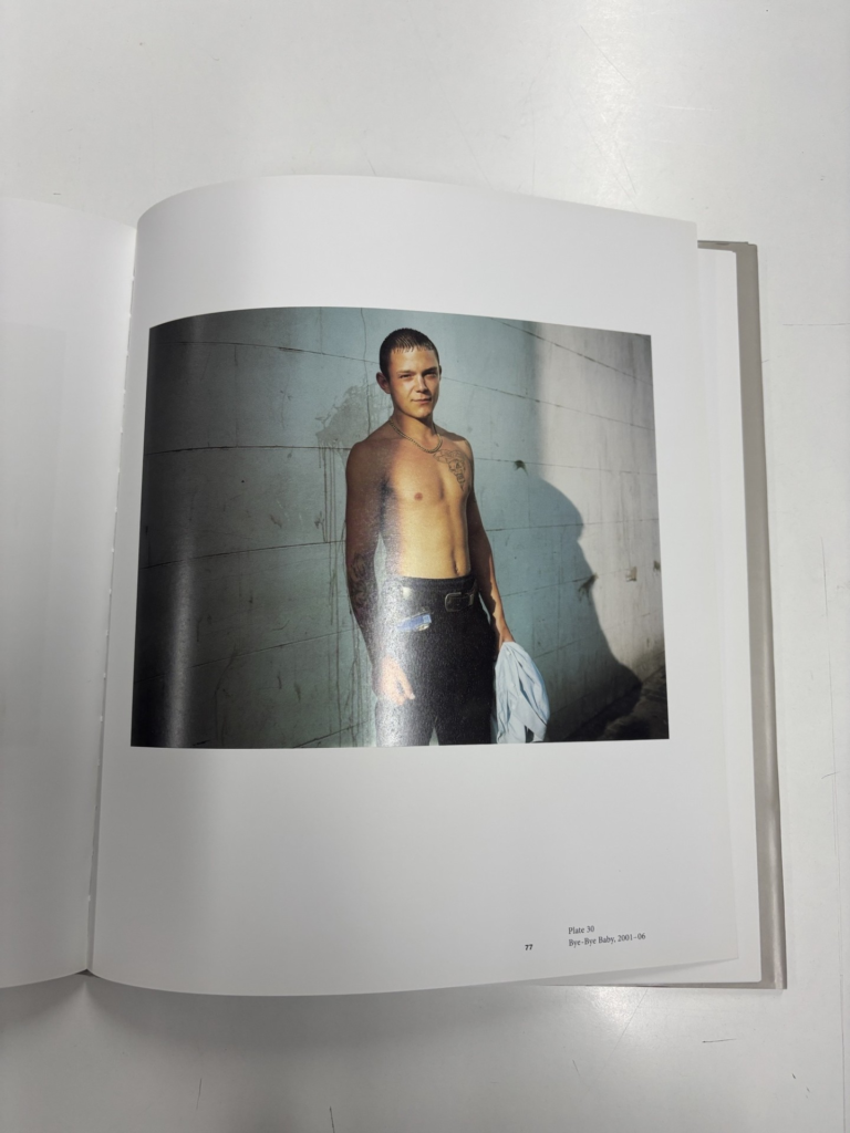
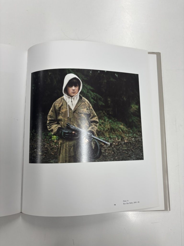
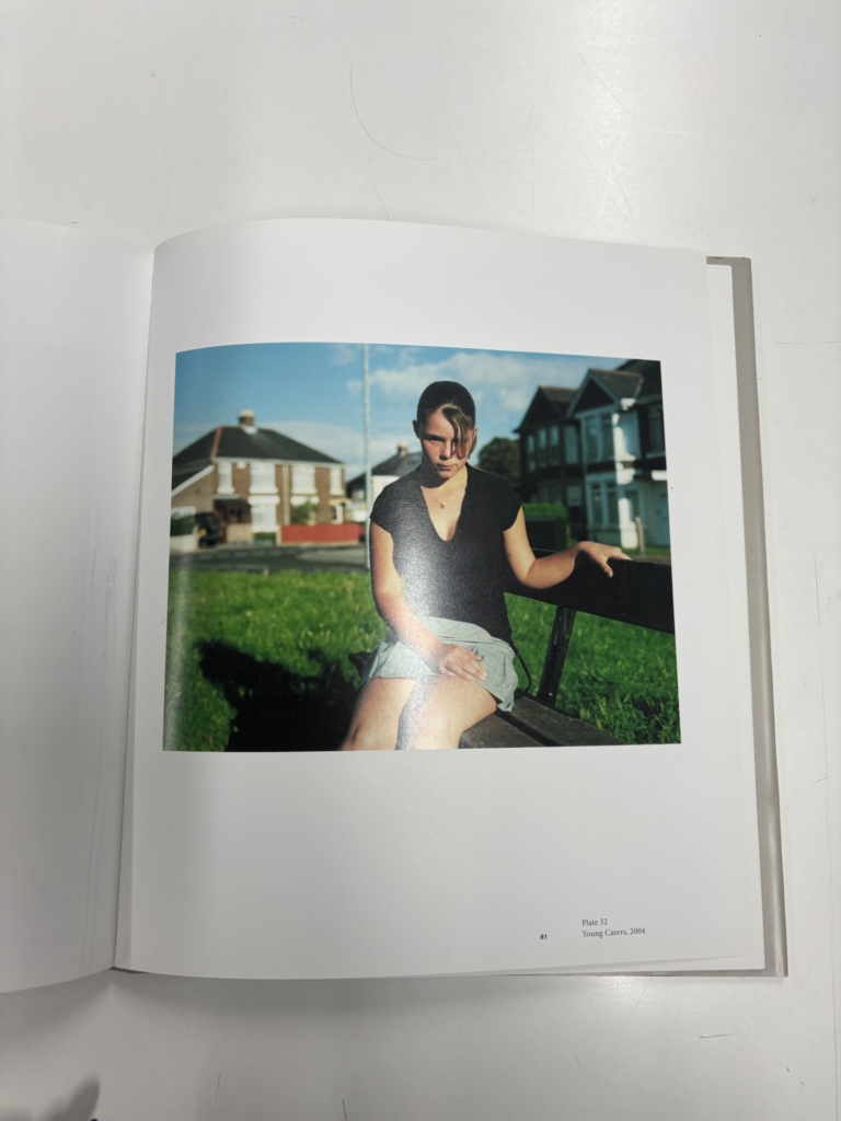
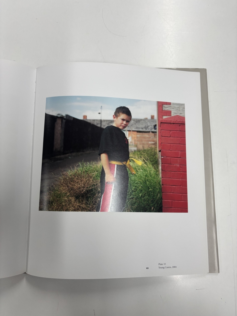
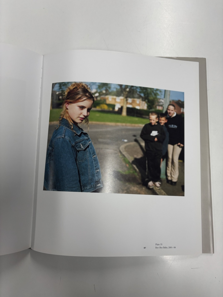
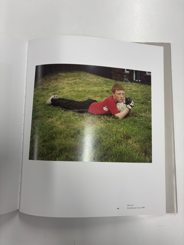
Michelle Sank took portraits of young people from different social contexts living in England, Wales and Northern Ireland, so she could communicate youth issues and bring light to issues, such as young carers- responsible for the care of a sick parent or siblings, teenage mothers and juvenile ex-offenders on rehabilitation programmes etc. She did this, because she is interested in the experience of growing up and the difficult transition from childhood to adulthood. She was interested in the way that individuals are shaped by social structures, gender, sexuality, class, ethnicity. In her work she particularly looked at individuals in lower socio-economic contexts, where for example the promise of adult sexuality appears to offer future security and happiness.
Her images are not staged, so they are documentary images and the subjects (models) in her images were not directed. Individuals were invited to present themselves to camera as they deemed appropriate and they confidently embraced the opportunity to be photographed with attitude and grace. The outcome is a series of portraits that reveal a quiet conflict within its subjects, where they appear confident and graceful, but they also appear vulnerable and doubtful, questioning the complex process and changing realities of becoming an adult.
Her deceptively simple portraits ask important and probing questions about the status, perception and representation of young people in contemporary society.
Sank’s portraits are distinct due to her work being made with a medium format camera that distinguishes its the subjects habitual way of operating from ‘faster,’ less conspicuous photographic practises and slowness of the picture making process seems to grant material space of the portrait a certain kind of privilege.
2. Who is the photographer?
Michelle Sank was born in Cape Town South Africa (1953) and grew up in an immigrant community during Apartheid, which was a policy or a system of segregation or discrimination on the grounds of race, until she moved to the UK in 1987. She claims that her background being born in Africa, during this time informed her interest in sub-cultures and the exploration of contemporary social issues and challenges, as she has empathy with the experience of a community from the peripheries. For over 5 years she has developed a passion and a great body of work of portraits of young people living in England, Wales and Northern Ireland. Through sensitive interaction with her subjects and improving the aesthetics of her work, Michelle Sank succeeds in making quiet but distinctive comments on the status, perception and representation of young people in contemporary society. Her crafted portraits and landscapes meld place and person creating sociological, visual and psychological narratives. Her photographs have been exhibited and published in England, Europe, Australia, Mexico, South Africa and the USA. She is represented by the Print Room at the Photographers Gallery, London and her work is held in a private and permanent collections in both Europe and America.
Michelle Sank is one on one with her subjects, so that she can get a better understanding of them and challenges they face. She states, ‘I have always felt that the human interactions I have with my subjects is as important to me as the imagery itself.‘ This portrays that she truly does care about the subjects in her photos and has empathy for them and their situations. She also wants them to feel comfortable with her, so she handles all the interactions in a sensitive way, so that they can present themselves without feeling embarrassment to do so.
An Interview- A closer look… Michelle Sank- Elliot Gallery:
Interviewer- ‘Your photographs all have a very particular style. What led you to that aesthetic?’
Michelle Sank- ‘I think its my appreciation of how photographic language is working in that moment- the way the light and the colour interact to create some kind of tension. The slowness of the image making process also allows the space of the portrait a certain kind of privilege- it is almost as if the protagonist experiences the space around him/her as a conventional studio or a stage with the accompanying dramatic potential.’ (Karen Downey from my monograph ‘Becoming’)
Karen Downey- Becoming
Interviewer- ‘What draws you to photograph a person and what is your approach to working with strangers?’
Michelle Sank- ‘There is an aura about them that i connect with that has its origins in my own genetic and history code. I feel this resonance, and the excitement that I experience is conveyed to strangers when I first meet them, which starts a connection between us. I have always felt that the human interactions I have with my subjects is as important to me as the imagery itself.’
Interviewer- ‘What stands out to me in your photographs is the connection or interplay between the subject and their surroundings. Is that something you pay special attention to? Why do you think this connection is so interesting to document?’
Michelle Sank- ‘Yes, it is, as I can be aware of the metaphor and symbolism that can become evident in the relationship between my subject and surroundings- the same occurring within my landscape images. I see my portraits as being able to mould person and place together, creating sociological, visual and psychological landscapes and narratives.’
Interviewer- ‘What is your approach to portraiture? Do you let the subject decide or do you direct?’
Michelle Sank- ‘It is a mix of the two as I work with my subjects in their found environment, but will also partly direct in those situations as how best to reveal the intention.’
Interviewer- ‘Since social documentary photography is very personal and intimate, how do you handle the ethical aspects of photography: How do you ensure a good balance between your artistic expression and your responsibility towards the participants?’
Michelle Sank- ‘I am very aware of respecting the individuals I work with. I hope there is a sense of respect and empathy that emanates from the imagery in relation to the subject matter that I tackle and that the viewer can get a sense of the spectacular in the ordinary.’
From this interview, it is apparent that Michelle Sank treats all her subjects with the most respect and she handles these sensitive interactions in an ethical and caring way. She also feels a connection with her subjects that she is able to present to the viewer through her work, by presenting, ‘the spectacular in the ordinary.’ . She also presents how important these interactions are to her and how important her images are when presenting these sensitive issues.
3. Deconstruct the narrative, concept and design of the book and apply theory above when considering:
Layout of Becoming:
Design of Becoming:
96 pages
dimensions (cm) 28.8 x 1.6 x 25.6
1.9 pounds
Language: English
Becoming- Becoming is a quite literal title in the sense that Michelle Sank is photographing youth, who are becoming an adult. However, I also think the title is quite intriguing, as you cannot tell what is becoming until you open the book.
The book has a hard cover with an image wrap, which is one of the photographs which she has used inside this book. The title is in bold grey writing in the top write hand corner, which her name slightly smaller, but still bold below it, but in white.
On the first page and last page of the book she uses a grey card like paper, which has a sort of grainy feel to it, compared to the white glossy, smooth paper that she used throughout the rest of her book.
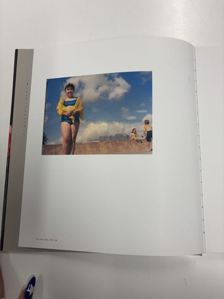
All her images are coloured images and they are all placed on the right hand page of the book, leaving the left hand page blank.
Before any of her photographs there is a contents page, which is in black and blue writing, and there is a couple pages of writing, which is written in black writing, but either has a blue subtitle, or a grey subtitle.
The orientation of the book is portrait, but the photographs inside the book are all landscape and only take up a small portion of the page and they all include a small caption in the bottom write hand corner of the page, which is written in black writing.
Narrative of Becoming:
The narrative Michelle Sank presents in her images is the personal narrative of the subjects life and how they want to express their identity through the images. She presents sensitive, but strong narratives, that displays the challenges the youth are going through in their lives and how it shapes their identity. Her narratives can sometimes be socially sensitive as they address deeper issues going on, especially in lower socio-economic groups, but her narratives have a deep meaning behind them, which Sank believes is important to present and address.
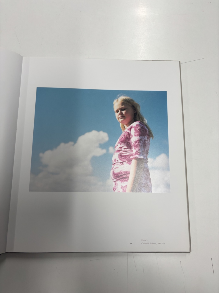
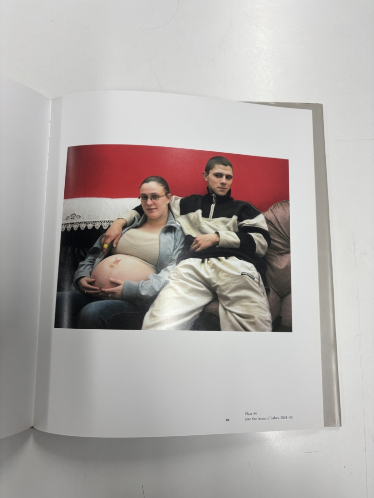
For example, in this image there is a young couple sat together on a couch, which I assume is their home, as Michelle Sank takes photographs of her subjects in their natural environments. The girl in the image is clearly heavily pregnant and the male sat next to her is the father of the baby I assume. The narrative/ challenge Michelle Sank is presenting through this image is teen pregnancy. She is displaying this narrative to the viewer, because she is exploring challenges in youth and wants to present these challenges, without causing shame or embarrassment to the subjects.
The Concept she is trying to convey to the viewer:
Michelle Sank is trying to present challenges that youth face, especially in lower socio-economic groups. She has done this by building sensitive, yet significant relationships with strangers, so that they feel comfortable enough to take part in her cause. She then photographs the youth in their natural environment, or the environment she has found them in. Some issues she addressed in her work is young carers- responsible for the care of a sick parent or siblings, teenage mothers and juvenile ex-offenders on rehabilitation programmes etc. She wants to present these issues to the viewers, so that they are aware of the issues surrounding youth, or/and socio-economic groups, even if the viewer has no similar experience, she still has the ability to have the viewer resonate with her work and the challenges the subjects are facing in her images. Her main aim when taking and presenting these photographs is to provoke a thoughtfulness to the lives and stories of young people.
Aesthetic- patterns in a photographer’s use of visual elements to create beautiful images. These elements can be frame compositions, subjects, color schemes and lighting techniques.
Formalism- Focusses on the formal elements, such as the design, composition and lighting and it is all about the elements, rather than the subject matter, as there is no emotion or context behind the image. The photographer becomes a visual designer whenever a frame is captured. In camera cropping concentrates on the desired subject while eliminating everything else.
Example: The west coast f/64 group, founded in 1932 consisted of a group of photographers working under the formalism movement eg Ansel Adams.
Indexicality- the way a photograph points (like an index finger) to its referent.
Example: Ideas that photographers are closely related to memory, the past, presence, absence and death.
The indexical sign is based in cause and effect, eg. the footprint in the wet sand indicates or traces of recent presence.
Symbols and metaphors can be indexical too.
Representation- photographs that are made of the real world and that represent a place or things relatively realistically.
Representation refers to the way in which individuals, groups or ideas are depicted. The use of the term usually signals acknowledgement that images are never ‘innocent,’ but always have their own History, cultural contexts and specify, and therefore carry ideological implications.
Narrative- the idea that an image or a series of images can be used to tell a story or create a narrative. A narrative is an account of an event or a moment in time, which makes photography the perfect medium for constructing narratives.
To what extend have Justine Kurland and Jeff Wall explored narrative in their work?
Introduction:
‘If you wanted a place in the narrative, you had to imagine yourself inside of it.’ -Justine Kurland, ‘Girl Pictures.’ 1
My intention for this study is to explore the themes of youth and identity by creating narratives personal to my own youth and identity. Specifically, I am going to focus on female identity and female stereotypes, and how they can be combatted against, as this is personal to me as a women. This subject is also extremely important for other women and young girls to demonstrate that your identity can be whatever you desire and that you do not have to comply with social norms, or expectations. I have also explored this in depth in my previous topics and was able to create visually pleasing images with powerful narratives. I would also like to present my female subjects ‘trying on a version of themselves that the world has thus far shown them was boy,’ 2so that I can present more masculine stereotypes and really exaggerate this point of opposing social ‘norms’. This topic of youth and identity interests me, because I think it would be interesting to see how my identity has changed from when I was younger, to now when I’m slightly older. I would also like to look back onto my youth, so that I can see what societal norms I followed and didn’t. I also would like to experiment with different compositional elements, such as the rule of thirds, so that I can improve the presentation of my narratives.
I am analysing Justine Kurland’s work, especially Girl Pictures, because the topic of youth and identity really interests me, because I am still exploring my own identity as I am growing, so this topic is also personal to me, especially because I am a female growing up in this society, who is held to certain expectations. This makes it important for me to combat stereotypical norms, so that I can be myself and help other women do the same thing and express their true identity through the narratives I am presenting. I also feel like because this topic is so personal to me it will allow me to create good photographs to display my feelings and opinions.
I am also analysing Jeff Wall’s images and how he creates his narratives and uses different compositional elements. Jeff Wall takes inspiration from historical paintings, similarly to Justine Kurland. I am also going to be pulling ideas, concepts and compositions from not only his work, but historical paintings as well, especially Le Déjeuner sur l’herbe painted by Édouard Manet in 1863.
So far in this study I have started recreating activities I used to do in my youth, so that I can present my identity and youth through the narratives of my images. I have created tableaux images, where I have positioned and manipulated my subjects. I have also experimented with compositional elements a little bit, by experimenting with the foreground, middle ground and background. To further develop my work, I would like to improve my compositional elements more, by experimenting with the rule of thirds for example and I would like to take inspiration from historical paintings, similarly to Justine Kurland and Jeff Wall. I would also like to focus on trying to create a different range of activities ranging from more feminine to more masculine elements.
Historical context
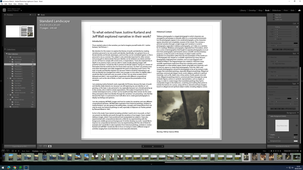
Tableaux photography is a staged photograph in which characters are arranged for picturesque or dramatic effect in a constructed environment, but the photographs appear to be candid photographs, as the characters appear absorbed and completely unaware of the viewer. This conveys a pictorial narrative through a single image and ‘narrative is crucial to photography,’ 3especially in tableaux photography, as it ‘relies on a narrative for it’s readings.’ 4Tableaux photography originated from Pictorialism, which was a union of photographers that fought to separate photography as an art form from photography used towards various scientific and documentary purposes, as they focused on the beauty of subject matter and the perfection of composition rather than the documentation of the world as it is. Photography was viewed as a scientific experiment by many, because photography originated from scientists, such as Louis Daguerre and Nicéphore Niépce. The Daguerreotype was created in 1839 from many scientific experiments made from these two scientists and it created photographs on silver-plated copper sheets using light and chemicals, such as mercury vapour to create these photographs. From the 1800’s and onwards photographers strived for photography to be art by trying to make images that resembled paintings, especially Allegorical paintings. Allegorical paintings communicate deeper moral, social, religious, political or spiritual meanings, such as life, death, love, virtue, justice, charity, greed, envy and more. Allegorical paintings tend to communicate these messages by using symbolic figures, actions or symbolic representation, such as angels, or wings. In order to create images that resembled paintings they had to manipulate images in the darkroom, scratching and marking their prints to imitate the texture of a canvas, using soft focus, blurred and fuzzy imagery based on allegorical and spiritual subject matter, including religious scenes.
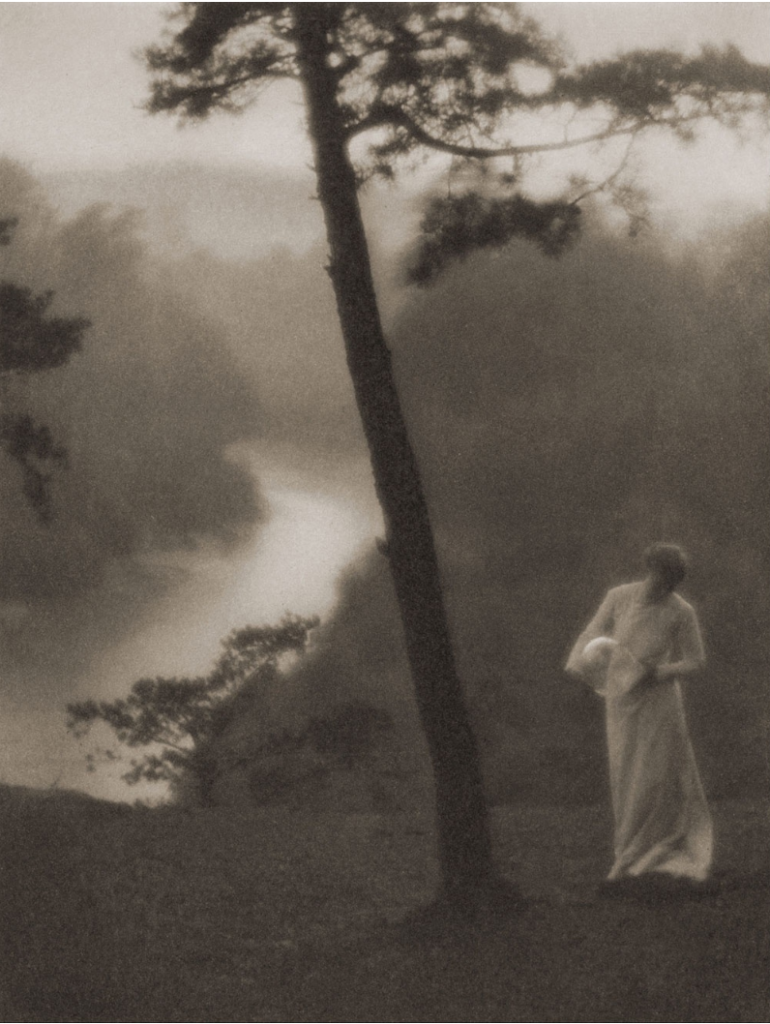
Morning 1908 by Clarence H White
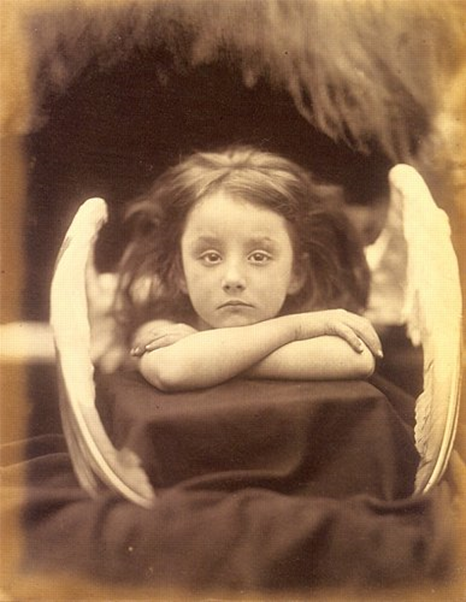
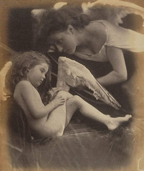
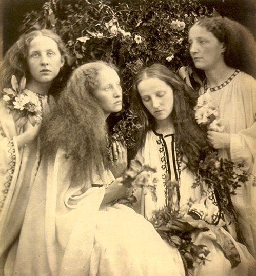
Julia Margaret Cameron was a photographer in the Victorian era, who supported the Pictorialism movement and was considered one of the most important portraitists of the 19th century. She was born on 11th June 1815 and died on 26th January 1879. She is known for her soft-focus close-ups of famous Victorians and for illustrative images depicting characters from mythology, Christianity and literature. She mainly used siblings as her models, including her own sisters, and her daughters, so that they would all look very similar in her photographs. She created allegorical images inspired by tableaux vivants, theatre, 15th-century Italian painters and contemporary artists. In the allegorical works in particular, her artistic influence was clearly Pre-Raphaelite, with far-away looks and limp poses and soft lighting. Pre-Raphaelite would urge artists to ‘go to nature,’ (Wikipedia) as they believed in an art of serious subjects treated with maximum realism. Their principal themes were initially religious, but they also used subjects from literature and poetry, particularly those dealing with love and death, very similarly to Cameron’s work. Cameron was contentious in her own time and her photographs were unconventional in their intimacy and their particular visual habit of created blur through both long exposures, where the subject moved and by leaving the lens intentionally out of focus.
Julia Margaret Cameron (1815–1879), “I Wait”Julia Margaret Cameron
The Rosebud Garden of Girls: Julia Margaret Cameron (1868)
Justine Kurland
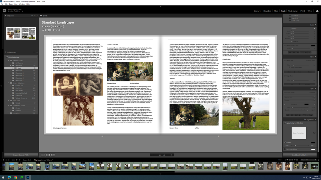
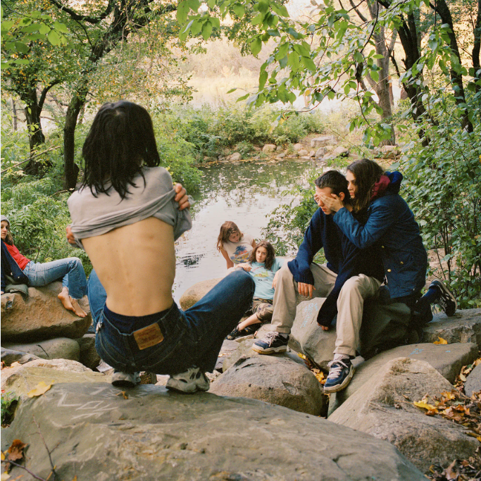
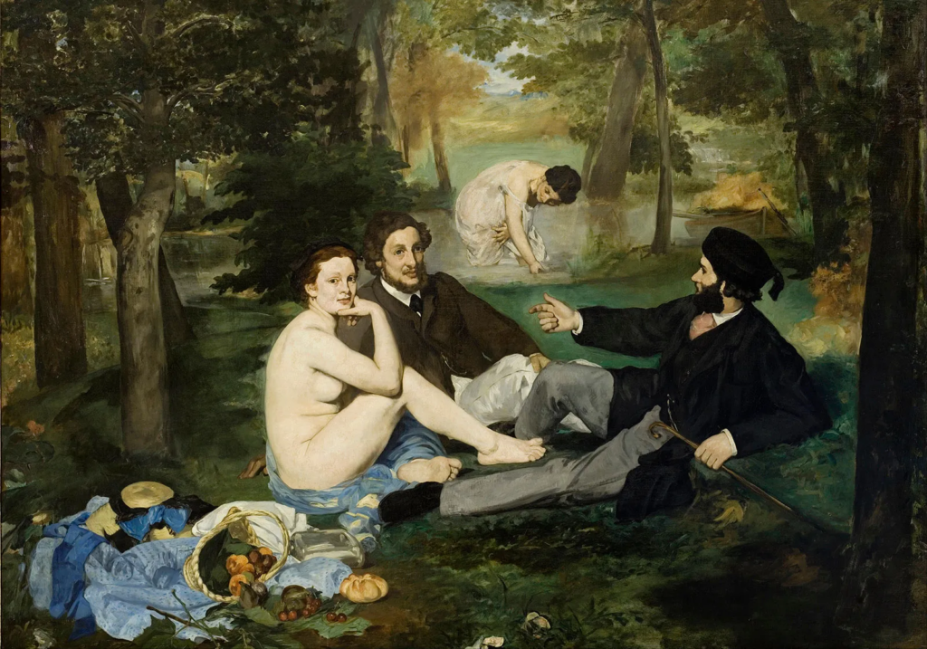
A notable influence within tableaux photography is Justine Kurland, who utilizes a narrative of young runaway girls in a staged environment, where she manipulates the positions/ layout of her subjects to create aesthetic compositions in all her photographs. She carefully composes all her tableaux images, as she manipulates the narrative to be whatever she desires. Justine Kurland borrowed ideas, concepts and compositions from old historical paintings (masters). An examples of her borrowing from a master is ‘Le Dejeuner sur L’Herbe’ by Edouard Manet, which was created in 1862-63.
Edouard ManetJustine Kurland
This painting includes a nude women in the foreground of the painting, who is lunching with two fully dressed men, who are in the middle ground of the painting. They also seem to be having a picnic in a woods, which is presented by the setting of the painting and the picnic basket containing fruit. This suggests they are lunching, as the title of the painting states. ‘Le Dejeuner sur l’herbe’ is French and states ‘Lunch on the grass.’ There is also a half dressed women in the background of this painting, who is washing herself/ swimming in the lake. This painting was very scandalous back in the 1800s, as public nudity was seen as vulgar and frowned upon by society. This was because nudity was a very private concept back in that time, so the models for this painting would have most likely been prostitutes, as a respectable women would not have done this, or been allowed to in this time period.
Justine Kurland borrowed the concept and the composition from this famous painting. As seen in the painting and the photograph, the settings are quite similar, as they are both scenic landscapes, which are wooded, with trees in the distance, as well as the lake in the background. She has also borrowed the nudity concept from the painting, as she has a young girl lifting her top in the photograph, as if she is undressing to get in the lake. She has also borrowed the composition from the painting, as well as other visual elements, such as the colour and texture seen in both the painting and the photograph. Justine Kurland has used the same layout of having the ‘nude’ girl in the foreground, with people in the middle ground, as well as more people in the background down near the lake.
Justine Kurland explores the theme of identity throughout her work, through narratives. The narrative of her work in Girl Pictures is that ‘the girls were rebelling. The girls were acting out. The girls had run away from home… Cowboys, sailors, pirates, hitchhikers, hobos, train hoppers, explorers, catchers in the rye, lords of the flies- you name it.’5 In Girl Pictures the girls weren’t just girls they were whoever they wished to be, as they are finding their true identity during their youth. She also states that they are in ‘the dominion of boys,’6 because in societal standards it is more socially acceptable for boys to act in this rambunctious manor, rather than girls. This is due to gender stereotypes, which have been seen through many centuries. Justine Kurland is trying to fight against these stereotypes of young girls, in her work, because this is an important matter to her and all other girls, because they have grown up being told what they should be or how they should behave a certain way due to their gender. She is fighting against these stereotypes, by having these young girls act in a way that is seen as more masculine and not socially acceptable for these girls. Youth is also an important theme throughout her work, as she presents these girls exploring their identity in their youth, which is extremely important, because during youth you do not know who you fully are yet and being able to explore every aspect of your youth and identity, even if it does not comply with social ‘norms’ allows you get the truest sense of your identity possible. Her message that she is presenting to the viewers through this work is that they can be anything they image, even if it is still in the ‘dominion of boy.’7
Jeff Wall
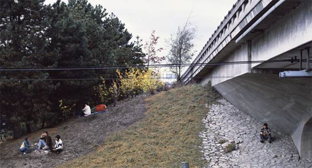
Another notable influence within tableaux photography is Jeff Wall. Jeff Wall creates tableaux photographs, by manipulating his subjects and he also borrows ideas, concepts and compositions from 1900th century classical paintings from the Baroque period, including ‘Le Dejeuner sur L’herbe’ by Edouard Manet. However, he alters the narratives of his photographs to present a more modern day version of the paintings, while still keeping the same compositional elements and concepts. On the influence of Baroque painting in Wall’s images he has said, ‘my work is based on the representation of the body. In the medium of photography, this representation depends upon the construction of expressive gestures which can function as emblems.’ (Wall 1984). In his body work he often captures a snapshot of ordinary street scenes and social encounters in everyday life that may as well have gone unacknowledged, as well as also exploring a range of social and political themes through his work. He also digitally manipulates his work at times, to confuse the viewer even more, so that they have to look harder at his work and think more deeply about the narrative and the role of the photograph itself.
Edouard ManetJeff Wall
Jeff Wall has created a tableaux image, where he has manipulated the positioning and location of his subjects and himself. He has also borrowed the composition that was used in Manet’s painting for his photograph, by having the three people in the foreground on the left, the person on the right in the middle ground and the far people in the background. He has also pulled from the setting a little bit, as the setting is in field like area with trees on the left. However, he has made a more modern day version of this painting by including the bridge, which is a modern day structure in his photograph.
Conclusion:
Overall, both Justine Kurland and Jeff Wall share similar inspirations, as they both pull ideas, concepts and compositions from old historical paintings and create unique more modern narratives in doing so. They also use similar paintings for their inspiration, which can be seen as they have both used Manet’s painting- ‘Le Dejeuner sur L’Herbe.’ However, they create and explore different narratives in their work, even when using similar inspirations. Justine Kurland explores the themes of youth and identity throughout her work, specifically in Girl Pictures. In order to explore these themes in her work, she presents a range of different narratives of young girls doing a range of different activities, such as swimming in lakes, playing at a park, laying on the beach etc. While she is presenting what is seen as simple narratives, they actually all have a deeper meaning behind them, as she is presenting to the viewer that these girls are doing all these things, because they can be whoever they desire to be and their identity can be whatever they decide to make it. She also presents the young girls doing more stereotyped boy-like activities, such as playing in the woods and wrestling etc, so that she can present to the viewer that they don’t need to follow societal ‘norms’ and they can be anything they imagine.
Whereas, Jeff Wall creates more simplistic narratives, such as sitting in the park, or lying on the grass etc. He says, he is ‘not interested in narrative,’ (Wall 1984) because he focuses more on the compositional and visual elements in his work. This makes his work more technically complex.
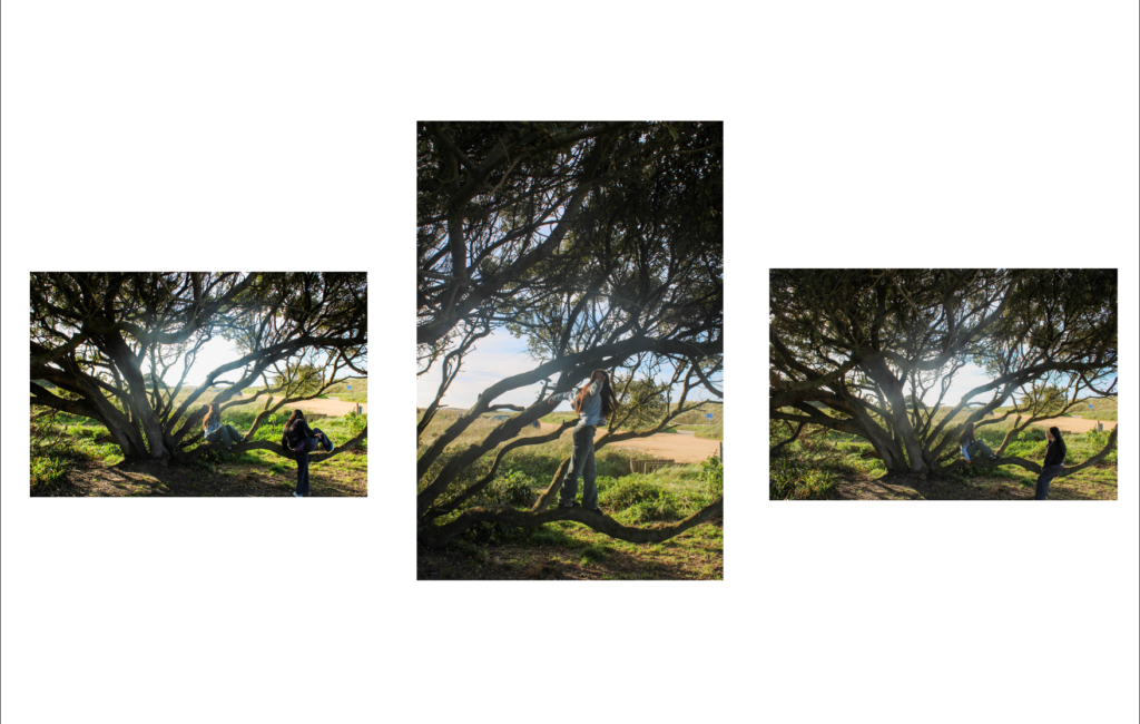
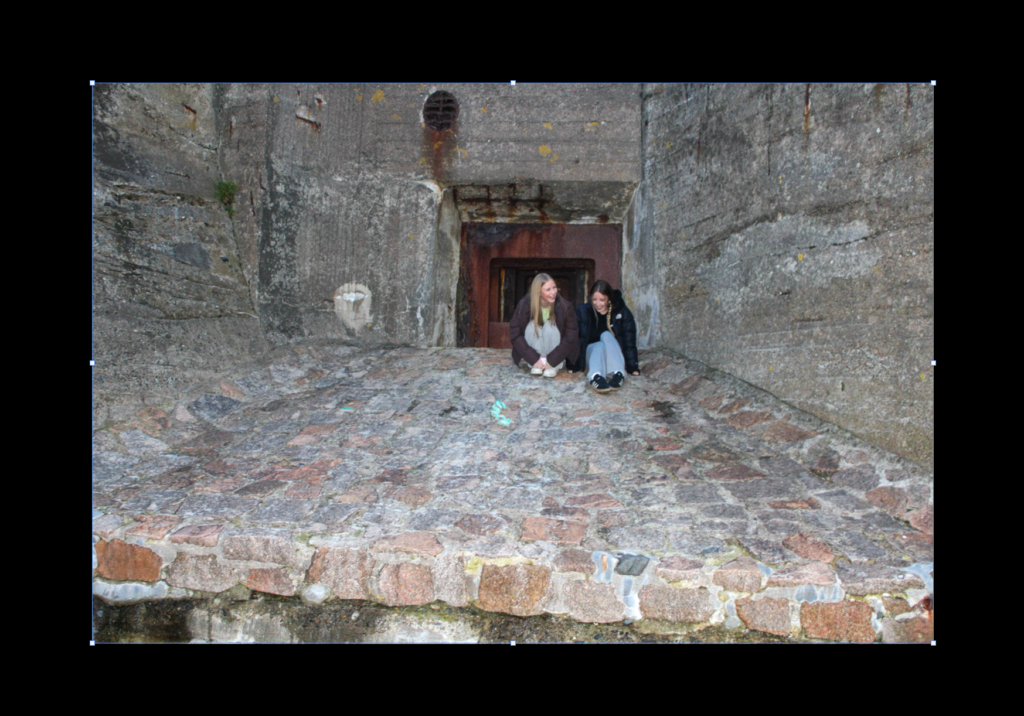
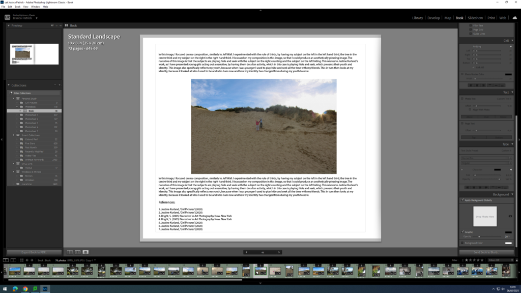
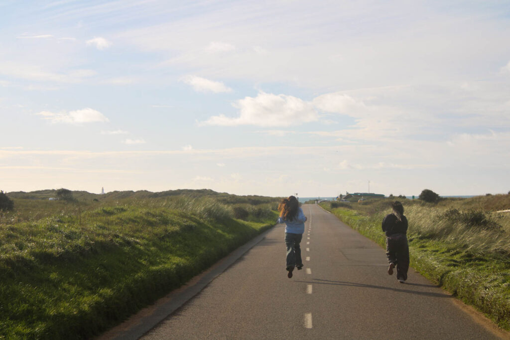
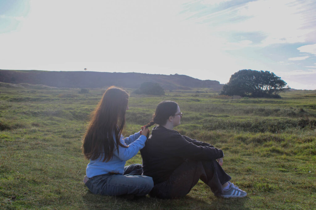
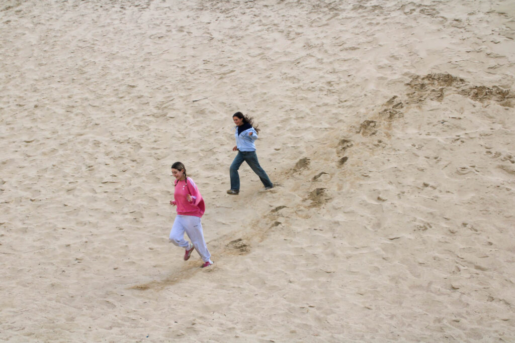
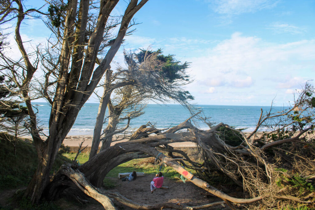
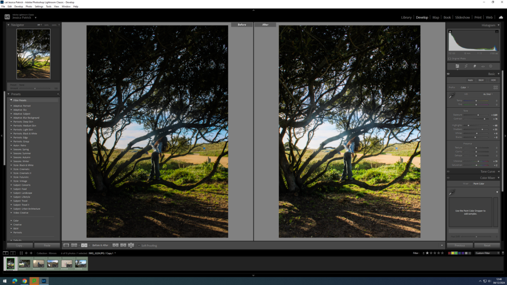
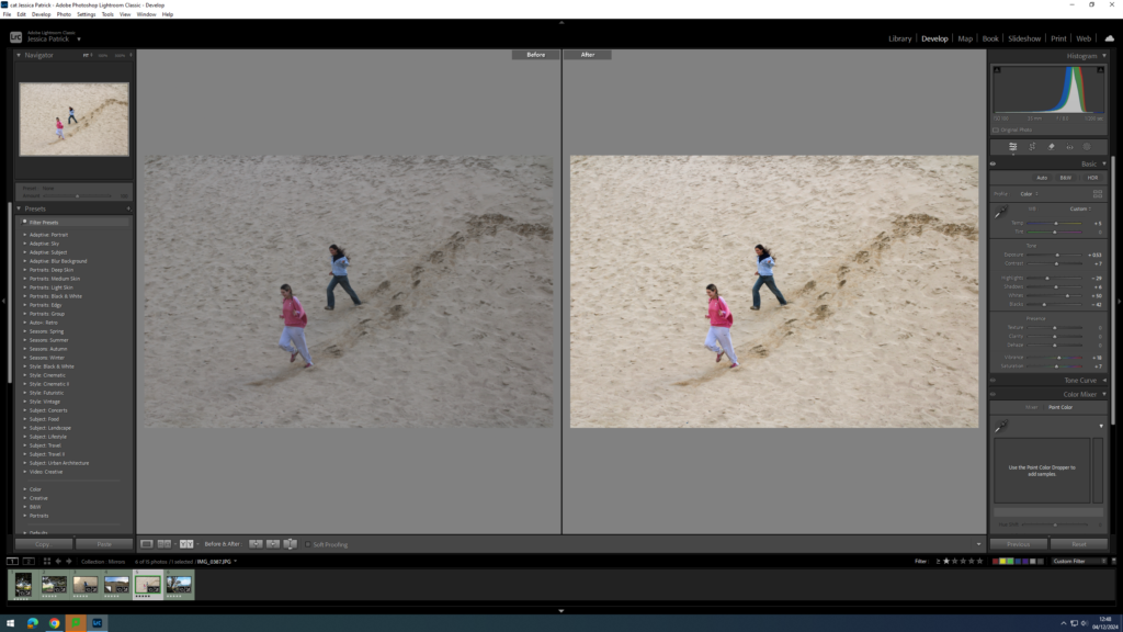
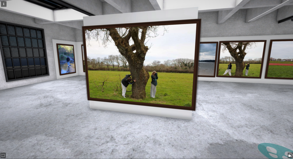
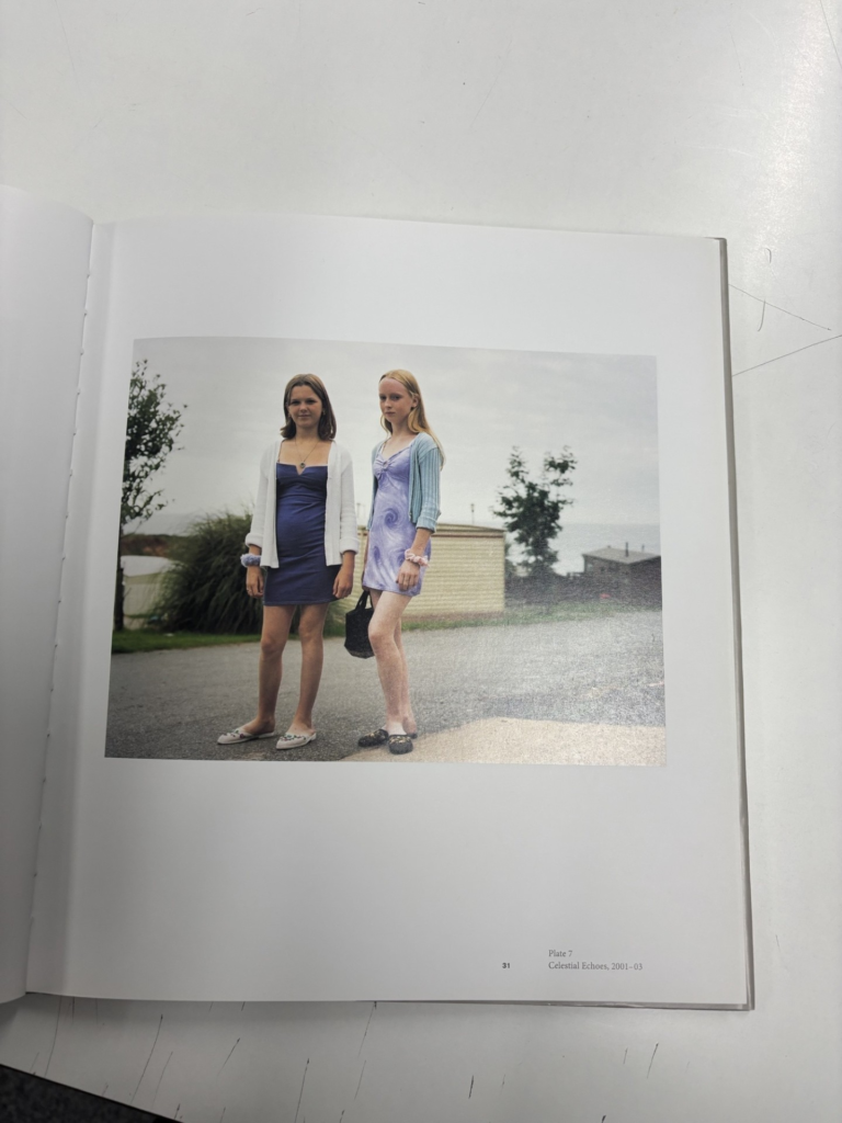
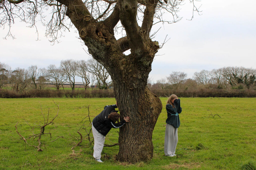
In this image, I focused on my composition, similarly to Jeff Wall. I experimented with the rule of thirds, by having my subject on the left in the left hand third, the tree in the centre third and my subject on the right in the right hand third. I focussed on my composition in this image, so that I could produce an aesthetically pleasing image. The narrative of this image is that the subjects are playing hide and seek with the subject on the right counting and the subject on the left hiding. This relates to Justine Kurland’s work, as I have presented young girls acting out a narrative, by having them do a fun activity, which in this case is playing hide and seek, which presents their youth and identity. This image also specifically reflects my youth, because when I was younger I used to play hide and seek all the time with my friends. This in turn then looks at my identity, because it looked at who I used to be and who I am now and how my identity has changed from during my youth to now.
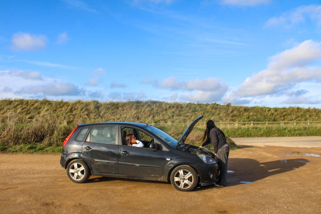
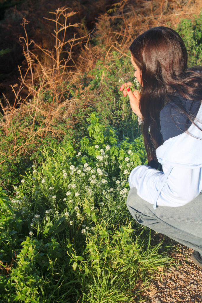
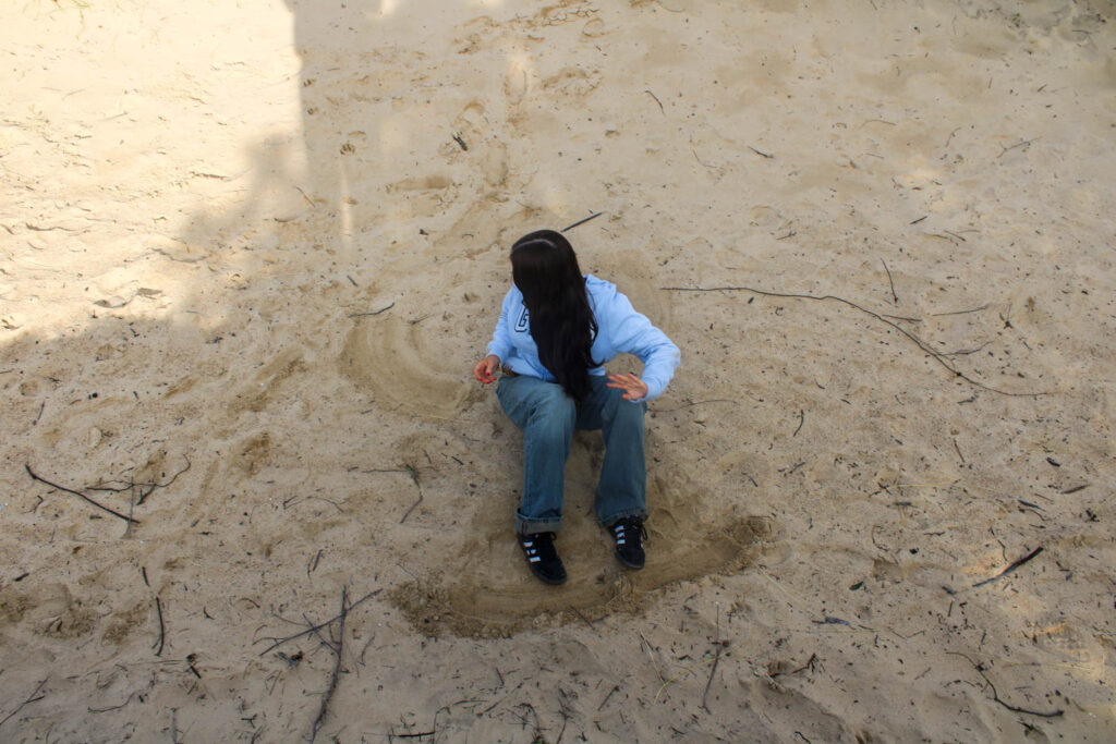
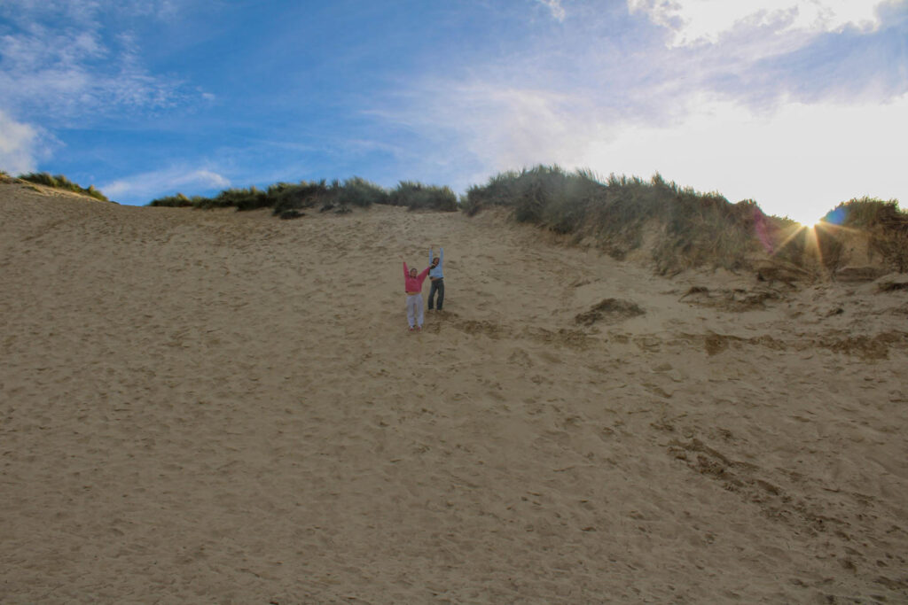
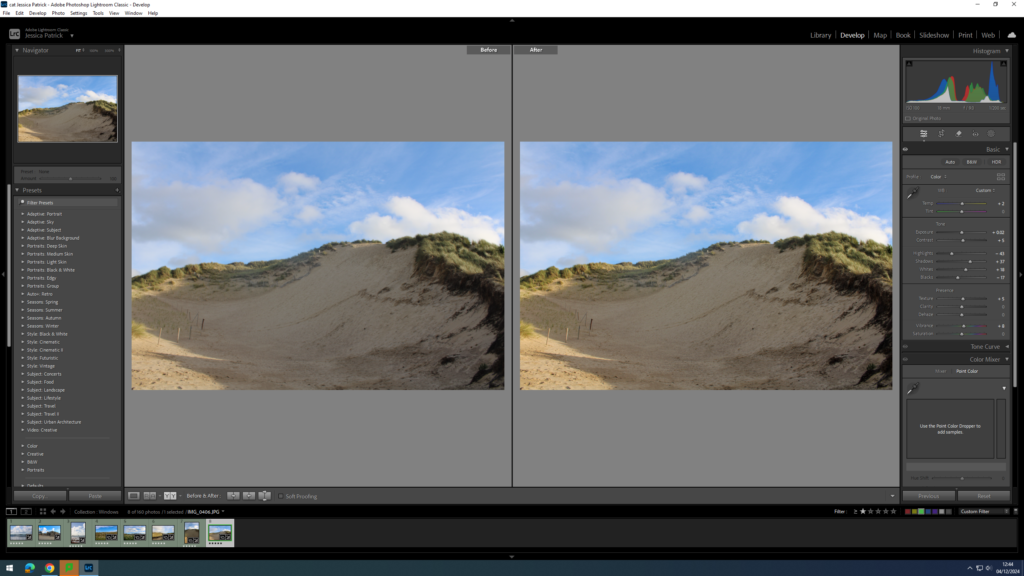
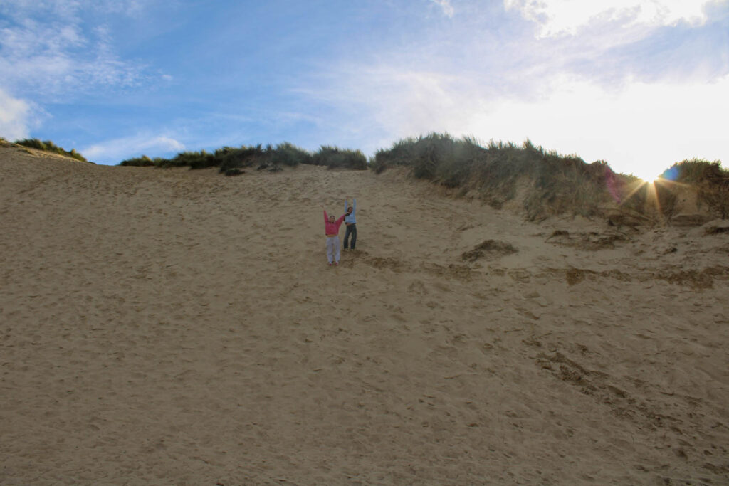
This image also relates specifically to my youth and identity, because the setting of this image is the sand dunes, and both subjects have climbed up the 100 foot hill, which is what I used to do in my youth every Summer. This relates to the theme of identity, because this image relates to who I was in my youth, as it displays an activity I enjoyed doing. This image also relates to Justine Kurland, as I have presented a narrative of a specific activity, which was done by my two subjects. This image also relates to Jeff Wall, as I have positioned my subjects in the centre of the frame, so that they are the main viewpoint.
DEADLINE: Essay Introduction Draft MUST be handed in Thursday 18 Dec 2024
DEADLINE: Final Essay MUST be handed in Fri 31 Jan 2025
ESSAY: In the Spring term will be spending 1 lesson a week, normally Wednesdays on writing and developing your essay. However, you will need to be working on it independently outside of lesson time.
Objective:Criteria from the Syllabus
Be aware of some of the methods employed by critics and historians within the history of art and photography.
Demonstrate a sound understanding of your chosen area of study with appropriate use of critical vocabulary. – use for image analysis
Investigate a wide range of work and sources
Develop a personal and critical inquiry.
How to start: Copy this essay plan into your own blog post, titled: Essay Draft:
Literary sources: Go to this blog post here: Theory: Literary Sources and copy relevant key texts relating to the subject of your essay and list in alphabetical order in your bibliography. In addition, find your own key texts in relation to artists selected for in-depth analysis in your essay and list these too. These texts could be interviews with the artist, or reviews/ critique’s written by others. See useful online sites/ sources here .
Research and identify 3-5 literary sources from a variety of media such as books, journal/magazines, internet, Youtube/video that relates to your personal study and artists references .
Begin to read essay, texts and interviews with your chosen artists as well as commentary from critics, historians and others.
It’s important that you show evidence of reading and draw upon different points of view – not only your own.
Take notes when you’re reading…key words, concepts, passages, page number to be used for in-text referencing etc.
Essay Question
Think of a hypothesis and list possible essay questions
Below is a list of possible essay questions that may help you to formulate your own.
Some examples of Personal Study essays from previous students:
Essay Plan Make a plan that lists what you are going to write about in each paragraph. Further help can be found here essay structure or see link here The Royal Literay Fund
Essay question:
In what way does Justine Kurland & Michelle Sank explore youth and femininity through their work?
How does Jeff Walls tableaux approach depict a seemingly photo journalistic approach?
How do Justine Kurland and Jim Goldberg portray childhood differently through their work?
To what extend have Justine Kurland and Jeff Wall used narrative as a way to explore female identity in their work?
To what extend has Justine Kurland used narrative as a way to explore female identity in their work?
To what extend have Justine Kurland and Jeff Wall explored narrative in their work?
Opening quote
‘To photograph is to appropriate the thing photographed. It means putting oneself into a certain relation to the world that feels like knowledge- and therefore, like power.’ (Sontag 1997:4)
Introduction (250-500 words): What is your area study? Which artists will you be analysing and why? How will you be responding to their work and essay question?
Female Identity and Narratives
Justine Kurland and Jeff Wall
Creating my own images recreating my own youth, while still borrowing concepts, ideas, compositions from both of them and other historical paintings, including Manet.
Tableaux photography
Pg 1 (500 words): Historical/ theoretical context within art, photography and visual culture relevant to your area of study. Make links to art movements/ isms and some of the methods employed by critics and historian.
Tableaux photography and its origin in Pictorialism – explain its influence from Allegorical Painting and how it was a reaction against photography as a scientific experiment – select an example from Pictorialism, eh. Julia Margaret Cameron, discuss how she constructed images using friends/ family to model exploring female identities influenced by Pre-Raphalite painters
Pg 2 (500 words): Analyse first artist/photographer in relation to your essay question. Present and evaluate your own images and responses.
Justine Kurland use of narrative using real people in staged situations and link with style of Tableux Photography – select key image that was inspired by Manet breakfast painting
Pg 3 (500 words): Analyse second artist/photographer in relation to your essay question. Present and evaluate your own images and responses.
Jeff Wall use of narrative using real people in staged situations and link with style of Tableux Photography – select key image that was also inspired by Manet breakfast painting
Conclusion (250-500 words): Draw parallels, explore differences/ similarities between artists/photographers and that of your own work that you have produced
Bibliography: List all relevant sources used
Sontag, S. (1977) ‘In Plato’s Cave’ in On Photography. London: Penquin Boohs.
Use of AI / ChatGPT – go to this blog post here for guidelines.
Key Terminology: Here is a link to a glossary of key words, glossary of photographic processes, glossary of art movements and genres, and linking words and phrases.
Essay writing: Here is a link to another blog post which will provide you with guideline and more details about how to structure each paragraph in your essay.
Draft Introduction (250-500 words). Think about an opening that will draw your reader in e.g. you can use an opening quote that sets the scene. You should include in your introduction an outline of your intention of your study e.g. what and who are you going to investigate. How does this area/ work interest you? What are you trying to prove/challenge, argument/ counter-argument? What historical or theoretical context is the work situated within. Include 1 or 2 quotes for or against. What links are there with your previous studies, if any? What have you explored so far, or what are you going to photograph? How will your work develop. What camera skills, techniques or processes have you experimented with, or are you going to experiment with?