I have 4 main focuses while designing my photobook;
Simplicity – 1 photo on each page; the photos I have taken are very good standalone, therefore each photo will be presented on the right page, with a blank page on the left throughout the book, creating a simple sequence that visually appeals to the viewer, while also directly disconnecting each photo from each other.
Create a narrative – my photo taking was very spontaneous, and no photo is the same really, however if I describe to the viewer what the Ferrariesta means to meat the start of the book, the viewer is more inclined to view the photobook as a journal, or a documentation of the Ferrariesta, similar to how 240 Landscapes by Helge Skodvin is presented.
Start with the best photos – if my best photos are scattered around near the front of the book, the first impressions of my photography will be much better, and since this book only has a loose narrative, I am able to do this.
Create connections between photos – there are some elements of my photos that are similar, and therefore it is best to put these photos together in the book so that the viewer recognises these similarities also.
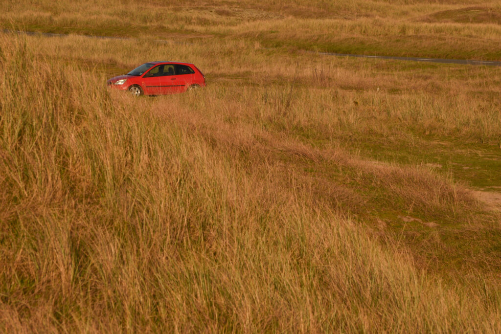
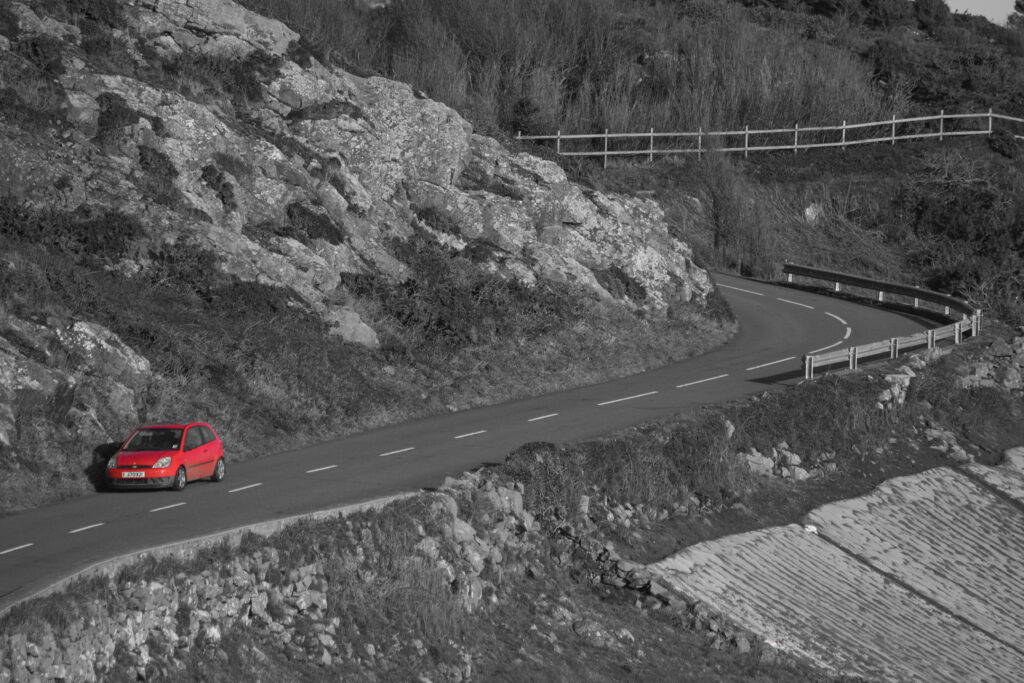
When building my sequence, I knew to start with my best images and move through the book trying to loosely connect each photo with each other. The majority of photos do not link, which made this slightly challenging, however I did find that these two photos would be perfect when put next to each other in the sequence.
The connection between man and car is far more special than what the eye can see, the whole is greater than the sum of the parts. When one is in control of a car, there exists a greater bond between the two, where the car’s built purpose is in action, and the driver instinctively manoeuvres the car, sometimes perfectly balancing the thin line of the car’s limitations. This connection is not just a physical connection, but an innate response to the forces that the car’s mechanical functions impose. Whether you are a regular driver on the road, or a rally driver with a performance-optimised car, it is this innate response that ultimately determines every movement the car makes. This is arguably one of the most important aspects of the relationship that a driver develops with their car, and it is from here that the relationship cultivates. It is here, where the car becomes animate and feels alive, where a driver becomes enwrapped and connected with a car, that the car’s soul is found. This is something that people who are not interested in cars do not understand. A quote by Jeremy Clarkson sums this up perfectly, “It’s what non-car people don’t get. They see all cars as just a ton and a half, two tons of wires, glass, metal, and rubber, and that’s all they see. People like you or I know we have an unshakable belief that cars are living entities… You can develop a relationship with a car and that’s what non-car people don’t get…”. In this essay, I want to explore the many ways one can develop a relationship with a car, and how this relationship, from extreme to simple, is directly reflected in the car’s soul. To demonstrate this photographically, I will first analyse the infamous rally photographer Maurice Selden, and show how his photographs visibly express the souls of the rally cars he captured.
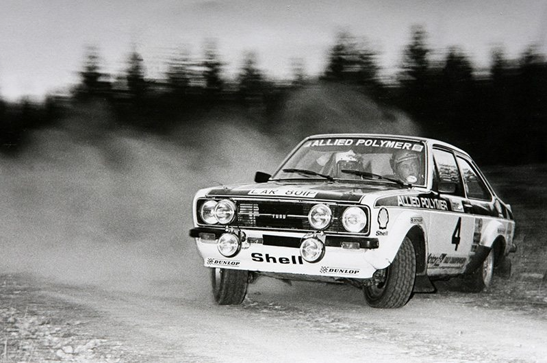
Ari Vatanen in the 1976 Granite City Rally in Scotland, photo by Maurice Selden
This is a perfect example of how Maurice Selden was able to capture the true essence of the velocity and intensity of rallying in a single photo. This photo is actually one of his personal favourites, as stated in an interview with RallySport Magazine, and it evidently expresses the trust that Ari Vatanen had in his car. In 1976, Maurice Selden was just starting out his long and prolific career as a rally photographer, and was luckily sent to the Granite City Rally where he captured this photo of Ari Vatanen in his brand new Mk2 Ford Escort. “It was a standard joke among photographers that if Ari was the next car we should take a couple of steps back, as he always appeared faster and used more of the road than other drivers. Just from the sound of his engine, I could tell that he was much faster than the previous cars”. Ari entered the right-hand turn much faster than expected, and had to turn in quickly and swing the rear out, then steer in the opposite direction and use the power of the rear wheels to push through the corner, battling with the steering and throttle to stay on the dirt track using whatever finite amount of grip he could find with the front wheels. During this intense bout of focus, Maurice Selden was stood on the inside of the corner a couple steps away from the road, and had set up his camera flash to compensate for the lack of daylight. Once Ari Vatanen instantly barrelled through the corner, Selden followed him with his camera and took a number of burst photos in rapid succession. This specific photo truly captures the raw essence of rallying; the motion blur combined with the scattering dust captures the driver’s dedication to speed, and his calm and focused facial expression combined with the wheel angle shows he has a massive amount of trust in his car. It clearly demonstrates the instinctive connection that rally drivers have with their cars: he simply looks at where he needs to go and subconsciously understands exactly what inputs the car needs in order to get there. And fundamentally, in rallying it is this level of understanding, trust and dedication from the driver that ultimately determines how much soul the car has. In this photo, the soul of the car is outstandingly striking; the face of the Ford Escort shines gleamingly in focus, illuminated by the quick flash of the camera, and the car looks so balanced and controlled even while being pushed so close to its limits. It is so clearly evident to me that, in this photo, Maurice Selden captures not only the car at its most extreme point, but also the relationship between the car and its driver that enables this ability to balance on the car’s thin line of limitation.
However, this relationship is very different to the majority of car owners who just use their cars for safe transport. These cars are not built to maximise speed or agility, rather they have been built for functionality and practicality. This is where these relationships evidently differ, a daily driver simply doesn’t have to drive on the edge of the car’s capability, and therefore these drivers will build a more personal relationship with their cars, one that involves more emotional connections (memories, family, places the car has been, etc.). It is these connections that ultimately create this relationship, I’m sure you can nostalgically remember a family car or a classic rust bucket that your father never quite finished working on. But there are so many ways that a person can develop a relationship with a car that I simply cannot express every view. A car can go through so many owners throughout its life, it is immeasurable how many memories the car has created. However, there is one way I can truly express my perspective, and that is to present to you my own car, the Ferrariesta.
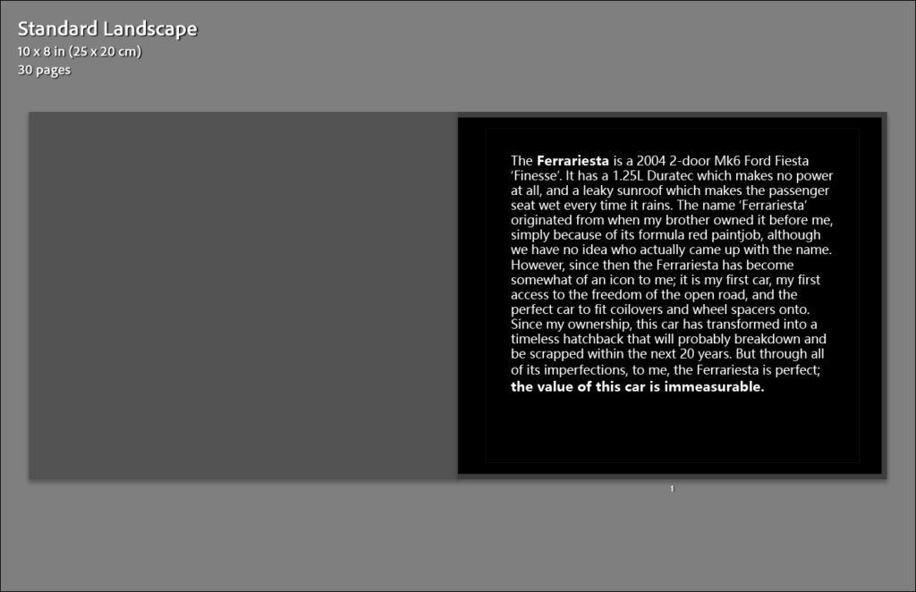
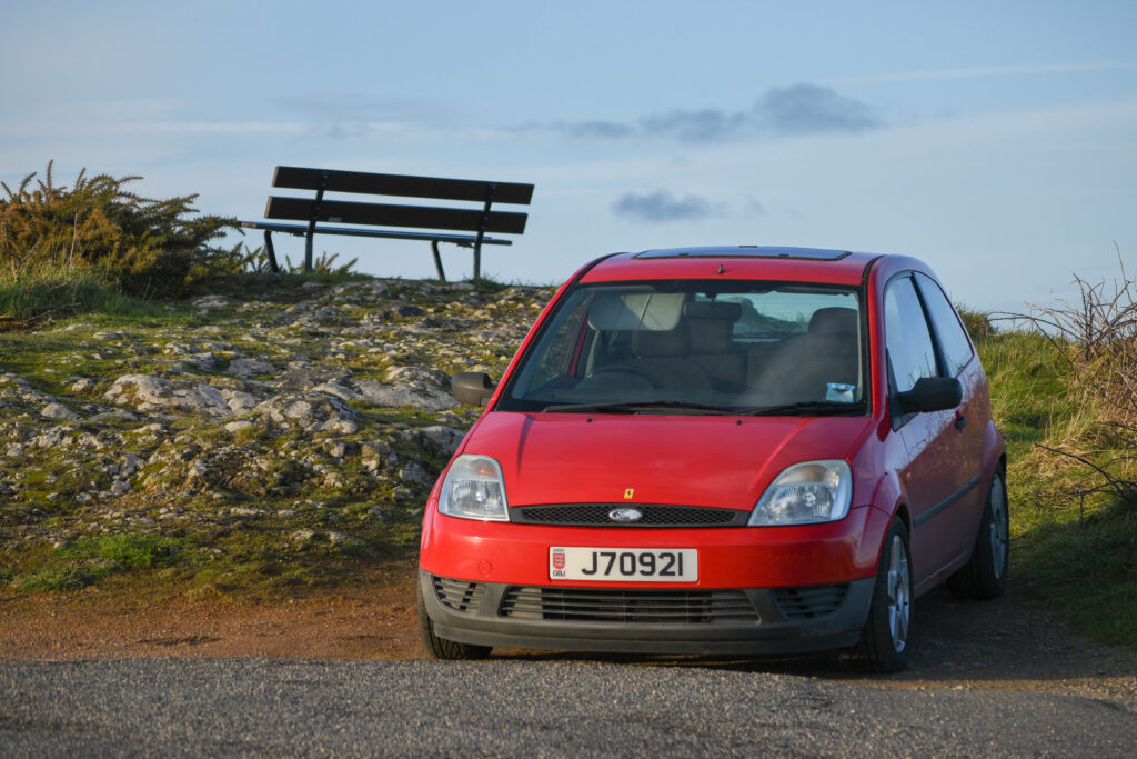
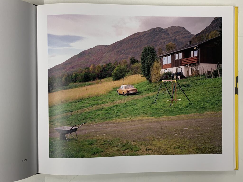
The Ferrariesta is a 2004 2-door Mk6 Ford Fiesta ‘Finesse’. It has a 1.25L Duratec which makes no power at all, and a leaky sunroof which drips water onto the passenger seat every time it rains. The name ‘Ferrariesta’ originated from when my brother owned it before me, simply because of its formula red paint job, although we have no idea who actually came up with the name. However, since then the Ferrariesta has become somewhat of an icon to me; it is my first car, my first access to the freedom of the open road, and the perfect car to fit coilovers and wheel spacers onto. Since my ownership, this car has transformed into a timeless hatchback that will probably break down and be scrapped within the next 20 years. But through all of its imperfections, to me, the Ferrariesta is perfect; the value of this car is immeasurable.
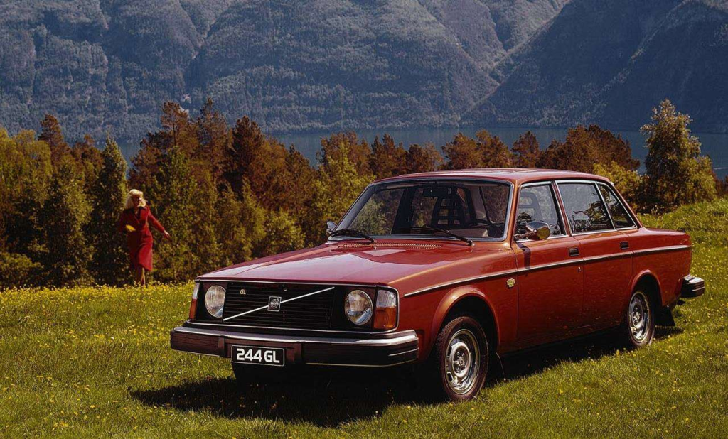
Overall, the point is this; every driver develops a different relationship with their car. Some are much less considerate about damaging their car, others develop a very personal relationship with their car, but in general, every driver has the appreciation for the freedom that their car provides them. Every driver appreciates these beauties of mechanical defiance that will take them anywhere in the world, without complaining, and there is no better way to portray this than to show you Helge Skodvin’s study of urban Volvo 240s, a car that will never back down, in the harsh environment of Norway that it was designed to thrive in.
240 Landscapes is a simple photobook created by Helge Skodvin, which is made up of Volvo 240s in various different landscapes in Norway. In each image, a different 240 is presented, and the viewer is left to question what each 240 represents when its environment is factored in. In this photo, the 240 is meant to represent a family car, it brings a sense of nostalgia and memory, something I’m sure you can relate to when recalling a family car and the roadtrips you may have taken in it. The souls of these 240s become so clearly evident when put in conjunction with their environments; some live in harsh, mountainous conditions, others live in peaceful cities or multi-story car parks.
But the point of the book is understanding this: the Volvo 240 was designed to be the safest and most reliable car in the market, every Volvo was designed to suit the needs of the driver. And subsequently, since every 240 was designed to live forever, a lot of 240s are still driving today nearly 40 years after they were manufactured, including all of the Volvo 240s in 240 Landscapes. Each of these Volvos has lived long lives, each with their own imperfections and modifications, and the lives they’ve lived is ultimately dependent on the environment that both the 240 and its owner live in.
CONCLUSION
Bibliography
Jeremy Clarkson (2009). – Interview from “Love the Beast” (released March 12, 2009), a documentary made by Eric Bana and Pickup Truck Pictures (production)
Literary sources: Go to this blog post here: Theory: Literary Sources and copy relevant key texts relating to the subject of your essay and list in alphabetical order in your bibliography. In addition, find your own key texts in relation to artists selected for in-depth analysis in your essay and list these too. These texts could be interviews with the artist, or reviews/ critique’s written by others. See useful online sites/ sources here .
Research and identify 3-5 literary sources from a variety of media such as books, journal/magazines, internet, Youtube/video that relates to your personal study and artists references .
Begin to read essay, texts and interviews with your chosen artists as well as commentary from critics, historians and others.
It’s important that you show evidence of reading and draw upon different points of view – not only your own.
Take notes when you’re reading…key words, concepts, passages, page number to be used for in-text referencing etc.
Essay Question
Think of a hypothesis and list possible essay questions
Below is a list of possible essay questions that may help you to formulate your own.
Subjects – car and driver (comparative), the car’s soul and how it is a reflection of its driver
Starters – Exploring the relationship between… (comparative), Through the eyes of the…, a journey through…,
Potential Questions
Exploring the relationship between the car and its driver
A journey through the soul of the car; and how it is a reflection of its driver
Essay Plan Make a plan that lists what you are going to write about in each paragraph – essay structure
Essay question:
Opening quote – Jeremy Clarkson (2009). – “It’s what non-car people don’t get. They see all cars as just a ton and a half, two tons of wires, glass, metal, and rubber, and that’s all they see. People like you or I know we have an unshakable belief that cars are living entities… You can develop a relationship with a car and that’s what non-car people don’t get… When something has foibles and won’t handle properly, that gives it a particularly human quality because it makes mistakes, and that’s how you can build a relationship with a car that other people won’t get.” – Interview from “Love the Beast” (released March 12, 2009), a documentary made by Eric Bana, Whyte House Entertainment (distribution), Pickup Truck Pictures (production)
Introduction (250-500 words): What is your area study? Which artists will you be analysing and why? How will you be responding to their work and essay question?
“exploring the relationship between a car and its driver”
explain how a car has a soul, where that soul is found; a driver has an innate connection when driving their car
explain this innate connection in rally photography
opening quote here?
Pg 1 (500 words): Analyse first artist/photographer in relation to your essay question. Present and evaluate your own images and responses.
artist reference 2 – Maurice Selden
Ari Vatanen in the 1976 Granite City Rally in Scotland, photo by Maurice Selden
talk about both stories behind the photo, from the drivers perspective, and the photographers perspective
explain how the relationship between the car and the driver is evident in this photo (face direction + wheel direction show driver has trust in the car/ motion blur = speed)
however, not every car and driver relationship is like this…
Pg 2 (500 words): Analyse second artist/photographer in relation to your essay question. Present and evaluate your own images and responses.
Artist reference 1 – Helge Skodvin – 240 landscapes
begin talking about how the regular relationship is different (more personal + emotional connection rather than a physical, drive fast connection)
present the Ferrariesta, why is it so special to me, where did the name come from etc.
get to the point – each driver develops a different relationship with their car, but ultimately every driver develops a level of appreciation for their car
link to Helge Skodvin – 240 landscapes – every car is different but each has its own soul.
refer back to artist reference – talking about personalisation + memories etc.
Conclusion (250-500 words): Draw parallels, explore differences/ similarities between artists/photographers and that of your own work that you have produced
parallels – every driver appreciates their car
Bibliography: List all relevant sources used
Bibliography
Jeremy Clarkson (2009). – Interview from “Love the Beast” (released March 12, 2009), a documentary made by Eric Bana and Pickup Truck Pictures (production)
Maurice Selden is a well-known and very prolific rally photographer, whose career spanned 45 years from 1973 to 2018. Selden first started out capturing WRC events working for various publications, slowly working his way up through the ranks, and by 1982 had become the chief photographer for the motorsport publication LAT, covering rally and Formula 1 events all over the world. His photographs made waves through media at the time, and many were used for brand advertisements such as Ford.
Ari Vatanen in the 1985 Swedish WRCAri Vatanen in the 1976 Granite City Rally in Scotland
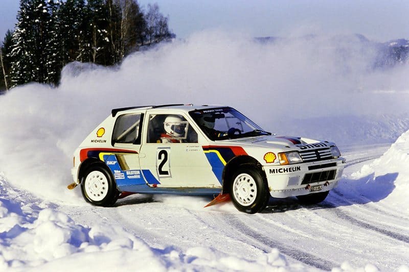
Here are two incredible photos by Maurice Selden, of the same driver, Ari Vatenen, in two different rallies 10 years apart. These two photos share very similar attributes that make the photos striking, demonstrating Maurice Selden’s method and style, and showing exactly how Selden finds the ‘decisive moment’ in rally photography. In my opinion, the root of his method begins with an obstacle (i.e. a corner, a jump), and how the car must act to manoeuvre this obstacle. On the left is an image of Ari Vatanen in a Peugout 205 T16, an all-wheel drive rally car made for Group B. For this photo, Selden stands on the outside of the exit to a hairpin corner, where the cars will be powering out of the corner sideways, creating a big dust cloud behind them. This perspective is perfect for two reasons; the obstacle is clear, you can see where the car came from and where it is going, and the car is all-wheel drive, meaning that the driver will perform the corner sideways before regaining grip and exiting the corner straight. Maurice Selden captures the image right before the car straightens up, and in turn, captures the car mid-slide, catching the velocity of the car in the shot. The same principle appears in the photo on the right, except in this one, Maurice Selden is standing on the inside of the corner. This shot only works because the car is rear-wheel drive, and Ari Vatanen has had to swing the back of the car out in order to make the corner without crashing into the ditch on the outside. Additionally, in comparison to the photo on the left, Selden is much closer to the corner, and has to follow the car fast, resulting in a very prominent motion blur in the background, which consequently captures much more velocity overall. But it is this velocity that ultimately makes these photos striking, it enables the viewer to feel the motion of the car and, overall, captures the raw soul of these machines.
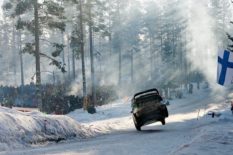
Matthew Wilson in the 2010 Swedish WRC
Rally photography is a very raw form of photography. The sheer speed of these cars requires fast shutter speeds, and the utilisation of whatever lighting the photographer can find to make these photos pop, which essentially boils down to either; a low hanging sun, or a camera flash. These are not controlled environments, and photographers will resort to using whatever elements possible to capture these beastly machines. This photo is a good example of how Maurice Selden does this while also catching the velocity of the car in the same shot. It is clear that Selden stood at this perspective understanding that the misty conditions create these god rays that majestically light up the snowy forest. But also, Selden considers that the cars will be hurdling through the air after hitting the jump to the left that is out of shot. It is the combination of these two factors that make up this photo; all Selden must focus on doing is capturing the car mid-air to catch its velocity. In this photo, the car is just about to hit the ground, a pivotal moment that captures anticipation and fear. The car is nearly sideways, and possibly didn’t even land the jump, but it is this specific decisive moment that Selden knew to capture because of its intensity and suspense. And it is this understanding of where the decisive moment is that ultimately makes Maurice Selden such a great photographer.
Helge Skodvin is a Norwegian photographer, who predominantly focuses on documenting the many aspects of Norway in his own juxtaposed style. In 2015, he created 240 Landscapes, a collection of images that all feature the Volvo 240, a staple car of the Nordic regions.
In these photos, Helge Skodvin experiments with the colour of the environment, and focuses on isolating the Volvo 240s in a way that captures the loneliness and grandiosity of Norway, using empty car parks or mountain landscapes to create distance and size. It is unclear if Skodvin puts the cars there himself, or simply finds them in the right places and takes his photo, it may well be a mixture of both. However, the most important aspect of the Volvo 240s in these photos is what they represent.
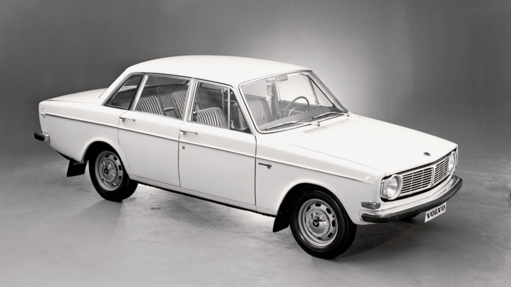
Volvo is a Swedish car brand, very well known for its safety and its boxy style, which was developed from the early 1960s to the late 90s. Many iconic Volvos came from this era, of which you can still see on the streets today because of how reliable these cars were made to be. Before this time, Volvo hadn’t settled on any specific style for its brand, they mostly just copied the curvy big block V8 American cars that were popular in the 40s and 50s. However, by the mid-60s Volvo’s engineers and designers had worked hard to develop their own style, which came in the form of the Volvo 144.
The 144 was a near-perfect car. The Volvo engineers’ focus on safety was pivotal to the overall design, and launched Volvo far ahead of its competitors when it came to safety. The car had disk brakes all around, which were 30% more effective than the drum brakes which mostly everyone else used. The design of the car also heavily utilised crumple zones, something that the majority of cars had previously failed to do resulting in more volatile crashes and a higher fatality rate. It is obvious to see why this car was so well-recepted in Scandinavia, a place full winding and icy roads, which pathed the way for Volvo’s reputation in later years.
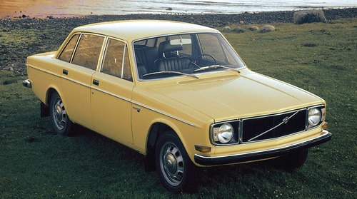
The 70s was an amazing decade for Volvo. It became the largest car manufacturer in Scandinavia, and continued to improve its safety features with every new car they designed. First came the Volvo 140, an improvement on the 144, most notably in the extended front bumper, providing an extended crumple zone, and a new headlight design. Volvo started 1970 with 600,000 cars produced total, and ended that same year with over 2 million total cars produced.
This was when the Volvo became a staple of the Nordic regions. Everyone had a Volvo, from taxi drivers and police, to families and their next door neighbours. This car was perfect, and for the next 4 years Volvo was hard at work trying to make it even better. Development of a new car was in the works, named the VESC for ‘Volvo Experimental Safety Car’. In these developments, new technology could be tested, such as antilocking brakes and airbags. The car was constantly tested and refined, every detail was carefully constructed to ensure the highest safety standard possible.
Then in 1974, Volvo released the 240 series.
The 240 series came in a variety of iterations, a 2-door, 4-door and Estate, and later the headlights were changed, and different trim levels would be added over the course of its 19 year run. However, a 240 is always a 240, these cars were the safest as they came, and everyone started buying them up once again. The 240 became the iconic, boxy, ‘Volvo’ look, and the car appealed to nearly every major car market at the time; UK, US, Europe, everyone wanted a taste.
As the 240 grew older, the car became a nostalgia piece for families all over the world, most notably in Scandinavia, including Norway where Helge Skodvin grew up admiring these beauties of mechanical defiance in places of such serenity and emptiness.
This is essentially what this book is filled with, it is in the name, ‘240 Landscapes’. But it is the combination of the 240 and all of its history, nostalgia and iconicness, combined with the beautiful mountainous, snowy and empty landscapes of Norway that incited Helge Skodvin to take these photos.
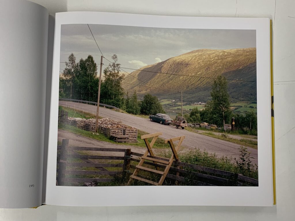
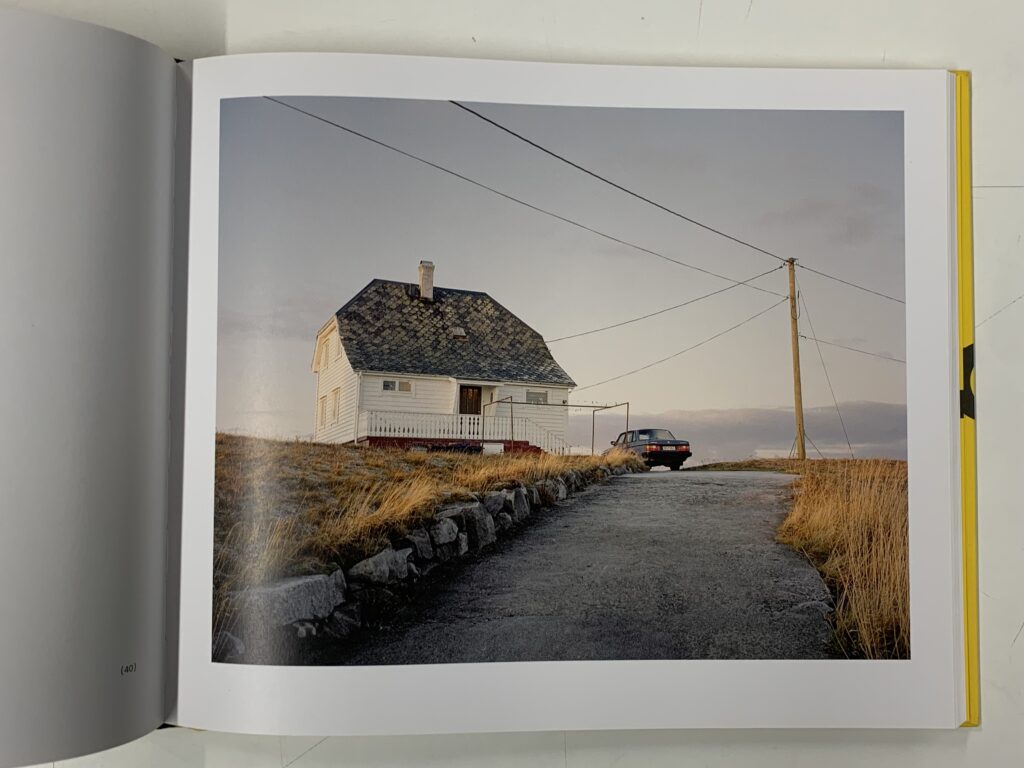
This is the first image that appears in 240 landscapes. Taken in the early morning, indicated by the low light level, this photo consists of a colourful home hidden somewhere in valleys of Norway. The most striking element of this photo is the framing, every entity has its own part in the frame; the bushes are in the bottom right, the driveway is in the bottom left leading to the house in the middle with a lovely green garden to the right, and in the background at the top of the image stand the grandiose, tall peaks of Norway. However, it is the placement of the Volvo that is most important. It sits outside of this very homely house next to this nostalgic looking garden with a trampoline that entails that a family owns the Volvo. From this, the viewer is presented with a glimpse into the memories that this family holds; although the family is not there, it still feels as though we are experiencing a memory of this house from the perspective of a family member, looking back on the serenity and simplicity of life as it was living here. The Volvo is a very significant part of this, as many families can relate to this type of memory when thinking about, for example, a roadtrip they once had, where the car becomes cemented in this feeling of nostalgia. It is this link to a personal emotion that Helge Skodvin is trying to get at with the Volvo’s throughout this book, one that many Scandinavian people can relate to when so many families owned a Volvo 240.
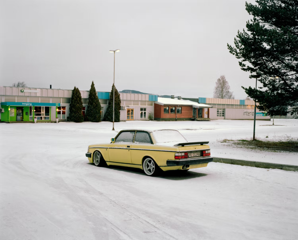
The book also explores personality in cars too. Here is a customised 240, probably owned by a car enthusiast. The photo overall is not particularly spectacular, however it is the car that is the main focus. This Volvo is yellow, with aftermarket wheels, lowered suspension and a spoiler; it is clear that the owner has modified this 240 in their own, personalised way, and in turn has transformed the soul of this Volvo. This is something I talk about in my essay; when a person customises their own car, the car transforms into something new, in a way that is personalised to the driver. This ultimately means that the car’s soul becomes a reflection of its driver, and this is what we see here in this photo. Overall, the shot is not about the snowy, urban landscape, rather it is about representing the soul of this car that has been changed in its own, unique way. It is also representative of all of the 240s in the book, in the way that they are not all the same, but each have their own soul, in the form of; colour, model, trim, modifications, scratches. Even a cars imperfections are what make up its soul.
In summary, 240 Landscapes is a photobook made to represent what the Volvo 240 truly is; a staple of the Nordic regions, a family car, a nostalgic piece of memorabilia that will never be forgotten by the generations of people who experienced the pleasure of owning a 240. This book is about Norway, its beautiful landscapes and isolated surroundings, and how the 240 perfectly slots into its environment everywhere it goes. In my opinion, the book explores many aspects of the soul of the Volvo 240,
This is a reflection of my favourite topics that I have studied throughout my A level photography course. I have really enjoyed exploring all of these different topics and artists, and I feel that I am a much greater photographer for doing so. These projects have really helped me in developing my ideas, and understanding what a photograph really needs to be.
Landscapes and Romanticism
With romanticism, we started by looking at its origin in landscape paintings from the early 1800s, and their relation to the sublime – a combination of extreme beauty and overwhelming scale that evokes a strong emotional reaction. I was very inspired by Edwin Deakin and his paintings of the beautiful Yosemite Valley.
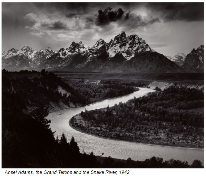
In the rise of the industrial revolution, I related heavily to these artists who escaped to the natural world and found freedom through their art in spite of the realists and rationality that plagued their homes at the time. Later, through the work of Ansel Adams and his own attachment to the Yosemite Valley, I found my own deep fascination with the natural landscapes of my own home, Jersey.
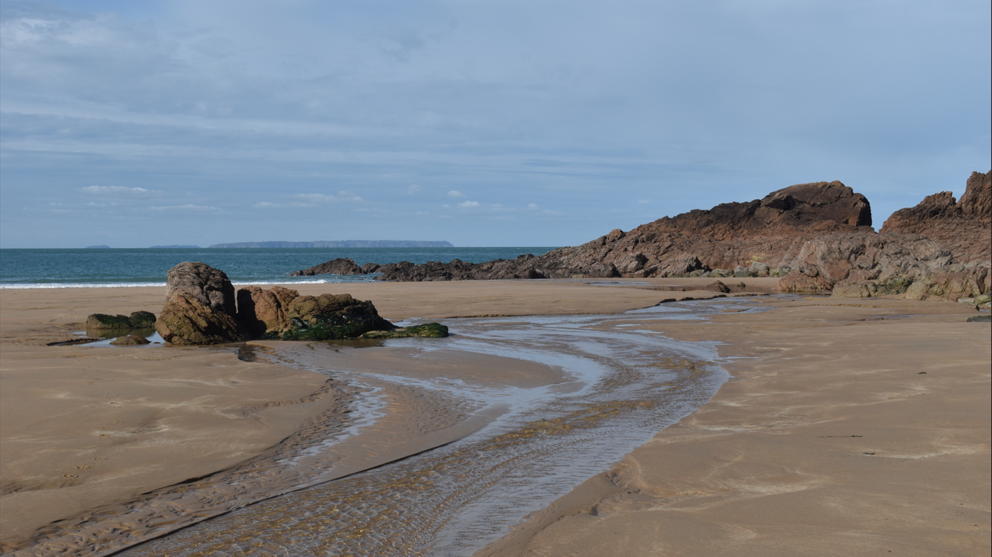
Here are two of Ansel Adams’ photos that I attempted to recreate at Plemont beach near my home. Plemont has always been a place for me to walk to and explore. It has these tall cliffs and deep caves, with jagged rocks scattered everywhere, as well as this huge tidal range that engulfs the entire beach at high tide.
(high tide photos)
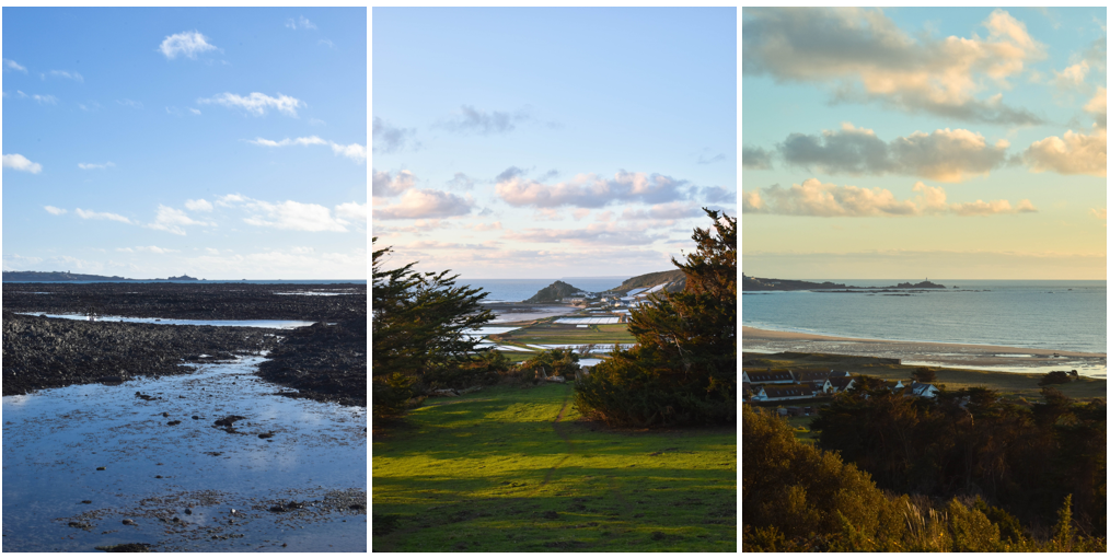
Further on in the landscape module, we were asked to produce a new topographics photoshoot. I was inspired by the works of Joe Deal, a photographer who is known for his sky view photographs. In order to do this, I would need to stand at a high vantage point and take photos looking down at the scenery.
This is one of the photos I came up with in comparison to Joe Deal’s work. This technique is like a ‘birds eye view’ of the world, and offers an interesting perspective on the exponential increasing of distance as you look further up through the photo. Further on in the same photoshoot I focused more on Ansel Adams, and portraying Jersey’s various natural landscapes. From this, I produced my favourite set of photos from throughout this course.
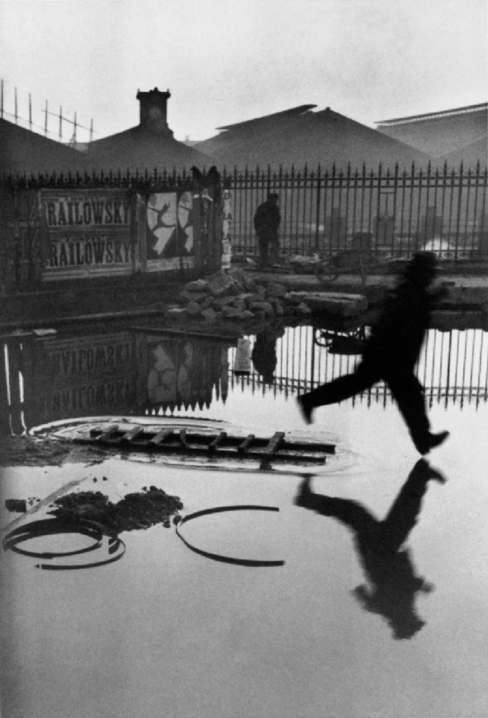
Henri Cartier-Bresson and Saint Malo
Later on in the course, we studied Henri Cartier-Bresson and the decisive moment. The decisive moment is the moment in time, from that exact perspective, where everything aligns perfectly. A perfect example of this is Cartier-Bresson’s infamous image named ‘Derriere la Gare Saint-Lazare’.
When studying him, I was fascinated with his method of taking photos, by simply allowing the world to move in front of his camera and waiting for the perfect moment to take the photo. When we visited Saint Malo for a street photoshoot, this was my exact mindset. Ultimately, I found myself wondering alone through the streets of Saint Malo, looking for these decisive moments.
These were the first photos that I was very happy with during the photoshoot. To me, they are related to each other as two opposing sides, an admiration of photography, and the taking of a photograph. I felt that these both related to me in a way, as the photographer of both of these photos and also an admirer of both of these photos.
What was the involvement of Jersey mariners in the Canadian cod-fisheries and the Transatlantic carrying trade?
Since the beginning of the construction of Jersey’s harbour in the early 1700s, it has been a vital part in creating many of the industries that Jersey thrives on today, including the large finance and agriculture industries. Being an island surrounded by miles of water, the harbour was unimaginably beneficial for creating wealth in the island.
Most of this wealth was originally created by merchants who had collectively formed networks of markets across both coasts of the Atlantic ocean, from European countries such as England or Russia, all the way to countries in the newly found Americas, such as Honduras or Canada.
Canada’s fishing industry had been thriving since the discovery of the Americas, especially in the aptly named ‘Newfoundland’ on the east coast. This is because of the large cod that was abundant in the region, which soon became a commodity for the Europeans after its discovery in the 1500s.
By 1530, there was evidence to suggest that Jerseymen had been to Newfoundland, and in 1582 there was a reference to people from Jersey opening fish markets and selling fish in Newfoundland. In the year 1600, Sir Walter Raleigh obtained a Grant of Application in Newfoundland for a colony, and persuaded seamen from Jersey to set up fisheries there, which would later trade deeper into the Americas, all the way down to the Caribbean Islands. A quote from official letters at the time state, “He certainly encouraged the trade nascent between Jersey and Newfoundland”. A few Jersey families from this trading group were later named ‘master traders’, which hints at Jersey becoming a significant trader during this time. These families supposedly brought back cod fish, skins, furs, sugar and tobacco (among other items) to Jersey, which would have provided these families with a large amount of wealth.
Which ports did Jersey ships sail to and trade with?
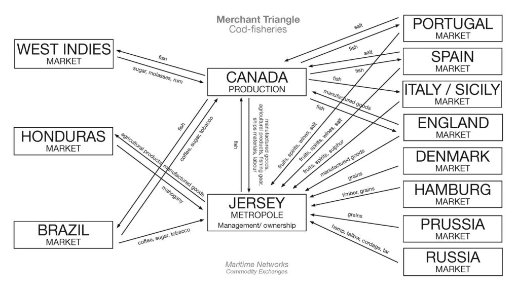
Over the next 100 years, the industry continued to grow and more Jersey merchant families and fishermen travelled to the American coast to fish and trade. Jersey began building ships in the late 18th century thanks to the completion of South Pier in 1765, with the requirement that the ships would be build larger than fishing boats. This was so that Jerseymen could travel across the Atlantic and join the Transatlantic trade. Below is a demonstration of the trade that Jersey merchants created soon after.
This diagram provides us with a lot of information, not just about what was traded and where, but how Jersey became a hub for trade along the European coast once it had a functioning harbour. A number of significant Jersey cod merchants began trading during this time, including Charles Robin, who founded the most successful trade firm on the Gaspé coast in 1766. The diagram above is roughly what this trade looked like at its height.
What type of goods did Jersey merchants exchange for cod-fish?
Essentially, how this ‘Merchant Triangle’ worked was: the fish caught in Canada were traded with the Europeans, as well as manufactured goods and other items that were from Canada also. Merchants would then trade wine and fruits with Portugal, Spain and Italy, and various grains with countries in central Europe, such as Denmark. With the wealth that this created, the desire for luxury furniture in the island grew also, and mahogany wood from Honduras was brought over to Jersey, which was then used to create household items such as wardrobes and stair railings.
To what extent, has the island of Jersey benefitted from its constitutional relationship with Britain and the legacies of colonialism based on a slave plantation economy during the first Industrial Revolution (1760-1840)?
For my project, I would like to explore my love of cars. Specifically, I want to investigate why I love cars and where that love comes from, by displaying the soul of my own car, the Ferrariesta, and other Fords that relate either directly to it, or that relate to me in where I have found my love of cars as I have grown up. I want to show where a car’s soul actually is, outside of the badge, the status symbol and the price. I want to show what I see in these cars where others simply see a metal box on wheels. I want to display how a car’s soul is fundamentally a reflection of its driver, through all of the intricacies that connect a person to a car, and ultimately question the true value of every car, by showing you what the Ferrariesta means to me.
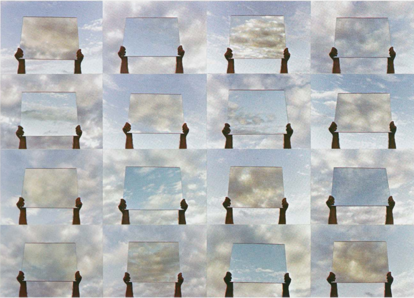
Every photograph has an implication. Whether it is to express an emotion, or to demonstrate a beautiful landscape, a photo is taken by a photographer with the intention of showing people something. However, according to John Szarkowski, what the photographer shows is one of two things; a reflection of the photographer “reflecting a portrait of the artist who made it”, or an exploration of the exterior world. Even the world’s first experimental daguerreotype photographs from the early 1800s fall under this distinction.
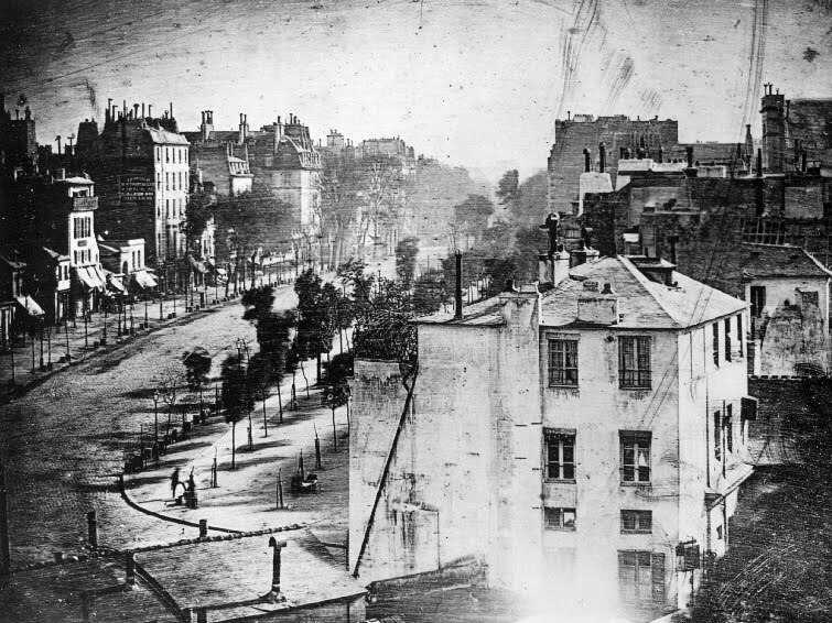
Boulevard du Temple, 1838, Louis Daguerre
A daguerreotype is essentially an ionized copper plate coated in silver that is sensitive to light. This makes it possible to create an image on the plate using a camera obscura, an effect which uses a pinhole in a dark box to create an inverted reflection of the world outside of the pinhole, the same effect that our eyes use to see. The plate is then fumed with mercury vapour to freeze the resulting image after the plate is exposed to light for a long enough time. The result is the image above. This photo was taken by Louis Daguerre, the inventor of the daguerreotype, in Paris. What we are actually seeing is a window into the past, a message speaking to us from nearly 200 years ago, and the first ever image of a human being. Through a window into the past, the mirror of a human reflects back at us, a testament to John Szarkowski’s belief that “the two creative motives that have been contrasted here are not discrete”, but ultimately can overlap each other and coexist in a single photo.
Here is an extract from Szarkowski’s book, a piece named “20 minutes in April” by Gary Beydler. Although a mirror is involved in this piece, in my opinion each photo is a window into the randomness of entropy, a snapshot in time that can never be replicated. This piece is rooted in the notion of realism, a demonstration of Gary Beydler’s love for the beauty of this chaotic world. John Szarkowski describes this as a “pursuit of beauty: that formal integrity which pays homage to the dream of meaningful life”, a romantic view of how a photographer can find meaning through the unpredictable nature of the world. However, an alternative realist view is provided by Jed Pearl in his review of Szarkowski’s book. Jed Pearl describes the photos in the book as “predictable images that tell us nothing of life”, demonstrating the realists acceptance of fact; that there exists no deeper meaning to the randomness of clouds, and that any meaning that is found is overruled by logic. In my opinion, I believe that the meaning of one’s life is subjective to their beliefs, and it evolves and changes through time as they develop a greater understanding of the world around them. “20 minutes in April” simply provides an insight into the chaotic and beautiful nature of clouds, however the meaning of this is not directly provided by the creator, Gary Beydler, instead it is meant to be inferred by the viewer to aid them in finding their own meaning to their own life. To state that this piece ‘tells us nothing of life’ is ignorant of this fact, but ultimately it is up to the viewer whether to find meaning or not.
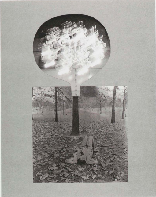
Here is another extract from Szarkowski’s ‘Mirrors and Windows’, a photomontage named ‘A Special Place’ by Joseph Bellanca. The piece consists of two contrasting images, an outdoor photo that depicts a lone woman lying on the woodland floor, and an indoor photo of a bright chandelier hanging from a chain, cut out similar to the shape of a head. In my opinion, this piece is a mirror of human consciousness, an attempt at expressing how it feels to be human; trapped within the boundaries of our physical and mental limitations, lost somewhere in the expanse of a limitless world. To me, the image portrays the feeling of dreaming; when the imagination lights up inside the brain and creates an artificial world that perceptually mimics reality. This is something that is impossible to photograph physically, therefore the only approach to express one’s own subjective reality in photographic form is to stage it, or to make it artificially, like the way Joseph Bellanca does perfectly here as well as the many other photographers featured in ‘Mirrors and Windows’. “Much of the work included in this show is meant to strike us with its surprising imagery”, Jed Pearl states in his review, “yet few of the photographs are closely, richly detailed enough, or surprising enough, to be separated from the mediums past characterized as new – as a vision dredged up from the depths of consciousness”. This quote describes the majority of the photos in ‘Mirrors and Windows’ as boring and emulative of the works from the ‘Romantic vs Realist’ debate of the 19th century, rather than contributing a new perspective of photo analysis to the modern world. However, John Szarkowski argues that dulling a photo down to right or left, romantic or realist, merely describes a singular intention in a photo, hidden within the photographers whole conscious intent, whether they even know it or not, “One can draw many sections through a house that will help one better comprehend the structure of the whole. It must be understood, however, that these section views are merely analytical devices, and therefore, by definition, describe less than the whole”.
Essay plan
Paragraph 2 (250 words):Choose one quote from Szarkowski’s thesis and another from Jed Pearl’s review which either supports of opposes Szarkowski’s original point of view. Make sure you comment to advance argumentation in providing a critical perspective.
Conclusion (250 words): Refer back to the essay question and write a conclusion where you summarise Szarkowski’s theory and Pearl’s review of his thesis. Describe differences and similarities between the two images above and their opposing concepts of objectivity and subjectivity, realism and romanticism, factual and fiction, public and private.
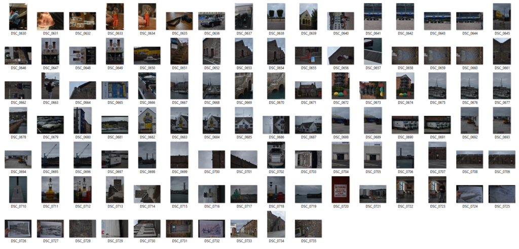
For the first photoshoot, I visited a few of Jersey’s marinas to discover some pieces of Jersey’s harbour history.
During my journey, I explored parts of the newer St. Helier Marina, the older South Pier, and even older Albert Pier. My focus initially was to take as many photos of anything I found interesting in order to inspire myself in later photoshoots.
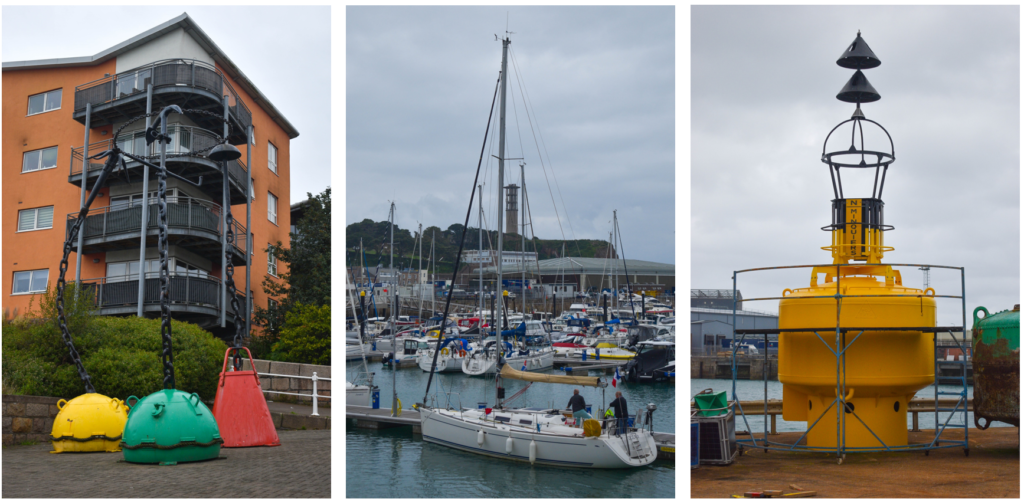
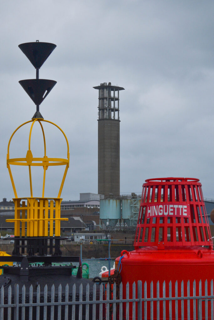
This tended to be the various historical monuments placed all around the harbour, large boats that were moored in the marina, or things I couldn’t even name. This became very helpful for gaining an understanding of the harbour and the various elaborate systems that have been created over the harbour’s history. For example, the object in the right photo is a buoy, used to warn sailors of danger. The two hats on the top are actually arrows indicating to sailors that the danger is to the north of the buoy.
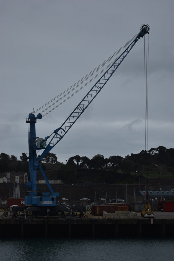
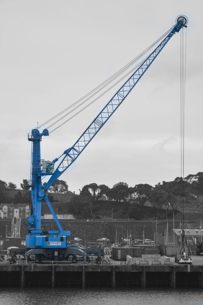
During the photoshoot, this image stood out to me, however my camera settings were very wrong and the photo came out very underexposed and the white balance completely out of place. I was able to fix this in Lightroom.
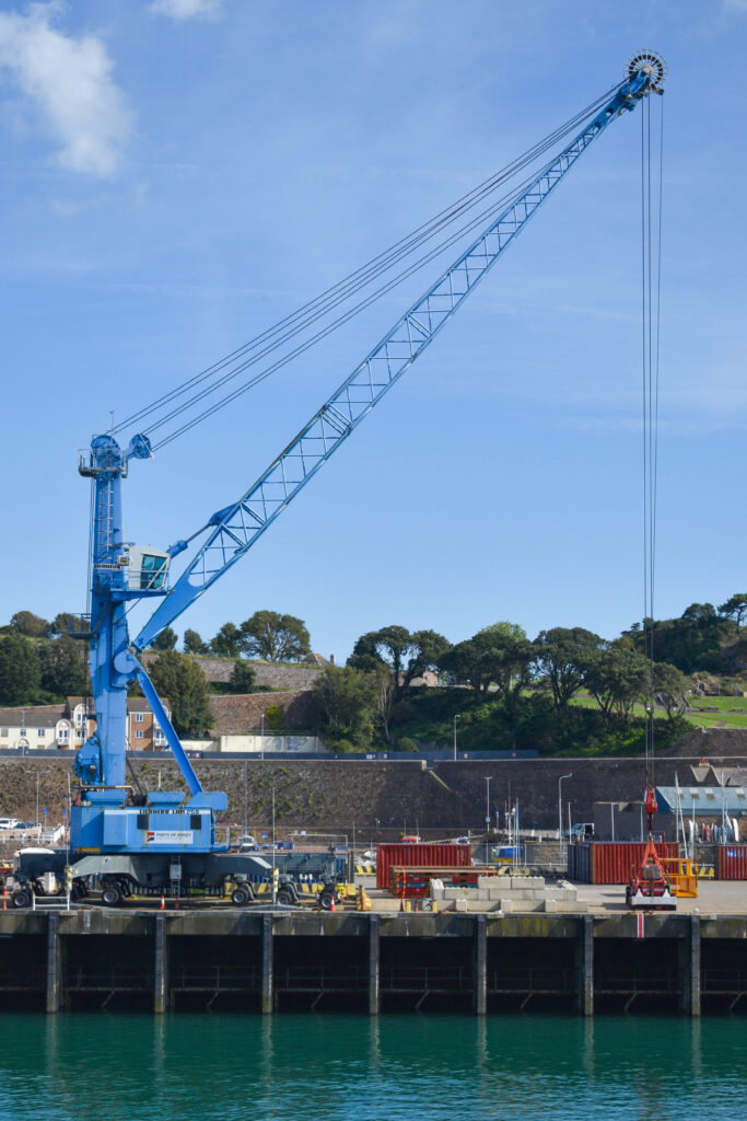
This edit of the image worked very well. By removing the terrible colour of the background and making it black and white, I was able to very easily balance the photo in contrast to the vibrant blue. However, I was very unpleased with how the initial photo came out. In my second photoshoot I returned to the same angle to retake the photo with a clearer sky.
This version of the photo is much better. There is so much more colour present in the photo which adds a genuine tone to the image. The blue crane as a whole is being used as a leading line that guides the viewer through the photo as if it is bleeding the colour of the sky onto the rest of the photo. The main colours of this image are from the blue sky and crane, the distant green trees, and the turquoise water at the bottom which acts as an intersection between the blue and green. Sandwiched between those is the New North Quay, which is used for hauling containers on and off small cargo ships. The subtle yellows and reds scattered along the quay bring the photo further through the colour spectrum. There is also a flat deadpan look to this photo, and in combination with the perfectly symmetrical beams reflecting in the water at the bottom of the photo, this image really stands out to me.
Another photo that stood out to me in my first photoshoot was this.
I liked this photo because of the contrasting vibrant colours and the composition of the objects that form a diagonal line. However, I was unhappy with this version of the photo because there wasn’t enough colour and the image didn’t look as full as it truly could have with the cloudy grey sky. In my second photoshoot I came back to fix this.
In this version of the photo, I took it in landscape to capture a larger photo than before. By doing this I also include more of these colourful buoys in the photo, which I think makes the photo look more full and vibrant. With the addition of the bright blue sky, the colours now work very well with each other, the blue sky acts like a base for the rest of the colours to pop and stand out to the viewer. The juxtaposition of the massive incinerator between the yellow and red buoy also makes the objects looks big and tall. Overall, this is a standout photo from all of the photoshoots that I definitely will want to use in my project.
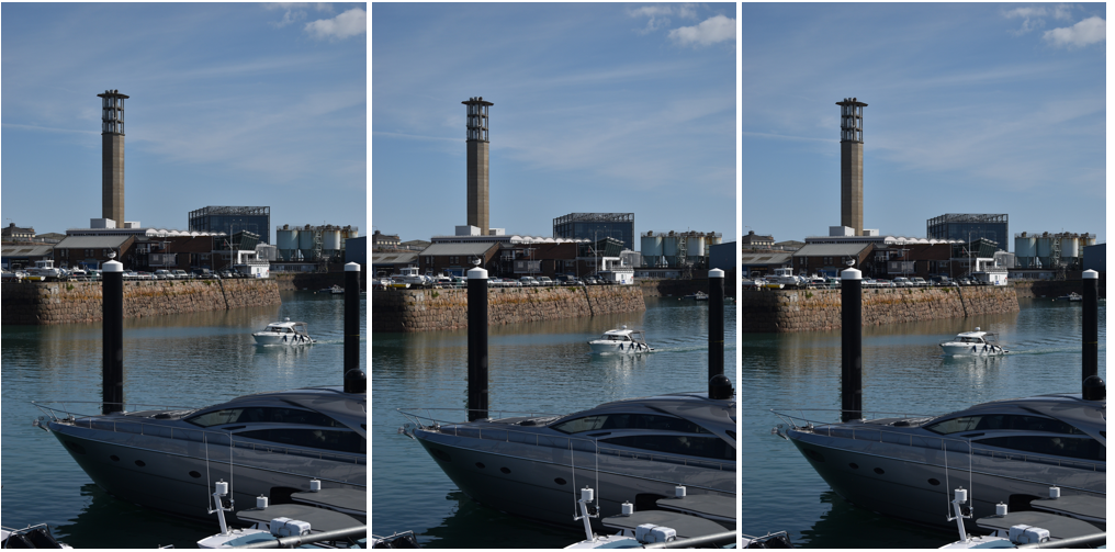
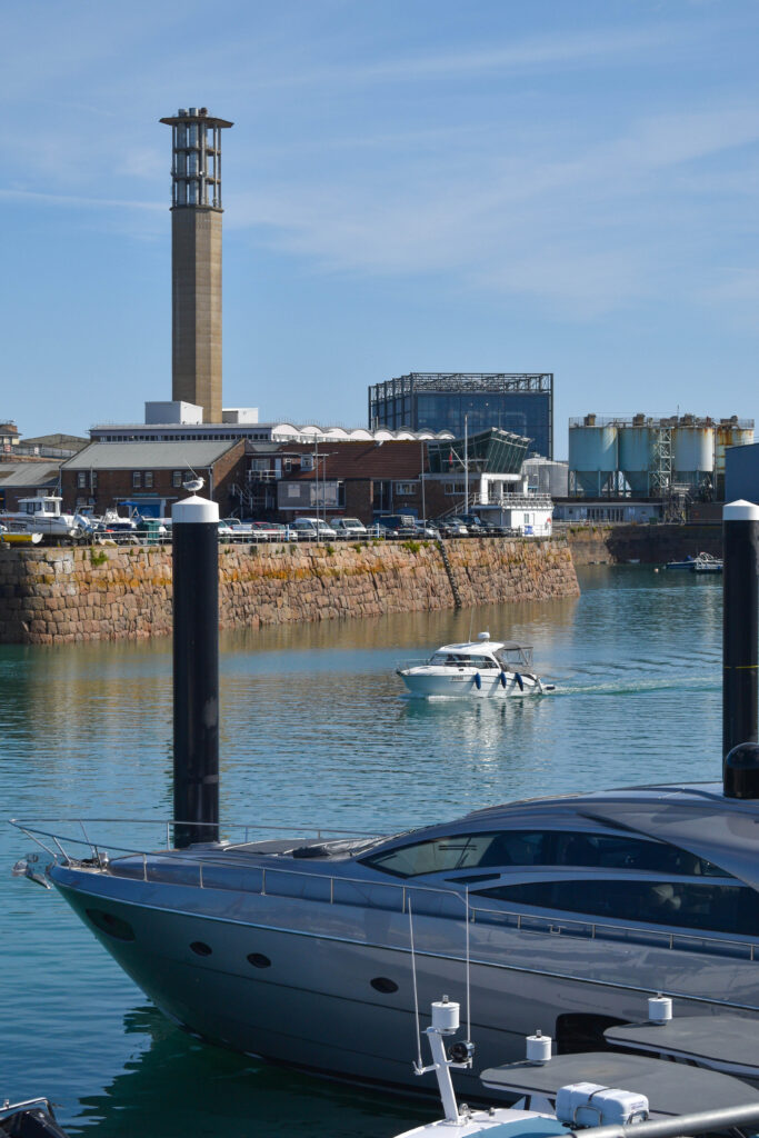
During the second photoshoot, I noticed this small boat coming into the harbour. I also noticed the contrast between the small boat and the yacht nearby, and the incinerator and a support beam that I could use to create a juxtaposed line by adjusting my position. Once I lined them up, I simply waited for the boat to sit evenly between the two support beams to take the photo.
Once I had the photo, I adjusted the colouring and the contrast. I like this photo somewhat, it has an odd looking composition, the elements of the photo look very contained. However, I feel that the yacht is a bit too long and it drags the photo out to the left a little too much, which creates this empty space above it which slightly skews the photo overall. If the boat was a bit shorter, I could crop the image so that this empty space is out of frame and the elements of the photo look even more contained.
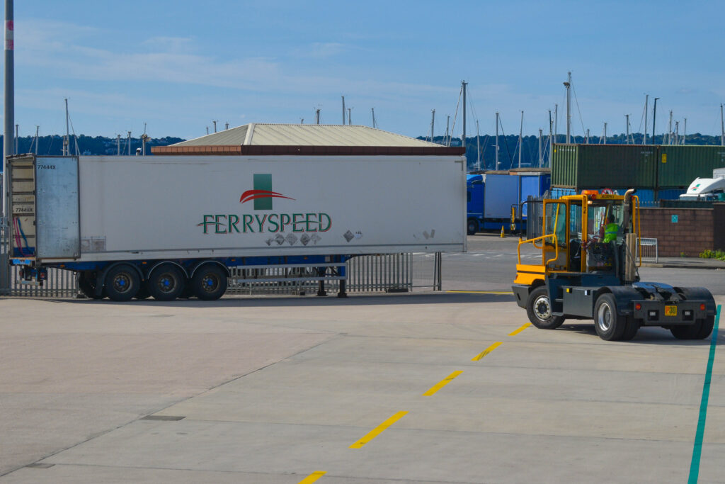
This is another image from the second photoshoot. I was intrigued by these colourful lines on the floor that I could use as perspective lines, and the large ‘Ferryspeed’ logo. As I was lining up the shot through the gaps of a fence, I noticed this yellow ‘terminal tractor’ getting ready to reverse. As it rotated into place, I captured this image when it was perfectly in between these perspective lines. In addition to the blue sky, the yellow and greens in the photo stand out very prominently and helps to section off each area of the photo. The flat blue and grey at the top and bottom make the image appear overall very minimal and basic, while also acting as a canvas for the rest of the elements to sit in the middle of. As a whole, this image is another that I will be keen to use in my project.
While I was at the harbour the second time, I stumbled upon this.
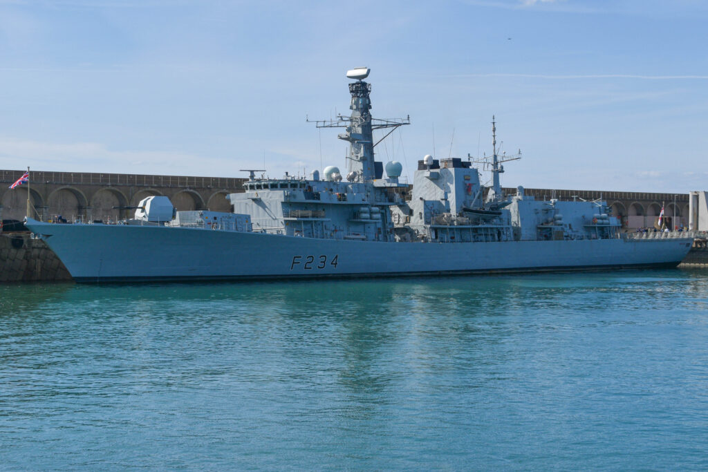
This is the HMS Iron Duke, a 133m Royal Navy battleship launched in 1991, although it hasn’t been involved in many wars, with the exception of 2 artillery missions off the coast of Africa directed at Libya in 2011 during the First Libyan Civil War. Prince William served as Sub-Lieutenant on this ship in 2008 in the Caribbean. During this time, the ship intercepted multiple large shipments of illegal substances headed to Europe. Nowadays, the ship has been refitted and has stayed around the south coast of England between Portsmouth and Plymouth. It just so happened that the ship was in Jersey the day I was at the harbour, and although the sun direction is a little bit late making the ship mostly shaded, I still think I can use this photo in my project. I do wish I had returned the next morning to grab a better photo with more direct lighting, but this photo is honestly good enough.
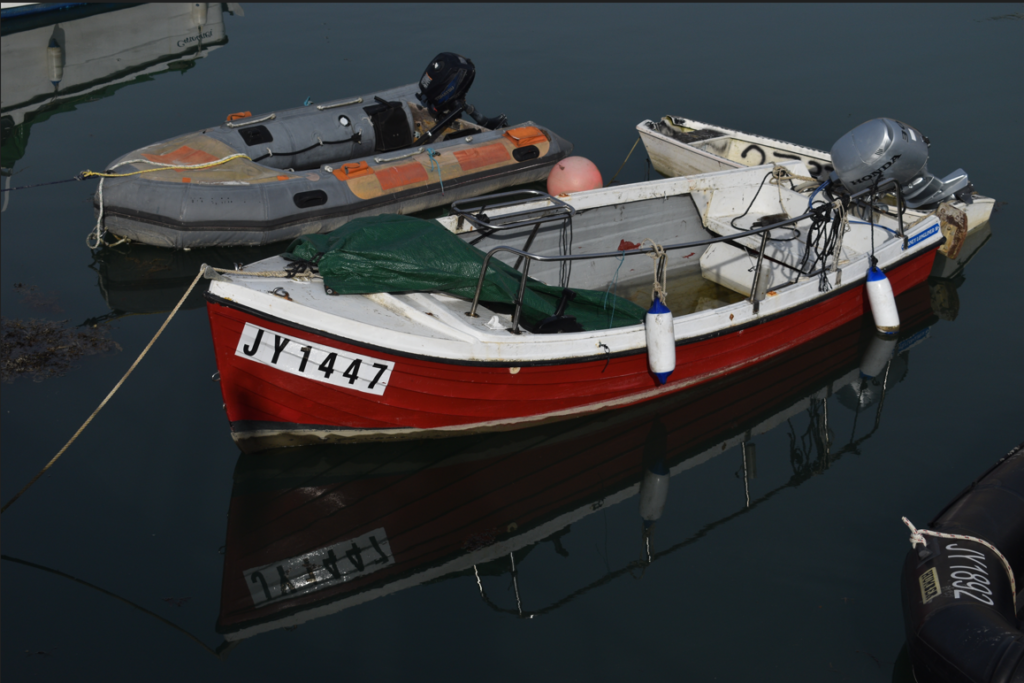
After the second photoshoot, I knew I had good photos, but not that many of them. However, I was able to get some more photos when I returned to do some maintenance on my family’s boat.
On the boat, it was very hard to line things up correctly because of how much the boat was rocking in the waves. Also, I had complications with the objects constantly moving more and more out of place as I tried to line each photo up correctly. This made it harder to get good photos. However, this didn’t stop me from getting good photos, it just limited me as to how many I got.
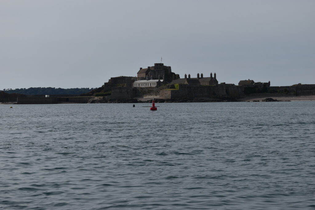
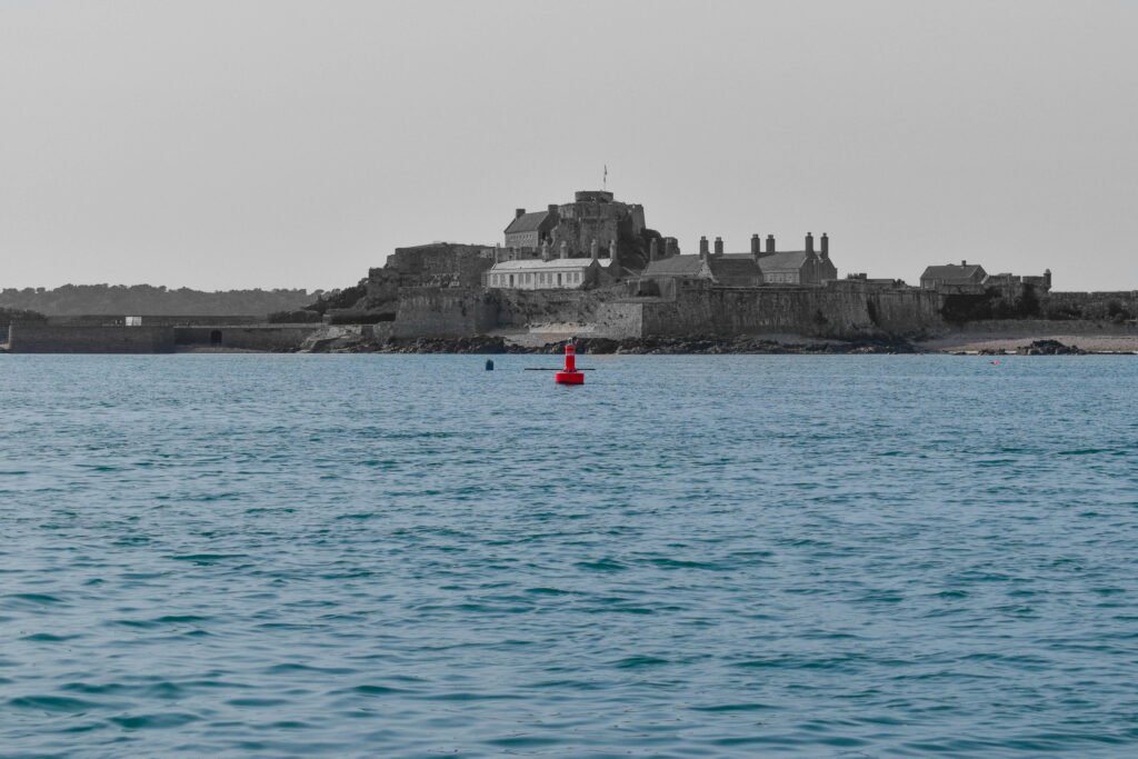
Overall, this was my favourite photo out of them all.
However, the white balance in this photo was really wrong and the photo came out really dark and unsaturated. I fixed this in lightroom.
I simply made everything except the sea and the red buoy black and white, and brought up the vibrance and saturation to bring out the remaining colour. Overall, I think this effect creates a contrast between the old Elizabeth castle constructed in the 1500s and the new world around it that has changed so much since.
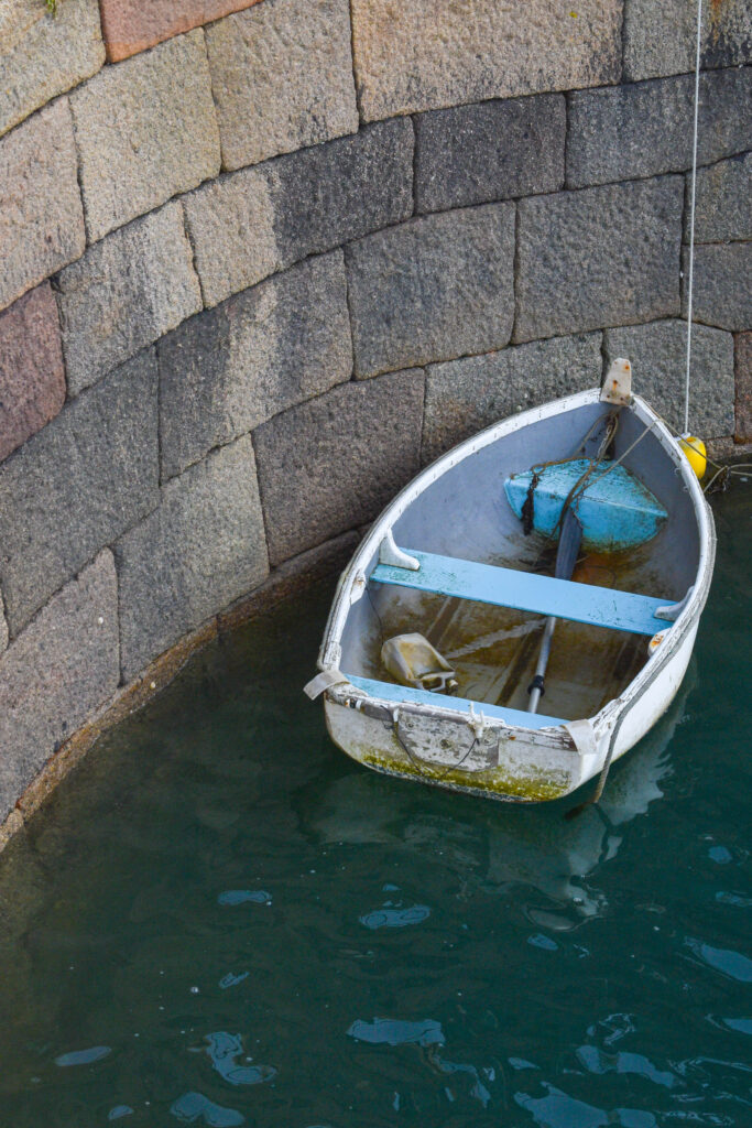
After I got off the boat and started heading back, I continued to take photos at the harbour. This tended to be various boats in the Old Harbour marina and the old commercial buildings.
I mostly experimented with the very reflective water that the boats sat on. I liked how these photos looked, the reflections helped fill the frame rather than simply acting as blank space. However, I wasn’t totally happy with how the colour of these photos came out, they didn’t match the other photos that I was going to use for the project. Although, this photo stood out to me.
This was a very simple photo I took near the end of the photoshoot. I like the basic geometric shapes that form from the curvature of the objects. This photo does not fit with the rest of the images in my opinion, it has a lot less details and overall just doesn’t fit with the sequence, however I feel that this image will be good to include on the back of my zine just to conclude the project.