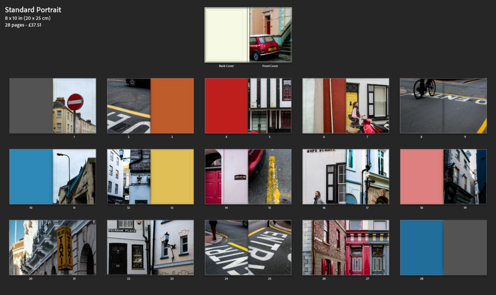
I began to by selecting my final images which I felt best worked together. Then started experimenting with how I could make the layouts very visual creating this aesthetic of colour, form, shape, and composition throughout.
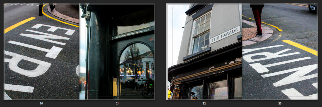
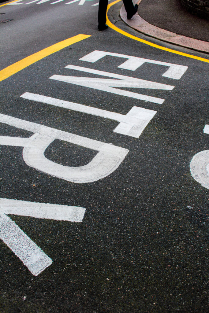
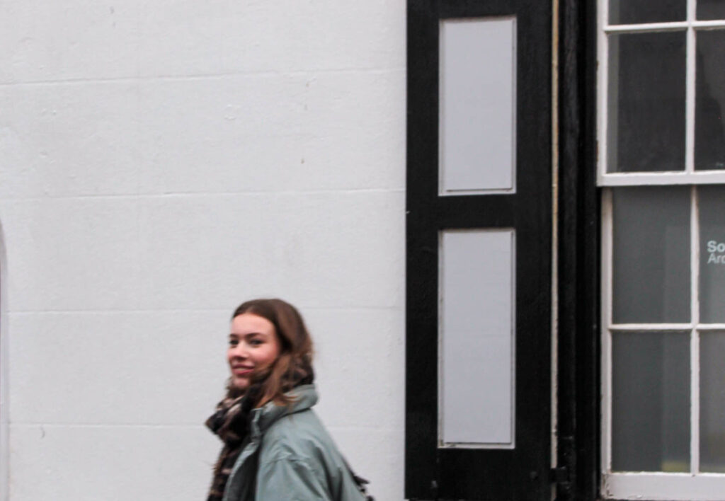
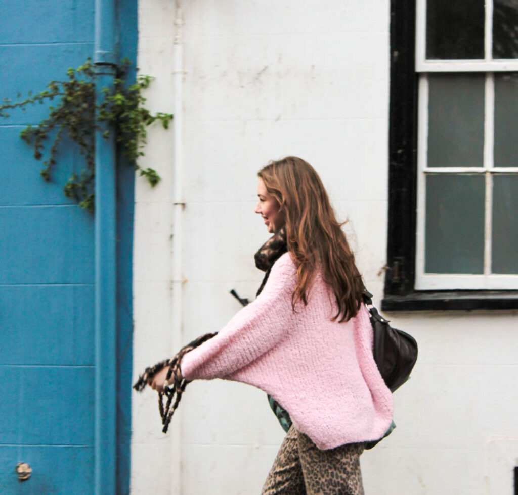
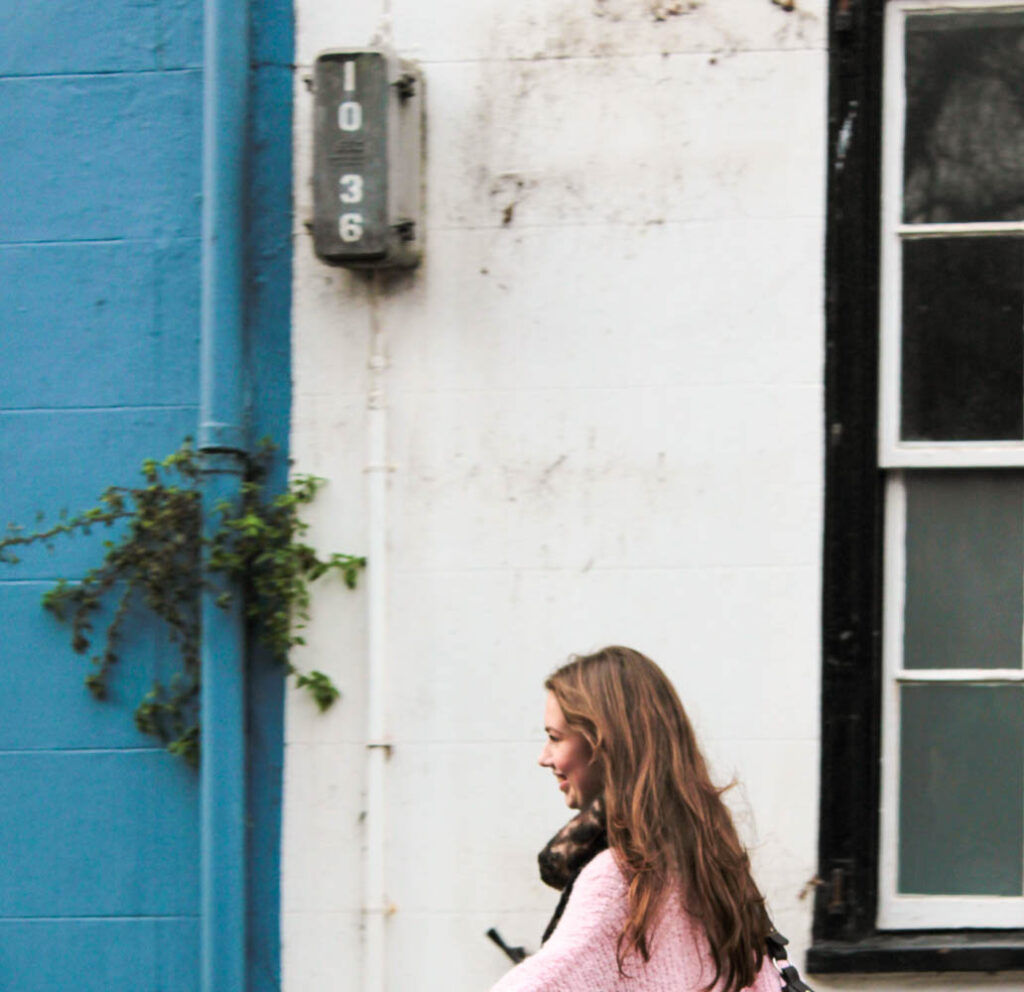
Here I was deciding the layout for these particular pages. I took these photos both in the same area but from different angles, which created this different confrontational effect. The writing could be presented and was displayed from different angles where the lines and formations of the pavements could be realised differently. I felt having both pictures on separate pages presented a nice flow as both achieved very similar yet different perspectives and angles. However I went with both images, presenting on a double page (side by side) as this revealed a much more unique composition. I found the abstract approach complemented the photos individually as your unsure yourself what the writing is suggesting or saying, instead we are drawn to the pigmented, sharp lines and shapes of colour that works well with the compositional arrangement of the streets. However, both photos complement one another, and they different versions of each other.
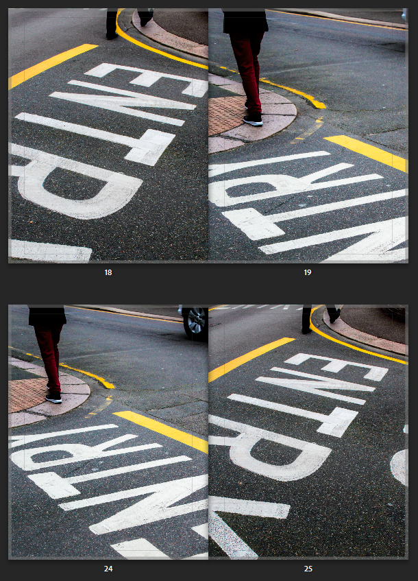
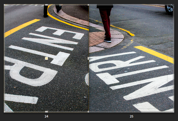
The second double page above was the composition I went with. I felt each photo displayed their own structural formation through the way the person is walking off the page, to the letters and coloured lines. Then the way the photos complement one another side by side, creates intense leading lines in-wards or into the page, instantly gripping your attention as your eyes follow this formation. This creates a slight symmetrical feature (although they aren’t identical images) from the way the photo is angled. The photos was taken from the same place, I stood in the middle then captured to the right of me then to the left of me, both including different people walking away. This creates a nice sequence, one that we wouldn’t notice, until after we notice the abstract feature. This creates even more diverse angles and compositions reiterating their juxtaposing effect side by side.
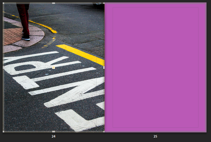
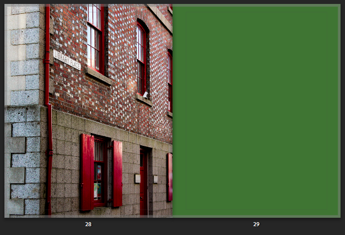
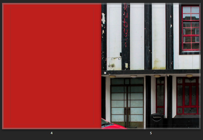
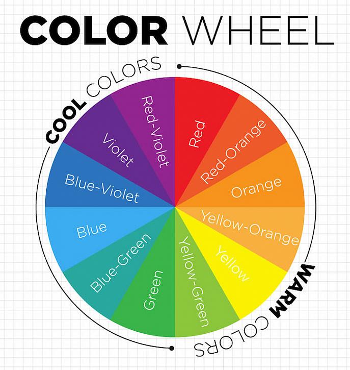
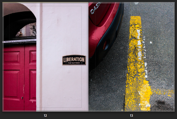
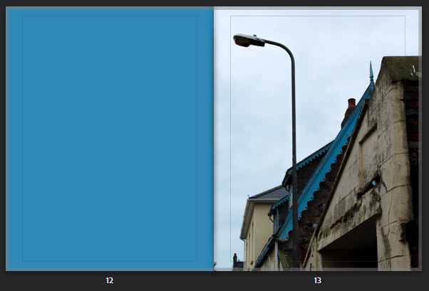
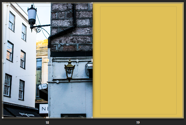
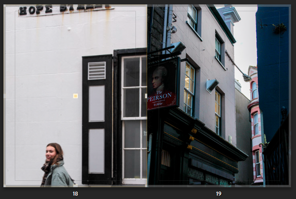
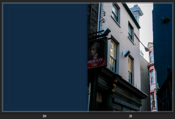
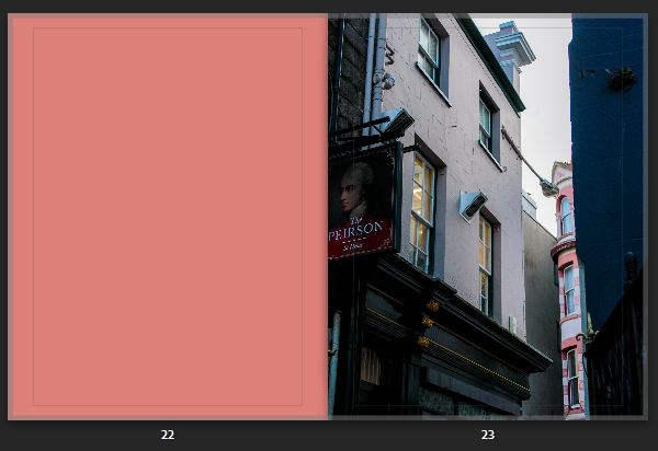
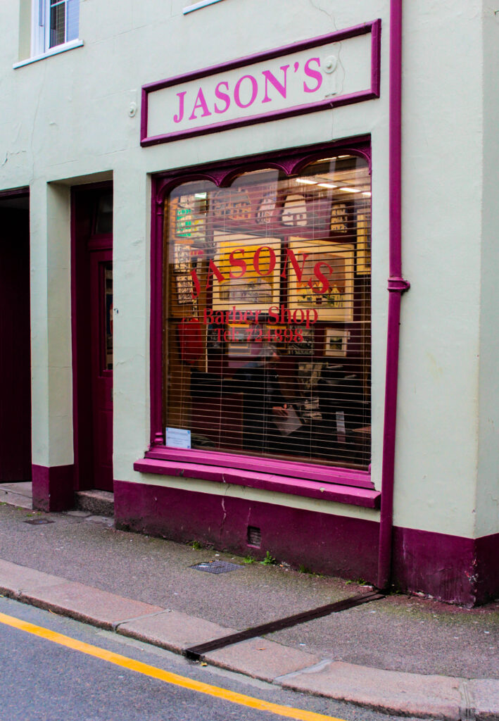
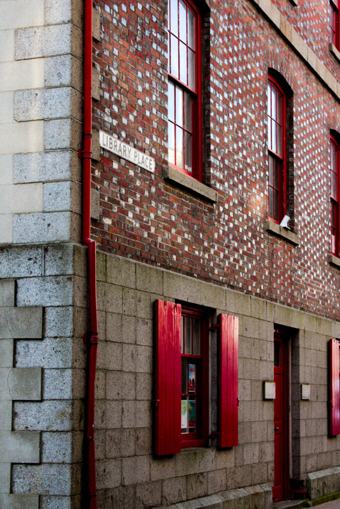
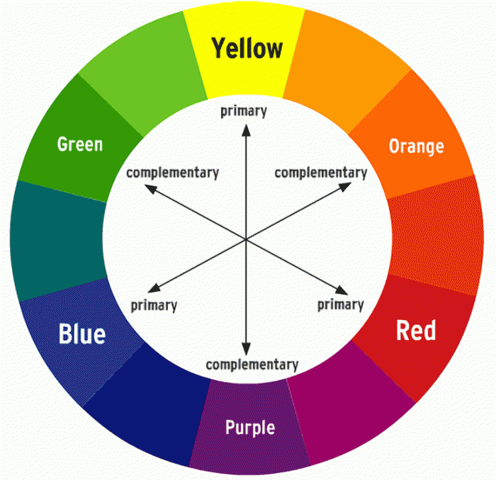
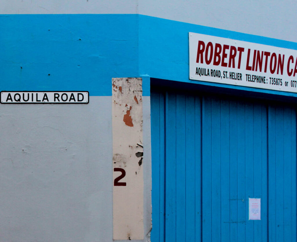
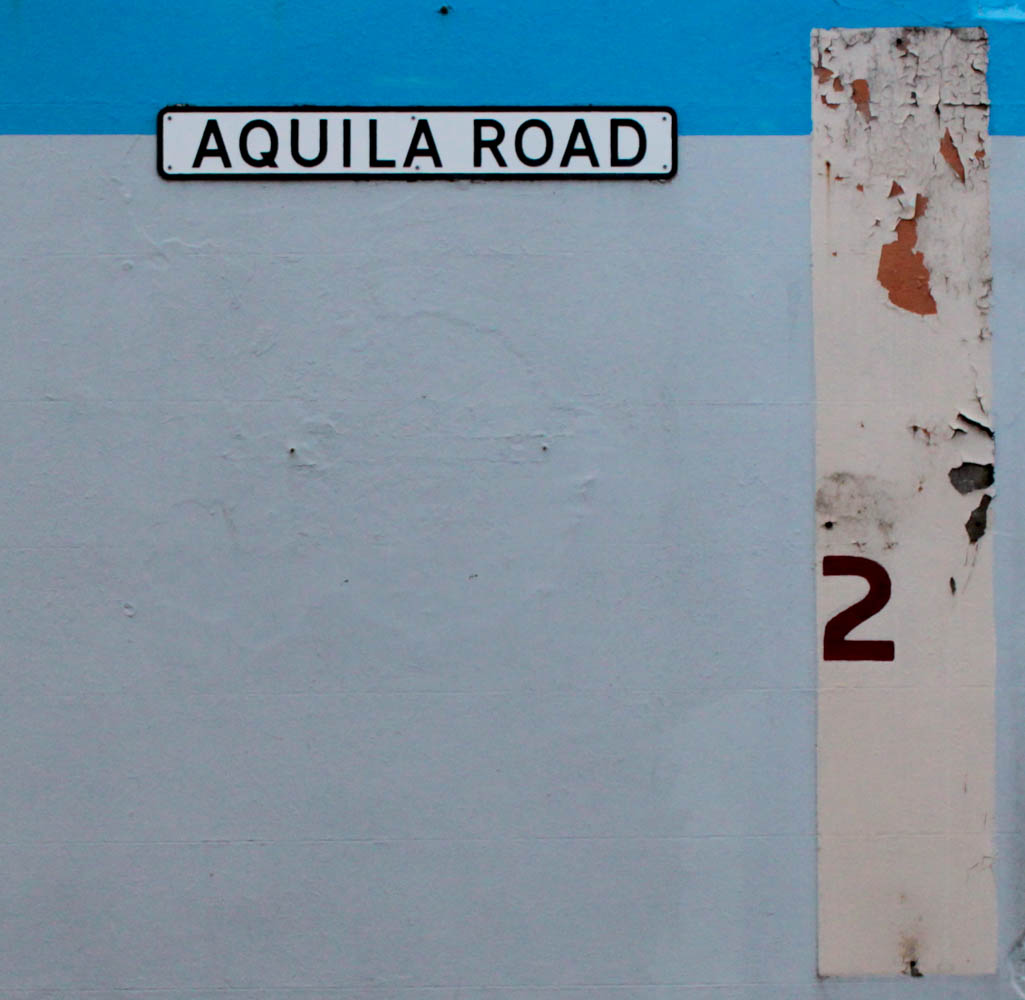
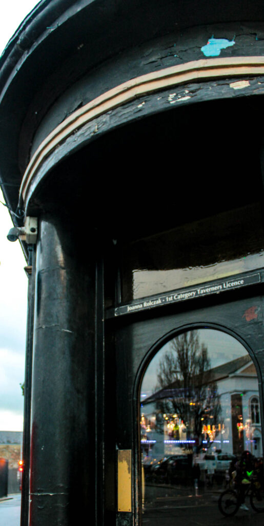
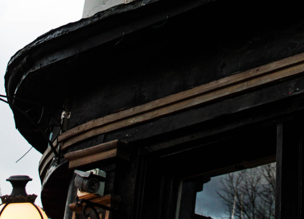
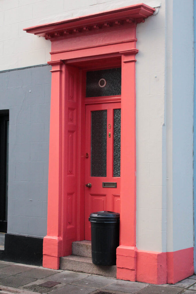
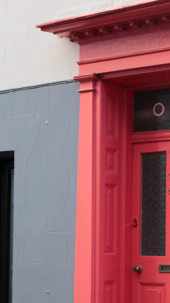
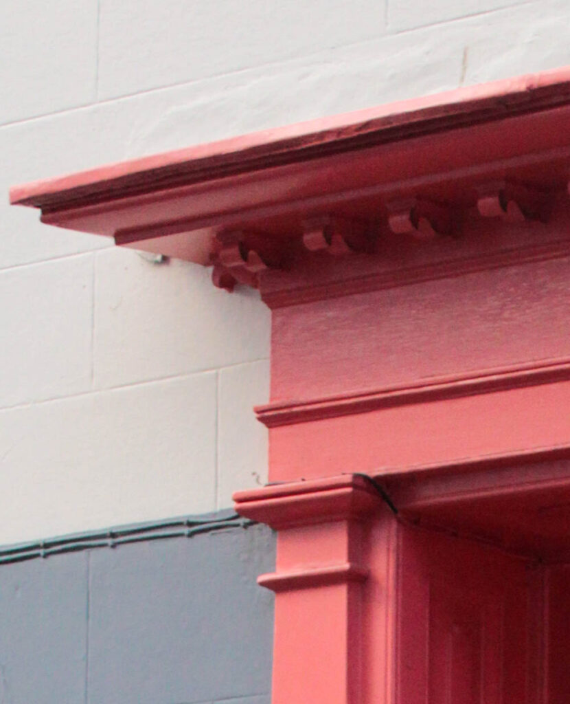
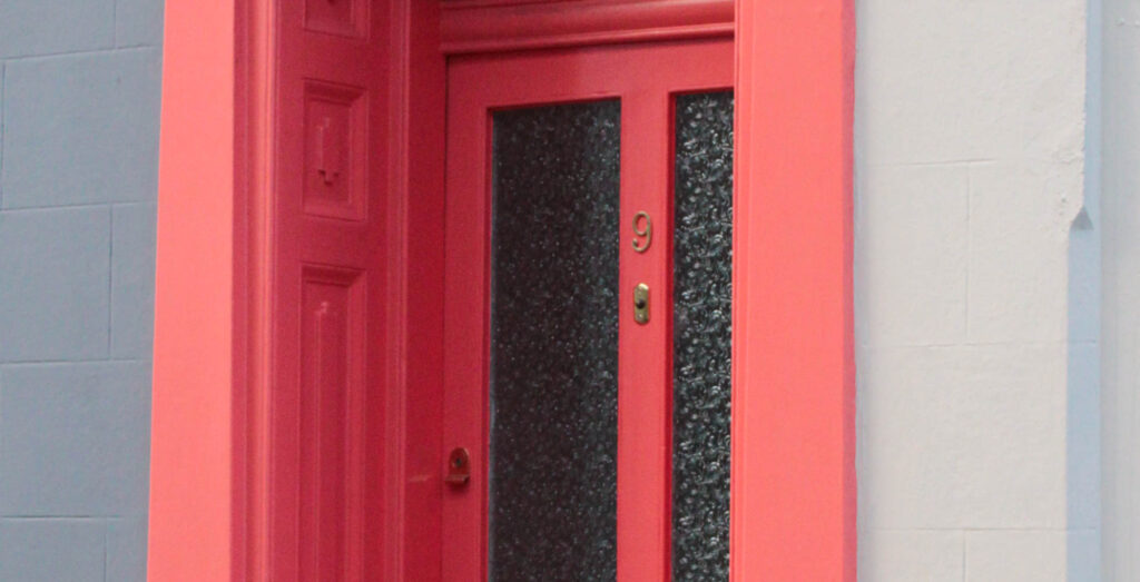
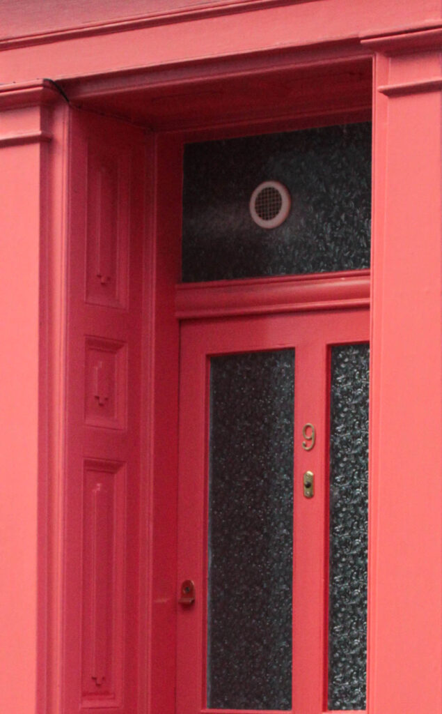
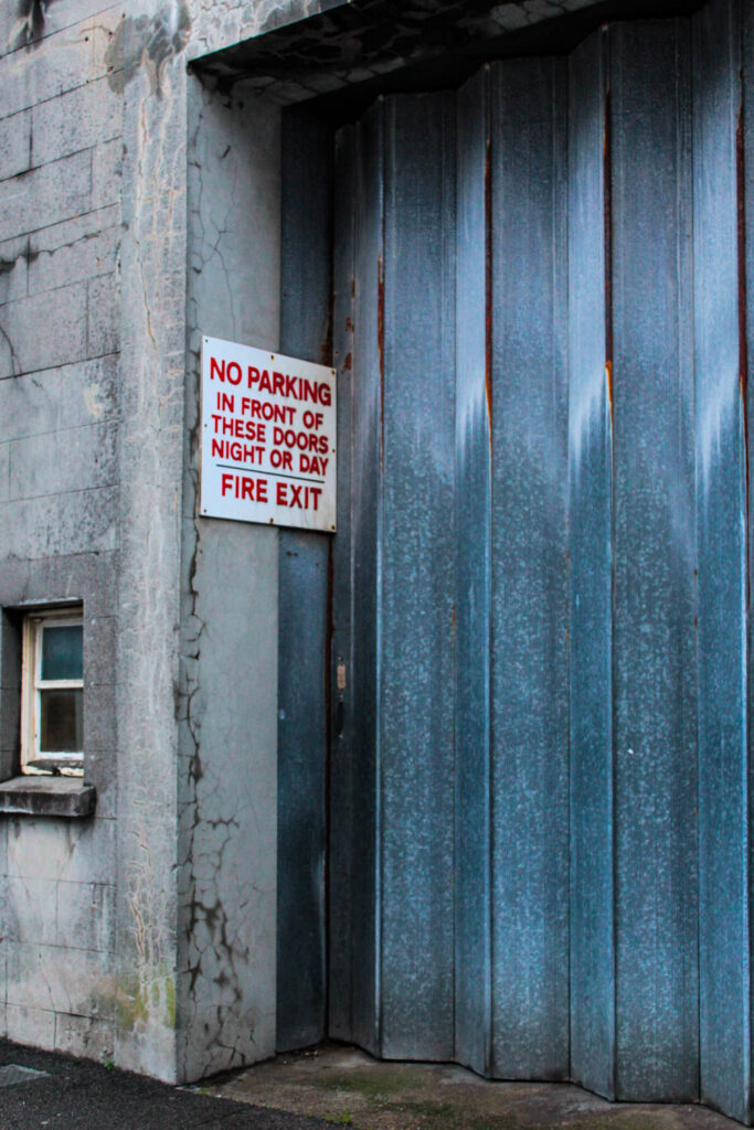
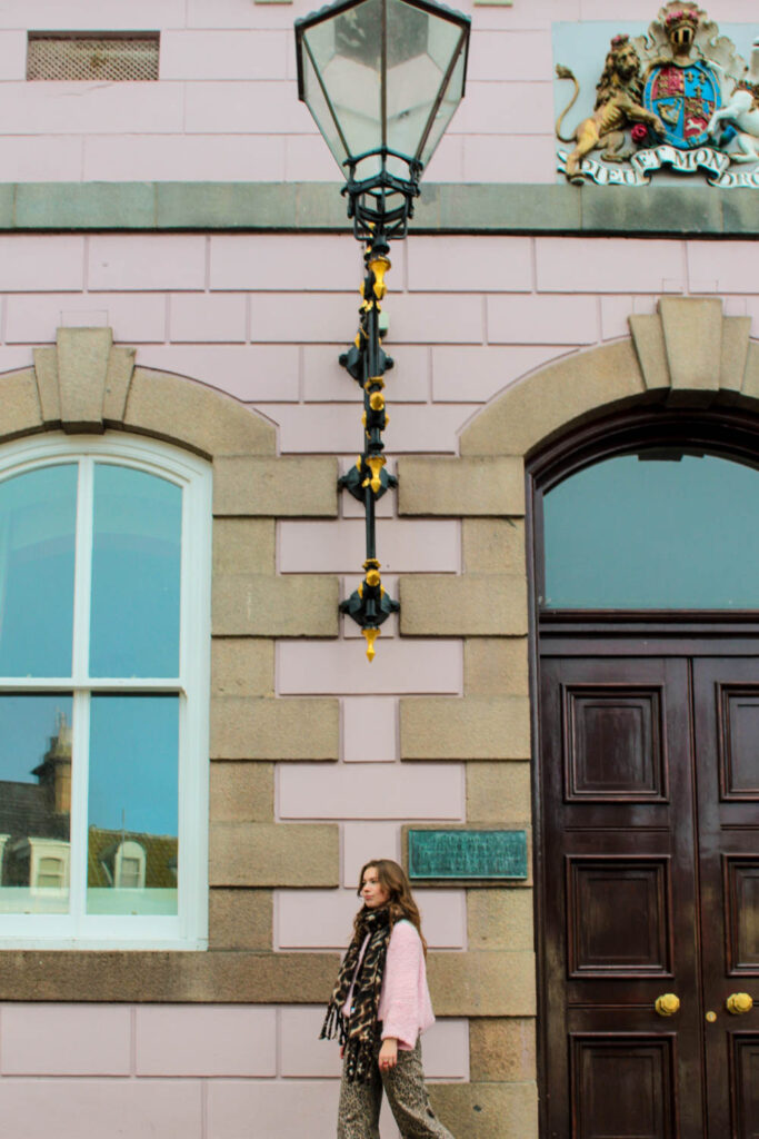
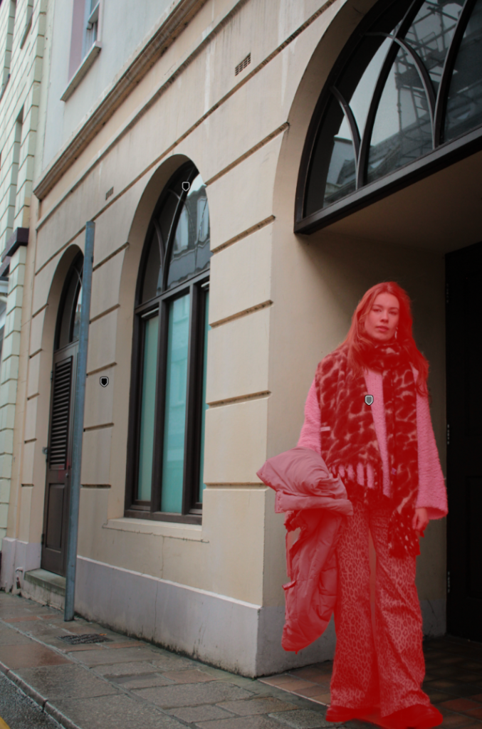
I then started playing around with adding a full colour page, which complemented a stoke/detail of colour I found in my image and wanted to emphasise further. Looking at the colour wheel as guidance this allowed me to easily see which colour complemented on another. For some pages, where you could only see a little detail of colour, I then matched the colour onto the next page, giving this unique relation and comparison. For example for the third photo below, you can see the intricate red detail from the outline/structure of the window and sign, which stands out against the alternating black and white background. So to express this feature further I wanted to bring this out, revealing the colour/ making it more visible as it is an interesting graphical feature- so I matched a whole page. In other photos where the colour was more visible through bold shapes and lines, I wanted to create a contrasting feature so used complementary colours instead as the whole page. I mimicked this particular technique Siegfried Hansen used, as I was automatically attracted to this feature presented in the book, Hold the Line, because it broke up the busyness/hectic feel you would be presented with otherwise, but also describing this interesting narrative throughout as you can see a deep connection in relation to the image.
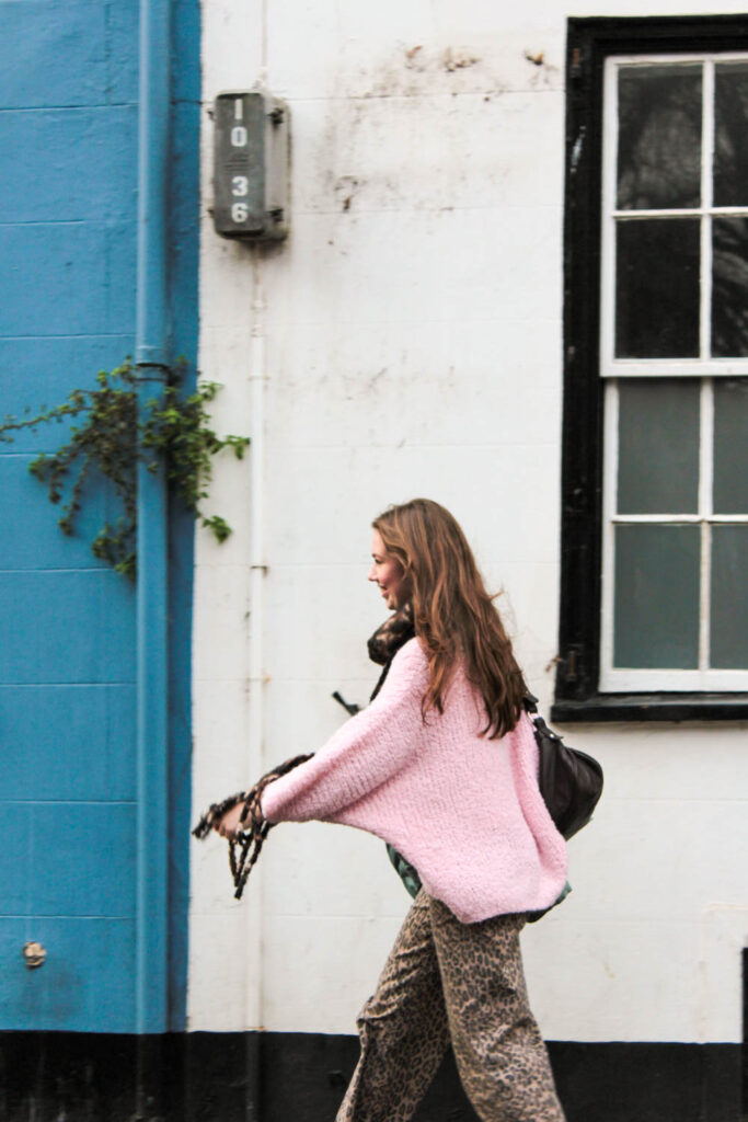
For some photos I experimented further with Hansen’s technique of having a whole colour as a page, to then incorporating a more visual and structured version through my photos. I took inspiration from the singular, pigmented colour Hansen used, to then incorporating more than one to give this dynamic relationship, that I could further use to complement my other images (like the photo on the left). So throughout that photoshoot I noticed colourful buildings, and the particular shades of paint used that I could then use instead of editing a colour into the page on Lightroom. I felt this would give a much more interesting feature as I have taken the photo, and related this the image followed after or before.
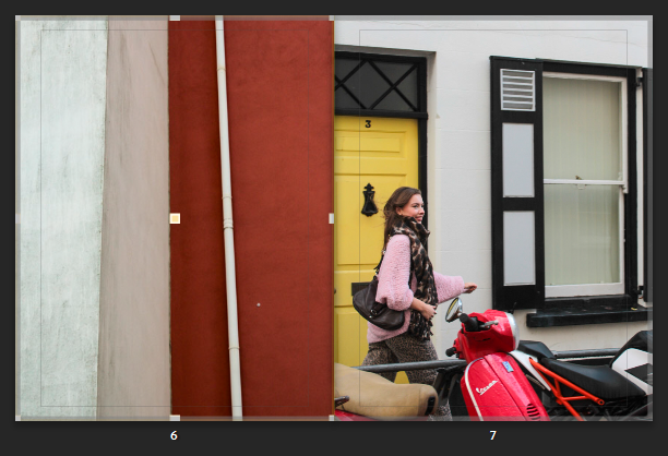
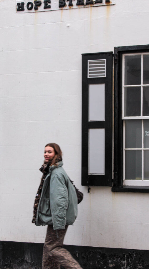
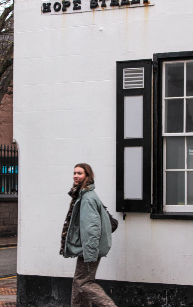
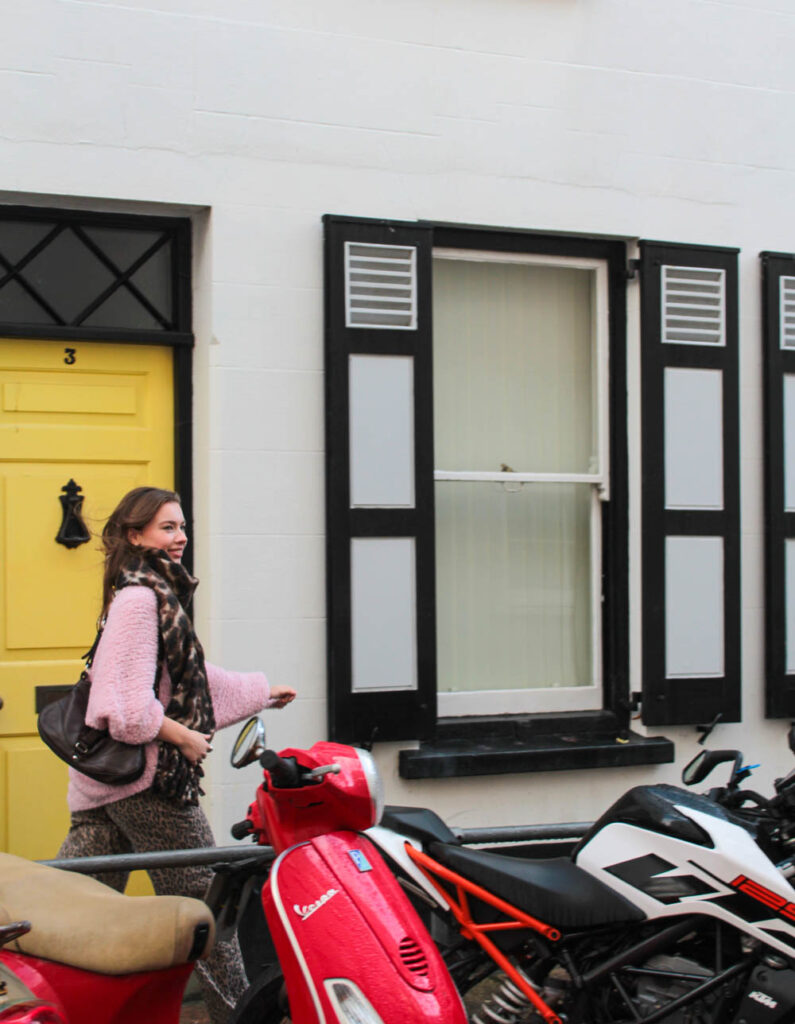
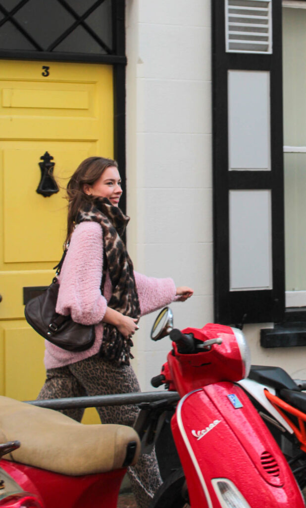
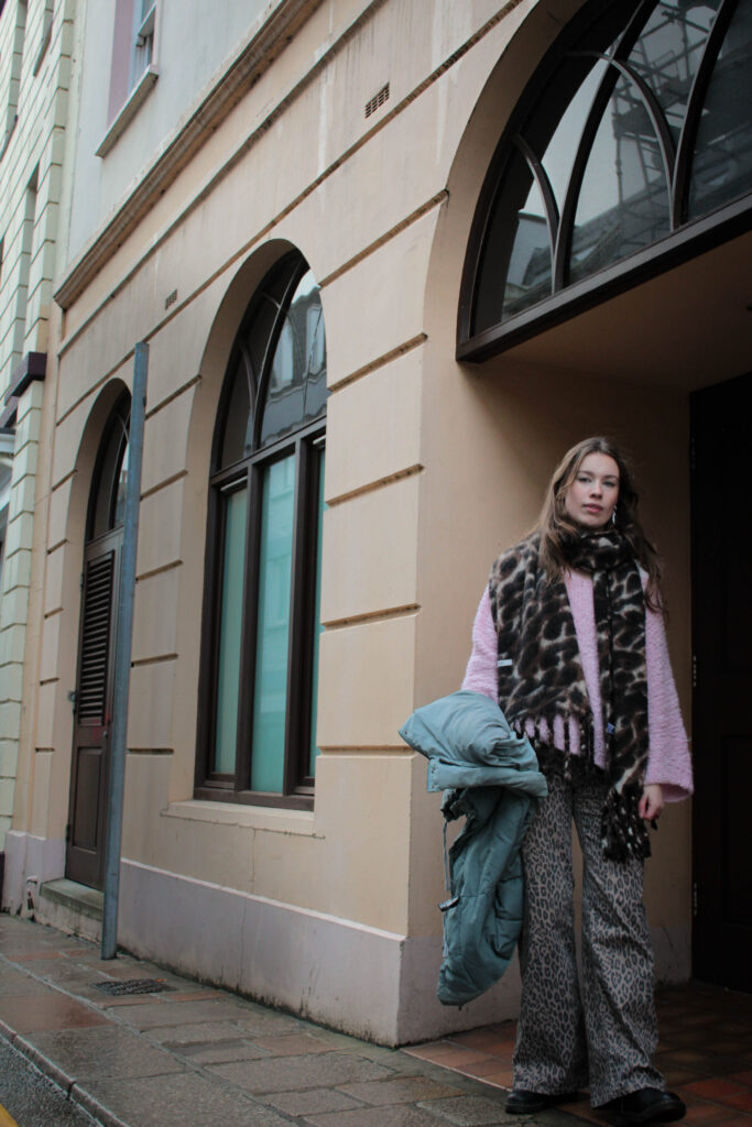
Like for these pages, I found this wall that already had contrasting features expressed by three two tones. I straight away noticed how the colours where presented through the composition and structure of the building, as you get the strand of white running through alongside the angles and three-dimensional feature. I like this A-symmetrical feature you get, which gives this particular character and interesting depth followed by how the lines are to an angle leading you into the composition. I felt the simplicity of this could relate and complement my other images in a different yet similar way, instead of using a single block colour. As you can See I have exaggerated and brought out the tones found within this image as you can see the texture and intricateness blemishes in the wall, which overall adds character. You can see the relation, as similar tones are displayed. I like how the tones aren’t the same which shows you they can still work together and complement one another as they bring out other features within the photo, such as the yellow coming from the door, and the pink jumper, but also the patterns revealed from the black and white building. It works well as the tone of white in both is highlighted throughout the double page.
Like-wise for some photos where I was not intending to express the colour, instead it was the formation and angle I took it from, the photograph still expressed the same effect as the full colour page, only adding in extra details and formations – which gave this passionate, energetic, expressive characteristic:
This mix of compositions reveals a similar effect followed by the dynamic structure of the road markings. The similar use of of compositions related to one another as they both express a very dramatic feeling.
I realised my images were very intense – from colour and composition so I was influenced by the Book ‘Hold The Line’ by Seigfreid Hansen, to add in full coloured pages.
As you can this double age is very hectic and busy as their is lots of bold compositions. Although, I chose images that complemented one other through their colours and structural formations as their side by side, it still portrayed a very chaotic, intense double page – one that worked together but clashed. So increase the aesthetics I added in full coloured pages that broke this up, therefore creating this unique contrasting effect. The colours I chose for the pages complemented the photograph on page next to it, or very little of the colour was visible- therefore this brought the colour out making it visible. I kept the colour pallet simple using complementary colours or primary colours.
Overall, I think my final outcome of creating a book was successful. My aim was to create a book influenced exploring colour. Influencing specifically by the formalist style From this dynamic formations were revealed which is what I think make it unique. Similar to Hold the Line by Seigfried Hansen, the photobook doesn’t express an obvious narrative, instead its open for us to interpret one. I think this is a very clever and different way of expressing a series of images in a book, as we are confronted with different angles and approaches which makes up the narrative. Through an abstract approach that we are straight away confronted with forces you to look beyond, focusing in on the formations and and structural elements of patterns and colour.
Both Saul Leiter and Seigfreid Hansen explore forms of colour which are defined through shapes and compositions. The similar yet different outcomes is what interested me the most. Seeing how moments and reality can be transformed into images which change your perspective, otherwise revealing moments you wouldn’t expect to see.
I captured the photographs in day light either when it was sunny or cloudy as this revealed two different effects expressed through the shadows and highlights. Focusing in on visual aspects such as colour, shape, pattern, line, texture and composition when out on photoshoots but also when making final edits. The visual elements all fitted together, complementing one another which is why I explored this abstract, confrontational effect. Seigfreid Hansen was my main influence, further shown in my final images in the photobook as he took everyday situations and moments and captured them in a way that revealed a type of structure defined with lines, patterns and colour. This then created contrast of colours and depth. Without expressing an initial narrative, it is left up to you how you interpret Hansen’s work. Leiter uses a similar approach, yet we soon figure out a narrative as subjects such as people interacting are captured. I tried to include this using people I know which created this staged look. In comparison, I then looked at Hansen’s style of abstract snapshots of particular moments, then created photographs in similar styles, with bike wheels and legs coming into the main photograph to give this contrasting narrative. My expliration of colour is expressed through different layouts which come together in the book, complementing one another. Using full coloured pages to break the caotic, intense images up, complemented slight details I wanted to enhance and make clear which would otherwise go unnoticed. Otherwise for some pages, I captured colours myself which included some lines and slight differences like the full coloured pages. This created the same effect as the full coloured pages yet made it more interesting.
My aim was to capture colour that was revealed through dynamic formations I found within the street. Alongside this unusual shapes, patterns, lines were revealed overall adding more depth.
Favourite Selection:
This photoshoot I used the TV setting on the camera which gave me this cool/warmth tone and candid feature. Inspired greately by Seigfreid Hansen and Saul Lieter I fosued on colour and how this could be clearly defyned through the unqiuenes of the features that are revealedd, and would otherwise go unnoticed
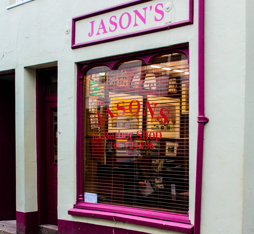
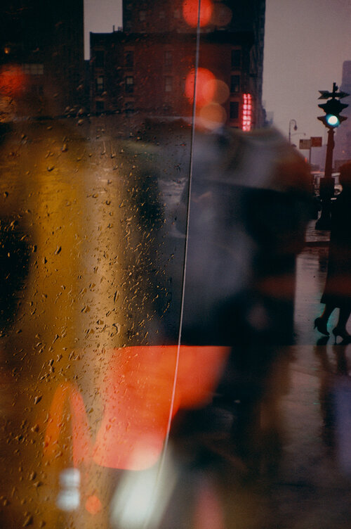
I was drawn to the reflections from within the window which created this layered affect therefore creating unique depth and structure. I wanted to express this feature, as I was already drawn to the warmth revealed by the colour then features such as the letters and writing displayed on the shop window, so decided to enhance this and clearly define these features when editing.

I experimented with various camera angles which help to produce images from unique perspectives, one giving a confrontational effect. This meant the viewer could further realise more within the photo and see things differently. Focusing on colour too, this allowed me to create particular/ subtle features that show a story when you look into it, as things are being presented to you from different angles or perspectives. It guides you into the photo, giving depth.
Siegfried Hansen Inspired
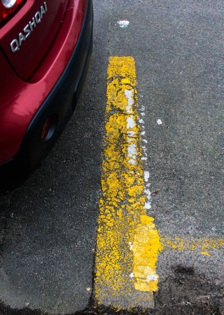
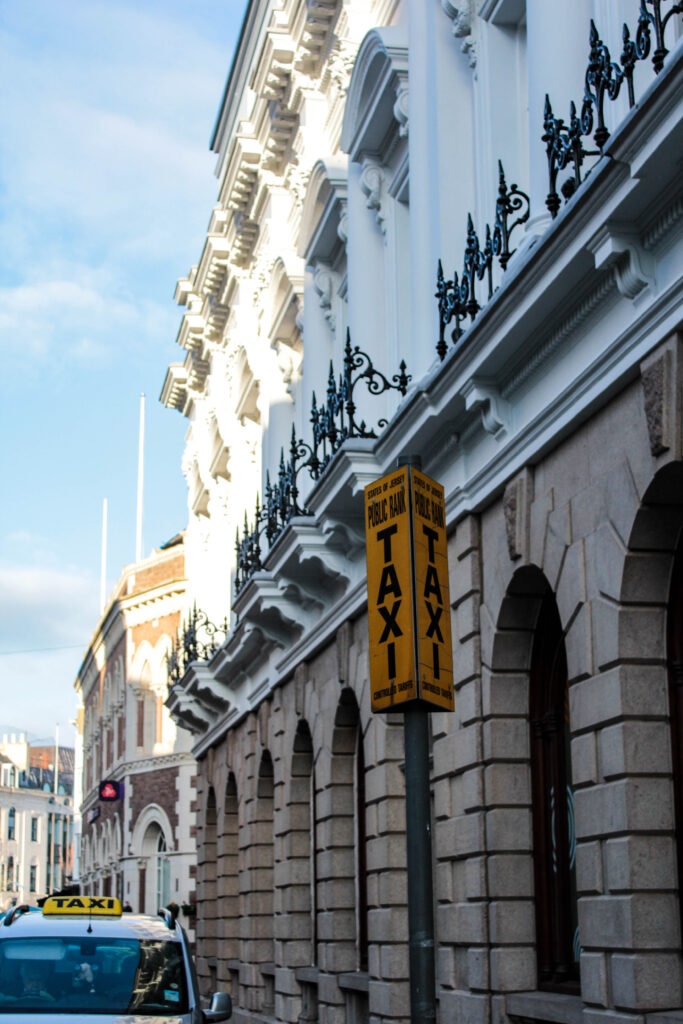
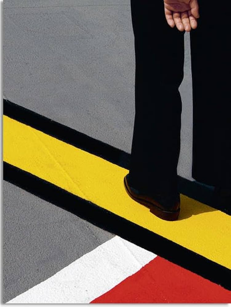
Inspired by Siegfried Hansen’s use of simplicity and capturing moments that you would perhaps not notice otherwise, I felt this gave a unique characteristic within the images which is what influenced me to produce images with similar features. It creates this gripping narrative as he has particular ways of expressing formations and shapes through vivid, bold, pigmented colour- overall creating a contrasted, and defining effect. Hansen looks at road markings and particular signs which is what I further looked into. I felt this revealed a certain aesthetic which before captured you wouldn’t notice it. The narrative is expressed through this in particular ways as only the legs of someone is displayed, giving this sense of unknown, whilst also being mesmerised by the visual features (of colour, line, shape, formation.) I edited the images to further enhance the formations in which gave this in-depth contrast, for example I firstly altered the contrast making this an obvious feature, I then altered the black and white levels as this further increased the shadows and pigmented colours
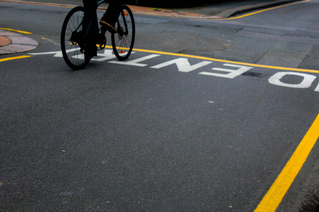
For the photo above, I firstly altered the contrast making this an obvious feature, I then altered the black and white levels as this further increased the shadows and enhanced the pigmented colours so each feature was clearly defined.
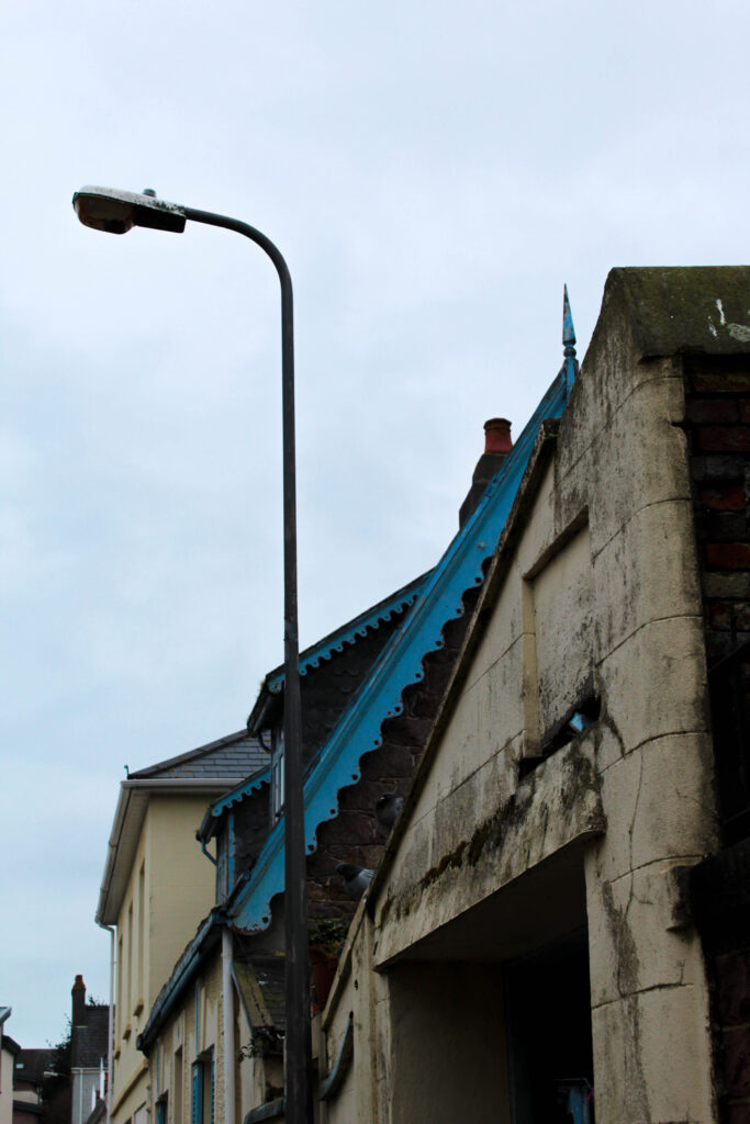
For this photoshoot my aim was to capture both colour and forms within the streets of St Helier, and how they work together to create this dynamic relationship meaning that when you look at the images your mind is completely mesmerised by the abstraction but also your confronted with something totally different and unusual – perhaps becoming unrecognisable. I took photos from various angles which helped to achieve these effects, but mainly focusing on how I can turn my sights into something complete unrecognisable, by presenting to the viewer a different perspective. My aim was for colour, formations, and shapes to take over, which creates an abstract view.
Overall I think this photoshoot was successful as you are ultimately being displayed something unusual and attractive. Throughout my goal was to capture moments or particular sights I saw in town which I through best described colour, saps, and formations. I felt this was a necessary thing to focus on as its not only until you look closely at something, it is where you notice it (colour). Then from this you notice complementing features such as lines, patterns and shapes.
Siegfried Hansen was one of my main influences. Noticing is simple yet engaging photos where subtle features distract you:

The visual elements are what you notice straight away, colour, shape, texture, form, pattern, and line. Then closely looking into this we see how they complement one another and create this dynamic connection between one another, one that we wouldn’t notice if it wasn’t for the abstract approach we are presented with straight away.
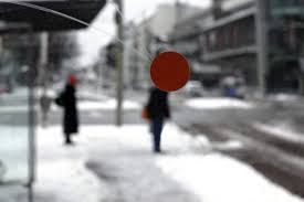
This photo instantly appeals to me. Through the structure to the colours that outline this in a formational way. It is minimalistic yet very revealing. This means the particular way the photo has been captured, to the markings on the road which lead up to the legs of an unknown person. The road markings coincidentally create leading lines towards the legs of an unknown person which automatically create a contrasting affect between this but also the pigmented, pure blocks of colour against the black. This dynamic contrast creates intense depth through the sharp, bold lines.
Relating closely to Formalism, the intense lines, layout, and colour create a close connection, bringing this much deeper meaning. Although the meaning is not presented through a specific subject, its shown instead to us through the visual aspects of the work, which enhances the aesthetic feature. Formalism is a focus on quality of colour, brushwork, form, line and composition which is what influenced Hansen’s style of work. – we can see the close connection. We are clearly presented with the structured /orderly layout expressed by blocks of colour that is then outlined by thick black lines. The visually attractive structure of formalism further complements the legs of the unknow person that comes into the photo from the right, as this creates a unique subject.
To what extent are Saul Leiter and Seigfried Hansen influenced by Formalism in their work?
Introduction
“I happen to believe in the beauty of simple things. I believe that the most uninteresting thing can be very interesting,” (Saul Leiter: line 16)
Saul Leiter suggest that what goes unnoticed is in fact the most exciting. The fact that we are almost unaware our surroundings of unique shapes and formations, with the only way that we truly see it is through abstract approaches. Throughout my personal study I aim to investigate street photography and how it can be portrayed through various ways and approcahes. I believe there is more to street photography and that it’s not just a standard photograph of a building, it’s in fact different visual elements such as vibrant colours, unusual shadows, textures, and patterns, to diverse formations and compositions that all intertwine, overall creating these contrasting effects. All these visual elements are otherwise known as formalism, compared to what we see on the streets it shows a very similar effect. The way colours are distinguished between more colours, separated by distinct lines is further represented within the streets whether we notice it or not. My aim is to bring this to life, presenting this through very abstract and diverse approaches, which makes you question the photo as it is so unrecognisable. Siegfried Hansen perfectly describes formalism. His similar approach overall achieves abstract, unrecognisable images, that are so bold, full of colour and life it changes our perspective of our surroundings – viewing things for their details and unique features that define them. Saul Leiter expresses this more excitingly, expressing very hectic and caotic images, however when stepping away they are clearly defined through formations, colours, and shadows. I aim to investigate various visual elements such as colour, formations and shadows and how they present their own narrative as we engage in different ways. Producing my own response in a formalist way, will create depth and meaning behind what I capture. More meaning will be revealed as I capture things in an abstract approach for example the colours chosen and formation expressing how uninteresting images can be made more interesting.
P1
Formalism is a study of art, where compositional elements are presented to us through elements of colour, line, shape, and texture. Rather than focusing on a specific meaning, reason of creation, historical background or context within the photo, (that goes unnoticed), we therefore consider the medium used or visual elements that is presented to us through such expressive and dynamic formations. The colour wheel perfectly represents this, as it greatly impacts formalism. The small sections of colour work together in an orderly way, complementing one another, therefore showing very visual relations between one another. This reveals such intriguing image because you are shown something through the ways in which colour is presented to us. ‘Aestetic pleasure was to be found in the painting itself not its subject,’ stated Mauris Denic (tate: line 8:1890), post-impressionist painter and writer on art.
Formalism is the most important aspect of art, presented through visual aspects rather than narrative content -connecting closely to the outside world. Within this we see a dynamic relationship of colour, brushstroke, line and composition.Isaac Newton developed the colour wheel based on his findings. Proving that white light was not a single entity, instead it was composed of a spectrum of colour combining to make white, suggesting white is a source of colour. Newton’s experiment consisted with passing a thin beam of sunlight through a prism which produced a spectrum of colours – red, orange, yellow, green, blue, indigo and violet. Then by placing an inverted prism in the path of the coloured light beams, which combined the colours producing white once more.
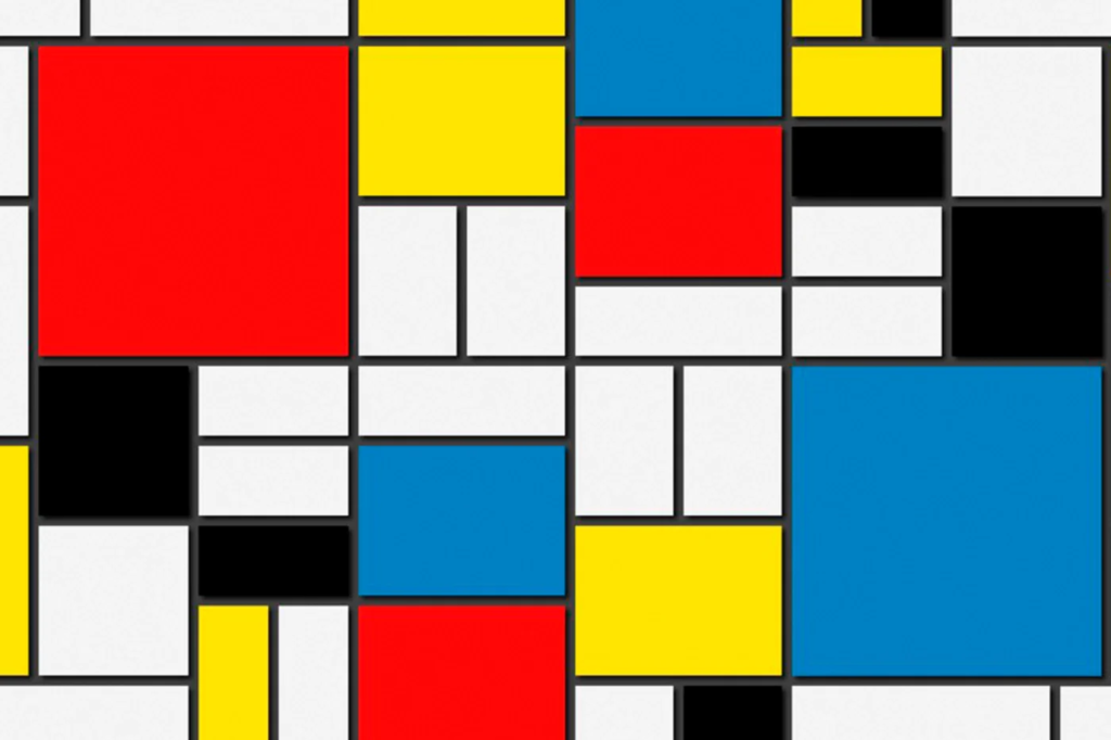
During the early 20th century, Piet Mondrian incorporated an art movement that allowed him to work around his abstract works, which formed a reductive theory – meaning a focus on simplicity rather than intricate/ detailed paintings. Stating in 1914, Mondrian said ‘Art is higher than reality and has know direct relation to reality.’ Describing through his style Mondrian shifted from figurative works to abstract art, explaining how art can reveal a type of reality through dynamic formations and variations, with one being formalism. Mondrian limited his colour use, to the three primary colours; blue, red and yellow, whilst still incorporating black, white and grey which was used as his base/background colours that brough the piece together. Alongside this Mondrian worked in two directions; horizontal and vertical. A confrontational effect is expressed through his art, shown through the specific, orderly layouts to the colours that are filled within each shape which work together to reveal a certain narrative, perhaps one we don’t understand as its just shapes and colour, so therefore it’s open for us to interpret. For me I think it is a very intelligent way of working. From working figuratively to then evolving into very abstract, structured, simple, limited use of colour type of work, but then still painting in a type of way to match the style of his reality (inspiration) I think is really effective as we learn his interpretation and perspective on his world- making it clear that art is higher than reality.

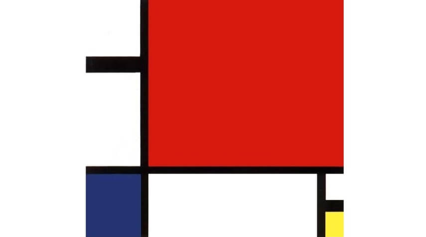
Piet Mondrian proposed a style called Neo-plasticism in which consisted of his own abstract style – primary colours, and horizontal and verical lines.
Mondrian was greatly inspired by impressionist techniques, in which he used particular techniques within his own work – in his own style. During the early 20th century, Mondrian evolved his work by using pointillist and cubist styles, also including other abstract mediums, followed by other techniques he had learnt. Mondrian stated, ‘the more basic the colour, the more inward, the more pure.’ (Piet Mondrian, openign statement) From visualising Mondrians work we notice this more and more, through the abstract use of bold, pigmented colour which perhaps suggests the term basic is in fact the most revealing and captivating form. It is inward in the sense you have to look into it, noticing the true beauty of the dynamic compositions of line, shape and colour, but also pure in the sense of its simple forms.
p2
“Seeing is a neglected enterprise” Saul Leiter (video, first quote)
Immersed within painting and photography since a teenager, Leiter found ways to incorporate both within his work, however his aim was never to create an obvious connection between them as they are still two separate works of art. ‘Photography is about finding things… Painting is different. It’s about making something.’ (Stated Saul Leiter, video) Leiter enjoyed using a brush, making a mark, then another, describing it to be a bit like ‘Jazz’ (Saul Leiter, Video)- you don’t know what your going to do next. In relation to formalism, (expressed through the defining abstract strokes of colour, outlined my more shapes and marks of colour, which instantly lures you in), Leiter expresses this through his own style expressing unique features creating a similar approach as you don’t know what to expect next. The loose strokes of colour creates a similar, mesmerising relationship- a bit like formalism describing how blocks of colour can be fitted together, to reveal an intense yet in-depth image.
An obvious relation is presented through his paintings and photographs, yet his aim is never to create an obvious connection. We can see his style of loose strokes of colour painted compared to what he looks for and how he captures his photos, both achieving very similar, abstract effects. The photographs look like strokes of colour, expressing a painted quality, whilst on the other-hand the paintings create this abstract up-close complexion of colour, making us ‘look twice’ at what it is we are seeing, as the colours and shapes are ‘merged’ together creating a similar feature seen in the photographs. From Similar perspectives, Leiter’s very prominent and abstract marks of colour create an interesting feature that strangely lures you in, as you wouldn’t expect strange (unsymmetrical) highly pigmented strokes of colour to be that engaging. Instead it is the hidden details and minor features, that entices you in – automatically making you see things differently from what they are. This effect continues throughout his photographs, as we’re presented with a confrontational perspective, where unique angles are expressed. It is clear Leiter’s work has a close connection to formalism. The colour creates very contrasting features as there is little of them, and they complement one another. Alongside the riveting lines, shapes, and patterns which are revealed, this therefore creates a captivating aesthetic because you wouldn’t expect all of these different features to work together and reveal hidden effects. It expresses street photography in a different light, meaning it attracts you. Leiter returned to New York in 1940, where he began experimenting with colour photography using slide film such as Kodachrome. Quickly becoming one of the most popular materials used for film; being lightweight, affordable, quick exposures allowed for producing brilliant, intense coloured images. ‘Leiter’s use of colour was subtle, yet impactful,’(Pioneering colour photography- line 4) .This further outlined that only a few colours were in fact needed to create contrasting visual effects. It shows how Leiter had an ability to use little colours, and through his painting knowledge of expressive marks to bold brush strokes further enables him to look at the streets differently -noticing lights, people, or just anything that he came into contact with, that act as his colours.
P3
Siegfried Hansen is a contemporary street photographer focusing on visual links to formalism; colour, geometry, abstraction and cityscape. Hansen looks through these visual compositions focusing on the graphics and colours found within the street. Hansen doesn’t focus on capturing people, instead he looks at the formations and relations found elsewhere, “It shows the Aesthetics of coincidence in a public area, which is full of surprises.” (Seigfried Hansen, line 2) The specific way coincidental features take form within the images, is exactly what makes them so intriguing, creating this sense of depth which forms a narrative. The diversity between the lines, structures, and signs combine with the architectural features, complementing one another whilst adapting to his abstract and graphical way of seeing. Hansen has this unique way of revealing surfaces, shapes and colour that would once go unnoticed, to now often being described as ‘poetic.’ (Leica Camera blog, line 6) Our attention is brought to unique perspectives and angles which would otherwise go unseen, creating a similar narrative and purpose, the same way a poem does – as the words are so powerful it makes you think twice of whats being described. In Hansen’s photographs the structure and bold shapes/ outlines create similar effects as we are confronted with it, resulting in us thinking twice. The abstraction within the photographs, confronts us with a new light relating to to a poem. Perhaps amplifying the fact that new things are constantly being revealed to us, explaining Hansen’s perspective of the world around him which could be different to ours.
Seigfreid Hansen takes photographs intuitively, using his ability to anticipate unusual situations then transforming them into multi facetted images. Further displayed in Hansen’s book ‘Hold The Line,’ we are confronted with abstract, unusual perspectives of a situation we aren’t normally shown, displaying a clear link to formalism. Rather than creating a specific meaning or narrative within the photo book, we are instead shown through visuals aspects of colour, composition, pattern, line and space which all work together achieving a formalist style. In response to Hansen’s style I created images with the same abstract, yet defined or structured way.
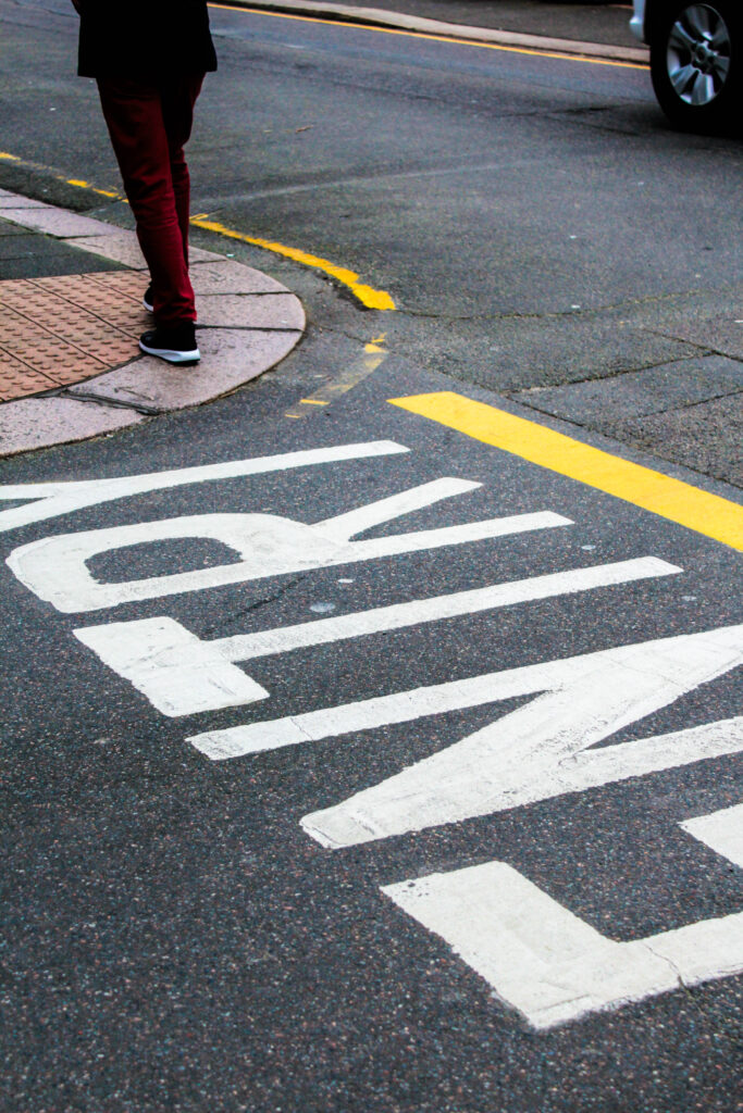
Within this photoshoot I liked this idea of road markings, then further increasing the vibrancy and saturation of colour when editing. Overall revealing unexpected angles and formations, especially as you wouldn’t normally choose to focus on the street ground. Instead this expressed an interesting distraction as shadows of people walking, bike wheels, legs and cars also came into the photograph.
Conclusion
Saul Leiter and Seigfried Hansen both interpret the theme formalism through their photographic responses in similar yet unique ways. A similarity being shown through how colour and composition is interpreted. Saul Leiter creates very hectic images, filled with life that overall creates this confrontational yet abstract effect making you question what is being photographed. Before photography took over, Leiter was an artist with his main inspiration comming from impressionism. Working with loose strokes of colour and marks that came together creating this abstract composition of colour, it was still present in his photography as similar techniques and skills were used. Followed by the colour came a structural element of lines and shapes which outlined and made the colour more prominent. Whether it being shadows, reflections, people or just interesting formations, they always without fail make to you look twice as it’s never obvious what is being presented. This is enhanced through a layered effect giving depth as when you look into the photo, because a lot is going on, you notice even more interactions of people and geometry that subtly fills the image. This creates a narrative as everything is connecting in ways you wouldn’t know until its being revealed to you.
On the other hand Seigfreid Hansen expresses colour and compositions in a similar way, but instead it’s more simplistic and refined. Hansen automatically focuses in on geometry and graphical elements that form the street, widening our vision of the streets. Hansen’s images display an obvious connection to formalism through this style of simplicity. He takes inspiration from your typical formalist painting, then expresses it in his own style of being found within the streets.

The simple use of colour, is further expressed within the photographs in a structured form. Capturing from abstract angles gives this direct approach, one you wouldn’t know before its photographed.
Bibliography:
(Saul Leiter: line 16) https://www.saulleiterfoundation.org/biography
Mauris Denic (tate: line 8:1890) Published manifesto titled: Definition of Neo traditionalism https://www.tate.org.uk/art/art-terms/f/formalism
1914 Piet Mondrian stated (line 10) https://en.wikipedia.org/wiki/Piet_Mondrian
Peit Mondrian – Evening:Red Tree Gemeentemuseum den Haag, Hague, Netherlands https://www.ideelart.com/magazine/piet-mondrian-artwork
Piet Mondrian – Composition II in Red, Blue, Yellow National Museum, Belgrade, Serbia https://www.ideelart.com/magazine/piet-mondrian-artwork
(Piet Mondrian, openign statement) https://www.piet-mondrian.org/
Saul Leiter (video, first quote) https://www.saulleiterfoundation.org/
Saul Leiter (video) https://www.saulleiterfoundation.org/
Saul leiter (video) https://www.saulleiterfoundation.org/
(Pioneering colour photography- line 4) https://proedu.com/blogs/photographer-spotlight/saul-leiter-master-of-color-in-street-photography-a-pioneers-urban-palette?srsltid=AfmBOopX8LW-V_29lHSs0z5jH_pYfF2itOAX582cDeEaF1q5LsumReP8
(Seigfried Hansen, line 2) https://siegfried-hansen.de/en/about-english-2/
(Leica Camera blog, line 6) https://leica-camera.blog/2021/03/29/the-flow-of-the-lines/
1. Research a photo-book and describe the story it is communicating with reference to subject-matter, genre and approach to image-making.
Siegfried Hansen takes pictured intuitively, using this ability to anticipate unusual situations, transforming them into multi-facetted images.
Hansen traces visual compositions from graphics and colours creating his unique style of ‘street photography,’ without showing faces or bodies. Instead he focuses on graphical ways and formalism elements. It shows both aesthetics and his coincidence within public spaces, as you never know what to expect next.
When I open up the book I see vivid blocks of colour defined through a compositional structure of a street or wall, revealing this in-depth approach as intricate details, texture, and shadows or reflections are revealed. The sharp photos makes us see things differently, altering our perspective as we are presented things from abstract and unusual angles. Closely linking to ‘formalism’. I love the unique layout, as the theme of ‘formalism’ is further expressed throughout. The photographs aren’t always displayed on the pages, they are broken up by plain coloured pages linking into the the previous photograph. I want to further experiment with this concept. We are faced with various and different subjects in each photo, further making us see things differently.
The title ‘Hold the line,’ is further expressed throughout as he photo shows this unique formation of lines, curves, and shapes.
2. Who is the photographer? Why did he/she make it? (intentions/ reasons) Who is it for? (audience) How was it received? (any press, reviews, awards, legacy etc.)
Seigfried Hansen – Hold the Line, Kettle, 2015, Dortmand
About
Street photography
Hardcover, signed
Street photography exists as a genre in incredibly many facets (any aspect that makes up the subject) and manifestations (object or action that clearly shows something abstract or theoretical). It is always about the right time to release the shutter, at the moment of capturing and how accurately to react to the subject. For Siegfried Hansen, street photography is not so much in the nature of reportage and documentation. What he is interested in is graphic elements, shapes, interwoven lines and structures that, when harmoniously related to one another, present an abstract image. Whereas in the photographs of key role model: Henri Cartier-Bresson and André Kertész, people play a major role. No more is shown than is needed to create an interesting and balanced combination of people and objects.“
3. Deconstruct the narrative, concept and design of the book and apply theory above when considering:
Pages: 56
Place: Dortmund
Year: 2015
Publisher: Kettler
Size: 20 x 27 cm (approx.)
https://josefchladek.com/book/siegfried_hansen_-_hold_the_line
There is a mix between layouts, portraiture and landscape
Exposed board cover, solid colour pages, thick matte paper, full bleed images, and a mix of portrait (one page for image, followed by a colour) and landscape pages (a double page spread) complement the graphic content.
“This is not about a particular city, but the graphic presence of the city. Through his attentive eye and smart design, Hansen has created a mini city symphony of line, shape and color.” Colin Pental
https://blog.photoeye.com/2016/01/book-review-hold-line.html
‘Hold the line,’ straight away draws us in as we
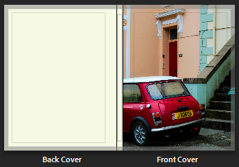
We are first presented with a landscape photo for both front and blurb. From the abstract angle and geometric print of clearly defined lines and formations of colour, straight away creates these intense leading lines. Followed by someone’s legs in the top-right-hand corner, who we may guess could be the subject/ focus. I like the fact they’re unrevealed. This simple yet effective front page makes us question the narrative and concept behind the book as we yet to figure this out, as no title is presented.
As you turn the page, we are presented with the metaphor (title) ‘Hold the line.’ We straight away question what is meant by this. This perhaps changes our perspective of a ‘line’ as we question what is truly meant by this. The title sticks with us throughout the book as we notice this more and more, experimenting with how the lines can be further expressed. Features that relate to this complement one another, colour, shadow, space and shape.
Hold The Line, doesn’t present an obvious narrative. However the subject of geometric, abstract and unusual compositions of street photography never fails to engage/ immerse you into the book, as you never know what to expect next. I feel Hansen’s unique approach/ style opens us up to a different style of street photography, one that we don’t typically see. Therefore this creates a different narrative, one that is open for the viewer to interpret. For me i like this different approach, seeing how colours are presented and complemented through shapes, shadows, and interesting compositions. This presentes this story of
Matt paper, hard back, full bleed,
When you flick through you see the unique structure that is expressed throughout, closely linking to the theme ‘formalism.’ Some double pages are broken up by full colour pages that complement the photo next to it, this is done through different ways. We can see the connection, as for some photos he is revealing a detail/ structural element through his choice in colour revealing this interesting and connecting concept. I feel to have a full colour page to break up certain images, with it having a close connection to the photograph expresses this uniqueness and difference as it reveals
Their is a unique layout displayed, with a mix between double pages spreads and singles pages. In a way the single pages are actually double pages, as full coloured complementary page colours that break this up up by full colour pages which complement the photo next to it. I find this effect interesting as we can see the connection, as for some photos he is revealing an intricate detail, ( strip of colour) or structural element through this effect, others it’s just a complementary colour.
We can see the connection, as for some photos he is revealing a detail/ structural element through his choice in colour creating this interesting concept.
There is no text throughout as no explanation is needed, making the book very visual and open for interpretation.
Literary sources: Go to this blog post here: Theory: Literary Sources and copy relevant key texts relating to the subject of your essay and list in alphabetical order in your bibliography. In addition, find your own key texts in relation to artists selected for in-depth analysis in your essay and list these too. These texts could be interviews with the artist, or reviews/ critique’s written by others. See useful online sites/ sources here .
Essay Question
possible-essay-questions-to-investigate
Some examples of Personal Study essays from previous students:
How can elements of Surrealism be used to express and visualise the personal……?
new topographics and traditional street photography
In what way can abstraction make visible what is invisible in the natural and urban landscape?
What is abstraction exactly?
……..William Klein’s confrontational approach to street photography?
Essay Plan
Make a plan that lists what you are going to write about in each paragraph – essay structure
‘To photograph is to appropriate the thing photographed.
It means putting oneself into a certain relation to the world that feel like knowledge– and therefore, like power.’ (Sontag 1977:4)
‘To collect photographs is to collect the world.’ (Sontag 1977)
“I happen to believe in the beauty of simple things. I believe that the most uninteresting thing can be very interesting.”
Saul Leiter
Introduction
Saul Leiter suggest that what goes unnoticed is in fact the most exciting. The fact that we are almost unaware our surroundings of unique shapes and formations, with the only way that we truly see it is through abstract approaches. Throughout my personal study I aim to investigate street photography and how it can be portrayed through various ways. I believe there is more to street photography and that it’s not just a standard photograph of a building, it’s in fact different visual elements such as vibrant colours, unusual shadows, textures, and patterns, to diverse formations and compositions that all intertwine, overall creating these contrasting effects. All these visual elements are otherwise known as formalism, compared to what we see on the streets it shows a very similar effect. The way colours are distinguished between more colours, separated by distinct lines is further represented within the streets whether we notice it or not. My aim is to bring this to life, presenting this through very abstract and diverse approaches, and makes you question the photo as it is so unrecognisable. Siegfried Hansen perfectly describes formalism. His similar approach overall achieves abstract, unrecognisable images, that are so bold and full of colour and life it changes our perspective of our surroundings – viewing things for their details and unique features that define them. Saul Leiter expresses this more excitingly, expressing very hectic and busy images, however are clearly defined through formations, colours, and shadows. I am going to investigate various visual elements such as colour, formations and shadows and how they present their own narrative as we engage in different ways. Producing my own response in a formalist way, will create depth and meaning behind what I capture. More meaning will be revealed as I capture things in an abstract approach for example the colours chosen and formation expressing how uninteresting images can be made more interesting.
Formalism
Formalism is a study of art, where compositional elements are presented to us through elements of colour, line, shape, and texture. Rather than focusing on a specific meaning, reason of creation, historical background or context within the photo, (that goes unnoticed), we therefore consider the medium used or visual elements that is presented to us through such expressive and dynamic formations. The colour wheel greatly impacts formalism, as the small selection of colour complements one another therefore creating a very appealing and engaging feature.
Formalism is the most important aspect of art, presented through visual aspects rather than narrative content -connecting closely to the outside world. Within this we see a dynamic relationship of colour, brushstroke, line and composition. Isaac Newton developed the colour wheel based on his findings. Proving that white light was not a single entity, instead it was composed of a spectrum of colour combining to make white, otherwise meaning white is a source of all colour. Newton’s experiment consisted with passing a thin beam of sunlight through a prism which produced a spectrum of colours – red, orange, yellow, green, blue, indigo and violet. Then by placing an inverted prism in the path of the coloured light beams, combined the colours producing white once more.
Piet Mondrian (Dutch painter) incorporated an art movement that worked around his abstract works, becoming introduced in the early 20th century. A reductive theory was all created from this, where by taking a larger scale image, brought it to life, focusing closely on the architectural works, sculpture forms, and graphic arts as well. Mondrian was greatly inspired by impressionist techniques, in which he used certain technique’s within his own work. Similar to Van Gogh, Mondrian uses ‘pure, glowing colours and expressive brushwork in which was influenced by pointillism. During the 20th century, Mondrian started to use pointillist and cubist style, also including other abstract mediums, followed by previous techniques he learnt. He said, ‘the more basic the color, the more inward, the more pure.’ (Mondrian reference source) Visualising Mondrian’s work, we notice this more and more. Through his abstract style and bold use of pigmented colour, perhaps suggests ‘basic’ is in fact the most captivating. It is ‘inward’ in the sense you have to look into it, where you notice the true beauty of the dynamic – the compositions of line, shape, and colour.
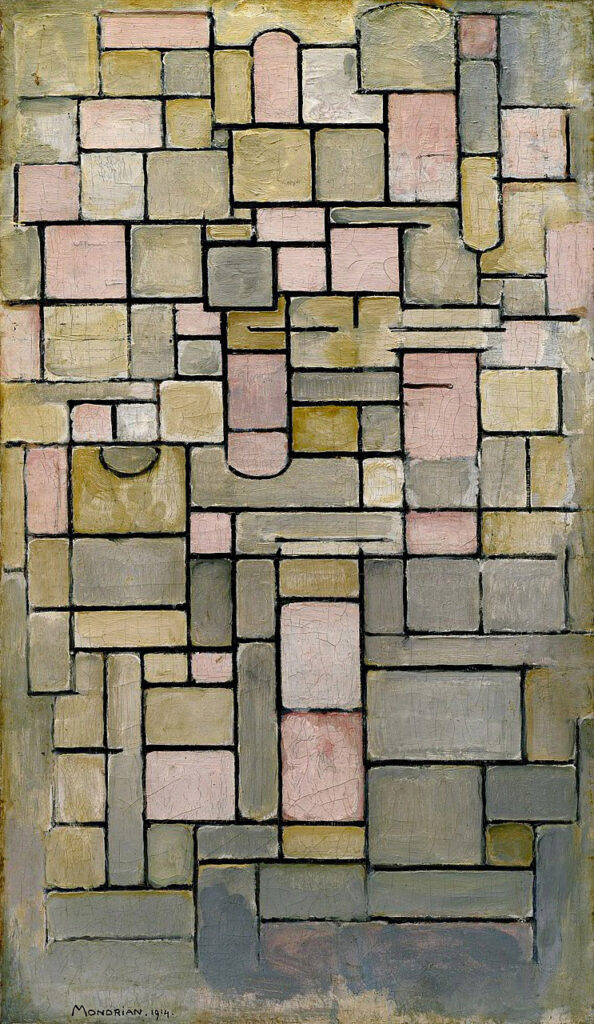
image captions; artists name, title, year
Having seen cubist paintings by George Braques and Pablo Picasso in 1911, Mondrian moved to Paris where he painted Tableau No. 2/Composition No. VII. Mondiran was greatly inspired by cubist paintings. From looking at tree to, scaffolding with interlocking black lines. Having spent years in Paris, he later returned to Holland (home) in 1914, and began to work on an abstract form of art which was later classified as a neoplastic style. The work he produced during this time wa
Saul Leiter
“Seeing is a neglected enterprise” Saul Leiter
Immersed within painting and photography since a teenager, Leiter found ways to incorporate both within his work, however his aim was never to create an obvious relation between them as they are still two separate works of art. ‘Photography is about finding things,’ Leiter said. ‘Painting is different. It’s about making something. (Leiter) Having enjoyed both types of art, Leiter couldn’t decide which he preferred, so did both. Leiter enjoyed using a brush, making a mark, then another, describing it to be a bit like ‘Jazz’- you don’t know what your going to do next. In relation to formalism, (expressed through the defining abstract strokes of colour, outlined my more shapes and marks of colour, which instantly lures you in) Leiter expresses this through his own style expressing unique features, creating a similar approach as you don’t know what to expect next. The loose strokes of colour creates a similar, mesmerising relationship- a bit like formalism describing how blocks of colour are fitted together.
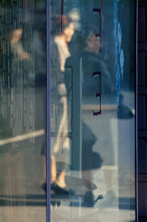
image captions; artists name, title, year
An obvious relation is presented through his paintings and photographs. We can see his style of loose strokes of colour painted compared to how he captures his photos, both achieving very similar, abstract effects. The photographs look like strokes of colour, expressing a painted quality, then the paintings create this abstract up-close complexion of colour, making us ‘look twice’ at what it is we are seeing, as the colours and shapes are ‘merged’ together creating a similar feature seen in the images. From Similar perspectives, Leiter’s very prominent and abstract marks of colour create an interesting feature that strangely lures you in, as you wouldn’t expect strange (unsymmetrical) highly pigmented strokes of colour to be that engaging. Instead it is the hidden details and minor features, that entices you in – automatically making you see things differently. This effect continues throughout his photographs, as we’re presented with a confrontational perspective, where unique angles are expressed. It is clear Leiter’s work has a close connection to formalism. The colour creates this contrasting feature alongside the riveting lines, shapes, and patterns which are revealed, therefore creating this captivating aesthetic.
Leiter returned to New York in 1940, where he began experimenting with colour photography using slide film such as Kodachrome. Quickly becoming one of the most popular materials used for film; being lightweight, affordable, quick exposures allowed for producing brilliant, intense coloured images. ‘Leiter’s use of colour was subtle, yet impactful,’(Pioneering colour photography- line 4) https://proedu.com/blogs/photographer-spotlight/saul-leiter-master-of-color-in-street-photography-a-pioneers-urban-palette?srsltid=AfmBOopX8LW-V_29lHSs0z5jH_pYfF2itOAX582cDeEaF1q5LsumReP8
Described through the use of muted tones and soft palettes of colour, create this minute, tranquil effect with an unobvious effect made to be very obvious. ‘Atmospheric images that evoked emotion and mood.’ Correlating to the simple use of colour and the subtle impression we get, this in fact creates an opposing effect creating enhanced character and heightened emotions. ……..
By 2006 was the release of his monograph, Early Color, which ‘revealed radically innovative compositions and a ground-breaking mastery (colour theory) that permanently changed the history of colour.’ However this didn’t apply to all of his work, as he refused to give meanings or background within his fine-art-photography. “I don’t have a philosophy,” Leiter said. “I have a camera” https://www.saulleiterfoundation.org/
Leiter said “The world is full of endless things, and there are many beautiful things around us, they (us as people) lack the imagination to see what is around us, is actually sometimes very beautiful.” (Leiter reference source)
Some of his work was written in his own neighbourhood “the street is like a balllet, you never know what is going to happen,” (Leiter reference source)
Le
https://www.saulleiterfoundation.org
Siegfried Hansen is a contemporary street photographer focusing on visual links to formalism; colour, geometry, abstraction and cityscape. Hansen looks through these visual compositions focusing on the graphics and colours found within the street. Hansen doesn’t focus on capturing people, instead he looks at the formations and relations found elsewhere, “It shows the Aesthetics of coincidence in a public area, which is full of surprises.” https://siegfried-hansen.de/en/about-english-2/ (line 2) The way coincidental features take form within the images, is what makes them so intriguing creating an in-depth narrative. The diversity between the lines, structures, and signs combine with the architectural features, complementing one another whilst adapting to his abstract and graphical way of seeing. Hansen has this unique way of revealing surfaces, shapes and colour – that go unnoticed often described as ‘poetic.’ https://leica-camera.blog/2021/03/29/the-flow-of-the-lines/ line6. Our attention is brought to unique perspectives and angles which would otherwise go unseen. Relating to this poetic theme it gives a sense of rhythm as new things are constantly being revealed to us as it is Hansen’s perspective of the world around him, perhaps communicating a different world. ‘Colour can make the motif appear even stronger,’ (Hansen reference source) Having mainly worked in black and white the motif (design) was the most important and what Hansen focused on. However Hansen figured by adding colour, the motif could easily be made even stronger. This meant coloured images could easily be turned into black and white because the motif was so strong.
When Looking a Siegfried Hansen work, I notice the simplicity straight away that lies within the dynamic formations of colour and shapes. I produced a series of images which i felt would challenge the viewers, as your being confronted by a unqiue perspective.
https://leica-camera.blog/2021/03/29/the-flow-of-the-lines
https://siegfried-hansen.de/en/about-english-2
show how ive responded 1 / 2 examples
Sontag, S. (1977) ‘In Plato’s cave’ in On Photography. London: Penguin Books.
https://www.historyofinformation.com/detail.php?id=3666
https://www.clerkmaxwellfoundation.org/html/first_colour_photographic_image.html
Mondrian, P. https://www.piet-mondrian.org
Leiter, S. (painting section) https://www.saulleiterfoundation.org/#:~:text=He%20maintained%20a%20lifelong%20habit,such%20as%20Bonnard%20and%20Vuillard.
https://www.saulleiterfoundation.org/color
Essay writing: Here is a link to another blog post which will provide you with guideline about how to structure each paragraph in your essay.
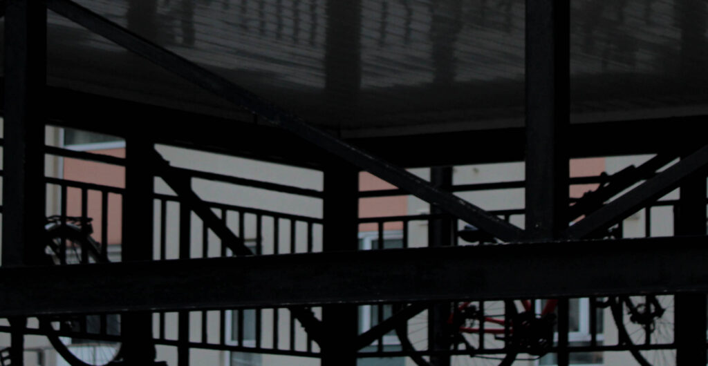
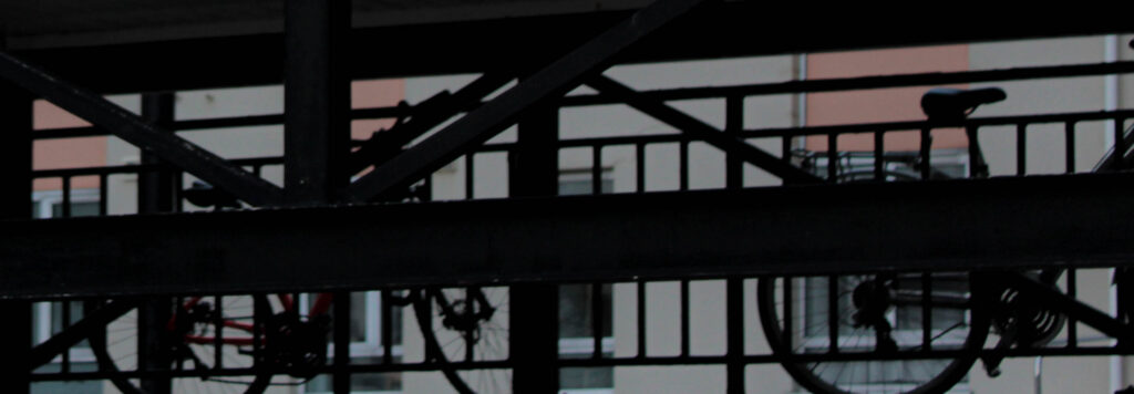
I decided to experiment with cropping and how interesting an engaging images can be captured from this. Inspired by Siegfried Hansen, his style of capturing images that are unrecognisable, but still show a unique and gripping narrative and character, as the areas he’s zoomed in on highlight unique features which I feel show give an interesting perspective. I liked this idea of making the photograph unrecognisable but instead show this in-depth abstract commotions of colour, that is clearly defined by structured elements, of lines, patterns, shapes and shadows.
Experimenting with cropping:
Edits
Edits
Edits
Edits
This photoshoot I focused on colour, and unique compositions that are revealed when captured from an abstract angle/approach. I achieved this by capturing photographs from particular view points – close-up shot, to more far away views. For each photo I had in mind the compositions and how I could achieve a unique, unusual angles from this. I further experimented with cropping the photos, to further make the photo unrecognisable through this very abstract angle. I wanted to achieve this effect, where only colour was visible, further defined by the lines, patterns, silhouettes and structured of outlines and shadows. To achieve this effect I chose certain areas from the original, which I though could be interesting and could achieve different focal points. This means that different details and features of the photo could be visible further creating interesting/ in-depth character.
To develop this further, I am going to focus more on the angles I use when I capture the photo, paying close attention to the the formations/ shapes and patterns, then capturing from angles in a similar way. I feel this will enhance the details further creating very gripping and engaging images, as I following the same effects.
I am going to capture more interesting angles found from unique compositions I find
Experiemnting with cropping


Process
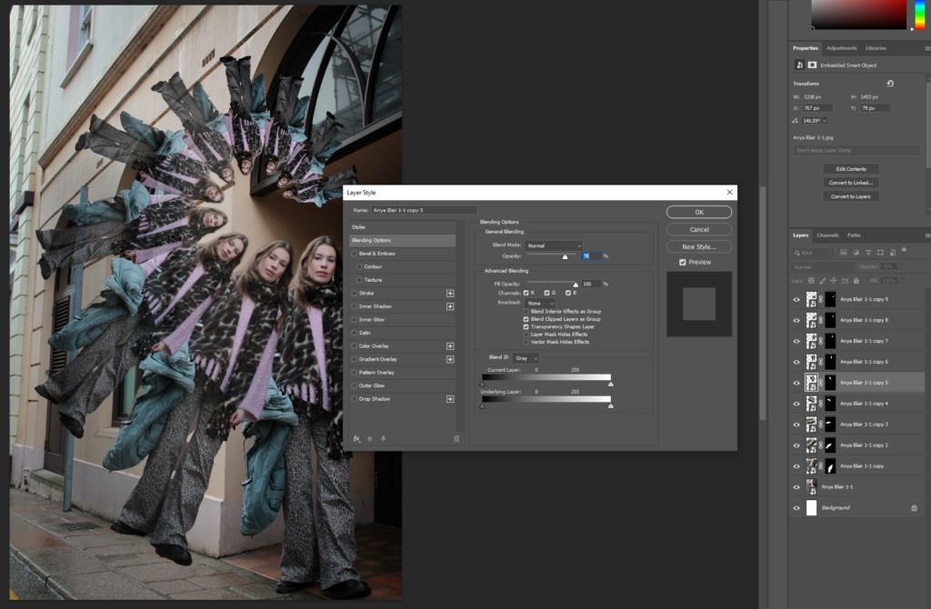
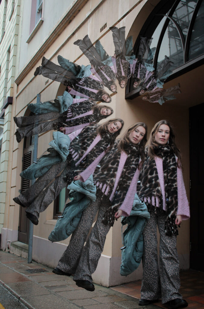
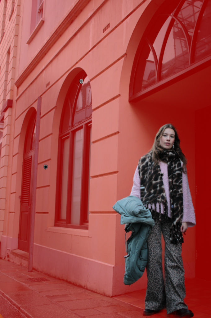
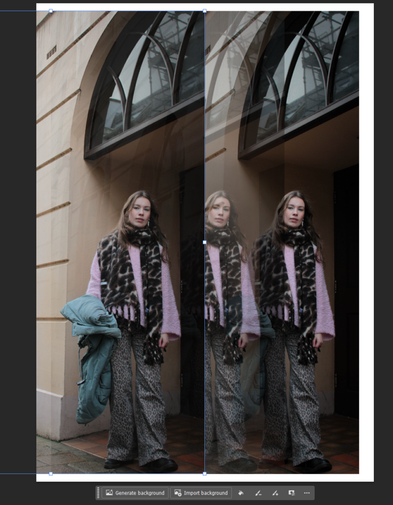
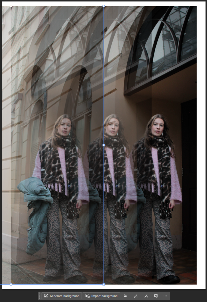
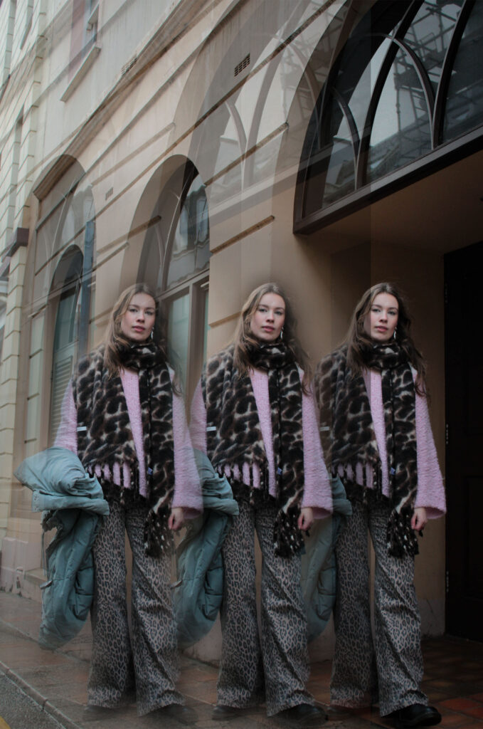
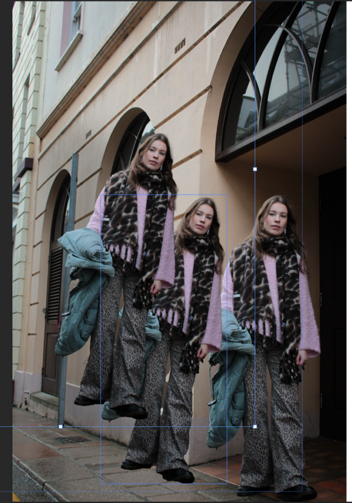
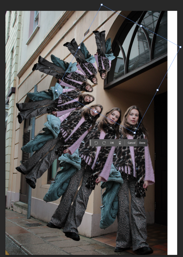
For the editing process I adjusted the subject and background separately. As you can see I highlighted the subject and increase the exposure whilst adding in contrast and shadows to give extra depth and highlights. I did the same for the background, however decreased the exposure to make it darker so that the subject would pop out in front of the background. This then enabled me to create more clearer and repeated patterns in the images, because the subject is always standing out against the darker background.
Edit 2
Final
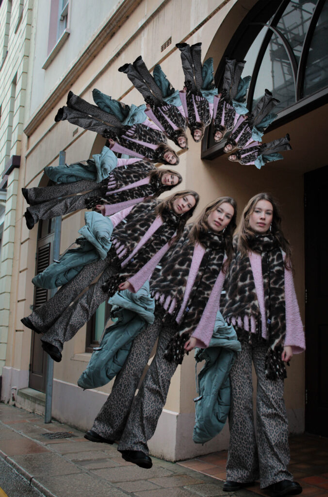
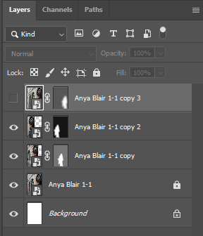
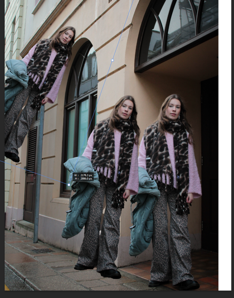
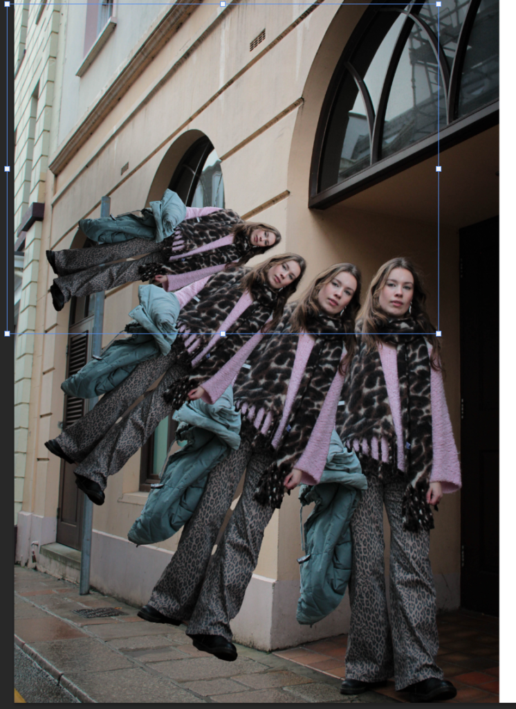
Further Adjusted
For this I further adjusted the images to softly make them fade off into the distance, or as you follow the pattern and sequence of the repeating images. From having created the mask layer, I was then able to adjust the blending options therefore leading to decreasing the capacity gradually for each person which creates the fading look. I feel this way it instantly creates more depth as each one is fading gradually away from you, until it is almost unnoticeable. It also add a 3D effect, as if the image is popping out from the background, this makes your eyes move into the direction the spiral is heading, creating interesting leading lines.