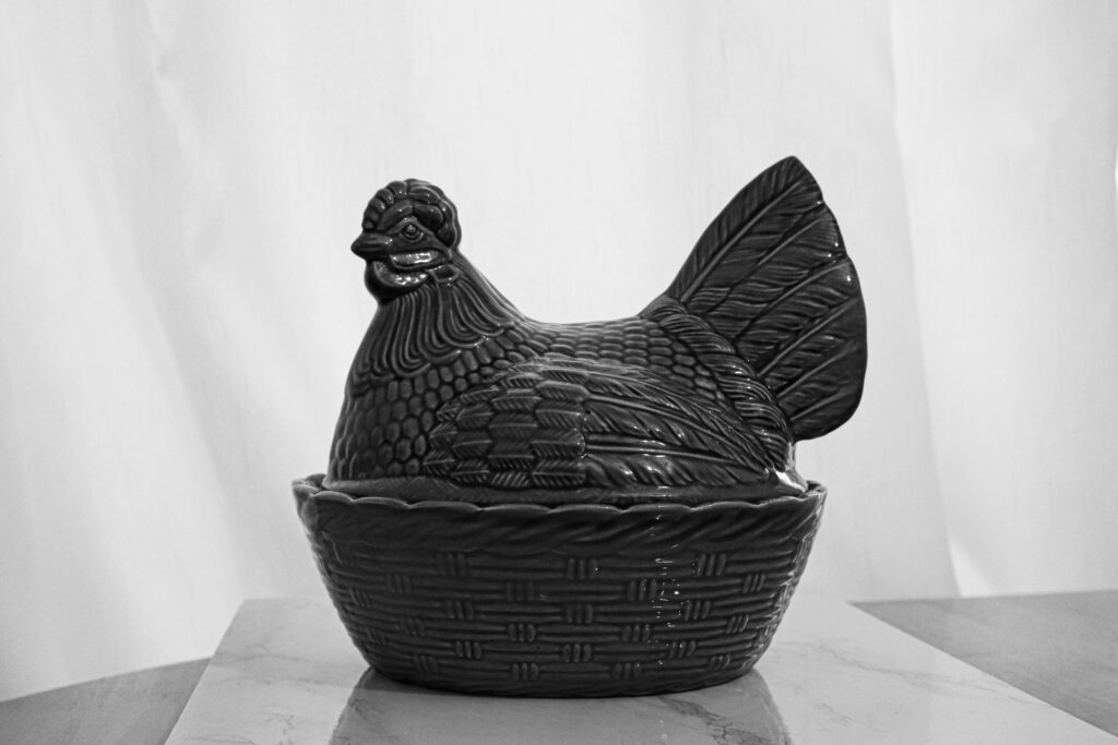
This chicken belongs to my Grandmother and is from 1980. I chose to edit this image black and white along with the other images of objects as it gives the idea they are linked to the past.
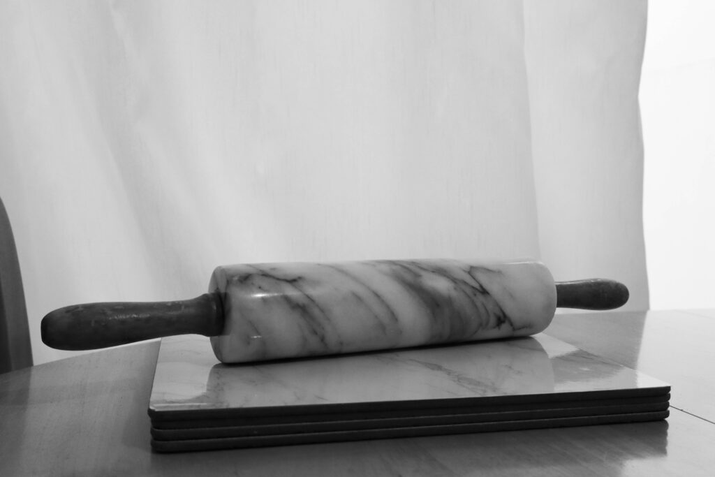
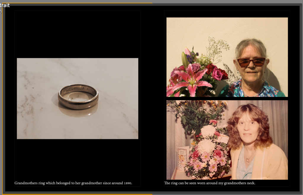
This was a wedding gift to my grandmother during 1971, and has stayed with her ever since.
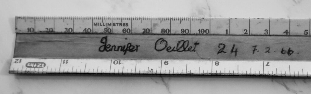
This ruler was given to my grandmother during 1966, when she was 14, and she has kept it since then.
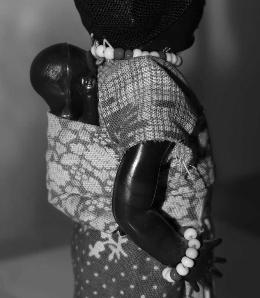
This is a close up of a doll given to my auntie as a gift from her friend who visited caketown during 1989.
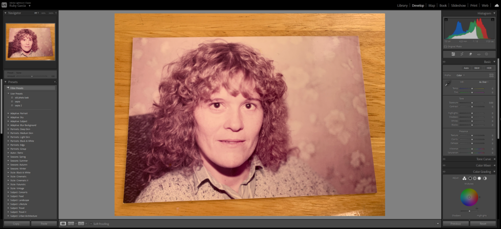
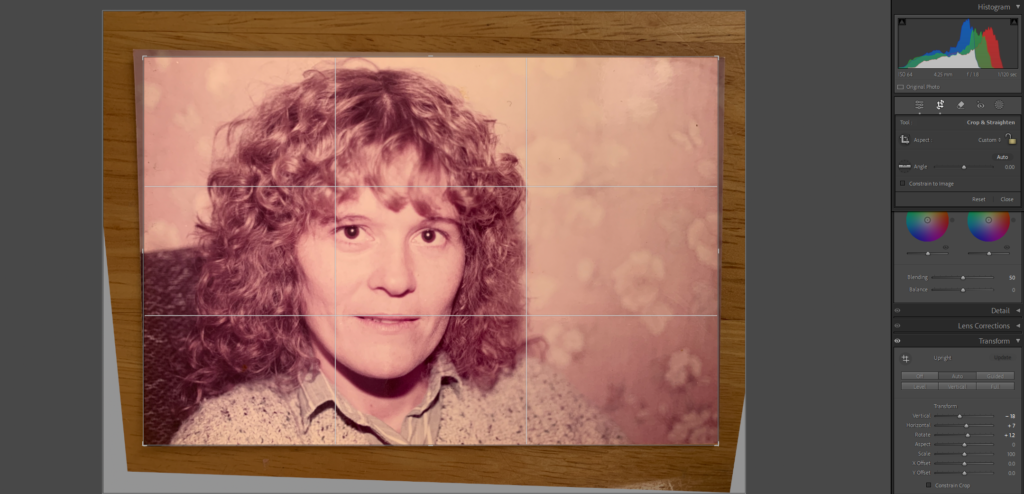
In my photobook I am going to include both old images as well as new ones which I have taken. For these old photos I am going to crop and transform them so that there is nothing in the background.
Adjusting my images:
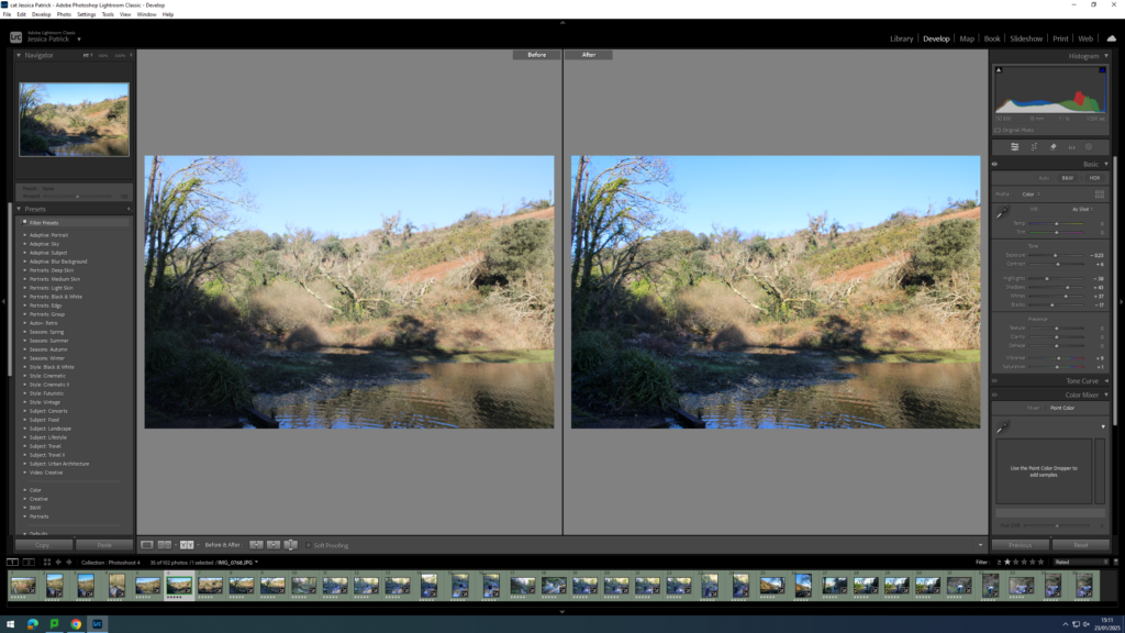
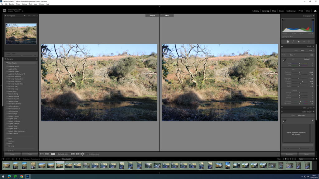
For majority of my old images the table is visible in the background. To fix this I am going to use lightroom tools to adjust it so that the photo is the only thing visible.
To do this I used the ‘transform’ option and adjusted the image slightly horizontal and vertical. I also rotated the image.
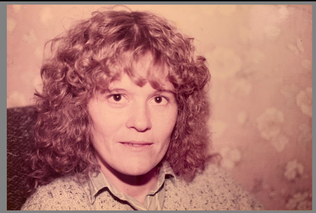
Finally I cropped the image after adjusting it. I will not make any other edits to the old images as I want them to have the same look as they already do.
Before:
After:
Making adjustments:
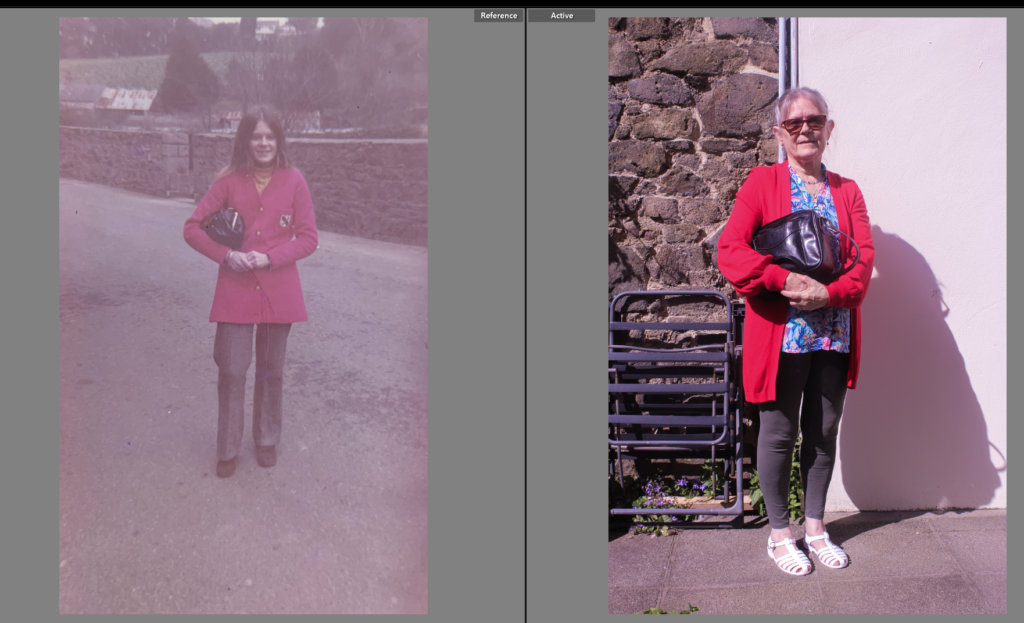
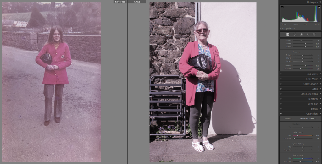
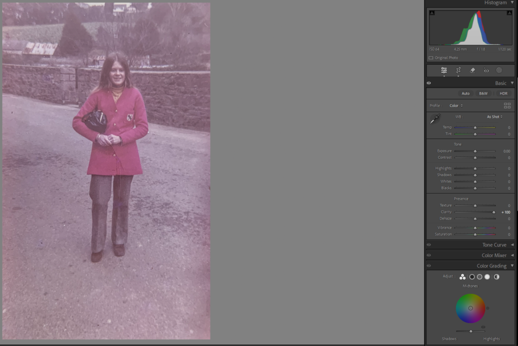
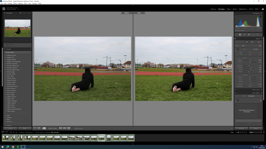
1: I have adjusted the image on the right so that it is a similar tone to the original image. I will put these onto the same page therefore I want them to be the same sort of tone.
I also chose to adjust the hue and saturation of certain colours such as red as i found the red jacket to be too vibrant in the original image.
I also chose to increase the clarity on the original image as it is sort of grainy as it is a very old image.
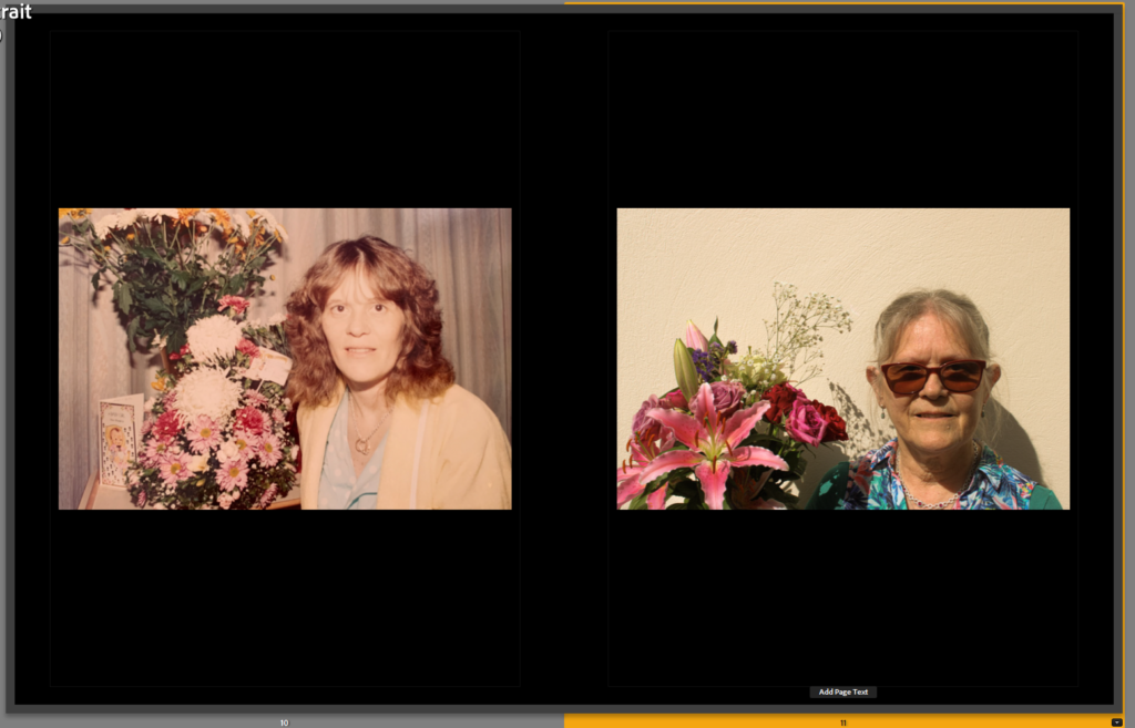
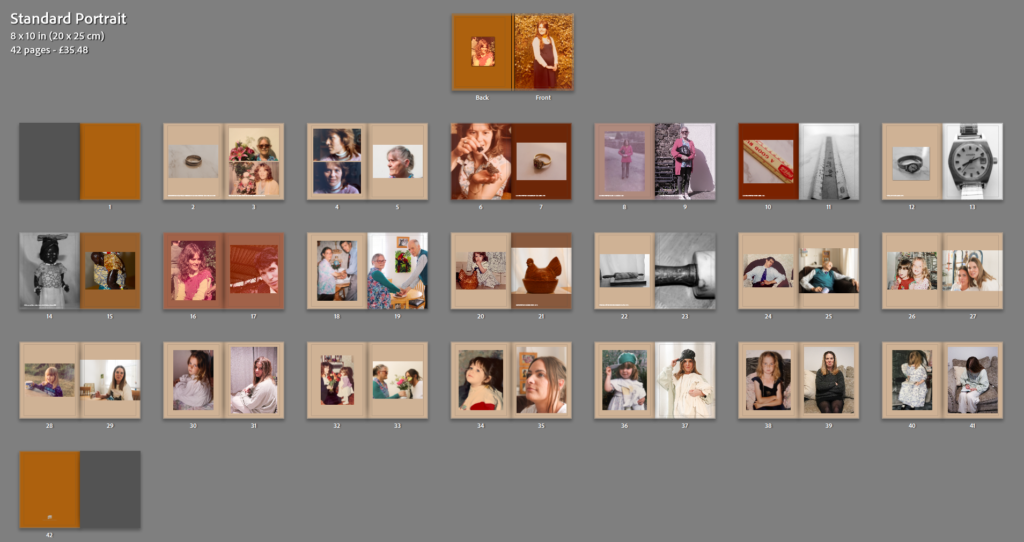
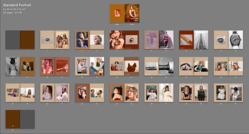
These two pages are two ideas, I perfer the second one which includes the wedding ring and the two photos on the second page.
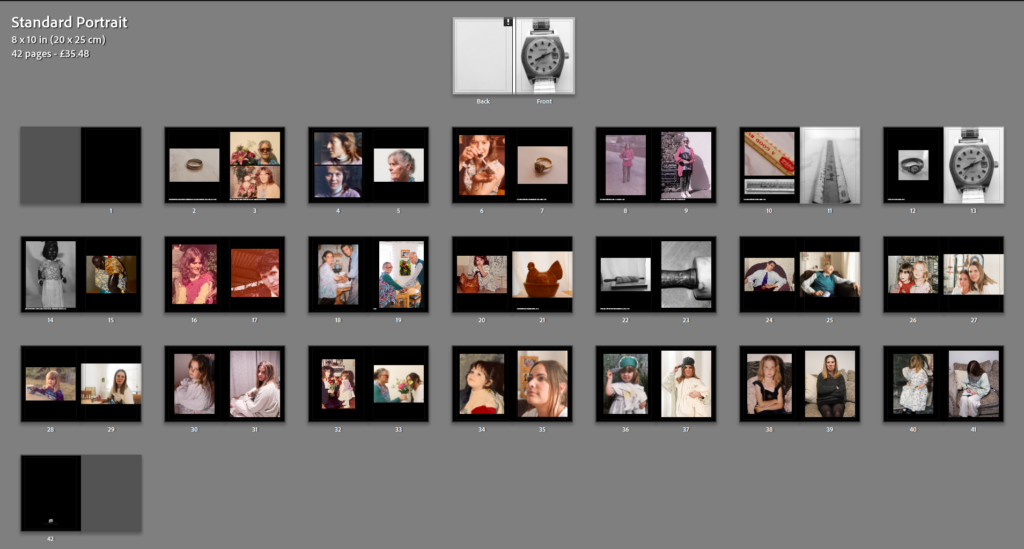
My layout
Front + Back cover ideas:
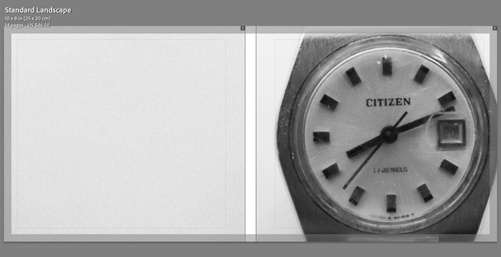
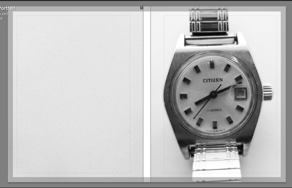
I am planning on using a watch for my front cover as my project is based on the past and how we change over time as well as memories. Therefore a clock will emphasise this meaning.
I decided to try a different colour for the background of the book, I then noticed that the front cover didn’t really suit the colour of the pages. Therefore I decided to change the front cover to a more warm toned image of my Grandmother.
I then experimented with adjusting the colours of individual pages to suit the images on them.
How can photographs be a way to connect to the past and a way to create a sense of nostalgia?
‘the power to photograph, the power to archive, the power to create a certain set of memories.’ 1– Collin Pantall
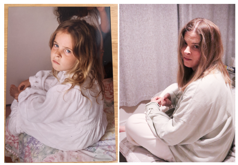
In my personal project I have chosen to explore the theme of nostalgia through photography. Nostalgia is a sense of longing affection for a period in the past, photography is a great way to create this sense as it allows you to capture this moment in time and lets you look back on these moments. To do this I studied the photographer Irina Werning whose most known project, “Back to the Future”, is all about nostalgia and how photography can be a way to reconnect to the past. To respond to Werning I looked through old photo albums to gather images which I was planning to recreate. In doing these photoshoots a sense of nostalgia was created for the models recreating these images, it was like reliving the past. Alongside Werning I also studied photographer Samiksha Chaudhary who created a project which also relates to nostalgia and memories. In my response to Chaudhary I photographed my families old objects, specifically my grandmothers. Whilst doing this I learnt more about my families past as I was told stories which accompanied each of the old objects.
Nostalgia itself goes back to the 17th century the Swiss medical student Johannes Hofer described the feeling of nostalgia as a disease, and those who felt it suffered from an ‘afflicted imagination’ 2. This was seen as a dangerous condition and it was thought to be caused by an imbalance of the four bodily fluids, which was a huge cause of disease in this era. It was also believed that it could cause physical health issues, especially if those affected were away from their native places for prolonged periods. It was not until the 18th and 19th centuries that nostalgia began to shift from a sickness to an emotional experience. The Romantic period was when nostalgia really began to be understood as a universal human feeling, an emotional reaction that was linked to memory as well as identity. Today, nostalgia is considered to be a complex emotional state which can create both positive and bad feelings.
Irina Werning:
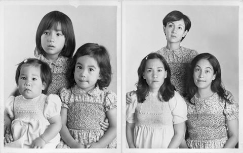
Irina Werning is a freelance photojournalist who focuses on personal long-term projects. She is based in Argentina and has a bachelor’s degree in economics, a master’s degree in history and a master’s in photojournalism. Werning won the Ian Parry Scholarsip in 2006, the Emerging photographer fund in 2012, and he first place Sony world photography award for portraiture in 2012. Irina Werning became world-famous as a result of her project ‘Back to the Future’. In this project Werning photographed people as they reenacted their childhood portraits. This unique series shows how people look and feel 20 years after their childhood portraits, Werning took her camera and portrayed hundreds of people as they go back to their future. She was inspired to create this project after she scanned some older photos and after she ended up in one of the locations where one of these photos had been shot.
In this image taken by Irina Werning, three relatives have come together to reenact an old portrait of the three of them when they were younger. Although this may not create a sense of nostalgia for the viewer, it would have created one for them as it is a recreation of a time in their childhood. In her book The Photography Reader, Liz Wells stated, ‘memories evoked by a photo do not simply spring out of the image itself, but are generated in an intertext of discourses that shift between past and present.’4 This suggests that the sense of nostalgia created from old images is subjective to the viewer. One viewers may see an image as nostalgic whereas another may not, this is because everyone has a different past and presence which may not connect to these images in an emotional way.
My response to Irina Werning consisted of me photographing mainly my mother. When recreating these old found images it created a sense of nostalgia not for me but for her, as she was the one who lived the moments captured in these photographs. This adds to the concept that the feeling of nostalgia is subjective as everyone gains a sense of nostalgia from different things depending on their past.
Samiksha Chaudhary
Samiksha Chaudhary believes objects function as memory keepers and he found himself reliving these memories through photography. This all began in lockdown when Chaudhary found himself stuck in Mumbai, whilst his parents were back home at Calcutta. Chaudhary found this time lonely as he missed his parents, therefore he aimed to revive and relive little moments which were created by these objects. He released a set of photographs taken of these objects as part of a bigger collection which he previously shot during 2019 whilst being at home with his parents. Chaudhary found photography to be a way of tracing back memories all the way to his childhood. It was also a way to feel closer to his parents and a way to hold onto old memories. Each of his unique objects tells a story which takes him back to his home. Chaudhary wishes to capture the object’s value to his personal history, rather than the value of them. These objects create a mental map to his childhood and they are also a way of knowing his family’s history. With the objects laid out they all tell a story. They capture a lifetime within them, not only his own but also that of his parents and relatives.
This image by Chaudhary is taken of a wooden doll, a wedding gift to his mother. It held a small vial of perfume and this amongst many other objects were showcased in his home when he was growing up, some were inherited whereas some were received as gifts, and some were collected by his parents themselves, mainly his mother.
In my response to Chaudhary I chose to photograph mainly my grandmothers old items, one of which being a ruler from when she was ages 14 during 1966. Whilst photographing many of these objects I gained a sense of nostalgia as she told me the stories which accompanied each of these valued items, despite not experiencing this time period myself. Looking at all these old items also allowed her to travel back in time through bringing back old memories which she has connected to these objects.
To conclude, photography can be a way to connect someone to the past. This can be seen in both Irina Werning and Samiksha Chaudhary’s work, however they both create this sense of nostalgia in different ways. For example, Werning focuses on portraiture and reenacting older images, reminding people of those times in the past and reliving old memories. This sense of nostalgia was felt by my family members when I photographed them restaging old images. On the other hand Chaudhary photographs objects of his parent past, creating new memories of a time he didn’t experience. Which is what I experienced when photographing my grandmothers old items, I felt a sense of nostalgia for a time I didn’t experience. Overall photography is largely linked to nostalgia as it is a way to both relive old memories as well as gain new memories of the past.
Bibliography:
Collin Pantall (2019) Remembering the Past, Remembering the Present. Location of site: Here↩︎
Johannes Hofer (1688) Coming home again. Location of site: here (Page 2) ↩︎
Image from project ‘Back to the Future’. Location of image: here↩︎
Annette Kuh (2003) Remembrance The child I never was. Location: here↩︎
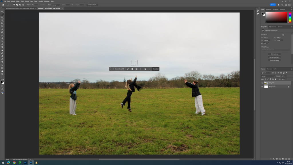
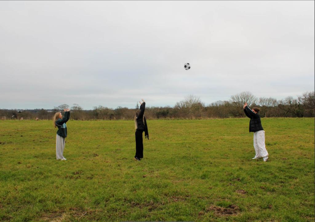
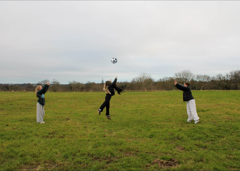
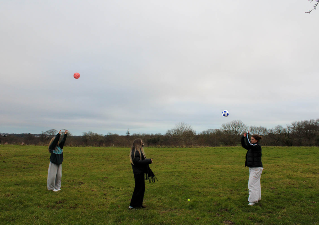
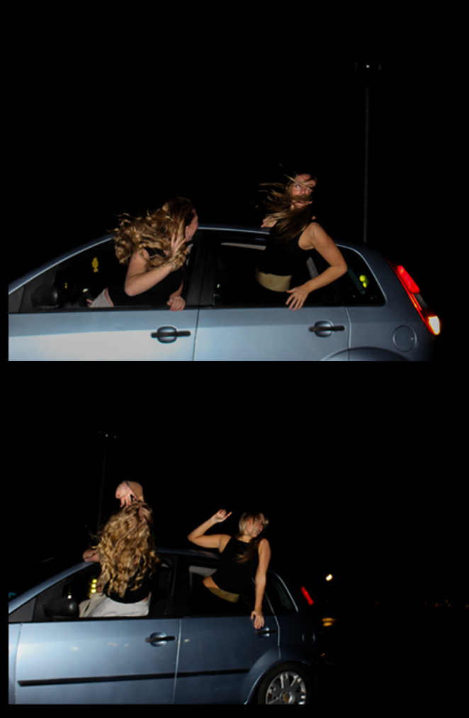
During one of my photoshoots, I had a set idea of what I wanted the narrative of my image to be, which was catch/ piggy in the middle. However, this narrative needed the props of balls, which I did not have, so instead of just not doing the photoshoot, I am going to AI balls into my images.
Edits
First, I drag the image I want to edit onto a photoshop document. Next, I select the rectangular marquee tool and select where on the image I want the AI to be.
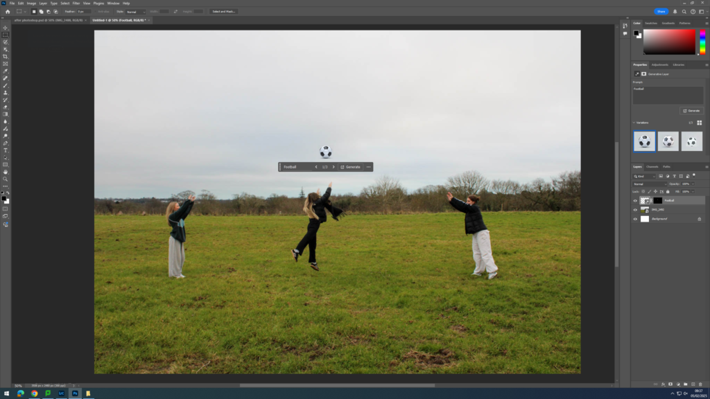
Next, I type in what I want to generate, which is a football in this case.
Next, I can pick between the options it has given me, or change my search slightly, until I am happy with the result.
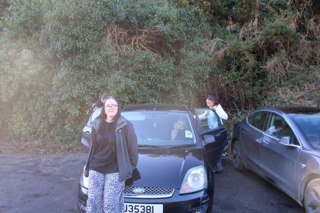
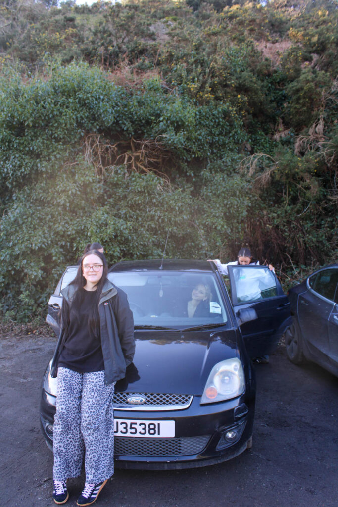
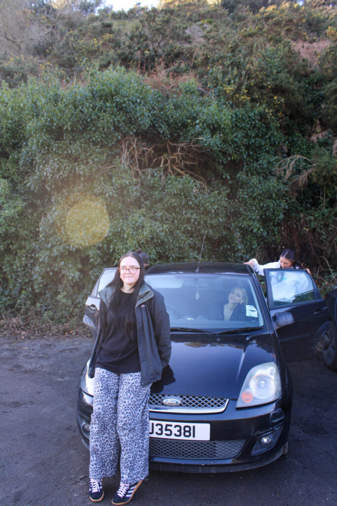
For this photoshoot I visited the field next to Jersey Dairy, where weekender used to be. The setting of this photoshoot doesn’t particularly relate to the themes of youth and identity, as this isn’t somewhere I used to visit except when I went to weekender, but it was a good setting to display the narratives I had in mind. The setting also correlated well with the settings used in Justine Kurland’s book. The narratives I wanted to display here was playing catch/ piggy in the middle, hula hooping and playing hide and seek.
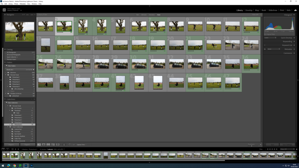
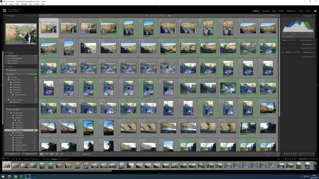
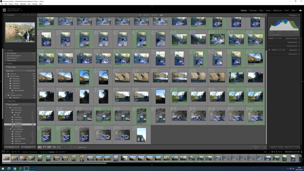
Contact Sheet
The images which are highlighted green are the images I have chosen to edit, because they are my best images with the best composition that fits my themes of youth and identity the best.
Edits
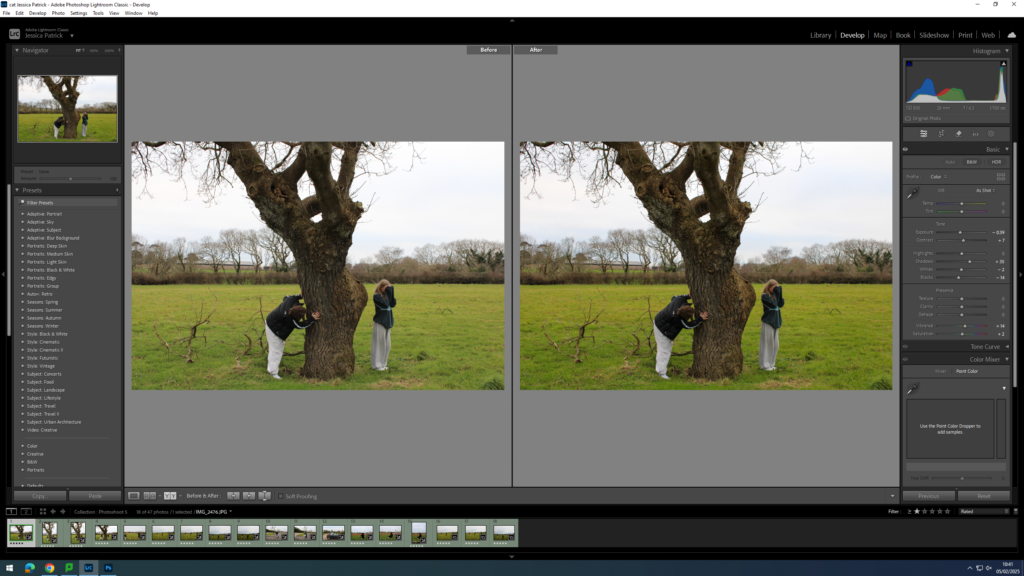
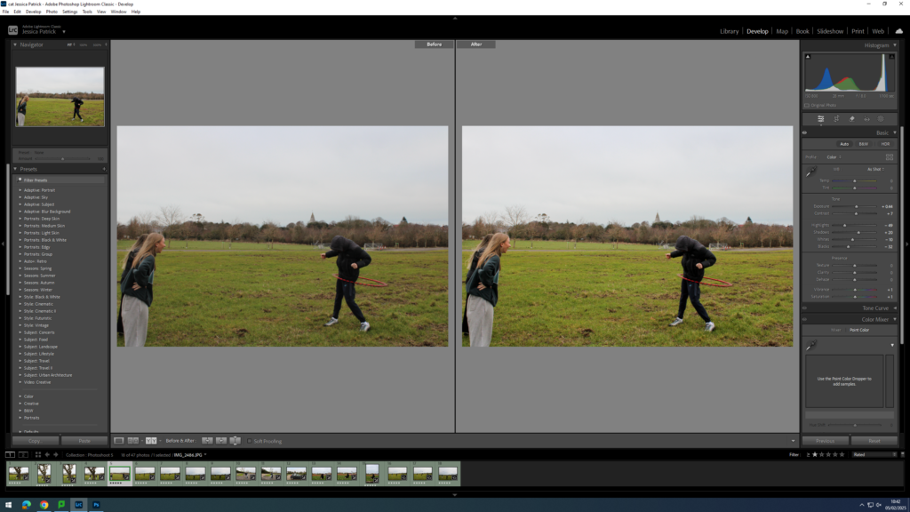
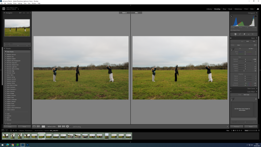
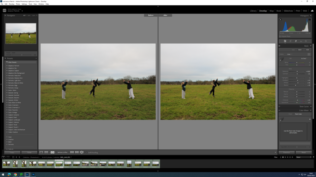
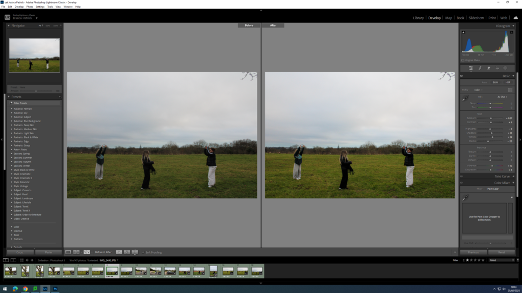
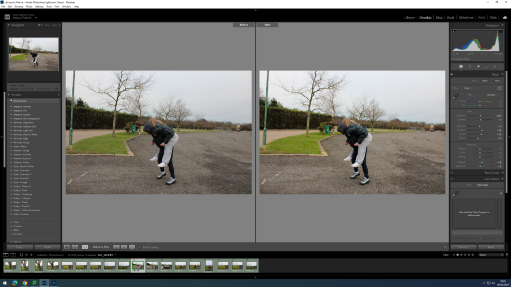
I edited this image by increasing the contrast, shadows, vibrancy and saturation, while decreasing the exposure, whites and blacks. I did this so that the image would be more vibrant and saturated, specifically the green grass.
I edited this image by increasing the contrast, shadows and saturation, while decreasing the exposure, highlights, whites, blacks and vibrancy. I did this, so that the image had better lighting and was more saturated.
I edited this image by increasing the exposure, contrast, shadows, whites, vibrancy and saturation, while decreasing the highlights and blacks. I did this, so that the image would have better lighting and be more vibrant.
I edited this image by increasing the exposure, contrast, shadows and saturation, while decreasing the highlights, whites, blacks and vibrancy. I did this, so that the image has better lighting and is slightly more saturated.
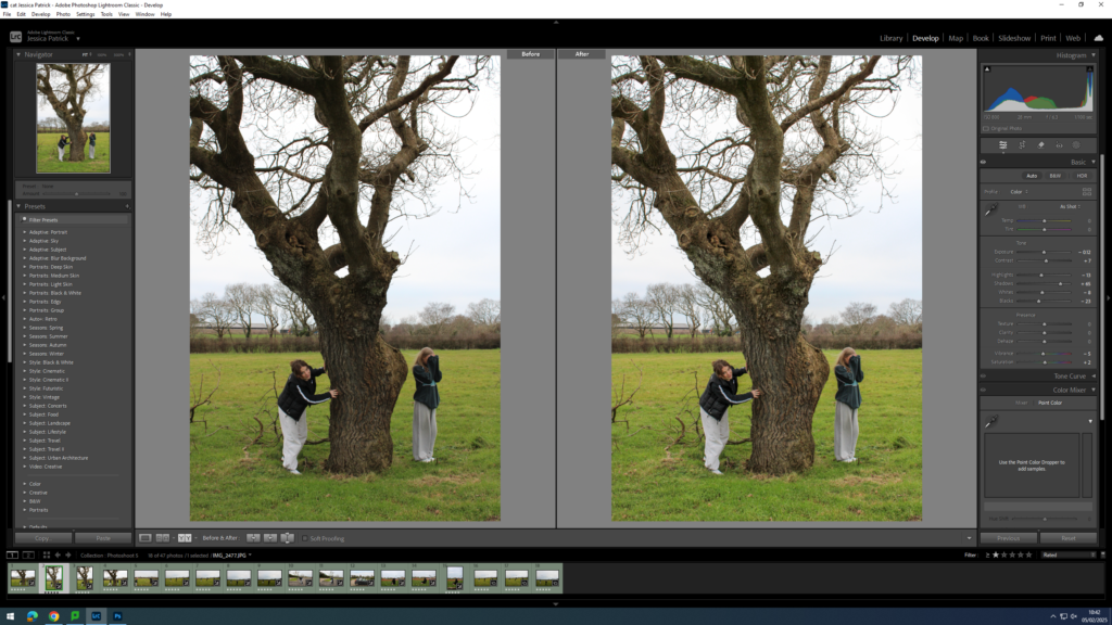
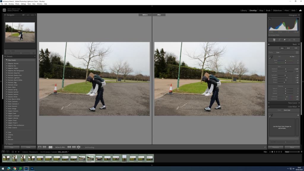
I edited this image by increasing the exposure, contrast, shadows, vibrancy and saturation, while decreasing the highlights, whites and blacks. I did this, so the image would be slightly more vibrant.
I edited this image by increasing the exposure, contrast, shadows, whites, vibrancy and saturation, while decreasing the blacks. I did this so the image would be more vibrant.
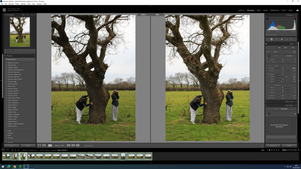
I edited this image by increasing the exposure, contrast, shadows, whites, vibrancy and saturation, while decreasing the blacks. I did this, so the image would be slightly more exposed and more vibrant.
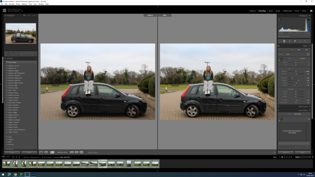
I edited this image by increasing the exposure, contrast, shadows, whites, vibrancy and saturation, while decreasing the highlights and blacks. I did this to improve the lighting.
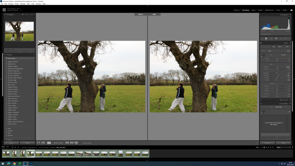
I edited this image by increasing the exposure, contrast, shadows, whites, vibrancy and saturation, while decreasing the highlights and blacks. I did this, so that the image would be slightly more exposed and more vibrant.
I edited this image by increasing the exposure, contrast, shadows, whites, vibrancy and saturation, while decreasing the highlights and blacks. I did this, so that the image would be slightly more exposed and more vibrant.
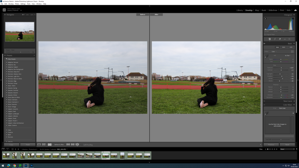
I edited this image by increasing the exposure, contrast, shadows, whites, vibrancy and saturation, while decreasing the highlights and blacks. I did this, so that the image would be slightly more exposed and therefore have better lighting.
I edited this image by increasing the exposure, contrast, shadows, whites, vibrancy and saturation, while decreasing the highlights and blacks. I did this, so that the lighting was better and the image was more vibrant.
I edited this image by increasing the exposure, contrast, shadows, whites, vibrancy and saturation, while decreasing the highlights and blacks. I did this, so that the image was slightly more exposed, so the lighting was better and so it was more vibrant.
How is sexuality and gender identity explored and represented in photography?
‘This binarism, which is but one of a series that underpins much photography theory and criticism, characterizes – in a manner that appears virtually self-evident – two possible positions for the photographer. The insider position – in this particular context, the “good” position – is thus understood to imply a position of engagement, participation, and privileged knowledge, whereas the second, the outsider’s position is taken to produce an alienated and voyeuristic relationship that heightens the distance between subject and object.’ (Abigail Solomon-Godeau, Inside/Out, 1995)
Introduction
Exploring sexuality and gender identity within photographs are usually captured and addressed from an outsider perspective, a viewpoint that is commonly objectifying and misleading. Instead, this intimate proximity, seen through Nan Goldin’s insider delineation of her close community, enables her to portray an extremely personal, and at times, voyeuristic perspective of her lived experiences. This narrative showcases a tableaux and uncompromising representation of Goldin’s and her found family’s feelings and familiarity within the queer community. Being in the same artistic circle as other photographers who predominantly photographed on film New York’s queer subculture, Goldin dedicated these portraits to preserving and capturing the essence of relationships, sexuality, gender exploration, and addiction during the 1970s and 1980s. As photography serves as an archive, there are many photographs exploring sexuality and gender identity which are immortalised, especially within the 19th and 20th century as photography began to become a popular and accessible medium of art and documentation. Situated within the fluidity and ambiguous notion of sexuality during these important and representative eras, these relaxed and fluid forms of identity captured within art and photography avoids distinct labelling, imposing a flexible identity of the individual.
Historical and theoretical context
Representation within art, photography and visual culture is to accept responsibility for the portrayal of the subject, and to deepen the understanding of the shared adjacent bond between the subject and the artist or photographer. The dichotomy between a subject’s essence being captured by someone outside their own community compared to inside their community showcases the epitome of “good” and “bad” representation of that person or group.
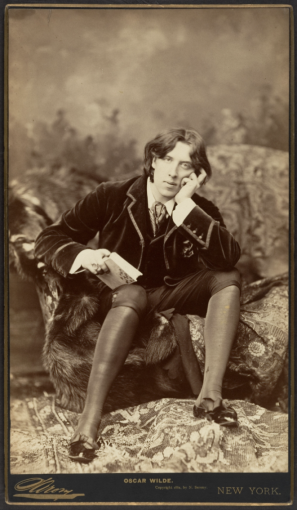
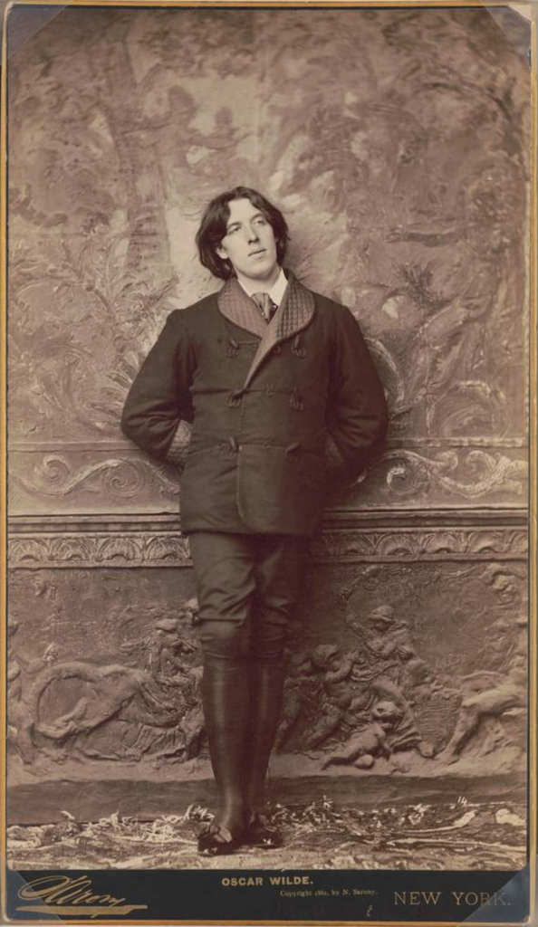
In circa 1882, the photographer Napoleon Sarony photographed portraits of Oscar Wilde, a poet and playwright in Victorian London, which positioned Wilde in the frame with his usual flamboyant and dandy personality, characteristics of the art movement of aestheticism which valued appearance of art over functions. The society of this time explicitly expressed disdain against sexual debauchery, which included the outlawing of all homosexual acts for ‘gross indecency’ under the 1885 Criminal Law Amendment Act, which Wilde was one of the first and highest importance figures prosecuted and put on trial for. This opens the discussion whether photography not only serves as an art form, but also archival material and an account of history.
Fig. 1Fig. 2
Fig. 1 – Napoleon Sarony, Oscar Wilde, 1882
Fig. 2 – Napoleon Sarony, Oscar Wilde, 1882
In Abigail Solomon-Godeau’s ‘Inside/Out’, she highlights and contrasts whether a photograph appears as an insider or outsider perspective. She states, ‘Are the terms of reception- or, for that matter, presentation- in any way determined by the position- inside or out- of the photographer making the exposure? … for not only are the photographs themselves exterior views, but they model themselves directly on the impersonality, anonymity, and banality of the purely instrumental image.’ (Solomon-Godeau, Inside/Out, 1995) This solidifies Napoleon Sarony’s portraits of Oscar Wilde as solely photographed originating from an outsider’s perspective.
Nan Goldin
The photographer beholding a position of intimate proximity is vastly evident throughout Nan Goldin’s wide photography portfolio. Goldin was born 12th September, 1953 in Washington, D.C. and has relished in photography since she was fifteen, and in downtown Boston until she was nineteen. Ultimately driven by her need to remember herself and those she loves, Goldin solidified her innate passion of documenting scenes of her subcultural communities she made a home within for herself once moving from Boston to New York in 1978.
‘[Journalists] talk about the work I did on drag queens and prostitution, on “marginalised” people. We were never marginalised. We were the world. We were our own world, and we could have cared less about what “straight” people thought of us.’ (Goldin, 1986)
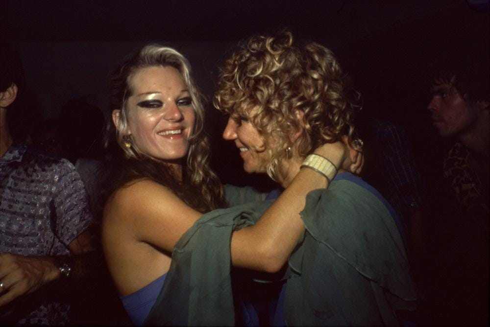
Utilising a narrative within photographs which conveys a deeply personal bond between Goldin and her subjects, she is often notably recognised for this inner representation of the communities and subcultures she shares space with. In her book The Ballad of Sexual Dependency, she initially shared the photographs within with those photographed in frequently visited clubs and venues, and an immediate reaction from these peers contributed to its growth and ultimately its final presentation. ‘I look at Ballad and see the dynamics of both love and hate, tenderness and violence, as well as all kinds of ambivalence in relationships.’ (Goldin, 2012) Whether her subjects were portrayed in these harshly juxtaposing settings; an extremely domestic house or party setting, or at the funeral of her close friend, in a deadpan approach, Goldin addressed her subjects by their first name and most commonly added context on what was happening within the photograph, allowing the viewer to look inside the scene and realise much more of the situation and the lives of these people. Goldin personally engages her subjects with the creation of her art, and although this could have swayed the reception, especially the involvement of queer people from the 1970s, 80s and 90s, she does not leave this up for discussion. Her subjects are presented as the artwork, identifying visceral and ambivalent reactions towards her work and deepening the sense of these photographs being deemed as a voyeuristic gaze.
Fig. 3Fig. 4
Fig. 3 – Nan Goldin, Cookie and Sharon Dancing at the Back Room, 1976
Fig. 4 – Nan Goldin, Warren and Jerry fighting, 1978
‘People in the pictures say my camera is as much a part of being with me as any other aspect of knowing me. It’s as if my hand were a camera. If it were possible, I’d want no mechanism between me and the moment of photographing. The camera is as much a part of my everyday life as talking or eating or sex. The instant of photographing, instead of creating distance, is a moment of clarity and emotional connection for me. There is a popular notion that the photographer is by nature a voyeur; the last one invited to the party. But I’m not crashing; this is my party. This is my family, my history’ (Goldin, 1986)
In Abigail Solomon-Godeau’s ‘Inside/Out’, she highlights and contrasts the representation of a photograph and how it shifts from being an insider or outsider portrayal of an individual, group, or community. She states, ‘The Ballad of Sexual Dependency can be considered as exemplary of the insider position … by way of examining the terms by which insiderness comes into play, the viewer can readily assume from the content of the images that the photographer is in a position of intimate proximity with her subjects. This is suggested by the depiction of the conventionally private activities of dressing and undressing, bathing, putting on makeup, the apparent physical closeness of the camera itself to its subjects in many of the pictures, and lastly, toward the end of the book, three images of one of the transvestites and a lover in bed together.’ (Solomon-Godeau, Inside/Out, 1995) This interpretation of Goldin’s work highlights the shared bond between herself and the subject of each individual photograph presented, and furthermore how these photographs involving vastly personal and intimate moments within the subject’s life would not have been documented without Goldin and her innate passion to document her community. This identifies how important an insider perspective is to accurately portray the life of an individual, and how aspects can be missed, hidden, or left out; whether purposely or not.
Fig. 5Fig. 6
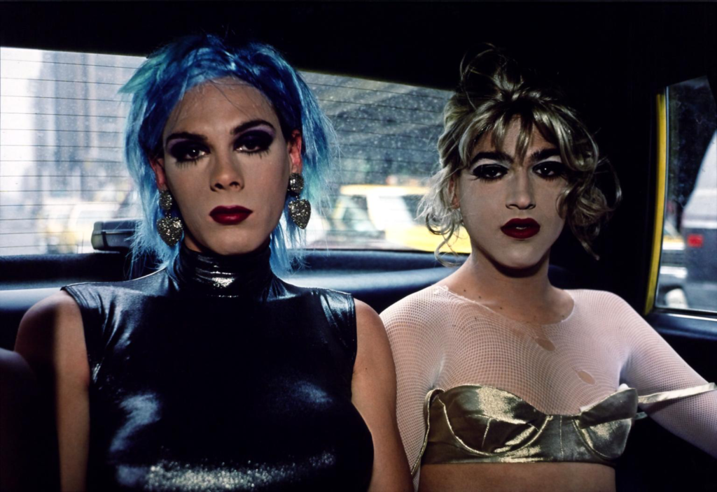
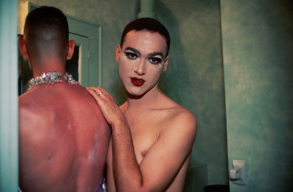
Fig. 5 – Nan Goldin, Misty and Jimmy Paulette in a taxi, 1991
Fig. 6 – Nan Goldin, Jimmy Paulette and Taboo! in the bathroom, 1991
Nan Goldin’s The Ballad of Sexual Dependency features a wide plethora of subjects she acknowledges holding an emotional and romantic investment for, and the photographs within this reflect this insider perspective of the queer community captured in a passionately close way by Goldin. As Nan Goldin has stated, ‘As children, we’re programmed into the limitations of gender distinction … But as we grow older, there’s a self-awareness that sees gender as a decision, as something malleable … Rather than accept gender distinction, the point is to redefine it … there is the decision to live out the alternatives, even to change one’s sex, which to me is the ultimate act of autonomy.’ (Goldin, 1986) In figures 5 and 6, Goldin has provided an insider representation of the queer community, a recurring subject in these two photos is Jimmy Paulette, who is depicted in a taxi with Misty, and then confidingly sharing the space in a bathroom with Taboo. Goldin’s photographs are usually personally close to the subjects and properly engage with the scene at hand, displaying the deeply held connection between the subject and photographer.
Conclusion
In conclusion, the representation of sexuality and gender identity within photography and visual culture ultimately depends on who is photographing the subjects, and how that individual personally wishes to portray a group or community. An insider delineation of people inside of a community, which is captured throughout Nan Goldin’s work opens up the possibility of an extremely intimate and personal perspective of her and her found family’s lived experiences and familiarity within the queer community. The essence of these connections and relationships inside communities throughout history are intricately preserved through photographers and artists like Nan Goldin, and the many photographs exploring sexuality and gender identity have been immortalised since the 19th century with the popularisation of photography not only as an art medium, but also a documentation of history.
Bibliography
Sontag, S. (1977) ‘In Plato’s cave’ in On Photography. London: Penguin Books.
Goldin, Nan (1985) ‘The Ballad of Sexual Dependency’
Solomon-Godeau, A. (1994), ‘Inside/ Out’in Photography At The Dock: Essays on Photographic History, Institutions, and Practices. Minnesota: University of Minnesota Press.
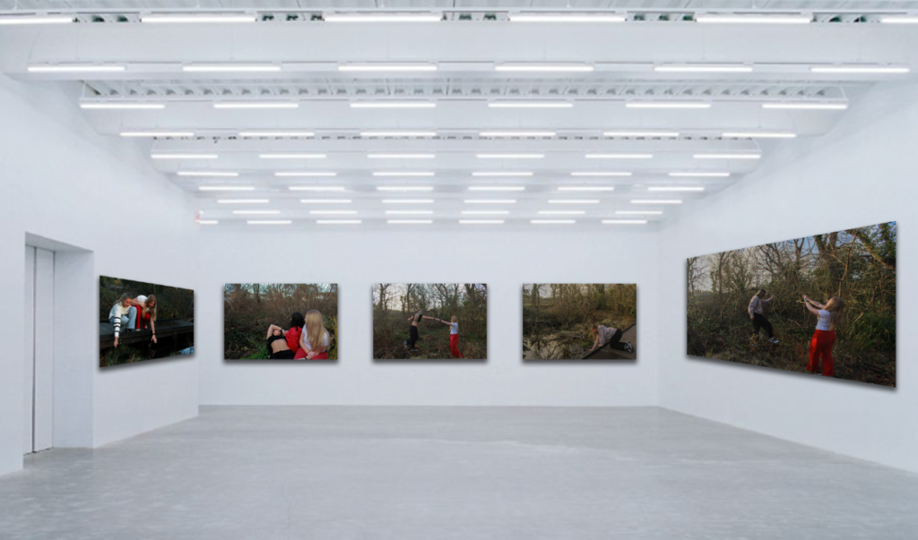
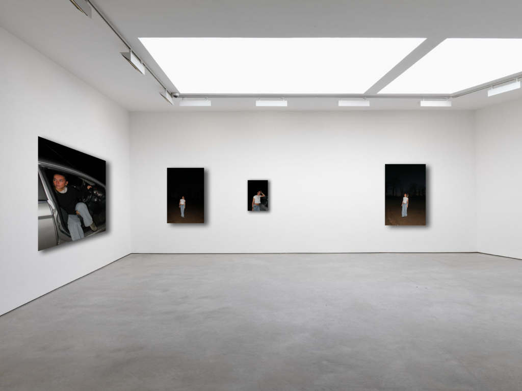
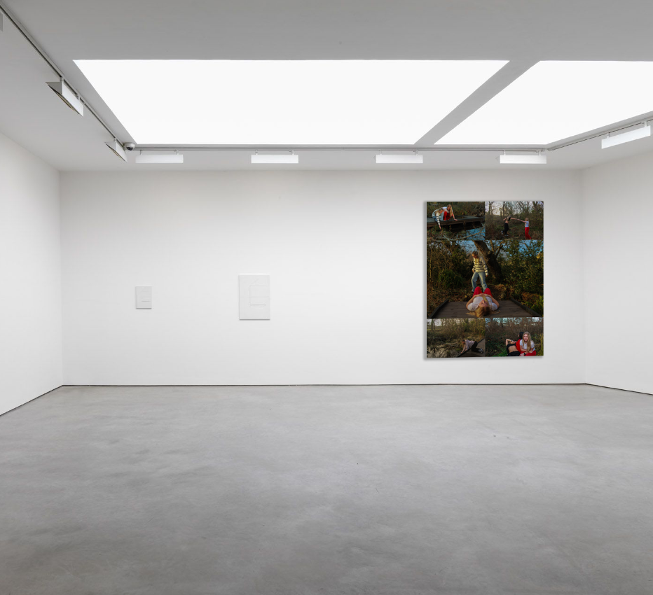
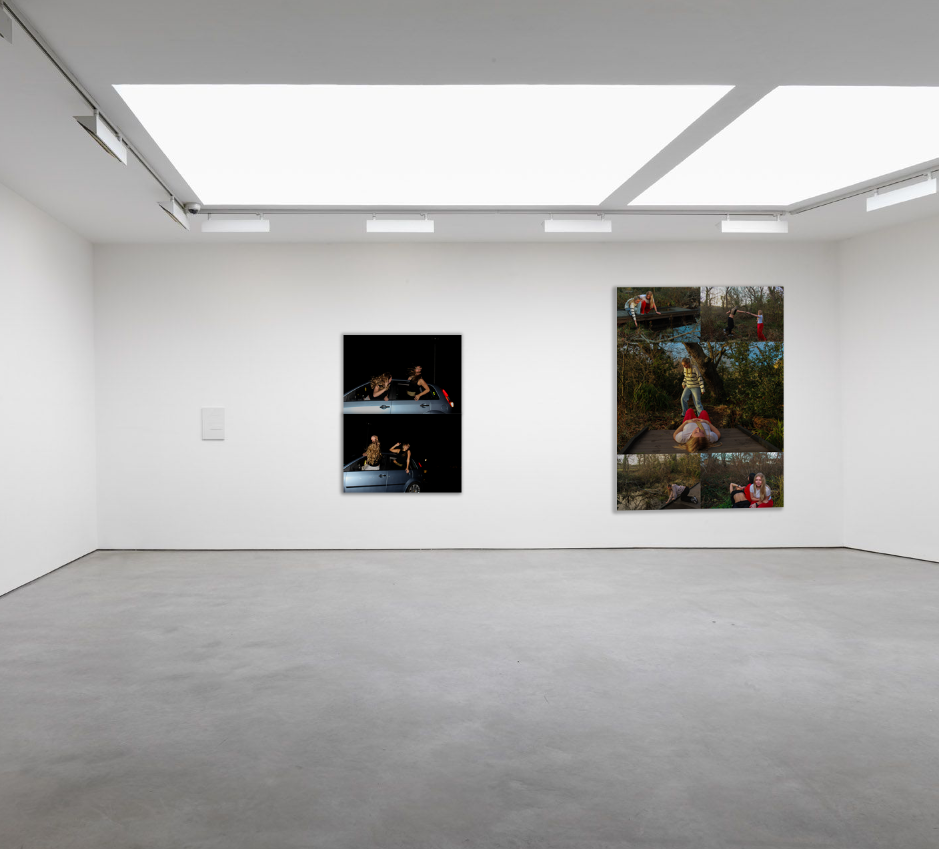
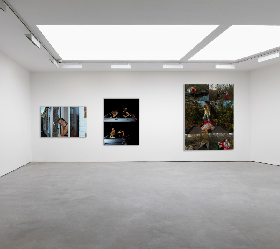
I chose to make virtual gallery’s to end this personal study because I think it is an effective way of displaying all of my best final outcomes, and the way each of them are placed next to each other makes it easier for the viewer to interpret them individually, yet also make comparisons between them and be able to make connections.
First, I chose my most successful shoots out of the 5 I exhibited, and picked out my final outcomes. I then opened up an empty gallery from the mock ups folder, and placed it into Photoshop as a document. I individually opened up each image that had been exported from Lightroom as a jpeg, and placed them into each space on the gallery. The two images on the left and the right are on a slight angle, which makes my images look more fitting into the gallery. To do this, I clicked ‘edit’ in the top left corner of my screen and scrolled down to the ‘transform’ option, where I could then press ‘perspective’. I dragged the bottom corners of the image so it could move to the correct place, making it look more realistic. Finally, I selected each image one at a time and added a drop shadow to them all so it looks sincere and adds a sense of professionalism.
Experimentation virtual gallery’s:
Final virtual gallery – mock ups:
The image above is my final virtual gallery for my personal study, successfully displaying a minimal variety of outcomes from different shoots I carried out.
I chose to display them this way as it meets exactly how I presented them in my mock exam, using mountboard and card. However, to make this virtual gallery specifically, I had to use different methods and layouts in Photoshop to create outcomes that resemble my real ones.
The first outcome on the left was placed using the same steps I described briefly above, there were no changes to the way I presented this one, as it is an individual image and has no layout. The image in the middle and the one on the right were presented using multiple layers and creating a grid to present them in. I added in each image accordingly to my physical outcomes, then cropped the excess space around it to create a singular compact image. I then flattened my layer so all the images become one layer rather than separate.
Similar to the previous, I individually placed my two outcomes onto a plain black backdrop, as in my mock exam I placed them onto a piece of black card to give the effect of a border. I also cropped the excess space to allow my images to take up the entire area.
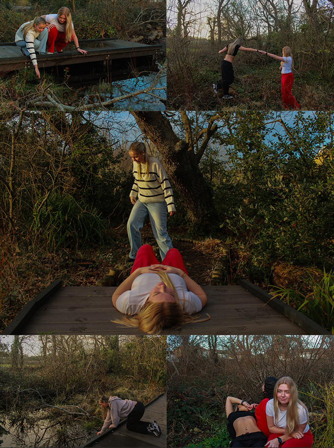
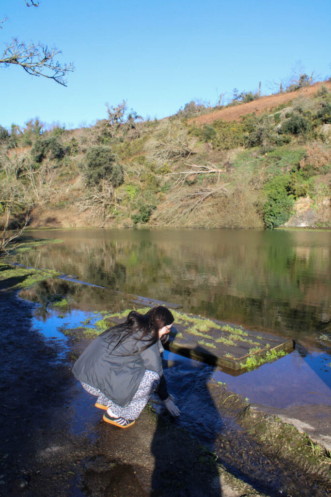
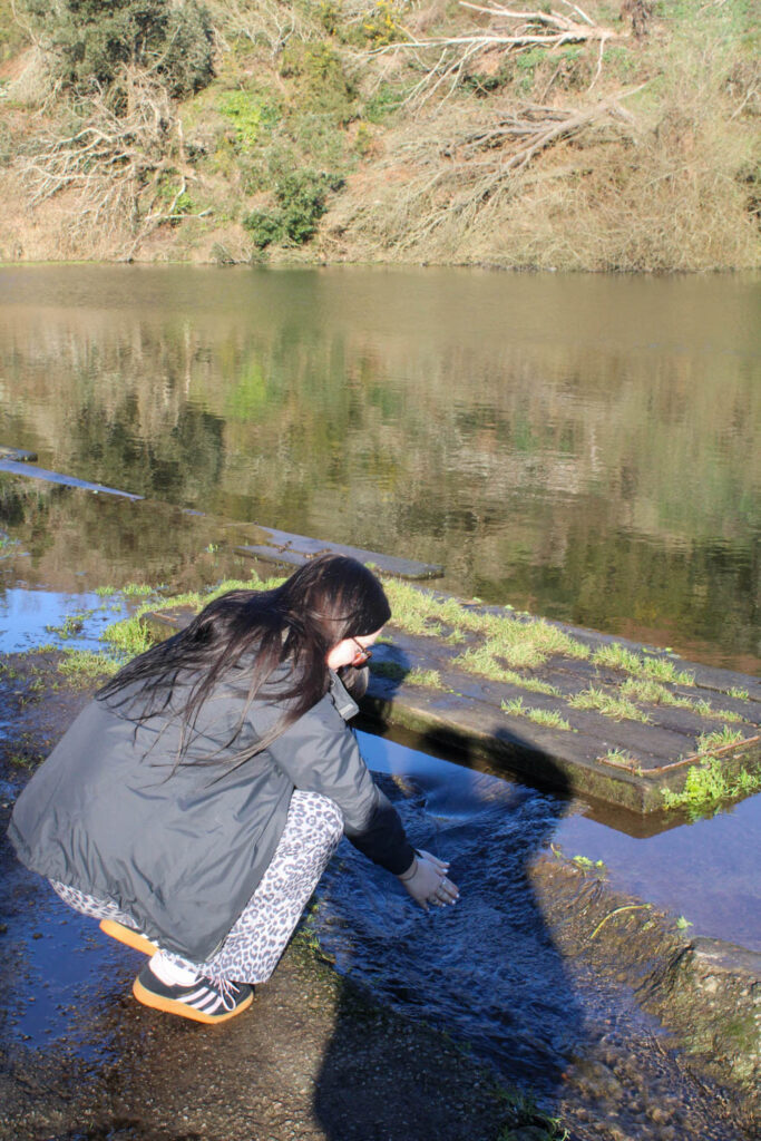
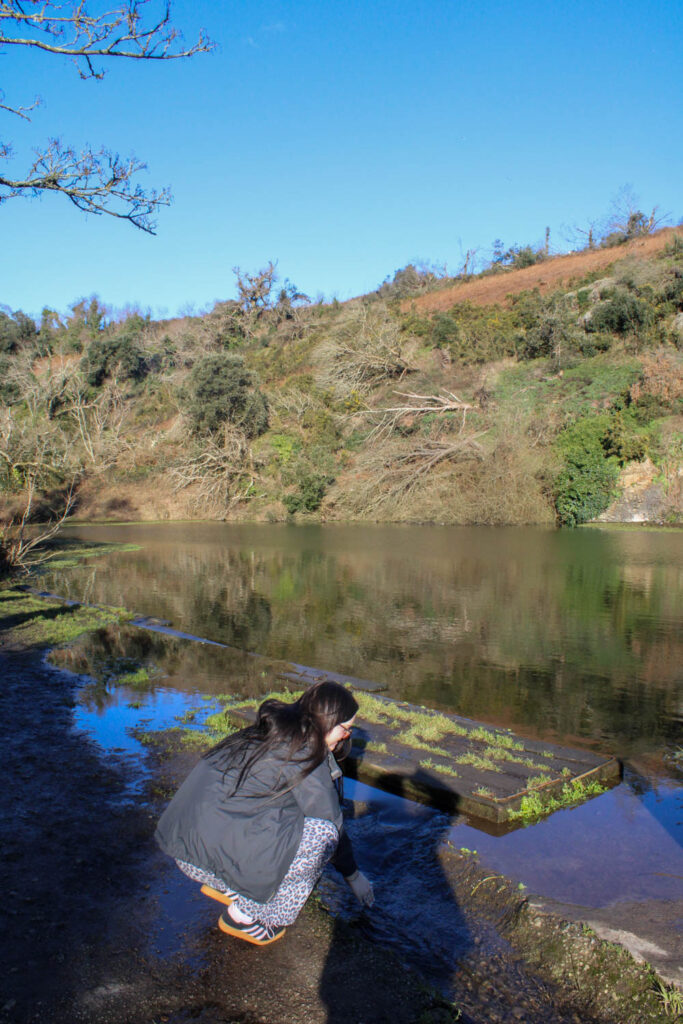
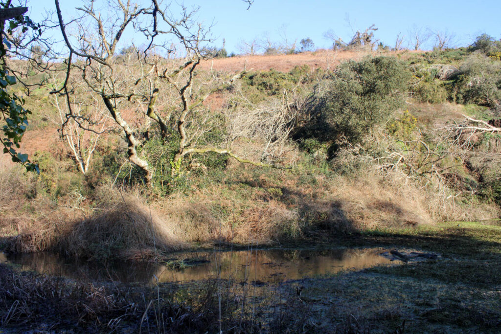
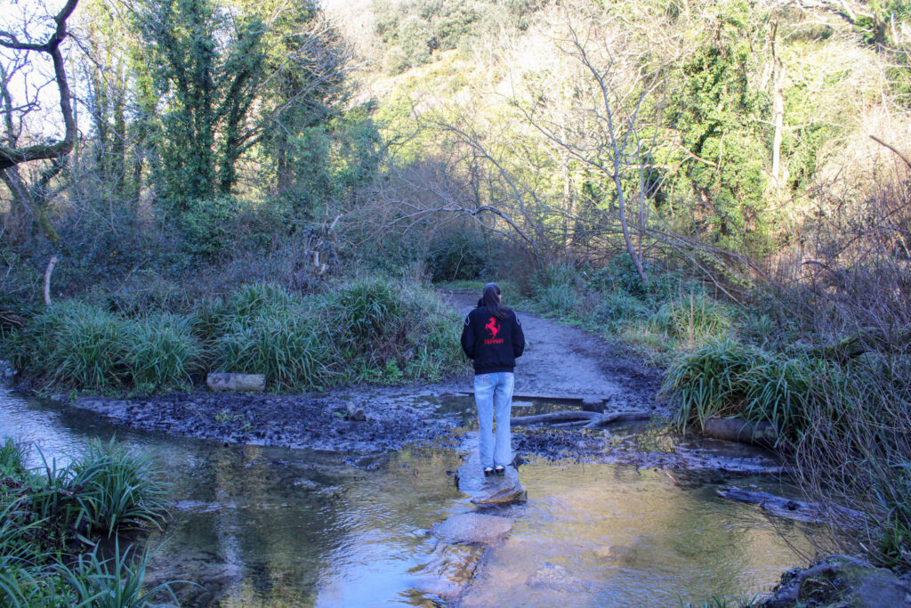
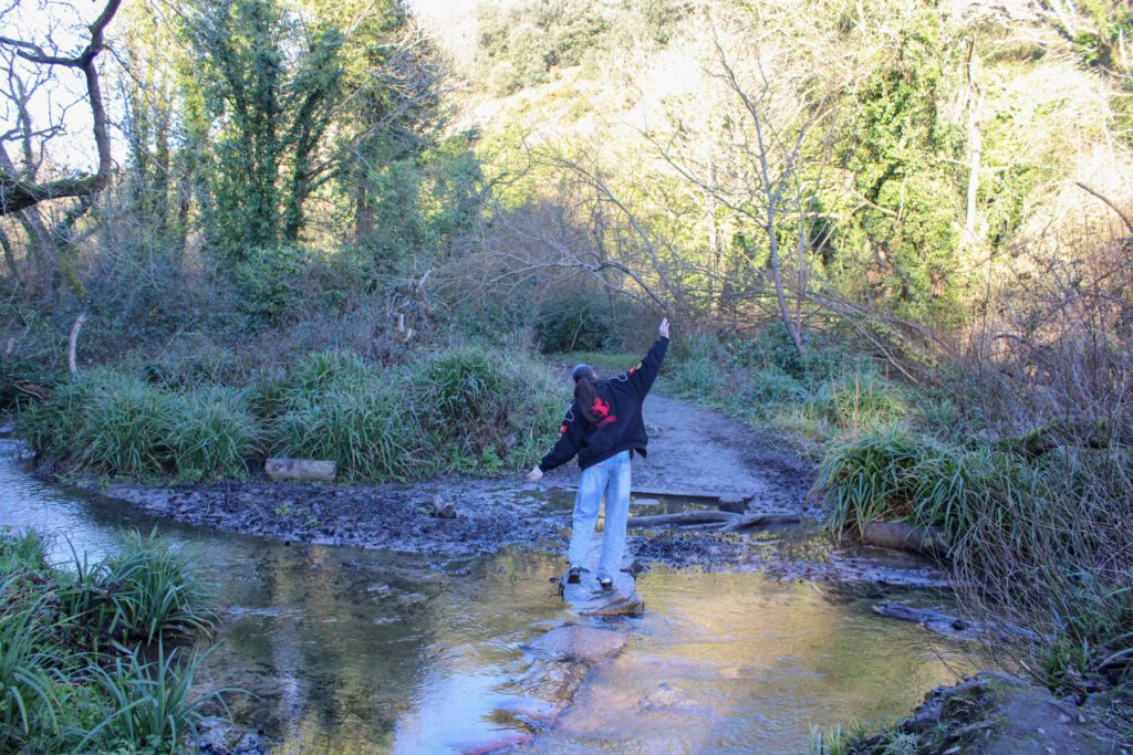
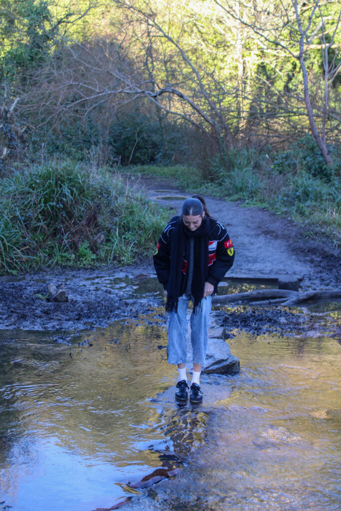
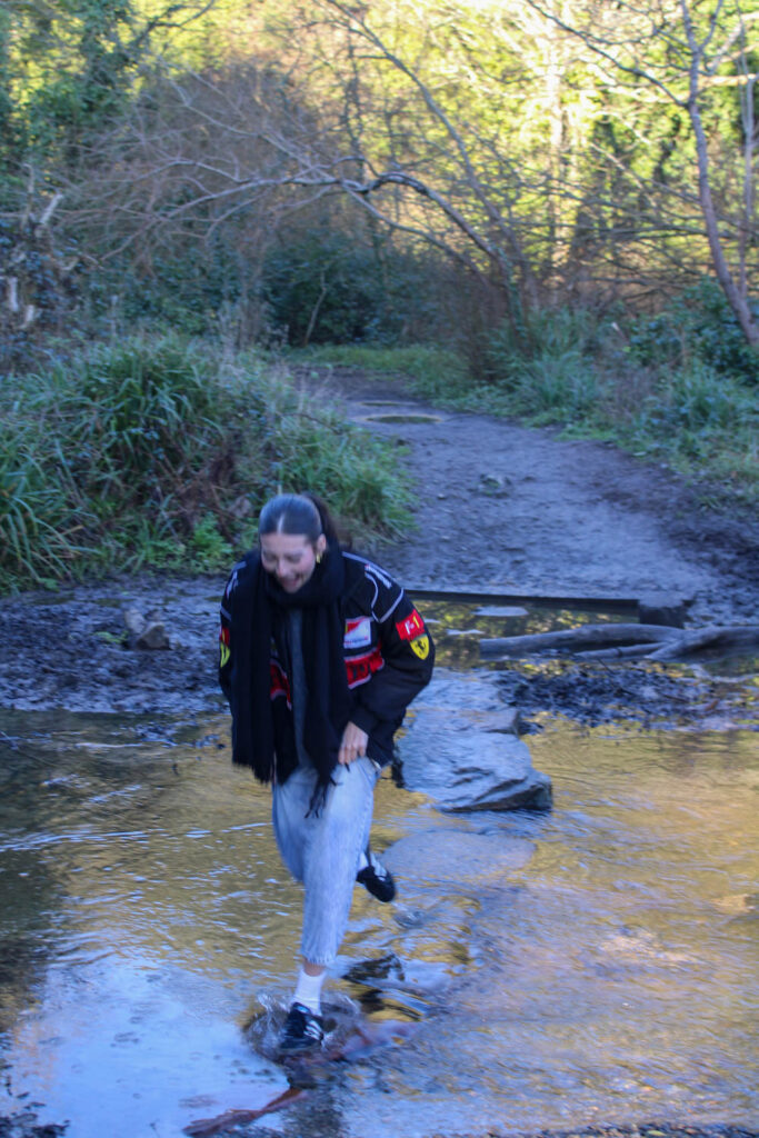
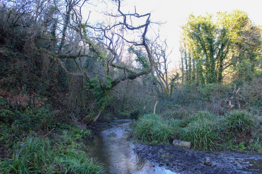
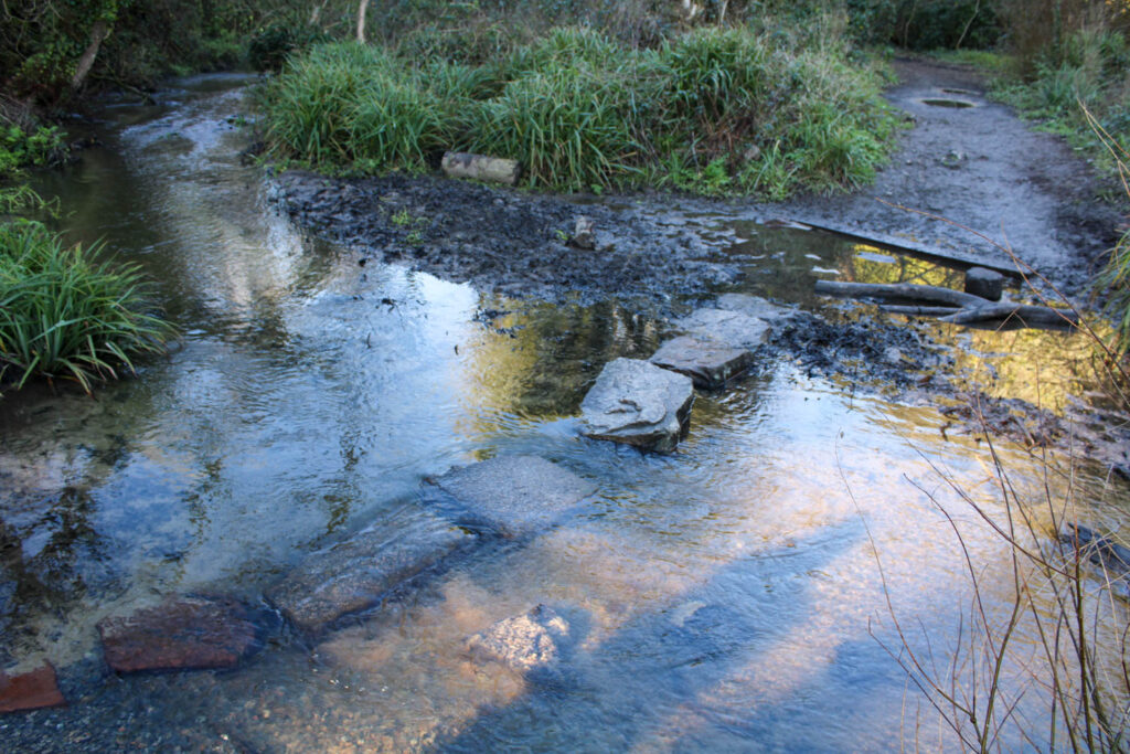
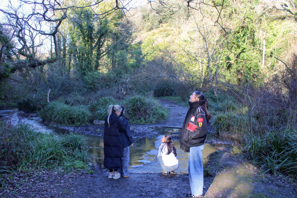
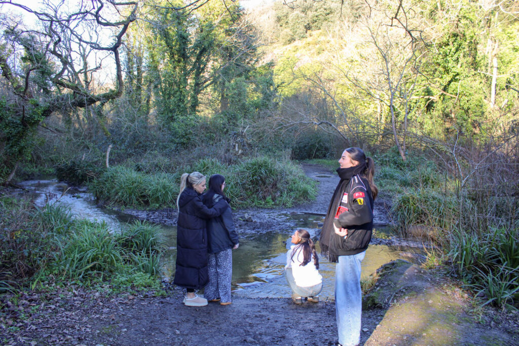
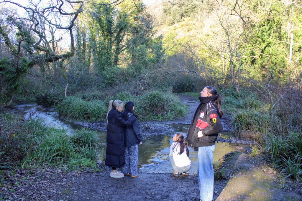
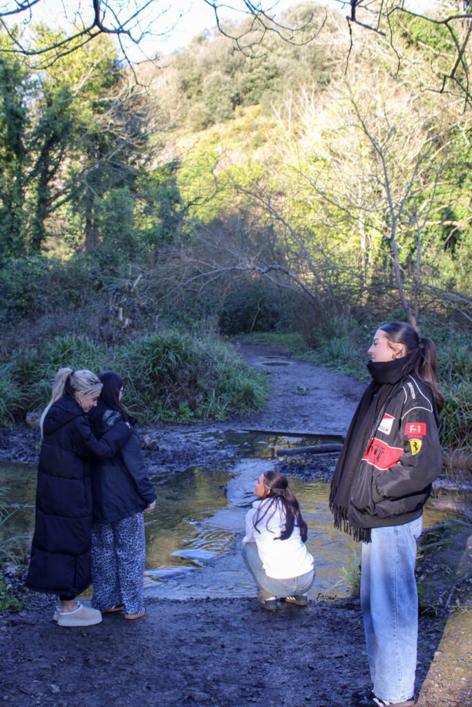
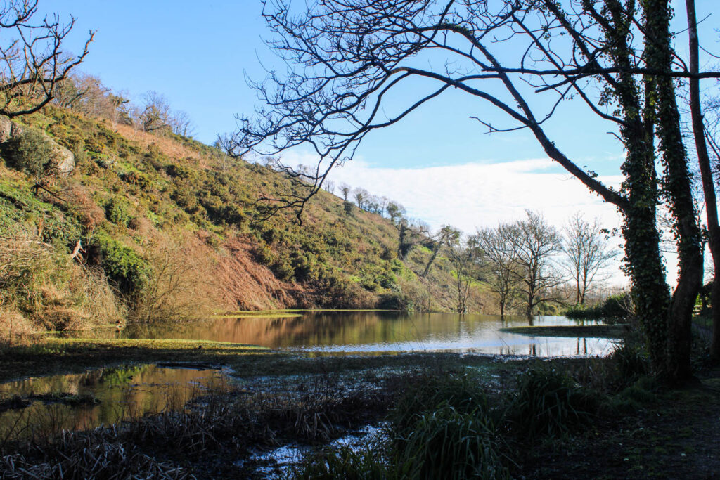
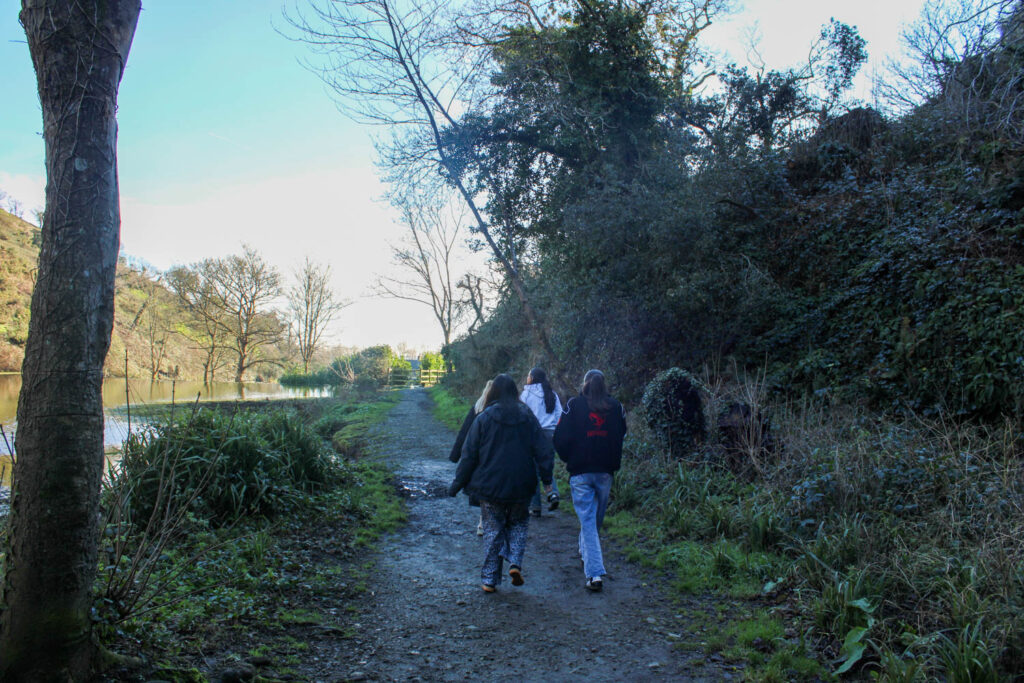
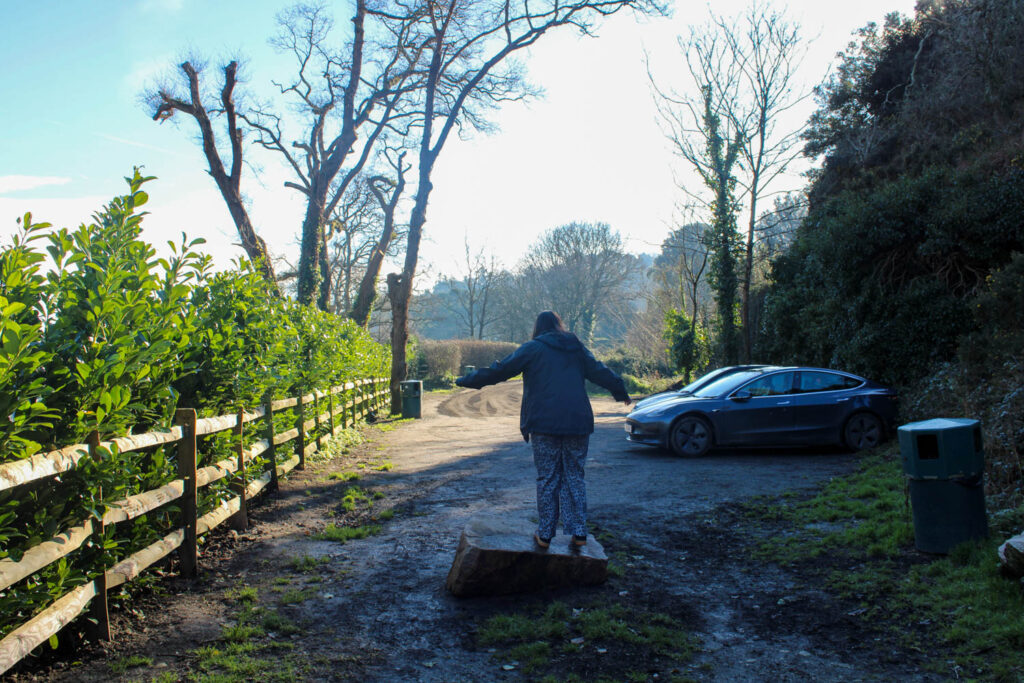
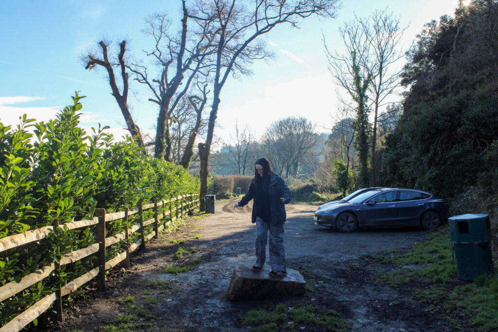
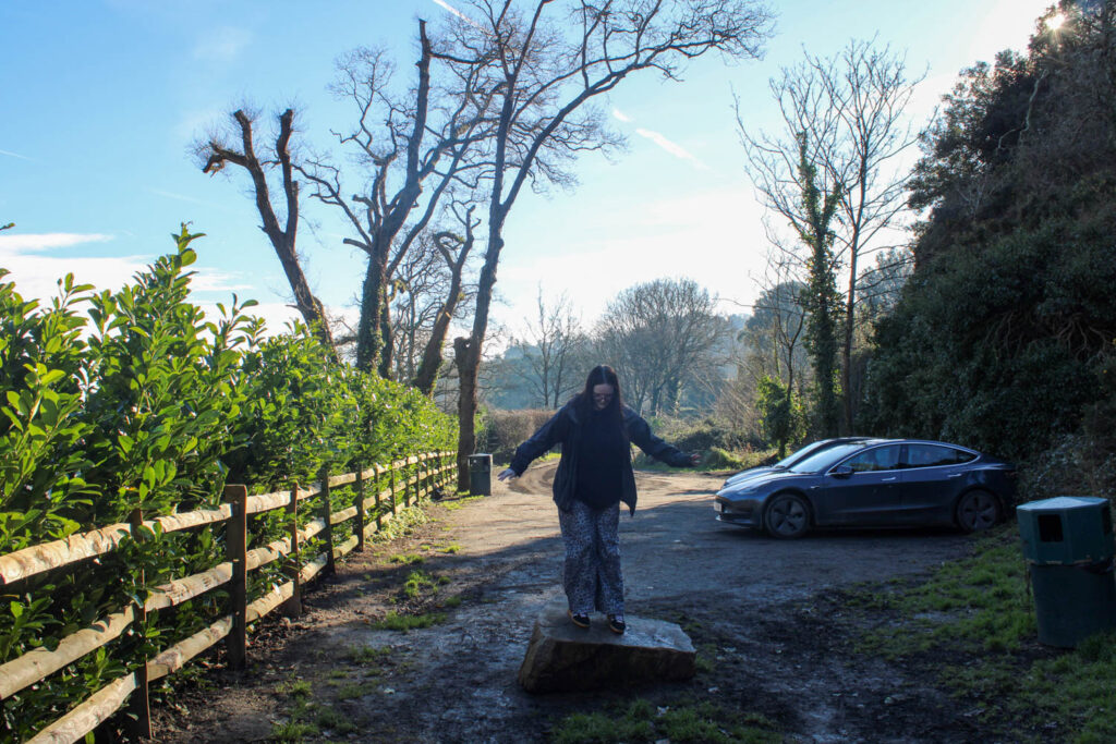
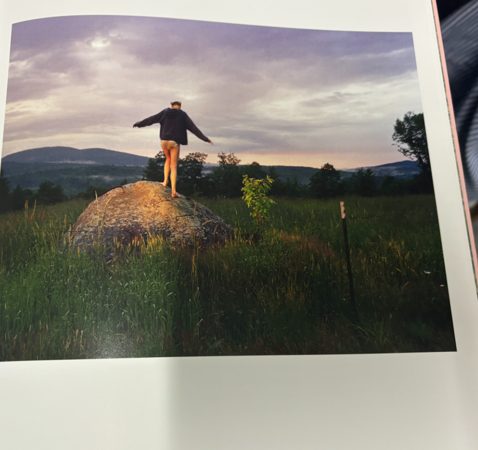
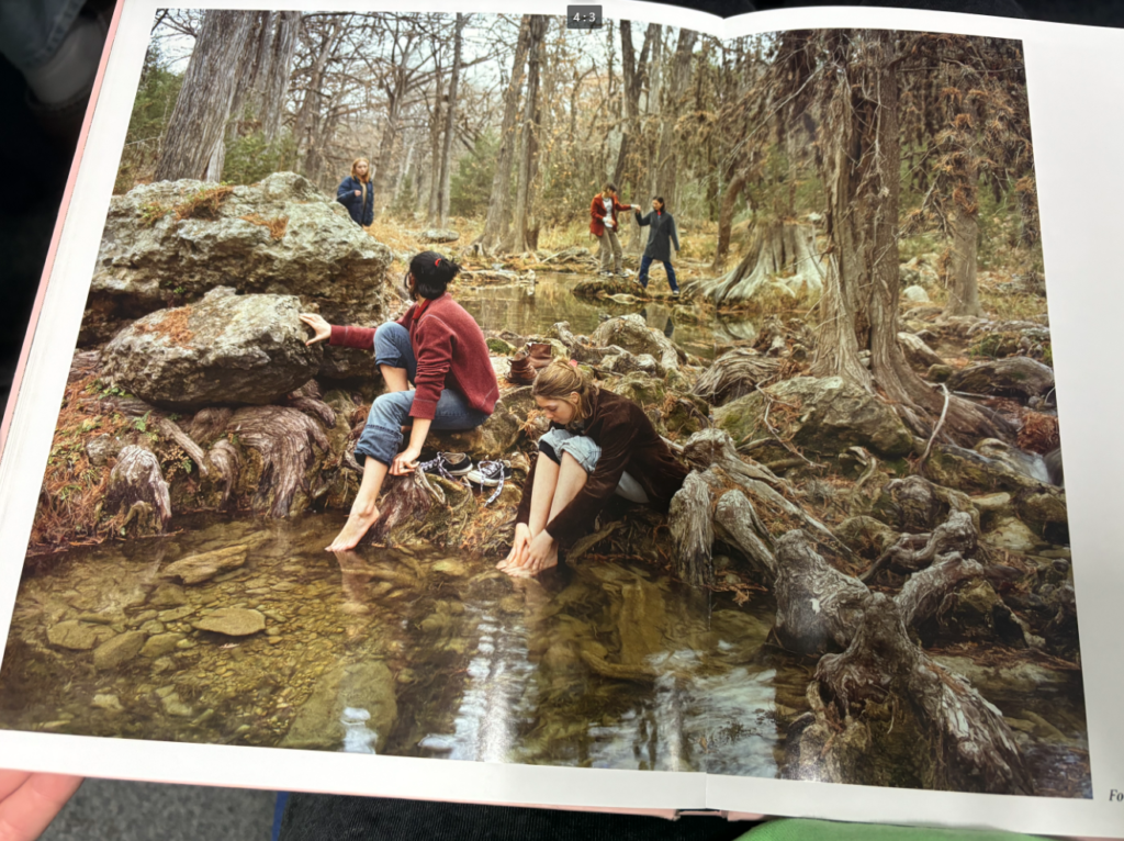
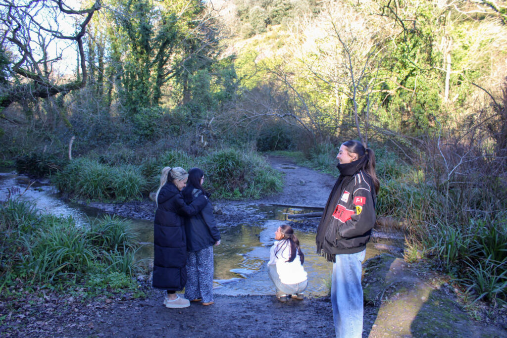
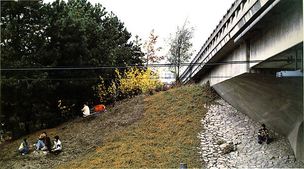
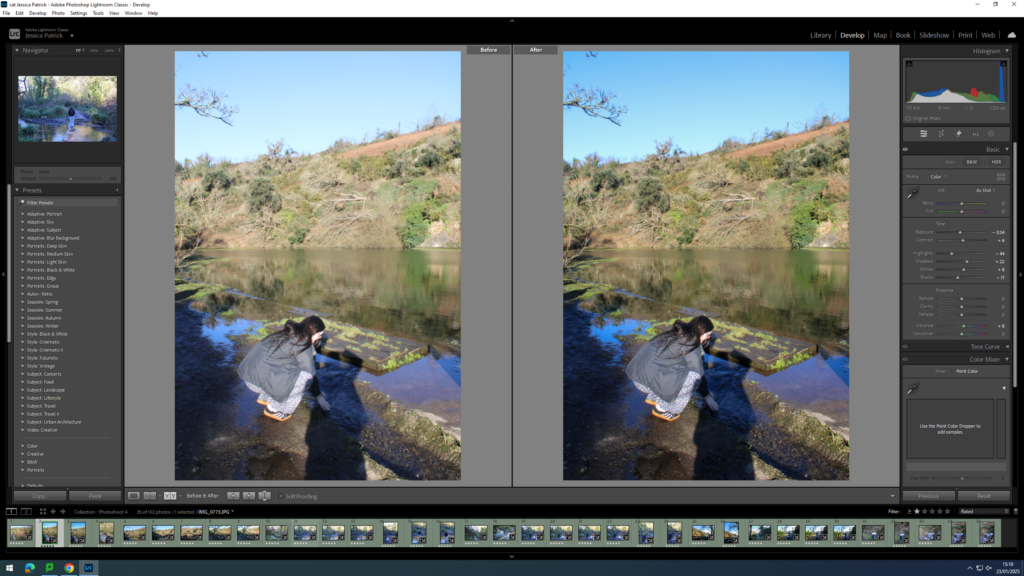
This photoshoot relates to Justine Kurland’s images, because they have a similar wooded setting and are at a similar time of day, so the lighting is very similar. I have also made some similar photographs to the ones that Justine Kurland have made.
Both Kurland’s subject and my subject are stood up on a rock.
In Justine Kurland’s image she had her subjects wash their feet in the lake. However, in my image the subject was washing her hands.
In this image, I have pulled from the composition, by having a subject in the foreground, middle ground and background. I have also pulled from the setting, with the wooded area with the trees and the lake in the background.
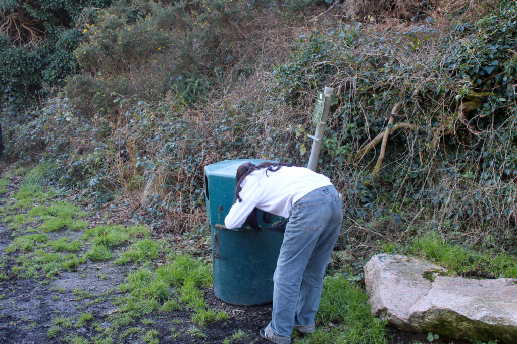
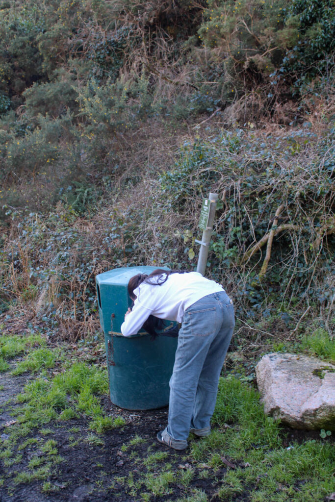
Justine Kurland also displays the subjects in her work as runaways, so I experimented with the concept of runaways in my work, by having a subject scavenge through a bin for food.
However, I do not think this narrative of the runaway girls suits my themes of youth and identity and what I am trying to portray.
In Comparison to Jeff Wall
In this photoshoot I focussed on composition for one specific photo. I have used the composition of having a subject in the background, middle ground and foreground. This relates to Jeff Wall, because he also focusses on composition and has used this compositional technique before.
How does this relate to the themes of youth and identity?
This photoshoot relates to the theme of youth, specifically my youth, as I used to visit St Catherine’s woods a lot when I was younger, especially in lockdown during Covid. I would visit the woods a lot with my family, as we would always take my dog for walks here. This represents my identity during my youth, as this photoshoot represents an activity I enjoyed doing and still enjoyed doing during this photoshoot. It also represents a part of my identity, because it represents the people I enjoy going here with and the people I surround myself with represent who I am as a person.
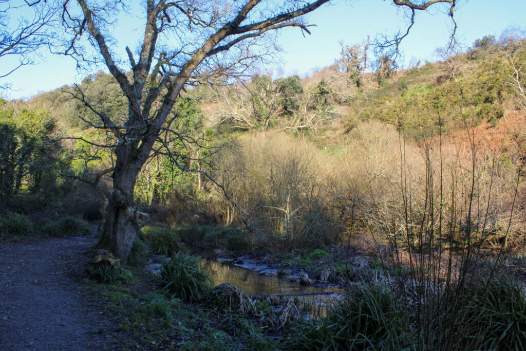
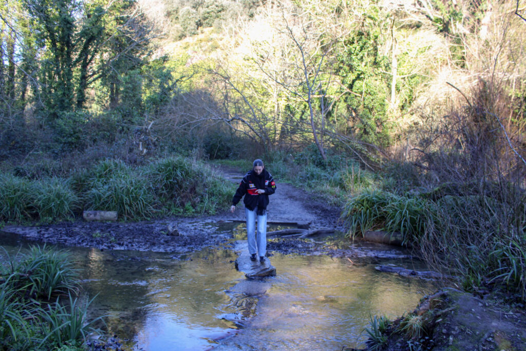
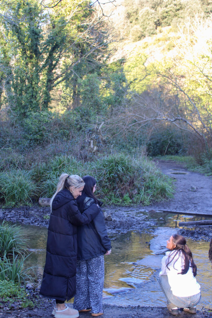
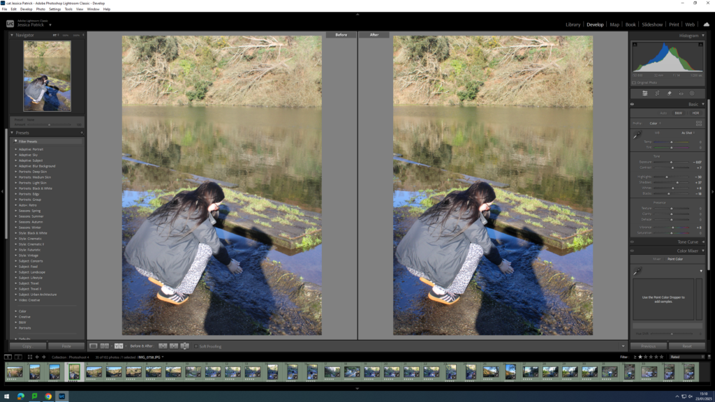
Analysis of 1 Image
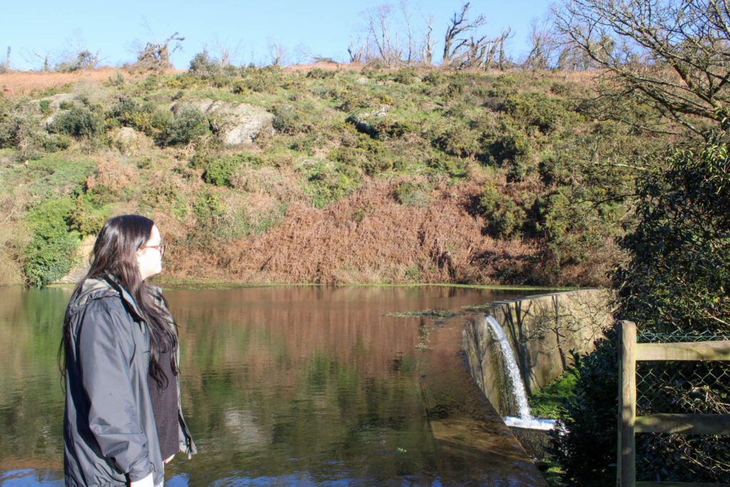
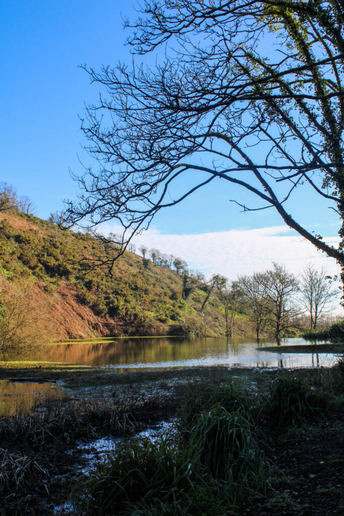
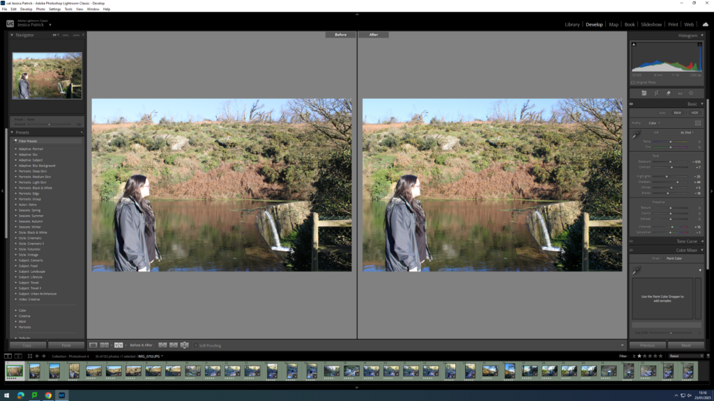
This photo has high levels of control, because I was able to manipulate the position and distance of not only my subjects, but myself as well. However, there was little control over the lighting, as natural daylight was used, rather than the lighting that can be found in a studio.
F Stop: f/ 4.5
Exposure time: 1/60 sec
ISO: ISO- 125
The colours in this image are not very bright, as the lighting in this image was quite dark. There are quite natural colours, such as the browns, green and blues, but the red and the yellow in the subjects jacket make the image pop slightly more, as they are quite a bit brighter and more vibrant. There is quite a lot of light tones in the top section of the frame, due to the sun, but throughout the rest of the image there is lots of dark tones, due to the shade caused by the trees. There is also a lot of texture in this photo, due to the ripples and current of the water, as well as the trees and muddy ground in the background. There is also a lot of line work in this image, which can be seen from the line of rocks in the lake and the path behind.
The composition of this subject is quite simple, as the main viewpoint is centre of the frame, and there is only one subject. However, the setting of this image makes it more interest due to the background and textures.
This image relates to my youth, because I used to visit St Catherine’s woods a lot when I was younger, especially in lockdown during Covid. I would visit the woods a lot with my family, as we would always take my dog for walks here. This represents my identity during my youth, as this photoshoot represents an activity I enjoyed doing and still enjoyed doing during this photoshoot. It also represents a part of my identity, because it represents the people I enjoy going here with and the people I surround myself with represent who I am as a person.
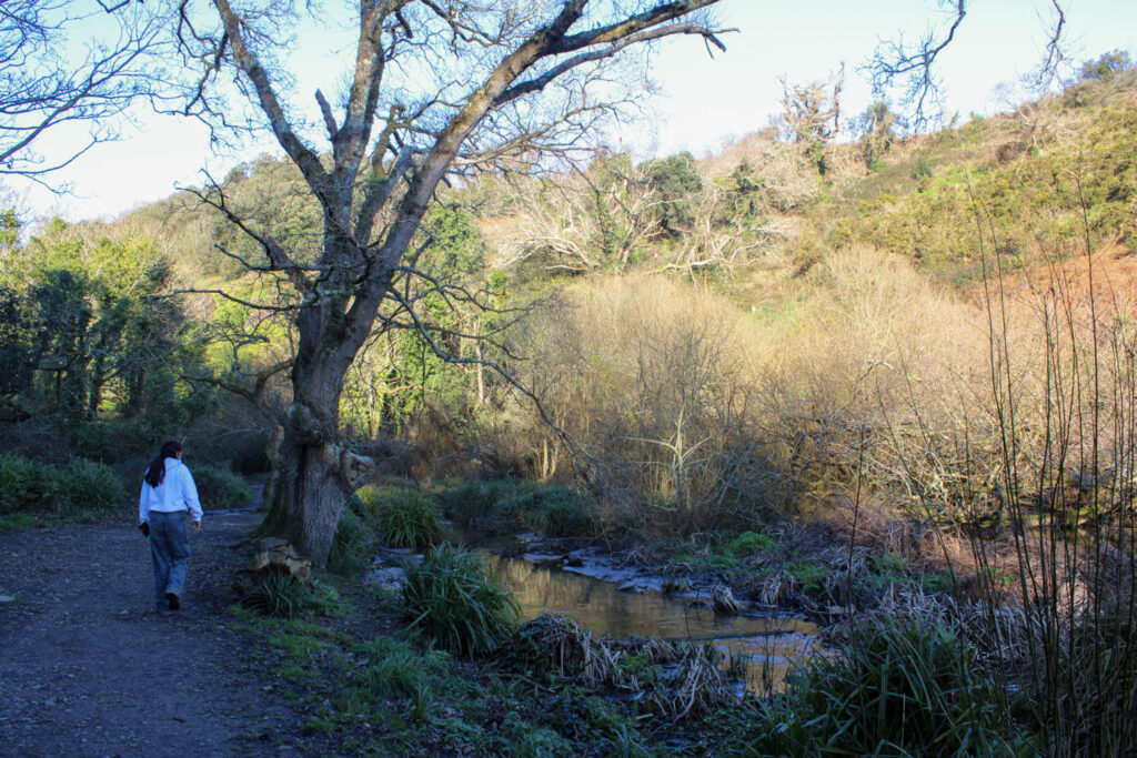
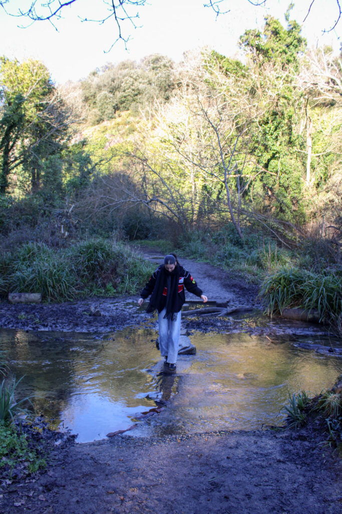
Photoshoot Conclusion
Overall, I think this photoshoot went well, as I was able to have a look at different compositional elements, such as the foreground, middle ground and background, like both Justine Kurland and Jeff Wall. I was also able to create a similar setting to the ones used in Justine Kurland’s work, with lots of similar visual elements, such as the texture.
However, some of the images were quite dark and had quite a blue tone, so next time I would adjust the exposure on my camera more to resolve this.
This photoshoot also presents the themes of youth and identity, in particular my youth and identity, as walking through these woods is an activity I used to love during my youth. This represents my identity, because it presents what I enjoy, which is part of what makes me who I am.
For this photoshoot, we visited St Catherine’s woods, because when I was younger, especially during covid, my family and I would go on walks here with our dog very regularly, so this setting relates to my youth and identity in particular.
Contact Sheet
The images which are highlighted green are the images I have chosen to edit, because they are my best images, with the best composition and layout. They also represent my themes of youth and identity the best.
Edits
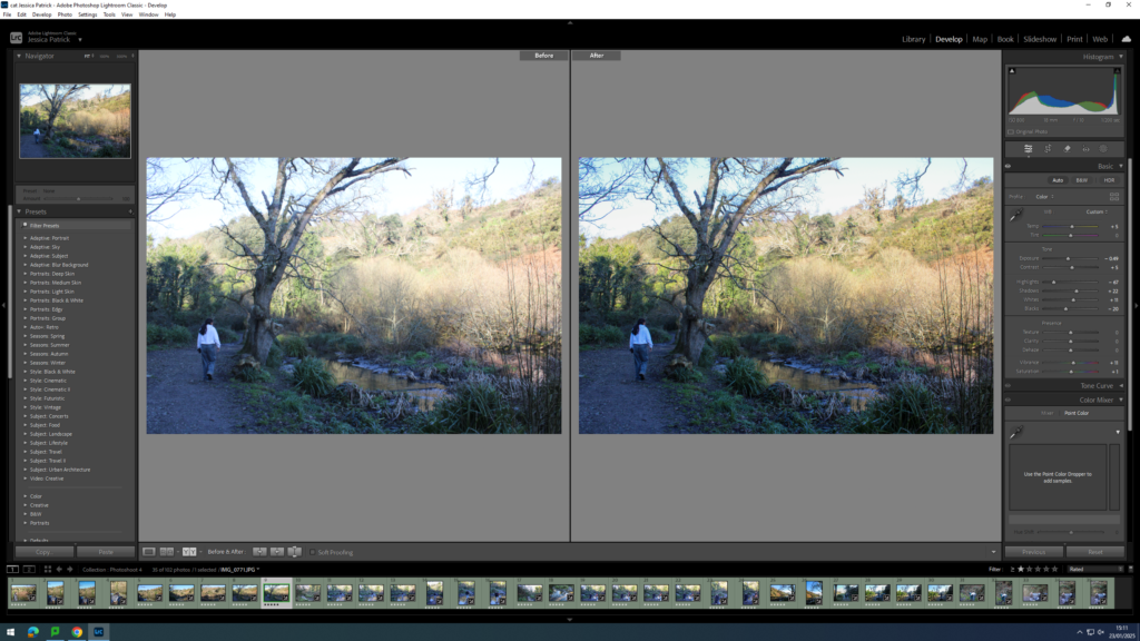
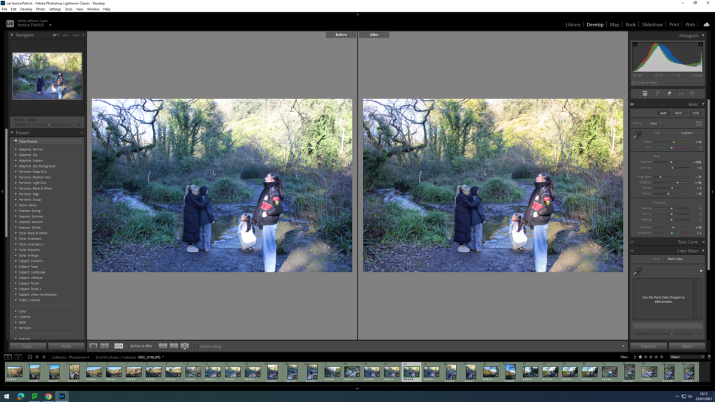
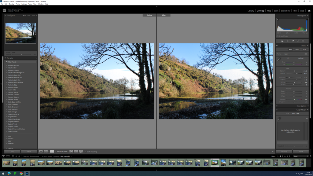
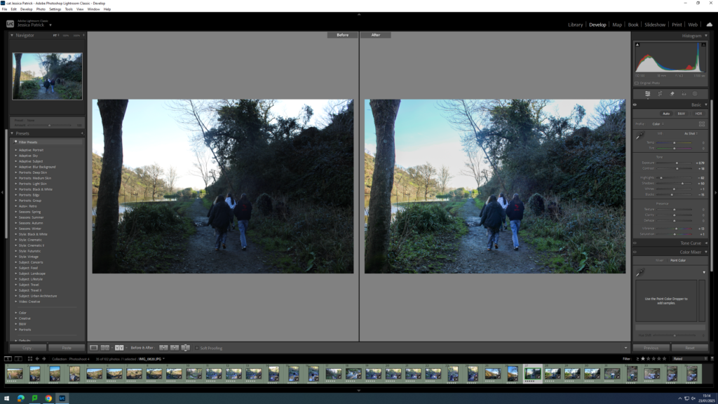
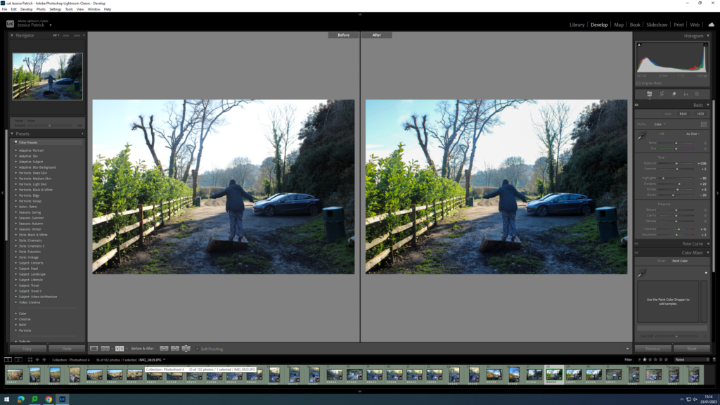
I edited this image by increasing the contrast, shadows, whites and vibrancy, while decreasing the exposure, highlights, blacks and saturation. I did this, so that the image was slightly less exposed and had better lighting.
I edited this image by increasing the contrast, shadows, whites and vibrancy, while decreasing the exposure, highlights and blacks, so that the image had better lighting and was slightly more vibrant.
I edited this image by increasing the contrast, shadows, whites and vibrancy, while decreasing the exposure, highlights, blacks and saturation. I did this, so that the image had better lighting, due to less exposure and so it was more vibrant.
I edited this image by increasing the contrast, shadows, whites, vibrancy and saturation, while decreasing the exposure, highlights and blacks. I did this, so that the image had better lighting.
I edited this image by increasing the contrast, shadows, whites and vibrancy, while decreasing the exposure, highlights, blacks and saturation. I did this, so that the lighting was better.
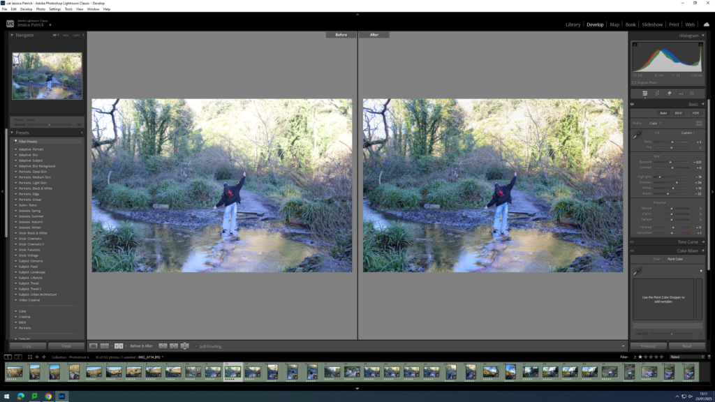
I edited this image by increasing contrast, shadows, whites, vibrancy and saturation, while decreasing the exposure, highlights and blacks. I did this so the lighting was better. I also added a yellow tint to the image, because the image had a blue tint originally, due to the lighting and camera settings, so I wanted to cancel that out.
I edited this image by increasing the contrast, shadows, whites, vibrancy and saturation, while decreasing the exposure, highlights and blacks. I did this, so that the image was more vibrant and had better lighting. I also added a yellow tint to this image, to cancel out the original blue tint that the image had.
I edited this image by increasing the contrast, shadows, whites, vibrancy and saturation, while decreasing the highlights and blacks. I did this, so that the image has better lighting and was more vibrant. I also added a yellow tint to this image in order to cancel out the blue tint it originally had.
I edited this image by increasing the contrast, shadows, whites, vibrancy and saturation, while decreasing the highlights and blacks. I also added a yellow tint to this image, to remove the blue tint and improve the lighting and make the image more vibrant.
I edited this image by increasing the contrast, shadows, whites, vibrancy and saturation, while decreasing the exposure, highlights and blacks. I did this, so the image would have better lighting. I also added a yellow tint to this image, so I could remove the blue tint the original image has.
I edited this image by increasing the contrast, shadows, whites, vibrancy and saturation, while decreasing the exposure, highlights and blacks. I did this to improve the lighting and make the image more vibrant. I also added a yellow tint to this image, so I could cancel out the slightly blue tint the original image had.
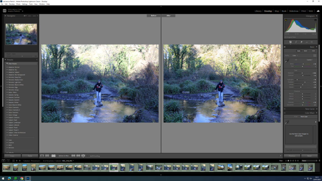
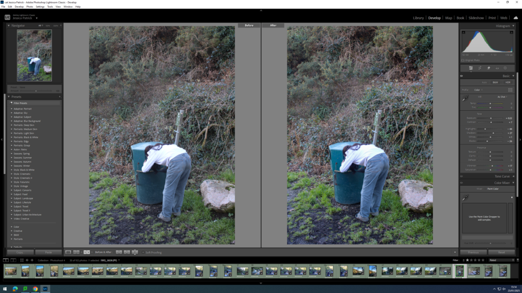
I edited this image by increasing the exposure, contrast, shadows, whites, vibrancy and saturation, while decreasing the highlights and blacks. I did this to improve the lighting and make the image more vibrant.
I edited this image by increasing the exposure, contrast, shadows, vibrancy and saturation while decreasing the highlights, whites and blacks. I did this to improve the lighting of this image.
I edited this image by increasing the exposure, contrast, shadows, whites, vibrancy and saturation, while decreasing the highlights and blacks. I did this, so that the lighting was better and the image was more vibrant.
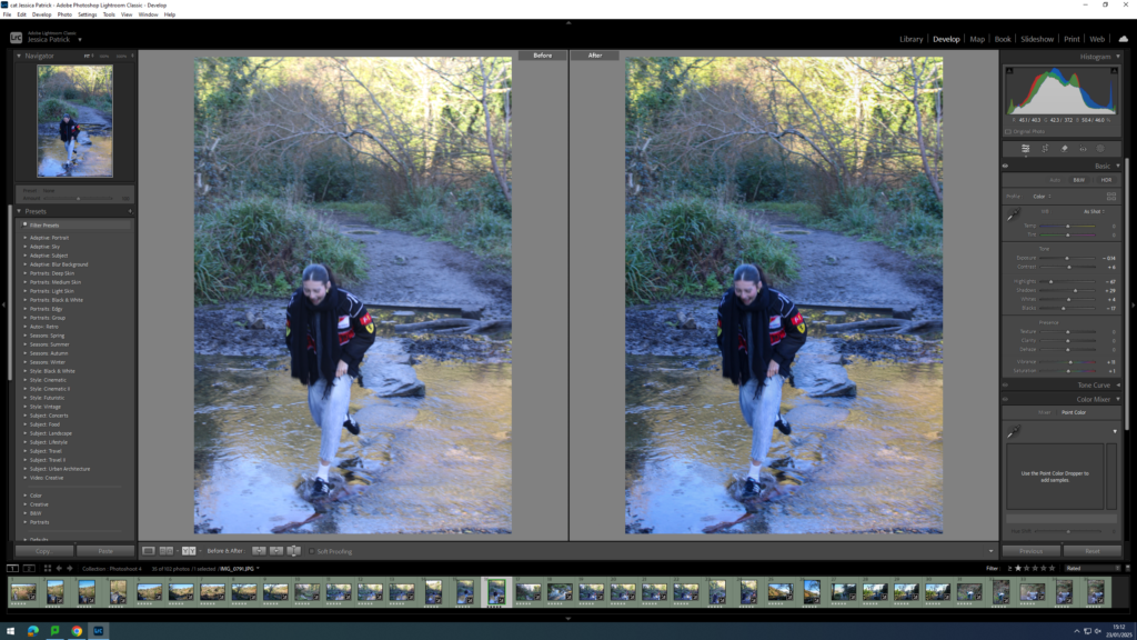
I edited this image by increasing the exposure, contrast, shadows, vibrancy and saturation, while decreasing the highlights and blacks. I did this, so that the image was more vibrant.
I edited this image by increasing the exposure, contrast, shadows, whites and vibrancy, while decreasing the highlights and blacks. I did this, so that the lighting was better.