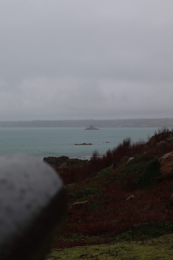
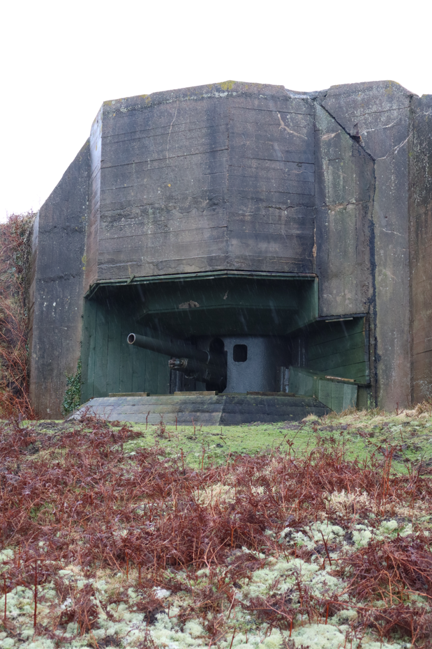
Both contemporary aspects of photography; documentary and tableaux, are paramount for encapsulating a specific scene which conveys a particular time frame in history. Although, the two photographic techniques maintain a common purpose, the method behind using one is a completely different prospect
Essay plan
Introduction (250-500 words)
This essay discusses and compares two aspects of photography; documentary and tableaux, in their unique ability to entice and seduce the viewer to comprehend the story that is being told. Both photographic methods attempt to convey a story in a historical timeframe; documentary photography is often used in reportage (Tate Gallery) in comparison a photograph that uses tableaux can feel pre-planned and hence reproduced. Although, the two techniques maintain a common purpose, the method behind each one is completely different. More recently it has been argued that some photographers such as Tyler Mitchell and Justine Kurland fuse together both the real with the imaginary.
Essay introduction: convert draft introduction to final version.
- Think about an opening that will draw your reader in e.g. you can use an opening quote that sets the scene. Or think more philosophically about the nature of photography and its feeble relationship with reality.
- You should include in your introduction an outline of your intention of your study, e.g.
- What are you going to investigate?
- How does this area/ work interest you?
- What are you trying to prove/challenge, argument/ counter-argument?
- Whose work (artists/photographers) are you analysing and why?
- What historical or theoretical context is the work situated within?
- What links are there with your previous studies?
- What have you explored or experimented with so far in your photography project?
- How will your work develop.
- What camera skills, techniques or digital processes have you used, or going to experiment with?
Below is link to a blog post which will provide you with helpful guidelines if you are struggling to structure your essay or writing paragraphs.
ESSAY WRITING | 2024 Photography Blog (hautlieucreative.co.uk)
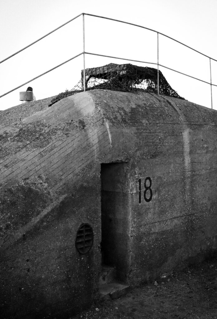
What is documentary photography? Photographing people, events, places etc to create an accurate record or story. Traditionally for highlighting issues and for promoting change (Tate reference). However it can also be used as an art form. It is similar to, though not the same as reportage photography.
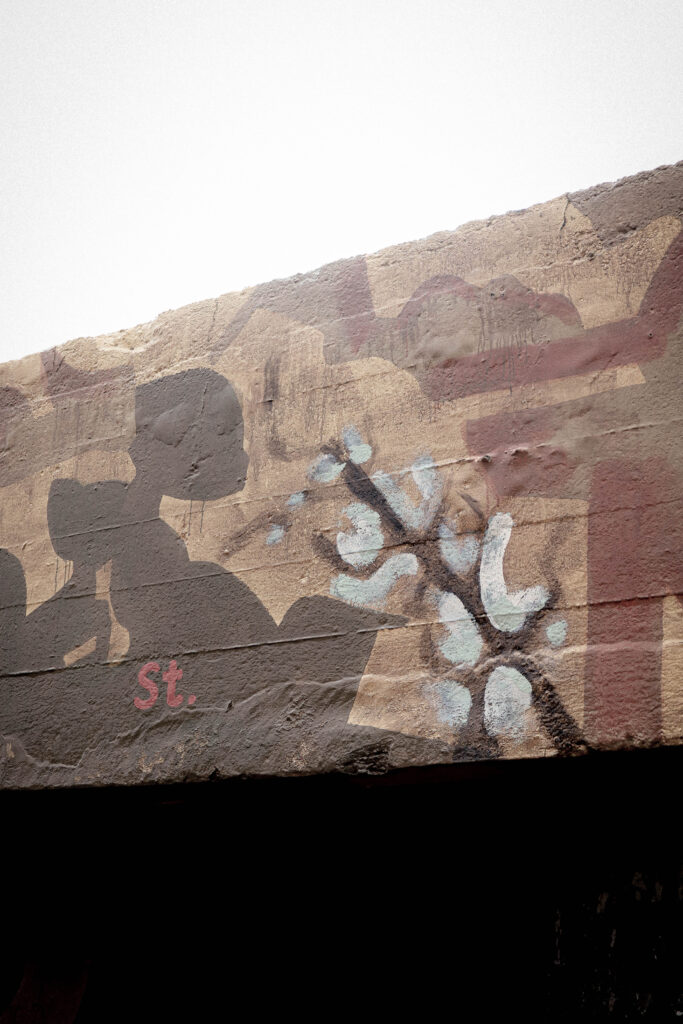
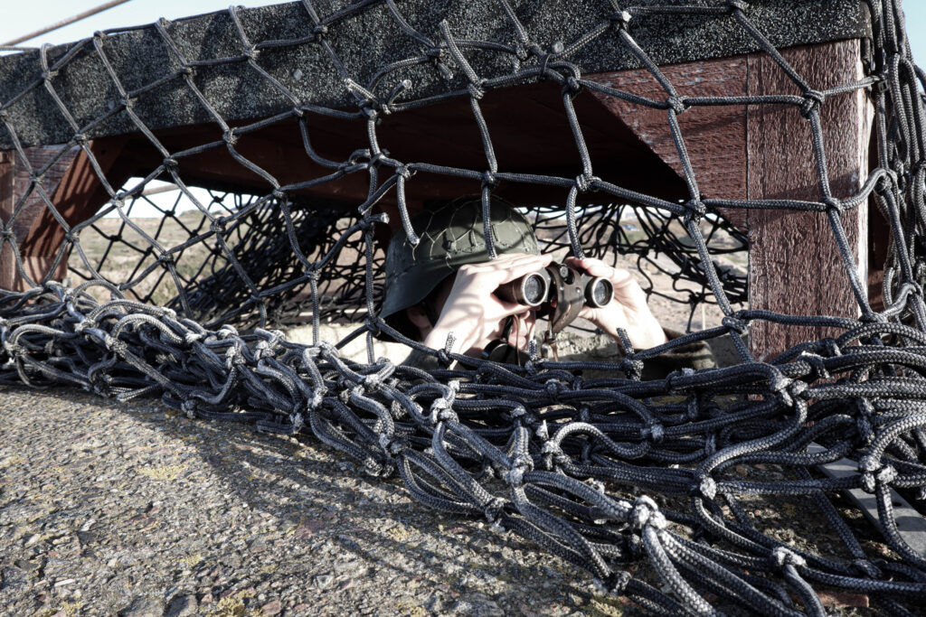
What is Tableaux photography? Tableaux photography is staged, often posed, people in the photographs may be wearing costumes, props may be used along with artificial lighting to create a scene. Tableaux photography is an evolution from art, for example Renaissance paintings depicting scenes from the bible or mythology. People in tableaux photographs are staged such that they appear to be absorbed in their actions or surroundings and unaware of the photographer. (Tate and felix pilgrim).
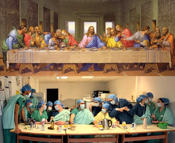
Above – Last Supper painting by Leonardo da Vinci and tableaux by doctors at a hospital in Paris during the Covid pandemic (artnews.com)
How are they similar/dissimilar?
Documentary supposed to show ‘reality’, whereas tableaux is artificial and posed
Documentary used to record events and can be used to try to influence (for example depression era photographers such as Dorothea Lange (smythsianmag.com)) whereas tableaux is often for artistic purposes, but may also be used for social or political purposes.
Subjects in documentary may or may not be aware that the photograph is being taken, however if they are aware there is a possibility their expression and stance may be influenced by the photographers presence (niemanreports.org). Subjects in tableaux are, by definition, aware they are being photographed, and may be instructed by the photographer to pose in a particular way.
- Use information gathered in previous blog posts, or use hyperlinks below, in relation to Art Movement and Isms relevant to your artists references and their work.
- Select at least two quotes from your literary sources that you can incorporate into your paragraph.
- Your paragraph must include visual examples of artists work within that art movement that is relevant to your Personal Study.
- Consider content and instructions below
- Complete Paragraph 1 and upload to the blog at the end of lesson
Paragraph 1 Structure (500 words) : Use subheading. This paragraph covers the first thing you said in your introduction that you would address. The first sentence introduces the main idea of the paragraph. Other sentences develop the subject of the paragraph.
Content: you could look at the following…exemplify your hypothesis within a historical and theoretical context. Write about how your area of study and own work is linked to a specific art movement/ ism. Research and read key text and articles from critics, historians and artists associated with the movement/ism. Use quotes from sources to make a point, back it up with evidence or an example (a photograph), explain how the image supports the point made or how your interpretation of the work may disapprove. How does the photograph compare or contrast with others made by the same photographer, or to other images made in the same period or of the same genre by other artists. How does the photograph relate to visual representation in general, and in particularly to the history and theory of photography, arts and culture.
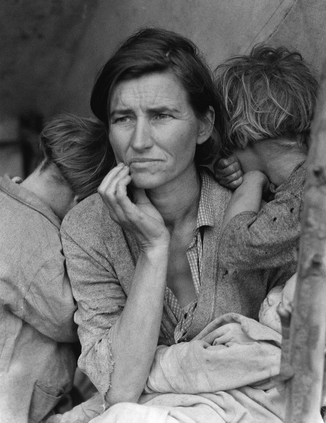
Above Dorothea Lange ‘Migrant Mother’ – example of documentary photograph taken during the Great Depression in USA during the 1930s. The composition draws your eye to her face, which is tired and shows she is worn out.
Paragraph 1 structure (use subheadings) (historical and theoretical context- how is your area of study links to the specific art movement- read key texts from critics, historians and artists, us quotes, evidence back up if can with photo. Explain how image supports the point made, how does the photo compare/contrast .
First photographer (put one of two or own pictures too)
Tom WoODS
Tom Woods became known as the ‘Photie Man’ as he was often seen around Liverpool and Merseyside in the 80s and 90s taking photographs of the people and events he observed around him. studiointernational.com. Tom Wood’s approach was to document everyday life, normally through candid, street, photography, although in some of his photographs his subjects were aware he was photographing them. Interestingly he says that he is not a documentary photographer, although this is what he has undeniably done: ‘I’m not trying to document anything ….. I’m only interested in good pictures, if it’s a document then it’s a bonus’.


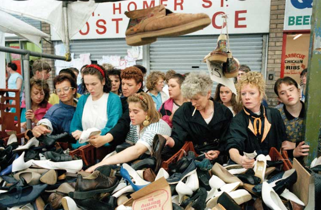
Above – Tom Woods ‘Finding a Pair’ – photograph of women at a second hand shoe stall. use of classic ‘rule of thirds’ composition
Second photographer (put one of two or own pictures too)
paul M smith
Paul M Smith is a British photographer who has produced several sets of images on the theme of masculinity. While his photographs appear to have the theme of documentary they are actually posed, and a large amount of effort has gone into capturing and editing the images in which, he, is often the only person in the photographs. Thus making these tableaux photographs.
It is interesting to juxtaposition images from his ‘Artist Rifles’ series alongside Robert Capa’s iages from taken during the Spanish civil war. In Artist Rifles Paul M Smith takes self portraits of himself dressed as different soldiers and uses digital photomontage to create fictional military scenes (some of which are relatively graphic, such as execution and burials).
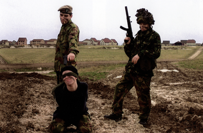
Above Paul M Smith photograph taken as part of his Artist Rifle series. In this photograph each of the soldiers is posed by Paul M Smith himself and the image put together as a photomontage. While having the appearance of a documentary image, it is entirely posed and fictional.
Robert Capa was a war photographer who documented the Spanish Civil War and the Second World War, was an acclaimed documentary photographer. One of his most famous images depicts the shooting of a soldier in 1936. A number of claims have been made that Capa’s description of the location where false and the photograph is likely to have been faked. Nytimes.com.
Between the posed images by Paul M Smith and the documentary footage (perhaps posed?) by Robert Capa, the clear definition between documentary and tableaux is blurred. “Art is always manipulation, from the moment you point a camera in one direction and not another,” (Spain’s culture minister, the film director and screenwriter Ángeles González-Sinde) (nytimes.com)
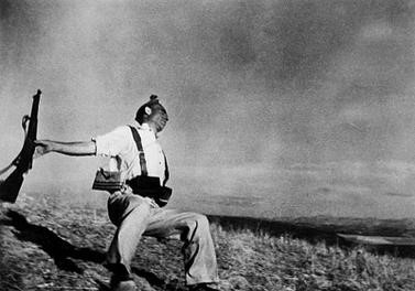
Above Robert Capa’s The Falling Solider, an image taken during the Spanish Civil war in 1936. Supposedly taken exactly at the time the soldier was shot, however there has been controversy over the accuracy of this picture.
neil leifer- sports documentary
Neil Leifer has been documenting key sporting events in America for 60 years and is responsible for many classic sporting images (nielleifer.com). His style is primarily documentary and portraiture. He has taken many posed photographs of famous sports personalities however it is his documentary photographs that this essay will focus on.
Neil Leifer puts his success down to luck and being in the right place at the right time, however he also emphases the need to recognise that a great shot is there and grab it, even when it may be fleeting: “what separates the top photographers from the run-of-the-mill photographers is that when you get lucky a good photographer doesn’t miss.” (npr.org).
One of Neil Leifer’s successes has been getting the camera in the right spot. He says this takes time and planning. For his famous shot of Ali v Williams boxing match at the Houston Astrodome in November 1966 he arrived four days before the match to set up and test his remote camera mounted in the rafters. He then took the film to the developers and waited for it to be processed “most photographers don’t hang around the magazine’s photo labs, but I would go to make sure they didn’t mess up my film”. (theguardian.com/artanddesign)
So for sports documentary it is important to be think ahead and plan and to control what you can, however it is equally important to be constantly on the lookout for ‘the shot’ and ensure you do not miss it.
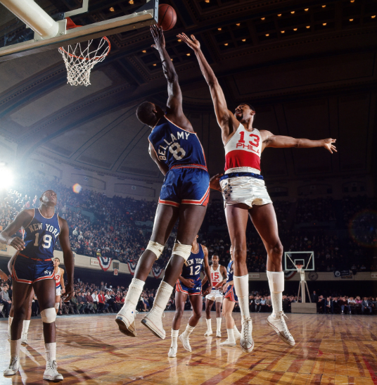
Philadelphia 76ers center Wilt Chamberlain shoots over Walt Bellamy of the New York Knicks during a game at Convention Hall. Philadelphia, Pennsylvania. March 1966 (neilleifer.com)
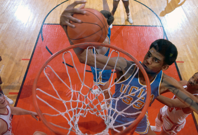
Aerial of UCLA center Lew Alcindor (later known as Kareem Abdul-Jabbar ) rebounding during the 1967 NCAA National Championship game against Dayton at Freedom Hall.Louisville, Kentucky. March 25, 1967. (neilleifer.com)
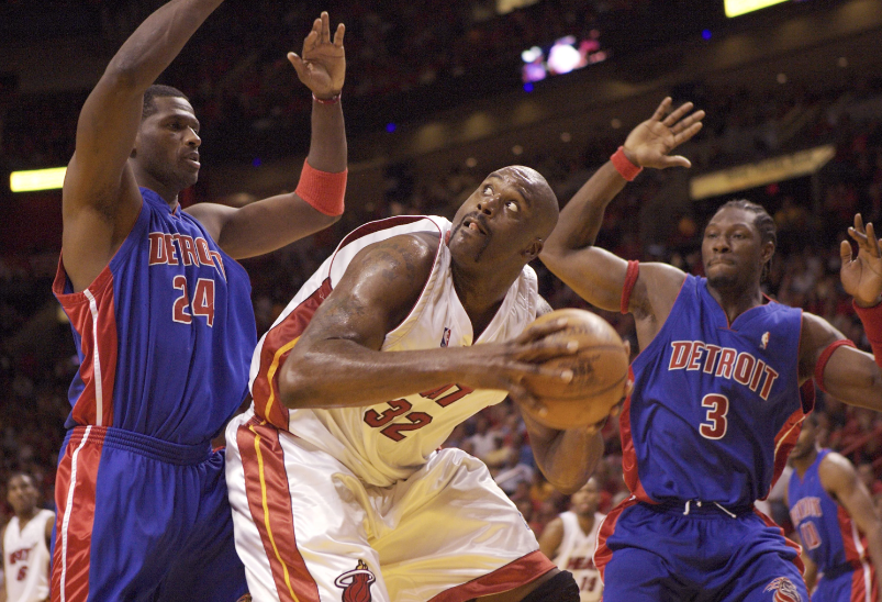
Miami Heat center Shaquille O’Neal goes up against Antonio McDyess and Ben Wallace of the Detroit Pistons during Game 5 of the 2005 NBA Eastern Conference Finals at American Airlines Arena. Miami, Florida. June 2, 2005. (neilleifer.com)
George McGinnis of the Philadelphia 76ers drives to the lane versus Paul Silas of the Denver Nuggets at The Spectrum. Philadelphia, Pennsylvania. March 9, 1977. (neilleifer.com)
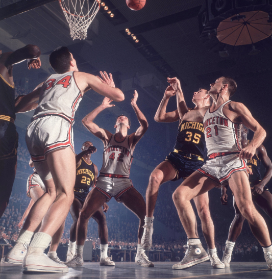
Bill Bradley of Princeton University waits for a rebound during a 1964 ECAC Holiday Festival game versus Michigan at Madison Square Garden. New York, New York. December 30, 1964. (neilleifer.com)
Conclusion
COMPARING THE IMPACT OF DOCUMENTARY VERSUS TABLEAUX PHOTOGRAPHY IN TELLING A STORY
- both used for telling a story, documentary should be ‘genuine’ whereas tableaux is fictional, but can be used to recreate past events
- what is the impact of the subjects knowing there is a photographer present? Does this affect the outcome and impact the documentary photograph?
- What if a documentary photograph, claiming to be real, is considered to be fake or influenced by the presence of the photographer?
- The best documentary photographs can still require time with planning and control over the process.
- Documentary photographers need to be able to rapid assess what is happening in front of them and be able to identify when a great shot is available and grab it.
- When photographing tableaux the photographer will normally have more time to set up the shot, and has the benefit of being able to repeat, or change the shot to achieve the desired outcome.
Things to add:
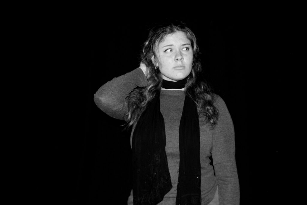
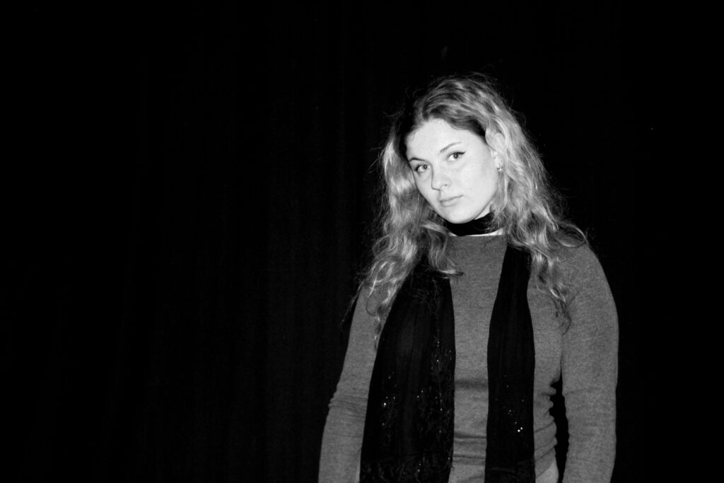
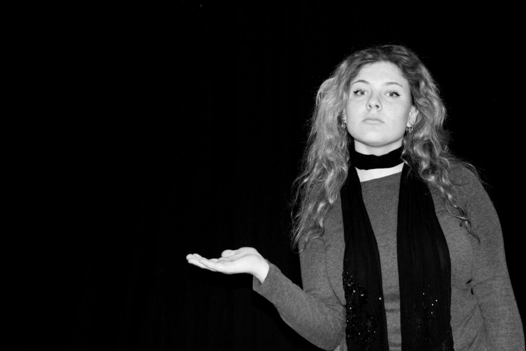
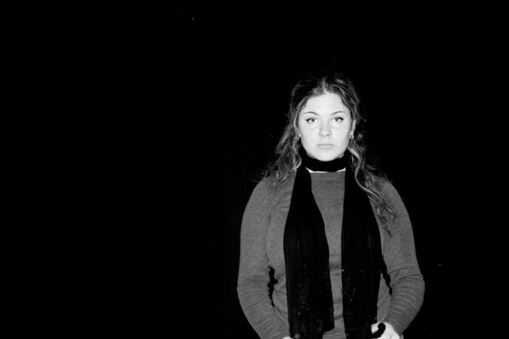
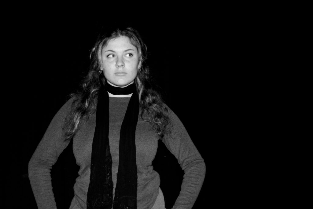
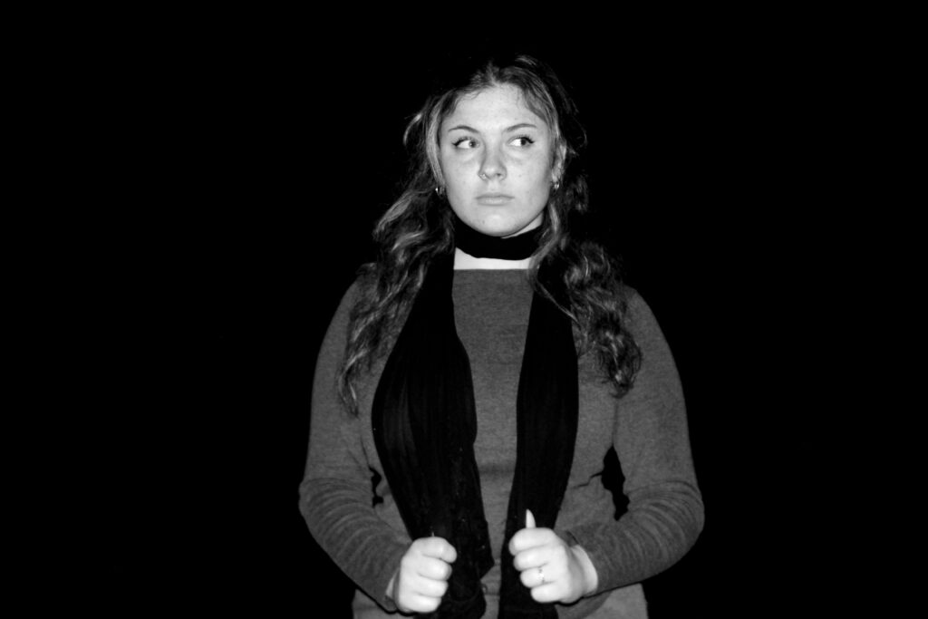
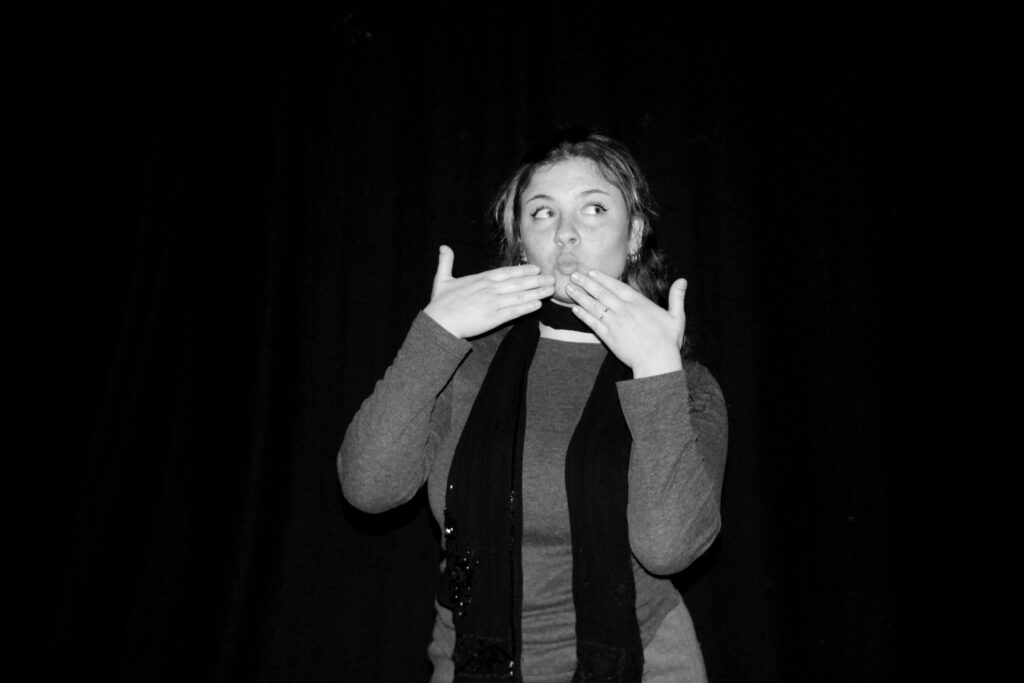
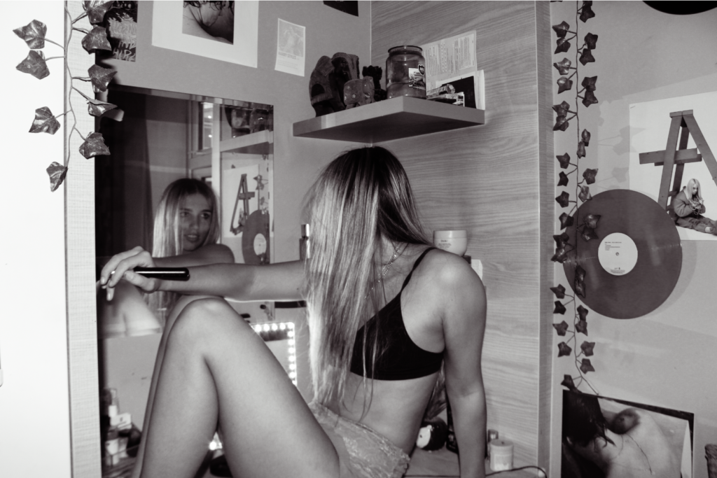
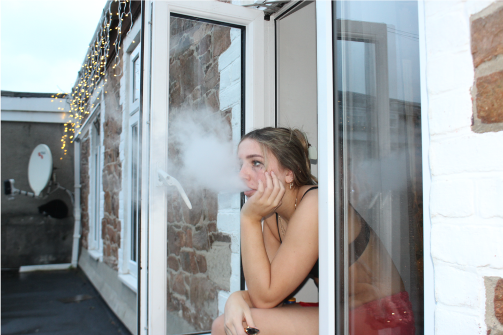
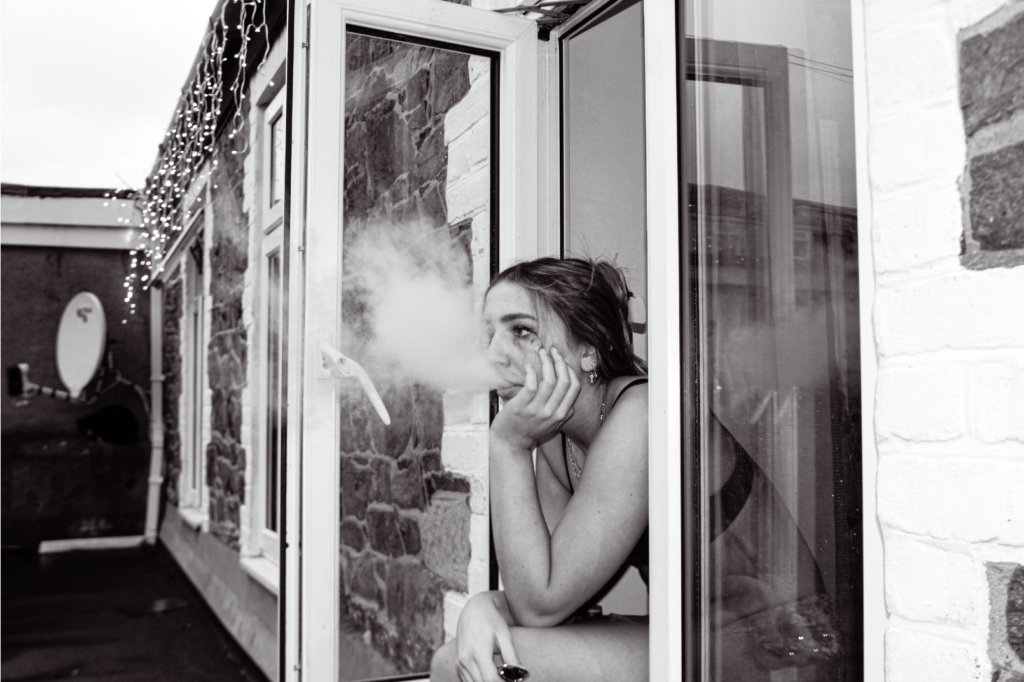
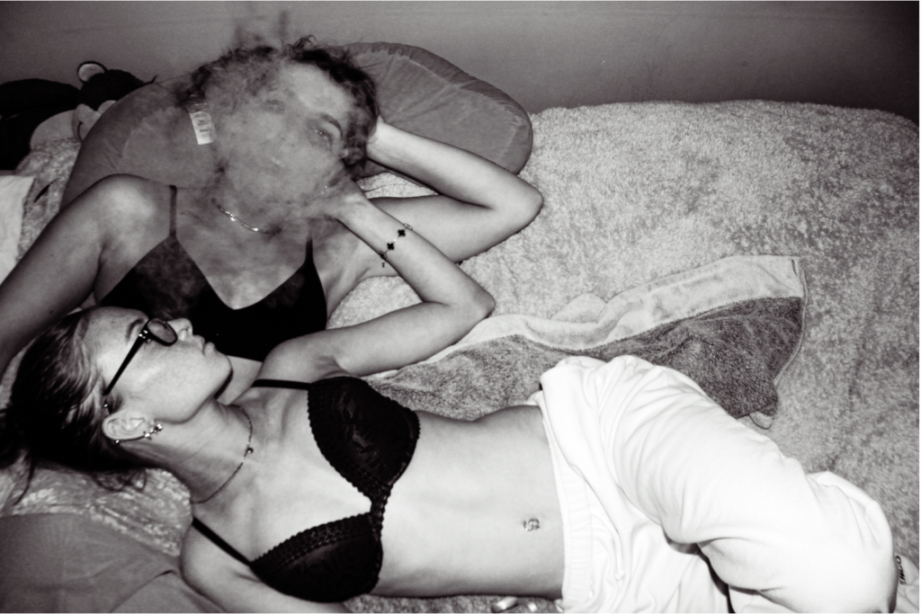
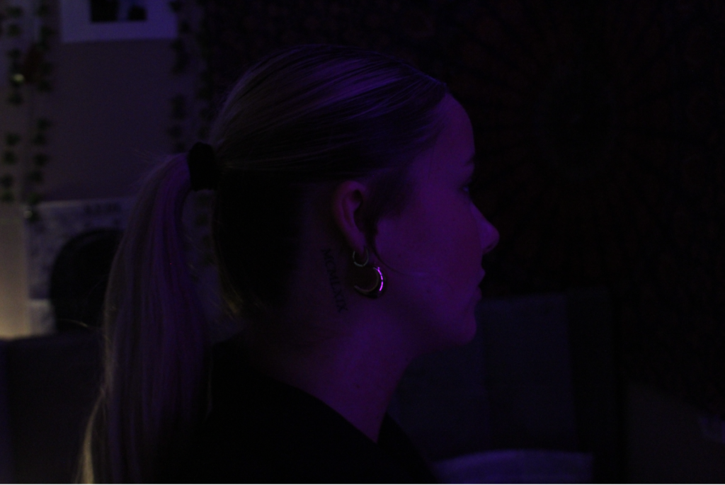
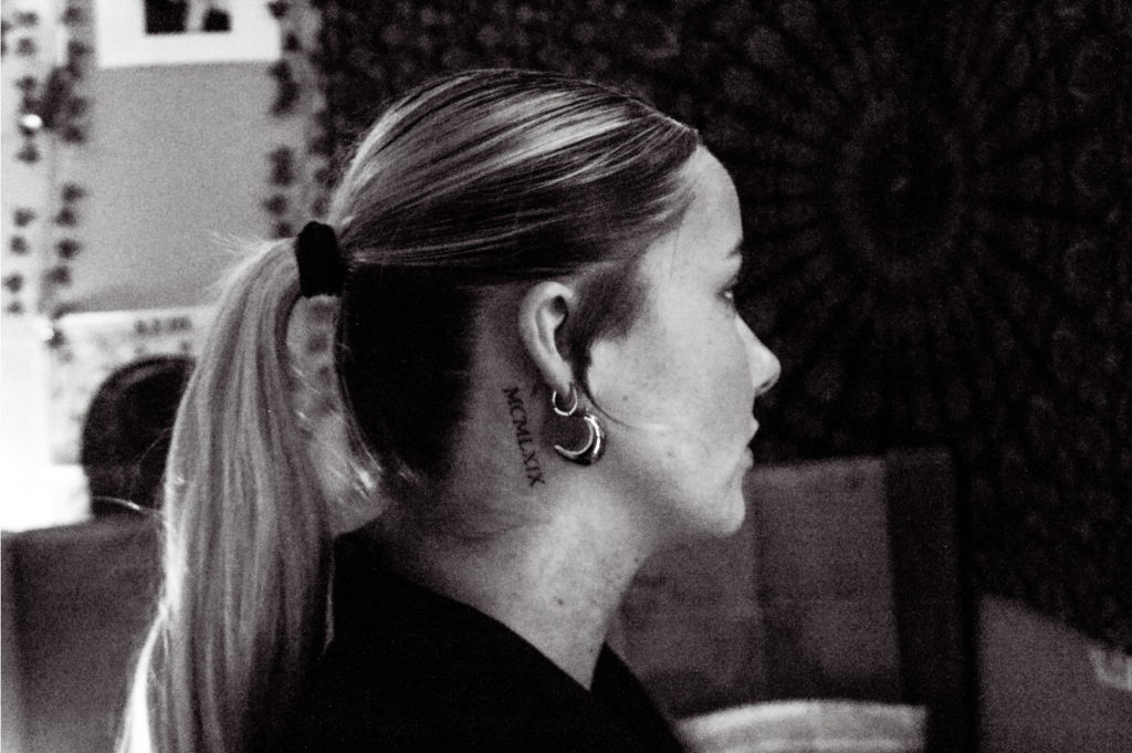
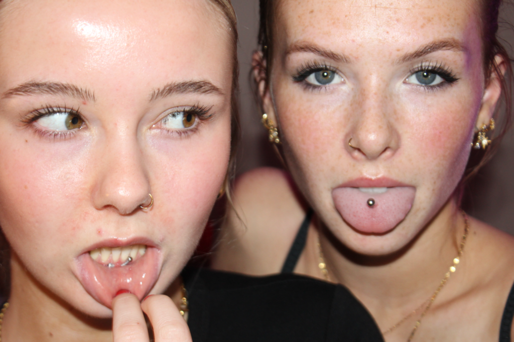
- A few of my own photos
- Explain why a tableaux photo or documentary photo is better using examples from photos
- Find a good quote using blog
- Why are telling stories so important to humans – plutons cave paintings
Bibliography
David_Bate_The_Pictorial_Turn.pdf
David_Bate_The_Art_of_the_Document.pdf
Photography Today: Between Tableau and Document Hilde Van Gelder- Photographie Volume 28, numéro 1-2, 2008 URI : https://id.erudit.org/iderudit/044589ar