Deconstruct photobook

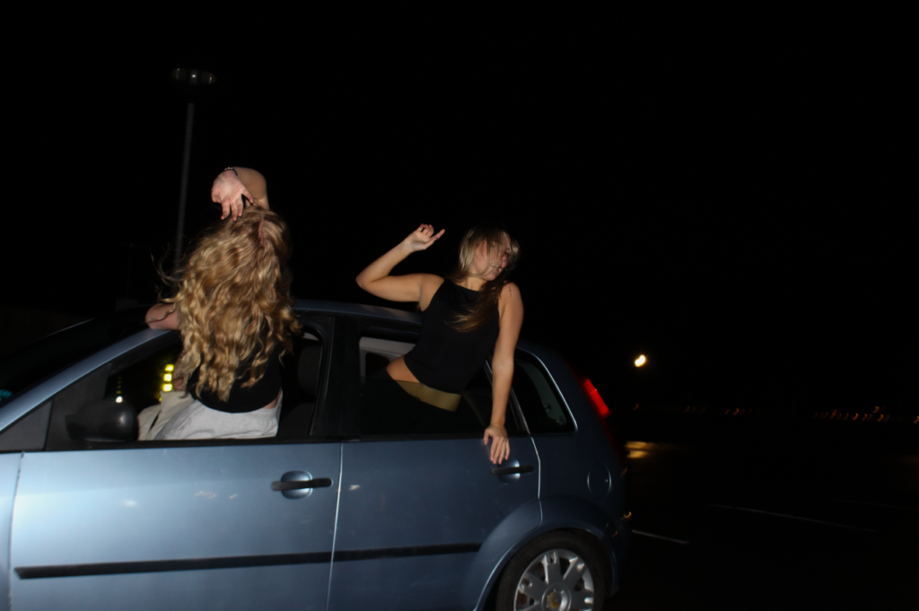
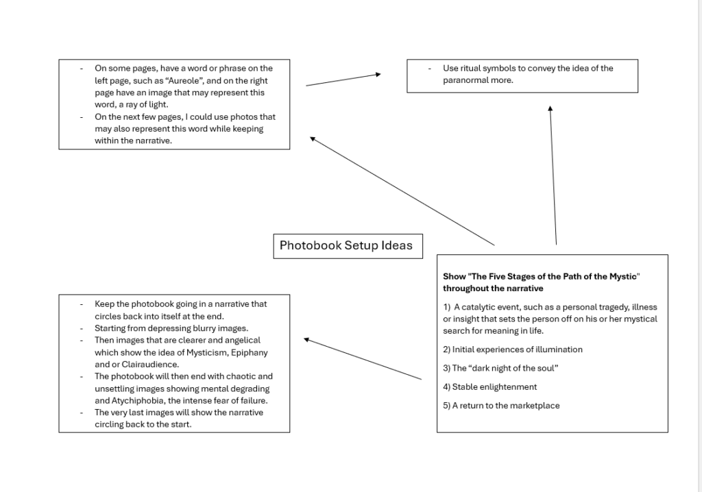
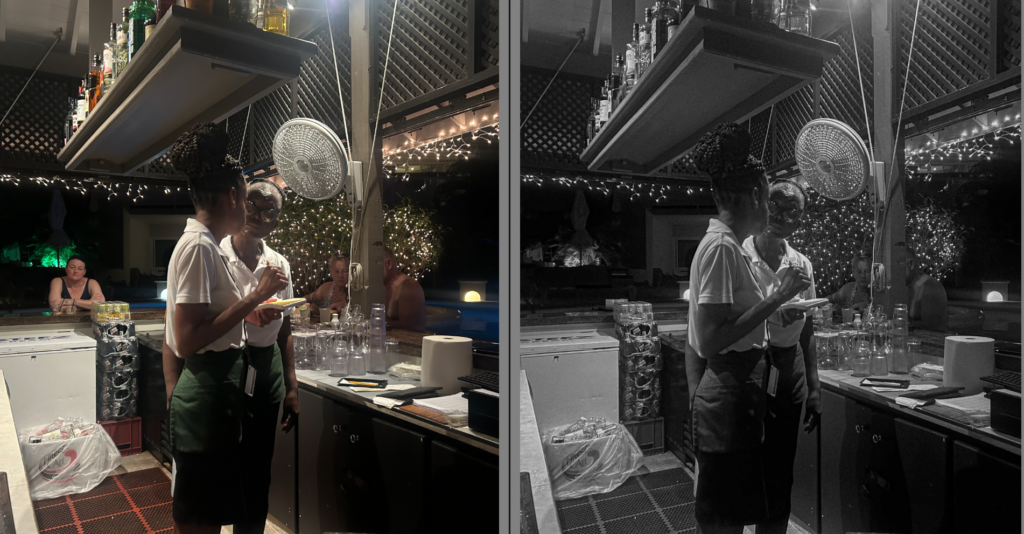
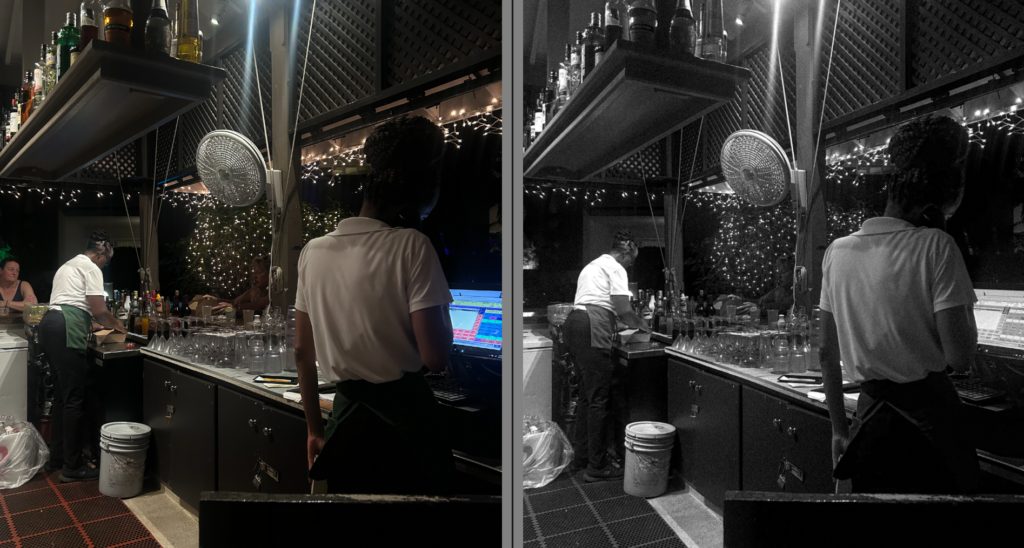
Photobooks are a typical format for presenting a photographers gallery of images. These images are contained into a concept, collection or a story, having an overarching theme. Sequencing and placement of the images are defining factors that contribute to the aesthetic of the book, however many photographers sometimes use text to relate these images to more qualitative information too.

Laia Abril – ‘The Epilogue’

“giving voice to the suffering of the indirect victims, the unwilling eyewitnesses of a very painful degeneration”Laia Abril, Burn Magazine

I chose Laia Abril’s photobook ‘The Epilogue’ to deconstruct as not only does it surround a sensitive topic, this being the story of the Robinson family after the loss of their 26-year-old daughter to Bulimia, but it also incorporates many unique techniques in order to keep the narrative consistent and detailed.

“Mother’s Day and Father’s Day are brutal holidays in our family”Cammy’s brother

Abril works closely with the family to reconstruct Cammy’s life through memories and flashbacks to depict the second-hand implications that her family were affected by also, showing not only the absence, frustration and guilt that her family share, but to act as a memorial to her wilfulness and energy. By doing so, this photobook comes together to act as a bittersweet way of remembering a loved one.

However, this photobook has wider applications through its explorations of the dilemmas and inner conflicts that many young girls and their parents face, and by giving voice to the suffering of the family or the indirect victims of eating disorders, such as close friends, it allows their eyewitness stories to be heard to process this grief, or allowing the viewer to relate and feel seen in order to prove that they aren’t alone in their battle against it. This conveyed narrative of loss, tragedy and remembrance provides a tone of solace to the viewer through the rawness and honesty in documenting Cammy’s story.

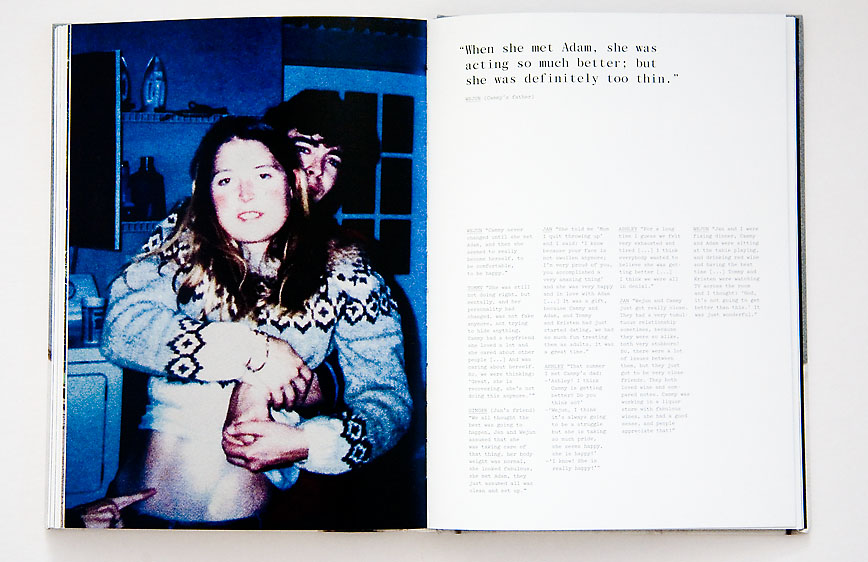
Being quite a large photobook, Abril has multiple genres in relation to her image-making in order to depict the Robinson’s family accurately, whilst also being paired with information in a text format, including ‘testimonies’ from family members, as well as small captions describing what the image represented or what it involved.

The Epilogue employs contemporary pictures, archived family images, letters, interviews, and documents in order to attempt to answer the complex question of Cammy’s identity and highlight how she was beset by psychological problems. This breaks down her life into a distressing amount of detail and picks apart the events in her life leading up to her death so that we, as the viewer, can gain a holistic perspective of her and her family dynamic.

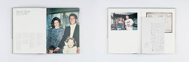
The book begins with candid images of the Robinson family paired with more landscape images to gain an initial understanding of who this person may be and allows the viewer to have a glimpse into what Cammy’s life was like:

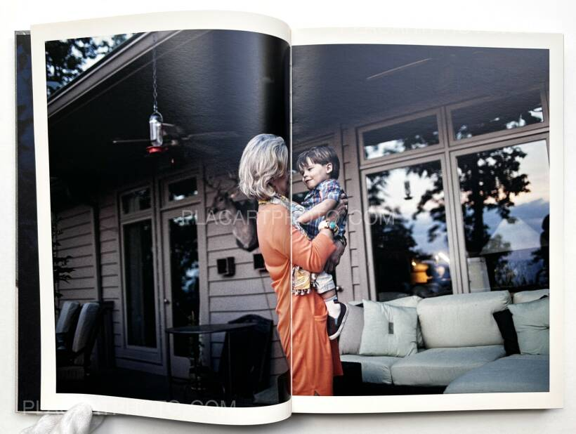
The beginning images connote love and connection, this could be suggestive not only to the bond they share in their times of remembrance and grief, but also how Cammy was surrounded by adoration from all members of her family. This could also be relative to how this story began until her Bulimia deteriorated her.

Similarly, Abril incorporates contemporary images of items too, such as strawberries or trainers in the back of the car, possibly symbolising how remnants of Cammy are everywhere, and how they feel that she is still with them.

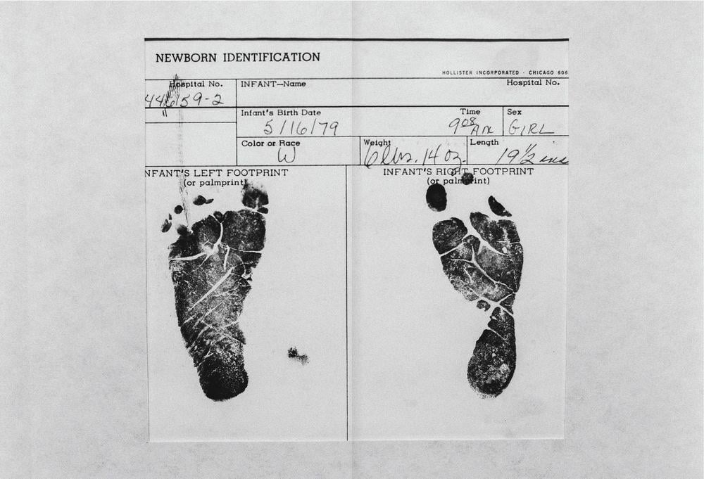
Abril includes medical information too. Towards the beginning of the book, Cammy’s new born identification sheet is digitised, creating a familiarity between the viewer and herself. Abril also does this with what seems to be Cammy’s ECG paper (tracing her heart) as it states earlier in the book that she previously had more than one seizure in relation to her eating habits.

Diary entries and letters from Cammy and family members also take multiple formats in The Epilogue, either being digitised, for example:

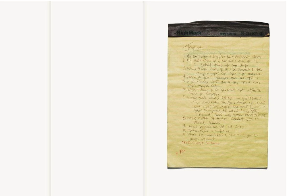
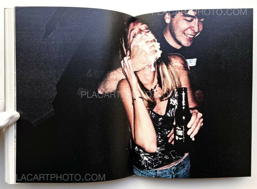
However, Abril also plants sections of these documents and data by making them look like leaflets overlaying the images that the viewer can pull out and read. I really like this aspect on Abril’s work because this creates a more physical perspective for the viewer rather than it being a singular visual narrative to make it more engaging. This could be a symbolisation of how her illness had good and bad days, explaining how her illness could spike at any given moment even in the midst of happy memories. I thought that this was extremely effective.

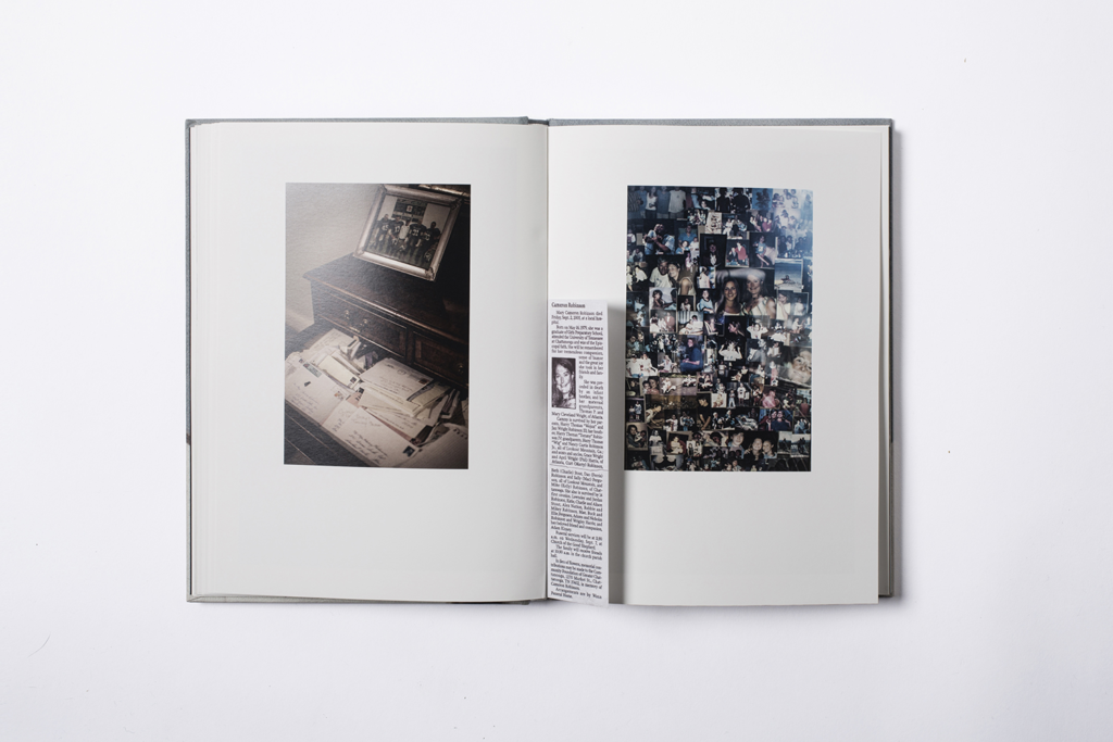
Abril also employs the use of archived images in order to be reminiscent on Cammy’s life and the moments that she felt enjoyment in order to make The Epilogue encapsulate the fluidity of emotion around this topic. Her use of various image styles and methods reinforce this idea, and this allows Abril to rehearse the story of the Robinson’s family overall to really assess what the situation was like and how this impacted all members.

With the image below, its clear to see that Abril uses a multitude of formats when layering her images too. This includes:

  • Double page spreads,
  • Single page,
  • Half page spreads,

Abril also would play alternate with the sizing and placement of the images, sometimes making the image look as if it came from a polaroid, in contrast to placing the image just off-centre.

Laia Abril:

Abril’s work in photography is heavily affiliated with themes of bio-politics, grief and women’s rights. Abril pushes the boundaries from looking into the failing structures of law that continue to perpetuate rape culture, to the impacts of abortion control in varying cultures, leading to her various projects surrounding the impacts of eating disorders – Thinspiration, for example, being a self-published zine that challenges the use of photography in pro-ana websites (websites which use the promotion of behaviours that influence anorexia nervosa).

Her bodies of work strive to advocate for inequalities, specifically more feminist matters, which are able to act as forms of activism for the female community, and give those less fortunate a voice. I feel that with The Epilogue, Abril is striving to speak out to young girls who may be struggling with body image or an eating disorder themselves, and strives to assure them that they are not alone. This also provides solace to parents or families who may have a young daughter who struggles with an eating disorder or recovering from one, so that they can hear the Robinson’s story and use this to find peace within their possible own grief. Eating disorders are a sensitive issue and I feel that Abril intended to show the harsh reality behind them in order to spread this awareness, and could possibly be used to create preventative methods against them through the spread of awareness.

The Epilogue “… is a sombre and affecting photobook … dense and rewarding … At times, it makes for a painful read. From time to time, I had to put it down, take a breather. But I kept going back.” The Guardian, Critic Sean O’Hagan

The Epilogue has received numerous awards, some of these being:

  • In 2014, The Epilogue was shortlisted as First PhotoBook award in the Paris Photo-Aperture Foundation PhotoBook Awards
  • The Hood Medal of the Royal Photographic Society
  • In 2023, the Spanish National Photography Prize
  • The PhotoEspaña Best Book Award
  • The PhotoBook festival in Kassel

Narrative, Design, Concept:

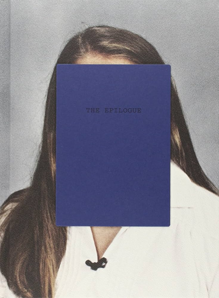
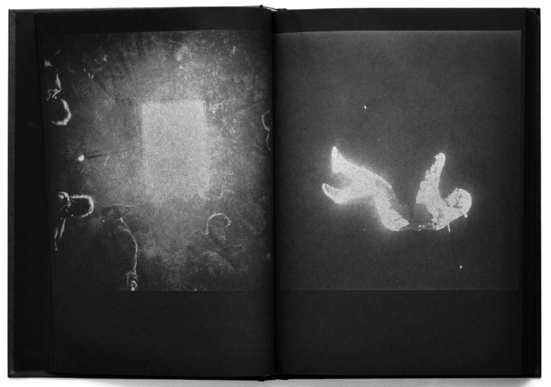
The term ‘Epilogue’ actually means a final or concluding act or event, usually a section at the end of a book or play that serves as a comment or conclusion on what has happened. I find that this being paired with a graphic rectangle over can be assumed to be Cammy’s face is very powerful as it secretly hints at her death without giving away any specifics until further into the photobook. I find that this could be metaphorical for how different she became, as eating disorders do not change just a person’s body but their attitude, personality and mindset too. Although the title is literal, I find it quite poetic too as this is concluding what happened to Cammy until the end of her life, resonating with the ending of the book. The weight of the book goes hand-in-hand with the title too as it tacitly hints at the dark and heavy subject matter that Abril is representing.

The beginning and last pages have an ominous blue tonality to them, appearing to be leaves against a wall at night-time. This adds to the solemnity that the front cover inhabits, preparing the viewer for this dark story. The photobook has a hard cover that has been printed on, however the graphic section of blue is slightly raised in an embossed way. This is where the design is raised up from the surrounding material. Within the book, this also consists of three chapters categorised into dates so that there is a progression of her illness at three intervals. All of the pages are kept white and portrait, however some images have been enlarged so that Abril could have pages which fold over so that it is interactive.

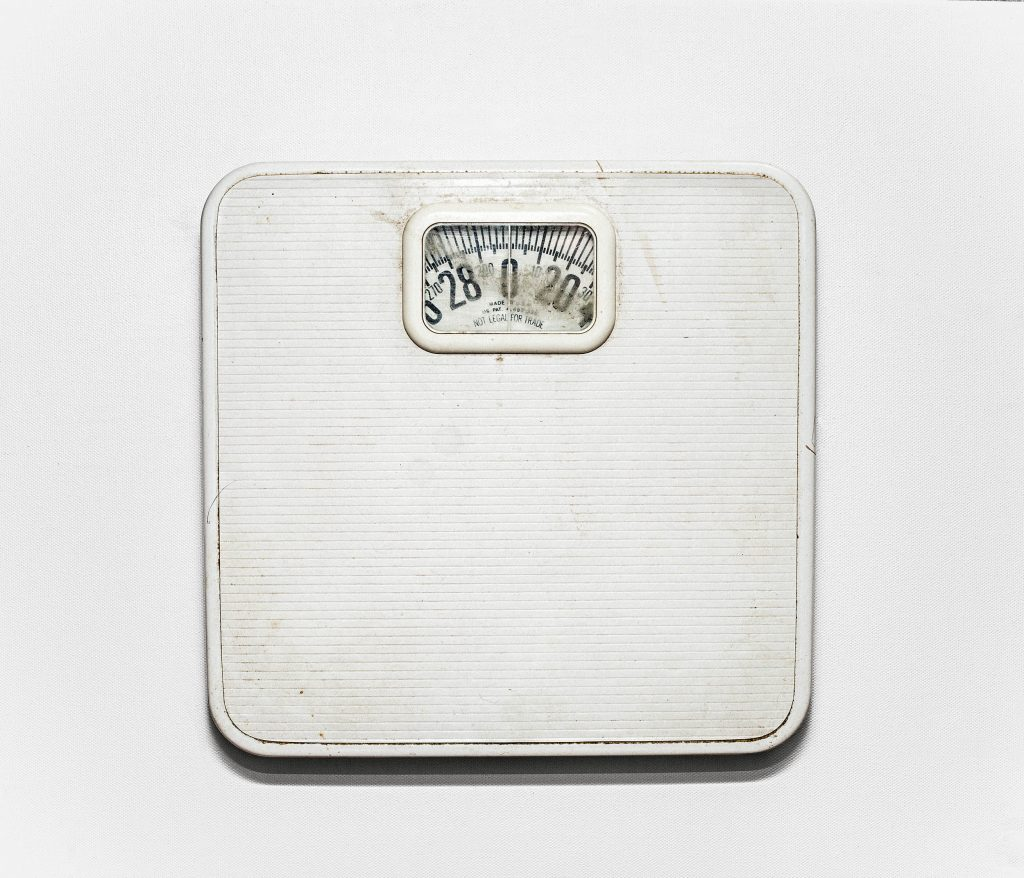
Whilst all the different types of images that Laia Abril employs in this photobook, the image of the scales above is the most defining image of the photobook. This image is extremely powerful, being that it would have been used by Cammy when tracking her weight. The swift in tonality between the scales themselves and the white background creates an ominous tone that can be echoed throughout the rest of the photobook with support from Abril’s other images, adding a ghostly effect to the scales themselves. In my work, I would like to be able to use this idea of having a defining image in my photobook, because Abril has been able to use this to solidify and verify the narrative that the other images were implicitly hinting at. Images like these can tend to pause the viewer so that they can take time to really connect with the context of the narrative and think about the deep conceptual meaning behind it.

ESSAY PLANNING.

QUESTION IDEA- How are women portrayed in art by the work of Helmut Newton in comparison to the work of Cindy Sherman’s untitled film stills?

DEADLINE: Essay Introduction Draft MUST be handed in Thursday 18 Dec 2024

DEADLINE: Final Essay MUST be handed in Fri 31 Jan 2025

Literary sources: Go to this blog post here: Theory: Literary Sources and copy relevant key texts relating to the subject of your essay and list in alphabetical order in your bibliography. In addition, find your own key texts in relation to artists selected for in-depth analysis in your essay and list these too. These texts could be interviews with the artist, or reviews/ critique’s written by others. See useful online sites/ sources here .

  • Research and identify 3-5 literary sources from a variety of media such as books, journal/magazines, internet, Youtube/video that relates to your personal study and artists references .
  • Begin to read essay, texts and interviews with your chosen artists as well as commentary from critics, historians and others.
  • It’s important that you show evidence of reading and draw upon different pints of view – not only your own.
  • Take notes when you’re reading…key words, concepts, passages, page number to be used for in-text referencing etc.


Essay Question Ideas

possible-essay-questions-to-investigate

Essay Plan
Make a plan that lists what you are going to write about in each paragraph – essay structure

  • Think about an opening that will draw your reader in e.g. you can use an opening quote that sets the scene. Or think more philosophically about the nature of photography and its feeble relationship with reality.
  • You should include in your introduction an outline of your intention of your study, e.g.
  • What are you going to investigate?
  • How does this area/ work interest you?
  • What are you trying to prove/challenge, argument/ counter-argument?
  • Whose work (artists/photographers) are you analysing and why?
  • What historical or theoretical context is the work situated within?
  • What links are there with your previous studies?
  • What have you explored or experimented with so far in your photography project?
  • How will your work develop.
  • What camera skills, techniques or digital processes have you used, or going to experiment with?
  • Introduction (250-500 words): What is your area study? Which artists will you be analysing and why? How will you be responding to their work and essay question?
  • Pg 1 (500 words): Historical/ theoretical context within art, photography and visual culture relevant to your area of study. Make links to art movements/ isms and some of the methods employed by critics and historian. 
  • Pg 2 (500 words): Analyse first artist/photographer in relation to your essay question. Present and evaluate your own images and responses.
  • Pg 3 (500 words): Analyse second artist/photographer in relation to your essay question. Present and evaluate your own images and responses.
  • Conclusion (250-500 words): Draw parallels, explore differences/ similarities between artists/photographers and that of your own work that you have PRODUCED.

‘To photograph is to appropriate the thing photographed.’ (Sontag 1977:4)

Photographs alter and enlarge our notions of what is worth looking at and what we have the right to observe.

Bibliography: List all relevant sources used:

Sontag,S. (1977) ‘In Plato’s Cave’ in On Photography. London: Penguin Books.

Mulvey, L. (1973) ‘Visual Pleasure and Narrative Cinema’ in Screen (1975)

Avgikos, J (2002) ‘Cindy Sherman: Burning Down the House’ in Well, L. The Photography Reader. London: Routledge.

Judith Butler is an academic and writer who is an authority on feminism and gender studies, incl queer theory. Her seminal book is: Gender Trouble which we do have a copy of in the Library LRC and in Media. Here is a good overview of her work – make sure you read it all and watch video as well.

Butler, J. (2019). ‘Gender as Performance: Judith Butler’ in Dixon, M. Media Theory for A-Level Students. London: Routledge.

  1. How is the work of Claude Cahun and Cindy Sherman questioning the politics of gender and female stereotypes?

2. Compare how Cindy Sherman and Phoebe Jane Barrett challenge gender stereotypes in their work.

3. How are woman portrayed in art by the work of Helmut Newton and Edouard Manet with reference to Berger’s book, ‘Ways of seeing.’

QUESTION IDEAS:

Personal Study – photoshoot 2 and editing

Contact Sheet:

For my second personal study photoshoot, I chose to use 4 of my friends as models and recreated scenes inspired by Justine Kurland and Ramona Wang. The location of this shoot was in indoor and outdoor locations, meaning I was able to get a range of different images portraying different feminine ideas and perspectives. This differs from the first shoot I executed because it was only based on outdoor scenes, meaning I only had a limited amount of different backgrounds to include, which didn’t add any unique elements for me. Although this photoshoot incorporates factors from both my artist inspirations as they share focus on femininity, within this photoshoot I have portrayed similar aesthetics to Roberta Tocco specifically because she includes female models often displaying a close relationship with one another, for example physical touch, in her images. I have recreated these by photographing my friends including myself exhibiting these ideas, where we are often seen as being feminine by ‘comforting’ one another. I believe that the use of physical touch between females successfully links to my project and the overall themes, this is because stereotypically, women are seen as nurturing due to us having duties of having children, and this highlights the importance of having emotional connections with others. Other photos I captured such as portraits of one model individually can also link to youth and femininity due to the fact by having one female model in an image the viewer is able to make assumptions of why the image was taken, what I am trying to portray and identify what the main subject is. Contrastingly, I did photograph outside in a dark and empty car park, where we took the images of the girls out the car window and on the car bonnet. The reasoning behind this was to illustrate teenagers girls and their fantasy life, which again links to Tocco and her focus. These images show the feelings girls have towards growing up and becoming young adults who need to find their own identity. By photographing youthful and women-like factors, it allows me to begin telling my own story through my own personal experiences of being a young woman who is slowly steering away from childhood, and I feel that these images represent girlhood and youth effectively.

On Lightroom, I imported all 273 images from my shoot, and placed them in a new collection named “Personal Study photoshoot 2” so I could have future access to this photoshoot. I then flicked through all the images, and deleted the ones that had no potential and perhaps did not reflect my artists or display the themes I am focusing my project on. Next, I categorised all my images into one of three categories by colour coding; green, yellow or red. Which makes the editing process easier as I will only want to edit the green images, the ones that have the best lighting, camera focus, shutter speed and iso etc. During this, I also flagged the best images from the shoot, meaning I can differentiate them from the rest when I come to edit them, and therefore only focus on my best outcomes.

Furthermore, to begin my editing process I selected just my flagged images to edit so it separates them from the least successful outcomes. This made it easier for me, so I can identify which images I want to include from my shoot into my final book.

Editing:

The following images I have edited are my best selections from photoshoot 2, where I mainly took inspiration from Ramona Wang, yet I also included inspirations from Justine Kurland in the sense of careless teenage runaways.

For my first edit, this image has an overall mood of melancholy due to the models facial expressions. Therefore I wanted to exaggerate these feelings through decreasing the saturation of the image, which makes it appear colder to the viewer. By increasing the contrast too, I extenuated this to add more depth into the image and overall increase the intensity. However, despite it looking effective by itself, I don’t think this image will fit into the rest of my photobook as it is not the aesthetic I am aiming to show.

I edited this image again, this time keeping saturation within it as I feel it gives the image some life. Although the models facial expressions show sorrow and dejection, I believe that by adding more vibrancy it is able to lift the overall mood of the image, which will take the viewers attention away from just her face and allowing the viewer to appreciate the background. I decreased the highlights in this image because I didn’t want the LED lights on the mirror to be too distracting and blinding, yet they are still noticeable, which I wanted them to be as mirrors and lights can link to girlhood and youth through ideas of makeup.

Edit 2:

With my second edit I took a similar approach to the first, as it is the same model in the same location. However I feel this image has more potential due to it being a portrait, which immediately implies that the main subject is the model, rather than letting the viewers eye wonder through the image. I wanted to include her outfit into this image, specifically the skirt as I think it represents feminine qualities and stereotypically, red is a lustful colour that women wear. As these elements within the image are prominent, I decided to keep the editing minimal to prevent distractions and giving the overall outcome a fictional aesthetic. I increased the contrast to add exaggeration and make the image look magnified, and keeping the whites and highlights significantly low so it doesn’t look too luminous.

Edit 3:

I decided to recreate some of Roberta Tocco’s approaches to editing this image, by keeping the image vigorous through decreasing the exposure which allows the colours and tones within the image stand out. I decreased the clarity in this photo, giving the image a more delicate and romantic mood. I think this works well as throughout my project I will be highlighting romance and delicacy in order to portray ideologies about femininity. Furthermore, I slightly increased the vibrance to accentuate the shades of red because I think they are an essential factor of the girlhood theme.

Edit 4:

As this image was taken at dusk, it has slightly cooler natural lighting, which is definitely something I wanted to take advantage of because this was one of Tocco’s main components, as it gives the image a more simplistic overall look. To make this stand out, I decreased the exposure slightly so the section of sky in the background wasn’t too outstanding and so it could blend in naturally with the rest of the colours throughout the image. I did not increase the contrast in this image specifically because it allows the image to appear softer and perhaps more feminine, rather than harsh. Similar to the previous image I edited, I also decreased the texture and clarity to make the image look simplistic.

Edit 5:

As my fifth photo had artificial and vibrant lighting, this contrasts from the rest of my images as it doesn’t execute the same realistic theme, so I wanted to make the image appear brighter so it could still be eye-catching. Therefore, I increased the exposure slightly so it wasn’t too dark, and kept the rest of the adjustments minimal to stop it from looking insincere. Again, I decreased the highlights and whites significantly because the candle on the left of the image was too bright and exposed, leaving the rest of the image looking bland. Yet, I kept the contrast neutral so the darker tones within the image were still visible.

Edit 6:

Firstly, I decreased the exposure slightly because I wanted the range of colours throughout this image to be seen as I think the different colours contrast each other, which makes the background more exciting. I kept this image in colour as I believe it adds a sense of realism as we see the world in colour and not black and white. Moreover, I am trying to portray a realistic idea within this image especially as I feel that my models facial expressions indicate jealousy. As jealousy is a common emotion felt by females growing up, I am able to draw the viewers attention to this which may be relatable. Therefore, there is very little editing in this image besides slightly increasing the contrast to add depth and emotion.

I also experimented with using a black and white filter on this photo, however I do not think it looks as effective as in colour. Despite black and white being stereotypically associated with sadness and realistic emotions, I feel that the image in black and white gives a surreal theme overall. Additionally, I believe it emphasises how the image is staged, which defeats the purpose of the themes I am portraying.

Edit 7:

With this image, I decreased the temp to 0 because I wanted to give the image a cooler tone, where the colours within the image can contrast each other, as well as allow the main subject to stand out against the background. By increasing the contrast and decreasing the exposure, this allows the viewer to focus on the model as it exaggerates the use of the flash on the image. Overall, the main subject already stands out due to the shadowy background, I wanted it to stay this way so I ensured the viewers eye would wonder through the foreground first, and then through the background.

Edit 8:

As this photo was taken in a unique location, I wanted to make it black and white to reflect girlhood and the struggles that come with growing up as a girl. Overall, the image has a melancholy mood to it, I wanted to accentuate this idea by decreasing the exposure so it is easier to notice the details in the image, and so it didn’t appear too blinding to the viewer. I also decreased the whites and increased the blacks to bring out the depth in the image and therefore add more of a depressing effect.

Edit 9:

Due to this photo having multiple people in it and the frame is full, I did not want to edit excessively. I decreased the exposure to make is easier to see what’s in the image, as well as decreasing the contrast so it wasn’t too intense, as I think the models already carry the overall photo. Due to the lighting being typically darker already, this brought out many of the textures throughout forcing it to look grainy. Therefore, I slightly decreased the texture to minimise this, yet increased the whites significantly to add some vibrancy.

Edit 10:

This image is similar to the previous one above so I changed it into black and white so the differences between them can be interpreted easier. However, I believe this image already has a staged approach and I think the black and white emphasises this. I decreased the highlights to -100 as it allows for the different tones to contrast effectively with each other, as well as not having too much light in the image. In addition, I slightly increased the contrast because it exaggerates the black and white effect, although I think it decreases the authenticity of the overall photo. I did not edit much more because I didn’t want to draw too much attention to the fact it is staged. Overall, I believe this image would look significantly better in colour to defeat this narrative.

Edit 11:

This edit is very minimal, as again it shares a similar aesthetic to the two previous outcomes. However, due to this one specifically having coloured lighting, it already stands out from the others. Meaning I had to decrease the highlights and the whites to keep an overall neutral lighting, and I wanted the fire from the lighter to be visible and vibrant. I increased the shadows to bring out the main subjects, which I think looks essential for the theme of my photoshoots. Lastly, I had to decrease the texture to add a smoother effect because the lighting is darker in this image compared to the others, meaning it was harder for the camera to capture accurate interpretations of the setting.

Edit 12:

This image of two models is very close up and personal, so I kept the editing minimal so I can represent my theme of youth and identity well. This is because I believe I need to present my photoshoots as realistic, and staged as little as possible. I decreased the texture so the viewer can focus on the eyes and the jewellery on the models, as they are a very important factor of girlhood and representations of being a girl. I decreased the exposure so there was the right amount of luminosity in the image. I also decreased the temp to -100 as it gives an overall neutral tone, as before this edit the image was very cool-toned. Lastly, I slightly increased the contrast to exaggerate.

Edit 13:

In this image, I figured that by matching the exposure and contrast so they can reflect each other, this would bring out the main subjects yet not bringing in too much lighting. I wanted the car to appear vibrant and colourful, as I feel this is a way of presenting girlhood and youth too. I increased the contrast to keep the dark background, I feel that this links effectively to Justine Kurland and the rebellious behaviour from the teenage runaways. I also decreased the highlights to prevent the camera flash from reflecting too much on the car.

Edit 14:

As this image is very similar to the previous, I kept the editing very minor to bring out the main subjects and so they can work well against the dark background.

Edit 15:

For my last edit, I changed it to black and white to create a drastic and tense effect. I thought this would compliment the overall artistic effect, which also works together with the dark background. I decreased the whites and highlights so they didn’t appear reflective, and by doing this it made it easier to focus on the models face, without too much brightness.

Photobook Setup Ideas

Notes

  • Instead of gong through all the 5 stages, the protagonist gets stuck at stages 2-3 where they unable to fight back with their thoughts or “demons” which then causes them to fall back to the start of where they began.
  • By the 2nd stage, the protagonist thinks they have become an “enlightened being” however that is not the case.

William Klein photoshoot

I would say that this photoshoot went quite well as I was able to capture some good images inspired by William Klein. I went around town with my model and tried to get some decent looking background, just like William did in New York, although jersey is a lot smaller and isn’t as posh as New York, I did manage to get a good set of images. My main goal was to try and find a wide cross walk so that I could recreate on of his famous photos, but I found it difficult and was only able to capture small cross walks, which isn’t bad but made it very difficult to make this photoshoot link in with my artist. I asked the model to pose for me in numerous places and even tried to get similar pictures to Klein’s, although it was difficult to get the model to wear a set of outstanding and bold clothes, I would say I still managed to get a similar aesthetic as I had planned to get. Most of the places in Jersey has scaffolding which doesn’t help and tends to make the image look very tacky, but that could a representation of what jersey is and how it is different to New York, jersey is a lot less busier and smaller, the population is lower and there are barely any shops left. This is what my hometown looks like and that is how it’s meaningful to me. After collecting these photo’s I then implanted them onto photoshop to edit the black and white effect just like Klein did to his. Though when I was editing, I realised that I was able to make my images different shades of black and white and add a tint of yellow to it, which made it look more unique and original. I will also be editing some other things on these images, to help present it better when constructing it into a book. For example, my plan is to make it look like a vogue magazine, so I will be implanting the vogue sign on the top and adding more detail to the bottom describing what my book is about. overall, this photoshoot went quite well and helped my get an understanding on the way William Klein photographed and how difficult it is to get decent images when in the middle of town, I did have certain goals when capturing my photographs and didn’t exactly manage to capture all of them but I did recreate one of William Klein’s photo with the model on the stairs walking it, but I did realise when I was photogating I wasn’t able to see the stairs so it didn’t really go as plan, so next time I do a photoshoot I will make sure to have a certain inspiration photograph to recreate and focus on one photograph at a time. I would also like to try and control my lighting a bit better as in some of the photographs they are darker and in others they are lighter, which doesn’t really help to balance the set of photographs I want to put together when contracting my Photobook/ magazine. I did find that when the model wasn’t looking directly at the camera it made the photograph look better, it added a sense of mystery and was overall just different from regular photographs of fashion photography, it almost added a style like Vivian Maier had in her candid photographs, I did also try and add different levelling when taking the photo just like Willian did, he tended to be higher up taking his models from above whereas I did the opposite and tried to get a shot of the models form below. I would definitely like to go back to town and get some more images with the same model wearing different clothing and try to find different surroundings, possibly when its busier as in Williams Klein’s images he always had people in background of his photographs. 

Marcelo Monreal Inspired Photoshoot

For this photoshoot, I was inspired by Marcelo Monreal. I began the editing process by first selecting an image of my model where she was slightly on her side (which would allow me to bring her face out to the side later). I then used the object selection tool to create an outline around the model then pressed layer via copy. I then dragged this cut out onto a blank white piece of A4 paper.

Next I used the lasso tool to make a shape on her face and then dragged out that shape to the side to give the illusion of a mask coming off of her face, revealing her true self. I then went onto google and searched up yellow and blue botanical flower prints. I chose these colours as the model is from Sweden and the colours seen on their flag is blue and yellow. This made my idea more personal and about identity as I incorporated her heritage into the image, which is a part of her identity.

Once I had selected a flower, I used the object select tool to make a cut-out of the flower and dragged it onto the model. Then, I had to bring the flower layer below the face cut out so that the flowers were behind the model. I repeated this step many times until I had the desired amount of flowers. I also experimented with adding a Swedish flag amongst the flowers. Finally, I experimented with different background colours and layouts. Ultimately, I decided to add an image of a Swedish newspaper in the corner in order to emphasise the point of the image being about showing her identity. I then tried different colours for the background eg red, blue and yellow. I think the red background made the model pop the most due to the extreme contrast between the black and white model and the red in the background.

Image that inspired my idea:

This is the photograph of the model I decided to use and the kinds of flowers I wanted to incorporate in my design.

Overall, I like how this idea came out as I managed to successfully resemble the work of Marcelo Monreal but was still able to add my own personal take on it by making the flowers inside of the models head be about her identity by showing the colours of the Sweden flag (which is where she is from). I also liked the idea of adding a rip into the background and adding an extract from a Swedish newspaper to emphasise the point of image being about her identity in the form of her heritage/ upbringing. Next time I would like to experiment with people from other cultures and instead of flowers, add objects that are associated with that place so it makes it clearer what I’m trying to convey.

Essay – Teenage Stereotypes

In what way does Sian Davey and Nick Haymes explore teenage stereotypes through their work?

Introduction

I am studying teenage stereotypes. I chose to study this topic as challenging teenage stereotypes is key as it promotes individuality and expressing yourself, reduces harmful representations, and encourages personal development. When these stereotypes are challenged, teenagers are given the freedom to express themselves without being restricted by unrealistic expectations, allowing them to explore themselves without judgement. These stereotypes often portray teens as rebellious, lazy, or overly dramatic. This can negatively affect their self-esteem and mental health if overthought.

By shutting down these negative concepts, society creates an environment that recognises the abilities of young people, encouraging them to develop in a responsible and confident way. Additionally, challenging stereotypes helps build more respectful relationships between generations, as adults are encouraged and known to see teenagers as complicated but however, are very capable individuals. Inclusivity is shown by acknowledging the diversity of teen experiences. This may vary based on culture and background. It ensures that all teens are given equal opportunities to succeed.

To support my findings in this topic, I researched and looked in to the artists Nick Haymes and Sian Davey. Nick Haymes is a visual artist and photographer born in Stratford Upon Avon (UK), living and working in Los Angeles. Haymes studied fine art, but dropped out in his second year. When using a fake ID under a friend’s name, he in due course studied photography at SVA and ICP. In 2010 Haymes started Little Big Man books and gallery. Davey is a photographer with a background in fine art and social policy, who worked for fifteen years as a humanist Buddhist psychotherapist.  She was born in Brighton, United Kingdom, 1964. She is based in Devon, United Kingdom. I will be responding to their work through a photobook. I’ll use these artists as references; explore and recreate their ideas and themes in my own way. I’ll use them as inspiration, analyse their images and find relationships between teenage stereotypes and their work.

Both artists use photography to explore identity, emotion, and the lives of teenagers, challenging stereotypical representations often found in media and culture. Their work draws on themes of emotional depth and personal growth, moving beyond the typical portrayal of teenagers as rebellious.

I intend to respond to Nick Haymes and Sian Daveys work by exploring the styles of their pictures and focus on subjects they focus on. To respond to teenage stereotypes, I want to focus on both sides of these stereotypes. I want to capture moments where teens are fitting these stereotypes, and also rejecting them by showing teens don’t have to fit these stereotypes. I am aware there are many teenagers who are do fit the accusations made, however, many teenagers are different, and don’t fit these stereotypes but are still put in a class where people think we are all the same.

Youth Subcultures

The cultural studies approach, particularly through theorists like Stuart Hall and Dick Hebdige, examines youth subcultures as expressions of resistance. These subcultures, from punk to hip-hop to goth, offer a critique of mainstream society. Teenage subcultures are often stereotyped in the media as rebellious or deviant, yet they also represent forms of resistance to cultural norms, through music, fashion, and language. These representations in photography and art show teenagers navigating tensions between individuality and conformity.

Resistance and Identity Formation: The idea of resistance is central to understanding teenage stereotypes in visual culture. Teens are often depicted as resisting adult authority, whether through the rebellious “bad boy” stereotype or the angsty, misunderstood “teenager” trope. Visual culture often frames them in opposition to adult norms, whether through their style (e.g., punk fashion, goth makeup) or their behaviour (e.g., defiance or disengagement).

‘Identity is never singular but is multiply constructed across intersecting and antagonistic discourses, practices and positions.’ – Stuart Hall

I agree with this statement made by Stuart Hall, as your identity is built with not only yourself, but your surroundings too. I do believe that negative, as well as positive, experiences create what kind of person you become. The people you surround yourself with play a major role in who you are today.

Hegemony: The theory of cultural hegemony, as developed by Antonio Gramsci, is helpful in understanding how dominant ideologies shape and control the representation of teenagers. Stereotypical depictions of teens in visual culture often reflect the values and interests of the adult-dominated culture, reinforcing ideas about how teenagers should behave, what they should desire, and who they are supposed to be.

Before puberty the child’s personality has not yet formed and it is easier to guide its life and make it acquire specific habits of order, discipline, and work. – Antonio Gramsci

I agree with this statement Antonio Gramsci has made as, when you are young, decisions are made for you, there is no feeling of self inflicted power. Adults are more able to control the youths life when young and not as capable.

Sian Davey

Sian Davey’s intimate, quiet portraits emphasise vulnerability and the complexity of teenage identity. This approach can be seen as a response to movements in art like Feminism and Humanism which have encouraged a more significant view of personal and social identity, rejecting simplified views of gender, age, and social roles. Davey’s work challenges the stereotypical representation of teens in what adults would call a ‘crisis’, instead focusing on their inner worlds and the importance of growing up. This reflects an understanding of identity that rejects ‘one-size-fits-all’ narratives. Sian Davey had spent years developing a project called ‘Looking For Alice’. This was a documentary photo project about her youngest daughter, who was born with Down’s Syndrome. It won many awards, bringing issues of social policy into the spotlight. She presumed her other children were relieved not to have the camera always on them. In reality, her 16-year-old daughter Martha felt a little left out. That opened the door to another project; one where Davey shifted from parent to photographer. She got to experience what most teenagers keep secret.

My own images:

Nick Haymes

My inspiration for using Nick Haymes as my artist reference was his project “The Last Survivor is the First Suspect”. It is a project captured between 2005 and 2009 by photographer Nick Haymes. It is a record of a drifting community of young friends based mainly between two geographic points; Southern California and Tulsa, Oklahoma. The book’s narrative merges a sense of joy in documenting friendships and bonds, and also a sense of dread that would ultimately peak in a series of tragedies. Living in New York since 2000, Haymes has worked over the last 7 years with some of the most important magazines worldwide: i-D, Dazed And Confused, Index, The Face, Vogue, TeenVogue, Another Magazine, Arena, Capricious and the Journal to name a few. Through these networks he has gained access to a whole scene of diverse worlds and tribes, which then brought Nick’s personal work closer to a particular atmosphere, made of family members, friends, and their inner sceneries. His work captured my eye and I wanted to create work that was similar to his. I like the way he presents his images and captures all the aspects of teenage life.

Conclusion

Similarities: Both artists show the depths of teenage stereotypes. Both Davey and Haymes focus their photography on personal subjects that are close to them, whether that’s family, relationships, or their own worlds. Davey’s work explores themes of motherhood and looking at identity, while Haymes has been known to document the intimacy and complications of his own life. They both present raw, unfiltered emotions and connections that are portrayed through their subjects expressions and in the environments they use. They look and focus on real life settings, so making sure nothing is staged and presenting their work to reflect their topic on teenagers. In relation to my own work, I also took pictures of people who are close to me, my friends. I didn’t use any strangers in my photoshoots. I also used raw, unfiltered images so nothing was set up in my photos. I wanted my project to be natural and not set up, just like most of their photos were.

Differences: Sian Davey’s work is often looking at themes of motherhood, family, and identity. She particularly explores the emotional and psychological experiences of raising children. Nick Haymes’ on the other hand, is often looking at the complications of relationships and youth. His work tends to often convey a sense of emotional uncertainty and the search for feeling like you belong. Their differences are in the tone, style, and range of their projects, with Davey focusing on intimate portraiture, and Haymes exploring emotional landscapes with a more conceptual and environmental lens. In relation to my own work, I feel like I relate to Nick Haymes more. I explored the themes of emotional uncertainty and wanted my photos to create a story of what teenagers are made out to be and look like. I wanted to capture these complications.

Bibliography

teenlife.ngohttps://teenlife.ngo › challenging-teenage-stereotypes

https://www.shashasha.co/en/book/the-last-survivor-is-the-first-suspect

https://photoworks.org.uk/ideas-series-interview-sian-davey

https://www.huckmag.com/article/teenage-life-sian-davey-martha-photography

https://www.shashasha.co/en/book/the-last-survivor-is-the-first-suspect#:~:text=Nick%20Haymes%20is%20a%20visual,and%20working%20in%20Los%20Angeles.

Rosler, Martha (1981) ‘In, around, and afterthoughts (on documentary photography)’ in Stallabras Julian (2013) Documentary. Cambridge (MA): The MIT Press.

Wells L. (1998). ‘Thinking about Photography’ in Photography: A Critical Introduction. London: Routledge.

Wells L. (1998). ‘The Photograph as Document’ in Photography: A Critical Introduction. London: Routledge.

Essay Draft

Literary sources: Go to this blog post here: Theory: Literary Sources and copy relevant key texts relating to the subject of your essay and list in alphabetical order in your bibliography. In addition, find your own key texts in relation to artists selected for in-depth analysis in your essay and list these too. These texts could be interviews with the artist, or reviews/ critique’s written by others. See useful online sites/ sources here .

  • Research and identify 3-5 literary sources from a variety of media such as books, journal/magazines, internet, Youtube/video that relates to your personal study and artists references .
  • Begin to read essay, texts and interviews with your chosen artists as well as commentary from critics, historians and others.
  • It’s important that you show evidence of reading and draw upon different pints of view – not only your own.
  • Take notes when you’re reading…key words, concepts, passages, page number to be used for in-text referencing etc.

  • Essay Question
  • Think of a hypothesis and list possible essay questions
  • Below is a list of possible essay questions that may help you to formulate your own.

possible-essay-questions-to-investigate

Some examples of Personal Study essays from previous students:

Essay Plan
Make a plan that lists what you are going to write about in each paragraph – essay structure

  • Essay question:
  • Opening quote
  • Introduction (250-500 words): What is your area study? Which artists will you be analysing and why? How will you be responding to their work and essay question?
  • Pg 1 (500 words): Historical/ theoretical context within art, photography and visual culture relevant to your area of study. Make links to art movements/ isms and some of the methods employed by critics and historian. 
  • Pg 2 (500 words): Analyse first artist/photographer in relation to your essay question. Present and evaluate your own images and responses.
  • Pg 3 (500 words): Analyse second artist/photographer in relation to your essay question. Present and evaluate your own images and responses.
  • Conclusion (250-500 words): Draw parallels, explore differences/ similarities between artists/photographers and that of your own work that you have produced
  • Bibliography: List all relevant sources used

Essay writing: Here is a link to another blog post which will provide you with guideline about how to structure each paragraph in your essay.

Bibliography

Rosler, Martha (1981) ‘In, around, and afterthoughts (on documentary photography)’ in Stallabras Julian (2013) Documentary. Cambridge (MA): The MIT Press.

Wells L. (1998). ‘Thinking about Photography’ in Photography: A Critical Introduction. London: Routledge.

Wells L. (1998). ‘The Photograph as Document’ in Photography: A Critical Introduction. London: Routledge.

Possible essay questions

How is the work of Sian Davey and Nick Haymes questioning the stereotypes of teenage lifestyles?

In what way does Sian Davey and Nick Haymes explore teenage stereotypes through their work?

Compare how Sian Davey and Nick Haymes challenge teenage stereotypes in their work?

Structure of my essay

*chosen photo* Title – Captured & Misunderstood.

In what way does Sian Davey and Nick Haymes explore teenage stereotypes through their work?

Paragraph 1 – What does your area study? Teenage stereotypes Which artists will you be analysing and why? Nick Haymes and Sian Davey How will you be responding to their work and essay question? Explore and recreate their ideas and themes/photos in my own way. Use them as inspiration. Look at their photos and find relationships between teenage stereotypes and their work.

Paragraph 1 – Historical/ theoretical context within art, photography and visual culture relevant to your area of study. looking at how past events, movements, and theories in art and culture have influenced the way people create and view images. Make links to art movements/ isms and some of the methods employed by critics and historian. teenagers have often been represented through certain stereotypes, like being rebellious, carefree, or obsessed with fashion and social status. These stereotypes are influenced by historical events (like cultural shifts in the ’50s or ’80s) and societal changes (such as the rise of youth culture or the influence of pop culture icons).

Paragraph 2 – Analyse first artist/photographer in relation to your essay question. Present and evaluate your own images and responses. Sian Davey

Paragraph 3 –  Analyse second artist/photographer in relation to your essay question. Present and evaluate your own images and responses. Nick Haymes

Paragraph 4 – Draw parallels, explore differences/ similarities between artists/photographers and that of your own work that you have produced

Bibliography

Photoshoot- 3rd Wave feminism experiment

Reasoning

My objective was to take images of women of culture working, or women working to portray the growth women fought for, for equal legalisation, pay and educational rights. Showing this, will also suggest racial growth. I aim to execute this photoshoot naturally in Barbados, and successfully show the culture of the working class locals.

This photoshoot differs to my other photoshoots as my 1st and 2nd wave photoshoot was carefully thought out, planned, used props and was staged. This linked more to Cindy Sherman as she liked staging photoshoots meanwhile making it look natural. This contrasts significantly to this photoshoot as this one relates more to the ‘ decisive moment’ as it is natural and real. I hope that my editing skills can attempt to make it look more vintage as this is suppose to aim around the 1990’s.

Firstly, I began to pick out the images I preferred the most by either flagging or accepting them to make it more efficient when it comes to editing the images I like. The main factors I took into account when viewing and choosing these images was very much lighting, as it was outdoors and difficult to find the correct exposure and where to stand, how realistic and natural the subject looked as she was aware I was taking these images which brings the subject to behave or change her mannerisms. Finally, I kept an eye out for background factors such as people or unwanted drinks which I definitely took into consideration. If this was the case, I could attempt to erase them in Lightroom. Not only this, I could crop my images to make sure every background or foreground element that is wanted and significant is in the frame and vice versa.

Editing

Some reasons why I like this photoshoot is because it involves racial features and growth, not only gender. I chose to do this photoshoot to emphasize successfully the rights women fought for, especially how black women struggled to gain the same legal rights. In this photoshoot, it represents culture and reveals women working as bartenders. Women working whilst gaining the same pay and recognition truly inspires me. However, I soon realised that it differs from the pattern of the rest of my photoshoot, such as posed and staged photos. Therefore, I learnt that I would like to take a different approach for my third photoshoot showing domestic abuse instead. I chose this theme as it was a major factor in the third wave feminist movement. Instead, I will take photos of my subject with bruises, linking more to Nan Goldin’s work as she experienced similar situations. I believe this will flow more seamlessly in my photobook as it will obtain throughout the same sort of images such as staging, posing etc. Not only this, they will obtain the same person which I believe will show more of a significant growth. However, I do not believe these photoshoots were a waste of time, as they show the theme of racial equality and I learnt more about lightings etc.

Deconstruct Photobook

1. Research a photo-book and describe the story it is communicating  with reference to subject-matter, genre and approach to image-making.

2. Who is the photographer? Why did he/she make it? (intentions/ reasons) Who is it for? (audience) How was it received? (any press, reviews, awards, legacy etc.)

3. Deconstruct the narrative, concept and design of the book and apply theory above when considering:

  • Book in hand: how does it feel? Smell, sniff the paper.
  • Paper and ink: use of different paper/ textures/ colour or B&W or both.
  • Format, size and orientation: portraiture/ landscape/ square/ A5, A4, A3 / number of pages.
  • Binding, soft/hard cover. image wrap/dust jacket. saddle stitch/swiss binding/ Japanese stab-binding/ leperello
  • Cover: linen/ card. graphic/ printed image. embossed/ debossed. letterpress/ silkscreen/hot-stamping.
  • Title: literal or poetic / relevant or intriguing.
  • Narrative: what is the story/ subject-matter. How is it told?
  • Structure and architecture: how design/ repeating motifs/ or specific features develops a concept or construct a narrative.
  • Design and layout: image size on pages/ single page, double-spread/ images/ grid, fold- outs/ inserts.
  • Editing and sequencing: selection of images/ juxtaposition of photographs/ editing process.
  • Images and text: are they linked? Introduction/ essay/ statement by artists or others.  Use of captions (if any.)
  • Astres Noirs – Choose Commune
  • The book uses B&W/duotone images, however the white has been replaced with a silver shimmer ink
  • Hard Cover only featuring text
  • The book is 16cm x 22cm, a bit larger than A5(15 x 21 cm)
  • There are 168 pages
  • Index at the end
  • Title – Astres Noirs meaning Dark Aster In French