Your final blog post should be an online link to you BLURB book with an evaluation. If you have already written an evaluation as part of another blog post on your book design then add the online link to that blog post and change the date to make sure it sits at the top.
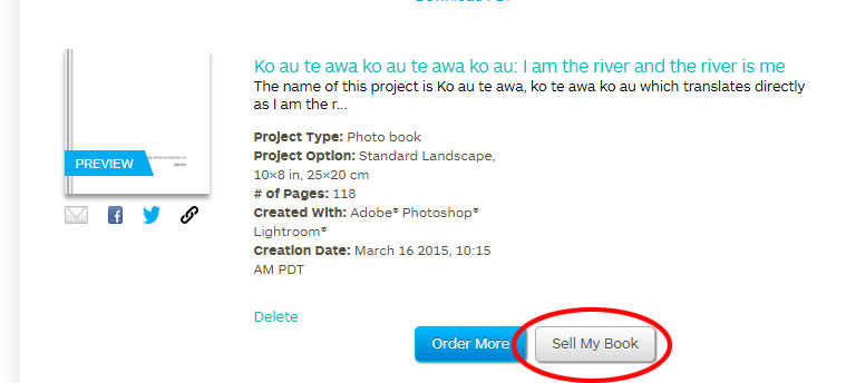
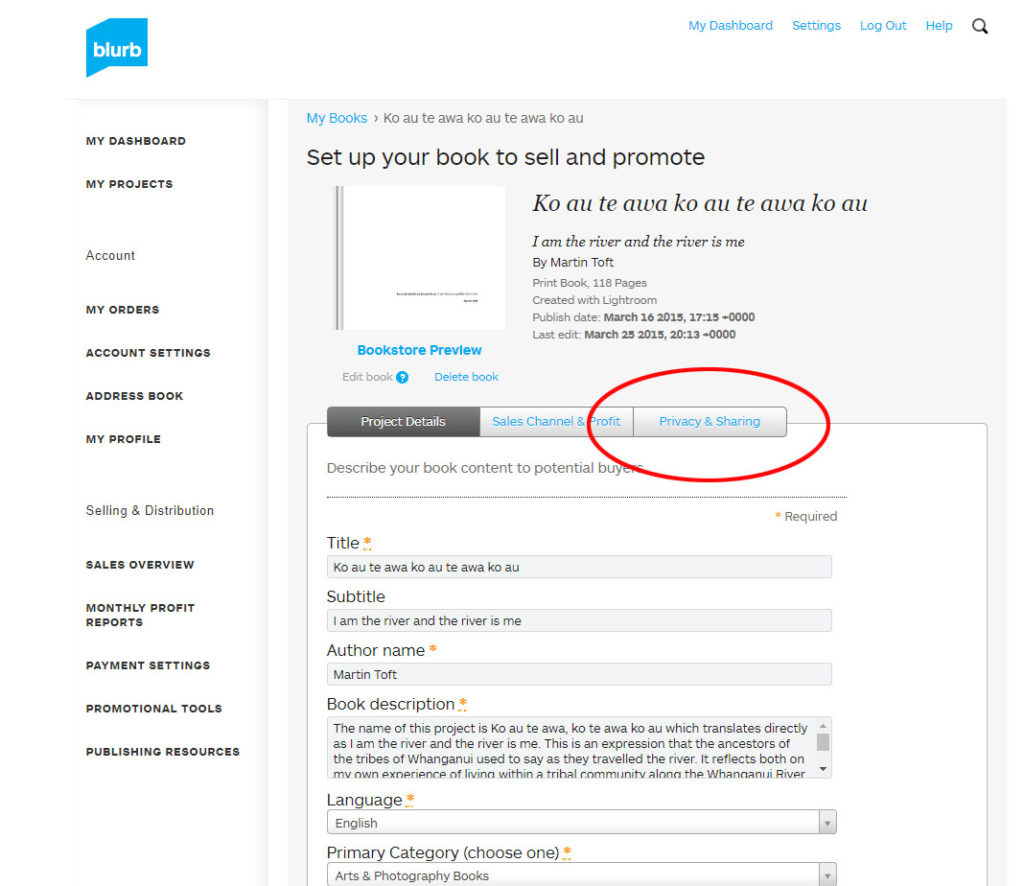
Log into your blurb account and click on Sell my book
Click on Privacy & Sharing
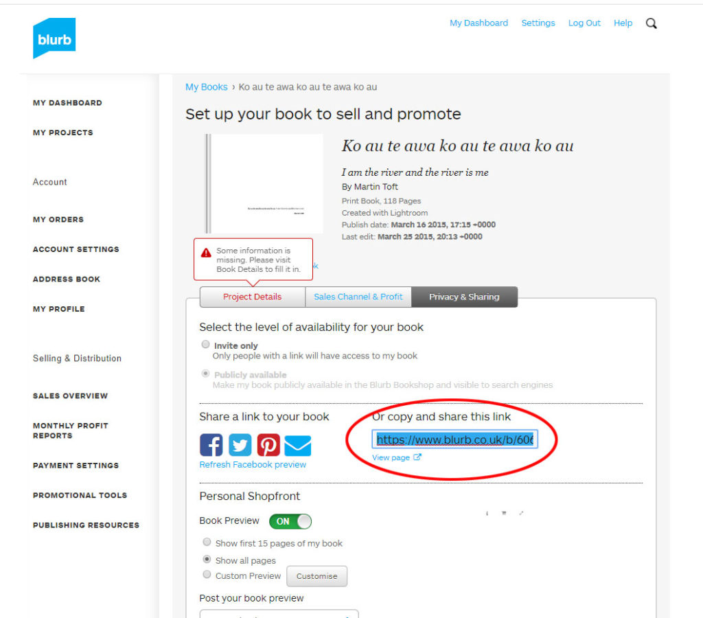
Copy link circled in red above.
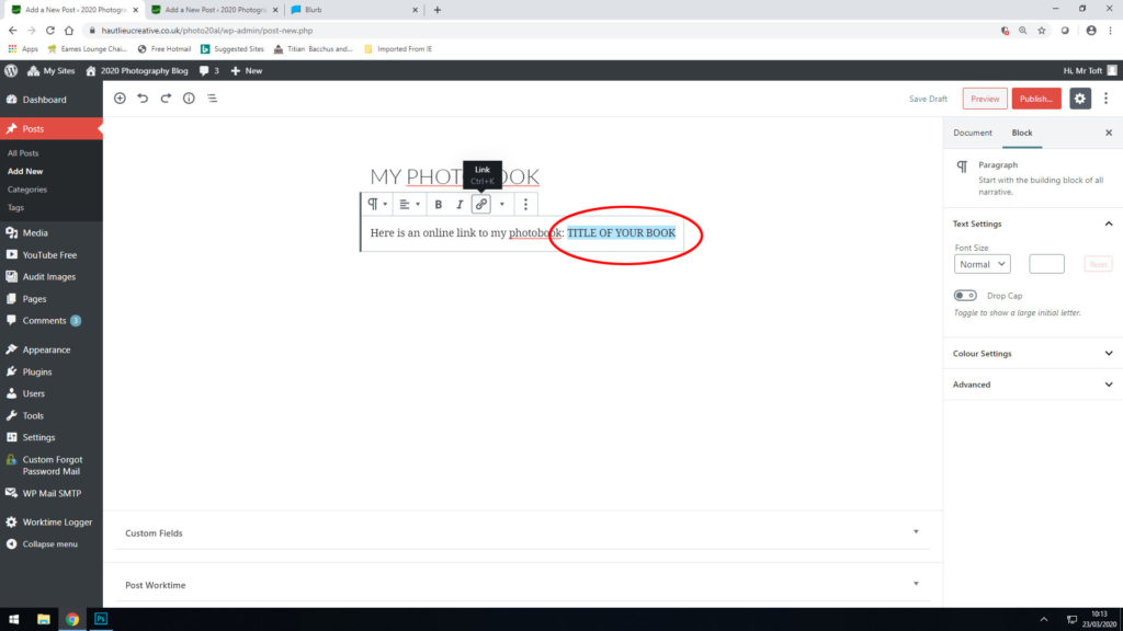
In your Photobook blog post with your final layout and design, at the very top, type title of your Photobook and copy in link from Blurb using Link button above.
Mon 3 – Thurs 6 Feb: 2 days = 10 hours controlled test Photography classroom + Photography studio Groups: 13C and 13A: MON 3 – TUE 4 FEB 13D: WED 5 – THURS 6 FEB
DEADLINE: LAST DAY OF YOUR MOCK EXAM ESSAY > PHOTOBOOKS / FILM > BLOG POSTS
IN PREPARATION FOR MOCK EXAM MAKE SURE THE FOLLOWING IS READY BY THE END OF THIS WEEK:
Complete and proof read essay by Friday 31 Jan and publish on blog (so there is enough time to present it into book design in Mock exam.)
Upload new photoshoots and complete final edit in Lightroom – make sure to produce blog posts showing selection process and experimentation of images.
A draft layout of your photobook/ rough cut of film edit before your Mock Exam begin (that time is used to fine tune design with teacher’s approval)
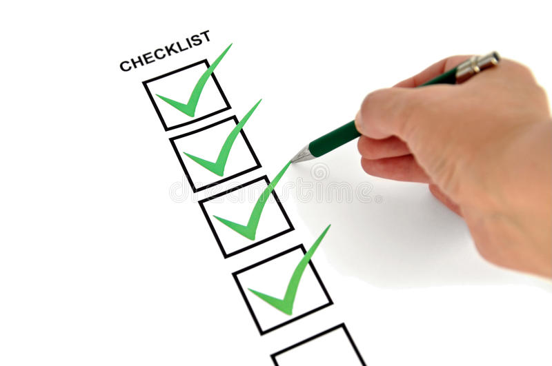
Review Checklist on blog for overview of work that must be completed.
Go through Go4School Tracking Sheet (sent in email on 17 Jan) and improve, complete and publish missing blogposts.
Structure your 2 day Mock Exam as follows:
DAY 1: Essay: If needed, complete any final adjustments to essay, incl illustrations, referencing and bibliography + publish on blog.
Photoshoots/ recordings: Complete editing images or recordings for your photobook / film + produce blog posts showing selection process and experimentation of images. Use a combination of print screens + annotation. Write an evaluation about what went well and what you need to do next to develop your shoots and project.
DAY 2 Photobook/ film: Complete photobook design/ edit film + produce blogpost showing design process and evaluate. Produce a blog post showing layout and design process using a combination of print screens + annotation. Add essay and present at the end of your book.
Prints: Select final prints and produce blog post showing presentation ideas and create mock-up in Photoshop and create a virtual gallery. Make sure you save final images in print folder here by end of the day:
Blogposts: Finish and publish any missing blog posts as per Checklist and your Go4School Tracking sheet.
ESSAY Publish final essay as a separate blog post with illustrations of key works by artists and your own images analysed in your text, as well as a bibliography listing all literary sources used. Also incorporate essay in the back of your book using layout in text columns and include illustrations and bibliography.
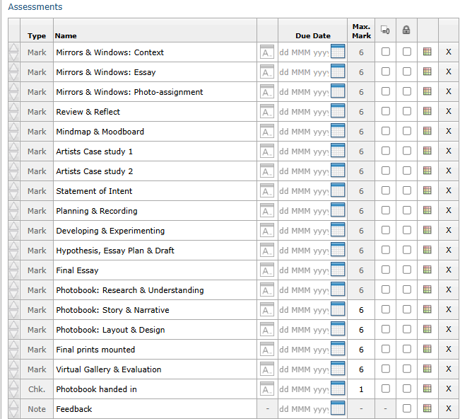
Marking Criteria
PHOTOBOOK Make sure you have a made a blog post that charts your design decisions, including prints screens of layout with annotation and write an ongoing evaluation. If you complete it; final book design must be checked and signed off by teacher.
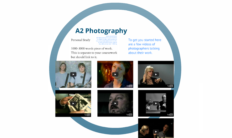
For more help and guidance editing, process and evaluation go to blog post below.
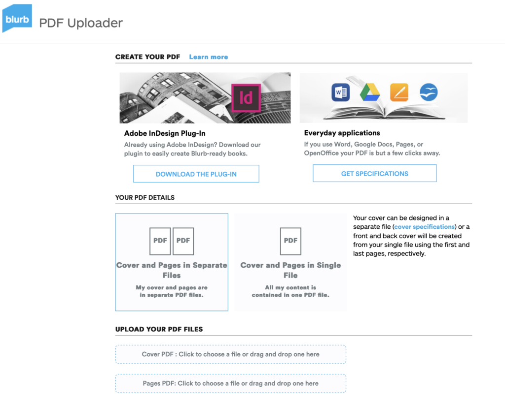
BLURB – Upload pdf to Book Once your final design has been signed off by the teacher follow these steps to upload book as a PDF to Blurb.
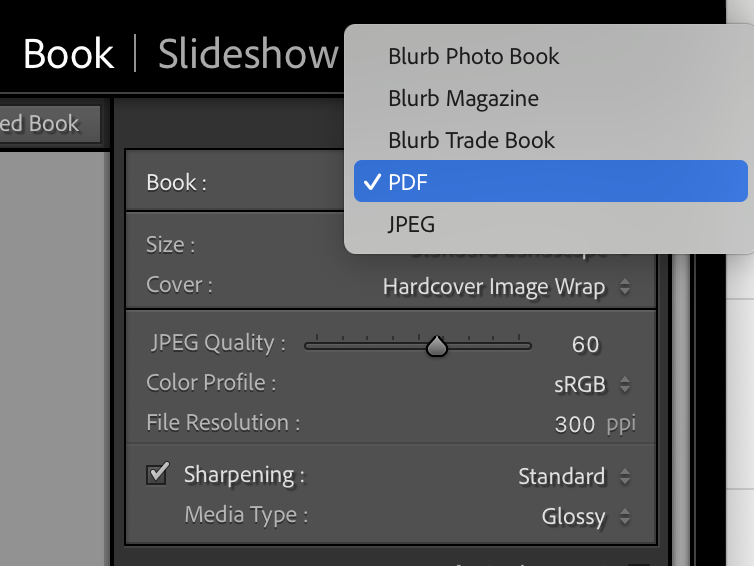
1. In Lightroom top right corner click drop-down menu in Blurb Photo Book and choose PDF. Make sure you increase JPEG Quality to 100 %.
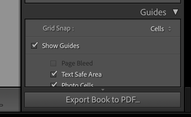
2. In bottom right corner click button: EXPORT BOOK to PDF
3. Save PDF as filename: PHOTOBOOK in folder in your student folder on M:drive.
4. Move PDF file: PHOTOBOOK toOne Drive in Office 365.
5. At home download above file from One Drive and save on your personal computer.
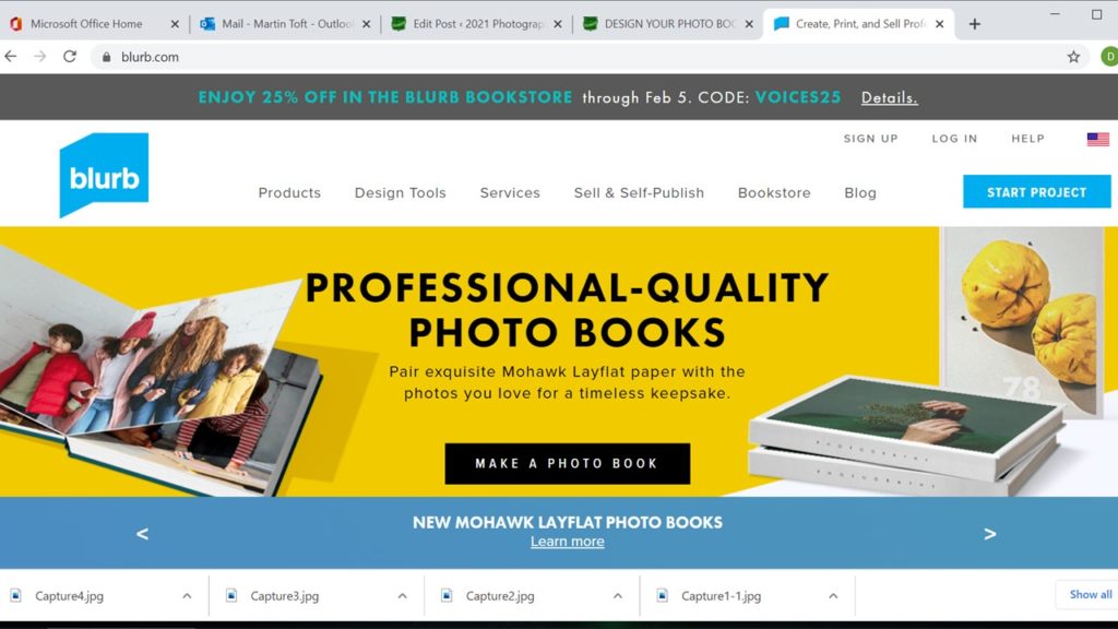
6. Log into your BLURB account (www.blurb.co.uk)
7. In top menu bar click on Design Tools and choose PDF to Book in drop down menu.
8. Click on button: Upload PDF
9. Upload your PDF files. Cover PDF: Click to choose a file or drag and drop one here Pages PDF: Click to choose a file or drag and drop one here
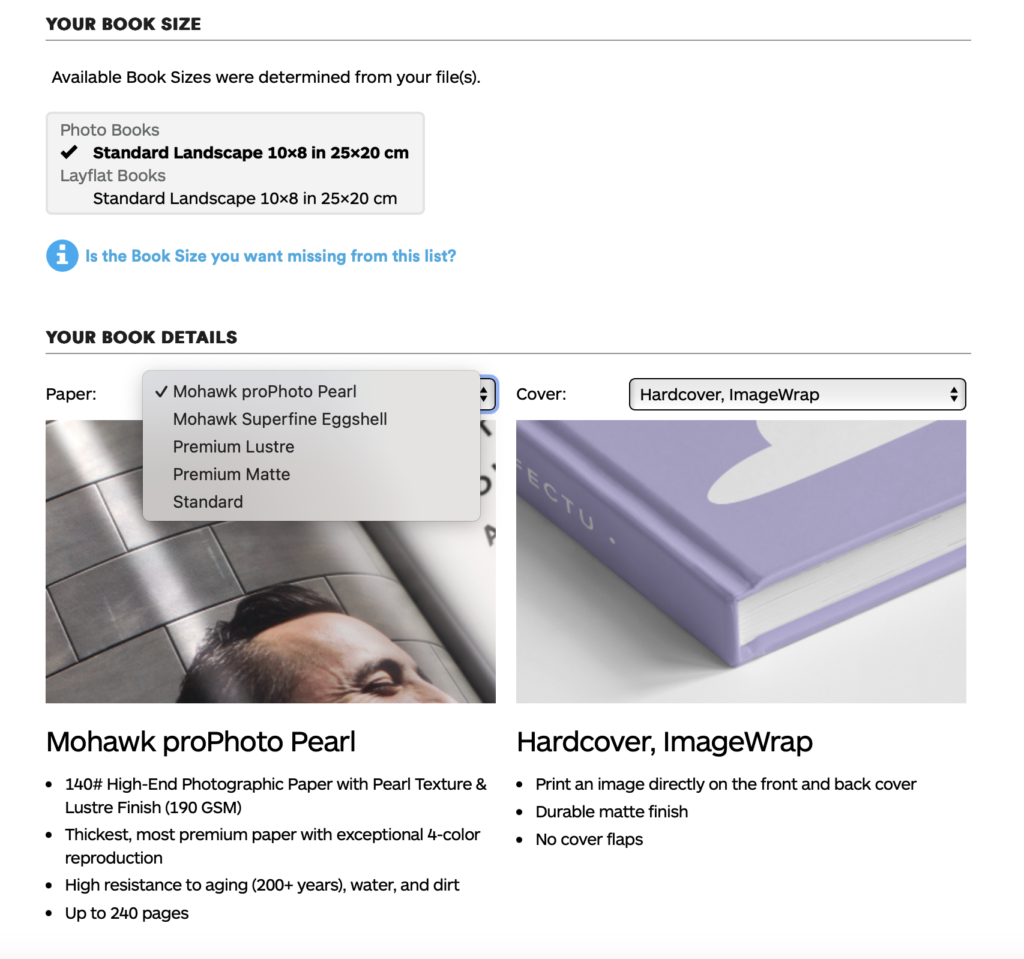
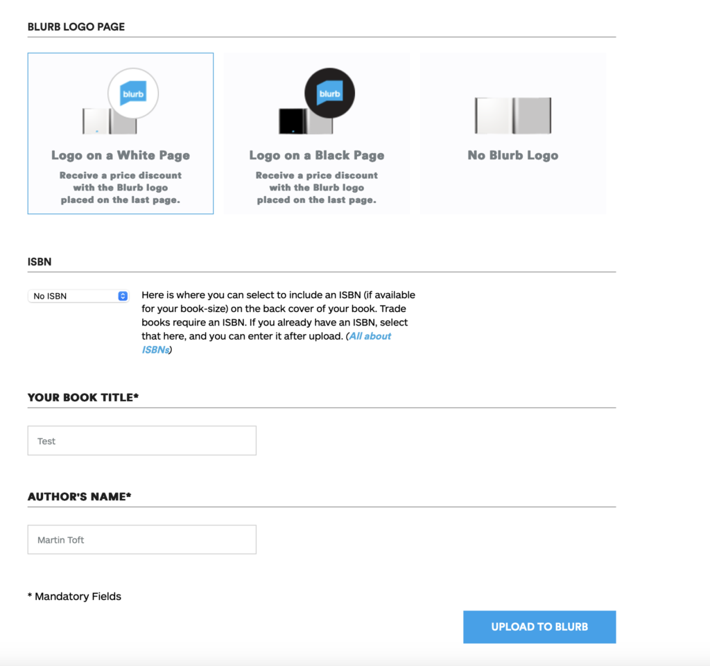
10. Once uploaded, choose paper, either Premium Lustre or Premium Matte and choose cover, either Hardcover, Image wrap or Soft cover.
11. Select either Logo on white page or Logo on black page. IT cost you more if you choose no logo.
12. Type Title of your book and Author’s name (your name)
13. Click button: Upload to Blurb and go to check-out and order your photobook (you need either debit or credit card)
BLURB – ORDER BOOK Inside Lightroom upload book design to BLURB, log onto your account on their website, pay and order the book.
Consider spending a few extra pounds on choosing better paper, such as Premium Lustre in check-out, change colour on end paper or choose different cloth/ linen if needed.
FILM Make sure you have a made a blog post that charts your editing process, including prints screens with annotation and write an evaluation. If you complete it; final film must be checked and signed off by teacher.
For more help and guidance on editing, process and evaluation go to blog post below.
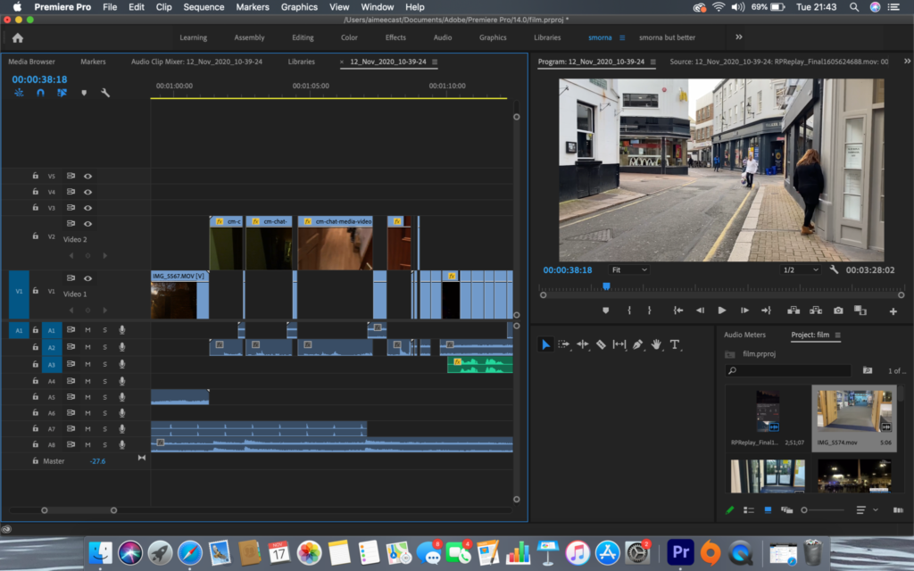
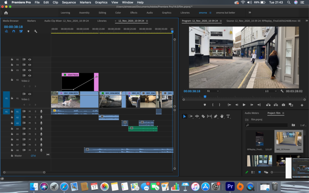
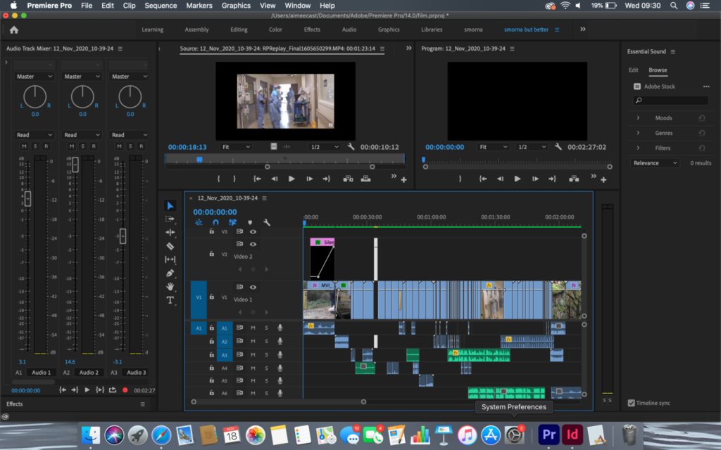
Export final film as mp4 file and upload to Youtube / Microsoft Streams and embed on Blog. Follow these steps:
In Premier: Click on Sequence > Render IN/OUT
File > Export > Media
Export Settings: Format H.264
Output Name: use title of your film and save to V:Data drive
Click Export at bottom
Using Microsoft Stream: Open up Office 365
Go to All Apps and select Stream
Create > Upload Video
Browse to upload your exported film from V:Data drive
Write a short description, choose thumbnail and publish
My Content > Videos > embed film into Blog post with evaluation.
In Youtube: Set up an account at home (www.youtube.com)
Click Create (top right corner) > Upload video
Select file > your exported film from V:Data drive
Write a short description and choose thumbnail
Once uploaded, embed film into Blog post with evaluation.
BLOGPOSTS All blog posts in relation to the above must be published, including any other supporting posts missing from previous work modules since the beginning of Yr 13 academic year, including zines which must be printed & bound, Hockney ‘joiners’, 3D photo-sculpture and final prints.
See previous student, Stanley Lucas as a guide on blogposts that needs to be done and published before you the end of your Mock Exam.
EVALUATION: Upon completion of photobook/ film and presentation of prints make sure you evaluate and reflect on your learning and final outcomes. Comment on the following:
How successful was your final outcomes (book, film, prints etc)?
Did you realise your intentions?
What references did you make to artists references? comment on technical, visual, contextual, conceptual?
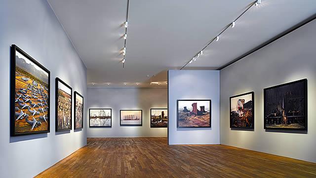
FINAL PRINTS Select your final prints (5-7) from photobook/ film and make a blog post showing ideas about how to present them.
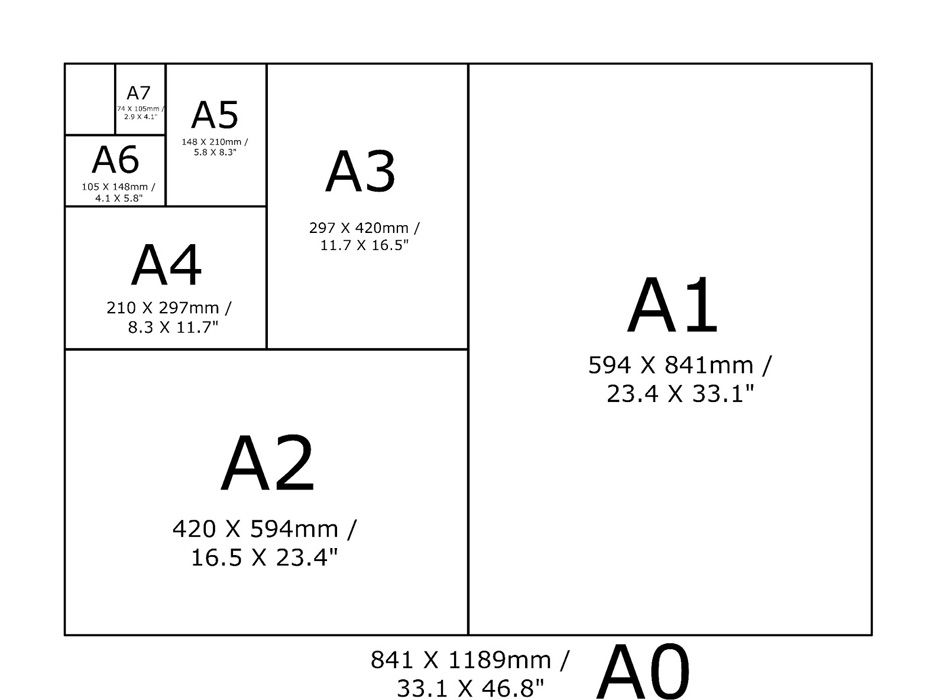
In photoshop produce a mock display (create new document size A1: 594 x 841mm) using different image sizes, for example: A3 x 2, A4 x 2, A5 x 3
PREPARE AND SAVE IMAGES FOR PRINTING:
Add your images to the print folder here…M:\Radio\Departments\Photography\Students\Image Transfer\Yr 13 NEA 2025
Complete any unfinished work from last term if you have time, For example: select images for print form Zine/ St Helier and/or St Malo project.
File Handling and printing...
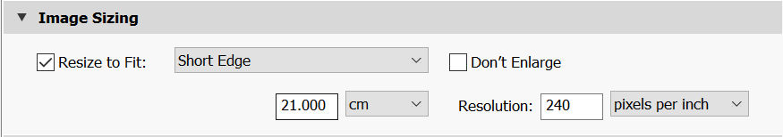
Remember when EXPORTING from Lightroom you must adjust the file size to 1000 pixels on the Short edge for “blog-friendly” images (JPEGS)
BUT…for editing and printing when EXPORTING from Lightroom you must adjust the file size to Short edge for “high resolution” images (JPEGS) like this…
A5 Short Edge = 14.8 cm
A4 Short Edge = 21.0 cm
A3 Short Edge =29.7 cm
This will ensure you have the correct ASPECT RATIO
Ensure you label and save your file in you M :Drive and then copy across to the PRINT FOLDER:
For a combination of images, or square format images you use the ADOBE PHOTOSHOP > NEW DOCUMENT + PRINT PRESETS on to help arrange images on the correct size page (A3, A4, A5)
You can do this using Photoshop, Set up the page sizes as templates and import images into each template, then you can see for themselves how well they fit… but remember to add an extra 6mm for bleed (3mm on each side of the page) to the original templates. i.e. A4 = 297mm x 210 but the template size for this would be 303mm x 216mm.
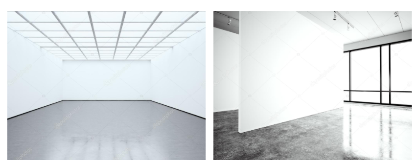
Making a Virtual Gallery in Photoshop
Download an empty gallery file…then insert your images and place them on the walls. Adjust the perspective, size and shape using CTRL T (free transform) You can also add things like a drop shadow to make the image look more realistic…
What was the involvement of Jersey mariners in the Canadian cod-fisheries and the Transatlantic carrying trade?
In 1497 (15th century), Newfoundland was discovered, and between the years of 1903 and 1947, Henry VIII commenced trading, kicking out the French and the Spanish. The oldest reference to a Jersey vessel having completed and returned from a trip to newfoundland is from 1582, where they were unloading cargo from Newfoundland.
The fisheries, while being established in Labrador, and later moving to newfoundland, and then finally settled in Gaspe in 1765. Jersey mariners would sail up to Gaspe, Canada to fish for cod. They would prepare and salt the fish. They would set up shop on the coast and in towns to make it easier to sell and trade the cod. This cod was then traded with different places.
Which ports did Jersey ships sail to and trade with?
Jersey ships would travel to the jersey fisheries up in Canada and the sail back to jersey stacked with salted cod. Jersey ships also used to sail to and trade with England and France and Honduras.
What type of goods did Jersey merchants exchange for cod-fish?
Markets in Europe with large roman catholic populations would had a large demand for fish to fast on Fridays, such as Portugal, Spain and Italy. It was traded with ports in Lisbon, Cadiz and Naples for products such as salt, wine, spirits, fruits and spices.
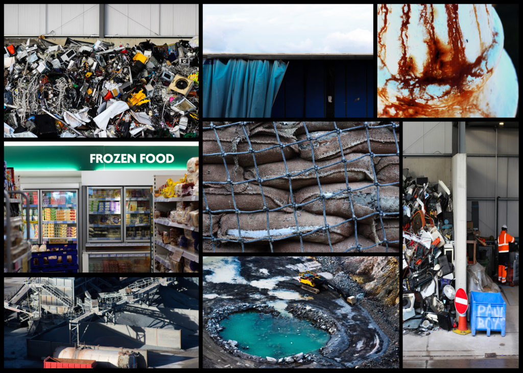
To what extend, has the island of Jersey benefitted from its constitutional relationship with Britain and the legacies of colonialism based on a slave plantation economy during the first Industrial Revolution (1760-1840)?
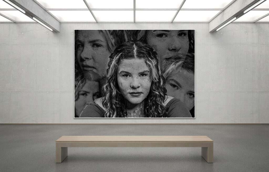
These are some of my final images presented as a virtual gallery.
Project Evaluation-
Overall I’m pleased with how my project came out. My aim for this project was to try and show the effects of the paitrachy and subjects like the male gaze but focus on the mental and psychological effects. From my perspective I have successfully portrayed that. In each photoshoot I included small and subtle aspects as well as using the makeup as a way of portraying my theme. For example in my second photoshoot I wanted to try and display how the media and society tries to erased women’s faces and how so much more emphasis is on women’s bodies. To portray this in addition to using this “mask” I also choose to not have the models face in focus.
For this project I took lots of inspiration from many different artists some that I had very little prior knowledge of and some that I already had an interest in. For example Lean Shamash and Michael Rubin these were new artists for me and although visually there might to be this clear link between my work and their, conceptually they helped form and shape my project.
Throughout my project there are many picture which I deem to be well executed.However, I consider these images to be some of my strongest within this project…
Im very pleased with the final outcome for both of these images. the image on the left is from my first photoshoot where I took a few of the portraits and editing them to be surrounding the model. One of the things that I believe makes it such an impactful image is due to the amount of detail on the models face. With the makeup that I used I realised it looked the best under studio harsh lighting it extenuated the cracks on her face and helped portray this decaying and weathered look which I was seeking. Additionally the image right is from my fifth photoshoot where I was inspired by a movement on social media from 2020 for “denim day” for sexual assault victims. This image stands out to me for multiple reasons one being that photoshoot as a whole was quite different compared to my other photoshoots. I believe this image to be so impactful due to the fact I am showing more of a physical representation of trauma.
The art of photography is intriguing, it allows another to view an experience that they would not have seen if not for the photographer.
The camera come from a optical phenomena referred to as a camera obscura, where as light travels through a pin hole and projects the opposing scene, upside down and inverted on a wall or canvas. However, there was no way of binding the image to the canvas with out sketching it on to it. 1839 is a key date in the world of photography, it was this year that lead to the invention of the calotype and the daguerreotype. According to John Szarkowski’s thesis these images could be seen as windows and mirrors. The calotype was invented by henry fox-Talbot. It is a process in which piece of paper, soaked in silver chloride, was exposed to light through a camera obscura. Over the course of a few hours, the image would appear in the paper, a memento of the world. Following Szarkowski’s theory, a calotype would be viewed as a window due to the fact that it looks out on the world. It is a very tableau in style image that captures a moment in time. The only issue being that because it takes several hours, a busy street would appear empty so o get an image of a person they would have to stand there for an extended period of time. Despite this they remained popular into the 1850s in the united kingdom and Europe.
The daguerreotype was a similar process to the calotype. However, the image was affixed to a polished metal plate instead of paper, with the edges being torched to secure the image to said plate. Per Szarkowski’s premise, a daguerreotype is a mirror due to the fact that it were staged in a studio. They were deeply intermit, often being of loved ones. The daguerreotypes where immensely popular, they remained popular till the late 1850s when the ambrotype became available.
“is it a mirror, reflecting a portrait of the artist who made it, or a window, through which one might better know the world?.”
the area I will be studying is the change in the landscape around Jersey how has it impacted the way people live and nature itself, and is it for the better? Or the worse? I will be doing this by also studying artist such as Ansel Adams and Robert Adams, and the reason I chose these artists is because i also share a similar that they believed in which was their interest in protecting the natural beauty of the landscapes around them. i will analyze the work of both Robert Adams and Ansel Adams by compering the twos work side by side and discussing their meaning and motivation for creating their images, and also dive into the methods and meaning behind their images. I’m going to respond to their work by creating my own images with inspiration of their work and using techniques they used such as the zone system and using techniques I want to experiment using some other techniques such as long exposure. The artists I’ve studied will obviously point me in a direction of what I want my outcomes to look like and the idea behind the images, however I want to produce a unique project with my own style of images using techniques I have learnt while studying photography the most notable project I’m referring would be the past landscape projects I have done Anthropocene, and romanticism, these projects helped me learn the zonal method of Ansel Adams and also the framing and composition in an image. So what will this help me achieve? this will help me achieve the best end results possible with what I want to achieve which would be an image that has a similar atmosphere to that of Robert Adams and Ansel Adams imagery which would consist of an image being most likely in black and white (doesn’t have to be) to help create contrasting tones and an interplay of light and shadow, and to create the sense of emptiness and understanding of Robert Adams images.
through these different interpretations of capturing environments, I believe it will help me explore the subject more in depth as I have two different perspectives to look from. for my project I will like to recreate the images of certain photobooks from both Robert Adams and Ansel Adams that corollate to each other in one photobook so I will be able to tell a narrative that makes sense and isn’t all over the place. The aesthetic that both of the photographers that I studied are quite similar and the story they are trying to tell are also quite similar but also have there own different techniques and styles which I will try to merge and incorporate in my work.
paragraph 1:
what was Ansel Adams motivation behind his photography? Ansel Adam’s motivation behind his photography was the fact that he was an activist for the cause of the environment and wildlife, to add to this he attended multiple meetings and wrote thousands of letters to newspapers in support of what he stood for he wrote to politicians, government bureaucrats and newspaper editors. This all had to do with his philosophy which was environmental conservation hence why he always took photographs of the wild and nature. the significance that Ansel Adams left was immense as helped pave the way for photography in America and the conservation movement was major as he he helped get photography looked at in a different way as they were started to be put along side paintings and portraiture in exhibitions in national gallery’s. Group f/64 was a group of photographers that Ansel Adams was apart of that all shared a similar style of photography which was photos that were sharply focused and carefully framed which led to the development of the zonal system that Ansel Adams I widely known for. how did Ansel Adams develop the zonal system and why? The reason why Ansel Adams wanted to develop the zonal system was so he could evaluate the exposure on his photographs, this would then lead him to place certain tones in certain places and it would also help him calculate whether tones would be to bright or to dark in certain scenes, which he could then adjust the exposure if it was necessary to prevent extreme contrast in his photographs. this was done by looking at “zones” of the image with the zones being 0 all the way to X zero being pure black and ten being Pure white such as light sources and reflections with everything on the lower end being darker shades and lighter shades on the higher end.
technical:
lighting: When we are looking at this image we can see that it has natural lighting just by looking of the environment in the image, we can also see that the level of control throughout the image is second to none as Ansel Adams was very good at utilizing his zonal system with shades such as white and black appearing where they should and not overpowering the image.
aperture: The lens this image uses has exceptional sharpness and clarity to help capture the detail and depth the photo has this could have been a variety of cameras that Ansel Adams uses as they all did very similar things, all of this helped Ansel Adams capture the wilderness to the best of his ability’s linking to romanticism as he would glorify the wilderness and nature whenever he possibly could.
shutter speed: this image seem to be under exposed as the black parts in the image seem to be very dark an the white and gray parts don’t seem to be that bright when comparing them to some of his other images, however on the contrary the less vocal points of the image such as the terrain on the right side of the image appears to be much lighter the the other parts in the image and the same can be said for the stream of water we see in the middle of the image.
white balance: this image appears to be very cold which suits the image due to it being a picture of a mountain with visible snow at the tips of the top of it. it could also be said that the color accuracy is consistent throughout the image due to it being in black and white.
Visual:
the visual elements we see in this image would consist of the following: black and white for the color, consistent dark tones with hints of light tones throughout the image with a 3D shape as we are able to see the around the surface of the image it isn’t just a flat image.
composition: this photo provides us with a a high up view point from what appears to be a high up foot path. when looking at the zone system we can see a lot of the image provides us with zones I to III due to the amount of black in the image, however there is also a few grey meaning zones such as IV to V have also been used frequently throughout the image providing a good amount of contrast at a first glance at the photo
contextual:
the added value we can add to this image that is the fact that Ansel Adams wasn’t just someone capturing images of a mountain for the sake of it, he took pictures of nature as a symbol of wilderness conservation as he believed these historic sites in the US weren’t being taken care of properly and wanted to make sure that they would stand for generations for millions of people to see for the foreseeable future. making his images are a powerful blend of art and an environmental movement.
conceptual:
A concept/art movement that Ansel Adams could have taken inspiration from is Romanticism this is because the whole idea behind romanticism is to emphasize emotion, individualism, and the glorification of nature which of these topics link to his photos and the context behind them. This is because Ansel Adams work is all about glorifying nature as he wanted to persuade people to preserve nature as much as possible, and their is emotion to all his images as he wanted to convey a sense of depth and spirituality as a symbol to save the wilderness and nature all tying back to the theme of Romanticism.
paragraph 2:
Robert Adams motivation behind his work was to document the damage that had occurred in the American West with both the reason of despair and hope his end goal with his projects were quote “to face the facts but to find a basis for hope” meaning he wanted his work to help show people the damage that had been done but show that it can still be salvaged. after doing research Its quite apparent that Robert Adams wasn’t the most technical photographer I’ve ever studied and didn’t really care for all these methods that all these other photographer did. He was much more raw than other photographers as he was simply a man travelling taking pictures of what he sees. He also believes he doesn’t have a “style” as his goal “isn’t to make a fashion statement or an investment opportunity” for him he believes his “style” is respect as he just respects the American west that he believes that is being destroyed by human arrogance. like i stated earlier he is a very raw photographer and never took any images through an editing process which could be apart of his “methods”. and you can see this through his images as they definitely be edited to be more appealing to majority of people as they are either very bright or very dark due to no editing being done to his images, however when looking at the information I’ve told you this suits what he is trying to convey to people as he wants to show the harsh reality of what people had done to the American west. His work had lead to him being involved in an exhibition in 1975 known as the New Topographics: Photographs of a Man-Altered Landscape, this helped pave the way for the future of photography as it present a new way of capturing landscape photography with a new aesthetic that hadn’t been seen before with a meaning that caught peoples attention. this helped change the approach to landscape photography to photograph landscapes that weren’t seen as desirable to take pictures of such as industrial landscapes, suburban sprawl, and everyday scenes.
this photo consists of the typical Robert Adams aesthetic an over exposed picture of the American west with bright day light over powering the image creating visible shadows in the image. this image was used with a 35 mm camera which is known for being very reliable to capture photos with a wide angle feel. its not got a high sensitivity as the image doesn’t appear to have that much grain the image doesn’t consist of much contrast as it all appears to be grey and white in the image with just a hint of black. The temperature of the image is very cold as there is lots of white and grey due to it being black and white not providing any color to make the image give any warmth atmosphere.
the visual elements in the image are very bland as it consist of shades of white and grey meaning the its mainly just bright tones in the image. The composition in the image seems to be very straight forward as there isn’t much contrast in the image and you have a viewpoint that isn’t that interesting. However all this being said these images aren’t supposed to blow you out the park and amaze you as the whole point behind Robert Adams work is to show you raw images of the effects that the American population has done to the West.
conclusion:
in conclusion Robert and Ansel Adams share significant simlarites on how they helped contribute to photography, especially in terms of capturing landscapes and also helping people understand how to combat against the damage people had done to the American landscape through their work. however both photographers did it in different eras with different meaning behind their projects. For example Ansel Adams wanted created images that glorified the American wests nature especially Yosemite National Park. This helped push photography to new heights as it was seen as fine art that was respected by the majority of public, this also includes his development of the zone system to control exposure and contrast which would help to create many of iconic images. this meant that he could then better capture the wilderness that he believed held such importance, this would be done as an attempt to get people talking about natural landscapes and how they can keep them pristine. And then on The other hand Robert Adams was a man who just wanted to capture the suburban development in the American west, with a more critical lens he provided a much more subdued and contemplative vision on the damage people had been causing on the west. in comparison Ansel Adams wanted to do the opposite to preserve nature not to show how it had been hindered to persuade people to want to take care of it with his images not how it had been changed. despite both their differences they both were able to use photography successfully to benefit the environment as they were able to make people see the issues that they can be presented in the future. with an ever lasting legacy that still effects modern day photographers. I used there styles to create images fairly similar but to look a bit more modern as I didn’t want to just stick to making black and white images to I made more saturated and colourful images to emphases things such as lights and cars and modern things we have all used to damage the environment in many of different ways.
A sentence– I’m focusing on the male gaze and showing how the male gaze is destroying women.
A paragraph– I’m centring my project around the male gaze which is the idea of men objectifying women for their visual pleasure. However I want to show how it actually effects women as in society we often get told the the male gaze is wrong but no one talks enough about why it still happens; how it effects women emotionally.
Design
For my photobook, I will be taking lots of inspiration from Anna Gaskell’s photobook which she was inspired by, and used references to Lewis Carroll’s Alice in Wonderland and 1970s horror films All About Eve and Carrie. However, I will make it my own, and decisions surrounding small details will be influenced by what I believe looks and feels best for my project.
I want to consider the following…
Paper and ink- I am planning on using premium lustre for paper type as I believe it will help extenuate the textures within my photos due to it being glossy. For me, what works best as the key aspects of my project are centred around texture. Additionally, this book will be using both colour and black and white, which the glossy premium lustre paper will compliment. Formatting and size- I am planning on displaying my book as “small square” (18 x 18cm). I have done this because I’ve used a mixture of portrait and landscape images within my project but my more powerful and impactful images tend to be landscape. Therefore, by using square, I believe it will make it easier and more effective when I create double-page spreads, but it will still accommodate and compliment my images, which are portraits. Something important for me is not going too much over 30 pages this is because I feel the longer my book ends up, the more repetitive and boring it will start to appear due to the photoshoot being very similar in style.
Title- In regards to the title of my book, I would like to choose something poetic that still has that clear link and clue to what my book is about, as my project as a whole is more abstract.
Narrative- For me, the way I present (in terms of the order, etc) my images is important. A key part of my book is having the book get darker and darker the further in you get to try and represent life being drained out of someone due to objectification and the psychological effects it brings.
Design- when designing my book, I would like to use a variety of different layout designs, including a double-page spread. For the last picture presented in my book, I am planning on using a double-page spread. In an attempt to heighten the photo’s visual presence and create a more impactful impression.
1. Research a photo-book and describe the story it is communicating with reference to subject-matter, genre and approach to image-making.
Deep Springs – Sam Contis
2. Who is the photographer? Why did he/she make it? (intentions/ reasons) Who is it for? (audience) How was it received? (any press, reviews, awards, legacy etc.)
Sam Contis was a female who lives in California and her story book was made in a remote valley, just east of the Sierra Nevada and north of Death Valley. The work shows the masculinity and focuses on all-male people and based on cowboys.
3. Deconstruct the narrative, concept and design of the book and apply theory above when considering:
Book in hand: how does it feel? Smell, sniff the paper. The outside cover is hard with a smooth feel to it, it’s made out of card with the paper smelling like standard card.
Paper and ink: use of different paper/ textures/ colour or B&W or both. Card for the paper with images on, some images in colour, some in B&W
Format, size and orientation: portraiture/ landscape/ square/ A5, A4, A3 / number of pages. Some photos in A3 Landscape, some in A4 portrait and landscape, and a few in A5 portrait and landscape, 30 Pages total.
Binding, soft/hard cover. image wrap/dust jacket. saddle stitch/swiss binding/ Japanese stab-binding/ leperello. Hard cover with image wrap for cover and back images.
Title: literal or poetic / relevant or intriguing. Literal Realism.
Narrative: what is the story/ subject-matter. How is it told? The work shows the masculinity and focuses on all-male people and based on cowboys.It is told very towards the viewer’s perspective and asks mindful questions throughout the book.
Structure and architecture: how design/ repeating motifs/ or specific features develops a concept or construct a narrative. The book images and design layout matches the aesthetic of the story she tells throughout it.
Design and layout: image size on pages/ single page, double-spread/ images/ grid, fold- outs/ inserts. Mainly A4 on single pages with text around the images and on the other side of the double spread.
Editing and sequencing: selection of images/ juxtaposition of photographs/ editing process. Uses grain and some colour saturation on some images and rule of thirds throughout taking them and editing/cropping the photos to direct the focus point on to the fields/canyon/cowboys and their day to day lifestyle.
Images and text: are they linked? Introduction/ essay/ statement by artists or others. Use of captions (if any.) Big titles allowing the viewer to understand the story throughout the story with use of introductions, headings and subheadings describing where she took the photograph and what of.
UNDERSTANDING PHOTOBOOKS: NARRATIVE, EDITING, SEQUENCING, DESIGN, FORM, FUNCTION
Started year 12 with my Summer Task which was to go take photos of 3 things, Place, Person & Object and link them all together. I did my Dad, Crib (the sport) and Jersey royals and explained how they link.
I’m going to take images of flowers up close and then trees from far away. In photoshop I’m going to change the images to black and white and increase the whites in the images to make them appear very clean, pure and positive compared to the dark blacks in the images which makes them come across as very dull and negative.
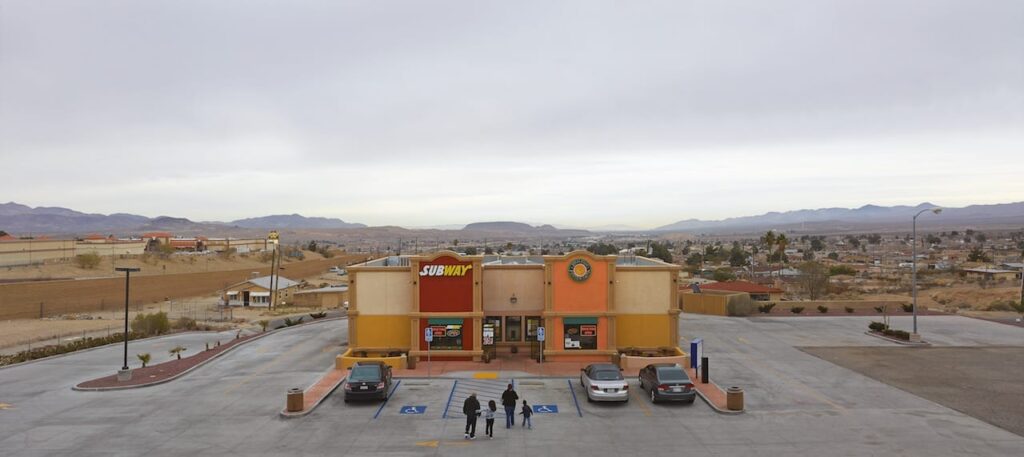
Overview on Mark Powers Photography
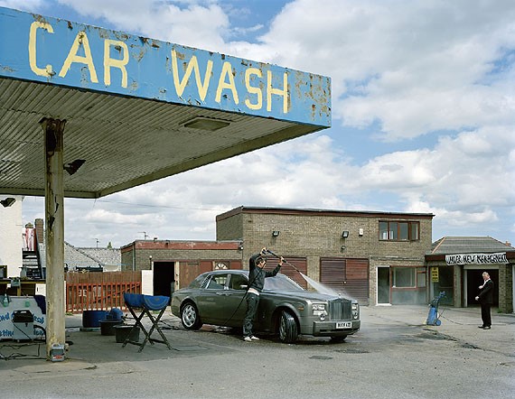
Mark Power is a documentary photographer and he captures unexpected things on camera and unusual places that might
have a significant meaning behind them. His photography also captures people in the images which documents certain events that might of happened or one of his images was a group of people getting out their car at a petrol station, his photography documents unexpected memories and places. His photos are very bright and they have quite a lot of colour in them making them eye catching and interesting to look at, however some of his images are in black and white to give an effect on the time it was taken or what was happening in the time of the photograph, which gives some of the images a dramatic emphasis on what is going on in them.
What kind of photography does Mark Power do?
He made Urban Landscapes and was a documentary photographer. His technical methods changed and he began to use colour film and a large format camera.
What inspired Mark Power?
As a child Mark Power discovered his fathers home made enlarger in the family attic, consisting of an upturned flowerpot, a domestic lightbulb and a simple camera lens. It was at this moment where Mark Forbes discovered his love for photography. However after he went to art college to study life drawing and painting. He was also influenced by documentary photographers such as Walker Evans.
Images like this influenced Mark Power because Walker Evans takes images in unexpected moments but they are almost set up to look a certain way this shows the similarities between Mark Power and Walker Evans style of photography.
Mark Power Image Analysis
The lighting in this image is very bright and vibrant and there is a lot of white in this image which suggests that this is a happy place or memory for someone. The tone of this photo is very light but there is a contrast between the light where there is the shadow at the bottom of the image. The meaning of this image is to show a Landscape image that had significance to Mark Power.
What kind of photos did Mark Power take for his projects?
Mark Power took documentary style images and also took landscape photography. In some of his images he does have a person in the image, which may show significance like that it was an important place for the person in the image.
What was Mark Power’s photography for?
Mark Power took documentary style images and also took landscape photography. In some of his images he does have a person in the image, which may show significance like that it was an important place for the person in the image.
What were the other options on Mark Powers photography?
The Magnum speaks on The Shipping Forecast by Mark Power and says that “nothing now holds the place that the Shipping Forecast did throughout the 20th century”, suggesting that it was a timeless piece of work in the 20th century and that no other artist has lived up to Mark Powers project on the the different radio stations across Europe. “It’s a beautiful, poetic language,” Power says. Now 63, the Magnum photographer first remembers listening to the forecast growing up on a housing estate in Leicester. The soundscapes had a lasting impact on Power which influenced him to create this project and take images that he was fascinated by. The British Journal of Photography says “The book doesn’t take us any closer to an understanding of the forecast, or any sea area. But it is nostalgic and unashamedly romantic” this suggests that the meaning behind the images is deeper than what the image portrays.