
Overall I found my chosen stance regarding the topic of political landscapes went well. Though I was a bit unsure of what to do at the beginning, after some more research I came to a conclusion of what I wanted do and achieve in the project, looking at how consumerism impacts the environment around us through industrialization. I found that the photographers I studied, Edward Burtynsky, Henry J Fair and Andreas Gursky proved to be great examples of what I wanted to do, with their unique photography style providing inspiration throughout the course for what I referred back to. My favorite project from them is called ‘Industrial Scars’, a book that consisted of aerial perspectives of industrial landscapes and the chemicals produced by them. This as a result led to me exploring a variety of landscapes present within Jersey such as quarries, shops and dumps, essentially the three main sectors of any consumerist industry. When I arrived at the designated area for photography I made sure to capture the subject in a straight documentary approach, a style that I really like regarding how political visions are put across, leading me to not use manipulation when editing the shoots as I wanted to keep it as close as possible to the reality I saw it as. I used Burtynsky’s style of photography to capture the landscape of the area in a more documentary style and Fair’s style to create abstract aesthetic results of rubbish and signs, and finally using Gursky’s work as a reference when photographing aisles of food and consumerist products. What I wanted from this was to present how we treat the environment in relation to the idea of our ever-increasing demands of societies needs, exploring how the present threat of wanting the newest thing leads to the destruction of landscapes not necessarily seen by the general public, but present enough to pose as a disruption to our we preserve land. As a result I wanted use straight photography as my leading cause for these topics where I would present a single sided perspective disregarding any other form of opinion as a means of causing debate and attraction the attention of the audiences.
Through the project I have explored various techniques to enhance my images such as gradients and black + white, which all the while have improved my overall skills and perspective regarding my stance and interpretation of intended matters. This project has taught me about how we perceive the issues in Jersey, whether they are seen or unseen by the eye, giving me opinions that I would have never taken into consideration if I’d never done the chosen topic, giving me opportunities to take images of things I never imagined I would do. The whole process I have gone through has given me a new understanding of how composition affects the viewers opinion and its warping of perspectives regarding my take on issues, allowing me to explore a variety of different styles that I would not have originally not used.


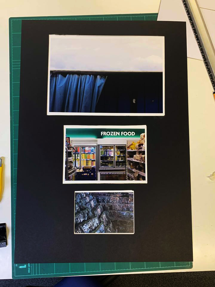


 This is the final layout and design for my book titled ‘Preserved Consumption’. The book includes three different sections including production, product and waste, all of which link into the theme of consumption and its permanent scarring on the landscape (hence the title preserved). Within I have included a variety of different page layouts such as double spreads, boxed in imagery and centred photos, all of which I have experimented with along the way, helping me to conclude which layouts are most effective at accompanying the previous and next photo. Regarding certain images I have included a white border due to it preventing the photo from becoming too overpowering and out-of-place, only really doing so for the larger pieces. For the majority of the pages I have used a white backdrop as I found that it complimented the images the most, stopping any attention being drawn away from the images and to the colours, something I made sure to do from the beginning. Before each category I made sure to add a title page to inform the viewer of the subcategory in the book, giving the layout a narrative as a result which I found is one of the key characteristics of the entire book. Finally I added my essay in the end pages of the book, this was because I wanted to allow the readers to interpret the topic of the book before actually reading about what I had to say about regarding it, with images depicting the studied photographers works and my responses alongside them.
 For the cover I decided to use a rustic effect taken from one of the corroding metal sheets, choosing to use a white New Times Roman font as the main go to for text fonts. I made sure to place this in an area of the page that would make it clear enough to make out and read for the viewer, so by placing it against a blue backdrop seemed to be the logical choice. I selected the title ‘Preserved Consumption’ because of its referencing to how out activities that scar the landscape preserve man actions towards the environment. Along the spine I placed the title and my name in the same font and colour to add the effect of consistency before actually opening the book.
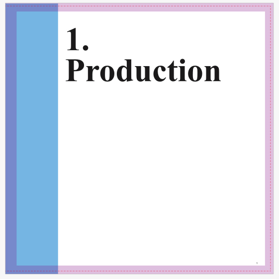

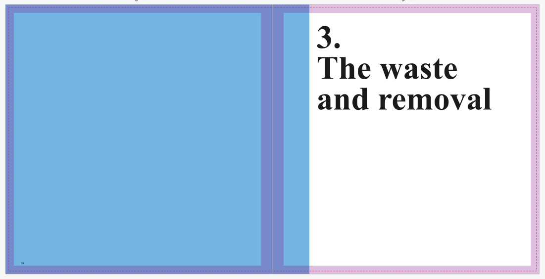 I then proceeded to implement title pages for each of the three topics which would separate the sections of the book out to create a narrative. Once again I used the font New Times Roman to create the impression of consistency, using numbers to represent the intended topic. When laying it out I made sure to include the text underneath the number so that it would fill more space whilst providing the book with an aesthetic result, which by complimenting it with a sky blue really brought out the result. For each of the titles I made sure they had a relevance to the topic they were before, allowing a certain expectation of what will be in it to arise before going through any of the pages.


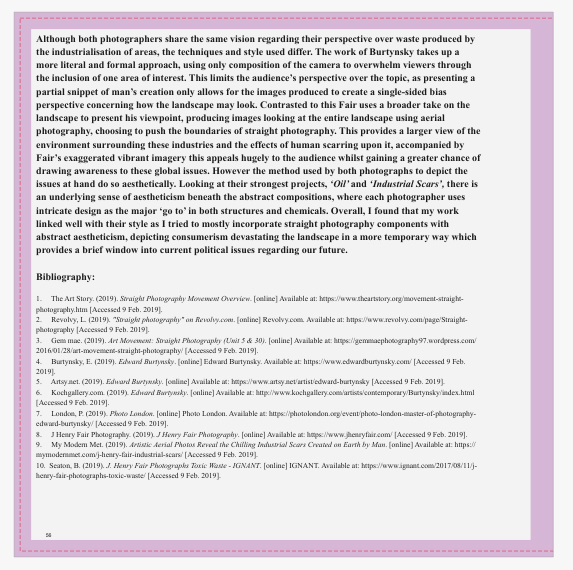 Finally for the essay I made sure to include it at the end of the book, by doing this it would allow for the viewer to interpret the message of the book throughout, with only at the end there being any real answer to what I wanted to explore. Like the rest of the book I made sure to use the font New Times Roman, using varying font sizes throughout the essay on things such as bibliography, title, text and references so that some degree of aestheticism could be put across. Accompanied across the pages of the text I included the photos that the book referenced to and the photographers I studied when making my results, this compliments the essay nicely as the reader can switch between the pages to gain a broader insight into what I wanted to achieve. Composition wise I made sure that the images were placed in an visually appeasing area that did not draw any attention away from the text across the page. When positioning the text for the essay I made sure it started on the left hand side of the page and ended on the right, by doing this it gave the opposite pages more breathing space between them, preventing anything from becoming too eye sore.


 By implementing these quotes into blank spaces I hoped to utilize the area, preventing it from becoming useless and instead allowing it to serve as a more aesthetic implementation into the book. Below I explored a few ways in which the text could be positioned next to the designated images:
 When looking over the text positions I found that the left and right alignment would pose as the best position due to them taking up little space as possible, whilst aligning themselves aesthetically against the side of the photo chosen. The center position however I did not think would suit the design of the book and its layout, this is because of how it did not have any end or beginning to it, leading to an unorganized look which didn’t compliment the environment it would be put in at all. Some examples of how I would like the text to be positioned next to the images can be seen below:
  I found the text to be most effective when looking over various books to be ending as the image starts, this creates an aesthetic effect which does not draw attention from the photos but instead subtly adds a bit of information. I would probably place the text near the top or bottom of the desired page due to the being the most implicit compositions to place it in, as the middle would be to clear. As a result of this I have concluded that the text should be placed in an isolated area of the blank space which does not take away from a photos visual appearance, whilst only being seen when observed closely.
 What I really wanted to put across from my layout of the book was a narrative, this would allow for me to tell a political storey through the narration of various images divided into separate categories that could be analysed and viewed in relation to the rest of images in that topic. To begin with I experimented with about six individual pages layouts, presenting a broader way in which I could compose the photos taken, such as full page spreads, double-page spreads and boxed in imagery. I wanted to leave a few spaces that I would be able to place text in such as my essay and titles for pages and photos.

 After I had experimented with a variety of different gradients upon certain pictures I then selected the best photos that used the gradient the most effectively. I wanted to change the atmosphere of each image to a more surreal and unusual portrayal that used metallic colours to highlight certain aspects of them. Here are my favorite outcomes for gradient use:


 When looking over the images I found that I really liked the see-through metallic film placed over the photos, as it gave them an tinted and old effect that I hadn’t seen in any of my previous work. Accompanied through the slightest change of colour tone, the effects of the gradient seems to product abstract and surreal results that overall I was really happy with.
 The artist’s new trilogy brings together three series of approximately 40 works each. The first series, Beyond Blue, is devoted completely to colourful threads, staged against coloured backgrounds. The viewer feels compelled to linger in this radical reduction, trying to unravel the entanglement of the seemingly unspectacular with the resulting aura of contemplation. In Shifting Clouds, Backhaus considers and documents this very transition – a reality that lies in between things. The second series shows fragments and visions that are poised on the verge of becoming, caught in limbo: reflections, chaotically appealing surfaces, shapes imaginatively metamorphosing, upbeat tones, intensely coloured sensations. In the third series, New Horizon, the artist presents free-flowing and persuasive poetic impressions. The compositions captivate with their variety and puzzle-like elements. Backhaus is breaking new ground in photography, incorporating components of mixed media, painting, and collage that expand and deepen these abstractions.
 Who is Jessica Backhaus?