Task
MON: Academic Sources
- Research and identify 3-5 literary sources from a variety of media such as books, journal/magazines, internet, Youtube/video that relates to your personal study and artists references .
- Begin to read essay, texts and interviews with your chosen artists as well as commentary from critics, historians and others.
- It’s important that you show evidence of reading and draw upon different pints of view – not only your own.
- Take notes when you’re reading…key words, concepts, passages
- Write down page number, author, year, title, publisher, place of publication so you can list source in a bibliography
Bibliography
List all the sources that you have identified above as literary sources. Where there are two or more works by one author in the same year distinguish them as 1988a, 1988b etc. Arrange literature in alphabetical order by author, or where no author is named, by the name of the museum or other organisation which produced the text. Apart from listing literature you must also list all other sources in alphabetical order e.g. websites/online sources, Youtube/ DVD/TV.
Quotation and Referencing:
Why should you reference?
- To add academic support for your work
- To support or disprove your argument
- To show evidence of reading
- To help readers locate your sources
- To show respect for other people’s work
- To avoid plagiarism
- To achieve higher marks
What should you reference?
- Anything that is based on a piece of information or idea that is not entirely your own.
- That includes, direct quotes, paraphrasing or summarising of an idea, theory or concept, definitions, images, tables, graphs, maps or anything else obtained from a source
How should you reference?
Tue: Essay Plan
Make a plan that lists what you are going to write about in each paragraph – essay structure
- Essay question: What is the relationship between photography and memory, or loss of memory?
- Opening quote
- Introduction (250-500 words): What is your area study? Which artists will you be analysing and why? How will you be responding to their work and essay question?
- Pg 1 (500 words): Historical/ theoretical context within art, photography and visual culture relevant to your area of study. Make links to art movements/ isms and some of the methods employed by critics and historian.
Contextual/ philosophical: what is the relationship between photography and memory – draw on your philosophy studies.
- Pg 2 (500 words): Analyse first artist/photographer in relation to your essay question. Present and evaluate your own images and responses.
example 1: memento mori
- Pg 3 (500 words): Analyse second artist/photographer in relation to your essay question. Present and evaluate your own images and responses.
example 2: Joel Sternfeld – choose one image from his project On this Site
- Conclusion (250-500 words): Draw parallels, explore differences/ similarities between artists/photographers and that of your own work that you have produced
- Bibliography: List all relevant sources used
Draft info
Essay question:
How do artists Joel Sternfeld and showcase the themes of memory and loss in their work?
What is the relationship between photography and memory, or loss of memory? (show examples of photographers who has explored that by choosing one image from each artist)
Bibliography:
Sternfeld, J (1996), On this site. San Francisco: Chronicle Books.
Brougher, K, Grundberg, A and Tucker, A.W. (2003), American Prospects; Joel Sternfeld. Gotingngen: Steidl Publishers.
Kuhn, ‘A. Remembrance: The Child I Never Was’ in Wells L. (ed) (2003) The Photography Reader. London: Routledge
Colberg, J (May 28, 2012) Photography and Memory
blogger on Conscientious
Barthes, R. (1984) Camera Lucida. London: Flamingo
A Matter of Memory: Photographs as Objects in the Digital Age
An exhibition at George Eastman House
A review on British Journal of Photography
In text references:
Essay draft
What is the relationship between photography and memory, or loss of memory?
‘Photographed images do not seem to be statements about the world so much as pieces of it, miniatures of reality that anyone can make or acquire.’
Susan Sontag from On Photography, 1971
Intro: My essay is going to be focusing on the theme of memory, both looking into my own memories from childhood as well as artists who have dedicated work to the topic, such as Joel Sternfeld and Annette Khun. I believe that memory is a very important part of being human since a lot of the time it is what helps to make us who we are today, as well as helping us to not repeat mistakes which, in turn, allows us to learn from them. Following along the theme of memory, I also plan to incorporate the idea of memory loss, such as being unable to recall events from when you were younger or simply forgetting things that get pushed to the back of your mind. A lot of the time these memories can be held onto through photographs which capture the moment, however when you lose these photos it can be upsetting due to the fear of the memory being forgotten. For this reason, memory and photography tend to go hand in hand and is something I look forward to exploring.
Para 1 philosophy reference:
Over time, the subject of memory has become an interesting topic of discussion, especially in philosophy, often getting us to look back on memory and even questioning how much we can actually trust it. When looking into the theme of memory in philosophy, we can link it to the theory of innatism which is presented to us by Plato who says that we are born with innate knowledge even if we are unaware of it and can come to realise these innate ideas later through reason.
‘We do not learn, and that what we call learning is only a process of recollection.’ – Plato
On the other hand, the opposing theory, presented by Locke, claims that when we are born our minds are like a ‘tabula rasa’ or ‘blank slate’, effectively saying that our minds are empty, and we have no innate knowledge. These theories link to memory as being born with knowledge would be the same as being born with memories, similarly to how some people claim to remember their past lives albeit we have no method to actually know if the claim is accurate, once again linking back to how we cannot trust our memories completely as they sometimes trick us.
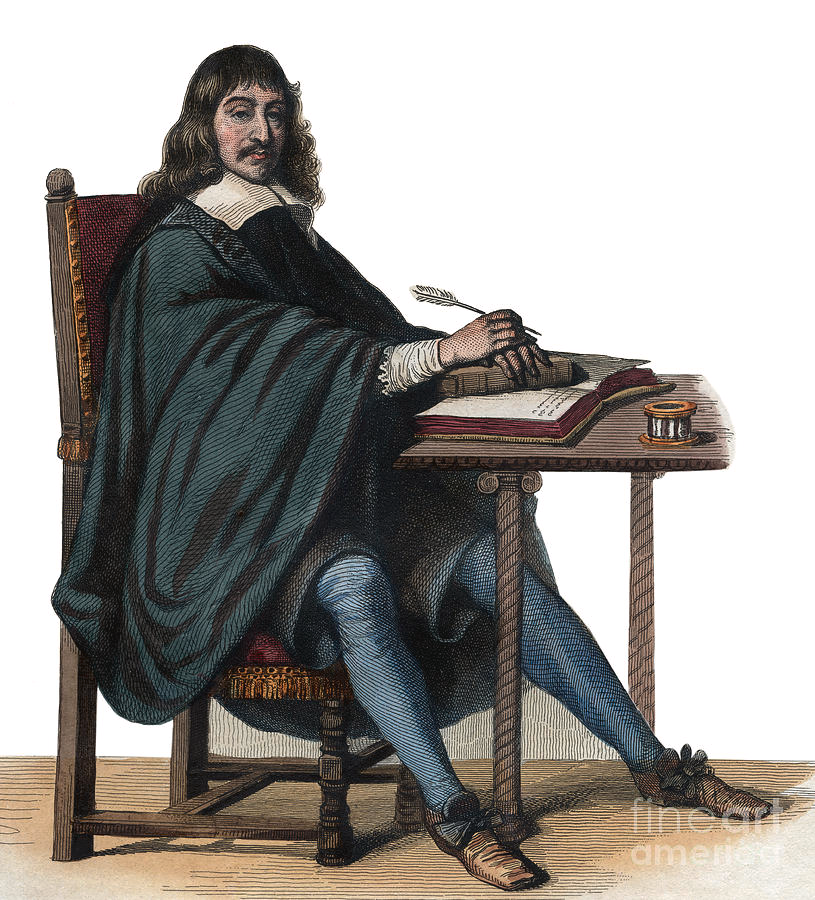
Another philosophical theory that ties into the theme of memory is Descartes ‘cogito ergo sum’ or better known as ‘i think therefore i am’. This theory came about after Descartes decided to rebuild his knowledge through his method of doubt, effectively questioning everything until he discovered that the only thing he could rely on was the fact that he was a thinking thing, meaning he knows he exists. This theory has ties to memory through his waves of doubt, firstly Descartes doubted his senses believing them to not be trustworthy due to them deceiving him before through experiences such as hallucinations or illusions. Secondly, Descartes claims that it is impossible to tell if you are dreaming or not as some dreams are so realistic you cannot tell the difference between them and reality. Memory connects to this as our memory can be untrustworthy at times, for example dementia or simply forgetting things, our memory will never be 100 percent trustworthy and even if we do forget something, without a reminder like a photograph we will likely not remember it again.
Para 2 Joel Sternfeld:
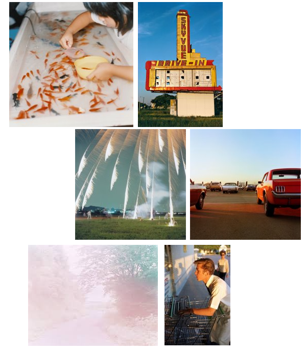
Joel Sternfeld was born on June 30th in 1944 and is an American fine-art photographer. He is best known for his large-format colour pictures of contemporary American life and identity. His work contributed to the establishment of colour photography as a respected artistic medium. He earned a BA from Dartmouth College and began taking colour photographs in 1970 after learning the colour theory of Johannes Itten and Josef Albers. He currently teaches at Sarah Lawrence College, where he holds the Noble Foundation Chair in Art and Cultural History. Sternfeld documents people and places with unexpected excitement, despair, tenderness, and hope. Ever since the 1987 publication of his landmark “American Prospects,” Sternfeld’s work has interwoven the conceptual and political, while being steeped in history, landscape theory and his passion for the passage of the seasons.
Sternfeld’s book that I have been focusing on is ‘On This Site’ which showcases a collection of photographs that depict tragedies that have taken place within America as well as short descriptions to inform the viewer of what had once happened. They show the current day locations of incidents, such as the location of Martin Luther King’s assassination or the Cuyahoga River which was set on fire after having chemicals dumped into it.
‘I went to Central Park to find the place behind the Metropolitan Museum of Art where Jennifer Levin had been killed. It was bewildering to find a scene so beautiful … to see the same sunlight pour down indifferently on the earth.’ – Joel Sternfeld
‘It occurred to me that I held something within: a list of places that I cannot forget because of the tragedies that identify them, and I began to wonder if each of us has such a list. I set out to photograph sites that were marked during my lifetime.’ – Joel Sternfeld
Sternfeld makes it clear that his photographs are so that we remember the loss and tragedy occurring in each location he photographs, however he also notices the beauty in what is often seen as ominous or unpleasant, ‘a scene so beautiful’. I agree that it is important to remember these events since without being able to look back at them, we would never be able to grow or change and would likely only end up repeating them. I also agree that looking back to such events can be beautiful in a way as it symbolizes change, which is a positive thing most of the time.

This image is taken of the stone wall inn, where the patrons of the gay bar were arrested and beaten which caused the village to rebel, creating what is now known as the stonewall rebellion. This photo denotes that there was a change, due to the neon sign in the window which links to a more modern design. In the photo we are able to see a lot of red ambient lighting, which is often use to either represent danger, warmth or love. In this case, we are able to see that it represents love due to the heart bouquet in the window. Another thing we are able to tell from the image, is that the bar is still up and running due to the more modern appearance it has taken. This tells us that even with the tragedy that occurred here, the bar has survived the attack and is currently thriving.
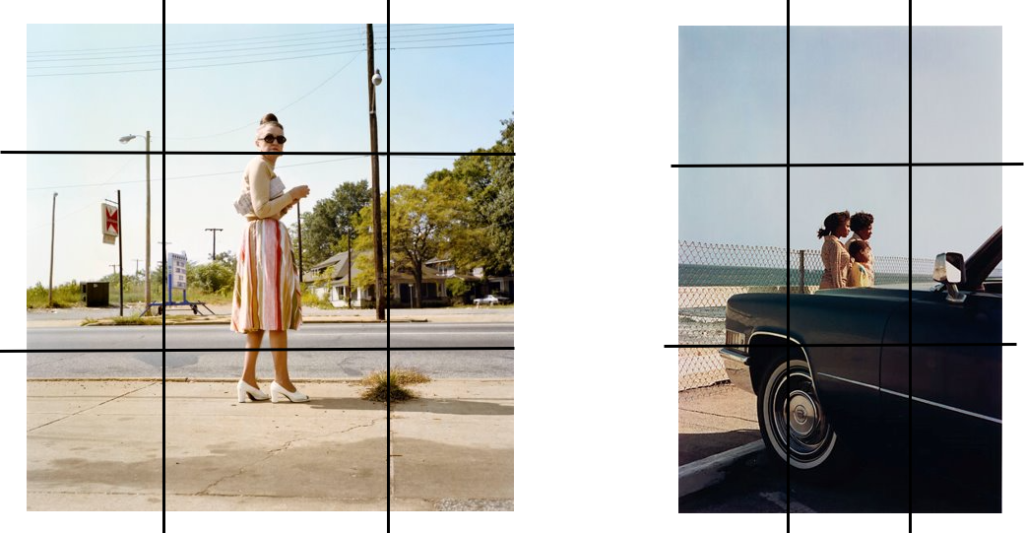
What I would like to recreate in my own images is the lighting since the colour tends to showcase the emotion taking place within the image which is useful, especially when there are no people to showcase it through body language.
Para 4 Jörg M. Colberg:
Jörg M. Colberg is a is a German writer, educator and photographer, born on the 15th of February 1968. He currently is living in Northampton, Massachusetts, USA. Colberg is the creator of the fine-art photography blog ‘Conscientious’ which offers daily profiles of photographers, in-depth interviews, exhibition and book reviews, as well as general articles about photography and related issues. In addition to working on Conscientious, Colberg has also written articles for international magazines, such as Singapore and Spain, while also writing the introduction to Hellen van Meene’s 2009 monograph “Tout va disparaître”.

The main reason why I have selected Colberg as a reference in my essay is specifically due to a certain post he made on his blog in May 2012 named ‘Photography and memory’. In his post, Colberg evaluates the differences and similarities between photography and memory, ultimately concluding that while memories and photographs are different by definition, our desire to hold onto a specific moment is what conjoins the two.
‘Memories define identity, and photographs help us have a more active role in that process.’ – Jörg M. Colberg
I believe that Colbergs evaluation is well thought through with the evidence he gathered through definitions and other sources backing his claim. While photographs and memory may be separate, they still go hand in hand with each other since we are able to reminisce on past memories through the help of photographs. I hope to showcase this through my project, showing that sentimental items such as photographs, objects or locations can help to reinstate old memories.
Para 5 Annette Khun:
Annette Khun is one of the many others to write an essay in the book ‘The Photography Reader’ which is a collection of twentieth century writings on photography, each essay looking into different aspects of photography. Khun’s essay is chapter 36, named ‘Remembrance, the child I never was’. The essay is focused on a photograph of Khun as a little girl, she explains how photographs are like evidence of memories since we may often forget small details that we will remember through photographs.

Khun explains that memories can be so easily changed, for example if we forget something, our brain often tends to replace what we have forgotten in order to make sense of the memory. Without having photographs or another kind of evidence (writing, journals, etc), we would be none the wiser that the memories we believe to be real may actually be false. Photographs act as a way to preserve these memories and events so that even if we do forget a detail, it isn’t erased from time completely.
‘Photographs are evidence…a photograph can be material for interpretation.’ – Annette Khun
Conclusion:
In conclusion, Joel Sternfeld, Jörg Colberg and Annette Khun all link photography to memory the same way. They all believe that while photography and memory are sperate on the whole, they are undoubtedly connected. When producing a photo, we unknowingly capture a memory that we can look back on for years to come and when later thinking of a memory, the photograph we have taken will help by acting as a form of evidence for the event that occurred.
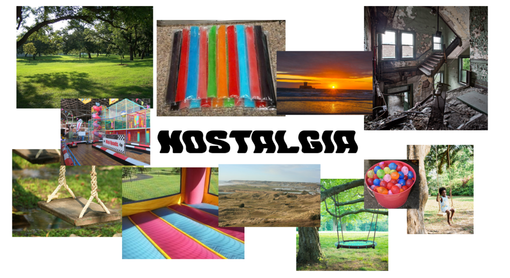
My photographic project will be focused on the theme of memory, specifically my own. I plan to do this by showcasing certain memorable events in my life whether that be through old photos of me or objects/ locations, my idea is to increase the fullness of the pages leading up till the end of the project to symbolize the fact that we forget many memories of our youth and retain more when they are recent.
Bibliography:
Link to word document – What is the relationship between photography and memory or loss of memory.docx
Link to sway document –
| What is the relationship between photography and memory, or loss of memory? |
| ‘Photographed images do not seem to be statements about the world so much as pieces of it, miniatures of reality that anyone can make or acquire.’ |
| Go to this Sway |
https://www.britannica.com/topic/memento-mori
https://en.wikipedia.org/wiki/Memento_mori
https://www.joelsternfeld.net/bio
https://en.wikipedia.org/wiki/Joel_Sternfeld
http://jmcolberg.com/weblog/extended/archives/photography_and_memory/

