All posts by Hannah Fernandes

Filters

Author:
Category:

Elizabeth Castle short film – Video

The app used to edit our Elizabeth Castle film is Premiere Pro.

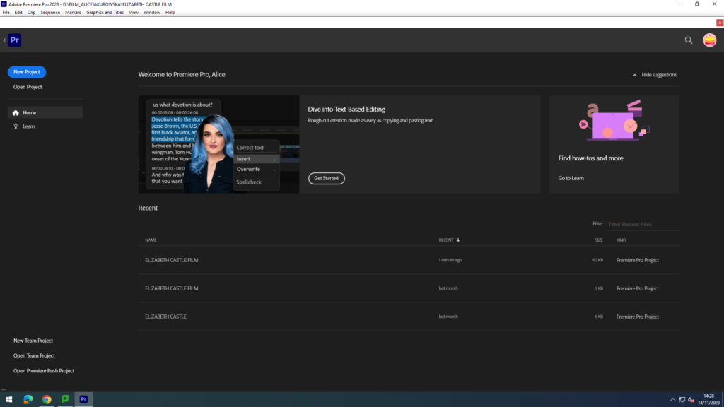
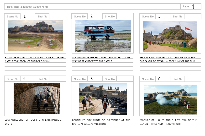
The process in making the film was particularly difficult, using this software for the first time which meant Alice had to familiarise myself with the tools. Alice being the creator of the film making in our group, she was tasked with adding creating the composition of the images/videos, the visual aesthetic, adding fading to the images, and making sure the audio was in the right place. Firstly she added our original image into a sequenced that we liked which also flowed better with a narrative, in order to add some history aspect to our film. According to Hesmondhalgh’s cultural industries theory producers use existing material so the audience can relate and minimise risk when releasing a product.
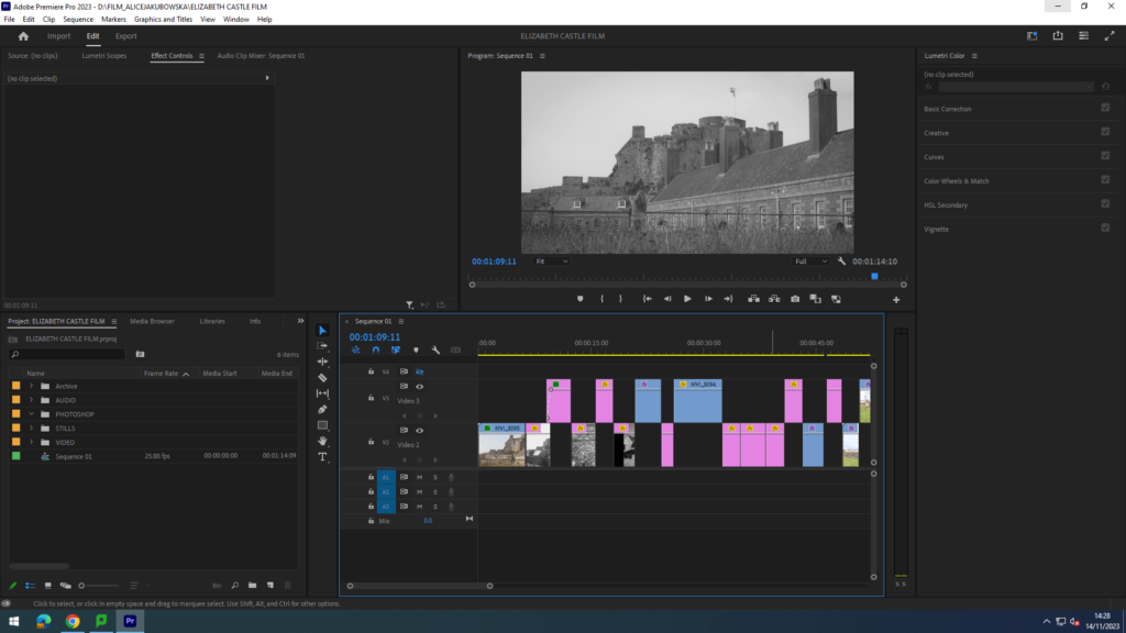
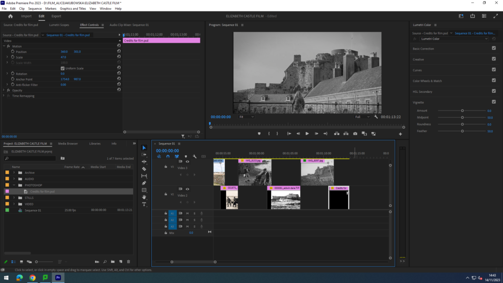
In this image you are able to see the sequencing of videos and images. To create a smooth film we tried to add similar images as to what you could see in the videos, sort of like a visual conclusion in what you saw in the short video. Furthermore, using the archive images Alice faded the original images into them to show the evolution and change you are able to see.
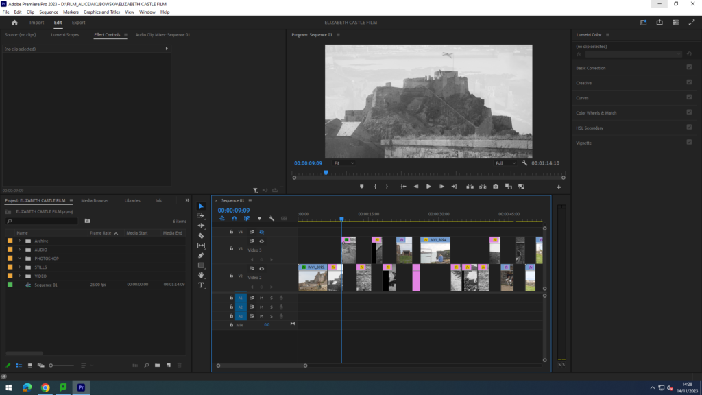
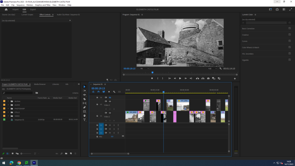
In this screenshot you are able to see a fade from one image to another. You can do this by slightly overlapping the two images and adding two key frames in the edge of each image. You are able to create different types of fades depending on how you position your images and the fade.
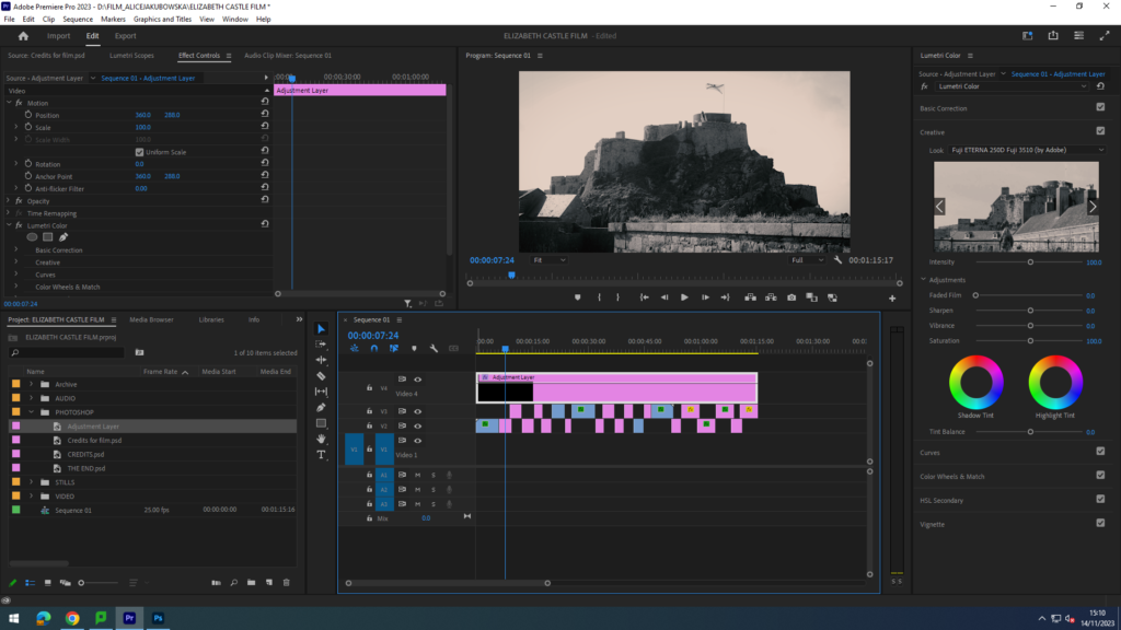
Here you are able to see the adjustment layer that is added on top of the sequence throughout the film. An adjustment layer, is an application of the same effect to a multitude of clips on your timeline. In the adjustment layer we added a black and white filter from the list of adobe filters, this was so the edited images and videos could have the same mood. However in order to make the archive images distinctive we added a different filter ‘Kodak Tobacco’ to create a more vintage old look. This filter had a gold/warm tone which seemed to look a bit like rustic paper used back in the day.

Elizabeth Castle short film – Sound

My role in the film was to edit and create sound for the film. To edit the sound in my film I used Adobe Audition. The class was given a workshop by Sam to demonstrate how to use this application when editing and creating soundscapes for the film.

FREE sound websites provided:

https://soundbible.com/

https://www.zapsplat.com/

https://sound-effects.bbcrewind.co.uk/

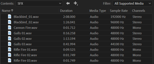
Sam provided us with a folder of sound material that he gathered from the trip to Elizabeth Castle. Majority of the sounds I worked with were taken from this folder, as my film group did not have the equipment to gather our own material. However, I used the audio from one of the videos captured for the canon fire. Using Adobe Audition, I made it louder and clearer so it can be heard in the film.

Sam’s provided sound effects

I used Sam’s materials to create my soundscapes. Using combination of sound effects, seagulls and the sea, to create an establishing background noise for the film. This helps to establish the setting and surroundings at the beginning of the film. I took other sound effects from this too, for example rifle firings.

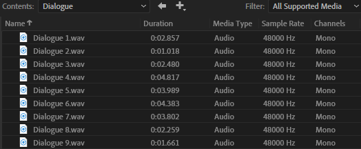
Sam’s provided dialogue clips

This folder included some dialogue clips recorded on the trip. They consist of recordings of demonstrations and other staff character commands. I distributed a selected few of these clips across my film. I did this because the focus of our film was supposed to aim for Tourism attractions which therefore linked to the history of the grounds.

Media – Radio – Departments – Media – Students – Sound FX

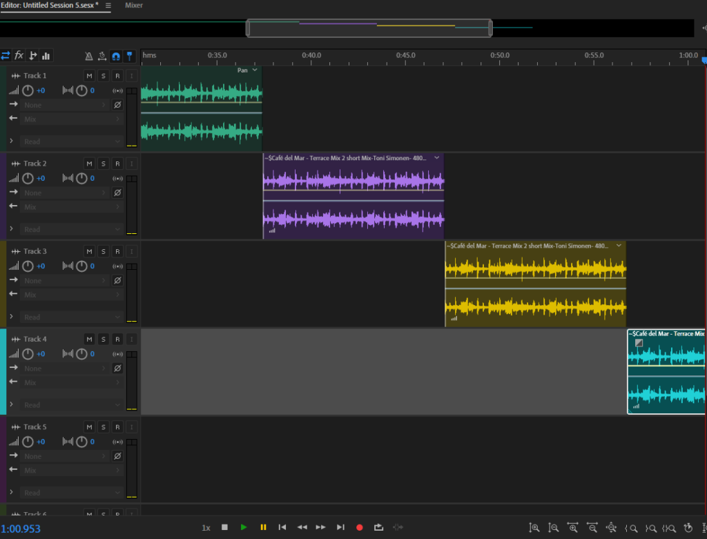
I gathered more sound effects from the Media Drive to expand our sound collection for the film. This includes the backing music for the film, called ‘Café del Mar – Terrace Mix 2’. However, the clip weren’t long enough for the entirety of the film. So, using Adobe Audition, I removed parts of the clip I didn’t like and duplicated it in order to extend the backing track to fit the film. This is shown below:

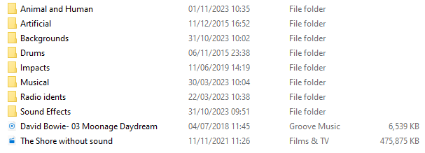
My audio folder for the film

This is my folder I created using all the sound effects, backing music, and Adobe Audition edits I created. This was useful as it allowed our entire sound material to be transferred to the film editor’s computer. This then allows the film editor, Alice, to add in the sound clips to our film as the finishing touches.

Elizabeth Castle short film – Photo

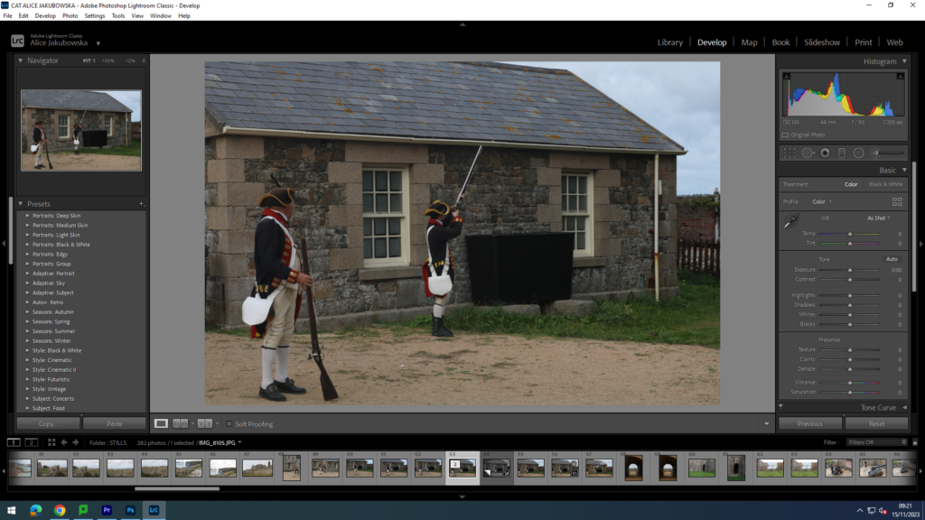
The app used to edit our Elizabeth Castle photographs is Lightroom Classic.

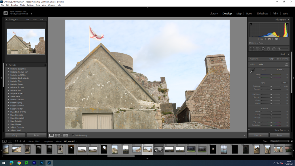
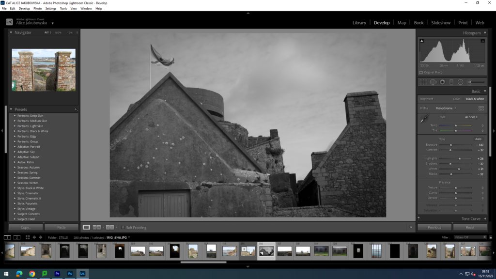
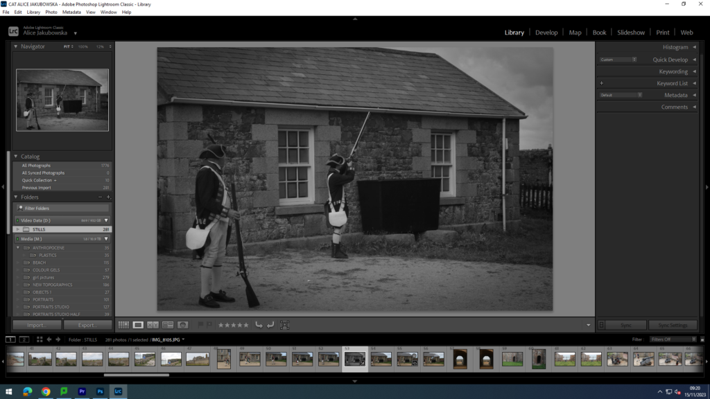
In this film we decided to create it black and white. This is so that the film could look more nostalgic and vintage. By creating this vintage look in the images we took at Elizabeth Castle they were able to fit with the aesthetic from the Jersey Archive images we received from Jersey Heritage. Our film was supposed to aim for Tourism attractions which therefore linked to the history of the grounds.

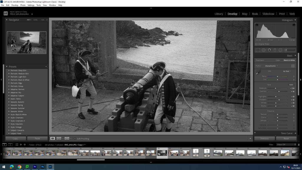
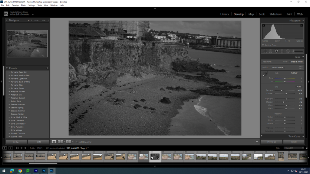
In the images we decided to created a dark atmosphere and vibe to the images, we achieved this decreasing the exposure and decreasing the blacks so we could have a darker mood. However we decided to give the image some dramatic look by contrasting the black and white tones, we further did this by increasing the white and decreasing the darks. Due to this there is a sharper contrast between the tones. To add a more dramatic effect to the images I added a slightly dark vignette around the image, however in order to create a natural aura to the image it was very minimal just enough to create some dimension to the image.

By developing this image in black and white it created a completely different visual look and emotion to the image. Black usually connotes darkness, death, and evil deeds this fits with the image as you are able to see soldiers about to fire from a canon. Which during that era was a deadly weapon that caused many soldiers from the oppositional group a painful death. To darken the mood in the image, the exposure was lowered to create a more depressed and deepen the mood already in the image. Furthermore, the white was increased in order to increase the contrast in the soldiers outfits from the darkened background.

Continuing with the black and white filter we used a similar editing technique and in the image above in order to create a dark serious mood. This is to further support the sincere topic of gun firing, and some of the audience may be affected by this sort action eg post war, or family members in the army. In order to do this, the saturation was lowered to create a dark mood and a sense of sad and ominous emotion for the viewers.

In this image you can see an establishing shot of the landscape in a hidden bit of the castle. This image was important to keep similar to the remaining images in order to keep the same mood through the film. The only different images that would stand out In the film would be the archival material provided by Jersey Heritage. This shot is one of the most important shots in the film as its shows the landscape and the area in which the movie is taking place, this shot therefore set the scene for the audience and creates an understanding of the environment.

Zine: Design & Layout 

process using screengrabs and annotation

Experimentation of zine covers

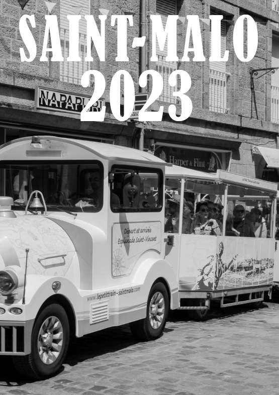
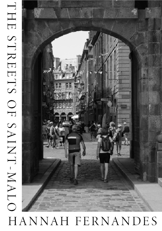
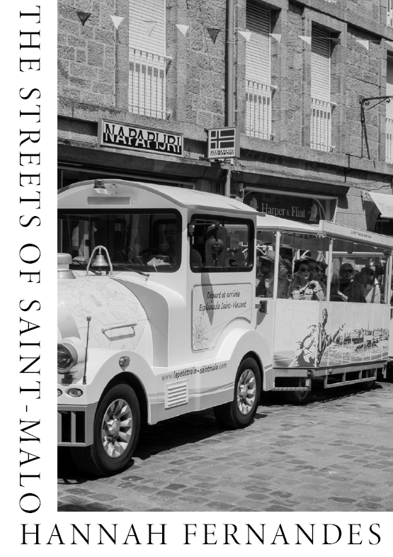
The photo on the right is one of my inspiration photos I found during my research and planning process. On the left is one of my own replications of this design for my zine cover. The following are other examples of this with other final images from my St. Malo collection.

I wanted to experiment with my zine cover and try out different designs before deciding on a final design. Above is another of the inspiration photos I liked during the planning process, as well as my own responses below.

I only managed to create a few possible designs for my cover as the creation process moved quite quickly.

This is the final image I used as inspiration for my zine’s cover. My responses are below, I believe these are my best and favourite designs I have created. The design allows me to incorporate the name of the zine as well as my name, without covering and blocking the image in any way.
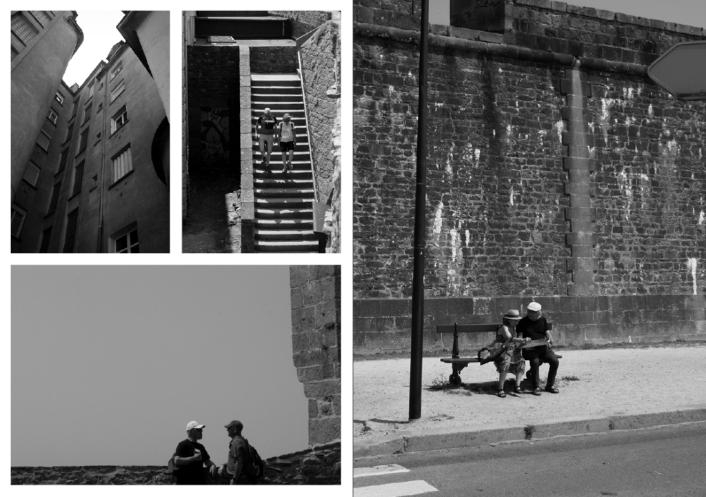
Experimentation of zine pages

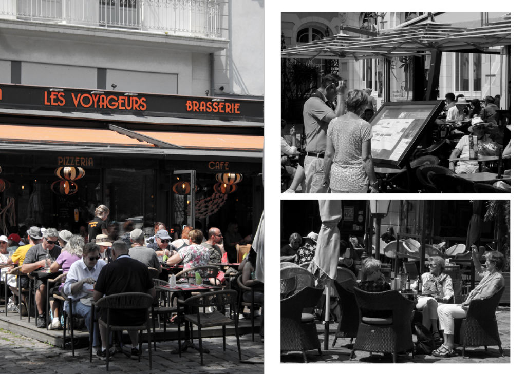
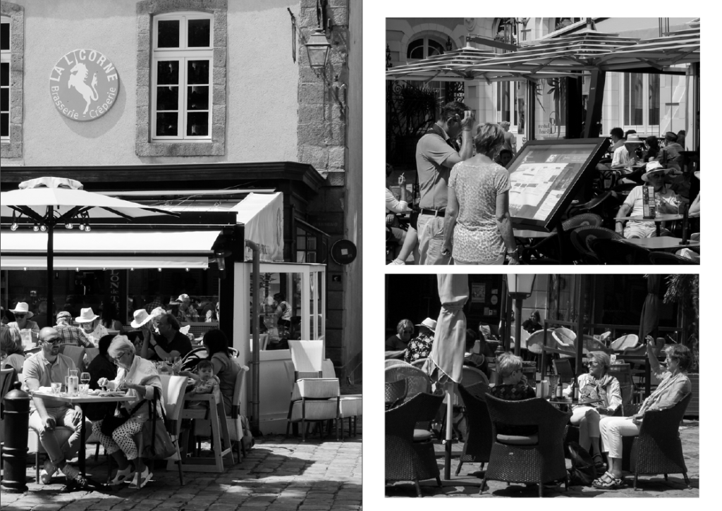
This is a spread where I played around with using different photographs. The top spread is the before, and the bottom spread is the final design. I realised the image in the top spread contained colours and therefore didn’t fit with the black & white theme I was trying to create. I also realised that the photo I chose to replace it with added to the story more than the previous. The final design contains images which I believe show and communicate the subjects’ lives and storylines, overall looking more personal and intimate.

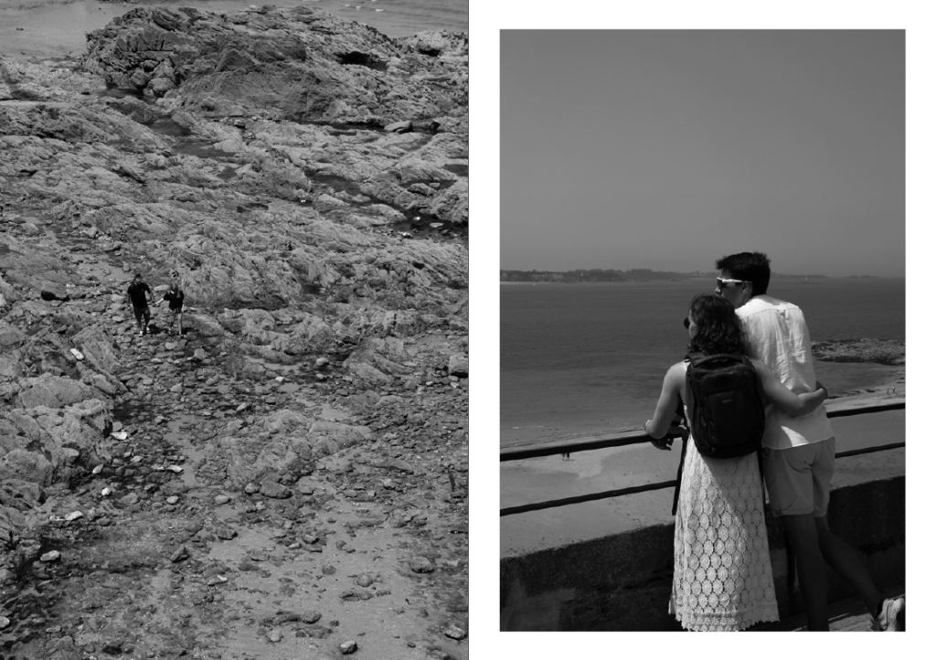
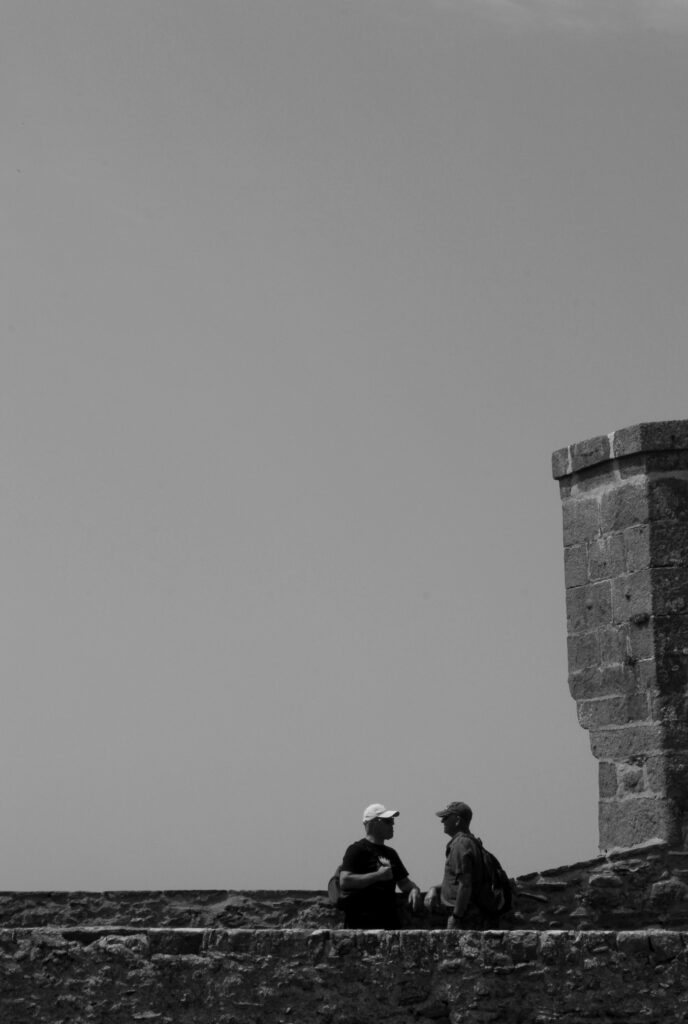
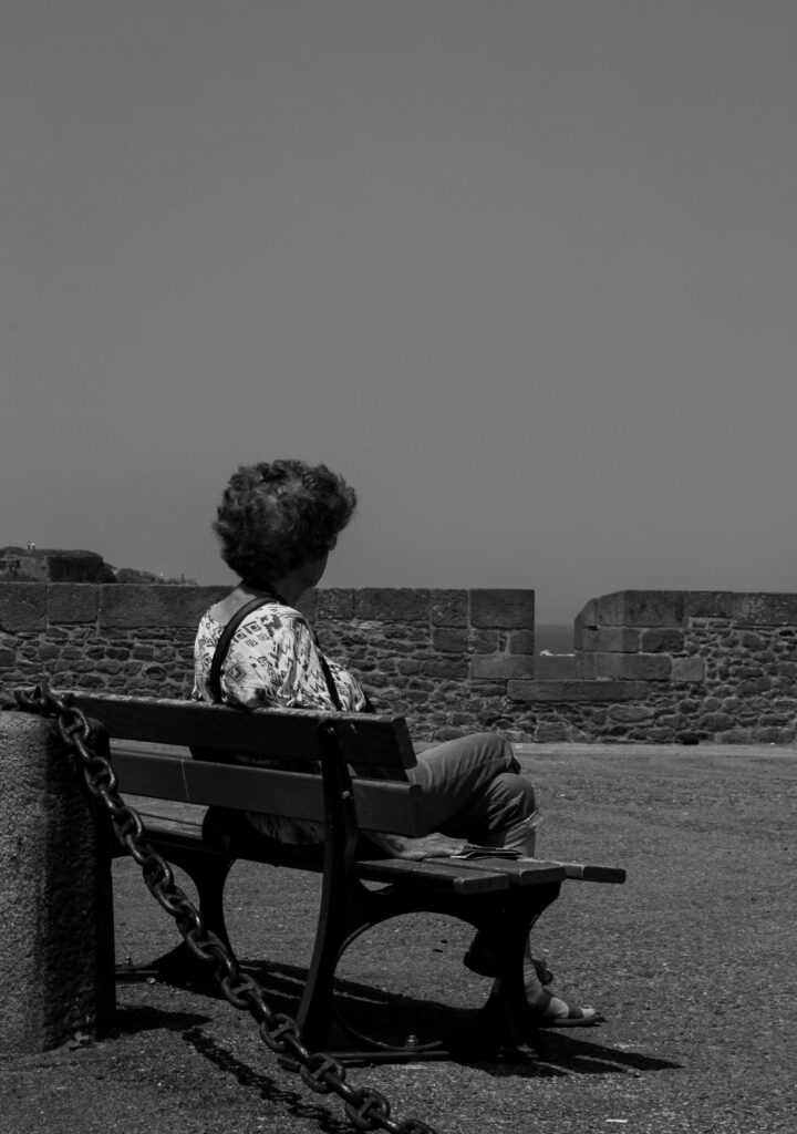
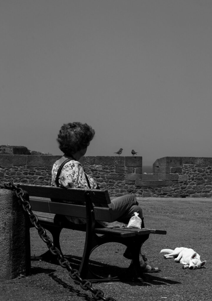
This is more of my photo selection process for the spreads and experimenting with what I think looks best on the page.

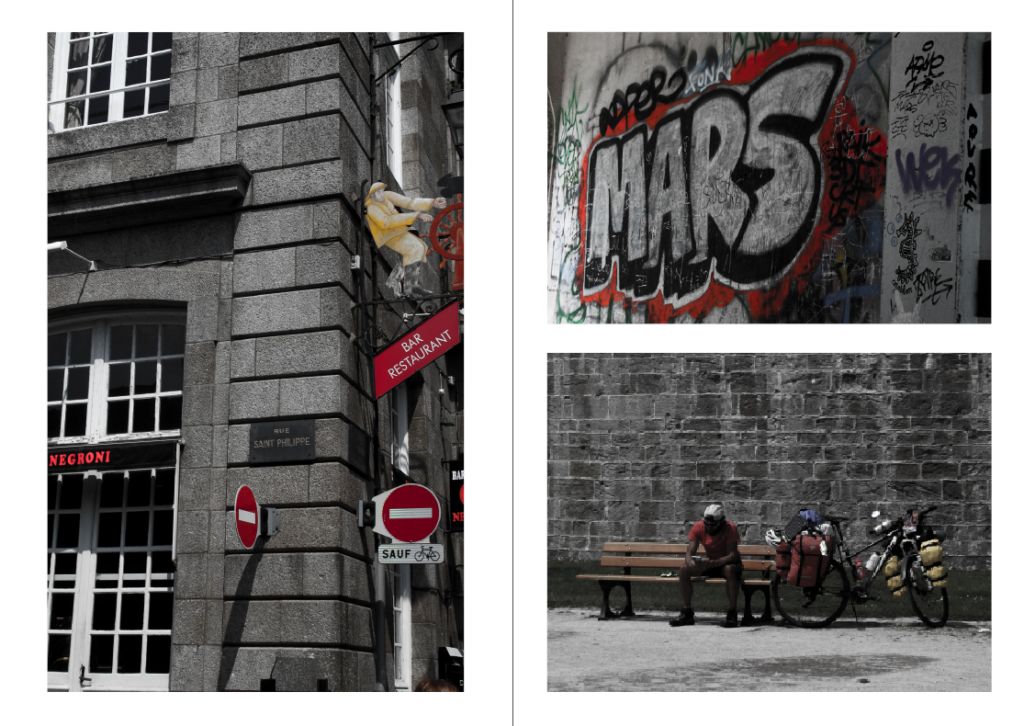
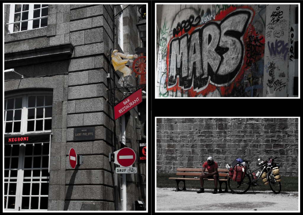
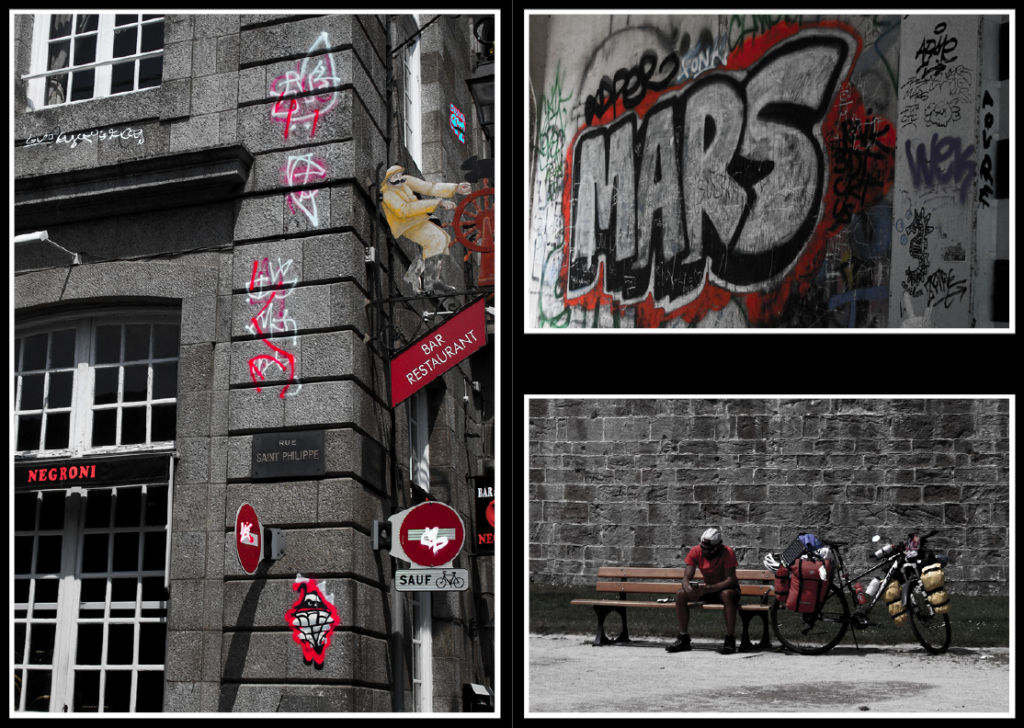
These images are a few of my St. Malo outcomes I edited by turning down the vibrance and turning up the saturation. This presents them as black and white but allows a pop of colour. Specifically I tried to incorporate images with red, white and blue elements (the colours of the French flag). I have chosen these images for the centre page as they don’t fit the black and white them of my zine, allowing some differentiation to the rest.

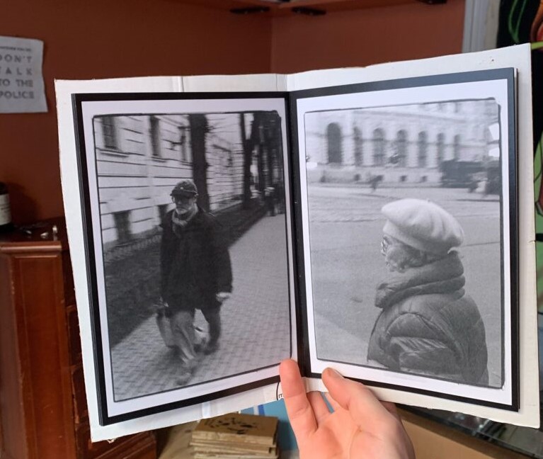
During my research into zines, I looked for inspiration for my zine covers but also my zine pages. This was an example of experimentation with double borders which I wanted to try.
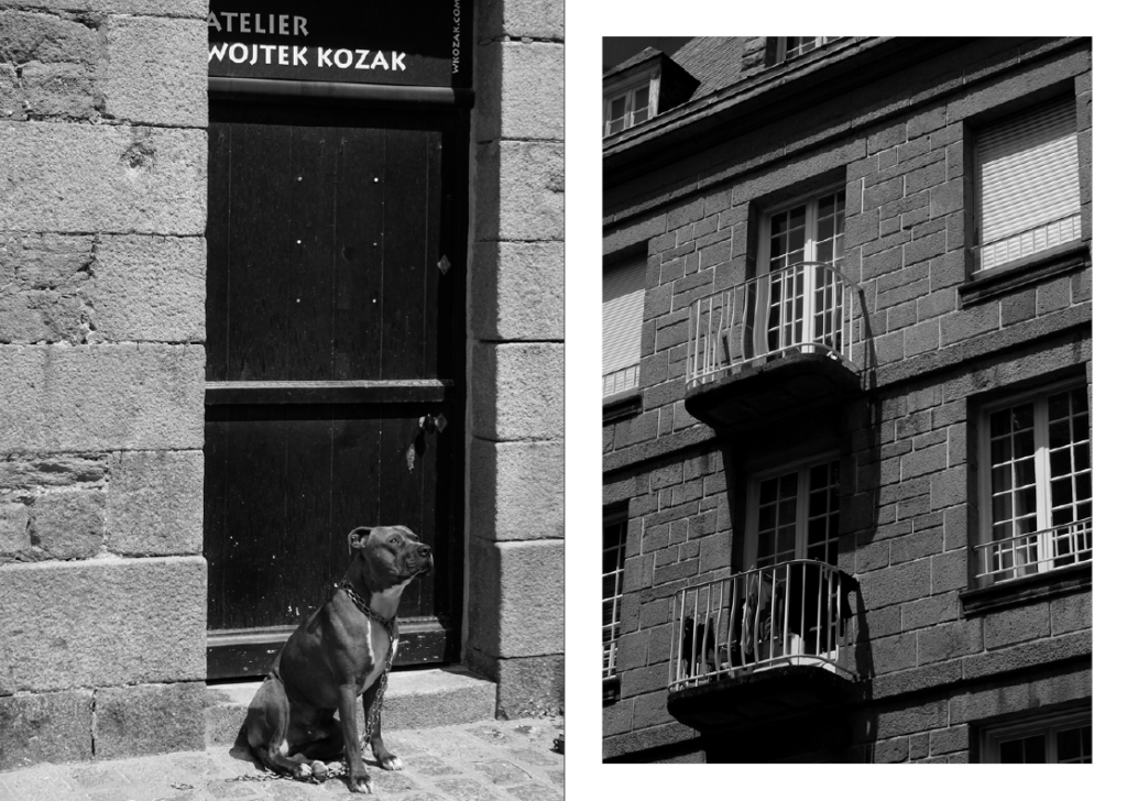
Although I haven’t layered the images in real life like in the inspiration photo, I have used InDesign to create this double border effect. By bordering the images with white and then black, it creates a sense of contrast and draws more attention to the photos and their colours. This differs from the typical layout and theme for my zine, but I think it is acceptable because it is the centre page.
Final pages

Front page
Spread 1
Spread 2
Spread 3
Centre spread
Spread 5
Spread 6
Spread 7
Spread 8
Back page

I believe my zine creation process has been overall successful and that I have created a zine which is well-made and enticing to look at. I have varied my page designs as much as possible to make it more entertaining and exciting. I chose a black and white theme for my zine, with pop of colour and a differentiation in design for the centre spread to make it more fun.

Zine: Narrative & Story

define what story that want to tell and how

STORY: What is your story? Describe in:

3 words

Life in Saint-Malo.

A sentence

What life is like in Saint-Malo, shown through the people and the environment.

A paragraph

NARRATIVE: How will you tell your story?

  • Images > St Malo street photographs and AI generated images in relation to theme of NOSTALGIA…
  • Archives > Old photos of St Malo or any found/ stock imagery…
  • Texts > Typography, words, street signs, graffiti..

Zine: Research and analysis

Mood boards:

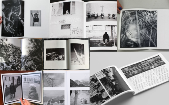
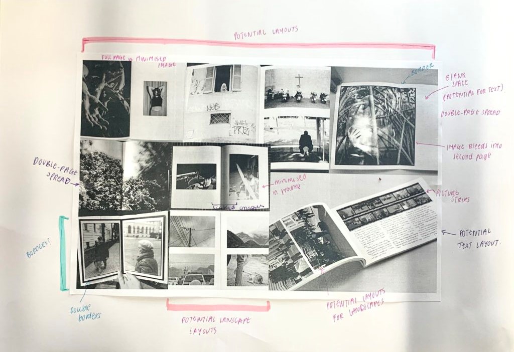
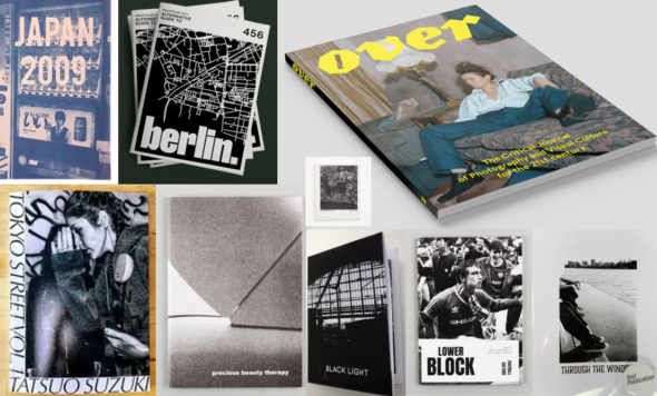
I have compiled some images from online of photography zines. The images in these mood boards consist of layouts and designs which I like. I want to maybe use them as inspiration and replicate them with my own photos in my zine. The mood board below is for inspiration on the content inside the zine.

Below is a photo of my annotations for my mood board. I have annotated aspects of the zines that I like, therefore why I have chosen them for my mood board. Most are for potential layouts for the zine format.

I have also created a separate mood board for the zine front page as I think it’s important to have an interesting, incising cover (below).

A3 page-spreads: design & layout

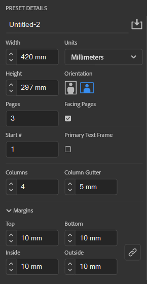
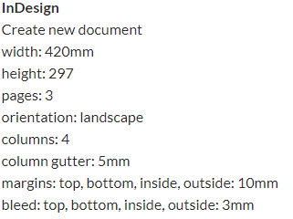
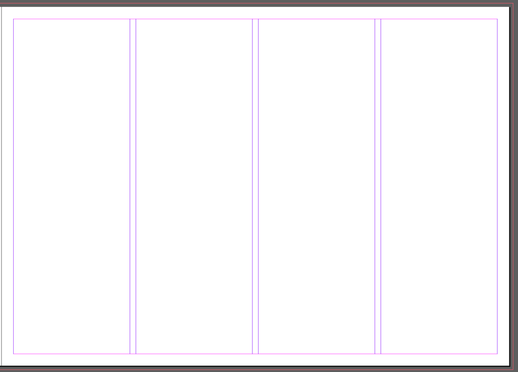
Using InDesign, we will be creating picture stories on A3 page spreads using photographs edited from the St. Malo trip. Here are the settings we’re instructed to use for the page spreads.

InDesign settings

This is what the layout of the page looks like with these settings. This is to aid arrangement of images on the page, and also to allow a border.

First page spread

I wanted to put these photographs together as they’re images that I have edited in Lightroom in a specific way.

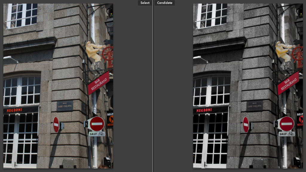
By decreasing the vibrance, and increasing the saturation, it makes the image black and white but also saturates bright colours in the image. I planned on using all black and white for my images on my page spreads, but I think this makes some of the photographs more interesting, allowing certain colours to pop and grab attention. This also creates a red motif across this page spread, as most of the images I selected have red elements. As well as the red, there are also elements of blue and white which collectively create the colours of the French flag.

Before vs. after

As an example, this is one of the images I used in this first page spread. It shows a before (left) and after (right) of the editing.

Second page spread

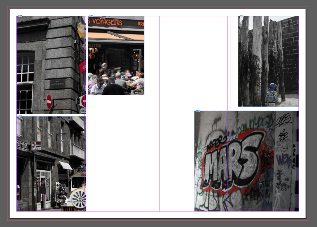
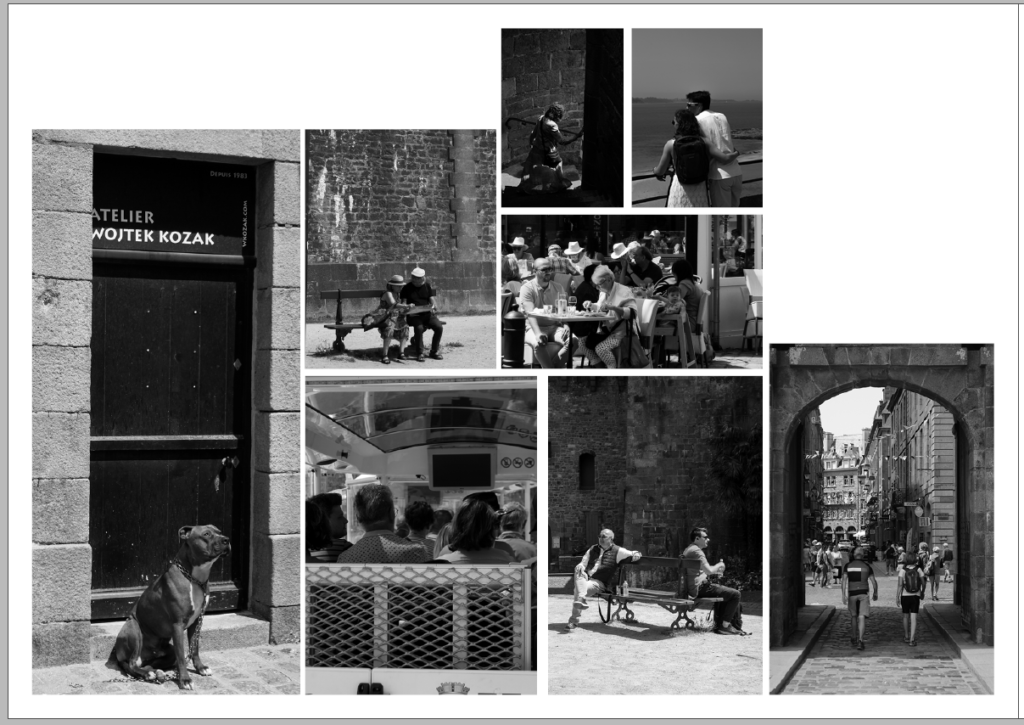
This is a screenshot of my first attempt at trying to select and arrange images on the page in an ordered fashion. However, it just looks disorganised and messy with no cohesion.

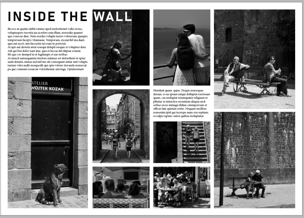
After some advice and experimentation, I arranged the images in a more organised and appealing way as well as adding text to fill any empty space. I creating a title ‘Inside The Wall’ for the page spread, referring to being inside the St. Malo wall which is where I took these photographs. As the title ran over the image on the page, I decided to make the ‘Wall’ part of the title white so that it stands out and is still eligible for readers.

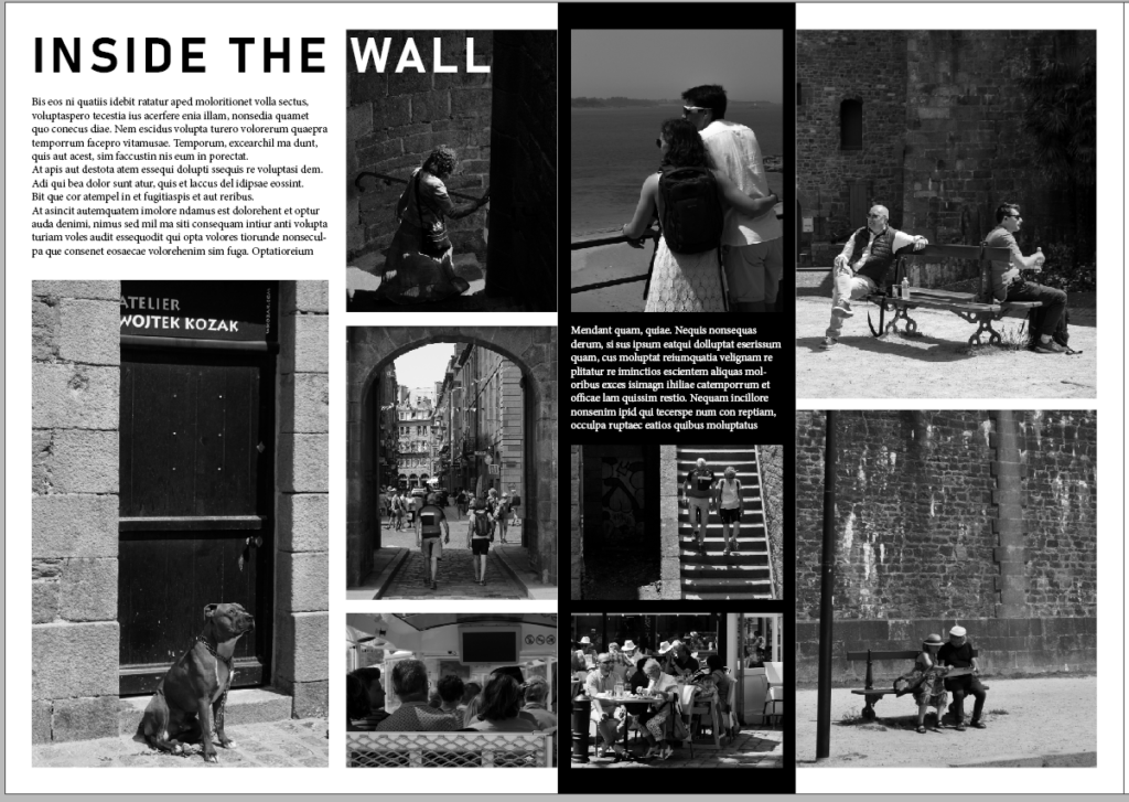
This screenshot of my design doesn’t have many changes from the previous design above. However, I added a strip of black (seen off-centre on the page) as well as making the text white so it is still eligible for readers. This is a small change but is nice as it makes the spread a little more interesting and less uniform.

Third page spread

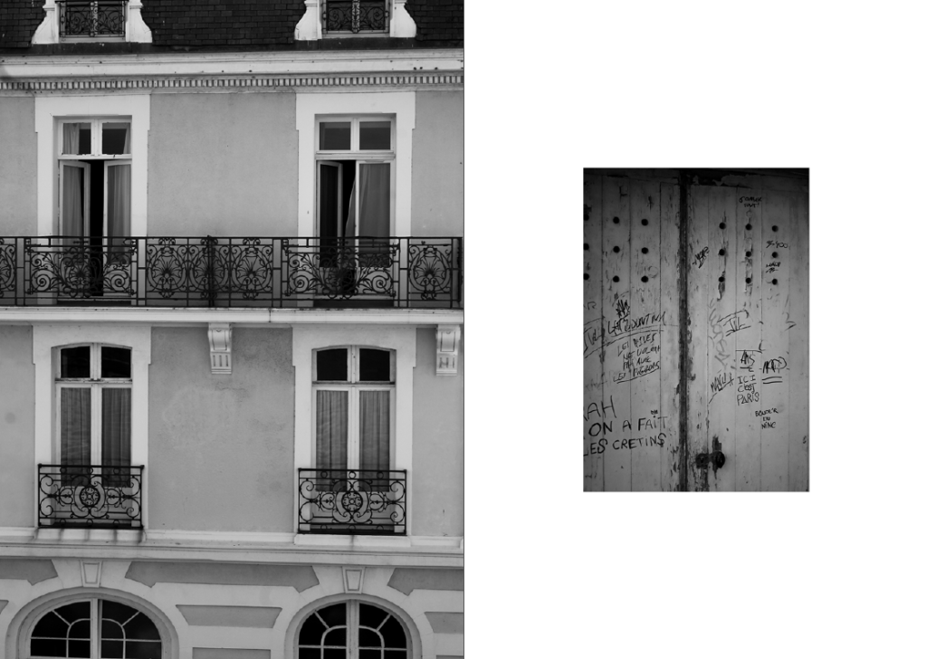
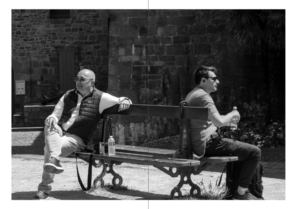
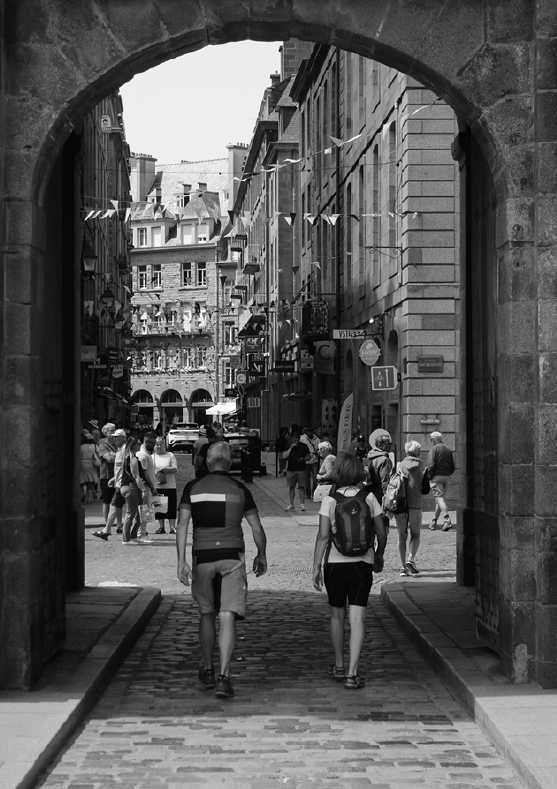
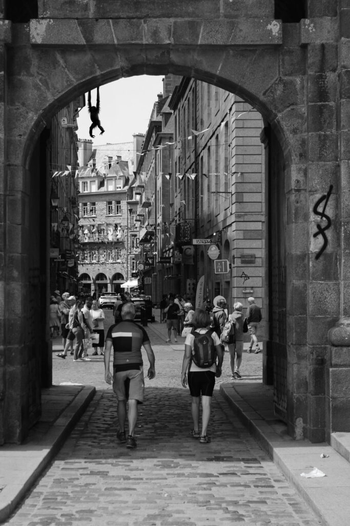
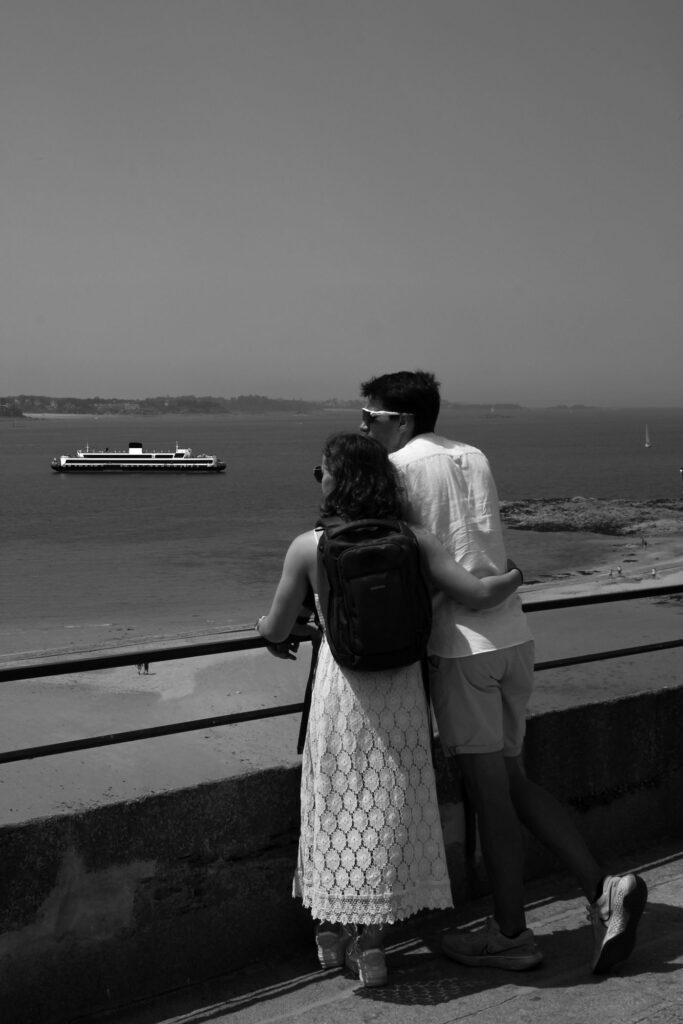
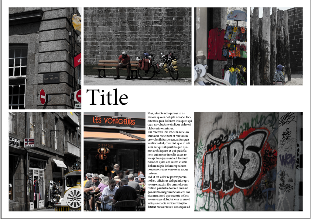
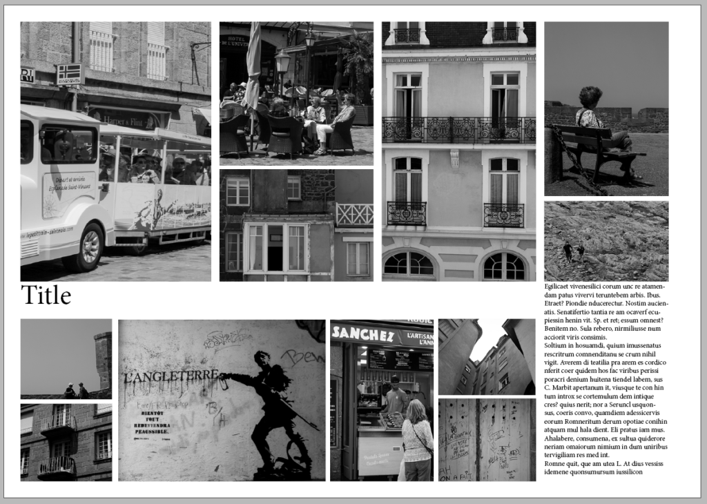
This page spread design shows my chosen layout of images and some added text to fill empty space. I like this layout and think it’s visually appealing as it is very neat and uniform.

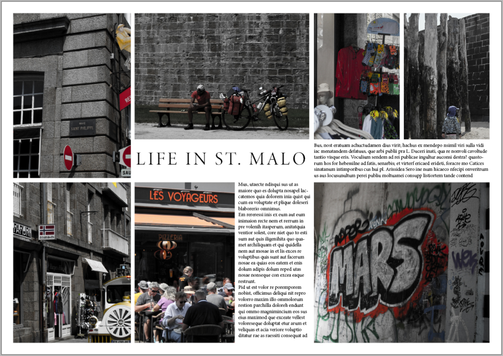
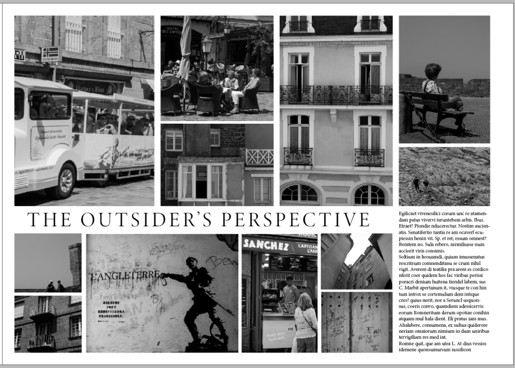
This design is the same as above, with the addition of a title for the spread. I came up with ‘The Outsider’s Perspective’ as I was a visitor in St. Malo taking photographs, which are from my perspective as a tourist.

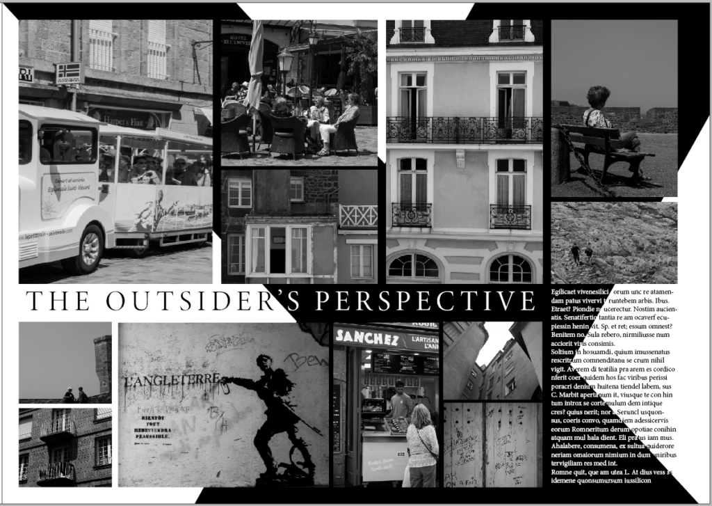
I wanted to add something to make it more exciting like the previous spread. So, I decided to add two diagonal black strips which form a cross. I also now had to make some of the text white so it can stand out against the black, which was quite time consuming. Overall, I think this change made the spread much more interesting and intriguing.