PHOTOBOOK INSPIRATION
CORINNE DAY – DIARY
RESEARCHING A PHOTO-BOOK
Corinne Day is the main inspiration for my project, the stunning photographer uses her photography to document her everyday life, displaying the intimacy and love in her circle of friends and family. Corinne Day’s style of photography is often put in the ‘dirty realism’ genre; “a literary genre characterised by a spare, terse style that features struggling, working-class characters in sterile, bleak environments”. Her images are ‘real’, and display immense personal events and emotions.
1. Describe the story:
Diary – ‘her first solo exhibition in London – is the culmination of ten years’ work and is an intensely personal and frank photographic account of her life and friendships during the last decade of the century in London.’
Corinne Day: diary | The Photographers’ Gallery
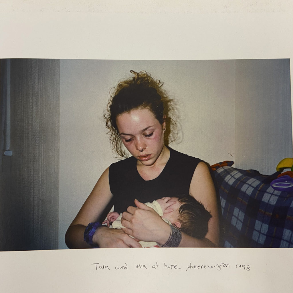
Diary is cold and melancholy, it archives young lives with uncompromising realism in the form of photographs, so we as the viewers feel encompassed in the visual and not just the worded description. The books genre is clearly dirty realism and Grunge. At other times, the photos are joyful and celebrate friendship. Day clearly shares her life with the lives of her close friends, and decides to share experiences like hospitalisation, partying, drugs. Clearly, her best friend Tara is a main character in the diary, we follow her though partying, sexual liaisons, illness and finally, motherhood. However, whether in the photograph or not, she is always emotionally present in her photographs.
2. Who is the photographer?
The photographer of the book is Corinne Day, however thought the book, there are images of herself which may have been taken by Tara (one of the main faces in the diary). One can only assume that Corinne made the photographic diary to remember all of the events in her life, but I think it was also to produce photographs in a ‘grunge’ and ‘dirty realistic’ style. I think the book was really for herself before she passed following the diagnosis of a brain tumour in 1996, but also for her close friends and family, hence the book name ‘diary’. “The series draws comparison with artists such as Nan Goldin and Larry Clark, who also live what they photograph. Like them, Day is curious about people who pursue experiences beyond the norm.”
TITLE AND NARRATIVE
The title ‘Diary’ is a very important aspect of the book, it simply explain what the book itself is; a diary of Corinne Day. The title of the book is written is what seems like Corinne’s handwriting, underneath a photograph of Tara’s face. Tara also seems to be a main character in Corinne’s life, a very close friend, and an important figure.
BOOK IN HAND
- large A4 square/ rectangle
- portrait book in black
- 56 pages
- 54 photographs
- hard cover
- colour and back and white images
- all same paper is used inside
- feels heavy, smells fresh.
- no letterpress, silkscreen or hot-stamping.
- cover is matte card with a printed image of Tara
- none of the words are embossed/ debossed.
image wrap/dust jacket. saddle stitch/swiss binding/ Japanese stab-binding/ leperello
DESIGN AND LAYOUT
Images are all placed in the same orientation on each page, and there is one photograph per page. there are also no double page spreads, but rather only one image to represent an event. Some photos aren’t of people, but they are aesthetically pleasing. There are no fold- outs or inserts in the book either, this makes the book very uniform and organised, a juxtaposition to the crazy, frantic life Corinne was having in the photos.
- one image on each page (54 images)
- landscape images, rarely portrait
- images are all the same size, just rotted landscape or portrait
- images don’t seem to be size edited, same size as taken with camera
- photos can be quite dark and gloomy, quite a grunge feel to them
The images are all linked together very well by how they are edited and by their captions. The photos all have the same ‘art-rock’ vibe, with gloomy, high contrasted and saturated images. Some photos even look to be taken on a disposable camera (however they are just edited in this way).
A narrative is constructed by the captions under each image, even though the images are not in chronological order. The captions are short and seem to be written in Corinne’s handwriting, making it very personal. She tells a story though jumbled photographs, however the captions seem to make sense, and really feel like a diary.
EDITING AND SEQUENCING
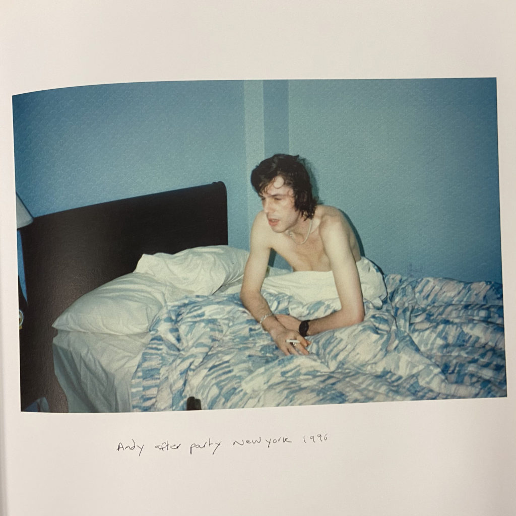
When looking at the photos in Corinne Day diary, there seems to be a particular selection of photographs; for each special (or main) event in her life with her family and friends, there only ever seems to be one image that represents the whole experience. For example: one image is of a man named Andy in bed, the image is captioned ‘Andy after party NewYork 1996’. There seems to be no images from the party in the book, only one image of a rather hungover Andy, which may be all that’s needed to remind Corinne of the experience. There seems to be no chronological order in her book, images are placed where they compliment each other.
Film Editing
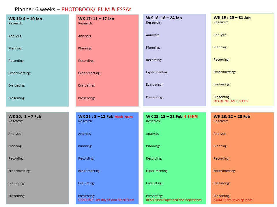
PLANNER – Download and save in your folder. Make sure you monitor and track your progress.
4 weeks remaining – including MOCK EXAM!
UNDERSTANDING FILM EDITING:
NARRATIVE, CINEMATOGRAPHY, SOUND, MISE-EN-SCENE, EDITING
Earlier in the academic year we looked at narrative in photography, literature and cinema. Let’s refresh our memory and revisit some of the theories around visual storytelling.
Week 18: 18 – 24 Jan:
Essay: Paragraph 2 + 3
Film: Deconstruct narrative, editing & sound
ESSAY: Lesson time (Fri)
• Complete Paragraph 2 & 3 and upload to the blog no later than Mon 25 Jan.
Blog: Produce a number of posts that show evidence of the following:
1. Research a film and describe its story – including subject-matter, genre and style etc.
2. Who is the film director? Why did he/she make it? (intentions/ reasons) Who is it for? (audience) How was it received? (any press, awards, legacy etc.)
3. Deconstruct the film’s narrative, editing and sound, such as; scenes, action, shot sizes, camera angles and mise-en-scene (the arrangement of the scenery in front of the camera) from location, props, people, lighting, sound etc.
CASE-STUDIES: Look below for examples of films and theory on editing and sound used in understanding cinema and language of moving images.
THEORY
For more details see Dr McKinlay’s blog on Narrative in Cinema and The Language of Moving Image which look more specifically at some of the recognised conventions and key terminology associated with moving image (film, TV, adverts, animations, installations and other moving image products) which will help to create your own moving image product. Remember the key is to know what the rules are before trying to break them.
The following recognised conventions should help students to deconstruct key moving image media texts and will also help students to create their own moving image products, working within or against these conventions. Remember the key is to know what the rules are before trying to break them.
As alluded to, when looking at moving image products, it is useful to make a link to NARRATIVE THEORY as most often the key ideas, codes and conventions that are put to use for moving image products, are usually put together to serve ideas around NARRATIVE. For example, character, theme, motivation, empathy, ideology and so on.
Here are a few things to consider when working with Moving Image. (These are extracts from Dr McKinlay’s blog posts above)
THE CAMERA: Here are some of the key features of the camera in terms of creating a moving image product.
Focus and Depth of Field: The focus is used to direct and prioritise elements in a shot and therefore prioritise certain information. For example, it will determine who the audience should look at (even if we are not listening to them). It may switch our focus (known technically as a pull focus / rack focus / follow focus) between one element and another. Remember that the elements may not be people, but could be objects, spaces, shapes or colours, which may represent an idea, theme, belief etc (see the post on Semiotics)
Shot sizes, angles and movements
- High angle / Low angle / bulls-eye / birds eye / canted angle
- Tracking / Panning / Craning / Tilting / Hand held / Steadicam
- Establishing Shot / Long Shot / Medium Shot / Close-up / Big Close-Up / Extreme Close Up (students often struggle with the first and the last again issues with SCALE, SIZE & SPACE, so practice is really important)
- Insert Shot
THE EDIT: Moving image products (like other media products: print, radio, on-line) are clearly constructed around the concept of putting one thing next to another. This is editing.
Editing is the process of manipulating separate images into a continuous piece of moving image which develops characters, themes, spaces and ideas through a series of events, interactions and occurrences. As such, it is (usually) LINEAR and SEQUENTIAL, although, it must be remembered that moving image products often parachute the audience into a particular moment and usually leave them at an equally unresolved moment. As such BACK STORY, FORESHADOWING, REPETITION, ELLIPSIS, DEVELOPMENT, ENIGMA, DRAMATIC IRONY and other concepts are really important to always bear in mind. Again NARRATIVE THEORY is really important to an understanding of moving image products.
Moving from Camera to Edit, would be to look at the way camera can frame and position characters and thereby the audience by creating ‘subjectivity‘ and empathy in the way they are constructed. This can be used to deliberately ‘stitch‘ the audience into the text in a deliberate and particular way.
This idea of sewing / stitching the audience into the text was developed by theoreticians of the “Screen theory” approach — Colin MacCabe, Stephen Heath and Laura Mulvey, so follow this link to find out a little bit more.
SHOT SEQUENCING 1: Shot / Reverse Shot
The Shot / Reverse Shot a really good starting point for students to both think about and produce moving image products. The basic sequence runs from a wide angle master shot that is at a 90′ angle to (usually) two characters. This sets up the visual space and allows the film-maker to to then shoot separate close-ups, that if connected through an eye-line match are able to give the impression that they are opposite each other talking. The shots are usually over the shoulder. Firstly, they include both characters – which are called EXTERNAL REVERSES. As the drama increases, the framing of each shot then excludes the back of the head of the other character and moves in to a much closer over the shoulder shot – which are called INTERNAL REVERSES. Remember that these shots are not creating a direct look to camera. To look directly at the camera creates a very different relationship between the characters and the audience and is a technique that is only used for specific techniques / genres / film-makers.
The basic edit: cut/fade/dissolve
SHOT SEQUENCING 2: Shot progression
Shot progression usually involves the following shots (although not always in the same order). The use of these shots allow the audience to understand SPATIAL RELATIONSHIPS between locations, people, movements etc. The length of shot will determine the drama, empathy, theme etc. The choice of how to sequence each shot will determine the AESTHETIC QUALITY of the product. The next sequence will then follow a similar pattern, which again allows the audience to understand concepts such as SPACE, TIME, DISTANCE, MOVEMENT, MOTIVATION, PLOT, THEME etc.
- establishing shot / ES, moving to
- wide shot / WS,
- to medium shot / MS,
- to close up / CU,
- to big close up / BCU;
- and then back out again
The use of sequential editing (editing one clip to another) allows for a number of key concepts to be produced:
- parallel editing: two events editing together – so that they may be happening at the same time, or not?
- flashback / flash-forward – allowing time to shift
- montage – a series of independent and perhaps unconnected shots to be edited together
CONTINUITY EDITING
Continuity editing can be seen as the opposite of montage editing as the main aim is to create a sense of realism or ‘believability’ known as verisimilitude and has it’s own structure of rules where shots are edited together at particular times or on particular shots. For example:
- match on action
- eye-line match
- graphic match
- sound bridge
- 30′ rule
- 180′ rule
Editing is the process of putting one element / idea next to another. It is known as the Kuleshov effect, in that adding one element / idea to another actually produces a third idea / element, which if constructed well can produce in the audience an idea that isn’t actually present! If this sounds confusing, the basic rule in editing is you don’t show everything literally, you need to use just enough information to provide ideas and suggestions for your audience to develop EMPATHY and INVOLVEMENT with characters, themes, setting, plot. As such, what you leave out known as ELLIPSIS is just as important as what you put in. Again the ideas of SPACE, SIZE & SCALE are really important, because you need to frame your shots with appropriate SIZE AND SCALE and trim your shots so that they are not too long ie creating the appropriate SPACE for ideas, characters, themes, the plot etc to develop.
The Kuleshov effect is a film editing (montage) effect demonstrated by Soviet filmmaker Lev Kuleshov in the 1910s and 1920s. It is a mental phenomenon by which viewers derive more meaning from the interaction of two sequential shots than from a single shot in isolation. Through this phenomenon we can suggest meaning and manipulate space, as well as time.
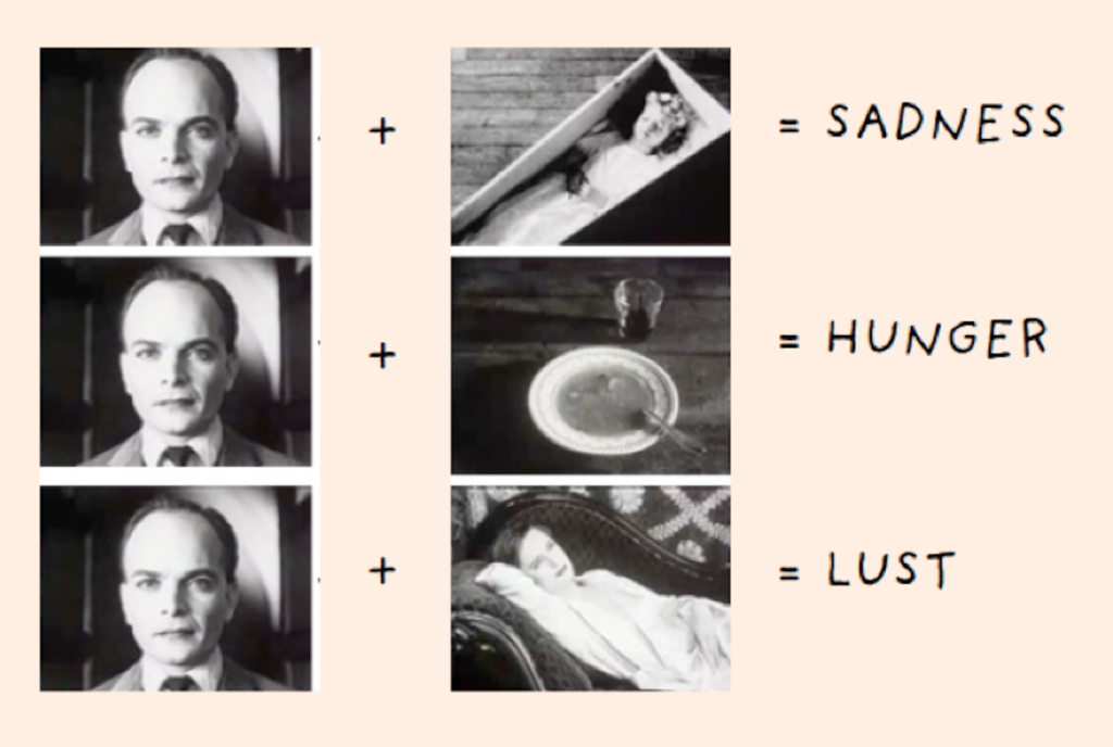
Kuleshov edited a short film in which a shot of the expressionless face of Tsarist matinee idol Ivan Mosjoukine was alternated with various other shots (a bowl of soup, a girl in a coffin, a woman on a divan). The film was shown to an audience who believed that the expression on Mosjoukine’s face was different each time he appeared, depending on whether he was “looking at” the bowl of soup, the girl in the coffin, or the woman on the divan, showing an expression of hunger, grief, or desire, respectively. The footage of Mosjoukine was actually the same shot each time.
Kuleshov used the experiment to indicate the usefulness and effectiveness of film editing. The implication is that viewers brought their own emotional reactions to this sequence of images, and then moreover attributed those reactions to the actor, investing his impassive face with their own feelings. Kuleshov believed this, along with montage, had to be the basis of cinema as an independent art form.
Chris Marker: La Jétte
Chris Marker, (1921-2012) was a French filmmaker, poet, novelist, photographer, editor and multi-media artist who has been challenging moviegoers, philosophers, and himself for years with his complex queries about time, memory, and the rapid advancement of life on this planet. Marker’s La Jetée is one of the most influential, radical science-fiction films ever made, a tale of time travel. What makes the film interesting for the purposes of this discussion, is that while in editing terms it uses the language of cinema to construct its narrative effect, it is composed entirely of still images showing images from the featureless dark of the underground caverns of future Paris, to the intensely detailed views across the ruined city, and the juxtaposition of destroyed buildings with the spire of the Eiffel Tower. You can read more here about the meaning of the film and it is available on Vimeo here in its entirety (29 mins)
Mark Cousins: Atomic, Living in Dread and Promise
A narrative can also be made constructed entirely of archive footage as in Atomic, Living in Dread and Promise, a film that shows impressionistic kaleidoscope of our nuclear times – protest marches, Cold War sabre-rattling, Chernobyl and Fukishima – but also the sublime beauty of the atomic world, and how x-rays and MRI scans have improved human lives. The nuclear age has been a nightmare, but dreamlike too. Made by director and film critic, Mark Cousins and featuring original music score by Mogwai, it was first broadcast on BBC4 as part of Storyville documentary. Your can read a Q&A with Cousins’ here where he discusses the making of the film.
Christopher Nolan: Memento
Memento is a 2000 American neo-noir psychological thriller film written and directed by Christopher Nolan. Guy Pearce stars as a man who, as a result of an injury, has anterograde amnesia (the inability to form new memories) and has short-term memory loss approximately every fifteen minutes. He is searching for the people who attacked him and killed his wife, using an intricate system of Polaroid photographs and tattoos to track information he cannot remember.
The film is presented as two different sequences of scenes interspersed during the film: a series in black-and-white that is shown chronologically, and a series of color sequences shown in reverse order (simulating for the audience the mental state of the protagonist). The two sequences meet at the end of the film, producing one complete and cohesive narrative
Telling a story in reverse can be an interesting way to construct a narrative. Both cinema and literature are good at jumping between different time modes, past, present and future. Moving image and sound can enhance these different temporal shifts and written language is good and transporting your imagination from one time zone to another. Photography is mute but different strategies can be employed such as changing from colour to monochrome suggesting a different time or a different set of images. Using old photographs from archives, or found imagery can add complexity too, and including words can support a sequence of images, or add tension between the visual and the textual adding other elements to a photographic narrative.
Memento: Narrative and Postmodernism is also being looked at in Media Studies and if you are studying this subject make sure you include knowledge and understanding learned. Adopting a inter-disciplinary approach to your work is advantageous and being able to use theory and/ or context from other subjects will add value to your overall quality of your work and potentially achieve higher marks.
Theorists like Sergei Eisenstein, D.W Griffiths, Lev Kuleshov, Jean Epstein, John Grierson (also the coiner of the term ‘documentary’), Dziga Vertov, Andre Bazin, and Siegfried Kracauer went into sometimes painful detail to articulate theories about how various film and editing combinations created different forms of meaning. Many of these ideas remain surprisingly robust and useful a century later, and remain the bedrock of much of the theory taught to film students.
MISE EN SCENE
Mise en scene plays a huge role in communicating the tone of a story — but what is mise en scene? In classical terms, mise en scene is the arrangement of scenery and stage properties in a play or film. Today, mise en scene is regarded as all of the elements that go into any single shot of a production. Click below to learn more about mise-en-scene
https://www.studiobinder.com/blog/mise-en-scene-elements-color-in-film/
Four of the most important aspects of mise en scene are: sets, props, costume/hair/makeup, and lighting. Here are examples from filmmakers Stanley Kubrick and Wes Anderson on how to apply color to these four aspects.
VIDEO ART are not following moving image conventions as described above. Instead they are more fragmented in structure and often don’t follow a narrative in a linear sense. Often they are concerned with other elements, such as repetition, parody, chance, play or staging something for the camera. For more help and guidance – see my a previous blog posts here from 2017
Tom Pope, Art and Protests, Jersey Live film stuff
You may explore different approaches to image-making across different genres such as performance, photography, video, multi-media, installation, land/ environmental art, experimental film-making and avant-garde cinema.
See more examples here of video art and experimental films in the blog post from our 90 sec film project on ART & ACTIVISM.
Sound
Moving image depends on sound for much of its’ meaning. It is impossible to overstate how important a role audio plays in the film viewing experience. While it’s perfectly natural to be drawn to the visual side of film making, those striking visuals don’t hold the same weight without strong cinematic sound design to back them up. Whereas a painting is purely visual and a song can be purely aural, cinema combines sight and sound for a unified experience where one bolsters and elevates the other. Click on link below and learn about the role of the sound designer and other sound design jobs, the fundamentals of sound design, and to check out some examples from the movies with the best sound design.
https://www.studiobinder.com/blog/what-is-sound-design-for-film/
What is sound design?
Sound design is how filmmakers flesh out the aural world of a film to enhance the mood, atmosphere, and/or tone. Sound design components include sound effects or SFX sound design, mixing, Foley sound design, dialogue, and music. Sound design is the final and most important element needed to create an immersive experience for the audience.
Examples of sound design in practice:
A sound designer working in the sci-fi, horror, or fantasy genres will likely be tasked with conceiving original sounds for unique sources. What does an alien ship sound like? How do you approach horror creature sound design? All of these are questions a sound designer will devise answers for.
Let’s take a look at District 9‘ssound design as an example. In this scene, the sounds of the mech suit, alien weapons, computerized UI, the spaceship, and the creature vocalizations all required immense creativity in District 9’s sound design.
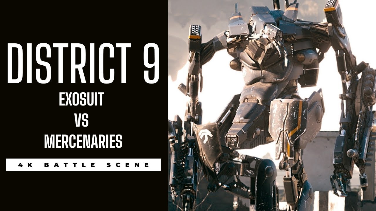
This is sound design from Neill Blomkamp’s District 9
The Coen Brothers have a keen ear for cinematic sound design. Their filmography is jam-packed with excellent examples of sound design, including some of the best sound design in films. Their work showcases the variety of different directions a sound designer can take the material.
This can range from stylized near-cartoon sound design in something like Raising Arizona to something more psychologically-driven like Barton Fink’ssound design. John Goodman’s ferocious roars, hysterical dialogue, the rush of fire, and the long decay of his shotgun blast, are all sound design examples culminating in one cohesive moment.
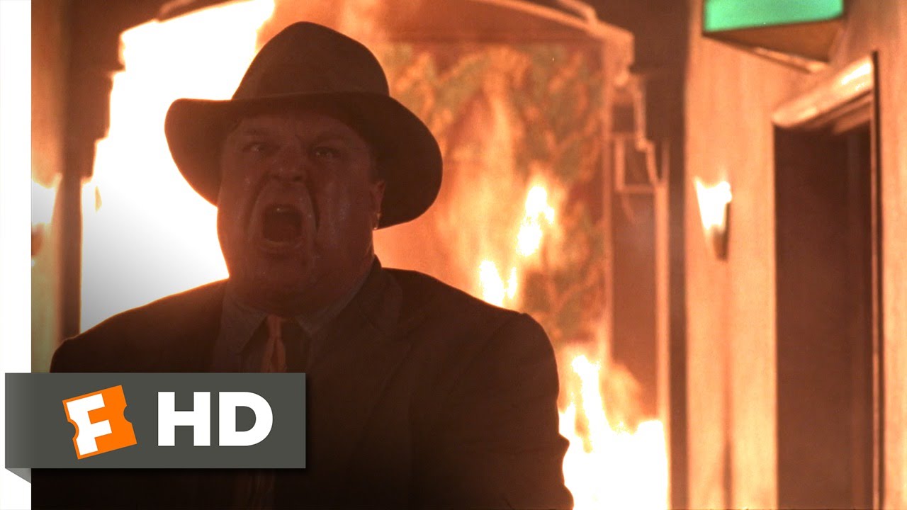
Barton Fink sound design in action
In addition to individual sound effects, sound designers also create what are known as soundscapes. You can think of a soundscape as a bed of audio that music, SFX, and dialogue rest on top of. Creative soundscapes are a great way to enhance a film’s sense of atmosphere or style.
Many of the most memorable soundscapes find themselves at home in the horror genre. An eerie soundscape can be a great way to double down on the creepiness of on-screen visuals. The films of David Lynch almost always feature incredibly inventive soundscapes that he often crafts himself.
In this example from Eraserhead, notice how much atmosphere and dread are generated through the powerful and oppressive soundscape. The droning, surreal tones are layered with industrial noises that magnify the bleak nature of the environment surrounding our protagonist and the end effect is staggeringly effective.
Sound editing vs sound mixing
To continue familiarizing yourself with audio post-production and to get a good handle on the distinction between sound editing and sound mixing, read article on the nuances that distinguish them here.
What you hear on a movie’s soundtrack is multilayered. Dialogue, ADR, sound effects, Foley, music — it’s all part of the overall sound design. Putting it all together is a massive job and it’s handled by multiple teams with different taks. So, that brings us to the question of the hour: what is the difference between sound editing vs sound mixing?
Catch a few scenes from iconic movies that delineate between editing and mixing, below.
https://www.studiobinder.com/blog/sound-editing-vs-sound-mixing/
What is sound editing?
Sound editing is the creation, recording, or re-recording of sounds.
When you’re on set, capturing quality sound is critical. But the majority of the sounds you hear in the movies are rarely ever captured this way. Often, the main focus on set, is the blocking and staging of the actors, and perfecting the execution of their lines.
Many of the sounds are added in later. The collection and creation of these sounds is sound editing. We’ll get more into the ways artists collect these sounds soon. Once these sounds are added in, then sound mixing can begin. The main goal in mixing is to make sure that all of the sounds, including recorded dialogue, are as seamless as possible.
Let’s dive a little deeper into both sound editing and mixing.
Week: 19-20 -21: 25 Jan– 11 Feb
MOCK EXAM 3 days (15 hrs) Mon 5 – Thurs 11 Feb Finish Editing Film & Complete Essay
In the next three week focus on beginning to edit and collect all your images, archival material and texts, including finishing writing your essay needed to complete your photobook.
ESSAY: Lesson time (Fri):
Complete conclusion, bibliography, proof read and hand in draft essay no later than Mon 1 FEB.
You want to aim for a draft layout and hand in draft version of your essay before your Mock Exam day, then use that day to fine tune design and complete essay
INTERIM DEADLINE: FRI 5 FEB
DRAFT FILM EDIT
FILM: Lesson time (Mon, Tue, Thurs & Fri)
Produce a number of blogposts that show evidence of the following:
- STORYBOARDING: Re-evaluate your own film’s narrative and storyboard including details of individual scenes, action, shot sizes, camera angles and mise-en-scene (the arrangement of the scenery in front of the camera) from location, props, people, lighting, sound etc.
Narrative: What is your story?
Describe in:
- 3 words
- A sentence
- A paragraph
2. RECORDING: Produce a number of photographic response to your Personal Study and bring footage from video/ audio recordings to lessons:
• Save footage in folder on local V:Data Drive
• Organisation: Create a new project in Premiere
3. EDITING:
• Begin editing video/ audio clips on the timeline
• Adjust recordings in Colour / B&W appropriate to your intentions.
• Video: experimenting with editing and sequencing using relevant transitions and effects
• Sound: consider how audio can add depth to your film, such as ambient sound, sound fx, voice-over, interview, musical score etc. • Title and credits: Consider typography/ graphics/ styles etc. For more creative possibilities make title page in Photoshop (format: 1280 x 720 pixels) and import as a Psd file into your project folder on the V-Data drive.
Produce screen prints of layout ideas as you progress and add to Blog for further annotation, commenting on editing and sequencing video and sound etc.
4. EVALUATION: Write an evaluation on the blog that reflects on your artistic intentions, film-editing process and collaboration. Include screen-prints from Premiere and a few ‘behind the scenes’ images of the shooting/ production for further annotation. Comment on the following:
- How successful was your photoshoot and experimentation?
- What references did you make to artists references? – comment on technical, visual, contextual, conceptual?
- How are you going to develop your project from here? – comment on research, planning, recording, experimenting.
- What are you going to do next? – what, why, how, when, where?
5. BLOG POSTS: Make sure all blog posts are finished including, research, analysis, experimentation, annotation and an evaluation of final outcomes.
6. FINAL PRINTS: Select a set of 5-6 photographs as final outcomes and evaluate – explaining in some detail how well you realised your intentions and reflect on what you have learned in LOVE & REBELLION project.
Save final prints in our shared PRINT folder (no later than 15:00 end of your Mock exam day) in a high-resolution (4000 pixels on the long edge.) Save each images in your name i.e. first name_surname_title_1, and 2, 3 and so on.
M:\Departments\Photography\Students\Image Transfer\PRINTING\A2 Coursework Prints Spring 2021
7. NEWSPAPER SPREADS
In anticipation of the possibility of producing a newspaper based on the themes of LOVE & REBELLION design 4 versions of a newspaper spreads based on using movie stills from your film. Use the technique of selecting key frames from the timeline in Premier and presenting them as still-images. We will also print your spreads as final outcome for mounting.
You must design the following spreads:
- SEQUENCE: Select a series of movie stills (between 5 – 12) and produce a sequence from your film either as a grid, story-board, contact-sheet or typology.
- MONTAGE: Select an appropriate set of movie stills and create a montage of layered images. You may to choose to work in Photoshop for more creativity and import into InDesign as one image (new document in Photoshop 420mm(h) x 280.5mm(w) in 300 dpi)
- JUXTAPOSITION: Select 2 movie stills and juxtapose images opposite eahc others or layer them to create new meaning.
- FULL-BLEED: Select one movie still as a full-bleed spread.
Follow these instructions:
- Create new document in InDesign with these dimensions: 420mm(h) x 280.5mm(w), 10 pages, Orientation: Portrait, 2 columns, Column gutter 5mm, Margins: 10mm, Bleed: 3mm
- Only use in high-res TIFF/JPEG files (4000 pixels)
- Use design ideas and layouts from your zine/ newspaper research as well as taking inspiration from artists listed here as a starting points for your spreads.
- Incorporate texts and typography where appropriate.
Once you have completed 3 pagespreads, double check:
- All images are high-res file
- Check links in InDesign (if Red Question mark appears re-point to image in your folder)
- Package your layout and save in your name into this shared folder: M:\Departments\Photography\Students\Image Transfer\LOVE & REBELLION\Newspaper
photobook design
PLANNER – Download and save in your folder. Make sure you monitor and track your progress.
4 weeks remaining – including MOCK EXAM!

Week 18: 18 – 24 Jan:
Essay: Paragraph 2 + 3
Photobook: Deconstruct narrative, editing & design
ESSAY: Lesson time (Fri)
• Complete Paragraph 2 & 3 and upload to the blog no later than Mon 25 Jan.
PHOTOBOOK: Produce a number of blogposts that show evidence of the following:
1. Research a photo-book and describe the story it is communicating with reference to subject-matter, genre and approach to image-making.
2. Who is the photographer? Why did he/she make it? (intentions/ reasons) Who is it for? (audience) How was it received? (any press, reviews, awards, legacy etc.)
3. Deconstruct the narrative, concept and design of the book and apply theory above when considering:
- Book in hand: how does it feel? Smell, sniff the paper.
- Paper and ink: use of different paper/ textures/ colour or B&W or both.
- Format, size and orientation: portraiture/ landscape/ square/ A5, A4, A3 / number of pages.
- Binding, soft/hard cover. image wrap/dust jacket. saddle stitch/swiss binding/ Japanese stab-binding/ leperello
- Cover: linen/ card. graphic/ printed image. embossed/ debossed. letterpress/ silkscreen/hot-stamping.
- Title: literal or poetic / relevant or intriguing.
- Narrative: what is the story/ subject-matter. How is it told?
- Structure and architecture: how design/ repeating motifs/ or specific features develops a concept or construct a narrative.
- Design and layout: image size on pages/ single page, double-spread/ images/ grid, fold- outs/ inserts.
- Editing and sequencing: selection of images/ juxtaposition of photographs/ editing process.
- Images and text: are they linked? Introduction/ essay/ statement by artists or others. Use of captions (if any.)
UNDERSTANDING PHOTOBOOKS:
NARRATIVE, EDITING, SEQUENCING, DESIGN, FORM, FUNCTION
Earlier in the academic year we looked at narrative in photography. Let’s refresh our memory and revisit some of the theories around visual storytelling.
Narrative – summary
Narrative is essentially the way a story is told. For example you can tell different narratives of the same story. It is a very subjective process and there is no right or wrong. Whether or not your photographic story is any good is another matter.
Narrative is constructed when you begin to create relationships between images (and/or text) and present more than two images together. Your selection of images (editing) and the order of how these images appear on the pages (sequencing) contributes significantly to the construction of the narrative. So too, does the structure and design of the photo-zine or photobook.
However, it is essential that you identity what your story is first before considering how you wish to tell it. Planning and research are also essential to understanding your subject and there are steps you can take in order to make it successful. Once you have considered the points made between the differences in narrative and story complete the following:
CASE-STUDIES: Let’s explore some examples of images used in photo-essays and photobooks and see if we can identify the story as well as examine how narrative is constructed through careful editing, sequencing and design.
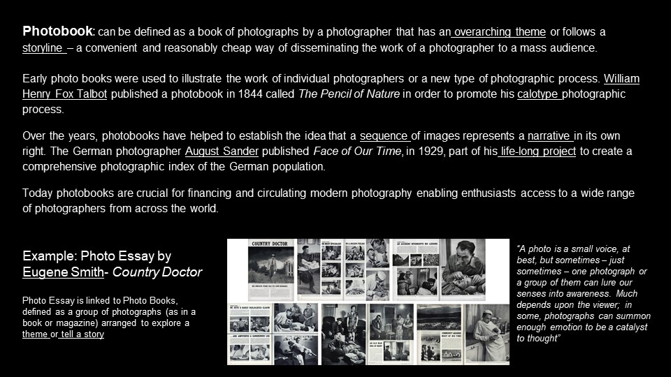
PHOTO-ESSAY: The life of a country doctor in Colorado’s Rocky Mountains
W. Eugene Smith: Country Doctor
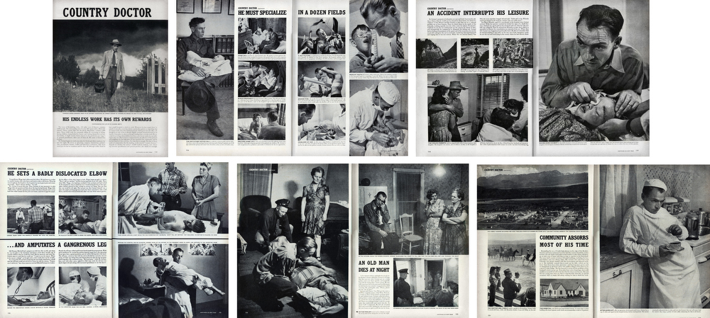
“A photo is a small voice, at best, but sometimes – just sometimes – one photograph or a group of them can lure our senses into awareness. Much depends upon the viewer; in some, photographs can summon enough emotion to be a catalyst to thought”
W. Eugne Smith
W. Eugene Smith compared his mode of working to that of a playwright; the powerful narrative structures of his photo essays set a new benchmark for the genre. His series, The Country Doctor, shot on assignment for Life Magazine in 1948, documents the everyday life of Dr Ernest Guy Ceriani, a GP tasked with providing 24-hour medical care to over 2,000 people in the small town of Kremmling, in the Rocky Mountains. The story was important at the time for drawing attention to the national shortage of country doctors and the impact of this on remote communities. Today the photoessay is widely regarded as representing a definitive moment in the history of photojournalism.
Here is a Powerpoint with more information about how to construct a Traditional Picture Story that includes individual images such as:
- Person at Work
- Relationship Shot
- Establishing Shot
- Detail shot
- Environmental Portrait
- Formal Portrait
- Observed Portrait
Here is a link to an entry for Percival Dunham considered Jersey first photojournalist for a very brief period in 1913 and 1914, when he worked for Jersey Illustrated Weekly and then the Morning News, the main competitor for many years for the Evening Post (now the Jersey Evening Post and the island’s only daily newspaper for over half a century). Try and identity individual images as above from a selection of prints from the Societe Jersiaise Photographic Archive that holds over 1000 images by Percival Dunham in their collection.
- Select somewhere between 12-15 images from the set and edit and sequence them to construct a specific narrative.
- Record an image of your sequence and produce a blogpost where you describe the above process.
PHOTOBOOKS: In October of 1958, French publisher Robert Delpire released Les Américains in Paris. The following year Grove Press published The Americans in New York with an introduction by American writer, Jack Kerouac (the book was released in January 1960).
Robert Frank: The Americans
Like Frank’s earlier books, the sequence of 83 pictures in The Americans is non-narrative and nonlinear; instead it uses thematic, formal, conceptual and linguistic devices to link the photographs. The Americans displays a deliberate structure, an emphatic narrator, and what Frank called a ‘distinct and intense order’ that amplified and tempered the individual pictures.
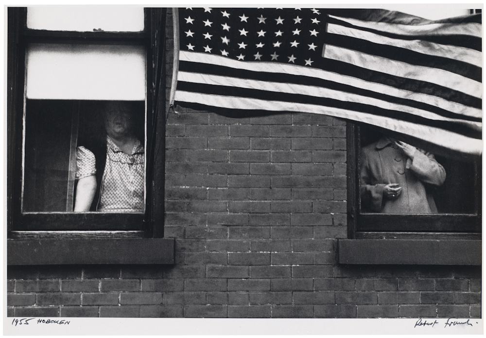
Although not immediately evident, The Americans is constructed in four sections. Each begins with a picture of an American flag and proceeds with a rhythm based on the interplay between motion and stasis, the presence and absence of people, observers and those being observed. The book as a whole explores the American people—black and white, military and civilian, urban and rural, poor and middle class—as they gather in drugstores and diners, meet on city streets, mourn at funerals, and congregate in and around cars. With piercing vision, poetic insight, and distinct photographic style, Frank reveals the politics, alienation, power, and injustice at play just beneath the surface of his adopted country.
Since its original publication, The Americans has appeared in numerous editions and has been translated into several languages. The cropping of images has varied slightly over the years, but their order has remained intact, as have the titles and Kerouac’s introductory text. The book, fiercely debated in the first years following its release, has made an indelible mark on American culture and changed the course of 20th-century photography. Read article by Sean O’Hagan in The Guardian
MORE PHOTOBOOKS: A few photobooks dealing with memory, loss and love
Yury Toroptsov: Deleted Scene
On a mission to photograph the invisible, with Deleted Scene photographer Yury Toroptsov takes us to Eastern Siberia in a unique story of pursuit along intermingling lines that form a complex labyrinth. His introspective journey in search of a father gone too soon crosses that of Akira Kurosawa who, in 1974, came to visit and film that same place where lived the hunter Dersu Uzala.
Yury Toroptsov is not indifferent to the parallels between hunting and photography, which the common vocabulary makes clear. Archival documents, old photographs, views of the timeless taiga or of contemporary Siberia, fragments or deleted scenes are arranged here as elements of a narrative. They come as clues or pebbles dropped on the edge of an invisible path where the viewer is invited to lose himself and the hunter is encouraged to continue his relentless pursuit.
Rita Puig Serra Costa: Where Mimosa Bloom
Dealing with the grief that the photographer suffered following the death of her mother, Where Mimosa Bloom by Rita Puig Serra Costatakes the form of an extended farewell letter; with photography skillfully used to present a visual eulogy or panegyric. This grief memoir about the loss of her mother is part meditative photo essay, part family biography and part personal message to her mother. These elements combine to form a fascinating and intriguing discourse on love, loss and sorrow.
“Where Mimosa Bloom” is the result of over two years work spent collecting and curating materials and taking photographs of places, objects and people that played a significant role in her relationship to her mother. Rita Puig Serra Costa skillfully avoids the dangerous lure of grief’s self-pity, isolationism, world-scorn and vanity. The resonance of “Where Mimosa Bloom” comes from all it doesn’t say, as well as all that it does; from the depth of love we infer from the desert of grief. Despite E.M.Forster’s words – “One death may explain itself, but it throws no light upon another” – Rita Puig Serra Costa proves that some aspects of grief are universal, or can be made so through the honesty and precision with which they are articulated.
Yoshikatsu Fujii: Red Strings
I received a text message. “Today, our divorce was finalized.” The message from my mother was written simply, even though she usually sends me messages with many pictures and symbols. I remember that I didn’t feel any particular emotion, except that the time had come. Because my parents continued to live apart in the same house for a long time, their relationship gently came to an end over the years. It was no wonder that a draft blowing between the two could completely break the family at any time.
In Japan, legend has it that a man and woman who are predestined to meet have been tied at the little finger by an invisible red string since the time they were born. Unfortunately, the red string tying my parents undone, broke, or perhaps was never even tied to begin with. But if the two had never met, I would never have been born into this world. If anything, you might say that there is an unbreakable red string of fate between parent and child.
Before long, I found myself thinking about the relationship between my parents and . How many days could I see my parents living far away? What if I couldn’t see them anymore? Since I couldn’t help feeling extremely anxious about it, I was driven to visit my parents’ house many times. Every day I engage in awkward conversation with my parents, as if in a scene in their daily lives. I adapt myself to them, and they shift their attitude toward me. We do not give way entirely to the other side, but rather meet halfway. Indeed family problems remain unresolved, although sometimes we tell allegorical stories and share feelings. It means a lot to us that our perspectives have changed with communication.
My family will probably never be all together again. But I feel without a doubt that there is proof inside of each of us that we once lived together. To ensure that the red string that ties my family together does not come undone, I want to reel it in and tie it tight.
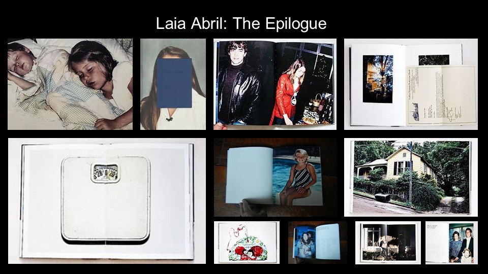
Laia Abril: The Epilogue’
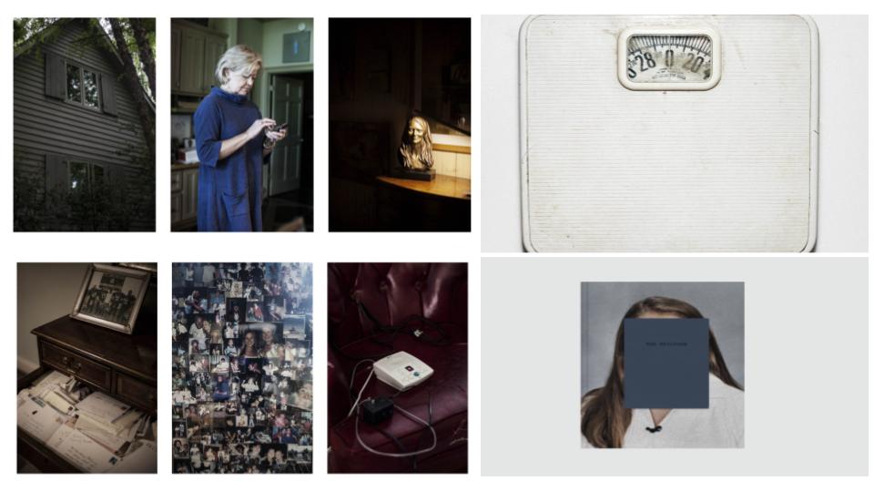
‘The Epilogue’ is the book about the story of the Robinson family – and the aftermath suffered in losing their 26 year old daughter to bulimia. Working closely with the family Laia Abril reconstructs Cammy’s life telling her story through flashbacks – memories, testimonies, objects, letters, places and images. The Epilogue gives voice to the suffering of the family, the indirect victims of ‘eating disorders’, the unwilling eyewitnesses of a very painful degeneration. Laia Abril shows us the dilemmas and struggles confronted by many young girls; the problems families face in dealing with guilt and the grieving process; the frustration of close friends and the dark ghosts of this deadliest of illnesses; all blended together in the bittersweet act of remembering a loved one. Read more here on Laia Abril’s website
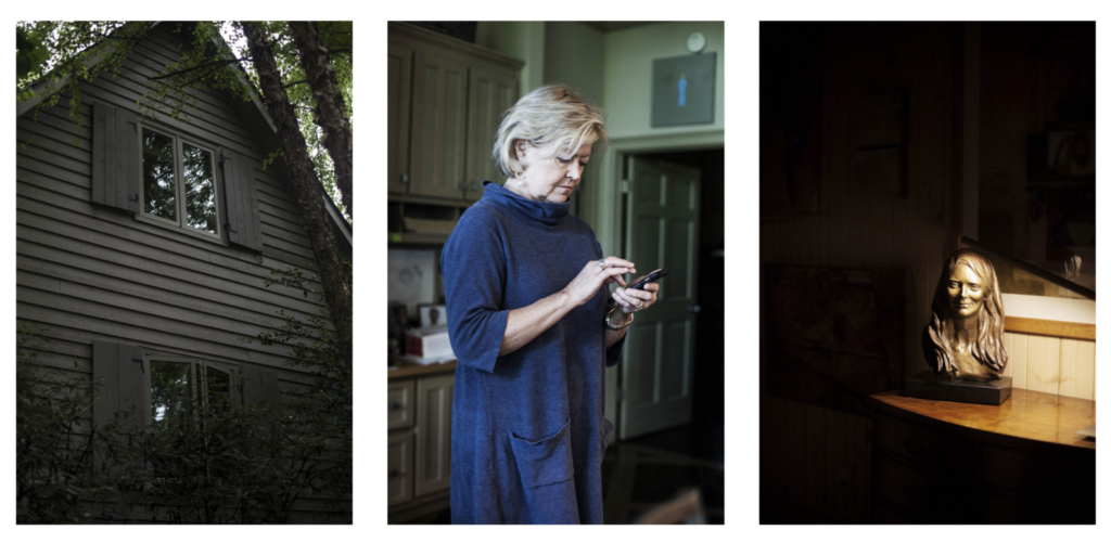

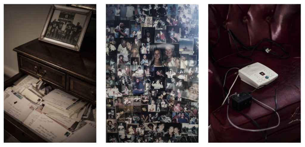
Here are a few lists of Best Photobooks 2020
Photographic Museum of Humanity
Week: 19-20 -21: 25 Jan– 11 Feb
MOCK EXAM 3 days (15 hrs) Mon 5 – Thurs 11 Feb Design your Photobook & Complete Essay
In the next three week focus on beginning to edit and collect all your images, archival material and texts, including finishing writing your essay needed to complete your photobook.
ESSAY: Lesson time (Fri)
• Complete conclusion, bibliography, proof read and hand in draft essay no later than Mon 1 FEB.
INTERIM DEADLINE: FRI 5 FEB
DRAFT PHOTOBOOK LAYOUT
You want to aim for a draft layout and hand in draft version of your essay before your Mock Exam day, then use that day to fine tune design and complete essay.
1. Write a book specification and describe in detail what your book will be about in terms of narrative, concept and design with reference to the same elements of bookmaking as above.
Narrative: What is your story?
Describe in:
- 3 words
- A sentence
- A paragraph
Design: Consider the following
- How you want your book to look and feel
- Paper and ink
- Format, size and orientation
- Binding and cover
- Title
- Structure and architecture
- Design and layout
- Editing and sequencing
- Images and text
2. Produce a mood-board of design ideas for inspiration. Look at BLURB online book making website, photo books from photographers or see previous books produced by Hautlieu students on the table in class.
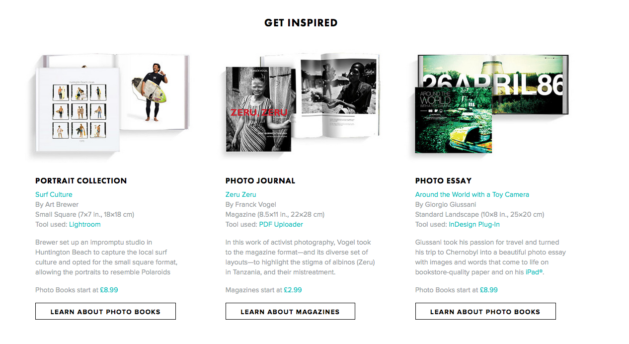
3. Create a BLURB account using your school email address. With Blurb you have different options on how you design your book:
a) Using Lightroom to design your book which is integrated with BLURB. Only for use on school computers, unless you have LR at home on your own laptop.
b) Download Bookwright via Blurb onto your own laptop and work offline at home and you can work indecently of school. Here you have full control of layout/ design features. Once completed, you upload photo book design to Blurb
c) Choose online option if you want to work directly online. Very limited layout/design options (not recommended!)
For those who wish to make their own hand-made photobook using Indesign follow the same steps as below in terms of documenting and annotating your design process. or if you want to customize your Blurb book see me for more details on how to do it.

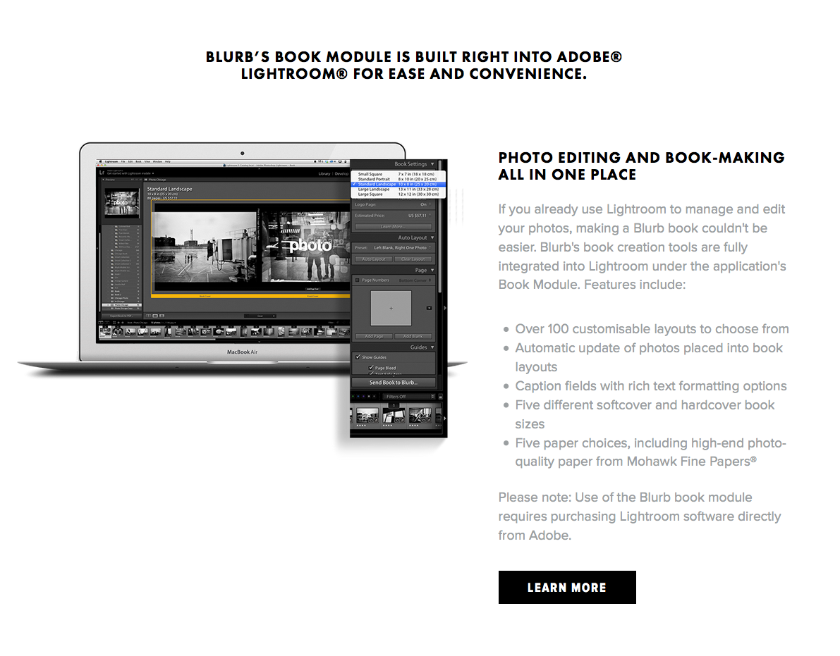
4. Using Lightroom make a rough selection of your 40-50 best pictures from all shoots. Make sure you have adjusted and standardised all the pictures in terms of exposure, colour balance/ B&W, contrast/brightness etc.
5. Print a set of small work prints (4 to one A4 page) on the Laserjet, cut them up in guillotine and lay them out on the big white table for editing.
6. Decide on format (landscape, portrait) size and style of your photo-book. Begin to design your photo book, considering carefully, narrative, editing, sequencing, page spreads, juxtaposition, image size, text pages, empty pages, use of archival material etc.
7. Add your illustrated essay at the end of your photo book, including title, any captions (if needed), bibliography, illustrations of artists work (incl data) and images of your own responses. Think carefully about font type, size and weighting.
8. Produce screen prints of layout ideas as you progress and add to Blog for further annotation, commenting on page layout/ narrative/ sequencing/ juxtaposition of pictures.
9. Make sure all blog posts are finished including, research, analysis, experimentation, annotation and an evaluation of final outcomes.
9. Final prints: Select a set of 5-6 photographs as final outcomes and evaluate – explaining in some detail how well you realised your intentions and reflect on what you have learned in LOVE & REBELLION project.
10. Save final prints in our shared PRINT folder (no later than 15:00 end of your Mock exam day) in a high-resolution (4000 pixels on the long edge.) Save each images in your name i.e. first name_surname_title_1, and 2, 3 and so on.
M:\Departments\Photography\Students\Image Transfer\PRINTING\A2 Coursework Prints Spring 2021
11. NEWSPAPER SPREADS: In anticipation of the possibility of producing a newspaper based on the themes of LOVE & REBELLION design 3-4 versions of a newspaper spreads based on images from your photobook.
You must design the following spreads:
- SEQUENCE: Select a series of movie stills (between 5 – 12) and produce a sequence from your film either as a grid, story-board, contact-sheet or typology.
- MONTAGE: Select an appropriate set of movie stills and create a montage of layered images. You may to choose to work in Photoshop for more creativity and import into InDesign as one image (new document in Photoshop 420mm(h) x 280.5mm(w) in 300 dpi)
- JUXTAPOSITION: Select 2 movie stills and juxtapose images opposite eahc others or layer them to create new meaning.
- FULL-BLEED: Select one movie still as a full-bleed spread.
Follow these instructions:
- Create new document in InDesign with these dimensions: 420mm(h) x 280.5mm(w), 10 pages, Orientation: Portrait, 2 columns, Column gutter 5mm, Margins: 10mm, Bleed: 3mm
- Only use in high-res TIFF/JPEG files (4000 pixels)
- Use design ideas and layouts from your zine/ newspaper research as well as taking inspiration from artists listed here as a starting points for your spreads.
- Incorporate texts and typography where appropriate.
Once you have completed pagespreads, double check:
- All images are high-res file
- Check links in InDesign (if Red Question mark appears re-point to image in your folder)
- Package your layout and save in your name into this shared folder: M:\Departments\Photography\Students\Image Transfer\LOVE & REBELLION\Newspaper
PRINTING: From Indesign export spreads as JPEGs into shared folder above and choose size A3.
First Project ideas
Student Inspiration:
sadie withers PD11
liv mcneil – numb
Tomfoolery -The Great Realisation
Myles Dean – Quarantine Perspective – Short Film
Artist references:
Nan Goldin
Erik Kessels
Photography idea – isolation
Tripod end of bed quick scene of everyday same
Mix in background archived videos from summer, getting louder speeding pace, near end layer tho show overwhelming loud
Show laptop looking at old summer clips, Layer shots of picture in bed over summer clips
Incorporate skating and possible drone footage? – ‘drone footage’ on gimble, all archived and new footage on iphone, tripod time lapse on camera
Start in bedroom, attempting work, phone alarms etc. on laptop message pop up from friend of summer clips REPLACE, open look through few videos. fall back. Cut to live filming, skating on lane, walks by the beach, drone footage? Show large scenes of freedom nature – all alone. Cut to look like just watched videos on laptop, use one of same clips fade through from live to laptop. Lean into next sequence. Use tripod scene end of bed layered on top in centre of summer videos playing with their sound in back. Switch videos with speed of inner scene that makes sense. Bring slight emotion into inner scene and slowly darken from day to night through clips, start layering sound of fun summer videos, building up to loud halt. Close laptop in hard scene scene which now full page.
Editing process
For my editing process I used Lightroom. Here is an example of how I edited these images.
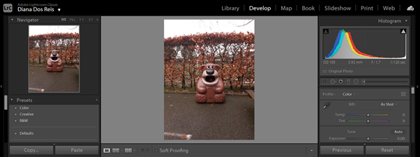
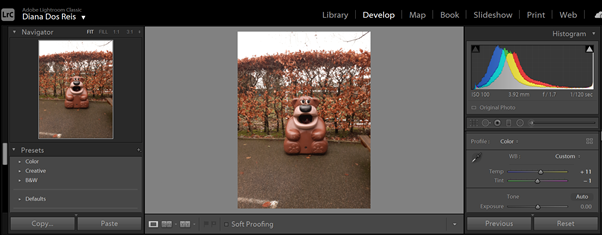
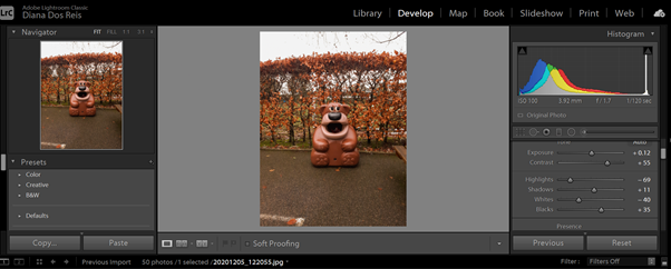
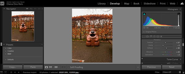
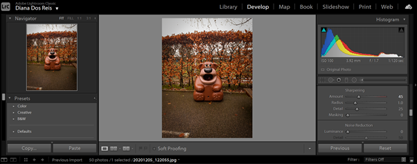
Unedited vs Edited:
Essay Introduction draft
In my personal investigation I am going to be exploring the life that my papa, Terry Batho, lived and documenting the legacy he left behind. I was ten years old when my papa died. I was close with both my gran parents but at that age I didn’t have the same sort of relationship with him than I would now. By looking into the life that my grandad lived and what kind of man he was, it gives me the opportunity to get to know him more and get a sense of closeness to him even though he has passed away. By speaking with my nan, my mum, my aunty and his close friends I can begin to paint a picture of the kind of man my grandad was. I can start to feel like I knew him and by speaking with his friends I can start to see the unique character that my papa had. I am going to be focusing on one of Terry’s biggest passion was Mini’s. He owned multiple over the years, buying them, fixing them and selling them. His garage has tools that he used to work on his cars, he also had specialist tools that were designed certain task to do with classic mini’s. He also had a very special car that was superior above all the rest. When his father died he used his inheritance money to by the millennium edition Mini Cooper S John Cooper works edition. This car was one of the small batch of Cooper S models that were the last of the classic British design to roll of the production line before BMW introduced the new shape mini in 2000. His legacy lives on and has influenced me. When he died in 2010, many members of the Jersey Mini Club did a drive by and an escort to the cemetery. My dad drove his special edition car in the escort with my uncle in the passenger seat and I sat in the back. I can vividly remember sitting on the red leather seats in the small back of the car. I thought to my self this is the coolest car I have ever been in, the metal dashboard and the cooper S details stood out to me and since that day I have always wanted one. And now I own one.
ESSAY
HOW DO BOTH CORINNE DAY AND NAN GOLDIN CREATE A ‘DIRTY REALISM’ WITHIN THEIR PHOTOGRAPHY?
‘Dirty Realism is the fiction of a new generation of American authors. They write about the belly-side of contemporary life – a deserted husband, an unwed mother, a car thief, a pickpocket, a drug addict – but they write about it with a disturbing detachment, at times verging on comedy. Understated, ironic, sometimes savage, but insistently compassionate, these stories constitute a new voice in fiction.’ – Bill Buford.
The term ‘dirty realism’, coined by Bill Buford, formed the title of the Summer 1983 edition of the Granta magazine. Buford wrote an explanatory introduction at the beginning of Granta 8, to define this North American literary movement. This beautiful, honest movement not only spread through literature but through art and photography too. In 1986, Nan Goldin published ‘‘The Ballad of Sexual Dependency”, a deeply personal diary composed of 700 snapshot photographs, documenting her life. The protagonists of the book and the photographer herself are frozen within intimate moments of love, pain, ecstasy, sex, and drug use. The book itself is the definition of ‘Love and Rebellion’ and has deeply inspired me to create my own personal photo diary, including the people and things I love, but more importantly, focus on exploring the idea of dirty realism and intimacy in photography. A Photographer who, in the following decade, emerged in the grunge genre of photography is Corinne day; a highly skilled fashion photographer inspired by Nan Goldin. Corinne day created ‘diary’ a photographic book similar to The Ballad of Sexual Dependency. Both photographers use specific techniques in order to convey emotion and intimacy within their photos, techniques that I will uncover and analyze and use to lead my creative path. This category of photography really changed the way many photographers understood photography, and it strongly inspired later generations of photographers, including myself, to express very personal life experiences through an album of images.
DIRTY REALISM
The area of art that has particularly sparked my creative direction is an extremely honest side to reality. Dirty realism is ”a literary genre characterized by a spare, terse style that features struggling, working-class characters in sterile, bleak environments”. The writers of this subcategory of Realism, such as Angela Carter, Bobbie Ann Mason, Richard Ford, Tobias Wolff, seem to write about the more mundane aspects of life, the more ‘real’ aspects. As I explained earlier, the term ‘dirty realism’, was coined by Bill Buford and it formed the title of the Summer 1983 edition of the Granta magazine, which would define a new school of American writers and inspire the world of photography. After extensively researching this movement, I came across Charles Bukowski and Raymond Carver, the ‘Dirty Realism Duo’, credited as the fathers of the “Dirty Realism” genre during the 1980s. The duo’s intentions branched from the minimalism movement, a primarily American movement originating in New York City in the late 1960s. The movement was outlined by ‘the stripping of fiction down to the least amount of words and a concentration on the subject’s view of the object’.The characters inCharles Bukowski and Raymond Carver’s books are usually ordinary, everyday people – the lower or middle-class worker, the unemployed, the alcoholic, the addict, the beaten-down-by-life. Similar to the photography aspect of dirty realism, it was ‘characterized by extreme simplicity of form and a literal, objective approach. This approach was quickly introduced into the creative arts as a form of fashion photography, stemmed from the idea of being ‘real’, and incorporated movements like grunge, indie, and punk: ‘defiance of traditional norms and nihilism.’ photographers shot gritty and uncomfortable pictures during these fashion subcultures, involving over or undersized clothing.
NAN GOLDIN
Nan Goldin wrote “‘The Ballad of Sexual Dependency is the diary I let people read,’… ‘The diary is my form of control over my life. It allows me to obsessively record every detail. It enables me to remember.’”. This amazing photographer is extremely well known for her controversial yet earthy outlook on life itself, an outlook which to the vast majority of people, is undeniably true. Nancy Goldin was a part of that great number of people, whose lives entailed grief and chaos. Goldin talks about her family during her time growing up: ‘’My father, who was not always great with my mother, was critical…There was a lot of bickering going on, and I wished they’d get divorced most of my childhood.” She also explains that her mother was very possessive of her father at that time, who was more focused on his sons. A tragic moment is Nancy’s life is detailed in the introduction of The Ballad of Sexual Dependency. During the preface, she writes very honestly about the heartaching situation, and makes note so some of the political topics she explores withing her photoraphs; “I was eleven when my sister committed suicide,” and continues to write:
“This was in 1965, when teenage suicide was a taboo subject. I was very close to my sister and aware of some of the forces that led her to choose suicide. I saw the role that her sexuality and its repression played in her destruction. Because of the times, the early sixties, women who were angry and sexual were frightening, outside the range of acceptable behavior, beyond control. By the time she was eighteen, she saw that her only way to get out was to lie down on the tracks of the commuter train outside of Washington, D.C. It was an act of immense will.
In the week of mourning that followed, I was seduced by an older man. During this period of greatest pain and loss, I was simultaneously awakened to intense sexual excitement. In spite of the guilt I suffered, I was obsessed by my desire.”
Goldin, a famous American photographer in the dirty realism movement, regularly focussed on taboo subjects such as fetish, sex, homosexuality, drug addiction, and transvestism. Her most notable piece was composed of almost 700 snapshot-like images that produce a stunning and personal narrative of her life between the late 1970s, 1980s, around Boston, New York, Berlin, and more. During an interview in 1996, Goldin describes her meaning of snapshots: “People take them out of love, and they take them to remember – people, places, and times. They’re about creating a history by recording a history. And that’s exactly what my work is about.”The book itself was originally a film, and was developed with multiple live and improvised performances, while goldin flipped through the slides alongs with a beautiful soundtrack; from Maria Callas to The Velvet Underground. The Ballad of Sexual Dependency, released as a film in 1985, is presented in its original 35mm format, including photographs that also emerge as images in the slide show. Shortly after, during 1986, Nan released “The Ballad of Sexual Dependency” as a book. This was Goldin’s first book and remains her best known.
One well-known piece by her was a self-portrait of herself after being beaten by her husband: to ‘show her world without glamorization or glorification.’ This photograph in particular truly displays the mundane reality of life itself, the alcoholic, the abuser, the victim, etc. Some of her images could even need viewer discretion due to their exposing nature of abuse. The photographs themselves were often blurred or gritty, which created a very authentic and ‘everyday’ grunge and dirty shot. When Nan was a young adult, the controversies around gay rights and the ‘LGBTQ community’ were still up in the air and not completely accepted. This makes Goldin’s work that little more questionable.
CORINNE DAY
Corinne Day, a very similar artist to Nan Goldin, is the main inspiration for my project, the stunning photographer uses her photography to document her everyday life, displaying the intimacy and love in her circle of friends and family. Day was born in 1965, and was a self-taught fashion photographer who was one of the first to introduce a new documentary look to photography, a formation of both candid and intimate images. Corinne Day’s style of photography is often put in the ‘dirty realism’ genre. Corinne has always been a massive admirer of Nan Goldin’s work, and it clearly shows in her most known work “Corinne Day Diary”. In her autobiography she states: “I met Nan there and to my astonishment and delight Nan had been an admirer of my work since the early Kate photographs. I first discovered Nan’s work in New York in 1992 when I was there meeting with Barney’s department store. Ronnie Cook took me to a photography book store and the first book I picked up was The Ballad of Sexual Dependency. At this time I had no knowledge of art photography, only what I had seen in commercial magazines. I had already been conveying my own personal experiences through my photography in magazines. I wanted the ordinary person to see real life in those pages. I found Nan Goldin’s and Larry Clark’s work liberating and their work also validated the way I had started to take photographs myself.
Corinne Day has been the main inspiration for my project, the stunning photographer uses her photography to document her everyday life, displaying the intimacy and love in her circle of friends and family. Corinne Day’s style of photography is often put in the ‘dirty realism’ genre; “a literary genre characterised by a spare, terse style that features struggling, working-class characters in sterile, bleak environments”. Her images are ‘real’, and display immense personal events and emotions. Before Corinne passed away she created a beautiful and personal book called “Corinne Day Diary”. The title ‘Diary’ is a very important aspect of the book, it simply explains what the book itself is; a diary of Corinne Day. The title of the book is written in what seems like Corinne’s handwriting, underneath a photograph of Tara’s face. Tara also seems to be a main character in Corinne’s life, a very close friend, and an important figure. Even though the photographer of the book is Corinne Day, there are images of herself which may have been taken by Tara (one of the main faces in the diary). One can only assume that Corinne made the photographic diary to remember all of the events in her life, but I think it was also to produce photographs in a ‘grunge’ and ‘dirty realistic’ style. I think the book was really for herself before she passed following the diagnosis of a brain tumour in 1996, but also for her close friends and family, hence the book name ‘diary’. “The series draws comparison with artists such as Nan Goldin and Larry Clark, who also live what they photograph. Like them, Day is curious about people who pursue experiences beyond the norm.”
Diary is cold and melancholy, it archives young lives with uncompromising realism in the form of photographs, so we as the viewers feel encompassed in the visual and not just the worded description. The books genre is clearly dirty realism and Grunge. At other times, the photos are joyful and celebrate friendship. Day clearly shares her life with the lives of her close friends, and decides to share experiences like hospitalisation, partying, drugs. Clearly, her best friend Tara is a main character in the diary, we follow her though partying, sexual liaisons, illness and finally, motherhood. However, whether in the photograph or not, she is always emotionally present in her photographs. In the image above, one of Corinne’s friends, Tara is seen crying at home, told by the caption below the image. What makes the book even more authentic is her handwriting that accompanies each image, describing a short story that will only be memorable to her.
I have been lucky enough to see the book and feel it by hand. There are many different things about the book that have inspired me, but also made the book personal and authentic. The images are all placed in the same orientation on each page, and there is one photograph per page, as well as this, there are no double page spreads, but rather only one image to represent an event. Some photos aren’t of people, but they are aesthetically pleasing. There are no fold- outs or inserts in the book either, this makes the book very uniform and organised, a juxtaposition to the crazy, frantic life Corinne was having in the photos. A narrative is constructed by the captions under each image, even though the images are not in chronological order. The captions are short and seem to be written in Corinne’s handwriting, making it very personal. She tells a story through jumbled photographs, however the captions seem to make sense, and really feel like a diary. What I really enjoy about Corinne’s book, is that all the images are ‘real’ there is no acting or posing, all the images are taken freely, as if they are core memories in Corinne’s mind. This is what really makes Corinne Day part of the Dirty realism genre of photography.
When comparing Corinne day and Nan Golding, There are very clear similarities between the two people, and the books they’ve created. Within their images they clearly perform to the qualities of the Dirty realism genre with how they show their hectic and honest lives through their images. Their personal and raw captions and images really do make it seem like the viewer is looking through the photographer’s diary. The editing processes both artists make truly display how the atmosphere and characters were feeling, whether the photographer was crying in hospital or had been beaten by their husband. I have truly taken inspiration from these beautiful dairies.
BIBLIOGRAPHY
- https://www.corinneday.co.uk/autobiography/
- om/artists/nan-goldin/
- https://www.tate.org.uk/art/artists/nan-goldin-2649
- https://www.moma.org/artists/7532
- https://www.mariangoodman.com/artists/44-nan-goldin/
- https://thephotographersgallery.org.uk/whats-on/exhibition/corinne-day-diary
- https://www.npg.org.uk/collections/search/person/mp88351/corinne-day
Essay plan
Possible essay question:
- What constitutes a ‘real’ image?
- How do Robert Capa and Paul M Smith use ‘fake’ / controversial imagery to emphasize the effects of war and masculinity?
Artists:
- Robert Capa
- Paul M Smith
Plan:
- Essay question: What constitutes a ‘real’ image?
- Opening quote:
- Introduction (250-500 words):
There are multiple criteria required to consider a photograph as ‘real’, does the subject within the image exist or is it imagined, is the photo artificially created or genuine? However, there is an ongoing debate surrounding the way in which we prove and define a subject, moment, or whole image as ‘existing’. Realism, in the arts, is considered the accurate, detailed, and unembellished depiction of nature or contemporary life. This is where Robert Capa’s picture of ‘The Falling Soldier’ or ‘Death of a Loyalist Militiaman’ comes under deep controversy. This image is known to depict the very instant a loyalist militia man, from the Spanish Civil War, 1936, was fatally shot and began to collapse into death. The debate over the authenticity of Capa’s image comes under four main themes: Realism, Representation, Ethics and Truth. As said by Richard Whelan in This is War! “The Falling Soldier is neither black nor white. It is neither a photograph of a man pretending to have been shot, nor an image made during what we would normally consider the heat of battle” A brief synopsis of ‘The Falling Soldier’ would show that there are many different theories in relation to the legitimacy of the image and it’s creation, however, in truth there will never be a clear answer to its legitimacy as only Capa and the men involved in the creation of the image know its full authenticity. Due to the amount of information collected to either prove or disprove this photos originality and the lack of a clear answer, the attention has been taken away from the photographs true meaning. This raises another dispute of whether it matters at all if the image is ‘real’ as stated by Susan Bright in Is It Real? “… reality is perhaps not the most important issue when making a statement about the role of representation in warfare.”
- What is your area study? Realism
- Which artists will you be analysing and why? Robert Capa and the controversy surrounding his image of the death of a loyalist militia man. Paul M Smith and his Pastiche of Capa’s work.
- How will you be responding to their work and essay question? I will explore the realism, representation, ethics and truth of the artists and their work.
- Pg 1 (500 words):
- Historical/ theoretical context within art, photography and visual culture relevant to your area of study. Make links to art movements/ isms and some of the methods employed by critics and historian.
- Pg 2 (500 words): Analyse first artist/photographer in relation to your essay question. Present and evaluate your own images and responses.
- Pg 3 (500 words): Analyse second artist/photographer in relation to your essay question. Present and evaluate your own images and responses.
- Conclusion (250-500 words): Draw parallels, explore differences/ similarities between artists/photographers and that of your own work that you have produced
- Bibliography: List all relevant sources used
Artist references
Richard Billingham
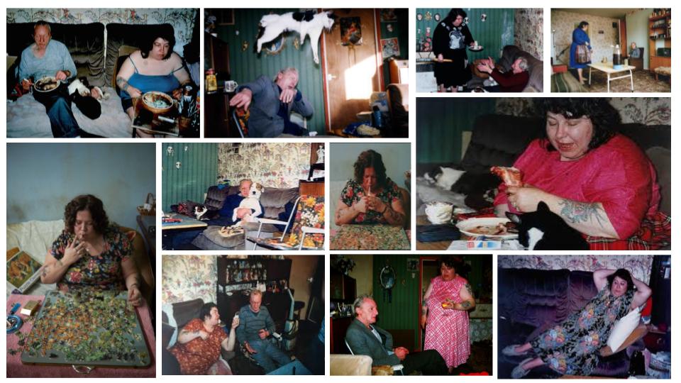
I chose Richard Billingham as one of my artists because his ideas and methods are similar to what I want to do; filming, almost exposing the inside life of my own family. He takes a documentary approach to his work which is what I’d like to achieve. His work also fits into the theme of Rebellion – since his Father was an alcoholic and his Mother was an angry lady with heavy tattoos, however this wasn’t exactly intentional.
He is an English Photographer, artist, filmmaker and art teacher. He is best known for his photography book (Ray’s A Laugh 1996), which documents the life of his alcoholic father, Ray and his obese, heavily tattooed mother, Liz. He’s also made a number of short films for example Fish tank (1998), which again surrounds his parents and exposes what goes on behind the scenes. He then went on to release his first feature film, Ray and Liz (2018). His work originally sprouted from when he aspired to be a painter, and was originally using the images he took as guidelines for his paintings, however, a tutor at Billingham’s art degree course fell upon these images and thought they were different and unique.
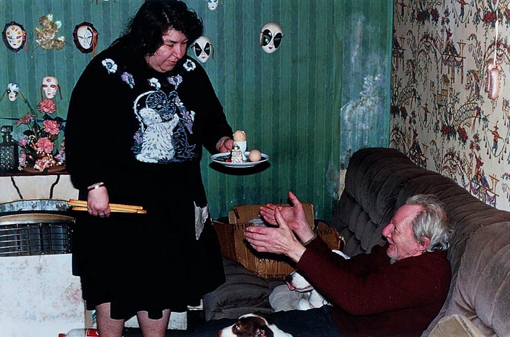
Billingham stated “I realised that if I photograph the whole room on a wide angle lens, you’re showing people everything, whereas if you focus on details then the viewer pieces together what that room looks like. It’s much more engaging – the viewer has to work to fill in the gaps, so I think it can be more engaging that way.” – This gives me some inspiration for the visuals of my film, instead of focusing on a big picture, grab details and smaller aspects of an area to intrigue the viewer. Here are a couple of interview based articles with Billingham:
https://thequietus.com/articles/26164-ray-liz-richard-billingham-interview
https://www.theguardian.com/film/2019/feb/23/richard-billingham-ray-and-liz-interview
PHOTO ANALYSIS
TECHNICAL: Looking at the image above, it is clear that Billingham uses natural lighting, nothing has been set up in order to achieve a specific type of lighting. However it does appear that there is a fluorescent/artificial lighting involved, most probably from the flash on the disposable camera that he used to take the photographs. In his films, he also appears to use natural lighting and no type of flash or artificial lighting has been used in order to achieve a certain type of lighting. Since he was using a disposable camera, the average shutter speed is about 1/100, allowing not much light in, however again, there is a flash. Disposable cameras also have a fixed mode of operation concerning the lens focus, aperture and shutter speed).
VISUAL: No filters or colour adjustments were used within Billingham’s images. Therefore, the colours in his images are natural and true to real life. The tones of his images are overall quite dark, especially when the pictures were taken during the night, however the tone does lighten when the images are taken during daytime. There is no specific composition when it comes to his photographs, as I have mentioned he takes a documentary approach to his work therefore there is no set up and takes images as things are happening right in front of him. This is the same for his films, there is no set up or composition, he simply let’s things flow naturally.
CONTEXTUAL AND CONCEPTUAL: As mentioned, Billingham wasn’t immediately set out to be a photographer, but instead, an artist. However when his tutor saw the photographs he realised that they were intriguing and had potential. His images and films were a portrayal of the poverty and deprivation in which he grew up in Cradley Heath, a town in Birmingham.

The area appears to be quite run down, middle to lower class area. He documented his parents mostly. His Mother being an overweight, tattooed chain smoker and his father being an alcoholic. His upbringing then may have been quite unique and different, compared to others he may have knew with ‘normal’ parents that lived without any addictions etc and lived within the middle to upper class areas. He may have felt many personal struggles when it came to his upbringing and expressed this through photography. Billingham has stated that he ‘just hated growing up in that tower block’. The reason why his images became so popular was because his pictures were surreal, claustrophobic and gave meaning to the idea of “too close to home”. It is not often you get to see someone essentially exposing their every day life and what the go through and have to deal with. As humans we have this inquisitive nature and wonder what happens behind closed doors. After making images, and them having a successful response, Billingham went on to make short films such as Fishtank and eventually a feature film named Ray & Liz. Overall going through major events that happened in his own life such as, when he was 10 years old and the family problems spiraled after Ray lost his job as a factory machinist.
It has been said that Billingham is protective and dismissive of the impacts that his childhood and upbringing has had on him. Instead of processing the hard times, he frames it – and out of that he did get successful, however he has said that “Jason often says to me now that, statistically, we should either be in prison, or dead.”. Richard Billingham most definitely turned a bad thing into a good thing. Which is the place that I am coming from when it comes to making my movie. My Mum does suffer from a terminal illness and things do get hard sometimes however exposing the inside to my life may bring some realization to some people and remind people that everyone has things going on behind closed doors.
Here’s a link to one of Billigham’s epiosode’s of ‘Fishtank’:
Meaning and Methods
Since I am making a film, I would like to focus on Billinghams’s filmmaking when it comes to talking about his meaning and methods. In the second clip I’ve inserted he says that the images he took ‘just happened by themselves’ and he wanted to experiment and see how things would look if he filmed the situations that he was living through. He wanted to explore a new medium to see if the same ‘magic’ would happen that appeared in his photographs. He also stated that with videos, he was looking for a ‘good catch’ and that he wanted to portray the emotions that were being expressed through a video.
He filmed most of his videos on a hand held camera and simply documented what he saw. His focus wasn’t necessarily on techniques but on capturing certain moments in order to create a hard hitting, close to home film. This is what’s good about documentary photography, it’s often non-fictional and true to real life which makes it somewhat more intriguing. He considers his photography ‘accidental artwork’ as he didn’t intend from the start to even be a photographer, but an artist. Billingham goes on to state in the interview that I have linked below that he didn’t want a polished aesthetic – he just wanted to make his images and films very moving emotionally.
Richard Billingham | Photoworks
From all the research it is clear that Richard Billingham’s meanings and methods are similar to what I would like to achieve. I’m not looking to make a technical, studio film, I’m wanting to make a hard-hitting, true to real life documentary film that captures certain struggles in my life, specifically surrounding my Mum, just as Billingham did with his parents. He has definitely inspired me with his short films and it goes to show that things don’t necessarily have to be the most visually pleasing or have a direct story for them to be a success.
Laia Abril
Laia Abril is a research-based artist working with photography, text, video and sound. She typically enjoys telling intimate stories that raise uneasy and hidden realities related with sexuality, eating disorders and gender equality. The Epilogue is a story of the Robinson Family and the aftermath in losing their 26 year old daughter to bulimia. She worked closely with the Robinson family and and reconstructed Cammy’s life through memories and flashbacks shown through the family’s grieving process. The Epilogue is about Cammy’s absence as well as her omnipresence; her energy and willfulness, her struggle with her disorder that truncated her life and capsized the lives of those around her. The book shares a range of dilemmas and the frustration that came with Cammy’s disorder, the guilt and the sorrow, all blended together in the bittersweet act of remembering their most troubles loved one.
Although Abril’s technique is different (she has photographed and created a photobook whereas I’m making a film) I feel like her concept and the elements she has pictured represents greatly of the feel I would like my film to be. For example, she is not directly photographing Cammy, because she has passed, but has photographed elements of Cammy’s life that all refer to her illness and troubled life. This is a technique that I would like to include in my film; not directly filming my Mother all of the time however incorporating certain elements like her medicine, doctors notes, my siblings etc that are all to do with her illness and struggles of every day life. I feel as though this gives a more intriguing feel to photography and film and allows the audience to make connections between the illness and various other thing’s in the person’s life.
She also tends to use archives of Cammy and the family from when she was alive; apparently happier times that strikes a great juxtaposition in the recent photographs that she has taken. This is something that I may experiment with to create some hard hitting juxtapositions within my own films – showing the difference in the past and how things have changed since my Mum fell ill.

CONCEPTUAL&CONTEXTUAL: This image is of Cammy’s mother. As I mentioned, Abril tends to use archives that show happier times that involved Cammy. Visually, this image is very sad and mundane and juxtaposes the old images greatly showing a huge difference in mood and family connection. Her mother appears very dull and worn out – showing the affects Cammy’s death has had on her. The photograph is essentially conveying a range of emotions which was Abril’s aim when it came to making this project. It shows remembrance, sadness and somewhat moving on. The image is very simple, however it makes you wonder all the things going round in the Mother’s head, that is also revealed throughout the book; ‘Where did it all go wrong?’, ‘Was she really unhappy?’, ‘What could we have done differently?’. As I have been saying a lot within my personal project, sometimes pictures and films do not have to be visually complex or pleasing, the meaning and covert messages that are at bay, are often more hard hitting than the visuals themselves. Again, this is something I want to achieve also.

