To start the process of my photozine, I photographed the first location that held significance to one of my subjects. After a conversation with my subject, they concluded that Devil’s hole was a place they wanted photographed.
Location 1- Devil’s hole. (natural landscape)
I began the filtering process of my images by going through each image and either flagging (Ctrl+P) or rejecting (Ctrl+X). I then did a rating system of 4 stars if I was unsure of the image and 5 stars if I was completely satisfied with the image.
To decide the final image out of these two I used the ‘X|Y’ tool. After a quick comparison, I decided that the image on the right had a better composition, as the grassy area in the foreground took up a larger proportion of the frame, as well as having more vibrant coloured shrubbery. Additionally, I altered the exposure when taking the shot on the right, in order to reduce the amount of light entering the lens (due to the bright conditions).
To decide between these two images I analysed the composition, and how it may look when placed in a photozine. As a double page spread, the image on the right proved to be a better candidate as it had a stronger contrast between the brown of the rocks, the white of the broken waves and the blue of the sea. As well as this, the positioning of the seagulls within the frame creates a spot in the negative space of the sea for the audience’s gaze to avert to.
As a final selection, I came out with two mages I felt were the strongest candidates for my Zine, which I have colour coded as green in Lightroom.
editing:
1.
colour editing-
To enhance this image, I wanted to decrease the haziness of the image, in order to increase the clarity of the image. To achieve this I increased the shadows within the image and increased the vibrancy. This had a major impact when editing the photo, as it brought out the greenery of the grassland and allowed for a clearer view of the sea.
2.
To edit this image, I wanted to make the colours within the image lighter and more vibrant. I increased the saturation slightly but mainly focused on the basic tone of the image. I decreased the exposure and the contrast, as well as a strong increase in the shadows of the image. Increasing the highlights of the image resulted in a photo that’s less gloomy than the original.
Location 2- Fort Regent carpark/ St brelades (urban landscape)
For my second location, I photographed an urban landscape, a place that held strong meaning to my second case-study. Stating that the lights have a significant effect on her I decided to take the shoot at night. A long exposure time was required and I used flat surfaces to steady the camera. The conditions were adverse, allowing many of the street lights and car headlights to be reflected off the avenue.
I selected 4 of the most clear and vibrant images by ‘flagging’ (Ctrl + P) or ‘rejecting’ (Ctrl + X) each image within the library. I colour rated (green for certain, yellow for uncertain) before the editing process.
Editing
I initially began the editing process, by cropping the image. I rotated the image slightly so as to straighten the image. Then, I enhanced the image by decreasing the temperature, which allowed me to get rid of major yellow tones within the image. From this point forward, I increased exposure and contrast to amplify the effect of the street lights as well and increase the effect of the shadows. Additionally, I decreased the highlights and shadows to reduce the glare of these lights and to improve the visibility of the photo.
As a final experiementation (to design my photo zine), I converted the image to black and white.
I converted the image to black and white to be able to layer a portrait over it without the colours clashing.
I began the editing process by increasing the exposure. This allowed the road and other areas of the image to become more visible. I also want to reduce the yellow of the lights, so I decreased the temperature of the image and reduced the highlights so as to limit the glare from the lights. Additionally, I reduced the shadows in the image to increase visibility
Lastly, I converted the photo to black and white, increasing the contrast and clarity of this image. This resulted in a successful image I could use for my zine.
The narrative I had chosen to portray through these images was one of a group of friends going about their normal lives together. Most of the images are shots of individuals, which represents how they each have their own lives separate from their friendship group, but how they all work well together and care about each other as a group. With the individual shots, many of them have the person clearly facing and looking in one direction away from the camera lens, and the sequencing of the images makes it so that they are looking at another person, which forms more of the “togetherness” in the narrative. The “love story” aspect is shown in the way that they all have platonic love for each other, which is obvious in the group images, but also all of the individual photos were taken while in a group setting, therefore the expression of happiness, or possibly not-happiness, as clear representations of the love story within the friendship group. The “love story” could also be related to their own individual love of their home where they grew up and their youth altogether.
I had a couple of different versions of the sequence of images, but here I’ll show to actual process of how I did the best one, in InDesign.
To begin with, I skipped making a front cover or title until the rest had been done, to save me having to change it halfway through, and because I needed more time to work on an appropriate title. So, I started placing my images into the zine in the sequence I had worked out before. I started off by placing them directly next to each other, like this.
However I quickly realised how much more interesting it would be if I had the pairs of images in different positions on the page as you flipped through the book, so I experimented with this on each page until I got a pattern I liked.
Most of my images are landscape, but I knew I wanted this one to be a standalone image and I placed it in the centre of the zine, so that it could have the full advantage of a two-page spread. This is one of two images that I had as standalone in the zine, because I felt they work work to full effect if they were the main focus.
I continued with this pattern of placing the pairs of images in a frame in InDesign, sizing them and cropping them where necessary, then adjusting their position on each page, re-evaluating as I went along, until I’d put all my images in the zine. I scrolled through a couple times, just to check I still liked the sequence and the narrative it shows, then went to the next stage.
I had all of my friends who featured in the zine to write their own names on a sheet of paper beforehand, which I then took a picture of, uploaded to my laptop, cropped and fixed so that only the writing was visible and not the paper, then placed them all on the first page of the zine, opposite the other standalone image, which I decided to have like that because it was the only portrait image in the series and it worked best just individually, instead of next to a landscape photo.
Next I added this title because it reminded me of the beginning credits scene in a movie, and I think it did well to make the zine a little more personal and fun, because the black and white of the photos could make it seem quite formal when that’s not the tone I was intending. As the title states, I placed the signatures in the order that their corresponding people first appear in the zine, and I resized and reshuffled them about a couple times before deciding on the way they are presented in the screenshot.
Then, I cropped the signatures to only the first initial of each name, made that a new image, and placed the initials near to their people each time they featured in the zine (except in the one big group image in the middle). I wanted this to have the effect of making it a little less plain and simple, but not distracting too much from the images, as well as making it more personal and distinctive. There are many studies that show how people’s handwriting may reflect their personality, and whether you believe in this or not I think it is a good way to add a bit more character to each unique photo.
I also added this to the centre image, because I thought it was a little odd that all the other pages had handwritten elements except this one. It’s a quote from on of my friend’s favourite books that she wrote down, and it works very well with my narrative and corresponds perfectly to this particular image, I feel. I was debating whether to put it over the actual image itself or not, but in the end I decided that it looked more natural to have it on the border, as though she had written it it the margins of an actual book.
Finally, I went back to the front cover and used a spare image from my first shoot that I liked but couldn’t fit into the actual zine, edited it in the same way as the others so that they all worked together visually, and chose a title that I felt represented my narrative well and conveyed the sort of tone I was going for. It’s the French word for “together”, which was one of the things my friends wrote down on the sheet of paper form before, and so I repeated the process as I did for the signatures and added the actual English handwritten word onto the back cover, as shown below. I kept the font the same as the title in the first page with all the signatures, and kept it relatively small and simple so as not to make it too overbearing or distracting, and try and keep the same minimalistic classic vibe throughout the whole zine.
I went for a plain black background to stick to the black and white theme, but I was conflicted on where to place the word for a while. I tried a couple of different sizes and positions on the [age before just settling on the simplest : small enough to be legible but not too big and in the centre of the page.
I then went through all of my pages, made any final adjustments to placing or size, double-checked that I was still happy with the sequence and my narrative, and then I was finished.
To begin with, I took all the images I had already and pasted a screenshot of them all together into PowerPoint, so that I was able to write notes all around them and colour code them in a way that made sense to me. At this point I’m simply trying to see if I can categorise the images into clear groups, as my plan for the sequencing is to have my images group into “stages/chapters”.
As can clearly be seen, I started by noting down any differences between them; whether they were of a group or an individual, whether the image felt happy or not, etc. , then I labelled where each image was taken. At this point, I was intending to group the images based on whether they portrayed happiness or not, or quite possibly the location where they were taken.
However, after experimenting with some different combinations in Lightroom and using my notes from PowerPoint, I decided that it would work best if I just paired images up with whichever they looked visually best with, based on composition, black and white balance and general shape and form of the image. I am also paying attention to what direction the people in each image are facing, to see if I can use that to my advantage in the zine.
After I made this decision, I went through all the images and, through the process of trial and error, found which images paired well with each other and which would do best as individuals, this didn’t take too long because I already had notes on each photo from before and I could use that to evaluate how successful each pairing was.
Next, I used the same process of visualising and trial and error to come up with several possible sequences of all the images in InDesign, before deciding on my favourite to focus all my attention on (A5 V).
I’m now able to make any final edits and complete my zine, ready for printing.
Environmental – A formal portrait that uses physical surroundings as well as non-physical contexts such as social, cultural and political factors in relation to the subject.
Environmental Portraiture MoodBoard
Candid Portraitures – More informal photography, used to represent the subjects daily life and how they would usually act. Candid photography is useful in terms of narrative as the subjects are more relaxed and ‘natural’.
Candid Portraiture MoodBoard
Introduction –
Environmental and Candid photography are similar in the way that they both emphasize on the contexts that effect a person. Social, economic, political, cultural and religious contexts are factors that can shape a person. Environmental photography is more formal in comparison to candid, with the subject usually facing the camera directly, the background is used in order to create an identity for the subject. Whereas, candid photography is deliberately less formal as it, similar to street photography, takes advantage of real-time events, allowing the subjects to express true emotions rather than exaggerated ones. The first dedicated examples of candid photography can be traced back to the 1920s, which then led to a boom in photojournalism during the 1930s. The early stages of Environmental photography can be traced back to the 1870s in America.
Environmental Artists –
Larry Sultan: Pictures from Home – MoodBoard
Alec Soth from I Know How Furiously Your Heart is Beating Mood Board
Daniel Meadows: Middle England, 1973-79 MoodBoard
Candid Artists –
Richard Billingham, Ray’s A Laugh MoodBoard
Sam Harris, The middle of somewhere
Planning Environmental –
Locations – My main location will probably be at home though, as this would allow me to use techniques by artists such as Alec Soth and Larry Sultan. However, I will also use the subjects other common locations such as work and school in order to express the theme of ‘Environmental’ photography too.
Feeling – Overall, I’d like my images to express strong emotions that may convey the different characteristics of that character through visual design. For example, the use of different backgrounds that could create an identity for the subject. (Arnold Newman)
Lighting – For my environmental portraits, I am going to try and take advantage of natural lighting as any other lighting would interrupt the atmosphere of the image and how the environment usually is. Though if the area is too dark tools on photoshop such as levelling will enable me to expose the background a bit more, which is key in environmental portraiture photography.
Subjects and Setting – As the key underlying theme of this project is ‘someone you love’, I am therefore going to take photos of family members who are working or doing every-day things that creates their own personal identity. As my mum works in a cafe, my first photoshoot will be of her working there, my next shoot will be of my brother and him going/ at school.
Inspirations –
Planning Candid –
Locations – For my candid shoot, I am going to try and cover a range of different locations as a way to express the effect of these on the subjects mood and feeling.
Feeling – Unlike my environmental portraits which aim to be more formal, my candid images are going to express multiple emotions. As each shoot isn’t necessarily planned like a formal one in a studio, it is hard to suggest what feelings may be expressed as multiple variables will play a part of what the subject is feeling.
Lighting – Similar to my environmental shoot, I am also going to use natural lighting for my candid shoots as they aren’t meant to be staged in order to represent life on a ‘daily basis’ accurately. Another advantage of natural lighting would be the shadows and tones that are created and how this can also affect the subjects mood.
Subjects and Setting – For my candid photoshoots, I am going to take photos of the same people however, in different situations and environments that may be less or more formal in order to contrast the different fragments that make up their identity.
Inspirations –
Environmental Shoot 1 –
Environmental Shoot 2 –
Candid Shoot 1 –
Candid Shoot 2 –
Editing Ideas –
After I have completed my shoots and edits, I am going to place two image with similar visual compositions, lighting/ stance, and place them side by side for a final piece. Hopefully, these images will express different emotions in order to express the different parts of the subjects persona and identity.
For the front cover I wanted to keep it simple with the initials and Zita’s and I’s first names (Zita and Diana = ZD). I also chose to use a blue accent on the Z as we are both water signs which we both value.
For the first spread of the zine I chose to use an environmental portrait of Zita beside the google definition of her name as I thought this looked quite aesthetically pleasing as its a formal way to introduce Zita to this story.
Here I chose to use items that Zita and I have collected over the years; theatre tickets of a production we watched. In the second image there are bracelets which say Madeira which is Both a country that are our parents are from and hold connection to. I think these photos work together due to the repetition of the orange/red colours.
I used these two figures which both Zita and I own; here Tiger represents me and Winnie represents Zita. I wanted to then add the quote “It’s the little things that bring us together” as I truly believe that; I think that it’s nice to have little memories and tokens that remind us of all the moments that friends have had together over the years that they might have forgotten about but when we stumble upon them again, it makes us treasure the true friendship which we have.
For the middle of the booklet I decided to use this image of Zita looking into the mirror; I think this image works well as it symbolises a moment of reflection; it shows our connection whilst still creating that mystery element that might suggest something is going wrong. As the reality of friendships is that its consists of ups and downs and this image symbolises the worries that friends might have in the fight to keep eachother happy and feel comfortable
For this spread I decided to include an old card that I was given by Zita earlier on in this friendship. I think this is important as I want the audience to feel invested in this friendship and I think that the use of a personal card can achieve this as it helps them see into our friendship and again memories we have made together.
The golden heart of Portugal again connotes to the love and heritage for our past and our families past as we both hold strong values to this. The ring shows another personal memory which I think helps to match the quote of “The items we hold make us cherish what we have” as the memories help us realise the importance of friendships and what wed lose if those friendships were to come to an end
This is the last page spread of the booklet; I chose the image of Zita smiling as not only does it end the book on a positive note but I think it helps to symbolise how no matter what occurs in friendships and no matter how bad times may get; knowing that you can rely on each other and support each other is the most important as it makes you realise how truly important friendship is.
Finally I again tried to keep the back cover simple to match the front; however I inverted the colour from the front cover; I think this works well as the reader is aware that it is the end of story and it keeps the zine looking uote high quality and professional.
Overall, I am quite proud of how far my zine has come as although not all my ideas made it into the zine I think I have managed to create a clear and organised zine where the ideas work together and form a high quality zine with a high conceptual meaning to it which can be up to the audience’s interpretation.
We are living in times of real change to our environment (climate change), politics (identity), economy and health (global downturn due to Covid-19). As young people you are the next generation whose future will feel the impact of what is happening around the world today. For this task we want you to make a 90 SEC FILM based on the theme of REBELLION which will give you an opportunity to make a creative response that is engaging with politics, whether that is based on art, identity or culture. The film is a platform for you to express how you feel about the current state of affairs and give you a voice that represents your views on issues that are important to you and your generation.
IDENTITY POLITICS is a term that describes a political approach wherein people of a particular religion, race, social background, class or other identifying factor form exclusive socio-political alliances, moving away from broad-based, coalitional politics to support and follow political movements that share a particular identifying quality with them. Its aim is to support and center the concerns, agendas, and projects of particular groups, in accord with specific social and political changes.
The term was coined by the Combahee River Collective in 1977. It took on widespread usage in the early 1980s, and in the ensuing decades has been employed in myriad cases with radically different connotations dependent upon the term’s context. It has gained currency with the emergence of social activism, manifesting in various dialogues within the feminist, American civil rights, and LGBT movements, disabled groups, as well as multiple nationalist and postcolonial organizations, for example: Black Lives Matter movement.
CI Pride 2019 in St Helier
CULTURE WARS are cultural conflicts between social groups and the struggle for dominance of their values, beliefs, and practices. It commonly refers to topics on which there is general societal disagreement and polarization in societal values is seen.
Grayson Perry’s: Big American Road Trip. Artist and social commentator Grayson Perry crosses the US, exploring its biggest fault lines, from race to class and identity, making art as he goes along. Click here to watch Episode 3 where he travels to the Midwest and finds folk bitterly divided over identity politics and hot issues like abortion and vaccination. What causes such ‘culture wars’ and how can they be overcome?
Grayson Perry. The American Dream. 2019
This map of the US reflects a battle-torn landscape where nuance, compromise and empathy are casualties in the culture war
DISCUSS: Make a blog post and write 300-500 words expressing your view on identity politics and culture wars . How does it impact society? Describe some of the positive aspects of groups harnessing their shared identity and political views as well some of the dangers of tribalism dividing communities. Provide examples both for and against, reference sources used and include images. Try and frame the debate both within a global and local perspective.
Read article here in the Financial Times, that uses the recent debate around the removal of Winston Churchill’s statue in Parliament Square as an example of wider discussion on Britain’s colonial past and the current government’s handling of racial inequality.
The issues above should also be viewed within a much broader historical frame work on racism and colonialism. Make connections with what we explored before the summer as part of our project
‘We women are roused. Now that we are roused, we will never be quiet again’ Emmeline Pankhurst
SUFFRAGETTES: A suffragette was a member of an activist women’s organisations in the early 20th century who, under the banner “Votes for Women”, fought for the right to vote in public elections, known as women’s suffrage. The term refers in particular to members of the British Women’s Social and Political Union (WSPU), a women-only movement founded in 1903 by Emmeline Pankhurst, which engaged in direct action and civil disobedience.In 1906, a reporter writing in the Daily Mail coined the term suffragette for the WSPU, from suffragist, to belittle the women advocating women’s suffrage. The militants embraced the new name, even adopting it for use as the title of the newspaper published by the WSPU.
Bringing together the voices of women who fought for equal rights and representation – from aristocrats and actresses to mill workers and trade unionists – these speeches, pamphlets, letters and articles form an inspiring testament to the power of a movement.
Suffragette Emmeline Pankhurst and her two daughters (left to right) Christabel and Sylvia manhandled by police (c1914)
Dame Millicent Fawcett addressing a meeting in Hyde Park as president of the National Union of Women’s Suffrage Societies (c1913)
“Militant suffragettes in Jersey – the Misses L Forsyth and Agnes Buckton who are at present visiting the Island” was the caption to this photograph published in the Jersey Morning News edition of 28/08/1914. The photograph is by Jersey’s first Photo Journalist: Percival Dunham.On 6 February 1918 the coalition government enfranchised women with the Representation of the People Act. However, the vote was restricted to those over 30, property owners and graduates from British universities. Ten years later, in June 1928, the government extended the franchise to include all women over the age of 21. A year later in 1919 women in Jersey were also given the right to vote.Photograph from the Société Jersiaise Photographic Archive
Women’s groups today and female activism: FEMEN is a feminist activist group intended to protect women’s rights. The organization became internationally known for organizing controversial topless protests against sex tourism, religious institutions, sexism, homophobia, and other social, national, and international topics.
The #MeToo movement, with variations of related local or international names, is a movement against sexual abuse and sexual harassment where people publicize allegations of sex crimes committed by powerful and/or prominent men.
DADAISM: Dada was an artistic and literary movement that began in Zürich, Switzerland. It arose as a reaction to World War I and the nationalism that many thought had led to the war. Influenced by other avant-garde movements – Cubism, Futurism, Constructivism, and Expressionism – its output was wildly diverse, ranging from performance art to poetry, photography, sculpture, painting, and collage. Dada’s aesthetic, marked by its mockery of materialistic and nationalistic attitudes, proved a powerful influence on artists in many cities, including Berlin, Hanover, Paris, New York, and Cologne, all of which generated their own groups. The movement dissipated with the establishment of Surrealism, but the ideas it gave rise to have become the cornerstones of various categories of modern and contemporary art.
Hannah Höch
Marcel Duchamp
Marcel Duchamp
The Art Critic 1919-20 Raoul Hausmann
Explore more here on The Art Story about Dada, key concepts, artists and their art. Here are some of their main players and some of their work. Hugo Ball, Tristan Tzara, Hans Arp, Emma Hennings, Francis Picabia, Marcel Duchamp, Hannah Höch, Marcel Janco, Sophie-Tauber-Arp, Max Ernst, Man Ray, Kurt Schwitters, Raoul Hausmann, George Grosz, Hans Richter, John Heartfield
Read an article here in the New Your Times celebrating its 100 year birthday.
At Cabaret Voltaire (the birthplace of Dada) in Zurich Hugo Ball recited one of his poems, Karawane in 1916.
Ball described his poetry as an effort to “return to the innermost alchemy of the word” to invent a new language outside of the conventional one. Of the phonetic verses that he created, which he called “Lautgedichte” (“sound poems”), he wrote:, “I don’t want words that other people have invented… I want my own stuff, my own rhythm, and vowels and consonants too, matching the rhythm and all my own. If this pulsation is seven yards long, I want words that are seven yards long.”
The Dada Manifesto is a short text that was written on July 14, 1916 by Hugo Ball and read the same day at the Waag Hall in Zurich, for the first public Dada party. In this manifesto, Hugo Ball expresses his opposition to Dada becoming an artistic movement. His proclamation upset Tristan Tzara a Romanian artists who in 1918 published another Dada manifesto, which you can read here.
READY-MADES: Marcel Duchamp was a pioneer of Dada. In the years immediately preceding World War I, Duchamp found success as a painter in Paris. But he soon gave up painting almost entirely, explaining, “I was interested in ideas—not merely in visual products.”
Seeking an alternative to representing objects in paint, Duchamp began presenting objects themselves as art. He selected mass-produced, commercially available, often utilitarian objects, designating them as art and giving them titles. “Readymades,” as he called them, disrupted centuries of thinking about the artist’s role as a skilled creator of original handmade objects. Instead, Duchamp argued, “An ordinary object [could be] elevated to the dignity of a work of art by the mere choice of an artist.”
“In 1913,” recalled Marcel Duchamp, “I had the happy idea to fasten a bicycle wheel to a kitchen stool and watch it turn.”1 The result, Bicycle Wheel, is the first of Duchamp’s Readymades
Dada, the direct antecedent to the Conceptual Art movement, is now considered a watershed moment in 20th-century art. Postmodernism as we know it would not exist without Dada. Almost every underlying postmodern theory in visual and written art as well as in music and drama was invented or at least utilized by Dada artists: art as performance, the overlapping of art with everyday life, the use of popular culture, audience participation, the interest in non-Western forms of art, the embrace of the absurd, and the use of chance.
A large number of artistic movements since Dada can trace their influence to the anti-establishment group. Other than the obvious examples of Surrealism, Neo-Dada, and Conceptual art, these would include Pop art, Fluxus, the Situationist International, Performance art, Feminist art, and Minimalism. Dada also had a profound influence on graphic design and the field of advertising with their use of collage and experimenting with typography, as well as fashion and music from Jazz and Punk. Read more here.
INSPIRATIONS > INFLUENCES
ARTISTS REFERENCES: You could consider the theme of REBELLION as an act of expressing your identity and protecting your freedom as a citizen, whether that is political, religious or sexual freedom. See link to A2 Exam in 2018 below for more ideas, artists references etc.
Below are a number of artists and ideas exploring the theme of REBELLION in relation to 3 associated subjects: GENDER, AUTHORITY AND PROPAGANDA.
GENDER
CASE STUDY: Claude Cahun, born Lucy Schwob was a French photographer, sculptor, and writer. She is best known for her self-portraits in which she assumes a variety of personas, including dandy, weight lifter, aviator, and doll. The Jersey Heritage Trust collection represents the largest repository of the artistic work of Cahun who moved to the Jersey in 1937 with her stepsister and lover Marcel Moore. She was imprisoned and sentenced to death in 1944 for activities in the resistance during the Occupation. However, Cahun survived and she was almost forgotten until the late 1980s, and much of her and Moore’s work was destroyed by the Nazis, who requisitioned their home. CaHun died in 1954 of ill health (some contribute this to her time in German captivity) and Moore killed herself in 1972. They are both buried together in St Brelade’s churchyard.
In this image, Cahun has shaved her head and is dressed in men’s clothing. She once explained: “Under this mask, another mask; I will never finish removing all these faces.”1 (Claude Cahun, Disavowals, London 2007, p.183)
Cahun was friends with many Surrealist artists and writers; André Breton once called her “one of the most curious spirits of our time.”
While many male Surrealists depicted women as objects of male desire, Cahun staged images of herself that challenge the idea of the politics of gender. Cahun was championing the idea of gender fluidity way before the hashtags of today. She was exploring her identity, not defining it. Her self-portraits often interrogates space, such as domestic interiors and Jersey landscapes using rock crevasses and granite gate posts.
READ articles here in The Guardian and the BBC to learn more and use these texts for your essay. Link to Jersey Heritage which houses the largest collection of her work.
In 2017 the National Portrait Gallery in London staged a major exhibition Gillian Wearing and Claude Cahun: Behind the Mask, Another Mask showing their work together for the first time. Slipping between genders and personae in their photographic self-images, Wearing and Cahun become others while inventing themselves. “We were born in different times, we have different concerns, and we come from different backgrounds. She didn’t know me, yet I know her,” Wearing says, paying homage to Cahun and acknowledging her presence. The bigger question the exhibition might ask is less how we construct identities for ourselves than what is this thing called presence?
In Behind The Mask, Wearing is being Cahun. Previously she has re-enacted photographs of Andy Warhol in drag, the young Diane Arbus with a camera, Robert Mapplethorpe with a skull-topped cane, hard-bitten New York crime photographer Weegee wreathed in cigar-smoke. Among these doubles, you know Wearing is in the frame somewhere, under the silicon mask and the prosthetics, the wigs and makeup and the lighting. Going through her own family albums, she has become her own mother and her father. It is a surprise she has never got lost in this hall of time-slipping mirrors, among her own self-images and the faces she has adopted. Wearing has got others to play her game, too – substituting their own adult voices with those of a child, putting on disguises while confessing their secrets on video. Read articles here in Aperture and The Guardian in relation to the exhibition.
Cahun has been described as a Cindy Sherman before her time. Wearing’s art undoubtedly owes something to Sherman – just as Sherman herself is indebted to artist Suzy Lake. Looking back at Cahun, Wearing is both tracing artistic influence, and paying homage to it, teasing out threads in a web of relationships crossing generations.
Cindy Sherman, A selection of images from her film stills
Cindy Sherman works play with female stereotypes. Masquerading as a myriad of characters, Cindy Sherman (American, born 1954) invents personas and tableaus that examine the construction of identity, the nature of representation, and the artifice of photography. To create her images, she assumes the multiple roles of photographer, model, makeup artist, hairdresser, and stylist. Whether portraying a career girl, a blond bombshell, a fashion victim, a clown, or a society lady of a certain age, for over thirty-five years this relentlessly adventurous artist has created an eloquent and provocative body of work that resonates deeply in our visual culture.
For an overview of Sherman’s incredible oeuvre on a dedicated site at the Museum Of Modern Art in New York that hosted a major survey exhibition of her work in 2012.
This exhibition surveys Sherman’s career, from her early experiments as a student in Buffalo in the mid-1970s to a recent large-scale photographic mural, presented here for the first time in the United States. Included are some of the artist’s groundbreaking works—the complete “Untitled Film Stills” (1977–80) and centerfolds (1981), plus the celebrated history portraits (1988–90)—and examples from her most important series, from her fashion work of the early 1980s to the break-through sex pictures of 1992 to her monumental 2008 society portraits.
Some of her latest images using digital montages
Sherman works in series, and each of her bodies of work is self-contained and internally coherent; yet there are themes that have recurred throughout her career. The exhibition showcases the artist’s individual series and also presents works grouped thematically around such common threads as cinema and performance; horror and the grotesque; myth, carnival, and fairy tales; and gender and class identity.
Watch her film below about feminism, her mother and her role in the family. This film was the starting point for her photographs above by re-staging herself as a domisticated female.
Here is link to Shannon’s blog showing all her research, analysis, recordings, experimentation and evaluations
Since her A-level studies Shannon has continued her passion for photography and has recently completed her BA (Hons) degree in Documentary Photography at University of South Wales. During her 3-year degree she developed a number of projects based around gender identities and constructions. Shannon will deliver a presentation about her practice on Wed 14 Oct, but beforehand you need to do some research about her work so you can engage with her talk and ask some relevant questions. You will need to have an in-depth knowledge of her work as you are are required to write a comparetive essay between Claude Cahun and Shannon O’donnell.
Here is a link to her website, a short biography below and examples of key works:
I am an artist born in Jersey, Channel Islands. Currently based in Cardiff, Wales my practice explores themes around the gendered experience with a focus on femininity and masculinity as gendered traits. Through deep research and a sociological approach my work explores the self and identity.
My fascination lies with questioning society and challenging traditional views of gender through my work. My work is informed by my personal experience and through interviewing specific demographics to help gage a sociological understanding of how gender is viewed or challenged within mainstream society.
That’s Not The Way The River Flows Gender is being re-conceptualised. Our experience of gender is changing, transforming from being solely male and female, opening to a multitude of subcategories including; gender queer, non-binary, transgender and gender fluid. As we unpick the complicated narrative of gender and the generalisations that it encapsulates, we are forced to re-imagine what it is that makes us who we are and what we want or can identify as. The beginning of change starts with the self.
That’s Not The Way The River Flows (2019) is a photographic series that playfully explores masculinity and femininity through self-portraits. The work comes from stills taken from moving image of the photographer performing scenes in front of the camera. This project aims to show the inner conflicts that the photographer has with identity and the gendered experience. It reveals the pressures, stereotypes and difficulties faced with growing up in a heavily, yet subtly, gendered society and how that has impacted the acceptance and exploration of the self.
A Short Film: That’s Not The Way The River Flows A visual poem with word by me surrounding the claustrophobia of gender identity, while visuals poke fun at ideas of masculinity and femininity (2019).
Here They Stood “Remember the dignity of your womanhood. Do not appeal, do not beg, do not grovel. Take courage, join hands, stand beside us, fight with us.” – Christabel Pankhurst
The Cat And Mouse Act, formally known as the Prisoners (Temporary Discharge for Ill-Health) Act, 1913 was formed in British Law specifically aimed at militant Suffragettes who went on hunger strike while imprisoned. The Act, passed on 25th April 1913, afforded prison guards to temporarily discharge individuals whose health was at major risk. Once in better health prisoners were informed to report back to carry out the rest of their sentence, many of whom did not conform.
The Cat And The Mice (2018) project, name derived from the Act of 1913, follows the path of Suffragettes and Suffragists alike around Cardiff in the early 1900s. It encapsulates historically significant places, now forgotten in modern city life. The project also aims to show how the efforts of those Welsh women within the Suffrage movement have allowed for contemporary women of Cardiff, specifically Riverside, the freedom to have a voice, to set up local peaceful organisations for change in the community, as well as a leading example to contemporary activists of today.
Susan’s Sleep (2018) is a short film that, when creating, became a form of therapy for me. It helped me to understand that I had a lot of unresolved trauma and for that reason and for my family I will not release the full short film but instead leave you with a trailer.
This body of work explores the traumatic experience that my family and I went through beginning on the 25th December 2016 and well into the new year. My mother was ill and on Christmas day was taken in an ambulance to the hospital as she could no longer breathe for herself. On the 27th December she was put into a medically induced coma after fighting with the NIV (Non Invasive Ventilation System). Here we spent our days by my mothers bedside in an isolated room on ICU (Intensive Care Unit). This short film is about that time in limbo, waiting each day for bad news, or any news.
By Your Bedside (2018) is a series of images that I created to compliment my short film, Susan’s Sleep. The images are quite, to reflect my own experience during the time my mother was in a coma. I went mute during this time, isolated myself and kept my emotions inside. The only time that I felt able to express myself was when I was sat by my mother’s bedside. These images convey the surreal movie-like experience I felt while waiting for my mum to wake up.
Casa Susanna: A series of polaroid portraits found at a jumble sale about 20 years after the images were originally taken in the 1960s. This was a place where men who enjoyed female dress and transgender women were able to fully be themselves without judgement. It was a kind of holiday place but with an extremely strong community that cared for one another surrounding it.
Lissa Rivera – Beautiful Boy (a chaptered series)Photographer makes images of her effeminate male partner, they have an interesting story on how he had felt so free during his time in college to dress and act as he felt confident but in the greater outside world he has reverted to sticking to the status quo and blending in as felt that he wouldn’t be accepted otherwise. Walter Pfeiffer – Carlo Joh. A collaboration between photographer and the subject where the subject brought in their own props and was involved in the creative process of how they wanted to be represented..
Clare Rae, an artist from Melbourne, Australia who produces photographs and moving image works that interrogate representations of the female body via an exploration of the physical environment. Rae visited Jersey as part of the Archisle international artist-in-residence programme in 2017. She was researching the Claude Cahun archive, shooting new photography and film in Jersey, as well as running workshops.
In her series, Never standing on two feet, Rae considers Cahun’s engagement with the physical and cultural landscapes of Jersey, an aspect of her work that has received little analysis to date. Rae writes:
Like Cahun’s, my photographs depict my body in relation to place; in these instances sites of coastal geography and Jersey’s Neolithic ritual monuments. I enact a visual dialogue between the body and these environments, and test how their photographic histories impact upon contemporary engagements. Cahun used self-portraiture to subvert the dominance of the male gaze in photographic depictions of the female body in the landscape. My practice is invested in the feminist act of self-representation and I draw parallels between my performances of an expanding vocabulary of gesture and Cahun’s overtly performative images of the body expressing a multiplicity of identity. In this series, I tease out the interpretations inherent in landscape photography. I utilise gesture and the performing body to contrast and unsettle traditional representations of the female figure in the landscape.
PHOTO-ASSIGNMENT: Here is the task that Clare asked participants to respond to in a workshop she delivered while in Jersey. This could be a good starting point for your photographic exploration.
1. Produce a self-portrait, in any style you like. Consider the history of self-portraiture, and try to create an image that alludes to, (or evades?) your identity.
2. Produce a performative photograph, considering the ideas presented on liveness, performance documentation and Cartier-Bresson’s decisive moment. ‘Captured’ vs. pre-meditated?
3. Produce a photograph that engages the body with the physical environment. Think of architecture, light, texture, and composition to create your image.
While in Jersey Clare gave an artist talk contextualising her practice, covering recent projects that have engaged with notions of architecture and the body, and the role of performative photography in her work. Clare will discuss her research on these areas, specifically her interest in artists such as Claude Cahun, Francesca Woodman and Australian performance artist Jill Orr.
At the age of thirteen Francesca Woodman took her first self-portrait. From then, up until her untimely death in 1981, aged just 22, she produced an extraordinary body of work. Comprising some 800 photographs, Woodman’s oeuvre is acclaimed for its singularity of style and range of innovative techniques. From the beginning, her body was both the subject and object in her work.
Francesca Woodman tested the boundaries of bodily experience in her work and her work often suggests a sense of self-displacement. Often nude except for individual body parts covered with props, sometimes wearing vintage clothing, the artist is typically sited in empty or sparsely furnished, dilapidated rooms, characterised by rough surfaces, shattered mirrors and old furniture. In some images Woodman quite literally becomes one with her surroundings, with the contours of her form blurred by movement, or blending into the background, wallpaper or floor, revealing the lack of distinction of both – between figure and ground, self and world. In others she uses her physical body literally as a framework in which to create and alter her material identity. For instance, holding a sheet of glass against her flesh, squeezing her body parts against the glass and smashing her face, breasts, hips, buttocks and stomach onto the surface from various angles, Woodman distorts her physical features making them appear grotesque.
Through fragmenting her body by hiding behind furniture, using reflective surfaces such as mirrors to conceal herself, or by simply cropping the image, she dissects the human figure emphasising isolated body parts. In her photographs Woodman reveals the body simultaneously as insistently there, yet somehow absent. This game of presence and absence argues for a kind of work that values disappearance as its very condition.
Since 1986, Woodman’s work has been exhibited widely and has been the subject of extensive critical study in the United States and Europe. Woodman is often situated alongside her contemporaries of the late 1970s such as Ana Mendieta and Hannah Wilke, yet her work also foreshadows artists such as Cindy Sherman, Sarah Lucas, Nan Goldin and Karen Finley in their subsequent dialogues with the self and reinterpretations of the female body.
MASCULINITIES: LIBERATION THROUGH PHOTOGRAPHY Through the medium of film and photography, this major exhibition considers how masculinity has been coded, performed, and socially constructed from the 1960s to the present day. Examining depictions of masculinity from behind the lens, the exhibition brings together over 300 works by over 50 pioneering international artists, photographers and filmmakers such as Richard Avedon, Peter Hujar, Isaac Julien, Rotimi Fani-Kayode, Robert Mapplethorpe, Annette Messager and Catherine Opie to show how photography and film have been central to the way masculinities are imagined and understood in contemporary culture. The show also highlightslesser-known and younger artists – some of whom have never exhibited in the UK – including Cassils, Sam Contis, George Dureau, Elle Pérez, Paul Mpagi Sepuya, Hank Willis Thomas, Karlheinz Weinberger and Marianne Wex amongst many others. Masculinities: Liberation through Photography is part of the Barbican’s 2020 season, Inside Out, which explores the relationship between our inner lives and creativity.
Catherine Opie
Peter Hujar
Rineke Dijkstra
Karen Knorr
Hal Fisher
Karlheinz Weinberger
Rotimi Fani-Kayode
Masahisa Fukase
Sam Contis
Thomas Dworzak
Adi Nes
In the wake of #MeToo the image of masculinity has come into sharper focus, with ideas of toxic and fragile masculinity permeating today’s society. This exhibition charts the often complex and sometimes contradictory representations of masculinities, and how they have developed and evolved over time. Touching on themes including power, patriarchy, queer identity, female perceptions of men, hypermasculine stereotypes, tenderness and the family, the exhibition shows how central photography and film have been to the way masculinities are imagined and understood in contemporary culture.
Here is a downloadable teaching resource that includes information, activities and tasks that will help you develop ideas.
Key Focus Areas and questions in relation to the exhibition and the concept: MASCULINITIES
1. What does it mean to be male?
2. What overarching themes do you associate with the words masculine, masculinities or male? What would you classify as hegemonic (ruling) masculine values or traits, particularly historically – e.g. power, leadership, strength, dominance?
3. What would you say are the assumed norms of masculinity today? Think of examples of what breaks or subverts these norms and find examples in the exhibition.
4. Compare expectations and perceptions of masculinity through time, society and place – where are we now and where have we come from? Look at the variety of masculine identities encompassed, often complex or even contradictory, shaped by culture and society. In addition, you could consider the word femininities in just the same way and compare commonalities or differences.
5. How much are we conditioned by the society or culture in which we live, in terms of our gender identities? Consider gender expectations from birth onwards – what messages do we receive about who we are or are supposed to be and accompanying notions of equality? Do you feel there is still pressure put on young boys to be a certain way or to conform to some perceived gender norm?
6. Consider too, the word liberation in the context of the title – how and if photography is a liberating force for the subjects of the camera’s gaze
7. Do you think photography such as that seen in the exhibition can help to pave the way for new attitudes and choices? Discuss using examples you find in the exhibition.
In 2018 the Barbican staged another ground breaking exhibition; ANOTHER KIND OF LIFE: PHOTOGRAPHY ON THE MARGINS. Touching on themes of countercultures, subcultures and minorities of all kinds, the show featured 20 photographers from the 1950s to present day, reflecting a more diverse complex view of the world.
Another Kind of Life followed the lives of individuals & communities on the fringes of society from America to India, Chile to Nigeria. Driven by personal and political motivations, many of the photographers sought to provide an authentic representation of the disenfranchised communities with whom they spent months, years or even decades with, often conspiring with them to construct their own identity through the camera lens.
Featuring communities of sexual experimenters, romantic rebels, outlaws, survivalists, the economically dispossessed and those who openly flout social convention, the works present the outsider as an agent of change. From street photography to portraiture, vernacular albums to documentary reportage, the show includes the Casa Susanna Collection, Paz Errazuriz, Pieter Hugo, Mary Ellen Mark, Dayanita Singh, Teresa Margolles, Katy Grannan, Phillipe Chancel, Daido Moriyama, Seiji Kurata, Igor Palmin and many others.
Daido Moriyama
Phillipe Chancel
Paz Errazuriz
Walter Pfeiffer
Katy Grannan
Pieter Hugo
Mary Ellen Mark
Igor Palmin
Seiji Kurata
Casa Susanna
Dayanita Singh
AUTHORITY
Rebellion could also question authority; parents (home), teachers (school), government (society) etc. Within art history there are many examples of artists being rebellious and making provocative work that reflects on their own role as an artists and as a citizen. Here are some examples of film and video works.
You may explore different approaches to image-making across different genres such as performance, photography, video,multi-media, installation, land/ environmental art, experimental film-making and avant-garde cinema.
In 2015 Tom Pope came to Jersey for a 6 month residency with Archisle in the Photographic Archive of the Société Jersiaise and produced an exhibition and installation I Am Not Tom Pope, You Are All Tom Pope featuring a number of diverse and new work incorporating elements of photography, performance, video and sculpture. As part of this exhibition Tom made The Last Portage where he in collaboration with friend and the public dragged a boat across Jersey from Gorey Harbour to St Ouen’s. Go to his website to see full version of the film and many other examples of his unique work. Here are some of the key concepts that underpin’s his work and practice:
Here is a clip where Tom is talking about his work Over the Edge
Here is a link to Tom Pope’s website where you can see a number of different works exploring the relationship between Performance and Photography using both video and stills photography to records his public performances and events.
Another link to a video teaser about his work which was a solo-exhibition So It Goes at London Gallery George and Jorgen
Here are a list of other artists/ photographers that has influenced Tom Pope’s work and that may inspire you too.
Mark Wallinger: Hymn
Bas Jan Ader: I’m Too Sad to Tell You
Martha Rosler: Kitchen Semiotics, 1975 In this performance Rosler takes on the role of an apron-clad housewife and parodies the television cooking demonstrations popularized by Julia Child in the 1960s. Standing in a kitchen, surrounded by refrigerator, table, and stove, she moves through the alphabet from A to Z, assigning a letter to the various tools found in this domestic space. Wielding knives, a nutcracker, and a rolling pin, she warms to her task, her gestures sharply punctuating the rage and frustration of oppressive women’s roles. Rosler has said of this work, “I was concerned with something like the notion of ‘language speaking the subject,’ and with the transformation of the woman herself into a sign in a system of signs that represent a system of food production, a system of harnessed subjectivity.”
Andy Warhol: The early experimental films Andy Warhol made in the 1960s are among the most significant works in the career of this prolific and mercurial American artist. In the short span of five years, from 1963 through 1968, Warhol produced nearly 650 films, including hundreds of silent Screen Tests, or portrait films, and dozens of full-length movies, in styles ranging from minimalist avant-garde to commercial “sexploitation.” Warhol’s films have been highly regarded for their radical explorations beyond the frontiers of conventional cinema. With works such as Empire (1964), his notorious eight-hour film of the Empire State Building, My Hustler (1965), a social comedy about gay life on Fire Island, and the double-screen The Chelsea Girls (1966), the first avant-garde film to achieve extensive commercial exhibition, Warhol redefined the film-going experience for a wide range of audiences and attracted serious critical attention as well as much publicity. In 1970, the artist withdrew his films from distribution; for the next twenty years, most critics and scholars could only reconstruct these works from reviews and other verbal accounts.
Yoko Ono: Since emerging onto the international art scene in the early 1960s, Yoko Ono has made profound contributions to visual art, performance, filmmaking, and experimental music. Born in Tokyo in 1933, she moved with her family to New York in the mid-1950s and enrolled at Sarah Lawrence College. Over the next decade she lived in New York, Tokyo, and London, greatly influencing the international development of Fluxus and Conceptual art.
Ono’s earliest works were often based on instructions that she communicated to the public in verbal or written form. Painting to Be Stepped On (1960–61), for example, invited people to tread upon a piece of canvas placed directly on the floor, either physically or in their minds. Though easily overlooked, the work radically questioned the division between art and the everyday. In 1964, she compiled more than 150 of her instructions in her groundbreaking artist’s book, Grapefruit. The instructions range from feasible to improbable, often relying upon the reader’s imagination to complete the work. At turns poetic, humorous, unsettling, and idealistic, Ono’s early instruction pieces anticipated her later work, such as Cut Piece (1964), a performance in which people were invited to cut away portions of her clothing; Sky Machine (1966), a sculpture that speaks to her environmental concerns; and To See the Sky (2015), a spiral staircase installed beneath a skylight that visitors were invited to ascend in order to contemplate the sky.
Gillian Wearing: Signs that Say What You Want Them To Say and Not Signs that Say What Someone Else Wants You To Say (1992-93)
Gillian Wearing: Dancing in Peckham. 1994
Duane Michaels: A self-taught photographer, Duane Michals broke away from established traditions of the medium during the 1960s. His messages and poems inscribed on the photographs, and his visual stories created through multiple images that he named Sequences defied the principles of the reigning practitioners of the form. Indeed, Michals considers himself as much a storyteller as a photographer.
Duane Michaels. Things Are Queer, 1973. Nine gelatin silver prints with hand-applied text. 3 3/8 x 5 inches
Some artists also presents political dissent enacted with the photograph in mind. Ai Weiwei took pictures of his hand, middle finger extended, in gestures of disrespect toward national monuments typically photographed by tourists
His extensive work is grounded in concepts of humanism, social philosophy and anthroposophy; it culminates in his “extended definition of art” and the idea of social sculpture as a gesamtkunstwerk, for which he claimed a creative, participatory role in shaping society and politics. His career was characterized by open public debates on a very wide range of subjects including political, environmental, social and long term cultural trends. He is widely regarded as one of the most influential artists of the second half of the 20th century.
Joseph Beuys was a German-born artist active in Europe and the United States from the 1950s through the early 1980s, who came to be loosely associated with that era’s international, proto-Conceptual art movement, Fluxus. Beuys’s diverse body of work ranges from traditional media of drawing, painting, and sculpture, to process-oriented, or time-based “action” art, the performance of which suggested how art may exercise a healing effect (on both the artist and the audience) when it takes up psychological, social, and/or political subjects. Beuys is especially famous for works incorporating animal fat and felt, two common materials – one organic, the other fabricated, or industrial – that had profound personal meaning to the artist. They were also recurring motifs in works suggesting that art, common materials, and one’s “everyday life” were ultimately inseparable.
In the work of Joseph Beuys dubbed ‘I Like America and America Likes Me‘, the artist is on a mission to illustrate that it is possible for human beings to coexist with nature. In this project of 1974, the artist is inspired by the belief that the union between men and nature must be restored. To put together the video for ‘I Like America and America Likes Me’, Beuys purposed that he would not set his foot down on American soil and his eyes would see nothing other than the coyote that was inside the gallery. By the time the three days were over, the coyote having built up its level of tolerance for the artist allows him a hug. He later added though that the coyote symbolizes the Native Americans and their relationship with nature. For the natives, the coyote is sacred, even representing a god to some, standing for power and transformation. In the eyes of the “white man,” the coyote stands for something very different: A dirty and untamable animal.
Dennis Oppenheim, Parallel Stress 1970
Dennis Oppenheim (September 6, 1938 – January 21, 2011) was an American conceptual artist, performance artist, earth artist, sculptor and photographer. Dennis Oppenheim’s early artistic practice is an epistemological questioning about the nature of art, the making of art and the definition of art: a meta-art that arose when strategies of the Minimalists were expanded to focus on site and context. As well as an aesthetic agenda, the work progressed from perceptions of the physical properties of the gallery to the social and political context, largely taking the form of permanent public sculpture in the last two decades of a highly prolific career, whose diversity could exasperate his critics.
Dennis Oppenheim, Tooth and nail. 1970-74
Bruce Nauman (American b.1941) Using an array of media including video installation, performance, sculpture, printmaking and photography, Bruce Nauman is known for conceptual works that explore space, language, and the body. Nauman infuses his pieces with irony and humor, creating verbal and visual puns to often-unsettling effect, challenging viewers and making them aware of their own physicality. Read more here in an interview in New York Times.
Bruce Nauman discusses his video work “Poke in the Eye/Nose/Ear” (1994). The artist filmed himself poking his face and then slowed the footage down, forcing viewers to pay attention to the formal qualities of each frame. Nauman reflects on how fellow artists such as John Cage, Merce Cunningham, and Andy Warhol also reconsidered time and duration.
Bruce Nauman’s No, No, New Museum forms part of a series of four videos called “Clown Torture”. In it, Nauman performs absurd scenarios dressed as a clown. The video elicits unease and disturbs the viewer despite including nothing shocking. The clown, associated with the circus and parties but also horror films such as “It”, repeats the word ‘no’ countless times.This monotonous complaint ‘no, no, no’ fixes itself in our minds like a torture. The video plays on a loop, so it restarts automatically when it ends, giving the impression that this act continues eternally.
Pioneer of performance art, Vito Acconci talks about three ground-breaking actions he staged at the Sonnabend Gallery, New York in January 1972.
In ‘Seedbed’ Acconci positioned himself in the confined space under a specially constructed ramp and repeatedly masturbated, using the sound of visitors walking above him to fuel his sexual fantasies. ‘Transference Zone’ took place in a small room containing photographs of seven people who had an important place in the artist’s life, along with some of their possessions. If a visitor knocked on the door, he would invite them in and respond to them as if he or she were that person. For ‘Supply Room’, Acconci stood blindfolded in a corner screened off by netting, while his companion Kathy Dillon sat in the opposite corner. Her voice was audible on a pre-recorded monologue, inviting women entering the space to kidnap Acconci and take him prisoner. The three performances reflect Acconci’s interest in the interplay between the psychological and the social, and the overlapping boundaries of interior and exterior.
Chris Burden, Shoot. 1971
Chris Burden was an American artist working in performance, sculpture and installation art. Burden became known in the 1970s for his performance art works, including Shoot, where he arranged for a friend to shoot him in the arm with a small-caliber rifle. From his action-based works of the 1970s to the jaw-dropping technical feats of his later sculptures, Chris Burden (1946–2015) consistently challenged his mental and physical limitations, reflecting on the surreal and precarious realities of contemporary life. Burden was a radical and uncompromising figure with a fierce political consciousness.
Gilbert & George: Gilbert & George have been creating art for almost fifty years. Describing their relationship in life and work, they have said, “It’s not a collaboration. . . . We are two people, but one artist.” George, born in Devon, England, in 1942, and Gilbert, born in the Dolomites, Italy, in 1943, met while studying sculpture at St. Martin’s School of Art, London, in 1967. One day while taking photos of each other holding their small-scale sculptures, and then without, the artists realized that they could dispense with them altogether. What was most interesting was not the objects themselves, but their presence as “living sculptures” within the images. They summed up their newly conceived position as artists succinctly: “Art and life became one, and we were the messengers of a new vision. At that moment that we decided we are art and life, every conversation with people became art, and still is.
Gilbert & George performed Singing Sculpture over a number of years and was their first success. For this performance they painted themselves in bronze and dressed in suits to sing and dance to a 1930s song titled Underneath the Arches
Marina Abramovich: Working in a wide range of media, Marina Abramović is best known for her provocative performance works, employing her own body as both subject and medium. In an early performance entitled Rhythm 10, Abramović repeatedly stabbed the spaces between her fingers with a series of knives, effectively testing the relationship between the mental and physical, and reinterpreting the concept of rhythm. Between 1976 and 1988, Abramović collaborated with German photographer and performance artist Ulay to create performance works that explore such binaries as male and female, active and passive, through the execution of repetitive, exhausting, and often painful actions. Abramović has continued to work independently since then, staging performative works that increasingly demand viewer involvement, such as her MoMA retrospective, “The Artist Is Present,” in which museum visitors could sit down across from Abramović at a table and engage in a silent exchange with the artist.
PROPAGANDA
Photography has been used as Propaganda for as long time. One of the most iconic images made during the Economic Depression in the 1930s America is Dorothea Lange’s Migrant Mother. It was used by the federal agency FSA (Farm Security Administration) to raise money and awareness has been reproduced for decades on stamps, posters etc. The controversy surrounding the image is an interesting study where the account from Lange and the woman photographed, Florence Thompson differ significantly.
Dorothea Lange ‘Migrant Mother’
Before migrant mother was made photography was entrenched in producing propaganda material for the Russian Revolution and socialist uprising. See the work of El Lissitzky, Alexander Rodchenko, Kazimir Malevich. These artists and many more were part of the new European avant-garde movements such as Russian Constructivism, Dadaism and later Surrealism. See also the work by some of the pioneers of photo-montages such as John Heartfield, Raoul Hausman, Hannah Hoch.
El Lissitzky
Raoul Haussman
John Heratfield
Hannah Höch
Peter Kennard is one Britians most productive artists using photo montage to producing propaganda style images with highly political comments and satire. All forms of advertising is a form of propaganda with material used to promote and sell a particular item, merchandise or lifestyle.
Peter KennardOccupy-London-democracy
Isis propaganda poster
For those of you who studying Media, you should be able to link this with your module on We Media. Make links both to historical and contemporary means of propaganda, visual material produced and forms of communication and dissemination of images/ messages/ ideology/ mechandise etc.
During the Vietnam War, conceptual artist, Marta Rosler made a series of photo montages that were a critique of America’s involvement. in 1981 she wrote one of the key essay on documentary photography and its fraught relationship with its inherent truth, ethics and the politics of representation, In, around, and afterthoughts (on documentary photography.) Read it here.
Martha Rosler collage from the war in VietnamMartha Rosler Photo-op from War in Iraq 2004
For contemporary responses to communist legacy of Russian communism and Soviet empirealism see new work by Polish photographer Rafal Milach
In REFUSAL Rafal Milach’s ongoing artistic practice focuses on applied sociotechnical systems of governmental control and ideological manipulations of belief and consciousness. Focusing on post-Soviet countries such as Belarus, Georgia, Ukraine, Azerbaijan and Poland, Milach traces the mechanisms of propaganda and their visual representation in architecture, urban projects and objects.
Refusal brings together different material and visual layers that ultimately represent these systems of control. Among other things, Refusal showcases photographs of handmade objects found in governmental centres and chess schools that produce optical illusions and whose innocent disposition is fundamentally changed here as they exemplify how the human mind can be influenced and controlled. Furthermore Soviet television programmes about social experiments or various state-run competitions exemplify the process of formatting and shifting meanings to serve a concrete vision of government.
See Milach’s latest photobook, The March of the First Gentlemen
https://vimeo.com/231261685
The First March of Gentlemen is a fictitious narration composed of authentic stories. Historical events related to the town of Września came to be the starting point for reflection on the protest and disciplinary mechanisms. In the series of collages, the reality of the 1950s Poland ruled by the communists blends with the memory of the Września children strike from the beginning of the 20th century. This shift in time is not just a coincidence, as the problems which the project touches upon are universal, and may be seen as a metaphor for the contemporary social tensions. The project includes archive photos by Września photographer Ryszard Szczepaniak. This project was made within Kolekcja Wrzesińska residency. Read review here in the BJP
Rafal Milach is also a founding member of Sputnik Photos and Polich photography collective who have been working on a large project, Lost Territories Archive about former soviet republics
Matthei Asselin: Monsanto: A Photographic Investigation Asselin’s project is conceived as a cautionary tale putting the spotlight on the consequences of corporate impunity, both for people and the environment. Designed by fellow countryman Ricardo Báez, a designer, curator and photobook collector who has notably worked with the Venezuelan master Paolo Gasparini, Monsanto® submerges the reader into an exposé of the corporation’s practices, whether by showing contaminated sites and the health and ecological damage they cause, the effects of Agent Orange in Vietnam, or the pressure on farmers to use patented GMO seeds.
Read article here in American Suburb X (ASX) and listen to interview below
Alice Wielinga: North Korea, a Life between Propaganda and RealityAs a photographer, how do you make insightful work about a place where media is as heavily controlled as it is in North Korea, ‘a big black hole on the world map’ where government propaganda is ubiquitous and stage managed photo opportunities are the norm? For Alice Wielinga the solution was to take that propaganda and imposed control and turn it back on itself, by creating detailed composite images that blend familiar North Korean propaganda paintings with her own photographs of the secretive state. The resulting series North Korea, a Life between Propaganda and Reality, has been on display at the Les Rencontres d’Arles festival following Wielinga’s win in the portfolio review prize at the previous year’s festival. Wielinga’s composites, which each take weeks to produce, are richly detailed vistas which could easily be dismissed at first glance as conventional propaganda. Closer inspection however reveals incongruities between the painted elements and the new photographic ones. Alongside the stylised faces of smiling workers and bold soldiers, she inserts the tired people and emaciated landscapes she photographed …
Alice Wielinga
Watch Youtube clip where Alice talks about her work from North Korea
This unit requires you to produce an appropriate number of blog posts which charts you project from start to finish including research, planning, analysis, recording, experimentation, evaluation, and presentation of creative outcomes.
Week 7: 12 – 18 Oct INSPIRATIONS & INFLUENCES Complete the following blog posts
RESEARCH > ANALYSIS
THEORY & CONTEXT: Write 300-500 words expressing your view on identity politics and culture wars. How does it impact society? Describe some of the positive aspects on groups harnessing their shared identity and political views as well some of the dangers of tribalism dividing communities. Provide examples both for and against, reference sources used and include images. Try and frame the debate both within a global and local perspective.
PROTESTS & MOVEMENTS: Research political activism of the Suffragettes as well as the artistic movement of Dadaism. Describe each of their political ideologies and analyse what role photography played and how it was used as a propaganda tool. Make references to contemporary activism and movements, such as FEMEN, #meToo, BLM etc.
ARTISTS REFERENCES: A comparative study between Claude Cahun and a contemporary photographer. Analyse, describe and discuss similarities and/or differences between key examples of their work on political activism and gender identities. Follow these steps:
1.Produce a mood board with a selection of images and write an overview of their work, style and approach to self-portraiture.
2.Select at least one image and/or video from each artists and analyse in depth using methodology of TECHNICAL>VISUAL>CONTEXTUAL>CONCEPTUAL
3.Incorporate quotes and comments from the artists themselves or others (art critics, art historians, curators, writers, journalists etc) using a variety of sources such as Youtube, online articles, reviews, text, books.
4.Make sure you reference sources and embed links to the above sources in your blog post.
5.Plan a photographic response that links with your 90 SEC FILM ASSIGNMENT
Week 8: 19 – 25 Oct PLANNING & SPECIFICATION Complete the following blog posts
PLANNING > PITCHING: 90 SEC FILM: A moving-image response in relation to the theme of REBELLION engaging with politics that are based on art, identity or culture.
• In groups of 2/3 students present idea and concept for your 90 sec film as a poster and manifesto.
• You have 30 mins to put together your poster and will have 30 seconds to present and pitch your idea to the class. Use Photoshop to design your poster and publish on the blog as a JPEG.
• Photo-game: You must use 3 words from ‘throwing the dice’ and incorporate into your manifesto and use those concepts as creative starting points for making your film.
INTENTIONS: including 3 dice words from photo-game
VISUALS: how the film will look – incl. inspirations from artists, film makers, movements etc
SOUND: consider audio, such as interviews, ambient sound, sound effects, music
TITLE: possible titles of film
ROLES: producer, photographer, editor
How to write a manifesto? Read more here A manifesto is a statement where you can share your… – Intentions (what you intend to do) – Opinions (what you believe, your stance on a particular topic) – Vision (the type of world that you dream about and wish to create.
STORYBOARD: Develop the above manifesto into a storyboard that provides you with a clear plan ahead of how you wish to make your 90 sec film, incl. individual scenes, shot sizes and mise-en-scene (the arrangement of the scenery in front of the camera) from location, props, people, lighting, sound etc.
Week 9-10: 26 Oct – 13 Nov (incl H-TERM) RECORDING > EDITING Complete the following blog posts
RECORDING > H-TERM: Plan and complete principal shoot following your storyboard during h-term. Make sure you take a few images behind the scenes of the production and are using the right equipment; camera, sound recorder, tripod etc.
EDITING > FILM PRODUCTION Still-images: Edit and adjust using Lightroom and export as high-res jpgs ready for import into Premiere
Moving-images & Sound: Upload clips into Premier and edit on the timeline. Show experimentation with cuts/ transitions/ duration etc.
Title and credits: Consider typography/ graphics/ styles etc. For more creative possibilities make title page in Photoshop (format: 1280 x 720 pixels) and import as a Psd file into your project folder on the V-Data drive.
Export film as mp4 file and uploads to Youtube account and embed on Blog. Follow these steps:
In Premier: Click on Sequence > Render IN/OUT
File > Export > Media
Export Settings: Format H.264
Output Name: use title of your film and save to V:Data drive
Click Export at bottom
Using Microsoft Stream: Open up Office 365
Go to All Apps and select Stream
Create > Upload Video
Browse to upload your exported film from V:Data drive
Write a short description, choose thumbnail and publish
My Content > Videos > embed film into Blog post with evaluation.
In Youtube: Set up an account at home (www.youtube.com)
Click Create (top right corner) > Upload video
Select file > your exported film from V:Data drive
Write a short description and choose thumbnail
Once uploaded, embed film into Blog post with evaluation.
Job done!
EVALUATING > SCREENING: Write an evaluation on the blog that reflects on you artistic intentions, film-editing process and collaborating as a group. Include screen-prints from Premiere and a few ‘behind the scenes’ images of the shooting/ production.
DEADLINE: Fri 13 Nov SCREENING: Mon 16 Nov (with popcorn) Prepare a short presentation of your film with Q&A.
ESSAY > WRITING
Claude Cahun was a prolific writer and she famously wrote, ‘Under this mask, another mask. I will never finish removing all these faces’
Essay Question: In what way can the work of Claude Cahun and Shannon O’Donnell be considered political? • Put in context of identity politics and both historical activism and contemporary movements.
• As exemplar, choose one key image of Cahun and O’Donnell for comparison.
READ: To write a good essay you need to have contextual knowledge of the subjects discussed in this blog posts, such as identity, culture, gender, authority and propaganda. In addition to resources already studied, below are some key texts on gender identity / feminism/ self portraiture that you must reference in your essay by incorporating relevant quotes to articulate a critical view. You MUST READ at least 2 of the texts below.
Listent to MoMa curator, Roxana Marcoci’s reading of Cahun’s self-portrait Untitled
Claude Cahun: Freedom Fighter, an article about Cahun’s activism and resistance against the German occupiers of Jersey, written by Louise Downey, curator at Jersey Heritage, 9 May 2017.
Masquerade, Susan Bright, curator and writer from her book, Auto-focus: The Self-portrait in Contemporary Photography. 2010 – link to pdf at school.
Read Nigerian writer Chimamanda Ngozi Adichie We Should All be Feminists Now which she delivered as TED talk in 2013. Watch her speech below or read an excerpt here.
DEADLINE: Mon 30 Nov. This is an independent study/ Homework task!
Week 11: 16 – 22 Nov Design newspaper spreads
Lesson TUE-FRI: In anticipation of the possibility of producing a newspaper based on the themes of LOVE & REBELLION we will this week focus on designing 4 versions of a newspaper spreads based on using movie stills from your film. Shannon O’Donnell uses the technique of selecting key frames from the timeline in Premier and presenting them as still-images. We will also print your spreads as final outcome for mounting.
You must design the following spreads:
SEQUENCE: Select a series of movie stills (between 5 – 12) and produce a sequence from your film either as a grid, story-board, contact-sheet or typology.
MONTAGE: Select an appropriate set of movie stills and create a montage of layered images. You may to choose to work in Photoshop for more creativity and import into InDesign as one image (new document in Photoshop 420mm(h) x 280.5mm(w) in 300 dpi)
JUXTAPOSITION: Select 2 movie stills and juxtapose images opposite eahc others or layer them to create new meaning.
FULL-BLEED: Select one movie still as a full-bleed spread.
Follow these instructions:
Create new document in InDesign with these dimensions: 420mm(h) x 280.5mm(w), 10 pages, Orientation: Portrait, 2 columns, Column gutter 5mm, Margins: 10mm, Bleed: 3mm
Only use in high-res TIFF/JPEG files (4000 pixels)
Use design ideas and layouts from your zine/ newspaper research as well as taking inspiration from artists listed here as a starting points for your spreads.
Incorporate texts and typography where appropriate.
Once you have completed 3 pagespreads, double check:
All images are high-res file
Check links in InDesign (if Red Question mark appears re-point to image in your folder)
Package your layout and save in your name into this shared folder: M:\Departments\Photography\Students\Image Transfer\LOVE & REBELLION\Newspaper
PRINTING: From Indesign export spreads as JPEG into shared folder below and choose size A3 or A4.
M:\Departments\Photography\Students\Image Transfer\PRINTING\A2 Coursework Prints Autumn 2020
INSPIRATIONS
SEQUENCE
Shannon O’Donnell:That’s Not The Way The River Flows (2019) is a photographic series that playfully explores masculinity and femininity through self-portraits. The work comes from stills taken from moving image of the photographer performing scenes in front of the camera. This project aims to show the inner conflicts that the photographer has with identity and the gendered experience. It reveals the pressures, stereotypes and difficulties faced with growing up in a heavily, yet subtly, gendered society and how that has impacted the acceptance and exploration of the self.
Duane Michals (b. 1932, USA) is one of the great photographic innovators of the last century, widely known for his work with series, multiple exposures, and text. Michals first made significant, creative strides in the field of photography during the 1960s. In an era heavily influenced by photojournalism, Michals manipulated the medium to communicate narratives. The sequences, for which he is widely known, appropriate cinema’s frame-by-frame format. Michals has also incorporated text as a key component in his works. Rather than serving a didactic or explanatory function, his handwritten text adds another dimension to the images’ meaning and gives voice to Michals’s singular musings, which are poetic, tragic, and humorous, often all at once.
Things Are Queer, 1973 Nine gelatin silver prints with hand-applied text 3 3/8 x 5 inches The Spirit Leaves the Body, 1968 Seven gelatin silver prints with hand-applied text 3 3/8 x 5 inches (each image)Death Comes to the Old Lady, 1969 Five gelatin silver prints with hand-applied text 3 3/8 x 5 inches (each image)Tracy Moffatt: Something More, 1989
Tracy Moffatt: The nine images in Something More tell an ambiguous tale of a young woman’s longing for ‘something more’, a quest which brings dashed hopes and the loss of innocence. With its staged theatricality and storyboard framing, the series has been described by critic Ingrid Perez as ‘a collection of scenes from a film that was never made’. While the film may never have been made, we recognise its components from a shared cultural memory of B-grade cinema and pulp fiction, from which Moffatt has drawn this melodrama. The ‘scenes’ can be displayed in any order – in pairs, rows or as a grid – and so their storyline is not fixed, although we piece together the arc from naïve country girl to fallen woman abandoned on the roadside in whatever arrangement they take. Moffatt capitalises on the cinematic device of montage, mixing together continuous narrative, flashbacks, cutaways, close-ups and memory or dream sequences, to structure the series, and relies on our knowledge of these devices to make sense and meaning out of the assemblage.
Philip Toledano: Day with my father, 2010
Philip Toledano: DAYS WITH MY FATHER is a son’s photo journal of his aging father’s last years. Following the death of his mother, photographer Phillip Toledano was shocked to learn of the extent of his father’s severe memory loss.
Sophie Calle’s practice is characterised by performances using rule-based scenarios, which she then documents. Venetian Suite consists of black and white photographs, texts and maps that document a journey the artist made to Venice in order to follow a man, referred to only as Henri B., whom she had previously briefly met in Paris. Although Calle undertook the journey in 1979, the texts describe the actions as taking place in 1980. Venetian Suite records Calle’s attempts to track her subject over the course of his thirteen-day stay in Venice. She investigates and stalks him, enlisting the help of friends and acquaintances she makes in the city. Eventually Henri B. recognises Calle, and they share a silent walk. Even after this encounter Calle continues her project, shadowing Henri B. from a distance until his arrival back in Paris.
The work was initially produced in book form in 1983; the same year Calle also presented the work as a sound installation in a confessional booth. In 1996 she configured Venetian Suite as a gallery-based work, the appearance of which deliberately recalls a detective casebook, with texts written in a style that mimics and deconstructs the narrative tension typical of detective novels or film noir. The text begins as follows:
For months I followed strangers on the street. For the pleasure of following them, not because they particularly interested me. I photographed them without their knowledge, took note of their movements, then finally lost sight of them and forgot them. At the end of January 1980, on the streets of Paris, I followed a man whom I lost sight of a few minutes later in the crowd. That very evening, quite by chance, he was introduced to me at an opening. During the course of our conversation, he told me he was planning an imminent trip to Venice. I decided to follow him. (Calle and Baudrillard 1988, p.2.)
Walkers Evans and Labour Anonymous
Walker Evans: One of the founding fathers of Documentary Photography Walker Evans used cropping as part of his work. Another pioneer of the photo-essay, W. Eugene Smith also experimented with cropping is his picture-stories
Hans-Peter Feldmann, Sonntagsbilder (Sunday Pictures). 1976 The complete set of 21 offset lithographs, on thin wove paper, with full margins, all I. various sizes
Hans-Peter Feldmann: (b. 1941 Duesseldorf). The photographic work of Hans-Peter Feldmann began with his own publications in small print-runs between 1968 and 1975. Often using reproductions of photographs from magazines or private snapshots, which he mixed with his own photographs, Feldmann, like Ed Ruscha, undermined the aura of the unique, “authentic” work of art. With his laconic imagery he seeks to break down conventional notions of art.
MONTAGE
Photomontage is the process and the result of making a composite photograph by cutting, gluing, rearranging and overlapping two or more photographs into a new image.
Mask XIV 2006
John Stezaker: Is a British artist who is fascinated by the lure of images. Taking classic movie stills, vintage postcards and book illustrations, Stezaker makes collages to give old images a new meaning. By adjusting, inverting and slicing separate pictures together to create unique new works of art, Stezaker explores the subversive force of found images. Stezaker’s famous Mask series fuses the profiles of glamorous sitters with caves, hamlets, or waterfalls, making for images of eerie beauty.
His ‘Dark Star’ series turns publicity portraits into cut-out silhouettes, creating an ambiguous presence in the place of the absent celebrity. Stezaker’s way of giving old images a new context reaches its height in the found images of his Third Person Archive: the artist has removed delicate, haunting figures from the margins of obsolete travel illustrations. Presented as images on their own, they now take the centre stage of our attention
Thomas Sauvin and Kensuke Koike: ‘No More, No Less’ In 2015, French artist Thomas Sauvin acquired an album produced in the early 1980s by an unknown Shanghai University photography student. This volume was given a second life through the expert hands of Kensuke Koike, a Japanese artist based in Venice whose practice combines collage and found photography. The series, “No More, No Less”, born from the encounter between Koike and Sauvin, includes new silver prints made from the album’s original negatives. These prints were then submitted to Koike’s sharp imagination, who, with a simple blade and adhesive tape, deconstructs and reinvents the images. However, these purely manual interventions all respect one single formal rule: nothing is removed, nothing is added, “No More, No Less”. In such a context that blends freedom and constraint, Koike and Sauvin meticulously explore the possibilities of an image only made up of itself.
Veronica GesickaTraces presents a selection of photomontages created by Weronika Gęsicka on the basis of American stock photographs from the 1950s and 1960s. Family scenes, holiday memories, everyday life – all of that suspended somewhere between truth and fiction. The images, modified by Gęsicka in various ways, are wrapped in a new context: our memories of the people and situations are transformed and blur gradually. Humorous as they may seem, Gęsicka’s works are a comment on such fundamental matters as identity, self-consciousness, relationships, imperfection.
JUXTAPOSTION
Juxtaposition is placing two things together to show contrast or similarities.Look at the newspapers: LIBERATION / OCCUPATION and FUTURE OF ST HELIER produced by past students and the publication GLOBAL MARKET on the table by ECAL students for inspiration.
Spreads from Global MarketW. Eugene Smith. Jazz Loft ProjectCOLOUR – SHAPESSHAPES – GEOMETRYRepetitionOBJECT – PORTRAIT
FULL-BLEED: Image goes across two pages to the edge
Page-spread from FUTURE OF ST HELIERPage-spread from LIBERATION / OCCUPATIONLewis Bush, from Metropole (2018)
Typology means the study and interpretation of types and became associated with photography through the work of Bernd and Hilla Becher, whose photographs taken over the course of 50 years of industrial structures; water towers, grain elevators, blast furnaces etc can be considered conceptual art. They were interested in the basic forms of these architectural structures and referred to them as ‘Anonyme Skulpturen’ (Anonymous Sculptures.)
The Becher’s were influenced by the work of earlier German photographers linked to the New Objectivity movement of the 1920s such as August Sander, Karl Blossfeldt and Albert-Renger-Patzsch.
August SanderKarl Blosfeldt
See also the work by Americans, William Christenberry and Ed Ruscha’s photographic works on types e.g. Twentysix Gasoline Stations (1964). Every building on the Sunset Strip (1966). Or Idris Khan‘s appropriation of Bechers’ images.
Ed Ruscha, 26 Gasoline StationsIdris Khan, Every…Bernd And Hilla Becher Gable Sided Houses. 2004 Photographic print 208 x 160 cm
Since 1959 Bernd and Hilla Becher have been photographing industrial structures that exemplify modernist engineering, such as gas reservoirs and water towers. Their photographs are often presented in groups of similar design; their repeated images make these everyday buildings seem strangely imposing and alien. Idris Khan’s Every… Bernd And Hilla Becher… series appropriates the Bechers’ imagery and compiles their collections into single super-images. In this piece, multiple images of American-style gabled houses are digitally layered and super-imposed giving the effect of an impressionistic drawing or blurred film still.
Idris Khan, Every…Bernd And Hilla Becher Gas . 2004
I imported all my images I took into lightroom. I added a new collection called, ‘A Love Story’, which is where I placed all the images I took in. I started to select certain images for my editing process. I did this first by using the system of P&X, by pressing P it meant that these images had a white flag attached to them and pressing X meant that these images had a black flag attached to them and were faded over. I then looked at the images in more detail and used the star rating on the white flag images. 5 stars was to indicate images that I really liked, 4 stars indicated images that i may use in the future and 3 stars indicated images that will probably not be used. After this I then used the traffic light system to allocated images that will be edited. Red stating no, orange stating maybe and green stating definitely. During this process I used different viewing styles, compare view, survey view and single view. I also used the magnifying glass tool to check that the images were in focus.

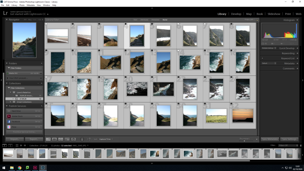
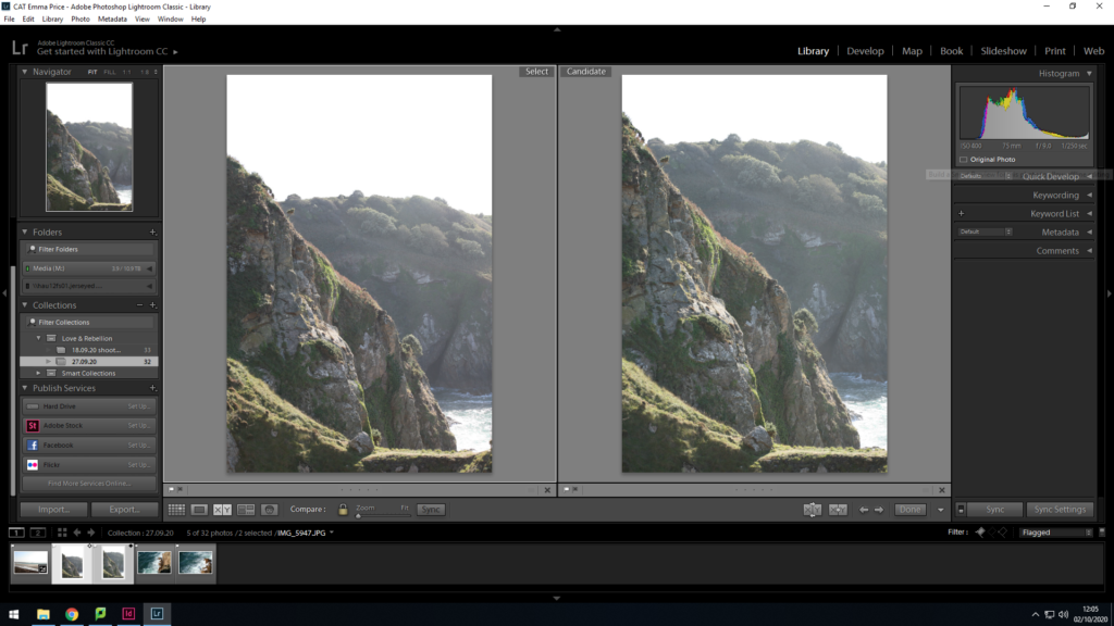
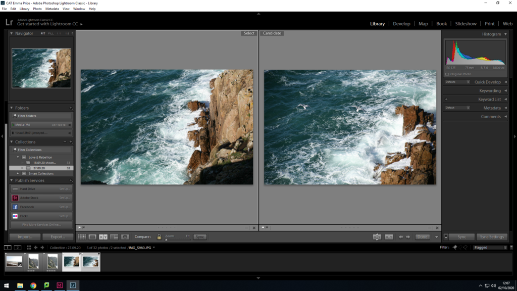
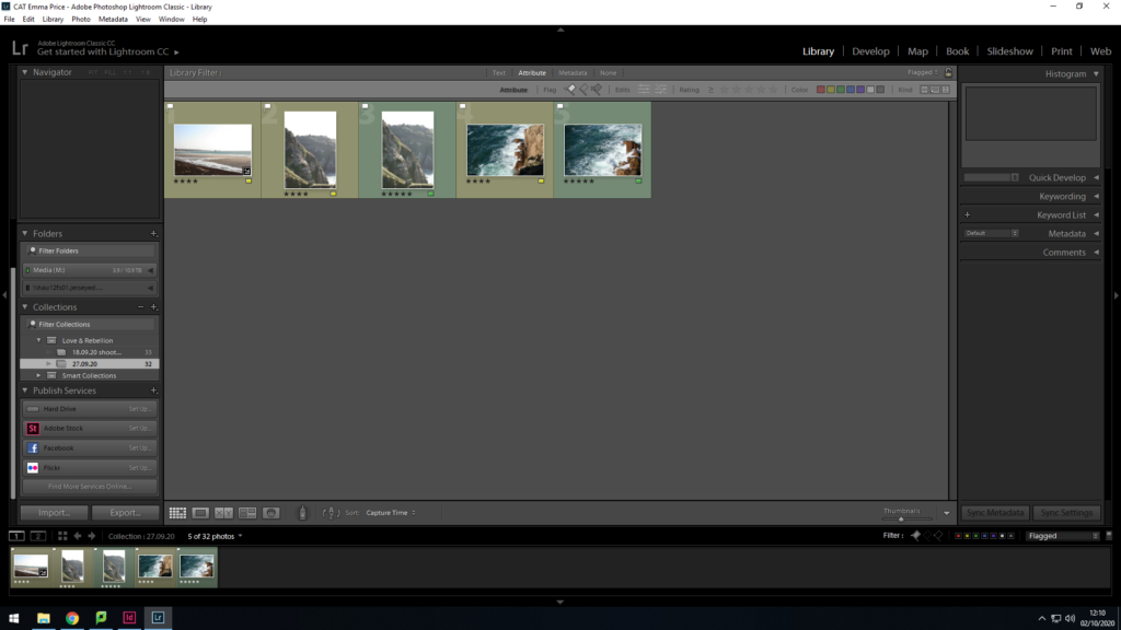
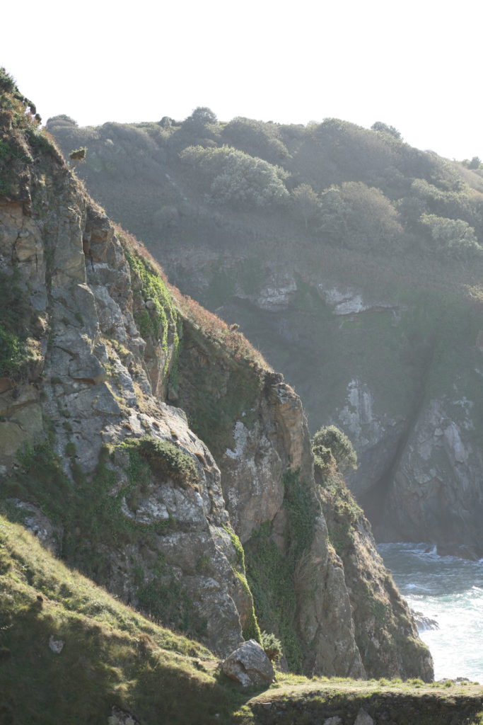
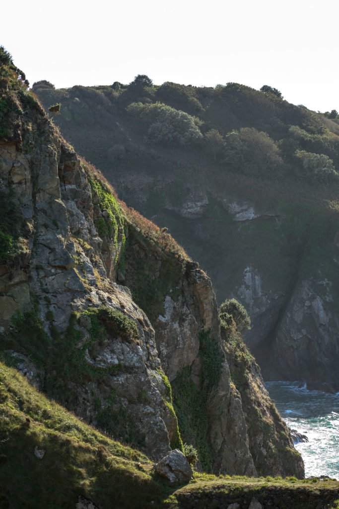
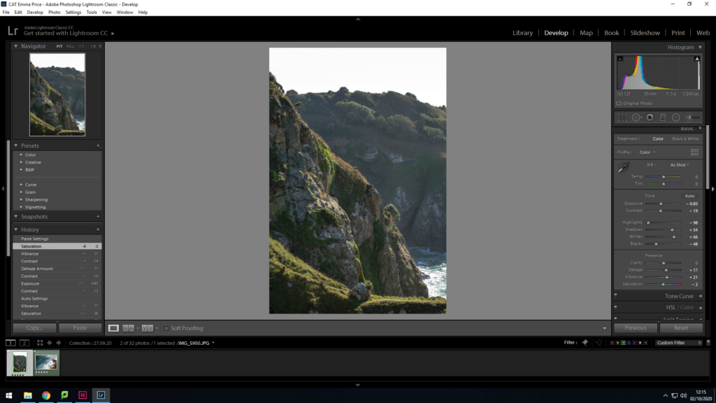
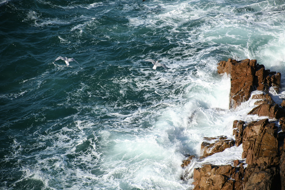
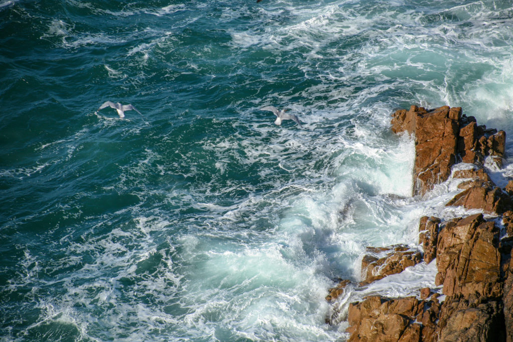
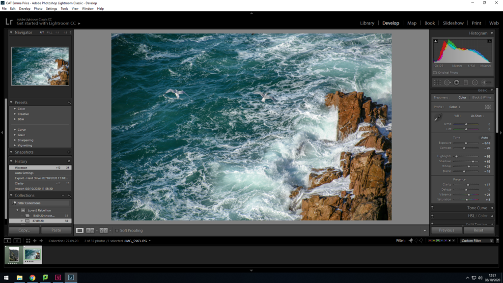
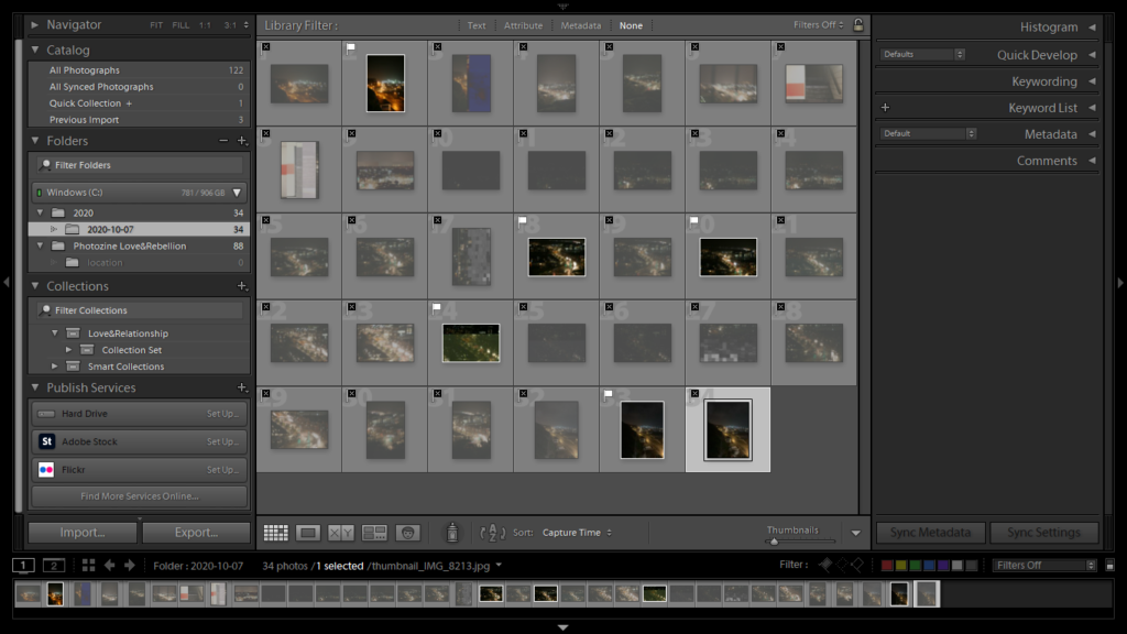
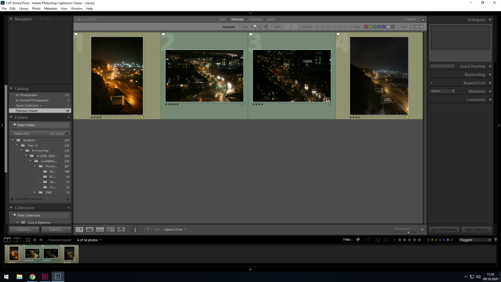
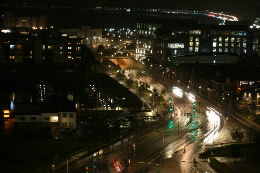
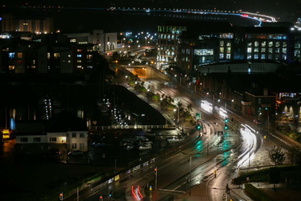
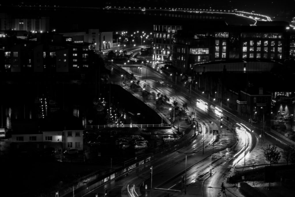
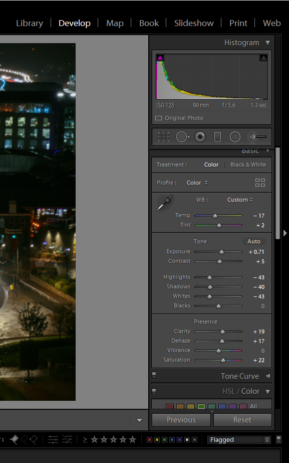
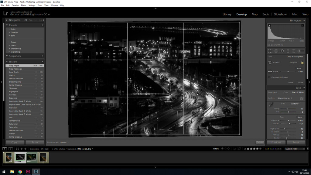
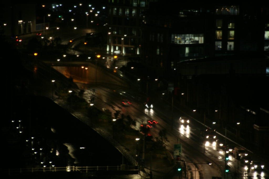
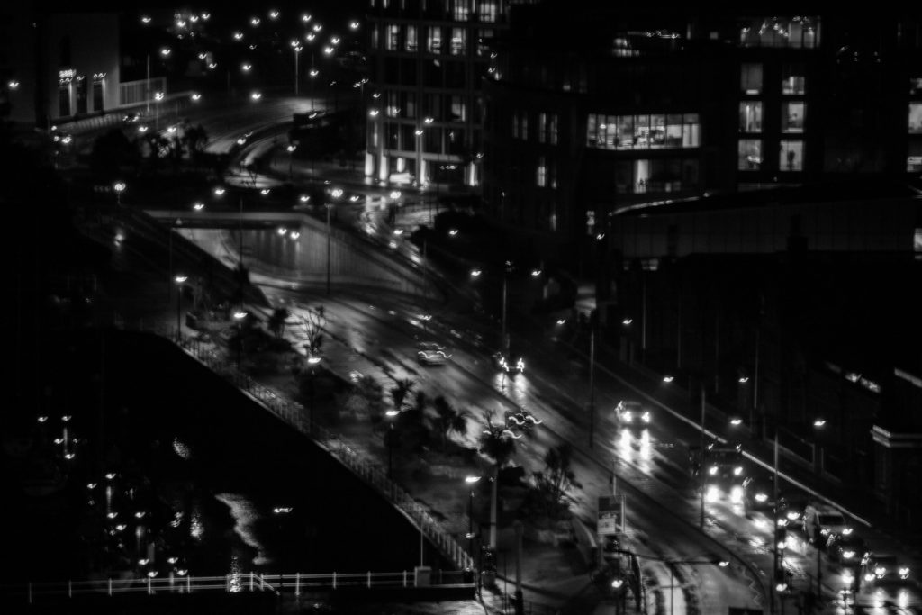
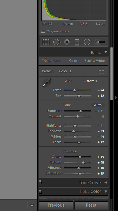
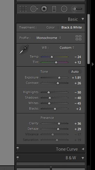
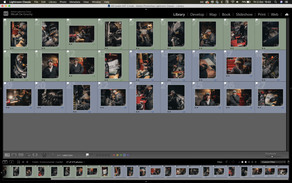
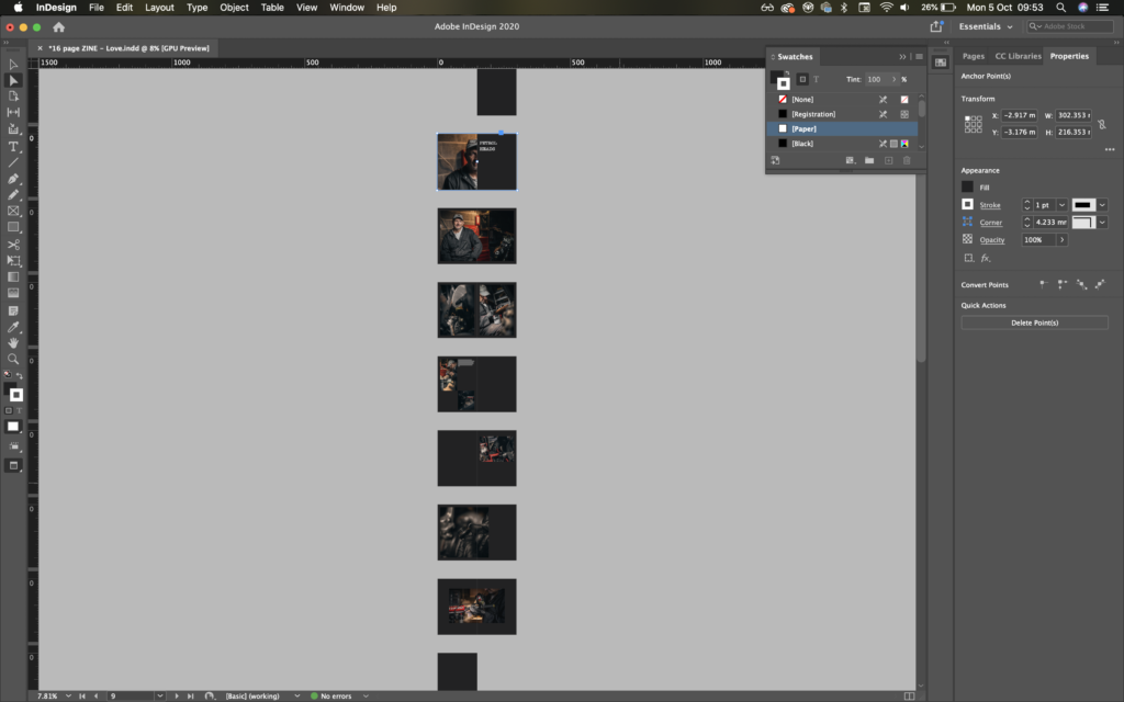
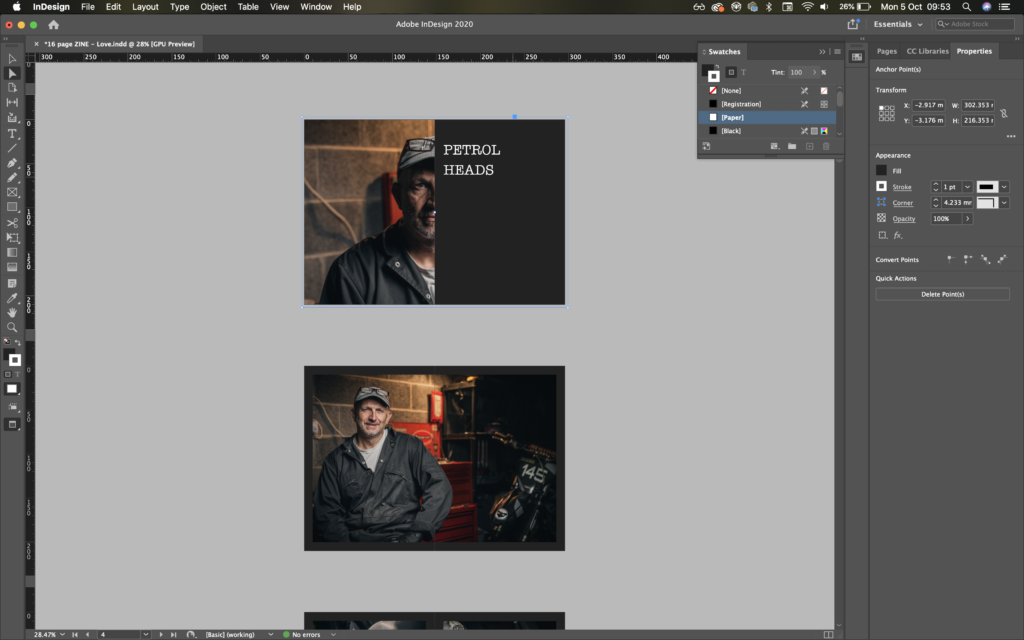
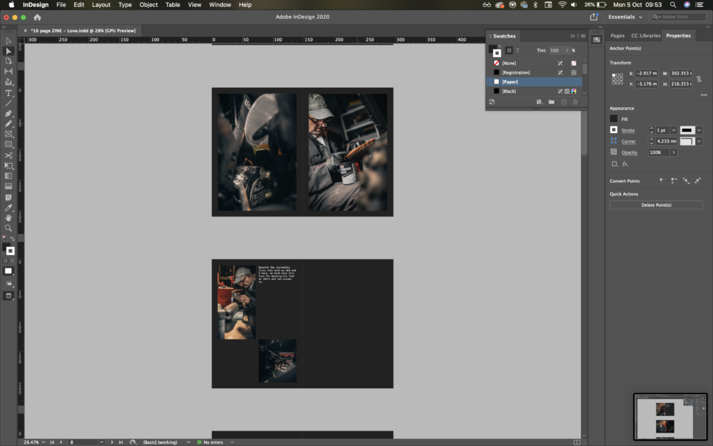
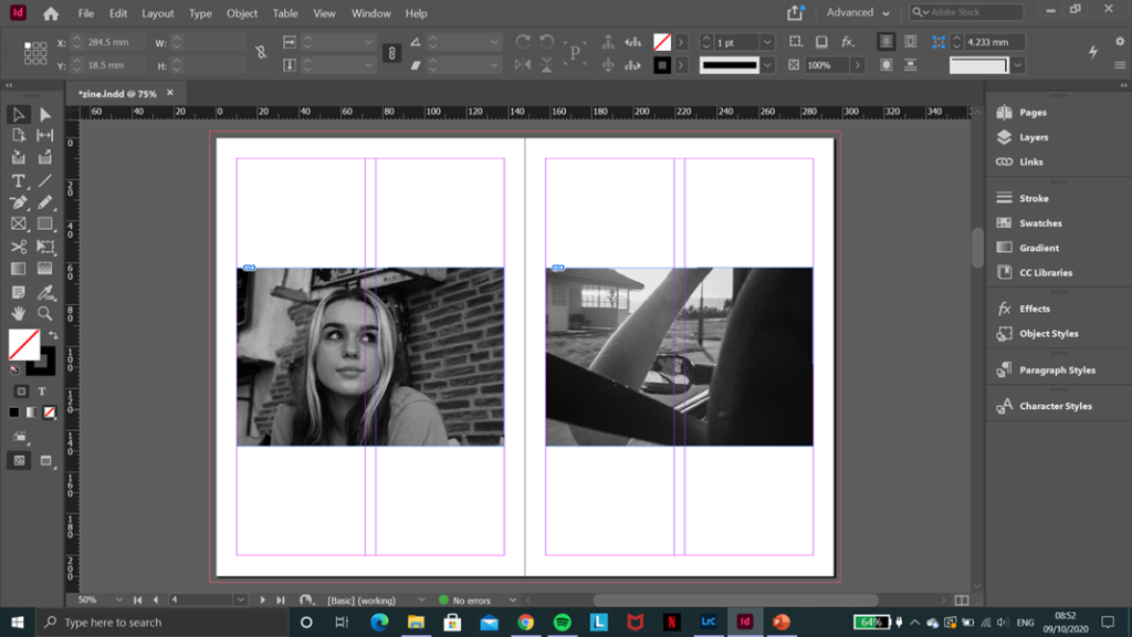
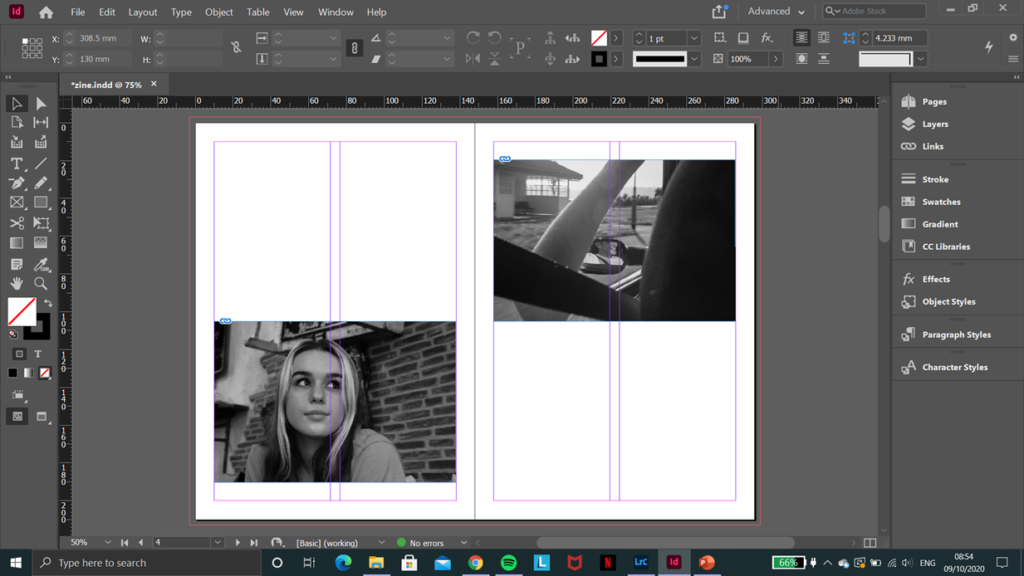
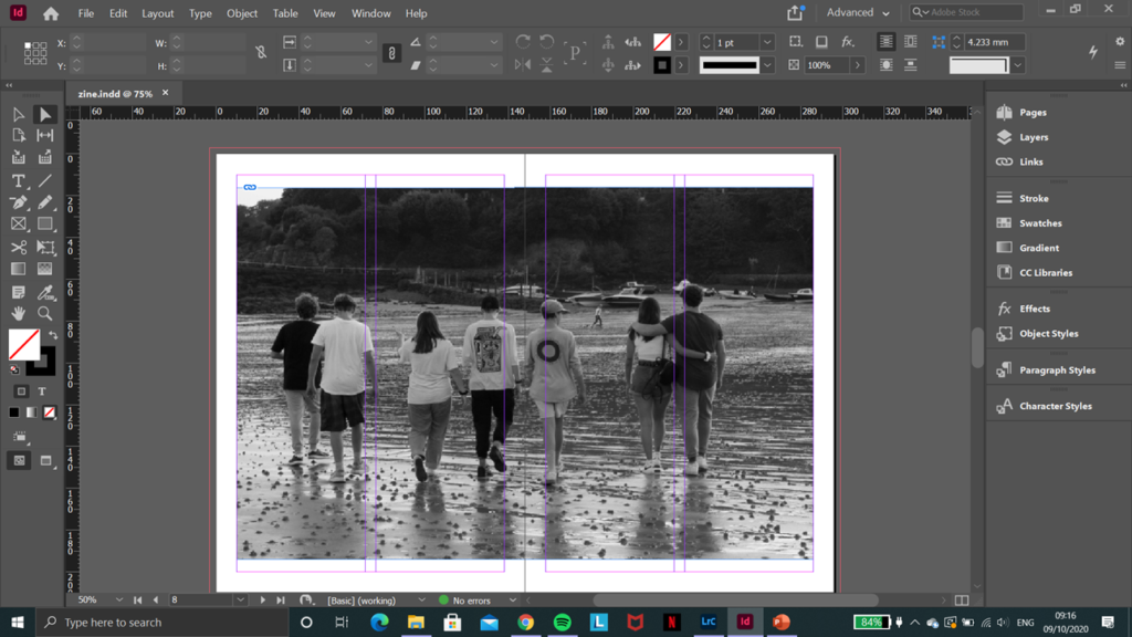
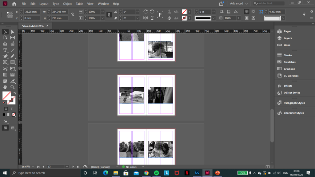
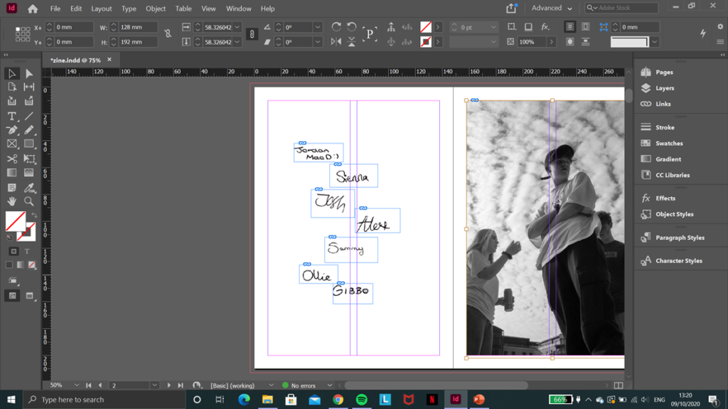
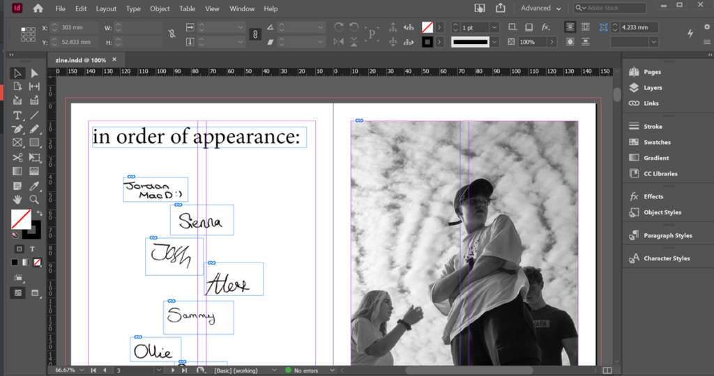
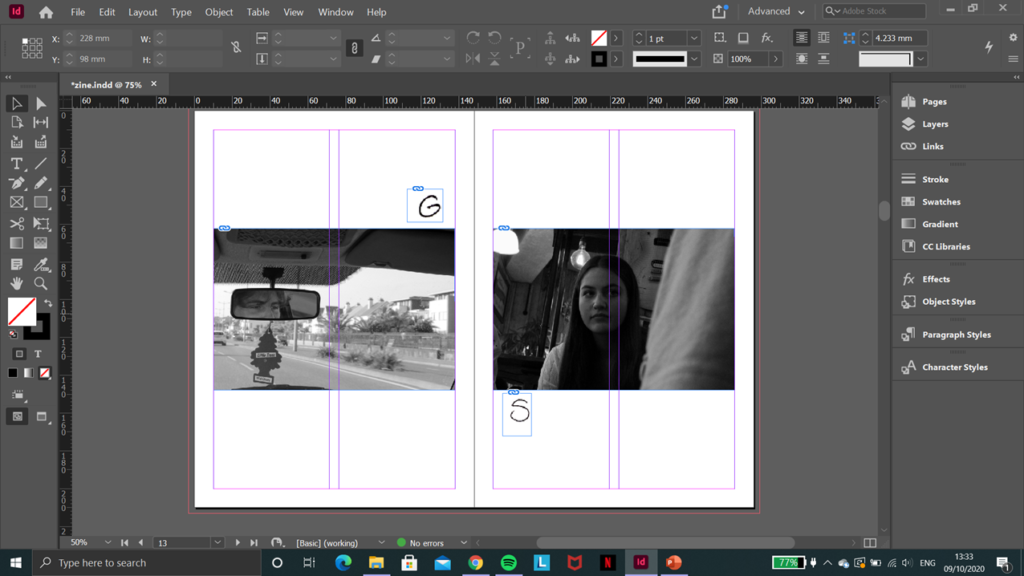
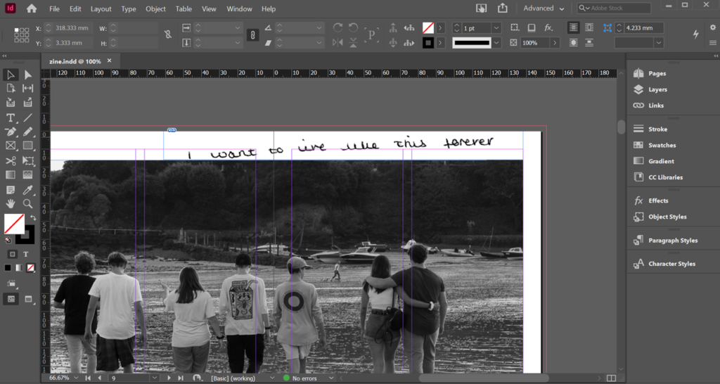
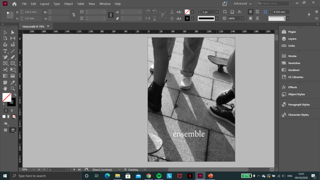
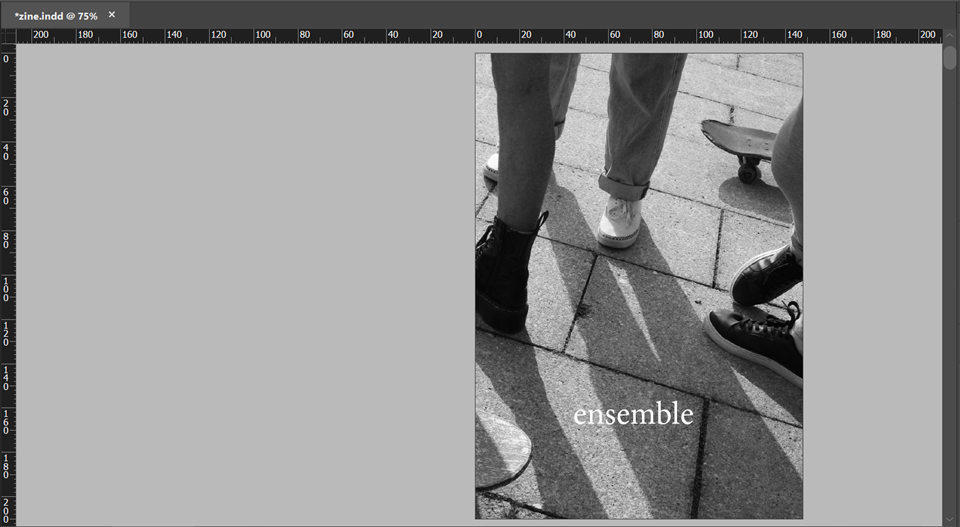
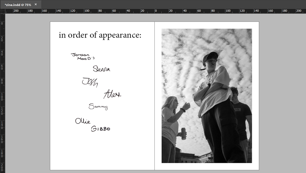
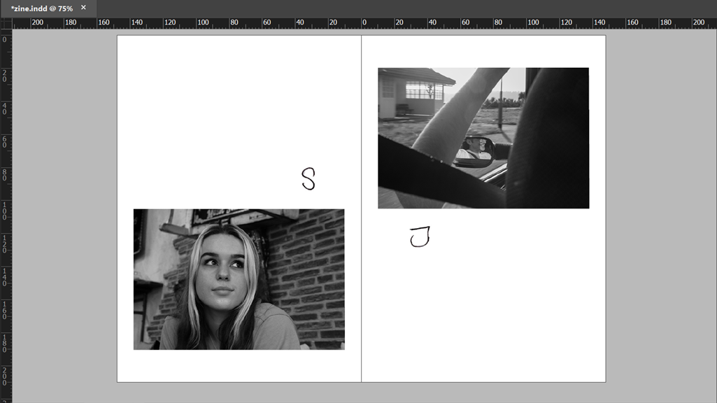
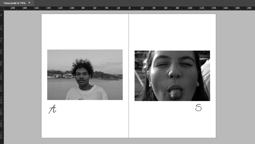
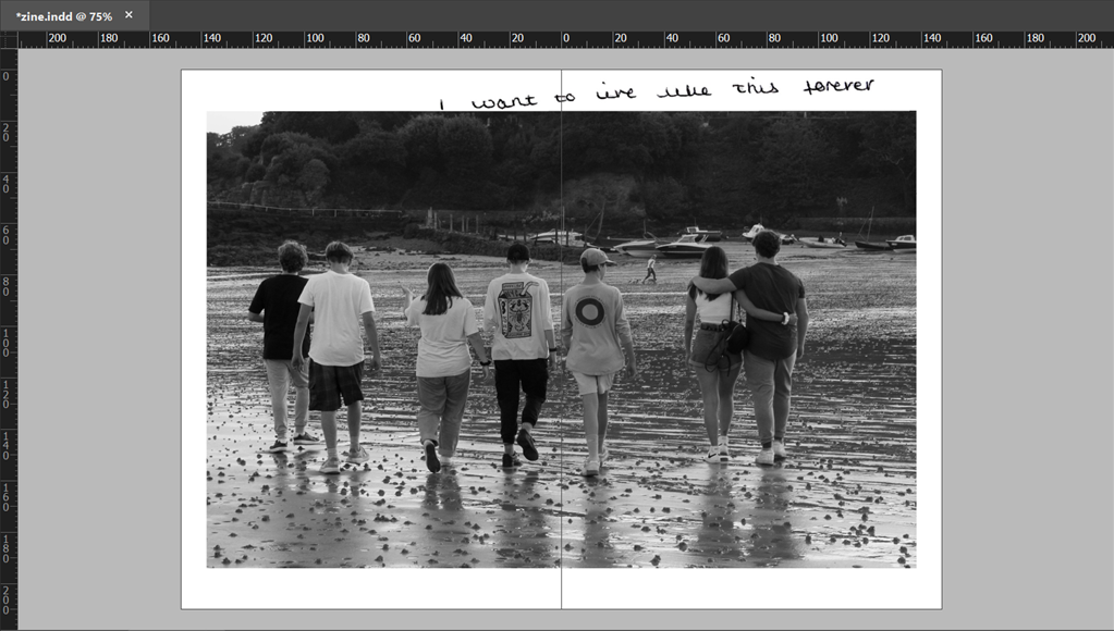
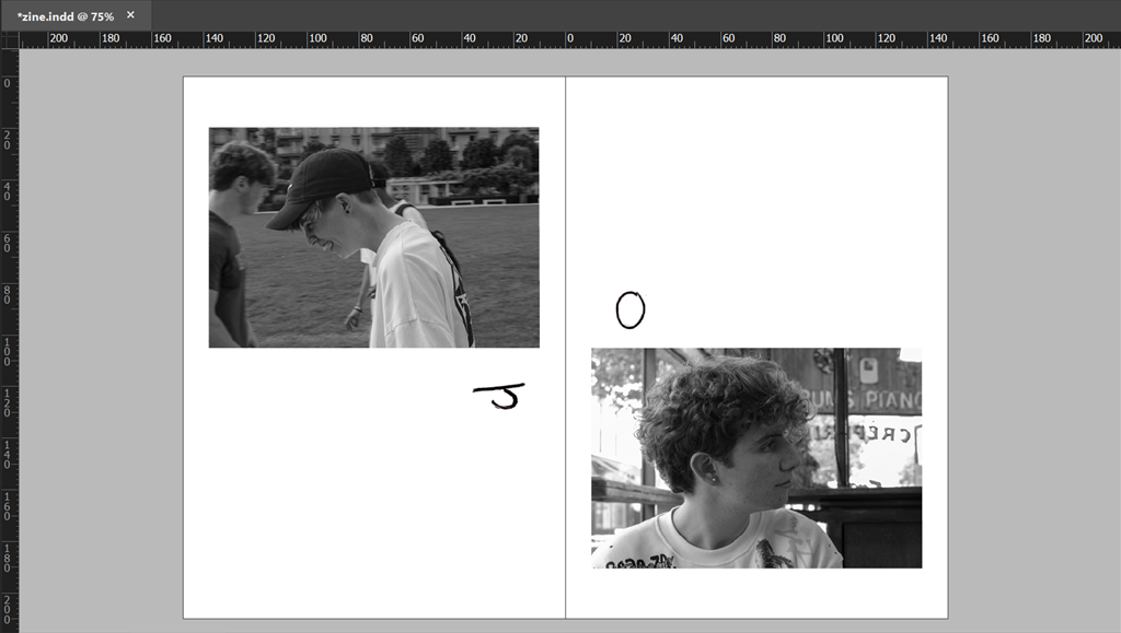
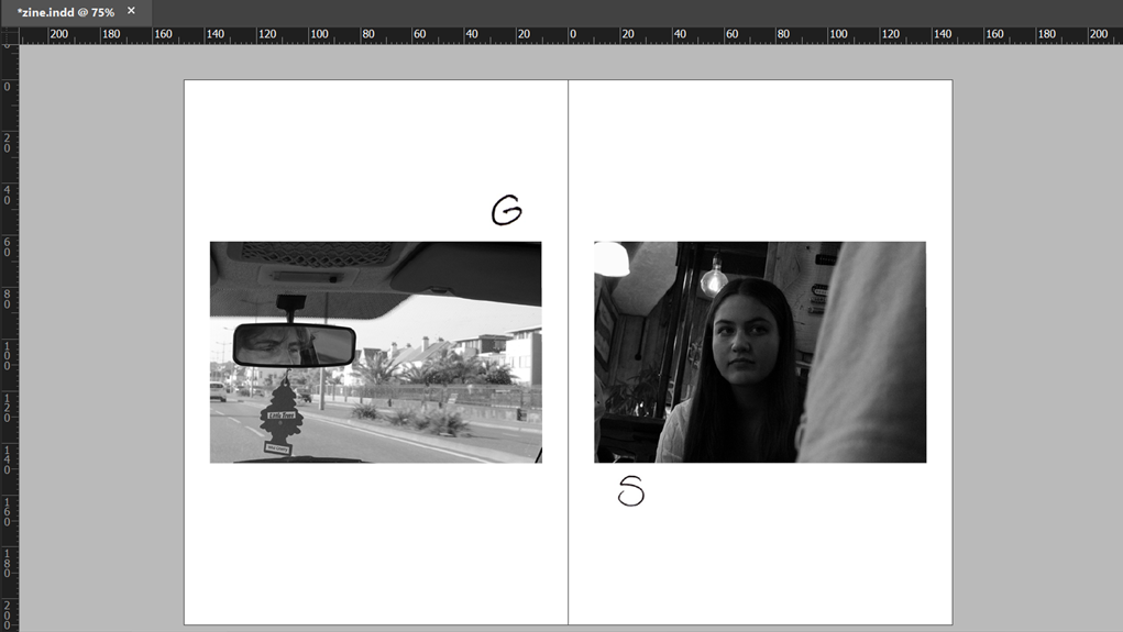
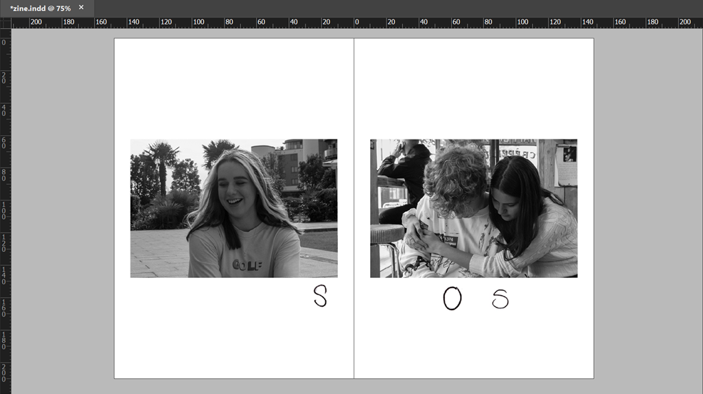
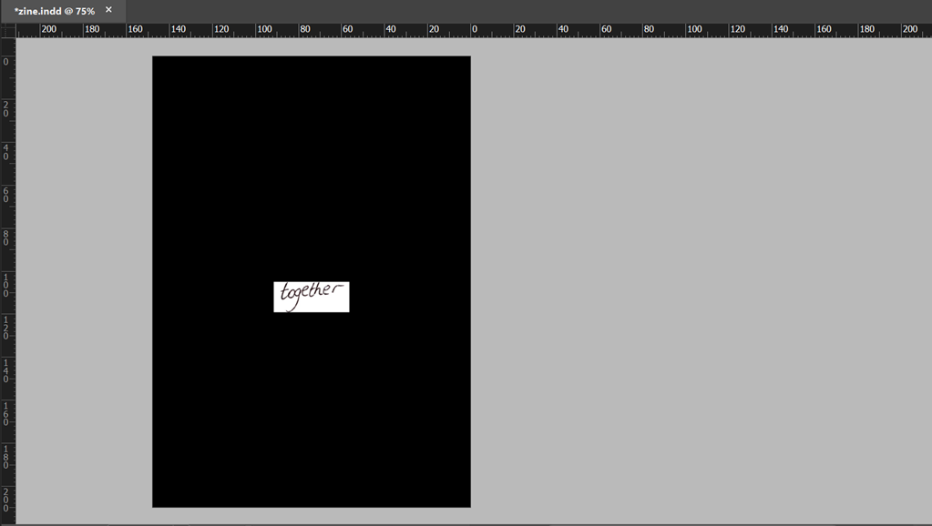
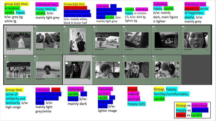
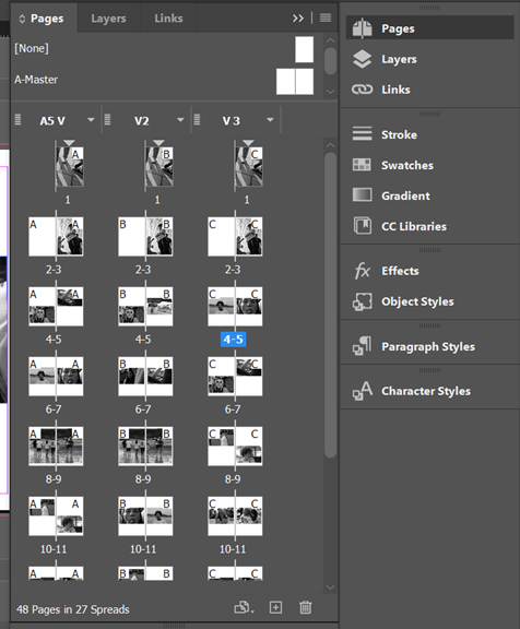
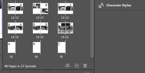
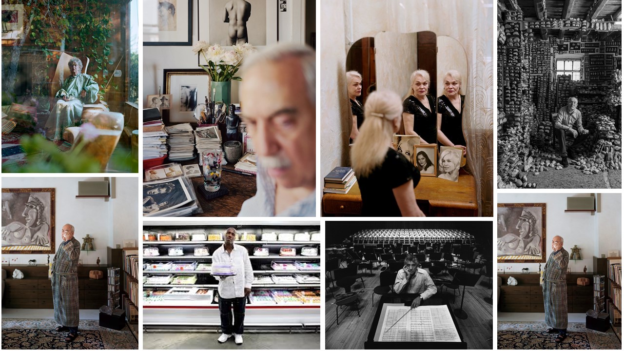
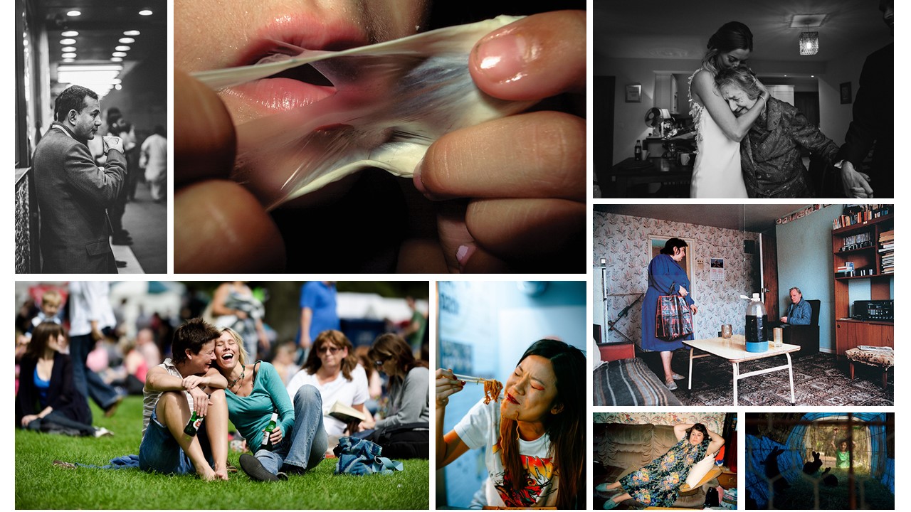
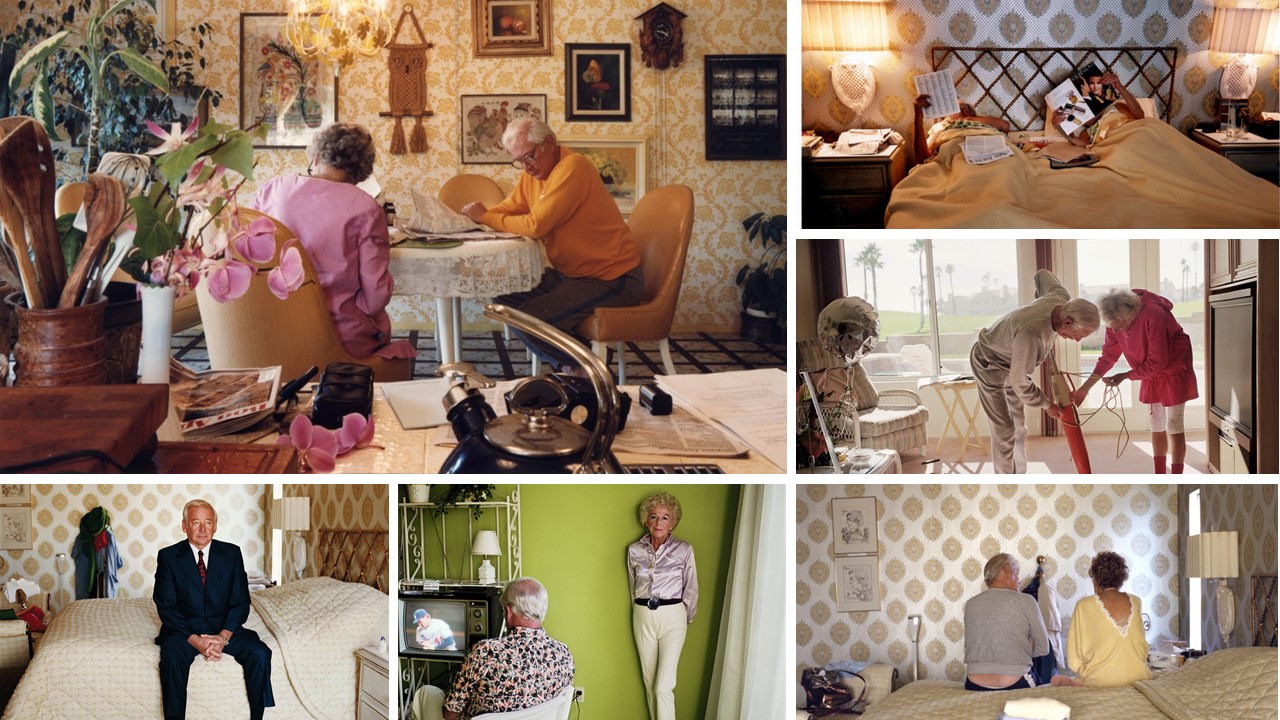
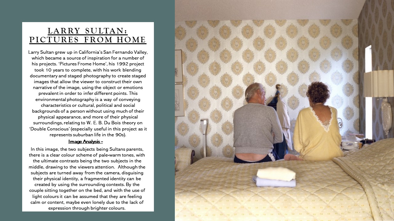
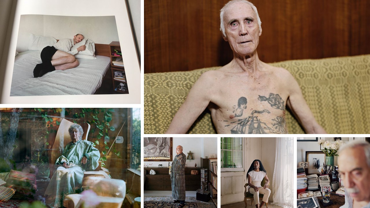
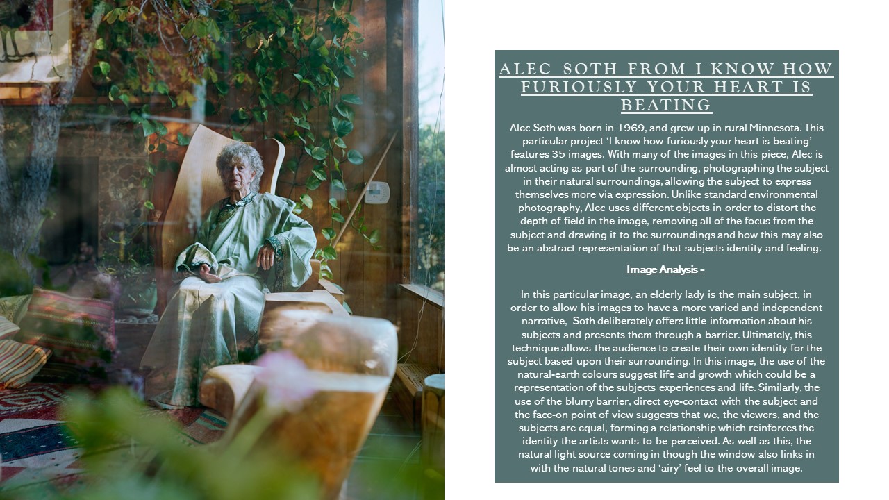
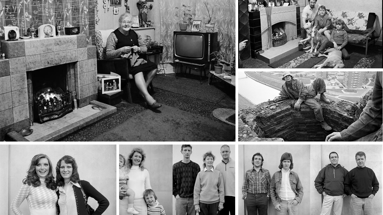
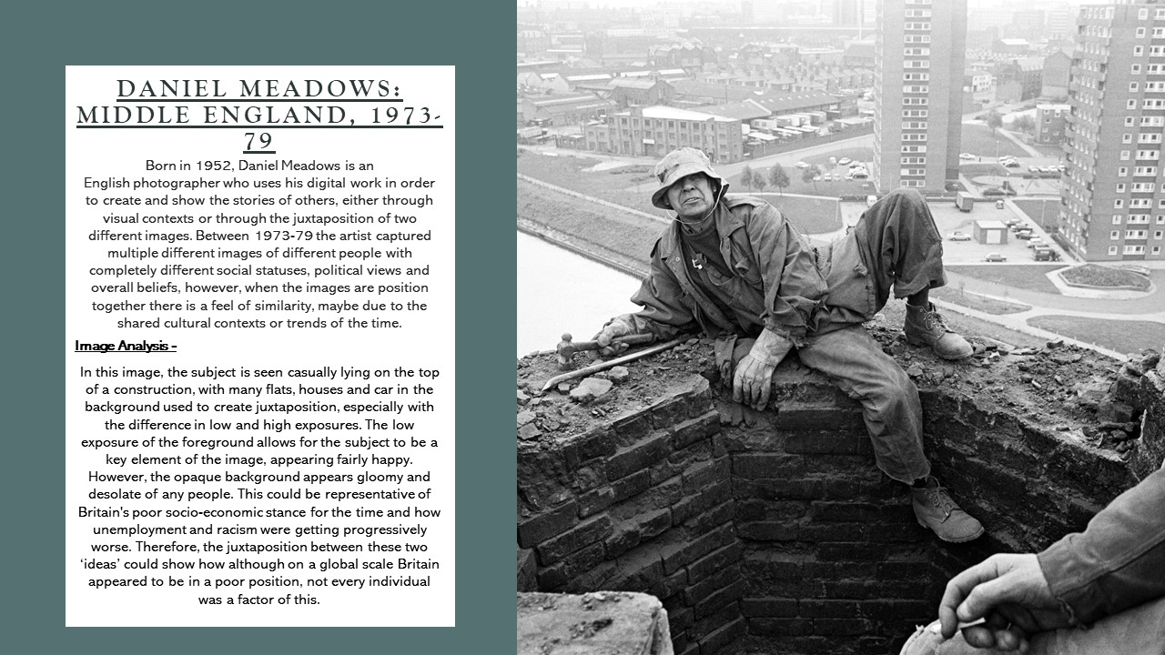
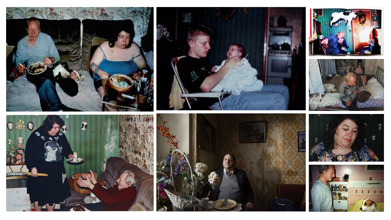
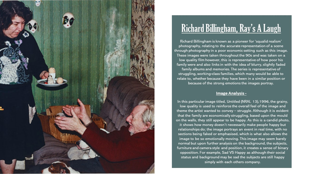
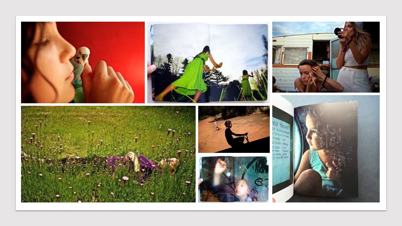
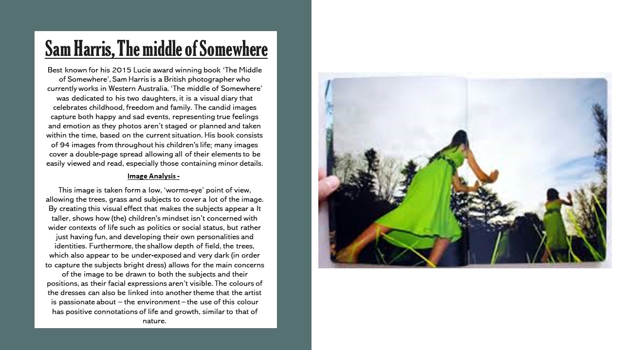
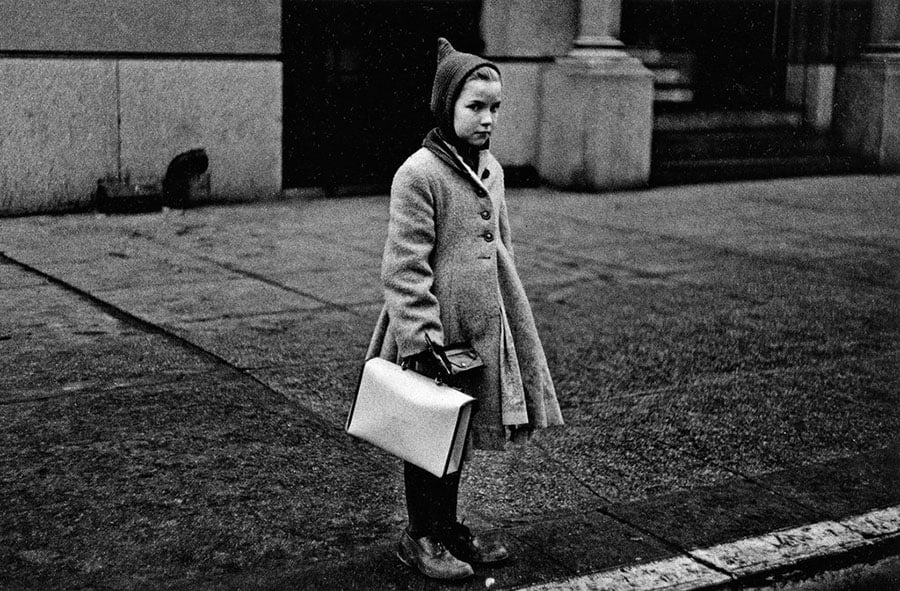
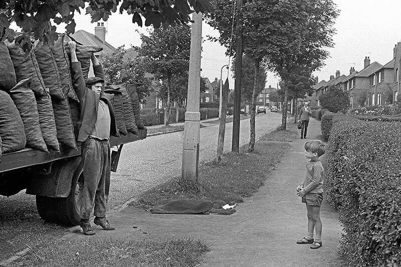
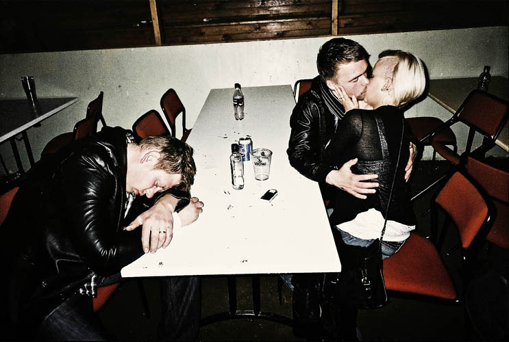
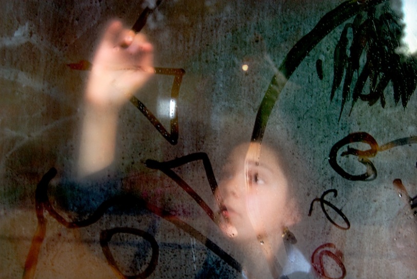
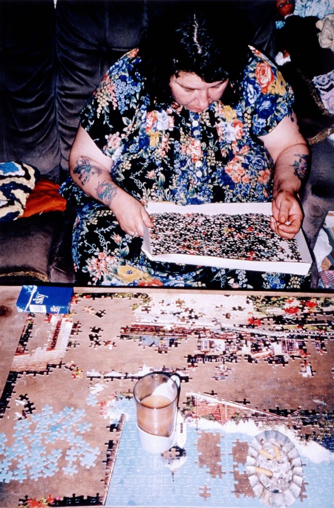
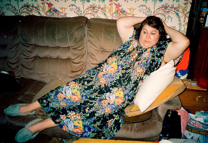
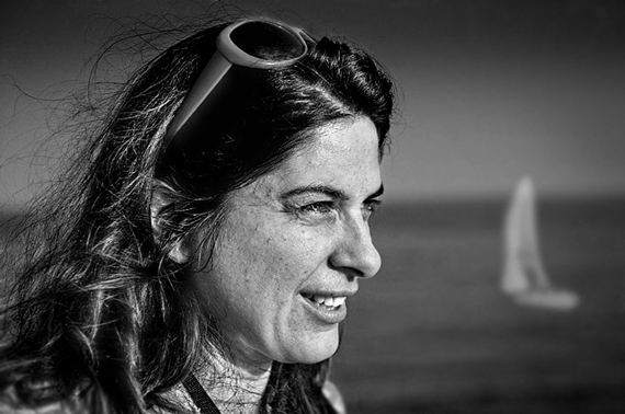
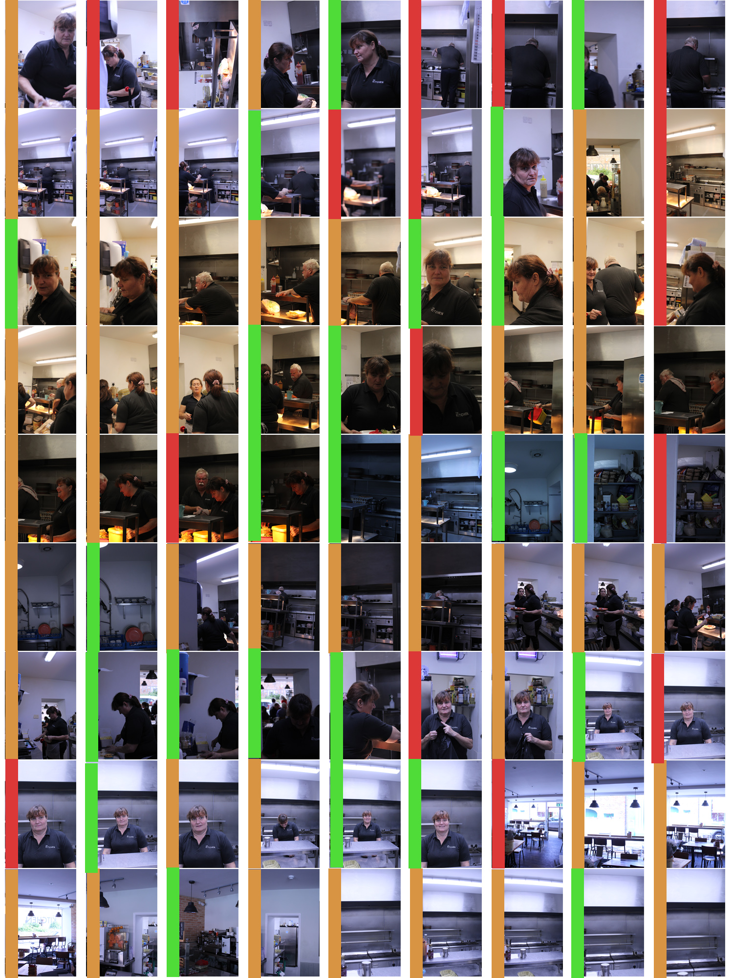
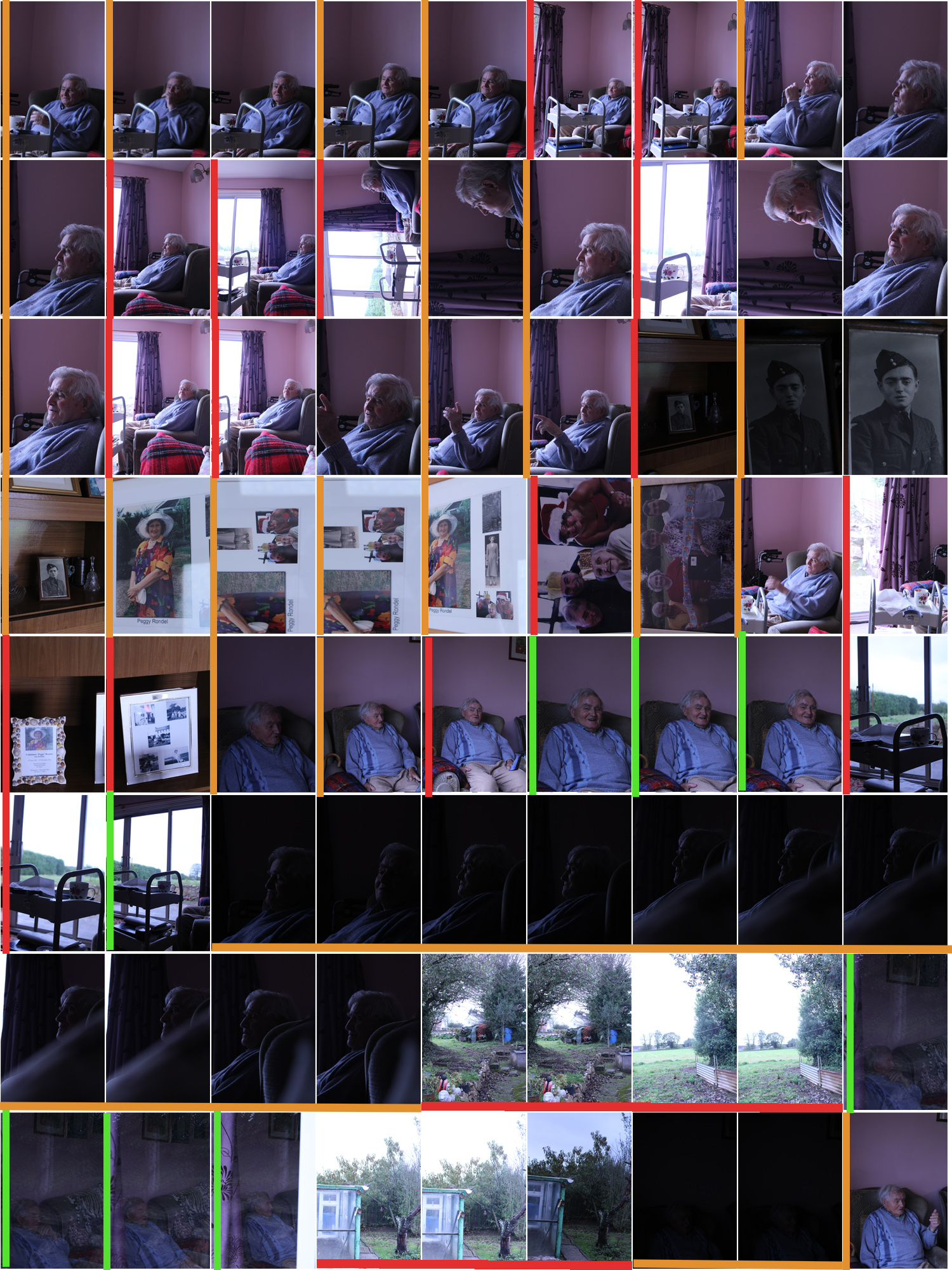
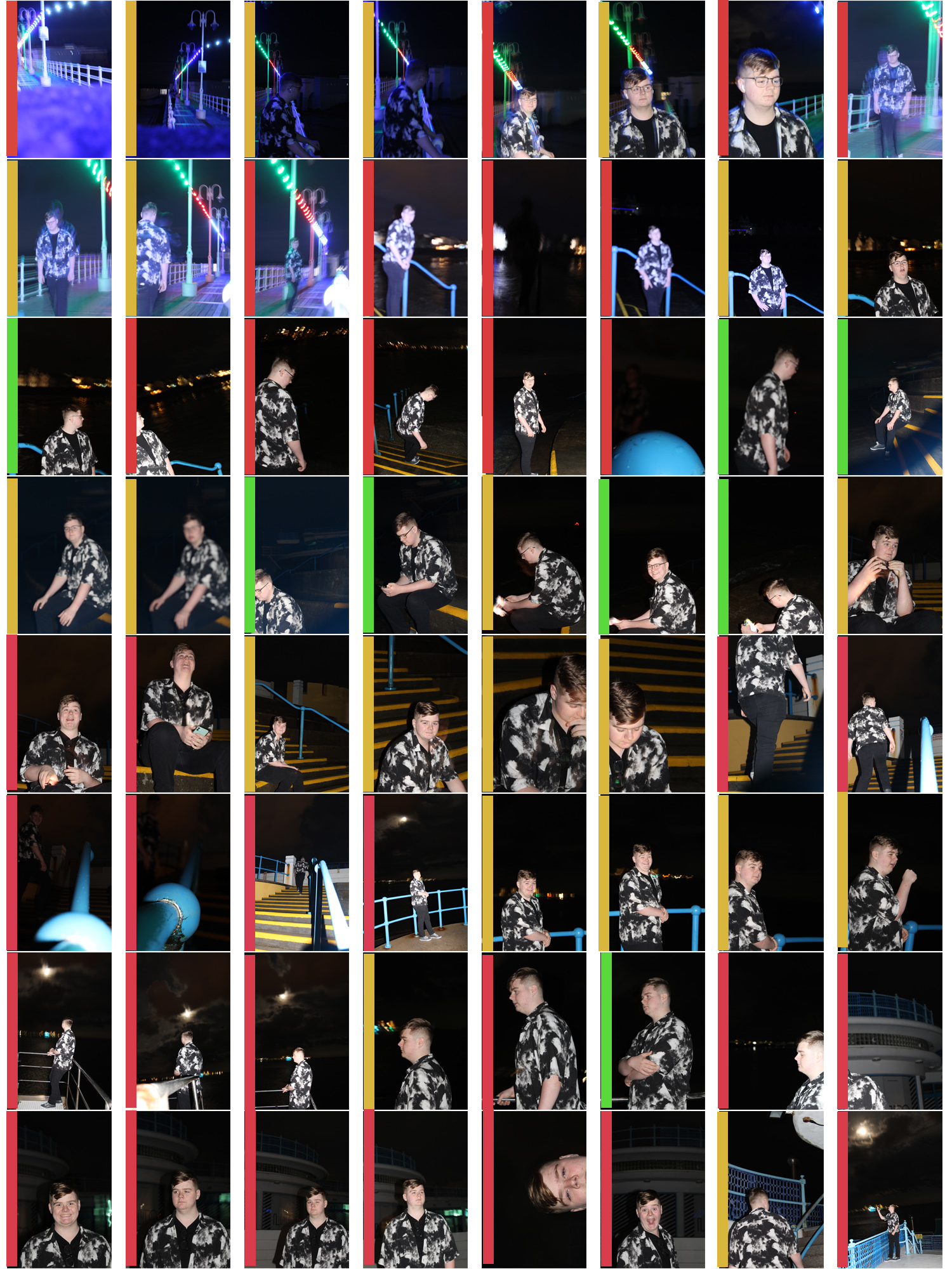
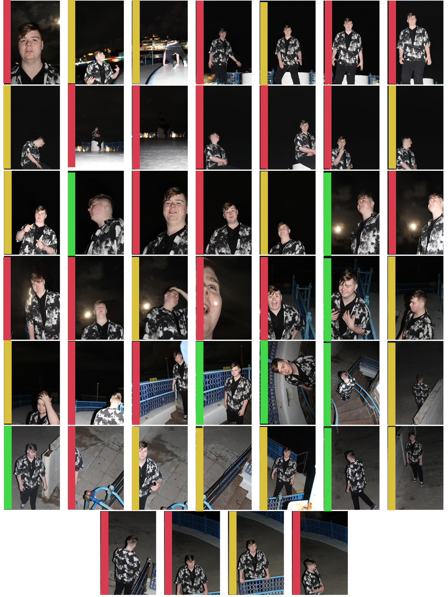
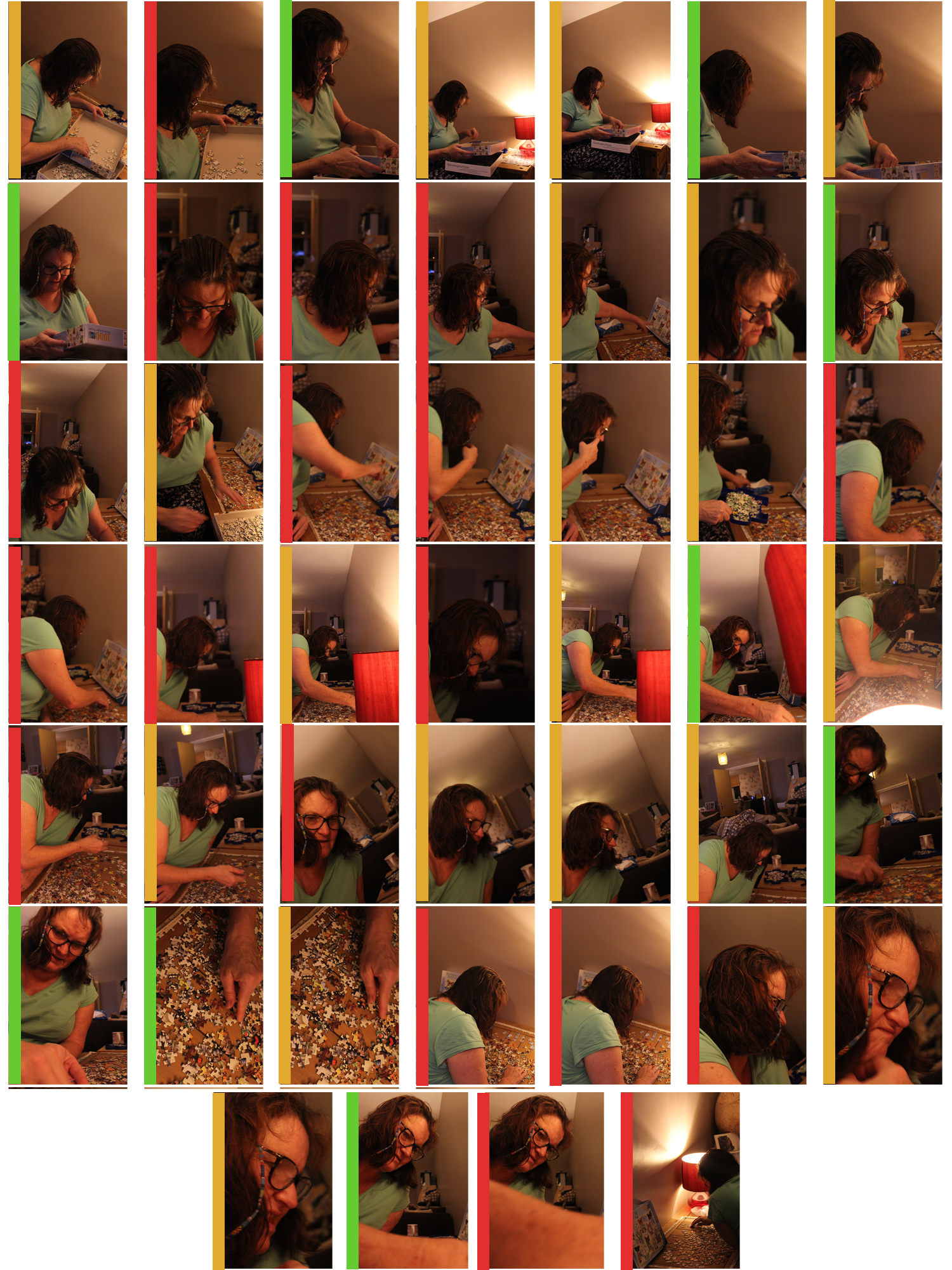
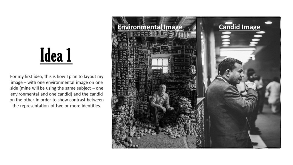
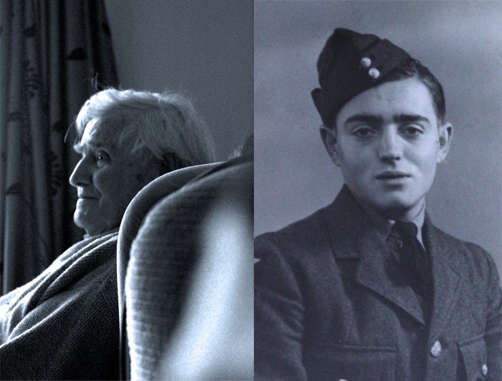
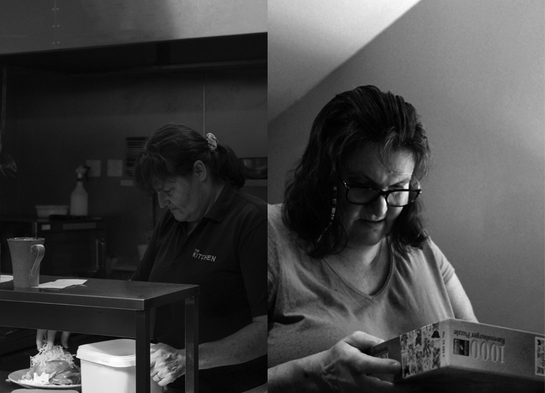
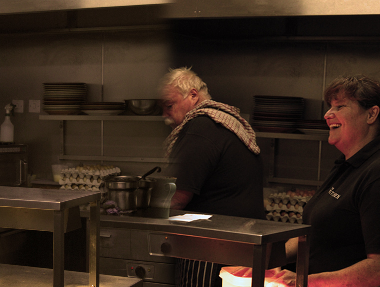
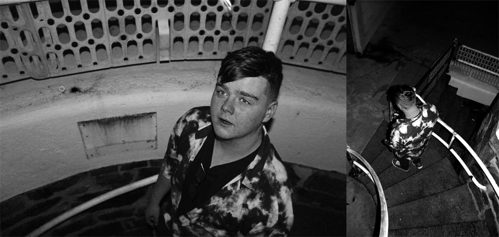
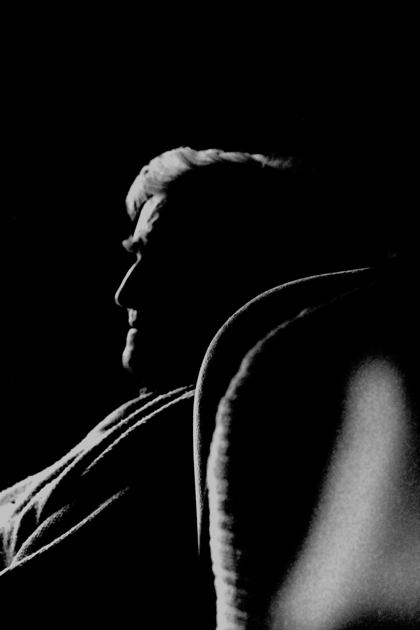
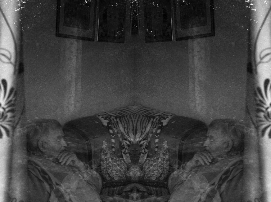
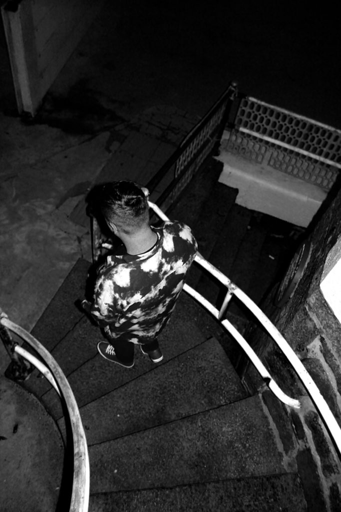
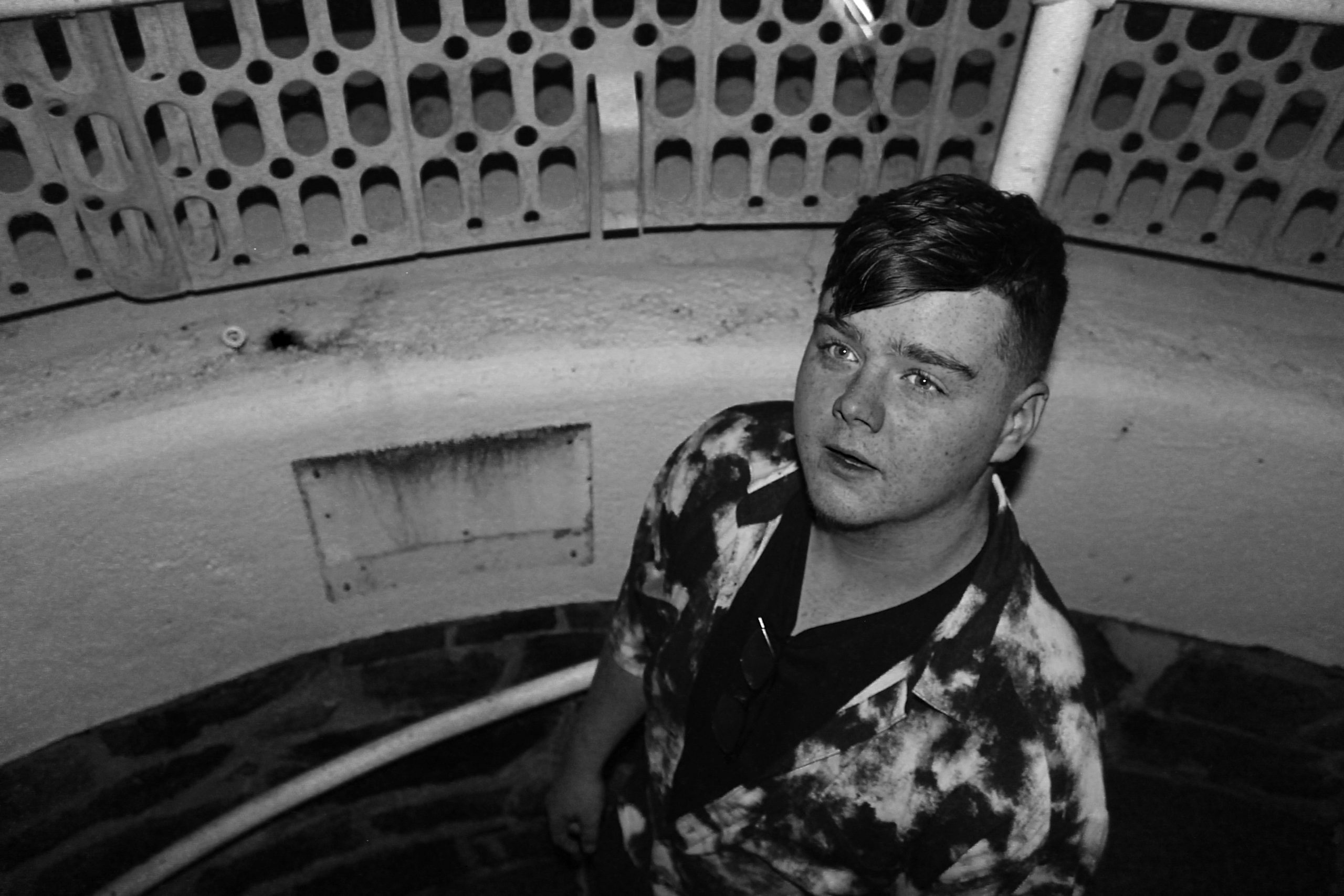
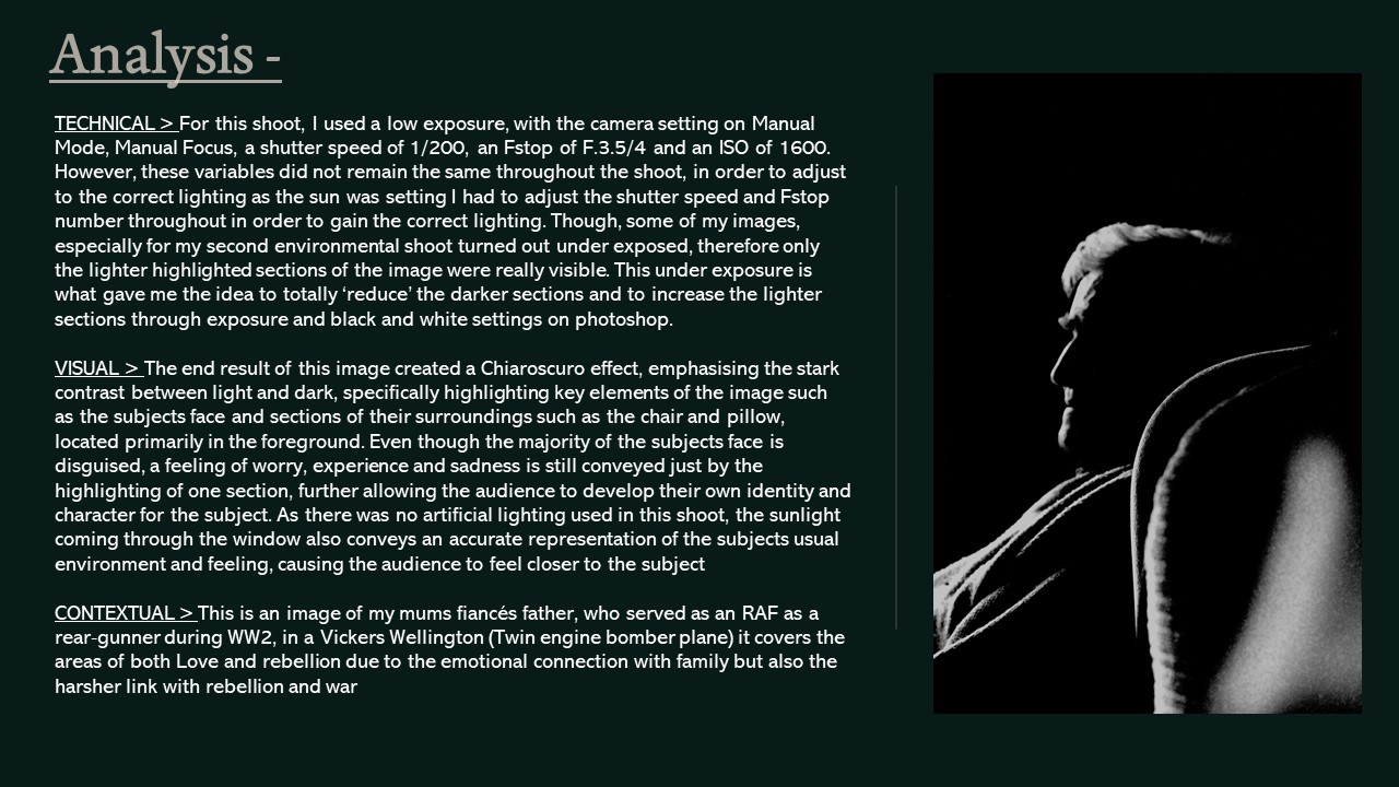
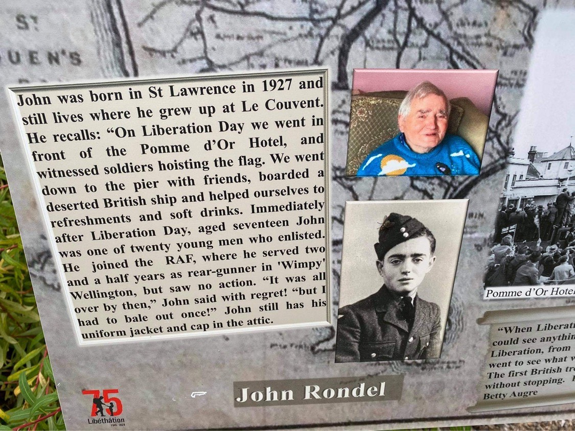
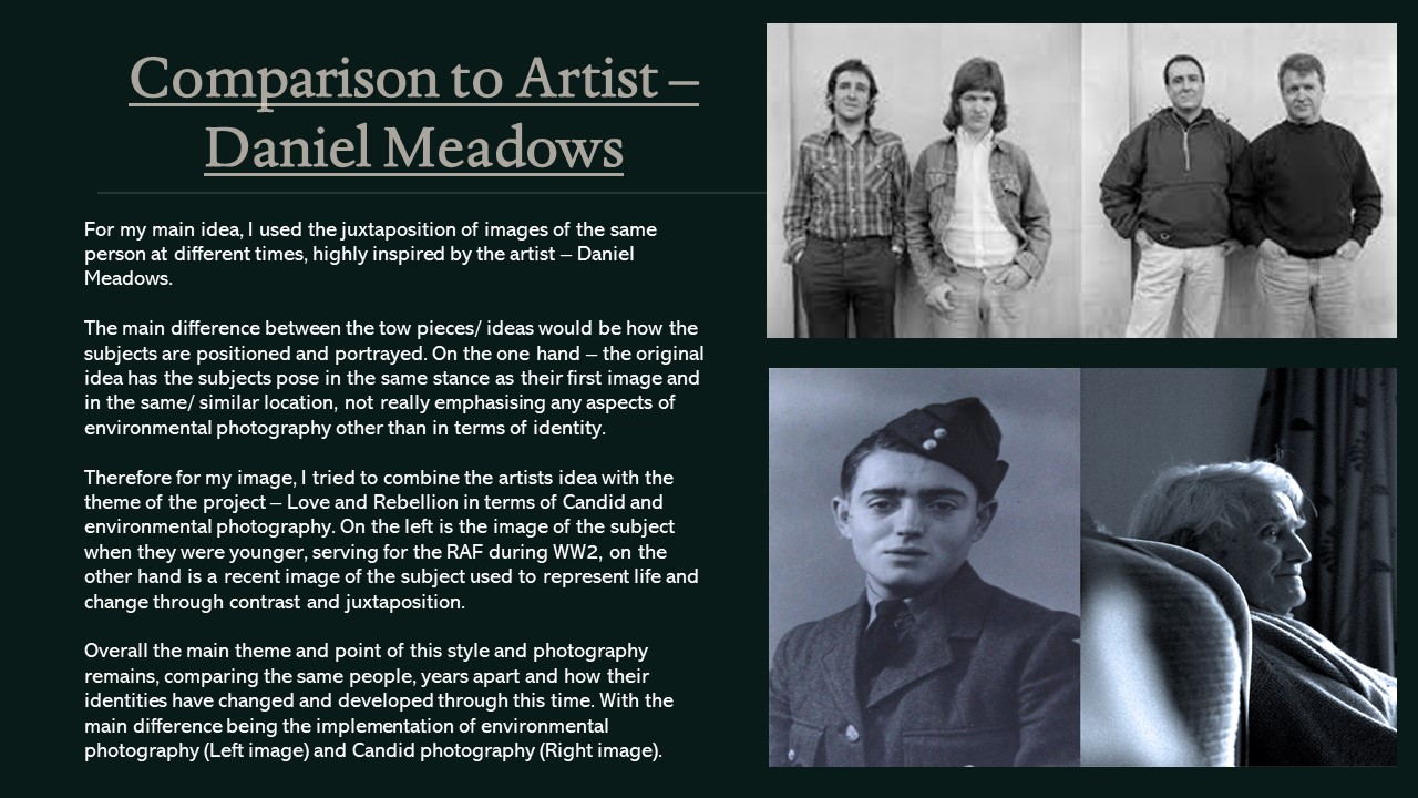
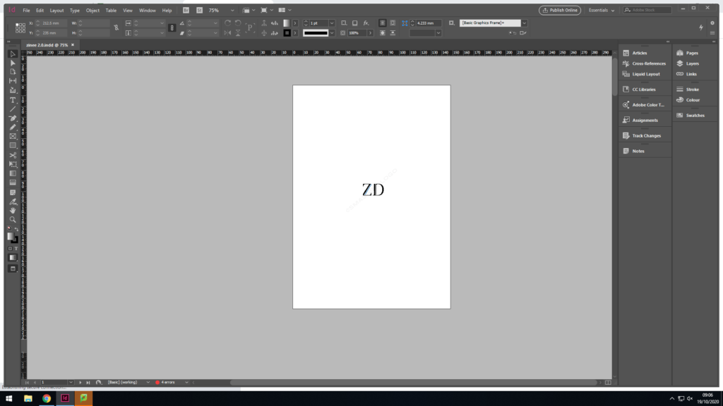
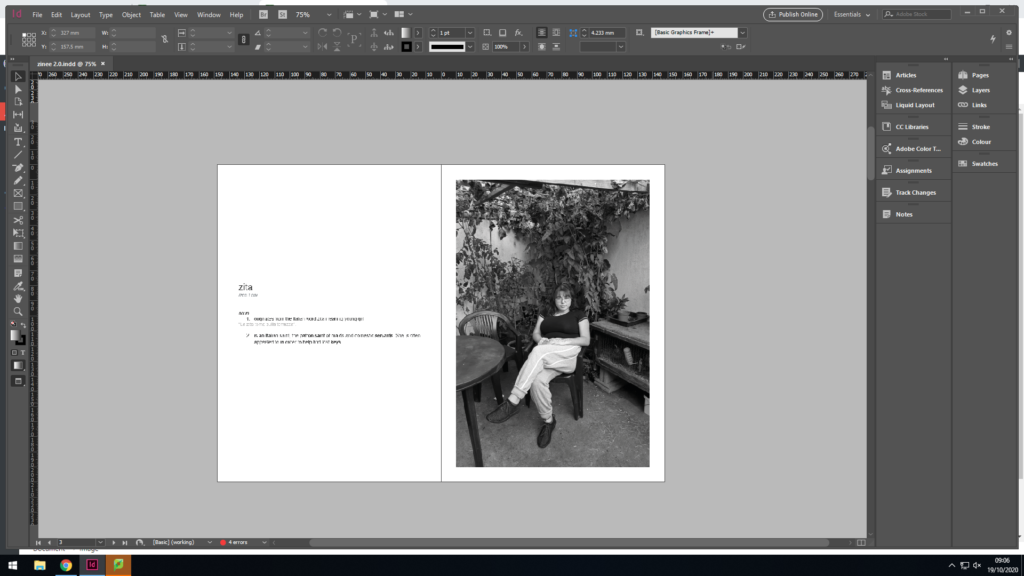
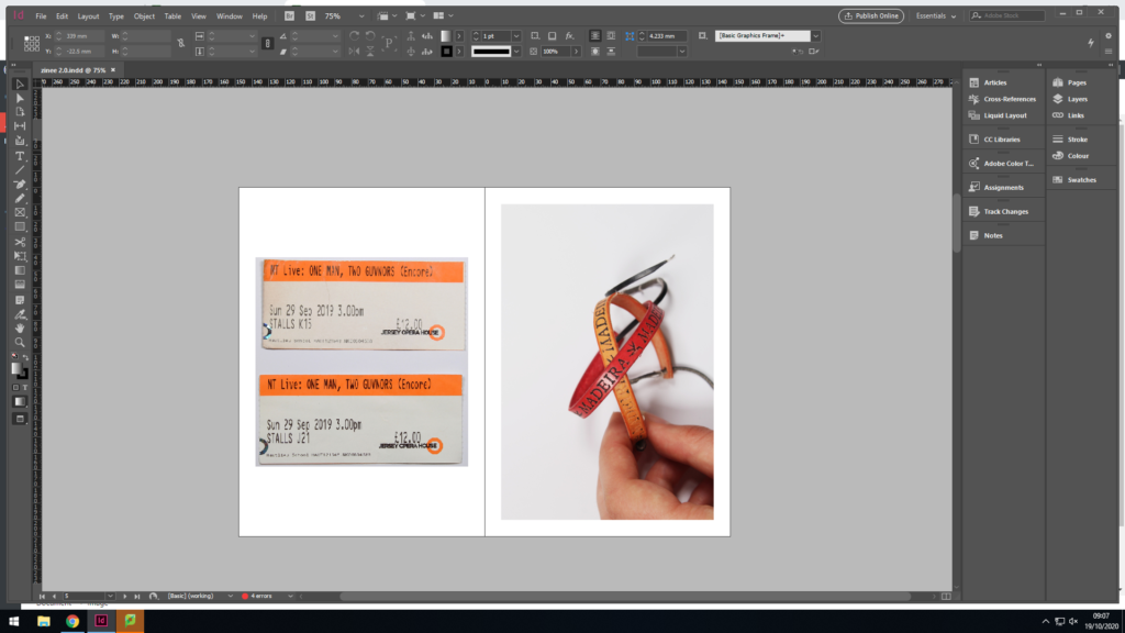
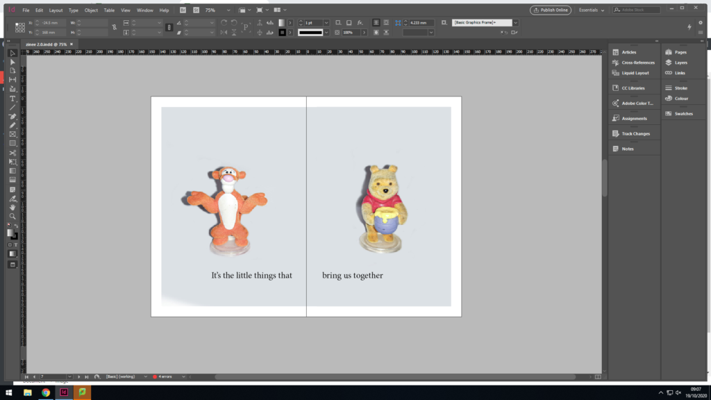
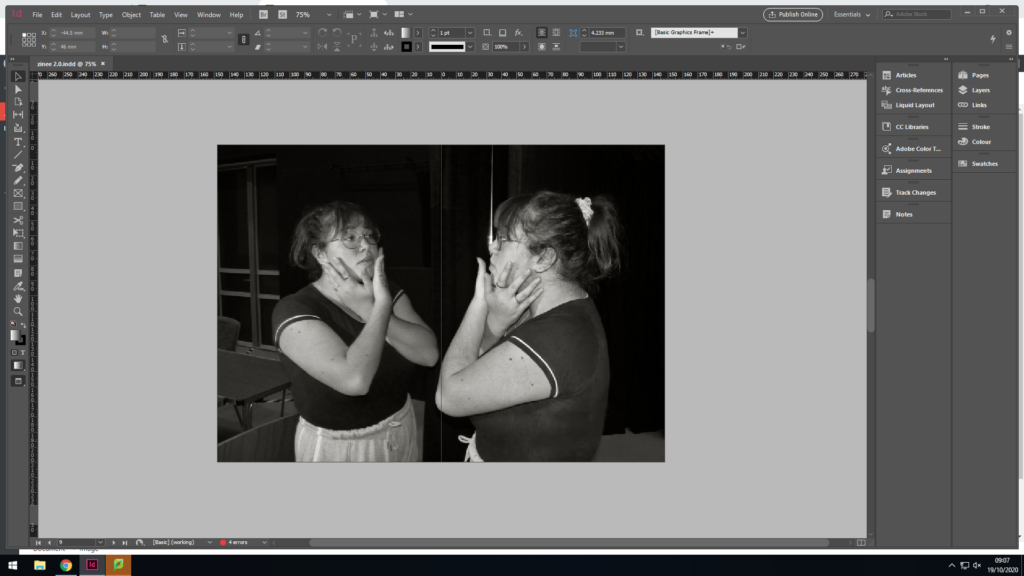
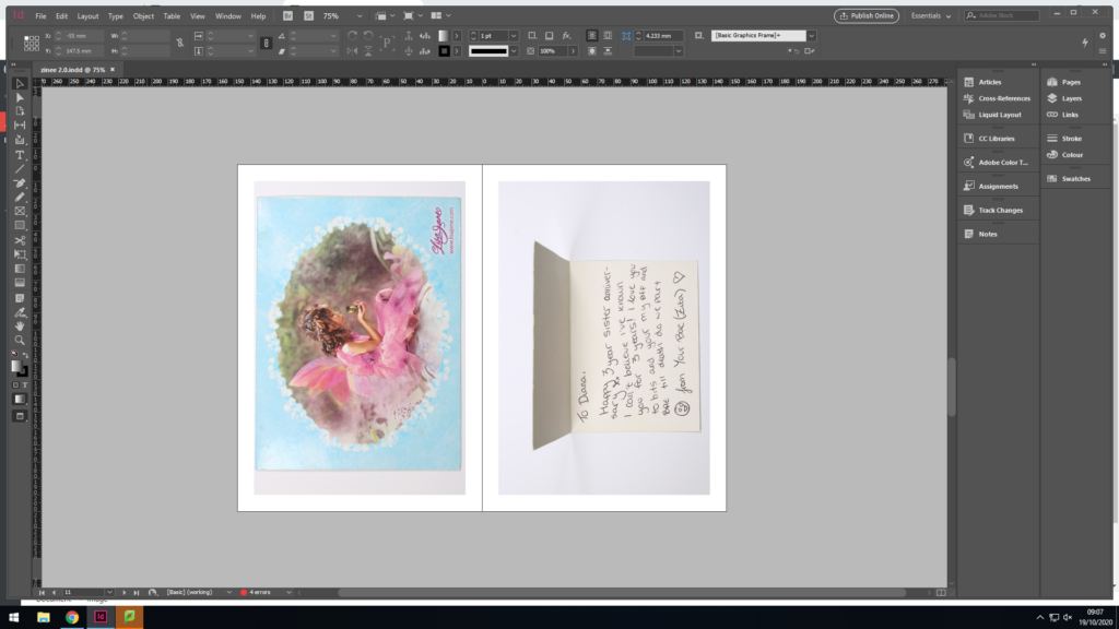

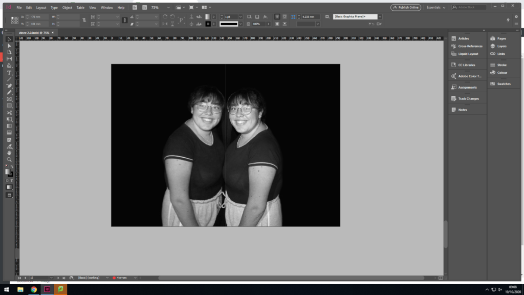
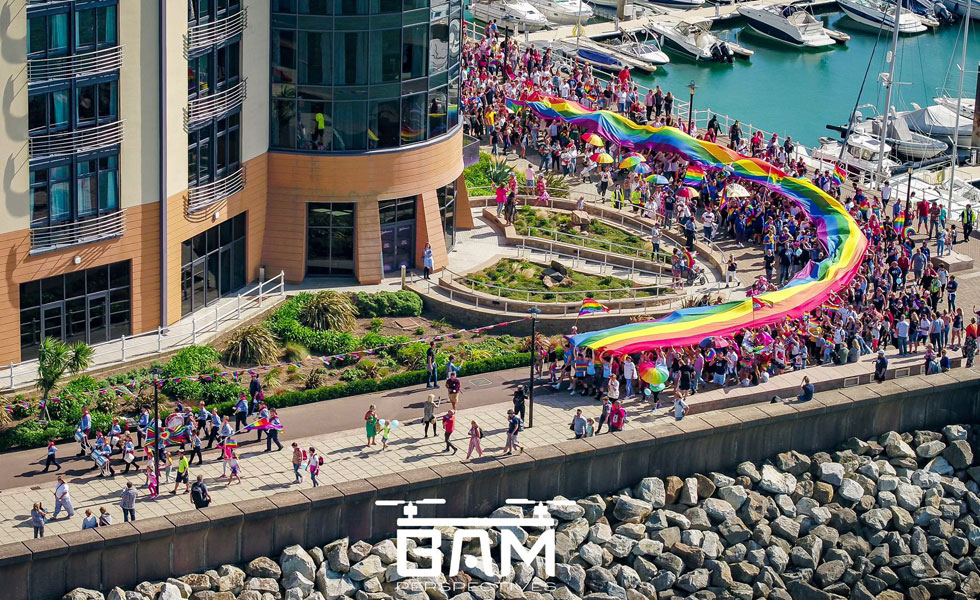


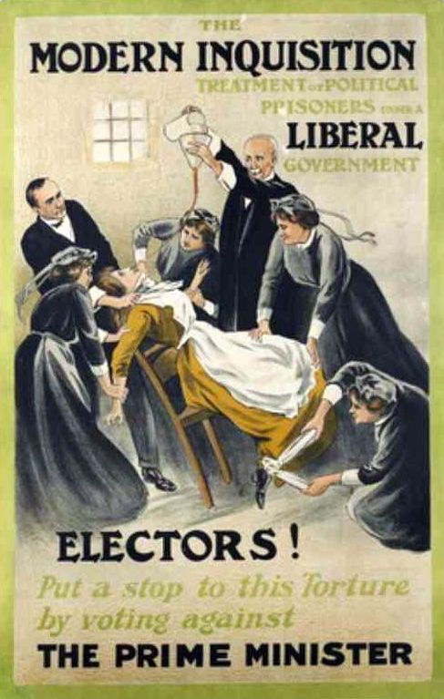
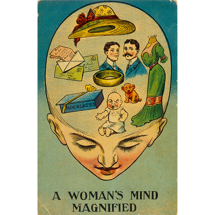
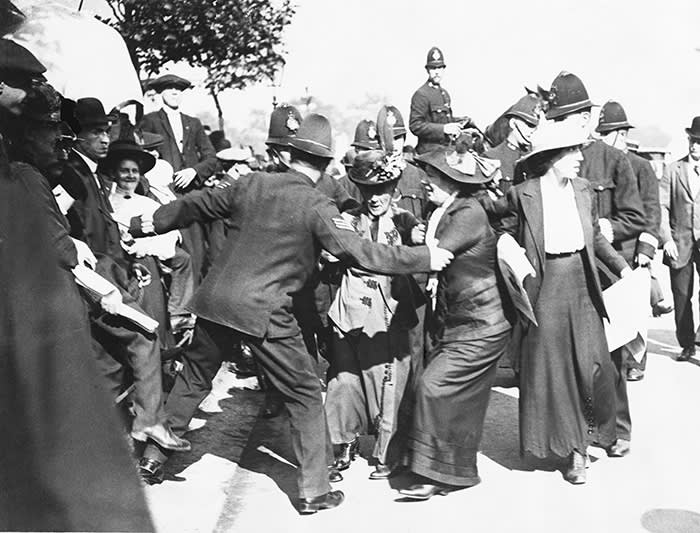
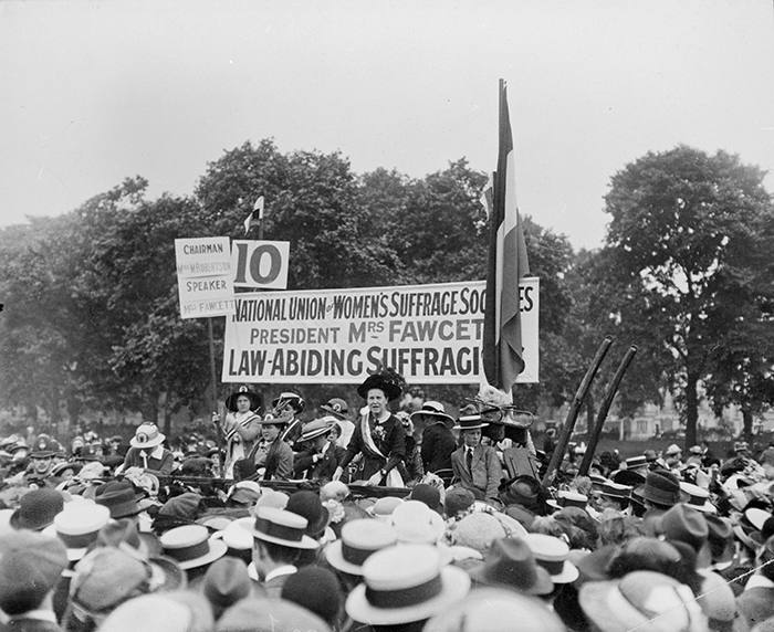
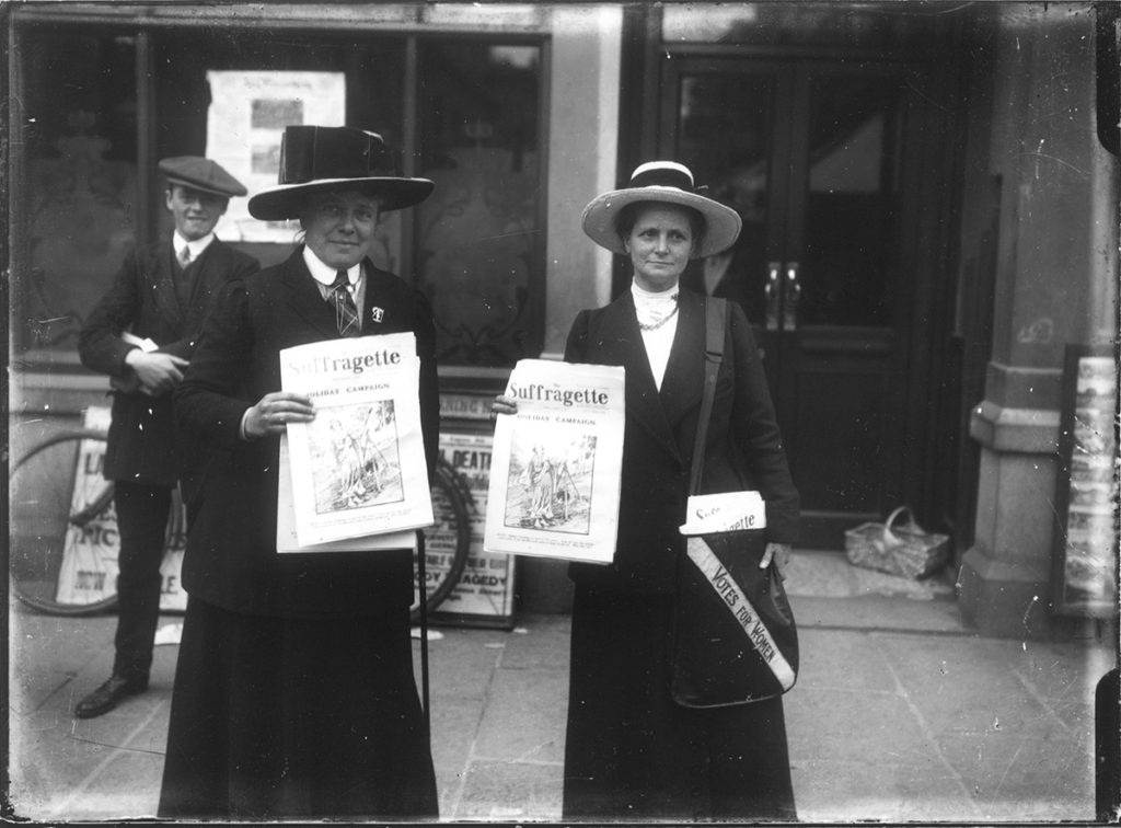
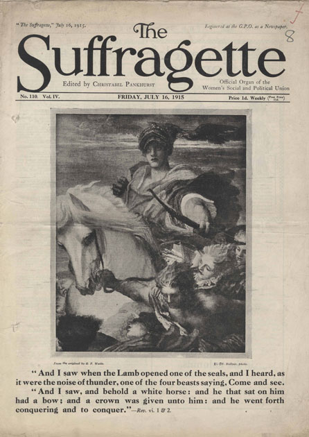
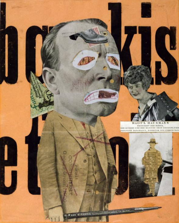
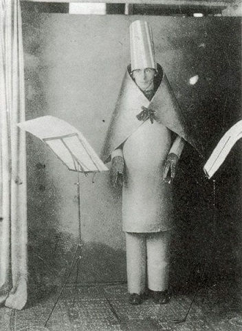
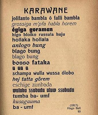
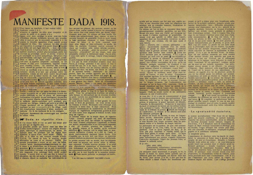
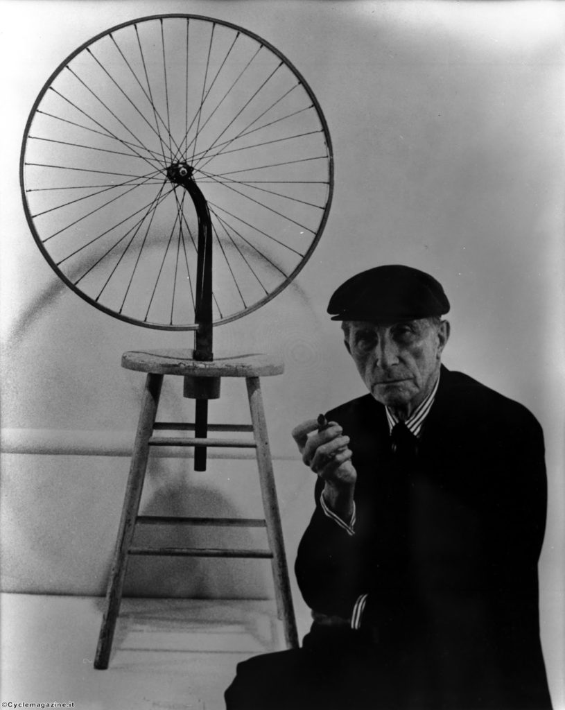
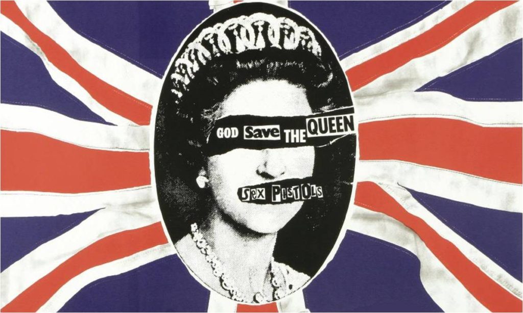


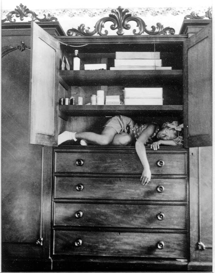
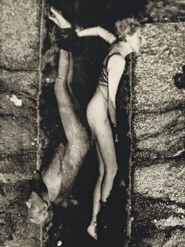
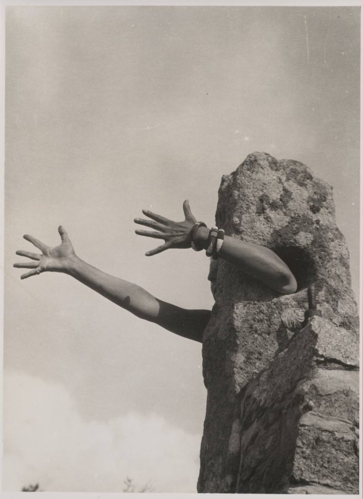
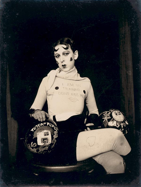


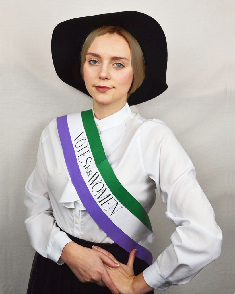
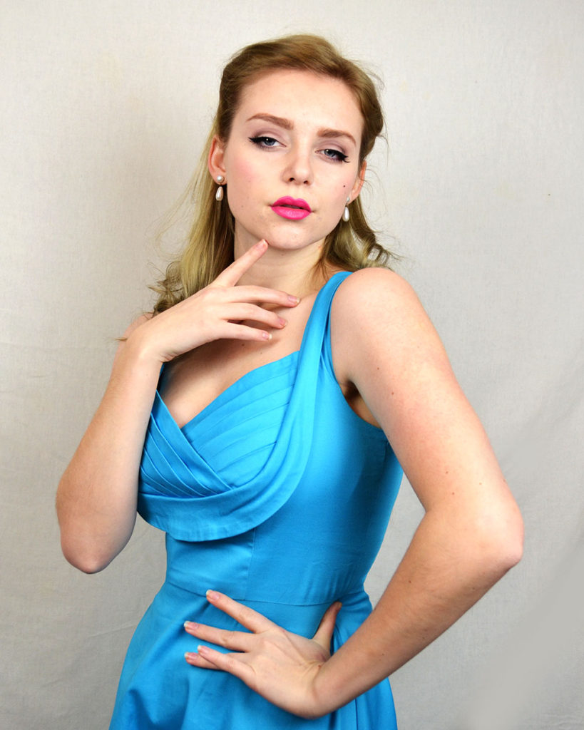
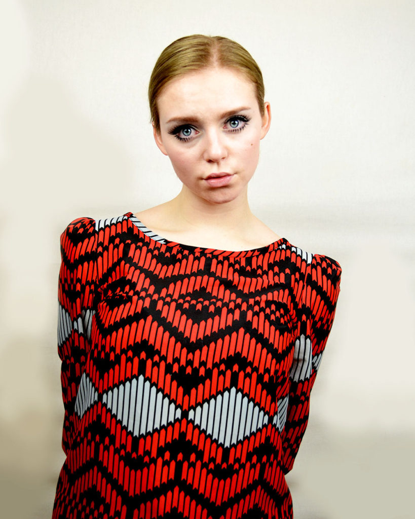
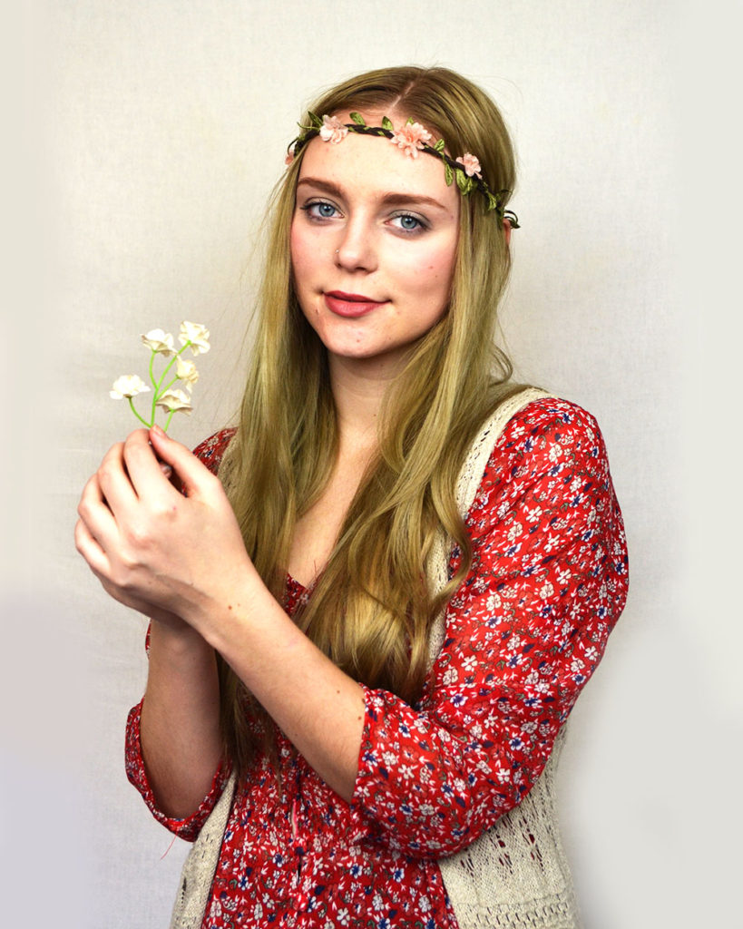
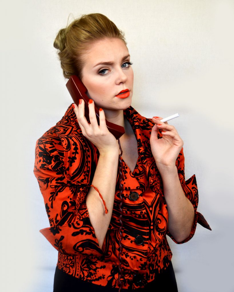
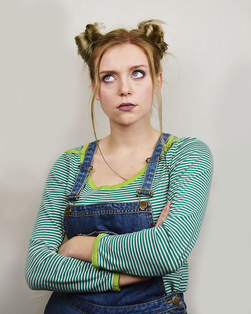
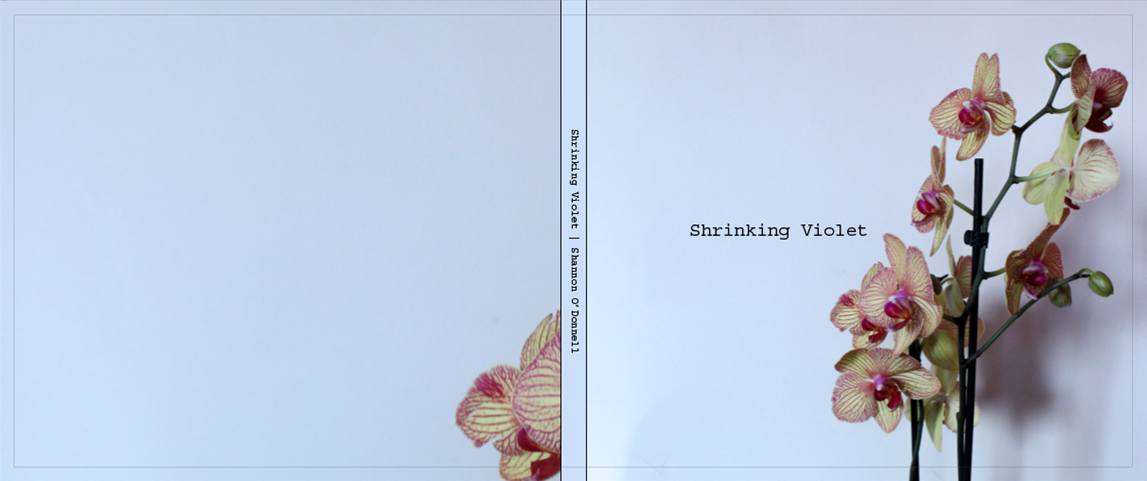
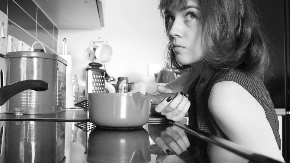
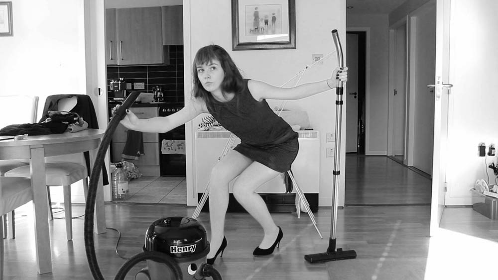


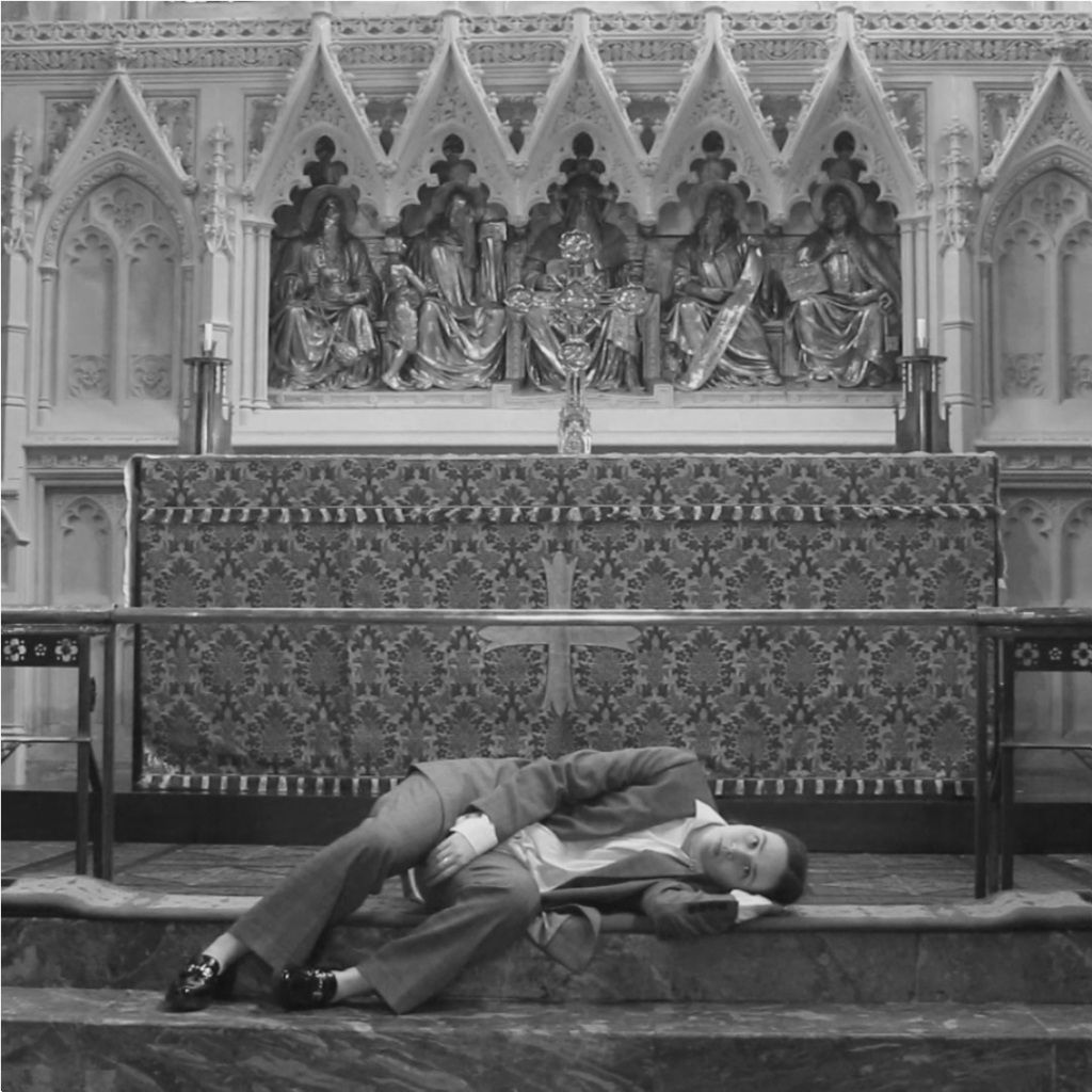


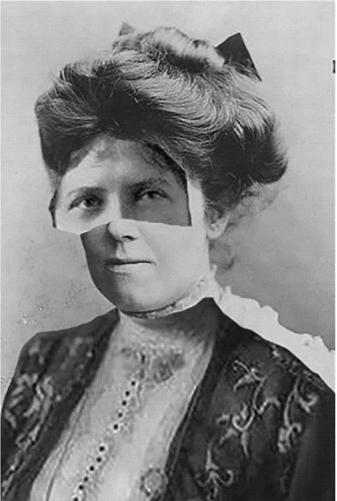
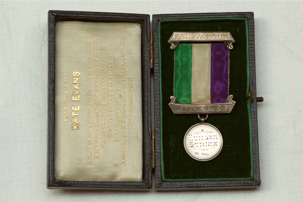
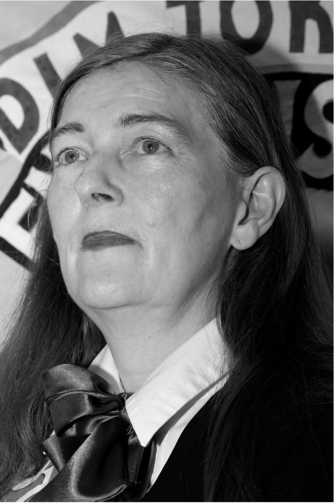
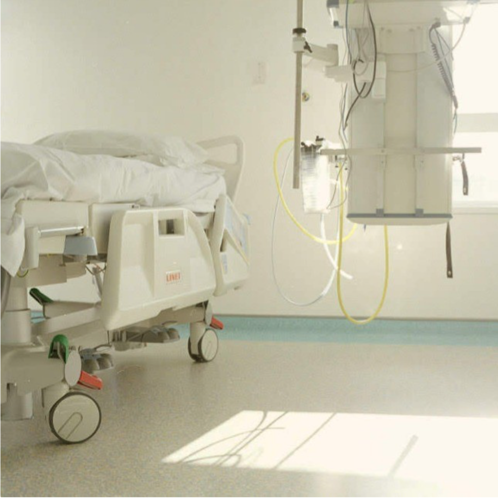
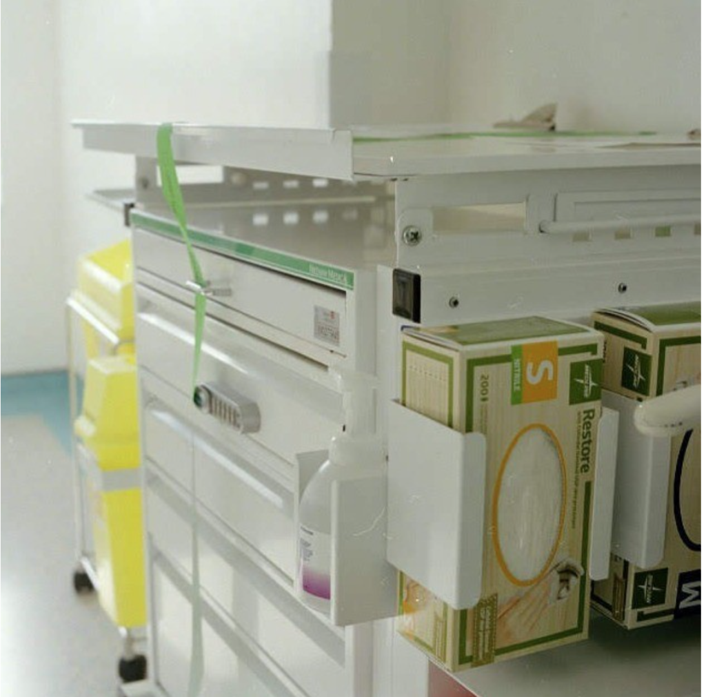
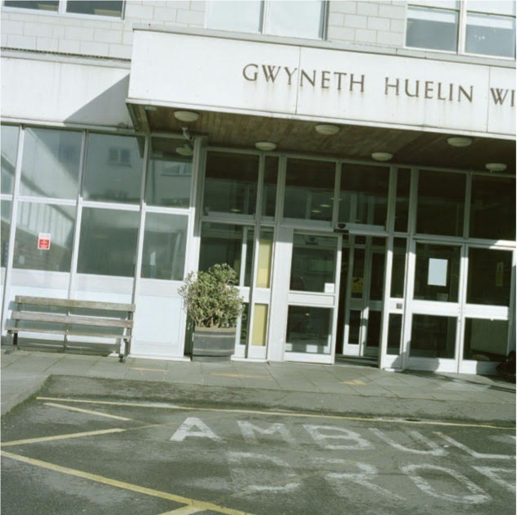


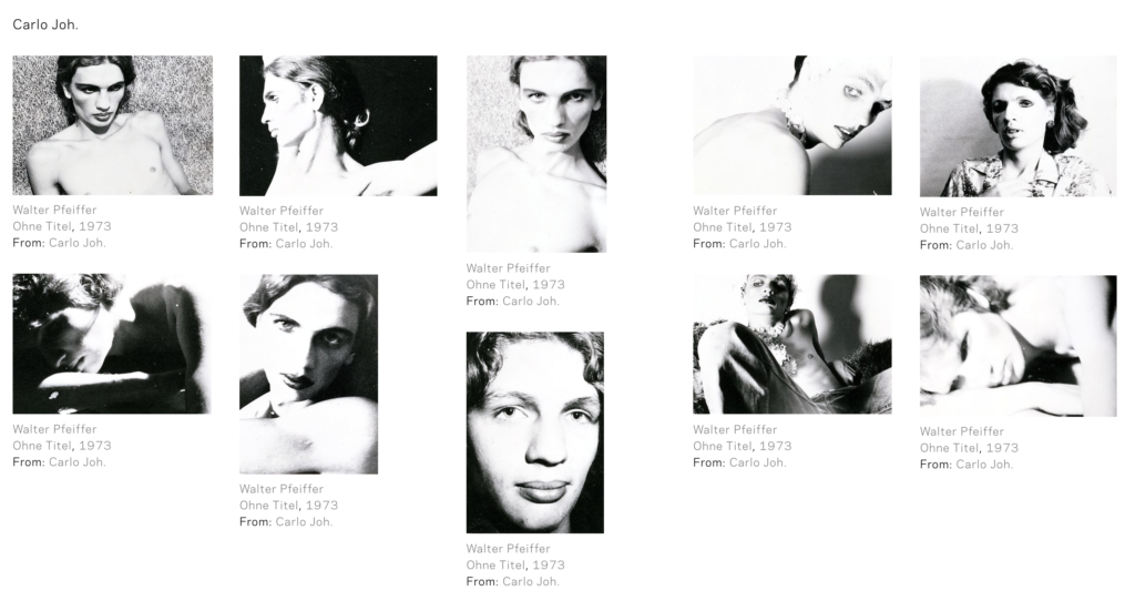

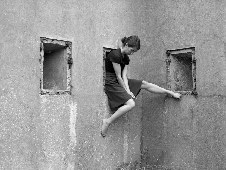
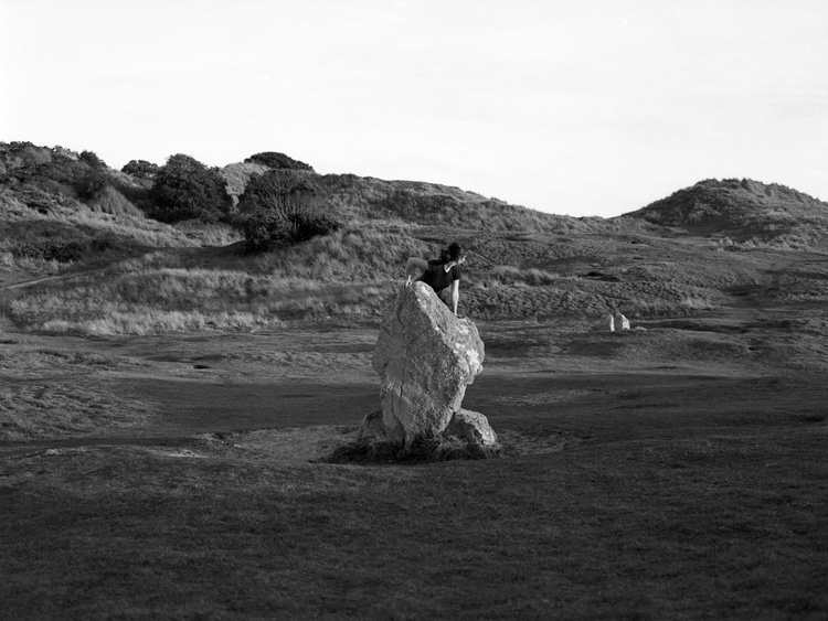
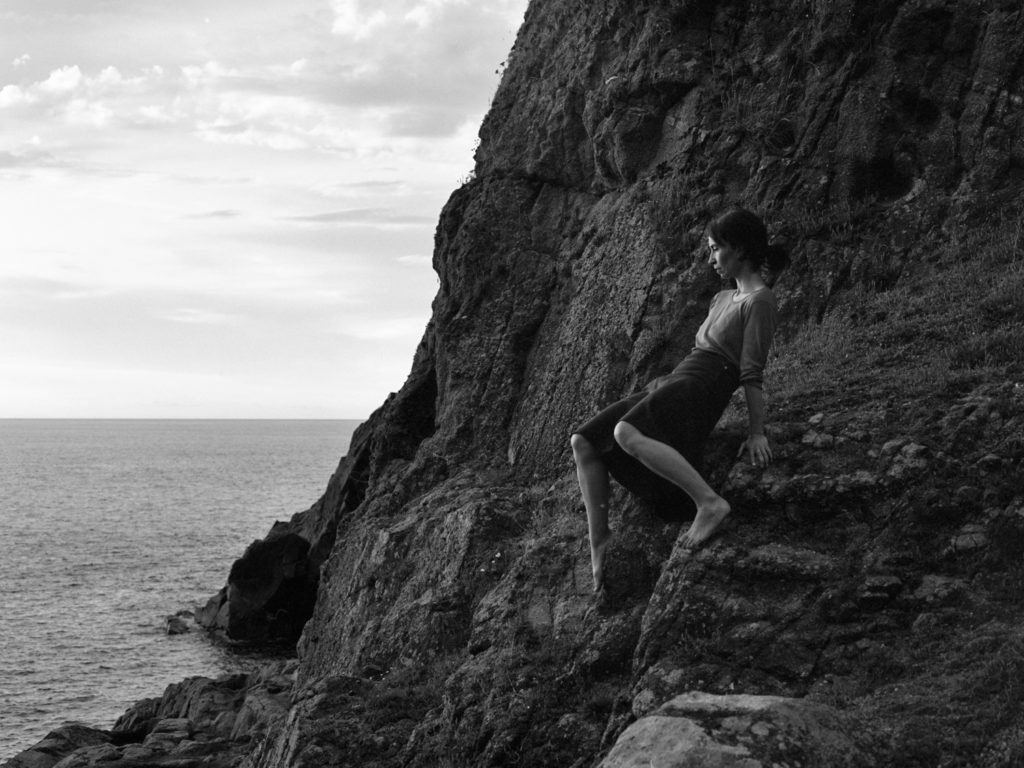


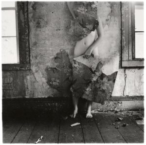
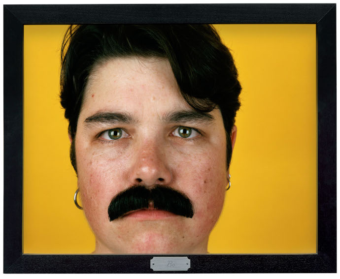
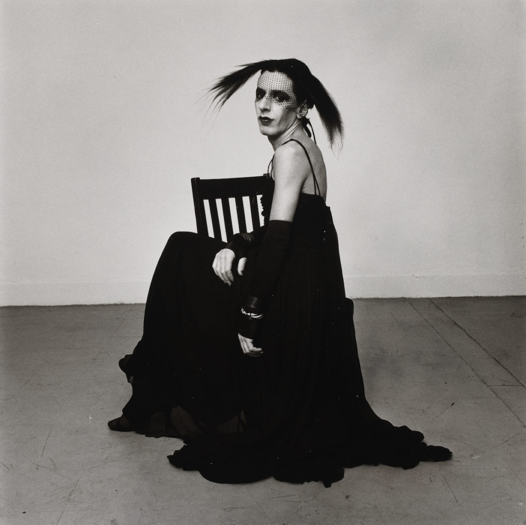
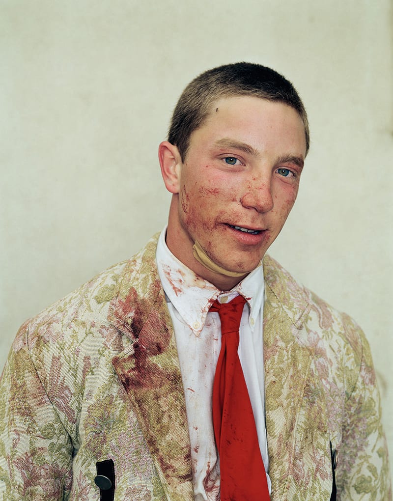
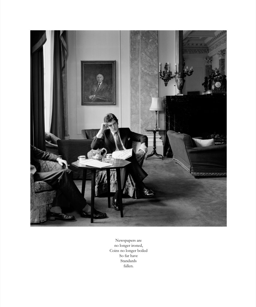
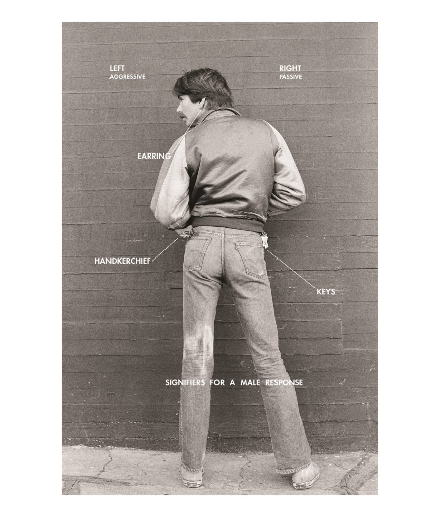
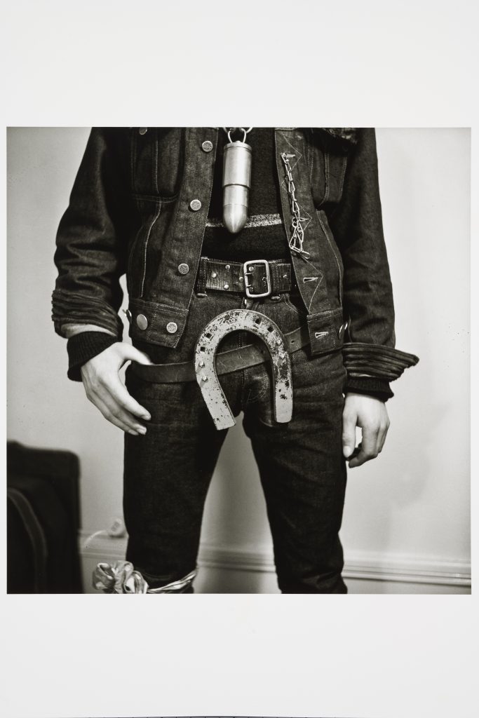
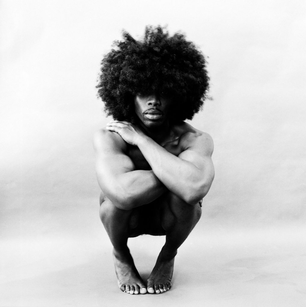
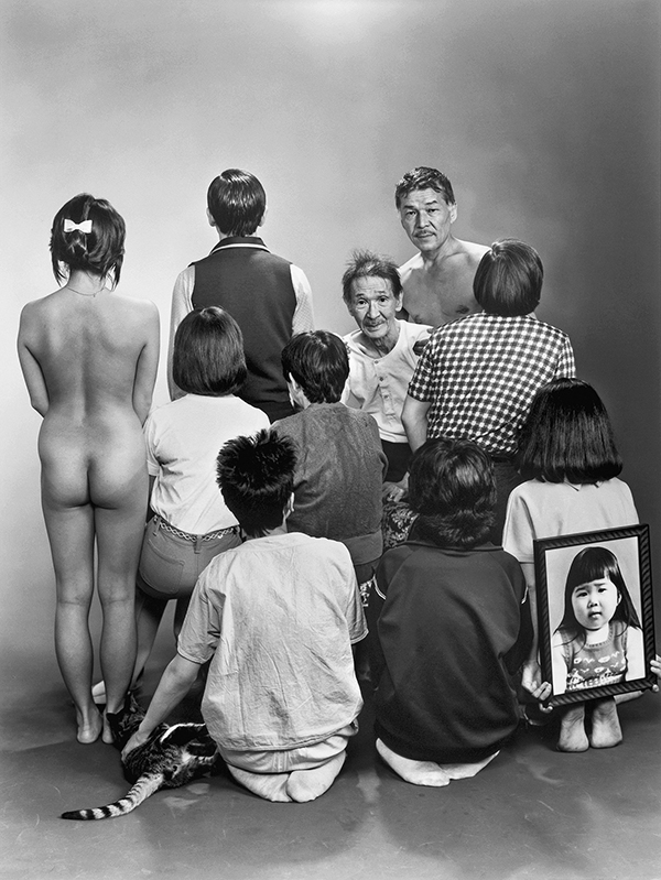
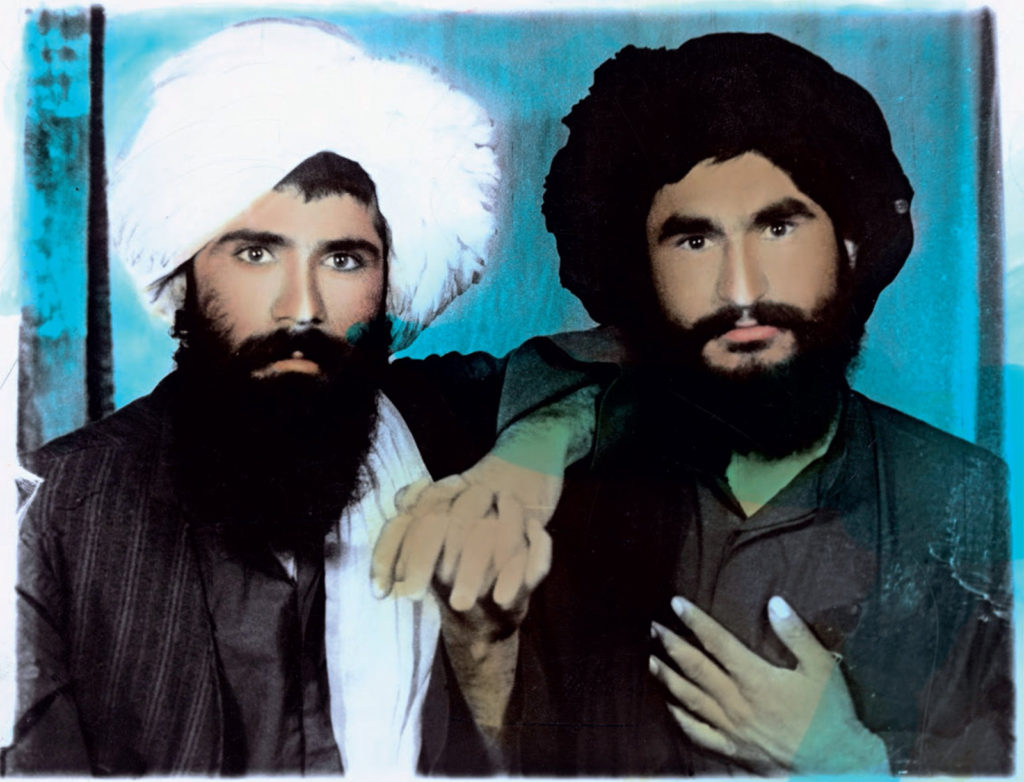
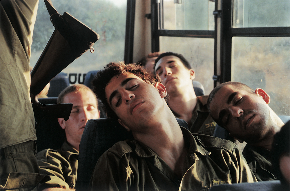

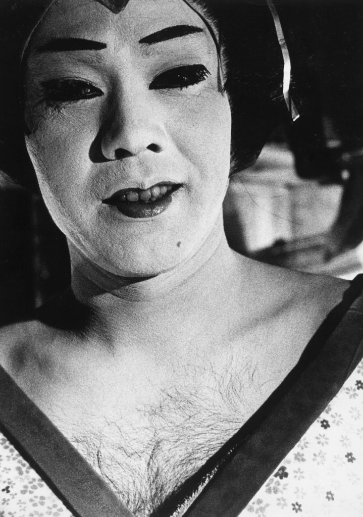
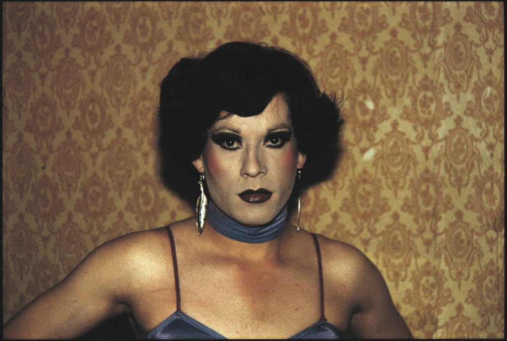
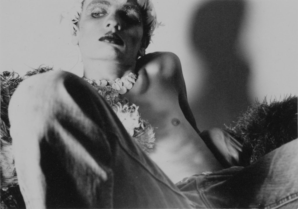
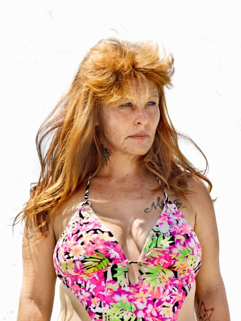
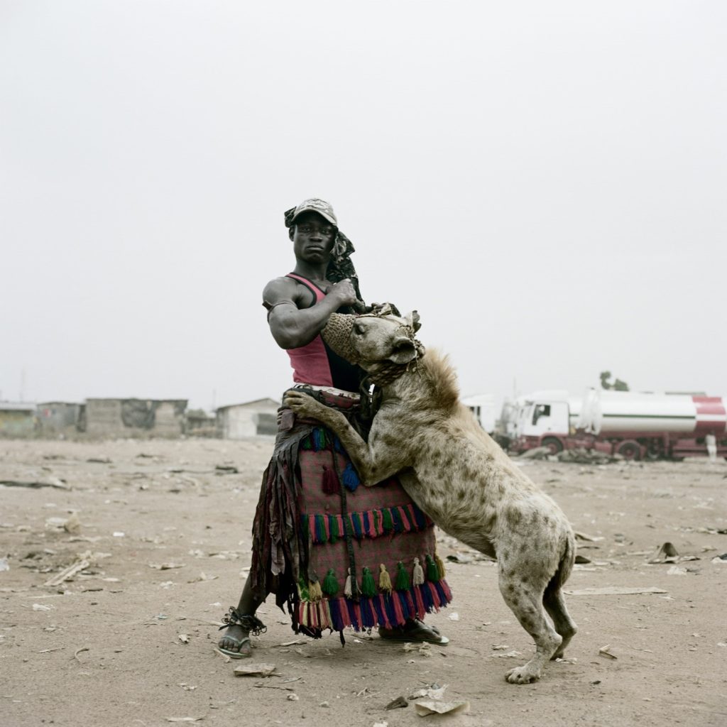
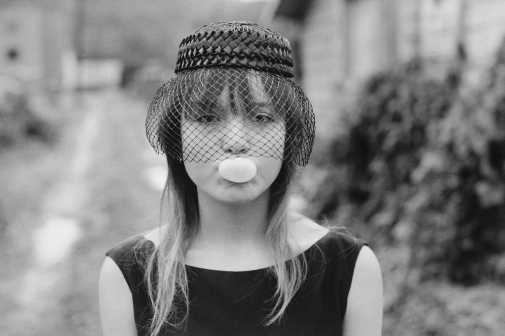
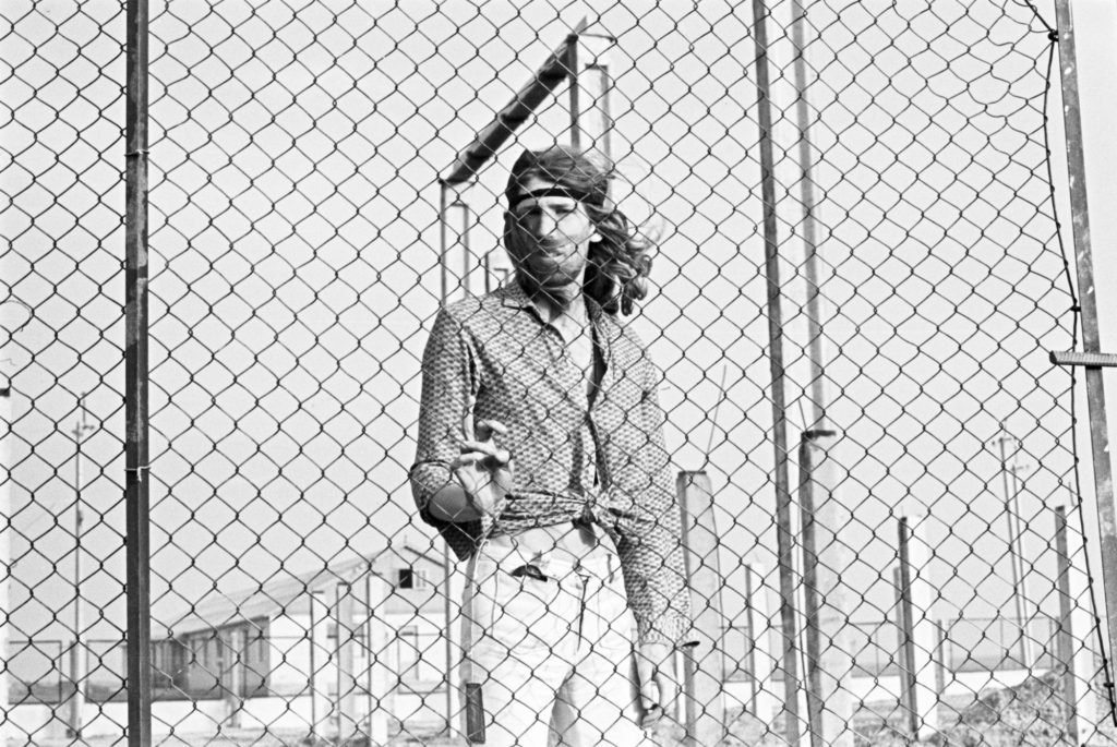
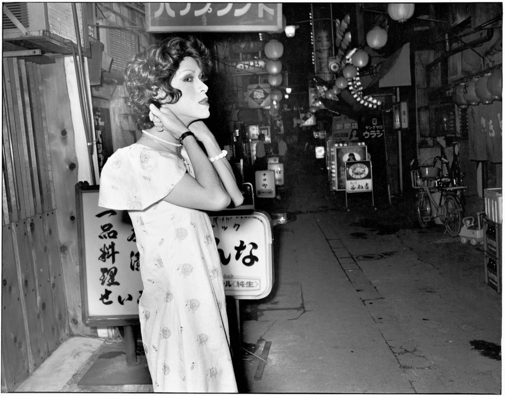
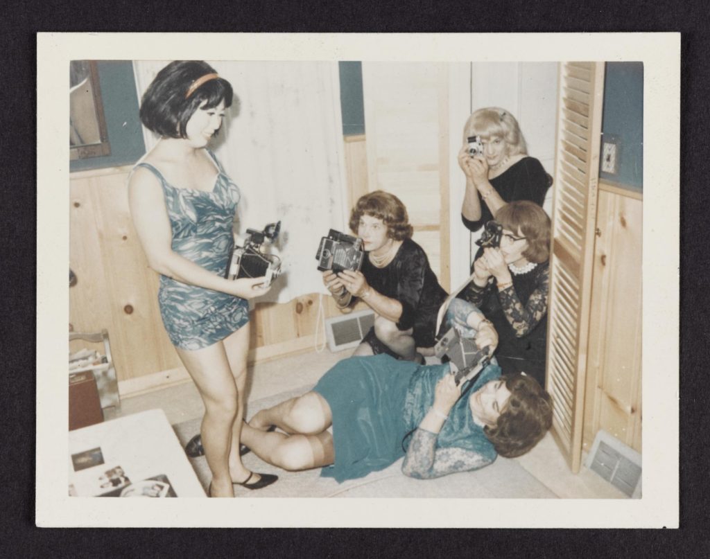
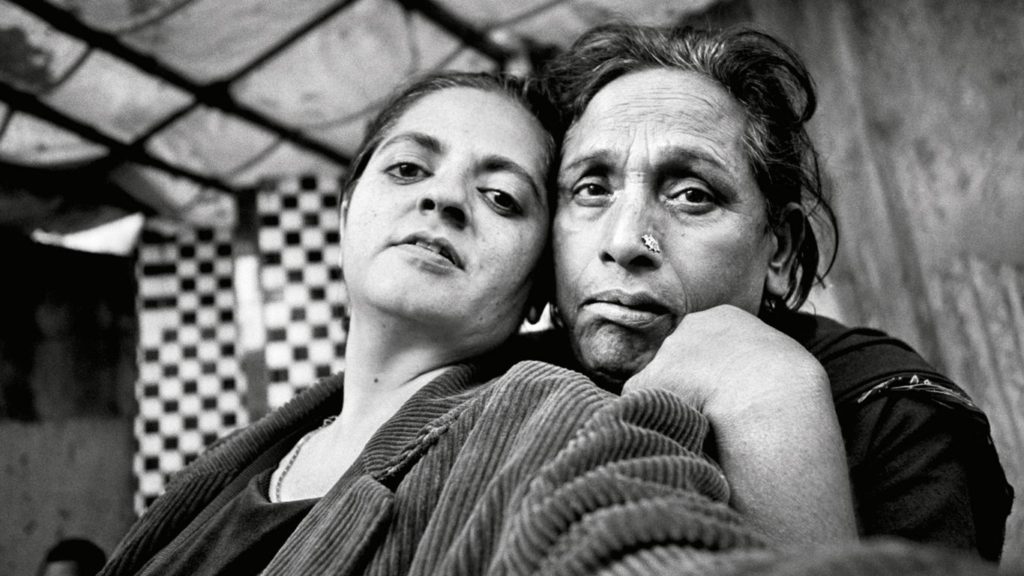

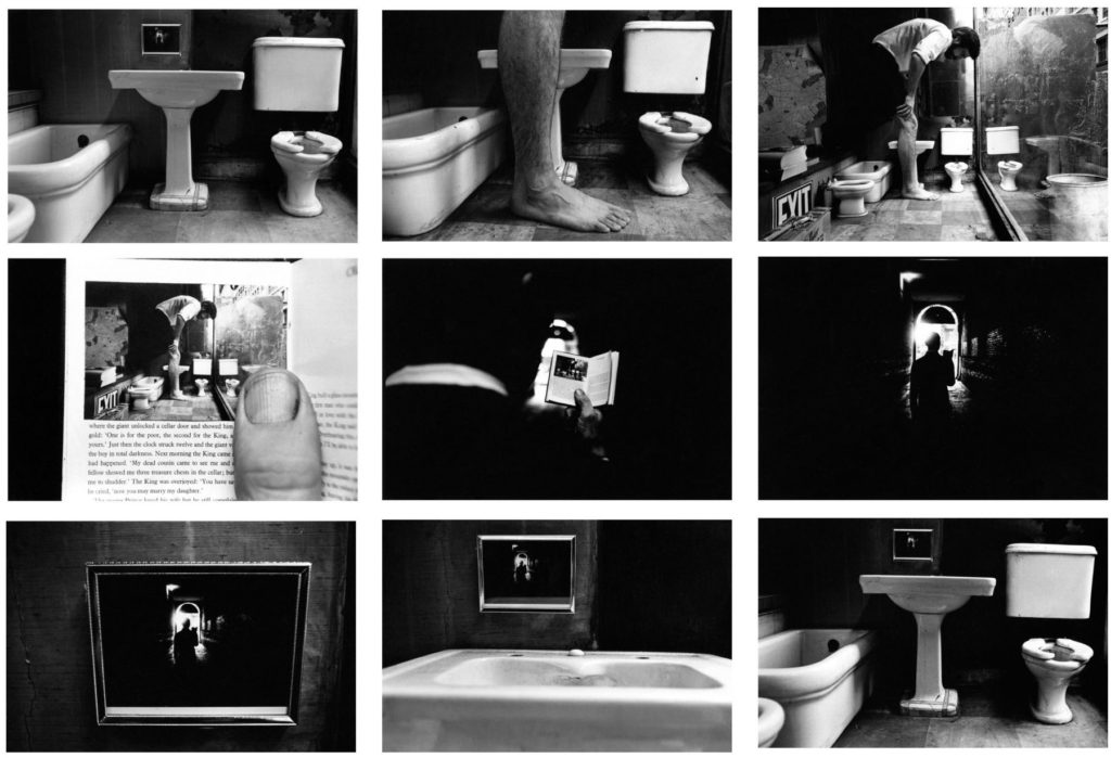
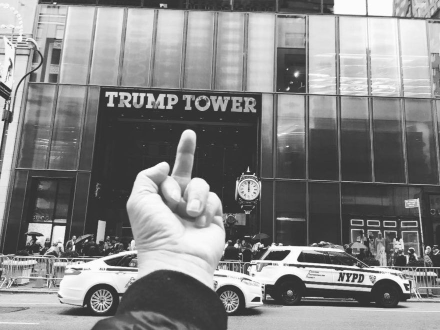
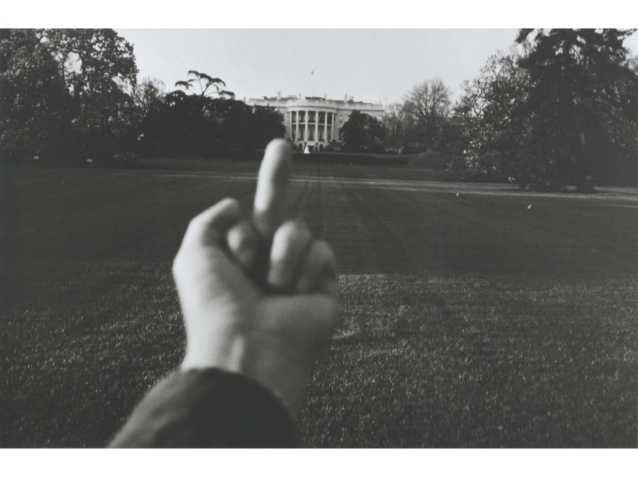
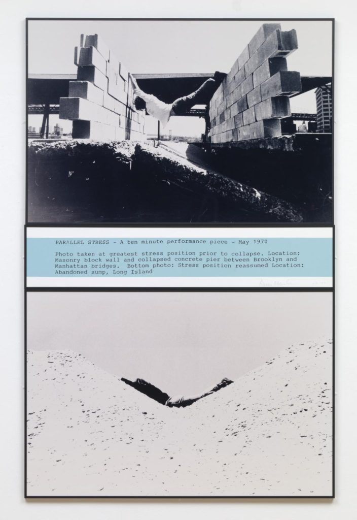


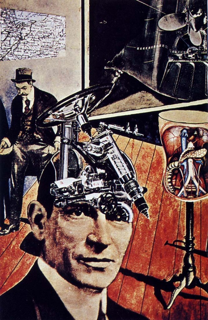
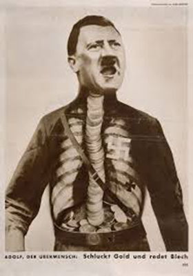
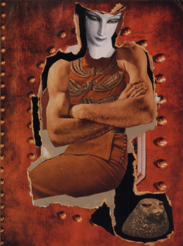


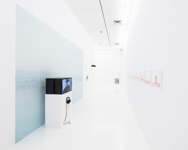
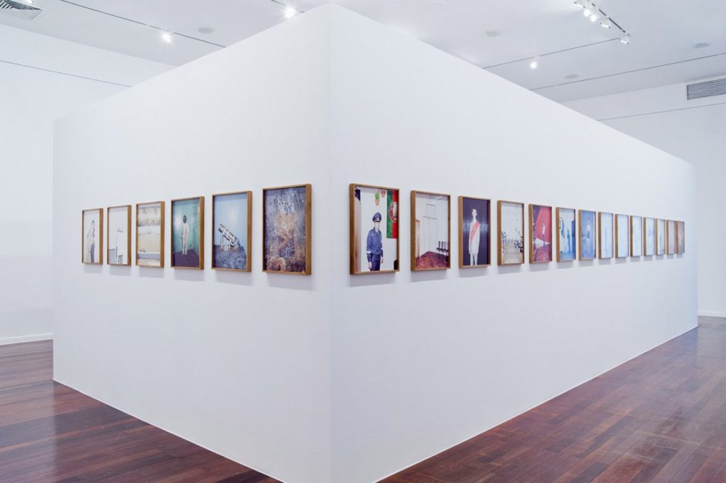


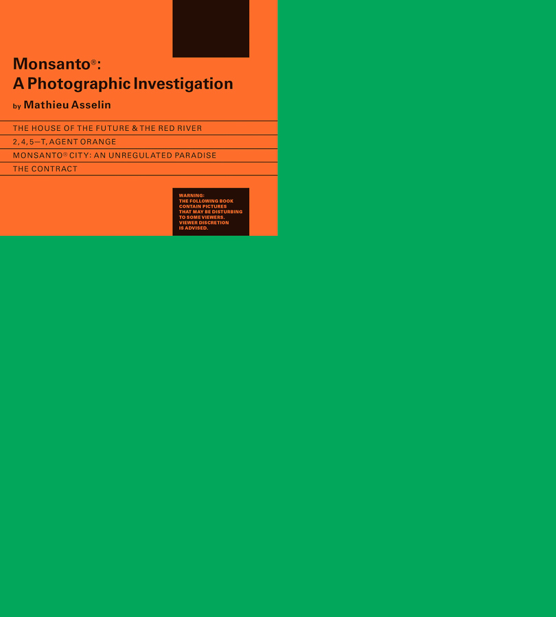
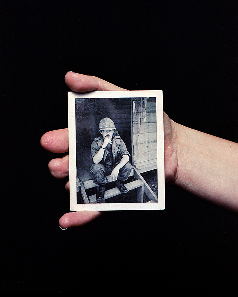
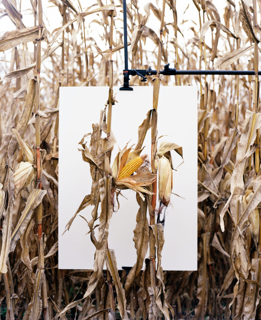
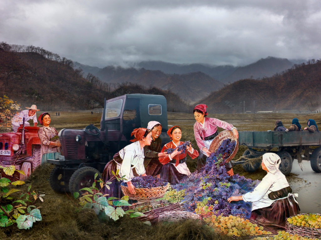
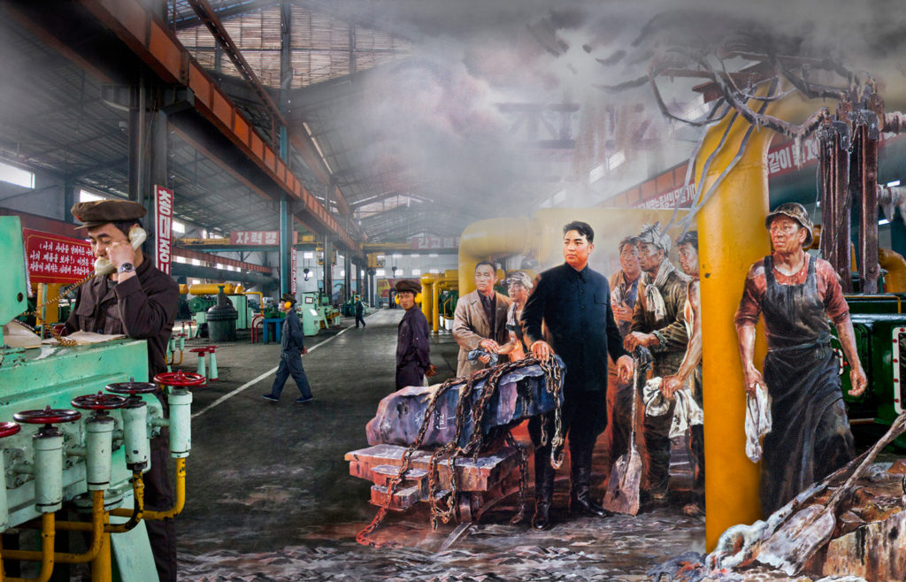

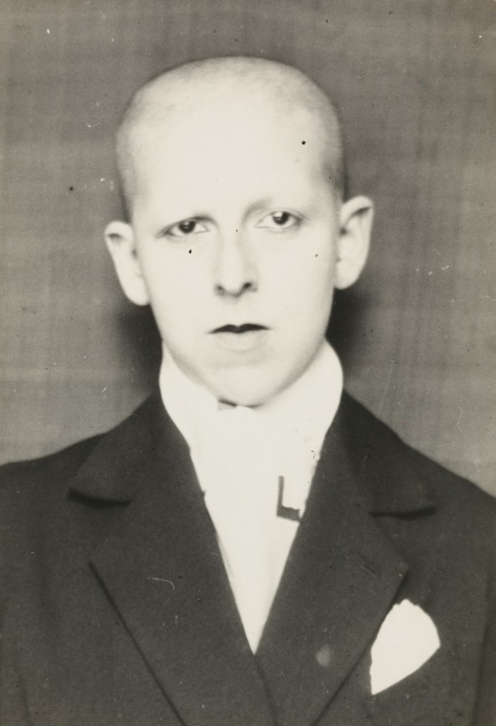
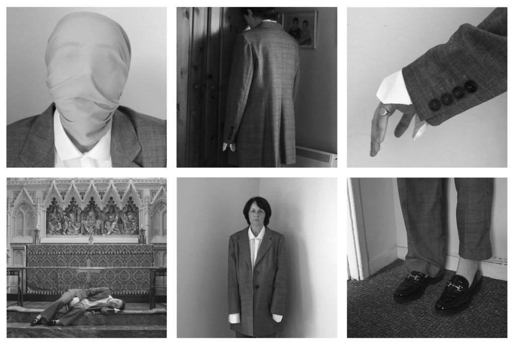

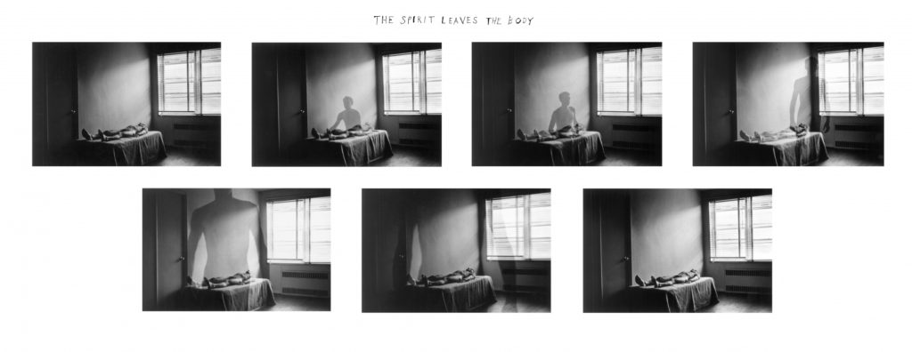
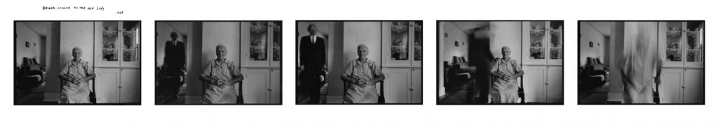
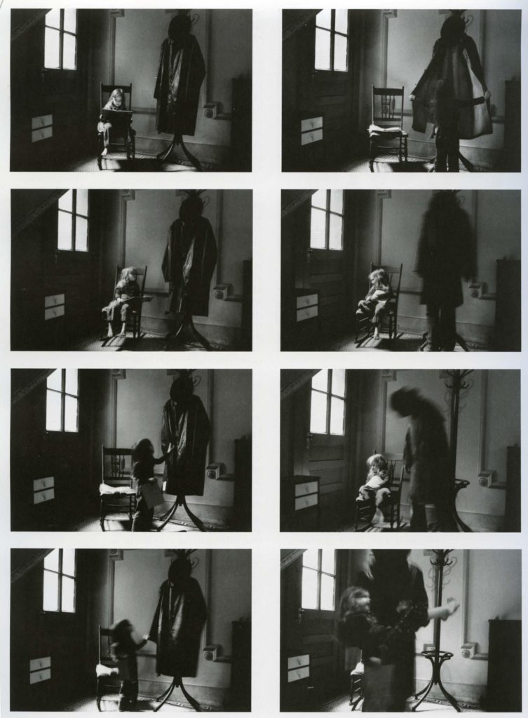
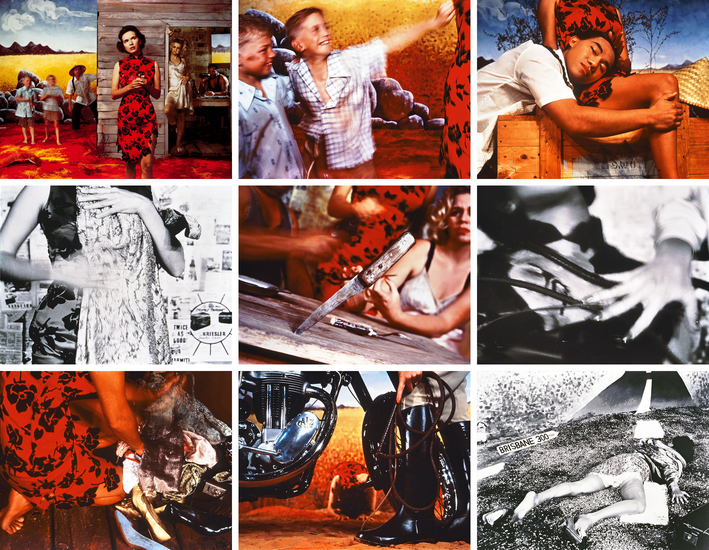
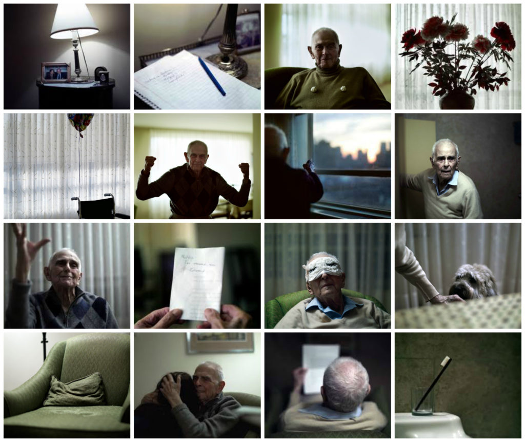
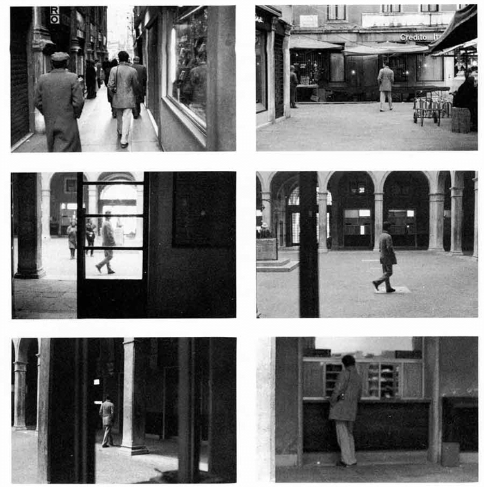
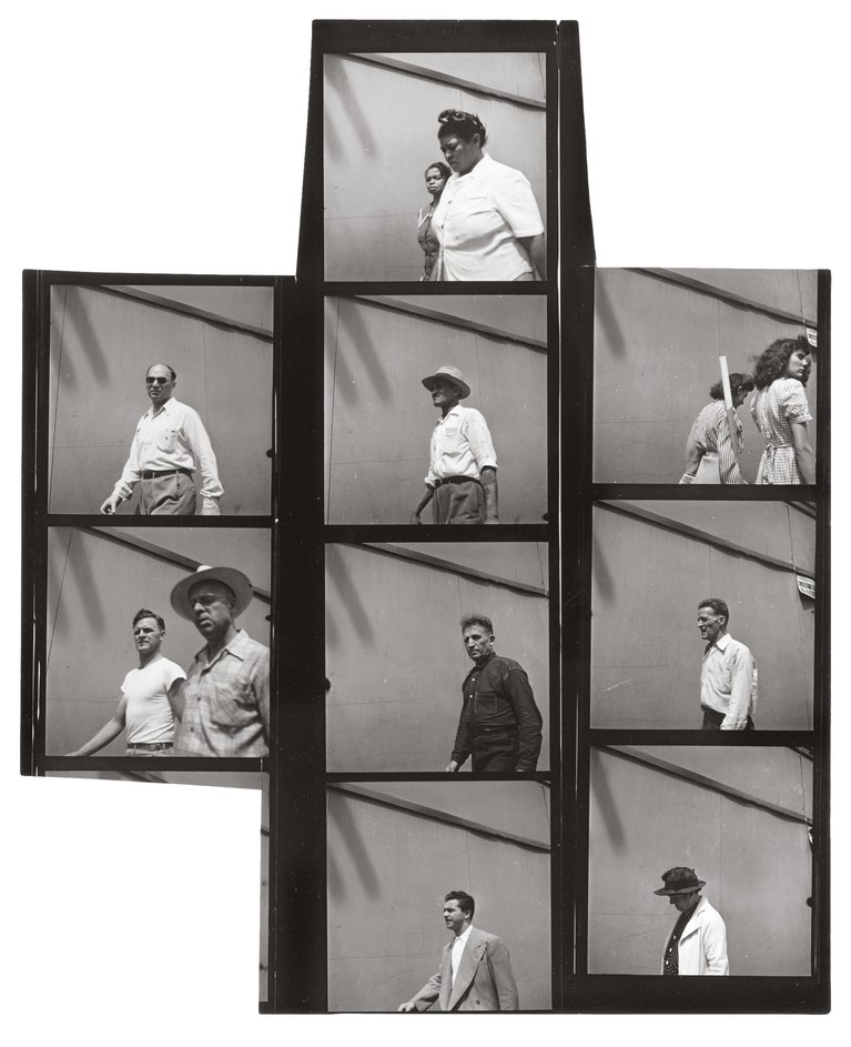
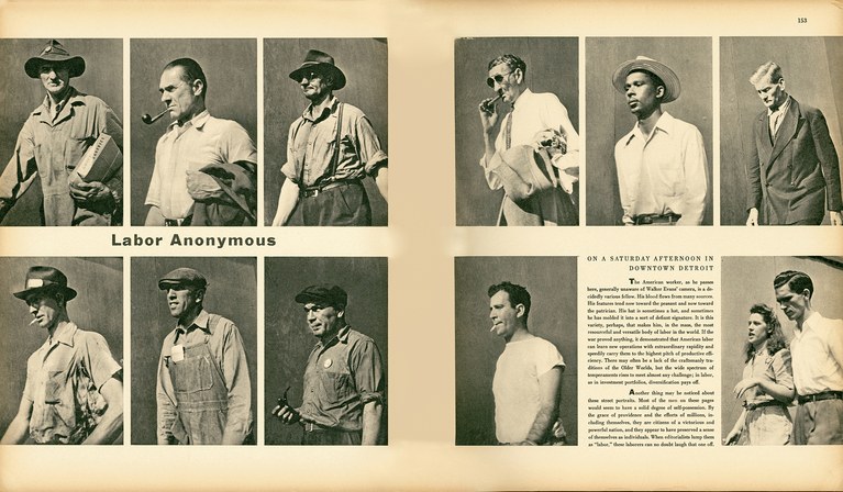
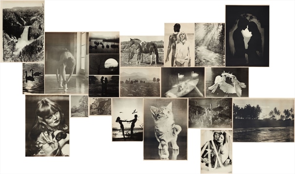
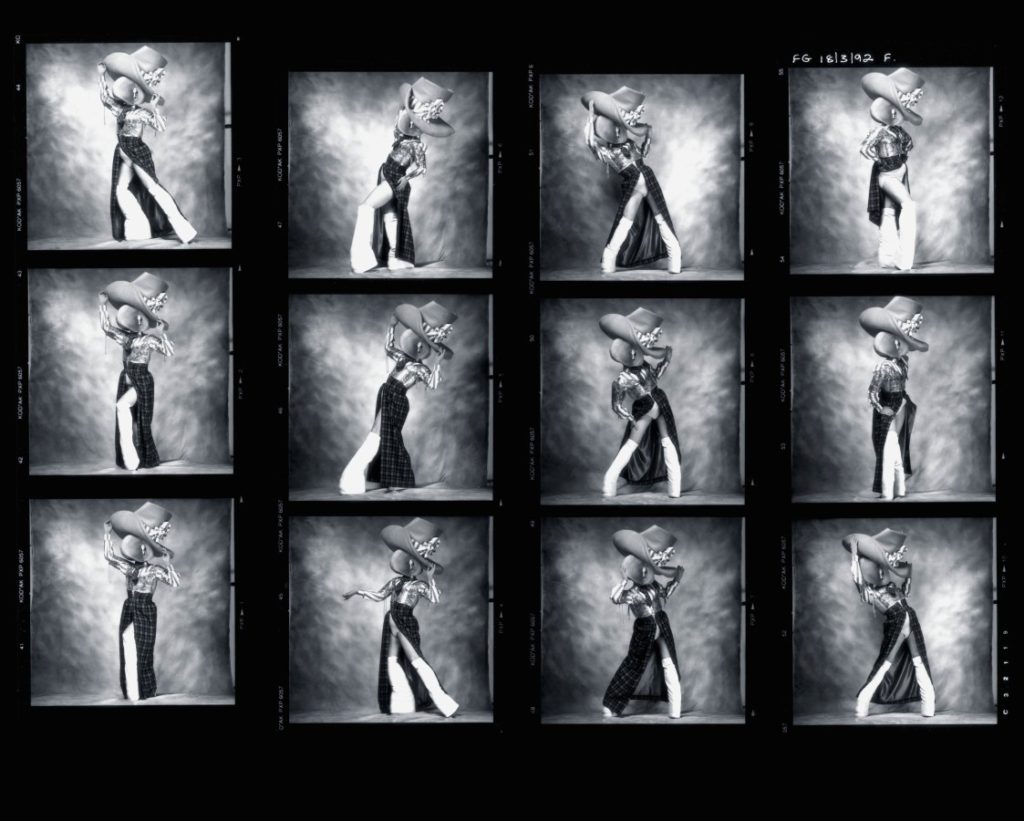
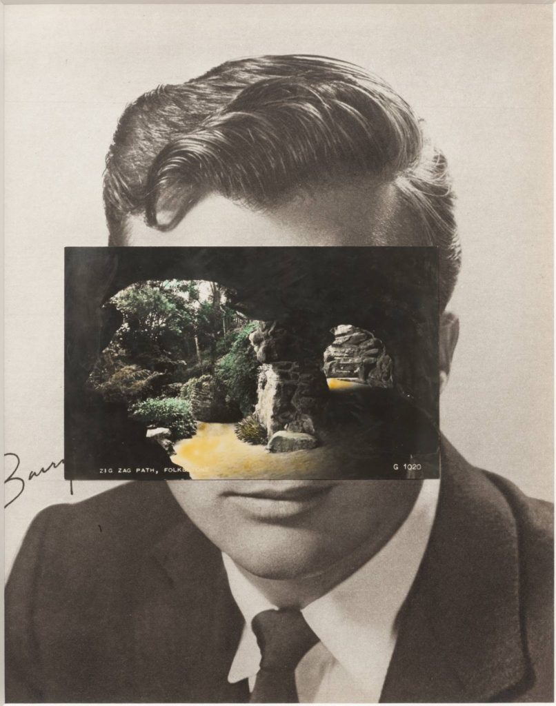
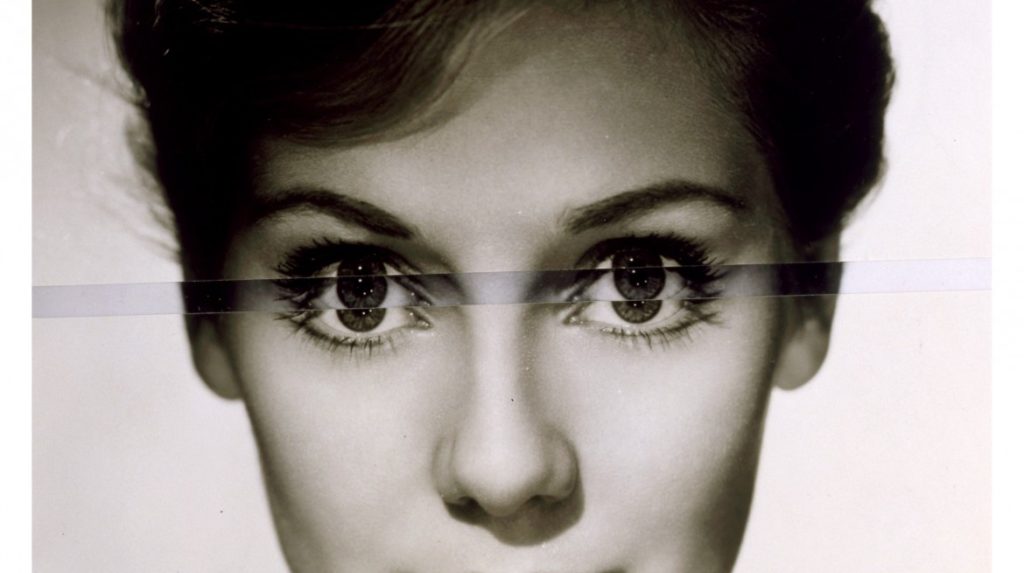
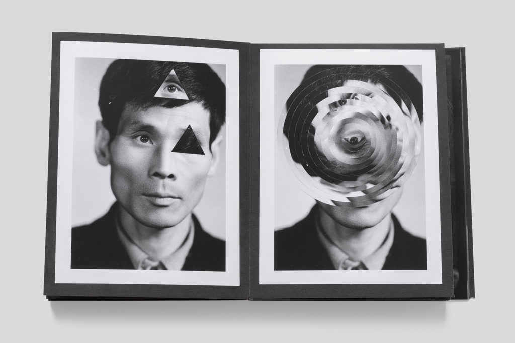
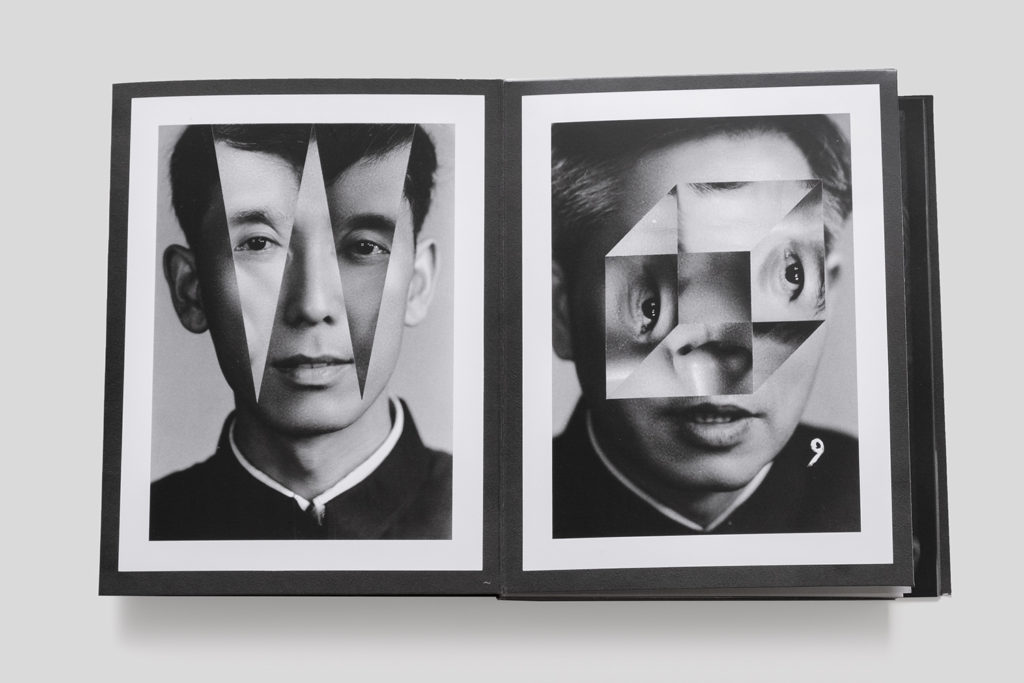
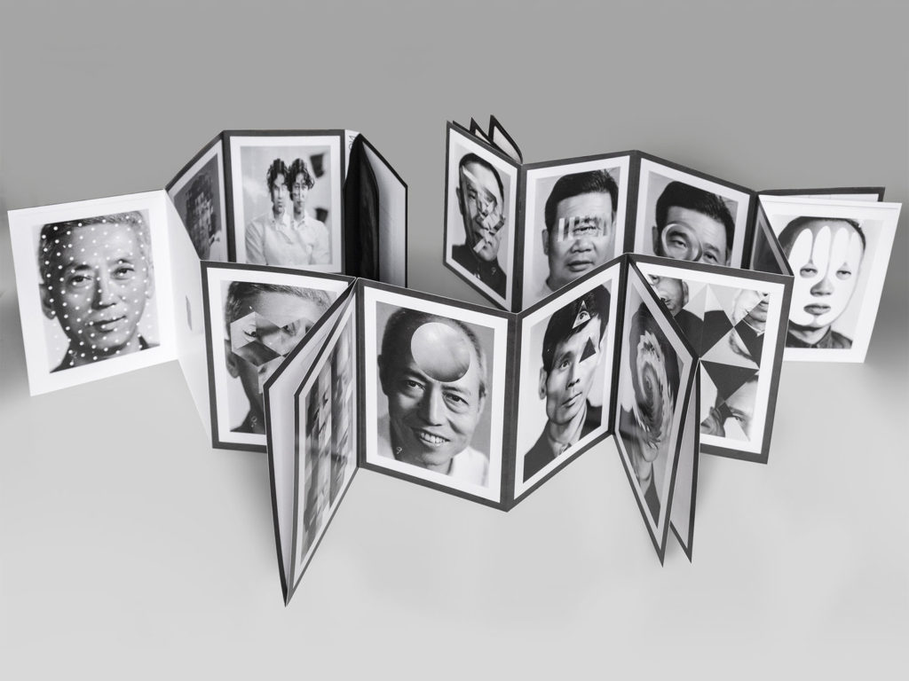
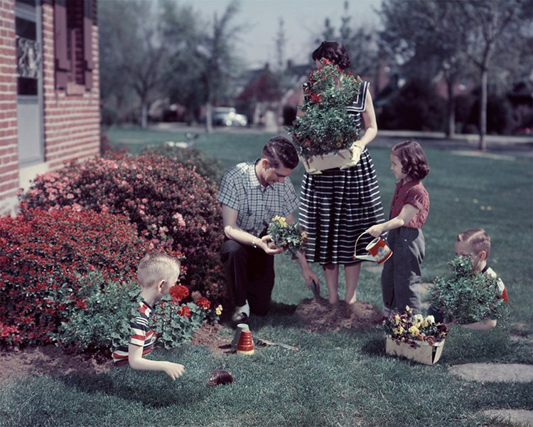
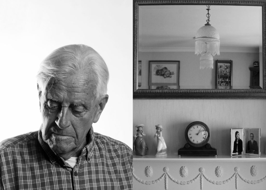
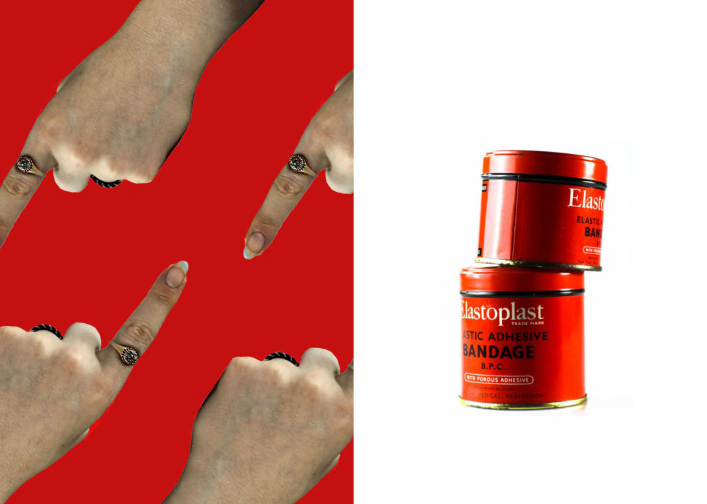
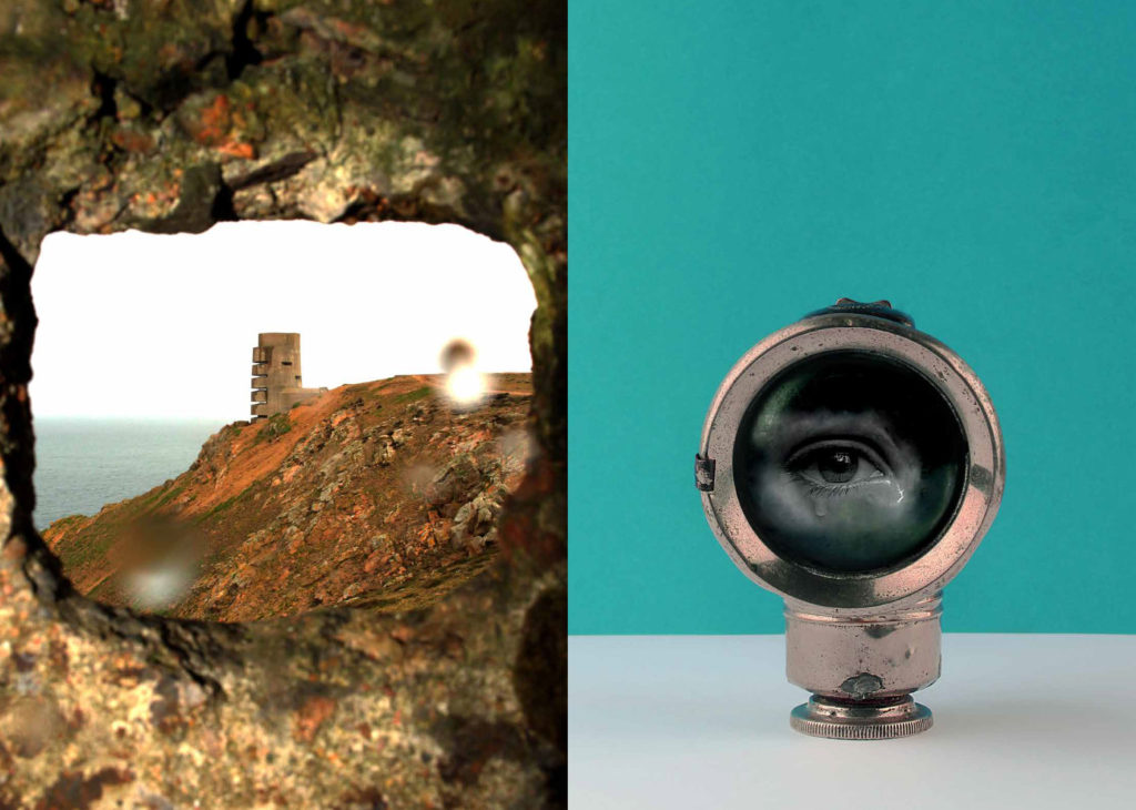
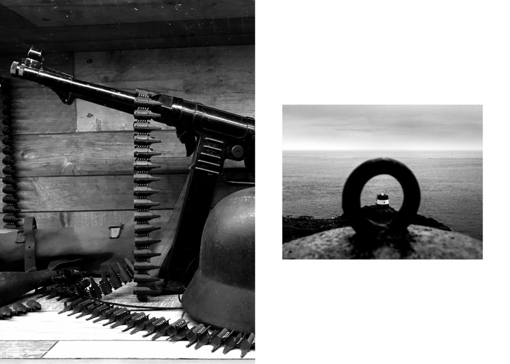
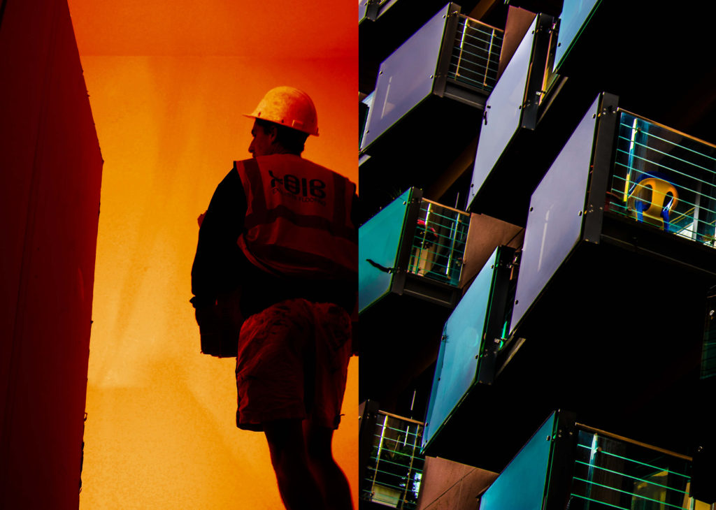
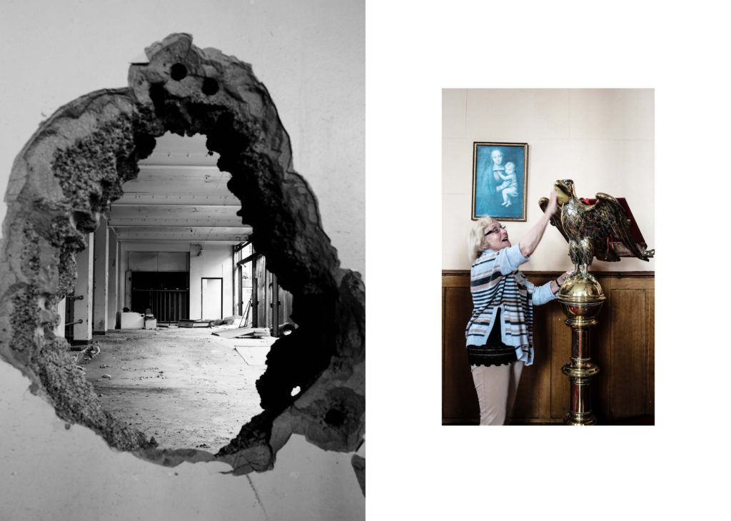
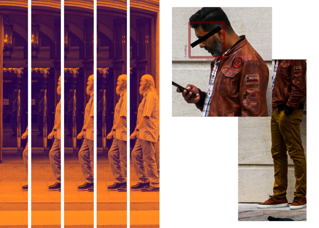
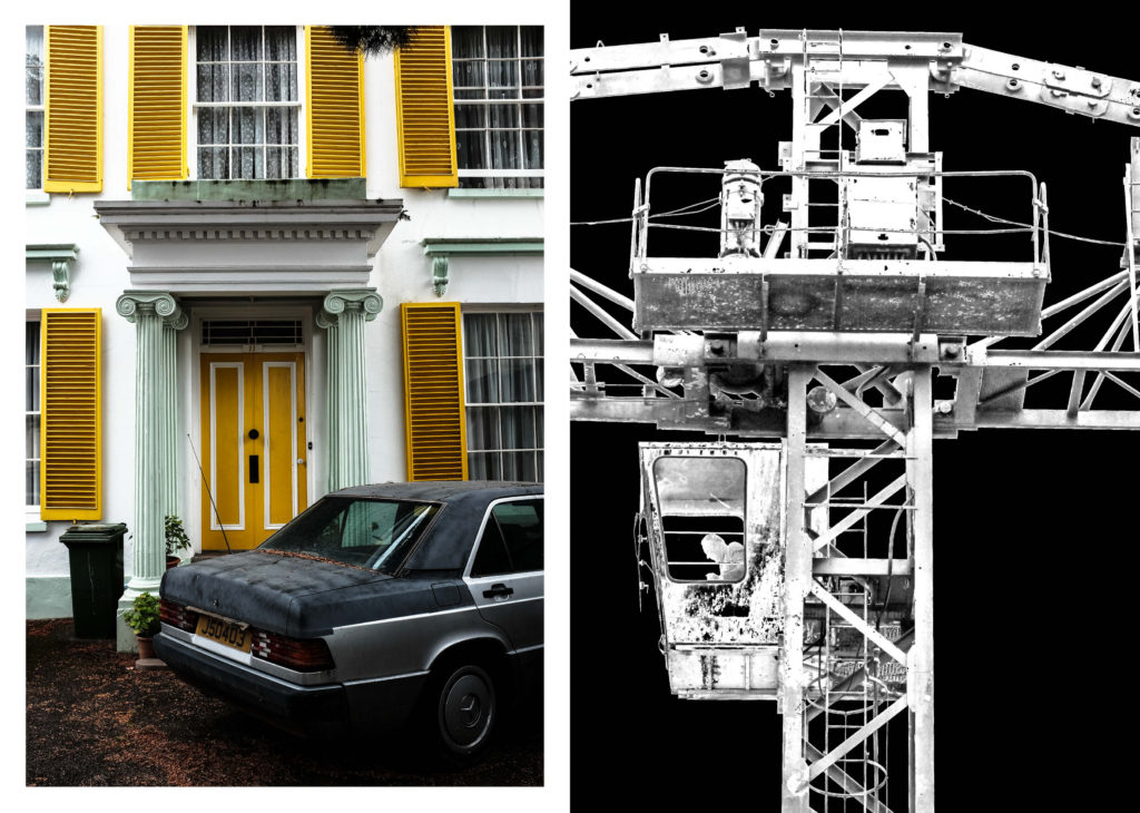
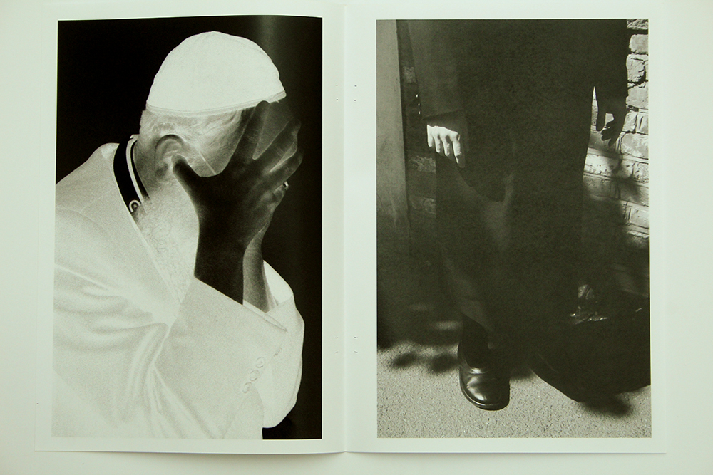
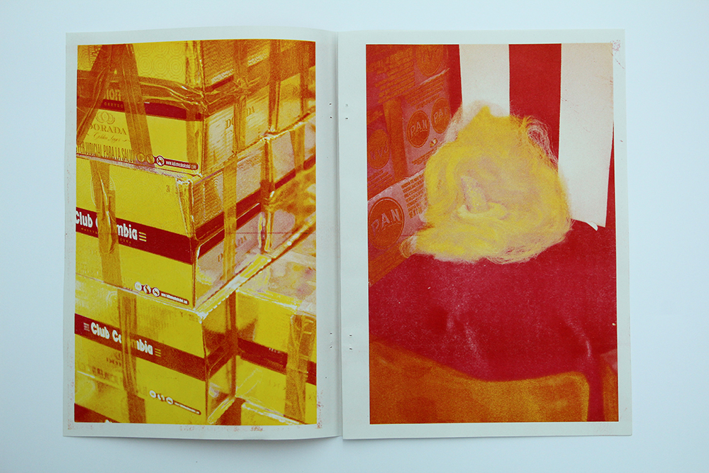
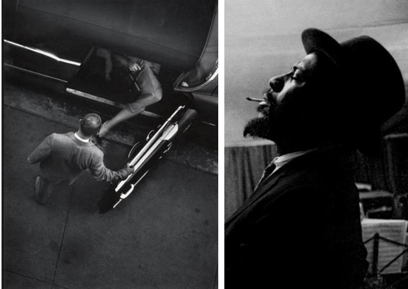
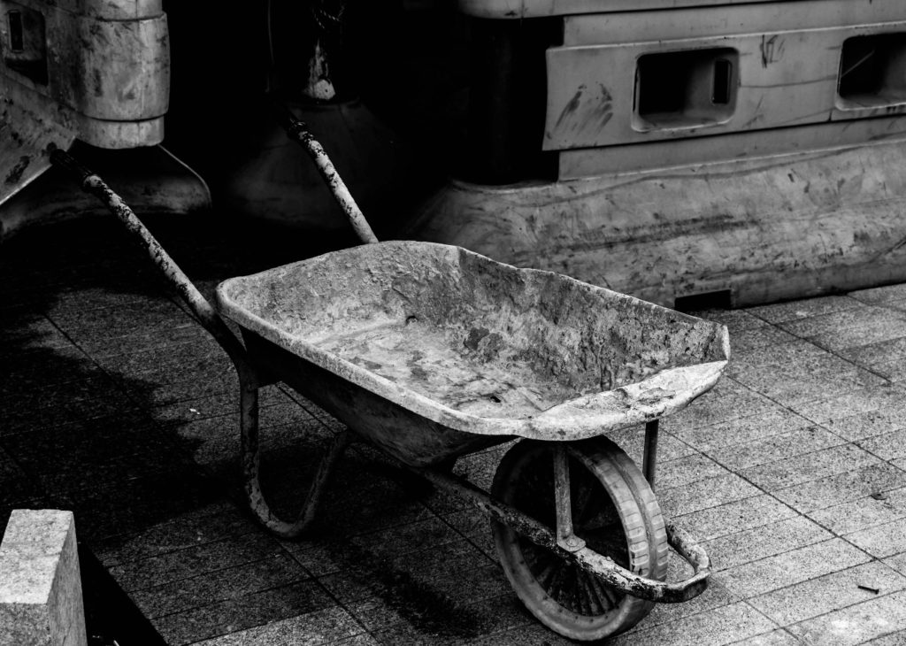
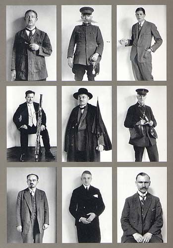
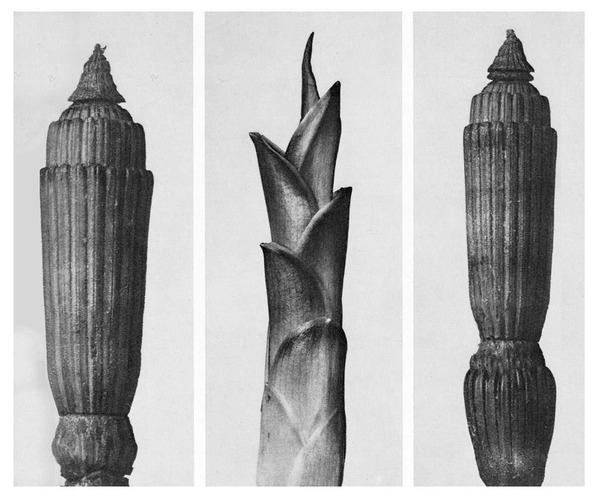


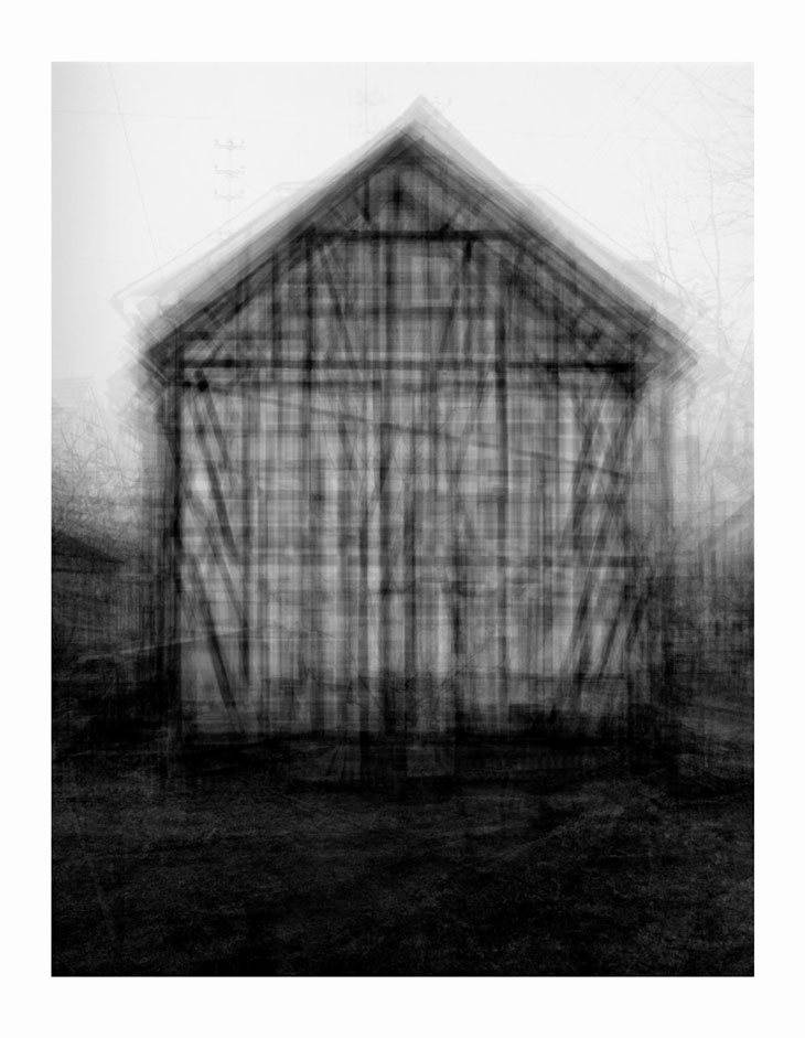

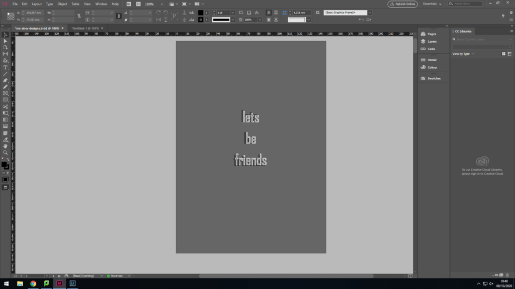
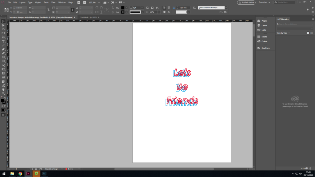
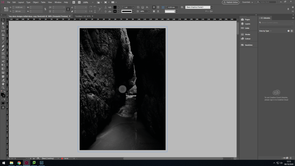
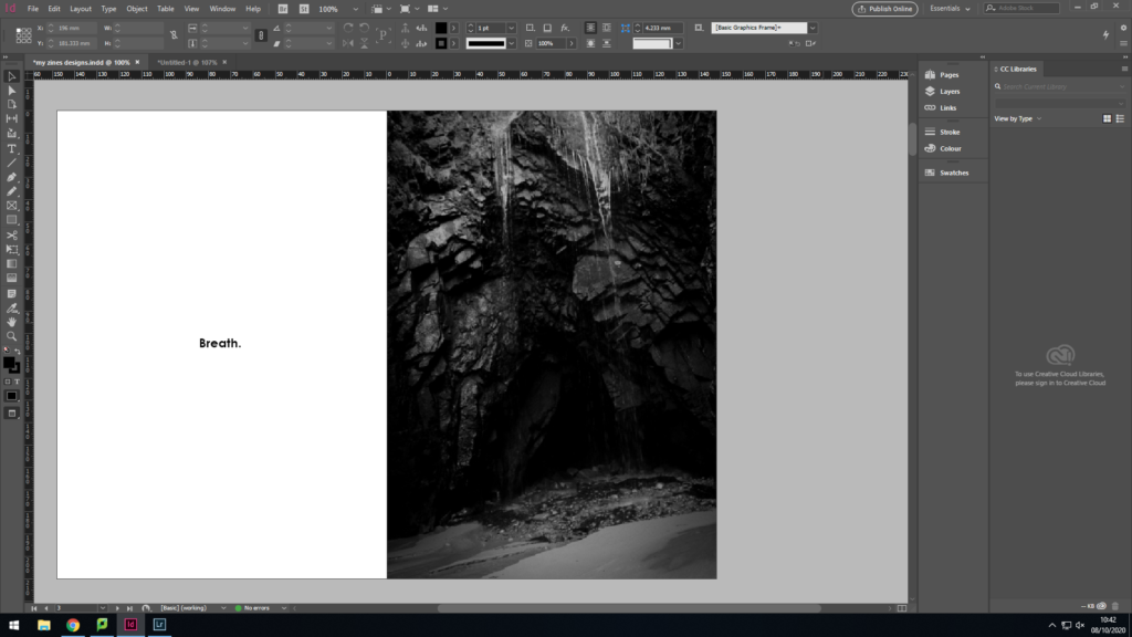
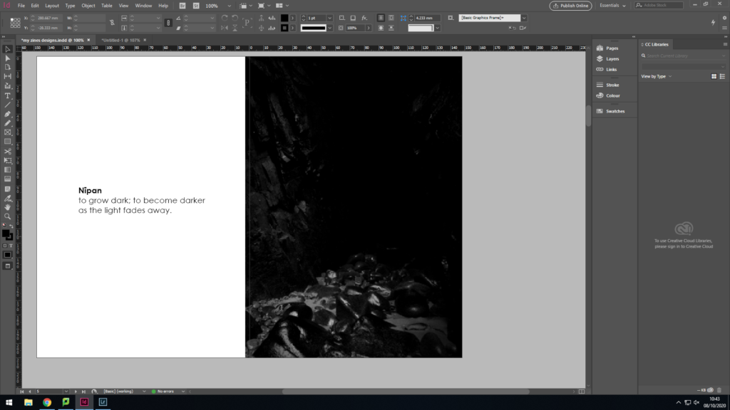
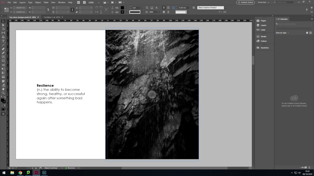
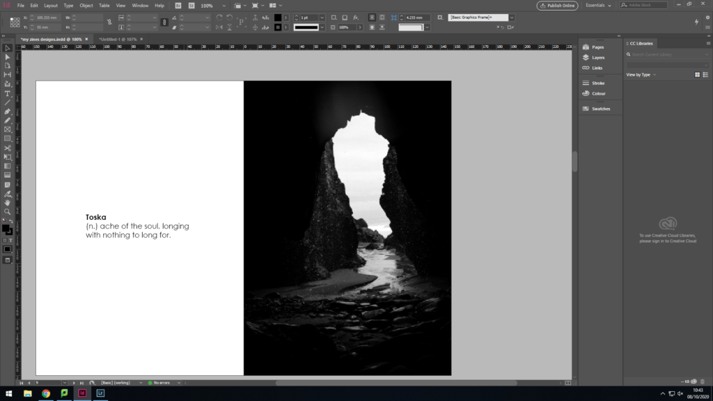
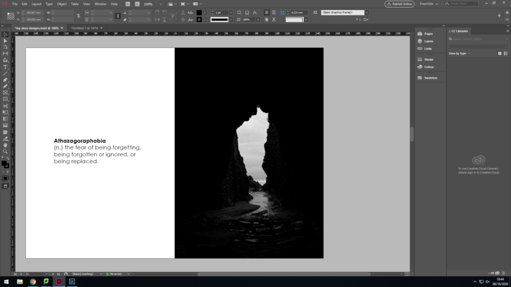
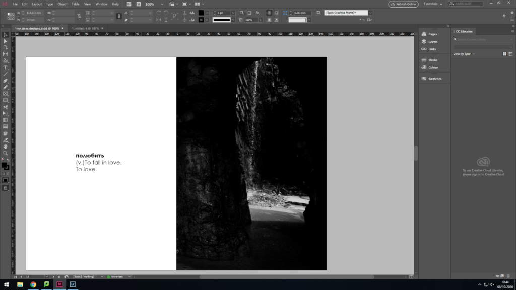
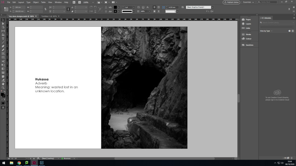
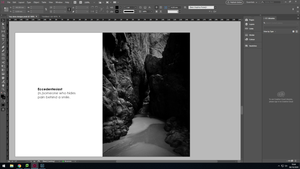
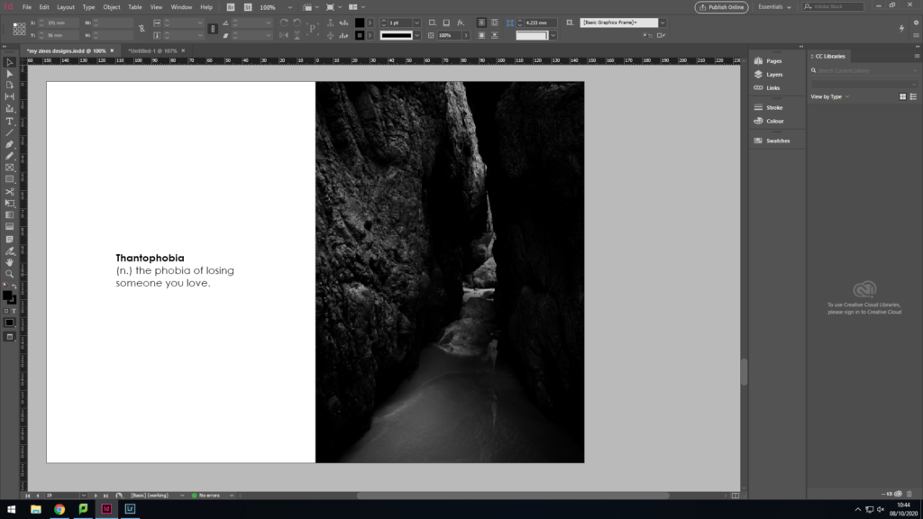
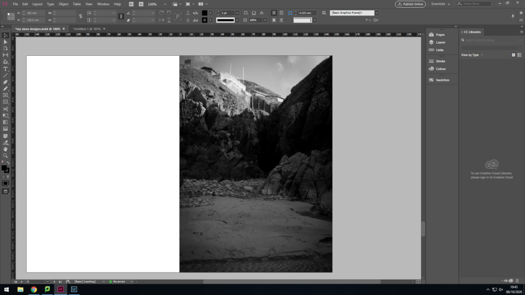
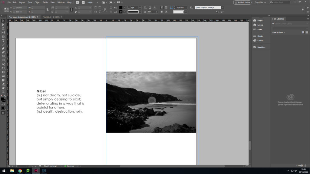
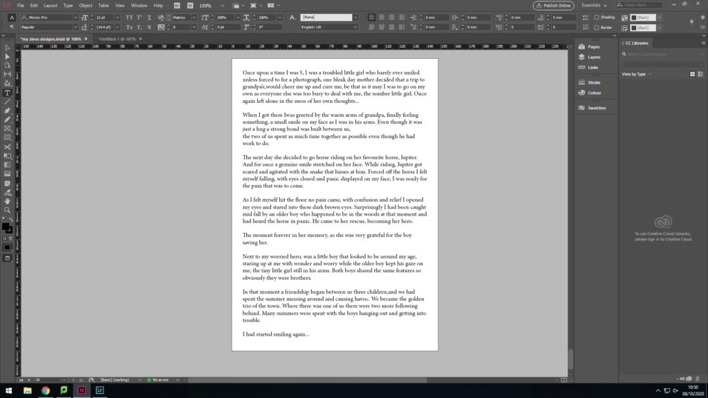
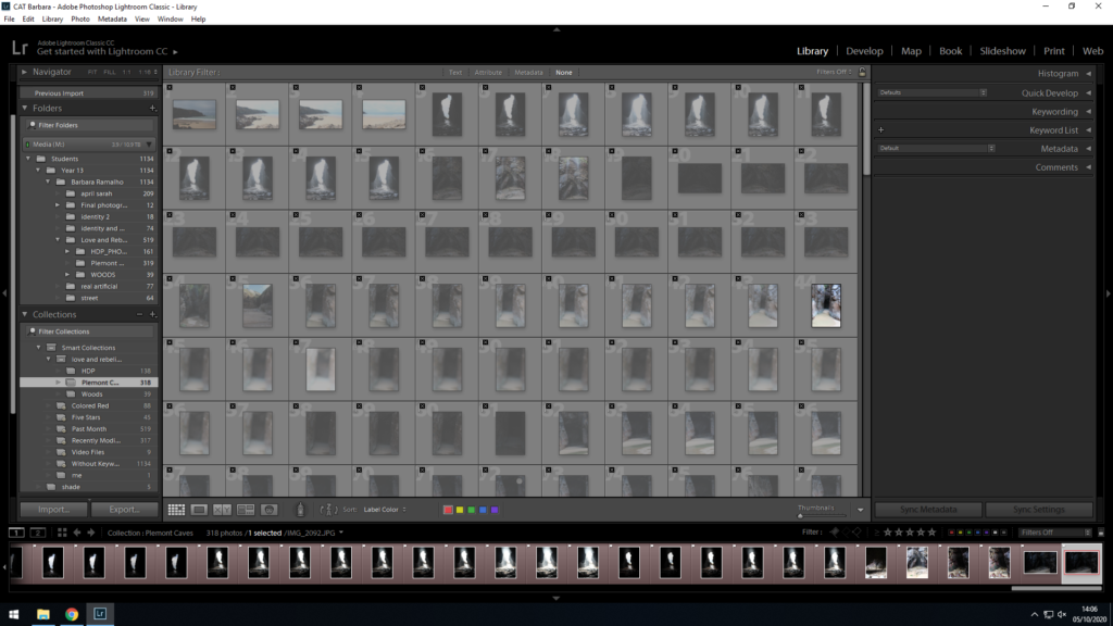
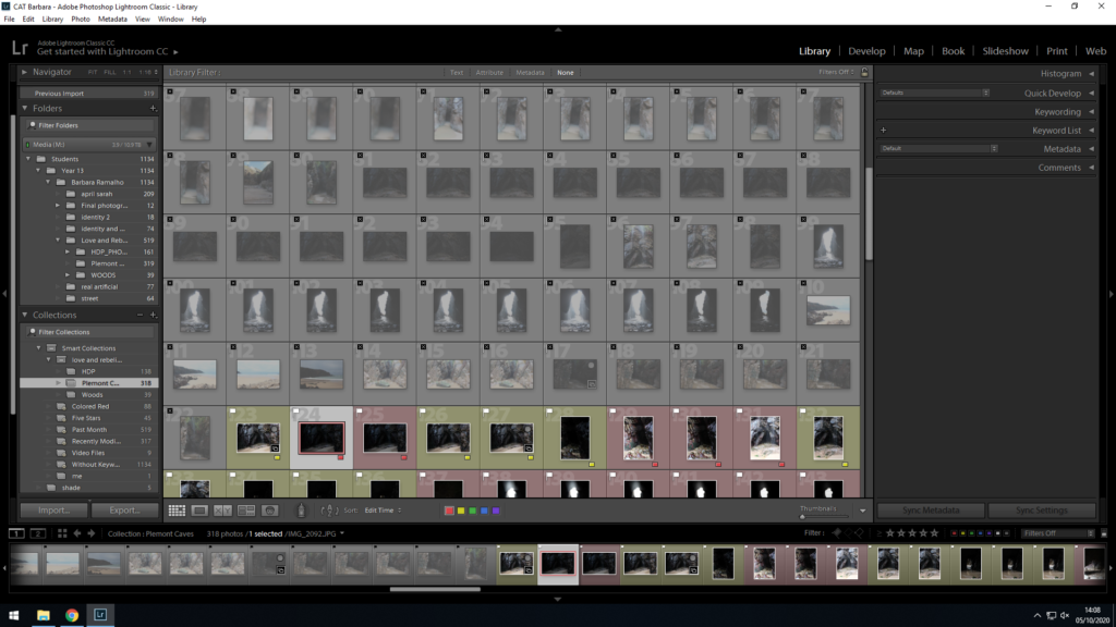
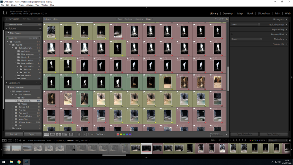
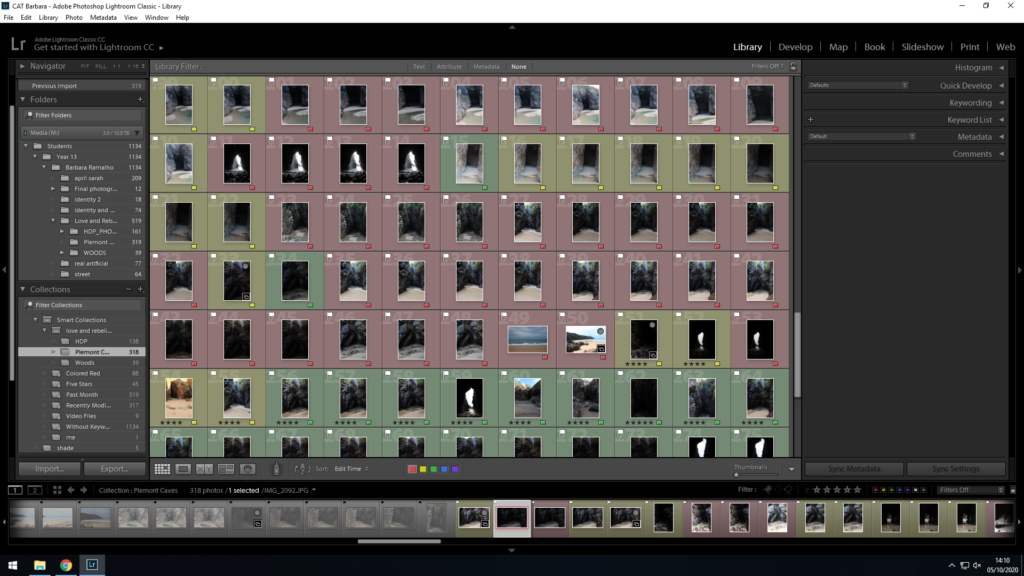
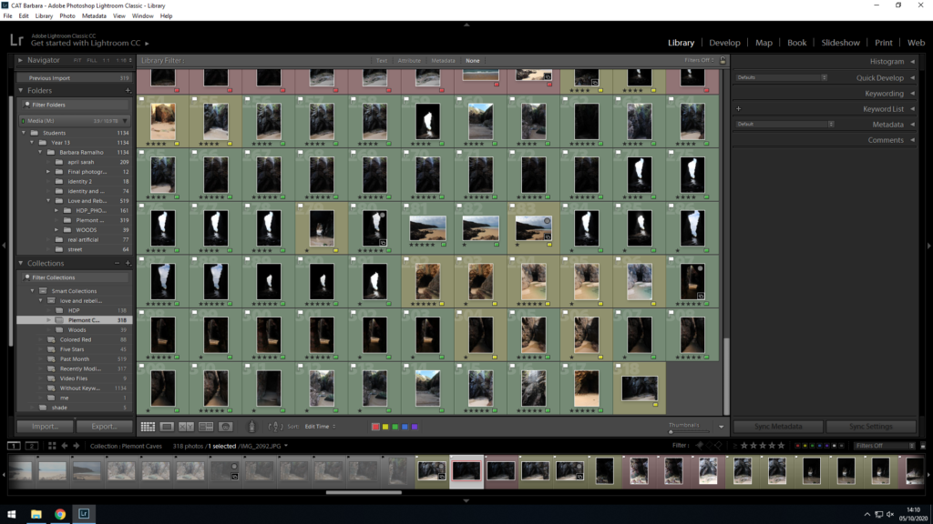
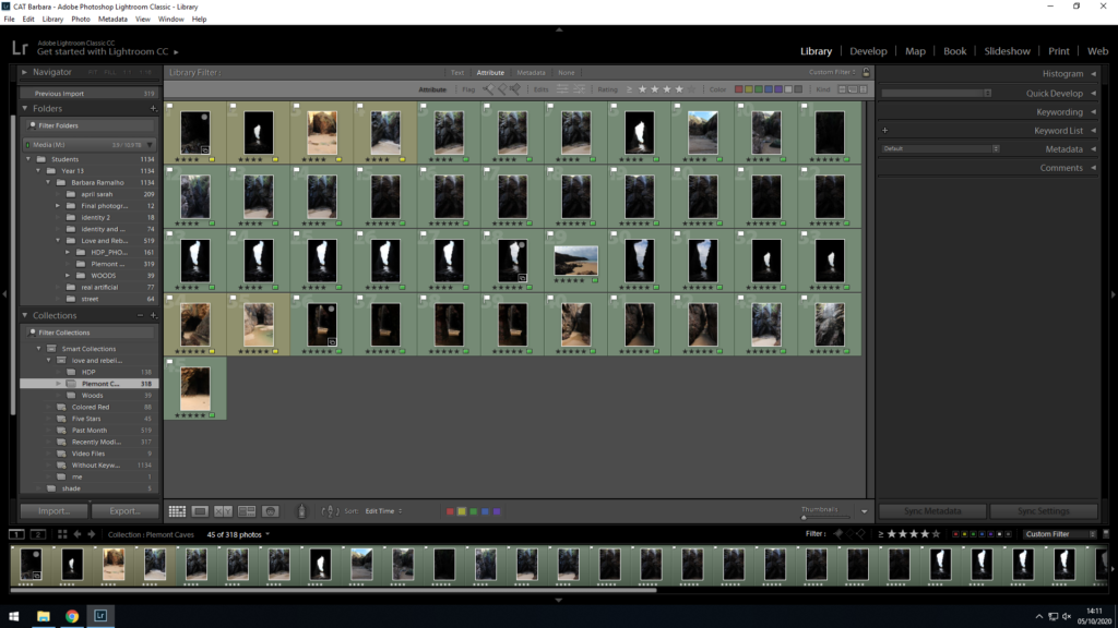
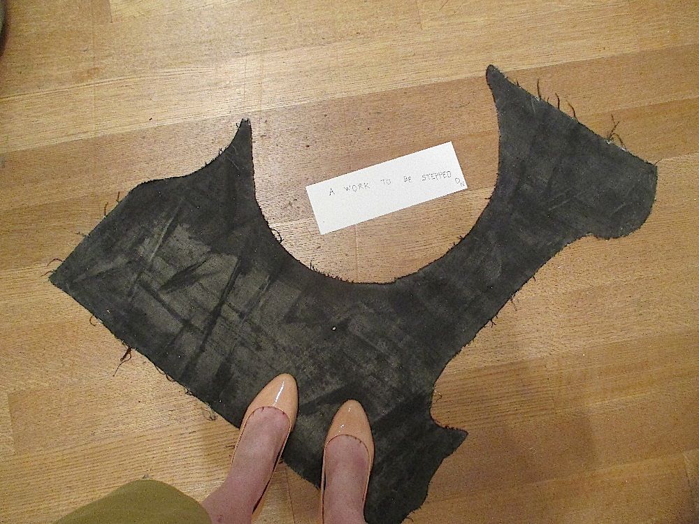