PLANNER: PERSONAL STUDY

What is a Personal Study?

The aim of this unit is to critically investigate, question and challenge a particular style, area or work by artists/ photographer(s) which will inform and develop your own emerging practice as a student of photography. The unit is designed to be an extension of your practical work in your Personal Investigation module where the practical informs and develops the theoretical elements and vice versa of your ongoing project.

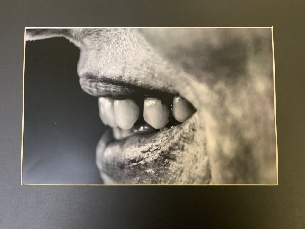
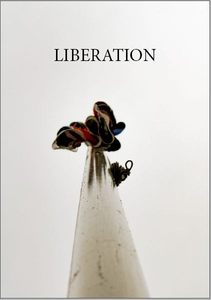
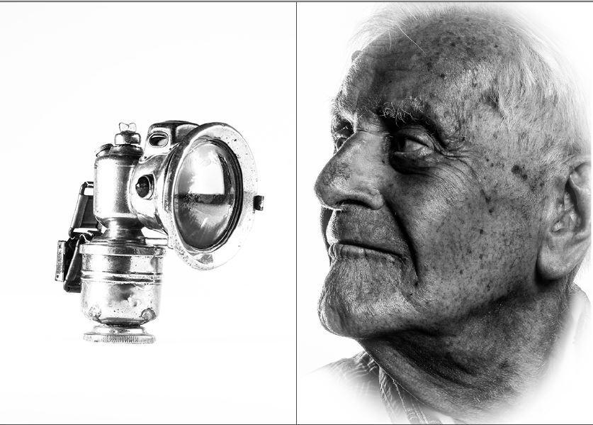
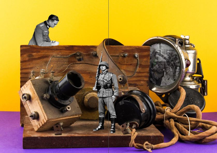
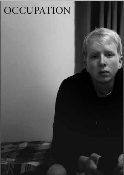
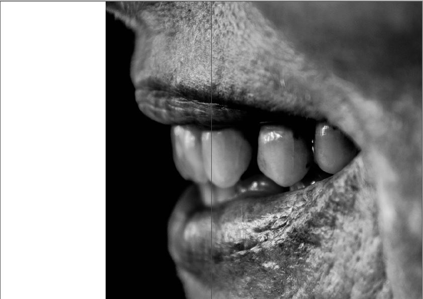
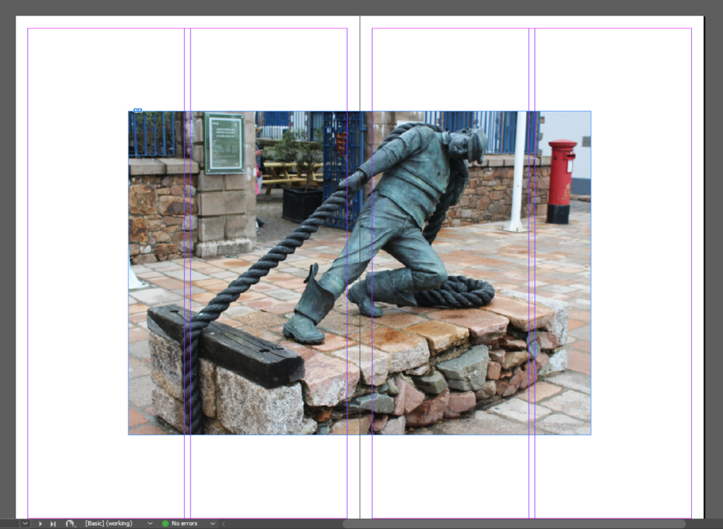
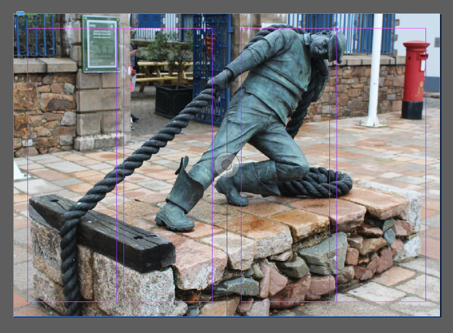
Your Personal Study is a written and illustrated dissertation, including a written essay (2000 words) and a photographic body of work (250- 500 photos) with a number of final outcomes produced from your Personal Investigation unit based on the themes of OCCUPATION vs LIBERATION. Essentially this is your final module and we are treating it as a MOCK EXAM project with an opportunity for you to explore the themes above anew, with fresh eyes and develop it in a personal manner.

link to a previous essay: How-and-why-do-photographers-use-the-human-body-to-physically-express-hidden-emotions (1)

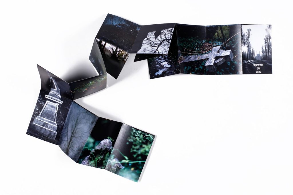
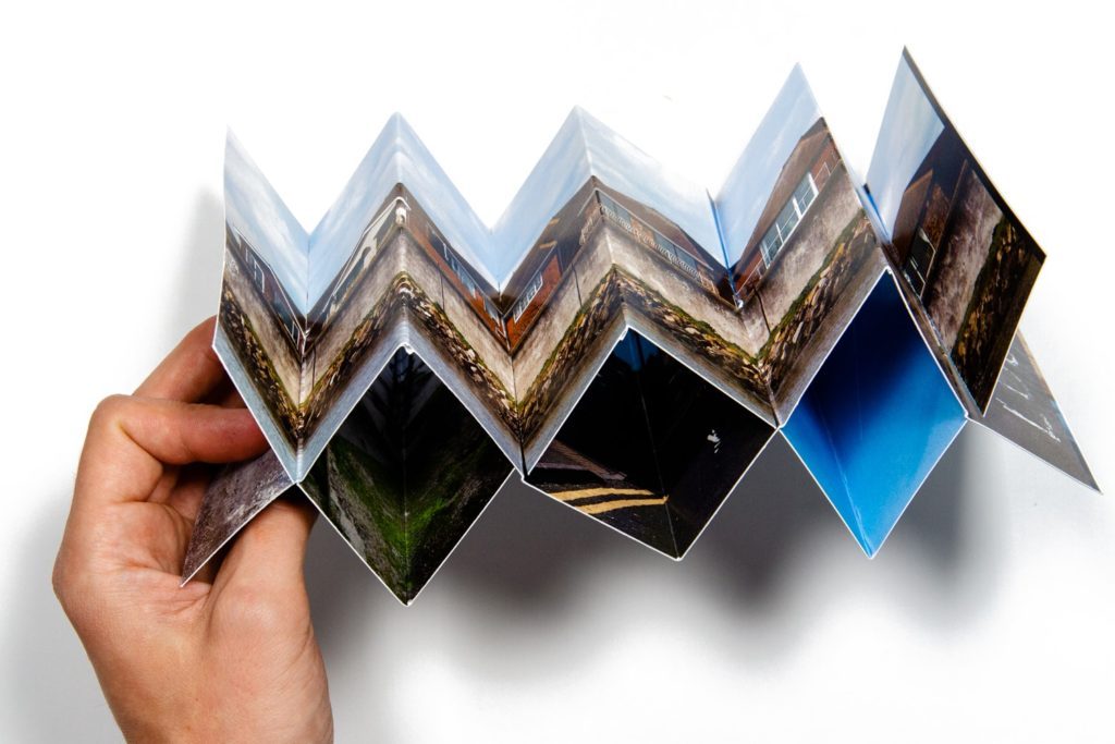
This year you have to make a photo book, either online using Blurb or by hand using traditional book binding techniques, which you design to include both your essay and a final selection and sequence of your photographs produced as a response to your chosen theme of OCCUPATION vs LIBERATION.

In addition, we are also expecting that those of you who want to go above and beyond will produce a mini film/ pod cast with sound and images based on the same narrative as used in your photobook.

All your usual research, analysis, planning, recording, experimentation and evaluation will be posted onto your BLOG

What it says in the syllabus (Edexcel)

  • Essential that students build on their prior knowledge and experience developed during the course.
  • Select artists work, methods and art movements appropriate to your previous coursework work as a suitable basis for your study.
  • Investigate a wide range of work and sources.
  • Develop your written dissertation in the light of your chosen focus from the practical part of previous coursework and projects.
  • Establish coherent and sustainable links between your own practical work with that of historical and contemporary reference.
  • Be aware of some of the methods employed by critics and historians within the history of art and photography.
  • Demonstrate a sound understanding of your chosen area of study with appropriate use of critical vocabulary.
  • Show evidence for an ongoing critical and analytical review of your investigation – both your written essay and own practical work in response to research and analysis.
  • Develop a personal and critical enquiry.
  • Culminate in an illustrated written presentation.

How to get started: Link your chosen area of study and essay question to your previous work, knowledge and understanding based upon the theme of OCCUPATION vs LIBERATION.

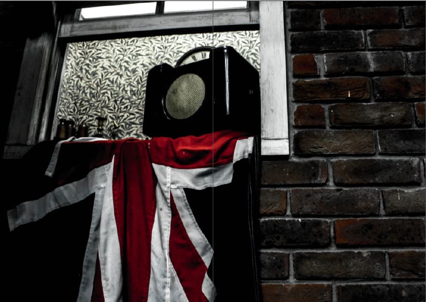
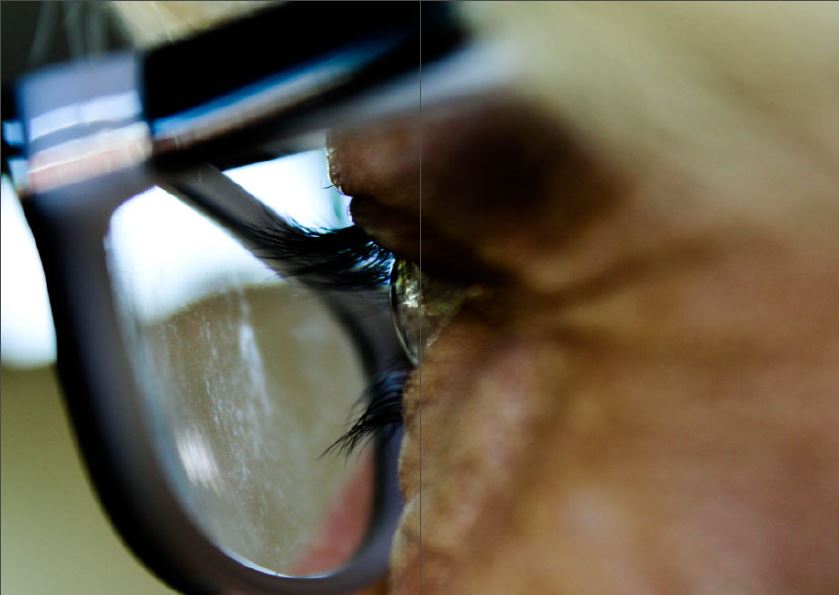
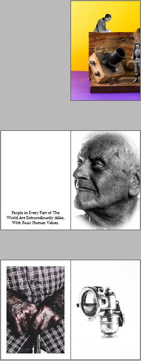
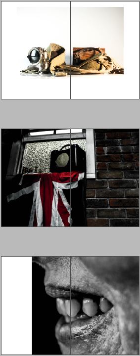
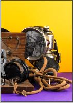
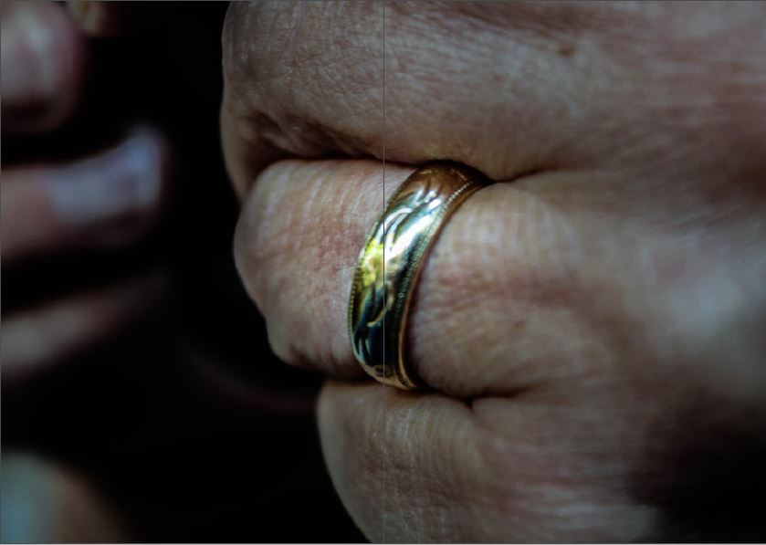
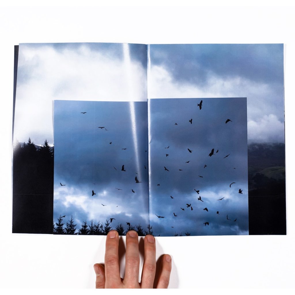
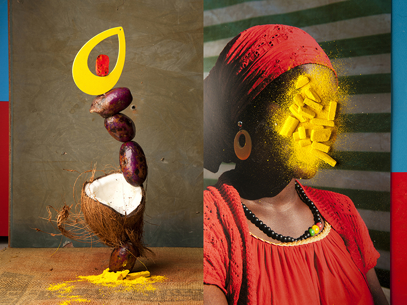
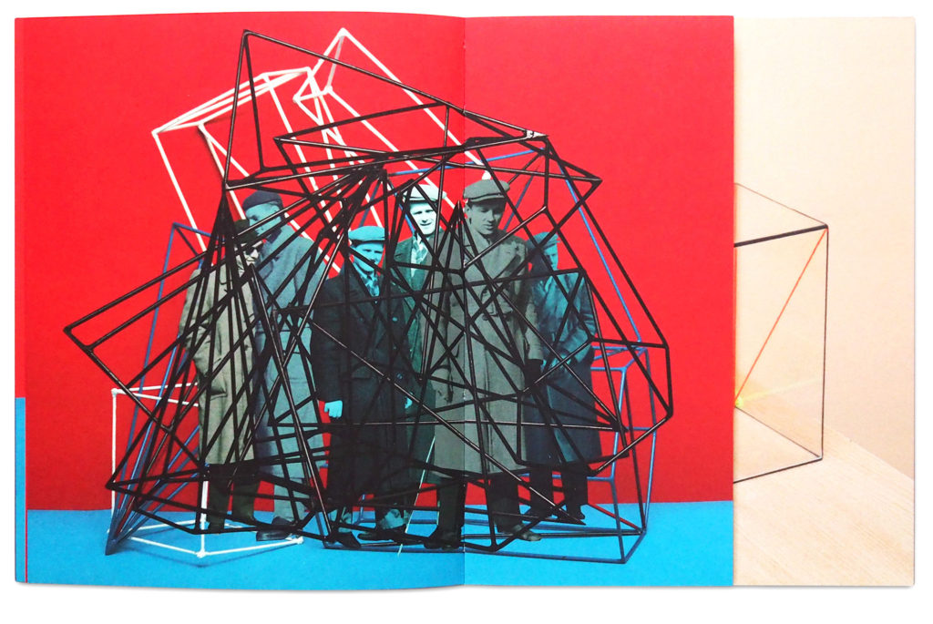
You can choose to develop your project within the Occupation of Jersey stories, focusing on one or a combination of sub- genres already explored such as LANDSCAPE > PEOPLE > OBJECTS and extend and refine studies already begun. This new direction could focus on your own family history in relation to the Occupation or World War II in general (if not Jersey born.)

Alternatively you can decide to interpret the themes in a different way relating to contemporary life, which may be more subjective based and dealing with personal experiences. For example, issues dealing with gender or race referencing political, social, cultural and identity differences.

PRACTICAL WORK: You have 6 weeks in lesson time  and over 2 weeks at Christmas to complete any shoots and make new images. This include all relevant blog posts demonstrating your knowledge and understanding of: RESEARCH > ANALYSIS > PLANNING > RECORDING, EXPERIMENTATION > PRESENTATION > EVALUATION.

DEADLINE: MUST complete 4-5 new photo-shoots this term that must be published on the blog by Tuesday 7 January 2019.

For further inspirations and starting points see blog post Past Personal Studies from previous students,, including links to photo books and essays.

ESSAY: We will be spending minimum 1 lesson a week on CONTEXTUAL STUDIES where you will be learning about critical theory, photo history and contemporary practice as well as developing academic study skills to help you writing your essay. However, it is essential that you are organising your time effectively and setting aside time outside of lessons to read, study and write.

DEADLINE: Essay draft MUST be handed in MON 7 Jan 2020.

PHOTOBOOK: Returning after Christmas we will be spending the whole month of January developing, designing and printing the photobook which will include your essay and somewhere between 40-60 images sequenced to tell a story.

MOCK EXAM: MON – WED 12 Feb 2020.

FINAL DEADLINE: Completion of photobook with final essay WED 12 Feb 2020.

EXAM (ESA): Exam Paper and preparation begins THUR 13 Feb 2020.

EXAM (ESA): Controlled Conditions
MON 27 April – FRI 1 MAY 2020.

PLANNER – Download and save in your folder

Week 9: 4 – 10 Nov
Introduction to Personal Study

Lesson task MON: Inspirations
Choose one Personal Study from past students, either from blog post below or photobooks in class. Look through sequence of images carefully and read the essay. Present the study in class and comment on the book’s, concept, design and narrative. Review the essay and comment on its use of critical/ contextual/ historical references, use of direct quotes to form an argument and specialist vocabulary relating to art and photography. Make an assessment using the mark sheet and calculate a grade.

Lesson Task TUE-FRI: Reviewing and reflecting

Objective:
 Criteria from the Syllabus

  • Essential that students build on their prior knowledge and experience developed during the course.

Follow these instructions:

  1. From your Personal Investigation based on OCCUPATION vs LIBERATION write an overview of what you learned and how you intend to develop your Personal Study.
  2. Describe which themes, approaches (LANDSCAPE, PEOPLE, OBJECTS), artists, skills and photographic processes/ techniques inspired you the most and why.
  3. Include examples of past and current experiments to illustrate your thinking.
  4. Produce a new mind-map and mood-board based around how you interpret the theme of OCCUPATION vs LIBERATION now.
  5. Plan your first photo-shoot as a response to initial ideas. Must be published on the blog by Mon 18 Nov.

For those not going to Paris on school trip continue to work on the above in lessons on Thursday and Friday.

Paris crew: Complete above task in your own time outside of lesson time once you have returned from Paris trip.

Week 10: 11 – 17 Nov
Design newspaper spreads
Workshop with EESAB

Lesson MON-WED:
This week each student will be designing 3 versions of a newspaper spreads based on the themes OCCUPATION vs LIBERATION in preparation for workshop with post-graduate (MA) students at EESAB ( L’école Européenne Supérieure d’art de Bretagne ) on Wed 13 Nov.

You must produce one spread each on:
LANDSCAPE
PEOPLE
OBJECTS

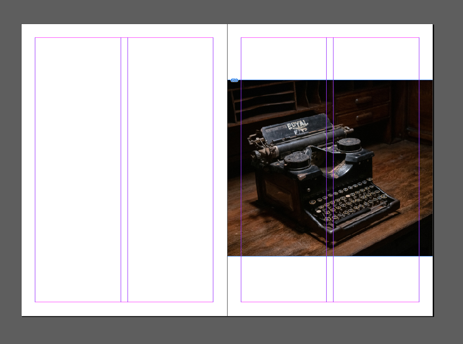
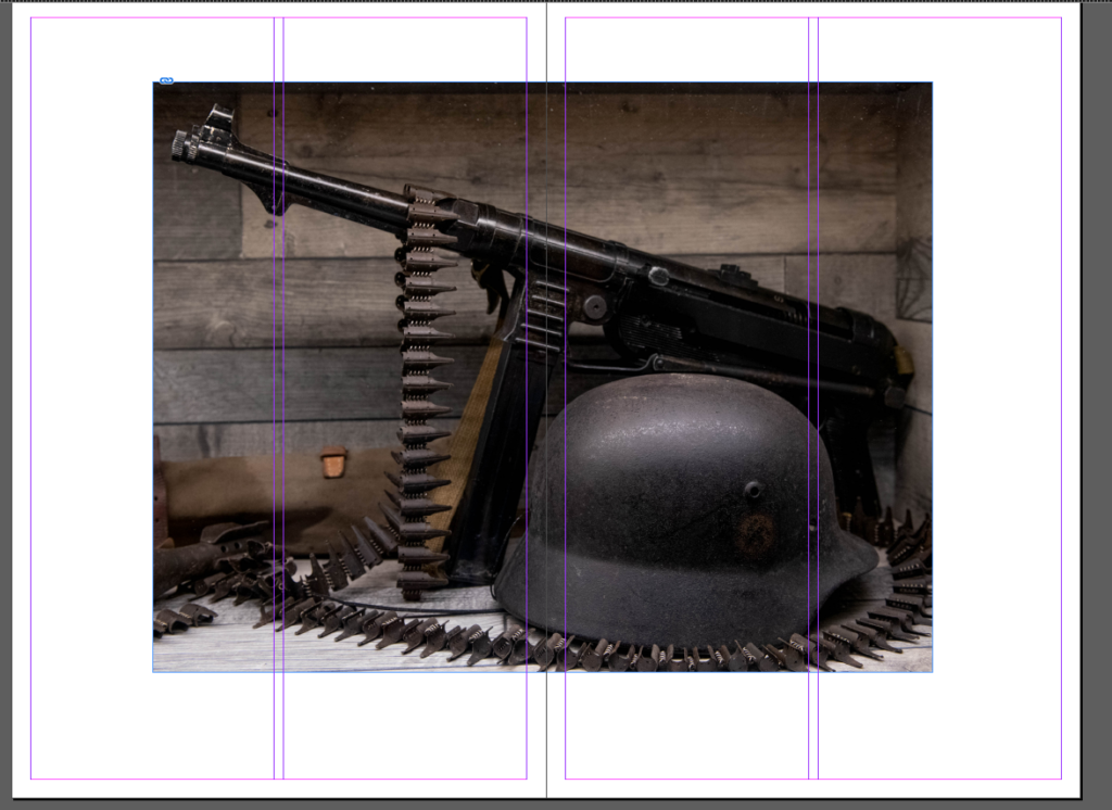
  • Create new document in InDesign with these dimensions: 420mm(h) x 280.5mm(w)
  • Only use in high-res TIFF files (4000 pixels)
  • Use design ideas and layouts from your zines and photomontages as a starting point or basis for your spreads.
  • One of your page spread must be one full-bleed image.
  • Incorporate texts and typography where appropriate.

Once you have completed 3 pagespreads, double check:

  • All images are high-res file
  • Check links in InDesign (if Red Question mark appears re-point to image in your folder)
  • Package your layout and save in your name into this shared folder

Complete by Friday 15th Nov 2019

M:\Departments\Photography\Students\Image Transfer\Occupation vs Liberation\Newspaper Pagespreads

Lessons WED 13 Nov: Workshop with EESAB
09:00-10:00: 13E
10:15-11:15: 13B
11:20-12:20: 13C

Other tasks to complete by end of this week:

SPECIFICATION: Continue to develop your specificationWRITE A STATEMENT OF INTENT – and PLAN 4 SHOOTS (2 shoots before Christmas and 2 shoots during Xmas break) in response to artists references and any ideas you may have. It’s important that you begin to make images and experiment.

Paris crew: upload and edit images from Paris trip, especially workshop with Yury Toroptsov. Reflecting on your trip follow instructions below too.

ZINE: Complete Zine design on PORTRAITS & OBJECTS, print and bind. Make sure you have evidence on the blog about showing experimentation with different layouts and annotation.

Week 11: 18 – 24 Nov
Theory & Practice: Artists References
Contextual Studies: Conversations on Photography

THEORY > Artists References

Objective: Criteria from the Syllabus

  • Select artists work, methods, theories and art movements appropriate to your previous coursework work as a suitable basis for your Personal Study.
  • Investigate a wide range of work and sources

TASKS: Evidence on BLOG

1. ARTISTS REFERENCES: Find inspirations and select 2-3 artists/photographers that you would like to research in depth, and who forms a basis for your Personal Study and influence your photographic shoots and experiments.

Compare and contrast their approaches , practice and work following these steps:

  1. Produce a mood board with a selection of images and write an overview of their work, style and approach to photography. 
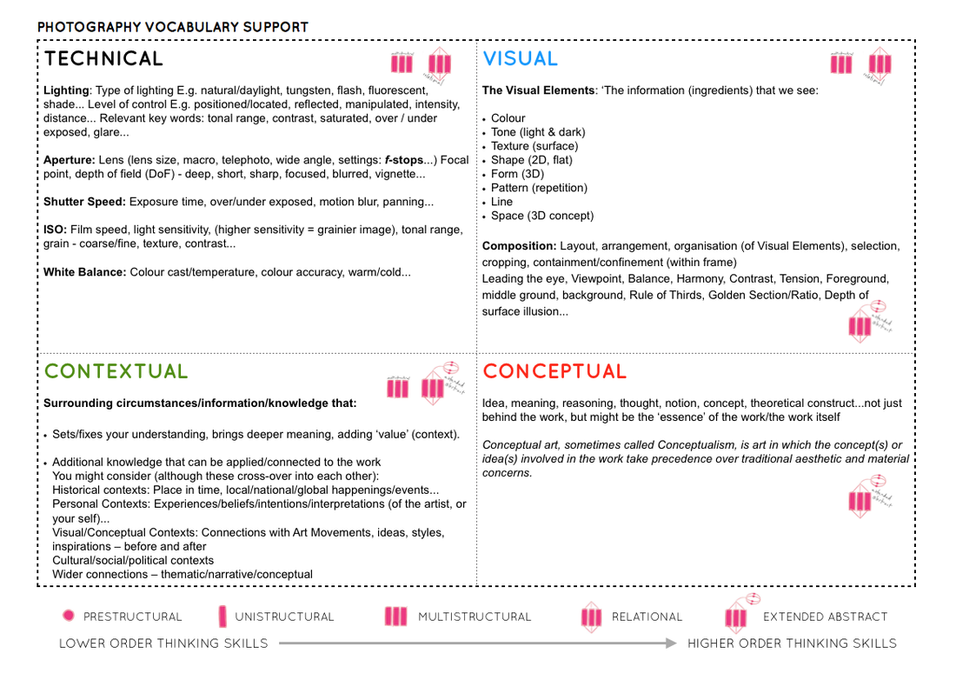
  2. Select at least one image from each photographer and analyse in depth using methodology of TECHNICAL>VISUAL>CONTEXTUAL>CONCEPTUAL 
  3. Incorporate quotes and comments from artist themselves or others (art critics, art historians, curators, writers, journalists etc) using a variety of sources such as Youtube, online articles, reviews, text, books etc. 
  4. Make sure you reference sources and embed links to the above sources in your blog post.

PARIS PHOTO: Ideally, try and find work by artists/ photographers and exhibitions that you experienced at Paris Photo. This will make personal connections and you will be able to draw on how you felt when you encountered the work.

For those who did not visit Paris, inspiration can also be found here.

2. MEANING & METHODS: Identify meaning and methods behind selected artists/photographers work and research at least 3 different literary sources (online articles, books, youtube clips) that will provide you with different critical perspective and views other than your own. Incorporate this new knowledge into your own interpretation of artists work.

The literary sources will also provide you with something to read for further contextual understanding and critical thinking in preparation for writing your essay. Make sure you save hyperlinks, photocopies etc in a new folder: Academic References.

PRACTICE> Artists References

3. PLANNING: Plan a shoot in response to researching and interpreting artists work above. Make sure it relates to your ideas on how you intend to develop your project. Follow these instructions: what, why, how, when, where?

4. RECORDING: Complete panned photo-shoot and bring images in to class. Begin to edit and show experimentation with images using Lightroom / Photoshops as appropriate to your intentions. Make sure you annotate process and techniques used.

5. EVALUATION: Upon completion of photoshoot and experimentation, make sure you evaluate and comment on the following:

  • How successful was your photoshoot and experimentation?
  • What references did you make to artists references? – comment on technical, visual, contextual, conceptual?
  • How are you going to develop your project from here? – comment on research, planning, recording, experimenting.
  • What are you going to do next? – what, why, how, when, where?

Wed 20 Nov: Contextual Studies
Conversations on Photography

Go to Blogpost here for more details

Week 12: 25 – 29 Nov
Theory & Practice: Art Movements & Isms

THEORY > Art Movements & Isms

The syllabus states clearly that you have to be aware of some of the methods employed by critics and historians within the history of art and photography.

To demonstrate your knowledge and understanding you will have to write a paragraph in your essay providing historical context about your chosen artists/ photographers and how their their work and practice is linked to a specific art movement, ism or theory.

For this task you need to select an art movement and ism that is relevant to your Personal Study and make a 2-3 minutes presentation in class. You can choose to work alone or pair up with a fellow student:

  • Pictorialism
  • Realism / Straight Photography
  • Modernism
  • Post-modernism

Follow these instructions:

  1. Start by looking at the PPT presentations here which will provide you with an overview.

    M:\Departments\Photography\Students\Occupation vs Liberation\Presentations

  2. Find two other sources, article on internet, text in book, youtube video etc and identify relevant quotes, at least two that you can incorporate into your blog post/ presentation.
  3. Use Art Movements & Isms sheet as a prompt with information that is required in your presentation
  4. Write 500 words which would form the basis of paragraph 1 in your essay and publish on blog.
  5. Your paragraph must include visual examples of artists making work within that art movement and ism.

PRACTICE> Photographic responses

  1. Respond to the art movement/ ism that you have researched and make an image or a set of images that represent the methods/ techniques/ processes/ approach/ styles / aesthetics used by artists working within that is ism or movement.
  2. Make it relevant to your own project.
  3. Produce a blog post and publish by – Mon 2 Dec

Week 13: 2 – 8 Dec
Introduction to Essay writing

Contextual Study: Photography Decoded

MON: Academic Sources

  • Research and identify 3-5 literary sources from a variety of media such as books, journal/magazines, internet, Youtube/video .
  • Begin to read essay, texts and interviews with your chosen artists as well as commentary from critics, historians and others.
  • It’s important that you show evidence of reading and draw upon different pints of view – not only your own.
  • Take notes when you’re reading…key words, concepts, passages
  • Write down page number, author, year, title, publisher, place of publication so you can list source in a bibliography

Bibliography: List all the sources that you have identified above as literary sources. Where there are two or more works by one author in the same year distinguish them as 1988a, 1988b etc. Arrange literature in alphabetical order by author, or where no author is named, by the name of the museum or other organisation which produced the text. Apart from listing literature you must also list all other sources in alphabetical order e.g. websites/online sources, Youtube/ DVD/TV.

Quotation and Referencing:

  • Use quotes to support or disprove your argument
  • Use quotes to show evidence of reading
  • Use Harvard System of Referencing…see Powerpoint: harvard system of referencing for further details on how to use it.

TUE: Essay Question

THUR-FRI: Essay Plan
Make a plan that lists what you are going to write about in each paragraph – essay structure.

  • Essay question:
  • Opening quote
  • Introduction (250-500 words): What is your area study? Which artists will you be analysing and why? How will you be responding to their work and essay question?
  • Pg 1 (500 words): Historical/ theoretical context within art, photography and visual culture relevant to your area of study. Make links to art movements/ isms and some of the methods employed by critics and historian. Link to powerpoints about isms andmovements M:\Departments\Photography\Students\Resources\Personal Study
  • Pg 2 (500 words): Analyse first artist/photographer in relation to your essay question. Present and evaluate your own images and responses.
  • Pg 3 (500 words): Analyse second artist/photographer in relation to your essay question. Present and evaluate your own images and responses.
  • Conclusion (250-500 words): Draw parallels, explore differences/ similarities between artists/photographers and that of your own work that you have produced
  • Bibliography: List all relevant sources used

Week 14-15: 9 – 20 Dec
Essay:
Introduction
Practical work: Photo-shoots & Experimentation

Objective: Criteria from the Syllabus

  • Show evidence for an on-going critical and analytical review of your investigation – both your written essay and own practical work in response to research and analysis.

PRACTICAL WORK:  Lesson time Mon, Tue, Thurs, Fri

Produce a number of photographic response to your Personal Study.  For example; experiment with story-telling approaches, subject-matter, style, form (lighting, composition) or specific skills, techniques, methods influenced by artist-references.

Bring images from new photo-shoots to lessons and follow these instructions:

  • Save shoots in folder on Media Drive: and import into Lightroom
  • Organisation: Create a new  Collection from each new shoot inside Collection Set: OCCUPATION vs LIBERATION
  • Editing: select 8-12 images from each shoot.
  • Experimenting: Adjust images in Develop, both as Colour and B&W images appropriate to your intentions
  • Export images as JPGS (1000 pixels) and save in a folder: BLOG
  • Create a Blogpost with edited images and an evaluation; explaining what you focused on in each shoot and how you intend to develop your next photoshoot.
  • Make references to artists references, previous shoots, experiments, inspiration etc.

FURTHER EXPERIMENTATION:

  • Export same set of images from Lightroom as TIFF (4000 pixels)
  • Experimentation: demonstrate further creativity using Photoshop to make composite/ montage/ typology/ grids/ diptych/triptych, text/ typology etc appropriate to your intentions
  • Design: Begin to explore different layout options using Indesign and make a new zine/book. Set up new document as A5 page sizes. This is trying out ideas before we begin designing photobook in January.
  • Make sure you annotate process and techniques used and evaluate each experiment

PLANNING

Produce a detailed plan of  at least 3-4 photoshoots that you intend on doing in the next 4 weeks – including Christmas holidays.

  • Must present one shoot, with edit and experimentation before we break up for Christmas.
  • Make sure you return in January 7 with at least 3-4 new shoots and sets of images.

WED 11 Dec: Contextual Studies
Photography Decoded

Go to Blogpost here for more details

FRI 13 Dec: Essay introduction

In this lesson you will write a draft essay introduction following these steps:

  1. Open a new Word document > SAVE AS: Essay draft
  2. Copy essay question into Essay titleHypothesis > if you don’t have one yet, make one!
  3. Copy your essay introduction (from Essay Plan) which will give you a framework to build upon
  4. Identify 2 quotes from sources identified in an earlier task using Harvard System of Referencing.
  5. Use one quote as an opening quote: Choose a quote from either one of your photographers or critics. It has to be something that relates to your investigation.
  6. Add sources to Bibliograpphy > if by now you don’t have any sources, use  S. Sontag. On Photography Ch1
  7. Begin to write a paragraph (250-500 words) answering the following questions:
  8. Look at an opening sentence.
  9. You got 45 mins to write and upload to the blog!
  • Think about an opening that will draw your reader in e.g. you can use an opening quote that sets the scene. Or think more philosophically about the nature of photography and and feeble relationship with reality.
  • You should include in your introduction an outline of your intention of your study e.g.
  • What are you going to investigate.
  • How does this area/ work interest you?
  • What are you trying to prove/challenge, argument/ counter-argument?
  • Whose work (artists/photographers) are you analysing and why?
  • What historical or theoretical context is the work situated within. Include 1 or 2 quotes for or against.
  • What links are there with your previous studies?
  • What have you explored so far in your Coursework or what are you going to photograph?
  • How did or will your work develop.
  • What camera skills, techniques or digital processes in Photoshop have or are you going to experiment with?

WEEK 15: PRESENTATIONWork-in-Progress

Prepare a 3-5 mins presentation on something that you are working on right now in your project. For example:

An idea
An image
A photo-shoot
An experiment
An inspiration
New research
New development

Use blog posts to present in class. As a class we will give constructive feedback on how each student can develop their work and project

Wed 18 Dec:
Leah Bohea
Eleanor Gilson
Talal Bayat
Charlie Dixon-Smith

Gabbi Bassford
Daniel Butt
Emily Cooper
Niah Da Costa

Kristiana Ambrasa
Jade Bell
Kristin Falle
Nathan Healey

Thurs 19 Dec:
Andreia Da Silva
Jazmin Gulley
Nelista Gallichan
Eren Gow

Francesca Hogan
Yordi Hogetoorn
Gabrielle Le Clezio
Lucy Lemos

Max Kucza
Leah Looby-Razzell
Aimee Low

Fri 20 Dec:
Jasmine Latimer
Kimberley Noel
Alexander Phillips
Ceira Walsh

Will Masterman
Filipe Pereira
Emelia Sargeant
Filip Spasow
Francesca Stubbings

Lillie Makestaad
Krystian Skarbek
Jack Tidy

Final Prints

With regards to final prints from the occupation and liberation I selected two photographs which I believed where my strongest. I decided to print both out as A3 photographs and frame them on black card using a window mount technique. Using a more contemporary photomontage creates an intriguing and captivating embodiment of work which allows conceptual and contextual representation about the war to be clearly illustrated. I also took a macro photograph from my home sweet home project, as I felt using the strongest detailed image allows the terms occupation and liberation to be viewed in a new way. Personally, I really like the way in which they stand alone, due to them being highly impactful in terms of concept and context and present the theme in different ways, through the difference in composition in the overall frame of the photographs.

Zine Objects and Portraits – Final Design

Evaluation:

To evaluate, having my final outcomes as a dos a dos layout, meant I could successfully showcase my war images and my home images under the same categories of occupation and liberation, whilst being able to showcase the relationship between objects. To achieve the dos a dos I simply glued the back pages of each zine together to create the effect, thus I have an overall zine which is two different zines. I believe my design has strong conceptual representations which clearly showcase my intended narrative. The layout for each page has been carefully thought out and justified as to why the spread is how it is, showcasing my ability to successfully place images into a clear sequence to showcase an intended narrative. I have been able to show my experimentation process when creating the zine, which shows my ability to critically analyse my work and reject ideas which may not be successful. Overall, I believe I have created a strong photographic zine which showcase my intended narrative through my strongest imagery from the part of the occupation and liberation project.

Zine DESIGN EXPERIMENTATION – Object and Portrait

Design 1:

For my first design I stuck to a normal zine layout, 16 page spread in A5 size and portrait orientation. In this design I looked at having half of the zine dedicated to the war and half dedicated to the home project. Overall, I felt that the transition between the two contexts was not clear or effective and almost spoilt the narrative trying to be presented. Below are the screenshots to this design, three pages at a time, with the page layouts being explained below with reasoning as to why these choices where made. In addition, I decided to stop this design shortly after the half way point, transition into the home, as it was not affective, with reasoning as to why, and still showed clear experimentation with new zine layout designs in mind.

On the front and back cover I decided to use the photomontage of the war objects and archival images of the soldiers. I felt as this was my strongest conceptual imagery, I believe it fit perfectly as my covers as it already held strong representation of my intended narrative, moreover the image itself is captivating through the warm vibrant colours, thus drawing viewers into the zine. For my first layout I wanted to use my strongest portrait from the Bob Le Sueur experimentation. I placed the image on the right hand side, as it showcases the subject looking over to the left, making it look more naturally placed. I then decided to add a direct quote from the interview with Bob. I felt the quote used clearly showcased the subjects opinion on the war and German’s and helped to present the beginning of the narrative, allowing a sense of flow within my outcomes. The next spread was an image which focused on detail and texture of Bob’s hands, which is emphasised through the structure and vibrance of the image, Placing this with the metallic headlight used in the war, both being whole page spreads presents the importance of the light during the occupation and the usefulness of the object. It also works alongside Bob’s quote as it shows everyone is alike, as we use the same objects for the same reason, which continues on the flow.

For the next three pages I looked at the transition between war into the home sweet home project. On my next spread I placed an image of a collection of war objects in the centre of the page, doing this supports the ideology that everyone used the same objects whether they were British or German, thus showcasing my narrative of the relationship between objects and portraits. For my middle page I wanted to use a double page spread which showcased liberation of the war, which leads onto the new occupation of the home. This then lead onto the 3/4 page spread of my strongest image from the home sweet home project, which is a macro photograph of a mouth. I felt that the image almost seemed out of place and broke the narrative trying to be presented, which lead me to question the effectiveness of the design.

After consideration I decided to stop with this design as I could not find a solution to transition the war into the home within one zine, therefore my initial design will showcase my experimentation and thought process when creating my final zine design.

Design 2:

For my second design I decided to experiment with different layouts of zines, showcased on my mood board on the narrative and sequencing blog post. After consideration I decided to explore the Dos a Dos design. The dos a dos zine contains two single section zines within one cover, facing them in opposite directions, it’s a neat structure for combining two sets of material which you really want a viewer to experience separately, rather than in a sequence where one follows another. For this one I’ve combined two very different sets of imagery about my native London, one about the city’s history, and the other about it’s possible future.

For the first half of my zine I wanted to showcase liberation from the war and the relationship between objects and portraits in the sense of liberation. I decided to keep similar layouts from the first design as I felt that some layouts were successful in presenting my narrative.

Originally my front cover was black with white text saying Liberation, which juxtaposed the Occupation front cover which was white with black text. Although this worked, having my zine as a dos a dos layout meant I lost two pages worth of display so I felt I was not utilising my pages wisely. This soon lead me to digging through my edits from previous photoshoots were I found an image I took from a worms eye view of Great Britains flag, I felt the fitted nicely with the ideology of liberation.

I decided to use the photomontage of the war objects and archival images of the soldiers. I felt as this was my strongest conceptual imagery, I believe it fit perfectly within my zine as it already held strong representation of my intended narrative, moreover the image itself is captivating through the warm vibrant colours, thus drawing viewers into the zine.

I wanted to use my strongest portrait from the Bob Le Sueur experimentation. I placed the image on the right hand side, as it showcases the subject looking over to the left, making it look more naturally placed. I then places the object of the head light on the left which faces towards the portrait. This presents a strong positive relationship between the two images, showing their importance during the war. This spread took inspiration from my first experimentation as I felt that this spread was the most successful in conveying my narrative.

For my last page spread under liberation I decided to showcase the liberation of the Island when Germans left. This spread focuses on objects of Great Britain’s flag and a radio set, which were banned during the occupation of the German’s. This full page spread clearly showcases the relationship with the objects to portraits with the absence of the portrait, as it is commonly known the citizens illegally held radio systems which outlines the objects importance within the imagery.

To start the occupation side of the zine, I started from the last page and made my way up to the first page, reverse order. The Occupation front cover which was white with black text, which juxtaposed my liberation front cover which was black with white text. As mentioned before although this worked, having my zine as a dos a dos layout meant I lost two pages worth of display so I felt I was not utilising my pages wisely. I will be changing this front cover, with the final layout shown below in order to show experimentation.

Within this half I wanted to showcase the occupation of marriage within a family and the relationship between portraits of objects under this ideology.

For my first page spread I wanted to showcase a portrait of my model hands, with one of the most traditional objects to do with marriage, the ring. A wedding ring symbolises the occupation of your love and life to your spouse, and is very important piece of symbolism to many married couples. Having this images as a whole page spread showcases a lack of space, showcasing the fulfilment marriage has on the impact of our lives.

I then wanted to keep the whole double page spread design as I liked the symbolism of the lack of space and how marriage impacts a whole persons life. I then decided to use this macro image of my models mouth who seems to be smiling, showing their teeth. The sense of black space on the left shows an emptiness and false sense of happiness, many marriages lead to relationship problems. This spread almost acts as a representation go how the models life has been taken away and how they are not happy about it but can not do much about it.

My final page spread focuses on the macro portrait of my subjects eyes. She is looking through her dirty glasses, which symbolises how she is unsure where her future is going and how marriage has lead her to not being able to freely make all decision by herself, showcasing the entrapment of marriage and the occupation it has.

Changes:

For my first change I wanted to change the front cover of my occupation front cover, to have the same amount of symbolism and my liberation front over. I decided to use the environmental portrait of my brother sat on his bed. The sense of negative space on the left and high tonal contrast shows the negative impacts of marriage which fits the theme of the occupation of marriage and begins to showcase the relationship between objects and portraits towards this overall running theme of marriage.

My second change was made after printing a trial run of my zine. In my initial design I turned the white space black, when printing this out the blacks came out as two different shades which distracted viewers from the conceptual representations and meaning of the spread. I decided to change this by getting rid of the artificially placed black on the left and just having it white, I felt that this change still gives off the same intended effect as the black.

Evaluation:

I believe I have made two successful experimentation of zine designs in order to showcase my narrative. I have been able to explore different layouts and the representations they held, with being able to clearly justify as to why I decided to have images in the sequence they are in. I have been able to show my artistic thought process throughout, with constant reference to my intended narrative when explaining each page layout. Overall, I believe my second design will be my final design with the changes made as I feel it’s the most successful in combining war and my home imagery.

Zine Design Objects and Portrait – Narrative and Sequencing

Narrative:

The rational within my second photographic zine I would like to convey the narrative of the relationship between objects and people, to reinforce the ideology of occupation and liberation. This relationship will be presented through different page layouts with a close look at proximity between photographs on a page. Not only do I want to showcase occupation and liberation during the second world war, I would also like to implement images from my home sweet home project to showcase the occupation of a household and the how the relationships of objects and portraits can be changed due to the context of the imagery. I want the relationships to present clear conceptual representation which gives insight into both contexts of the war and home to allow a clear narrative for viewers to follow when reading the zine.

Sequencing:

For this photographic zine I am going to keep the sequencing of my images simplistic, I am going to divide the zine into two with the first half being focused on the war and the second half being focused on home sweet home. I will focus on proximity to convey the relationship between the objects and portrait, with images closer together representing a stronger relationship between the imagery. I will also focus on the sense of space, and the ideology conveyed with whole page spreads, half page spreads and 3/4 page spreads. In addition I will be using my war photomontage as a front cover to convey occupation and liberation as I believe the imagery can link into both contexts of the war and home, and provides a visually stimulating front cover or viewers to look at.

Mood Board:

Below is a mood board which shows different design ideas which could help influence the way in which I layout my photographic zine in order to convey my intended narrative of the relationship of objects and portraits during the war and within a home environment.

Zine- Final Design

For my second zine, I plan to use Images which I took at the Jersey War Tunnels and Occupation Objects as I found that these images have been my best from my latest photo shoots. I think including Occupation Objects will be a way of making my zine personal as there objects I chose myself. In order to make it more personal I may include portrait images. I also plan to use relevant quoted from occupation survivor ‘Joan’ who spoke about her experiences in the occupation.

I’m not too bothered on my zine having a set structure to it, however I would like it to have a pattern in the images that are used. Example- Don’t have two images with quotes next to one another.

Page 16

Evaluation of Zine

To evaluate this zine, I found having the layout which has been organised how allowed me to fully showcase war images through different projects which showcased the relationship of objects with occupation and liberation. To do this I used the app InDesign on Photoshop to create my zine which allowed me to print out my design in the end which I preferred to use than making it myself as I find its more professional for the theme I was representing. I believe I have been able to show my experimentation process when creating the zine, showing ability to plan my image placing effectivily to create a strong conceptual representation. The layout for each page was well throughout out to ensure none of the same images were placed next to each other or quotes which allowed for a well designed zine. Overall, I think my zine is successful in the way which I showcase my images in the zine as well as my strong imagery from most aspects in the project.

Zine Design Experimentation

Experimentation One- First Design

For my first design, i created a division between having have of my booklet on occupation, and the other half on liberation. I stuck to the typical 16 page A5 booklet which i created on InDesign and was set up in portrait style. Although i created this draft and had experimented with have a half and half booklet, i felt as if it didn’t link up very nicely and the two contexts were not very clear and it wasn’t as effective as i would have liked.

Screenshots of my first experimentation is below along with a reasoning of why i made certain choices in the photo book.

Page One and Sixteen

For the front and back of this zine, I decided to keep the design simple with no actual images which I have taken included. As seen I used a dark green colour to cover the back and front of the photo book as my thought is that green is a typical archive colour which is used on websites as well as other photo books I have seen. Although I like the simplicity of this colour as well as it giving off a well-respected vibe to the book I am unsure if I fully love it enough to keep it. I may decide to keep this colour theme going or choose another.

Page 1
Page 16

Pages Two- Seven

Due to wanting the first part of my photo book to represent the theme of occupation, I used three of best images from my ‘Jersey War Tunnels’ photo shoot as I felt as if it gave a clear representation of conditions people in the war lived in and guns/ helmets which German soldiers used during the time. These occupation items created a theme of realization, the objects such as the gun allowing outsiders to be put in the position people in the war were in, see things which they had to deal with everyday. As for the image of a living room, I wanted to include this image as I found it interesting as the set up included typical books on the bookshelf seen which are from the occupation, helping to vision household items seen in homes.

Page 2 + 3
Page 4 + 5
Page 6 + 7

Page Eight and Nine

For my fourth page, I created a double page spread which included an image from my still-life occupation objects shoot. This image was created in the style of Rafal Milach and included two bandaid red pots, a book on the occupation of jersey and a real occupation ration pot. These elements were designed in front of a red and blue background with geometric frames also included in the image. This helped to add an element of style into what would have been a plain image.

Page 8 + 9

Page Ten and Eleven

When creating my fifth double page spread, I left the left hand side of the page plain white to create a separation between the two different themes of occupation and liberation but had a simple title at the top of the page stating ‘Liberation’. On the right hand side of the page I included an image of speaker Joan who told us about Liberation Day which she experienced when she was younger, therefore i thought this was an appropriate way to introduce the next topic.

Page 10 + 11

Page Twelve to Fifteen

Page 12 + 13
Page 14 + 15

Experimentation Two- Second Design

For my second zine, I plan to use Images which I took at the Jersey War Tunnels and Occupation Objects as I found that these images have been my best from my latest photo shoots. I think including Occupation Objects will be a way of making my zine personal as there objects I chose myself. In order to make it more personal I may include portrait images. I also plan to use relevant quoted from occupation survivor ‘Joan’ who spoke about her experiences in the occupation.

I’m not too bothered on my zine having a set structure to it, however I would like it to have a pattern in the images that are used. Example- Don’t have two images with quotes next to one another. I stuck to the typical 16 page A5 booklet which i created on InDesign and was set up in portrait style.

Page One and Sixteen

Page One
Page Sixteen

As seen, on the front of my page I have used a plain white page with a simple title “Occupation VS Liberation” which I liked as it adds simplicity to the front of the book and has no images distracting the title. In also felt like I needed the simplicity again at the end of the Zine and therefore left it the same.

Page Two and Three

This image has an empty alt attribute; its file name is image-35.png

I decided to full bleed this image as I thought it is one of my better images included in the book and that it should be showcased. The image also links to the occupation due to including an emergency kit with two pots of bandages and an occupation book. This image was part of my experimentation with Rafal Milach’s photography style, therefore including a coloured background and geometrical shapes which I think added to the image and the subject as the shapes give off the idea of the bandages being trapped linking to the idea that some people couldn’t get ahold of some of these items.

Page Four and Five

This image has an empty alt attribute; its file name is image-34.png

For the next page I decided to enlarge the image which was taken in my ‘Occupation Objects’ shoot. As seen, the image includes a British Red Cross Food Parcel as well as some stamps. I kept a boarder on page of this image which can be seen as white. This allowed for me to include a quote if I wanted to use one which can be seen on the top right hand corner. I chose the quote “Each family had a Ration Booklet which included removable stamps which were used to purchase essential food items” as it links to the food parcel as both the quote and image are to do with the shortage of food in Jersey.

Page Six and Seven

This image has an empty alt attribute; its file name is image-36.png

This third image is an image which was taken at Jersey War Tunnels and is a set up bedroom representing what a typical one would have looked like. I used this image to cover two pages as a double page spread to represent an actual living room.

Page Eight and Nine

This image has an empty alt attribute; its file name is image-37.png

I have included a portrait image of speaker Joan as she was very inspirational to our class and told us on her story of her time in the occupation. During her story she mentioned her mother having a secret radio which can be seen on the page next to her portrait (page eight). On page eight the radio is included as well as an old fashion bike light. I edited both these images black and white so they suited better.

Page Ten and Eleven

Page Twelve and Thirteen

This image has an empty alt attribute; its file name is image-39.png

For page twelve I wanted to make it a blank page so there was a separation from the image of page eleven, I liked the design of having a blank page. I arranged the typewriter image which was taken at Jersey War Tunnels to be covering only half of the image as I liked how the boarder around the image blended with the black page next to it.

Page Fourteen and Fifteen

This image has an empty alt attribute; its file name is image-40.png

I found that this image looked best spread over two pages therefore I placed it at the end of my zine due to having one similar at the beginning of my zine.

Evaluation

Overall I feel as if my second zine example is more successful than my first due to me learning from mistakes and edits in the first zine. Although the first zine shows more of a narrative than the second, I still do prefer the second due to the specific layout and the overall design of the piece as each image has a reason as to why its been placed there. I have been able to showcase an artistic approach throughout each zine and believe that I will stick with my decision to use my second zine as my final. However, sue to me thinking the white background for the front and back cover is too plain I will use my experimentation one front and back cover as it adds more to the zine.