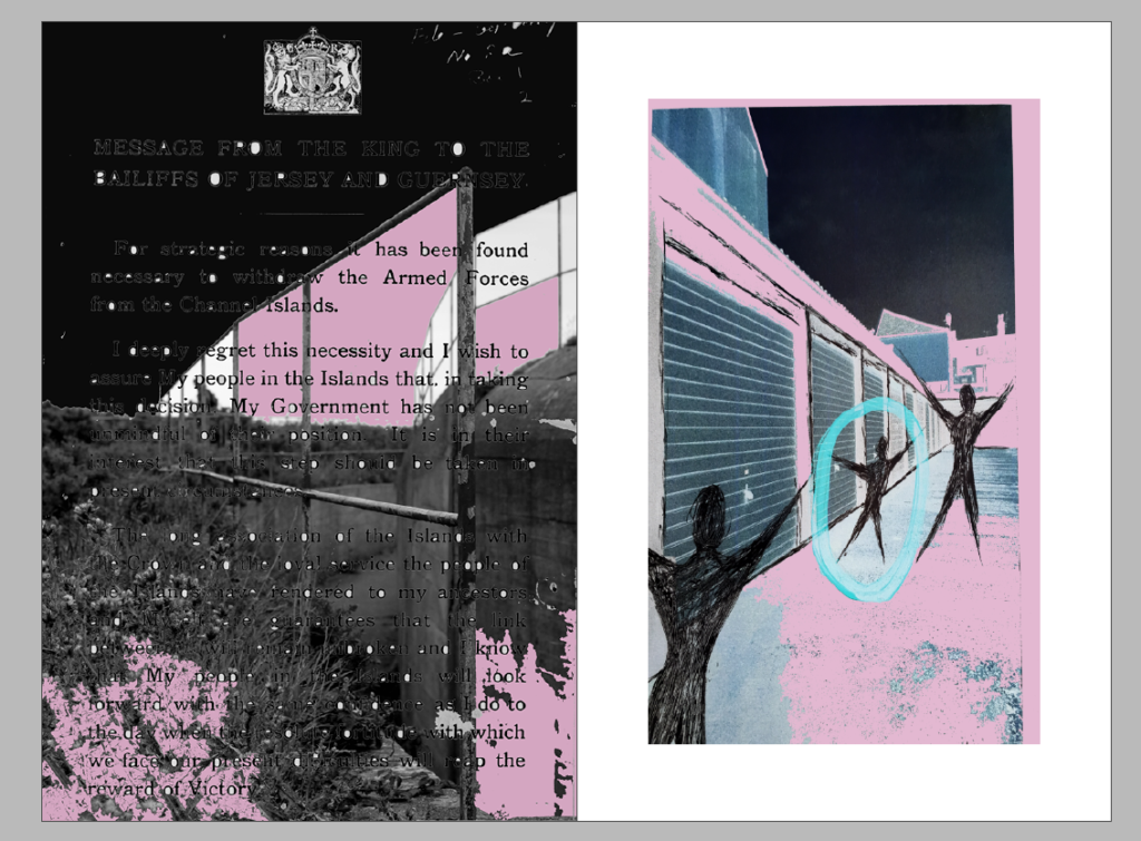
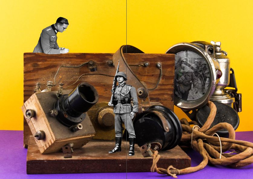
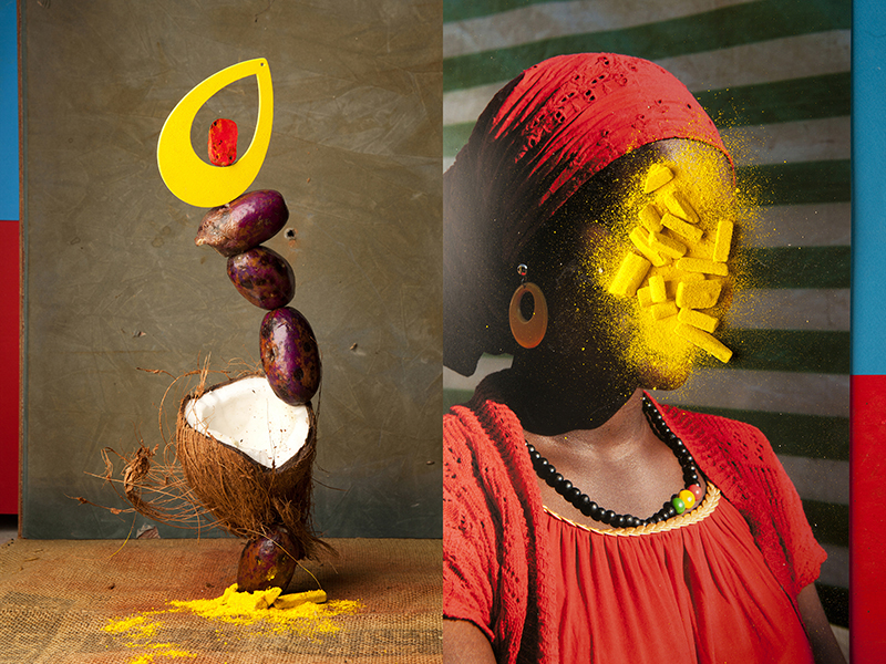
Below are the 3 different variations of a double spread for the newspaper. Most of the images I have used are Occupation related or have a relation to something we have worked on in this unit, such as the montage of the Emile Guiton auto-chrome rose. I’ve chosen a light pink, black and blue/green theme for all these images as I think they go well together but also work well on their own. I’ve also inverted 3 of my montages in Photoshop as I think it gives an interesting effect and matches the colour scheme well.
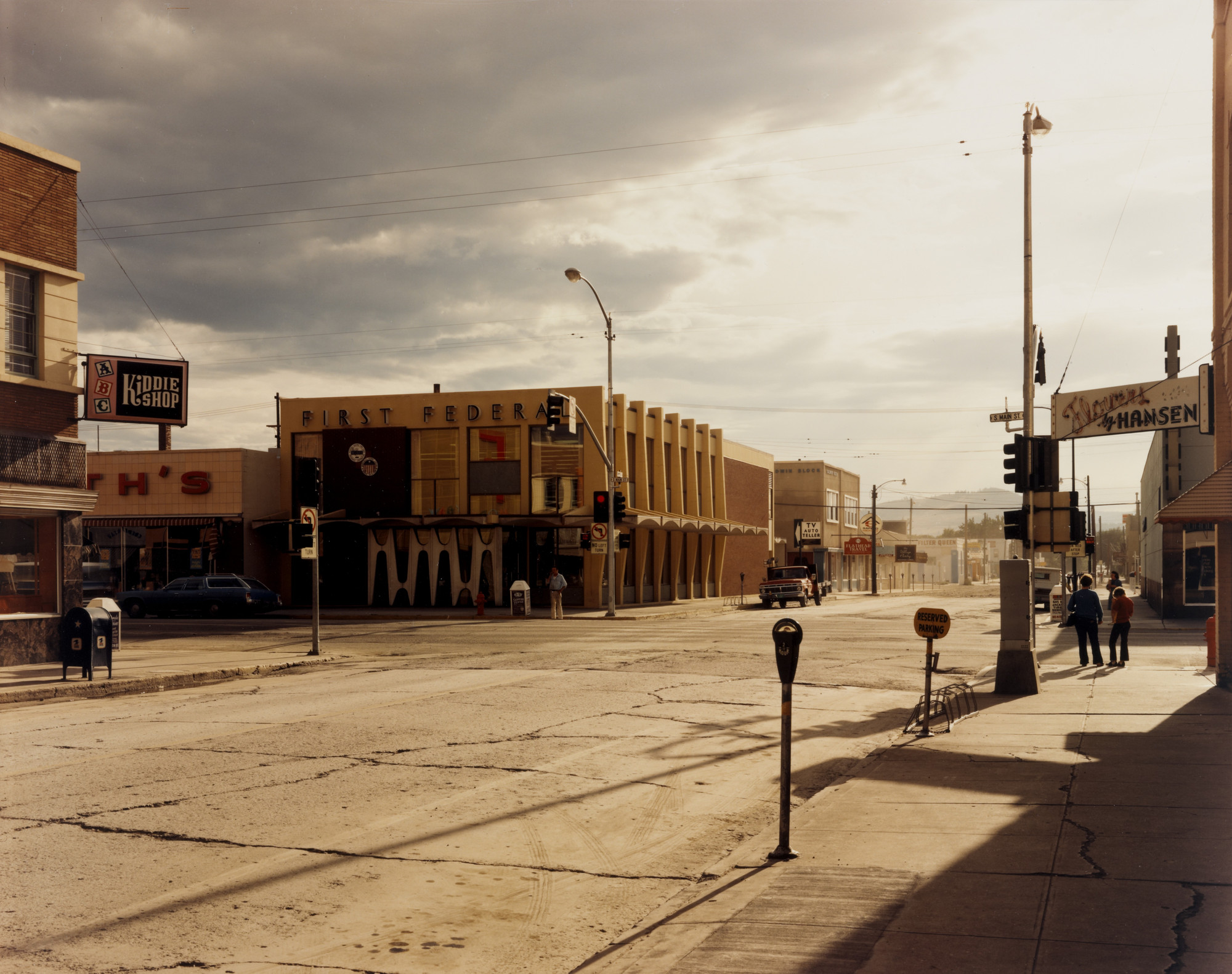
Stephen Shore’s work has been widely published and exhibited for the past forty-five years. He was the first living photographer to have a one-man show at the Metropolitan Museum of Art in New York since Alfred Stieglitz, forty years earlier. He has also had one-man shows at George Eastman House, Rochester; Kunsthalle, Dusseldorf; Hammer Museum, Los Angeles; Jeu de Paume, Paris; and Art Institute of Chicago. In 2017, the Museum of Modern Art opened a major retrospective spanning Stephen Shore’s entire career. He has received fellowships from the Guggenheim Foundation and the National Endowment for the Arts. His series of exhibitions at Light Gallery in New York in the early 1970s sparked new interest in color photography and in the use of the view camera for documentary work.
More than 25 books have been published of Stephen Shore’s photographs including Uncommon Places: The Complete Works; American Surfaces; Stephen Shore, a retrospective monograph in Phaidon’s Contemporary Artists series; Stephen Shore: Survey and most recently, Factory: Andy Warhol and Stephen Shore: Selected Works, 1973-1981. In 2017, the Museum of Modern Art published Stephen Shore in conjunction with their retrospective of his photographic career. Stephen also wrote The Nature of Photographs, published by Phaidon Press, which addresses how a photograph functions visually. His work is represented by 303 Gallery, New York; and Sprüth Magers, London and Berlin. Since 1982 he has been the director of the Photography Program at Bard College, Annandale-on-Hudson, NY, where he is the Susan Weber Professor in the Arts.
“I’d thought about this in a certain way before – about this idea of how to make a picture look natural. In a way I deconstructed all of that over a period of years and made pictures that were almost the opposite, very intensely structured.”
Key Ideas:
Shore’s photographs often appear as unstudied snapshots before revealing themselves, on closer examination, to be carefully calculated and balanced. His images show a deep consideration of framing, with lines and colors chosen to emphasize the formal qualities of the places or objects within the frame, heightening the viewer’s focus.
Shore’s images are structured around the experience of seeing, seeking to communicate the way in which the everyday might register to an outsider. He has regularly used his work as a form of visual diary, communicating his own experiences through his photographs. Shore’s photographic choices suggest emotional states to the audience, often drawing power through the ways in which light and composition evoke feelings that the viewer cannot name.
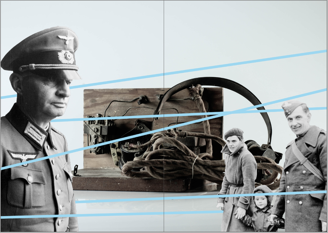
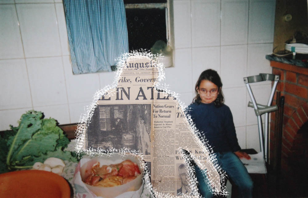
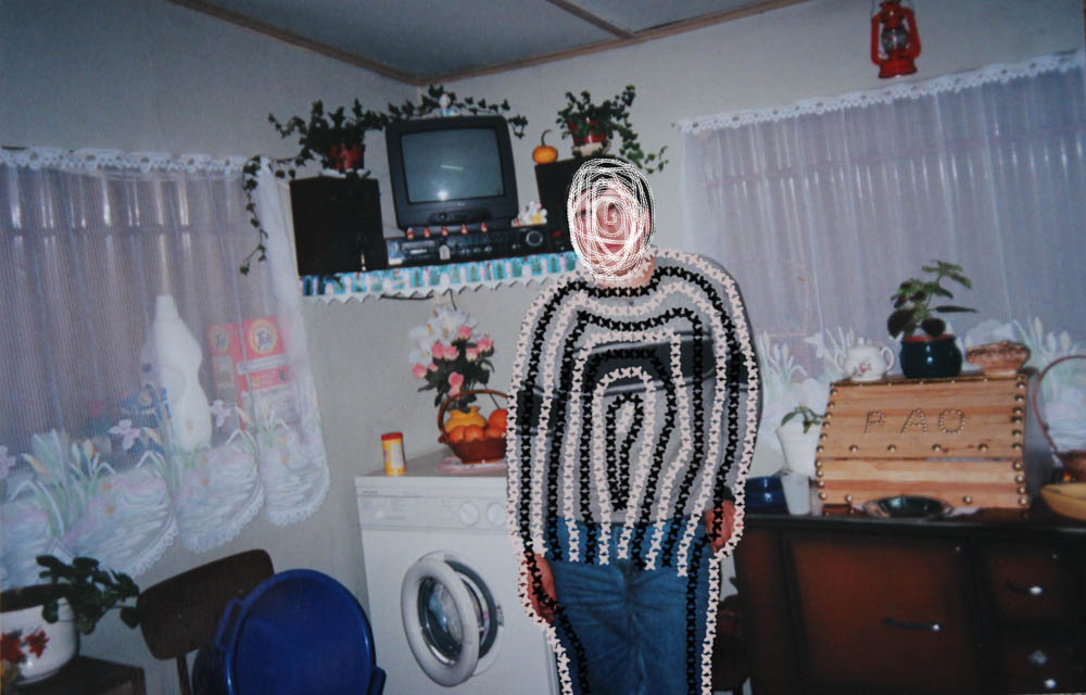
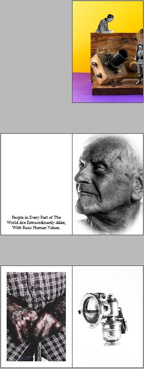
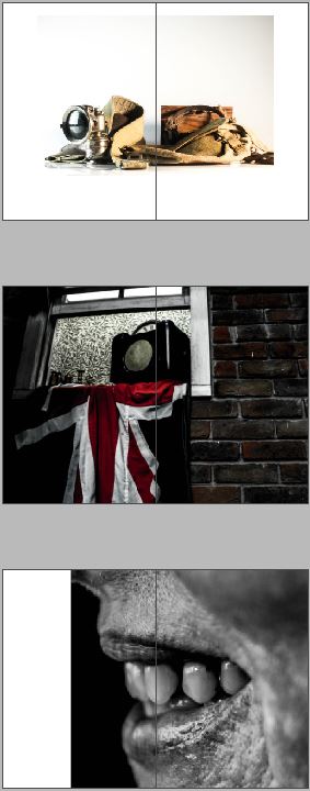
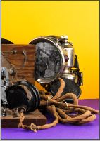
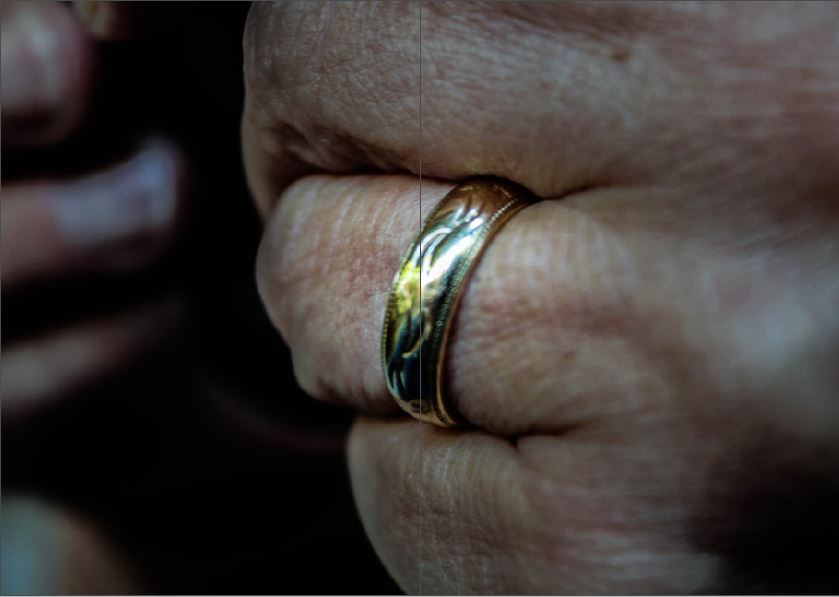
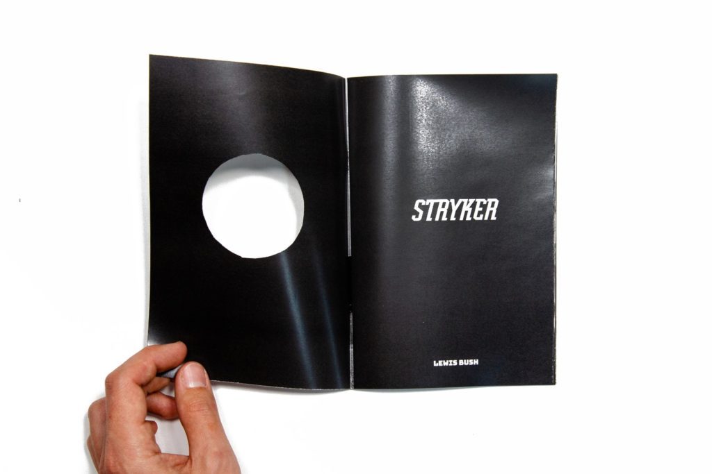
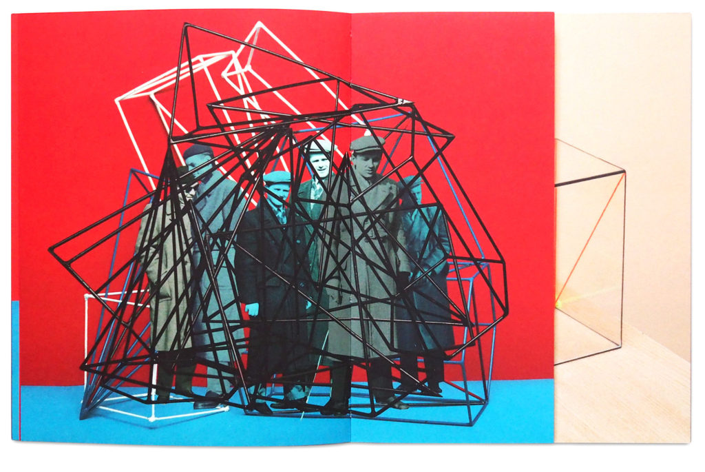
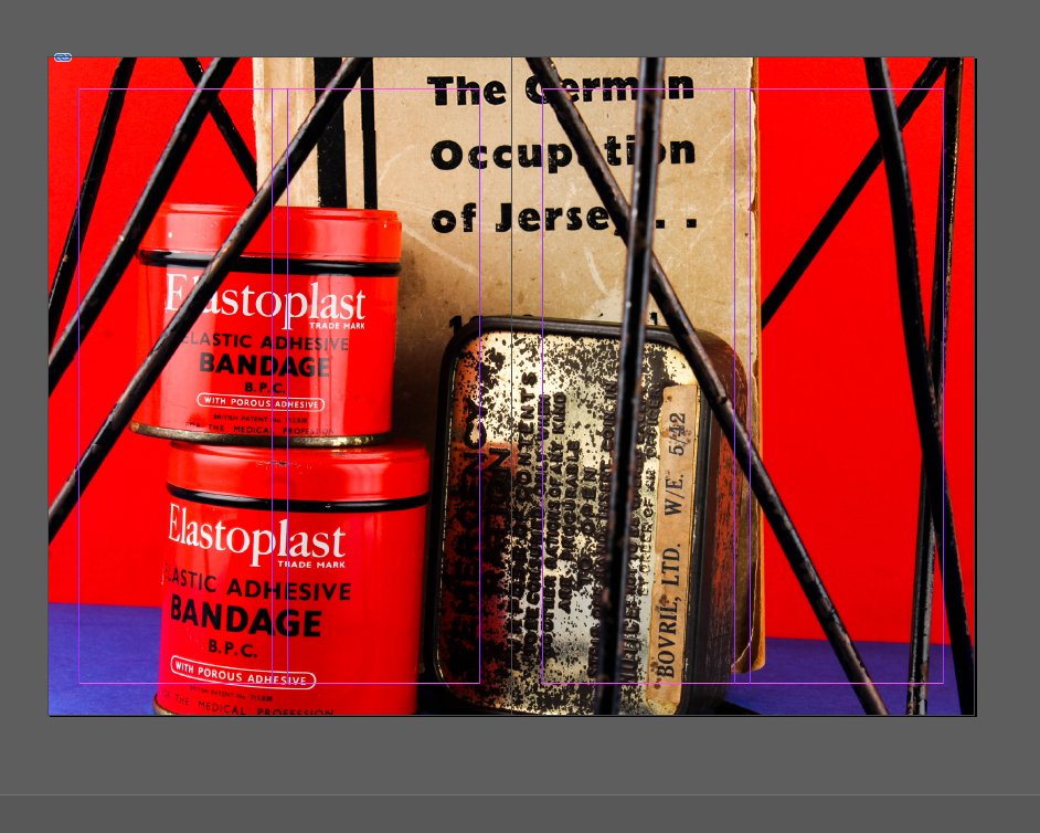
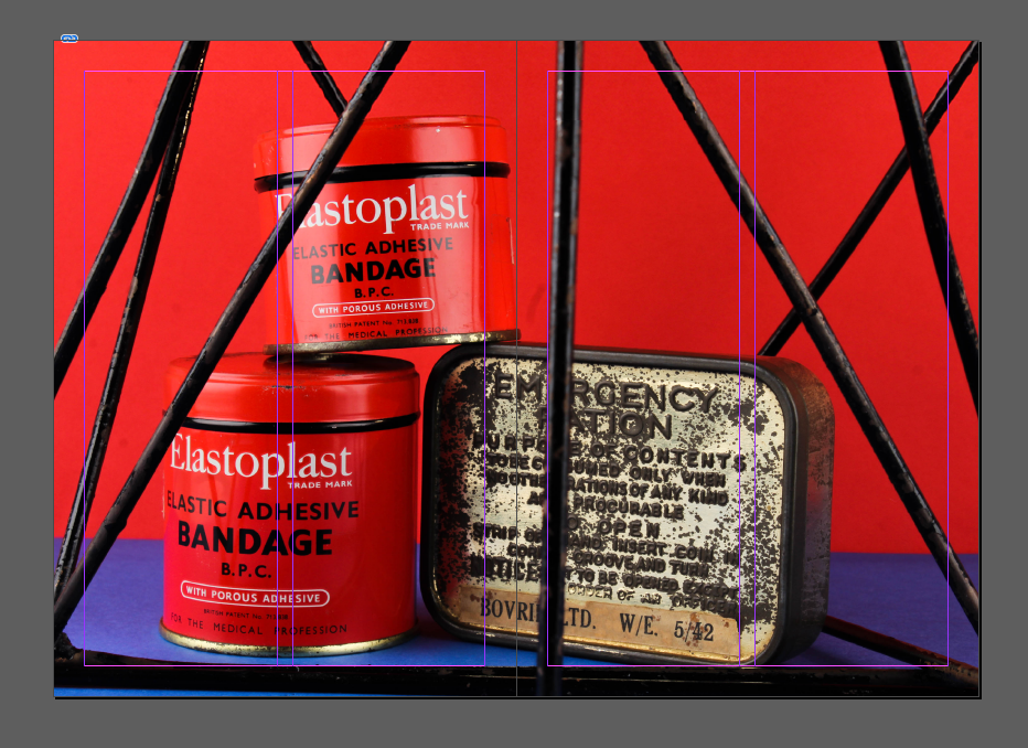
My zine has been influenced by The First March of Gentlemen by Rafal Milach. I have detached figures from the Société Jersiaise archival imagery and placed them onto my still life photographs of Occupation objects. Several figures in the zine are caged in geometric shapes as a metaphor of the restrictions the German’s introduced into Jersey when it was Occupied
I love the bold, vivid colour scheme of my zine since it juxtaposes with the historical, black and white images of the soldiers. The colourful aspect of the zine camouflages the serious subject matter of World War 2. I have also included typography inside to add a pop of colour, so there would be a constant colour scheme running throughout my zine.
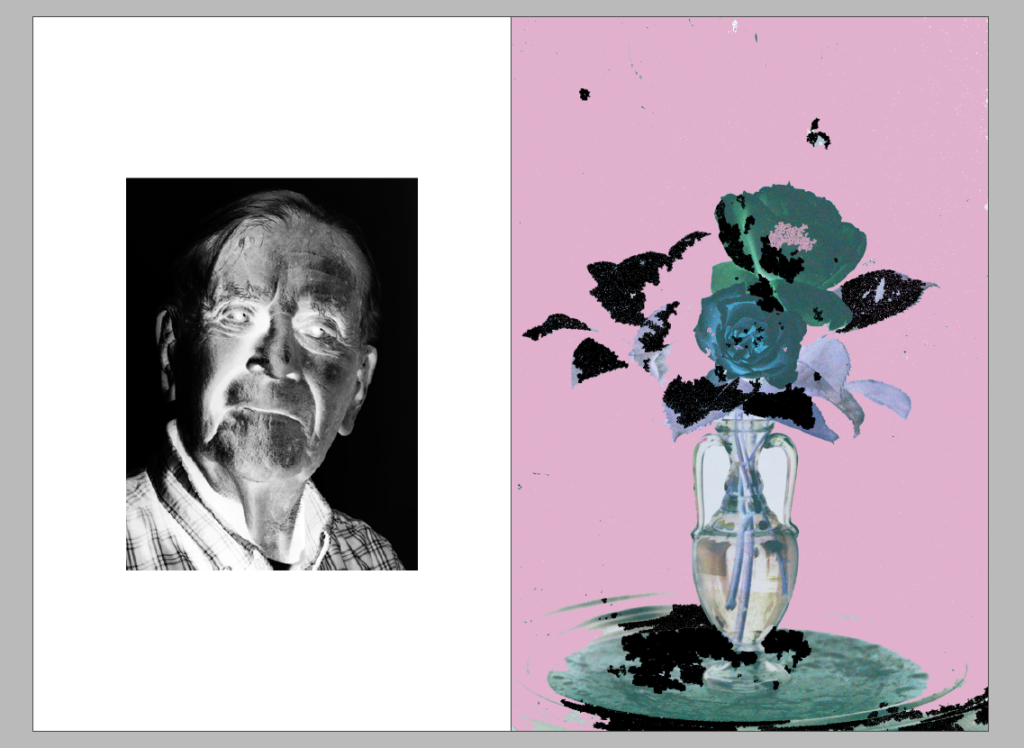
The theme of the zine is looking at the different topics that we have explored during the Occupation vs Liberation project. These include portraiture, still life and photomontage. The majority of the images in my zine are montages since I wanted to present my photos in a creative way, however there is a double page that includes a portrait of Joan Tapley and two still life’s from the Jersey War Tunnels.
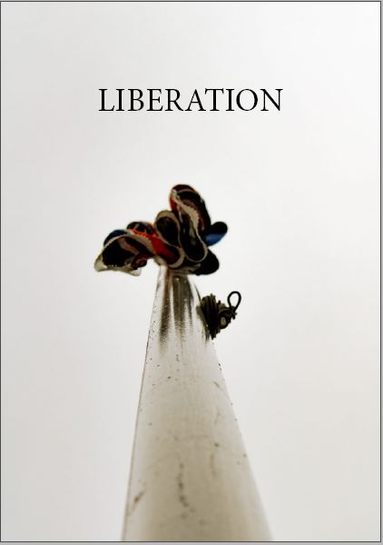
The front cover includes all the archival figures that can be seen inside the zine. I used the font TitlingGothicFB Skyline as the title since it’s bold and will most likely capture the viewers attention. Previously, I had the title in the colour black but decided to change it to white since there is greater contrast between the lettering and the “candy” coloured background. The background from the front continues to the back cover, where a newspaper from the Jersey Weekly Post is depicted stating “Liberation Supplement”. This was published in 1945 and shows Jersey’s Liberation from the German Occupation, creating a pleasant ending to this zine.
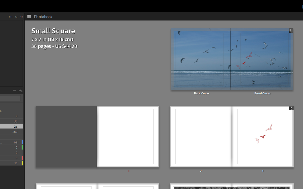
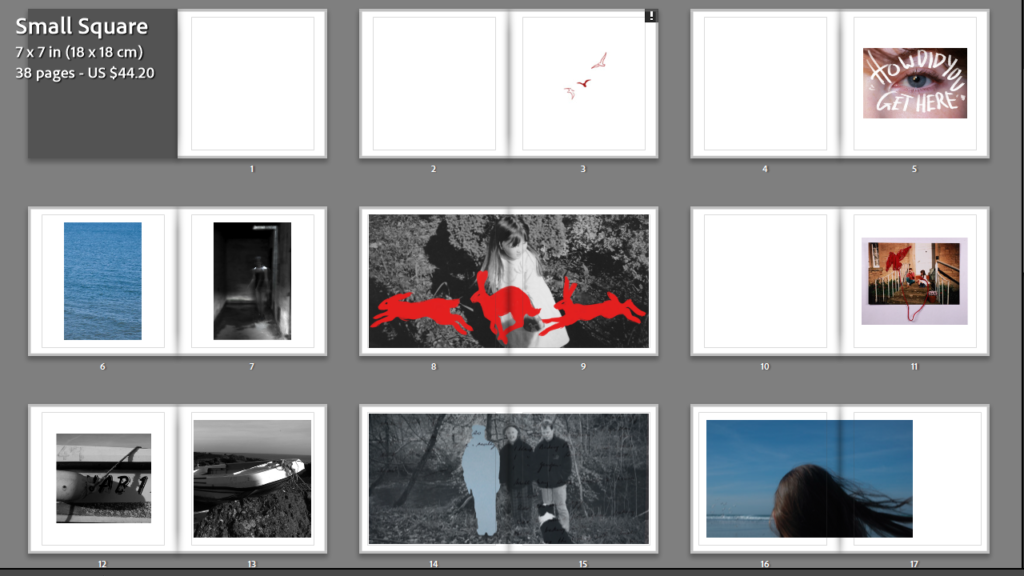
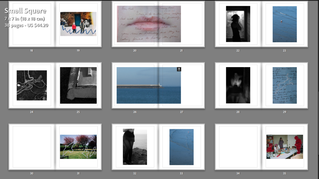
Within my photobook I want to convey themes of comfort, security and warmth – an ethereal display of locations where I feel at ease within nature and/or areas at home. My narrative will tell the story of my imagination, a dreamlike collection of images in a Pictorialist style that get disrupted by waves of anxiety being represented by darker colder images. My narrative will consist of juxtapositions, comparing the feeling of unease to instant comfort – the photobook will be a journey through ‘Wonderland’ (representing a world where anxiety is calmed but reality isn’t quite real, certain comforts may feel a little too perfect). With landscape images being broken up by still-lives of flowers and objects, it is as if this perfect world of calm and tranquillity is breaking down to reality; escapism can only be a comfort for so long before reality hits.
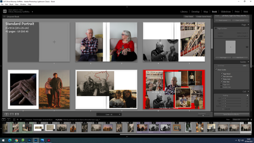
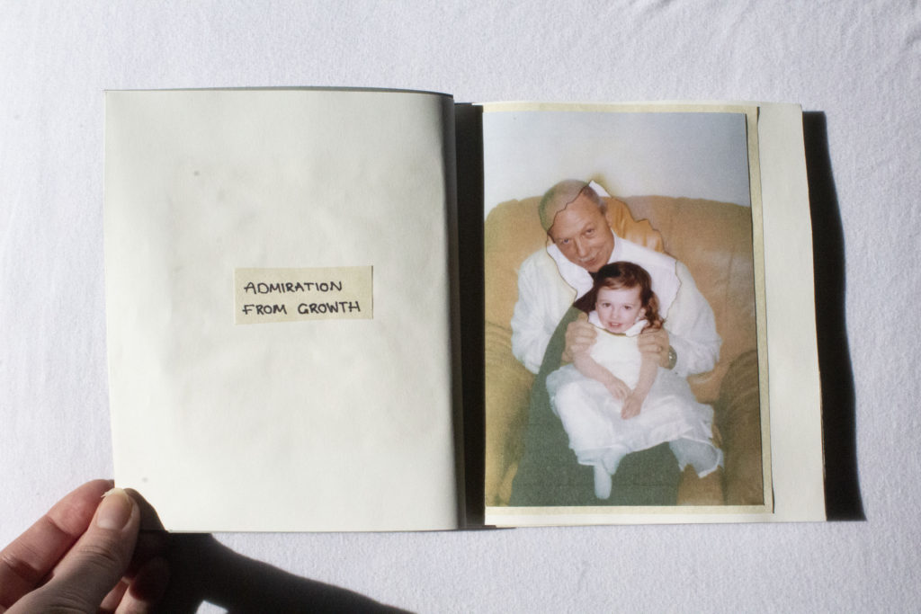
My photobook narrative will present the story of how my grandparents put their family first and worked hard to provide them with a comfortable life. This photobook will use both old and new photographic images to retell the stories that are often not mentioned in my family, such as the dedication of my grandma to help bring up my grandad’s siblings after their parents moved away, as well as my grandad’s tireless work ethic that persisted through various economic struggles. It will also touch on my family’s Mancunian roots and their move from there, for my grandad’s job. In essence, this photobook is a form of appreciation to the older generations in my family for the comfortable life and opportunities they have proved me with, as well as celebrating our strong bond and love for each other.
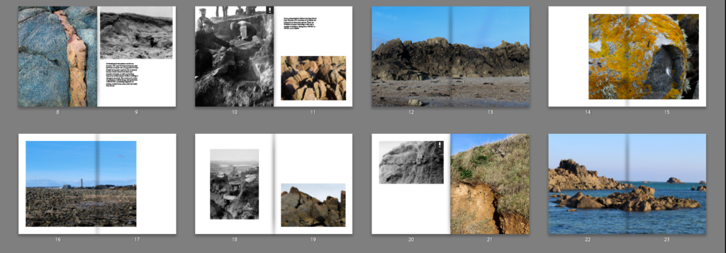
My idea is to make a photobook in which I explore the area Bouley Bay, overall I want to capture the activity, views, and close ups of key feature such as rocks, shells, heritage, the hill climb, and the bay. I could also look into the history of the bay and the Jersey Folklore, involving the Black Dog. It is important to me as I grew up in that area, and have many memories of it. And I hope to capture it in the same way in which remember it. I wish to develop my project by exploring the bay and collecting lots of objects to photograph in a studio, and also to take long exposure, aerial, and underwater of the bay, as I have been inspired by many photographers, such as, Martin J Patterson (@ mjplandscapes on Instagram), Jaun Munoz (@ drjuanmdc on Instagram), and David Aguilar (@ davidaguilar_photo).
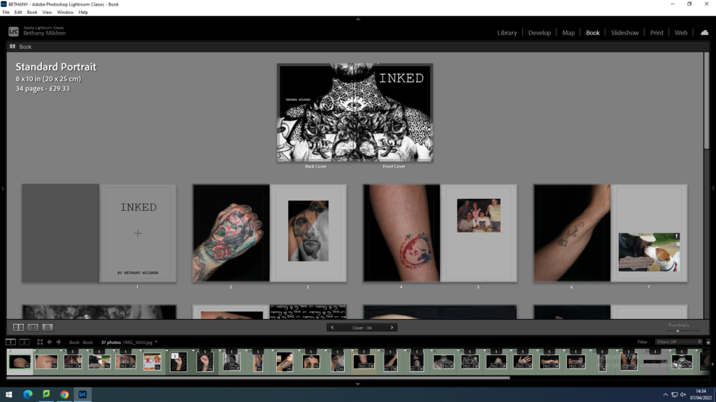
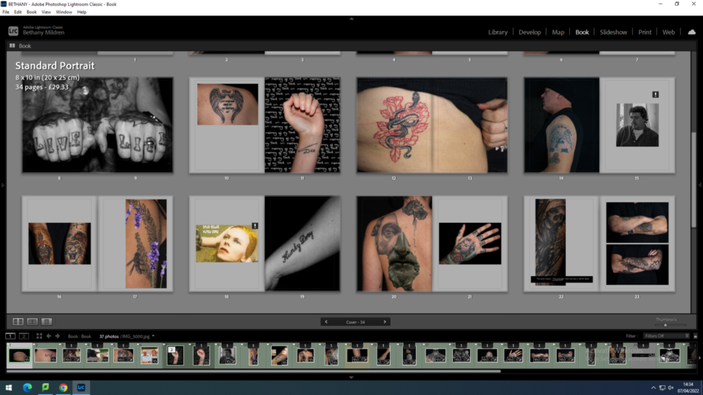
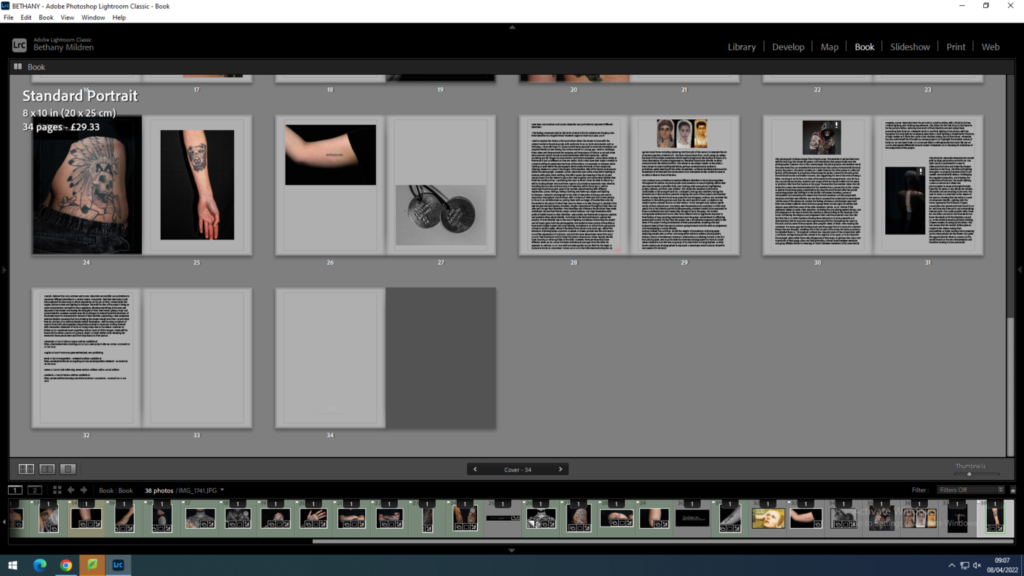
My aim is to explore the question that I have about people’s identity ; How do you present who you are? I wish to dive into the expressive forms of tattooing, the permanence of a part of who you are. Over the year, I have had the continuous stream of questions like ‘Why would you do that to your body?’ , ‘You know that’s permanent right?’ and ‘I could never do that to myself?’. There has always been a stigma around people with tattoos which upsets me as it can be a beautiful artform to express your identity. In this project I will document my friends’ and families’ tattoos and pair the photos with what they mean to them, either a handwritten note from them or an object/photo that ties in with the meaning behind. I’m exited to do more research into this subject matter, including the history and culture values which i can add to my final piece if appropriate.
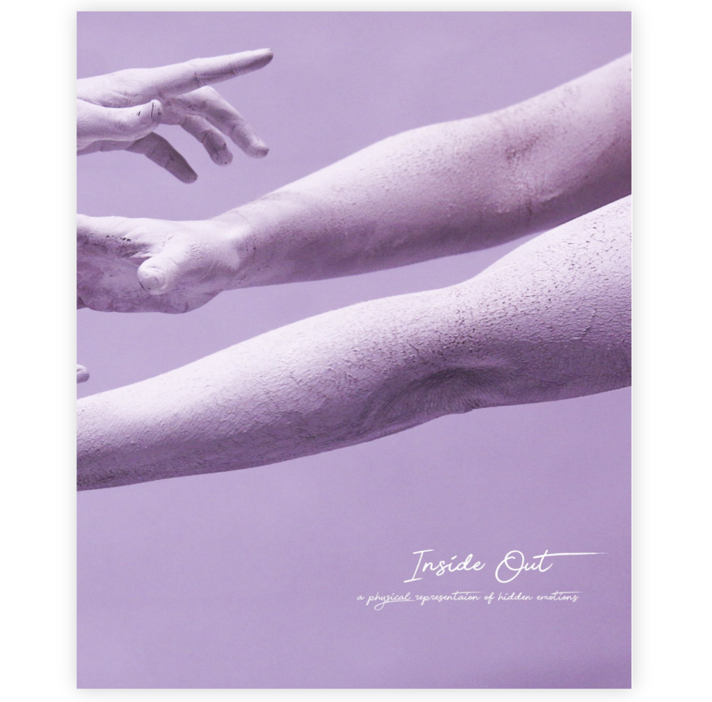
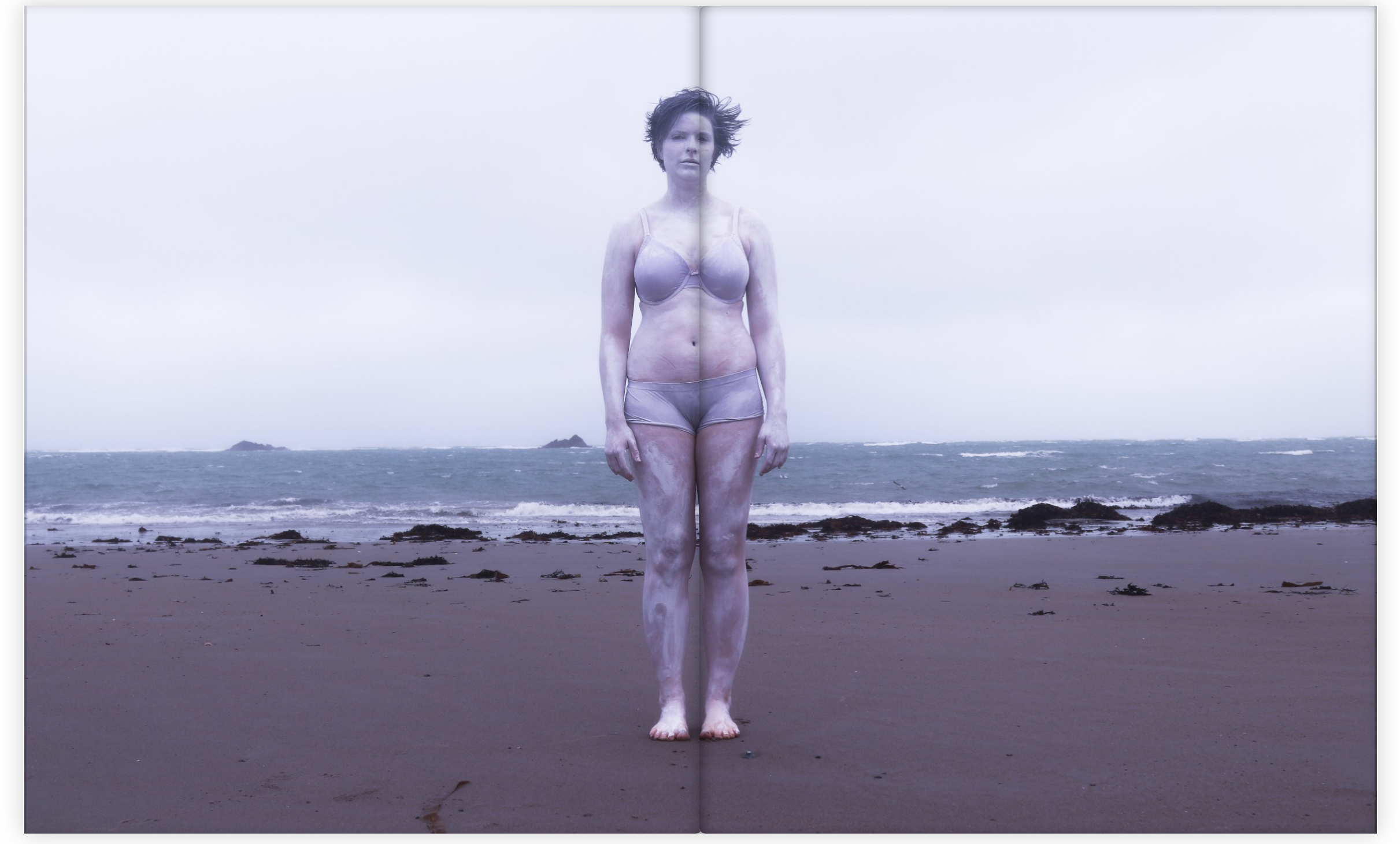
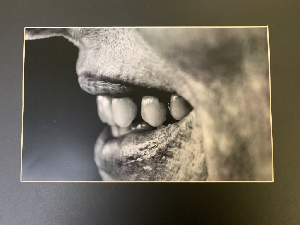
My body image project is about capturing a physical representation of hidden emotions. My book “Inside Out” includes images of subjects posing in a certain way that represents a specific emotion such as pain or happiness. The title Inside Out, concludes what the series is about in a very simple way. The book contains images where I’ve focused on particular body parts, such as the face or the hands. I’ve captured them in a creative way where the shapes and movement that they create represent certain emotions. The book contains a certain aesthetic that flows throughout. It has a very contemporary feel because of the way of using the human body and also the use of the bright colours and abstract visions. The book contains a variation of sizes of images, ranging from half page images to full page spreads. I decided to use a portrait orientation for the book because it was the best way to display my images. Although I didn’t want to categories my images into different sections of the book, I also didn’t want a completely random structure and sequencing. I therefore displayed images together that linked in some way, to do with colour or subject.
Read more on her BLOG to learn about her research and experimentation
My book Wabi Sabi is about the freedom of viewing the world in our own unique way. Its about capturing the insignificant details that we would usually ignore or not notice, and appreciating the pure and spiritual elements of the imperfect details of our lives. The Japanese term, Wabi Sabi fully explains what the series is about in a simple way. The definition of the term, “a way of living that focuses on finding beauty within the imperfections of life and accepting peacefully the natural cycle of growth and decay” concludes the project well. Throughout the book I focus closely on the tiny details of objects and scenes that we witness all the time. An example of scenes that I’ve included is the Sky at evening time, and the movement of the sea. Within these scenes Ive focused on and framed particular elements that interested me. My aim was to fragment specific details that were insignificant yet beautiful.
My plan for my photo book is to produce a detailed and insightful exploration into my family life, with me centered within the middle. This is the running theme throughout and I hope to show it through poetic, still images of landscapes or objects which may have no direct meaning at its face value but has a deeper meaning once inferred. As well, the portraits in my project are intended to be collaborative and intimate to show the relationships I hold with the people in my life but the portraits are intended to show the emotion of each being as well. I have contrasted yet shown the similarities of my mum and dad’s relationship when they were together to that of my relationship with Lucy now and the overall look I hope to achieve is that of a fun, vibrant, light-hearted but quite solemn and sombre image-based diary about how I am still developing through the events if life and the attachments I have built from the event which shaped my life – my mum and dad’s divorce. I want their to be an obvious existence of the theme of attachment but also an underlying theme of detachment. Although these themes are the main focus for my book, they are underlying themes which are subtly hinted at every now and then by a sequence which develops upon the understanding of love. Memory is fragile and I use this notion as a driving force for my project made up of diaristic photographs, which, when come together, create an album of moments in time which in-turn lend themselves to never be forgotten. I have attempted not to avoid the subject of my mum and dad’s divorce but felt it easier to express this and my feelings towards it through other subject matter, being my relationship with my girlfriend and the other people in my life, such as my individual relationships with my mum and dad and how I view them in solitary opposition to one another.
For the majority of my coursework, I focused primarily on my first photo book by capturing and sifting through 1600 images, editing the ones I thought best-suited my project and then becoming accustom to the online book publication ‘Blurb’. In retrospect, I struggled with this particular project as I found the content rather intrusive and the self-reflection into my own feelings was an intrinsic exposure I had never experienced before. However, I am glad I studied what I did as I believe I have become more self-aware as well as starting to make a conscious effort into helping my step-brother through the process I had once undergone. I steered my attention to my socio-economic surroundings in my early life by capturing Noah in his current environment, giving the perception Noah is a reincarnation of my younger self. When I began the project, my teacher had requested I focused on something thats personal with depth and meaning, and when it came to the planning stages of my project, I realized I was drawn to capturing former situations which I experienced. By focusing on this subject, I believe I created a unique narrative which focuses on what I’m looking at, but the subject of each image I am looking at is reflecting back at me and revealing small but significant elements of my childhood story. Overall, I didn’t enjoy photographing my photography coursework as it invaded my personal emotions and feelings, but in retrospect, I believe that’s what elements are photography about; pushing yourself to identify or explore minor subjects in a unique perception.
My book is a mixture of images of the people, places and objects that hold meaning in my life. Looking back and how the growing up in Jersey a place in where there is a significant lack of diversity regards to the black in the community. Also that my parents have separated and I live with my mother, how this has effected my relationship with my father and if in some ways that I have rejected that side of my life so I became less connected to him.
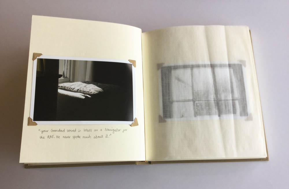
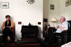
On a basic level I believe my exploration into the terms of occupation and liberation went well. The terms were broad and allowed me to consider many different opportunities to explore, but I felt looking at the occupation my Grandparents lifestyle was a perfect fit. At first I was a little worried as I knew my portraits were not always my strong point within photography, but I knew it would allow me to refine and develop me skills within this area of photography. Using artists such as Walker Evans, LaToya Ruby Frazier, Laura Blight and many allowed me to explore different ways to present my Grandparents lifestyle through portraits and landscapes. Initially, I wanted to focus of both my Grandma and Grandad but as my project developed I made the decision to place the central focus on my Grandad due to his higher position within the family hierarchy and how he considers himself the backbone of the household. At first, I looked at just capturing portraits and understood that my narrative of my book would need a change of pace and so I decided to explore the interior and exterior of their house and the relationship between landscape and person. In terms of photographic styles my project follows a documentary style as I try and capture the reality of my Grandparents lifestyle. I often found it challenging to produce reliable imagery as I did not want to ‘intrude’ on my Grandparents, but I felt as the project went along the bond between me and my Grandparents became stronger allowing me to decode their lifestyle more.
My intentions were always to have a book that explores family and how a belief and faith can connect a family as well as help it. Throughout my book I have placed photos like the one you can see below. This was useful to break up the photos as otherwise it could be considered very repetitive. Many of these family archive photos have been altered in some way or other. A continuing theme was red, this was meant to represent God as in the bible when the text is red it is Jesus talking. These photos are very symbolic. They were inspired by the photographer Jonny Briggs and Carol Benitah. Jonny Briggs is a photographer that actually visited our school. He asked us to manipulate, physically change the images to not be afraid of making mistakes. This opened a whole new realm of creativity for me and it gave me so many ideas of how I wanted to explore this. This played a part in the making of the book.
The exam brief was to create photos around the words Freedom and Limitations. I made a book with the name Baptism. The reason for this is because when a person is baptized it is a symbolic representation of what God has done in their life. In this we believe God has washed away the old life and this person has started a new life with god. ‘Old’ and ‘New’ are keys words in the context of my book. By using software I was able to change the original colors and intensify them. Giving these photos New Life with New Colors.
Previously I have been studying the spiritual link between color and the soul. I read the book ‘Concerning the Spiritual in Art’ by Wassily Kandinsky, in this he writes about how certain colors can effect human emotions differently. I wanted this to be the case with my book. Baptism is a very spiritual thing and I found calling my book that linked everything together nicely. When a person is baptized the person has the Freedom to start over to begin a new life. Before these photos were Limited by the colors that they were captured in. But I have given these photos the Freedom to change, to be something new, with new colors that effect the soul differently to when the photos were initially taken.
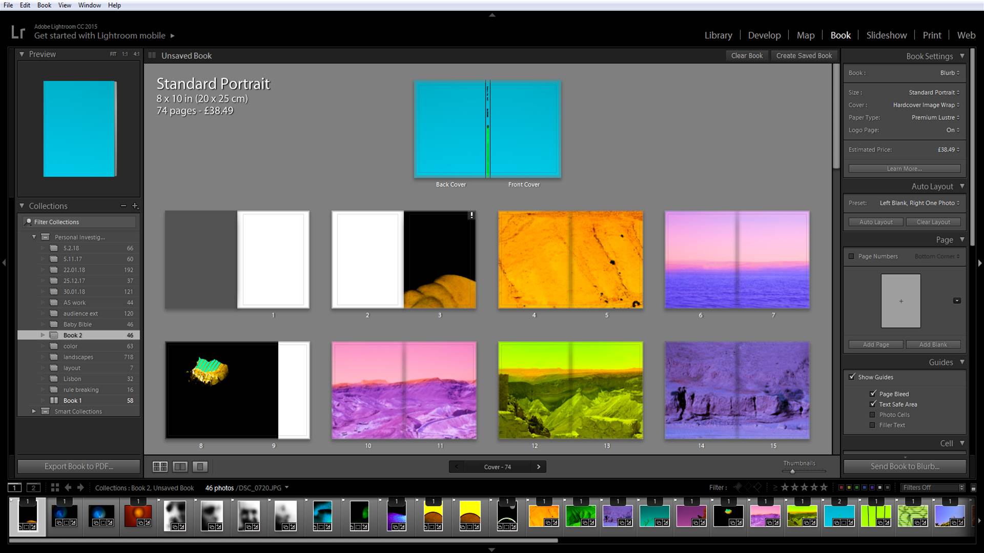
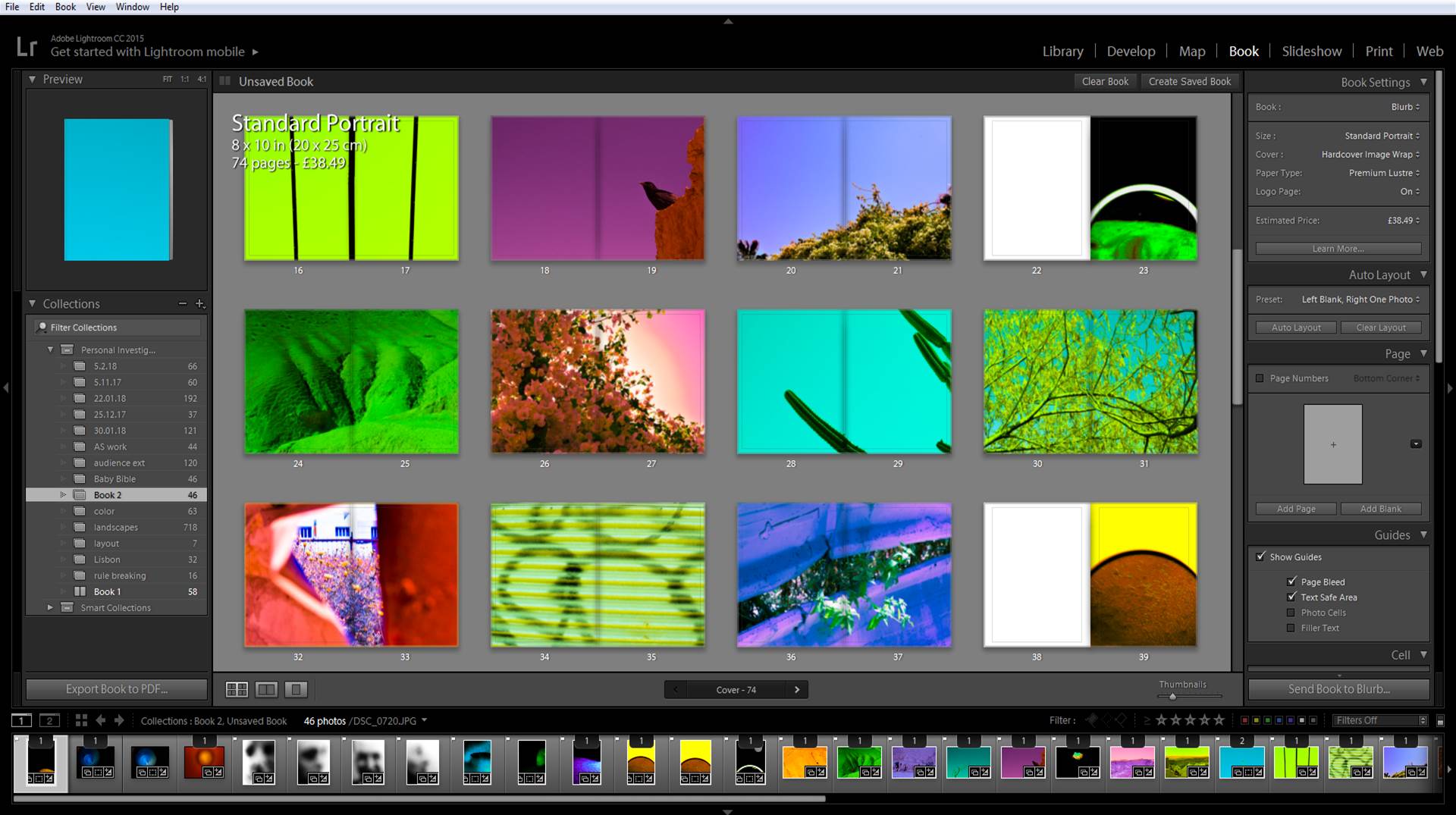
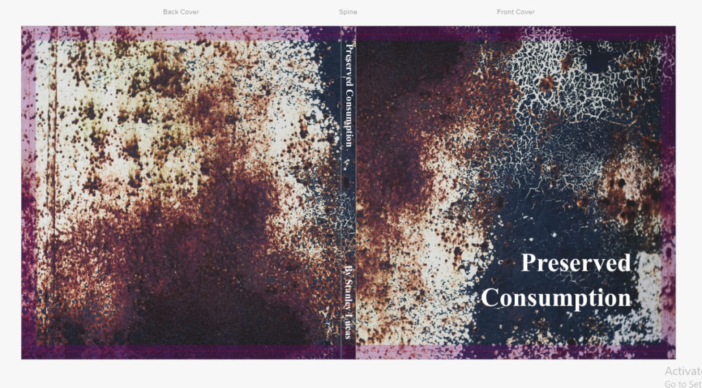
This is the final layout and design for my book titled ‘Preserved Consumption’. The book includes three different sections including production, product and waste, all of which link into the theme of consumption and its permanent scarring on the landscape (hence the title preserved). Within I have included a variety of different page layouts such as double spreads, boxed in imagery and centred photos, all of which I have experimented with along the way, helping me to conclude which layouts are most effective at accompanying the previous and next photo. Regarding certain images I have included a white border due to it preventing the photo from becoming too overpowering and out-of-place, only really doing so for the larger pieces. For the majority of the pages I have used a white backdrop as I found that it complimented the images the most, stopping any attention being drawn away from the images and to the colours, something I made sure to do from the beginning. Before each category I made sure to add a title page to inform the viewer of the subcategory in the book, giving the layout a narrative as a result which I found is one of the key characteristics of the entire book. Finally I added my essay in the end pages of the book, this was because I wanted to allow the readers to interpret the topic of the book before actually reading about what I had to say about regarding it, with images depicting the studied photographers works and my responses alongside them.
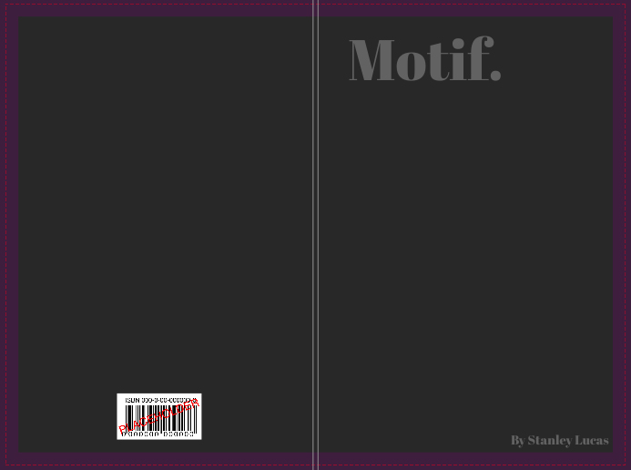
Stanley Lucas set of 3 books for his exam books: Hue, Form and Motif
Overall these are the final layouts for each of the books, Motif, Form and Hue. The three books contain a different theme within each looking at colour, texture and pattern, all of which come under my topic title of abstraction and the variety of ways in which it can be portrayed through the camera. Within the books I have included a variety of different page layouts consisting of double spreads, single images and triple photos, all of which I have previously experimented with so that they can transition between the different photos inside s effective as possible. Regarding certain images I have made sure to include a white border around each photo due to how it effectively boxes in the pieces, separating them from the next and creating contrast between the pages which I have used a white backdrop for all pages except the covers. The use of a white backdrop I found was the most effective outcome I could produce due to it not taking away anything from the images like a coloured backdrop would, instead adding definition and that needed bit of contrast on the monochrome imagery. In creating the book I wanted to go straight into the theme portrayed on the covers of each, this meant that the first pages would include my best image from each section so that it set the pace and theme for the rest of the spreads.
I started my project with the intention of exploring issues of pollution and plastic specifically, taking inspiration from the photographer Mandy Barker and experimented in my first shoot by taking images with string infront of the lens looking at rules of manipulation. I then found the photobook ‘The Meadow’ by photographers Barbara Bosworth and Margot Anne Kelley which is what first interested me in photographing and exploring specific areas, as well as gathering objects and photographing them. I also discovered the photographer Chrystel Lebas and her photobook ‘Field Studies: Walking through Landscapes and Archives’ which is where I read about the changing environment. She compared her modern images to the photography of Edward James Salisbury in the early 20th century and walked in his footsteps, going to the same areas he did to explore how the environment had changed over 100 years. This is where I decided that the concept for my project would be looking at how the natural environment had changed over 90 years at the location La Motte. I found archival images from this area and thought i would build my photobook around them, comparing and contrasting them to my own images. I noticed Lebas’ influences from sublime ideologies by Edmund Burkina his book ‘Enquiry into the Origin of our Ideas of the Sublime and the Beautiful’,with her images being vast and other-worldly, which is an aspect I wanted to reflect in my own work. From then on, I did an additional five shoots where i went and took landscape images of La Motte and at the same time gathered natural objects that i found on the island and the beach i.e. rocks, seaweed, flowers. I did multiple shoots where I photographed these objects formally with plain background and edited them to reflect the work of early botanists where they used light sensitive paper to create photograms. I did this as i thought it would give my project and photobook a scientific appearance and reflect that of an investigation into a specific area. Towards my final shoots, I walked around La Motte and tried to find man made objects that I could photograph to perhaps represent how the natural landscape had changed.
In the final version, I changed the cover images to what was originally the first pages in the book. I felt that these images were more powerful in portraying my ideas as well as captivating the essence of my project.
I summed the topic of my project in one word being ‘Waste’ as it reflects the three concepts behind my work:
The ‘Waste’ featured in the images
The action behind humans throwing away the things they do not consider important.
The consequences of disposing items to ‘Waste’ away.
The title is written sideways to give a ‘scientific document’ feel.
I repeated the same pattern of images throughout the book, to give an organised aesthetic. The circle images are placed alongside their close-up comparisons to show the detail in the items depicted. I chose to make many of my images full scale, as they all have dark backgrounds. Black is used in a minimalistic style to emphasize the items, as well as being associated with darkness and negativity to reflect the topic of pollution.
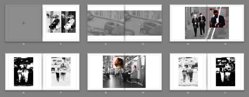
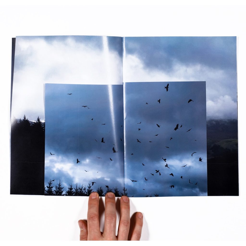
In my design specification I stated ”Some images will be best as full page spreads (single or double), some images will look best with boarders and some will look best grouped together, and therefore I am not going to limit myself by completely sticking to one uniformed layout and will instead lay out my photographs in the way which I believe individually best suits them…The sequencing of images in the book I intend to follow a narrative of how surveillance is evolving/developing. So as the book continues the images represent closer and more personal forms of surveillance, such as surveillance through our own devices. Whereas in the beginning it will look at visual forms of surveillance (birds) and then early forms of technological surveillance (CCTV etc.)” This, as I said, was something which I definitely followed up on and stuck to.
I decided the title of my book ‘ A State of Contentment’ when i was actually in Burkina Faso completely submerged in the situation that i was in. The idea came to me when we were on the building site discussing the local community and thinking of all the things we are grateful for that we were getting to go home to. It was evident to us that we would only be in Africa living a minimalist life for a few weeks whereas the reality for the local community was that they would be experiencing this hardship for the most of their lives. Although this seems like a harsh thought we had all noticed that even though the community had so little they were utterly content with what they had and i said during this discussion that it seemed as though they were in a state of contentment, because the community truly were in a state of peaceful happiness. I put the title and my name on the cover so that the writing did not take away from the cover image.
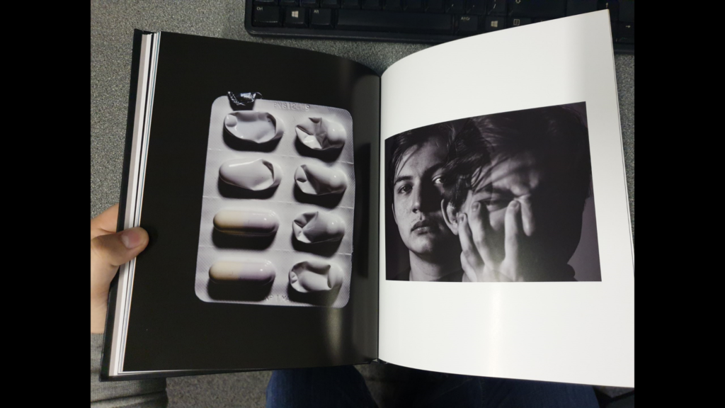
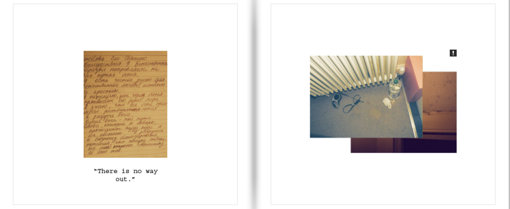
I decided to portray mental illness throughout my photobook. When I started this project I knew I wanted to tackle the subject of mental health, but it took me a while to figure out the best way to go forward with it. Originally i though of using landscapes as a way to convey emotion, however eventually decided to turn the camera on myself for a set of self-portraits. I feel as though this decision really helped me open up and put as much personal experience into the book as possible. After the original self-portrait shoot, i wanted to continue with creating a really unique and personal narrative in which i can show both my own emotions and feelings that i have been through, but leave parts of it ambiguous enough to be interpreted by other people in their own way.
I then decided to focus on my personnel experience surrounding prescription anti-depressant drugs, or more specifically SSRIs ( Selective serotonin reuptake inhibitors ) which are used when, for whatever reason, there is a lack of serotonin being produced, with it’s aim to boost serotonin levels in the brain. This element was quite difficult to capture, as most of the time you don’t notice anything different, which is why i decided to use a gradual build in saturation inside the book to show the slow but steady changes, however I did want to make sure to capture aspects of medication not working, and the task of changing medications and gradually building back up until it works. I represented this component in my book by showing the rise in dosage levels in text at the bottom of the page.
I want to explore how moving from where I have grown up has impacted my life, whilst also adjusting to and finding beauty in a new place. I want this book to primarily focus on family and my relationships with them whilst growing up.
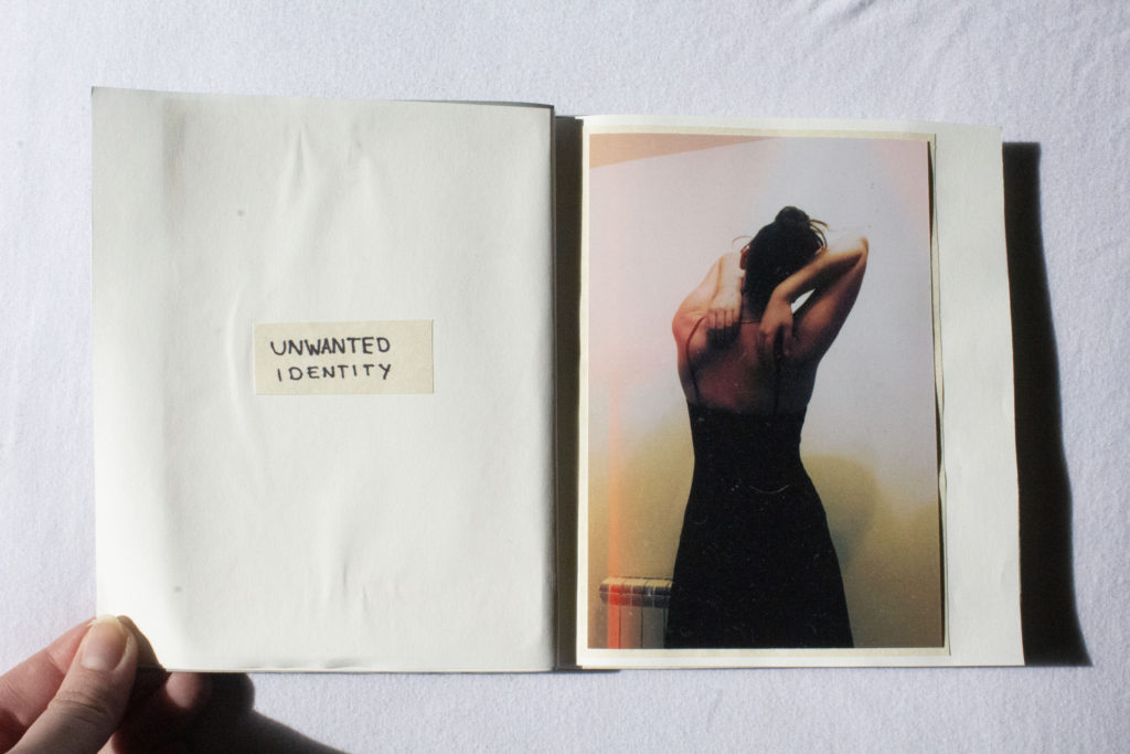
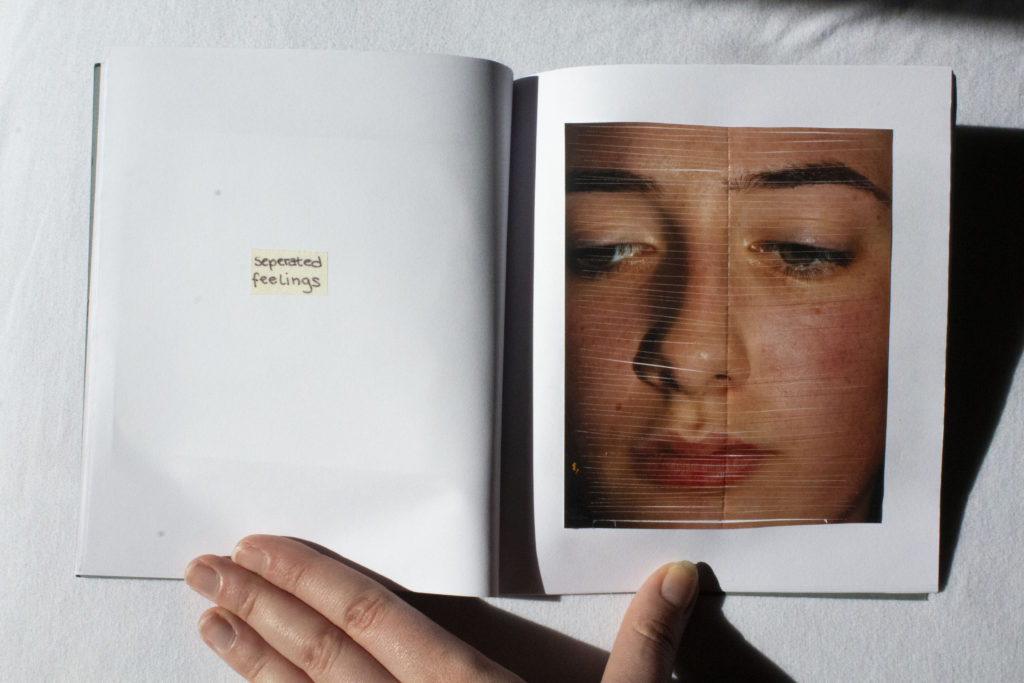
To conclude, this project has overall been successful in terms of recording and capturing the concepts which I brought into the project, focusing on self identity. Given the titles ‘Occupation Vs Liberation’ I had a large range of work I could explore, however I found the idea that suited best was the liberation of personal identity and the occupation of your own thoughts. Initially I wanted to focus on the destruction of self portraits that would reflect a physical emotion towards these pictures, but through experimentation and photoshoots I created images that reflected an identity. Through my responses to Francesca Woodman and Edward Honaker I was able to combine both response imagery together in which they completed each other and formed a narrative. The narrative being the unwanted identity I was given and how I view myself within those images. Within my final zines I utilised self portraits both archival and new so that it was reflected even as I grew, the sense of unease was consistent.
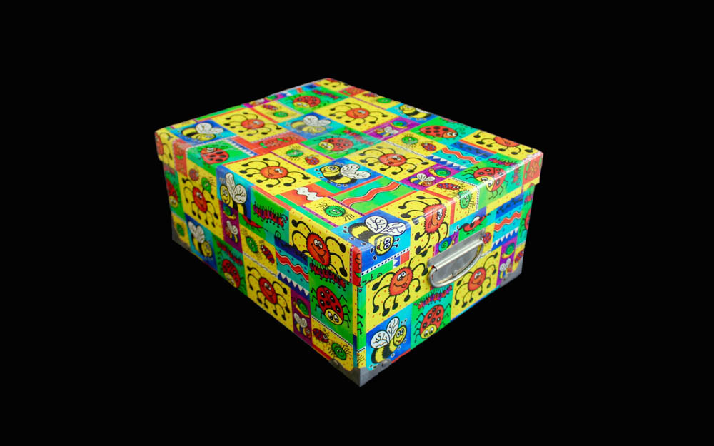
For my final pieces, I am very proud in how I managed to construct 2 photographic zines, a storage box for them and a mobile for my mounted and hung images. I wanted everything to be done by hand because it was a project about myself and I don’t think something made by a machine would convey the right message.
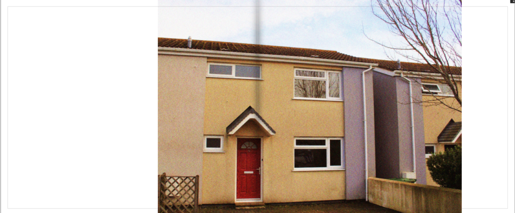
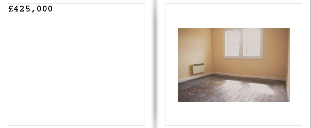
This project has overall been very successful in terms of recording and capturing the concepts which I brought into this project, focusing on three main concepts, the housing crisis, nostalgia and control. I took significant inspiration from the slum photographer Nick Hedges and used his conceptual and contextual intents within my own work, bringing awareness to the housing crisis here in Jersey. In order to respond to my personal study I employed the use of both a film camera and digital camera. As I used the theme of nostalgia, the use of a film camera is an effective way to display this through the grainy and soft nature of the photos themselves. The subject of my images is the low cost, affordable housing which can be rented in Jersey. I contacted estate agents in order to show the contrast of the way in which housing agents glorify these homes in a way which makes them more commercially appealing, versus what the reality of them are. I focused on small and minor details which distinguish each property such as the flooring, bathrooms and kitchen cabinet. I photographed the exterior of buildings, going around the dingier parts of St.Helier which depict the depressing lifestyle some people face by living in the urbanized town center.
When developing my final book I wanted to have something unique, something I have never done before, and originality that meant my final presentations will be unlike any others. To do so I started off with developing the book. I Knew for my book I wanted to create a black and white tonal book. This soon transpired to having silver and black ink inverted to create glowing images. I also knew that for my narrative of life from birth to death, told through the story of creation, That I would need a long narrative. To do so I first off assigned myself 100 pages, then narrowing down only the best images to around 87 pages in total. Furthermore, to go in hand with his over exaggeration of visual overload due to the volume, I decided to have an image on every single page, so to go hand in hand with this large effect. In the end I was left with an array of different displays, differing from two full bleeds, to some with black boards to full double page spreads. The distorted array not being continually mimicked was very effective and something which Made the narrative of my book, perhaps, more enjoyable, as you are able to take your time when looking through each of the images. As spoken about previously the finality of my book was found within previous books such as Astres Noirs.
For my photo book, the main theme was intimacy and young love. I wanted to explore my relationship with my boyfriend and show a series of different styles of images. I called this photo book “Espera” which means to wait in Portuguese, as this word (besides love) is a word that both Jack and I use frequently. Read more on her BLOG here.
For my personal investigation I intend to create a photo-book project around the theme of documenting the youth of today and our culture, which is rarely portrayed accurately in the media, this may also include certain subcultures that I could decide to delve into. I will try the best I can to capture and achieve a realistic portrait of each individual person. The question then arises, ‘What does a ‘real photo’ even look like: is it something you can hold? Is it something you can see on a screen and alter?’ (Bright, S. and Van Erp, H. 2019: 17.) I hope to answer this question throughout my efforts of trying to capture a ‘real’ portrait of an individual. How much can you really tell about a person through looking at a mere photograph of them?
Jasmin Ross: Handle With Care
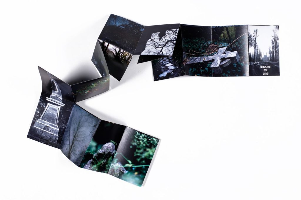
I have made a book which is called Handle With Care, it is about the history of St Saviours hospital from when it first opened in 1869 to when it closed. The layout of the book starts from the outside, goes inside then, then you meet 3 patients, it stays inside then it goes outside again to finish the book. My book is 108 pages and it has a combination of text, double page spreads and single image pages. My book is split into two parts of Archival material which was the basis of my work which i went a collected and photographed then next part is of my own images which i made of the outside of the abandoned building.
Overall I have found my personal study project very interesting. Assisting with the wider project in collaboration with the Société Jersiaise Photographic Archive and National Trust has meant that I have been involved with research and discoveries as well as having access to exciting photographic opportunities. I was originally introduced to the collection of Francis Foot’s photographs in October last year while interring at the SJ Photographic Archive and since then have been involved in a lot of work developing a project around it in connection to the building restorations. I started by researching the family and history of the buildings and familiarising myself with the collection by updating the database. One of the most interesting areas of my project was actually visiting the buildings while they were in the process of being restored. This allowed me to connect the knowledge of the past to the present and explore the idea of preserving built heritage in connection to the historical photographic aspect. This relates to my interest in local history and the development of photography as an art form. Having knowledge of the past inhabitants reflects the human side of buildings and memories and traces associated with them. Some of the small details such as the image found behind the mirror and writing on the walls were particularly striking examples of this. It has also been interesting to explore family portraiture throughout time and conduct various shoots with my own family including one specifically connected to the Foot Shops.
Beliefs and superstitions revolving around mythical characters in Jersey, Channel Island are common. The ancient lanes overhung with vegetation look almost like dark tunnels leading into the unknown. Unexplained ruins dotted around the coast add to the air of mystery and Island people with a long and proud history have many stories to tell which have been passed down from generation to generation. In this photo book I have explored three of Jerseys most famous and well-known legends, portraying each one with a series of environmental portraits, studio shots and landscape photographs. The first legend tells the story of the poor Bride of Waterworks Valley, the second shows the demonic presence down at Devil’s Hole and the third looks into the many tales of Witchcraft in Jersey. This project is my response to the provided themes of ‘truth, fantasy and fiction’, as well as the beautiful depictions of myths created by other photographers. My aim for this photo book was to recreate some of our islands most interesting history using beautiful and insightful visuals. By doing this I hope to bring these legends back to life in this colourful yet ominous series.
I produce a large amount of documentary style images revolving around the more shadowed teenage social life. This involves being in a lot of places we shouldn’t be, drinking too much and probably a little more nudity that this blog is ready for. Below is a selection of my project work over the last few weeks presenting a range of locations – from abandoned hotels to out of hours nightclubs – featuring my friends being strange and causing trouble. There are some clear trends in the image I create such as the selective palettes and tight range of colours and the positioning of characters – these images were not directed at all though the figures were of course aware I was photographing them. This photobook was made using bookwright software and will be printed as a portrait A4 project. Many of the design ideas for this projects are inspired from artists and graphic designers I have studied over the last two years such as Lotta Nieminen. Studying the graphic designer’s personal projects. I took particular notice of the image layouts and use of overlapping text. There is a carefully controlled colour palette and minimalistic design which aids the presentation of images in such a publication. Benjamin Koh’s project work again has a strong graphic theme which uses a muted colour palette to emphasize the continued sense of photographic narrative. His pages tend to be uncluttered and minimal which draws attention to the graphic images in each of the carefully constructed double-page spreads. These elements were crucial to my own work, ensuring that images would be easily visible and clearly presented.
There is a consistency of monochrome tones and grainy, heavy contrasted images. Throughout my project I have looked at documentary photographers such as Larry Clark and Jacob Sobol, and upon reviewing their work i have grown a love for their styles. The layout and the order of the images is important as the book needs to flow, almost the same way a story does. I need to find similar groups of images and order them carefully one by one so the book feels as if it has a narrative. I started with a small, shadow filled image of my face as the book is about my teenage life with friends. I followed this by a double sided silhouette of a friend in the school car park leaning up against a car. I wanted to start the book of with images based around friends and our utilisation of cars. These next pages were organised to follow the theme around cars, starting with another image of friends in the school car park between lessons, leading to images in cars at night time.
In terms of my title, I called my book ‘home sweet home?’. This is of course a common household saying, that I have added a question mark to. Due to the fact that my home life is fairly broken and has been on and off my entire life, which makes it far from ‘sweet’. On the first page within my book I write the quote ‘family means no one gets left behind or forgotten’. This is controversial from the start, as my farther had done exactly this from my birth, which is ultimately what stems my thoughts and feelings towards a lot of my family life and the reasons for the decisions made within this book.
Here I feature a stand alone image of an ultrasound of me. This is used to imply that I am the center of this book and that this is my own representation. The inclusion of juxtaposing images, put alongside one another, help to emphasise my emotions towards certain characters within my book.
My granddad is someone who has consistently been in and out of my life, throughout my upbringing. Therefore I feature him alongside a set of spiraling stairs to imply that he has spiraled out of my life.
The first step I took to my project inspired by the work of the artists I have studied and discussed was look at my own archived family photographs. I have a huge selection taken by my parents featuring me and my brother, many appeared very informal depicting me and my brother playing and laughing at each other, which gave the ability to see the relationship between me and my brother and how it has developed. Much like any family album, these photographs share a very personal importance to me. I wanted to use photographs that depicted who I was as well as my brother in my book as a way of a candid reflection of what my childhood was like and how I felt about it. Similar to the work of Carolle Benitah I wanted to make physical alterations to the photographs to further explore the notion of nostalgia, memories and the relationships between family members, in particular between me and my brother. I wanted use their project as a way to further understand myself through the use of memories and photographs to build and develop and understanding of who me and my brother are today and in particular our differences which are created from the notion of ‘nature and nurture’.
The research of both these artists informed and influenced my personal project, which focused on the life of my mother who is currently diagnosed with metastatic breast cancer. She was originally diagnosed with breast cancer in Easter 2014, but when the cancer has spread to other parts of the body, it is called metastatic cancer. The liver, lungs, lymph nodes, and bones are common areas of spread of metastasis. Using art and physical materials, I wanted to draw into and edit the photographs I take in order to illustrate my emotions and what my mother is going through. The physical art would be a visual guide to the audience, telling a story regarding the illness. This is something that I was excited to do, given my passion and abilities in art and design. I can draw, scratch or edit the photograph using chemicals and other kinds of destructive methods. This can demonstrate some kind of investigation into the relationship between traditional art and Photography as mediums. This is something that I touched upon for my AS project.
During my personal study I enjoyed having freedom to explore my own ideas and take inspiration from artists and photographers that I am interested in. I was very inspired by Cindy Sherman’s work, I wanted to explore themes such as masquerade, costumes and stereotypes which are very present in Sherman’s studio portraits. When first collecting ideas as to what I should base my project on I decided I wanted to explore female stereotypes through costume and studio portraits. However, with so many stereotypes existing within my gender I decided to create a series of portraits depicting stereotypes from each decade of the 20th Century. As I was born in 1998, I was looking at these stereotypes with a retrospective. I also kept feminist theory in mind, relating my stereotypes to important movements in feminist history including the three main waves as well as smaller social victories for women. I felt that this project was very successful and that each decade was well planned and executed and that the nine image work well as a series.
My photo-book is based around my Grandfather. He died 30 years ago and so I never got the chance to meet him. I wanted therefore to find out more about him and develop an understanding of what he may have been like if I had got to know him. This project was therefore very much about exploring and investigating the theme of absence, a story based around someone who is no directly part of it. I photographed off and on for 9 months to create this project, re-tracing my Grandfather’s steps and using photography to express my findings. Archival resources in particular have played a huge part in my project, especially through the access I have had from the Société Jersiaise Photographic Archives, and the resources I have found play as much a part in this story as does my own responses. I wanted to make my images and narrative feel as simplistic and personal as possible and so I constructed my photo-book by hand, I style I believe gives my work a quirky, old-fashioned feel.
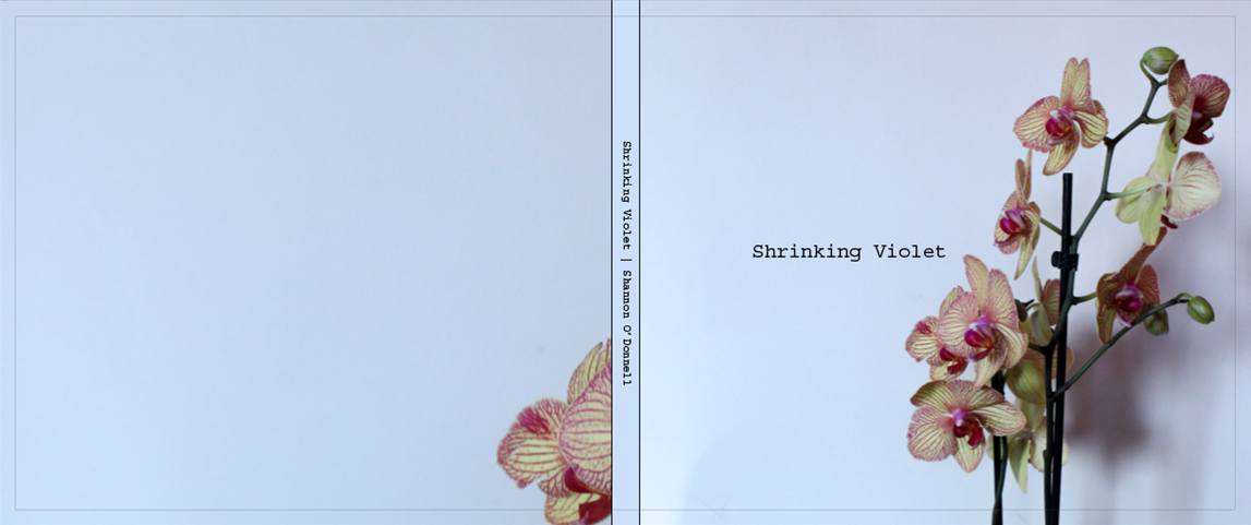
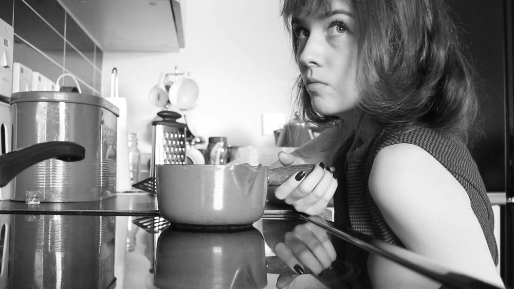
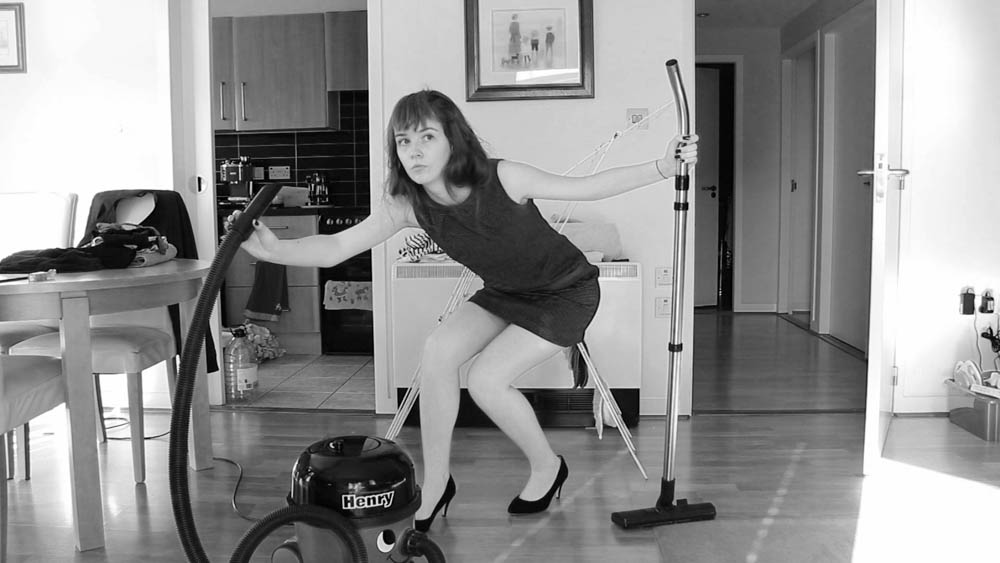
Shrinking Violet stemmed from a short film that I created as part of my project of my mother. I made a film based around an interview that I did with my mum and made it up of archival images as well as documenting her everyday life. Part of the interview sparked my interest when she said ‘I’m not one of those shrinking violets in the work place’. This caught my attention as I see her role as simply doing what is expected of her, something that I want to challenge through my photographic work. This brought on the idea for creating a parody shoot where I dress as a persona, similar to my mum, and pose around the house mimicking the role I see my mum portray. I wanted this photo book to embody the traditional role of women our society perceives and for spectators to view the images I have created to recognise themselves, their mothers, their sisters and their wives. Gender defines everyone and, at times, can be limiting. It makes us feel that we need to belong and conform to the expectations placed on us at birth solely on whether we were born male or female.
Watch her film below about feminism, her mother and her role in the family. This film was the starting point for her photographs above by re-staging herself as a domisticated female.
“Good friends make you face the truth about yourself and you do the same for them, as painful, or as pleasurable, as the truth may be.” – Corinne Day
An autobiography is an account of the life of a person written by that person. In other words, it is the story that a person wrote about themselves. My inspiration for this study came from memories that are forgotten, and the ‘things’ that re-jog our brains to remember them. These could be objects from a childhood collection box or a set of images from a blurry holiday. For this piece of work I attempted to join two ways of memory revival into a book as well as a layout presenting some of my final images.
I took huge inspiration from photographers such as Thilde Jensen, Jo Spence and Francesca Woodman, these three photographers all explored their illnesses through photography which I thought would help me come to accept my diagnosis. As Jo Spence explained, photography can be used as therapy, “literally using photography to heal ourselves.” Through taking these photographs to document my illness like a diary I came to terms with it and learnt to adapt and slowly started to be able to have a normal life again just at a slower pace than before. For me this was a difficult subject matter to explore as I try and keep it rather private, friends know about it but I try to keep it private from classmates and the general public. I don’t want people to look at me differently and I found I felt rather vulnerable exposing the one thing I do my best to hide.
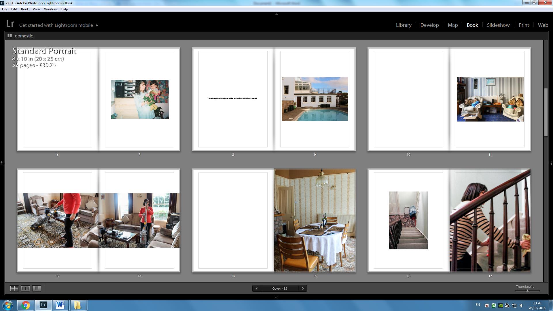
My personal study is about my mother who immigrated to Jersey in 1987, from a disadvantaged background in the hopes of having a better life. My mother is the eldest child of six, who grow up in a village called Machico on the south east side of the Island of Madeira. After leaving school at the age of 9 to work on the land to provide for her family, she developed a hard working discipline. Currently, she is the breadwinner within my family working in five different jobs all within the domestic area. In my personal study I am exploring how my mum’s role as a breadwinner abdicates from her culture and stereotypical role within a household.
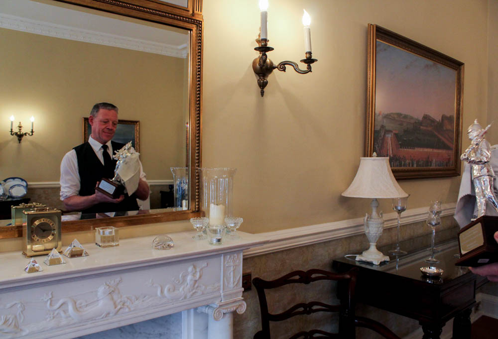
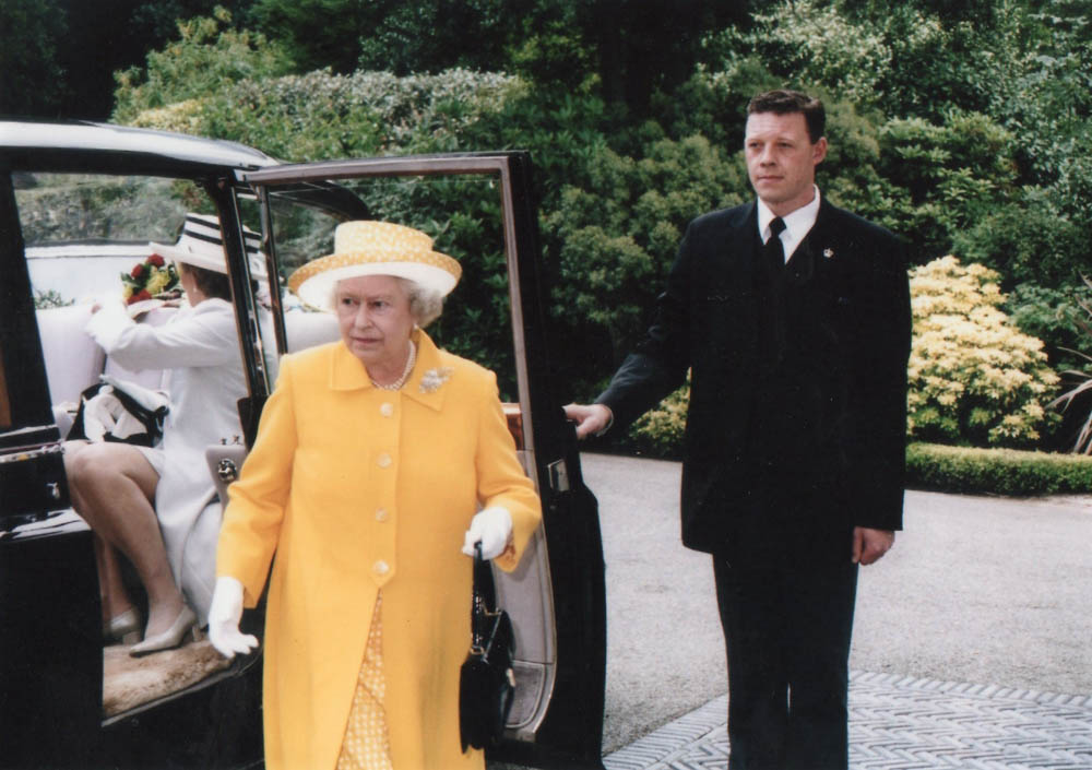
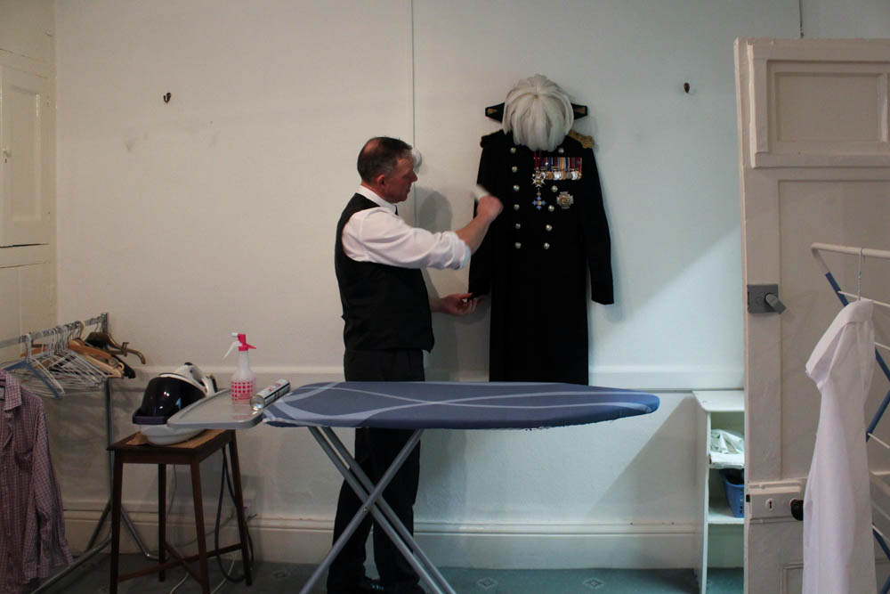
As a photographer, it is important for me to express details about my life to almost create a biography through photographs. I chose to use my dad for my project as his job has impacted my life since day 1. My dad is the Butler for the Lieutenant Governor of Jersey and has enabled me to have an insight into the life of royalty. My dad’s responsibilities are; ensuring the house events run smoothly, he also manages the house staff and liaises with his Excellency and Lady Mc Cole for all their requirements. I have lived in the grounds of Government House all my life and have truly honoured living here. Our tight community has really impacted my life and the way I am, as I also work as a waitress for Government House functions, I have been taught the type of service required for the Governor and his guests by my Dad himself. It was an honour to follow the footsteps of my dad and what he does at work and for the Governor to allow me take photographs of him off duty was a privilege in itself. To me, family is the most important aspect in life, it’s the root to our personality. Family is the single most important influence in a child’s life. From your first moments of life, you depend on parents and family to protect and provide for your needs. They form your first relationships with other people and are your role models throughout life. Researching into the way different photographs express the notion of home was truly inspiring and made me want to produce something that shows how my life has been
I created this photographic book called “Creation Is Destruction” as an outlet to show how not everything we see is the truth. As part of our exam project, I decided to focus on the theme of truth to be able to have a chance of telling my own version of events that have occurred throughout my life. The main theme of my photo book is the sense that when you destroy something, you forget that you are always creating something new. I used that notion to therefore allow myself to create a whole new truth about who I am, where I came from and what it all means to me. I decided to use archival images from when I was a child as well as images taken from family photo albums which I then digitalised and this is when I began my destruction process. I ripped up, stitched together, erased people and added people to my photographs to create a new truth and a new sense of reality that, at that time I still had no idea what it was going to be until I left everything I grew up with behind and started a whole new life in a completely different place.
I have explored how the invisible can be captured and portrayed through the medium of photography. And why memories hold such a powerful influence over our past, present and future. I have looked at what makes a photograph meaningful, what gives a photograph reality and how through photography the memory of a person can live on. My project focused on exploring the invisible through three female generation’s memories; this included my grandmother, my mother and myself. These distinctive viewpoints enabled my project to become more personal and really seek the depths of my grandfather’s life. I think memory is more than simply remembering a once present thought, but it is about connecting with the past in order for it to live on. We are made up of fragmented memories and forgotten dreams. Our entirety rests in the fate of old letters, burnt photographs and meaningless possessions. We never question the invisible, it is as though we are on a relentless pursuit to try and capture what we cannot see. We abide by the rules and limitations that are enforced by the concept of death. But what happens to those who become untouchable, those who are no longer part of the flux. Their existence becomes empty and lost; they are no longer perceptible to the eye. We yearn to cherish the ‘good’ memories and except the restrictions we are faced with, regarding mortality. In doing so, the feeling of life is created; the tangibility of pleasure and pain enters our worlds and consumes us. But, photographs hold heritage and meaning, they have a depth of knowledge and feeling to them.
The title of this work is phrase I would hear both my Scottish Grandparents say almost every time I answered the phone. During this project, I focused on my Scottish Heritage and the difficultly living in Jersey has bought to our relationship with my Grandparents.
Bryony’s exam project:Artificial
Being surrounded and fascinated in the prosthetic world through my parents’ occupation, I felt that this to be an appropriate area to explore under the theme flaws and imperfections. From the moment the idea sprung to mind, I knew this was going to be a challenge, being well aware it would push my abilities as an amateur photographer. However, I was firm in my decision to pursue this, making it my goal to depict the power, strength and determination of amputees, and how in-fact, their ‘imperfection’ or ‘flaw’ as some would call it, is certainly not a flaw at all. Stuart Penn, the focus of my photographs, was such a pleasure to work and a huge inspiration, giving us the powerful message that anything really is possible. I feel honoured to have had the opportunity of taking his photographs and gaining insight into his incredible lifestyle.
Eve Ozouf A Lekker Christmas
For this project I captured the highlights of my family holiday to Durban, South Africa for Christmas 2014. The images were captured in a documentary style, which is my preferred approach as I enjoy capturing family life as well as landscapes where human activity has occurred. The word ‘Lekker’ which I used to describe my Christmas means ‘good’ in the native language of Afrikaans. My photographs show a variety of environments that South Africa has to offer with its vast land including urban built up areas to the deserted African plains. Some images show the ‘Durbanite’ way of life, including where my 14-year-old cousin demonstrates how to use my grandfather’s rifle to shoot the annoyingly noisy ‘Hadeda’ birds. South Africa is full of vibrant colours and textures which I particularly focused on when producing this body of work as a photograph isn’t just about how it looks, it’s how you imagine it feeling. A lot of experimentation was used to bring out different styles of photography including slow shutter speeds to dramatise events such as the bonfire sprites floating towards the sky. For me, these images capture the quality of life South Africa has to offer and should make the viewers want to visit this beautiful country for themselves.
Oliver Sharman You’s Company, Me’s a Crowd
This photo book is in an autobiographical form, whereby I am re-enacting events that occurred in my recent life, venturing from visiting my brother at university and the hungover pain this brough, to partying and hanging out with friends in all manner of ways and the aftermath of this. So, here is an insight into me, often eventful life of a teen in the island of Jersey.
Matt Palmer: I Need A Shovel
This photobook is the story of my Granddad, the house he has lived in since the 1960s and the clearing out of the house as it is now need to be sold. The name of this project came from my Dad. Him and a couple of others when ahead to my Granddad’s house whilst I went with my Aunt to pick my Granddad up. My Dad had the job of removing the upstairs toilet, which, when it stopped working, my Granddad kept on using it until it overflowed. When my Aunt and I arrived the first thing my Dad said to his sister was ‘I Need A Shovel.’ We all found that line funny when we heard it and then that line just stuck with me.
Lots of people can see little bits of themselves when they see my granddad’s hoarding, be it from collecting newspapers, or postcards, or whatever they’ve collected, it can all be related to what my Granddad has done over the past 50 years.
It is a growing problem. The family need to sell the house as the people next door want to buy the house, however, my Granddad doesn’t want anything to go or be moved. I feel that this could be happening to lots of people across not just the UK but the world. This project will speak to lots of families who are facing the same problem.
Matt Palmer: A Little Bit Longer:
Not all disabilities are visible. You could know some your whole life and never know that they have a severe, life-long condition. On Tuesday 14th July 2009, I was diagnosed with an invisible illness; Diabetes Mellitus Type 1, a condition when the pancreas in the body loses the ability to produce insulin independently. Day to day, my life hasn’t changed; however, I have to inject myself four times a day, and manually balance my sugar levels for the rest of my life.
As diabetes is something you cannot see, it was very hard to photograph it. I took inspiration from Elinor Carucci, an Israeli-American photographer who photographed herself with her children from when she was pregnant, through the birth to her children growing up. Her work involves very revealing, close-up self-portraits to capture her emotions. I found this style to be inspiring in capturing one’s self, and adopted this style into my own.
This is the first time I have ever turned the camera on myself. You would think it would be hard, however, it was just like I was being a model for someone else, and since I’m very open, talking about my diabetes, I found it easy to show my emotions. Photographing events from having low blood sugar level in the middle of the night, to a regular check-up at the diabetes Centre, to an eye-screening at the hospital, and the different physiological outcomes I had to injure, all within one week.
Tom Rolls: Angel; The Perfect being?
With this work, I am exploring Angels in relation to the project brief “Perfection/Imperfection” which I chose as part of my A2 final Photography exam. Throughout the project, my aim was to rekindle an idea of the Angelic being in relation to different people’s perceptions; for faith, protection, happiness, balance etc. I spoke with a number of different people about their definition of an Angel and what it meant to them.
I interviewed my local church vicar who gave me a very brought insight into angels in both a religious and personal sense. I came away bewildered at the fact that Angels are a very important part of people’s lives, and realised that there is a whole other dimension to the subject. Having researched and gained enough primary knowledge, I began transforming these different perceptions into my own interpretations and pieced together a visual binding of all the ways in which an Angel spoke to me through others. I made a film which documents my journey in the sense of exploring what angels actually symbolise today, and how its image and meaning has changed over time. I hope you will also find this a journey for yourself and come away reflecting on this inner dimension from your own personal viewpoint. Are angels in fact the perfect being, or is it in fact their imperfections which make them so sacred?CONTEXTUAL STUDIES, PHOTO LITERACY, WRITING
The aim of this unit is to critically investigate, question and challenge a particular style, area or work by artists/ photographer(s) which will inform and develop your own emerging practice as a student of photography. The unit is designed to be an extension of your practical work in your Personal Investigation module where the practical informs and develops the theoretical elements and vice versa of your ongoing project.
Your Personal Study is a written and illustrated dissertation, including a written essay (2000 words) and a photographic body of work (250- 500 photos) with a number of final outcomes produced from your Personal Investigation unit based on the themes of OCCUPATION vs LIBERATION. Essentially this is your final module and we are treating it as a MOCK EXAM project with an opportunity for you to explore the themes above anew, with fresh eyes and develop it in a personal manner.
This year you have to make a photo book, either online using Blurb or by hand using traditional book binding techniques, which you design to include both your essay and a final selection and sequence of your photographs produced as a response to your chosen theme of OCCUPATION vs LIBERATION.
In addition, we are also expecting that those of you who want to go above and beyond will produce a mini film/ pod cast with sound and images based on the same narrative as used in your photobook.
All your usual research, analysis, planning, recording, experimentation and evaluation will be posted onto your BLOG
What it says in the syllabus (Edexcel)
Essential that students build on their prior knowledge and experience developed during the course.
Select artists work, methods and art movements appropriate to your previous coursework work as a suitable basis for your study.
Investigate a wide range of work and sources.
Develop your written dissertation in the light of your chosen focus from the practical part of previous coursework and projects.
Establish coherent and sustainable links between your own practical work with that of historical and contemporary reference.
Be aware of some of the methods employed by critics and historians within the history of art and photography.
Demonstrate a sound understanding of your chosen area of study with appropriate use of critical vocabulary.
Show evidence for an ongoing critical and analytical review of your investigation – both your written essay and own practical work in response to research and analysis.
Develop a personal and critical enquiry.
Culminate in an illustrated written presentation.
How to get started: Link your chosen area of study and essay question to your previous work, knowledge and understanding based upon the theme of OCCUPATION vs LIBERATION.
You can choose to develop your project within the Occupation of Jersey stories, focusing on one or a combination of sub- genres already explored such as LANDSCAPE > PEOPLE > OBJECTS and extend and refine studies already begun. This new direction could focus on your own family history in relation to the Occupation or World War II in general (if not Jersey born.)
Alternatively you can decide to interpret the themes in a different way relating to contemporary life, which may be more subjective based and dealing with personal experiences. For example, issues dealing with gender or race referencing political, social, cultural and identity differences.
PRACTICAL WORK: You have 6 weeks in lesson time and over 2 weeks at Christmas to complete any shoots and make new images. This include all relevant blog posts demonstrating your knowledge and understanding of: RESEARCH > ANALYSIS > PLANNING > RECORDING, EXPERIMENTATION > PRESENTATION > EVALUATION.
DEADLINE: MUST complete 4-5 new photo-shoots this term that must be published on the blog by Tuesday 7 January 2019.
For further inspirations and starting points see blog post Past Personal Studies from previous students,, including links to photo books and essays.
ESSAY: We will be spending minimum 1 lesson a week on CONTEXTUAL STUDIES where you will be learning about critical theory, photo history and contemporary practice as well as developing academic study skills to help you writing your essay. However, it is essential that you are organising your time effectively and setting aside time outside of lessons to read, study and write.
DEADLINE: Essay draft MUST be handed in MON 7 Jan 2020.
PHOTOBOOK: Returning after Christmas we will be spending the whole month of January developing, designing and printing the photobook which will include your essay and somewhere between 40-60 images sequenced to tell a story.
MOCK EXAM: MON – WED 12 Feb 2020.
FINAL DEADLINE: Completion of photobook with final essay WED 12 Feb 2020.
EXAM (ESA): Exam Paper and preparation begins THUR 13 Feb 2020.
EXAM (ESA): Controlled Conditions MON 27 April – FRI 1 MAY 2020.
Lesson task MON:Inspirations Choose one Personal Study from past students, either from blog post below or photobooks in class. Look through sequence of images carefully and read the essay. Present the study in class and comment on the book’s, concept, design and narrative. Review the essay and comment on its use of critical/ contextual/ historical references, use of direct quotes to form an argument and specialist vocabulary relating to art and photography. Make an assessment using the mark sheet and calculate a grade.
Lesson Task TUE-FRI: Reviewing and reflecting
Objective:Criteria from the Syllabus
Essential that students build on their prior knowledge and experience developed during the course.
Follow these instructions:
From your Personal Investigation based on OCCUPATION vs LIBERATION write an overview of what you learned and how you intend to develop your Personal Study.
Describe which themes, approaches (LANDSCAPE, PEOPLE, OBJECTS), artists, skills and photographic processes/ techniques inspired you the most and why.
Include examples of past and current experiments to illustrate your thinking.
Produce a new mind-map and mood-board based around how you interpret the theme of OCCUPATION vs LIBERATION now.
Plan your first photo-shoot as a response to initial ideas. Must be published on the blog by Mon 18 Nov.
For those not going to Paris on school trip continue to work on the above in lessons on Thursday and Friday.
Paris crew: Complete above task in your own time outside of lesson time once you have returned from Paris trip.
Week 10: 11 – 17 Nov Design newspaper spreads Workshop with EESAB
Lesson MON-WED: This week each student will be designing 3 versions of a newspaper spreads based on the themes OCCUPATION vs LIBERATION in preparation for workshop with post-graduate (MA) students at EESAB ( L’école Européenne Supérieure d’art de Bretagne ) on Wed 13 Nov.
You must produce one spread each on: LANDSCAPE PEOPLE OBJECTS
Create new document in InDesign with these dimensions: 420mm(h) x 280.5mm(w)
Only use in high-res TIFF files (4000 pixels)
Use design ideas and layouts from your zines and photomontages as a starting point or basis for your spreads.
One of your page spread must be one full-bleed image.
Incorporate texts and typography where appropriate.
Once you have completed 3 pagespreads, double check:
All images are high-res file
Check links in InDesign (if Red Question mark appears re-point to image in your folder)
Package your layout and save in your name into this shared folder
Complete by Friday 15th Nov 2019
M:\Departments\Photography\Students\Image Transfer\Occupation vs Liberation\Newspaper Pagespreads
Lessons WED 13 Nov: Workshop with EESAB 09:00-10:00: 13E 10:15-11:15: 13B 11:20-12:20: 13C
Other tasks to complete by end of this week:
SPECIFICATION: Continue to develop your specification– WRITE A STATEMENT OF INTENT – and PLAN 4 SHOOTS(2 shoots before Christmas and 2 shoots during Xmas break) in response to artists references and any ideas you may have. It’s important that you begin to make images and experiment.
Paris crew: upload and edit images from Paris trip, especially workshop with Yury Toroptsov. Reflecting on your trip follow instructions below too.
ZINE: Complete Zine design on PORTRAITS & OBJECTS, print and bind. Make sure you have evidence on the blog about showing experimentation with different layouts and annotation.
Week 11: 18 – 24 Nov Theory & Practice: Artists References Contextual Studies: Conversations on Photography
THEORY > Artists References
Objective:Criteria from the Syllabus
Select artists work, methods, theories and art movements appropriate to your previous coursework work as a suitable basis for your Personal Study.
Investigate a wide range of work and sources
TASKS: Evidence on BLOG
1. ARTISTS REFERENCES: Find inspirations and select 2-3 artists/photographers that you would like to research in depth, and who forms a basis for your Personal Study and influence your photographic shoots and experiments.
Compare and contrast their approaches , practice and work following these steps:
Produce a mood board with a selection of images and write an overview of their work, style and approach to photography.
Select at least one image from each photographer and analyse in depth using methodology of TECHNICAL>VISUAL>CONTEXTUAL>CONCEPTUAL
Incorporate quotes and comments from artist themselves or others (art critics, art historians, curators, writers, journalists etc) using a variety of sources such as Youtube, online articles, reviews, text, books etc.
Make sure you reference sources and embed links to the above sources in your blog post.
PARIS PHOTO: Ideally, try and find work by artists/ photographers and exhibitions that you experienced at Paris Photo. This will make personal connections and you will be able to draw on how you felt when you encountered the work.
For those who did not visit Paris, inspiration can also be found here.
2. MEANING & METHODS: Identify meaning and methods behind selected artists/photographers work and research at least 3 different literary sources (online articles, books, youtube clips) that will provide you with different critical perspective and views other than your own. Incorporate this new knowledge into your own interpretation of artists work.
The literary sources will also provide you with something to read for further contextual understanding and critical thinking in preparation for writing your essay. Make sure you save hyperlinks, photocopies etc in a new folder: Academic References.
PRACTICE> Artists References
3. PLANNING: Plan a shoot in response to researching and interpreting artists work above. Make sure it relates to your ideas on how you intend to develop your project. Follow these instructions: what, why, how, when, where?
4. RECORDING: Complete panned photo-shoot and bring images in to class. Begin to edit and show experimentation with images using Lightroom / Photoshops as appropriate to your intentions. Make sure you annotate process and techniques used.
5. EVALUATION: Upon completion of photoshoot and experimentation, make sure you evaluate and comment on the following:
How successful was your photoshoot and experimentation?
What references did you make to artists references? – comment on technical, visual, contextual, conceptual?
How are you going to develop your project from here? – comment on research, planning, recording, experimenting.
What are you going to do next? – what, why, how, when, where?
Wed 20 Nov: Contextual Studies Conversations on Photography
Week 12: 25 – 29 Nov Theory & Practice: Art Movements & Isms
THEORY > Art Movements & Isms
The syllabus states clearly that you have to be aware of some of the methods employed by critics and historians within the history of art and photography.
To demonstrate your knowledge and understanding you will have to write a paragraph in your essay providing historical context about your chosen artists/ photographers and how their their work and practice is linked to a specific art movement, ism or theory.
For this task you need to select an art movement and ism that is relevant to your Personal Study and make a 2-3 minutes presentation in class. You can choose to work alone or pair up with a fellow student:
Pictorialism
Realism / Straight Photography
Modernism
Post-modernism
Follow these instructions:
Start by looking at the PPT presentations here which will provide you with an overview.
M:\Departments\Photography\Students\Occupation vs Liberation\Presentations
Find two other sources, article on internet, text in book, youtube video etc and identify relevant quotes, at least two that you can incorporate into your blog post/ presentation.
Write 500 words which would form the basis of paragraph 1 in your essay and publish on blog.
Your paragraph must include visual examples of artists making work within that art movement and ism.
PRACTICE>Photographic responses
Respond to the art movement/ ism that you have researched and make an image or a set of images that represent the methods/ techniques/ processes/ approach/ styles / aesthetics used by artists working within that is ism or movement.
Make it relevant to your own project.
Produce a blog post and publish by – Mon 2 Dec
Week 13: 2 – 8 Dec Introduction to Essay writing Contextual Study: Photography Decoded
MON: Academic Sources
Research and identify 3-5 literary sources from a variety of media such as books, journal/magazines, internet, Youtube/video .
Begin to read essay, texts and interviews with your chosen artists as well as commentary from critics, historians and others.
It’s important that you show evidence of reading and draw upon different pints of view – not only your own.
Take notes when you’re reading…key words, concepts, passages
Write down page number, author, year, title, publisher, place of publication so you can list source in a bibliography
Bibliography: List all the sources that you have identified above as literary sources. Where there are two or more works by one author in the same year distinguish them as 1988a, 1988b etc. Arrange literature in alphabetical order by author, or where no author is named, by the name of the museum or other organisation which produced the text. Apart from listing literature you must also list all other sources in alphabetical order e.g. websites/online sources, Youtube/ DVD/TV.
Quotation and Referencing:
Use quotes to support or disprove your argument
Use quotes to show evidence of reading
Use Harvard System of Referencing…see Powerpoint: harvard system of referencing for further details on how to use it.
TUE: Essay Question
Think of a hypothesis and list possible essay questions
THUR-FRI: Essay Plan Make a plan that lists what you are going to write about in each paragraph – essay structure.
Essay question:
Opening quote
Introduction (250-500 words): What is your area study? Which artists will you be analysing and why? How will you be responding to their work and essay question?
Pg 1 (500 words): Historical/ theoretical context within art, photography and visual culture relevant to your area of study. Make links to art movements/ isms and some of the methods employed by critics and historian. Link to powerpoints about isms andmovements M:\Departments\Photography\Students\Resources\Personal Study
Pg 2 (500 words): Analyse first artist/photographer in relation to your essay question. Present and evaluate your own images and responses.
Pg 3 (500 words): Analyse second artist/photographer in relation to your essay question. Present and evaluate your own images and responses.
Conclusion (250-500 words): Draw parallels, explore differences/ similarities between artists/photographers and that of your own work that you have produced
Show evidence for an on-going critical and analytical review of your investigation – both your written essay and own practical work in response to research and analysis.
PRACTICAL WORK: Lesson time Mon, Tue, Thurs, Fri
Produce a number of photographic response to your Personal Study. For example; experiment with story-telling approaches, subject-matter, style, form (lighting, composition) or specific skills, techniques, methods influenced by artist-references.
Bring images from new photo-shoots to lessons and follow these instructions:
Save shoots in folder on Media Drive: and import into Lightroom
Organisation: Create a new Collection from each new shoot inside Collection Set: OCCUPATION vs LIBERATION
Editing: select 8-12 images from each shoot.
Experimenting: Adjust images in Develop, both as Colour and B&W images appropriate to your intentions
Export images as JPGS (1000 pixels) and save in a folder: BLOG
Create a Blogpost with edited images and an evaluation; explaining what you focused on in each shoot and how you intend to develop your next photoshoot.
Make references to artists references, previous shoots, experiments, inspiration etc.
FURTHER EXPERIMENTATION:
Export same set of images from Lightroom as TIFF (4000 pixels)
Experimentation: demonstrate further creativity using Photoshop to make composite/ montage/ typology/ grids/ diptych/triptych, text/ typology etc appropriate to your intentions
Design: Begin to explore different layout options using Indesign and make a new zine/book. Set up new document as A5 page sizes. This is trying out ideas before we begin designing photobook in January.
Make sure you annotate process and techniques used and evaluate each experiment
PLANNING
Produce a detailed plan of at least 3-4 photoshoots that you intend on doing in the next 4 weeks – including Christmas holidays.
Must present one shoot, with edit and experimentation before we break up for Christmas.
Make sure you return in January 7 with at least 3-4 new shoots and sets of images.
In this lesson you will write a draft essay introduction following these steps:
Open a new Word document > SAVE AS: Essay draft
Copy essay question into Essay title: Hypothesis > if you don’t have one yet, make one!
Copy your essay introduction (from Essay Plan) which will give you a framework to build upon
Identify 2 quotes from sources identified in an earlier task using Harvard System of Referencing.
Use one quote as an opening quote:Choose a quote from either one of your photographers or critics. It has to be something that relates to your investigation.
Begin to write a paragraph (250-500 words) answering the following questions:
Look at an opening sentence.
You got 45 mins to write and upload to the blog!
Think about an opening that will draw your reader in e.g. you can use an opening quote that sets the scene. Or think more philosophically about the nature of photography and and feeble relationship with reality.
You should include in your introduction an outline of your intention of your study e.g.
What are you going to investigate.
How does this area/ work interest you?
What are you trying to prove/challenge, argument/ counter-argument?
Whose work (artists/photographers) are you analysing and why?
What historical or theoretical context is the work situated within. Include 1 or 2 quotes for or against.
What links are there with your previous studies?
What have you explored so far in your Coursework or what are you going to photograph?
How did or will your work develop.
What camera skills, techniques or digital processes in Photoshop have or are you going to experiment with?
WEEK 15: PRESENTATION – Work-in-Progress
Prepare a 3-5 mins presentation on something that you are working on right now in your project. For example:
An idea An image A photo-shoot An experiment An inspiration New research New development
Use blog posts to present in class. As a class we will give constructive feedback on how each student can develop their work and project
With regards to final prints from the occupation and liberation I selected two photographs which I believed where my strongest. I decided to print both out as A3 photographs and frame them on black card using a window mount technique. Using a more contemporary photomontage creates an intriguing and captivating embodiment of work which allows conceptual and contextual representation about the war to be clearly illustrated. I also took a macro photograph from my home sweet home project, as I felt using the strongest detailed image allows the terms occupation and liberation to be viewed in a new way. Personally, I really like the way in which they stand alone, due to them being highly impactful in terms of concept and context and present the theme in different ways, through the difference in composition in the overall frame of the photographs.
To evaluate, having my final outcomes as a dos a dos layout, meant I could successfully showcase my war images and my home images under the same categories of occupation and liberation, whilst being able to showcase the relationship between objects. To achieve the dos a dos I simply glued the back pages of each zine together to create the effect, thus I have an overall zine which is two different zines. I believe my design has strong conceptual representations which clearly showcase my intended narrative. The layout for each page has been carefully thought out and justified as to why the spread is how it is, showcasing my ability to successfully place images into a clear sequence to showcase an intended narrative. I have been able to show my experimentation process when creating the zine, which shows my ability to critically analyse my work and reject ideas which may not be successful. Overall, I believe I have created a strong photographic zine which showcase my intended narrative through my strongest imagery from the part of the occupation and liberation project.
For my first design I stuck to a normal zine layout, 16 page spread in A5 size and portrait orientation. In this design I looked at having half of the zine dedicated to the war and half dedicated to the home project. Overall, I felt that the transition between the two contexts was not clear or effective and almost spoilt the narrative trying to be presented. Below are the screenshots to this design, three pages at a time, with the page layouts being explained below with reasoning as to why these choices where made. In addition, I decided to stop this design shortly after the half way point, transition into the home, as it was not affective, with reasoning as to why, and still showed clear experimentation with new zine layout designs in mind.
On the front and back cover I decided to use the photomontage of the war objects and archival images of the soldiers. I felt as this was my strongest conceptual imagery, I believe it fit perfectly as my covers as it already held strong representation of my intended narrative, moreover the image itself is captivating through the warm vibrant colours, thus drawing viewers into the zine. For my first layout I wanted to use my strongest portrait from the Bob Le Sueur experimentation. I placed the image on the right hand side, as it showcases the subject looking over to the left, making it look more naturally placed. I then decided to add a direct quote from the interview with Bob. I felt the quote used clearly showcased the subjects opinion on the war and German’s and helped to present the beginning of the narrative, allowing a sense of flow within my outcomes. The next spread was an image which focused on detail and texture of Bob’s hands, which is emphasised through the structure and vibrance of the image, Placing this with the metallic headlight used in the war, both being whole page spreads presents the importance of the light during the occupation and the usefulness of the object. It also works alongside Bob’s quote as it shows everyone is alike, as we use the same objects for the same reason, which continues on the flow.
For the next three pages I looked at the transition between war into the home sweet home project. On my next spread I placed an image of a collection of war objects in the centre of the page, doing this supports the ideology that everyone used the same objects whether they were British or German, thus showcasing my narrative of the relationship between objects and portraits. For my middle page I wanted to use a double page spread which showcased liberation of the war, which leads onto the new occupation of the home. This then lead onto the 3/4 page spread of my strongest image from the home sweet home project, which is a macro photograph of a mouth. I felt that the image almost seemed out of place and broke the narrative trying to be presented, which lead me to question the effectiveness of the design.
After consideration I decided to stop with this design as I could not find a solution to transition the war into the home within one zine, therefore my initial design will showcase my experimentation and thought process when creating my final zine design.
Design 2:
For my second design I decided to experiment with different layouts of zines, showcased on my mood board on the narrative and sequencing blog post. After consideration I decided to explore the Dos a Dos design. The dos a dos zine contains two single section zines within one cover, facing them in opposite directions, it’s a neat structure for combining two sets of material which you really want a viewer to experience separately, rather than in a sequence where one follows another. For this one I’ve combined two very different sets of imagery about my native London, one about the city’s history, and the other about it’s possible future.
For the first half of my zine I wanted to showcase liberation from the war and the relationship between objects and portraits in the sense of liberation. I decided to keep similar layouts from the first design as I felt that some layouts were successful in presenting my narrative.
Originally my front cover was black with white text saying Liberation, which juxtaposed the Occupation front cover which was white with black text. Although this worked, having my zine as a dos a dos layout meant I lost two pages worth of display so I felt I was not utilising my pages wisely. This soon lead me to digging through my edits from previous photoshoots were I found an image I took from a worms eye view of Great Britains flag, I felt the fitted nicely with the ideology of liberation.
I decided to use the photomontage of the war objects and archival images of the soldiers. I felt as this was my strongest conceptual imagery, I believe it fit perfectly within my zine as it already held strong representation of my intended narrative, moreover the image itself is captivating through the warm vibrant colours, thus drawing viewers into the zine.
I wanted to use my strongest portrait from the Bob Le Sueur experimentation. I placed the image on the right hand side, as it showcases the subject looking over to the left, making it look more naturally placed. I then places the object of the head light on the left which faces towards the portrait. This presents a strong positive relationship between the two images, showing their importance during the war. This spread took inspiration from my first experimentation as I felt that this spread was the most successful in conveying my narrative.
For my last page spread under liberation I decided to showcase the liberation of the Island when Germans left. This spread focuses on objects of Great Britain’s flag and a radio set, which were banned during the occupation of the German’s. This full page spread clearly showcases the relationship with the objects to portraits with the absence of the portrait, as it is commonly known the citizens illegally held radio systems which outlines the objects importance within the imagery.
To start the occupation side of the zine, I started from the last page and made my way up to the first page, reverse order. The Occupation front cover which was white with black text, which juxtaposed my liberation front cover which was black with white text. As mentioned before although this worked, having my zine as a dos a dos layout meant I lost two pages worth of display so I felt I was not utilising my pages wisely. I will be changing this front cover, with the final layout shown below in order to show experimentation.
Within this half I wanted to showcase the occupation of marriage within a family and the relationship between portraits of objects under this ideology.
For my first page spread I wanted to showcase a portrait of my model hands, with one of the most traditional objects to do with marriage, the ring. A wedding ring symbolises the occupation of your love and life to your spouse, and is very important piece of symbolism to many married couples. Having this images as a whole page spread showcases a lack of space, showcasing the fulfilment marriage has on the impact of our lives.
I then wanted to keep the whole double page spread design as I liked the symbolism of the lack of space and how marriage impacts a whole persons life. I then decided to use this macro image of my models mouth who seems to be smiling, showing their teeth. The sense of black space on the left shows an emptiness and false sense of happiness, many marriages lead to relationship problems. This spread almost acts as a representation go how the models life has been taken away and how they are not happy about it but can not do much about it.
My final page spread focuses on the macro portrait of my subjects eyes. She is looking through her dirty glasses, which symbolises how she is unsure where her future is going and how marriage has lead her to not being able to freely make all decision by herself, showcasing the entrapment of marriage and the occupation it has.
Changes:
New Design
Old Design
For my first change I wanted to change the front cover of my occupation front cover, to have the same amount of symbolism and my liberation front over. I decided to use the environmental portrait of my brother sat on his bed. The sense of negative space on the left and high tonal contrast shows the negative impacts of marriage which fits the theme of the occupation of marriage and begins to showcase the relationship between objects and portraits towards this overall running theme of marriage.
New Design
Old Design
My second change was made after printing a trial run of my zine. In my initial design I turned the white space black, when printing this out the blacks came out as two different shades which distracted viewers from the conceptual representations and meaning of the spread. I decided to change this by getting rid of the artificially placed black on the left and just having it white, I felt that this change still gives off the same intended effect as the black.
Evaluation:
I believe I have made two successful experimentation of zine designs in order to showcase my narrative. I have been able to explore different layouts and the representations they held, with being able to clearly justify as to why I decided to have images in the sequence they are in. I have been able to show my artistic thought process throughout, with constant reference to my intended narrative when explaining each page layout. Overall, I believe my second design will be my final design with the changes made as I feel it’s the most successful in combining war and my home imagery.
The rational within my second photographic zine I would like to convey the narrative of the relationship between objects and people, to reinforce the ideology of occupation and liberation. This relationship will be presented through different page layouts with a close look at proximity between photographs on a page. Not only do I want to showcase occupation and liberation during the second world war, I would also like to implement images from my home sweet home project to showcase the occupation of a household and the how the relationships of objects and portraits can be changed due to the context of the imagery. I want the relationships to present clear conceptual representation which gives insight into both contexts of the war and home to allow a clear narrative for viewers to follow when reading the zine.
Sequencing:
For this photographic zine I am going to keep the sequencing of my images simplistic, I am going to divide the zine into two with the first half being focused on the war and the second half being focused on home sweet home. I will focus on proximity to convey the relationship between the objects and portrait, with images closer together representing a stronger relationship between the imagery. I will also focus on the sense of space, and the ideology conveyed with whole page spreads, half page spreads and 3/4 page spreads. In addition I will be using my war photomontage as a front cover to convey occupation and liberation as I believe the imagery can link into both contexts of the war and home, and provides a visually stimulating front cover or viewers to look at.
Mood Board:
Below is a mood board which shows different design ideas which could help influence the way in which I layout my photographic zine in order to convey my intended narrative of the relationship of objects and portraits during the war and within a home environment.
For my second zine, I plan to use Images which I took at the Jersey War Tunnels and Occupation Objects as I found that these images have been my best from my latest photo shoots. I think including Occupation Objects will be a way of making my zine personal as there objects I chose myself. In order to make it more personal I may include portrait images. I also plan to use relevant quoted from occupation survivor ‘Joan’ who spoke about her experiences in the occupation.
I’m not too bothered on my zine having a set structure to it, however I would like it to have a pattern in the images that are used. Example- Don’t have two images with quotes next to one another.
Page 16
Evaluation of Zine
To evaluate this zine, I found having the layout which has been organised how allowed me to fully showcase war images through different projects which showcased the relationship of objects with occupation and liberation. To do this I used the app InDesign on Photoshop to create my zine which allowed me to print out my design in the end which I preferred to use than making it myself as I find its more professional for the theme I was representing. I believe I have been able to show my experimentation process when creating the zine, showing ability to plan my image placing effectivily to create a strong conceptual representation. The layout for each page was well throughout out to ensure none of the same images were placed next to each other or quotes which allowed for a well designed zine. Overall, I think my zine is successful in the way which I showcase my images in the zine as well as my strong imagery from most aspects in the project.