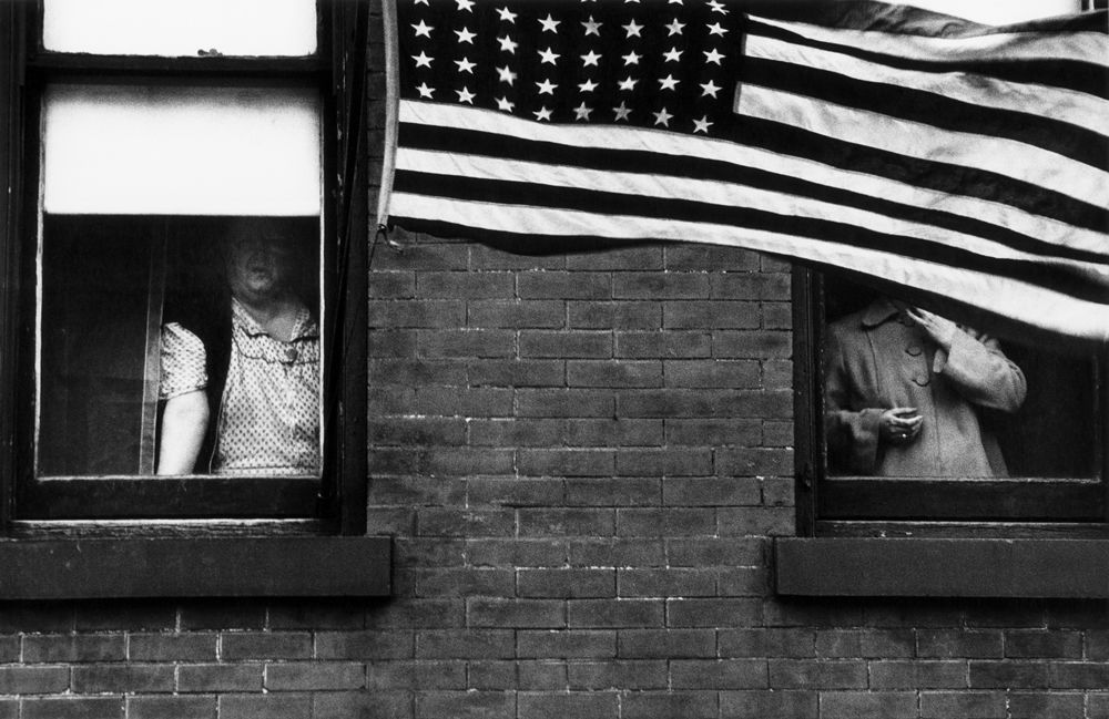
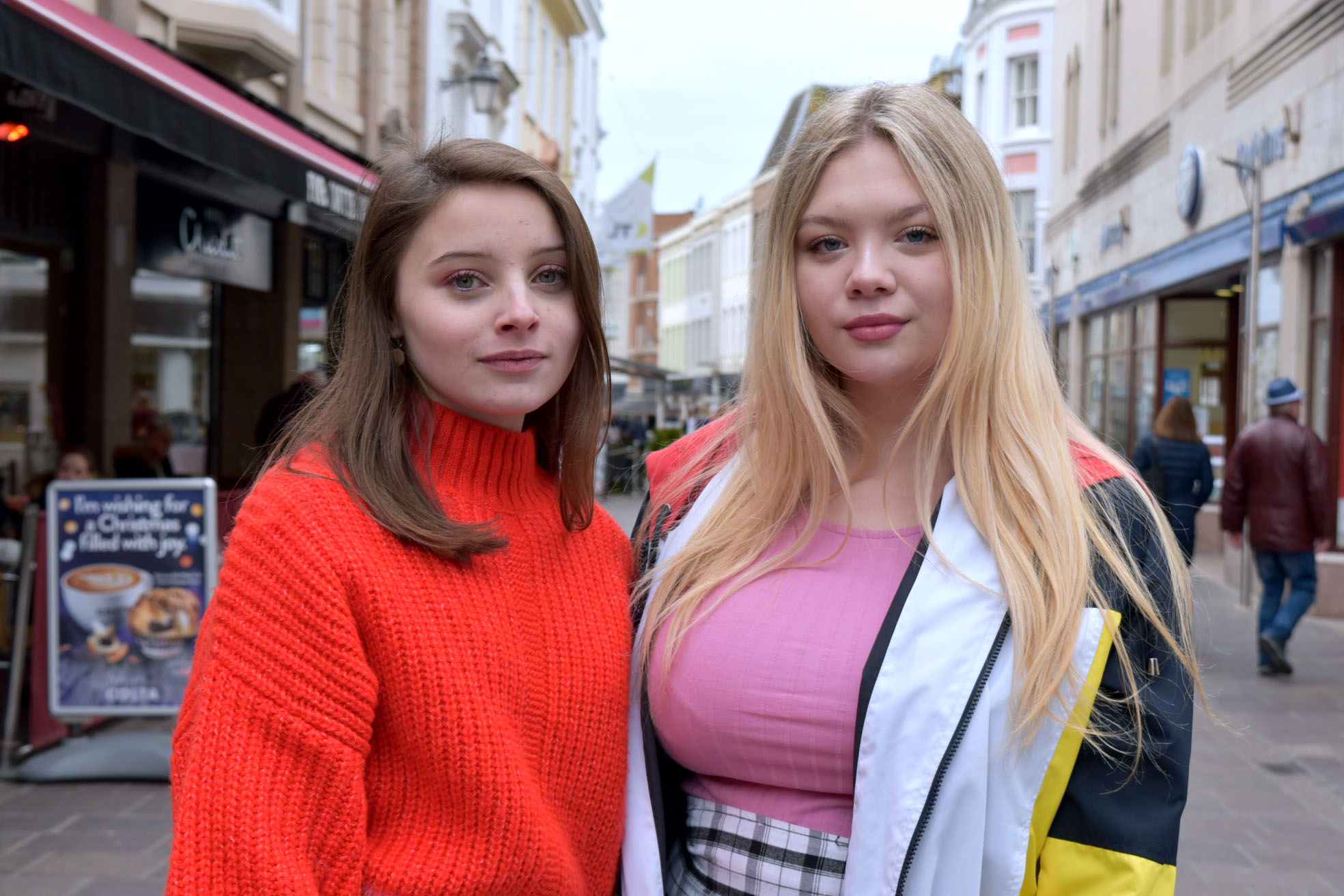
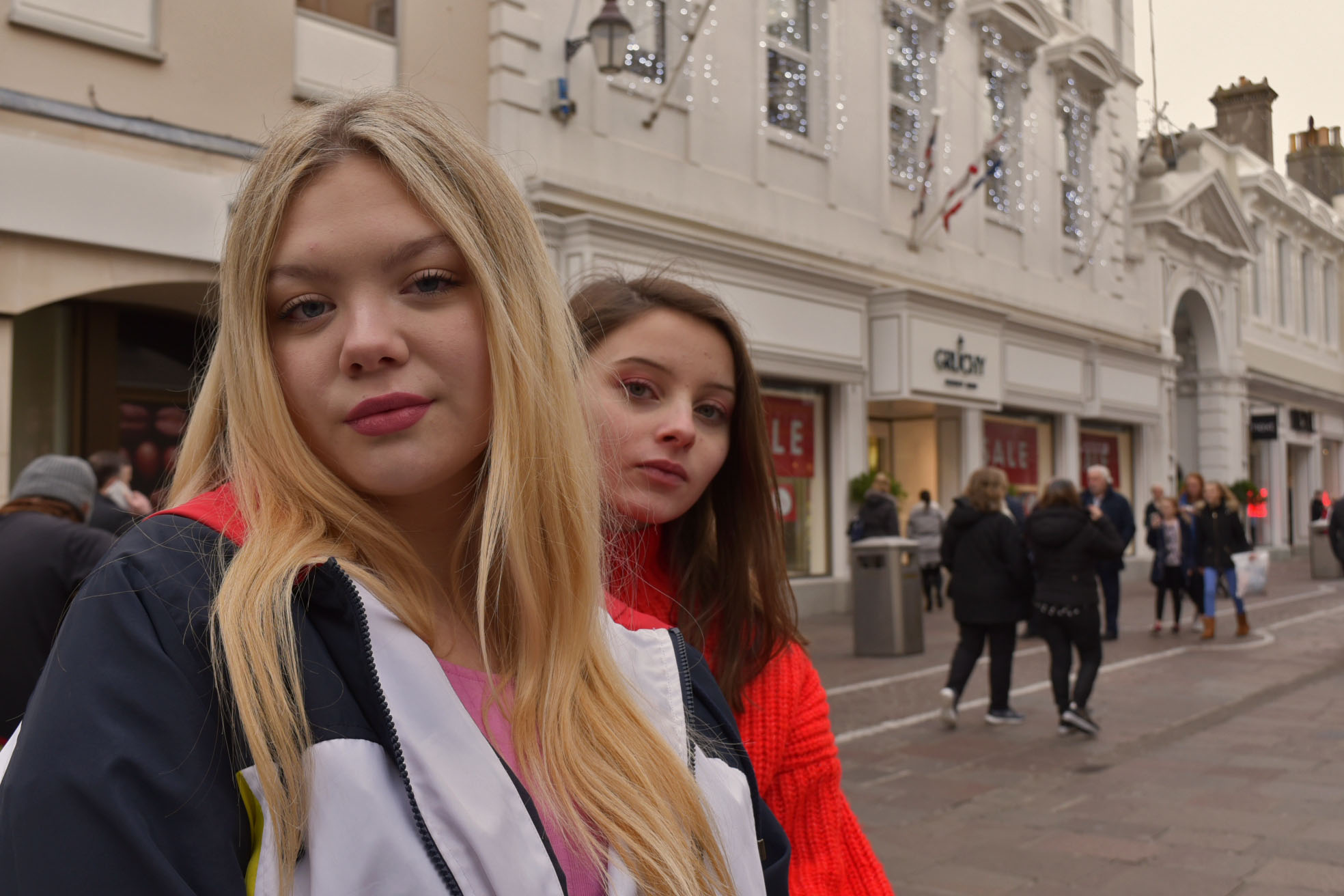
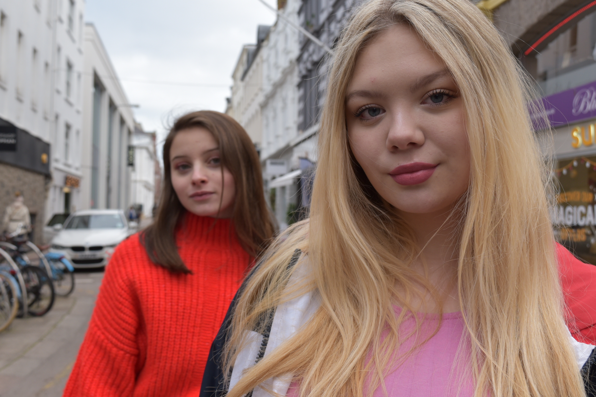
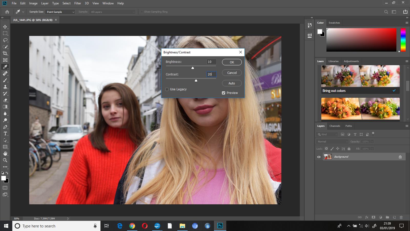
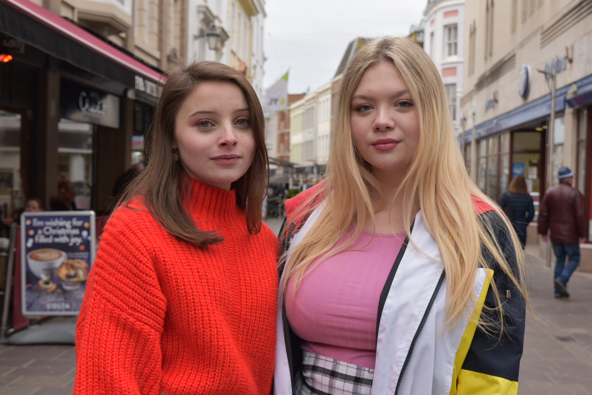
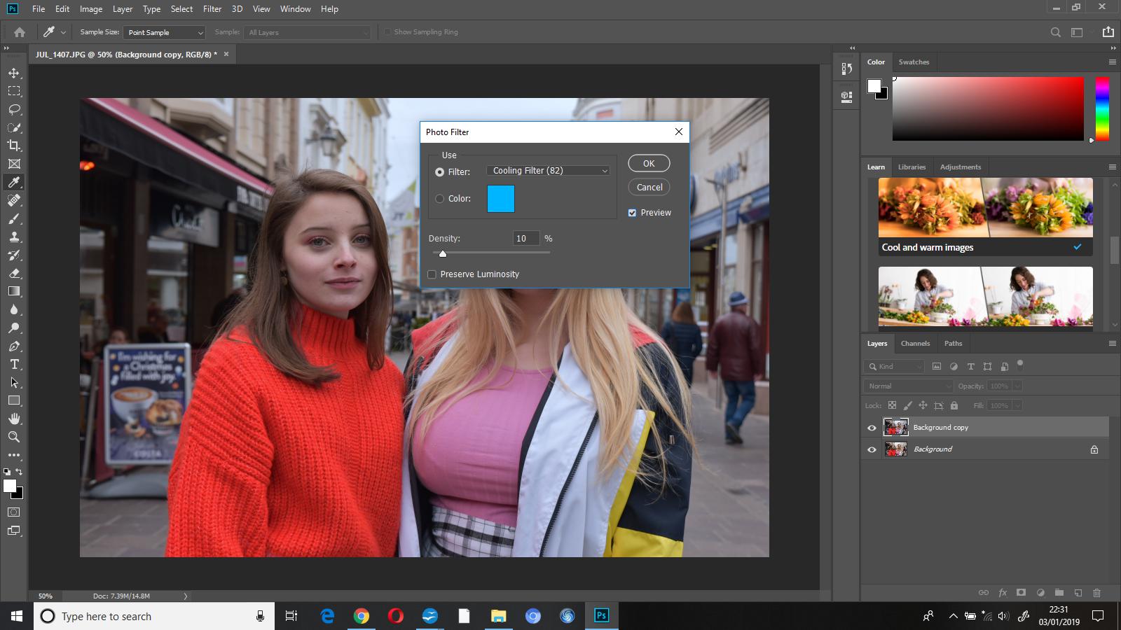
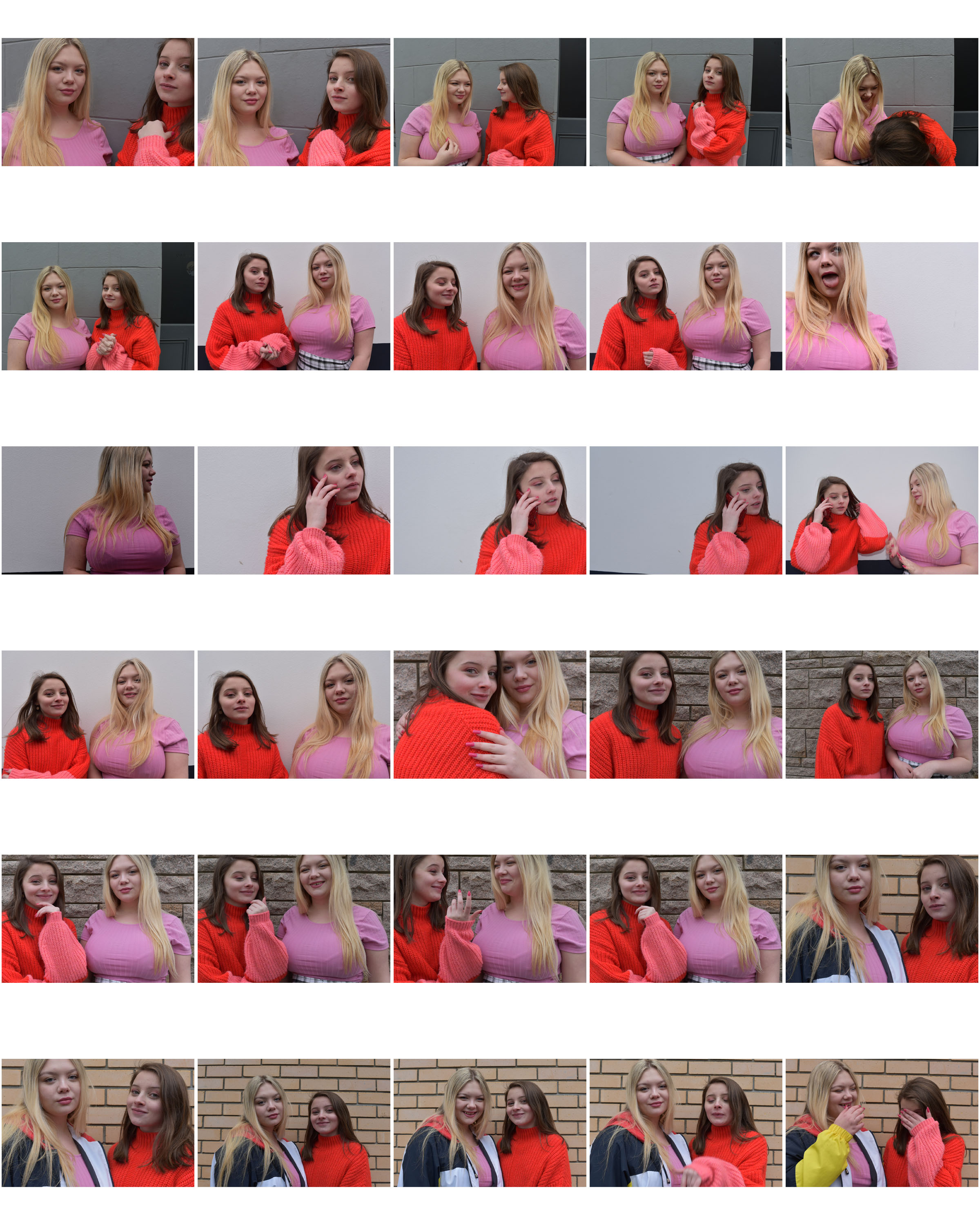
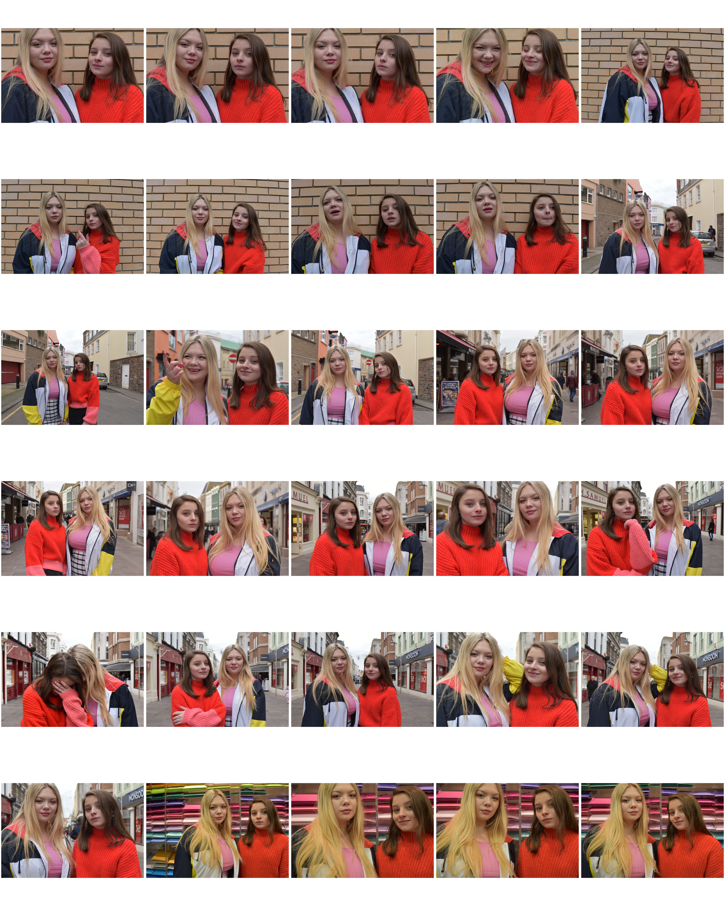
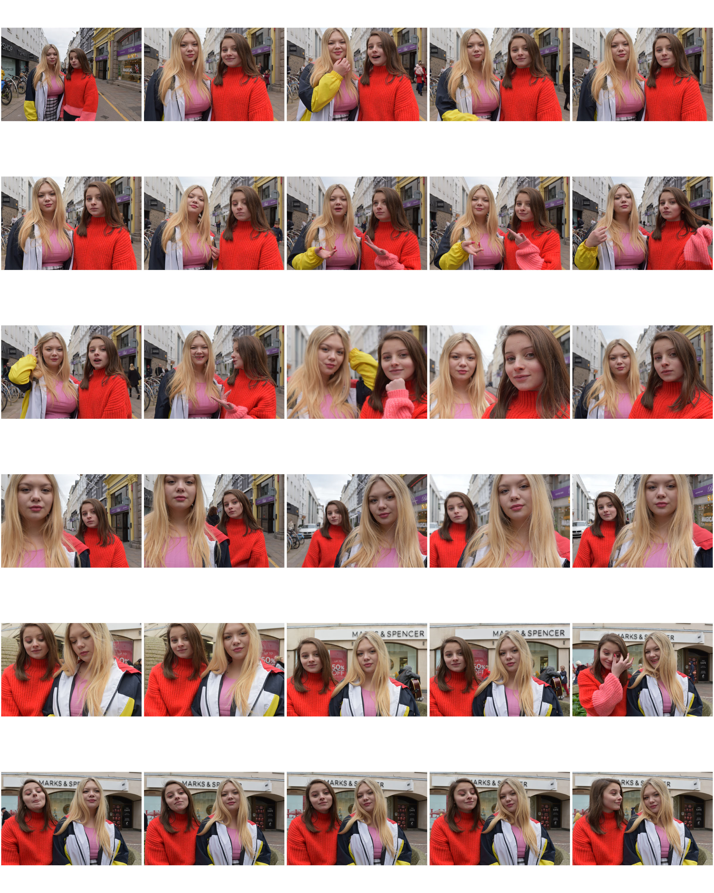
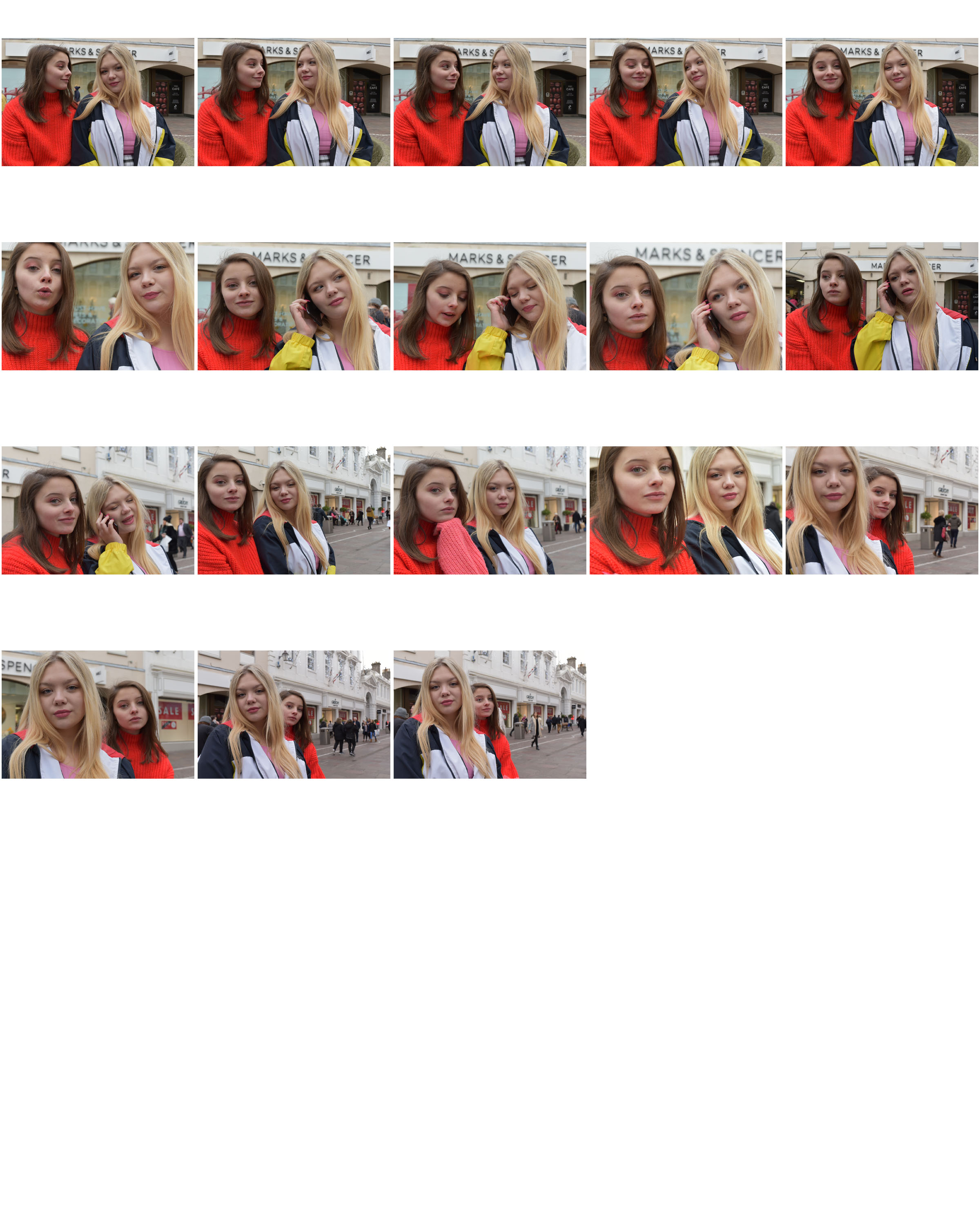
Introduction
A photo-montage is a collage constructed from photographs. The technique has been used historically to make political statements and gained popularity in the early 20th century (World War 1-World War 2). Many Artists such as Raoul Haussman , Hannah Hoch, John Heartfield employed cut-n-paste techniques as a form of propaganda as well as Soviet artists like Aleksander Rodchenko and El Lissitsky. Photo-montage is a type of collage art. It is composed primarily of photographs or fragments of photographs in order to direct the viewer’s mind toward specific connections. The pieces are often constructed to convey a message, whether that be a commentary on political, social, or other issues. When done correctly, they can have a dramatic impact
History
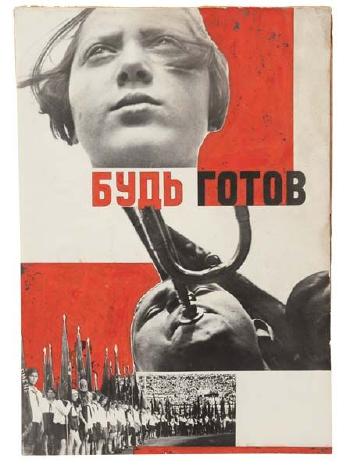
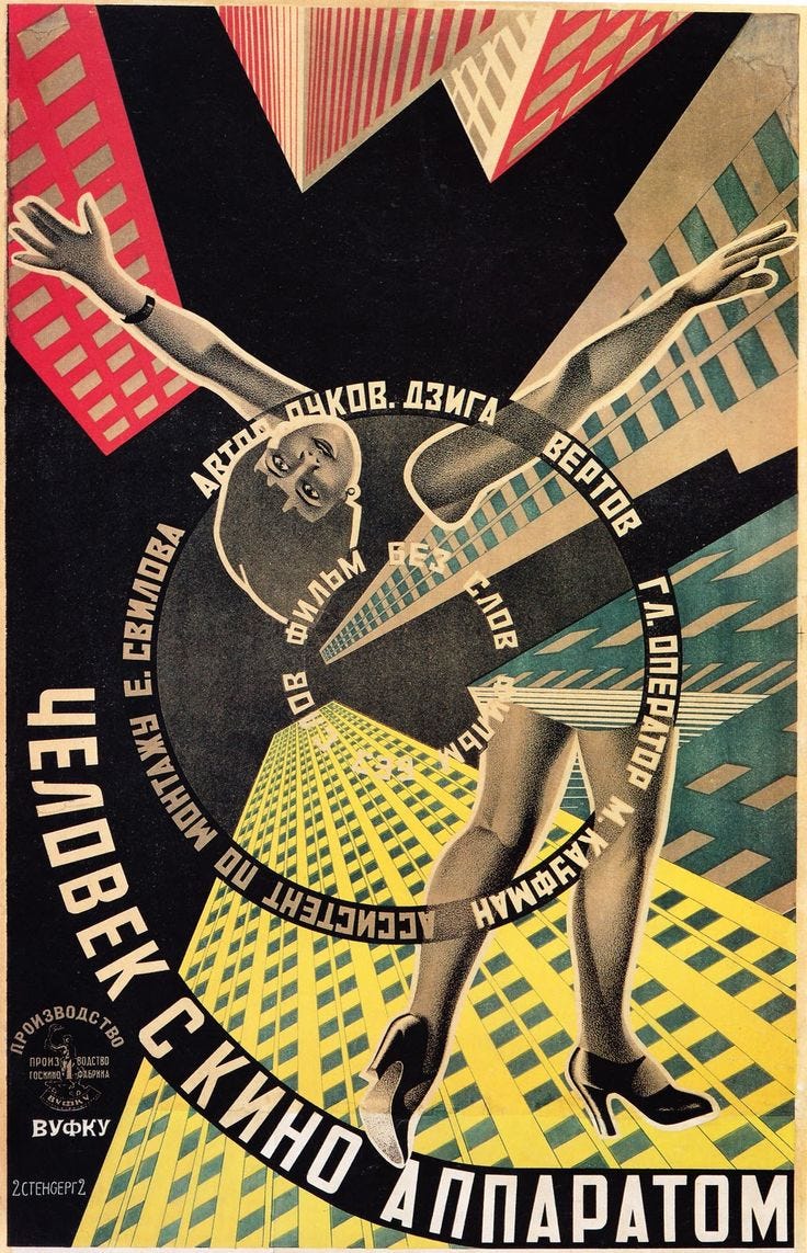
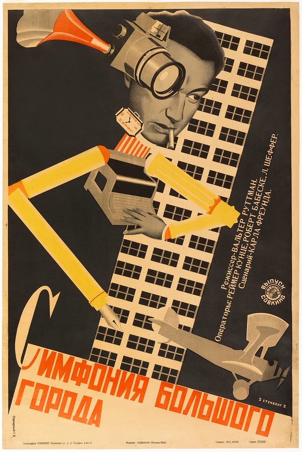
Soviet Propaganda
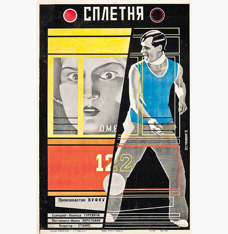
The photo-montage technique appeared in Russia and Europe during WWI and developed particularly in Moscow. The main creators of the genre were Alexander Rodchenko and El Lissitsky. After the revolution, their work got a boost from Vladimir Lenin after he declares that ‘photography is a super-powerful propaganda tool in a country where 70% of the population cannot read’. During the civil war he even makes plans to give every soldier a camera in order to ‘let them use it as a weapon able to demonstrate visually and precisely the political changes’. Although the idea wasn’t pushed any further, due to technical difficulty. The photo-montage would then be used to portray a cheerful “reality” and bright future. The medium combined the realism of the photography with the revolutionary ideas. Some examples:
Aleksander Rodchenko

El Lissitsky

Pop Art and the Dada Movement
Pop Art was born in Britain in the mid 1950s, the technique of photo-montage then emerged and was also used a great amount by various Pop Artists in the mid 20th Century in order to explore and react to abstract expressionism, it also tackled popular consumerism, advertising, branding and marketing techniques. Some politcal concerns were also focused on such as war and gender roles.
The Dada movement was created in Germany after World War I. It attempted to create a new kind of art that was valued primarily for its conceptual properties rather than focusing on aesthetics or skills. Dada quickly spread to France and the US (to Paris and New York in particular), but many of its main creators (who worked with photography) still remained in Germany. One of the main ways in which the ‘Dadaists’ challenged traditional art was through photo-montage.
Artists such as Max Ernst and Hannah Höch used scissors and glue to cut up found (and some original) photographs from a number of sources and reassemble them, using contrast to emphasize their message. The use of photo-montage as an art technique was one of the most influential ways in which the Dadaists shook up the traditional ways of the art world.

Hannah Höch, ‘Cut with the Dada Kitchen Knife through the Last Weimar Beer-Belly Cultural Epoch’ in Germany (1919)
Further Examples:

David Hockney
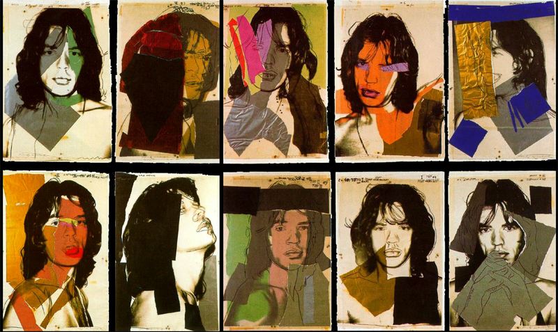
Andy Warhol

 PAUL M SMITH – LADS NIGHT OUT
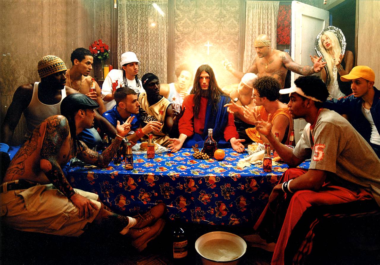 DAVID LA CHAPELLE – LAST SUPER 2008


 Lorna Simpson—gender identity
 Paul Sepuya—cultural and national identity / gender identity
 Shirin Neshat—cultural identity
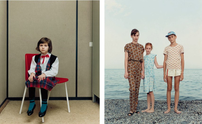 Rineke Dijkstra—geographical, political and social identity
 Sarah Maple—gender identity