The initial layout of my book didn’t have a sense of a continuous theme throughout my design and layout. I wanted to imitate the content of my pictures through my design but the overall outlook of my design was too messy, untidy and had an overriding intense feeling. To improve the presentation of my book I used the templates instead of making my own to create a continuous flow. Below is my final design, improved from my initial design.
My photo book will focus on the ongoing political movement of feminism and claiming back power through portraits and tableaux’s of domestic scenes that comment on traditional characteristics and stereotypes of the female using humor, with inspiration taken from working artists and photographers, Liu Susiraja, Juno Calypso and Izumi Miyazaki.
Izumi Miyazaki ‘Me and Me’ photobook
Izumi Miyazaki created ‘Me and Me’ photo book consisting of surreal self portraits that question reality and female stereotypes in art. Miyazaki is a Japanese artist, her work is considered in her homeland to be nontraditional for a female artist which helps to break down barriers for other female artists within and out of her homeland.
I like the format of Miyazaki’s ‘Me and Me’, the inspiration I take from her book is the individual formats on each page for each photograph. Every layout on each page caters for one image, keeping each image separate with individual frames that work best for the overall mise-en-scene and treating each portrait as a separate piece of art. This is simply done with each image on a blank background with different crops and frames, size and placement giving each image a different area of negative space.
I want my book to feel as authentic as my subjects and to disregard any connotations of mainstream beauty magazines, adverts or icons in western society. Females are usually represented to be refined and perfect with a sense of materialistic features and symbols which I think take away from the authentic female. I don’t want to replicate this in my photo book, I think glossy paper connotes this negative outlook as it’s often used in magazines that are sold to a consumerist audience, making them buy into unrealistic lifestyles and beauty standards that are toxic to the mind. I want my book to have a fresh authentic feel, using matte paper is more raw and real, not fake.
From the moment someone looks at the cover of my book I don’t want any prejudice opinions of the content just by looking at a photo or colour. Colour and photographs hold a range of meanings that could lead to presumptions about the content of my book. The word Feminism already has so many negative connotations and I don’t want to add any more negative outlooks on my book.
One of the main inspirations for my photobook is Sophie Calle’s Suite Venitienne, though the layout of the images in that book isn’t something that I wish to replicate or take inspiration from. The thing I will focus on is the text aspect. The text provides a very strong narrative additon to the photographs in the book. I have picked out an extract from a book by a famous philospher Jean Baudrillard, who was an influence in the early life of Sophie Calle as he helped her forge her degrees.
The writing style differs from edition but is genuinely smaller and placed to the side on a seperate page, the writing tends to be small but still effective. Though I wish to experiment with different styles and sizes. I will also experiment with font types and their placement; taking incpiration but not fully copying the work of Sophie Calle.
Pictures
The overall concept for the layout of my image is to group them; displaying multiple images on a page – in a grid formation or landscape orientation. The images will be of the same set; creating a visual narrative to go with the text. In some instances, I want the grids of images to fill up a double spread. In others, I would like a single image to fill up a whole single page or a full double spread ; creating diverse yet a clean and repetitive layout.
Process
The first part of the process involved using Bookwright an app by Blurbused to create and export photobooks.
I want the pages in the book to be dark; not quite black thogh to contrast the images and make the greys and undertones stand out more. I did this by going into ‘Page Colour’ and then selecting more colours – using the slider to pick out the exact shade I had in mind.
The next part involved creating an title page, I had to chose a font that I wanted to keep all throughout the book – I settled for Century Schoolbook, white in colour to contrast the background.
The first spread, I wanted to start with a full image, pairing it with the first line from the extract. Keeping it simple yet effective.
I mirrored the first spread, flipping the image and text on each side.
A doubl spread filled with images, showing progression and without text.
This was the last image of this set; involving this specific subject. I used the last image as a full single page.
The images are displayed in a set of 4, if displayed horizontally they would lose the effect; hence the square layout. Acoompanied by text in the top left.
Another double spread; the images are slowly building up to overwhelm the viewer.
Introduction of colour to differentiate between the subjects.
More images followed by text and empty space; creating a break from the surge of images.
Double spread – image creates break from smaller ones and from text.
Another set of 4, this time with colour – breaking the absence of it throughout the book.
Last spread; a little text and empty space. A clear end,putting an end to all images and text
After narrowing my selection of images I started bringing them into the book wright app to form the layout. I knew I wanted to split the book into 3 sections each based on a poem written by my grandpa, I would then construct the following pages as a response to the poems and create individual narratives surrounding the themes. I am looking to create a few basic templates for the format and repeat them throughout the book according to the style of each photo, this will create a more uniform and organised aesthetic.
I wrote out the poems and tested their placing on the pages, I wanted them to appear similar to how they did in his anthology, with centred writing and an a long columns. Initially I thought of placing it on the right hand side so it is right there when you open the page however alongside the image it looked more natural on the left hand side with the archival image on the right.
I experimented with the size of this archival image, firstly making it full page and then the size of a 4×6 photography that people would have in a family album. The second layout fitted the personal family aesthetic better and didn’t take away from the writing too much.
For my portrait image in the book I wanted it to be a stand alone image so the bold colours and characteristics could show. The image has a simple colour scheme but the patterns and textures are complex, with the diagonal lines on the top half of the image traveling back and the black leaves hanging down I didn’t want to take away from I by placing it next to another photo.
I played around with the placing of the image on the right hand side page, firstly I make its the tradition 6×4 photograph size but due to the style of image I don’t think it suited this. Next tried it full page which looked better, without the white border to distract from the colours. I think this image is powerful on its own and having it a big size shows it off best. The framing on the photo wasn’t quite right as the bottom of my subjects coat was just above the bottom of the frame and she filled almost the whole page. As there was excess image not shown on the pages I just moves the photo down so there was some empty space above the subjects head and the bottom of the coat was cropped out, this makes the photo more balanced.
For the third poem “Stefi’s Castle” it was very long and in the original anthology it covered two pages. To keep the format is used for the other two poems I would need to squeeze in onto one page to allow the archival image to go opposite. I tested this out and although it fitted all on one page I thought it looked over crowded.
To resolve this I split the poem onto two pages allowing the text to be centred to the page this was much more spacious and gave a more minimal effect.
Throughout the layout process I looked at an overview of all the pages to help me gat an idea of the order of the pages and how they fit together. At this stage I thought the pages looked to cluttered and random. I refined the designs to fix this and made templates so that there was a theme and structure throughout the book.
Some images I have chosen to have as double pages with no white boarder, these are images with small detail which I want to stand out more. For example this photo of the medieval character toy is mostly out of focus however the key part of the photo with most intricate details is focused and I wanted to blow it up so they were clear and almost larger than life. I wanted the perspectives in this image to to be blurred and the small toy to appear life size.
final book layout
The final layout for my book displays a variety of images, from archival to natural landscapes and even manipulated images. I have constructed it with three sections each following similar layouts. The final thing I had to think about before ordering the book was the cover, I though of using an image of my Grandpa, perhaps one of the layered edits I had made using his poem notes. However I decided to use one of my simple landscapes of the beach linking to the ‘tunnelling’ poem, this is because how it links to the cover of his anthology which is a landscape painting of a beach. By doing this the colours and simple style match. The image will be a wrap around cover with the parallel horizon along the centre of the cover.
For my final photobook design, I want to include text in between my images; giving my photographs more depth and contributing to the narrative. This idea was originally inspired by Suite Venitienne, In her book, Calle uses text to give context to her images – her entries are very diary like. For my book, I will use poems, extracts and statistics along side my photographs. The main theme will be stalking; how different people feel about this subject and how it can be turned into an art.
Sites and sources that I’ve used to gather the quotes:
This is the quote I decided to use, this is an exract from Jean Baudrillard’s Please Follow Me. I really liked this extract as it gave a very fresh and interesting outlook on following. Baudrillard is a philosopher with a unique and incommon view on the world, this contriutes to his appealing and provocative describtion.
For my editing process I chose to enhance the colours in each photo which I think lifts each image’s content and my subjects within them. I wanted to preserve the idea of femininity by keeping the images soft, contrasting the vibrance in colours while toning down the initial intake of visual representation.
ORIGINAL PHOTOADDED ROSE TINTENHANCED EXPOSURE TO ADD LIGHT
TONED DOWN EXPOSURE WITH CONTRASTENHANCED SHADOWS FOR DEPTHENHANCED WHITES FOR RANGE IN TONEENHANCED BLACKS FOR ADDED DEPTH IN DARKER COLOURSTONED DOWN THE CLARITY FOR SOFTER EFFECTENHANCED VIBRANCEENHANCED DETAILSADJUSTED EXPOSURE
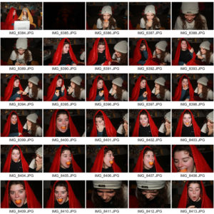
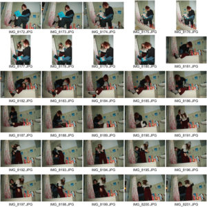
Marina Abramovic and Izumi Miyazaki influenced my photoshoot a lot. From Abramovic I took the idea of performance and directed many scenarios in my project that displayed the characters and traits of my subjects. I shot my whole project in one room, my subjects personal space which I interpret as her landscape, decorated in an organised mess that represents many characteristics of the individual in each object that lies around her room and the interactions she has with them. My concept behind the series is influenced behind the history of women in art and Miyazaki. Miyazaki has control over the representation of her sex because she is taking them herself. Miyazaki purposely produces pictures that move away from the classifications of female stereotypes. As a female, I thought it was important that the representation of my subjects displayed them as individuals and not as objects, therefore keeping them in their personal environments and disregarding any ideas of perfection or social ideologies of how women should look and what women do. Women taking pictures of other women allows complete control over representation. I wanted the effect of getting to know the subjects when the series is viewed rather than seeing someone who looks ‘aesthetically’ pleasing in terms of beauty standards within the western world, with no character behind the individual. The series is a personal look into a stranger’s life, using the notion of scopophilia but with consent and without the expectation of female stereotypes.
I believe after different attempts and layouts this was the one I found was the strongest. I have insisted on making sure I have variety throughout and too not have all my images in the same format. Although there are a lot of double page spreads, I have made sure that I have split them up evenly so its not the same throughout. I have included borders throughout around certain images to create that sense of variety due to me wanting more then one layout. The use of borders and different positions of the images throughout the book I believe produces a create and interesting feel to the book as it doesn’t have a boring, consistent theme throughout. The images that I have chosen to include in my book I believe reflect my chosen theme the strongest and in a way that clearly tells an interesting story. Because of this, it enables me to produce a book that opens the viewers mind to how people can react to man made structures around them and how they can control but also how they are affected by them.


 I want my book to feel as authentic as my subjects and to disregard any connotations of mainstream beauty magazines, adverts or icons in western society. Females are usually represented to be refined and perfect with a sense of materialistic features and symbols which I think take away from the authentic female. I don’t want to replicate this in my photo book, I think glossy paper connotes this negative outlook as it’s often used in magazines that are sold to a consumerist audience, making them buy into unrealistic lifestyles and beauty standards that are toxic to the mind. I want my book to have a fresh authentic feel, using matte paper is more raw and real, not fake.