What is photoshop
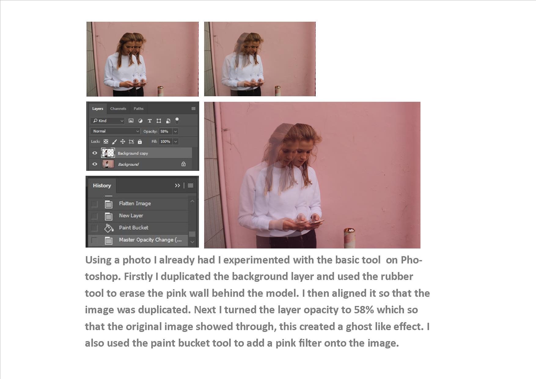
This is to alter (a photographic image) digitally using image-editing software.It is done to exaggerate or dramatic change an image to connote and exaggerate a feel that wants to be expressed or brought forward to the audience.
How I achieved and edited my images
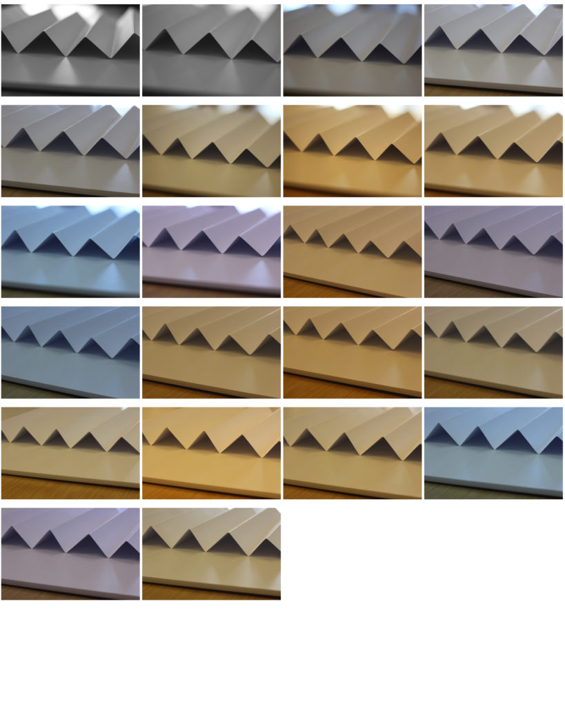
I achieved my images Using photoshop I wanted to developing deepening tone and texture to exaggeration depth within the image using layers.
Firstly I started off by inserting the image into photoshop in order to deepen the saturation and develop a more grip feel and not use the colour as a distraction for the image and circulation with patterns and line within the piece itself. Using the Crop tool, you can trim edges, change the shape and size of a photo, and even straighten a crooked line or the shape within the leaf. Furthermore Enhanced the quality and Brighten the photo and make its quality and highlights pop using adjustment layers. After layering the image ignorer to edit different aspect to then eventually flatten this image. I went onto a bast in order to move the saturation and so developing the colour to deepen the effect. I wanted to still be able to see sources of colour to not completely inveterate the colour within the leaf.I then costume the colours in a grain setting so would be able to accurately develop the colours and cancel out all the extras vibrancy that I did not want in my image. Finally I Convert color to black and white, add an old-fashioned tinted look, and play with focus using the Tilt-Shift Blur filter.
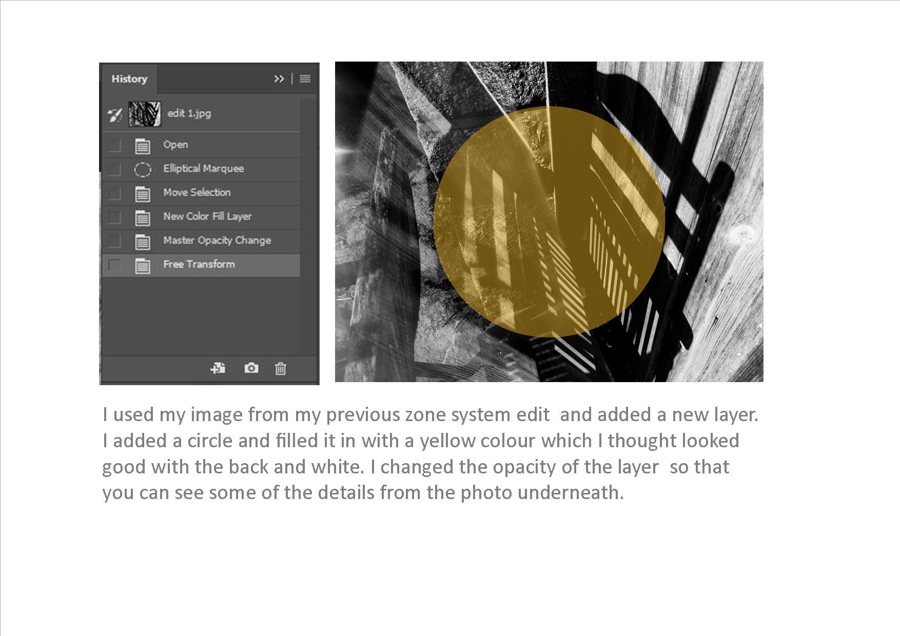
You can see the tool bars here in which I dimmed the saturation and colour to depth the image but also allowing the tone range from very black inner leaf to a progressive lighter leaf. You can also see the layers through the photo and how the custom levels about to be set to green to develop a deeper tone relevant to the piece.
Before
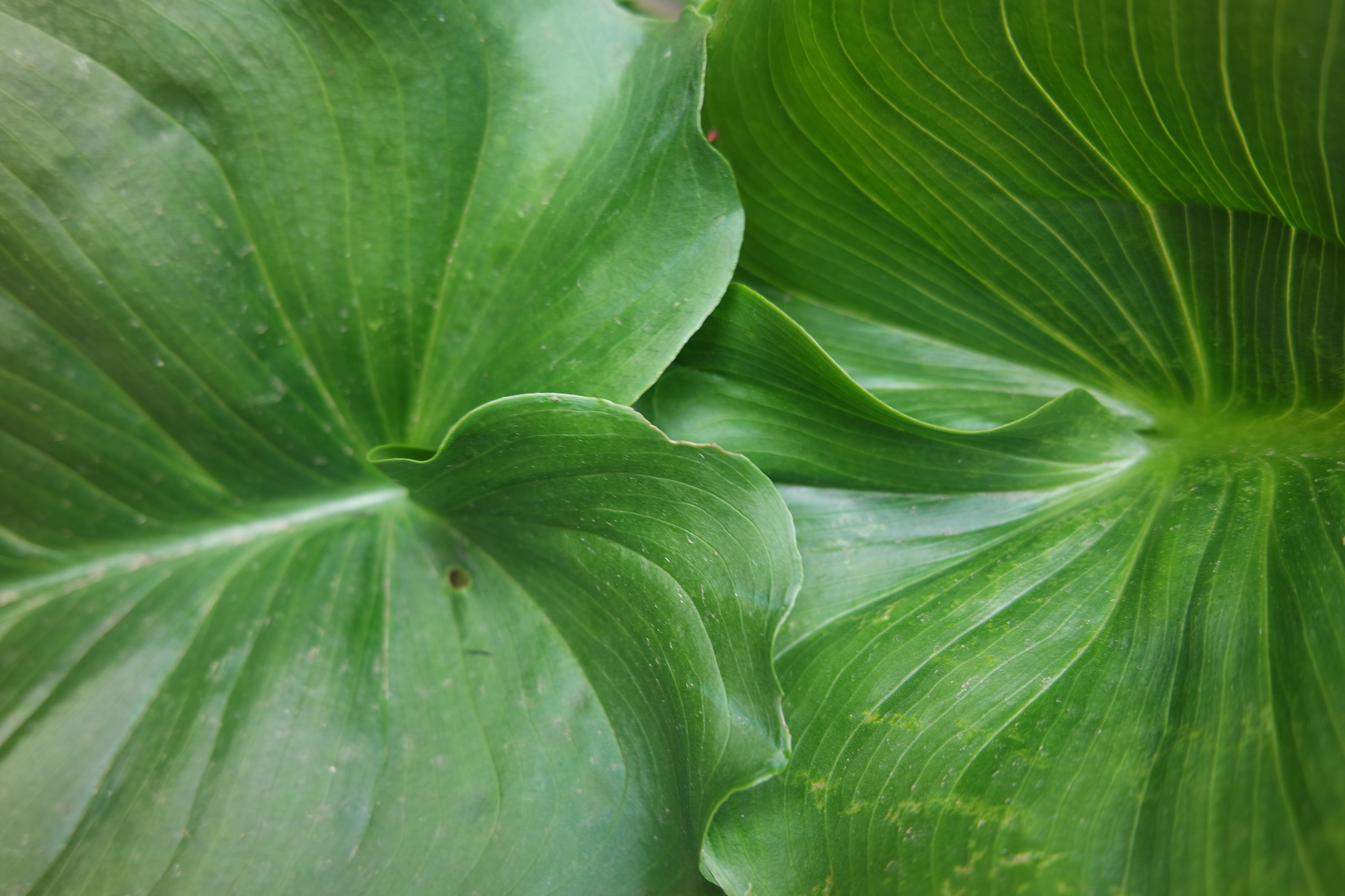
First Edit
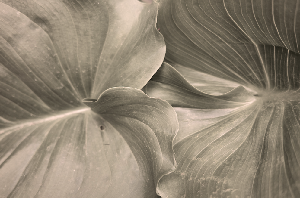
Second edit
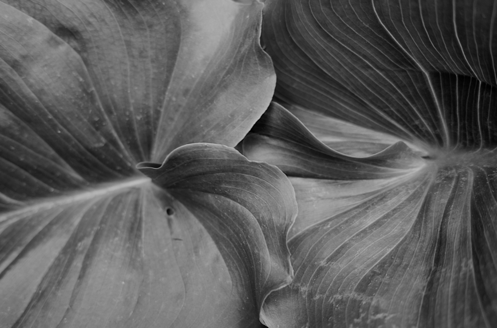
Third and Best Edit
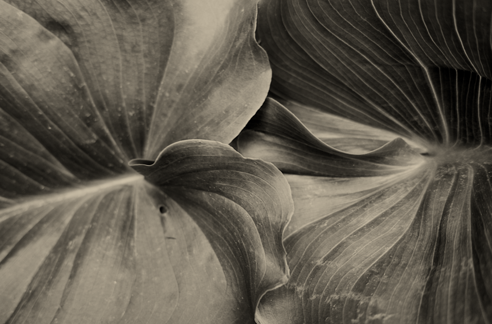
Overall this images now more effective as a whole and creates a better presence and does not direct form the image itself.It create s larger impact overall through the image and displays a larger impact of space and authority.
Tone and Contrast
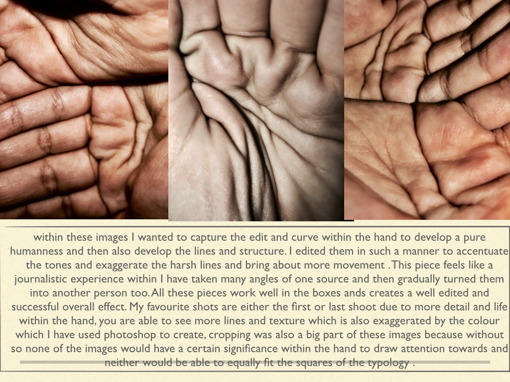
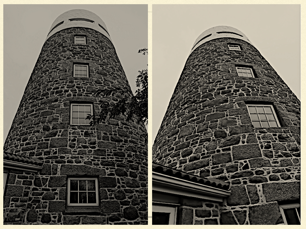
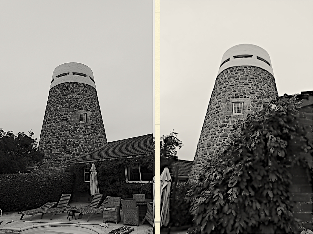
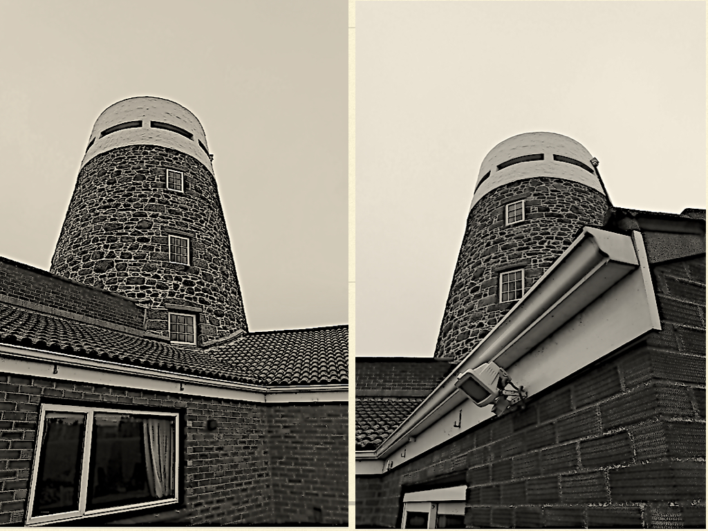
Contrast is a measure of the difference in brightness between light and dark areas in a scene. This reflects a scene with significant contrast , whereas narrow lens reflect less contrast and may appear flat or dull. This can be caused by any combination of subject matter and lighting conditions.The is a great importance due to colour will only work effectively due to a good contrast.However countless images have been seen in black and white using this is a tangible element of compostion
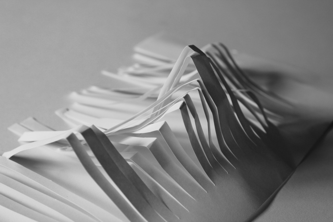
Tone may consist of shadings from white-to-gray-to-black, or it may consist of darks against lights with little or no grays. The use of dark areas against light areas is a common method of adding the feeling of a third dimension to a two-dimensional black-and-white picture.This is also highly significant to the tonal range within the tone system

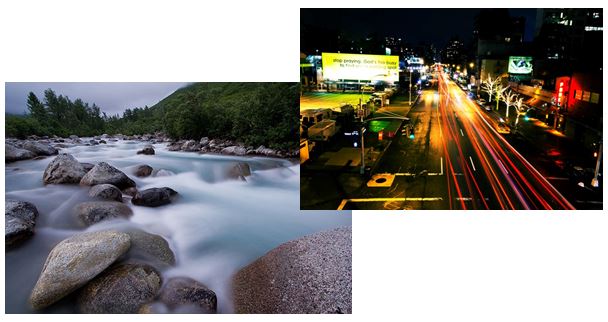
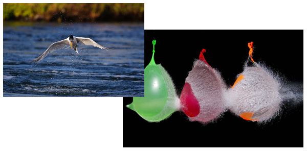


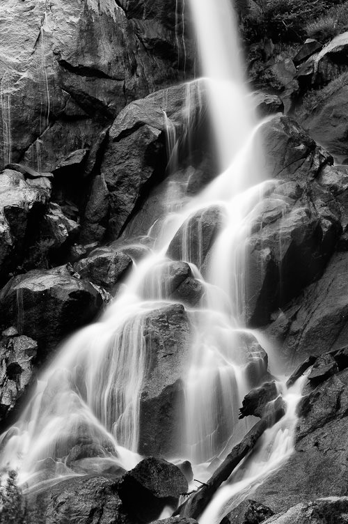
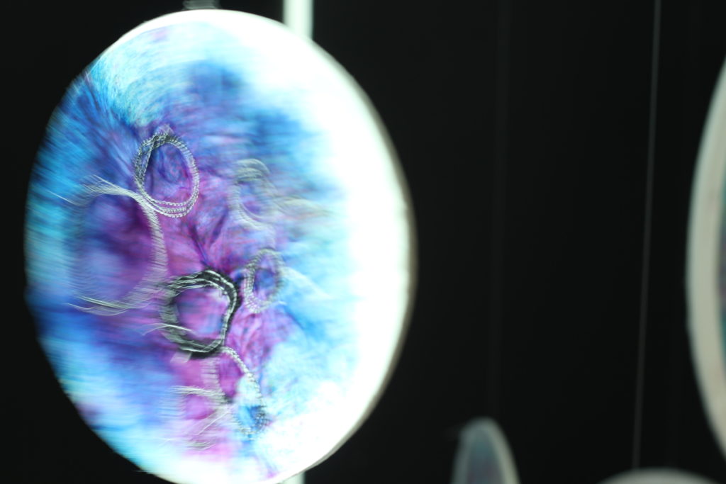
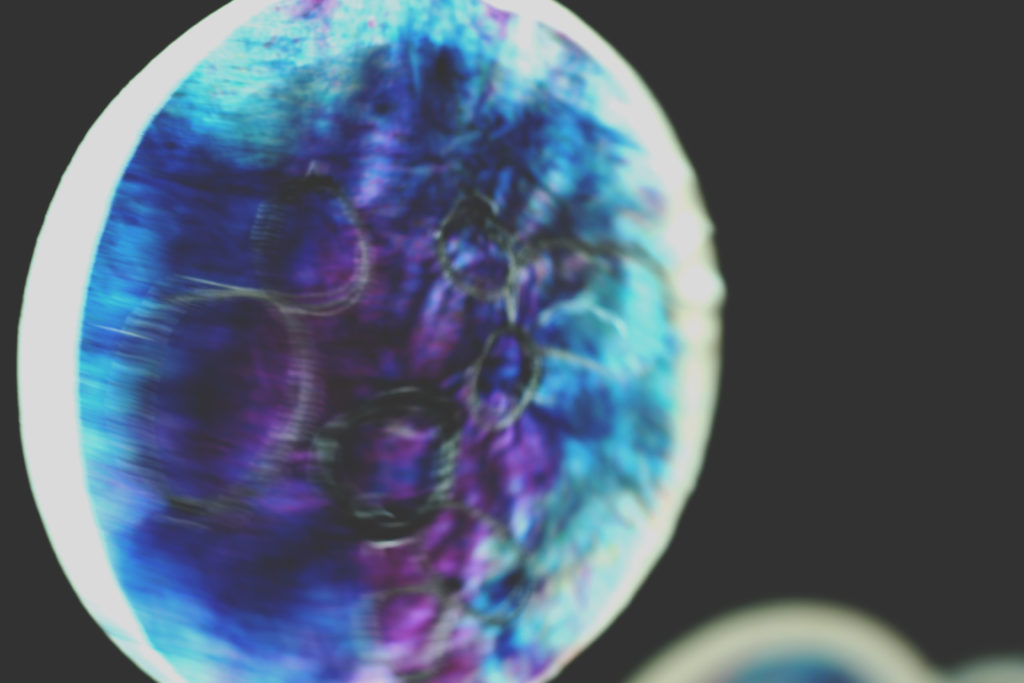
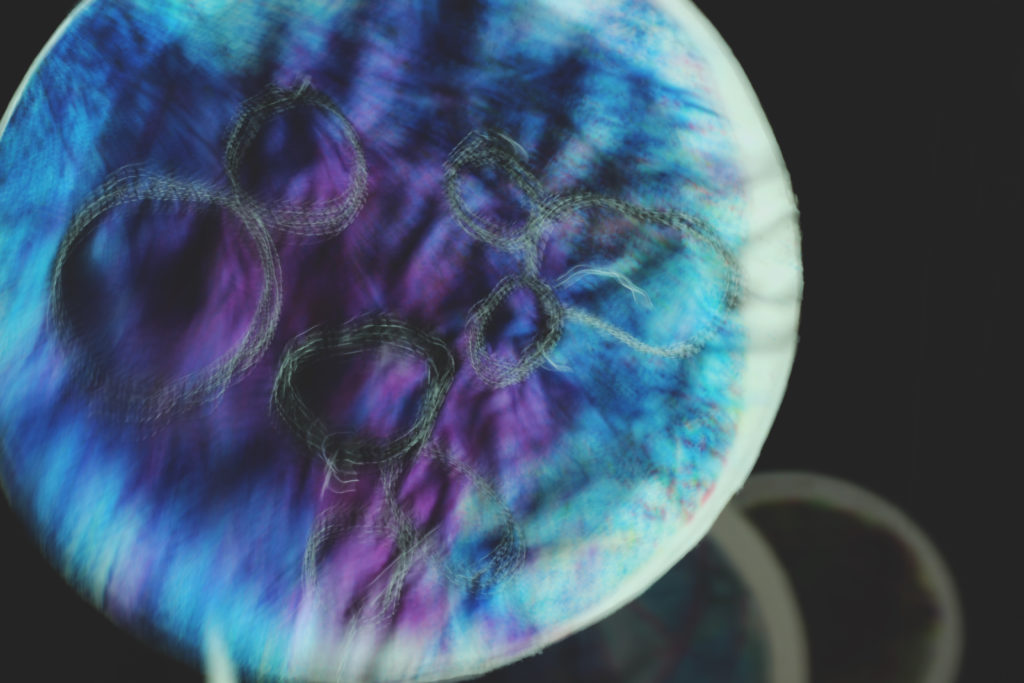
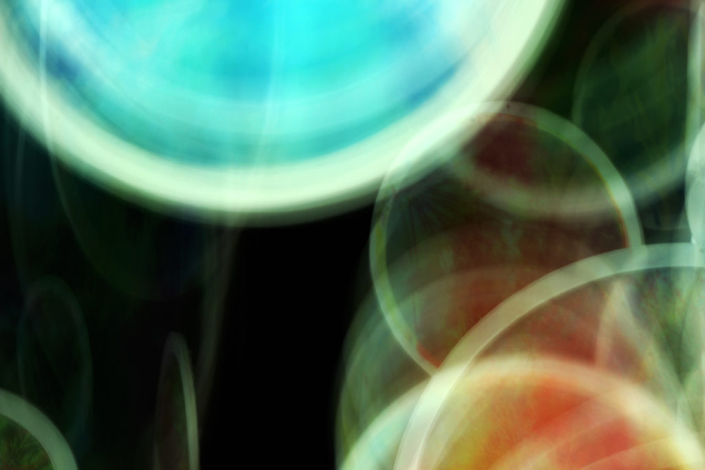
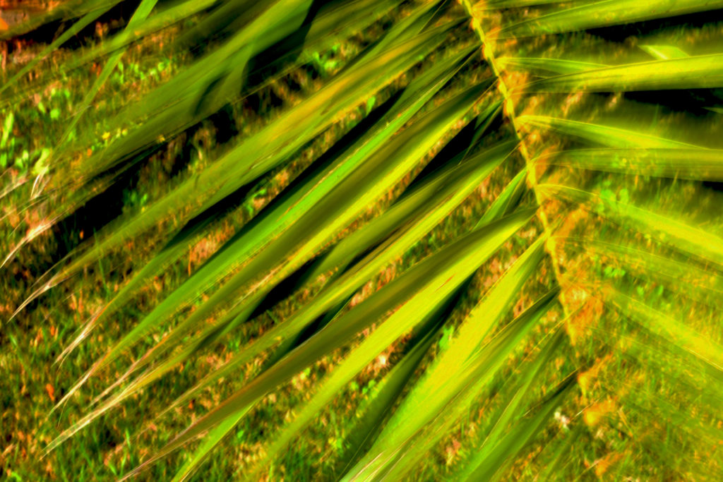
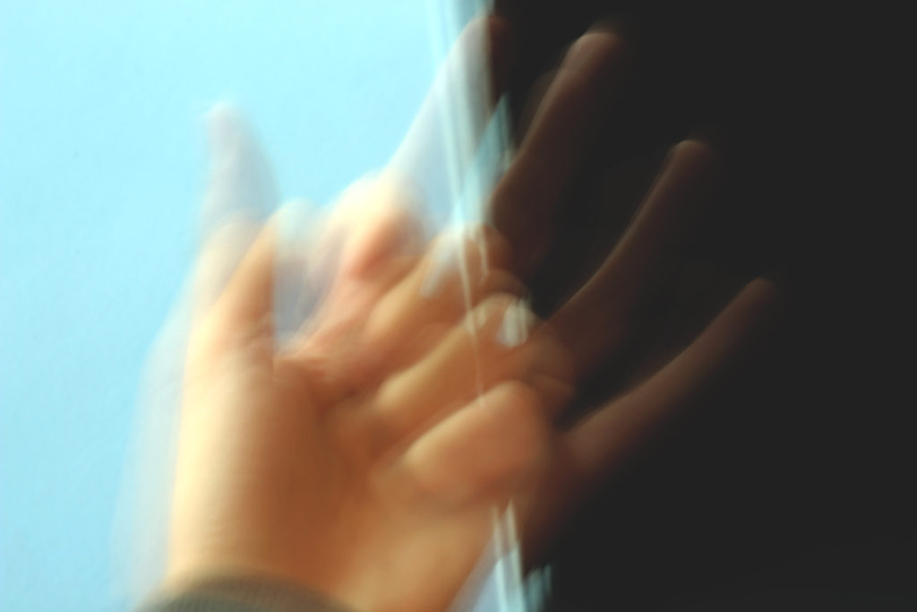
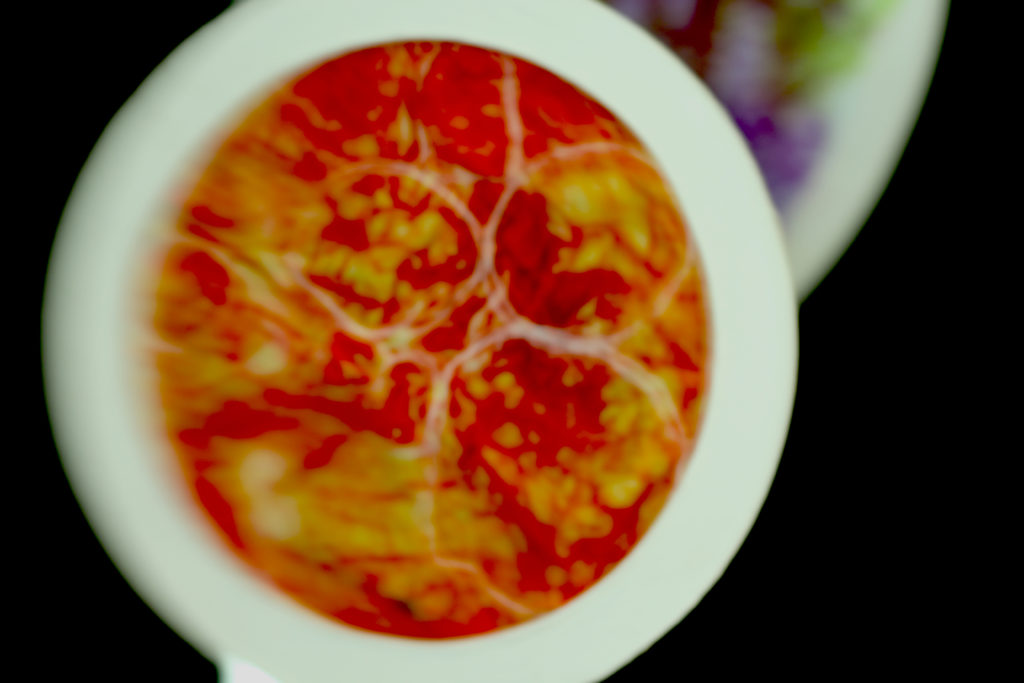
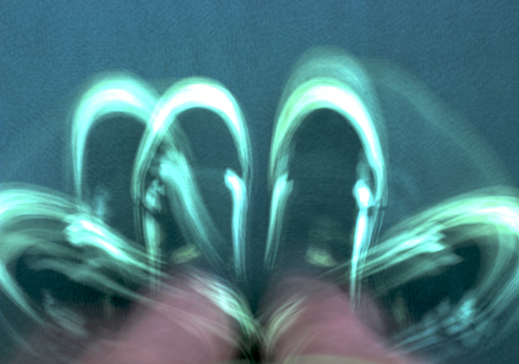
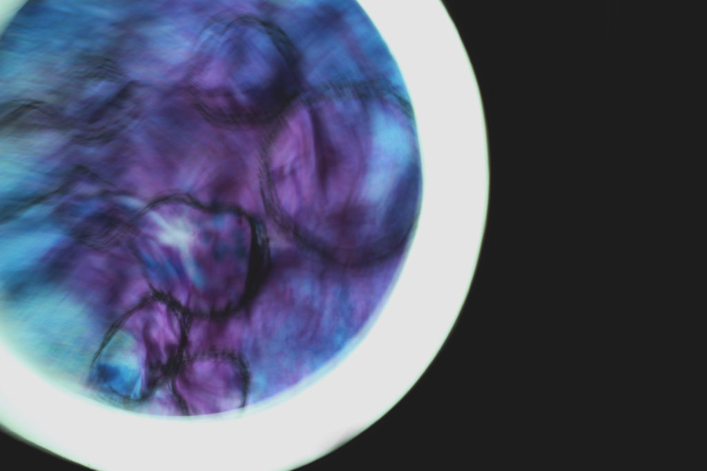
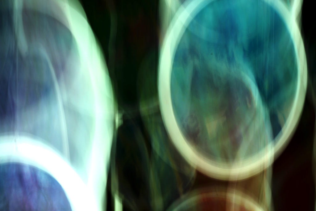
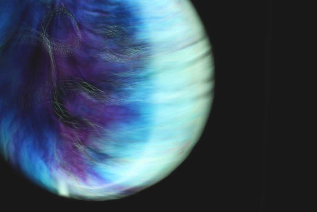
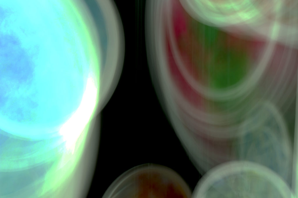
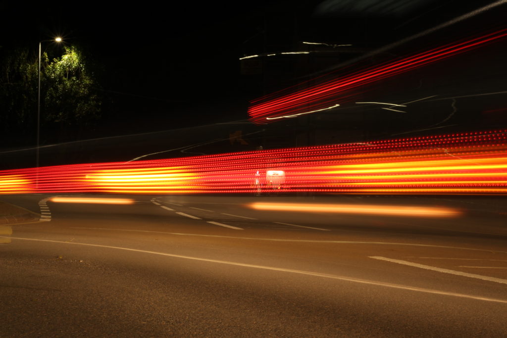
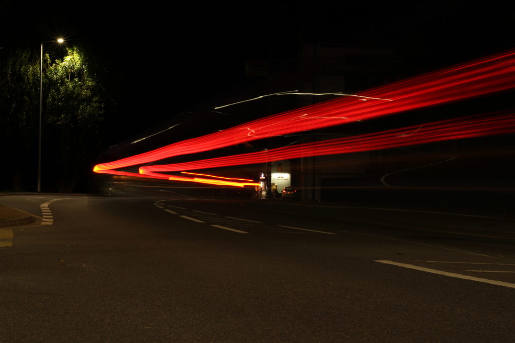
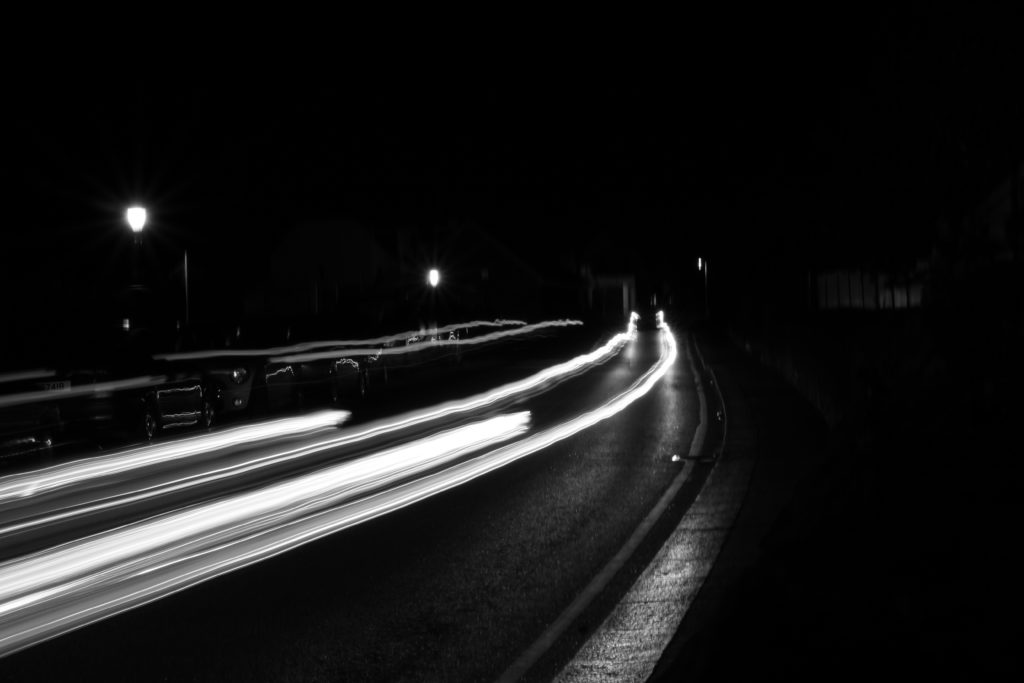
 However if the shutter speed is slow, it can create an effect called motion blur, where moving objects appear blurred along the direction of the motion, and can be used in things like advertisements for cars, motorbikes and nature, as seen below of the water.
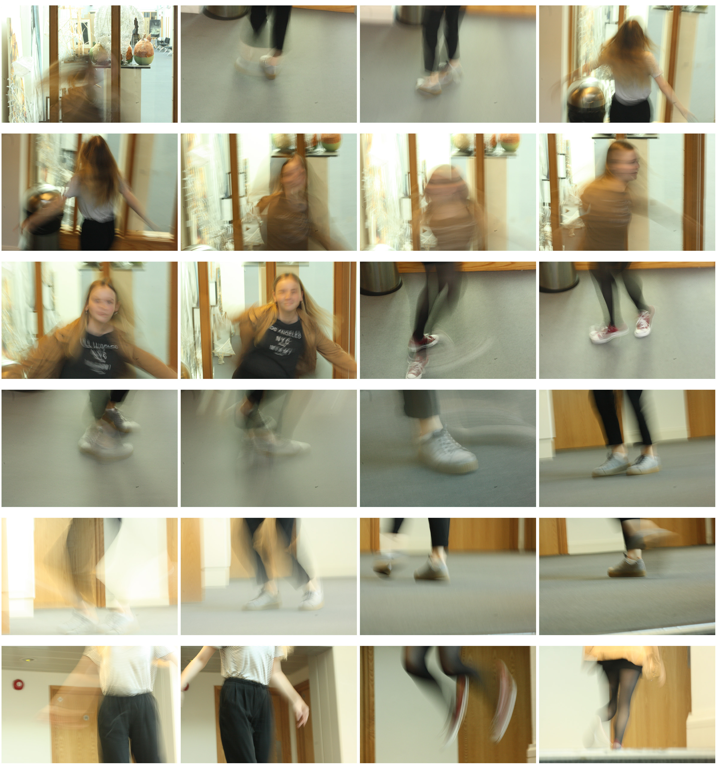
 I experimented myself with this blurred effect within school and this was the outcome:




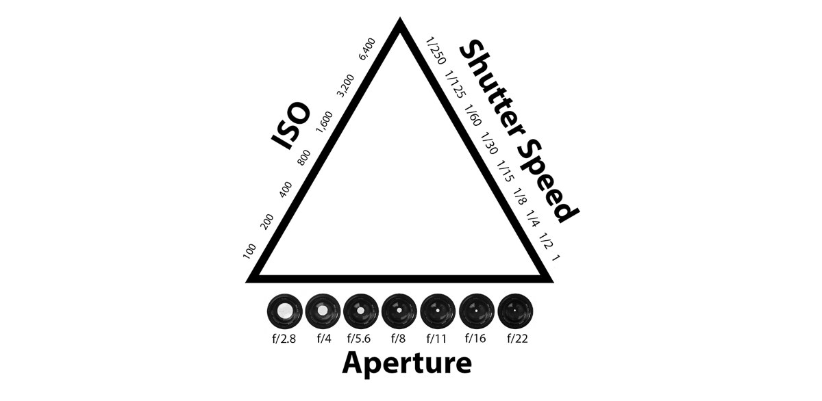
 Within Photographs, exposure determines how light or dark an image will appear when it had been captured by the camera and viewed. This can be determined through aperture, ISO and shutter speed, which can be located on your camera and seen in the exposure triangle below. However you need a combination of all three to make the perfect exposure. If too little light is let into the picture, it will become too dark and underexposed, and the same with letting too much light into it as the image will become too bright and overexposed.
