Primary image Anylsis

Image analysis of main images found within my book:

I chose this image due to its clear relation to the sublime. The division of her face once again strips away any identity and importance to the girl compared to the importance of water. The reaching of the hand is almost an indication of help. I wanted to create a fluidity of movement within the piece and have an aspect of struggle and fight within the water. Although, while this piece does show aspects of the sublime and emotions of the power of nature, it is still clear through the dress and effortless posture of the girl that there is beauty and innocence within the photo. The use of the walls almost indicates a tunnel and also shows a sense of narrative to the image, as there is a physical tunnel pulling you in.This tunnel continues the narrative and suspends the image as less of a one off but as a journey this girl is on. Perhaps it shows more indications to that of sirens and being water based. The division of the face is something really deliberate that I knew I wanted to capture within this image although the division of the face between the water would show an illusion of repetition and almost capture the girl in a  different and mystical world. Not only does this show an extrusion to the image, but it also creates a direct form of interest for the girl herself. I did not think think this image needed any more photoshop due to the already complexity shown. For the colour I did not want to over edit the image, and keep a slight romanticized and old feel. The original was too bright and removed the element of segregation and abandonment and showed to much of a relation to the overly bright pool.

This almost illusion was created in order to show a more abstract view of water, and show a creativity within it. Despite the water being in front of the girl, it almost captures and shows an impersonation of the light hearted, young girls spirit. Once again I edited the tones to show it being more blue, but instead of doing so in such a way to create a darkness to the image, I wanted to lighten the image as this is the original emotion you get from this piece. The division of the close up secs of water, in comparison the the slow drifting of the smaller specs of water almost emphasis a falling of beauty and creates further connotations to the young girl herself. The direct eye contact with the camera breaks apart the photo and allows a direct connection with the girl and creates a contrast to the main importance of the image. There is something almost angelic and magical about this image, it not only is a question of the possibilities of how it was taken, but the magic within the image also constitutes to a sense of mythological accent to the images. The small circles are almost heavenly with their softness and brightness of colour. I believe too all the colours compliment themselves within the photo, the light purples and blues represented against the themes of my editing the water in blues, or greens dependent on the overall original tone of the image.  It seemingly purposes what the sublime is through the inventive collaboration of life and beauty and a new passion of wonderment, while without the pain. It is full for childish wonderment, the light pink of the lips emphasises the front of a profound yet beautiful image.

I took this image with the purpose to make the water and the boy to look as though they were one. I wanted the water to have an aspect of blending into him and see as through he is enjoying the use of water. I had this intention as much of my imagery is the frustration and aggression of water, whereas this looks almost peaceful and although the water is blessing or helping the boy. I wanted to make sure I got the water captured dripping at the bottom. I wanted a picture of slow movement yet the shutter fast enough in order to show a moment captured in time. The darkening of the photo shows an even more eccentric character of time and wonderment. The dark outter tones almost purpose a sense of time that is running out. The shadow of the boy also demands an question of, who is she and why is he here and how did this happen. I wanted to create a whole narrative and story within this on image as this is what is seen within a romanticised landscape. How did this beauty and circumstance happen for someone like me to be able to see it. The highlights of the light within the three areas of his face allow a life to be projected onto himself, and not just a still of emotionless wonderment. The tiles in the background, leave a question scenario, it indicates connotations to isolation and like a lab of enclosure. The crystal white also shows a his aspiration for cleanliness and purity, perhaps why he is washing himself. There is such a large extent to the emotions and delicacy within this image, and this is why I belive it is such a valid primary image.
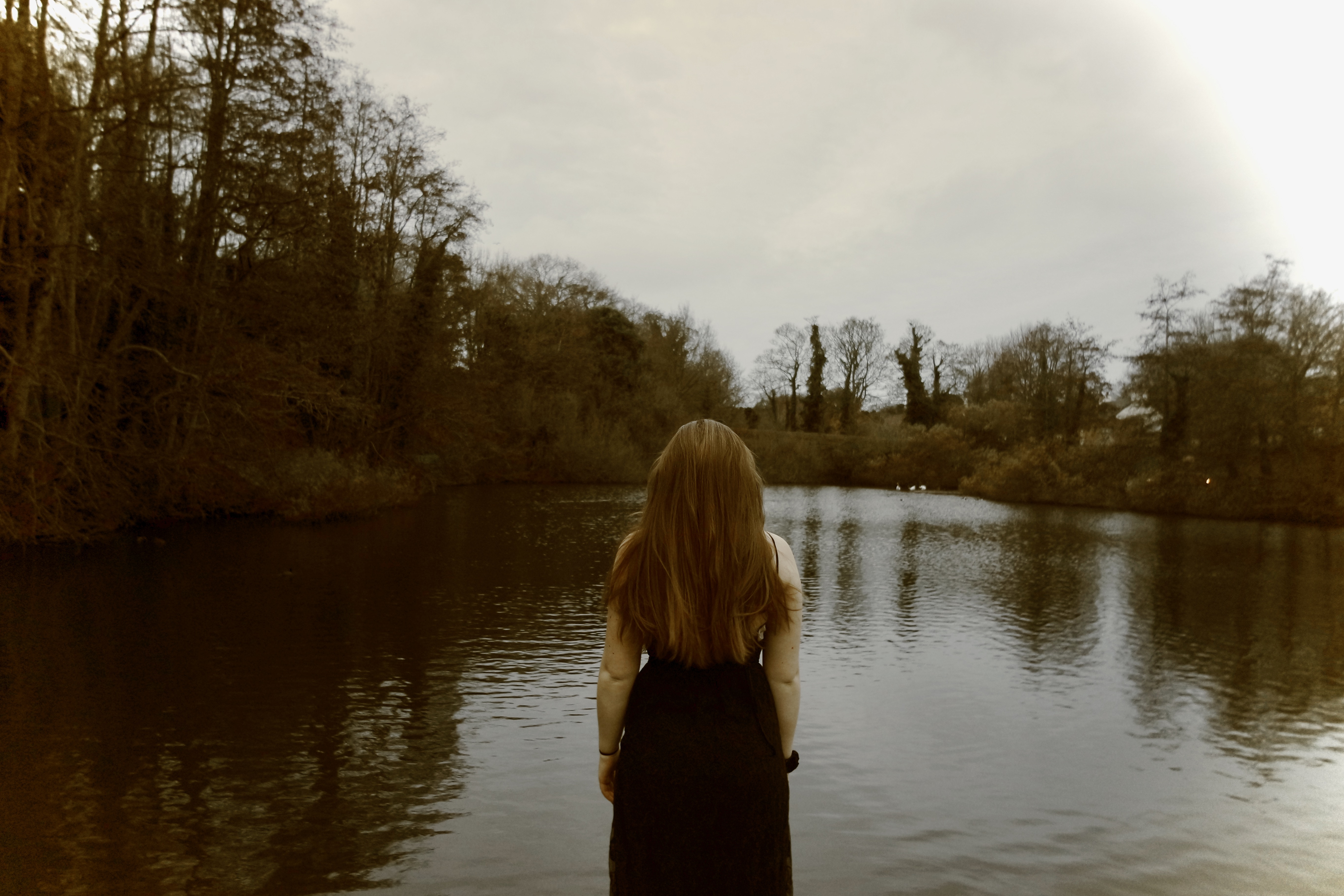
I’m very set on having this image as a double page spread, at the end of my book before my essay. This is due the representation of her no longer being trapped under the water, or being seen facing the camera, but she is now able to stare into a sublime romanticised landscape, seeing the beauty and emotions herself, and no longer being subjected to be stuck within a landscape but part of it. This image also has clear denotations to pictorialism influence, I need this with clear intentions as she is a very classical looking young girl, and the use of the colour, too links with the old fashioned movement. This also influences a sense of purity to the last image, very different to the start of  narrative book where there is a greater representation of emotion. Her stance not only is strong and shows a power within a young girl, mimicking the power of nature, yet also as it is centered in the composition, it allows a balance to the book and creates implementations the sublime is just as much equally what someone makes of it then what it actually is. Her position also shows clear indication as if she is standing on water, this religious influence and enhances the landscape t be elevated above everything else due to it having a relation to being ‘godly’. Overall I think there is no better image then to end the book on. Not only could this image be an ending, but it purposes a start of a new journey, and for a novel this is fundamental as it allows the photos to have a future, it creates a wonderment of the journey the next photographer might perhaps go on. you cannot see an end to the water, and you do not know the direction the girl will go.
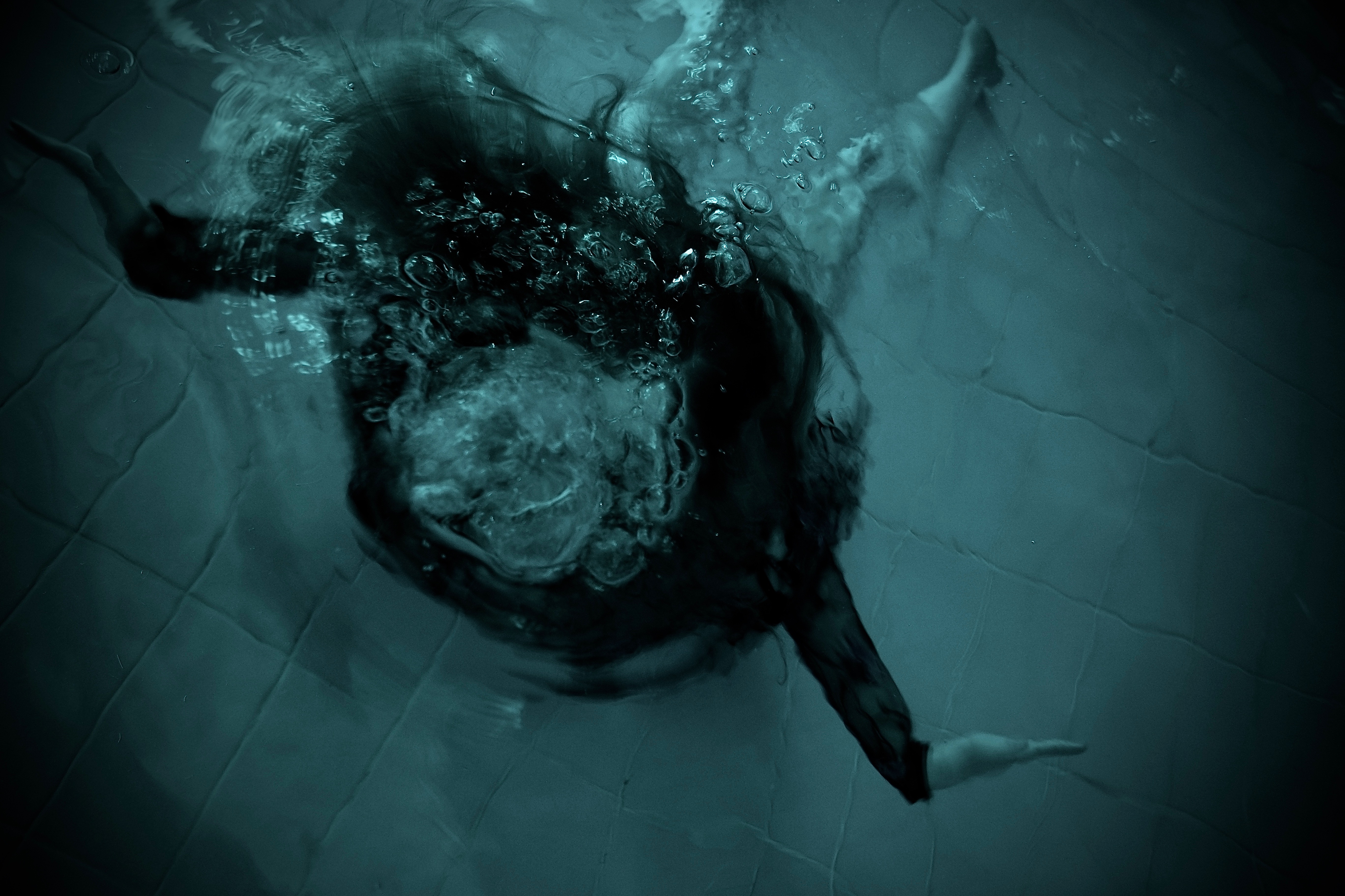
This is the starting double page spread of my photobook. I chose this image due to its disparity and the hectic atmosphere it contains. It shows a beauty within panicking, and creates a clear illusion of ‘pleasure and pain’. The position of her body is extended and demonstrates as if she is being pushed down and her hands are trying to grab onto something. The outward of bubbles surrounding her face, not only show an inability to breath, but whips any identity of the girl, this re-asserts the power the water has over the girl and her life. I decided to edit this image into deeper tonal blues, because I wanted to mimic the colour most related to water, I darkened the edges to show a fading of life, and lifelessness drifting. For an opening image it instantaneously shows the continuous theme of water and pain throughout my book, and also shows an interest to create images usually not seen in photography works. Once again the slow closing of the edges allow the life within the colour centered in the middle to show a sense of loosing breath and hope of escape within the image. Both allowing the image to have a combination of beauty and death combined. I did want this image also to look as though it was at a much greater depth. I had to take my images in a more shallow pool, due to this, I had to experiment with many more angles, in order to create a look as though she is in a great depth, as this increases the chance of pain and also a physical suspension and light weight edges of the water.

Complete all CW for MOCK EXAM

DEADLINE: MOCK EXAM!
Mon 11 Feb Class 13C
Tue 12 Feb Class 13D
Wed 13 Feb Class 13A

Interim deadline: Essay Draft Tue 5 Feb

IN PREPARATION FOR MOCK EXAM NEXT WEEK MAKE SURE THE FOLLOWING IS READY BY THE END OF THIS WEEK:

  1. You want to aim for a draft layout of your photobook before your Mock Exam day and use that day to fine tune design with teacher
  2. Complete and proof read essay by end of week so it is ready to be incorporated into book design. 
  3. Make sure you monitor and track your progress by Fri 2 Feb here  Personal-Study-Planner-Tracker-2018-19

Publish tracking sheet on the blog

AT THE END OF YOUR MOCK EXAM DAY – ALL COURSEWORK MUST BE COMPLETE

PHOTOBOOK
Final book design checked and signed off by teacher.

ESSAY
Include essay in the back of your book. Work in text columns and make sure to include illustrations of your own images and that of artists, as well as a bibliography

BLURB – ORDER BOOK
Upload book design to BLURB, log onto your account on their website, pay and order the book.

Consider spending a few extra pounds on choosing better paper, such as Premium Lustre in check-out, change colour on end paper or choose different cloth/ linen

BLOGPOST
All blog posts in relation to the above must be published, including any other posts missing from previous work modules since the beginning of A2 academic year.

FINAL PRINTS
Select your final prints from book project. They may need to be added to prints from exhibition.

Save each image in your name as a high-res image (4000 pixels) into shared PRINTING folder here M:\Departments\Photography\Students\Image Transfer\PRINTING

MOUNTING
If you complete all the above and has extra time in Mock exam begin to mount and present final prints from Zine project.

Collect AS folder from Mr Cole’s room and add mounted images to your CW folder. Make sure each print is labelled with your name and candidate number.


Essay – First Draft

 How is the work of Tanya Deman and Darren Almoud questioning the politics of environmental issues and the way in which we treat our earth?

Introduction

The area which I have chosen to study is the sublime and the political debate about how natural land is used and the destruction that urbanization is causing to it. This has been a reality since humans first existed. This subject matter is important to me as I believe it is vital to keep the earth natural and not ruin the sublime environment with man-made features that are contributing the the destruction of our earth. Photographers that explore the sublime environment are often giving the viewer an insight to a landscape that is rare and the experience is uncommon. This rare landscape is as a result of the destruction humanity is causing to them leaving most of them only as a memory. This area of study deals with political, social and cultural issues that have impacted people all across the world. Essentially, my area of study is a non-verbal communication about raising awareness of the beauty of our earth and to prevent people from destroying it. Psychologists believe that this non-verbal communication can reveal much more than words which I believe can help spread my passion for the natural environment and preserving it too. The representation of the land has been explored by many artists including the photographers Darren Almound and Tanya Deman that I have previously taken inspiration from and will be analysing in this essay. Both of these photographers use the land to portray their views on how society treats and uses it. Within my essay I will be discussing how the two photographers have taken a different approach in portraying the land in relation to their perspective of it. I have chosen to analyse the work of these two photographers due to their somewhat similar messages yet very different approaches in telling the story. Darren Almound focuses on capturing beautiful imagery of the natural land with a subtle conflict of pain and beauty that creates the sublime environment. Tanya Deman uses a manipulation approach to focus on humanities destruction to the world that is eliminating any recollection of a beautiful natural environment. The reason I chose to focus on these two artists are due to the similar political issue they have tackled yet the differeing approaches they tackled it with.

For Darren Almound I will specifically be looking into his ‘full moon’ project where he leaves you wondering what words like landscape and nature can possibly mean in a world where environmental change is so rapid that both are fast disappearing into myth and memory. In ‘Fullmoon’, British artist Darren Almond catches landscapes around the globe, under the particular light of a full moon. With the shutter kept open for over a quarter of an hour, rivers, meadows and mountains are illuminated almost like daybreak, but the atmosphere is different: a mild glow emanates even from the shadows, star-lines cross the sky, and water blankets the earth like a misty froth. The enhanced moonlight fill the landscapes with a sense of the surreal or the sublime, and with haunting ideas of time, nature and beauty. Within my own work, I have taken inspiration from this project and created two photo shoots where I proceeded to keep the shutter open for between 15-30 seconds to create dream like images that can’t be seen by the naked eye. I think these images will play a major part in my project in telling the story about the conflict between pain and beauty within the environment. The harsh rocks conflict with the soft water to show this sense of pain and beauty and the rocks/cliffs act as a metaphor for the urban development occurring in other areas.

In relation to Tanya Deman I will explore a particular image of hers which links directly to the ideas that Darren Almounds full moon project portray about the ever changing land and destruction of the the natural landscape. The particular image that I will focus on has these ideas about the natural landscape fast disappearing into myth and memory which is exactly what Almounds project focuses on. I have responded to Tanya’s work where she places urban infrastructure into nature by creating my own manipulation imagery using St Ouens beach and the skyline of London and New York to juxtapose.

In the late 18th Century the aesthetic theories of the sublime and picturesque emerged and inspired many 18th Century landscape artists. Burkes ideologies of the sublime were first established in the book:  A Philosophical Enquiry into the Origin of Our Ideas of the Sublime and Beautiful written in 1756 suggesting that the sublime and beautiful cannot be seen at the same time. Burke illustrated the sublime as a ‘character of a particular scene imbued it with a special quality of beauty, which was at the same time admirable and awe inspiring, but also capable of imparting a fission of fear’. Whereas the picturesque was established by Uvedale Price, is when ‘the artist concentrated on those details which he knew would delight the viewer’. There was a clear need to establish a distinction between the sublime, beautiful and picturesque when it came to art. The sublime and picturesque where a chance for landscape painters during the Romantic period to showcase their style of painting. The term ‘picturesque beauty’ was first used by William Gilpin for an item being neither beautiful or sublime. The pictorial qualities of picturesque landscapes are, ‘roughness, sudden variation, or broken tints’.

Tanya Deman is a Croatian visual artist whose recent photo compositions have taken the relationship between the built environment and natural landscape to its extremes. The dreamy images depict familiar urban forms like skyscrapers and highways, dropped into natural landscapes such as mountain terrains. The more close-up shots of a theatre and stadium, seem to make a spectacle of nature’s wrath and Tanya’s anger towards the mistreatment of the natural land. The image which stood out to me the most was the one inside of the theatre. This is because it clearly remarks a series of messages about the destruction of our land and proposes the idea that one day the natural land will be part of history and we will have to go to the theater to view it. What most interested me about Tanya’s work is how she points a surreal spotlight on the relationship between nature and humans. Her work acts as a voice to humans about the problems we are having to nature and the environmental problems we are enhancing/creating. This is really intriguing to me as I have a strong interest in preserving our environment and keeping it untouched by humans and too want to share this political message through my photographs. I think that Tanya’s work will be a strong reminder to the general public that we are now having undeniable impacts on the environment at the scale of the planet as a whole. This debate has sparked a new battle between geologists and environmental advocates over what to call the time period we live in. It would appear that Tanya’s work agrees with the argument for “Anthropocene” time period in which is the time period that is viewed as the period during which human activity has been the dominant influence on climate and the environment. The word combines the root “anthropo”, meaning “human” with the root “-cene”, the standard suffix for “epoch” in geologic time. Experts argue that the Holocene is outdated which began 11,700 years ago after the last major ice age and I think that Tanya’s work would shows her agreement with this and her belief in the Anthropocene time period.

Image result for tanja demanI think the image conveys a very powerful story about the relationship between urban landscapes and the nature. My interpretation of this manipulated image is that at the rate humans are developing our land with man made features, one day we will have no natural land to see. Therefore going to the theater is the only way that people can see the natural land due to the destruction of it.  Essentially her message is that the one day the natural land will be part of history and this is clearly dealing with the politics of environmental destruction. There are many other ways this can be interpreted for example, the message that nature needs to be appreciated mimicking the way in which people appreciate theater performances. However most interpretations will follow the intended message of the photographer about having respect for our natural land and bring a realization of the harsh man made urban development. There is a large tonal range within the image from the dark shadows in the foreground to the highlights in the background. The sections where people are seated, there is a use of dark shadows which I think  were purposely created to show a sense of danger that humanity is to nature. The forest area is bright with increased highlights to show the significance and importance of it. The framing and composition of this photograph is really appealing to the viewer. I like how the theater creates a frame for the main subject which is also positioned central to show the audience that it is the focus point. Also, the use of leading lines from the balcony and rows of chairs at the front help draw the viewer to the main subject. Overall all it is clear, through this image and many of her other pieces, that Tanya Deman is questioning the political issue of man vs nature and the impact that we are having on it. This is achieved through the use of a juxtaposition between the natural land assisted by urban landscapes dropped into them. These compositions depict a changing environment and creates an oddly disturbing message to us; who is destroying the natural land.

My second artist is an English based photographer, Darren Almond. One of Almound’s projects that stood out in particular was his full moon project taken in Patagonia and Cape Verde. Looking at this work presents us with picturesque images shot by the light of a full moon. To achieve the photos in his project he stood attentively by his camera waiting for clouds to clear, then used long exposures of between 12 and 30 minutes. The results are both natural and unearthly, recognizable and oddly alien. Quoted by Sean O’Hagan from The Gaurdian – “Volcanic rock emerges from a sea that looks like misty cloud seen from an aeroplane window. A river’s torrent is rendered smooth and sculptural, and the eucalyptus forest it runs through seems impressionistic and ghostly. Shadows lose their edges; they become soft and almost indistinct.” “With long exposures, you can never see what you are shooting,” Almond told The Gaurdian, “But you are giving the landscape longer to express itself.”

Image result for darren almond full moon

Almounds work in this project reminds me of the initial artists who painted with the aesthetic theory of the picturesque containing significant amount of detail. His outdoor landscapes show a connection with these ideas of the picturesque which has a deeper meaning, understood by reviewing the image to gather all the detail which is contained in a single photograph. Almond has the ability to connect with the audience’s emotions using his images to reflect environmental change with the motion in his pictures signifying the ever changing environment. Linking with the theory of the sublime Almonds images clearly have aspects of beauty and danger with the contrast between the elegant silky water and the harsh sharp rocks. It may also be seen that the motion of the sky and waves is a depiction of the force of nature that is dangerous. The vortex of sea and mist draws the audience to look at the image. It showcases the experience of awe and power which the natural elements behold evoking a feeling of fear within the audience.  My interpretation of his images is that the rocks act as a metaphor for the urban development that is occurring, a clear environmental issue within our world. The fear of the unknown is a key element within Darren Almounds work but at the same time there is true beauty within his work. His landscape work present homes devoid of human activity however we know that by looking in detail that there is a reference to the human activity in the world today. The de-saturated color scheme showcases the life which has deteriorated from presence of human interaction. A sense of the sublime aesthetics comes from the alien nature which these images represent, which do intrigue us but add a sense of fear due to the unrealistic environment which is being captured. As an audience we are free looking into Almounds landscape series, as there is large room and space in the frame. This creates an overwhelming or intimidating feel which introduce the fear factor involved in the sublime. Furthermore, the ideas of not knowing what is lurking beyond the sea or rock formation, presents us with the aesthetics of the sublime. Capturing these images in the style of the sublime clearly shows how the environment is unstable with the destruction that humans are causing to it. Despite the fact there is no presence of humans or the direct destruction they are causing to the landscape in Almounds project, through the inspiration of the picturesque and incorperation of the sublime, when the audience look in detail we can understand the messages about environmental change that he is displaying.

To conclude, over the course of this personal investigation, my own work has been inspired to capture elements of the aesthetic theories of the picturesque and the sublime. I have further taken inspiration from the photographers Darren Almound and Tanya Deman also which has led to my exploration of the rural vs urban environments as well as the Utopian world too. My work on this project began looking at the beautiful natural environment inspired by the picturesque and sublime theories where i photographed coastal areas.

  • Bibliography: List all relevant sources used

https://books.google.je/books/about/A_Philosophical_Enquiry_Into_the_Origin.html?id=pdpDAAAAYAAJ&printsec=frontcover&source=kp_read_button&redir_esc=y#v=onepage&q&f=false

https://archive.org/details/gri_essayonthepi00c2pr

https://www.smithsonianmag.com/science-nature/what-is-the-anthropocene-and-are-we-in-it-164801414/

http://www.anthropocene.info/

https://www.theguardian.com/artanddesign/2014/jan/21/darren-almond-moonlight-landscape-photography

https://www.architecturaldigest.com/story/darren-almond-fullmoon-article

Draft Personal Study (Mass Surveillance)

Looking at the work of Sophie Calle and Thomas Ruff: How does mass surveillance and the ‘big brother theory’ cause a common paranoia and feeling of insecurity within the general public?

”The notion that “Big Brother Is Watching” has been around for decades, it is an often-used catchphrase to describe surveillance or privacy infringements. The evolution of the Internet, cellular networks and the growth of high speed connections worldwide has allowed an endless supply of devices to connect to this global network and produce an infinite supply of very specific, personal data.” [2]

Introduction:

Mass surveillance has become an overruling and unavoidable force of governmental power, which puts the general public in a state of unease and discomfort, sometimes even as far as paranoia. There are many theories and ideas behind the subject of mass surveillance and what exactly it consists of. So what does it directly consist of? The idea of ‘The big brother’ is something that has remained apparent for several years now, becoming very relevant since the publication of the dystopian novel ‘Nineteen Eighty-Four’ by English author, George Orwell, in 1949. In this novel Orwell looked at the way in which he believed in the soon future, the population of the world would become victims of boundless mass surveillance by the governments around the world. It seems that since this publication was made that somewhat, if not completely, this has become the harsh truth which we are faced with in this day and age. Being surrounded by different forms of visual surveillance such as CCTV cameras and cameras on our own personal technology is just one of many ways in which we are watched and kept track of by large corporations and the government. Among various other techniques of surveillance such as audio, data and location surveillance. In this personal study I will be looking into the different ways in which two photographers, Sophie Calle and Thomas Ruff, explore these themes of surveillance in their work. I will look at the ways that their work intends to make comments on this subject matter and how visually responsive I have and will be in developing my own work on this controversial topic.

Sophie Calle:

Sophie Calle is a French photographer, writer and artist born in 1953. She explores the concept of what it is to be an observer and to be observed by others. In one of her most notorious works ‘Suite Venitienne’ Calle investigates the theme of surveillance in a physical form as stalking. It began when she met a man at a party who said he was moving to Venice, she then moved to Venice herself, and there began to follow this man named as Henri B. Calle documented her attempts at following the man. She went to great lengths in order to keep on-tail of the man that she was following; going as far as phoning hundreds of hotels and visiting a police station in order to find out where it was that he was staying. She even went as far as persuading a woman who lived opposite to let her photograph the man from her window. A section of text from Calle’s Suite Venitienne book explains how she went about all of this in her own words, she said…

‘’For months I followed strangers on the street. For the pleasure of following them, not because they particularly interested me. I photographed them without their know-ledge, took note of their movements, then finally lost sight of them and forgot them. At the end of January 1980, on the streets of Paris, I followed a man whom I lost sight of a few minutes later in the crowd. That very evening, quite by chance, he was introduced to me at an opening. During the course of our conversation, he told me he was planning an imminent trip to Venice. I decided to follow him.’’ [3]

Images from Sophie Calle’s book “Suite Venitienne,” (1979)

The photographs that she produced as part of this project show the back the coated man, Henri B, whilst he walks around Venice, the city making for a beautiful aesthetic backdrop to her unusual internalised mission. Looking at her Suite Venitienne project, it is clear that Calle produces her work with the obvious intention of exploring concepts surrounding surveillance, as I said before in a physical from of stalking. This theme of stalking is very relevant in comparison to modern forms of mass surveillance, as Calle intimately follows her subject without him knowing, which I believe closely relates to the ways in which people in the modern world are being followed at all times without even being completely aware of it. Going back to Orwell’s Nineteen Eighty-Four, it is that concept of the ‘Big-Brother’ watching you at all times creating a feeling of restlessness among those in question, which I believe is definitely somewhat portrayed in Calle’s Suite Venitienne, as the photographs definitely have a sense of discomfort and tenseness by the way they are not set up and framed to perfection. However this is not to say that the photographs aren’t perfect for what Calle is trying to portray.

Thomas Ruff:

Thomas Ruff is a German photographer born in 1958 (5 years after Calle), he is an considerably conceptual individual of his craft and has been described as “a master of edited and reimagined images” [4]. In his ‘Nacht’ series which he produced over 4 years from 1992 to 1996, Ruff blatantly explored the subject matter of surveillance, stating himself that these were his intentions of the project. In this series of photographs Ruff used his camera as tool of observation and documentation of night-time scenes of suburban and industrial areas in his home city of Dusseldorf.

Photographs from Nacht – Thomas Ruff (1992-1996)

But he did not just do this in and ordinary manner; he produced the images with the aesthetic qualities of a long-lens night-vision CCTV surveillance camera. This unusual nocturnal abstraction which Ruff has managed to create in this series is something which I believe does not just make these photographs but also artworks of their own right. Something which Ruff has explained about his work himself, as he states “Photography lies because it purports to represent reality; but a photograph remains a picture, and photography is merely a technique for the creation of pictures, just like painting” [5]. This particular project created by Ruff shows a clear message and link to government surveillance and how what cannot be seen at night by the every-day person’s naked eye can be witnessed by those with authority and higher power. This being part of the reason as to why citizen paranoia caused by the concept of ‘the big brother’ is becoming more and more common. In my personal opinion I believe that Ruff’s work, from this series especially, is amazing at making social comments in a subtle way but which after thinking about become very apparent to the viewer. This is something which I try to, and wish to continue developing in my own photographic work.

Comparing Sophie Calle and Thomas Ruff’s work:

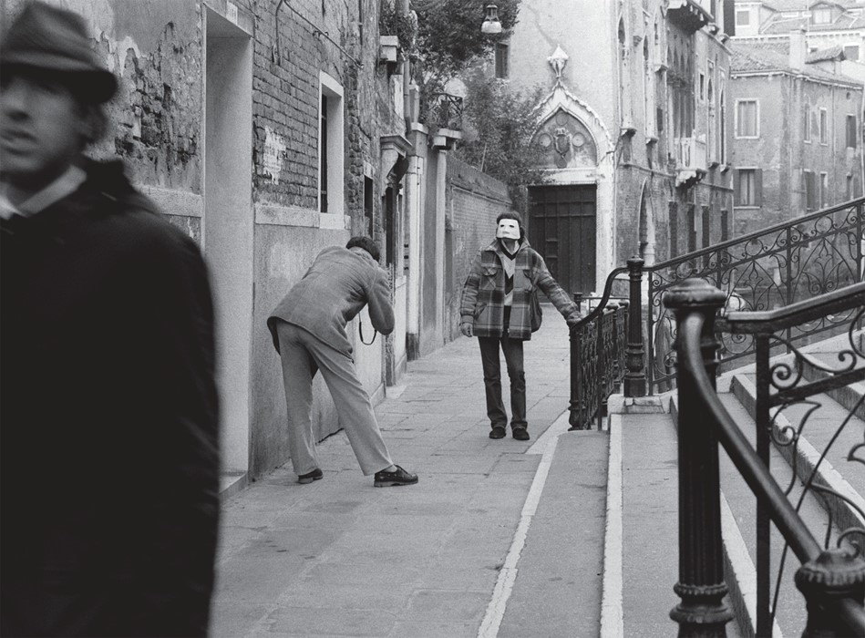
There is one photo in particular from Calle’s ‘Suite Venitienne’ that stands out to me; this photograph unlike the rest of Suite Venitienne has other main subjects which distract from the man she was stalking, supposedly the main focus of the project.

Suite Venitienne – Sophie Calle (1979)

The lighting used for this photograph is natural daylight as the photo does not seem to be staged despite the unusual occurrences within the image. The image was most likely taken in the aside of it being midday as the light is not overpowering, and the exposure used for the image seems to be fairly balanced as the lighter tones such as the edges of the steps are balanced and contrast with the darker tones in the image such as the door and the coated man by the camera. The photograph has various visual aspects starting with the composition; the viewer is immediately drawn to the dark figure in the forefront of the frame as the figure takes up a considerable bit of space and catches your eye straight away. The eye of the viewer is likely to go from their backwards through the image passing from the stairs to the two other people, to the door and then to the background of the image where the buildings overlook the Venetian canals. As you can see the image is in black and white, most likely due to the traditional and dated aesthetic that Calle wanted to put across, somewhat like that of an old European film. However this may have been done as a means of creating a mysterious or eerie feel to the photographs as the idea of following a stranger around reflects this. The concept behind this photograph, as a part of project consisting of similar images, is that it is a single snapshot of the documenting process of Calle stalking her subject around Venice. This photograph however focuses on multiple human subjects despite the main body of the project consisting of the man in question being the main subject within the images.

There was also one photograph that stood out to me from Ruff’s ‘Nacht.’ This was the first photograph in the series of others similar, titled ‘Nacht 1 I,’ this of all the photographs consisted of certain visual elements that others didn’t, which drew me in as a viewer.

Thomas Ruff – Nacht 1 I (1993)

The first part of this photograph which your eyes are drawn to as a viewer is the light shining from a third storey window which appears to be part of a residential building. This is because the bright white tones completely contrast with the dark black and green tones of the rest of the image. This use of light is something that is a repeated visual element within the ‘Nacht’ series, which could be done purposefully by Ruff or could just be due to the fact that at night any source of light becomes aesthetically prominent. The photographs that the series consisted of were ‘’shot at night using a 35mm camera and a Zeiss equipment with the ability to amplify available light’’ [6]. Which has assisted Ruff in replicating CCTV surveillance footage with a night-vision smoky green aesthetic. It is evident that Ruff is not bothered by and infact embraces the low resolution quality of his images. For this project in particular this is very fitting, since genuine footage from surveillance cameras tend to be of a low resolution and use a green tinted night-vision light after they are unable to capture footage using natural daylight. I believe that this photograph as well as the others which make up the series, show how surveillance can be used at all times and in fact in some ways is unavoidable.

It is clear the Sophie Calle and Thomas Ruff go about exploring the subject matter of surveillance in two very alternative ways. Their work has obvious visual differences such as Ruff’s use of colour opposing to Calle’s monochromatic style, and also their composition as Ruff uses a square format with a centrally focussed image whereas Calle uses landscape and portrait formats in which her photographs tend to fill the whole frame. Also the other main difference between these two photographers’ approaches is what they are trying to convey and explore with their work as Calle investigates surveillance in a more subtle and less direct manner whereas Ruff clearly makes it blatant from his work that he is directly producing a response to existent means of surveillance used in the modern world. However despite these dissimilarities, I believe that from looking into their work they do share some common intentions. I believe that both photographers produce work that makes people question their personal security as they become aware of how easy it is to be watched at all times; because if it is possible for photographers to replicate these forms of surveillance, then it is certain that it will be made much easier for specialists within the field of surveillance and the government.

Conclusion:

Overall I have come to understand different ways in which the subject matter of mass surveillance can and has been explored in photography. The work of Sophie Calle and Thomas Ruff has backed up my initial ideas and strengthened how I feel about surveillance in general and also how I can put across these thought in my own work. My initial thoughts on the subject matter is that some people are not as aware of the circumstances involving mass surveillance as I believe they should be, however it seems that as time goes on more and more of the public are becoming aware of the problems and consequences of mass surveillance in the modern world. The modern world is a consistently developing place, and therefore surveillance is just becoming more and more common, and also more advanced as well as personal. This ubiquitous increase in surveillance is something which is slowly causing more and more people to become paranoid and feel like they are being controlled and watched at all times; again a concept which is covered within George Orwell’s Nineteen Eighty-Four novel, that is worryingly becoming more realistic by the day. As I said these thoughts are ones which I now feel even stronger about due to investigating the topic in more depth in terms of how it can be photographically interpreted.

Bibliography:

(Inside Photo-Book) George Orwell, Nineteen Eighty Four, Part 3, Chapter 4, Pg 37 [1]

Robert McMahon – Quoted from ‘surveillance and privacy in the digital age: a primer for public relations’ Page 1 [2]

sigliopress.com/book/suite-venitienne [3]

“Thomas Ruff’s manipulative photography”. The Economist. 30 September 2017. [4]

http://lossyculture.altervista.org/thomas-ruff-nacht/ [5] & [6]