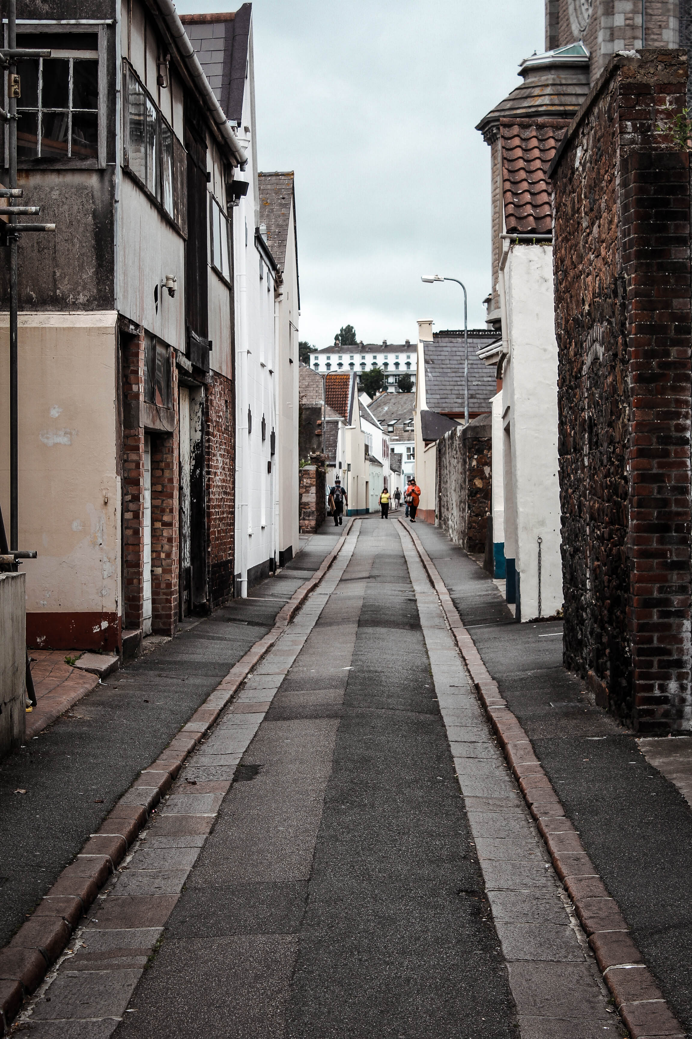
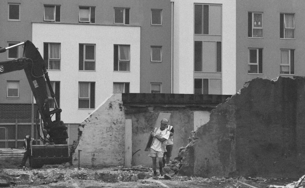
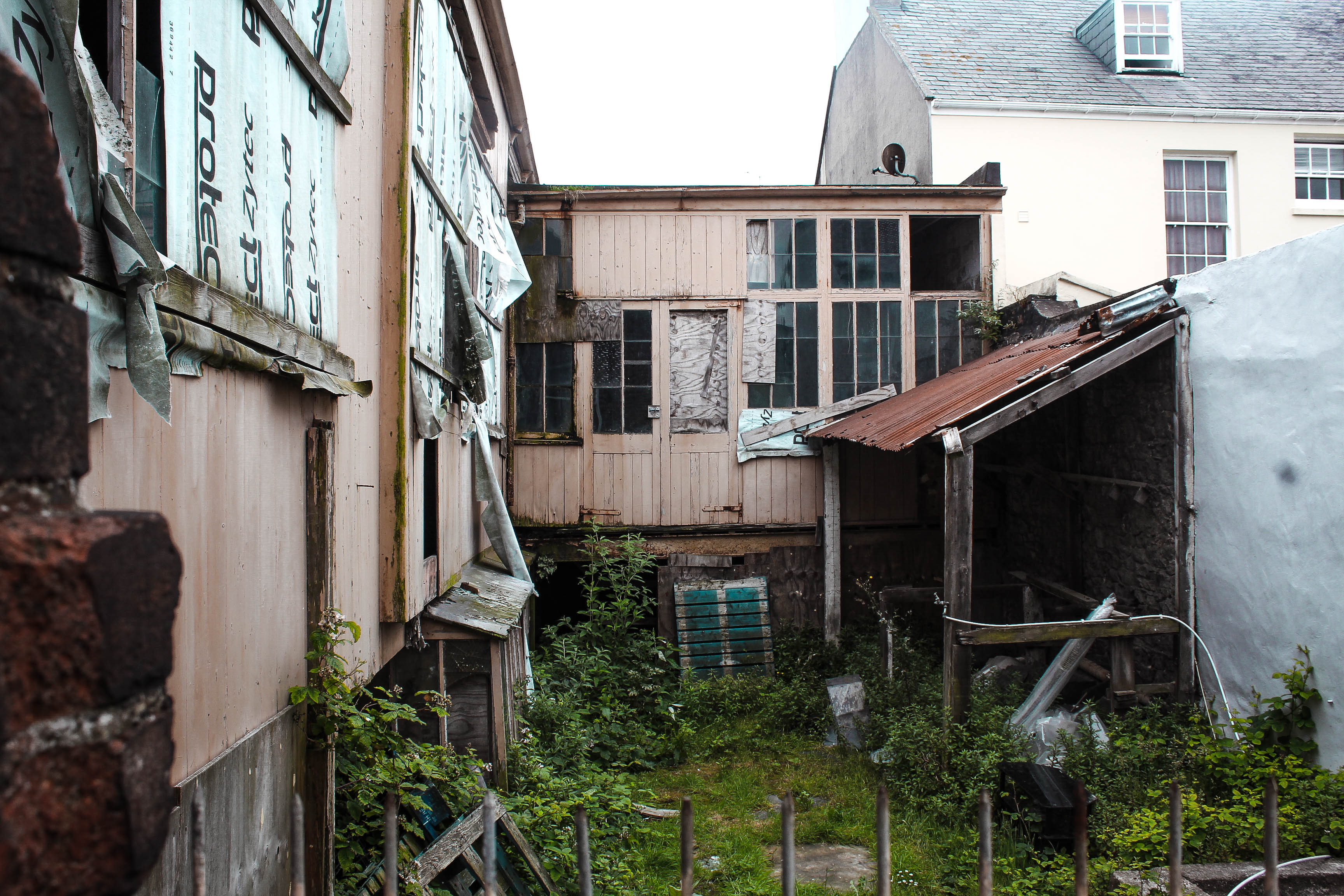
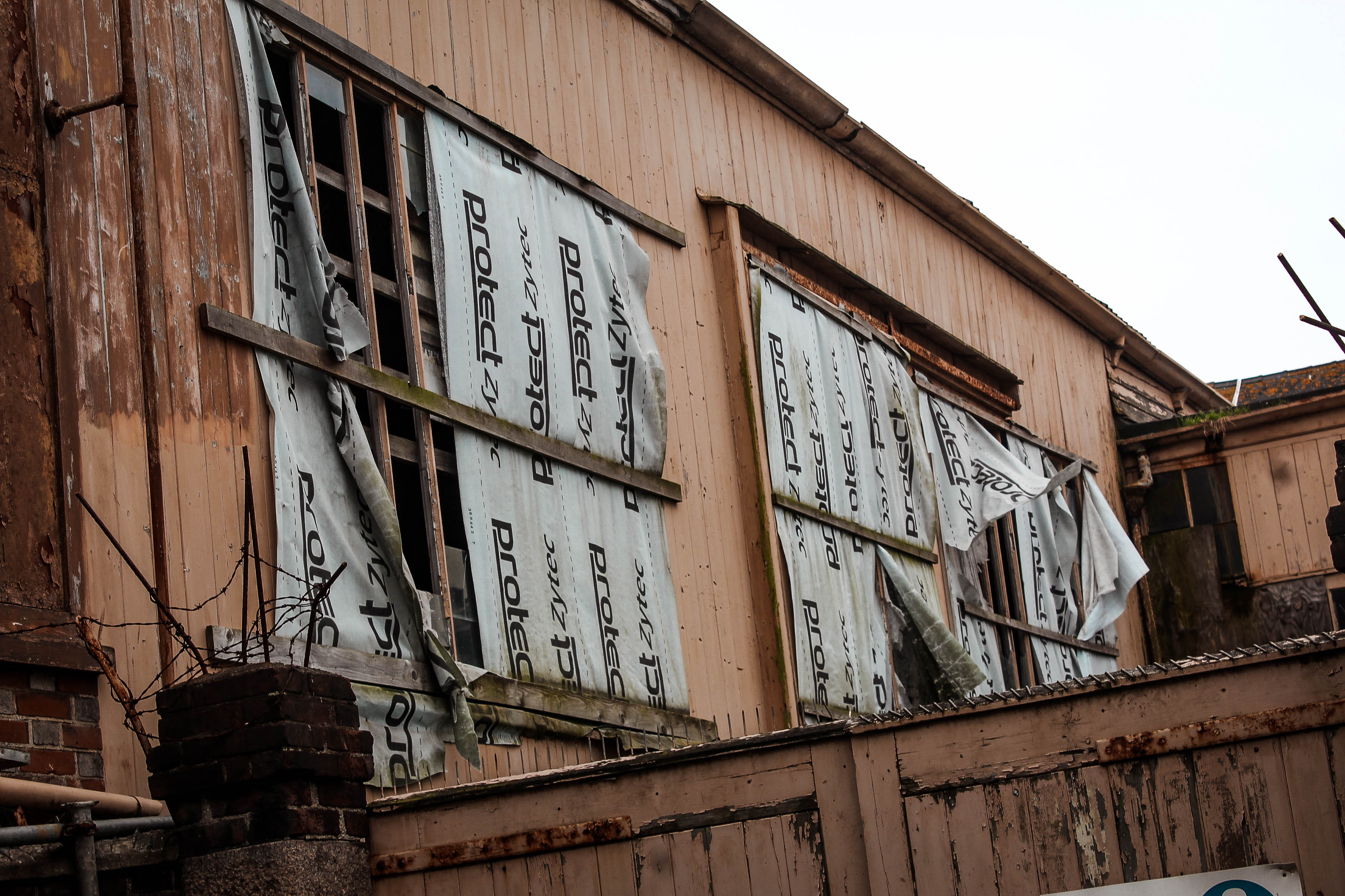
Experimenting with Cropping

Photograph 1

This is the original photograph with no cropping done as of yet. I believe this photo will be effective to focus in on different aspects to change the ideas portrayed.

I believe this edit helps to portray the shape and alignment of the church and almost demonstrates how the church is aligned behind the buildings. This is because the narrow crop reflects how narrow and skinny churches are compared to their height. This photo could possibly represent how religion in St Helier is not respected. This is because the building in front of the church appears to be pretty torn up as if the area is pretty rough which contrasts with the ideas of Christianity which is showing respect towards everything and being peaceful. 

For this crop I have focused in on the church and the dominant factor it has compared to all the buildings below it. It appears to be tall and superior which could imply that religion is a key aspect to St Helier. This demonstrates a strong sense of community within St Helier.

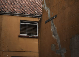
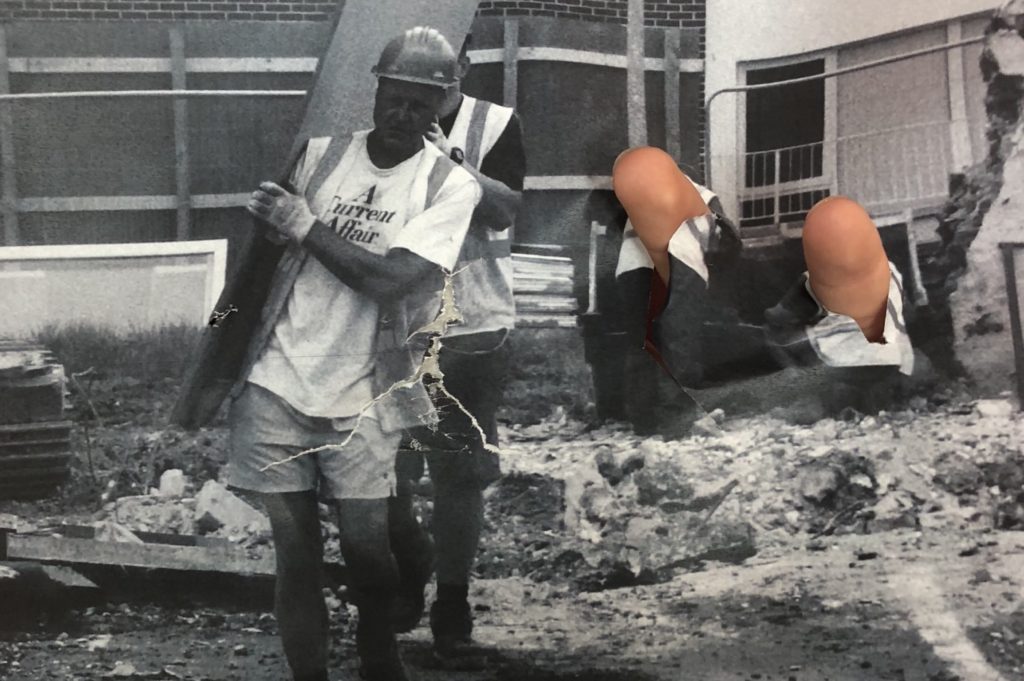
This cropping focuses on the dirty, torn up building which shows a sense of poverty and destruction that is present within the area of St Helier. By cropping out the church, the whole concept of the photograph has been altered.
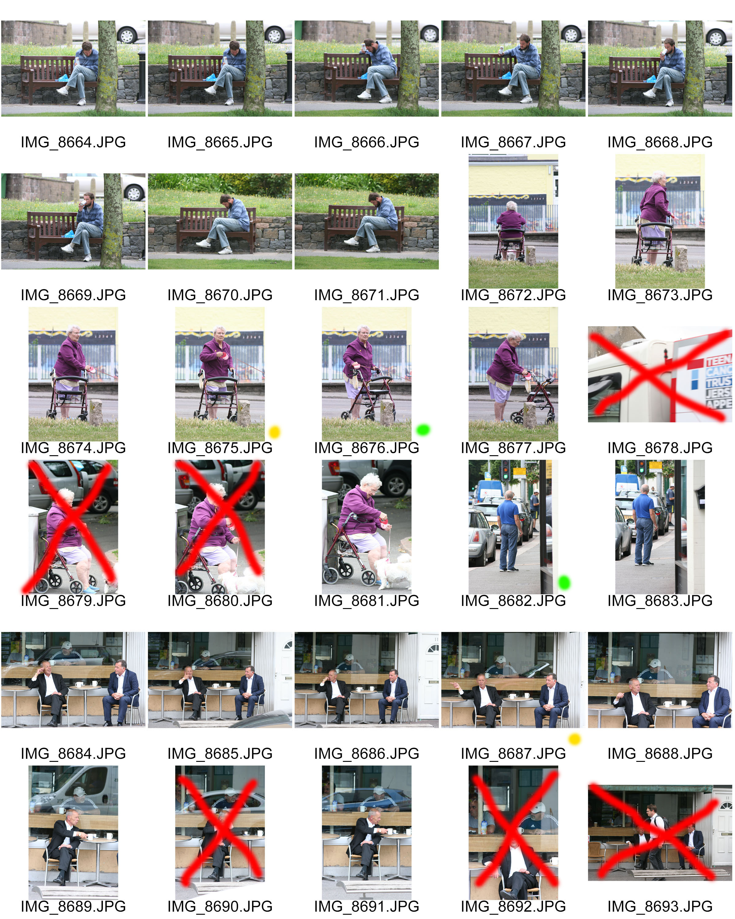
Photograph 2

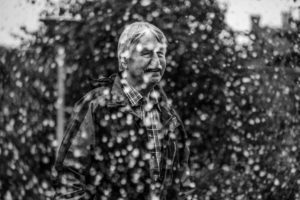
This is the original photograph with no cropping.

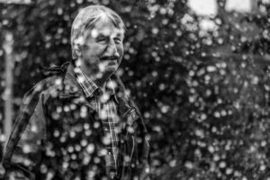
For this photograph I narrowed down the image to ensure that there are no distractions to the focus of the image which is the mans happiness. I cropped it so that the viewer can too look towards the direction the man is positioned and looking.

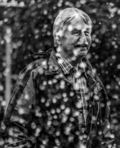
The cropping of this image focuses directly on the man and his happiness with the modern park that he is in. The main attraction, thus being the water fountain, is what i photographed through and clearly the man is enjoying it. This shows that St Helier’s recent developments are benefiting our community and they’re enjoying it.

St Helier Photoshoot 3

For this photo shoot, I wanted to capture the modernization of St Helier and show the development which is occurring to improve the area and build a stronger community. When wondering around the area i noticed that the development was a lot less centered around community but more around making life better for others with new modern buildings, and what appears to be making St Helier more futuristic.

These few photos above demonstrate a sense of community without actual people being there. This is because of the nature of the place I have photographed and the goals/aspirations of the people that run the building. The building is the freedom church which once was a cinema. Both attractions designed to bring people together and build a sense of community. The freedom church aims to bring youngsters off the streets at night causing trouble and provide a safe place for them to hang out. These photos provide a strong juxtaposition with my second photo shoot that focuses on the destruction of the area which relates to the kids causing trouble on the streets and vandalizing buildings.


Experimenting With Montages

In the below montage I have edited in the two construction workers from another photograph. This creates another subject within the photograph.


In the below montages I have edited in the bear from another photograph in order to add to my story telling narrative within the sequence of photographs.

Cut and Paste Montages

In the below photographs I have manipulated the photograph with my hands and then taped the photograph back together then repeating the process in order to create a weathered look in the later on compositions. I think that this is a good experiment to explore as there is lots of shapes and creations that you can come up with but for this project I am enjoying photographing and editing to create documentary style sequences.


Deadline: Final Sequence

By the end of lesson on Friday 6 July you must have the following completed:

1. Import your experiments into Lightroom and add them to your collection of images that you made a sequence from last week in Lewis Bush’ workshop.

2. Re-evaluate and decide on a final sequence with a set of 6-10 images that express your own personal feelings towards the Future of St Helier.

This set of images could be made entirely of your full frame, cropped, adjusted or montaged images or a combination. The important thing is that it is a coherent set of images which communicates a specific narrative and express visually your own unique view.

Think about some of the examples that Lewis used here in his presentation.

Hautlieu Editing_reduced

3. Create a new collection and name it ‘Final Sequence’ under Future  of St Helier in LR.

4. Export those images into a new folder named DESIGN that you create on your Media:drive as TIFF files in high-res 4000 pixels

5. Make sure you come into lesson on Mon 9 July for Workshop#4 with Lewis Bush where we will begin to design page spreads in Indesign.

St Helier Photoshoot 2

For this photo shoot my intentions were to capture the destruction of the area i was allocated. I did this by shooting derelict buildings which had a sense of usage and were clearly left abandoned. I wanted to bring an awareness to the community of St Helier that these buildings are wasting space and could be used for something that would benefit our island.  I also intended on bringing a strong contrast between the old vs new of St Helier which would truly show how wasteful the abandoned buildings are.

This photo displays a clear contrast between new vs old within St Helier. This strong contrasts helps to alarm the viewer and bring a sense of annoyance as the viewer can see what is capable in the destroyed area however it still remains ruined. The textures are interesting in this photo, with the new building having soft calming textures to reflect a bright future however the derelict building in front conveys very tough and ridged textures. The way i decided to compose this image was to have the derelict building in front to show that this is a key issue standing between us and the bright future for St Helier.

I think this photo is very effective in portraying the idea that Jersey needs development to help the future of St Helier. The photo has the idea that we are looking through a portal into the future of St Helier and if we carry on the way we are going, the future of St Helier is as displayed, destroyed. This is effective in raising awareness of this issue and connecting with the audience in bringing a realization to this issue.

I believe that this shoot was successful in portraying the decline of the area i was allocated however showing the hope for it by including some direct contrasts between the dereliction of buildings and the new structures. This helps to show the viewer that there is large room for development within St Helier which would not only improve the aesthetics of the area but also help to build a community. I have edited most of the images with low saturation and high contrast and clarity, dark shadows and increased blacks to give this sinister feeling to represent my views on this destruction.

Experimenting with cropping and conceptual ideas

Edits:

For my first images I wanted to experiment wihtin dividing and duplicating segment of the images to create a fractured dynamic, I think it creates a depth within the images and a disjointed narrative structure which is effective.My second images I wanted to extend the way in which the long corridor is exaggerated, it allows a centre point to the image. Both of these demonstrate cropping in a different manner in order to exaggerate different aspects of a piece. to either lengthen or disorganise a piece to become more abstract and present St Helier in a more iconic method.

Within this image I wanted to form two images together, using instant alpha and moulding two separate environments of town together, one is of a floor covered with de constructed buildings and the other is a buildings falling down, this is interesting to me as they both symbolise the deterioration of St helier and perhaps the near future consequences for the house itself. I think it is a weird composition and almost as if this is a collage but I think this could be further experimented with and perhaps make a successful image altogether.

These two images I wanted to capture the design of a building in an interesting angles,I wanted the images to look as if they have an authority and power, it Presents the modernisation of a building,how the first is the development which looks bad and complicated however the contrast within the  second piece and how it looks so smooth and futuristic.This is also interesting as both images were taken next to each other in the same environment. it is a development of how cropping can be copied and expanded to create an abstract piece. 

these two images I used photoshop and cropped the shape of them in order to be more focused on a specific section of the original piece itself. it presents the same building from two different perspectives.The first shows a narrowed angle and is stretched in order to show the length of the building itself, it is also interesting as the light is centred throughout in the same mirroring shape. 

This image is similar to the previous it is a lot more abstract themes wihtin the structure and how there looks like a long extension until the horizon.it shows an industrial field,I made the tones within the images copy from different segments of the images and repeat. 

My main interest within this was to crop in on a specific centred angled gate as it has a dynamic pattern and having a highlighted  contrast to the dark wall on the right and light wall on the left. 

For the portrait images I wanted to purely crop the images in order to create a straight connection within the person themselves.Tthe crop allows a direct eye contact and allows the shape and proportions to be mirrored by the length of their body of the activity they are doing. 

this last images I cropped in order to look as if you were about the centre the houses it is more centred upon the left sided and I have edited off the road in order to not get distracted by the environment but purely the house and architecture themselves ,and an idea of the people who live in there.

8. Experimental Editing

I have experimented with cropping to make more abstract images of of a few of my favourite photos from my initial shoot.

I was originally planning to display each of the crops separately but had the idea to combined them into a photo montage to create repetition in the patterns. This created a more interesting image rather than the original documentary approach.

Whilst exploring our area on the photoshoot I decided to collect interesting things that I found which either reflected the location or stood out as different and out of place. I found a variety of objects such as a bike brake on the pavement, a Christmas decoration and warning tape outside a church. I wanted to use these items as part of my image making and final outcome. Using photocopier I placed the objects in different arrangements and layers before closing and scanning it into an image.  The scanned images turned out different to how I was expecting due to the distorted areas which were further from the glass on the photocopier. Although this was not planned I like how it turned out because it gives the image a more interesting and abstract effect with the contrast between focus and blurred areas. These photos show an alternative way of capturing a photographs and also display elements of the area I also captured in my photographs.