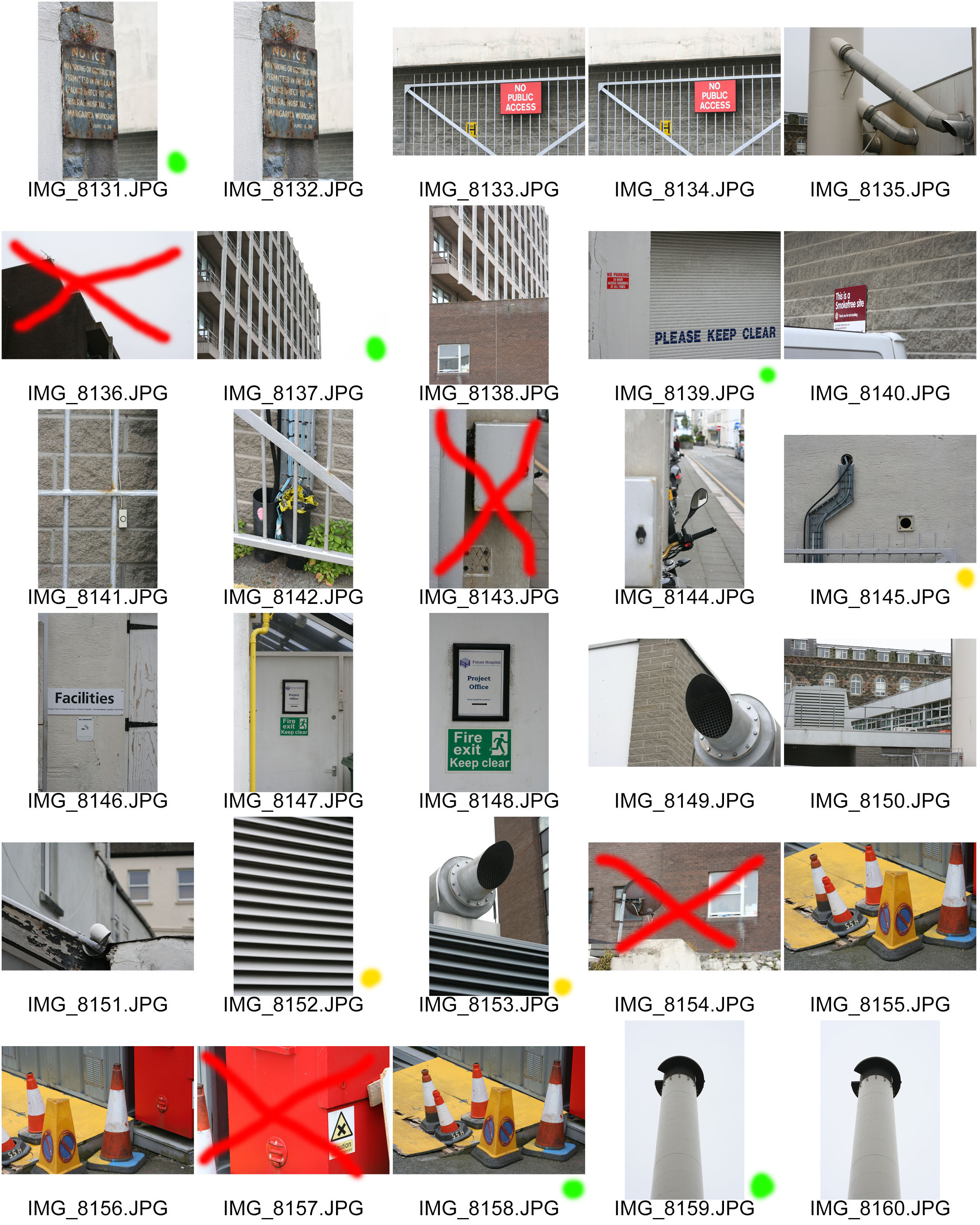
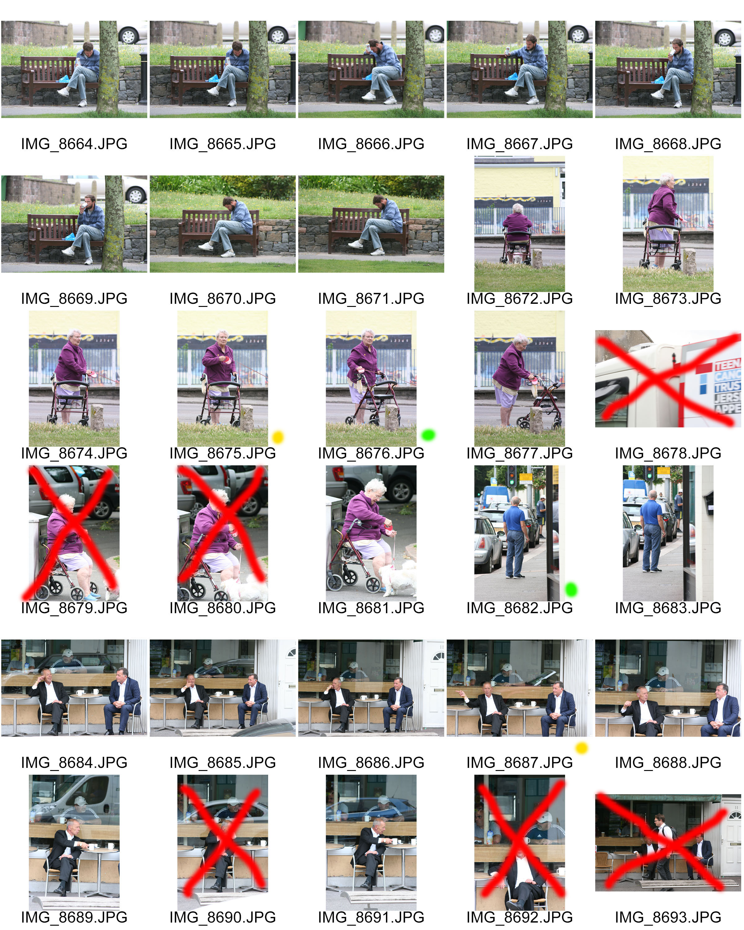
RED = UNSUCCESSFUL
YELLOW = SUCCESSFUL / POSSIBLE USE
GREEN = SUCCESSFUL / USE FOR EDITING PROCESS





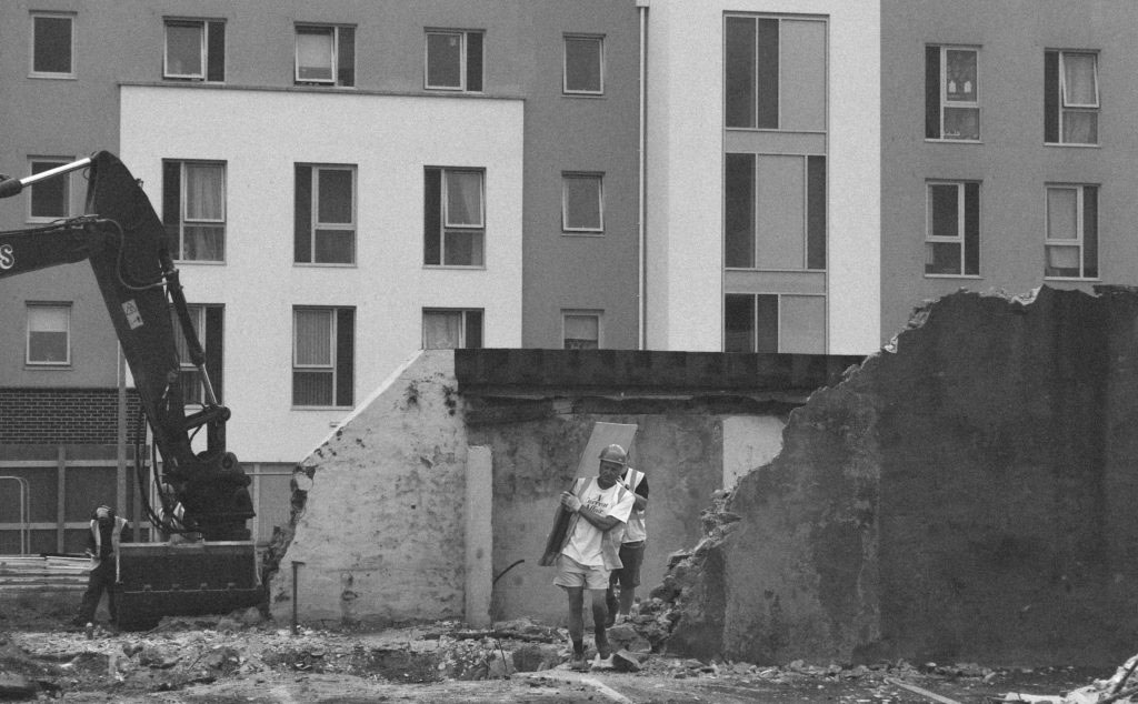
In the below montage I have edited in the two construction workers from another photograph. This creates another subject within the photograph.
In the below montages I have edited in the bear from another photograph in order to add to my story telling narrative within the sequence of photographs.


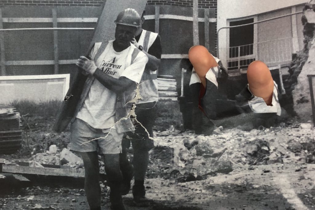
In the below photographs I have manipulated the photograph with my hands and then taped the photograph back together then repeating the process in order to create a weathered look in the later on compositions. I think that this is a good experiment to explore as there is lots of shapes and creations that you can come up with but for this project I am enjoying photographing and editing to create documentary style sequences.



By the end of lesson on Friday 6 July you must have the following completed:
1. Import your experiments into Lightroom and add them to your collection of images that you made a sequence from last week in Lewis Bush’ workshop.
2. Re-evaluate and decide on a final sequence with a set of 6-10 images that express your own personal feelings towards the Future of St Helier.
This set of images could be made entirely of your full frame, cropped, adjusted or montaged images or a combination. The important thing is that it is a coherent set of images which communicates a specific narrative and express visually your own unique view.
Think about some of the examples that Lewis used here in his presentation.
3. Create a new collection and name it ‘Final Sequence’ under Future of St Helier in LR.

4. Export those images into a new folder named DESIGN that you create on your Media:drive as TIFF files in high-res 4000 pixels
5. Make sure you come into lesson on Mon 9 July for Workshop#4 with Lewis Bush where we will begin to design page spreads in Indesign.


For this photo shoot my intentions were to capture the destruction of the area i was allocated. I did this by shooting derelict buildings which had a sense of usage and were clearly left abandoned. I wanted to bring an awareness to the community of St Helier that these buildings are wasting space and could be used for something that would benefit our island. I also intended on bringing a strong contrast between the old vs new of St Helier which would truly show how wasteful the abandoned buildings are.
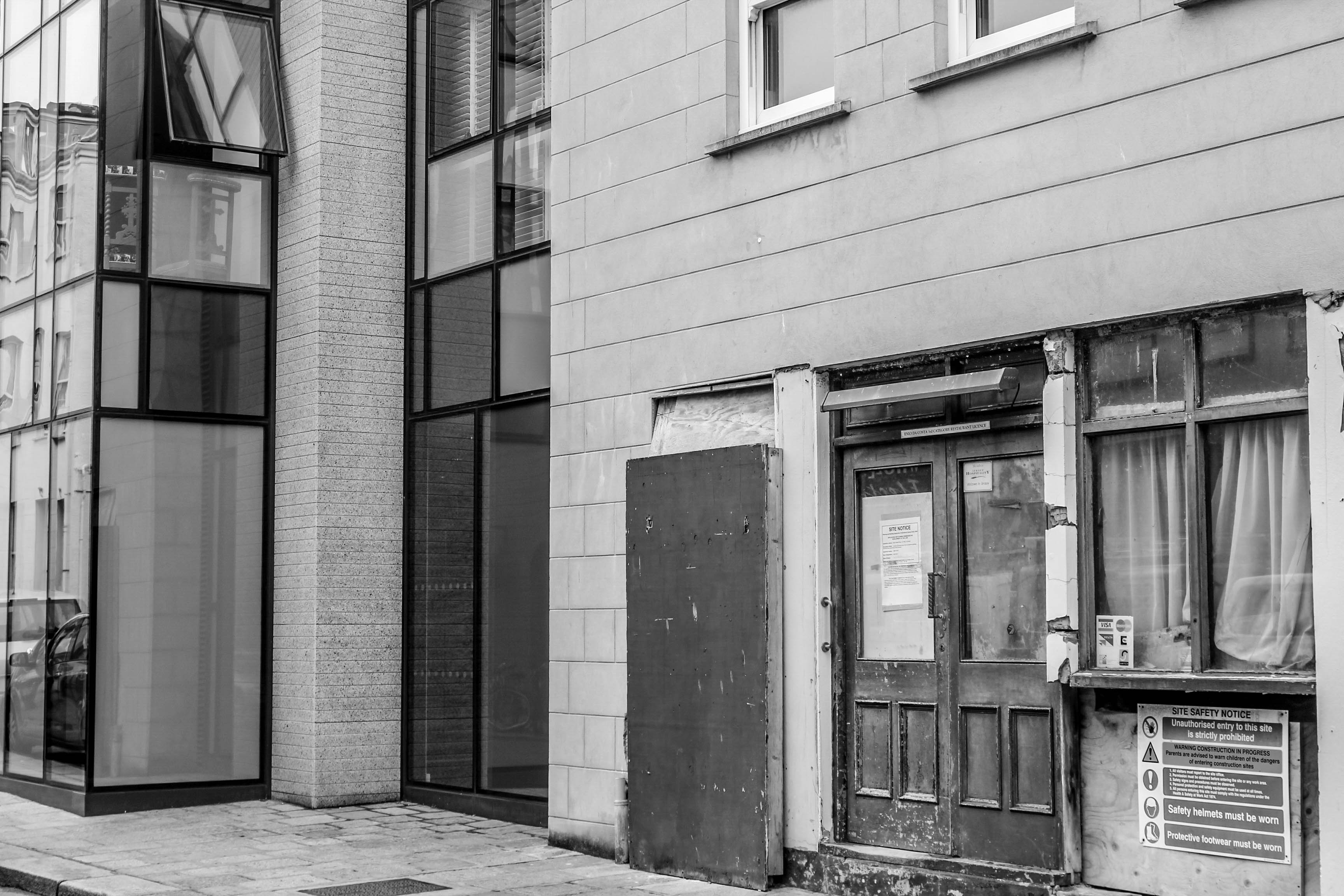


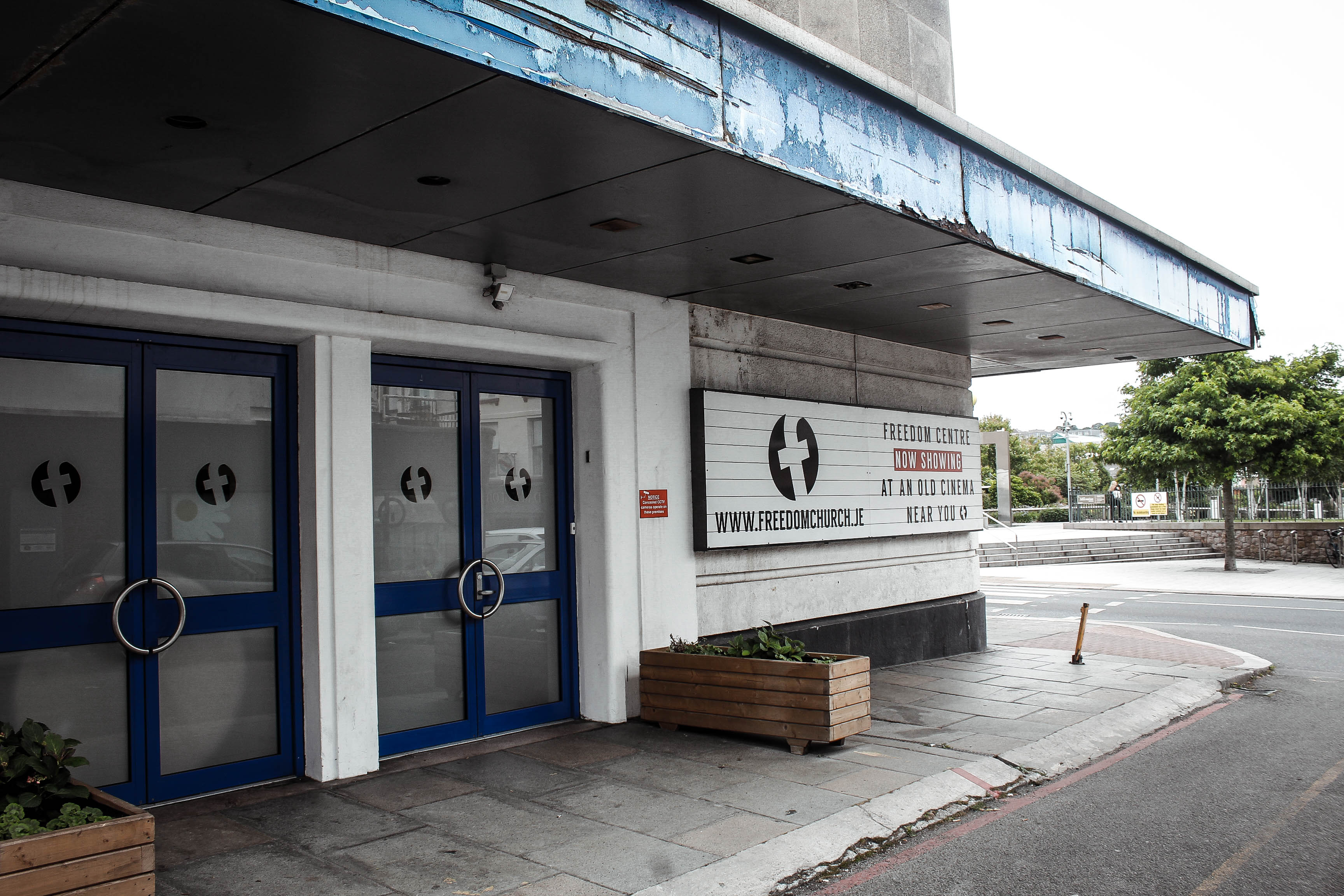


This photo displays a clear contrast between new vs old within St Helier. This strong contrasts helps to alarm the viewer and bring a sense of annoyance as the viewer can see what is capable in the destroyed area however it still remains ruined. The textures are interesting in this photo, with the new building having soft calming textures to reflect a bright future however the derelict building in front conveys very tough and ridged textures. The way i decided to compose this image was to have the derelict building in front to show that this is a key issue standing between us and the bright future for St Helier.


I think this photo is very effective in portraying the idea that Jersey needs development to help the future of St Helier. The photo has the idea that we are looking through a portal into the future of St Helier and if we carry on the way we are going, the future of St Helier is as displayed, destroyed. This is effective in raising awareness of this issue and connecting with the audience in bringing a realization to this issue.
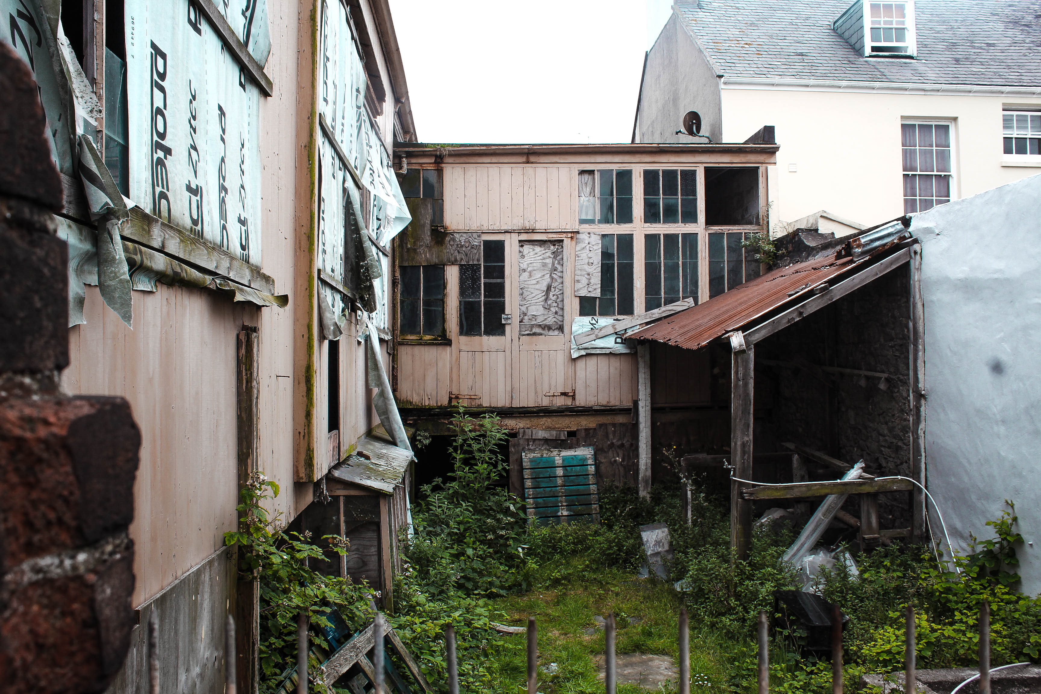
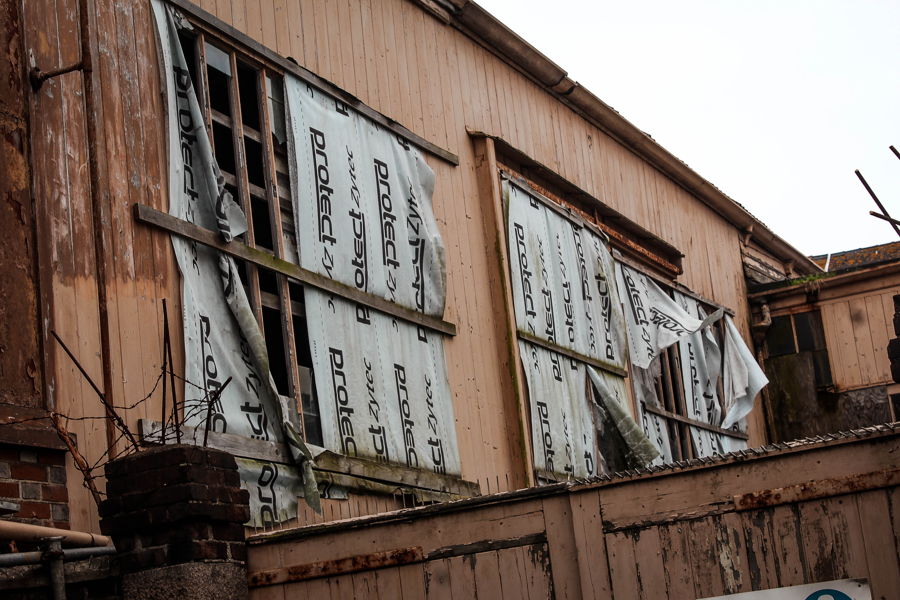

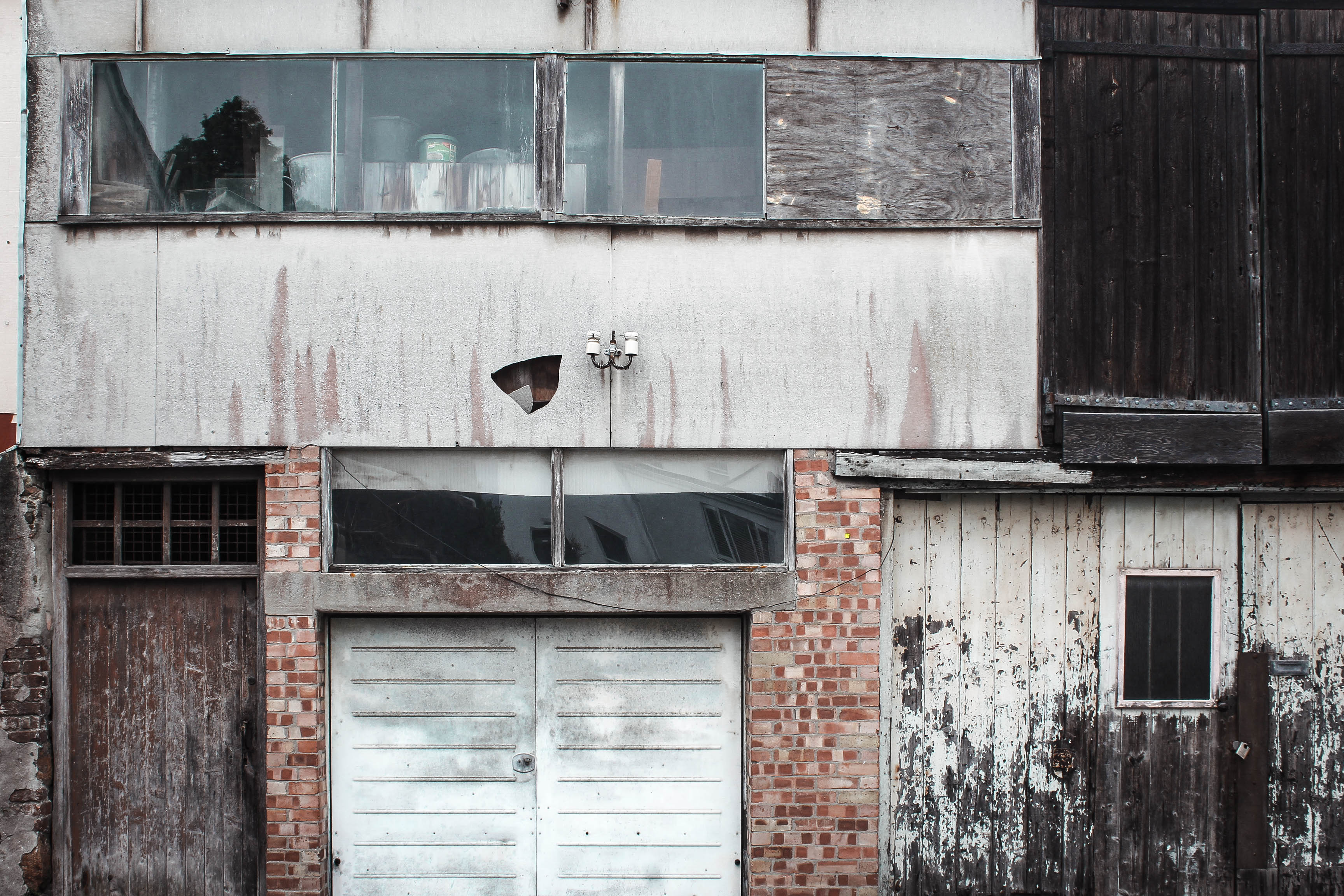

I believe that this shoot was successful in portraying the decline of the area i was allocated however showing the hope for it by including some direct contrasts between the dereliction of buildings and the new structures. This helps to show the viewer that there is large room for development within St Helier which would not only improve the aesthetics of the area but also help to build a community. I have edited most of the images with low saturation and high contrast and clarity, dark shadows and increased blacks to give this sinister feeling to represent my views on this destruction.