FINAL PRINTS, PRESENTATION AND EVALUATION

PLANNER for A2 EXAMINATIONS 2019

FINAL PRINTS DATES:
Select your final images for both EXAM and COURSEWORK (if you haven’t completed this already)

Tue 30 April 15:00
prints ready for Day 1 of Exam 7 / 8 May
Tue 7 & 8 May 15:00
prints ready for Day 2 of Exam 13 / 14 May
Mon 13 & Tue 14 May 15:00
prints ready Tue 21 May

EXAMINATION DATES:
15 hrs controlled test over 3 days
Groups 13A / 13C – 7, 13 & 21 May
Group 13D – 8, 14 & 22 May

CLASS LIST + EXTRA TIME
For those of you who have extra time – check when this has been allocated.

BLOG: End your blog with evidence of the following:

1. Show evidence of how you intend to present and display your final prints – make mock up in Photoshop – for example. a single image or diptych, triptych, predella, size A5, A4 or A3, typology-style grid, collage etc

2. If you have made a photobook – write a book specification and describe in detail what your book is about in terms of narrative, concept and design.  Produce a mood-board of design ideas and consider the following:

  • How you want your book to look and feel
  • Paper and ink: use of different paper/ textures/ colour or B&W or both.
  • Format, size and orientation: portraiture/ landscape/ square/ A5, A4, A3 / number of pages.
  • Binding: soft/hard cover. Image wrap/dust jacket. Saddle stitch/swiss binding/ Japanese stab-binding/ leperello
  • Cover: linen/ card. graphic/ printed image. embossed/ debossed. letterpress/ silkscreen/hot-stamping.
  • Title: literal or poetic / relevant or intriguing.
  • Narrative: what is the story/ subject-matter. How is it told?
  • Structure and architecture: how design/ repeating motifs/ or specific features develops a concept or construct a narrative.
  • Design and layout: image size on pages/ single page, double-spread/ images/ grid, fold- outs/ inserts.
  • Editing and sequencing: selection of images/ juxtaposition of photographs/ editing process
  • Images and text: are they linked? Introduction/ statement / use of captions (if any.)

3. Write an overall final evaluation (250-500 words) that explain in some detail the following:

  • how successfully you fulfilled the EXAM brief and realised your intentions.
  • links and inspiration between your final images and exam theme including artists references
  • analysis of final prints/presentation in terms of composition, lighting, meaning, concept, symbolism etc.

see example here: https://hautlieucreative.co.uk/photo16a2e/author/sodonnell05/

4. Go through all your blog posts and make sure that you have completed them all to your best ability, e.g. good use of images/ illustrations, annotation of processes/ techniques used, analysis/ evaluation of images and experimentation

5. Present your final outcomes in window mounts or on foam board, label with name, candidate number, attach velcro and put in a BROWN/BEIGE/YELLOW folder.

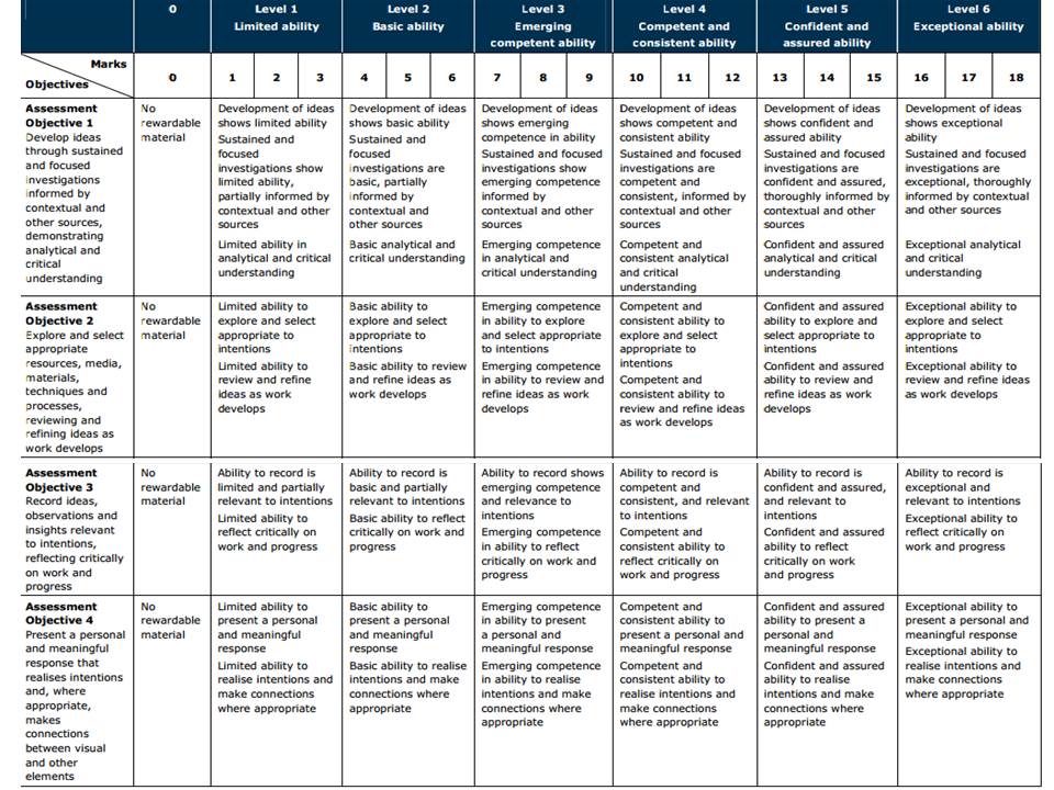
To achieve a top marks we need to see a coherent progression of quality work from start to finish following these steps:

RESEARCH > ANALYSIS > PLANNING > RECORDING > DEVELOPING > EXPERIMENTING > PRESENTING > EVALUATING
The following students have been selected for moderation:

Coursework:
Shanesia Da Silva
Jordan Fenn
Ben Grindheim
Charlton Hoy
Alice Kent
Kobi Le Cornu
Erin Luis
Declan O’Grady
Hayden Runacres
Anya Waigh
Stanley Lucas

Externally Set Assignment:
Shanesia Da Silva
Jordan Fenn
Ben Grindheim
Charlton Hoy
Alice Kent
Kobi Le Cornu
Erin Luis
Declan O’Grady
Hayden Runacres
Anya Waigh
Stanley Lucas (H)
Georgine Lutkin Clarke (L)

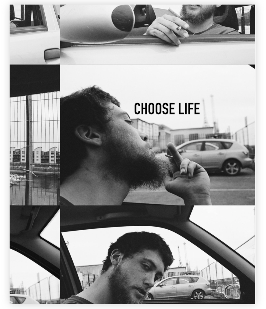
Evaluation – Photobook

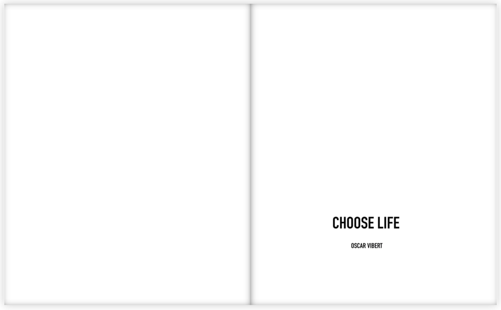
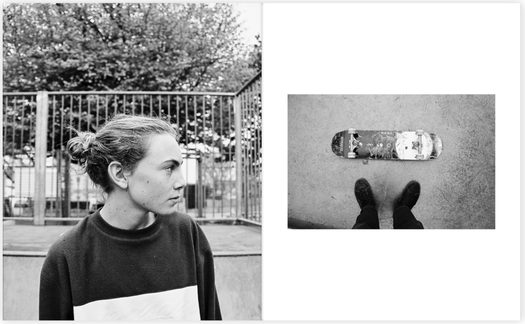
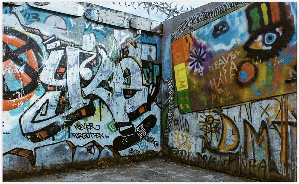
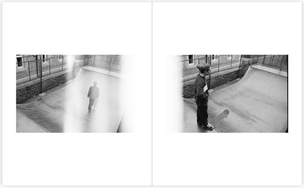
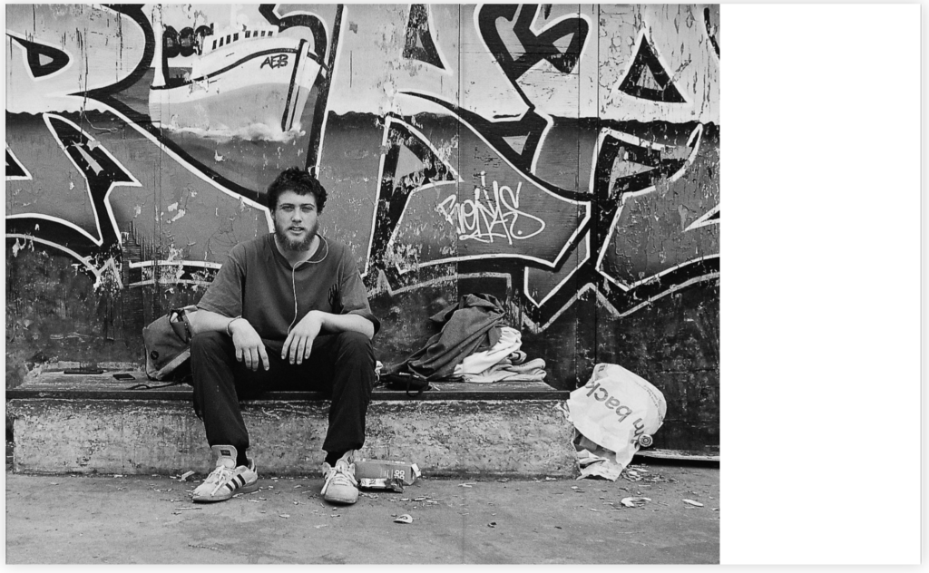
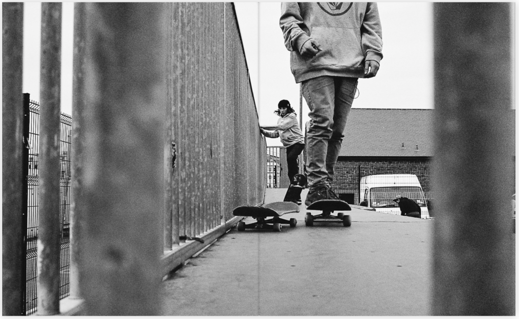
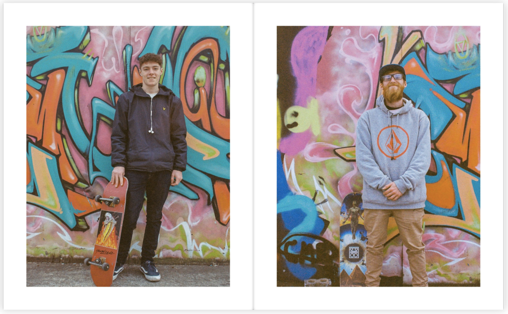
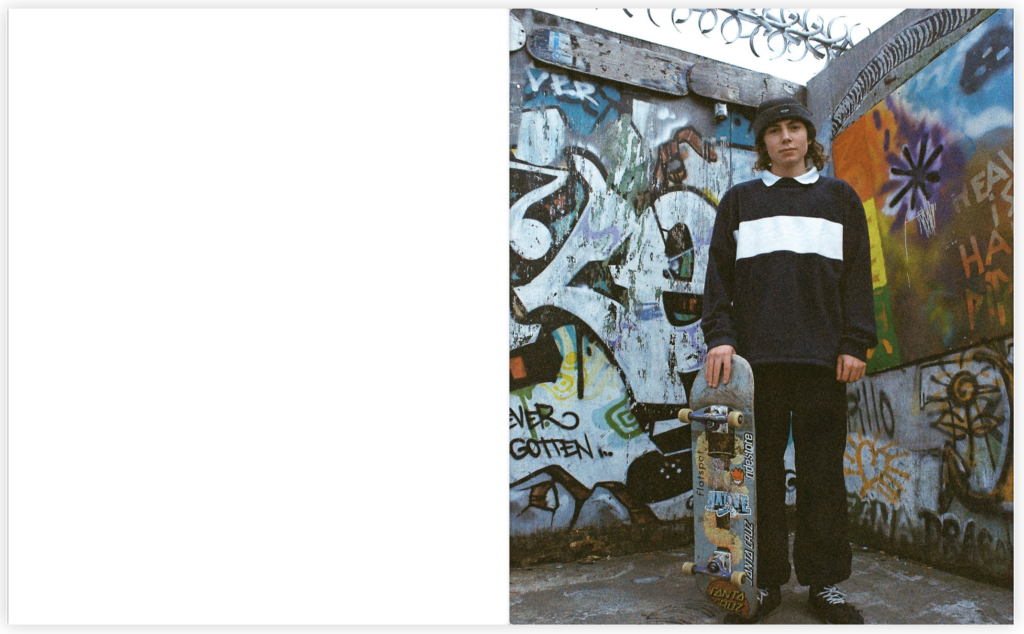
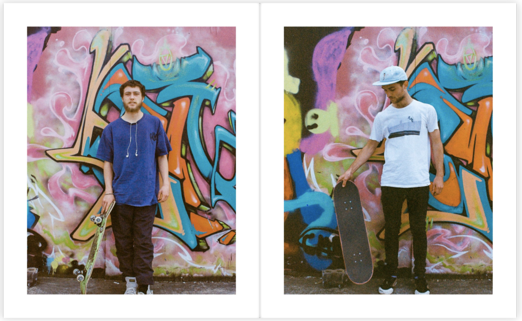
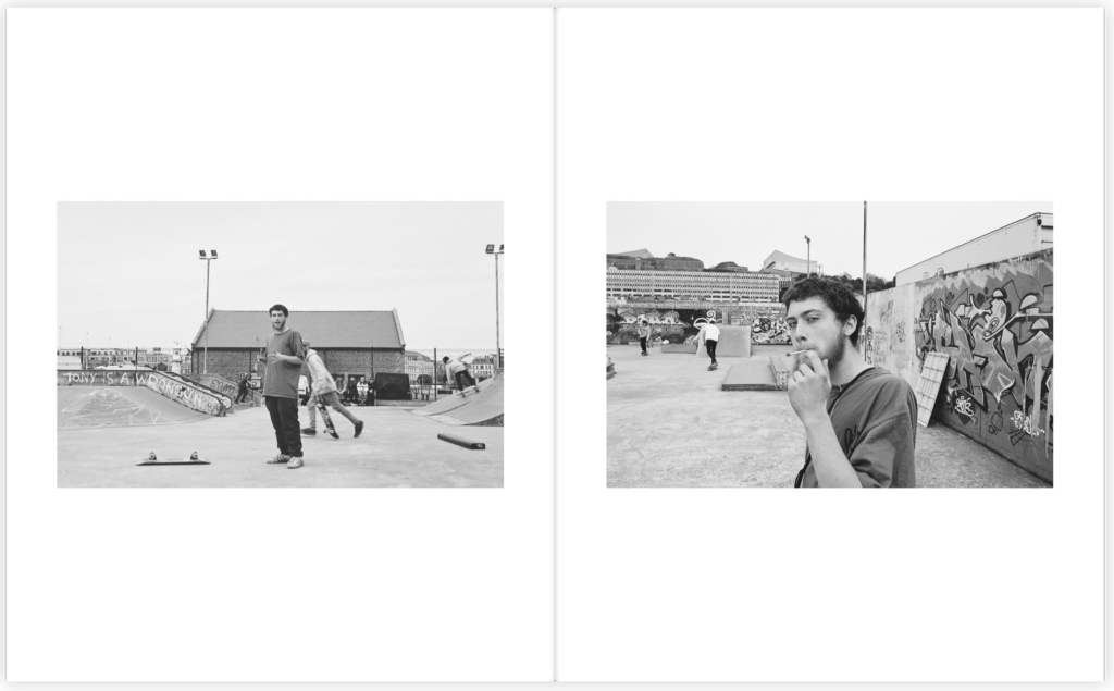
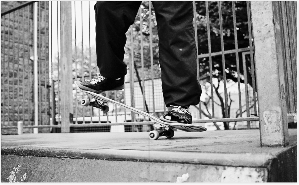
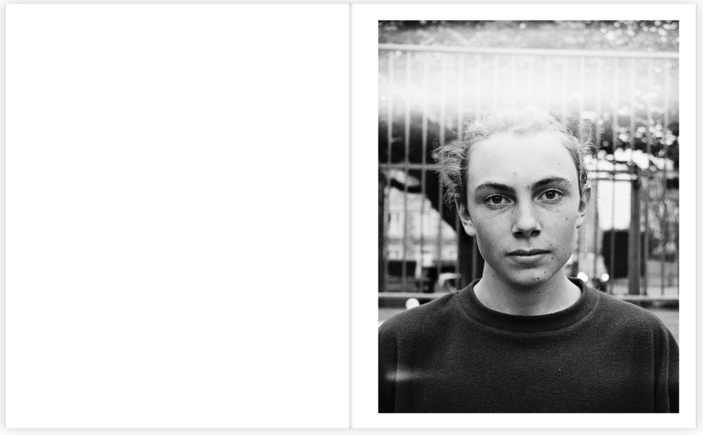
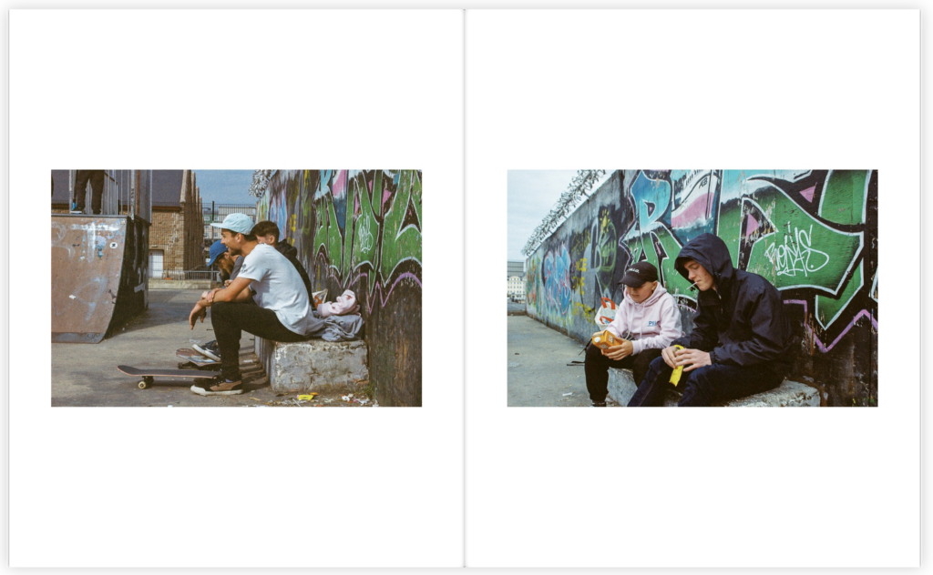
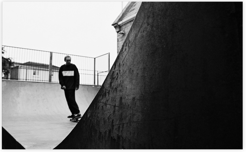
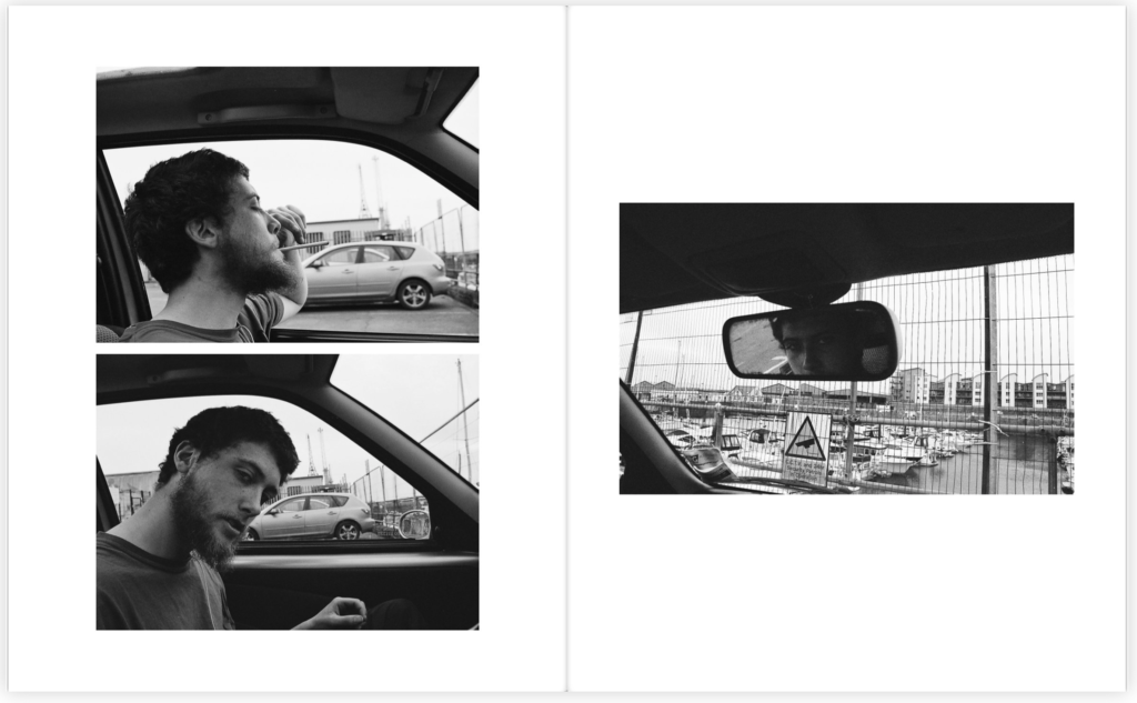
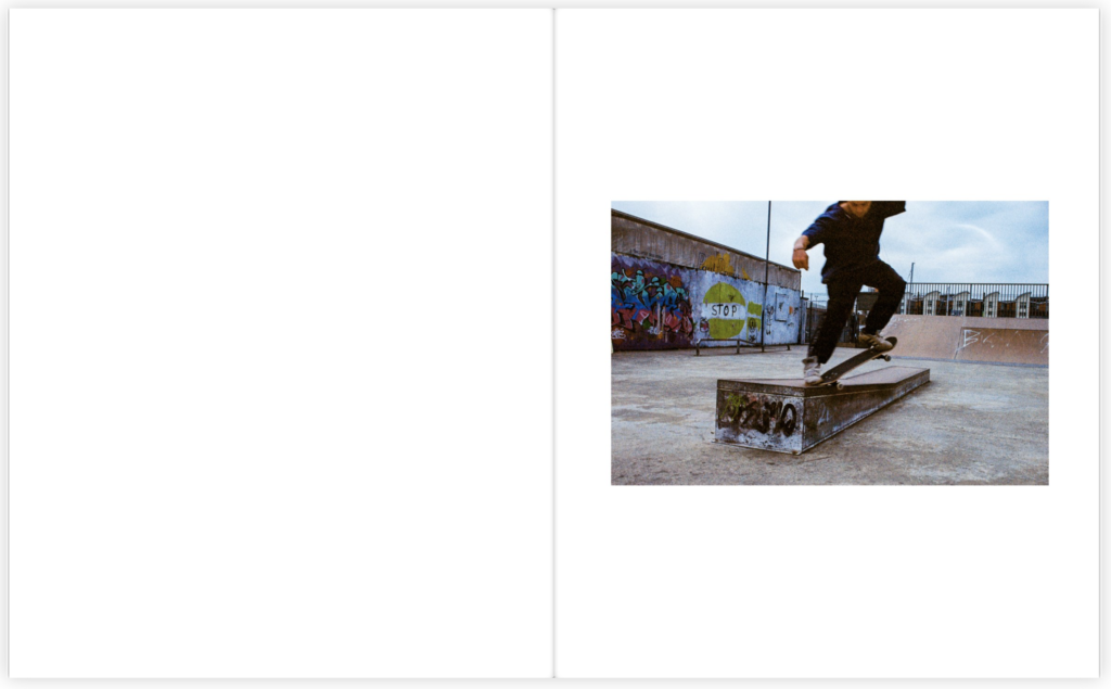
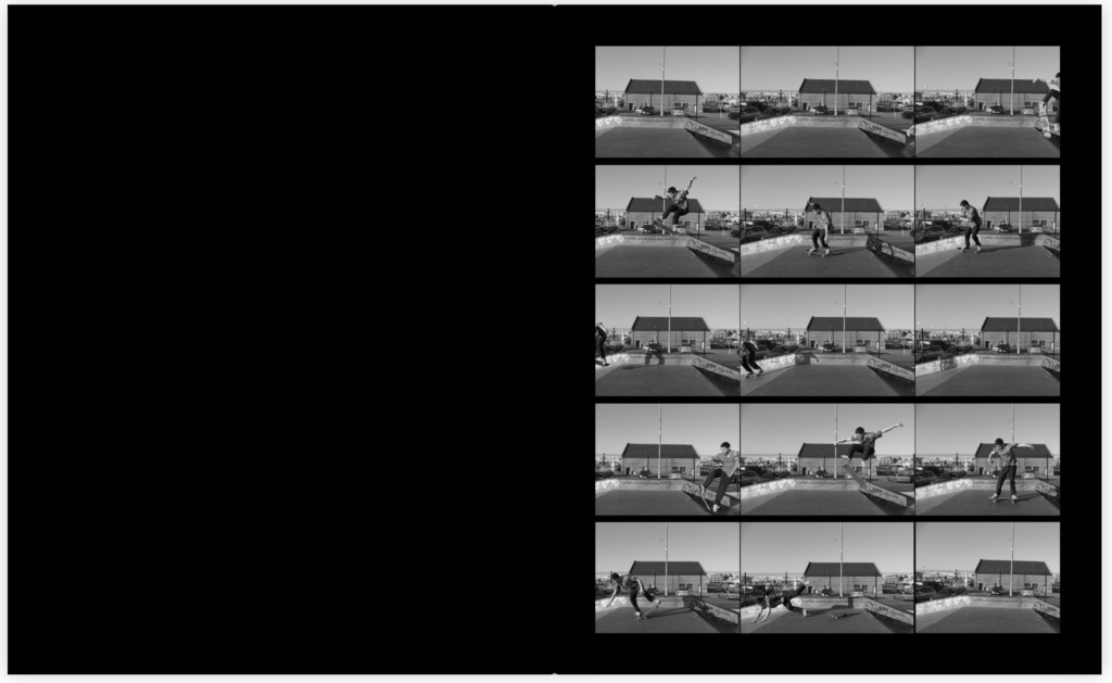
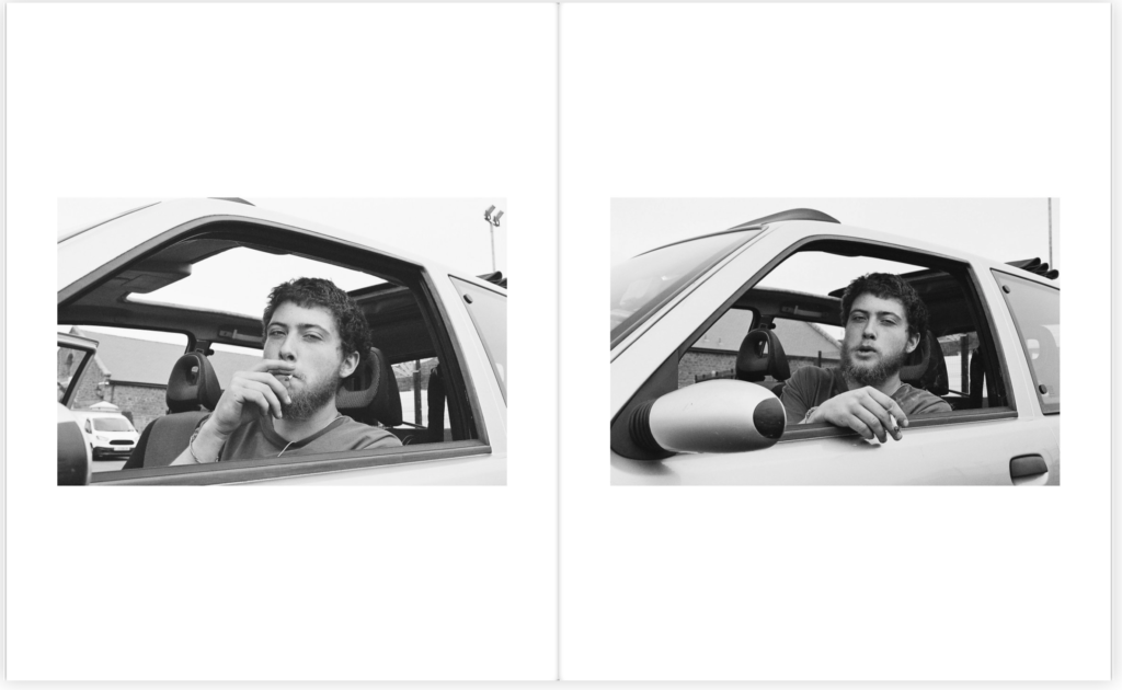
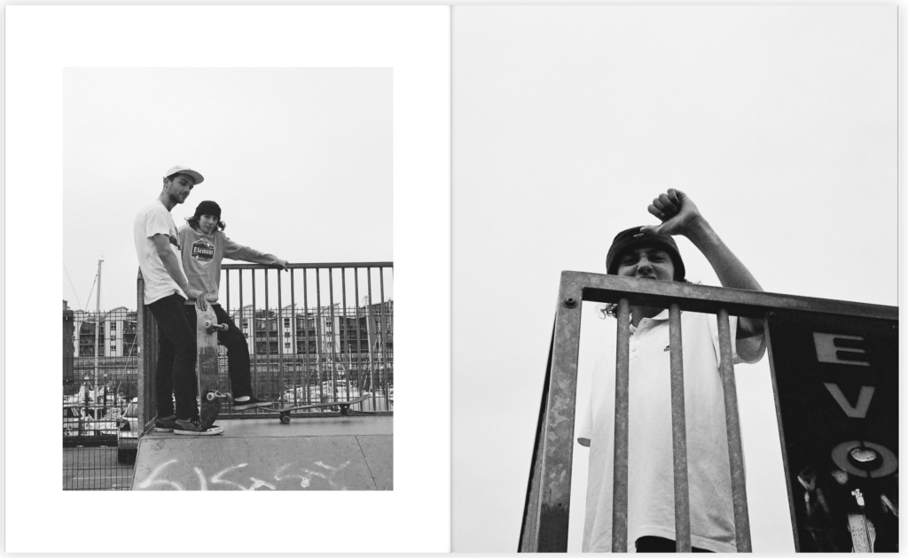
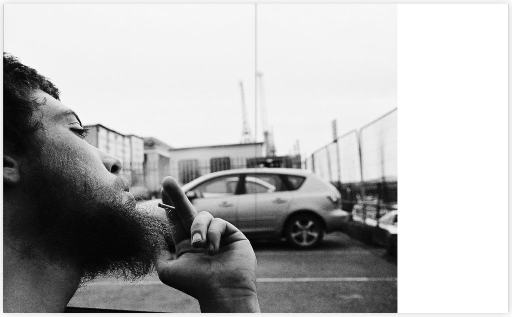
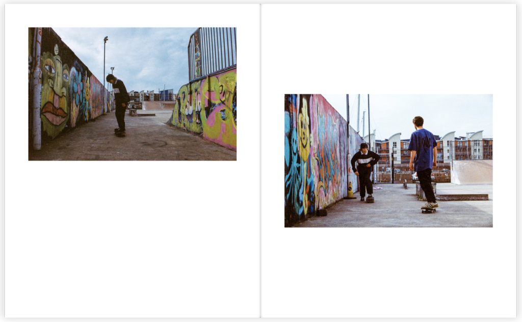
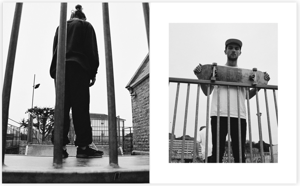
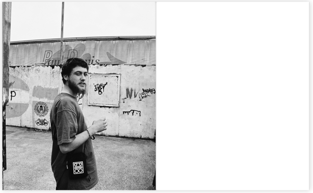
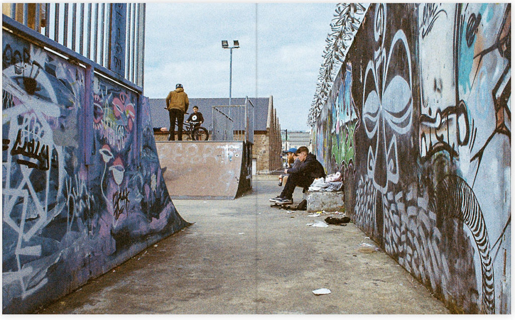
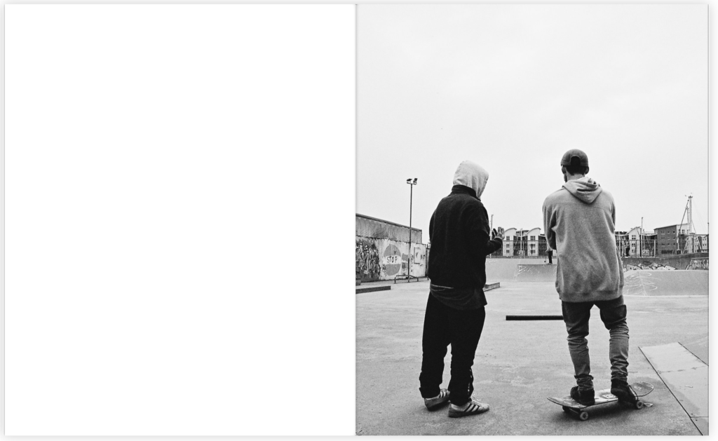
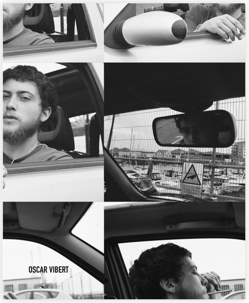
To introduce my book I wanted to make it clear to the audience this sense of lifestyle which is the ongoing theme within my book. This set of images on the opening page show these ideas of variation through the outfits worn to the locations being visited by these individuals. Another main focus within my book was to highlight the lifestyles seen throughout and to focus on the individuals through the skateboarding lifestyle but within the sport itself. Throughout the book I used multiple different layouts as I believe it created a strong variation throughout which has kept the book Interesting and consistent. Furthermore, Within the book I focused heavily on documentary photography as I found the photographers I looked at, their work fell heavily into the documentary style which I believed would create an interesting concept throughout. In addition, these photos were taken on film in both black and white and colour and are pretty much untouched when being edited. I wanted my book to have a raw feeling to it as I found that these photos told the story of each individual without having been altered or manipulated in anyway. I believe by having done this it has created a documentary style theme throughout the book emphasising each individual image. The name of the book comes from a very well known film which I thought would be an interesting title for this book as I was focusing on the lifestyle of these boys. The actual meaning of choose life was to promote an anti drug movement, within this lifestyle drugs play a large part within these subjects lives. By having choose life as the title of this book I believe it represents this lifestyle as a whole ranging from the highs and the lows. To finish the book I implemented the image of the two boys turned away from the camera, I used this image in particular to close the book as I believe it has connotations of them turning away from all the problems and accidents that this lifestyle has had within their lives and allowing for them to focus and enjoy on the positives that this lifestyle holds.

Choose Life

Evaluation – Final Prints

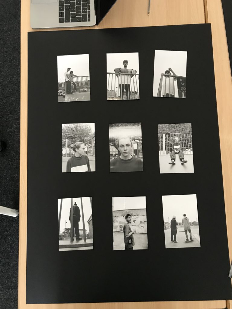
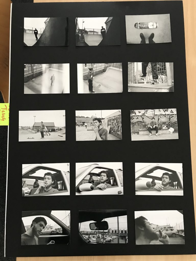
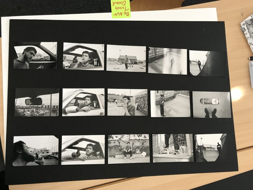
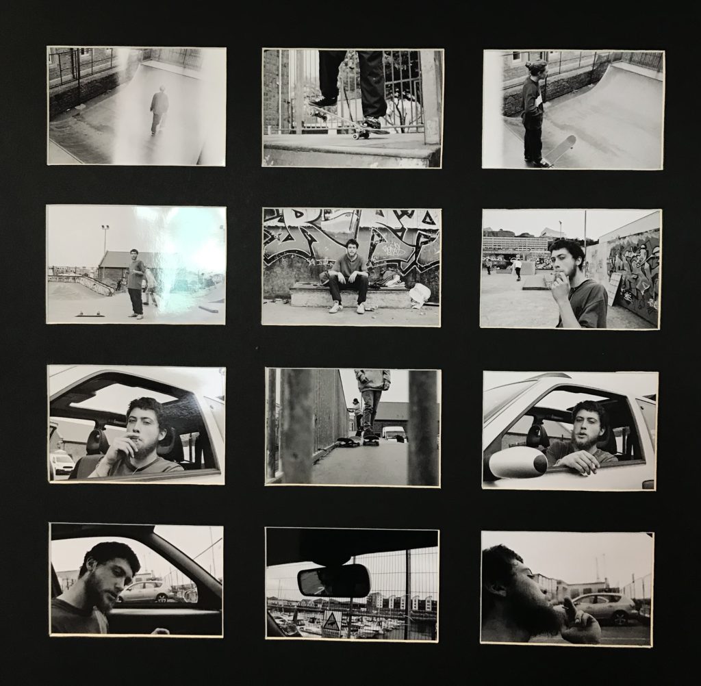
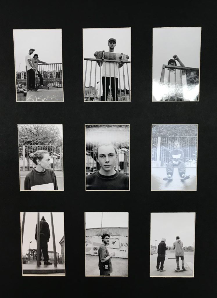
I wanted to incorporate the typologies theme throughout my final prints as I felt this theme conveyed a contact sheet style which I thought would have an interesting outcome for my final images. I wasn’t sure how to display my images, so I came up with multiple different layouts however the three layouts above where the ones I decided on and thought where the strongest layouts and had the strongest images in throughout. However, when looking at a traditional typology or contact sheet they were all portrait which allowed me to narrow down my decision and resulting in me using the two portrait orientation layouts for my final decision. Furthermore, when displaying my images I wanted to create window mounts for my display as I believe my images would be suited better with a little white boarder round the outside of each image and allowed for a stronger effect then if I had just stuck them onto the black mounting card. I decided on using these images as I believed that each individual one had some sort of relation to each other and found they complemented each other strongly within the set. When laying out the images I found I wanted to relate to the theme of the project ‘Variation and Similarity’. I was able to use this theme when laying out and selecting my images as I wanted to include images as part of a set however I also wanted to create a bit of variation within the layout by having a juxtaposing image run through the middle of the the two similar ones. I found by doing this changed up the layout of my images including an obvious variation between the layout and the images. I believe this created a strong effect on the layout which I believe allowed for it to be a more interesting final outcome.

These where my final outcomes.

Reviewing and Reflecting

How well have ideas developed? – I feel as if my work has developed into a sustainable idea that is consistent with its approach and has a clear focus. The focus within my work is the lifestyle of a skateboard/ s and the reality of something they do everyday. I wanted to capture the things that aren’t always seen and to focus more on them rather than the sport itself.


How many responses/ shoots? –
I have completed 5 photographic responses to my ideas associated around skateboarding lifestyle. The first shoot consisted heavily of the sport and movement however, when progressing through I found focusing on the skateboarders themselves I was able to capture more interesting photographs. the second and third shoot where heavily focused on lifestyle not so much on the skateboarding. I found by having variation between my shoots would allow for me to have stronger outcomes and a larger variety of ideas and also images. The fourth and fifth shoot I decided to heavily focus on the skateboarders lifestyle as I found I wanted to combine the sport and the lifestyle together as I wanted to create strong documentary style images which I wanted to conclude this project on. I used film for both these shoots as I believe it would create that more raw feeling to each image which I found when working with the developed images I was able to really show that.


Command of camera skills/ photographic techniques and processes –
I have clearly demonstrated my use of camera skills and my ability to adapt the settings to meet the particular requirements of the location and lighting. I also experiment with different cameras using both film and digital throughout. When focusing on the skateboard I was able to focus on the right setting as I wanted to capture the skateboarders movement in the best quality when moving quickly.


Understanding of composition/ considering quality of light. What are the overall quality of the images?
– I think my images are strong in the way they have been composed and framed. With the absence of any digital manipulation. I have strongly captured my ideas within my photographs and have clearly displayed them within my final pieces. I have made sure that my images are aesthetically pleasing and draw the viewer in. I feel as if there are potential areas for improvement to get a little more creative with my images however I believe that the overall outcomes of my images are strong and are to the best quality.


How do they respond to research and artists references?
 – My photographic images were inspired and therefore respond to the research I have completed on Larry Clark, Craig Stecyk and Theo Gosselin. I feel I have clearly responded to the artists I have studied however I have also put my own twist to each and every image by integrating skills I have previously learnt. I believe that this has resulted in stronger outcomes as I have gained inspiration from strong artists however with my own skills incorporated with it.


How do they interpret exam theme? –
The variation of people I focused on within my 5 shoots all from different backgrounds and classes has allowed me to capture different lifestyles however, the similarity being that they are all part of that same community with that hobby. These people I have focused on would probably not have associated with one another however, this lifestyle has bought this variation of people together. This shows that there are a variation of people within this community and lifestyle however, they all have that one similarity due to the fact that they are all interested in the same thing being skateboarding.

ESA // EVALUATION

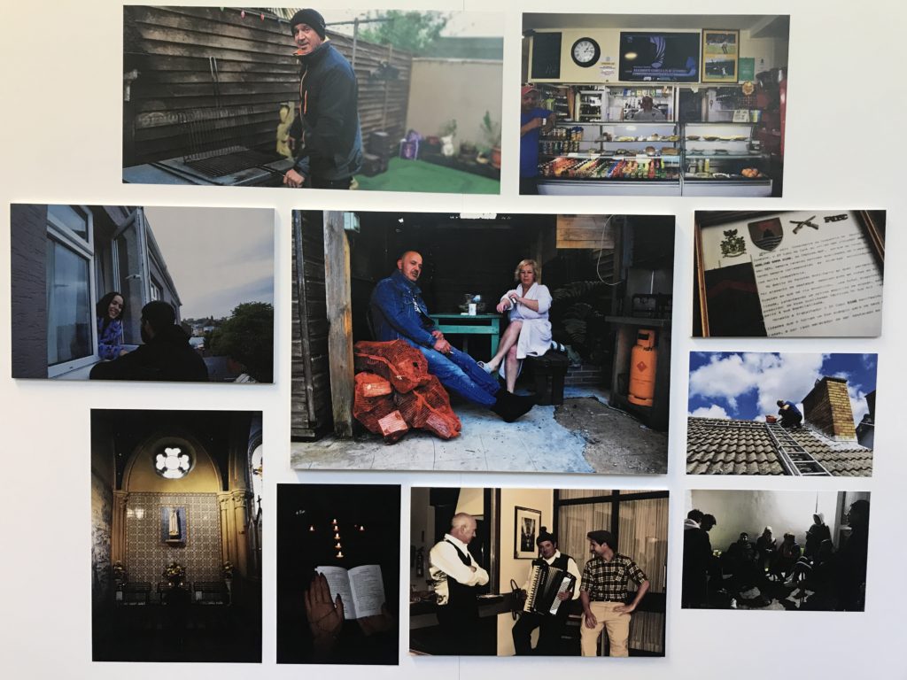
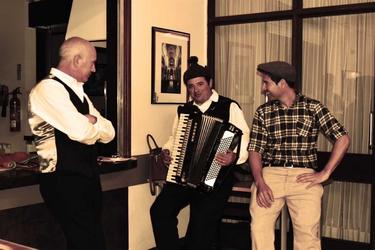
I started this project when looking at the exam booklet. The title “Variations and Similarities”. The first question I asked myself was, “What is completely the same but so significantly different?” My initial thought was people. We are all the same, we all have the same organs but are so differnt in terms of lifestyle, appearance and beliefs. When putting these things into a plan I thought cuklture would be the ideal experiment. To explore how different we all are from each other. We all have a culture and all come from a background that most are proud of. I started off by looking into more depth about my own culture. The people from the Portuguese community all tend to follow the same patterns, some of which come from old ways of thinking and some which are only recently accepted.

When looking into other photographers who capture photographs of people, I found Mahtab Hussain. His album “You Get Me?” captured my interest at first glance, especially as my strongest point in photography is portraiture. His images felt very powerful and I could relate to these images to a further extent. While looking at these images, which were photographs of the Muslim culture, I found that to some extent they lived in a similar way to the Portuguese and so I made my project idea broader by focusing on how Portuguese people live in a foreign country. I also noticed that many of his images consisted bright and enhanced colours, some of which, in my opinion, purposefully represented flags and so I also decided to play and manipulate colours to achieve the same affect. I also came across other photographers such as Michelle Sank who also captures images of different people, however, with the idea of showing distinct personalities and also Philip Toledano who focused on objects and their meanings.

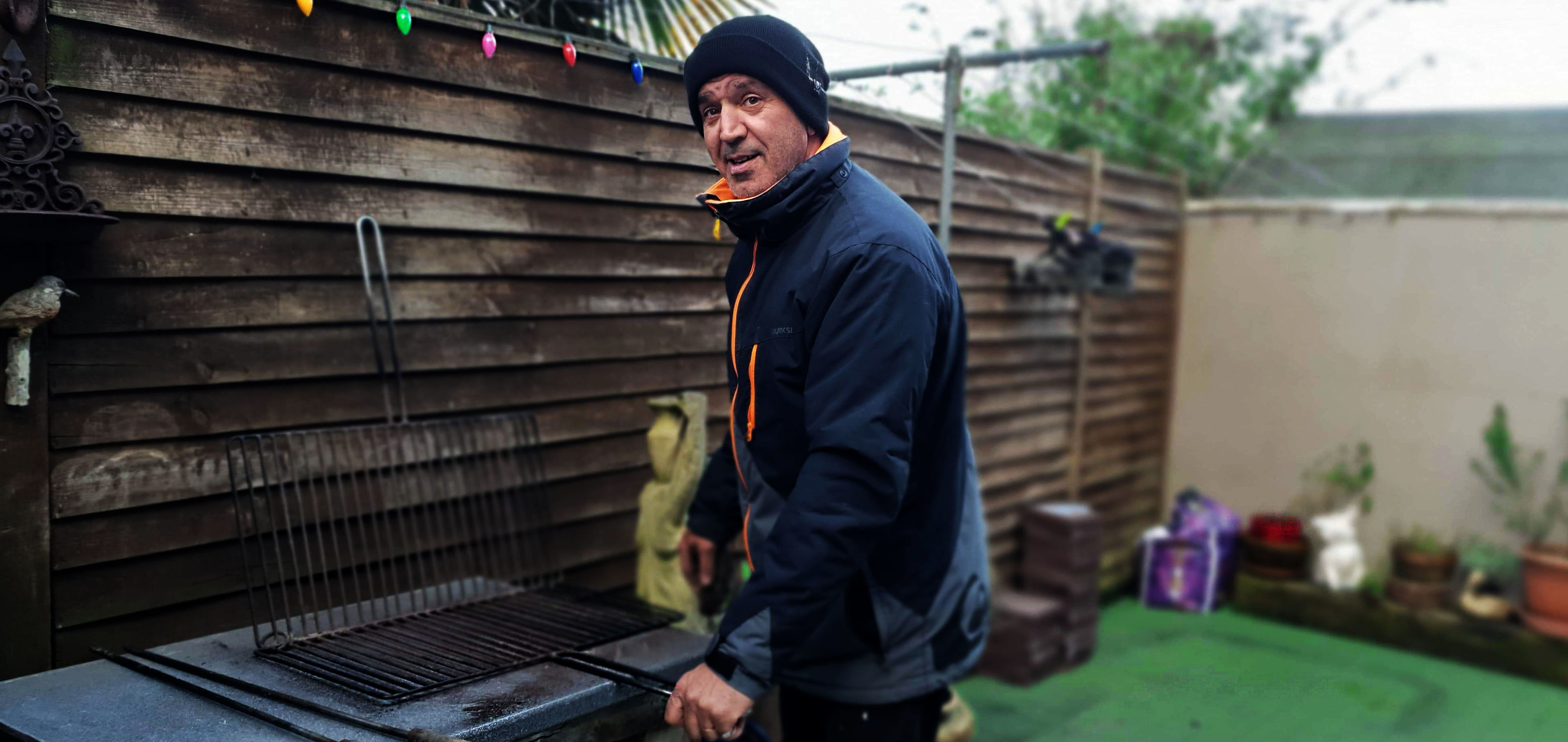
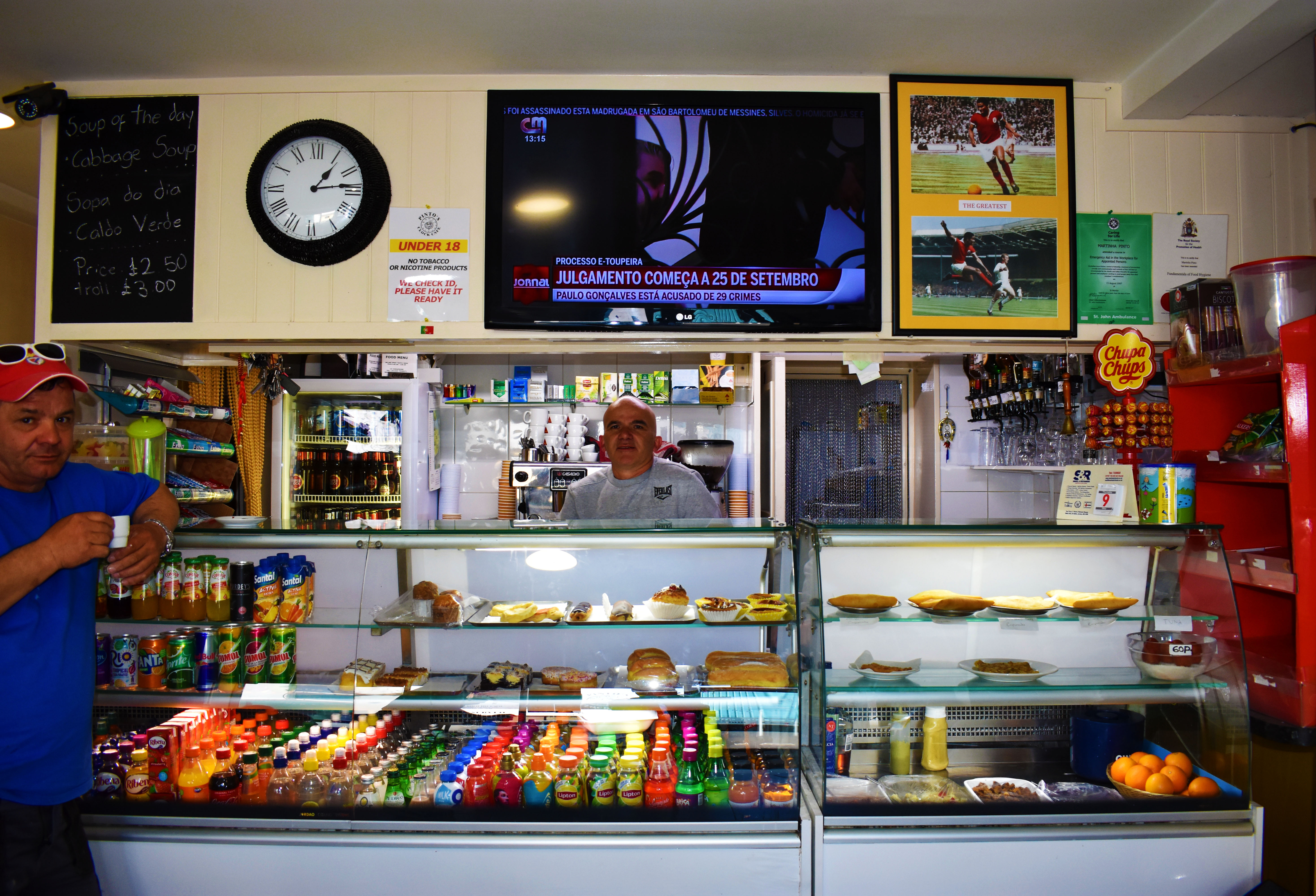
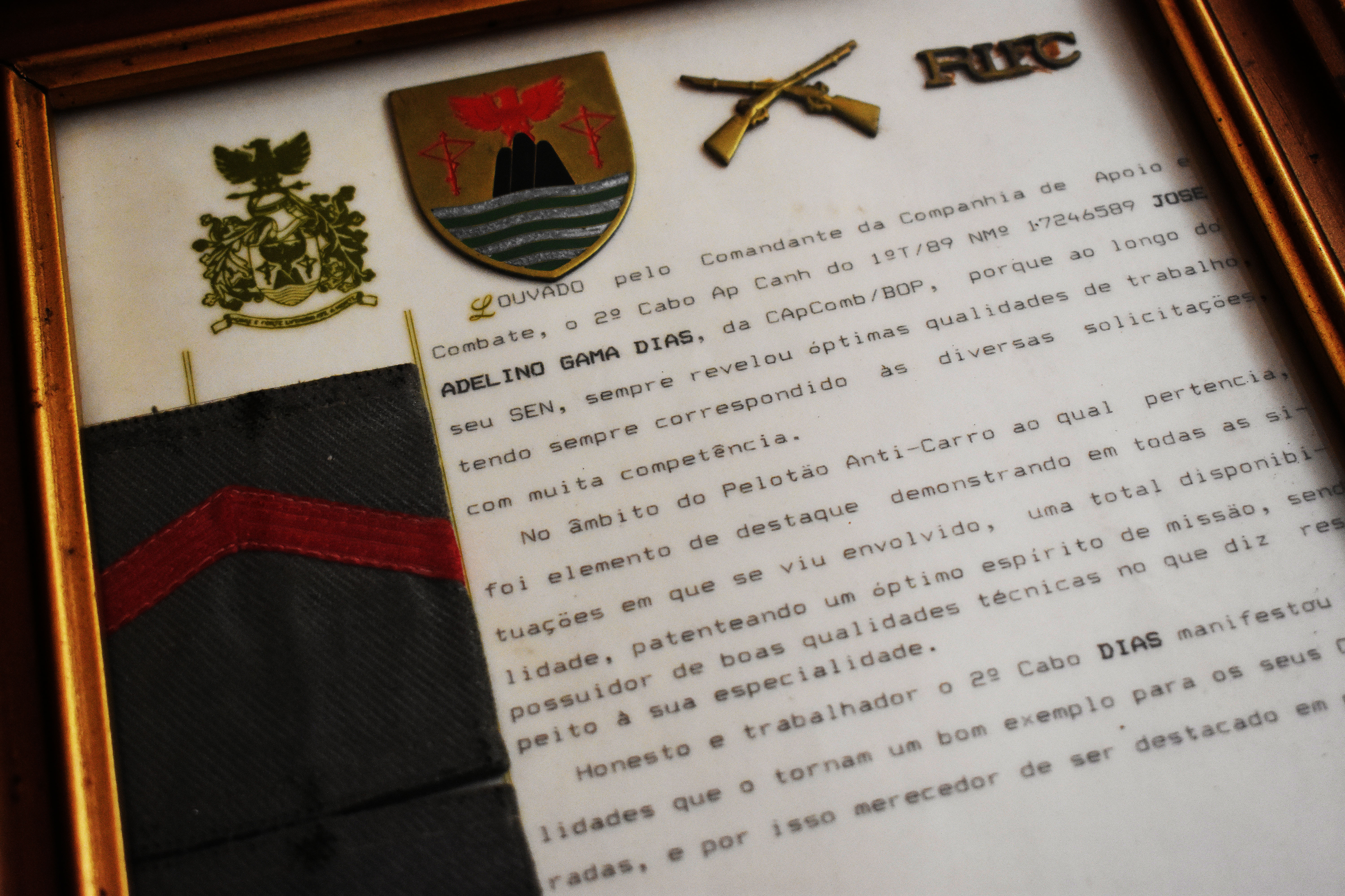
I felt that I could put all the pieces together and construct a project which included, the main concept, culture, while also including different lifestyles for different generations and also archival objects which play a huge part in this culture. It total I completed a few shoots but after thinking about the way I was going to approach this project, I thought it would only make sense to photograph some people in their natural environments, acting as natural as possible in order to achieve a true and real project. I then diminished all these images to finish with a total of 10 images. I removed some images from this final piece as I thought the essential way to present my work was to make it into a small story telling piece.

I decided to present these images on foam board almost as if it is a storyboard of the Portuguese culture. It was a very difficult project to do as it was trying to find ways of visually representing my culture trying not to stereotype, however, extremely entertaining. I think it went really well as people got involved and I was able to reach out to different Portuguese people. I think I could’ve improved it in a sense of possibly presenting it differently in order to show a timeline and maybe adding more archival photos to show the modern vs old fashions. I believe that I explored this theme very closely and broadly. I explored the young and the old generations as well as the difference between genders.

ESA // PHOTOSHOOT 4

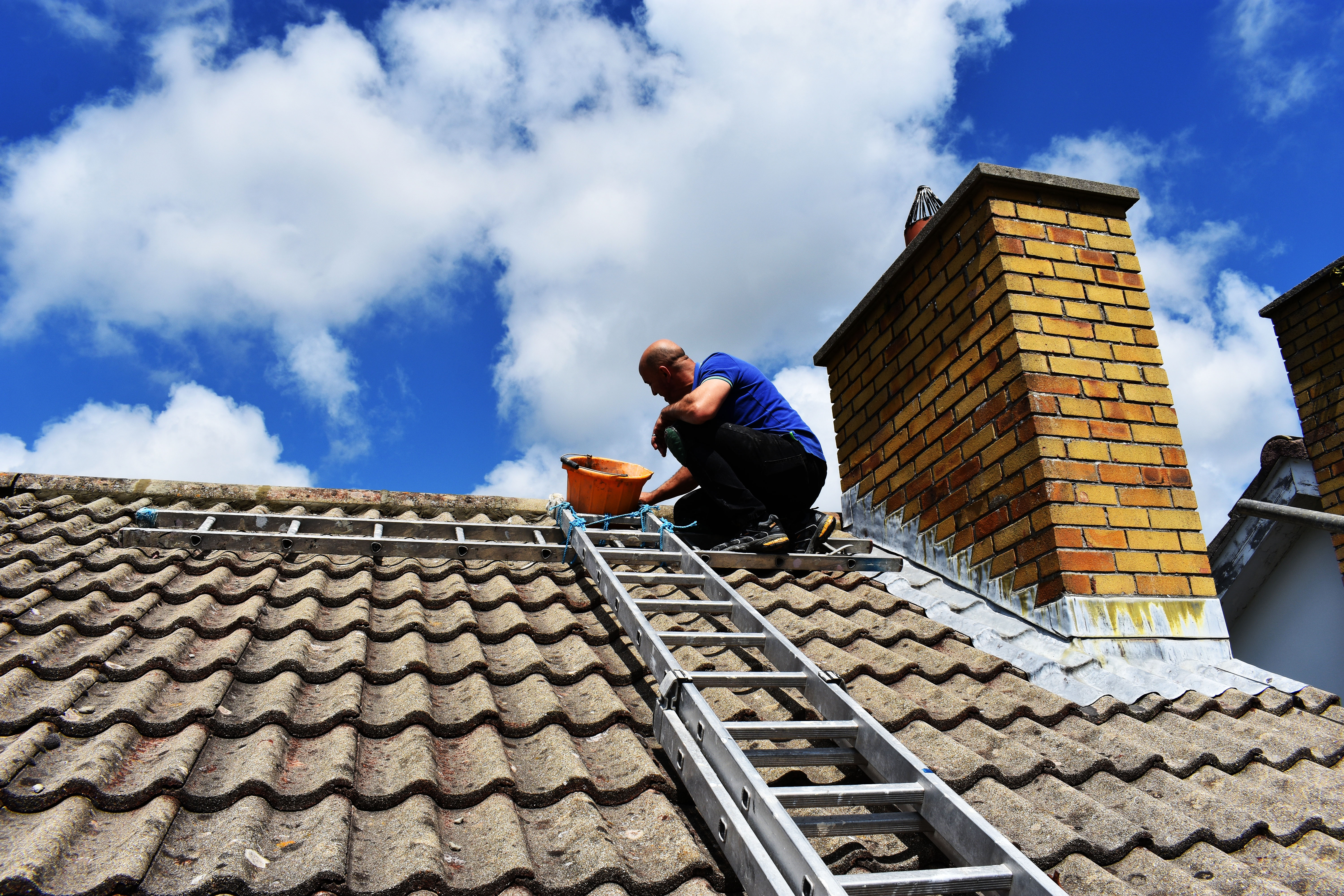
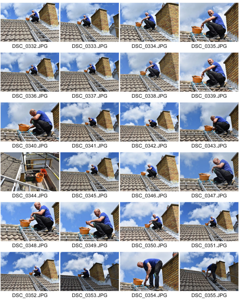
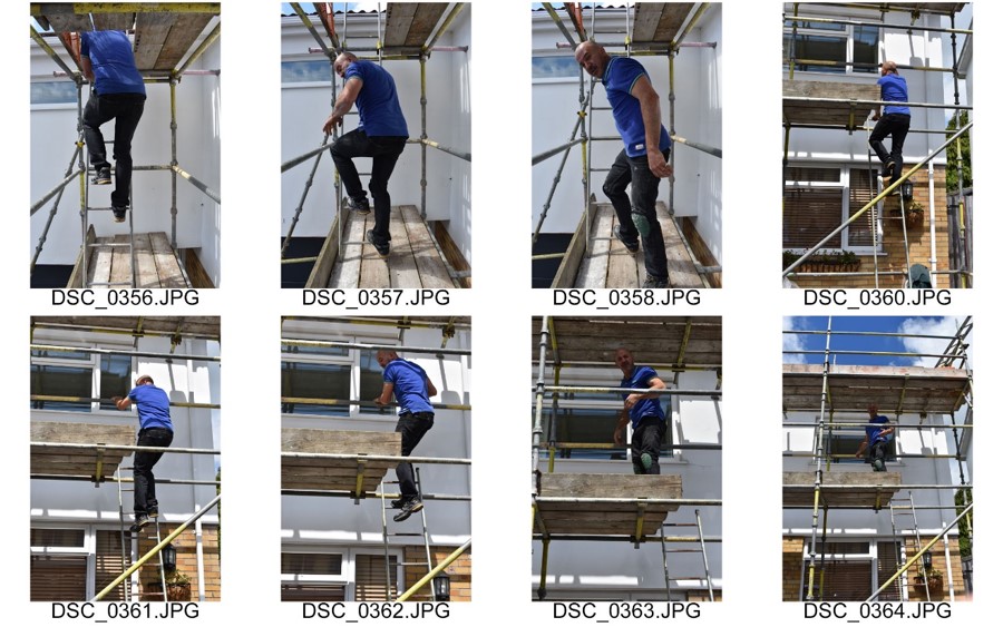
In these photographs I aimed to show how immigrants work on the island. In this photograph the man is working on a roof. This is also to reinforce the idea that men are the breadwinner in the family, they go out to work while the women typically are in charge of domestics.

ESA // PHOTOSHOOT 3

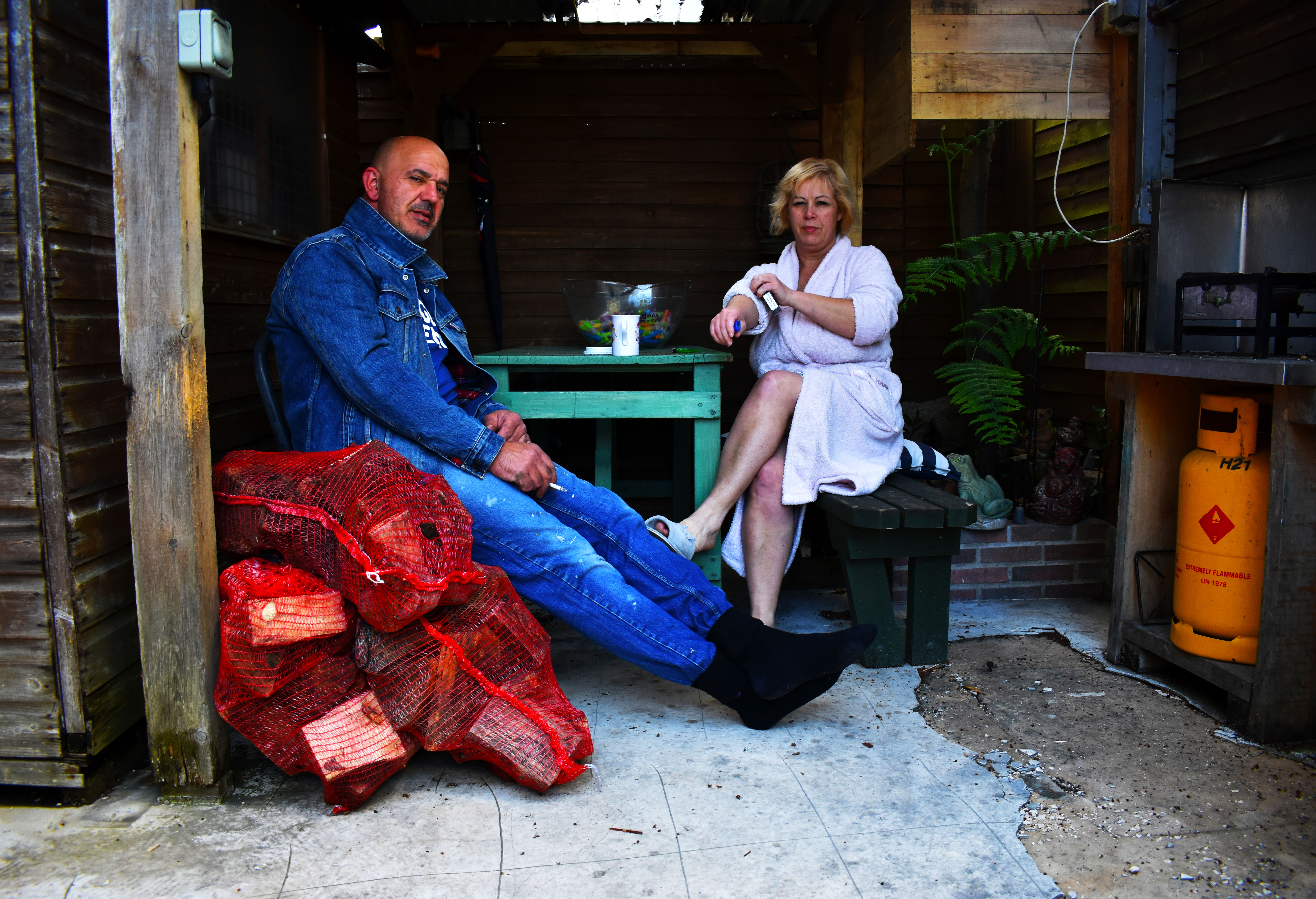
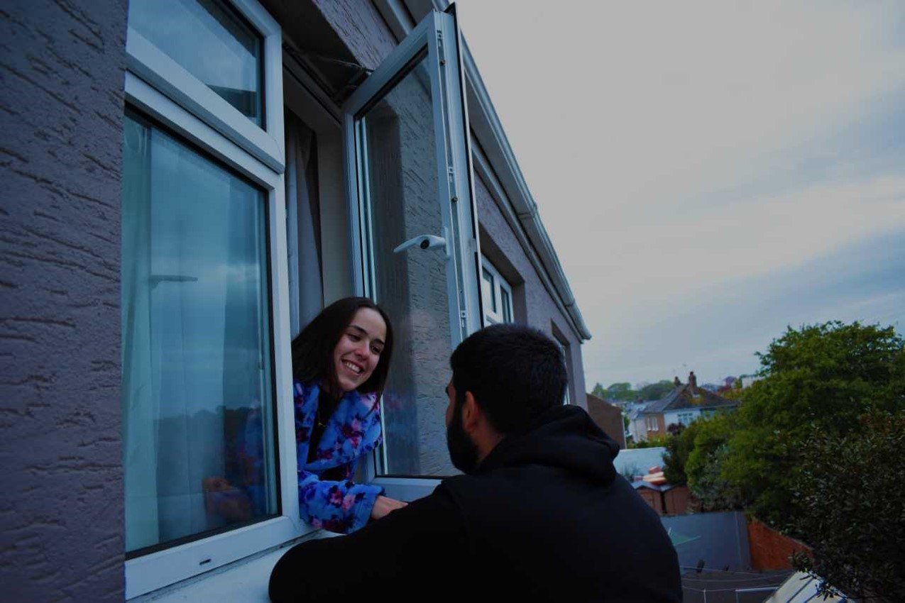
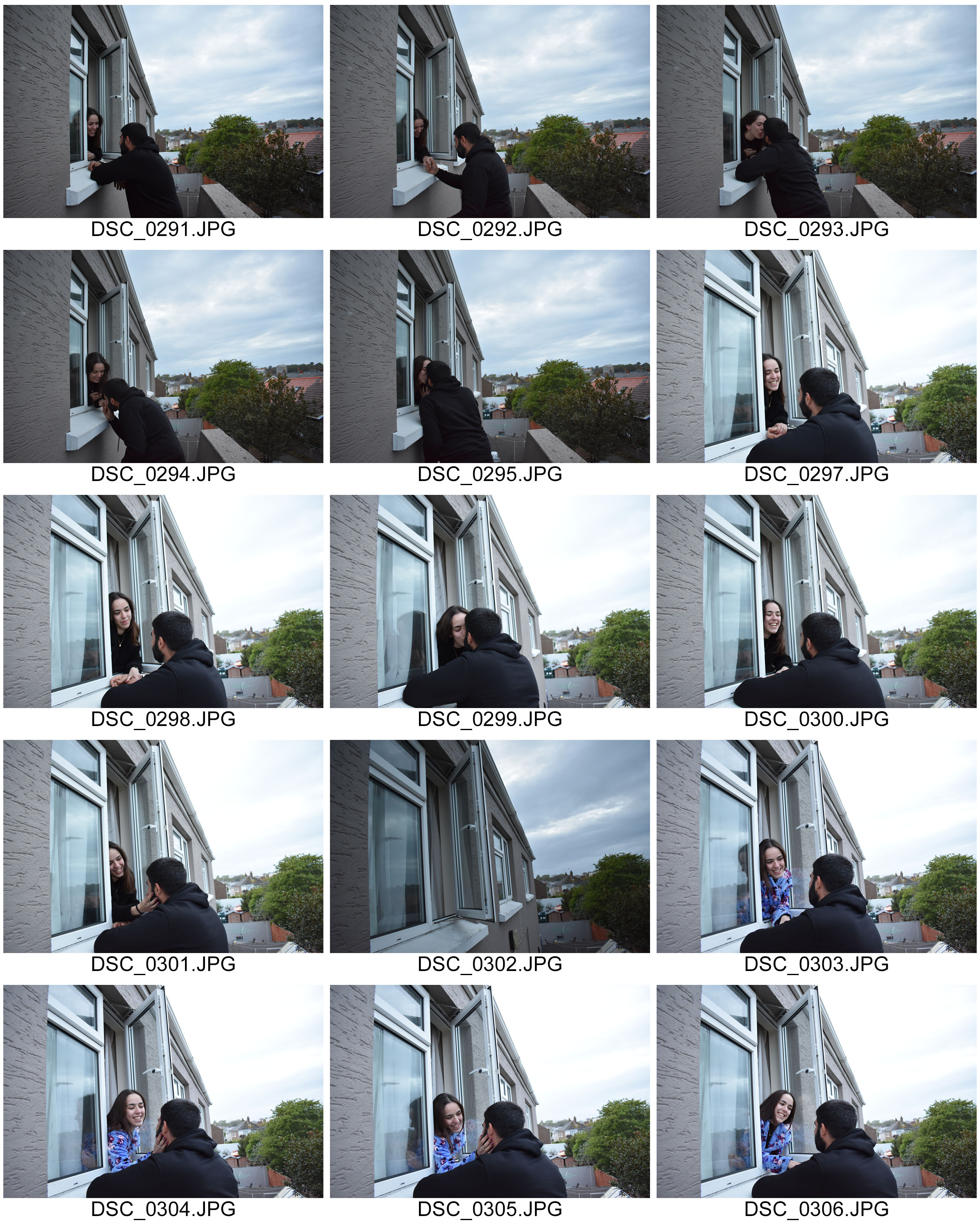
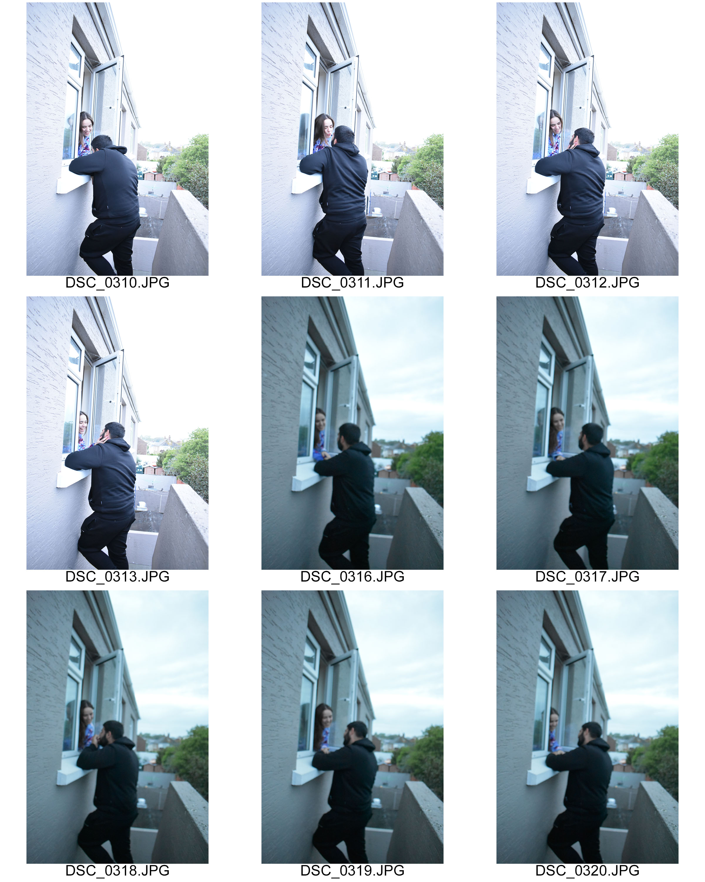
These photographs are showing young love stereo typically for young Portuguese girls and boys. I was trying to achieve the idea that girls tend to not have as much freedom as boys. In my opinion, Madeiran families in particular follow old ways of thinking, there are elements of respect for the parents and therefore I took these images at a window where the female figure is inside the house leaning out of the window while the boy is outside to represent the freedom.

ESA // PHOTO SHOOT 2

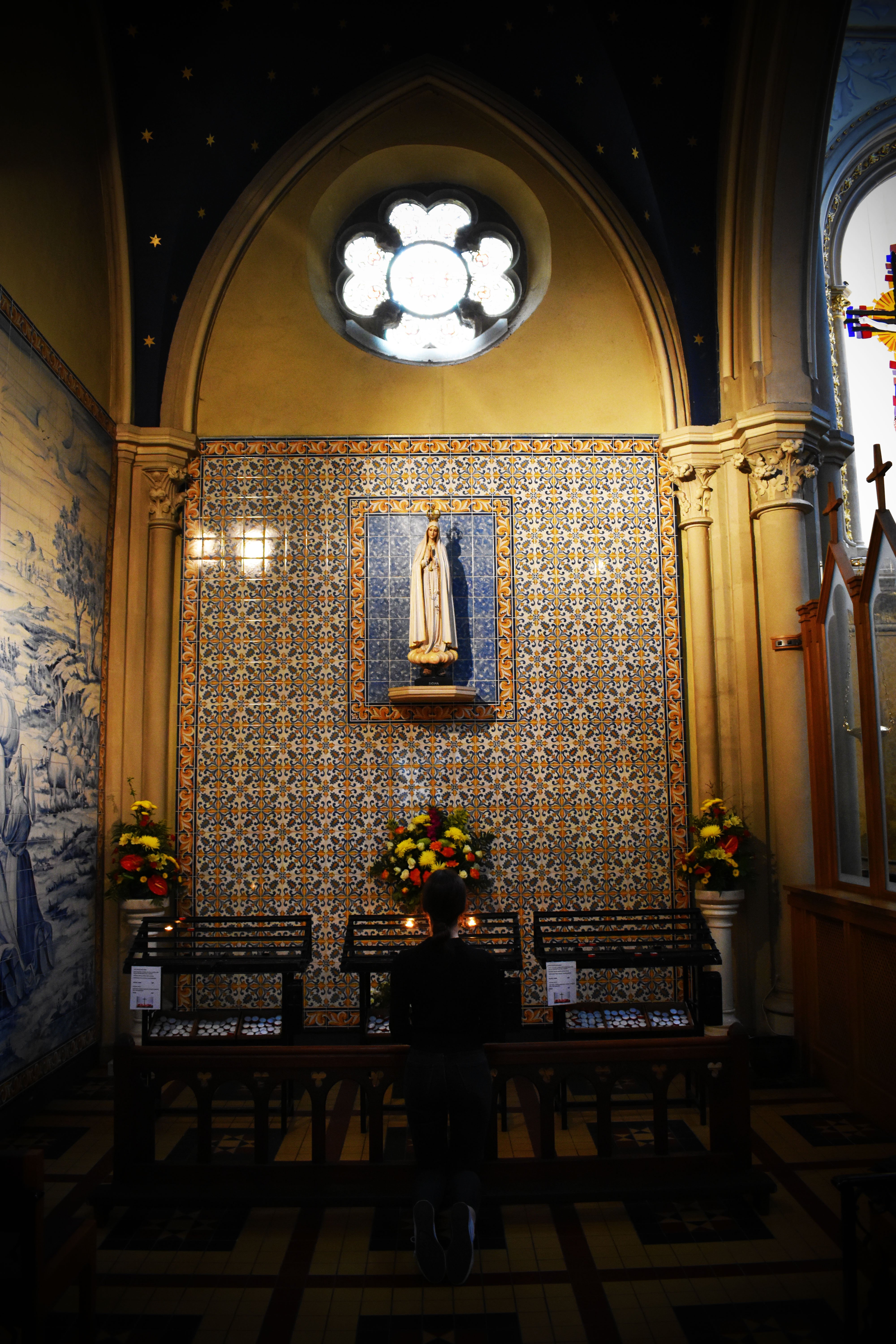
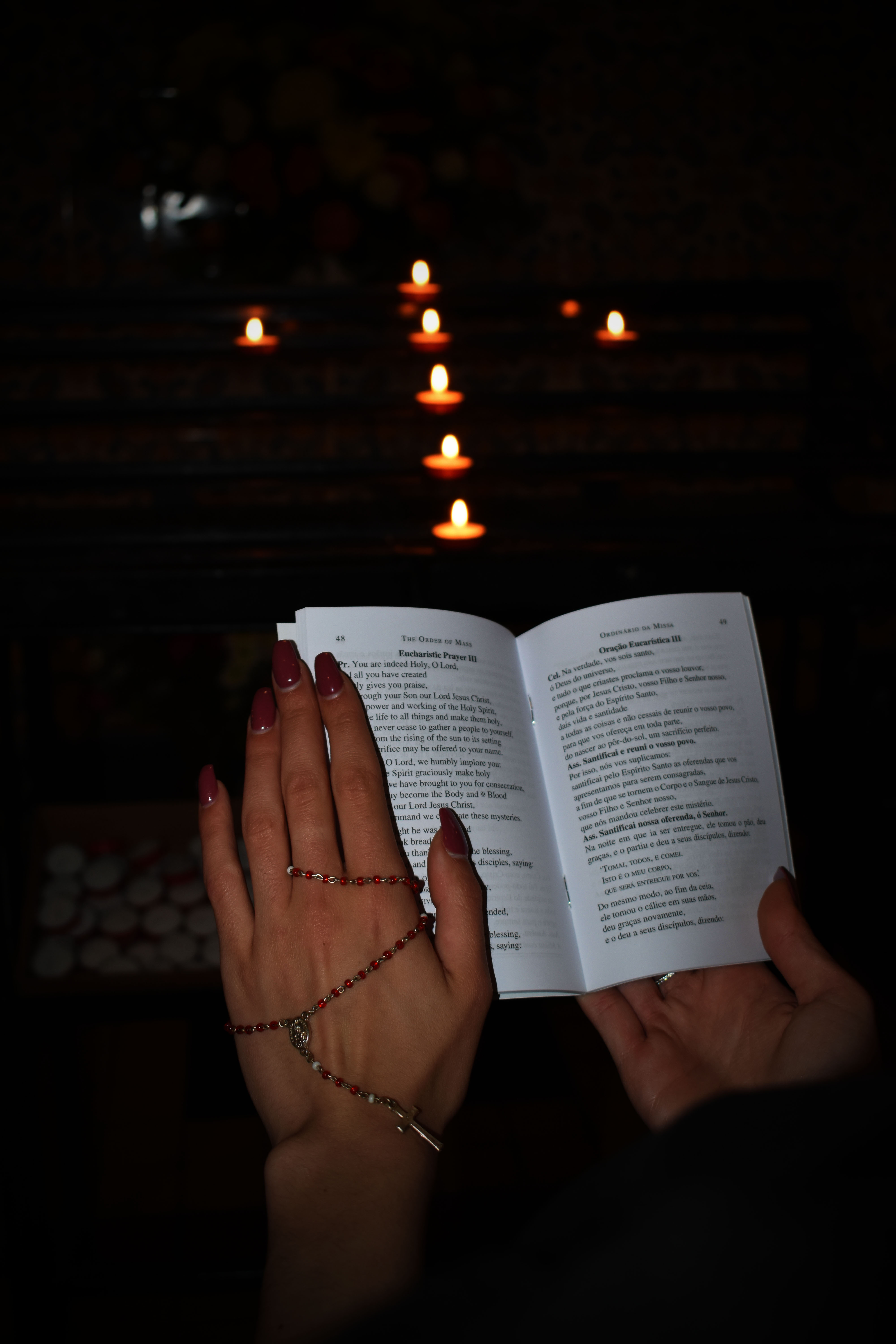
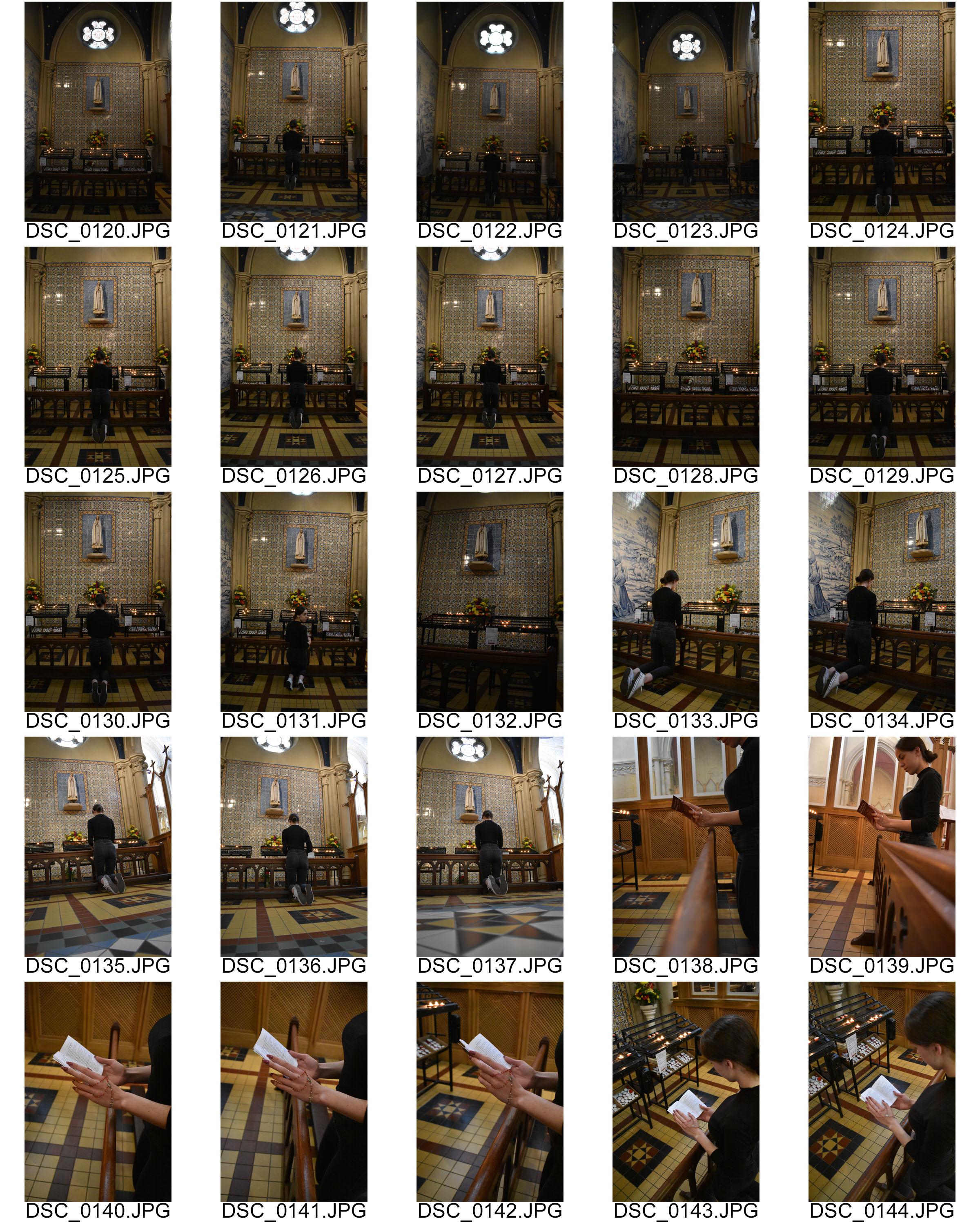
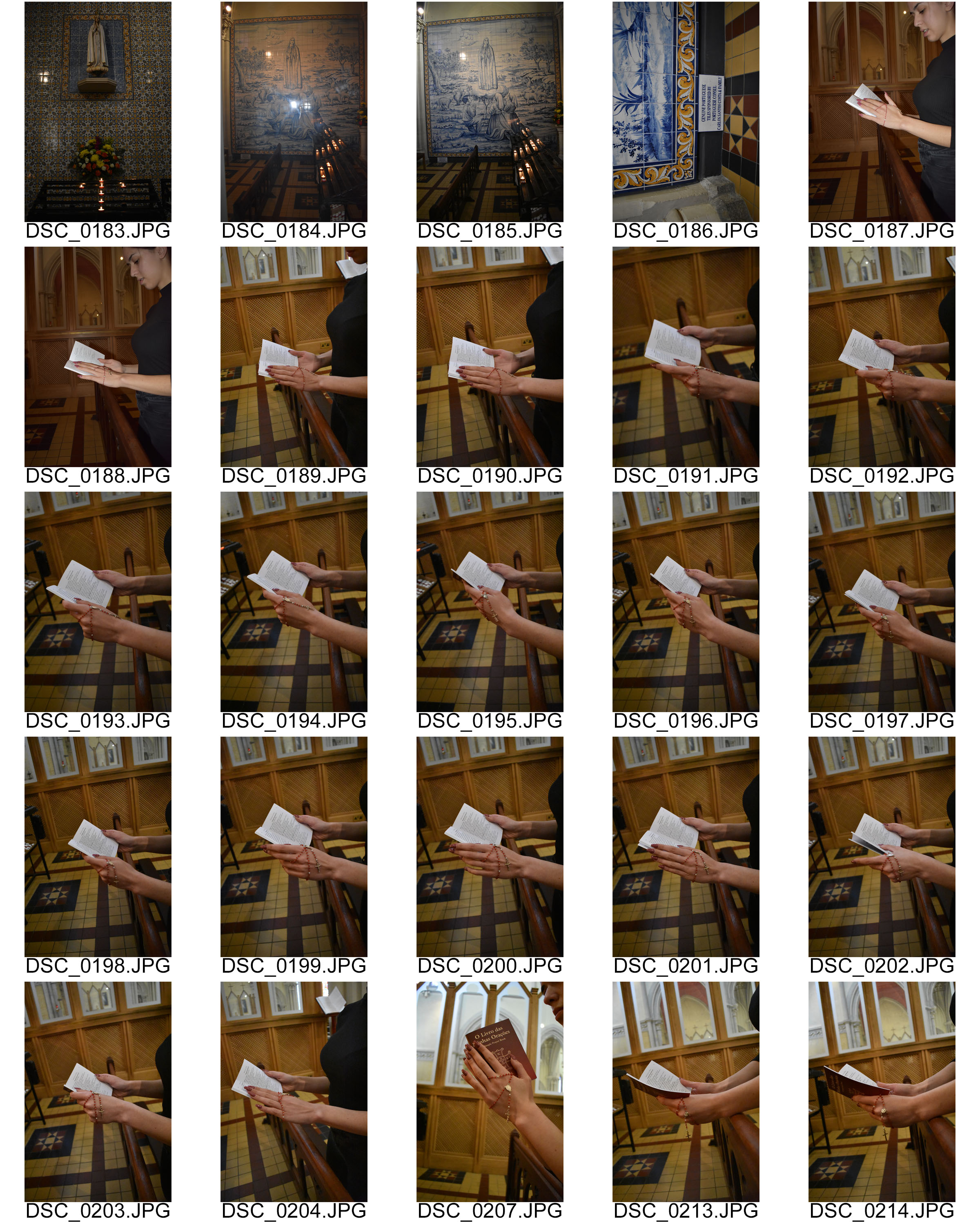
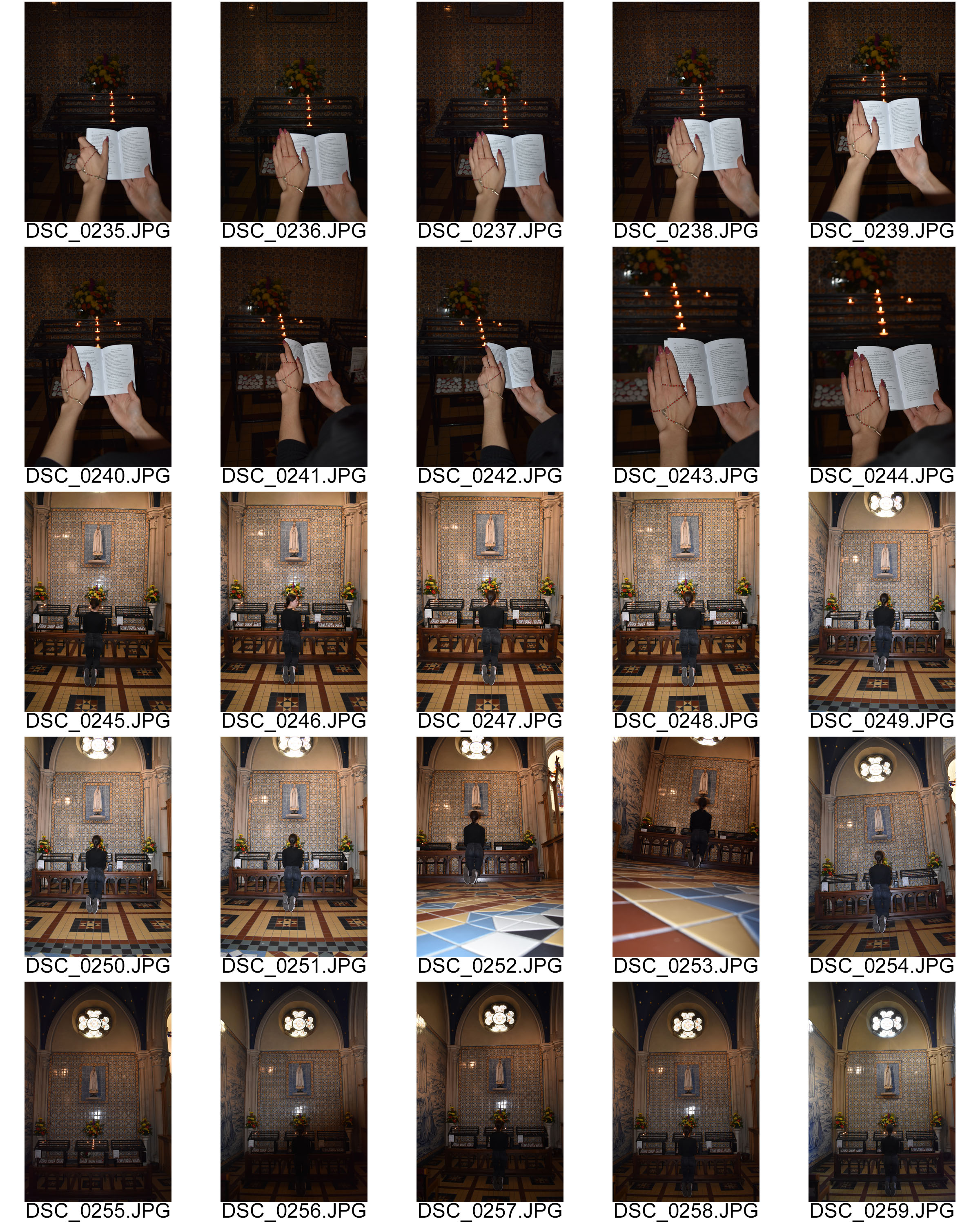
Below I have published my images from my second shoot. I chose to take these photographs in the church as I come from a very religious background and I think a big reason for this is due to the fact Christianity is the main religion for a huge percentage of Portuguese population.

The statue seen on the wall is of Nossa Senhora de Fátima which translates to “Our Lady of Fatima”.
Our Lady of Fatima is a Catholic title of the Blessed Virgin Mary based on the famed Marian apparitions reported in 1917 by three shepherd children at the Cova da Iria, in Fátima, Portugal.

This statue is located in St Thomas Church, Jersey and if often visited by the Portuguese immigrants who live in Jersey.

Other photos in this shoot contain hands holding a prayer book which is in both English and Portuguese.