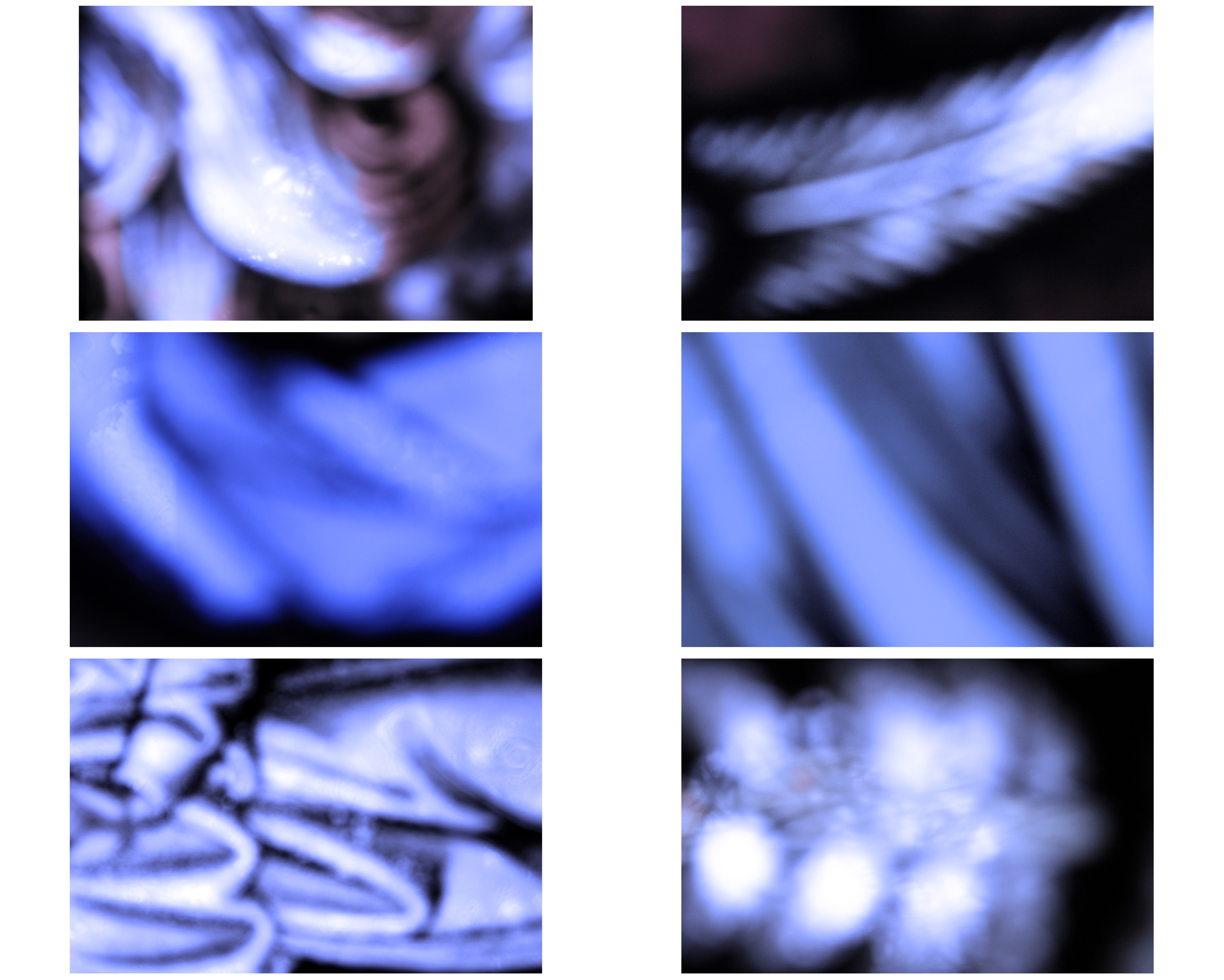
Light vs Darkness

In these images I am trying to explore the relationship between light and darkness, that very much relates to the idea of creationism in that both these elements were  key features in the early days of the world according to the Bible and other similer sources. This strongly links to the idea of freedom and limitations because it not only represents the freedom in light and spiritual experience against the dark forces, but also in doing this, this concept explored and expresses the freedom in the constant change in nature and as to why it occurs.  This is as I am capturing light in a way that is represented to be overlapping the dark tones in these images.  In a sense this bears slight resemblance to the theory of evolution as I am depicting my images as not only as a direct reference to the continual spiritual development that occurs in nature to this day, but also this I believe references also to evolution.  This is because in order for evolution to take place, elements need to exist to support this growth.  In my opinion, by taking images of the elements I am conveying the idea that evolution takes place, but there is more to it than that as spiritual evolution that dictates the laws of nature is also taking place which reinforces the idea of evolution depicts the how where continuous spiritual creationism is the why.  However the slight issue which occurs is that although we don’t necessarily know why we creationism occurs likewise with evolution, religiously it is for us to draw closer to God.  Therefore in common religious belief it is that everything was created by and for God to act as a celebration of his creationism and that every element such as plants that exists, by existing is worshippig God.  ““Praise him, sun and moon; praise him, all you shining stars” (Psalm 148:3).  Therefore it is suggested that man also was created to worship God and be connected to him: “Everyone who is called by My name, whom I have created for My glory; I have formed him; yes, I have made him” (Isaiah 43:7).  ALthough this previous quote includes direct reference to man and nature, because in religious belief God gave man intelligence for stewardship over the Earth and the elements, I believe my images, I am trying to photograph and document the lost relationship and connection we previously had.  This is apparent in Genesis within the Bible:

“Then God said, ‘Let Us make man in Our image, according to Our likeness; let them have dominion over the fish of the sea, over the birds of the air, and over the cattle, over all the earth and over every creeping thing that creeps on the earth.’ So God created man in His own image; in the image of God He created him; male and female He created them. Then God blessed them, and God said to them, ‘Be fruitful and multiply; fill the earth and subdue it; have dominion over the fish of the sea, over the birds of the air, and over every living thing that moves on the earth.’ And God said, ‘See, I have given you every herb that yields seed which is on the face of all the earth, and every tree whose fruit yields seed; to you it shall be for food. Also, to every beast of the earth, to every bird of the air, and to everything that creeps on the earth, in which there is life, I have given every green herb for food;’ and it was so” (Genesis 1:26-30, NKJV). “The LORD God took the man and put him in the Garden of Eden to tend and keep it” (Genesis 2:15,


The Sublime

The Age of Enlightenment

The age of enlightenment was a philisophical movement that heavily occurred in the Europe in the 18th century.  This was during a period when science was breaking away from the Church which for centuries had dominated peoples lives in the way that they lived.  This is not to say that people weren’t religious but there was a stronger sense of freedom that existed which included individual liberties and religious tolerance to each individual.  This theory is closely linked with the scientific revolution, breaking away from the Church led to the political revolutions of the 18th and 19th centuries by empowering people to have a voice and interpretation of the world around us.

Rene Descartes’ rationalist philosophy alid the foundations for enlightenment thought by constructing science on a metaphysical basis.  His skepticism was refined by John Locke’s Essay: Concerning Human Understanding (1690) concerning the foundation of human knowledge and David Hume’s writings examine passion not reason was the governing factor influencing human behavior.  This laid down two significant lines of enlightenment: 1) reform vs power and faith 2) Democracy, Liberty, freedom of expression.  Philosophers advocating this theory wanted to emphasize the intellect from within from these overshadowing themes which contrasted counter Enlightenment philosophers who sought a return to faith and argued  that beauty existed in and out of this world.  This influenced art in this era because in the transition from faith to science, questioning where we stand, artists very much explored the idea of heaven being on earth as Earth being a hub for all things paradisaical.  This links to my project exploring creationism, evolution and the process of change – acting as backdrops for freedoms in nature and over that freedoms of spirituality in nature.

The Theory of the Sublime

In terms of Aesthetics  (a branch of philosophy exploring the nature of art, beauty and taste within the creation of beauty), is the quality of greatness, whether physical, moral, intellectual, metaphysical, spiritual measures that is beyond human comprehension.

The concept of the world appearing  sublime in an aesthetic form in how nature is distinct from beauty first arose heavily in the 18th century with three particular philosophers Anthony Ashley Cooper,  John Dennis and Joseph Addison – exposing the fearful and irregular forms of external nature with reference to sublimity.  Each of thee men had journeyed across the Alps and this essentially inspired them to express their accounts of the horror and harmony of the experience, highlighting the contrasting relationship of each aesthetic quality.

Contrastingly, Edmund Burke’s concept of the sublime was developed in the book: A Philosophical Enquiry into the origin of Our Ideas of the Sublime and Beautiful.  He believes that the sublime and the beautiful are mutually exclusive.  Burke heavily referenced the concept of light vs darkness as he advocates that beauty is made predominantly significant because of light, but either intense light or darkness is sublime in that it reconfigured the sight of an object and turn it into a sense of awe and wonder but also with horror because it connotes feelings of darkness, uncertainty and confusion.  The sublime may invoke horror, however in doing this, one receives pleasure in knowing the perception is fiction.  Burke identified the idea of the theory of the sublime as in his own words: “delightful when we have an idea of pain and danger, without being actually, in such circumstances… whatever excites this delight, I call the sublime.” (Burke, E. [date) A Philosophical Enquiry into the Origin of our Ideas of the Sublime and Beautiful. Oxford. Oxford University Press).

In Art

One artist who is well established in being philosophically influenced in their artwork for the sublime are JMW Turner.  Turner revolutionized the uses of light and color which he utilizes when capturing aesthetically beautiful natural world scenes by recalling experiences and their impacts internally and externally, expressing them through his work.   He clearly displays how Burke’s theories on light and darkness, and how both these factors create a sense of horror that exists to allow the viewer to feel exhilaration that the artist is capturing.

The oil painting Snow Storm I believe captures the awe and wonder found within the sublime.  The storm is creating danger within the image that creates a sense of exhilaration that is almost dangerous and out of control.  This links to Burke’s theory because he describes the sublime as being successfully endorsed through feelings of horror and through that, the viewer finds these perceived feelings enjoyable knowing that it is fiction.  For example the brush strokes showing the impact of the forces of nature such as the wind, the sea and the light I believe emphasizes this.


How to Explore and Record

There are two weeks until Easter it is paramount that you explore photoshoots as per your manifesto/ specification and make your principal images now so you have a critical body of work to edit and produce final outcomes from.

When you are photographing and responding to ideas and inspirations from artist references you are both exploring and recording. The two go hand in hand. If yo do it well and often (on a weekly basis) you should be able to achieve 50% of your overall marks!

In the PLANNER for A2 EXAMINATIONS 2018 I have highlighted the importance of a sustained investigation.

Each week you are required to make a photographic response (still-images and/or moving image) that relates to the research and work that you explored in that week. Sustained investigations means taking a lot of time and effort to produce the best you can possibly do – reviewing, modifying and refining your idea and taking more pictures to build up a strong body of work with a clear sense of purpose and direction

Get yourself familiar with the assessment grid here:

AO2 – Explore and select appropriate resources, media, materials, techniques and processes, reviewing and refining their ideas as work develops.

AO3 – Record ideas, observations and insights relevant to intentions, reflecting critically on work and progress.

To achieve an A or A*-grade you must demonstrate an Exceptional ability (Level 6) through sustained and focused investigations achieving 16-18 marks out of 18 in each assessment objective

Have a look at previous student, Flora Devenport and her exam work from 2016 and assess it according to the Assessment Objectives A2 Photography: (Edexcel.) Think about what level the student is working at.

Have a look at previous student, Jasmin Ross and her exam work from 2017 and assess it according to the Assessment Objectives A2 Photography: (Edexcel.) Think about what level the student is working at.

What you are looking for when assessing A02 (Explore) and A03 (Record):

How well have ideas developed?
Are ideas explored and selective appropriate to intentions?
Are they sustained and focused?
Are they reviewed and refined?
How many responses/ shoots?

Command of camera skills/ photographic techniques and processes
Understanding of composition/ considering quality of light
What are the overall quality of the images?
How do they respond to research?
How do they relate to artists references?
How do the interpret exam theme of Environment?

Homework: Based on the evidence of your blog, what level are you working at? Produce a blog post where you reflect on your own progress. Provide targets that you can achieve over Easter and that can improve your work. Upload by Wed 21 March

Classwork: To develop your ideas further from research and analysis of artists references and other inspirations  on the theme s og FREEDOM and/or LIMITATAIONS you now must be planning a number of photographic responses (at least 3 shoots per idea.)

Follow these steps to success!

  1. Produce a detailed plan of 3 shoots for each idea in your specification that you are intending to do;  how, who, when, where and why in the next 3 weeks?
  2. Think about lighting, are you going to shoot outside in natural light or inside using studio lights? Maybe shoot both inside and outside to make informed choices and experimentation. Remember to try out a variety of shot sizes and angles, pay attention to composition, focussing, scale, perspective, rule of 1/3rds, foreground/ background and creative control of aperture (depth of field) and shutter speed (movement). If appropriate, think about how to convey an emotion, expression or attitude and the colour palette, tone, mood and texture of your pictures. Consider mise-en-scène (everything in the frame) – e.g. in portraiture deliberate use of clothing, posture, choice of subject objects, props, accessories, settings. Make a selection of the best 15- 20 images for further experimentation. Produce 2-3 blog posts from each shoot and analyse and evaluate your photos through annotation showing understanding of basic visual language using specialist terminology.
  3. It is essential that you complete your principal shooting over Easter and return on Tue 17 April with a few hundred images ready for further post-production and editing. Remember first final print run is Wed 18 April
  4. Upload blog post with above planning by Fri 23 March


ARTIST REFERENCE // MICHELLE SANK

MICHELLE SANK:

Michelle Sank was born in South Africa and has been living in the UK since 1987. Her photographs have been exhibited and published extensively in England, Europe, Australia and Mexico, South Africa and the U.S.A and are held in collections in the UK and the USA.

She has undertaken numerous commissions for prominent galleries and magazines in Europe and the USA. Her practice is concerned with the notion of encountering, collecting, and re-telling. She is interested in creating sociological landscapes, interplays of human form and location that are significant in their visual, sociological and psychological nuances. She has three published books to date: Becoming (Published by Belfast Exposed Photography and Ffotogallery,). The Water’s Edge: Women on the Waterfront (Published by Liverpool University Press,). The Submerged (Published by Schilt)

I wanted to look at the works of Michelle Sank because she came over to Jersey in 2013 and work with the Jersey Archilse project. She was a resident of the island for around 6 months and worked with the archives as well as the local citizens of jersey to created a series of photos which she continues with once she left jersey. Her project ‘In My Skin’ focused on capturing individuals who were under the age of 25 and had been challenging there body image. Although this doesn’t obviously relate to my project it relates in the way that she focused on young people challenging their freedoms to express the way they present their body and as im focusing on the second wave of feminism which looks at how women thought for the freedom to express their body and femininity there is a loose connection between the two projects.

She is also a modern day photographer which adds variety to my artist reference as i don’t only want to focus on how photographers in the seventies portrayed women, i want to developed my projected into looking at the freedoms and limitations of the modern day female. Therefore Michelle Sank’s works are hugely helpful to me as she looks at how /body image is one of the biggest limitations for individuals in the modern day. I think it is really interesting to also contrast between the different limitations that females are experiencing since the twentieth century. As limitation on the political front are less evident now days however females internal thoughts are limiting them as body confidence as social consensus in Western society today is particularly focused on physical beauty and achieving and maintaining the “perfect” face and body.  This constant pressure fed through the media has led to a growing number of young people becoming dissatisfied with themselves and trying different ways to achieve the ‘beautiful’. This desire for perfection has been largely disseminated through photographic imagery in magazines, adverts, television etc. In My Skin makes use of this image dissemination but turns it on its head showing a different side – the human stories behind the decisions of these young people to undergo the physical changes. In those transitioning it is about them achieving an inner beauty by finally freeing themselves from society’s expectations and becoming comfortable in their own skin.

Below is Sank’s Website which allows you to gain some further understanding of what her series ‘In My Skin’ is about aswell as view all the images in the series:

Official Website

The images below are ones that i selected as photographs which most link to my project. Both subjects are young females, possibly teenagers who have expressed to Michelle Sank that they have challenged their body images. I chose to analyse these images further because of the camera angles that Sank has used as well as the body position, stance and positioning of the model. The way they look at the camera is also very telling about who they are and engages the audience in the images more.

Hannah, 17, Botox

Michelle Sank seemed to state why she photographed each indivual, however i was unable to find why this particular teenager was used in her project, however she must have had some form of issue with her body which has led her to try and change it in a certain way. I chose this image because the way she is lying on the bed seems to portray that she is confident working with the camera and who she is. She is dressed up in a nice dress with her hair done and this may symbolize that she wants to present herself nicely and possibly likes the attention she receives from people when dressing in this way. The individual gives us an idea that she is uninhibited about having her image taking and that she is a confident female, this is the type of personality i want to capture in my images. I want to portray women with confidence and that they are strong as this is the freedom which i consider the suffragettes and the waves of feminism gained for women.

The image shows a young female lying across her bed in a red dress against white bed sheets, this may be to show her femininity but also her new found freedom to express her sexuality. The way she is lying is slightly suggestive and i noticed that this is similar to how a lot of females began to be photographed in the seventies. the use of colour works well in this image as the red stand out strongly against the predominately white background. The lighting that Michelle Sank uses is also notable. A lot of her images she focuses on using the natural light coming in from the individuals windows however if there is not enough bright lighting she takes a light along with her to her shoots and sets it up directing the light onto the individual she is photographing. In this image the direction of light is coming from behind and slighting the the right of Sank and is therefore illuminating the subject so we can see them in a clear, slightly harsh light, where the bed in the foreground o the image is near to being over exposed. Framing in this image is created by the whiteness of the bed sheets as it frames around the subject making her in red in the middle stand out almost dramatically and in the audience face, this may be because Sank is trying to replicate the individuals personality. She is also right in the centre of the image breaking the rule of thirds making the image a statement and putting the issue of young people challenging there body image in the audiences face.

FREEDOM AND LIMITATIONS // INSTAGRAM

Instagram is a mobile, desktop, and Internet-based photo-sharing application and service that allows users to share pictures and videos either publicly, or privately to pre-approved followers.

As the focus of women in the 1970’s has always been of interest to me and the women’s right movements i actually follow a few accounts on Instagram which regularly post images f women during the feminist protests in the 70’s aswell as how women where presented through images. There is also one account which posts images of females which are inspired by the 1970’s and the movements that occurred during this period. As this is extremely similar to the project which i am doing i managed to gain a huge amount of inspiration, which helped me too plan my next few shoots and give me ideas of the ways that i could present feminism and the decade i am focusing on. Below are some screenshots of my saved folder on Instagram which is where you can save certain images which you would like to revisit or have in a collection.

A lot of the photographs are head shots or face on shots of women looking into the camera with strong facial expression and expressing themselves as strong independent women who have broken away from the stereotypical idea of the ‘Stay at home mum’. There a big mix of styles of images in my inspiration collection, varying from documentary street photography to studio work, too capturing women in their natural locations such as there homes. These are all different styles which i would like to capture through my photography as i would like to show a diverse range of images which show young women in the present day as well as imitating the way women where presented in the 1970’s


ARTIST REFERENCE // GARY WINDOGRAND

The first retrospective in twenty-five years of work by Garry Winogrand (1928–1984)—the renowned photographer of New York City and of American life from the 1950s through the early 1980s—this exhibition brings together more than 175 of the artist’s most iconic images, a trove of unseen prints, and even Winogrand’s famed series of photos made at the Metropolitan Museum in 1969 when the Museum celebrated its centennial. It offers a rigorous overview of Winogrand’s complete working life and reveals for the first time the full sweep of his career.

Born in the Bronx, Winogrand did much of his best-known work in Manhattan during the 1960s, and in both the content of his photographs and his artistic style he became one of the principal voices of that eruptive decade. Known primarily as a street photographer, Winogrand, who is often associated with famed contemporaries Diane Arbus and Lee Friedlander, photographed with dazzling energy and incessant appetite, exposing some twenty thousand rolls of film in his short lifetime. He photographed business moguls, everyday women on the street, famous actors and athletes, hippies, politicians, soldiers, animals in zoos, rodeos, car culture, airports, and antiwar demonstrators and the construction workers who beat them bloody in view of the unmoved police. Daily life in postwar America—rich with new possibility and yet equally anxious, threatening to spin out of control—seemed to unfold for him in a continuous stream.

While Winogrand is widely considered one of the greatest photographers of the twentieth century, his overall body of work and influence on the field remain incompletely explored. He was enormously prolific but largely postponed the editing and printing of his work. The act of taking pictures was far more fulfilling to Winogrand than making prints or editing for books and exhibitions; he often allowed others to perform these tasks for him. Dying suddenly at the age of 56, he left behind proof sheets from his earlier years that he had marked but never printed, as well as approximately 6,600 rolls of film  that he had never seen, more than one-third of which he had never developed at all; these rolls of film were developed after his death.

Among Winogrand’s favorite subjects were women, and he described himself as being “compulsively interested in women” and having “compulsively photographed women.” A large part of Winogrand’s images in the collection of the MoCP form part of the Women are Beautiful portfolio (1981), which was initially published as a monograph in 1975. For the monograph, John Szarkowski, curator of photography at The Museum of Modern Art in New York at the time, selected eighty-five images featuring women from hundreds of photographs by Winogrand. The resulting book offers a random collection of women caught on the street, in parks, getting into cars, at parties, marching in parades, skinny-dipping in ponds, etc. The images capture not only Winogrand’s attraction to the women he photographed, but also the styles, activities, gestures, and energies pertaining to gender in the 1960s and 1970s, an era of transition during second-wave feminism and the sexual revolution. In the monograph and in the portfolio.

 “Whenever I’ve seen an attractive woman, I’ve done my best to photograph her. I don’t know if all the women in the photographs are beautiful, but I do know that the women are beautiful in the photographs.” – Windogrand

I love this image captured by Gary Windogrand, he compleatly captures the natural elegance and beauty of women in the 1970’s. His image can immediately be seen to link to the whole idea of female actresses emerging as being beautiful and subjects that are glamorous yet not highlighting women’s intelligence. However i do not think this is the purpose of Windogrand when taking this image. He loved to capture images of women, which is evident when he completed his series ‘Women are beautiful’ which is where this image is from. He shoots in a documentary style where he observes women in their day to day lives photographing there natural movements. As the images are unstaged they give us a more truthful representation of women in the 1970’s. This image does not have a caption or title as it came from the massive amount of films which were not developed until after his death, however we can make assumptions of what the image is of and the location. I think that this image was from a high end party or maybe even a movie premiere as the female protagonist is dressed very glamorously with a silk dress and pearls.  Windogrand may have been trying to capture how desirable actresses where i the 70’s by the fact that she is surrounded by many men in the image.

Furthermore, although Windogrand captures this series of images as documentary photography and on the spot images i think that he does consider the composition of the image before taking it. This is evident in this image especially as the female is placed just of the centre of the image which means that he wants to show her as the main focus of the image but follow the rule of thirds making this image aesthetically pleasing and composed correctly. He has also considered framing for this image as the focal point is surround by males in black which create a frame to the edge of the image and then in the center is the women in a white dress which further highlights her as the focal point as she is the area of the photo which your eye is immediately drawn too. This can also link into the way he has used contrast between light and dark tonal range to tell the story and portray his message. The dark suits which create the frame directly contrast with the lightness of her dress. Depth of field is also created in this image by the natural business of the situation. The men seem to be surrounding her creating framing but also adding depth of field to the image as they are slightly in front of her being the foreground of the image as well as being behind her creating the background and then the female in the middle is again shown to be the aspect Windogrand is highlighting. His clever composition is what attracted me to this image as he creates an artistically beautiful image as well as portraying the narrative of the role women began to play in the 1970’s.

Gary Windogrand series of images have widened my ideas of what i want to photograph and i am interested in maybe doing a documentary shoot where i use my film camera so i don’t know what images i have captured and just have to take one which is the right image. Documentary photography would add to my project in the way that it captures the young females of the twenty first century in a similar way to in the 1970’s where i could then compare how things have changed as well as how i subconsciously portray the role and freedoms of the modern day female in my images.

ARTIST REFERENCE // CINDY SHERMAN

CINDY SHERMAN

Cindy Sherman is a contemporary master of socially critical photography. She is a key figure of the “Pictures Generation,” a loose circle of American artists who came to artistic maturity and critical recognition during the early 1980s, a period notable for the rapid and widespread proliferation of mass media imagery. At first painting in a super-realist style in art school during the aftermath of American Feminism, Sherman turned to photography toward the end of the 1970s in order to explore a wide range of common female social roles, or personas. Sherman sought to call into question the seductive and often oppressive influence of mass-media over our individual and collective identities. Turning the camera on herself in a game of extended role playing of fantasy Hollywood, fashion, mass advertising, and “girl-next-door” roles and poses, Sherman ultimately called her audience’s attention to the powerful machinery and make-up that lay behind the countless images circulating in an incessantly public, “plugged in” culture. Sexual desire and domination, the fashioning of self identity as mass deception, these are among the unsettling subjects lying behind Sherman’s extensive series of self-portraiture in various guises. Sherman’s work is central in the era of intense consumerism and image proliferation at the close of the 20th century.

Recalling a long tradition of self-portraiture and theatrical role-playing in art, Sherman utilizes the camera and the various tools of the everyday cinema, such as makeup, costumes, and stage scenery, to recreate common illusions, or iconic “snapshots,” that signify various concepts of public celebrity, self confidence, sexual adventure, entertainment, and other socially sanctioned, existential conditions. As though they constituted only a first premise, however, these images promptly begin to unravel in various ways that suggest how self identity is often an unstable compromise between social dictates and personal intention.
Sherman’s photographic portraiture is both intensely grounded in the present while it extends long traditions in art that force the audience to reconsider common stereotypes and cultural assumptions, among the latter political satire, caricature, the graphic novel, pulp fiction, stand-up comedy (some of her characters are indeed uncomfortably “funny”), and other socially critical disciplines.
Sherman’s many variations on the methods of self-portraiture share a single, notable feature: in the vast majority of her portraits she directly confronts the viewer’s gaze, no less in the case of posed sex dolls, as though to suggest that an underlying penchant for deception is perhaps the only “value” that truly unites us.
Long assumed to be a medium that “mirrors” reality with precision, photography in Sherman’s hands simultaneously constructs and critiques its apparent subject. In this sense, Sherman’s unique form of portrait photography functions, in part, as a sign for the subjective nature of all human intelligence and the unstable nature of visual perception.

in 1977 Cindy Sherman began capturing images of women which became one of her most world renound projects,  “Untitled Film Stills.” Over three years, the series grew to comprise a total of seventy black-and-white photographs. Taken as a whole, the this series of images resembles publicity pictures made on movie sets of stereotypical female roles inspired by 1950s and 1960s Hollywood, film noir, B movies, and European art-house films. But while the characters and scenarios may seem familiar Cindy Sherman’s “Stills” are entirely fictitious; they represent clichés (career girl, bombshell, girl on the run, vamp, housewife, and so on) that are deeply embedded in the cultural imagination. While the pictures can be appreciated individually, much of their significance comes in the endless variation of identities from one photograph to the next. As a group they explore the complexity of representation in a world saturated with images, and refer to the cultural filter of images (moving and still) through which we see the world.

FURTHER RESEARCH:

I got hold of a couple books containing Cindy Sherman’s works as well as the book below which contained an essay analyzing her works, the way she created photographs and her purpose for taking mages of women in the style that she did.

In the book above, Retrospective, different art critics look at pieces of work by Cindy Sherman attempting to discuss them from a non objective way. Amelia Jones, who writes the ‘Tracing the Subject’ essay in the book initally considers how Cindy Shermans work is ‘A feminist negotiation of the male gaze’. She considers how cindy sherman has looked a her subjects from a male point and view and then views context on the theory of ‘The Projective Eye’ which in the 1970’s was a way in which the male could be seen to be looking at the female. There are three ways in the projective eye theory that of which the victims take their place relative to it. The first being that they internalize the penislike eye (meaning the photography considers what a males viewpoint and perspective would be. The second being that they aggressively enact themselves according to the rules that have been established and then they confuse its potentially disempowering effects by throwing the gaze back at the viewer.

Performing gender

“the adoption of feminimity as a sign of the ways in which particular subjects are aloowed to experience themselves produces the subject as an object trapped within the inexorable purview of the projective gaze.” I consider what Jone’s is saying her to be that no matter whether male or female, as soon as they are stood in front of the lens they are subject to the eye of the photographer and they will be represented in the way that their projective eye sees. This links to the idea of objectification and how no photograph can really be holey authentic. However in consideration to the role of female and how females are presented during the 1970’s and 80’s they were more than not subject to the idea of the male gaze which Sherman considers a lot during her work especially when looking at her untitled film stills series which was created to resemble movies sets where women where sexualised. Jones goes on to consider the Untitled Films Still series by Sherman saying how it is obvious that she is trying to show feminimity through her images however it still contains the generic structures of the gaze. A really interesting point which i found when reading this essay was that Jones says “her entire body of work’s performance of the sexual subject as an effect of the other.”. I think that this is notable to consider when looking at other artists and photographers throughout my project that images may only ever be subjective and sexualised because of the eye of the creator.

IMAGE ANALYSIS

I chose to analyse this image because the subject that Cindy Sherman was photographing was portraying a sense of uninhibition (expressing one’s feelings or thoughts unselfconsciously and without restraint.) and this is why i was initially drawn to Shermans work. Her models in her series ‘untitled film stills do not seem to be shy in front of the camera they are focusing on strong confident women who are embracing there beauty. ‘Untitled Film Stills’ was a key series of works in showing women’s femininity and before the 1970’s women’s bodies hadn’t really been revealed in front of the camera. I also chose this image as i really liked the strong pose and the way the subjects body is positioned as well as an interesting camera angle being used.

The image is of a young women lying across white bed sheets holding her hair brush in her underwear and night robe. The image, taken in 1977, is taken in the style of the way actresses were represented. Actresses were partly negatively represented in the 1970’s as they were shown as beautiful women who were sex symbols and adored. However they were only portrayed as this, they were not shown to be intelligent or independent women and i think that this is conveyed through Sherman’s image #6. Her close of portrait of the subject breaks the rule of thirds as the subject takes up nearly the whole screen however i think that this is clever composition as it keeps her as the main focus point of the image and there is nothing taken away from the subject.  The composition complements the framing of the image as the subject reaches each edge of the image so the framing has been captured around where the subject is getting her to just film the frame. Colour tones and contrast play a key part in creating this image. The nearly pure black of the hair brush and bra stand out really strongly against the the white sheets and her skin tone. I think that this may have purposely been set up as these two items are very feminine  objects. The angles that Sherman’s uses are also key to analyse as she does not photograph from a typical eye level mid zoom shot. She has been more experimental with the perspectives that she captures of the females she focused on. Her she is above the subject looking down on them, this could be a connotation of men looking down on women or us looking into the lives of female movie stars in the 1970’s. It is hard to figure out but i think that the lighting in this image may have been coming from a big open window on a bright day which providing a lot of light into the room making the scene well lit with no shadow occurring.

The image relates closely to the context of my project which is Freedom and limitations which i have refined down to being females freedoms and limitations in the 1970’s. ‘Untitled Film Stills’ being some of the most famous feminist photographs are taken are a key starting point for me to look at the understand the status of women during the time period of the 1970’s and has given me some initial ideas of how i am going to represent the femininity of young women and how they can express it in a tasteful way.

EXPERIMENTATION:

I decided to do an initial experimentation shoot which took place during lesson time where i used the school library to experiment taking images with natural lighting. As images in the 1970’s were predominantly captured in black and white: lighting, tonal range, and contrast where very important to making a successful image. Therefore i needed to practices and get some experience in the amount of natural light i would need and the setting and clothing colours which would need to be used in shoots to create well contrasted images without them being over exposed or under exposed

I took inspiration from Cindy Sherman’s image taken in 1978,from her ‘untitled film stills’ series #13

Doing this shoot helped my understanding of the lighting needed and they angles which i wanted to focus on creating in my images. I struggled to get the right amount  of contrast and as it can be seen in the above images which i edited the tonal range was correct.  The outcome of the images was that they just looked a bit flat and from looking at the images i came to the conclusion that it was because i was photographing with the light behind the subject as well as the background being white, this meant that the white areas of the images where too white and the blacks in the images when changed to black and white where too pure black. However this shoot was helpful in understanding this and i now have a greater understanding of how to position the subject and the camera to get the portraits that i want.



FREEDOM AND LIMITATIONS // FILM THEORY

THE VISUAL PLEASURE – LAURA MULVEY

In Laura Mulvey’s ‘Visual pleasure and narrative Cinema’ she explores the theory of psychoanalysis and how it can be used as a ‘political weapon’ to show how the patriachic subconscious of society shapes our cinema itself as well as the audience’s film watching experience. According to Mulvey the cinematic text is organized along lines that are corresponding to the cultural subconscious with is essentially patriarchic. Mulvey argues that the popularity of Hollywood films is determined and reinforced by preexisting social patterns which have shaped the fascinated subject. And this is why i was drawn to this piece of work to enriched my understanding of why Cindy Sherman may have created her Film stills in the way that she did.  Mulvey explores the methodology of cinematic means of expression of how the female and the male are represented as well as looking into how the formation of subjectivity is created. Mulvey helps us to understand how films produce the meaning that they did in the 1970’s. Mulvey’s main argument in “Visual Pleasure and Narrative Cinema” is that Hollywood narrative films use women in order to provide a pleasurable visual experience for men. The narrative film structures its gaze as masculine. The woman is always the object of the reifying gaze, not the bearer of it.

The way that she deciphers the role of the female as the surrogate, highlights the role of women in the 1970’s. She discusses how women are in films purely for the sexual pleasure of the male on the screen with them as well as the audience. Men are portrayed as the hero through the cameras movement and the angles which are presented on the screens. The main subject of the first half of her essay is the theme of ‘scopophilia’ which is the sexual pleasure from watching others when they are naked. Mulvey states that this is the importance of the female in cinema. In her essay she states that ‘Freud isolated Scopophilia as one of the component instincts of sexuality which exists as drives quite independently of the erotogenic zones.’ This highlights the use of people as objects in films. Males, who play the role of the protagonist, tell the narrative of the film whilst women are simplified to objects of erotica. She further states that ‘The cinema satisfies a primordial wish for pleasurable looking’ – stating that the purpose of films were to provide satisfaction and for this to be provided women were used. The role of women in Hollywood an be seen as sexual objects where the ‘female figures is styled accordingly’. Women in cinema in the 1970’s were dehumanised and feminized compositional features to the narrative. Often, it’s women’s bodies as sexualized objects, women as problems to conquer not people to interact with. For example, Mulvey notes that many “classic” Hollywood films show women’s body parts for example a leg, but not women as whole beings–the camera literally butchers women into their most tasty, delectable cuts. Cutting up women, objectifying them, that’s what we like, aesthetically, in classic Hollywood cinema.

After reading and analysing this article, picking out key aspects which are relevant to my project, i thought that it would be useful to actually watch from films which were produced in the 1970’s to see for myself how they have been portrayed and if i can highlight key points in the film where women are shown as objects and that there role in the film has been sexualized. I have decided to pick movies which have beautiful women who at the time where huge film stars in Hollywood and were very popular with the male gender.

Still grieving over the accidental death of their daughter, Christine (Sharon Williams), John (Donald Sutherland) and Laura Baxter (Julie Christie) head to Venice, Italy, where John’s been commissioned to restore a church. There Laura meets two sisters (Hilary Mason, Clelia Matania) who claim to be in touch with the spirit of the Baxters’ daughter. Laura takes them seriously, but John scoffs until he himself catches a glimpse of what looks like Christine running through the streets of Venice. – Wikipedia

Throughout the movie, it is hard to decipher who is the protagonist of the film as both have n equal role in the movie. However it is evident who is the stronger role in the relationship. This is the male actor played by Donald Sutherland who plays the dad of the young girl that unfortunately dies right at the beginning of the film. John seems to be slightly in control of his wife, making her seem crazy when she is fascinated by the two sisters who say that they are in touch with her daughters spirit. One scene definitely catches the eye of the audience and does seem to be slightly out of place with the narrative of the film and this is were i believe that Laura Mulveys theme for her essay can be noted in this film. Around half way through there is a nude scene where John and Laura begin to role around on the bed which turn into an erotic sex scene. Her role in the film seem to immediately change and she is now playing the role of the sexualized object that Mulvey describes. Through fast movie camera angles the audience is drawn in through the ‘graze’ of this scene, and as many cinematic presentations did during the 1970’s it provides scopophila for those watching.

Furthermore, the analysis of film theory and watching an actual film has enriched my knowledge and understanding of the way females where portrayed in the seventies and eighties and provides an understanding for the need of the second wave of feminism. In my photography i am going to try and portray how women were presented during this time, through my stills which will create the sense that women are feminine and sexual however i will try to do this without exploiting them and simplifying them to sexulaized objects.

Abstract Artist study

Wassily Kandinsky 1866-1944

“Color is a means of exerting direct influence on the soul.”-Wassily Kandinsky

Kandinsky contributed massively to the abstract expressionism movement as one of the pioneers of abstract modern art. Kandinsky believed abstraction offered the possibility for profound, spiritual expression and that copying from the surrounding environments prevented. He was inspired to create art that that connected with people on a spiritual level, innovating a pictorial language that loosely related to the real world and expressed largely about the artists inner experiences. For Kandinsky painting wasdeeply spiritual . He sought to convey profound spirituality and the depth of human emotion through a universal visual language of abstract forms and colors that transcended cultural and physical boundaries. Kandinsky viewed himself as a prophet. He viewed non-objective, abstract art as the main way to allow someone to have  a deep emotional connection.

Kandinsky viewed music as the most supernatural form of non-objective art. He strove to produce similarly object-free, spiritually rich paintings that represent sounds and emotions. The painting below is one of these paintings. Kandinsky has used color, structure, form, composition, dimension and shade to convey and show the spiritual experience he had when listening to a piece of music.

Music is also a large influence in my work. I often edit images while listening to music and sometimes even take photos while listening to music. This often affects the mood of the photo as the music effects my mood and the way I edit a certain photo. Whether that’d be increasing the dark’s or lights, increasing the saturation and vibrance or making the image black and white. I understand the mindset and mostly agree with what Kandinsky says about music. How it affects the soul deeply and how it is a huge influence. His careful composition of shapes and colors is something else I will use in my project. I want to take inspiration from this and carefully compose some my images to show different shades and shapes. Kandinsky was one of the first artist’s that completely allowed the spiritual, surreal emotions to be placed on a canvas. His work showed the freedom to express himself. It showed art without barriers, how art doesn’t need to show something physical like nature and trees to give a sense of spirituality. His art was a gateway for other artists to explore the freedom of painting and capturing their subconscious thoughts, their moods and feelings.

Image result for KandinskyKandinsky-Composition VIII, 1923

The painting above is one of those that has been heavily influenced by music. It features many circles, straight lines, squares, triangles and colors. As you can see it looks like a mixture of different shapes and colors almost like an organised mess. To me the lines that subsequently turn into boxes look like a psychedelic, dream like piano keys. Other lines remind me of music notes and the circles are like the color of emotions and mood the artist was feeling when listening to the music. Kandinsky is clearly trying to show the music and his thoughts through the picture. I am only attempting to intepret what the picture means. However, I do not think we need to know what it means as it is clearly an emotional response to piece of music.

Specification///Color filters///Planning shoot 1

In previous years studying photography, I have been inspired by many other photographers. Due to my focus on color it has reminded me of my previous study of James Welling. James welling takes photos of landscapes using different colored filters to change the image (as shown on the left).  Below is a photo that I did a year ago trying to emulate that same effect (one on the right). I filtered the image digitally unlike James Welling who did it manually using real filters. I’d like to explore the idea of filtering and using different colors to convey certain moods in a photo.

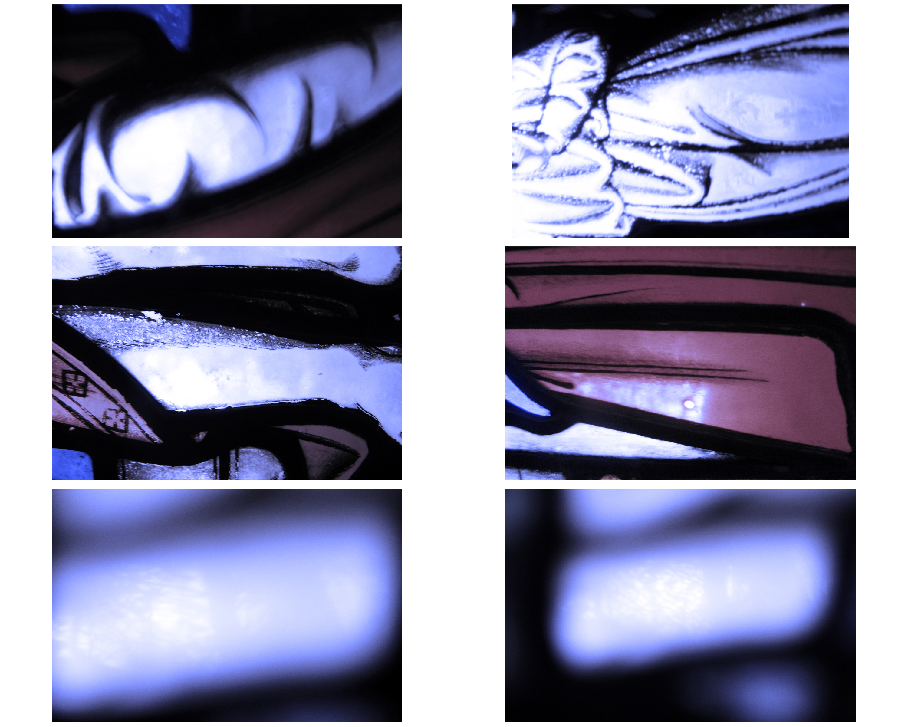
One of my largest strengths in photography, I would say is photographing people and faces. I’d like to do this but use filters just as my chosen artist has. Welling has never tackled portraiture but I think with these effects and good portraits would make a good photo. Overall I am exploring color and it’s link with faith and spirituality. When I hear the word spirituality it is hard to image that without people. The belief I have in God massively involves people. It is completely focused on the relationship with God and people. For me personally, if I am going to take photos that correspond with spirituality it needs to include the people. I have studied other artists in this project and focused mainly on the art movement Abstraction. Abstract Expressionism focused on giving the viewer a sense of transcendence just using color and shapes.  I would like to focus on close-ups of a persons face turning there face into shapes and shadows, turning them into a figure that you can barely recognize or not recognize at all. This is similar to the experimentation shoots I did early in the project as shown below. Instead I will use colored filters to add another aspect to the photo.

I have found this blog post on lomography.com that shows you how to make your own color filters. I will use this to make my own and test this. If this does not work I will either buy some filters or do it digitally. The link to the blog post is below.

https://www.lomography.com/magazine/181536-make-your-own-color-filter