Jonny Briggs’ Task (Destroy an Image 5 Different Ways) – Archival Imagery Task Response

When Jonny Briggs visited the school on 04/07/17 for his workshop he held for us, he set us a task to complete for the next time he visits the school on 18/07/17.

“find five different ways to destroy an image”…

I have chosen to destroy one image form my own personal archive. It is an image I have already experimented with – this being the image of myself and my dad sitting at the breakfast able on a holiday in France wearing similar raglan tops and with identical haircuts! I find this one very amusing because of the obvious similarities between myself and my dad when I younger, but still now that I’m grown up I get told I look lots like my dad.

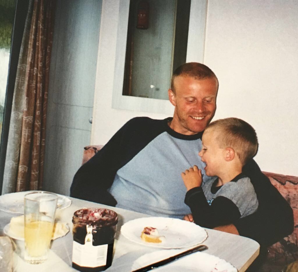
I have already experimented with the image on Photoshop to attempt to alter its look digitally. I do enjoy this method because it allows me to play around with the Photoshop tools and find a weird way to make an image look different. When editing on Photoshop, I found it difficult to let my creativity run wild and my freedom seemed limited because I didn’t really know what I wanted to achieve. I am hoping that when I have the image in front of me physically, I will start gathering ideas as to what I can do to essentially “destroy” it. Therefore, as well as the digital edits, I have printed out around seven copies of the image so I can manually destroy it. I will upload the outcomes from this experiment once complete and explain my thought processes so it is easy to understand why I did it.

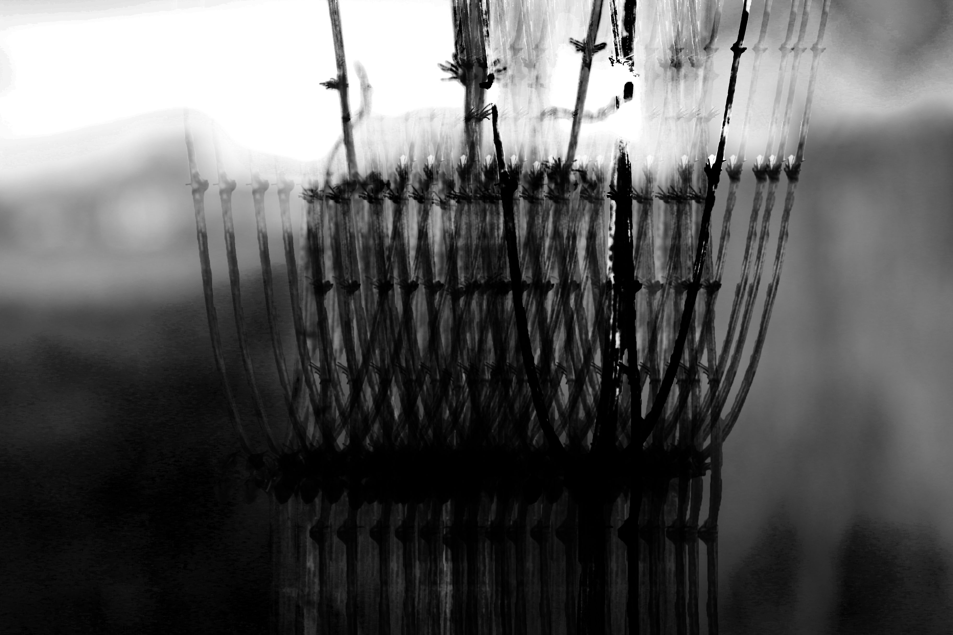
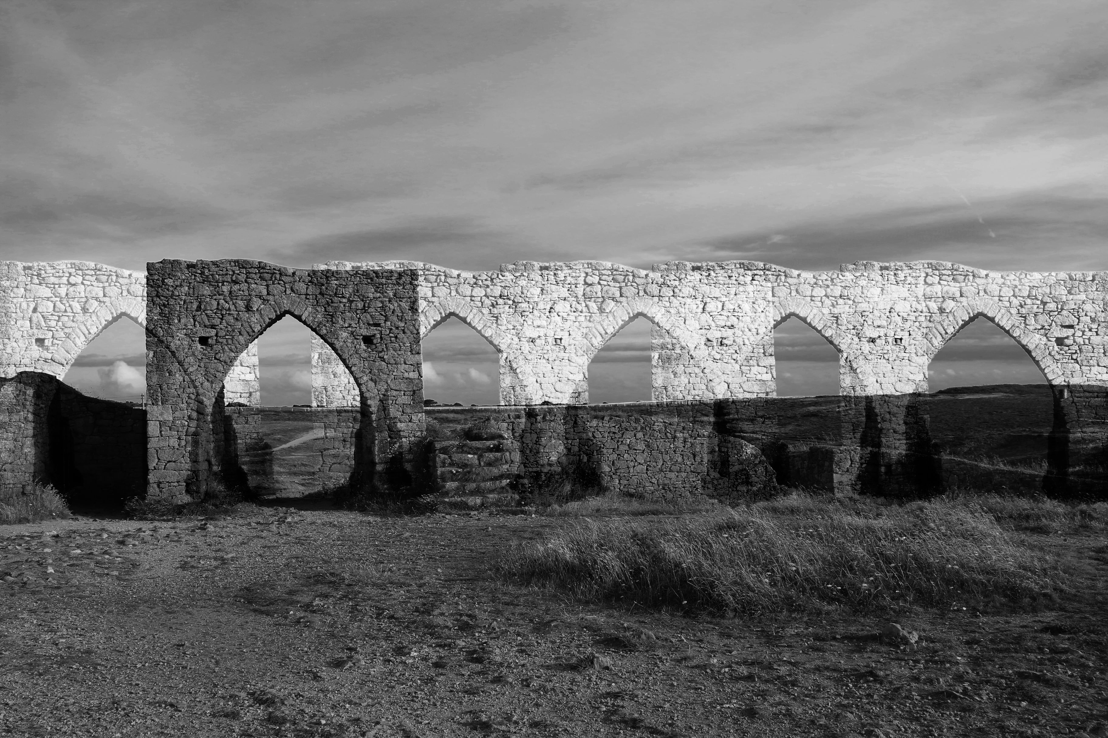
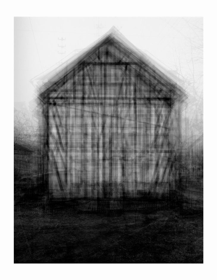
Here are the products from my session on Photoshop:

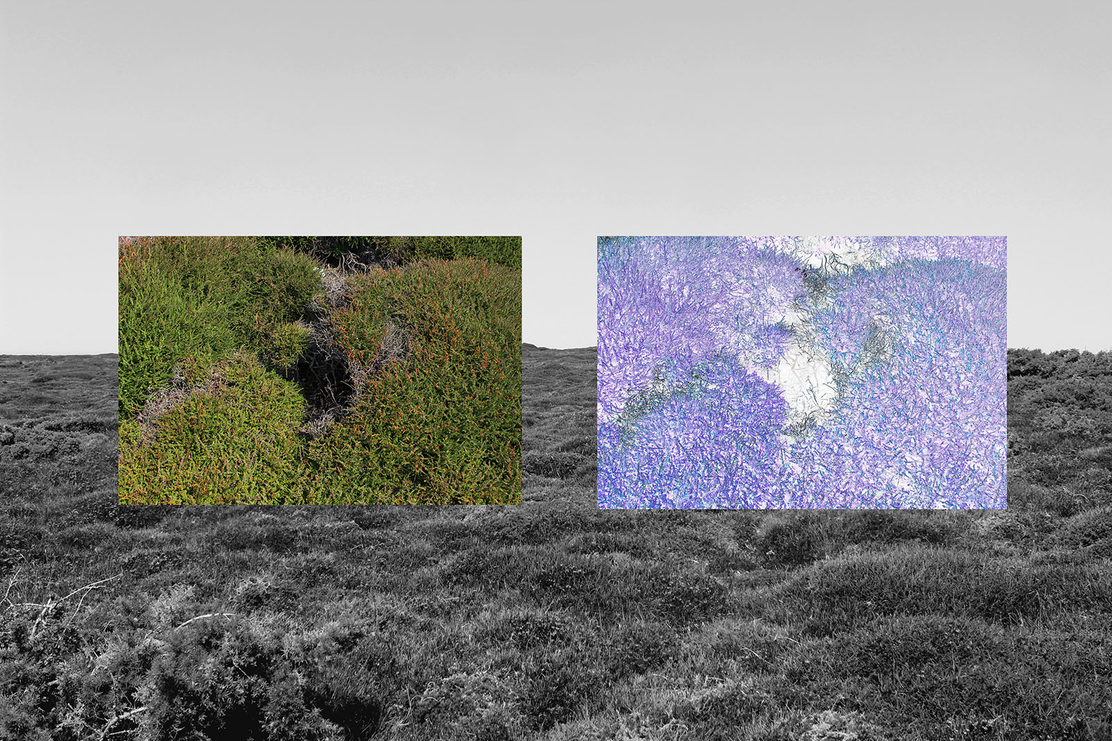
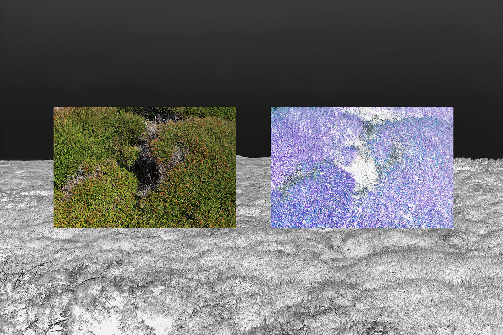
With each edit, I used the same page size and same sized image to show consistency and make a pleasing series of five of the same images it just edited differently. I also chose the same background colour being a faded out black because I felt like this allowed the image to stand out best.

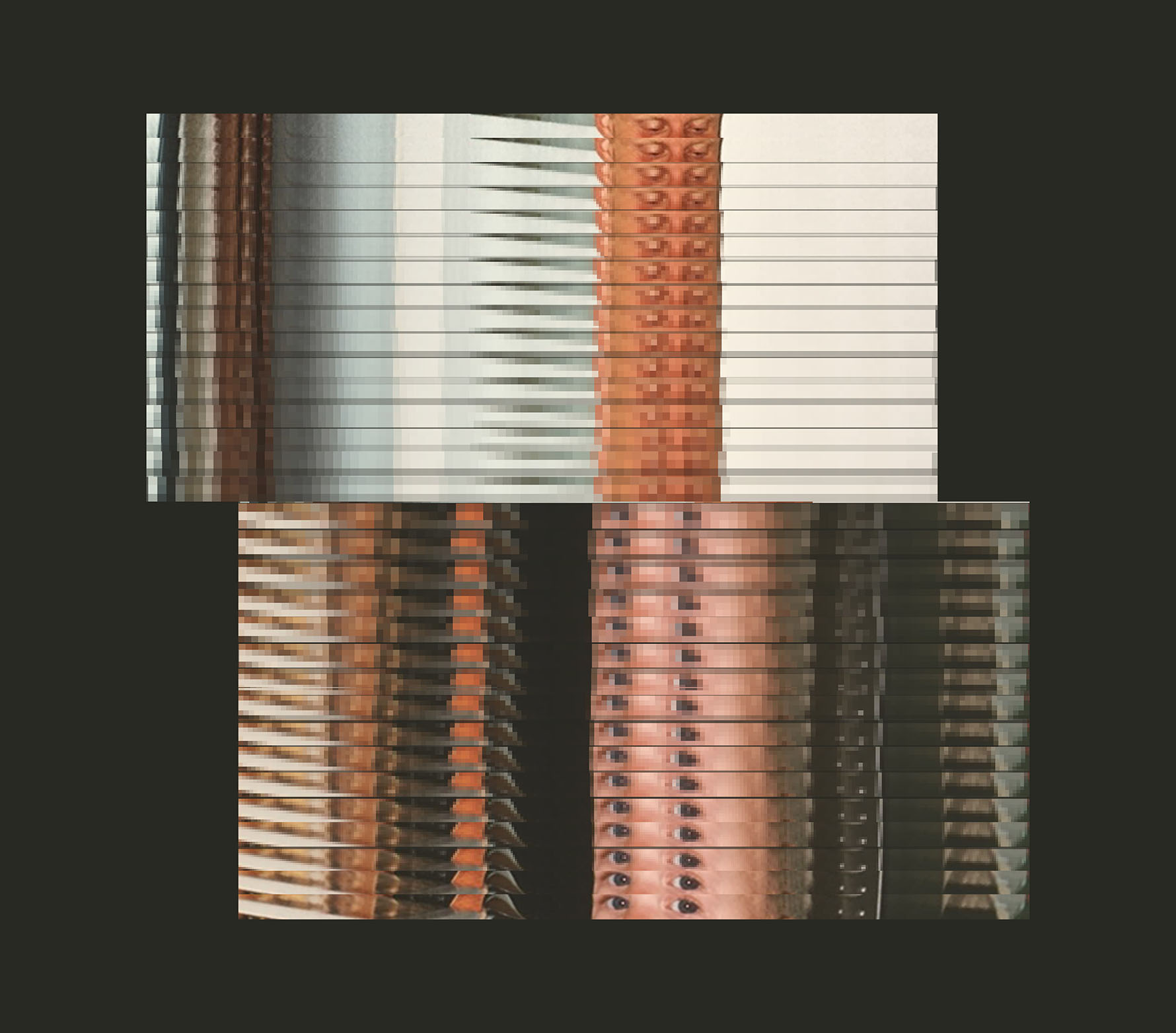
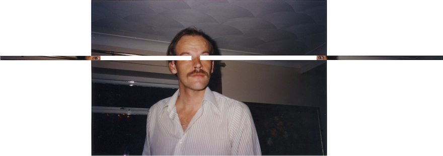
For this edit, I extracted just the eyes from the original image. I wanted to show my understanding of Jonny’s work and attempt to replicate in my own way but following similar styles to what he does. Jonny makes a habit out of using and focusing on the eyes of some his images frequently and he often takes out just the eyes and makes this feature of the subject within the image the focal point which I love because it is so small and can be so easily ignored yet the eyes can hold so much narrative in themselves because emotions are told through your eyes an the way you look at something. However, what Jonny does not do is make an image or a montage out of just the eyes of people. This is what I have done and attempted to make it personal. I taken the eyes of myself in a picture and the eyes of my dad from an image and merged them into one edit. I wanted to create the idea that my dad’s constant gaze down on me from when I was a baby up until I was a young child, to when I became teenager and still now has been a significant part of my upbringing and is for moist children if you have a dominant male figure in your upbringing. His effort to look out for me non-stop is a huge influence for how I have grown up and what I have become and I wanted to show this in my edit yet a gaze can sometimes become very confused and hazed and I wanted to play a trick on the mind – by pixelating the cut-out eyes, the viewers own look becomes confused. I wanted to show that my dad’s gaze has progressively and gradually morphed into mine and as I become older, I begin to look at things the way my dad does. Especially now with a younger sister, my own look has matured as I have to monitor, as a guardian essentially, someone who is so young and innocent, as I used to be. 

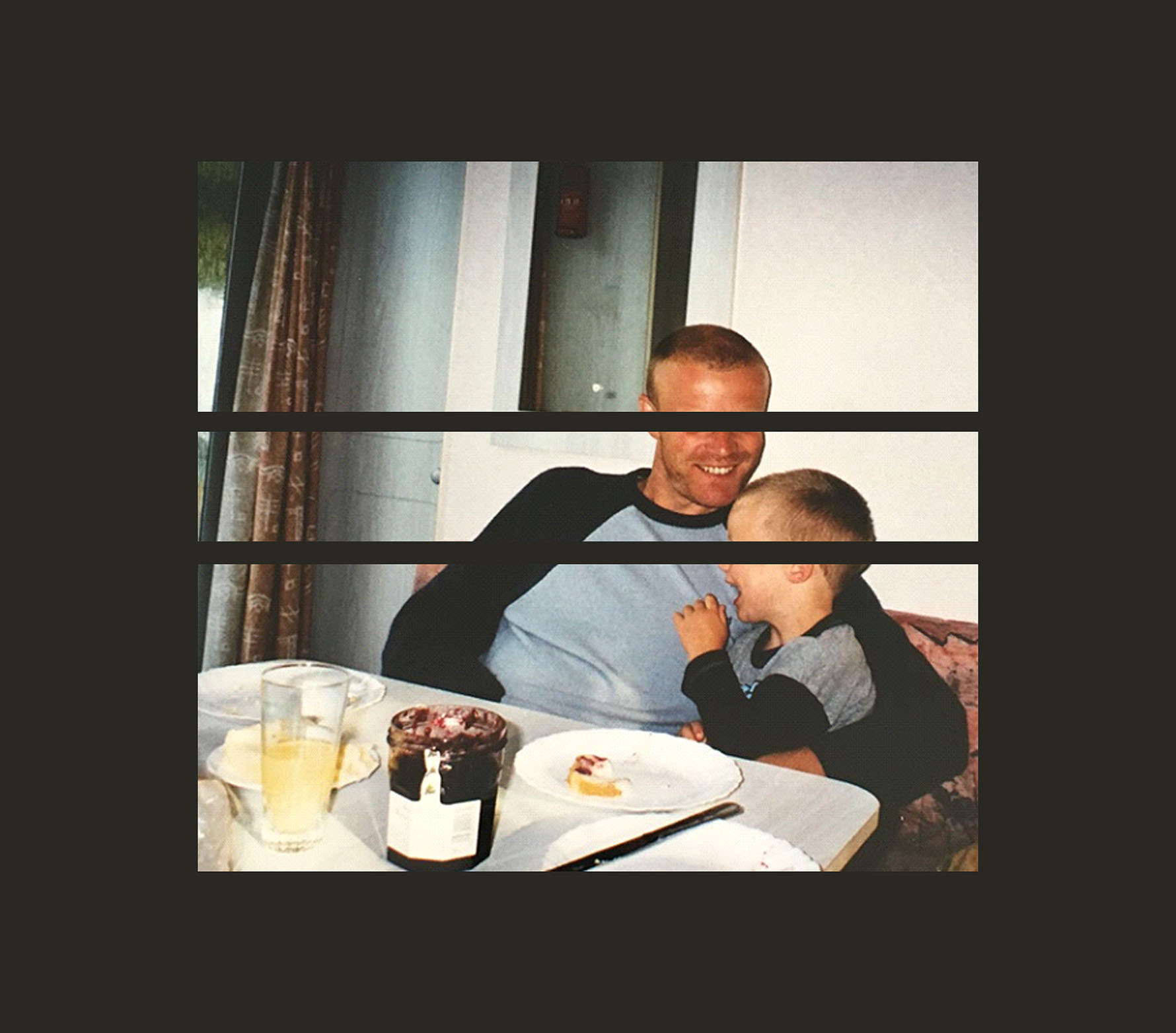
With this edit, again focusing on the eyes, I have taken this particular feature out this time. With this edit, I decided to make it more simple and not edit the photo in any way apart from to take the eyes of both myself and my dad out of the frame. This is something Jonny does in his photos and was something I was really drawn to because of its simplicity but complex meaning behind it. I decided to remove the eyes of both subjects because although eyes can tell a million words through the way you look at something or someone – whether it be love or passion or anger etc. I wanted to address the idea that emotions can be so easily ignored and although you may look at someone with love, other gestures, such as your body gestures and your words can play a part in getting across your message. I also anted to see the effect of removing the eyes in this image because they actually play a big part in the story told because my dad is looking down at me, with what I now is love and happiness, however, I am looking away. But we both have a smile on our faces and this is what can show the sense of love.

Forward Slashes, Altered family photograph, 10 x 28cm, 2013 <br/> <br/>Jareh Das; In some of these altered family photographs, you have removed <br/>the eyes. I'm reminded of Peggy Phelan's observations that the formation of 'I' <br/>cannot be witnessed by the 'Eye'. In other we don't recognise our 'self' <br/>through our eyes. Do you think that your works through the camera's 'eye' <br/>somehow communicate or capture some of how the self is formed?<br/> <br/>The gaze is an important aspect in the work – beyond myself as a <br/>photographer looking through the lens, there is often a wish for the works to <br/>look back at the viewer, to return the gaze. The work could be seen as a <br/>rebellion against my father’s gaze from behind the lens when taking our <br/>family photographs. Whenever I take photographs of him or my mother, I <br/>suddenly feel in control, like there has been a power flip, that now it’s about <br/>the way that I see, unveiling an alternative family story. <br/> <br/>I’m reminded of times in public, when I realize that someone is looking at me; <br/>or even worse, our gaze meets. In that moment my mind splits into my <br/>fears and desires – that they are either attracted to me, or that they want to <br/>start a fight with me. That they think that I am attracted to them, or that I want <br/>to start a fight with them. It’s no wonder that so many people find it hard to <br/>look others in the eye, that when we look at an image we gravitate towards <br/>the eyes of the subject, and that fights so often start with the phrase ‘What <br/>are you looking at?’ <br/> <br/>I often entertain the thought that what our parents, Grandparents, and all <br/>those around us say to us – and even words and language in themselves, <br/>can categorize and shape the way we see the world around us. Our <br/>memories can cloud the way we see, and it is these artificial perceptions I <br/>wish to think beyond; to detach myself from my adulthood assumptions and <br/>see the world afresh like a child again. Because what we perceive can be a <br/>projection of our own fears and desires or tainted by our memories, <br/>I identify with Peggy Phelan’s observations. In this sense the work could be <br/>interpreted as how the conditioned self is formed, which reminds me of <br/>Narcissus, upon tearing out his own eyes exclaiming ‘Once I could not see, <br/>but now I can see.’
Jonny’s image

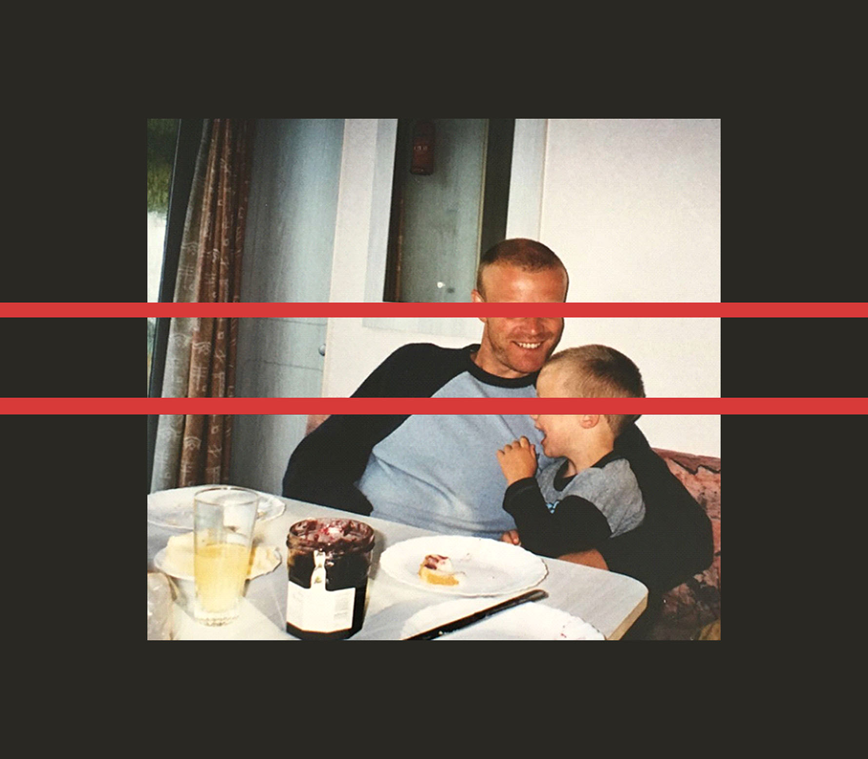
This is the same edit as the one above, however told in a different perspective to get across a different meaning. Where the space was that the eyes originally filled, I have filled this with a red block. The reason I have done this is very simple and was just an addition tot he original edit to show a different narrative. I chose to colour the negative space red because red is an iconic symbol of love and we, most of the time use our eyes as a way of telling someone we love them if it isn’t verbally. This isn’t my favorite edit but I do like it and I have focused on the effect of love and showing this through all my edits – the love that is shown between myself and my dad and how strong and powerful it is – that a relationship can provide happiness – also shown in the photo. The concept of happiness is evident to someone who hasn’t seen the photo but for me, it has a stronger meaning and I connect more so with it which I like. 
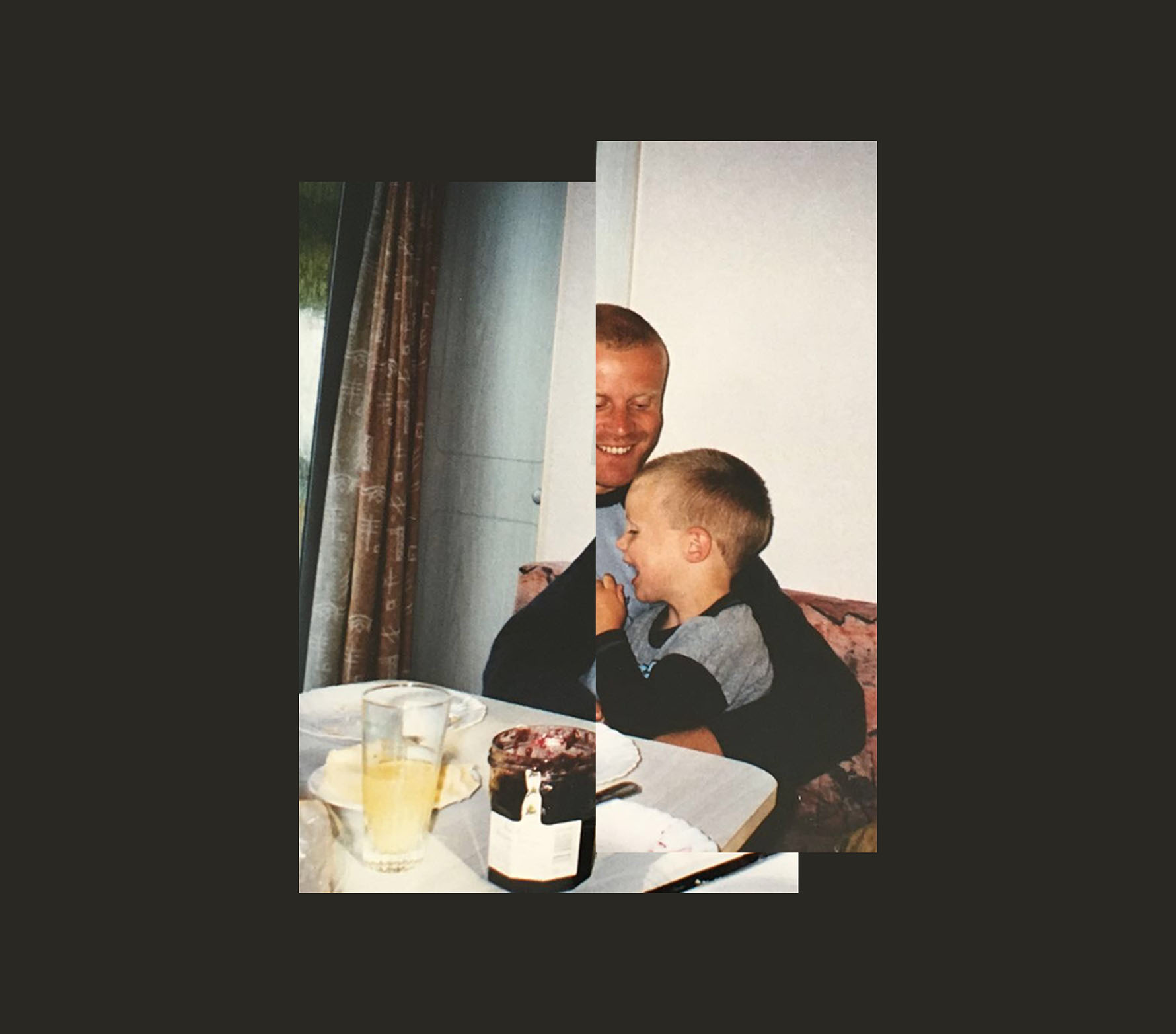
For this edit, I simply cut the photo in half in using the ‘rectangular marquee’ tool to select what area of the image I wanted to adjust. I selected the area then copied it, deleted the original and pasted the area I copied so that I could move it about as I wished.

I chose to move the copied area of myself and my dads head closer into the original image so that it overlapped. I wanted to do this so that the arms of my dad which are wrapped around me as I laugh in his grasp were closer together so that it portrayed the idea that he was holding me very tightly – crating a stronger bond and a cohesion between us two. Although, this was occurring in the original, I wanted to emphasise this further, therefore moved the copied area so that I was closer into my dads abdominal and so there wasn’t as much of  assistance between us as before. I also moved the image up a little bit once repositioned so that the table edges were in line with one another. And as you can see, here, I have again opted for the concept of love and creating strong bonds.

Schisms 3, Sister's head upon my body, Adapted family photograph, 2011
Jonny’s image

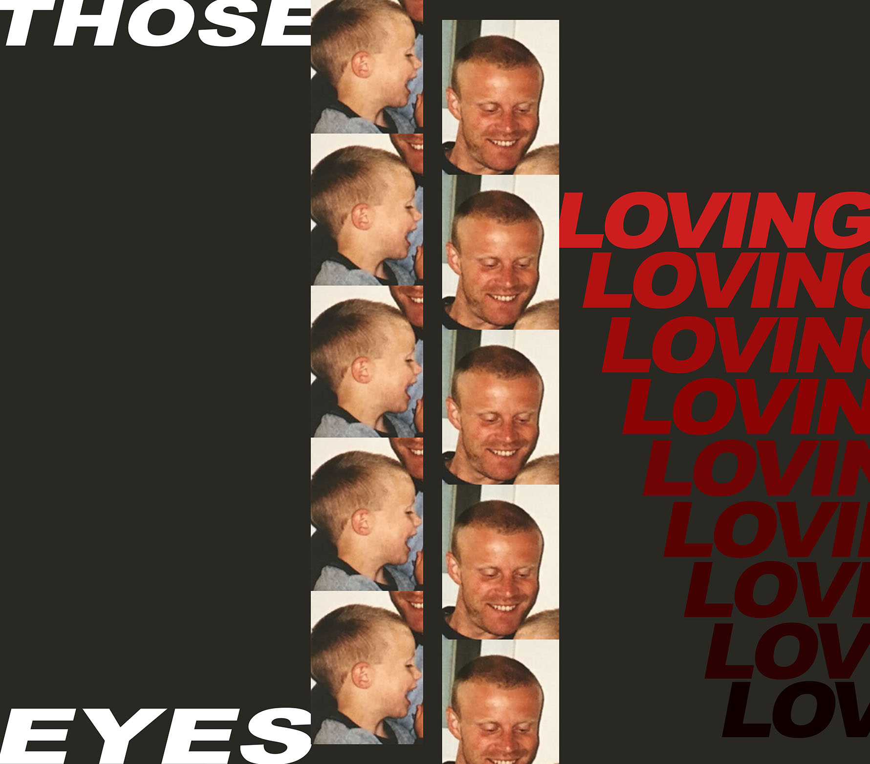
This is my final edit that I produced and is one of my favourites because of the addition of text. I have again focused on what the eyes of each of us – myself and my dad can say and what they tell the audience. I cropped out the head of myself and replicated this four times and did the same with my dad also. This forces the viewers to look at the face’s of us only and derive some menaings and thoughts just by what we look like and what the orginal image may have looked like if they hadn’t seen it.

I wanted to confuse the audience again so flipped my head once cropped to face the other way to the original and I also moved my dad’s presence to the right of me instead of to the left – which is what the original was. However, to provide a clue that I have cropped the image, in the photos of my head, you can see the mouth and chin of my dad in the upper right corner – hinting that that he was originally looking down on me, however, now looking down at nothing. The emotions are still the same and it can be viewed that we are both smiling at nothing – perhaps there wasn’t actually anything funny in the original image and I am therefore making a new narrative for myself to interpret because I was so young at the time, I cannot remember the time the image was taken.

Adding to the idea of nostalgia and creating new stories and memories – I have arranged both sets of images in the style of a series of images from a photo booth. I really like this effect because each image is the same and it hasn’t changed as the series progresses which is usually what happens when having a mini shoot in a phtobooth. I wanted to show the idea of repetition in our lives – maybe going to the same holiday destination every time because it was what I liked and what my parents knew was safe (in the image we were in France).

As well, I have added in some type this time because I felt ike it would add an extra layer of narrative and give the overall work some more character. I chose to use the words ‘those loving eyes’ as I wished to narrow down the image to the focus of eyes and how they pay an important part in this image to tell a story and show emotion. I decided to replicate the word ‘loving’ several times as it works its way down the page fading gradually to black – showing that love is so easily lost at times in terms of romantic reltionships and I wanted to show that love is such a delicate thing.

Here are my manually made edits:


Reflection of Workshop w/ Tanja Deman

Yesterday, on 11/07/17, Croatian photographer Tanja Deman came into the school to hold a workshop with us. It was centered around looking at the shots we captured form out shoot at Grosnez and L’Etacq a few weeks ago – she wanted us to reflect on what we caught and start thinking about ideas for creating photo montages and photo collages like hers.

She also set a task before her workshop yesterday for us to gather some out favourite images from the shoot, and link them to our artist references to then begin gathering thoughts about what we could o with out images and I began creating some edits. These are on the blog.

The workshop consisted of Tanja getting us to open up Adobe Bridge on out computers and to begin organizing our folders so she can come round to our work areas and look at what we have produced – this was what the opening part of the lesson was made up of. From working with Tanja before in the photographic academy which took place in the Easter holidays, I was aware that she was very reliant of using Bridge to arrange her image and she essentially is an advocate of the software program to use as a tool for seeing all your images together and she encouraged all of us to use it regularly in future work. She briefly went through the essential tools within the program to help us.

Katrin Koenning

I like that in the image above, Koenning has, as it seems, attempted to contrast the effect of land and sea. The left image being land and some sort of bush or tree being the subject contrasted against a black background so that it absorbs the light and makes the red of the tree stand out. The right image being sea and a fish being the subject. I love the contrast between content and colors of the photo – that the right one is almost over exposed and looks as though a flash has been used but I really like this effect and I find the cold blue very enticing. I thought about contrasts in my images when editing in post production. I chose to use the method of overlaying images and creating a collage of just two images to contrast subjects. I like the effect of layering images because it can hide features of the background image and the new image can replace what is missing and create a new outlook and a new narrative.

In the above image I crated, I wanted to show the effect of contrasting two images. I really like using a black and white image that is heavily contrasted so that there are deep blacks against faded out whites and neutral greys and then a more vibrant, smaller image on top. I wanted to contrast the vast and wide landscape in the background that is very empty against the more close-up macro of the yellow plant and greenery surrounding it. I love the juxtaposition of feeling micro and feeling mega! There is also more evident detail in the macro which contrasts to the vaster landscape where you cannot pick up detail as much and to add to this, I also blurred the image in the background using the motion blur tool on Photoshop.

By the timer she had come round to my work station, I had organised all my folders so that she could have a look and give some advice on what I can do next to progress. I really enjoyed seeing Tanja again because it is helpful that she already knows my style and has seen my photography work before so knows that I nave a particular way of photographing and editing images. I think this was evident from my sets of edits I presented her ans I believe she enjoyed looking at them. I did show her my images that I collected from the archive in advance to the workshop but I have no intention of using them because I don’t feel like they would relate to what I want to produce, however, the other artist references, including Superstudio, Luigi Ghirri and Katrin Koenning will be influential to be further edits. In particular, Katrin Koenning’s images – I hope to take into account her work when planning another shoot so I can capture images that reflect her very aesthetically pleasing style and technique of paring two images together – almost like half-frame photography.

Katrin Koenning
My image inspired by Luigi Ghirri’s warm and retro colours and environments

Once Tanja had had a look through my edits and given me her thoughts on them, it had given me some sudden inspiration and there were thoughts going through my head about her I could improve and move forward with ideas she told me she liked. She especially liked the pool images where I had played about with overlaying and re-sizing images to create more of a collage where proportions are a bit confused but had a nice effect on the audience. She told me to progress with this style and play about more and more with overlaying and re-sizing on Photoshop and to just go crazy with it until I have some works that look very muddled but effective. The images of myself in a pool in France on a holiday last summer with the use of an image of L’Etacq are my favorite as well and once again used contrasts to juxtapose man-made swimming areas – being the pool and natural constructions of beach and eroded rock over time to create a seascape.

Tanja then finally showed us some of her work on Photoshop using hr own laptop where she gave us a very quick masterclass on how to make the most of the tools on Photoshop to create a good collage. She demonstrated her skills and told us what she does to create what she does.

Edits inspired by Tanja Deman

I really liked the underwater images that Tanja captured on the coast in Jersey. I decided to use them as inspiration while editing some of the images I got from Grosnez. The black and white faded effect was what I wanted to create with my edits.

I remembered a photographer that I liked called Idiris Khan, and I wanted to combine his ideas and Deman’s to achieve my edits. Here is the main image by Khan that I wanted to use as inspiration. 

The images below are my edits of the images that I took at Grosnez usings Deman’s and Khan’s ideas.

I wanted to try an edit just using Khan’s idea. His edits look very blurry because he layers the same image over and over again. I decided to use the motion blur tool on Photoshop to achieve the same effect.

My image
Khan’s image

A day with Jonny Briggs

Is fear is a good thing? / What are your opinions on fear? / Have you ever experienced fear during your photography?

On the 2nd of July we had an hour long workshop with Jonny Briggs. During this session the main topic was based around fear and fear of making mistakes and how it can impact our work. The questions above are a few of the initial questions that Jonny faced with us, he went around the group asking everyone what there personal opinions on whether fear is a good thing or not. Listening to everyone’s ideas was really interesting and definitely stretched my thoughts on it and made me consider that fear can be a good thing and especially fear of mistakes because it means you care about something and don’t want to wreck the work you may be creating. Other concepts which came up in discussion which i found interesting was that mistakes can often improve our work and make it more individual and different because mistakes can lead to work differing from the social norms.

Jonny then got us to do a task about making mistakes and getting us to try new things which we may have felt fearful off. We all had a pen and piece of paper and had to close our eyes and draw a face with as much detail as possible. The outcomes were discussed and many people agreed that the outcomes were more interesting than normal faces because they were more distorted and every image was different and people seemed to have a style to their drawings when we compared the first drawing we did to the second drawing.


Further Edits Inspired by Tanja Deman from Grosnez/L’Etacq Trip

Here are some more edits, continued on from my primary experiments using the pen tool on Photoshop to digitally draw on top of the images. I decided to explore the concept of photo collage and montage more so in preparation for Tanja visit on Tuesday 11th June. I felt like this would be necessary and would open up my mind to the style of art more to allow to me decipher whether I wish to explore it in more detail for A2 course or not – or whether I just want to use it as a starting point and experimentation tool – which I think is most likely because I don’t feel like collaging is something I can strive at but is useful for developing my skills and advancing my understanding of the very popular style.

I tried to use the work of my artist references more in these edits and just explore different way of editing to get me back into the habit of editing constantly. I started overlaying images and I was particularly drawn to the idea of placing one image on top of another – most of the time contrasting black and white and colour and I opted for the lighter and more delicate way of editing. Towards the latter stages however, I explored the tools more so and came up with a piece plays about with proportions and colours.

Revisiter

Over the weekend, I visited my neighbour who is the owner of Claude Cahun’s old property In the parish of Saint Brelade. Diane Martland is a lady in her seventies who has lived in the property since 1965; eleven years after Claude Cahun died. Her father purchased the house addressed “Bedford House” for £15,000 and I couldn’t hazard a guess to as how much the property is worth now considering the location, condition of the house/ land and due to the discovery of Claude Cahun’s work and how this coincides with the property. Of paramount importance, Jersey Heritage recently ‘listed’ the building meaning it cannot be knocked down and it will be forever protected.

I questioned Lady Di to what her favourite image(s) were of Claude Cahun’s collection to which she picked the following:

Image result for standing and sitting in the garden claude cahun

Image result for claude cahun cat on the wall

Diane picked these two images as she felt a connection on a personal level as the pictures were taken in the garden she owns. She commented on how she enjoyed the absurdity of the images, especially the photograph of the cat on a leash on the beach/garden wall. Claude Cahun and Marcel Moore’s photographic montage is another Diane enjoys as its quirky nature combined with the breathtaking scenery of the South-West coast creates a sublime image.

Following this discussion, I asked Diane whether she’d be comfortable posing to replicate some similar images to that which Cahun took and she jumped at the opportunity… she was doing costume changes as she’d arranged different sets of clothing which she felt were similar to that of the image and also asked me to fetch my dog because we didn’t quite have a cat.