Category Archives: Research

Filters

Author:
Category:

Manipulation of Film Negatives

“Breaking” Film Negatives


Going on from looking at using film I have looked into different ways that you can distort film negatives. By distorting the negatives and rescanning/printing them you can get some incredible results that are completely unpredictable. I have looked at a lot of different ways of distorting and destroying negatives. One source that I looked at first was this article. It talks about many different ways of distorting the images that are stored on a strip of negatives and how they can have different effects. One of the more abstract results that they show are by the artist Phillip Stearns.

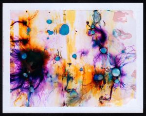
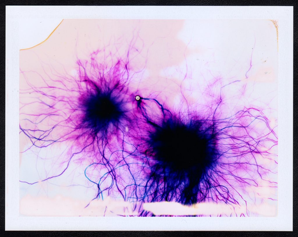
He creates his pieces in an unusual way that even different to the other artists that manipulate film. Instead of taking images on the film (Fujifilm FP-100C Color Instant Film) and then messing with the negatives, or messing with the film and then taking the images, he simply messes around with the film and then those negatives are the final pieces.

The video above shows him using some of his techniques. He uses many, many different ways to edit the negatives, including different chemicals, high voltage electricity and even common house salt but in the video we only see him using 15,000 volt electricity and comoun bleach. He never knows what the images will look like until he opens the negatives and sees the final result, this sense of the unknown and anticipation is what I want to achieve with my project, due to these both being properties of water. Stearns talks about why he has chosen this as a project that he pursued on his blog here. He says that

“I was struck by the similarities between the layering of materials in the film and the layering of cells in the [retina]… the similarities were striking.”

He goes on to talk about how the camera is the extension of the eye and looking more into the links between the images that he is creating and the different things that are going on in the human eye. Stearns mentions that with digital photography there has been a loss of connection between the eye and photography and so he is almost creating these images that bring back that link between the eye and photography. To link further to this he says:

“I find it curious and exhilarating that the impressions left behind after developing these extreme exposures so perfectly resemble networks of blood vessels in the retina.”

The two images above demonstrate this visual relationship between his creations and the physiological structure of the retina. They both have these large spots of darkness, in the retina these are the optical nerves or the Fovea centralis, and in the artwork they are the epicenter from where the electrical current touches down on the film.  The “veins” that come out from here also look very similar to each other and really lend to this connection between the eye and his artwork.

A similar idea but more connected with my project is “Fox River Derivatives” by Peter Hoffman. In this series of photographs Hoffman traveled along Fox River in Illinois with a medium format camera taking images of the river and it’s immediate surroundings, he then takes the negatives from this and sprays them with gasoline before throwing a match into the pile of images and gasoline and dousing them with water before they are completely destroyed.  He talks about his motivation for the project being that

“our consumption habits—specifically dealing with precious natural resources—are out of control and unsustainable.”

He talks about how the next generation will not get to see what we get to see and so to highlight this he did not just want to make photographs of the river, he wanted to have an element of destructive chance being applied to his images.

“I wanted to transfer that feeling I had, which was maybe something like a sense of powerlessness or dread, to the image making process. I wanted to lose control, having the resulting work border on ceasing to exist in any recognizable form.”

The surreal bubbly effects, often obscuring other parts of the image show the rapidly disappearing natural landscapes that are almost hiding behind the destruction. By using gasoline he is using one of these natural resources that we are using up and exhausting to destroy the natural landscapes he is showing the volatility of the environment, and the randomness with which it is disappearing.

But out of all of the different examples of what other artists have done this kind of film manipulation the one that I connect with the most is the work of Matthew Brandt. He has made lots of different bodies of work and there are several of them that are relevant to my project. The first is titled “Waterbodies,” in this series he takes a number of images of different bodies of water, often oceans, and collects water from them.  He then uses that water as part of the development process to create the final images.

He has not produced many images via this process but it is very interesting to see what the images have turned out like. This concept of using parts of the environment to create these images is a very interesting idea to me and even though they are not the most visually impressive the concept behind their production is really fun and suited well to my project. I looked for the conceptual reasoning for why Brandit did this particular project but could not come up with anything in particular. My interpretation of it though is that to create something then you need inspiration and resources. He already had the inspiration for these images but for the resources he decided not to use the standard salted water for the development process, instead allowing the environment to leave even more of its mark on the images. A truly personalised image that is perfectly customised for the environment.

While he was taking the exposures of this project he came across the idea to do another project, Lakes and Reservoirs. This body of work does not involve using the water to create the images, instead it involves using the water from the environment to destroy the images. Finding out the reasoning behind this project was not what I expected ether and may explain the lack of information about the previous project. In an interview with Brandit for Dazed Magazine the article states that:

“The creative process of his latest series  shows that he clearly understands the art in photography, although Brandt himself insists it is merely a representation of what he sees in front of him.”

Later on he talks about the hiking and climbing that he needed to do to be able to take the images that he used. and how even though the images were being taken to be destroyed he still spent the time to get into good position and to properly compose the images.

“For these ‘shots’, I was looking for the most calendaresque view I could find. A view and composition that was the most encompassing to visually represent that lake and/or reservoir… to me, I enjoy the perversity in subverting all this photographic labor by later degrading it with the lake water.”

This is definitely something that I am going to look into for my project. There are a lot of different water sources around Jersey and it would be interesting to see the difference in effect that this could have on the images. I will be updating about my process of altering the negatives in another blog post.

More links to pages that I found interesting:

Art Student – Planning

A stereotype that I certainly currently conform to is the archetype of a female art student. This stereotype can be broken down into various sub groups but the on running theme is that the modern day, young, female art student is middle class and a little pretentious. When exploring this stereotype I want to look at two different subgroups of the art student stereotype that I believe I conform to, these being the messy, scruffy, slightly edgy, doc marten wearing practical student and the more style conscious, fashionable, club kid/ Harajuku inspired, heavily-active-on-instagram type student. I feel that on somedays I can dress stylishly, put on some fun makeup and look very well put together and on other days I wear comfy clothes, throw my hair up in a bun and get covered in charcoal and paint. There is rarely an in-between.

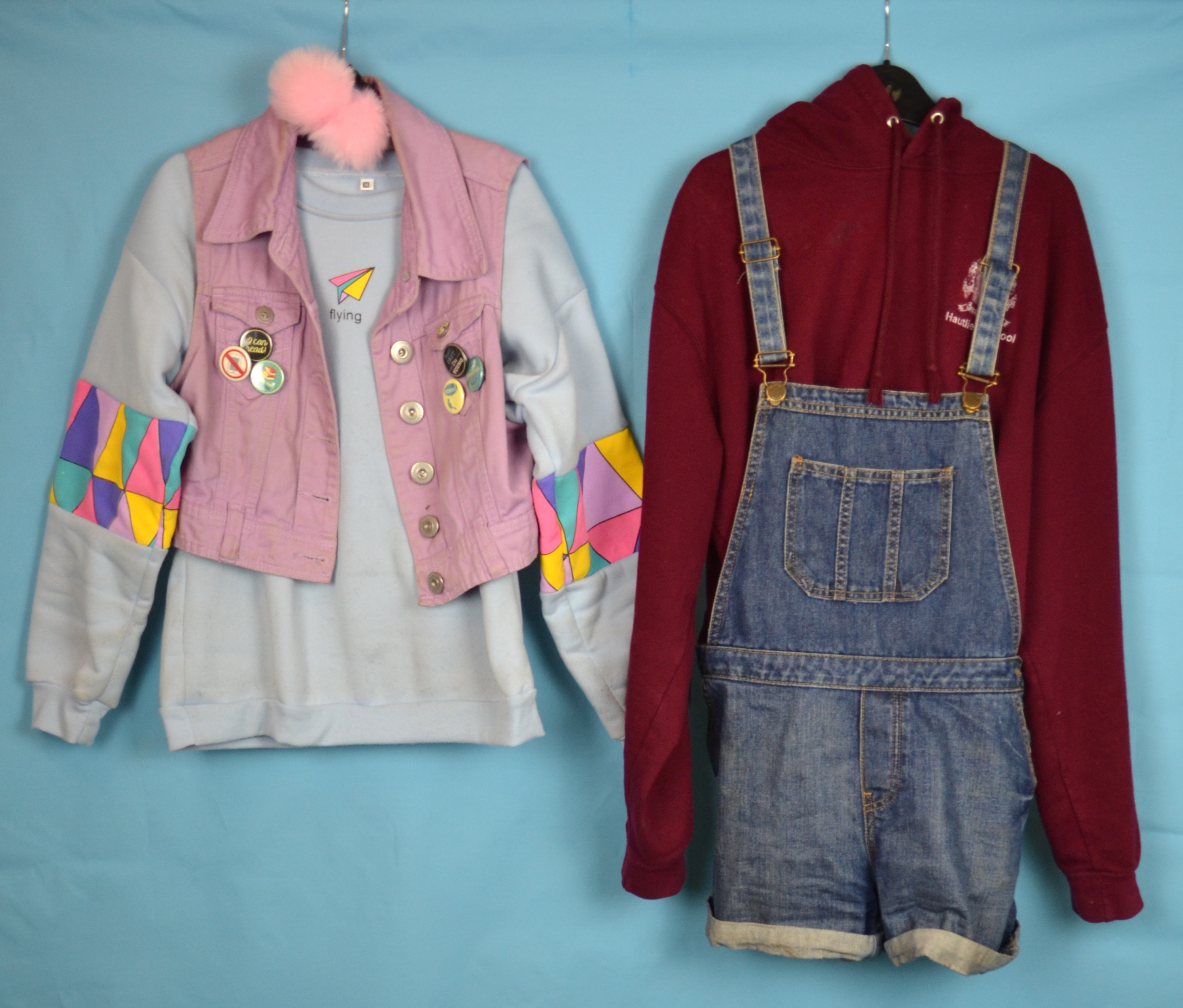
The above moodboard depicts the more relaxed, scruffy art student for this shoot I plan to wear my comfy maroon jumper from my school trip to China in 2016. I often wear this jumper when I’m lounging around the house, doing art or just want to feel comfy. I wear this jumper so often that my mum has to tear it off my body in order to wash it. I also want to wear a pair of denim dungarees, I don’t usually wear these when painting because they are not particularly comfortable but I feel that it will complete the art student aesthetic. I also want to play off the idea of what people think an artist at work looks like, so I plan to wipe some paint of my face and arms as well as tucking some paint brushes into my bun.

Above is my second mood board for my more fashion forward, heavily active on Instagram, art student as well as some photos from my personal Instagram page. I want to create a harajuku fashion inspired look with pastel colours and fluffy hair accessories (pictured below) and my fun monster’s inc backpack. In terms of poses for this shoot I want to try some cutesy, bubbly smiley poses and perhaps some images that include taking selfies for instagram as the case of my iPod in bubblegum pink and cat shared which would fit in with the pastel them I want to create. For the first shoot I plan to use my blue back drop as the maroon jumper I plan to wear will almost certainly clash with the pink. However for the second shoot I plan to use both the pink and blue background because the outfit that I have selected (pictured below) will work well with both colours.

Daniel Ray Jones

Website: https://studentpages.scad.edu/~djones36/gasmask.html

Daniel Ray Jones is a commercial photographing who is working towards his Bachelor degree of Fine Arts and the Savannah College of Art and Design.

He is native to the Pacific Northwest, he lived in Greater Seattle for 20 years before moving to Savannah, Georgia.

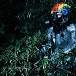
He has created a project using gas masks. He places his models in eerie looking places with darker clothing but also clown clothing and photographs them.

His work is very dark and haunting but he adds a humor element to his photos by adding a clown wig but this could also work in the sense that it adds more tension and makes the photos much scarier. He does mostly night shoots as they are much more dramatic however his images do not relate directly to my work as i am trying to avoid creating scary looking images as that is not the point of my project. However, i am planning on doing a night shoot but i do not want to create images like these as i am photographing my models from afar and not so up close and personal. One primary composition which i have noticed with his photographs is that they are very anonymous, we are unable to see the models eyes in any of the photographs he has taken which is the opposite to what i want to achieve.

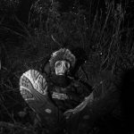
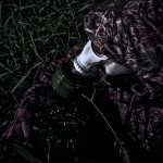
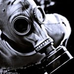
This photographs relate slightly to one i have taken in which my model is partially hiding behind a tree and is hidden by twigs and branches. I like this photo as everything is very dark and gloomy but the mask draws your attention to the model who’s body you can barely see which makes it look like the mask is floating in the air. However, i do think that the model may look better right in the middle of the grass as it would create a frame for your eyes to focus on and it would consider the rule of three. The object in the background is distracting but i think that Daniel’s work is not meant to be perfectly composed as it is abstract photography in my eyes and i think that is what attracts my attention. The anonymity works well in this photo as it makes the viewer wonder what kind of person is underneath and what they are doing. I like these types of photos as they allow your mind to imagine what could be happening. I also like how Daniel combines both Tableaux and Abstract photography to create unusual images which catch the eye.

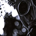
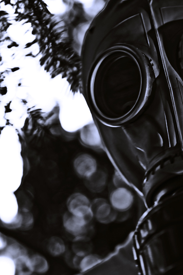
This images is very sinister and feels like you are being hunted in a sense but this is just my personal view, as again the scenario of the image makes it a mystery and allows the viewers mind to try imagine what could be happening. I very much like photos which leave it up to the viewer to decide whats happening, as many different stories could come up and all could be correct. Daniel did very well to mask the identity of the model even when so up close but this could be done by tinting the windows in the gas mask. The background is very interesting because you cannot tell what it is, for me it is trees with a bright skin behind and the highlights in editing turned up high. This image creates a lot of tension as we cannot see the other half of the mask but we not that there must be one and the same with the models body. This again makes the viewers mind create an image in their head of what the model would look like which makes the image feel more personal for each viewer.

Shoot 3 – Rome

On the next day of my travels, I visited the capital of Italy, Rome. Rome was once the cradle of one of the globes greatest civilizations ever, and is a historic centre of power, culture and religion. The city has exerted a huge influence over the world in its roughly 2800 years of existence. With wonderful palaces, churches, grand romantic ruins, monuments, ornate statues and fountains, Rome has an immensely rich historical heritage and cosmopolitan atmosphere, making it one of Europe’s and the world’s most visited, famous, influential and beautiful capitals. I was incredibly excited to visit Rome as I am fascinated by history and have read and consumed so much material about this famous city. I had desperately wanted to the visit Rome for many years and was excited to take some photographs upon my visit. I had to remember and consider my project idea, which was to produce work that could be utilised as a backdrop for external illustrations. This would involve focusing on elements such as lighting whilst maintaining a direct focus on the city itself and trying to capture the atmosphere and style. Below, I have included a contact sheet of all photographs taken on the shoot . 

Rome is traditionally said to have been founded by the mythical twins Romulus and Remus on 21 April 753 BC. The twins were abandoned as infants in the Tiber river and raised by a wolf before being found by a shepherd, who raised them as his own sons. The settlement developed into the capital of the Roman Kingdom, led by a series of Etruscan kings, before becoming the seat of the Roman Republic and then the centre of the Roman Empire. For almost a thousand years, Rome was the largest, wealthiest, most powerful city in the Western world, with dominance over most of Europe and the Mediterranean Sea.  Even after the fall of the Western Roman Empire in 476AD, Rome maintained considerable importance and wealth. Beginning with the reign of Constantine I, the Bishop of Rome gained political and religious importance, establishing the city as the centre of the Catholic Church. Throughout the Middle Ages, most of the city’s ancient monuments fell in disrepair and were gradually stripped of their precious statues, ornaments and materials; these were either recycled in other constructions or, as in the case of marble, baked in order to obtain mortar for new buildings. With the Italian Renaissance fully under way in the 15th century, Rome changed dramatically. Extravagant churches, bridges, and public spaces, including a new Saint Peter’s Basilica and the Sistine Chapel, were constructed by the Papacy so that Rome would equal the grandeur of other Italian cities of the period. The city became the centre of Baroque architecture, renowned artists such as Michelangelo, Bernini and Caravaggio worked there. 

To summarise my experience, Rome exceeded my expectations and I was amazed by the appearance and design of the city. Rome is essentially a giant piece of art, the architecture and street design is articulate and decorative drawing emotion just like a painting would. You are forced to look in all directions just due to the sheer amount of history and culture that constantly surrounds you. On every street corner you are confronted by another church or monument with its own individual story and history. It felt like a city where life was built around the history, monuments and ruins rather than on top of it. There is a beautiful combination of old and new which creates a vivid contrast. Nevertheless this juxtaposition feels natural as the aesthetic of the city is maintained throughout and no building looks out of place. Architecturally and culturally, these contrasts are shown through areas with pompously huge majestic palaces, avenues and basilicas which are then surrounded by tiny alleyways, little churches and old houses.  You may also find yourself walking from a grand palace into a small and cramped Medieval-like street. Hopefully I captured this within some of my favourite images below.

— Its important to note that these images have been selectedwith the intention to develop with illustrations. They are not individually the best photographs from the shoot, but provide the best opportunities for overlaid drawings. —

These two photographs display the Arch of Constantine. This is a triumphal arch in Rome, situated between the Colosseum and the Palatine Hill. It was erected by the Roman Senate to commemorate Constantine I’s victory at the Battle of Milvian Bridge in 312. Dedicated in 315, it is the largest Roman triumphal arch. The statues at the top were taken from the Forum of Trajan. They depict Dacian captured soldiers, defeated by the Trajan army. The relief panels between the statues were created for Marcus Aurelius while the roundels are from Emperor Hadrian’s time. Some figures in the roundels were modified to resemble Constantine. The decorations on the central and lower part were created specifically for this triumphal arch. I really like these two images, despite their basic compositions. The blank emptiness of the sky really compliments the complexity of the arch design, enabling the engraving and sculptures to truly stand out. The lighting works effectively, casting delicate shadows from the details of the monument. The main reason why I selected these two photographs is because I believe they will be highly suitable for draw on top of. As mentioned before hand, the blank sky can be taken advantage of, as it provides a blank canvas for my illustrations. Perhaps some Roman history can be incorporated within the artwork.

These 4 Photographs are very different from the remaining shoot, as they are portraits. Here, you can see some images that I captured of my sister as we travelled throughout the city. I think that its always a positive to obtain variety within a portfolio and implementing a few images that break the trend of landscapes can be effective. The portraits incorporate more of a personal feel to the project as I begin to integrate my life, friends and interests within the work. It provides the photography with personality as it becomes unique to me. If my travels through Europe are being presented as a story, the audience is now supplied with characters within the narrative. This assists significantly with story-telling. In the first two photographs, we see closeups of my sister, one outside the Colosseum and one outside the Vatican. Both these photographs retain a fun and youthful aesthetic, as portrayed through facial expressions. The happiness upon the subjects face can reflect upon the viewer consequently evoking cheerful emotions. I really like the reflective imagery within the subjects sunglass lenses as we see the surrounding environments duplicated and presented back to us through these small, distorted viewing-holes. For example, within the first photo we can identify the Arch of Constantine inside the left frame and myself in the right. A full perspective of the scene is shown. A similar effect is replicated in the next photograph, where you can see the statues within St Peters Square and myself reflected on the glass. The 3rd photograph features a slightly different composition, where we get a more enhanced look at the surrounding environment as well as a portrait. Whilst my sister is in the foreground, the background is occupied by St.Peters Square and the Saint Statues. St. Peter’s Square is one of the largest and most beautiful squares in the world. It is located in Vatican City, at the feet of St. Peter’s Basilica. The final photo is very different from the rest, as I attempted something peculiar and new. In this image, I have photographed my sisters phone capturing my reflection in the front-camera. The image itself is not very interesting, but I think I could create something unusual with additional illustrations. The phone surface presents me with a canvas that is in direct view of the audience.

These 4 photographs are more casual, displaying less grand sites. Moving away from monuments, churches and ruins, for the first two photographs I have directed my attention towards ordinary streets and alleys. I wanted to capture average Roman lifestyle as oppose to the landmarks and tourist attractions that we are accustomed to viewing. Both photographs are simple, but as explained previously, this is perfect from digital manipulation and editing, which is why they have been selected. Both images share an appealing colour palette, the oranges and cream-painted walls evoking a warm and European ambience. We get a summery feel from these images which I like. In the first photo, the uniform, organised layout of windows creates a sense of satisfaction, as we see the blinders, open and closed, line the walls of the street. I like the texture of the wall, the paint beginning to fade and crack suggesting a sense of imperfection that is also present in the second image. I thought that the first photo would provide a fantastic opportunity to draw something within the open window in the foreground. Perhaps a resident within the room or a romantic balcony interaction.

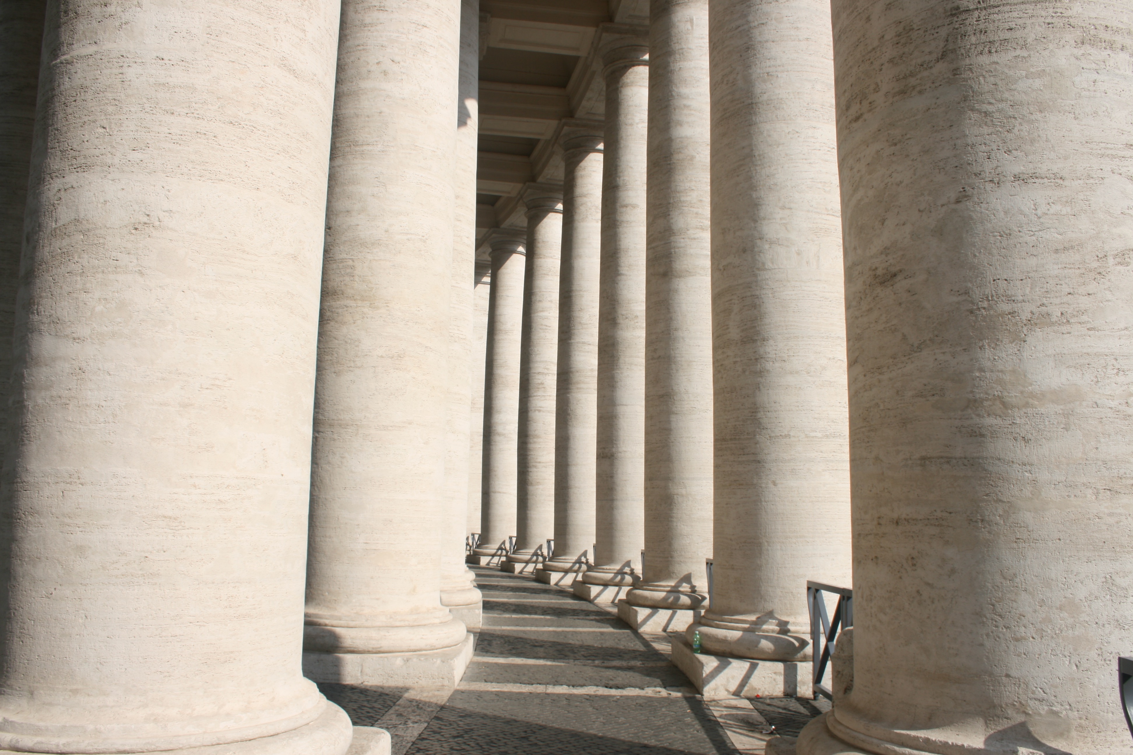
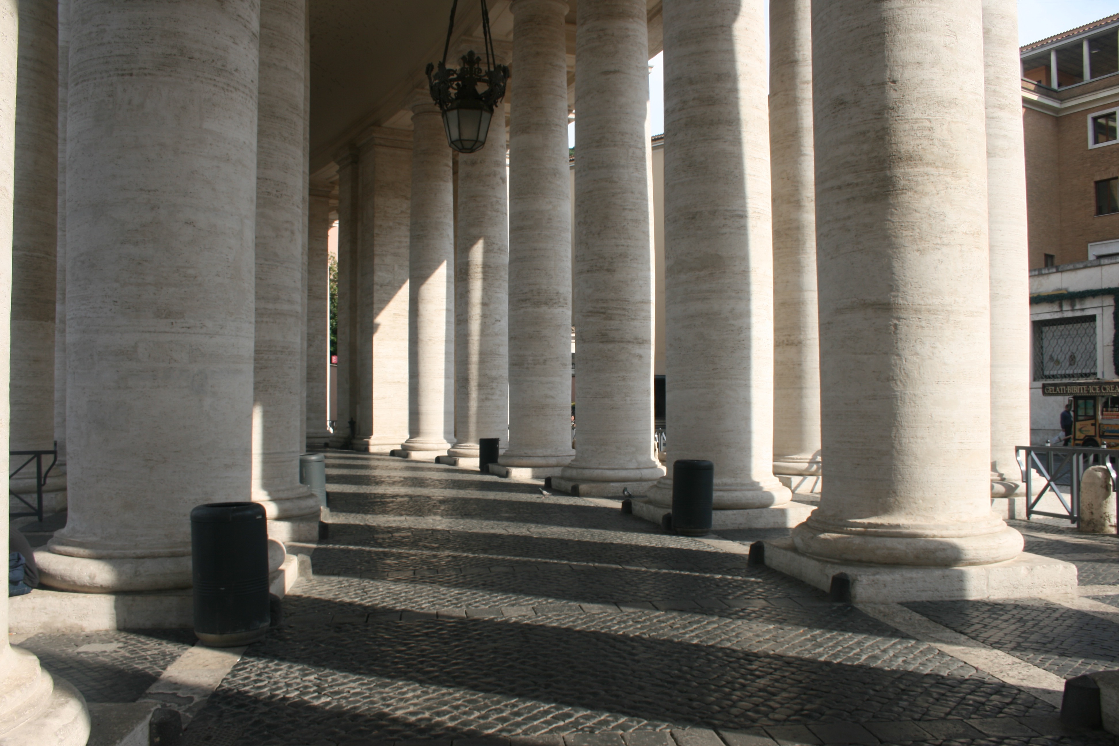
In the next two, I have captured the Colonnades that enclose St. Peters Square. The colonnades define the piazza. I really like these two photographs, the lighting working very effectively to create a domino-like effect. We see the large, marble columns spiral around the corner out of sight which leads the eye throughout the composition of the photo. There is a great balance of light and dark here, splitting the image into separate segments. Furthermore, another beautiful lighting display is presented on the clean brick floor as a zebra-crossing effect is created. The shadow of each pillar generates a striped pattern which is quite intriguing. 

In these 3 photographs, I have tried my best to experiment with lighting, focusing on light and dark rather than direct content. The first photograph, again, depicts the Saints Statues within St. Peters Square. These Statues that lay ontop of the Collonades were directly infront of the sun, and consequently created some beautiful, angelic silhouettes. The way in which we are looking up to the Saints from a Low angle, almost creates some religious imagery as they appear to be above us in heaven. This is supported the the bright sunlight behind them that shines into the camera suggesting an opening in the sky. This photograph came out really well and I think it is one of the most successful pieces from the shoot. The following two photographs were taken within the Pantheon. The Roman Pantheon is the most preserved and influential building of ancient Rome. It is a Roman temple dedicated to all the gods of pagan Rome. As the brick stamps on the side of the building reveal it was built and dedicated between A.D 118 and 125.The original use of the Pantheon is somewhat unknown, except that is was classified as a temple. However, it is unknown as to how the people worshipped in the building, because the structure of the temple is so different from other traditional Roman temples.Probably one of the most fascinating features of the Pantheon is the Architecture. The dome would have been built to look like the heavenly sphere of all the gods that the name Pantheon evokes. The highlight of the site is the hole in the center of the domed ceiling, otherwise known as an oculus. This was an engineering gem of the Roman world. No oculus had even dared come close in size to the one in the Pantheon. It is still lined with the original Roman bronze and is the main source of light for the whole building. This was one of my favourite sites within the city and I wanted to include this magnificent oculus within my project. Consequently you can see it present within the second photograph which is quite abstract. I have stood directly below the hole in the ceiling and pointed my camera upwards, capturing the leaking light. This photo provides me with many illustrative opportunities to experiment with when I start drawing due to its abstract visuals. The final photo of this set is a statue of St Agnes. I like the way the lighting submerges the statues top half in shadow and the way in which a smooth texture has been included over the subjects clothing.

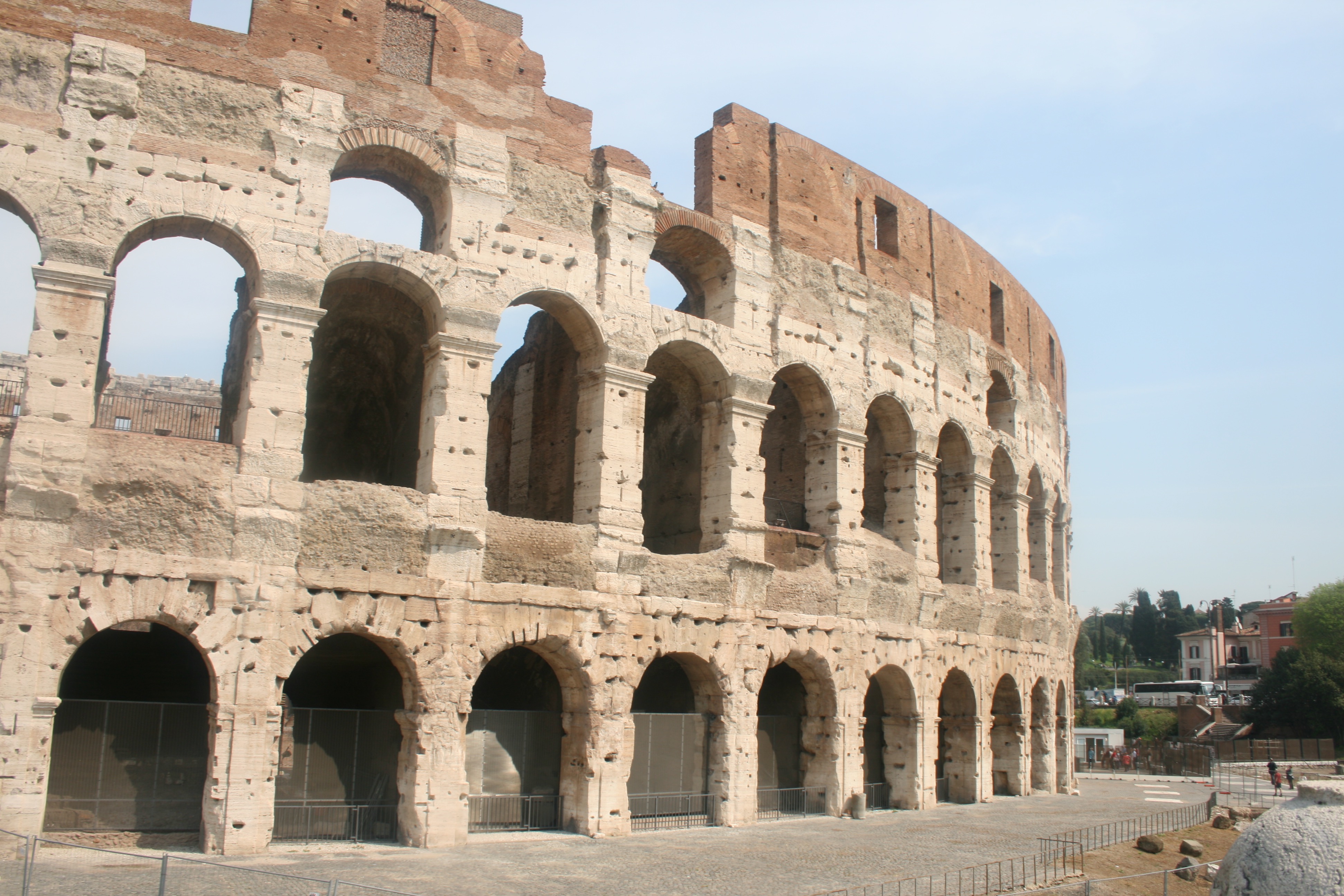
Finally, I have my photographs taken from my visit to the famous Colosseum. Located just east of the Roman Forum, the massive stone amphitheater known as the Colosseum was commissioned around A.D. 70-72 by Emperor Vespasian of the Flavian dynasty as a gift to the Roman people. In A.D. 80, Vespasian’s son Titus opened the Colosseum–officially known as the Flavian Amphitheater–with 100 days of games, including gladiatorial combats and wild animal fights. After four centuries of active use, the magnificent arena fell into neglect, and up until the 18th century it was used as a source of building materials. Though two-thirds of the original Colosseum has been destroyed over time, the amphitheater remains a popular tourist destination, as well as an iconic symbol of Rome and its long, tumultuous history. The Colosseum could hold, it is estimated, between 50,000 and 80,000 spectators. It was used for gladiatorial contests and public spectacles such as mock sea battles, animal hunts, executions, re-enactments of famous battles, and dramas based on Classical mythology. The building ceased to be used for entertainment in the early medieval era.

I think it is integral that I include the Colosseum within my project and study on Rome. This is due to my belief that it is the most famous building within the city and therefore Representative of its history and culture. I have tried to include a nice variety of responses for this landmark as seen above. The first image would be ideal for the drawing stage due to its simplicity and basic composition that would provide me with more freedom when drawing. Some kind of artwork could easily be implemented within the blank sky or upper quarter of the architecture due to its lack of texture or detail.  The photo is not fascinating but will serve effectively in its complete purpose. The second image is more generic and what we would typically expect from Colosseum photography. The picture features a full survey of the scene and we can admire the arena in its full beauty. Given that the site is so recognizable and identifiable within this photo, I think it would be ideal to consider it for further development. And then finally, I have taken a slightly different photograph that moves away from the grand, imposing scale of the stadium and focuses more on the mundane interior details. We see an archway entrance that reveals the colosseum interior like a window. The main focal point of this image is the lighting which works effectively due the way in which light is seeping through the archway and generating crisp silhouettes.

Symbolism: Beach & Ocean Pollution – planning

After researching the amazing collective work done by Angela Haseltine Pozzi, her team and the local community, I am ready to plan my own symbolic response to this pollution issue. I love this idea using art, made of recycled pollution, to spread awareness and how it is already being used as a successful proactive tool. However, instead of 3D sculptures, like the ones put together by the ‘Washed Ashore Project’ above, I will be creating 2D art pieces laid out and brought to life through my use of composition, angles and lighting. Because I already had the loose original plan to do this whilst still completing some of my previous shoots (when completing my beach cleans) I kept all the pieces of fishing rope and bottle caps I could find to later transform into emotive art.

I have decided to use these two specific materials one, because of their effect on the environment and marine life, and two, because I didn’t want to over-complicate my images and make the message too difficult to see. The reason fishing rope and netting are such a huge problem for our eco-system is, not only does it take at least 600 years to degrade, more than 260 animal species worldwide have suffered and died from being entangled in or consuming the material. The bottle caps, however, will be symbols of every plastic bottle that were discarded with them. Bottles used to package water take between 400 and 1,000 years to bio-degrade and if incinerated, they produce toxic fumes. It is estimated that over 80% of all single-use water bottles used in the U.S. simply become ‘litter’. As well as this it is estimated that 14% of all litter comes from beverage containers when caps and labels are considered, the number is considerably higher. In the contact sheets below I have depicted a few of my initial designs on how to put these materials together along with some other artist inspirations…My plan of action for this next shoot is to use the designs I have drawn out above, a ‘home studio’ and interesting compositions to capture this pollution issue in a colourful, eye-catching and insightful way. To complete this shoot I will be using the materials I have already collected during my previous beach clean ups, black fabric as the background and a mixture of artificial and natural light. My goal is to produce emotive outcomes portraying marine life and ocean scenes by only using the pollution we cover it in. I have decided to use a fish as the subject for this shoot because, much like with the sculptures from ‘Washed Ashore’, I want to put across that it’s the sea life that is most affected by pollution. The fish is the most common creature found in the sea, hence why I will be using to symbolise my message about marine life. To create fine details and make the subject stand out more I will also be using salt as an ocean themed artistic material. For the waves design, I am aiming to show that this problem is very condensed and will eventually effect ‘every wave in the sea’. I love the examples I have managed to find and present for inspiration on how to create this kind of inspiring art. When the element of photography is added to capture the subject properly, I think this idea will produce some really nice emotive outcomes.

The ‘Washed Ashore Project’ – Beach & Ocean Pollution Inspiration

Since completing my previous shoots, emphasising the issue of beach and ocean pollution, I next wanted to explore this problem from a symbolistic viewpoint. Using this same kind of stage photography that I have presented before in my project, I hope to capture meaningful and striking images wich will aim is to spark positive change in consumer habits. When deciding how to portray common beach/ocean pollution in an insightful way, my first instinct was to create pieces of art that tells the story whilst subtly putting to use the discarded materials. Before deciding on my designs, I found inspiration for this shoot from an amazing organisation dedicated to informing and influencing the public of this same pollution issue. The ‘Washed Ashore Project‘ is a non-profit community art project that brings pollution to life, awakening the hearts and minds of viewers to the global marine debris crisis.

Founder and artistic director, Angela Haseltine Pozzi, is a successful internationally exhibited artist whose expertise has led her to community involvement in multiple areas. Angela’s evolution as an artist shifted when she noticed immense amounts of plastic pollution on pristine southern Oregon beaches. As she learned more about ocean pollution from plastics and marine debris she became motivated to do something about it. Thus, the Washed Ashore Project was born. Angela decided to enlist the help of hundreds of local volunteers to clean up the beaches and use all the debris to construct massive sculptures of the sea animals most affected by the pollution. These sculptures now tour as the ‘Washed Ashore Project’ travelling exhibit, educating and inspiring countless people from diverse backgrounds to take action in their own lives to prevent contributing to this global problem. Her work continues as Lead Artist, designing and creating a multitude of sea creatures from the ongoing tonnes of marine debris with the goal to have a global impact. As the leader of a team of dedicated employees and hundreds of volunteers, Angela has vowed that this effort is her calling and “until we run out of plastic on the beach, we will keep doing our work”. Below are a few photographs taken as examples of these breathtaking sculptures that represent the sea life affected by plastic pollution…

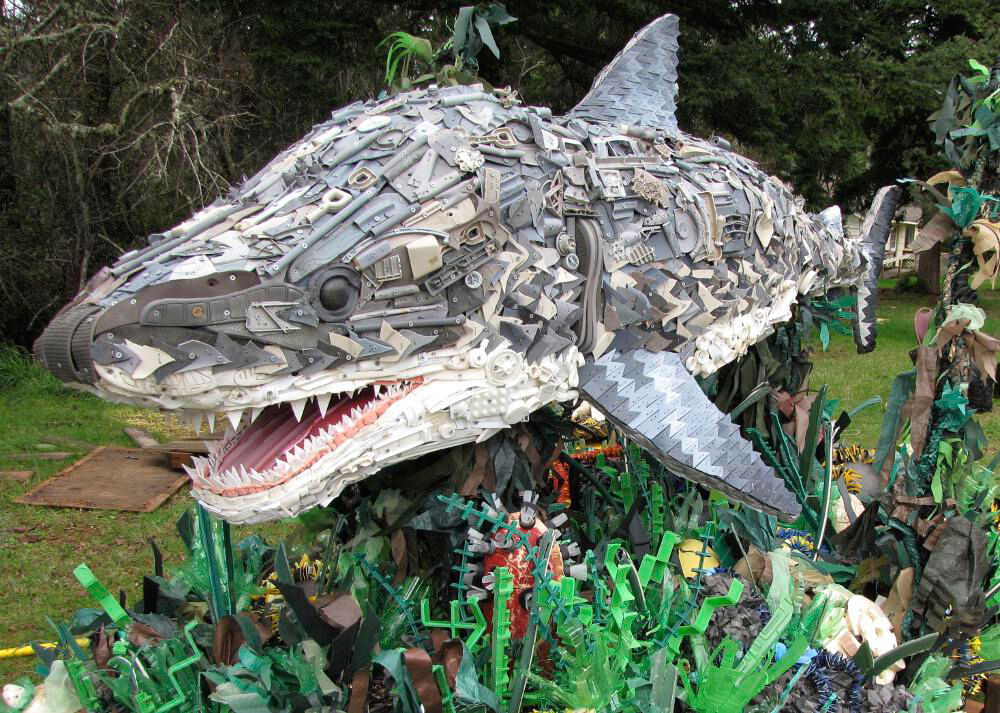
Above is a huge sculpture depicting what looks like a great white shark created using an array of different discarded materials. To put these masterpieces together the ‘Washed Ashore Project‘ volunteers collect rubbish that has been removed from beaches through community cleanups. This pollution is then washed, sorted and prepared for the creation process. Each sculpture is designed and directed by a professional artist and then formed through a collaboration of Washed Ashore team members, volunteers and students. The meaning behind these sculptures is to symbolically present our ocean pollution crisis and inspire change in our modern consumer culture. I love the use of small plastic items to collectively display such a textured and detailed masterpiece. The size of the shark and its surroundings, plus the sheer amount small and dangerous pieces of plastic collected from the beach, really make this piece something to think about.
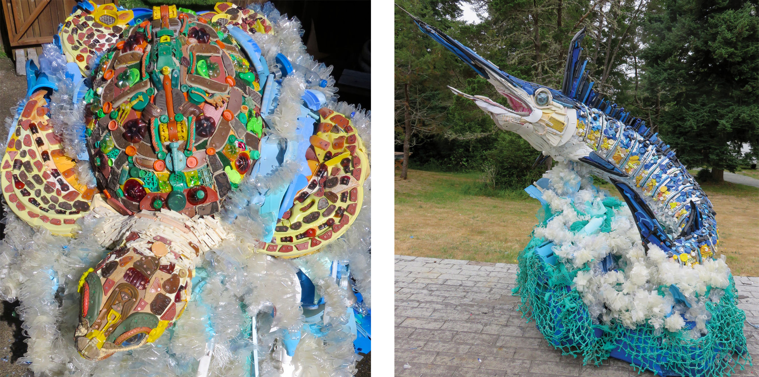
The next two photographs depict other transportable and inspiring pieces of art that portray a few creatures who are most affected by ocean pollution. The first sculpture on the right shows a carefully crafted sea turtle put together using discarded materials found on the beach such as water bottles, boots, shotgun shells, detergent bottles etc. The sculpture on the left depicts a Marlin fish created using things like sunglasses, toothbrushes, fishing lures and a toilet seat. I love the textured effect these creatures are given by being made up of such tiny pollution elements as well as the array of colours that can be presented. The size of these sculptures, along with their beautifully thought out structure, can definitely emphasise this pollution crisis and give the public a good idea of just how massive it is. All artists, volunteers and designers involved in the creation of these pieces will have been influenced by our current consumer culture. The sculptures’ construction is truly a community effort, with volunteers collecting, cleaning, sorting, and building the sculptures together.

Goussin and Hortense / Kim Preston – Ocean Pollution inspirations

Hortense Le Calvez & Mathieu Goussin:

Goussin and Hortense are a french duo working together to create their own freelance photography business known as the ‘Forlane 6 Studio’. Hortense Le Calvez was born in 1988, she studied at the Rietveld Academy, Amsterdam and graduated in 2010 from Wimbledon College of Art in London. Mathieu Goussin was born in 1985, he studied at the National School of Merchant Navy in Marseille and often works on large ships as a mechanical engineer. Together their practice explores themes of ‘environmental dystopia’, ‘eco-anxiety’ and terrible human influences. Their water-based works depict irrational aquatic fictions in the form of sculptural installations. Currently, the pair live in Greece and work on their sailing boat turned home studio, Forlane 6. They have been exhibited in France and abroad, were shortlisted for the Coal prize Art and Environment and participated to several artist residencies with a strong link to the sea.

I chose to explore scuba diving artists, Goussin and Hortense, as inspiration for my own underwater shoot because of one of their collections in particular. This series concentrates on using underwater sculptors to perfectly portray our oceanic trash problem. These resultant images address this issue beautifully, using plastic streamers, garden furniture, old clothing, and bottles as well as highly controlled lighting. Submerged, the objects lose their lifeless plastic appearance and make a transformation into what look like living organic creatures. As they put it, “this weightless and slow aesthetic contradicts the usual way objects are consumed and disposed of in an inconsiderate speed.” Finding that strange space between reality and fantasy is very much part of the work, says Le Calvez. “We want to have an ambiguous image that maybe doesn’t read as underwater at first glance,” she explains. “We do find a lot of inspiration in existing sea creatures, from the bioluminescent plankton to the small fish mastering the art of camouflage.” Although each is unique, the duo says they’re always going for the same “post-catastrophic” aesthetic, “imagining the future of objects wandering in the sea, trapped in the plastic soup.” Below I have chosen two of my favourite images from this collection to analysis…

The meaning behind these images is to portray our oceanic trash problem by creating sculptures that look like living organic creatures. This, therefore, creates the sense of a bleak future for oceans and represents how we are ‘replacing’ marine life with deadly pollution. These pieces are clearly influenced by humanities modern consumer culture, and although beautiful, illustrate a very ominous subject. The first image on the left depicts a metal sculpture portraying a ‘jellyfish-like’ creature captured from just below the ocean’s surface. I chose this piece as an example as the reflections of light bouncing from the strands of metal create an amazing sense of movement. I also love the deep ocean blue tone of this image and the ripples on the surface really bring the scene to life. The next photograph on the right is a much lighter and softer version of the same kind of creature, this time made from thin strands of blue plastic without the surface of the water in sight. I love the soft tones and colours of this photograph along with the calming rays of sunlight streaming through the composition.
Kim Preston:

Kim Preston is an Australian based photographer with a background in fine art and experience in the working life of a digital art director. Preston covers a range of subjects with her work from small illustrations to help engage children, to a high-quality photographic series on the perils of plastics accumulation in our ocean. Regardless of the medium or the platform, her aim is always the same; to create unique content which clearly and effectively communicates with the viewer, educating and inspiring them. Kim Preston’s current work is a variety of fashion, beauty and commercial Photography, using high contrast and unsaturated colours. She enjoys capturing honest emotions and tries to avoid true centring when framing her images. Growing up in Pasadena, CA Preston attended Cal State Northridge where she received her BA in Photography.  In 2009 she was published in Cosmo Hong Kong and Sure magazine Korea. In 2010 through 2012 she has been in 5 shows in Los Angeles, San Bernadino, and New York.

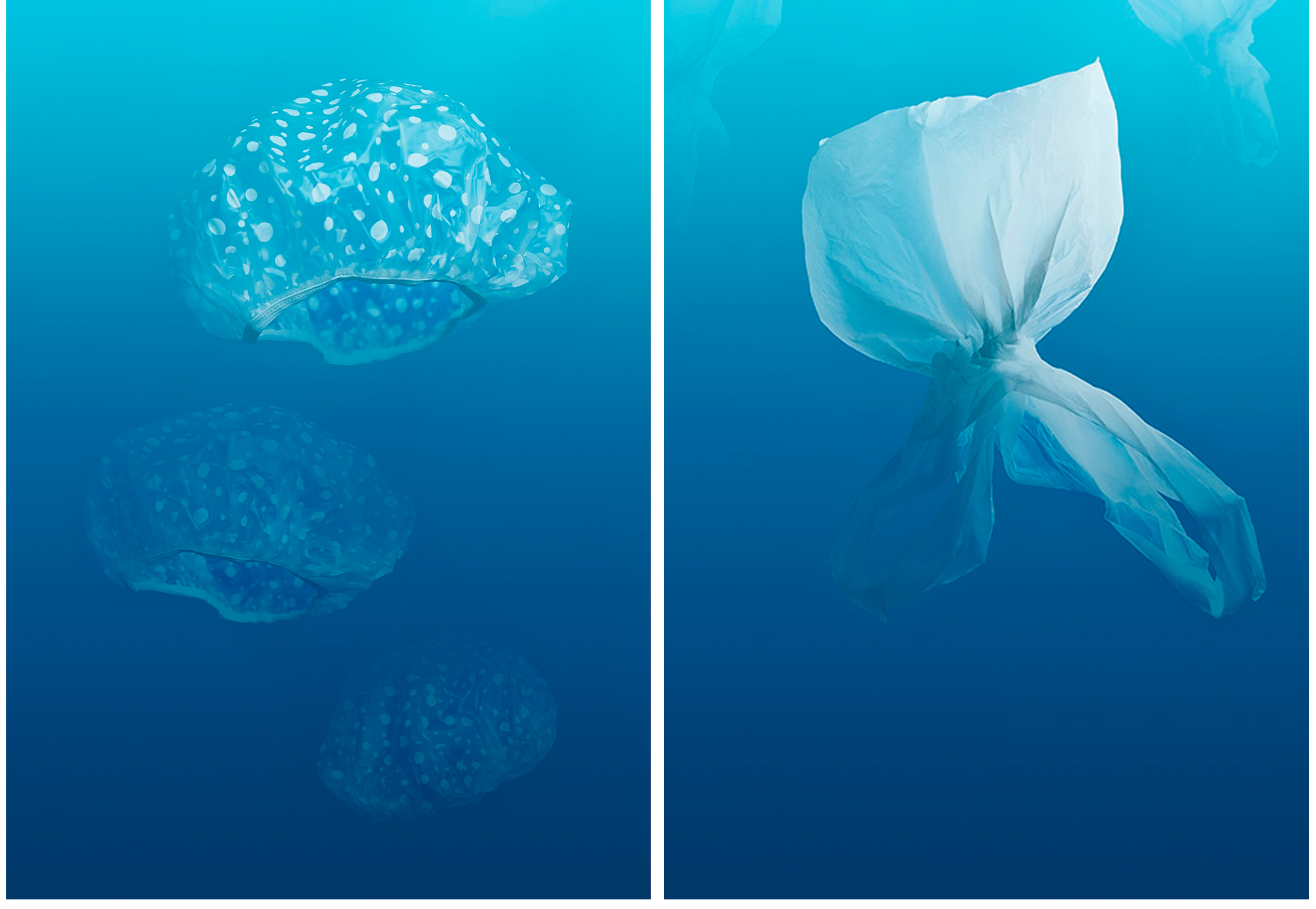
The reason I have chosen to use her as an inspiration for my next shoot is because of her beautiful and appropriately named photography project, ‘Plastic Pacific’. This series explores the devastating impact of plastics accumulation in our oceans by transforming everyday household objects into the sea creatures choking to death in the ‘Great Pacific Garbage Patch’. Surprisingly this collection was actually made by Preston as part of a school assignment that expressed her concern about the ‘trash vortex’ of the North Pacific Ocean. In 2012 it won the  ACMP Student Photographer of the Year (Advertising) award and was immediately picked up by several online publications, both of photographic and environmental interest. Because her images are so eerie and strangely beautiful, she states that her hope “that they will engage viewers who would otherwise be turned off, or even somewhat immune, to the more obviously depressing reality.” Preston feels that art is the perfect medium by which to inspire independent thought and give the viewer pause to reflect and question what they think they already know. Below are two of my favourites from this amazing collection…

Much like with the work of Goussin and Hortense these images represent a bleak future for our oceans by creating seemingly living organic creatures from common household pollution. Again these pieces were influenced by humanities modern consumer culture, as well as being particularly inspired by the catastrophe of the ‘trash vortex’ in the North Pacific Ocean. The first image on the left shows basic shower caps floating together like a perfectly framed swarm of jellyfish in the vast blue ocean. I love the simplicity of the subject matter in this as, although it is obvious what they are, the shower caps are brought to life by their perspective, depth, and shape. The next image is of a plastic bag tied at the bottom to create the shape of a fish. I love the perspective of ‘the fish’ swimming away and the gradient of dark to light blue in the background, much like you would see in the ocean. I believe these types of photographs will be great pieces of historical evidence in the future, either to state our acknowledgement of the changing world or how we managed to save it before it’s too late.

Other Inspirations – Steven Hirsch:

As well as these amazing artists above, I will also be looking back at the work of a previously researched photographer, Steven Hirsch, for inspiration in my next shoot. This is because of his influential project, “Gowanus: Off The Water’s Surface”, and its perfect representation of depicting interesting and alluring water pollution through photography.

I love the way Hirsch has taken something so horrible and turned it into something beautiful, thus subtly informing the public of their society’s environmental problems. I hope to use this technique for my next shoot, representing pollution in our oceans as something intriguing and beautiful that will catch the viewer’s attention. Although I know I will not see any toxic waste (like there is in Brooklyn’s Canals) in Jersey’s seas, I hope to create these same kinds of beautifully abstracted pieces, of this very unpleasant ocean pollution subject. Below I have chosen to present again, four of Steven Hirsch’s images as a reminder and inspiration for my next underwater shoot.

Documentary: Beach & Ocean Pollution – planning

My next topic of documenting our islands pollution will be focusing on our beautiful, yet tainted beaches and seas. With 45 miles of coastline, Jersey beaches are considered to be some of the best and most varied throughout the British Isles. However, we are no exception to the growing worldwide issue of beach pollution produced by the gross amount of waste dumped into the ocean each year. These next few shoots documenting this problem will be a straight photography style approach to expressing and representing our islands beach pollution.

Beach pollution is a persistent problem, in 1995 alone nearly 4000 beach closings and advisories were issued by the state and local governments. The litter that is swamping our oceans and washing up on beaches kills wildlife, looks disgusting and is a hazard to our health. It is estimated that there are nearly 2,500 items of rubbish for every kilometre of a beach. These items mostly consist of plastic waste which has increased in amount 140% since 1994. This is especially hazardous since plastic will never biodegrade and will eventually break down into tiny microplastic particles investing the water. The main types of beach pollution include wet weather discharges, the public, discarded fishing equipment, and sewage runoffs. The biggest source of pollution in the ocean (and therefore on beaches) however, is directly from land-based sources, such as oil, dirt, septic tanks, farms, ranches and motor vehicles. Even though much of the trash and waste dumped into the ocean is released hundreds of miles away from land, it still washes up on beaches and coastal areas and affects everything in between. Every marine animal is affected by man-made chemicals released into the water. — Below are some examples of my previously taken photographs showing beach pollution, and below that is a contact sheet of the kind of images I am hoping to create in my first section….

Although I do like a few of my images shown in this small collection above, I do not feel they show beach pollution ‘on a whole’ as well as they could. This shoot was not planned and was simply aimed to experiment with what kinds of objects I can expect to find, and how to get across my message by photographing them. The results have taught me that in order to show the scale of common beach pollution I must come at this from a different angle. Since then I have been inspired to complete my own beach clean-ups, showing what I find, collected together in one powerful photograph. When looking at ocean pollution I will visite one of these same beaches a few weeks later, using the trash accumulated there to create interesting underwater photographs.

Although the fact I am tampering with the subjects, compromises this next shoot as a part of documentary photography, the truth of how much pollution is on just one beach will be evidently clear. To complete this first beach pollution section I will begin by simply visiting some of Jersey’s popular beaches to determine wich will be the best to get across my message. Although I am unsure of which beaches will be featured, I plan to look at smaller beaches to emphasise how such a confined area can demonstrate so much pollution. All I will need to do this shoot is my camera, some trash bags, gloves and natural light from the sun. It will be interesting to see how much of this waste I can find to support my point of this being a massive and overlooked pollution issue. For the ocean pollution section, I will be trying to create meaningful photographs of rubbish found in our beautiful seas from an underwater perspective.  This will hopefully emphasise the issue of beach pollution and how it affects marine life and the environment. To do this I will simply be using real props found on location and my iPhone with and underwater phone case. Below is a contact sheet of the kind of images I am hoping to create for the first section of these shoots (minus the people). For the underwater photography, looking at ocean pollution, I will be exploring my inspirations with a couple of artist researches before I complete the shoot. 

Environment – Artist Reference 1 – Carlos Spottorno

Carlos Spottorno


Having confirmed a plan in producing photographic responses to my travels throughout the Mediterranean, I wanted to investigate some methods in making this kind of photography more original unique. As discovered in my previous blog post, the genre of Travel Photography is now very crowded due to its accessibility and ease of involvement. There is little originality in documenting the landscapes and atmospheres of foreign locations as it can essentially be done by anyone. Consequently, I may have to indulge in some peculiar methods in order to make my work more personal and distinctive. With this plan in mind, I began looking at the work of Carlos Spottorno. Carlos Spottorno is a Spanish documentary and Travel photographer with an artistic background who has focused his main personal projects on subjects related to power shifts, economy, and social issues that shape the real world. Born in Budapest in 1971, Spottorno has travelled all across the globe, generating editorial, commercial and personal projects that possess some fork of message or deeper meaning.

One of his projects called “The PIGS” bears some visual resemblance to the work I am producing due the synonymous European environments explored. For this project, Spottorno intended to capture Portugal, Italy, Greece and Spain through the eyes of the economists. PIGS is a term coined by the business and financial press as a way to refer to Portugal, Italy, Greece and Spain during their current financial plight. These countries are all united in facing vast loss in historical prominence and are hence grouped together under this banner. What started as a pejorative label used by neoconservatives, mainly from English speaking countries, was eventually taken up for some time without any qualms by the media. Excessively high levels of public and private debt, government deficits, a property bubble and very disappointing political and economic policies, have put the PIGS in the crosshairs. It is alleged that the PIGS won’t be able to bear the pressure of sharing a common currency with their stronger European brethren. Spottorno states:

“I have often asked myself how, after so many centuries of splendor, could these countries have come to their current destitute state. What happened to Greece, the cradle of Western Civilization? What became of Italy, heir to the Roman Empire and endowed with one of the richest artistic heritages in the world? What went wrong with Portugal, the first global naval power in history? At what point did Spain and its empire, on which the sun never set, see the onset of their decline? I believe the root-cause of our countries’ current sorry state of affairs is to be found in the distant past. Issues that for many centuries piled up on our doorsteps are now rearing their heads and plain to see.”

Spottorno continues, arguing that the PIGS view themselves, rightly, as the architects, and as the stem cells from which the idea of Europe developed. Southern Europe resists admitting its loss of political stature in the global political arena, seeing itself as the wellspring of Western Civilization. Spottorno sees The PIGS as old, cynical and individualistic countries. I think this is a really interesting concept, and I something that I have frequently thought about in the past. Its quite staggering how these countries were formerly, some of the most powerful and dominant forces on the planet and now are simple, weak shadows of these former identities. I think that Spottorno had an excellent lead for a photographic project here, due to the passion he had behind the project. He attempts to illustrate the stereotypes brought up by the term PIGS. In other words, what we would see if we were to translate into images the articles we read in the financial press. He intends to present how he imagines economists perceiving these countries. The result is a collection of clichés, some true and incomplete. The same way a travel guide carefully avoids anything seemingly unattractive, this book shows much of what we find embarrassing, oftentimes rightly, and at times unfairly.  What stands out the most is the glaring absence in these images of all that is positive, beautiful and promising in these countries.

In this photograph, we see a young gipsy holding his horse after cleaning it. In some parts of Portugal, like in other european countries it is still possible to see working horses in urban context. Nomad gipsies settlements are in the middle of town, generating sometimes troubles between them and the other people living in the areas. They are accused of being dirty and chaotic, besides dealing with drugs and crime. This is a clear highlight of the plight endured by Portugal and he transformation experienced through history. I like this photograph a lot, a powerful composition evoking a lot of emotion. The boy and the horse are stood central dominating the frame and drawing the attention of the viewer. Nevertheless, in the background, we see the urban landscape, a  white blocky building providing the context and message. The building features an interesting lighting setup as certain faces are shrouded in complete shadows and others in complete light. A nice contrast is created that doesn’t distract from the subject and his horse but ensures our eyes naturally meet this component.
Carboneras, Almería: hotel “El Algarrobico” was built in a protected Natural Park with the complicity of local authorities. Popular activism and the pressure made by Greenpeace stopped the project, although after a decade of legal activity it has not yet been demolished. Nevertheless, It’s interesting, though, that many locals would like the hotel to start operating, and revitalize the poor local economy. This photograph is really interesting as we see a lot of opposition and clashing of certain messages. Typically we associate tourism with lush landscapes, clean architecture  and bright, vivid colours. However, within this photograph this idea of tourism which is ushered in by the family sat upon the beach, is conflicted by the surrounding landscape. This abandoned hotel that still remains to be demolished is just sitting there, whilst the dingy colours of the surrounding environment produces quite a depressing tone. We truly see the repercussions of this failing economy and stereotypes surrounding Spain have been challenged.

The photographs within the PIGS project represent, visually, my initial intentions for this study. The photographs concentrate primarily on the landscape and significance of the local environment which is what I wished to do as well. They occasionally feature a subject within the foreground who can provide context and intrigue surrounding the narrative. Nevertheless, my travels around the Mediterranean do not possess the same kind of depth and meaning that Spottorno has here. The reason why the PIGS project is so successful is due to the direct, concentrated proposition organised by Spottorno. He has discovered something that he is passionate about and ensured absolute focus upon this for his photographs. On the other hand, this kind of depth or internal meaning is absence from my work, meaning minimal focus would be achieved on my shoots. This is why I would like to find something more unusual for my work, and fortunately Spottorno has another project that I would like to reference.

LA GRIETA / THE CRACK


In December 2013 reporter Guillermo Abril and Spottorno received from the assignment of preparing a series of stories about the European Union’s external borders. THE CRACK is Spottorno’s field journal as he followed the border from Africa to the Arctic with the aim of identifying the causes and consequences of Europe’s identity crisis. Halfway between a photobook book and a graphic novel, in as much as it uses narrative elements of the latter, the end result is not a story based on actual events: these are actual events. At the time the media’s coverage was focused on the migration flows in Melilla and the Southern Mediterranean. The great migrant exodus in the Balkans, and the attacks in Paris and Nice were still a long ways in the future. The war in Ukraine seemed to have stabilized, and the United Kingdom hadn’t yet voted to leave European Union. These and many other events would take place over the course of time it took them to cover their assignment, which took them all the way from Melilla to the Arctic. After three years working on the story, several covers, dozens of pages in magazines, and a World Press Photo, the authors set out to convey, with the 25,000 photographs and 15 notebooks they had compiled, the story of what is happening on the European Union’s borders, making use of an innovative narrative form.

This project is a perfect example of how to present Travel Photography in an innovative and original way in order to separate it from the crowded genre and boring photographs. Spottorno has borrowed the aesthetic of comic-book art presenting his images upon paneled pages with a typical comic-book filter employed onto the images. The pages feature speech bubbles and narration boxes, just like a comic book would, enabling a narrative to be told. The idea is very imaginative and a good representative of the originality I intend to capture for my travel photography. By presenting the images in this way, Spottorno is provided his travels around the globe with a story and sense of progression. The portfolio becomes more than just images, and Spottorno has created a professional and sophisticated final product. This is something that I would like to replicate for my Environmental project, essentially utilizing the travel photograph as a backdrop for something greater and more creative. Whilst the visuals of the PIGS project can still be echoed, I would like to incorporate an individual style through the editing stage, perhaps taking advantage of my artistic abilities as I have done in the past. The next stage is to try and think of an concept i  manipulating my shoots that is original and individually relevant.