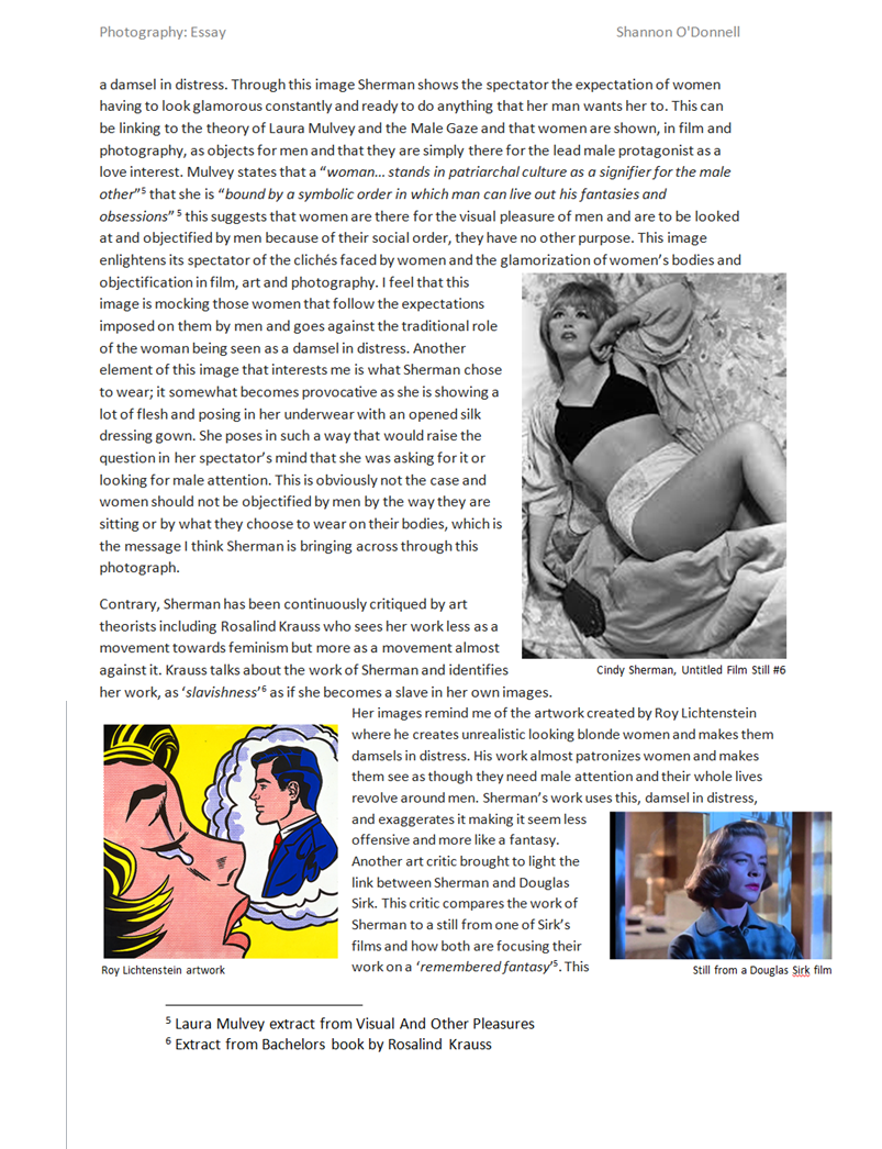
Making My Photo-Book
1. Printing off images
I have now taken all of my images and selected the ones that I want to print off.
Gareth has kindly agreed to let me use the photo printer at the Société Jersiaise Photographic Archives to print off my images. Therefore I will spend a few hours over the next couple of days getting all of my images printed off.
2. Choosing the Paper
I had to decide the type of photo-paper I wanted to print my images on. I was given the choice of three different types of paper; matte, smooth-pearl, or gloss. The style of all of the different papers are as follows .
Deciding the right type of paper to use is very important because it affects the appearance, style, mood and feel of the images. What paper my images is on is therefore very important because it
1.Gloss Paper
- very shining surface
- smooth texture
- high colour saturation
- good for commercial/promotional images
2. Matte Paper
-
coarse, grainy texture
-
not great for printing out colour images
-
most expensive due to the way it is made
-
gives a very rustic, natural feel
-
seen as the most professional and highest quality
-
not vulnerable to being marred by fingerprints and it produces a non-glare
3. Smooth Pearl Paper
-
‘in-between’ of Gloss and Matte Paper
-
‘fine-art’ paper quality
-
some (but low) gloss
-
widely used in photo-books: seen as more traditional than matte paper
I have decided to go for Smooth Pearl Paper because felt it was a nice balance of the two paper styles. I didn’t think the style of images that the matte paper produced would work well for the type of photographs I had created. The coarse texture of matte paper, along with the fact there is no gloss means that the images would be slightly blurred and dull in appearance. This is acceptable if the
At the other extreme, gloss paper in my opinion would have over-saturated my images, and in general I do not like the glare it creates as it would be very overbearing on the page, taking away from the subtle and reflective nature I want to maintain throughout. I also find that gloss paper really compromises the quality of the images, to the extent that it makes the images look to commercial, lacking any degree of subtly and sensitivity.
Smooth Pearl paper on the other hand ensures that my images are sharp and of good quality, whilst keeping a very simplistic and basic feel /appearance. Upon reviewing a test print I really liked the clarity of the printing, the photograph was very smooth and flowed easily on the page. This paper thus ensured I would be able to print out my images in mass, knowing the quality and saturation of the images would remain consistent.
3. Printing off
I started the printing process of yesterday and am about half-way there. Here is a step-by-step guide I am using to print my images off…
Part 1 – Designing
- Transfer the images to a TIFF format at a resolution of 360
- Go to Abode Bridge a select all the images you need.
- In Photoshop, open a document file and apply the images into it accordingly – set it to A3
- The images are separated by different layers – activate the ‘auto-select’ button beforehand and each time you select an image it will automatically transfer to that layer
- Toggle the image size to how you want it by adjusting the corners using the shift key
- Move the images around dependent
Part 2 – Printing
- Go to file + print. Customise the printing settings to make it specific (see screen shot below)
- Place the A3 Printing Paper in alignment to the right-hand side of the printer
- To print select ‘proceed’ and review on print preview (if not happy cancel and re-do this process)
- When happy select ‘print’
[UPDATE – I HAVE DONE 2/3 OF THE PRINTING + HOPE TO PRINT THE REST OF BY THE END OF FRIDAY]
4. Trimming the Photographs
Now I have printed off all of my images I will need to begin the process of trimming these prints down to the right size, to then place inside my photo-book. I have agreed that two different format sizes will work well in this instance – 10 x 15cm + 13 x 18cm. As I discussed with Gareth, getting these sizes perfect isn’t crucial as the merits of a hand-made style of photo-books is that I have room for error and that an anomaly isn’t always a bad thing.
To cut the images out I will use a standard A4 paper cutter. Beforehand I will need to ensure the following ………
- the grid-line is straight and secure
- the blade is sharp
- the paper is fastened in properly beforehand so that it does not move/jam during the cutting process
- have got to right measurements and cut to the markings
4. Selecting the Photo-corners
I want to use photo-corners in this photo-book to tie in with the old fashioned photo-album design I am trying to replicate. Therefore a key consideration in the process of selecting photo-corners will be to chose an old fashioned design.
Ideally (like the photo-paper) I am looking for a design which is a balanced in terms of what it adds to the page. I am aiming for my photo-corners to be a basic and simple design which blends in subtly into the page, not taking the viewers attention away from the images. At the same time I don’t wish for them to be too weak and they need to have a certain presence to them that supports but importantly, does not overpower the images.
Once I have done all my prints I will then buy some photo-corners. My instinct is to buy simple brown photo-corners which are slightly larger than standard white/black photo-corners. This subtle and neutral colour with give my images fairly established presence that is old fashioned to provide a nostalgic connection. Nevertheless I may change my mind as I have printed off. I will also discuss this with Gareth and ask for his opinion.
5. Choosing my Order + Presentation
I went through my photo-sequencing with Gareth down at the Photographic Archives. We laid my 40 final images on a big table and played around with the order. I found that there was a lot of advantages of working with photo-sequences using real-life prints oppose to using a computer screen. It was much more visual and interactive this way and allowed me to connect and make links much clearer. It was also easier to change to order around without the restrictions of a computer screen. The sequencing took about 45 minutes do to properly. I am happy with how it has turned out.
6. Sticking the images down
To stick the images down in my book I am using self-adhesive photo-corners. My method is to put one photo-corner in first to use this as a guide to get all of my other photo-corners straight. It was quite a long and fiddly process but I am happy with the way that it turned out
7. Captions
I have kept the style of my captions very simple, including only occasional captions – a few words/sentences expressing simple and basic thoughts which help link and flow aspects of the narrative together. I find it makes my work more personal and allows my own thoughts and ideas to subtly impact/guide the viewer in the way they perceive the story.
Typology Idea
The focus of my essay is the Bechers and their Typologies, and so to respond to their work I decided to do a Typology with the houses on my estate, as when they were built, they were all built with the same blueprints, although half the houses were built with the garages on the right and the other half are mirror image layouts of those houses. These houses have evolved over time, as the people who have owned the houses over time have made changes to the doors, windows, paint, extending the houses etc.
I wasn’t able to photograph all 50 houses on my estate, as some houses were built on a slope and so were awkward to photograph. This is because I photographed all the houses from a higher angle by using a ladder, I have taken this from the Bechers rules of photographing, as they would usually use special scaffolding to photograph all the industrial buildings at the same angle.
I have now gone through the images I took and have picked the best photo of each house I photographed, I got 8 images of houses where the garages were on the left side, and 11 images of houses with the garages on the right.
From these images I will make two typologies, one with the images tagged green, and one with the images tagged blue. I will also experiment with both colour and black and white versions of these typologies.
FINAL ESSAY
How is the work of Corrine Day and Phillip Toledano autobiographical?
“Good friends make you face the truth about yourself and you do the same for them, as painful, or as pleasurable, as the truth may be.” – Corinne Day, Diary, 2000
An autobiography is an account of the life of a person written by that person. In other words, it is the story that a person wrote about themselves. In this essay I will be evaluating the work and reputations of Corinne Day and Phil Toledano, and how their work has an autobiographical element. Phillip Toledano has many projects of photography based work. However the project that attracted me the most was his work from which he produced a photo book – When I Was Six. This book is a very moving book, it draws you in with confusion and intriguing elements. When Toledano was six, his sister died. His family never talked of her again. But when his parents died, Toledano discovered a box in the back of their wardrobe. It was full of Claudias belongings, and of pictures they had taken of her. The box had been untouched for years and was made by Toledanos parents in Claudias memory. From this discovery sprouted and idea, a year elapsed between his discovery of Claudias belongings and finding the strength to begin When I Was Six. “It was almost hilariously miserable,” he says. “I’d take a picture, then I’d start crying. I’d go to sleep and then wake up, take some more pictures, and start crying again. It was just so exhausting, on a molecular level.” He eventually created a photography book called “When i was 6” – he was 6 when she died and he tried to remember memories of her and also things he was interested in in that period of his life.
“When I saw the pictures, she seemed so grown up, and that was so shocking to me, she was a real person. I guess it’s easy to think you’ve lost a baby than you’ve lost a person.” – Phillip Toledano
Toledano photographed multiple items of the box’ contents, These created beautiful images that draw you in with interest and contrasting lights. This work quickly started to become and show autobiographical elements by a documentation of Claudias belongings. Creating an untold story that the Toledano parents had withheld from Phillip for years. Some of the images i find extremely interesting, also the idea that these belongings of a sister Toledano has very little remembrance of intrigues me. What does he remember? what doesn’t he know? I love the way these images have been taken and presented aswell. A typical presentation would be just flat on a table and taken from a birds eye view. Toledano changed this and made the images of the objects interesting aswell, by using natural lights to create contrasting shadows and propping the objects up aswell as piling things up to increased perceived quantity but letting the eye only see the most interesting one. However the contrasting and strong natural light with created shadows makes the images look moody and mysterious, this I feel sets a great theme for the book. Some of the best images from this piece of work, I feel are the images of a lock of Claudias hair, a ceramic pig in a box and a pencil. Although these images may not seem or sound very interesting, I feel that they are some of the best in the book. The lock of Claudias hair is one of my favorite images, this is due to the whole aura and feel of the image. The color of the hair makes you try to imagine, what she looked like? How long was her hair? questions that we dont know the answer to by just perceiving this image. The hair represents the last piece of claudias body in this world, this whole concept is extremely creepy to me. Due to this exact creep and discomfort it has pushed this image to be one of my favorite. Another interesting image would be of claudias pencil. This photograph is very simple, this simplicity is what makes it great. The pencil is shown as half in the light and half in darkness, giving the photograph a moody and mysterious affect. Yet again the sheer simplicity of the image is one of its best characteristics, focusing the eye on the pencil and light contrasts alone. This type of image makes you wonder what the pencil was used for? Where is the text/pictures Claudia wrote/drew now? Are they inside the box aswell? Trying to imagine how her small hands and fingertips clasped round this pencil looked is the first thing which comes to mind for me when I see this image. Toledano seemed to do this with the majority of the images by making you question what the image represents and how does it make you feel? The majority of Toledanos images force your mind to wonder. Toledano also does this with the quotes shown in the beginning of the book – “I have only two memories of my sister,” he writes in the opening jet-black pages of the book. “Kicking the door of her room, screaming, ‘I wish you were dead!’ and on the day of Claudias death “Two policeman at our door, tall and official. Telling us there had been an accident…”. These quotes only bring a feel of complete heartbreak and regret. The emotions Toledano must has felt and is feeling for saying these terrible things to his sister must be horrific. The book twists and turns throughout, jumping focus from Claudia to Phillip. This is done by Toledano threading another, more impressionist, narrative through the book, evoking another vast, empty world into which he escaped in his sisters absence: a world of space travel, distant planets and far-flung galaxies – places that seemed impossible to reach and understand.
The work of Phillip Toledano has links to the work of Corrine Day – Diary, due to both of their autobiographical elements. These elements are thing such as documentations of lives and possessions, creating autobiographys for the piece of work it links to. For example, Corrine Days work for her photography book ‘Diary’.
Corinne Day is a British photographer whose influence on the style and perception of photography in the early 1990s has been immense. As a self taught photographer, Day brought a more hard edged documentary look to fashion image making, in which she often included biographical and raw edgy elements. Her best work, is in the photography book which is called ‘Diary’. The book is a collection of photographs spanning ten years of Corinne Days life. Focusing on many characters within her life, but mainly of ‘Tara’. Tara seems to be Days best friend and some of the photographs of her are really heart wrenching. “tara crying at home stoknewington 1999” is a photograph that really moves me. She’s looking straight into the camera smoking a rollup and everything about her face tells you she’s probably only on a two-second break from bursting back into tears. Throughout the book you’ve got some shockers in there from bloody knickers on the floor of an apartment to a nice looking guy in a cozy cardigan shooting up. You have Day herself smoking heroin and touching herself in bed and much more of the same theme. Some of Days best work within the book I feel are the images shown on this page. These images are very strong and moving images. For example, The image show at the top of this page – “Tara crying at home stokenewington 1999” is one of my favorite, as described on the previous page as a hysterical smoking session. The photograph of Tara pregnant is a gentle break from all the heroin and nudity to a simple shot of Tara in the reflection of a mirror, admiring her pregnant self. This image is a very strong one due to its sheer simplicity and gentle feel. The casting white light from the window brightens and lightens the image giving it a clean perception. The photography to the right of pregnant Tara is called “Tara wales 1997”, this image makes me smile because you can see for a change Taras sheer happiness and playful side. Kneeling on the floor wrapped in tinsel and what appears to be laughing, this image is yet again a playful and fun change to the hardcore drug seen shown throughout the majority of the book. Below is another photograph of Tara crying. Red faced and blotchy she is yet again crying hysterically over something that once again we do not know the reason. Throughout the book to counter these photos, you see Tara doing things like emptying the baby pool looking all purposeful and busy, covered in mud in the garden smiling having a smoke. They all have a kind of homely quality to them. Due to the way in which you are introduced to Tara, you may find that these photos genuinely make you smile for her, which gives you an inkling of how pulled into these peoples’ lives you suddenly find yourself. Halfway through the book you get slapped in the face with an image of Day sitting on a bed picking her nails and trying not to cry, the title is “Me after the doctor told me I had a brain tumor Bellvue Hospital New York 1996”. This image stops you in your tracks and you heart sinks but as you go on, you see her go down for surgery, recovering, being visited in hospital by her family, Mark and Tara. You feel genuinely relieved that your storyteller is ok and well enough to carry on the story
My own work is also similar to both of these photographers, and to showing an autobiographical element of my own life through my images and documentations. For this piece of work I decided on an idea called ‘The Box’, This idea comes from a ‘special box’ that I was given when i was born. This is why I linked my work to the work of Phillip Toledano because we both have the advantage of having a sort of ‘autobiographical box’. My sister was also given an identical one also. Throughout our lives, my mother has collected things from our childhood that have been of significant memory and has put them in the box. These things range from baby scans of us inside my mother, hospital bands from the day we were born, our first shoes, presents we were given as children and much much more. These objects in these boxes have become very special to us, and are restricted and hidden in chosen places in our bedrooms. My parents, particularly my mother doesn’t like anyone who is not family looking at these boxes, I’m unsure of the reason why but I
assume privacy reasons. I feel this relates me to Toledano as only I could tell this story as all of the objects in the box have sentimental value and memories related to them that nobody would understand apart from me, aswell as Toledano having the same situation presented in front of him when his parents died and he found Claudias box. I also decided link my project of work to another photographer Corinne Day her project Diary. For these images I tried to recreate similar images to Toledanos work in ‘When I was Six’. I was very pleased with how the images turned out. I also tied in a set of Corinne Days Diary inspired images that I have taken over the past year. These images are similarly linked to Corinne Days work in Diary because they are all based and taken in a party scene. The images I have taken over the past year have been at events such as festivals, parties and trips to town. These images are autobiographical because they are snapshots from my life taken by me. This therefore creates a link between my work, Corinne Day & Phillip Toledanos work. We all have links to eachothers pieces of work, perceptual similarities aswell as previously spoken autobiographical images. We all had the same bases and idea of documentation of something, an inspiration to tell a personal story. I enjoyed conducting this project because I discovered things that I wouldn’t have if I hadn’t conducted and perused it. I have grown to love Corinne Days Diary because The way she has created the book it feels as though you are apart of her community of friends and when the book finishes you miss all the characters and you read it again. Her work has also taught me to appreciate my friends more and all that they do for me. My favorite quote from Corinne Day is shown below, the work of Phillip Toledano has taught me to refrain from saying such awful things to my sister and to collect and treasure more items that I could add to my box that my mother has made for me.

My Shoot: Shrinking Violet
Possible introduction for my photo book: ‘I refuse to be a shrinking violet. I will not allow old tradition to consume my freedom and make me succumb to the societal norms that are expected of me.’ I made this quote up myself and thought that it would be good to have at the front of my photo book as this is something that many women say they aren’t yet they seem to contradict themselves by taking on the role of homemaker and taking care of the house. I think that the images that I have created will add to the sarcasm of my work and really reflect how I feel about the traditional role of the woman.
This shoot came from a short film that I made of my mum and her role within the household. I really took on board what she had to say and found it very interesting, which inspired me to come up with the idea for this shoot. One of the main points of this shoot is sarcasm, in a sense it is a parody of my mother and how she is represented. I find that the role of the modern day woman is still very much focused on old traditions and leaves women in an in-between of full-time work and full-time chores at home. Instead of women staying at home and doing all of the cooking, cleaning and food shopping they are now going out and getting jobs yet the expectation still lies solely on the shoulders of women to do all the cooking, cleaning and food shopping. I find it ridiculous that even in a modern society we still have these unfair expectations, women aren’t slaves and shouldn’t be treated so within their own homes. This shoot embodies my mother in a more glamorised sense as many people try to say that doing all of the household chores isn’t that bad and I wanted to add in the expectation built up and constantly pushing down on women of having to be perfect and to look beautiful all of the time. This notion of beauty and being perfect for a man is bizarre and something that no woman should think she has to aspire to. This shoot really tells the story of all women and brings a visual understanding to the expectations and limitations women are faced with in our Western world.
The reason that I titled this shoot ‘Shrinking Violet’ is because when interviewing my mum she used this term and while reviewing the footage and listening to the audio over and over this is what really stood out to me. It made me think about how women seem to automatically become shrinking violets in their own home, many women just accept that their role is to be the homemaker and shy away from the possibility of creating a more equal living space simply because it wasn’t the way that they were brought up. I feel that this can partly be a generation thing but my mum has always been an important figure to me and she does all of the cooking, cleaning and food shopping yet I don’t want to be the same as her and I don’t want to live in the same way that she does. Somewhere down the line, that shrinking violet changes her mind and realises that she doesn’t need to be the one and shouldn’t be the one to do all of the chores and to be a housewife. Nowadays most women have jobs yet a lot of those women still think that it is ok to do 100% of the chores and the housework. I like the title Shrinking Violet purely because I liked it and it seemed to really fit with what I am doing.
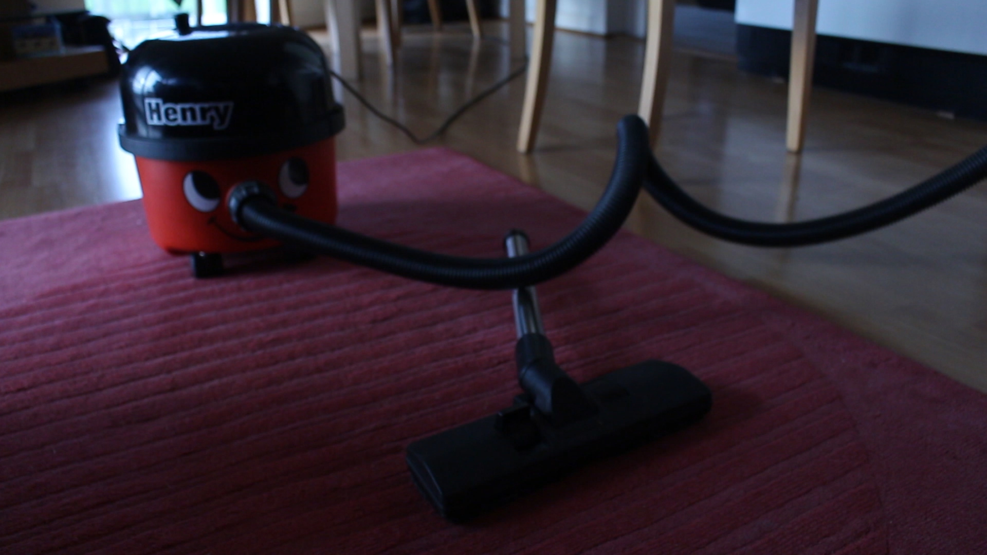
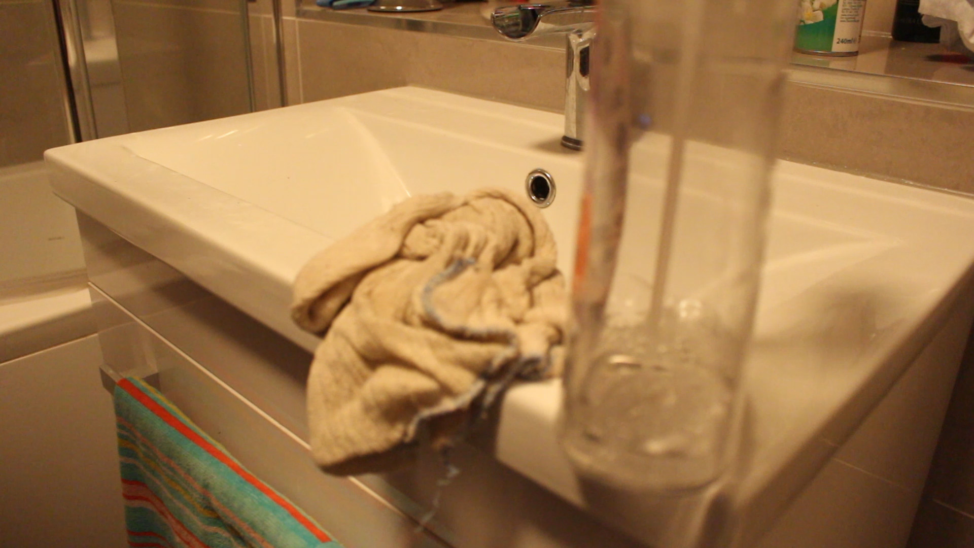
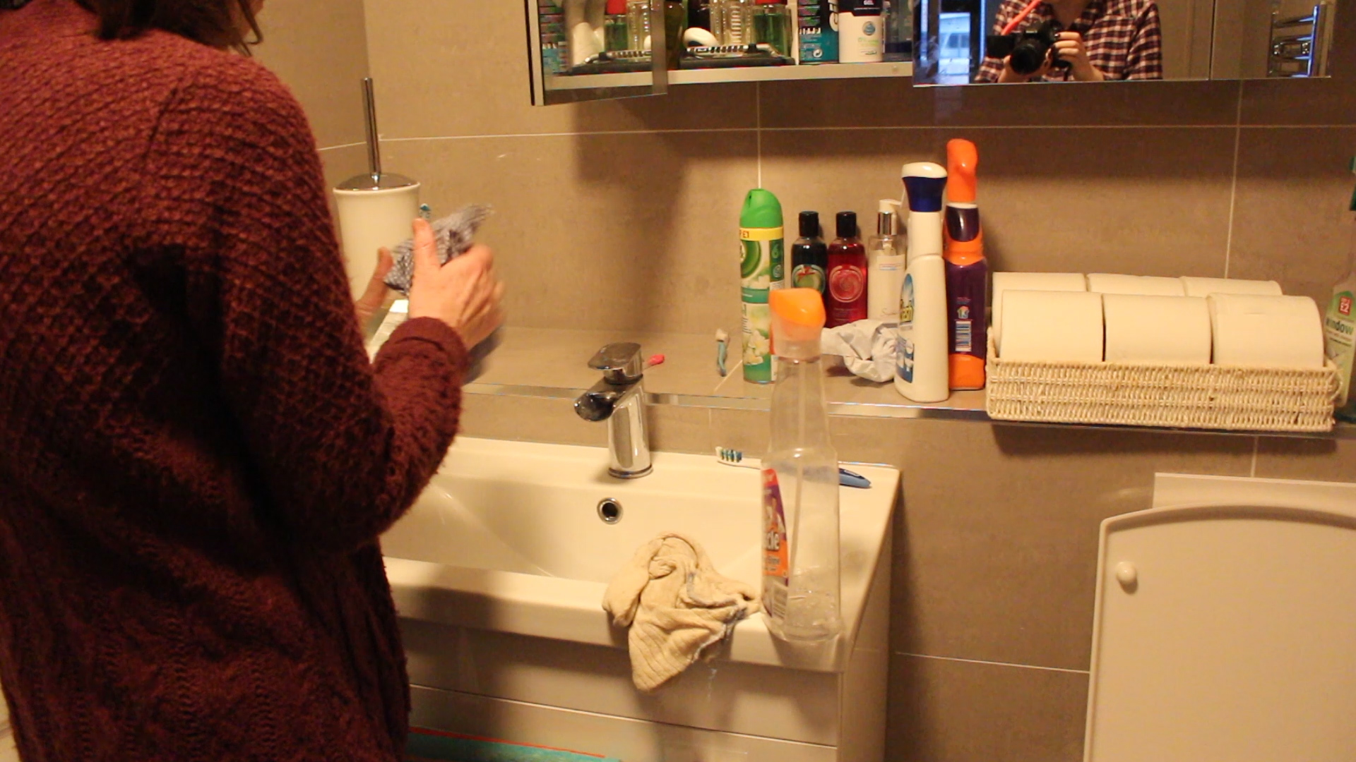
I made images around my house of cleaning products and parts of the house that you usually wouldn’t focus on. I wanted to show the little details of what is around my house and the usually boring elements of cleaning etc. I want to add these images in colour into my book to add more detail to my work and to show the reality of what goes on in an average household. Along with this I will be adding black and white images that I am in as they are the staged images and parody the traditional role of the woman within our society. I chose to make these images black and white so that they would stand out more against the coloured images and I just find that with them being in black and white the spectator is more able to actually focus in on the message behind the images and what the subject is doing rather than looking around the image and being attracted to different colours, leaving my spectator distracted from what I actually want them to focus on.
How I made staged images
Instead of going back and forth to make photographs being both the director and the subject of the photos, I came up with the idea to just film myself. This was so much easier as I was able to just stand still in the footage and change the position of my body and the direction of my head and eyes. I then put that footage onto Adobe Premier Pro and took screenshots of my favourite images. I then took to Photoshop and edited them all individually. I prefer Photoshop to Lightroom and although it does take longer I’m just used to editing my photos there. After editing all of the images and making them black and white I opened them up in Lightroom and began making my photo book. This was challenging at first as I didn’t really know how to use Lightroom but eventually I got the hang of it and made my final photo book which I am happy with. I am also very happy with the images that I produced for this project and feel that they have been done well.
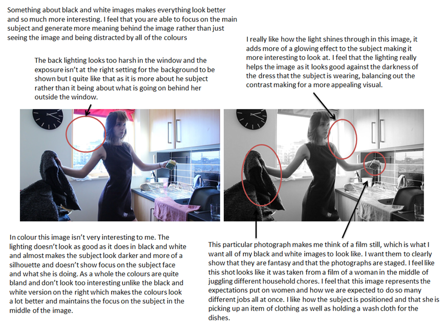
This is one of my favourite images in the whole series as it brings more detail to the spectator and really does remind me of a film still. I feel that this image is effective in black and white and adds to the mystery of the image. I took inspiration from Cindy Sherman’s Untitled Film Stills and how she presents herself within those images. She never really looks into the camera and always looks off into the distance in some sort of trance. I feel that my portray and version of this has worked well and really does portray my persona as a robotic traditional woman. I chose to compose my image at a bit of a lower angle and rested my camera on the worktop with a folded bag holding up the lens to the angle that I wanted it. I then recorded for a short while of me posing in similar ways to then take stills from to create images. This is my favourite still from this particular video. The facial expression of my persona looks very neutral and possibly unimpressed. As if I am unhappy doing what I am doing yet I still do it out of routine and tradition.
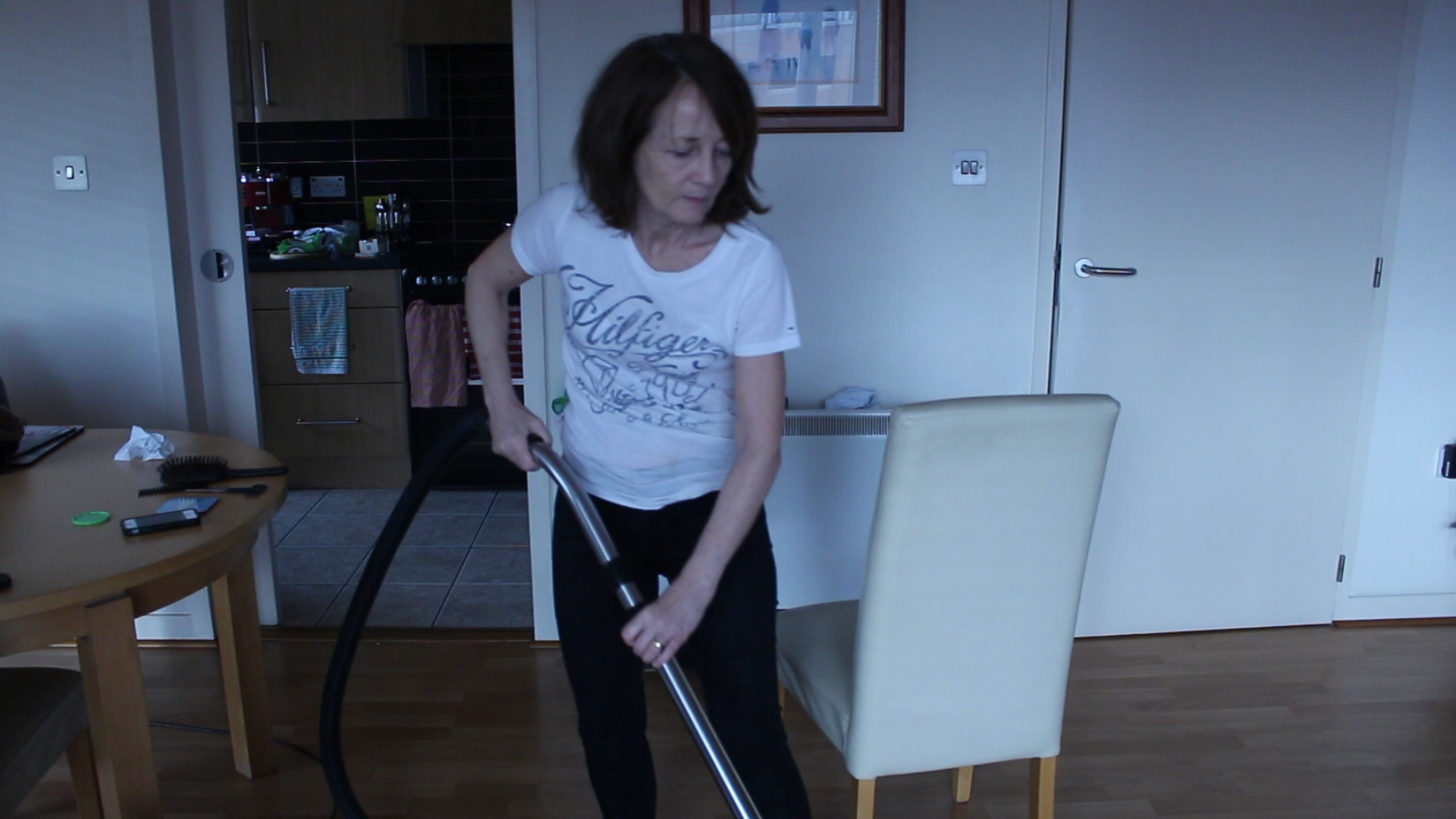
I wanted to explain this image more in depth. This particular image was inspired by some footage that I made of my mum while filming her for my short film. In the footage I found that my mum was always in awkward positions and always down on her knees to get every last bit of the house clean. I took that and wanted to make an image where my subject is stood in an awkward looking position. In this image I also wanted to try and represent how these women always seem to be juggling two different things at once. I also decided to look off into the distance as if it is systematic for me to be doing the chores and I don’t even need to concentrate to be able to do it. I really like this image and like that my persona is centred in the middle of the image with the two open doors either side of the subject. I wanted the doors to be open as I thought it would look better than it just being plain white in the background.
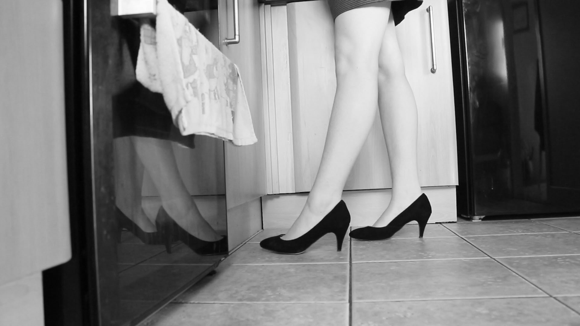
I wanted to make this image purely because it is different and not a usual photograph that you would expect to see. I wanted to have the subject in heels on one side with the other showing the oven and a tea towel in the shot to show how women are expected to be glamorous and to always be put together. I feel that women are faced with this expectation constantly and are always being put down and ridiculed if they aren’t constantly put together. This is one of my favourite images as it doesn’t show much of who is doing the chores but represents women that do. It allows my spectator to identify more with the persona and think of themselves in her shoes. I also like the light shadow that is at the top of my legs from my dress, it just makes the image more interesting. 
This particular image is heavily inspired by a shot that I got of my mum when making my short film for this project. I liked how it looked and wanted to recreate this with my persona. I find this image interesting, it almost looks strange too. It is odd to find a woman doing house chores in heels and a dress but that is the whole point of my shoot. I just really like this image and think that my spectators will like to look at it. I find that this shoot makes the mundane of doing house chores look a lot more exciting. I find that the position that the subject is in looks robotic and this is exactly what I wanted to portray.
Feeding the shrinking violet. I chose to have these flowers act as the shrinking violet because they are beautiful yet quite, obviously as they are flowers. I like this image as I chose to look away and make it seem as though I didn’t even know that I was feeding it which symbolises what many women seem to do. They allow themselves to take on the traditional role of the woman without ever challenging it or wanting to change the expectations placed on women. I like this image and the position of my persona as it looks as though I’m not even trying, again this is something that I feel women do. They just repeat the same old process and routine without even thinking about it, they become slaves in their own homes. I like the composition of this photograph and that it is a medium shot of my persona. I feel that the image is at the perfect size and angle to get the flower in as well as its plant pot as well as just enough detail of my persona to fit into the image too.
Image comparison | B&W vs colour


Final Essay
Essay | Source Bank
Sources | Books
– Bachelors – Rosalind Krauss
– The Complete Untitled Film Stills – Cindy Sherman
– Jersey Heritage Trust – Heritage Magazine
– We Should All Be Feminists – Chimamanda Ngozi Adichie
Sources | Online interviews [YouTube clips]
Interview with Cindy Sherman:
https://www.youtube.com/watch?v=tiszC33puc0
Sources | Articles
– Bloomberg Business review on Cindy Sherman
– Article on the work of Claude Cahun: http://articles.chicagotribune.com/2012-04-11/entertainment/ct-ent-0412-claude-cahun-review-20120411_1_portraits-art-institute-masks
– Chicago Tribune article on ‘Provocative new exhibit full of self-portraits from Claude Cahun
– Feminist Art Archive review on Claude Cahun
Behind Every Good Man There Is A Great Woman | My Shoot
This shoot is very personal to me. It is about my mother and how she runs the house and seems to do everything. I wanted to do this shoot to show the unfair pressures that are put on women with families as they always seem to have to run the household and run around everywhere and be expected to do it all every single day. This is a more ‘traditional’ or old-fashioned household where the woman is now expected to work a full-time job only to come home to do all the cooking, cleaning and maintaining the home. Through my work my mother represents many women that go through this every single day. Growing up I would always look at my mothers role and think that I don’t want that kind of life, where I’m expected to do everything and basically live to serve. To me, she almost becomes a slave in her own home. I don’t want that kind of life and through this shoot I want to find out more about her role and what she thinks about it through interviews with her.
I get really annoyed when I see my mum running around and doing everything for my family. I do have to say that sometimes I am really lazy and don’t do much but I am a teenager and we are known for being extremely lazy. Both my parents should be doing equal amounts of chores to maintain the house, not just my mum. It is so frustrating to see my mum come home later than my dad and go straight into the kitchen to start making dinner when my dad has been home and is more than capable of making it too. However, my dad does sometimes make me dinner but only when my mum is working late or out. They should both equally be spreading things out and working as a team to get all of the chores done rather than just allowing my mum to do it all. There is another side to this though because there have been occasions when I’ve tried to help my mum peel potatoes or vacuum the floor and she just tends to prefer to do it all herself but this is because it is what she is used to and how she has grown to become accustomed to just doing it all on her own. There is not a single part of me that looks at my mums role in the household and wants to do it. I don’t want to come home from a hard day of working to them work some more and not get to rest until I go to bed. I have no desire to be a ‘housewife’ and run after my husband day in and day out. It just isn’t for me. Yet some women are happy and willing to do this which I accept but I feel that, with my mum especially, it has been placed on them since a young age so they know no different and just think that doing everything is the norm and they should always be doing the chores, cleaning and food shopping. Through some interviews I hope to find out a bit more about why she does it all and what she actually thinks about all of the work that she does.
Reflection | Progress so far
After reviewing footage that I have already got of my mum, none of it seems good enough to me to be a still. It just isn’t that interesting on its own. I want to make this film great and for it to stand out and be as visually pleasing as it is interesting to listen to. I am constantly looking at the composition of the shots and getting different angles to make my film more appealing and it is going well. I have managed to collect some good shots together that flow well with the interview which I have playing over the footage. It looks great altogether and really does make sense and is interesting but a still on its own just doesn’t look right and, in my opinion, isn’t a strong enough image to really impact my spectator. This footage will be staying as a film and not made into stills. The only stills that might make it as finals will be the ones of me re-staging and parodying my mums role in the household from the footage I have made of her. I think that this is the best way to move forward as it will be a whole lot more interesting for my spectator who can then go to the film and watch it to get more background and context to the images that I have made. Honestly, I find looking at stills of the film boring and it makes me disinterested, maybe that’s because I see it all the time and I’m just used to seeing my mum doing all the work but I just don’t think the shots look good enough to make a spectator think ‘whoah, this is amazing’ so I’m definitely going to be making this a film ONLY and then using the images that I will be making as stills.
I’m continuously collecting together shots of my mum and her life to be able to make the best film that I possibly can. A new layer which I have added to my film is archive images, here I got my mum to find images of her parents and of herself when she was younger just to make it that more personal as well as putting a face to the name with the interview. I have also got some footage of my own archive images of me when I was younger and also images alongside my older sister and my mum [my dad was always behind the camera]. I really like the footage that I have so far and think that it really makes my short film that much better allowing my audience in on my personal life and my mother’s life a bit more. This was really nice to see images of my grandparents as I have never met either of them, they both died before I was born, so seeing these images was a nice experience. It was also quite funny to look back at old family images of me and my sisters too. I like the idea of adding in these archive images as I really love the way those old images look, they are all old images from the 60s of my mums family.
I also have more footage of my mum. I went food shopping with her and have filmed her doing what she would usually do when food shopping, this was interesting to see the heavy bags that my mum lifts and how boring food shopping can be, especially when you have to do it alone. I really appreciate what my mum does and I want my work to reflect that, to show just how much she does for me and my family. The shots are coming together nicely and I am well into the editing process and have accumulated many shots to bring visuals to the audio interview that I did with my mum. One thing that I think I will need to change about my audio footage is the ending as it just kind of ends and I want it to have a better ending, something that will have more of an impact and that will also leave my audience thinking about the role that their own mothers have within their household.
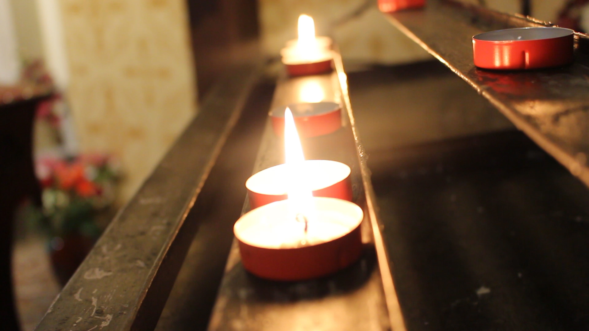
After editing the clips together for a while now I am starting to really see progress and am liking what I have created so far. I still need to collect together some other shots of archive images as well as possibly some more footage of my mum just to bring the whole video together and to get the final bits needed. I am actually missing a bit of a chunk of footage within my short film where my mum is talking about her religion and why she didn’t bring me up in the same way that she was brought up which I haven’t made much footage for and am trying to come up with ideas as to how I would be able to fill that gap as my mum literally only has one small candle in our whole house that resembles her religion and the rest is pretty neutral. I also can’t film her parents as neither of them are alive and my mum only really has one proper image of them and that is in a family photo with my mums parents and two of her sisters. I think that I might be able to get some footage of my two Auntie’s as they are over from Scotland [from 9th-13th February] but I am unsure how relevant this will be in my short film. I have also got the idea of possibly going to a church and filming around there to fill in the gaps in my short film, I also actually have some shots from a Notre Dame church when I went to the South of France a few years ago which I may be able to use.
I’ve had a think and reviewed my short film so far and think that it will just be best to actually go to a local church and ask if I can film around to get the clips and shots that are needed. I couldn’t find the clips from when I went away on holiday with my parents and we visited a Notre Dame church so I will just have to go out and get the new footage as planned. I also don’t think that it would be relevant to get footage of my auntie’s as they are not mentioned at all throughout the interview and it just wouldn’t fit in with the rest of my short film. Overall, I am happy with how it looks so far and think that it has potential to look really good once everything is added and it is all done. Watching this short film come together and listening to what my mum has to say has given me some inspiration to create another short film about feminism with a voice over. I think that this will be beneficial to my project and will actually work out much better than a magazine would as I will be able to take stills from this project and put them into a photo book.
UPDATE: Over the half term I have been working on my short film and managed to get some extra footage of a church to fit in with the audio where my mum talks about her religion. I think that these shots have worked well in my short film and it is really starting to come together. I realized which editing that I still need to get some shots of my mum putting on her work clothes and getting ready for work as there is a section where she mentions what she does so this would fit in quite nicely. I will be getting these shots this week and adding them into my short film.
What next?
So after looking through this footage and putting together the whole video I wanted to keep up with my idea of parodying her role and mimicking what she does myself in a series of images. I want these images to be a reflection of how I see my mum and what she kind of represents to me. I am going to be staging images dressed in one of my mum’s dresses and I am going to change my hair around so that it looks like her hairstyle. I want to make these images stand out and to be interesting to look at, somehow I need to make cooking and cleaning look interesting. Taking inspiration from Cindy Sherman I want to make my new persona/character almost unrealistic, something that you would only ever see in movies or something. This will just make the images stand out more and will really emphasis that I am parodying the way women, specifically my mum, are perceived within our modern society. These images will be taken over the half term and my aim is to get at least two images from each part of my mums role. For example, I will be doing a shoot in the kitchen, one shoot will be in the bathroom cleaning, another will be in the living room cleaning and another shoot would also be food shopping. Little shoots that I want to hold big impact and to really send a clear message to my spectator about the role of women in modern society and how flawed it all is.
Short Film | An interview with my mum
Here is the finished short film all about my mum. I interviewed her asking various questions and from there have created a sequence of shots that correspond to what she is saying. I think that this short film has worked well and it gave me more of an insight as to what my mum thinks and as a personal study has really helped me to develop my thoughts on feminism as well as how I see my mums role compared to my own. This short film has given me inspiration to create more images based around the woman’s role within our Western society and what is expected of her.
https://www.youtube.com/watch?v=cx5ayloQdsI
Short Film | Evaluation
I wanted to explain some of the shots I made in my short film in a bit more depth to show the meaning behind them. I feel that my short film has been successful and does represent my mother and many other women that follow the same traditional role as her. I wanted my short film to stand out and for the visuals to bring to life what my mother is saying in the interview. I really think that this project has given me a better understanding of my mother’s role and has really solidified for me the fight for equality in not only the Western world but the entire globe. I feel that this project has allowed me to develop my knowledge and understanding of other women fighting for their freedom and has helped me to understand more clearly that women need to fight for their rights and for our voices to be heard we need to stand up for what we believe in.
Image analysis 1
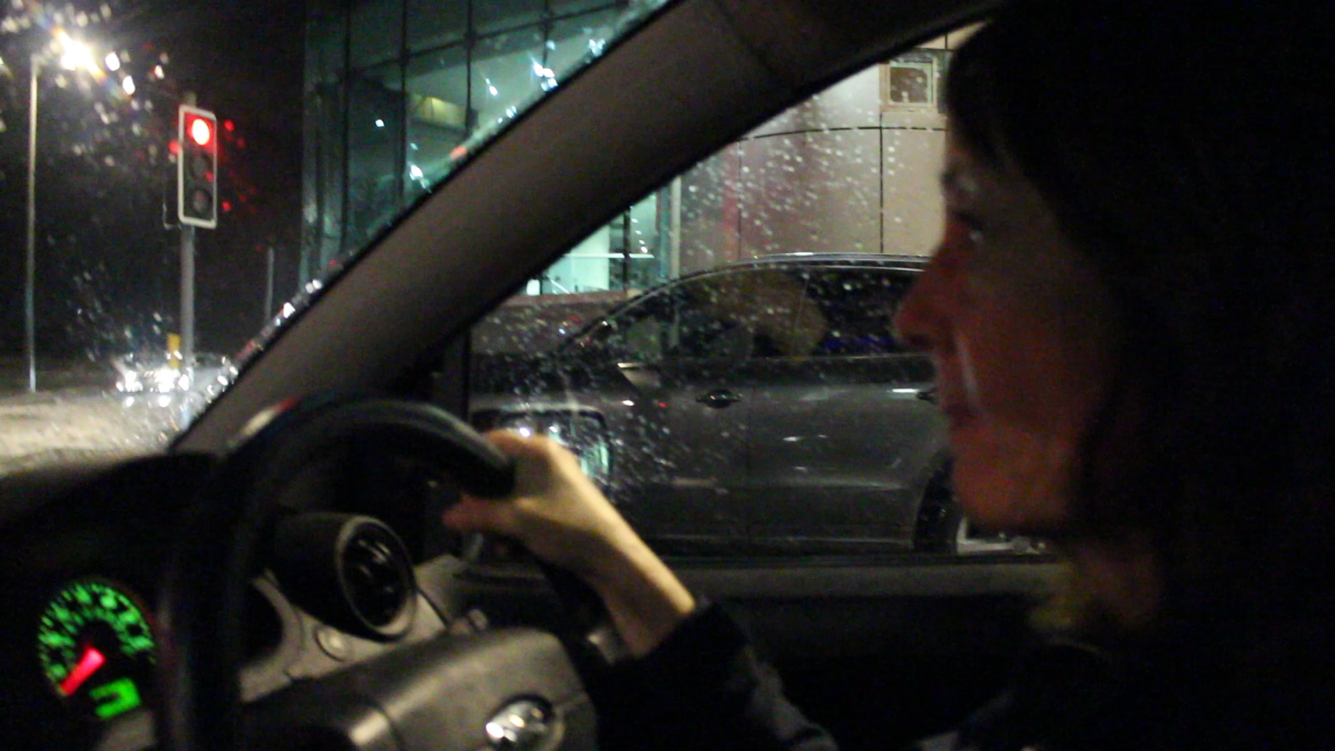
I put this clip in where my mum talks about her mother and how my mum’s role is harder than that of her own mother’s as she has a full-time job. The reason for this is actually because in the background of this is the location of my mum’s work and I wanted to have it as a subtle background just because I think that it looks better this way. I like this shot as my mum is concentrating on the road and not on the camera so it looks a lot more natural and she is acting as if the camera isn’t even there. I think that I was at an advantage throughout as my mum obviously feels comfortable around me and isn’t worried or nervous about what I am filming of her. I think being an insider for this project has helped me to create a much more precise and accurate project as I’ve known my mum my entire life and by now I understand her role and I am there everyday so I know what she does and doesn’t do. I feel that this clip is also interesting as it is slightly darker than a lot of my footage and stands out making my audience/spectator look at it more and want to analyse it more.
Image analysis 2
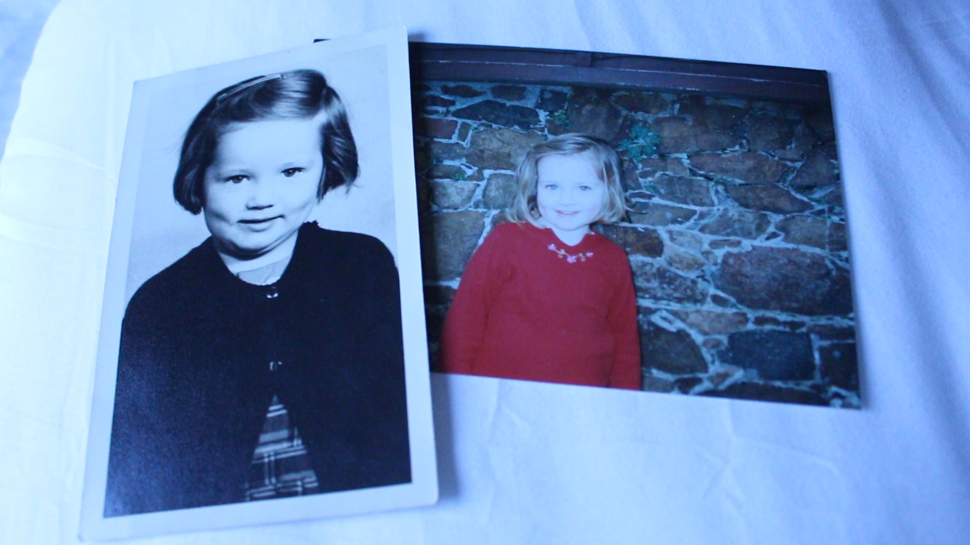
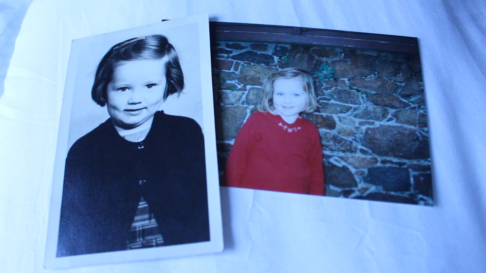
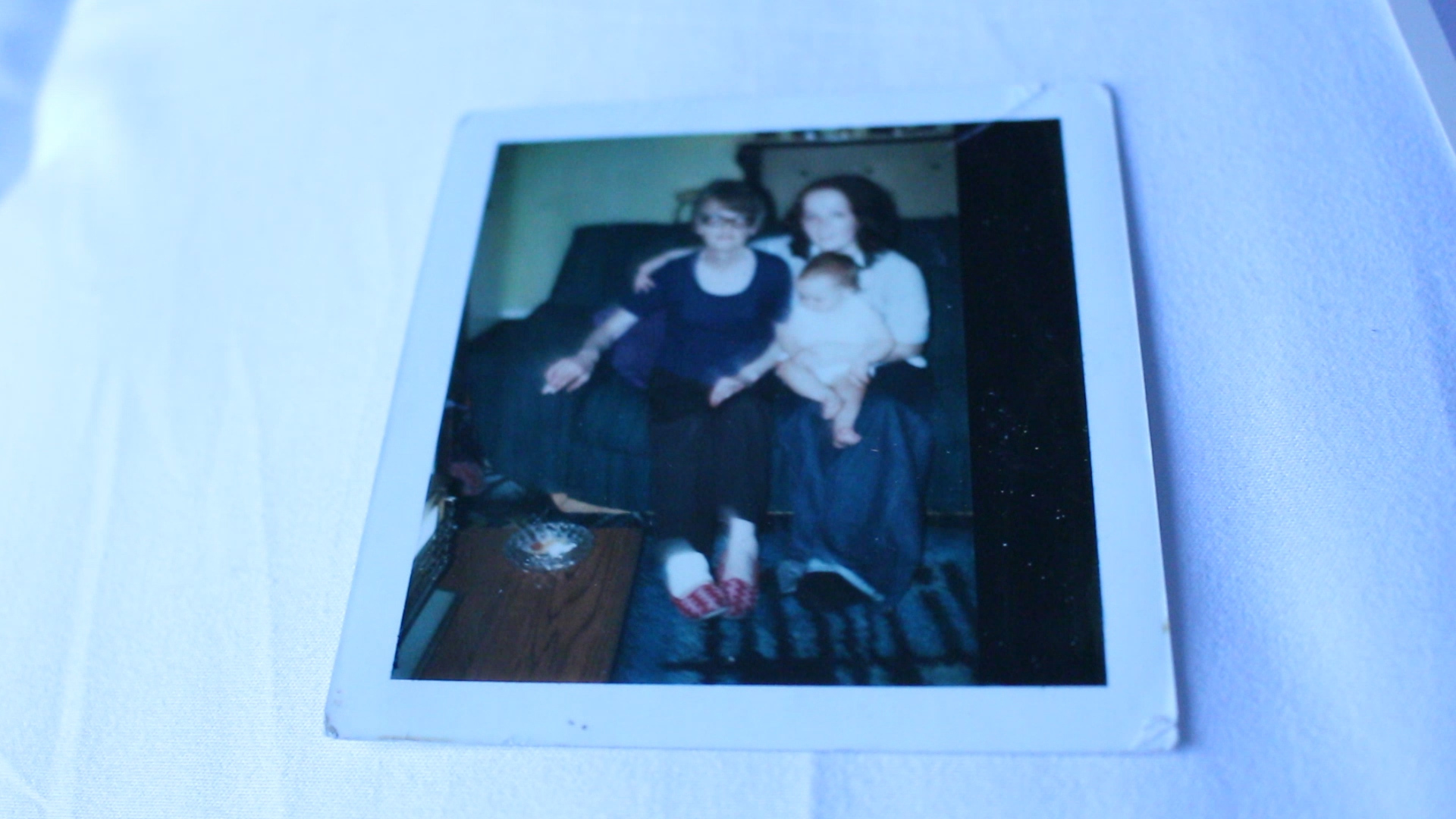
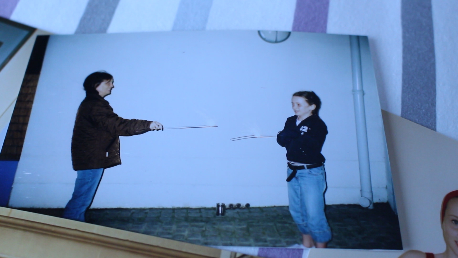
I love this still! This is an archive image that I decided to add into my project just to add more layers and to make it more personal for audience. The photo on the left is of my mother when she was younger and the one on the right is of me. I wanted to put the two next to one another as I find that we look so much alike in these images. I like this clip as it fits in to what my mum was talking about and the question I asked about how I was raised compared to how my mum was raised. I think that using archive images really helps with the development of my project and makes it more personal to me sharing old photographs of my childhood as well as looking more into the childhood of my mother. I this that the composition of this photograph is good as there is an even amount of space around the sides of the entire image and I also like how I have placed the images too. I wanted them to slightly overlap one another as I wanted the main elements of the images to be how similar I look to my mother when we were both younger. I chose to just put the images on a bed with a white cover as this is the room that my mum keeps the images, right next to her bed in a cupboard and in a small box. I think that this just makes it more authentic and adds yet another more personal layer to my project.
Image analysis 3
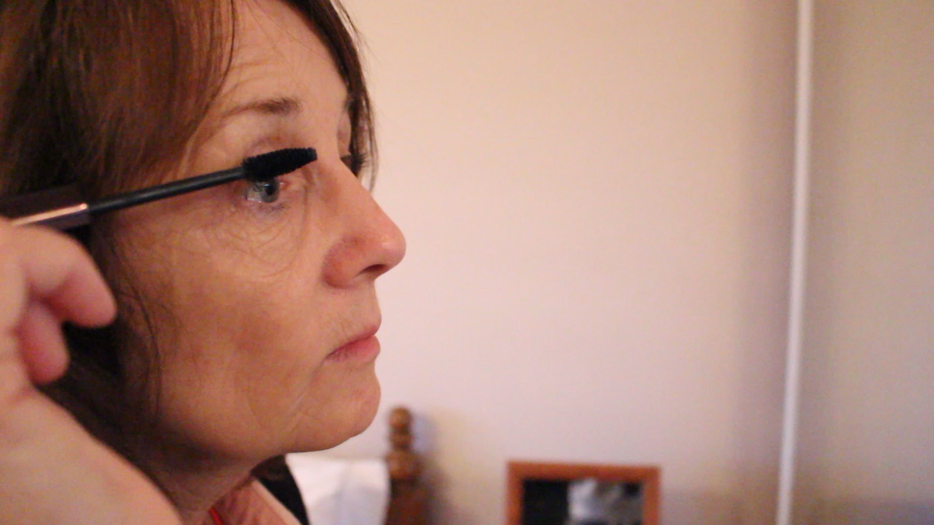
This shot is from a mini sequence that I created of my mum getting ready for work. Here the audio is my mum explaining her job and how many females there are at her work. I didn’t want to film her at work as the whole thing about my project is her life at home and her role within the household. I wanted my mum to be putting on her makeup as she usually does as it shows the expectation put on women to be glamorous and to look feminine. I just thought that this would be a nice extension on showing what are expected of women within our society as being the homemaker as well as constantly being glamorous. This has helped me with the idea for my stills mimicking my mums role and creating a new persona that parody’s her role and the traditional expectation of the role of women in our society. I also think that this is a good shot and I like the composition of a close up of my mum on the left hand side of the clip while the right hand side shows the mirror she is looking into adding more context to the still. I really like this still as it is clear and interesting to look at and one of the rare shots showing my mum at a closer angle than I usually do. Within my short film I have mainly shot from afar and looking at my mum from a distance but this shot makes it more personal and shows the actual features of my mum’s face more up close.
Image analysis 4
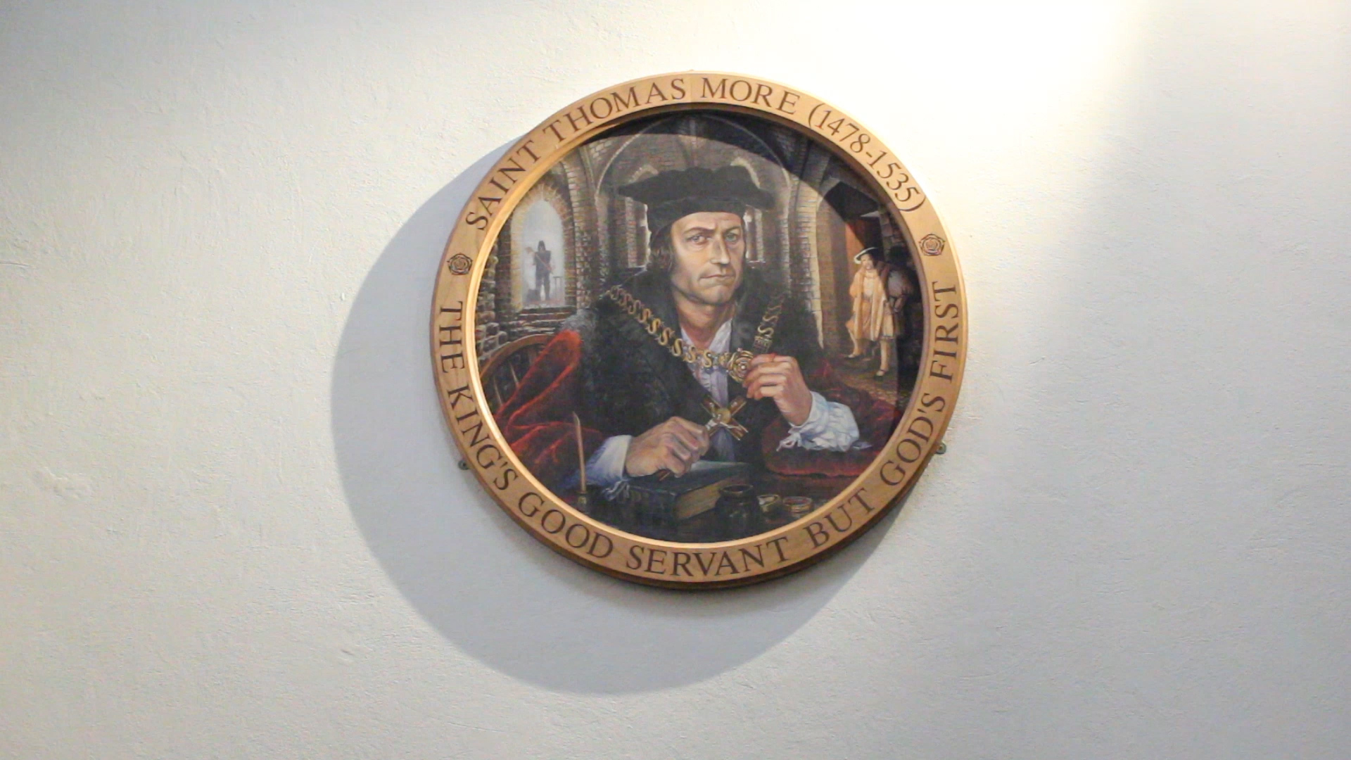
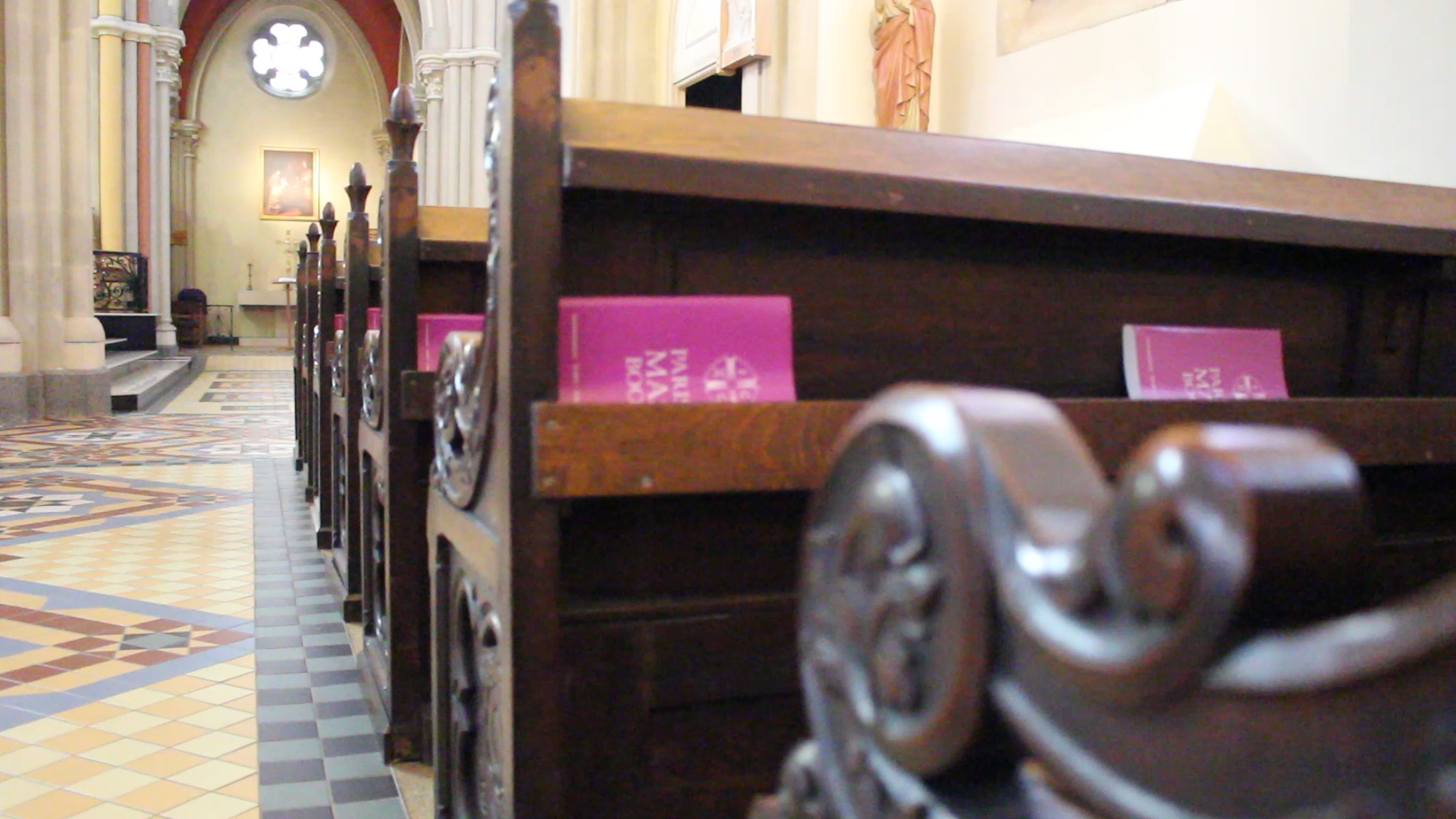
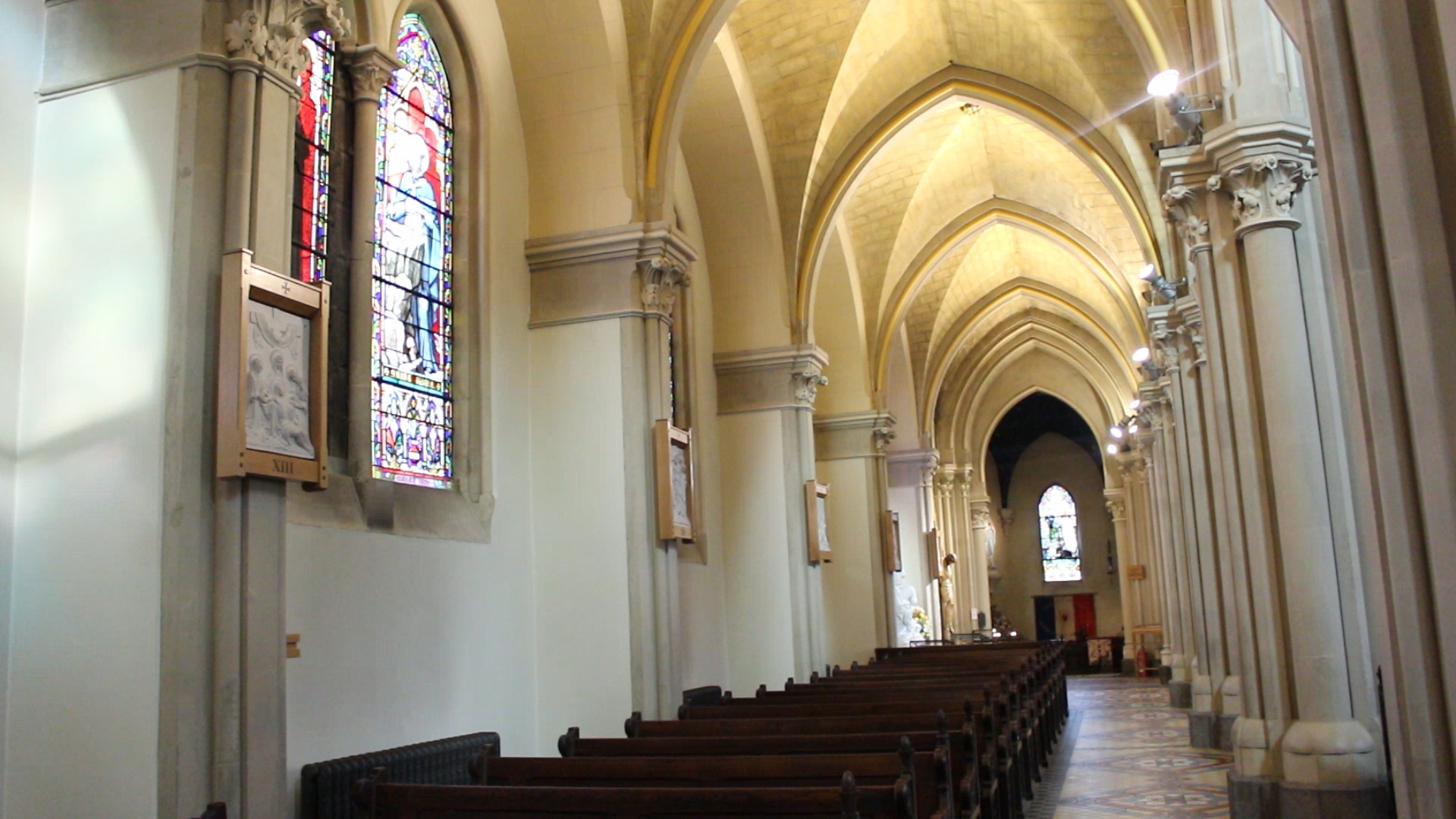
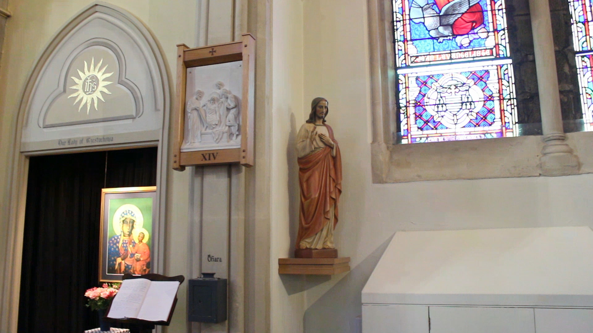
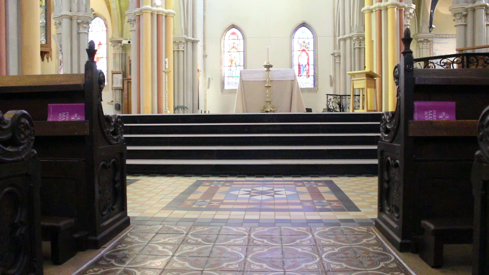
I decided to go down to St. Thomas’ church to get some footage around the building to go with the audio of my mum talking about her early life as a Catholic and her religion. I find that these shots bring to life what my mum is talking about and blends well with the whole film. I like this shot in particular as the painting in the frame is perfectly centered in the middle of the clip and I really like how the shadow falls as the light shines down on the painting. I also chose to film this particular painting because of the writing around it, ‘THE KING’S GOOD SERVANT BUT GOD’S FIRST’. I find this really interesting as it shows how devoted people are to their religion and that they would first follow God over any ruler. I also wanted to add this in kind of as a symbol of how my mum doesn’t really practice Catholicism. I really like that the light is shining down on the painting as many people see God as a ray of light and his light will shine down on you. This just brings the still together and adds to how many people see religion.
Image analysis 5
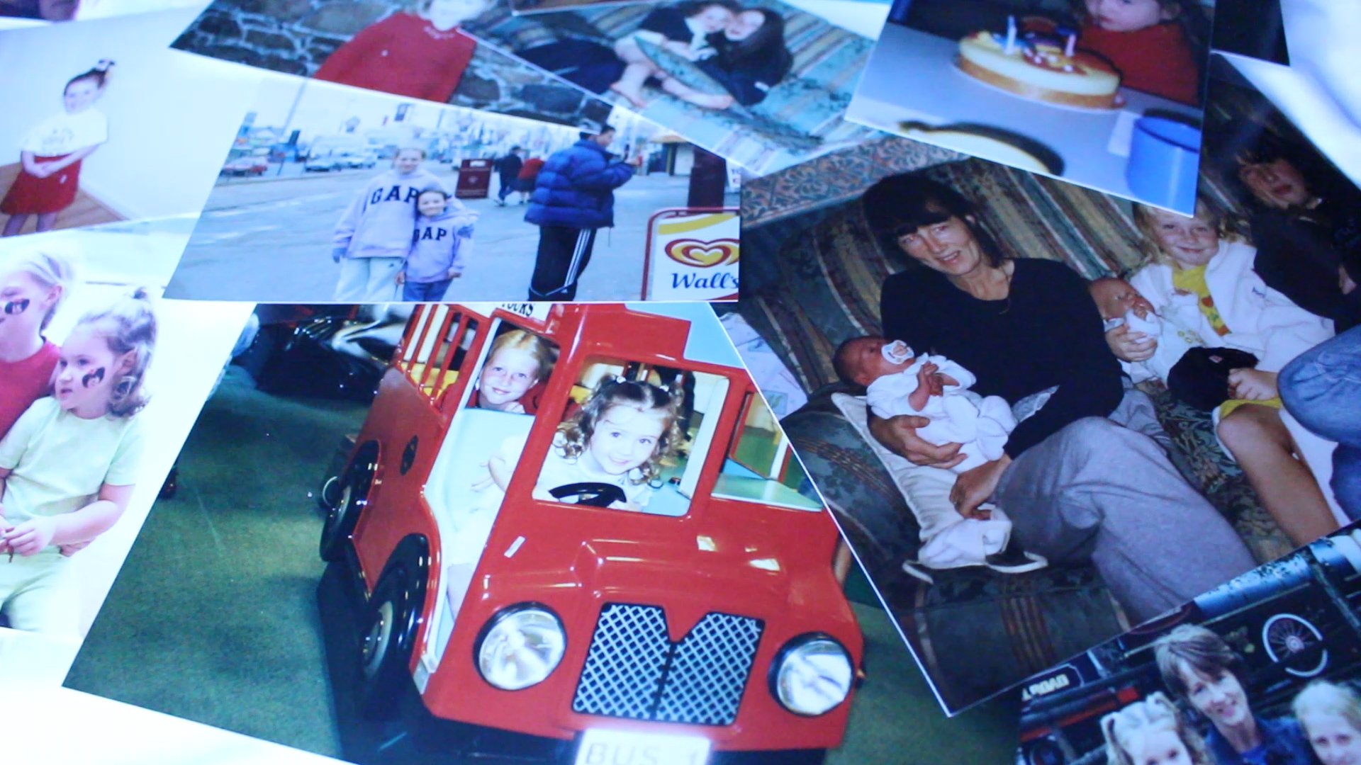
I added in archive images for my short film as it makes it a lot more personal and as I’m interviewing my mum I thought it would fit to share images of my early life and the life of my mum. I like the images that I have chosen as it shows happy moments in our lives and it matches with what my mum is talking about. It is also good for my spectator to see a little more of my life and my family and how I was brought up compared to how my mum had been brought up. I like adding in archive images as there is something quite unique about them, they are printed and show an older form of media which seems to be getting lost in the age of phones and storing images of computers.
Image analysis 6
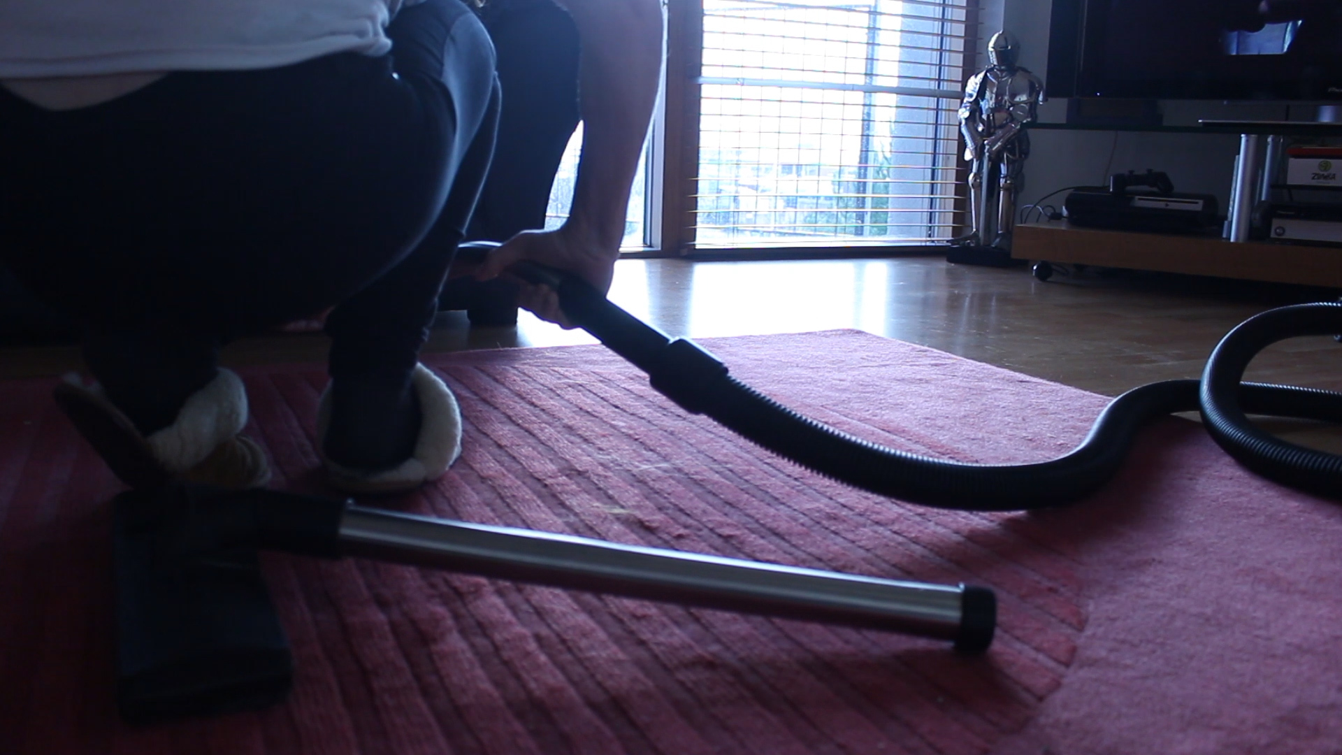
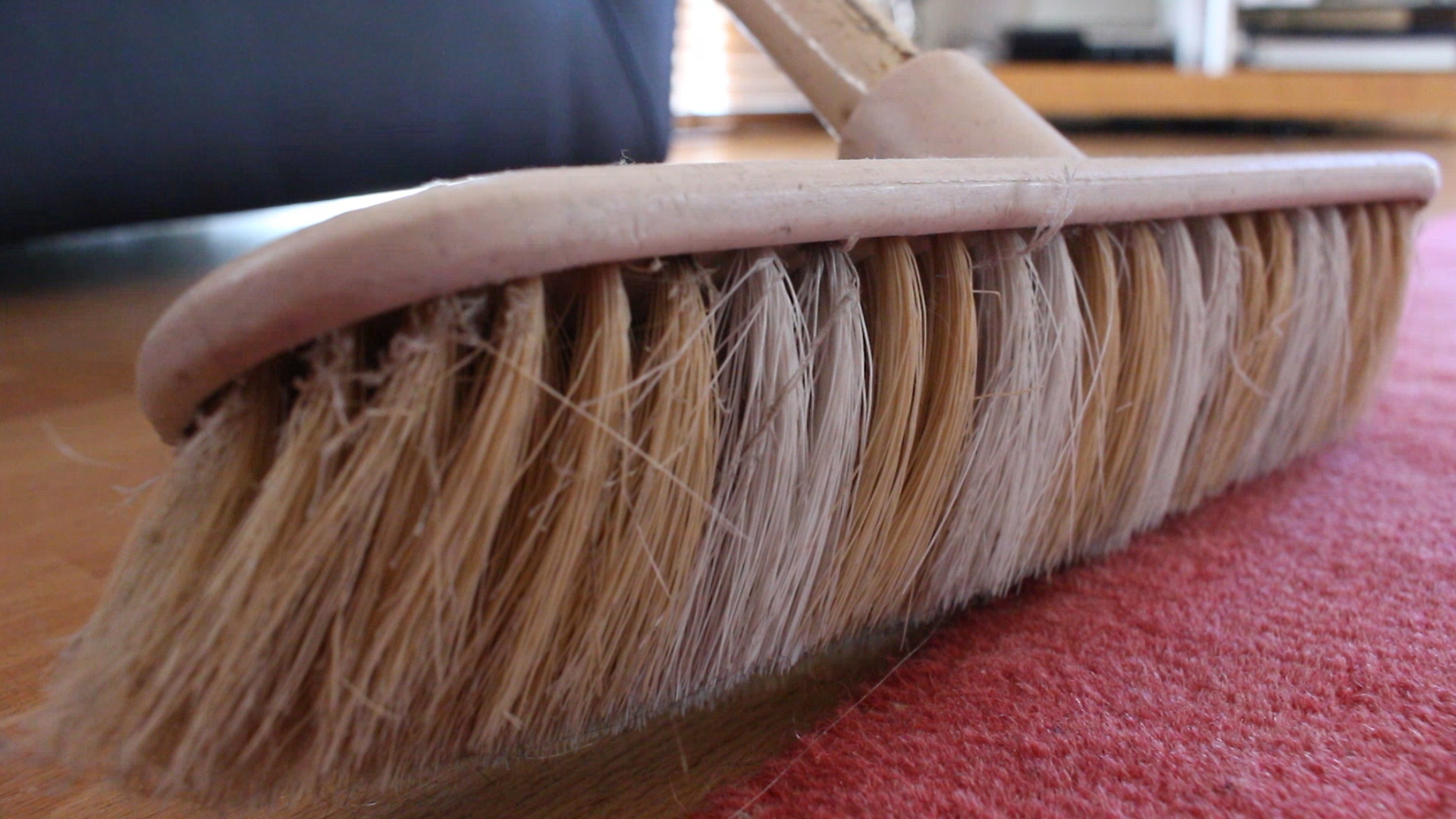
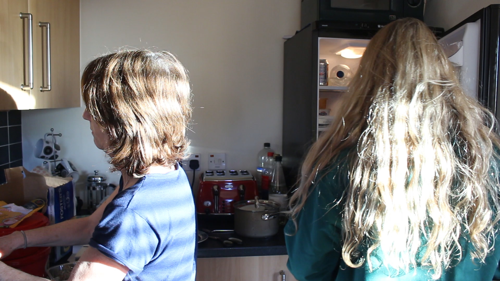
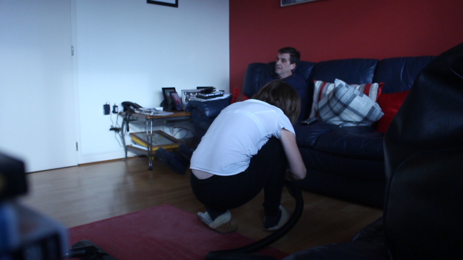
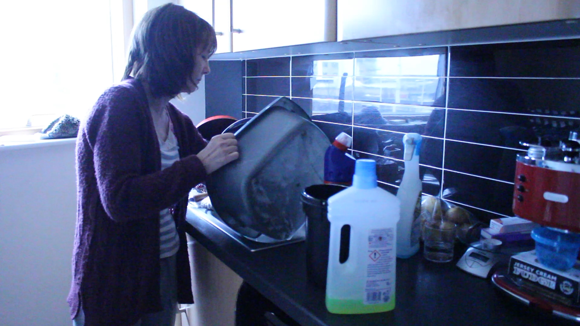
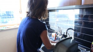
I really like this shot of my mum cleaning as you aren’t really able to see her too clearly but the focus is on what she is doing and her surroundings. I like that my mum’s face isn’t visible in the shot as it adds a sense of mystery and makes my audience want to see her face and to find out a little more about her. I like the harsh lighting in this image with it being quite dark and just a ray of natural light coming through the large windows. I think that this still adds to the story of how my mum is continuously cleaning up after everyone and is even getting down on her hands and knees to make sure the flat is looking how she wants it to look. This shot does work really well within my short film and adds to the little details of what my mum does and how she does it. This also gave me some inspiration for my photo shoot as she always seems to be in awkward positions to try and get everything clean and she seems to always be juggling so many jobs at one time. I wanted to exaggerate this in my own work and this image has really helped me to develop this idea further.
Extra Clips Used | Research
Here are the videos that I got snippets from for my short film to add more context to what my mum is saying and to also give my short film more layers and allow my audience to visually see what my mum may be talking about and expressing.
Madeira Island: Picture Edits
In order to emulate the style of the photographer Sebastiao Salgado, I’ve turned the majority of these photographs into black and white. I think that Salgado uses this filter as it takes the viewer’s concentration off of the colors and more onto the emotions and feelings that can be felt from the image:
I took the picture above at a viewpoint called ‘Pico do Facho’. The high altitude allowed me to get a great view of the harbor and separate beaches. The beach is surrounded by modern and exquisite buildings. I like the fact that you can see almost a completely different parish, just by looked further ahead. In addition, the airport is visibly in sight on the rock cliff.
The composition contains many leading lines. The curved edges of the island may make the viewer look at various different points on the picture.
Pigeons are very common in Madeira, and are always roaming the sky’s and luckily spotted some. Although one is white and one is grey, they both seem to be domesticated pigeons (rock pigeons).
The pair that are in my photograph are interestingly facing opposite directions. Therefore, there’s not only a contrast between their color, but also their positions.
I took this photograph from the bottom of a rock mount, therefore my perspective allowed me to only capture the bird’s heads.
This picture was taken at the airport in ‘Santa Cruz’. It was a clear afternoon and the sky was crowded with clouds.
I think that the composition is quite good, in that: the airplane is situated in the middle of the shot. Additionally, the barbed wire is intercepting the main ‘hot-spots’ of the rule of thirds, as well as adding detail. The fence and wire also frame the photograph in a weird manner, making the viewer’s gaze turn to the left hand side of the image; where the plane is headed.
Recording one- interviews
Recording three- interviews:
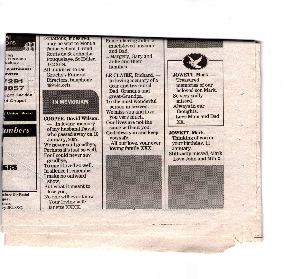
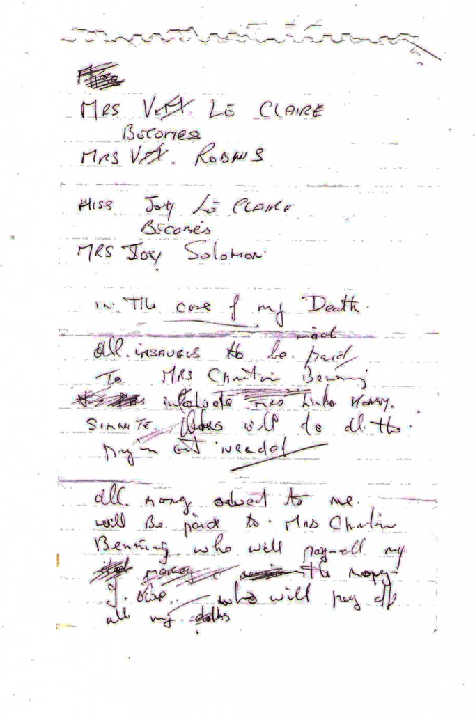
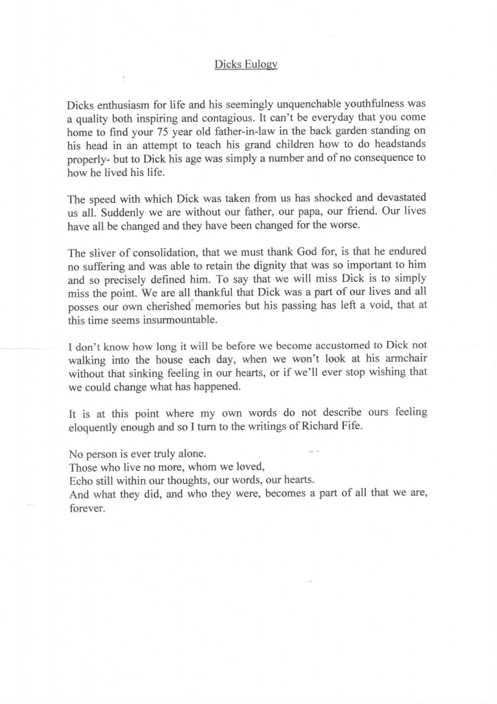
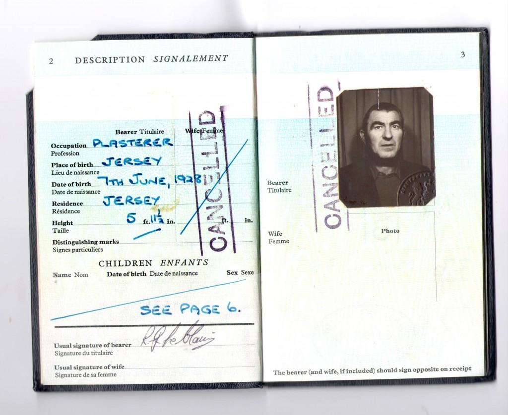
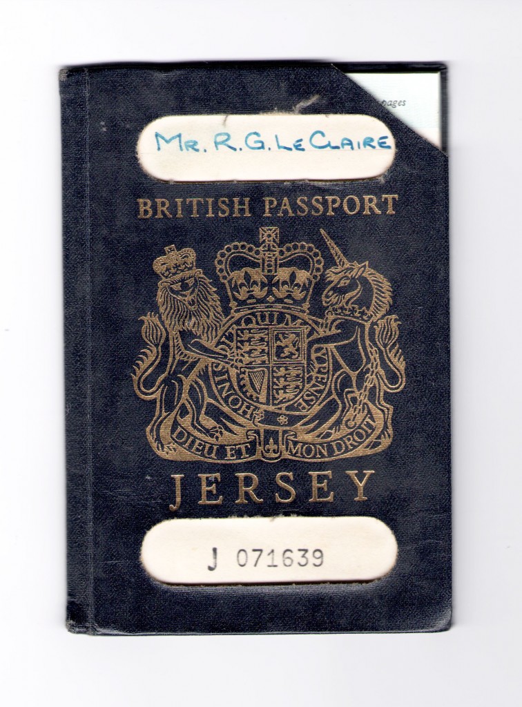
I have interviewed both my mother and grandmother in order to fully understand my grandfather’s life and the memories they have of him. I wanted to learn how my grandmother and grandfather met, the struggles of their divorce and how they managed to remain close friends years after. I also wanted to know what it was like to raise eight children and the type of life style they had. The more I find out about my grandfather the better I can produce images which truly symbolise him. Furthermore, when interviewing my mother I wanted to find out about the type of father daughter relationship they had.
Interview one- Mary Robins
What reminds you of Richard Le Claire?
M- What reminds me of Richard Le Claire? My children, yes my children, er one in particular my second son looks a lot like him. Whenever I see him I remember, I remember when we were very young, we met when we’d play together, when I was about five and he was about twelve. That’s when I first met him, I didn’t see him for a few years and then I met him again and we use to all go out together, his sister Anne and Reg, they are both gone now. And we use to go sit on Howard Davis Park and have tea together, that reminds me of him. He was a very very shy man, we use to go to the Dinner dances for the post office, it was my once a yearly outing. I use to dance but he didn’t dance. Sometimes after we had our meal and the dancing started he would disappear and go home. He didn’t like dancing but he didn’t mind me staying.
What sort of jobs did he have?
Well he worked for Horn Brothers for many many years but it wasn’t a very good paying job, and he was a carpenter and plasterer and it was hard work. Sometimes he would have to lose days because there wasn’t enough work for him to do, but then somebody offered him a job at the brewery. He loved the work at the brewery because it was inside and he made a lot of friends, and he worked there until he was retired.
Could you tell me a little bit about your wedding and your children?
My wedding, well we go married in the town church, I wore blue with a little hat. We lived together with the children, we were there until Robert, Richard and Jenny were born. It was quite an old house, the yard was pretty grim but we were very happy. But then we moved to Grassett Park when, I think I was pregnant with Michael, I had Andrew, Joy and Christine at Grassett Park.
Do you still have the wedding ring?
No, when we quarrelled he threw it away, which I was quite upset about really but we became very good friends after that we were only bad friends for a little while.
Do you miss him?
Yeah I miss him, I was very upset when he died we had some good years together, we didn’t have a lot of money but we had fun. We made the best of what we had and we loved eacherother for a long time. I still think of him a lot and still love him.
Do you cherish the memories you had with him?
Yeah, I do, I do cherish the memories. I was very sorry he died when he did it was very sad.
Interview two- Christine Benning
What reminds you of Richard Le Claire? For example, smells, colours, holidays etc.
Do you miss him?
How did you deal with the grieving of your father?
Do you find comfort and happiness when looking at archive images of him?

