Category Archives: essay

Filters

Author:
Category:

Personal Study – Abstraction – Essay:

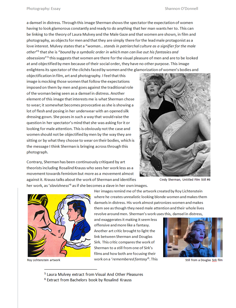
 The development and recognition of abstraction and abstract photography since its discovery with the used of analog techniques to now, where there is a more digital approach begin taken through the use of technology.

“Abstraction forces you to reach the highest level of the basics.” – Alan Soffer

Abstraction comes from latin meaning away from and draw. It is the process of taking away or removing certain characteristics from something, whether that is a landscape, a person, an item etc in order to reduce it to only some of its intentional characteristics. It is sometimes called or known as non-objective, experimental, concrete or conceptual photography. It all essentially means creating a visual / photograph that doesn’t have an immediate association with the original object or even something that doesn’t particularly represent the world we live in. An abstract photograph or piece of art is all about banishing everything it is showing, or wanting to show and detach only a fragment of a scene. All this is doing is removing its inherent context from the viewer, so that they only get exactly what the photographer or artist wants them to see. This is purposefully done to be about to create a seemingly unreal appearance from real objects, people or places. Not only that, but some of the most popular and well known piece of abstract photography and art are all fundamentally focusing on things that very often go unnoticed by the human eye on a day to day basis, however are always present. These are things like shadows, colour, lights, textures, shapes etc. Personally, I believe that anything that simply be turned into an abstract visual, it all depends on the way you look at objects, situations, people, places etc.

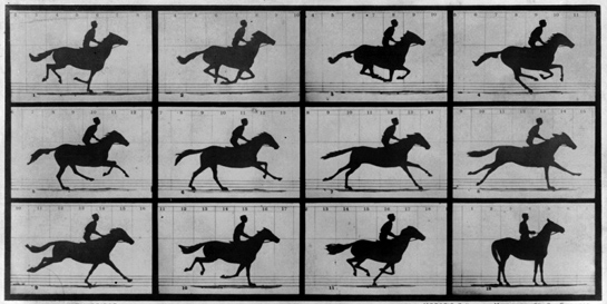
Abstraction has been around since around the first decade after the invention of the craft. One of the earliest traces of abstract photography was done in 1842, when John William Draper created some photographs using a spectroscope, which he dispersed light rays into and recorded the unusual patterns that it would create. His prints, were viewed as having no visible relation to reality and the real world, compared to what other photographers in that time were recording, having a much more close link with the real world. The interesting thing about this was that Draper actually saw these photographs as scientific records rather than art, however their abstract quality is very much appreciated today for its groundbreaking status and individuality .

I have always had a fascination for something that is out of the normal and of the thought of turning something that can be portrayed as unoriginal and boring into something that can make people think of the purpose or even ask the simple question that may confuse many and that being ‘What is it?’.  That’s possibly the main thing that really pulled me into exploring the intricate but captivating theme of abstraction for my personal study. Abstraction is still to this day something that many people still do not understand and due to this, I feel like abstraction is not as well appreciated when differentiated with something less complex which enables a better and more simplistic understand of which is not the can with this theme. People are pre disposed into thinking that there is a reason for everything, whether complex or not. However, I feel like abstraction is for the most part, a result of experimentation, and nothing more than trial and errors. Sometimes, the best outcomes from the events you have least faith in, which I found to be very true when creating the visuals for this project.

‘There are always two sides to every story’

Throughout my research I was astounded at the many faces abstraction has. This got me thinking about the way that many artists and photographers use abstraction as if they were almost taking a self – portrait of their brain and their own unique way of thinking about the complex world we inhabit. With that in mind, it is fascinating to therefore see how the different visuals that abstraction can have, have changed over the decades from when abstraction was first discovered.

There are two main differentiations that divide the term and the visuals of abstraction, these two main differentiations being the concept of abstraction being created using an analogue process , which was the process that began not only abstract photography but also the main concept of photography it self during its early times, or by using a digital process, which is what we seem to cannot live without nowadays more than ever. nalog photography is essentially the use of a film camera to take photographs, which is something I have explored for this project. However, when I refer to analog photography, I am not only referring at the image making process but I also referring to un-edited / un-manipulated photographs, meaning that they have not been changed in any way, much like a photograph taken with a film camera will be. Analog abstract photography was the first type of abstract photography to come about, as back when abstract photography was beginning to emerge and gain recognition, digitally formatted photographs were not yet around. Some photographers and art historians have been speaking and / or writing about abstraction for a long time, however none of them ever attempted to create a specific visual for the term and they also were not too sure on an exact meaning for it either. However it all started to change when Alvin Langdon Coburn suggested in 1916 that he was decided on creating an exhibition with the title of ‘Abstract Photography’. He made it clear that “no work will be admitted in which the interest of the subject matter is greater than the appreciation of the extraordinary”. Although the actual exhibition didn’t end up going ahead, Langdon Coburn did indeed create some abstract photographs later on in his life. Therefore that was really there first time someone was really showing any interest in trying to define what abstraction in photography really was and what it meant and represented, not only in theory but also visually.

Some of the first photographs to be classified as abstract along side John William Draper’s photographs which were actually just taken to aid his science research, however years later it was discovered and thought to be one of the first recordings of any type of abstract photography, there was also Henry Fox Talbot’s “Sun Pictures”. These photographs, were actually photograms, and they consisted of shadow images that were recorded straight onto paper without the use of any negatives. These “sun pictures” weren’t anything like anyone had seen before and nothing that really had been done before as well, however thought to be a definition of abstractions by theory. They portrayed no “surface details” as a ‘normal’ photograph would be expected to include, and they are essentially just some shadows and their outlines, and the interesting thing was that they were “light registering in two – dimensional patterns”. Digital abstraction is mainly the creating or manipulating of photographs using a digital process. Digital abstraction was very popular in the 1990’s as this is when computer started to become affordable for most people to have, therefore they started manipulating with their photographs and due to the graphics still not being very high in quality the photographs, this was  called the digital revolution. Even though they may have just been of sceneries and situations that we are very familiar with and are things that are very popular to photograph, they would always come out looking ‘glitched’ and more abstract look. “Even though the foundations of many digital technologies had been laid up to sixty years earlier, these technologies became seemingly ubiquitous during the last decade of the twentieth century: hardware and software became more redefined and affordable, and the advent of the World Wide Web in the mid – 1990s added a layer of ‘global connectivity’”. It’s very clear to see, when looking at how digital art in itself and not just in the terms of abstraction has moved along over the years, that many artist were already experimenting with all sorts of technology to try and get ahead of the digital world. Something which we can see that was created 20 – 30 years before the big ‘computer fever’ in the 1990s, some films in the 1960-70s were already being creative with the technology that they could get their hands on, for example, there are some videos and propaganda’s where they used technology and abstraction which is now considered as ‘trippy’.  It was a mixture of pop art and digitalised cartoons, which would then be used to create new and unique visuals, that many had never seen before. Therefore meaning that technology was something that some artists were already using and experimenting with to create out of the ordinary pieces and visuals.

Through both the digital medium and the internet, there are endless possibilities for what can happen, specially nowadays with everyone trying to be more creative than the next person and wanting to stand out in a digital world where we see photographs and videos more than ever before.  The website rhizome.org is a great medium to find exceptionally unique digital abstraction, however new internet terms such as Vapour Wave, Synth Wave, Cloud Rap, Witch House, and other Tumblr aesthetic terms have also been emerging, and it combines different nostalgic and digital visuals to create a whole new look, and aesthetic for that matter. Something that i have noticed even before i began researching for this personal study, is that although the internet is something that is new, and has had a fast growing popularity throughout out the years, is that we are in a way, were are going back to how the internet used to be and how things used to be before or just at the beginning of the internet  ,and how the look of computers used to be like.  As mentioned just above, these Tumblr emerging aesthetics are very nostalgic, and it is something that I am finding very interesting, the fact that the more advanced and the higher quality of digital imaging that we have, the more we are making our aesthetics look as if we were going back in time. Therefore, when looking at digital abstraction, I very often would find Windows 98 edits and abstract images combining these different digital aspects, all created digital as well.

“Colour field painting is a tendency within Abstract Expressionism “(a post – world war II  art movement in American painting, developed in New York in the 1940s) . It has been around since the 1940 -50s in New York. Many people were initially surprised by some of the early works of Mark Rothko, Barnett Newman and Clyfford Still. These three artists who engaged in the Colour Field Painting movement are some names among others who are part of the first generation of American Expressionists.; these bing people who were given the first opportunities to open doors and  explore what Colour Field Painting really was.However, in the late 1950s,  what is now known as the second generation of American Expressionists emerged. This second generation included artists such as Helen Frankenthaler,  Morris Louis, Kenneth Noland and Jules Olitsk who began to evolve more of a  neutral and unbiased and more formal visual of Colour Field Painting, extracting all the feeling and emotional vibes from their paintings, which is elements that the first generation of American Expressionists included. Because of this idea, and approach to the movement, it was given a new sub-category called Post  Painterly Abstraction by Clement Greenberg.

Colour Field Painting is the meaning of when artist were trying to have some freedom from the normal forward thinking of what art should be.  As many wanted to go against what most people wanted to define art as and what the standard look of art was, it meant that many were left on either side of the fence, many found anger in this movement as they were too into the perceived standard of art and many other people’s visions opened up for miles allowing for new creative ideas and experimentations.

Colour Field Painting has its own distinctive ways of creating new and exciting pieces of art or in other words, a sort of guide line and thinking frame for people to be able to create their own colour field painting. First of all, artists who are into and support this movement will see the surface in which they desire to paint as an open field for their vision to just ‘spill’. Not in any way shape or form is there a ‘main focal point’, which seems odd if compared to traditional painters who organise their surface neatly depending on what they are wanting to right. Another aspects is that often, they are not too invested in creating a realistic visual, and going with that thought, these types of artist will very often, if not pretty much every time, will not create an object that we as humans can recognise and visualise in our day to day life styles. And finally, and what i think is the most important aspect about Colour Field Painting is that it allows for the artist to express their emotions and their individual state of mind in new and open ways, rather than felling restricted.

Something interesting and very much the opposite to standard art, is that Colour Field Painting is less focused on the process of creating the work and how it all is done, but it is more focused on the relationships and contrasts of overlapping areas of colours and how they are all working together to create a more open field of vision, without a structure but very much geometric look to it all. Some of the characteristics of Colour Field Painting which people notice straight away is that the visuals are bright, with specific geometric shapes which are now neatly defined and how that works in with the background.  The actual paintings are usually really big, which is in a way done on purpose to be able to aid the viewer with a whole new experience in emerging themselves in all the colour; a field of colour.

The Colour Field Painting movement is very much related and apart of abstraction, and it has not only encouraged for more diverse abstraction to arise, whether in analog or digital art, and photography. Photographers such as Penelope Umbrico  (End of Things) and Adam Broomberg and Oliver Chagrin (The Repatriation), although digital have a very distinct ‘Colour Field Painting visual to their work, which just expresses  that this movement has been inspiring and creating for more than 60 years sine its rebel beginning.

Cubism is a conceptual approach that looks  at realism and “aims to depict the world as it is and not as it seems”, and it tries to visualise a concept for the Fourth Dimension. Paul Cézanne expressed cubism as being made up of mainly 3 ‘ingredients’ and these being geometricity, simultaneity and passage. “Cubism can be considered realism, in a conceptual way, rather than perceptional way”. This type of art is considered on the most prestigious art visuals of the early 20th century. It first came about and created by Pablo Picasso and George Braque in Paris between 1907-14.

“The Cubist painters rejected the inherited concept that art should copy nature, or that they should adopt the traditional techniques of perspective, modelling, and foreshortening. They wanted instead to emphasise the two – dimensionality of the canvas. Soothes reduced and fractured objects into geometric forms, and then realigned the within a shallow, relief like space. They also use multiple or contrasting vantage points.”

Cubism, as a movement has already had four periods since its beginning; Early Cubism (1908-1910)  – Analytic Cubism (1910-1912)  – Synthetic Cubism (1912-1914) – Late cubism (1915-present day).

Early cubism (1908-1910): This period was the beginning of the movement and style visuals, which were firstly created by Pablo Picasso and Georges Braque.

Analytic Cubism (1910-1912): “Its artworks look more severe and are made up of an interweaving of planes and lines in muted tones of blacks, greys and ochres”

Synthetic Cubism (1912-1914): “is the later phase of cubism, generally considered to date from about 1912 to 1914, and characterised by simpler shapes and brighter colours. Synthetic cubist works also often include collaged real elements such as newspapers. The inclusion of real objects directly in art  was the start of one of the most important ideas in modern art.”

Late Cubism (1915-present day):  is the last period of the Cubism movement for now, which is basically the period of finding value in the works previously done.

Cubism is a visual that is recognised all over the world due to its very distinctive and unique characteristics; Geometricity is a characteristic that is very prominent and the main thing that people see and think about when looking at a cubism piece. it is a simplification of objects and subjects that have been adapted into geometrical elements and compositions that may or may not add up to the whole figure or object known in the natural world. Other more subtle but still predominant  characteristics are elects such as approximation of the Fourth Dimension, conceptual instead of perceptual reality, distortion and deformation of known figures and forms in the natural world, passage which is the overlapping and interpenetration of plane and simultaneity or multiple views meaning different points of view made visible on one plane.

Vapour wave is a genre of music that originated from online websites such as tumblr and reddit in the early 2010s. It is distinctively has no set location to where it could have originated from, as it started online and cannot be traced back to its roots. Therefore because of this, it makes this genre of music and aesthetics completely globalised. In the beginning, it began as an aesthetic that was popularised by an obsession with 80s and 90s culture using glitch art, early digital graphic designs, roman busts, a fascination with tropical landscapes and Japanese culture. The look of the aesthetic is seen as a series of abstract images, photos and art that are known for feeling ‘oddly perfect’, either by having  a running theme, following certain patterns or by having colour pallets that blend well together. The aesthetic first emerged through two album covers (A1 – Chuck Person) merged together to create what we now call vaporwave.  It has been described by some as a digital punk movement with ideals that counter for our most natural concepts ownership by making vapourware an anonymous art for anonymous people. The word vaporwave is essentially the combination of vapourware, which is a business term to describe a product which id announced to the public but never actually release. It is also marked as the term to describe perpetuating repetition of ideas which are not concrete or meaningful in their philosophy, described as waves of vapour. It can also be seen as a critic on modern capitalism. Some people go by an internet emerged abbreviation  “2deep4u” which is meant to be “too deep for you”. This abbreviation / phrase is indicating that the content may be too profound or obscure for its audience to appreciate, due to the abstract nature of it.

“Vaporwave iconography centers around a set of graphic tropes depicting obsolete technologies; VHS,  CD audio and HD video, early computer graphics, and anachronistic corporate entities like AOL and Internet Explorer. The emblems of outdated technology are a reminder of the impact of technological change on daily life,  and the icons of capitalism are re-purposed to subversive effect. There was a  willingness to experiment, to use images that defy existing standards of what is attractive…” – Anothercountryheard blogTo be able to have some inspiration for me to be able to create, respond and develop a style of abstract visuals, I had to look very closely at the different artists whether from one hundred years ago or from last year, as well as investigate the different processes and ways of creating some unique and astonishing abstract images. To begin with I was very much influenced by Alvin Langdon Coburn – “Vortograph of Ezra Pound – 1917” , Paul Strand – “Porch Shadows – 1916” , Franntisek Drtikol – “Circles – 1928”,  Raplh Eugene Meatyard – “Untitled (Tricycle in snowy yard) – 1955”, therefore I wanted to find a way of creating visuals that would respond well and that could speak out a connection between my work and some of the work from the different artists. To achieve this, I used a photo filter using the Photo Booth app using my iPad called X-Ray to achieve my visuals. I found it very interesting however, due to the fact that I wasn’t going to manipulate my photographs in any after they were taken which would make them analogue. however I was taking them using a piece of advanced technology that was definitely not around when the photographers mentioned above produced theirs. It feels if I was breaking the boundaries and going against what my whole project was about by combining digital and analogue processes to create one set of visuals.

Another thing that I did which was also influenced by not only the photographers mentioned above but also any other photographer mentioned previously in my research that didn’t use any type of digital process to create their abstract visuals, was to create my own set of abstract images using an old film camera with 20 year old, out of date film. I did this so I would be able to understand the mind patterns that these old abstract photographers had to think about when wanting to produce an abstract photograph, and the fact that you have to really think about everything such as lighting, and angles as there’s no going back once the photograph is taken. Again, I did not use any post – production editing to manipulate these photographs in any way, as I wanted to make sure that they were as raw and they would be if I was to be taking those photographs one hundred years ago.

Lastly, I wanted to explore the digital side of abstraction. I had looked at different processes that made it obvious that there was some really intense post – production done to a photograph. I did a lot of researching about the internet emerging aesthetic known as vaporwave, however I wanted to create something where I could actually use the environment around me to create abstract photographs, even if I did manipulate them to make them look a lot more abstract, whereas vaporwave wouldn’t really give me room to use my own visuals. Therefore, I decided to make my own unique style using inspiration from Peter Halley and Rafaël Rozendaal. These artists create very unique pieces that inspired me to manipulate my photographs a certain way using Photoshop, as I decided to take some photographs before I got any sort of inspiration of what I wanted them to look like, as I wanted to be able to reflect my own style and to not just have a copy of the artists’s work.

Overall, there has been a 360 turn around with the visuals of abstraction due to the very strong influence of the media, internet and where all of that can be used which is through the use of technology. However, there is still analogue abstraction being created and people are still tracing back to the first abstract discoveries which is something that is still fascinating. From my point of view, I personally think that abstraction is something that cannot be predicted in any way, shape or form, therefore we can only wait to see how obscure and complex visuals will look like in the future, what’s going to be the influence and hopefully the appreciation for abstraction whether digital or analogue will still be appreciated who knows if they will combine.

“The goal of abstract art is to communicate the intangible, that which eludes the photograph and normal seeing.” – Curtis Verdun

“Abstraction generally involves implication, suggestion and mystery, rather than obvious description.” – Robert Genn

Personal Study Essay

Photography Personal Study

How did the Bechers’ typologies of Industrial Architecture influence a new generation of photographers?

Introduction

“When we noticed these sites were disappearing, we thought they were worth preserving at least in picture and decided to do that, to miniaturise them and take them with us.” – Bernd Becher (1.1)

“We considered it our duty and focused exclusively on that.” – Bernd Becher (1.1)

“That these sights were disappearing was the only reason, we were really fascinated by them, nobody else was doing what we were doing. There was the thrill of the new… the adventure.” – Hilla Becher (1.1)

“The aesthetic of industry is based on function. Its basically scaffolding with containers and pipes, but to me they are sculptures.” – Bernd Becher (1.1)

Within this essay I am going to be exploring how the Bechers’ found their unique style of work based around industrial architecture and how they developed what has become known as Typologies. In order for me understand what motivated them to focus on structures like water towers, blast furnaces, gas tanks and so on I will be investigating their main influences such a Karl Blossfeldt, August Sander and Albert Renger-Patzsch. I am also interested in their methodology of working, including why they photographed in such specific conditions and the reasoning behind their alternative layouts, in particular with reference to their grid formats. The Bechers’ legacy is not only associated with  their inclusion in the New Topographic’s exhibition in 1975 but their teachings at the Dusseldorf Kunstakademie where students such as Andrea Gursky, Thomas Struth, Candida Höfer and Thomas Ruff who, amongst others, have become celebrated stars in contemporary photography.

Following the completion of my A Levels my intention is to further my eduction with a closer focus on Architectural studies which have been an area of specific interest for a considerable duration of time. From this interest, it seemed natural to focus my personal study around this for my art projects as well, although I was looking more at the form and function of certain buildings rather than how they are documented. Due to this I decided to work on Bechers’ projects within this personal study, as they didn’t view the buildings they photographed as being works of art which are extraordinarily beautiful. By instead seeing beauty in their simplicity and choosing to document the buildings which were slowly starting to disappear, the Bechers’ created a huge archive of Industrial buildings which may not be around for much longer. Following on from this idea of preserving things the way they are, I decided to form a study on houses within my estate focusing on the similar design for all fifty odd constructions. Due to new added extensions, colour variations and so on I was interested in creating a comparison between all the different houses and exteriors, which contrasts to my AS project where I was primarily focused on exploring the interiors of contrasting houses in Jersey.

Before starting this study, I was inspired by a photographer who was initially a student of the Bechers’, Andreas Gursky. Although I will discuss him later within this project, his work looks at large crowds of people and particularly busy areas. Whilst Gursky’s work seems to focus more on the characters in a space, I wanted to focus on the kinds of places where people gather, whether purposely or accidentally. My response to this makes up the first section of my final printed portfolio.

Chapter 1: The New Objectivity Movement

In the 1920’s, the style titled ‘New Objectivity’ developed within Germany, which focused on the objective world, rather than the more romanticised, abstract work which was popular at the time. The Term Neue Sachlichkeit (New Objectivity) was originally the title of an exhibition (1925) by artist Gustav Friedrich Hartlaub, with the purpose of showcasing the work of artists working in a post-expressionist style.

“(The exhibition) organized around five thematic sections and featuring 180 works by more than 50 artists, the exhibition mixes painting, photography, and works on paper to bring them into a visual dialogue.”(4.2)

‘New Objectivity’ is known as being a documentary approach to photography with sharply focussed images, which was, as mentioned before, considerably controversial compared with the popular art style of the time (abstraction and pictorialism). The Bechers’ sharply focused style of photography was heavily influenced by photographers from within The New Objectivity movement,  most notably Karl Blossfeldt, August Sander and Albert Renger-Patzsch, whom were all german photographers linked to this movement. These three photographers are written about on several occasions within the Bechers’ book ‘Typologies of Industrial Buildings’.

Karl Blossfeldt

Blossfeldt is a very clear influence for the Bechers’, which is visible through the similarities in the way both photographers shoot their images. Blossfeldt was a German  photographer, sculptor, teacher, and artist. He made most of his images with a homemade camera which was able to magnify the subject up to 30x its size, mainly used to photograph plants. This camera revealed extensive detail with regards to a plant’s natural structure and he used these images to educate his students studying sculpture of the design elements in nature. As these plants were so magnified, and the parts photographed were taken out of context of the whole plant, they appeared to be almost manmade. The way Blossfeldt presented these images in a comparative way greatly inspired the grid layout that the Bechers’ used in their typologies. Blossfeldt’s style was quite scientific in the way that it classified different plants and their forms, which is effectively the same as what the Bechers’ went on to do within their work, only they were studying the forms of Industrial Architecture, rather than plant forms. Blossfeldt’s method of framing the plants is also similar to the style the Bechers’ adopted in their work, leaving grey space as a constructed border around the top of the object to make it stand out as the focus. Another key example being their method of photographing the subject from the same heights and angles.

The Bechers’ approached photography the way a botanist might approach the cataloguing of flora and fauna… their work was contrasted to that of Karl Blossfeldt (during the exhibition: ‘Typology, Taxonomy and Serial Photography’)” (1.4)

August Sander

During military service, August Sander worked as an assistant based within a photographic studio in Trier. By 1904 he had opened his own studio in Linz. After moving to a suburb in Cologne in 1909 he began to photograph the rural farmers who lived nearby,plain and ordinary german people. Around three years later Sander left this urban studio so he could continue photographing in the field, finding subjects along the roads he traveled by bicycle. Sander aimed to photograph as many types and classes of people as he could, working to capture every person that he would see. Sander wasn’t categorising and grouping the images in the same way as the Bechers’ went on to with their images, however his style of collecting images of supposedly ordinary subject matter inspired the Bechers’ to attempt photographing many versions of the same industrial buildings, to build up an archive of those particular constructed sites to be compared later.

Albert Renger-Patzsch

Renger-Patzsch was a German photographer who began to pursue photography as a full-time career in 1925. He rejected both Pictorialism, an imitation of painting, and the experimentation of photographers who relied on startling techniques. His photographs recorded the exact detail of natural forms, like plants (although in a very different way to Blossfeldt), industrial and mass produced objects presented in a way similar to scientific illustrations . In his book Die Welt ist schön (“The world is beautiful”), his images showed both nature and industry in his style of photography, which was clear and precise. These images were closely related to paintings of the Neue Sachlichkeit (“The New Objectivity”) movement. His work was very documentary and he successfully combined the recording of structures with good composition and framing.

Chapter 11: The Bechers’ link to the New Topographic’s

Typologies are the study of types and the interpretation of types, and they are mainly associated with the work of Bernd and Hilla Becher. The Bechers’ didn’t create this style by themselves which is visible when you analyse their influences and can begin to see how their style came about. Perhaps the  most obvious comparisons to the Bechers’ is the work of The New Topographic’s photographers, an exhibition curated by William Jenkins. He selected eight young american photographers whose images all had a similar banal aesthetic.

“As it had in the prewar era, the built environment emerged as a major topos, as did the search for a neutral, non-judgemental way to photograph it” (10.1)

This group of photographers, who fitted this non-judgemental, banal style of photography was comprised of Robert Adams, Lewis Baltz, Joe Deal, Frank Gohlke, Nicholas Nixon, John Schott, Stephen Shore and Henry Wessel Jr. Their photographs all focused on the western world and, all apart from one of the photographers, photographed in black and white in the same style as Bernd and Hilla Becher.

“The sharp edge-to-edge clarity of these images violated the traditional romantic iconography of the west” (10.1)

I will be studying Robert Adams and Lewis Baltz, to attempt a more concise understanding of this photographic style with an aim to grasping the  connection between the Bechers’ and their working influences.

Robert Adams

Adams is an American Photographer whose work was part of the New Topographic’s exhibition. His work demonstrates the vast and beautiful nature of America with particular reference to the banal aesthetic that made Jenkins chose him for the exhibition. His work began taking pictures of Colorado, a suburb of Denver, where he bought a 35mm reflex camera and he experimented with photographing nature and the architecture of the area.

“I thought I was taking pictures of things that I hated, but there was something about these pictures… they were unexpectedly, disconcertingly glorious” Robert Adams (2.1)

Using Ansel Adams zone system with extreme precision within his photographs to contrast light and dark areas, Adams creates particular points of interest. Photographing in black and white also heightens this romanticised effect which Ansel Adams was well known for. This method of enhanced Romanticism transforms less aesthetic areas, typically comprised of human structures, to carefully constructed settings of interest. His images also tend to have an underlying message, whether they’re trying to pass across a statement regarding deforestation, human attitude, or the man made impact on nature, this is possibly the most crucial element of his portfolio.

“The final strength in really great photographs is that they suggest more than just want they show literally.” Robert Adams (2.1)

Lewis Baltz

Baltz is a photographer I initially studied last year when looking at Landscape photography. Although at the time I had very little interest in his work, I have come to appreciate his style and technique whilst enjoying his images to their full extent. I particularly love how he would take places which have very little interest to most people, industrial buildings that are often very ugly, and he then shows them in a new light to make their banal form very beautiful. Baltz’s images focused, like some of Adam’s work, on the man made landscape: offices factories and car parks.

“Photography begins with a world that’s perhaps overfull, and needs to sort out from that world what’s meaningful” Lewis Baltz (3.1)

Similar to the photographers mentioned previously within The New Topographic’s exhibition, The Bechers’ work was focused on documenting seemingly banal forms. Only when the complete collection of photos are seen together is it possible to fully appreciate the deeper level of interest hidden within the layers of their connections. Comparing small differences of initially similar industrial buildings has interest in itself however after seeing the images together as a complete project you can begin to appreciate each image individually. This element of scale and layered meaning is perhaps the most crucial part of the Bechers’’ work. Taking hundreds of images of these different industrial structures from all over the US, along side the precision of their photos, stays true to their style and makes their extensive portfolio especially impressive.

The question I ask myself repeatedly while viewing their work however is in regards to their style and ability to keep a constant visual theme throughout their extensive body of work.

Chapter 111: How did the Bechers’ influence a new generation of photographers?

Bernd Becher went on to teach at the Kunstakademie Düsseldorf from 1976-96 where he influenced many photography students who then went on to make a name for themselves within the photographic community. Notable students included Thomas Ruff, Elger Esser, Thomas Struth and Andreas Gursky. I will be studying the latter two photographers from that short list below to see if Becher’s style and methods of shooting continued through to his students.

Thomas Struth

Struth is a German Photographer known for his images of urban scenes, jungles, and portraits.

“Much of his early works are black and white photographs of urban scenes, particularly industrial spaces and deserted streets, which reflect the changing conditions of contemporary society in his observations of architecture and urban development.”

This kind of edge to his work shows a clear  influence from the Bechers’ work and teaching. You can tell when you look at his portfolio with the Bechers’ that he picked up a distinctive style from their teaching. His outdoor landscapes all seem to be taken with a grey, cloudless sky with minimal expressive effects. Soft but natural lighting is a key example of this which mirrors the conditions used by the Bechers’ within their work.

Andreas Gursky

“Gursky studied under Bernd and Hilla Becher at the Düsseldorf Kunstakademie in the early 1980s and first adopted a style and method closely following Becher’s systematic approach to photography, creating small, black-and-white prints. ”

His current work is known for its scale and colour, with images focused on the effects of capitalism and globalisation on a contemporary lifestyle.

“Gursky often composes his landscapes from aloof, elevated, almost godlike vantage points” (10.2)

Gursky appears to have taken inspiration from his knowledge of the Bechers’’ use of scaffold to achieve God-like vantage points. This is evident in his photographs focused on industrial build which are all taken from the same angle with a fixed vantage point.

Chapter 1v: Conclusion

Having studied these dramatically different photographers, both influenced and were influenced by the Bechers’’, it is clear to see how their study of Typology Industrial Architecture has created a new style of photography and has inspired several generations of art photographers.

The Bechers’ extensive studies are possibly the best known work within their photographic circle, with the work that they produced creating a new way of thinking about photography among contemporary artists. Prior to Bernd and Hilla, the idea of solely focusing on one subject matter and being so precise with photographing it in the same way every time was very rare. Now however there is a growing number of photographers who devote their skills to one thing, for example Helge Skodvin took many landscape photos containing the Volvo 240, a typology in a similar sense to the Bechers’, but a slightly looser style. Another example is Jason Vaughn, who captured Hides in various locations. His photography is very much like the work of the Bechers’, but again has slightly looser guidelines in order to create a new style off the Bechers’ very strictly ruled Typologies.

The Bechers’ teaching was also a big part of their legacy, creating students who have become some of the best known contemporary photographers within modern society. With Andreas Gursky’s photos being sold for millions, a feat growingly rare for contemporary photographs, he is the most expensive photo-artist of our day. So many of these modern-day Bechers’ have taken to working in a typology style with key examples including Candida Höfer, with her images of libraries and theatres, and Thomas Struth with his work based on an artwork’s audience.

“The Bechers’’ rejection of colour and large formats has made it easier for the younger photographers to find a path of their own” (1.5)

ESSAY

Essay question:

How has ancient Greek statues influenced the perception of the male form, with reference to other artists regarding how they express the male physique. 

“Ancient statues are looked at and not seen” – James Davidson

When people imagine how they want their body to look like, we don’t usually think that our inspiration came from Greek sculptures, usually this has come from either internal or external forces that have created our ‘obsession’ with us having the ‘perfect’ body. When looking at Greek sculptures it is hard to not notice there “superb imperial torsos[1] and I think that when noticing this it is clear where males have their aspirations for the ideal body from. Even from around 438BC it is obvious that this idea of the ideal body was formed, younger generations are now being influenced by this idea and there is a growing increase in the amount of younger boys and girls who are entering the gym to try and improve their bodies. Also when looking at the photography that takes place involving the male physique you mainly come across media campaigns or on the other end of the scale body building competitions, this is where the body builder will use other aspect to improve the appearance of their body, for instance fake tan to make them look more defined and the use of anabolic steroids to enhance their bodies, the photographer will also usually use harsher lighting to improve the aesthetical appearance of them.  82d01799-19da-4459-abf1-85e72cc87d1b-2060x1236 (1)When looking into what I wanted to focus on for my personal study, I thought it would be interesting to look into why younger males over the past few years have become increasingly interested in working out in the gym. As my subject is a regular gym goer, I am going to study him by taking images of his gym workouts, what he eats, but I also want to take a studio shoot, so that I can take images that are similar to ones that would be featured in a magazine spread. I am going to do this so that I can see what younger males do to achieve the perfect body which they desire, and how much hard work they need to put it to achieve it. I am planning on asking a questionnaire around my subject and his friends but also some females as to why they go to the gym, and what motivates them to go. By asking these sorts of questions I will gain an insight into whyyounger generations are taking an interest into the gym. I will be looking into what affects their characters and what goals they have in life, as usually they have gym goals that they want to reach. 

Eadweard Muybridge’s looks into the idea of capturing movement within an image, this idea is called chronophotography, this type of photography was invented for scientists to study how the human body worked while it moved. One of the first chronophotography images was of a horse which is galloping, showing how at one point all four of the horse’s hooves are off the floor. This concept can be related to when looking at image of the physique and how movement changes how the body is displayed in an image. Using similar techniques to how body builders improve the appearance of their body, males make sure that they have their torso and other muscles in their body tensed so that they appear bigger. I think that this can also be related to how males unconsciously feel that they have competition between other males to have the best body, this may be to compete to get girls, or could be to impress other men. In relation to Greek statues they can be seen as one frame of the movement, and the muscles that the Greek sculptures are showing shows the statue capturing the movement. muybridge_galloping_horse (1)

In Robert Mapplethorpe’s book ‘Robert Mapplethorpe and the Classical Tradition’ he focuses on images from around the 16th century of Greek classical structures, mostly consisting of the male physique. The sculptures are very muscular, which when taken in the 16th century it is not something that you would think everyone would be interested in or aspiring to look like. Also these images from the 16th century raise questions as to whether this is why people nowadays have been so interested in going to the gym and transforming their body from hard training and eating a strict diet. Mapplethorpe’s images consist of his own images of body builders, most of which are naked and taken from different angles. These images of the male physique can be considered to show how contemporary men aspire to look like, which is why younger men are spending more time in the gym trying to improve their body. When asking my subject why he started going to the gym he said it was to “get bigger because he was scrawny” and also initially to “impress girls” I also asked some of my subjects friends and all of them said that it was for them to “get bigger” and to “build muscle”. I think that it is interesting in how the images from the late 16th century show muscular men, and it raises the question as to whether men have always felt that they need to look like their idol, the person they aspire to be. ‘I have boundless admiration for the naked body. I worship it… sometimes, looking at a model, you think you have found nothing. Then, all at once, little by little, nature reveals itself, a strip of flesh appears, and the shred of truth conveys the whole truth and enables you to rise at a single bound, to the absolute principle of things’[2], Mapplethorpe arguably implies by him having admiration for the naked body that he believes the body to be a sculpture, of which something that can be moulded into something that you want it, as if the human body is a piece of art. Furthermore I think that it can be argued that men consciously do not think that they are aspiring to look like their idol, but unconsciously they think that this is what they need to look like, to look like the ‘perfect’ man, with an amazing physique. I think that social media also has an influence on how people consider their bodies, as unconsciously we desire to look like them as they are in the public eye. Articles that are in magazines show the men to be muscular, and this is what they post as to what is the ‘perfect form’, and the main aspect of the image is the male’s torso.riefenstahl_olympia

In regard to my images I was greatly influenced by Robert Mapplethorpe’s images and through this I took images in a studio to try and get similar quality images. Through this I got my subject to pose in different positions to try and show off his muscles, to try and show how he has been influenced by the media and also other men who have been around him. I used one-point lighting to take this image to create deep and dark shadows to accentuate the muscles and make them stand out more, as Joachim Ladefoged did in his monograph called ‘Mirror’ which showed body builders before their competition doing exercises to build up the appearance of their muscles. In my image I wanted to get the oblique’s showing as I think that this, alongside the desired six pack is what men aspire to look like. By using one-point lighting the shadows are deepened and the muscles are highlighted accentuating them. I chose to change this image into black and white because I think that it shows direct link to Robert Mapplethorpe’s work as most of his images are in black and white, and I think that it makes the images appear more professional.

I think that bodybuilding competitions are a way for men to show off all of the hard work that they have put in to get their desired figure, and I also think that for some men going to the gym is their hobby and they do it because they enjoy it, and because going to the gym makes them feel better, on the inside and on the outside. Personally I go to the gym and I am very interested in living a healthy lifestyle and doing things that make me feel good about myself. In comparison to men I think that women usually go for different reasons, I asked some girls who said they go “to lose weight, tone up and to feel good about themselves when they wear something”, whereas when I asked my subject and his friends why they go to the gym they said it was “to impress girls and to compete with other men”, but they also go to “feel better about themselves”. When going into the gym it is hard not to notice the growing increase in younger men and women who are going into the gym, mainly male dominated the men go to build muscle and shred down for summer. The weights in the gym are mainly filled with groups of men, but also young men working together to help one another achieve the perfect body to impress women.hfghf

When looking around to see the relationship between Greek sculptures I noticed an article by James Davidson called ‘Naked Ambition’, in this he pointed out that the nudity of the male sculptures has become normal to us over the past 2,500 years, and it is what we expect from ancient statues. Most statues are ignored when going around a museum and people do not tend to focus on them as art pieces, and they also do not look at the significance of the statues masculine figures. ‘Ancient statues are looked at and not seen’, [3] I thought that this was an important quote because when noticing Greek statues Davidson states that there is something which all of the statues seem to have, a ‘superb imperial torso that would not disgrace the cover of Men’s Health magazine’[4]. I think that this shows how even since 300BC when human sculptures were formed; there was still an idea of the ‘perfect male’ and how men had to have a perfect torso to make them attractive. The ‘Greek nude’ which Davidson addresses is to do with nudity in practice, Greek homosexuality, a passion for gymnasium and also athletics. One concept which Davidson also relates to seems to be the idea of male body building, ‘a Nudity was a kind of costume, an idea enhanced by the face that much time seems to have been spent oiling oneself up and scraping oneself down’ [5]. I think that this implies the idea of bodybuilding and how men choose to make themselves look as muscular as possible by using other facts to enhance their personal appearance, for example fake tan and the use of steroid and other banned substances before their competitions.Mens-Health-Magazine-January-2016-Australia

I was inspired by Leni Riefenstahl’s film ‘Olympia’ produced in 1938 in Germany as a documentary film. Parts of this film show famous dive scenes which are 4 minutes long in the first edition and then 50 seconds long in the second edition. In 1938 when ‘Olympia’ was produced advanced techniques were used including unusual camera angles, smash cuts and extreme close-ups.  When looking at the images from the film ‘Olympia’ it is clear that they are all similar in a sense that they are all muscular, this is so that they can complete their sport to their full ability. The images show strong body figures, which relates to classical Greek sculptures, this is because of the masculine figures, but also because of the postures and shape of the males bodies. This image shows how the images from the film ‘Olympiacan be related to the classical Greek sculptures because some images copy how the Greek structures have been built. Moreover this arguably shows how these muscular figures have influences younger generations, but even older generation and made them unconsciously want to have a similar body type/image. Most if not all of the position which the subjects are standing in have strong postures, a perfect form. Arguably this shows how they are strong, as are the Greek statues. In comparison to body building photos, for instance Mapplethorpe’s image of Arnold Schwarzenegger, there are similarities in how they all pose, as they all have strong body postures which show off their muscles and make them a solid structure, like a statue. As you can also see in my image which I took of my subject in the studio you can see similarities in how they are tensing their muscles to create a solid form, to make themselves as solid as possible.

The perfect form is something that we all arguably aspire to be like, even when we do not consciously think we want to look like them. When looking around in today’s modern society we are flooded with images and also knowledge on how to achieve this ‘perfect body’ that everyone talks about. Plato, one of the first philosophers proposed the idea of the theory of ‘Forms’, which is a non-material abstract. ‘When used in this sense, the word form or idea is often capitalized’. [6] Plato suggests that these forms or ideas are the ‘only true subjects of study’ [7] and he proposed that there is the perfect form or the ultimate thing to be. Plato states that everyone in this world has the perfect idea of what they want to be, and in terms of physique, everyone has the perfect body in which they aspire to look like, but Plato says that all of these things are trying to be the perfect form, so in this case they are ‘mimicking’ the perfect form. It can be questioned as to whether everyone has their own perfect form of what they want. Plato uses the idea of a triangle to relate this to, as he says that someone’s idea of the perfect form never changes over time. For example, it can be questioned as to whether over time peoples idea of the perfect body had changed since even in the BC era, and looking back at Greek statues it shows that people still seem to look up to their ‘perfect form’. The forms can be seen as perfect themselves because they do not change. The example of the triangle is described to be as to when someone draws a triangle on a piece of paper, it cannot be said to be beautiful, as it is just a triangle, however the form ‘triangle’ which allows us to understand that the picture on the piece of paper is a triangle is perfect as it is unchangeable. This is because the idea and the concept of the triangle is the same to everyone, which can be said for body image, and it can be questioned as to whether everyone has the same body images which they look up to, or as we are all individuals, whether we all have a different ‘perfect form’ which we aspire to look like.

riefenstahl_olympia

Left-Robert-Mapplethorpe-Arnold-Schwarzenegger-Right-Robert-Mapplethorpe-Richard-Gere

IMG_5175

In relation to my own images I have found Mapplethorpe to be the most influential approach to this particular style of photography. Therefore a great deal of my images reflects his interpretation of Greek statues and body building images in relation to the male physique. In this image of Mapplethorpe’s I think that this shows his mental strength as his head is the focal point of this image. The circle which the man he is can be said to metaphorically imply his strength, as a circle is a strong shape as it is never ending, this can be showing his continual aspirations to meet their goals, as bodybuilders always want to improve their bodies and be better. Similarly in my image the focal point again is the subjects head, which is different from the other photographs I have produced because they normally have been focused on the muscles and brawn of his body. Moreover the lighting of the image is comparable to the likes of Mapplethorpe’s.

Large_H1000xW950

IMG_5178

Overall, I think that Greek statues have unconsciously influenced men’s perception of the perfect male form. Greek statues alongside media greatly influence how men and women think about themselves, but the idea for men to have the perfect torso is widely spoken about and published in media, therefore I think that this greatly influences the younger generations, thus making them join a gym to improve their physique. Plato’s idea of the perfect form shows how men unconsciously have a perfect form which they desire to look like, and it is questionable whether everyone has the same form or not. I think that it is clear that when we want to improve our body we do not think that our inspiration came from classical Greek sculptures, but looking back at images from 300BC I think that arguably it is clear that they have a certain degree of influence on modern society and how we view our physiques.

[1] Davidson, J (2015), ‘Naked Ambition’. The Guardian: 16-17

[2] (Mapplethorpe 2004:47)  

[3] Davidson, J (2015), ‘Naked Ambition’. The Guardian: 16-17

[4] Davidson, J (2015), ‘Naked Ambition’. The Guardian: 16-17

[5] Davidson, J (2015), ‘Naked Ambition’. The Guardian: 16-17

[6] https://en.wikipedia.org/wiki/Theory_of_Forms

[7]  https://en.wikipedia.org/wiki/Theory_of_Forms


Personal Study Essay

How do Larry Sultan and Sam Harris’ photographs of their family represent the concept of Love?

Larry Sultan and Sam Harris are two photographers who work with the theme of family. Larry Sultan’s ‘Pictures from Home’ captures his mother and father in their home of California over a decade. The work captures their love for one another as well as their lifestyle. This photographer has been a main inspiration to my work, as I also photographed my grandparents in their home and tried to incorporate all of the important things in their lives into the project. Sam Harris’ ‘The Middle of Somewhere’ is an on going family journal, showing the family’s travels through Australia and his two daughters growing up. This photographers main  inspiration to me was his design of photo book and the styles of images that he took. Although these two photographers present very different types of work, both are very relatable. Throughout this essay I am going to explore how Harris and Sultan’s photographs represent the concept of love. I will then be showing the way I have tried to include my Grandparents Love for each other and their surrounding into my project.

Photographing family members has always been a typical subject for a photographer to photograph. ‘From the beginning, amateur and professionals practised lighting techniques and rehearsed stances  using members of the family.’ ( Hattersley-Smith.K 2006:457) Although the style of photography has developed over the years and has been explored, the theme of taking images of your family has remained the same. I think this is because when the photographer feels comfortable with their subject they feel more comfortable spending time perfecting the image.

Larry Sultan uses his hometown of California’s San Fernando Valley as his main source of inspiration for a number of his projects. One of my favourite collections of his called ‘Pictures From Home” was a 10 year long project where he photographed his mother and father in their suburban life. Sultan was able to photograph both portrait and landscape photographs which captured his parents retired lifestyle and their loving relationship. Sultan has selected a range of photographs containing intimate portraits, still life images from around their home and action shots of them doing their everyday activities; such as hoovering the lounge, watching the TV and reading the news paper. Overall the project portrays a happy retired couple that are living comfortably in their home. Because the majority of the photographs contain both his mother and his father, I get the impression that they do almost everything together. I really enjoyed looking through this collection of photographs because I thought he captured not only the strong love between his mother and father, but also their strong individual characters.These photographs are accompanied by quotes from his parents, which I think really makes the collection come to life.

One of my favourite photographs from this collection is the portrait of both his mother and father seen below. It looks like it has been taken in a dark room with only a leak of light illuminating the main view point of the image, his parents faces. The lighting of this photograph has been adjusted to draw the viewers eye into the centre of the image, making the background and the edges significantly darker than the centre. The photograph has a tinge of yellow/orange which takes away the harsh contrasting colours making it more gentle to match the theme of the image. The father is the main focus of this portrait because you can see the whole of his face, and which also contains intricate details for the viewer to engage with; such as the position and the shape of his hand, which is clasped over his mouth and the watch that is attached to his arm. Because the father is the dominant focus of the image, the views eye is firstly drawn to him. The horizontal lines on his shirt act as leading lines taking the viewers eyes over to his wife, who is hugging his shoulder. The reason I like this photograph is because it is the first image in the collection we see the couple being physically intimate. The other photographs present the activities the couple get up to during their day, where as this photograph presents the love they have for one another.
His father is wearing a pair of glasses, which he is not wearing in any other photograph. His mother has her two arms around him with her head is resting on his shoulder. The photo shows the couple relaxing and I think it was taken during the evening due to the dim lighting.

PFH44_SULTAN_Close_Up_ND-1000x827
Picture from Larry Sultan’s ‘Pictures from home’ called ‘Close up’

I think the collection ‘Pictures from home” reflects heavily what type of family the Sultans are. The photographs can be seen as a record of how the parents like to keep themselves busy since their retirement with activities such as, gardening, reading, swimming etc. The photos suggest that they seem to spend much of their time together and do not have much contact with friends or family. However it appears that they have a close relationship and feel comfortable being affectionate with each other whilst their son is taking photographs of them.
Sultan says ‘What drives me to continue this work is difficult to name. It has more to do with love than with sociology’ (- Larry Sultan -Roswell Angier, (2011), americansuburb.com)This says to me that, he really enjoys using his parents as his stimulus to work around as he has kept it as an open project which he kept working on for a decade. By working with his family it has enabled him to create a project which contains intimate details, such as the quotes, which adds to the character of the book.

The second photographer, Sam Harris, who also uses family as his inspiration created a family journal called ‘The Middle Of Somewhere’ which he kept of his children, Yali and Uma growing up in their remote home in the South West corner of Western Australia.
Harris’ photography career began in London when he was designing record covers. However when he found the world of documentary he started to create family journals. His first journal called ‘Postcards from Home’ was published in 2011 and tells the story of his family migrating from London to Australia. His latest book ‘The Middle of Somewhere’ is a follow on from his previous book and was published in 2015.
Harris explains in his ‘Video at home with Sam’ that ‘its the subject matter thats important and your connection to the subject matter is what’s really important. My subject matter is my family, particularly my daughters’. (- Sam Harris, http://samharrisphoto.com/633647/the-middle-of-somewhere/)
I think this quote supports Harris’s work because he is constantly taking pictures of his children whilst they are living their everyday lives. These images have a spontaneous feel to them which foreshadows the innocence and playfulness of his children,and which makes the journal easy and enjoyable to look through.
The composition of the journal was careful not to overexpose his children, and Harris ‘developed a way of leaving them a little ambiguous in pictures’ (The Telegraph, London 2015) such as their covering their faces when playing outside as a way of portraying what was going on in their everyday life, but at the same time providing a degree of anonymity. The book contains a wide variety of picture types; still life, landscape, portraits and action shots, but Harris also included every day things such as post-it notes stuck onto images with shopping lists on etc, which normalise his work and at the sometime keep the focus on everyday family life .
My favourite image in the collection which I think reflects the theme of ‘family’ the most is this image of one of his children crying to her mother. It is an action shot which is easily understood and relatable to most people.

sam harris
Picture from Sam Harris’ ‘The middle of Somewhere’

The portrait has been cropped so the main focus is the girls face, which shows that she is in pain and distressed, as she has injured her mouth. The image contains lot of textures, the girls curly/wind swept hair which has blown over the majority of her face and the red stripes on the mothers t-shirt, which contrast with her wooly cardigan. These textures make the image quite dense and also very eye catching and interesting to look at.
There is a lot of other detail in this photo which provokes an emotional response in me when I look at it. The tears rolling down her cheek, the blood around her tooth, her wet eyelashes that are stuck together from her tears etc; are all details help to tell the story of little girl who has hurt herself, probably during an accident when playing as we can also see that the photo was taken outside. I think this image relates to the feeling of shock, followed by pain and the need for reassurance and comfort from a parent which is portrayed by this photo and which made me think similar events that happened to me during my own childhood.
Thinking about the theme of family was really enjoyable for me. I decided to use my grandparents as my stimulus as they were moving house at the time. I photographed them moving into their new home and tried to capture them decorating the place to make it their own. I liked working with family members as I was able to gain a deeper source of information and context by including some family archive photographs.
I decided to develop my project further by photographing my grandparents everyday lives and the things that are most important to them;faith, family, Jersey, Wales and music. I wanted to photograph them at family events, such as Christmas day, and also just a Sunday afternoon at home.
I collected a variety of material but taking inspiration from Martin Usborne’s ‘I’ve lived in East London for 86 1/2 years’ I decided that I also wanted to include my grandparents words in my book. So I conducted an interview with them on these 5 topics, and chose my favourite quotes to put into my book. I think by having words as well as photographs it gives the project more depth and it helps the reader to develop an understanding of my grandparents personalities.

One of my favourite portraits from my collections is from my first shoot. It is of my Grandma in the back garden bringing the washing in.

Screen Shot 2016-02-26 at 14.53.56

In this photograph, my Grandma is at my house taking our washing in. This supports her quote of ‘We always try and go the extra mile for family’.
It is a very simple photograph, just folding her washing off the line yet it creates an image which is interesting to look at. There are lots of details from around the garden which are attractive to the eye for example the row of flower pots along the side of the garden and the socks individually pegged on the washing line. The image contains lots of rich colours such as the reoccurring green and the dominant colour of beige on the wall.
Another thing that I like about this photograph is the way it is divided by natural leading lines, the top of the brick wall, leading your eyes from one side of the photograph to the other side. There is also the leading line from the grass. These lines transport your eyes around the photograph.

Another photograph from my collection that I particularly like is this photograph that was taken on Christmas day. It is of my parents reading a bed time story to my younger cousins. Christmas is a very family orientated day which is filled with family traditions, this is why I think this photo fits nicely into my photo book. This photograph contains comedic features such as the Santa’s hat, and the bear slippers.

Screen Shot 2016-02-26 at 14.55.15

In conclusion I believe that both Sultan and Harris’ photographs of their families represent their concept of love. The way the photographers have taken their photo’s show that they know their subjects very well and the subjects look like they are comfortable with having their photographs taken by a person that they know and trust. I think that the main drive for a photographer is their love for the subject and this inspires them to want to spend lots of time and attention on their projects and in this case they are creating a memento of their family life which also will have a shared meaning with the subjects as they are family members.
I think both of these photographs show their love for their families through both the sensitivity and humour obvious in the some of the moments captured in the pictures. The images also represent the interests and similarities that can be found by the viewers with their own lives, creating a sense of shared meaning and understanding of what is going on. I have found that these works have had a powerful effect on me, which has inspired me to create something similar that I can share with my family.

1- Germann. M, Gorner. M, Zander. T (Eds) (2010), Katherine Avenue Larry Sultan Gottingen: Steidl introduction to quot’quote’ (Germann 2010:14)

2- Burbridge.B, Celia.D (Eds) (2013) Photoworks, Family politics. Brighton: Grande Parade introduction to quote ‘quote’ (Williams.V 2013:85)

3- Hattersley-Smith.K, Spenser.J (Eds) (2006), Photography: A Cultural History 2nd edition, Mary Warner Marien. London: Great Russell Street http://www.americansuburbx.com/2011/10/roswell-angier-roswell-angier-on-larry-sultan-pictures-from-home-2006.html

4- http://larrysultan.com

5- http://www.americansuburbx.com/2011/10/roswell-angier-roswell-angier-on-larry-sultan-pictures-from-home- (Roswell Angier, (2011), americansuburb.com

6-http://www.theaustralian.com.au/life/weekend-australian-magazine/sam-harris-the-middle-of-somewhere-and-photographs-of-a-new-life/news-story/df8ba352e7e9a3a20549f9e25eab6842 (The Telegraph, London 2015)

Essay final

How does my mum’s role as breadwinner abdicate from her culture?

“A Legend of the Strength of… Motherhood.” [20]

Motherhood is the state or experience of having and raising a child.

In this essay, the first thing I am going to do is analyse and compare the links between my personal study and Dorothea Lange’s Iconic ‘Migrant Mother’ photographs. I have chosen to analyse the photograph of ‘Migrant Mother’ In particular because it is such a well-known photograph with a powerful context behind it which is very interesting to me. Furthermore I have found that it relates to my personal study because my mother is also an economic migrant who came to Jersey In 1987 to work and create a better life for herself. Secondly, I am going to explore my mum’s work ethic, female traditional roles and how my mums’ role as a breadwinner of my family abdicates from her culture. My mum was born in Madeira which means that the female exceptions of her are very different to the role that she ‘plays’ now.  To explore this concept I have been photographing my mum in her working environment over a period of months. I am also going to include my personal archive photographs to compare my mum’s role before and now.

Migrant Mother by Dorothea Lange

‘Humanity is a hypothesis that has run its course’ (Aragon 2002:21) – Dorothea Lange: The Heart and Mind of a Photographer

In 1939 during the Great Depression Dorothea Lange was working on a project for the Farm Security Administration (FSA), which was created to help combat American poverty. The aim of this project was to capture the effect that the Great Depression had on people. According to Dorothea Lange, this photograph was taken when she was driving past a camp site that caught her eye and she then stopped and approached ‘Migrant Mother’ and within 10-15 minutes she had taken 6 different exposures. Dorothea Lange said that ‘Migrant Mother’ had been living off frozen vegetables from the field and wild birds the children caught and that they could not move on, because her husband had just sold the tires from their car to buy food. On the other hand Florence Owens Thompson who is ‘Migrant Mother’ herself says that the encounter happened differently. She said that the photograph was taken on a camping site where they had set up temporarily while her husband had gone to get the car radiator repaired. Lange had also promised that the photographs would not be published, however she sent it to San Francisco News as well as to the Resettlement Administration in Washington, D.C. Since then the photograph has become an Icon and a representation of the Great Depression time period.

Propaganda is the formation, of photographs or other sources of information, especially of a biased or misleading nature, used to promote or publicize a particular political cause or point of view. Some people argue that the photograph of Migrant Mother was used as propaganda to raise awareness of the 1930’s from a specific political point of view, which is the depression and poverty. The photograph is of a mother and her children who are subjects that everyone can relate too and therefore this creates a lot of empathy from the viewers. The photographs were also used to raise money; however none of that money was given to Migrant Mother herself. However some of the money that was raised was given to the people on the crop farm where the photograph was originally taken. The Migrant Mother photograph was then appropriated on to many things such as stamps and cartoons; so much so it soon became the most reproduced photograph in the history of photography.

Social reform is a kind of social movement that aims to make gradual change by changing certain aspects and opinions of society, rather than making rapid fundamental changes. A reform movement is distinguished from more radical social movements such as revolutionary movements.  A Danish migrant, Jacob A. Rils published a photo book called ‘How the Other Half Lives’ which was based on the slums of Manhattan. This then triggered photographers such as Lewis Hine and Dorothea Lange to document through photographs industrialization of American working class families. This brought to the attention the need for housing and labour reforms. These photographs then led to what we know now as photojournalism and documentary photography which are used to tell stories, raise awareness and document events.

One of the first most obvious links that I found between my personal study and Dorothea Lange’s photographs of ‘Migrant Mother’ is that both our main subject matters are woman and mothers which is an important factor although, I am photographing my own mum.  Another link that I found was the social class both Migrant Mother and my mother are immigrants of a working class even though they are portrayed at two different ends of the spectrum. Florence Owens Thompson as a more of a ‘typical’ migrant mother with no job and living in poverty. Whereas my mum is portrayed as someone who has immigrated but is now in better conditions. Finally, the idea of documenting gendered photographs is a link which both our work incorporates. Photo historians have said that Lange is the ‘mother’ of documentary photography. They have also argued that being a female photographing other women has made her photographs more compassionate. ‘Migrant Mother’ upholds the idea of mother and child and symbolises the universal concept of motherhood. Following on from this I have used an archive photograph of me and my mum as an equivalent of a personal photograph which represents motherhood.

Culture is the customs, arts, social institutions, and achievements of a particular nation, people, or other social group. We often expect individuals to present themselves within the norms of their culture. We create prejudice assumptions about the way they think, act and live based on their culture.  Through this personal study I am hoping to break assumptions about cultural stereotypical role and give my mother, her own identity.

” In an era of face recognition software and data sharing between governments and corporations, the only way to protect your identity, and hence your privacy, may be to destroy all pictures of yourself” – Paul Wombell: British journal of photography (2010)

In my personal study I have chosen to obscure my mums face with objects and make her identity unknown. The only time we see her full identity is at the beginning of the book where I have included an archive photograph of me and my mum. I chose to obscure my mums face because I think it links in with her job title, as a domestic I think my mum’s work is done ‘behind the scenes’ and not taken much notice of. I think obscuring my mum also links in with my mum’s culture because often in a Portuguese society men have the most ‘dominant’ roles therefore woman are mostly in the background. I represented this in my photographs by ‘hiding’ her face with an object. When I first started photographing I did this unconsciously, it was only when I looked back at the photographs that I realized it would work really well as a concept.

“I’d watch my brothers leave every morning to go to school whilst I would stay at home all day to help my mother” – Adelina Freire

This project is about my mother who immigrated to Jersey in 1987, from a disadvantaged background in the hopes of having a better life. My mother is the eldest child of six, who grow up in a village called Machiço on the east side of the Island of Madeira. After leaving school at the age of 9 to work on the land to provide for her family, she developed a hard working ethics. Statistically, the Portuguese are the third most hard working nation in Europe on average working nine hours per day. Currently, she is the breadwinner within my family working in five different jobs all within the domestic area. My mum works from Monday to Saturday; an average working day for her would be working from nine am until eight pm in two to three different locations. This is very different from what is expected of her traditionally and even today, in Madeira a woman of my mums age would likely not be working instead looking after her children. The culture within the Portuguese society is very male orientated, the men are portrayed as very masculine and as the ‘dominant’ sex, although they are respectful towards women many men still occupying the most important positions.  Women were expected to behave in a certain way; had very specific roles. My mum was taken out of school at the age of 9 to fulfil this role. Their main priority was to stay at home to do household chores and look after the children although my mum helped her parents by working on the land. An example of this stereotype is my grandmother who has never had a job before. Up until my mum moved to Jersey this was the role she had not by choice, however now she is currently the breadwinner within my family therefore she challenges the concept of gender stereotypes within society and her culture. One of the reasons my mums is the breadwinner of my family is because of circumstance, originally my dad used to be the breadwinner, he worked at a bakery for 30 plus years this lead him to develop chronic back pain which now incapacitates him from working. As a result of this my dad now takes on ‘stereotypical’ female roles such as doing some household work, cooking and looking after me and my brother.

In conclusion, after doing research and photographing my mum over a period of months I have come to the conclusion that my mum’s role as the breadwinner of my family has abdicated from her culture and way of life. Now that she is working in five different jobs, she has taken on the role the breadwinner which is normally the man’s role which means she has less time to household work which is what woman within her culture do. Not only that but I feel that my mum has come out of the ‘shadow’ that women in marriages are in, by this I mean that my dad Is no longer seen as the most ‘dominant’ sex and there is more of an equality between them.

As a woman from a Portuguese background, I see my future as being very different to the one that my mum has encountered. With the aspiration of continuing my education and going to university.  It’s likely that I will never have to work more than one or two jobs and that I will not have to work in a labour intensive job.

FINAL ESSAY

How is the work of Corrine Day and Phillip Toledano autobiographical?

“Good friends make you face the truth about yourself and you do the same for them, as painful, or as pleasurable, as the truth may be.” – Corinne Day, Diary, 2000

An autobiography is an account of the life of a person written by that person. In other words, it is the story that a person wrote about themselves. In this essay I will be evaluating the work and reputations of Corinne Day and Phil Toledano, and how their work has an autobiographical element. Phillip Toledano has many projects of photography based work. However the project that attracted me the most was his work from which he produced a photo book – When I Was Six. This book is a very moving book, it draws you in with confusion and intriguing elements. When Toledano was six, his sister died. His family never talked of her again. But when his parents died, Toledano discovered a box in the back of their wardrobe. It was full of Claudias belongings, and of pictures they had taken of her. The box had been untouched for years and was made by Toledanos parents in Claudias memory. From this discovery sprouted and idea, a year elapsed between his discovery of Claudias belongings and finding the strength to begin When I Was Six. “It was almost hilariously miserable,” he says. “I’d take a picture, then I’d start crying. I’d go to sleep and then wake up, take some more pictures, and start crying again. It was just so exhausting, on a molecular level.” He eventually created a photography book called “When i was 6” – he was 6 when she died and he tried to remember memories of her and also things he was interested in in that period of his life.

“When I saw the pictures, she seemed so grown up, and that was so shocking to me, she was a real person. I guess it’s easy to think you’ve lost a baby than you’ve lost a person.” – Phillip Toledano

Toledano photographed multiple items of the box’ contents, These created beautiful images that draw you in with interest and contrasting lights. This work quickly started to become and show autobiographical elements by a documentation of Claudias belongings. Creating an untold story that the Toledano parents had withheld from Phillip for years. Some of the images i find extremely interesting, also the idea that these belongings of a sister Toledano has very little remembrance of intrigues me. What does he remember? what doesn’t he know? I love the way these images have been taken and presented aswell. A typical presentation would be just flat on a table and taken from a birds eye view. Toledano changed this and made the images of the objects interesting aswell, by using natural lights to create contrasting shadows and propping the objects up aswell as piling things up to increased perceived quantity but letting the eye only see the most interesting one. However the contrasting and strong natural light with created shadows makes the images look moody and mysterious, this I feel sets a great theme for the book. Some of the best images from this piece of work, I feel are the images of a lock of Claudias hair, a ceramic pig in a box and a pencil. Although these images may not seem or sound very interesting, I feel that they are some of the best in the book. The lock of Claudias hair is one of my favorite images, this is due to the whole aura and feel of the image. The color of the hair makes you try to imagine, what she looked like? How long was her hair? questions that we dont know the answer to by just perceiving this image. The hair represents the last piece of claudias body in this world, this whole concept is extremely creepy to me. Due to this exact creep and discomfort it has pushed this image to be one of my favorite. Another interesting image would be of claudias pencil. This photograph is very simple, this simplicity is what makes it great. The pencil is shown as half in the light and half in darkness, giving the photograph a moody and mysterious affect. Yet again the sheer simplicity of the image is one of its best characteristics, focusing the eye on the pencil and light contrasts alone. This type of image makes you wonder what the pencil was used for? Where is the text/pictures Claudia wrote/drew now? Are they inside the box aswell? Trying to imagine how her small hands and fingertips clasped round this pencil looked is the first thing which comes to mind for me when I see this image. Toledano seemed to do this with the majority of the images by making you question what the image represents and how does it make you feel? The majority of Toledanos images force your mind to wonder. Toledano also does this with the quotes shown in the beginning of the book – “I have only two memories of my sister,” he writes in the opening jet-black pages of the book. “Kicking the door of her room, screaming, ‘I wish you were dead!’ and on the day of Claudias death “Two policeman at our door, tall and official. Telling us there had been an accident…”. These quotes only bring a feel of complete heartbreak and regret. The emotions Toledano must has felt and is feeling for saying these terrible things to his sister must be horrific. The book twists and turns throughout, jumping focus from Claudia to Phillip. This is done by Toledano threading another, more impressionist, narrative through the book, evoking another vast, empty world into which he escaped in his sisters absence: a world of space travel, distant planets and far-flung galaxies – places that seemed impossible to reach and understand.

The work of Phillip Toledano has links to the work of Corrine Day – Diary, due to both of their autobiographical elements. These elements are thing such as documentations of lives and possessions, creating autobiographys for the piece of work it links to. For example, Corrine Days work for her photography book ‘Diary’.

Corinne Day is a British photographer whose influence on the style and perception of photography in the early 1990s has been immense. As a self taught photographer, Day brought a more hard edged documentary look to fashion image making, in which she often included biographical and raw edgy elements. Her best work, is in the photography book which is called ‘Diary’. The book is a collection of photographs spanning ten years of Corinne Days life. Focusing on many characters within her life, but mainly of ‘Tara’. Tara seems to be Days best friend and some of the photographs of her are really heart wrenching. “tara crying at home stoknewington 1999” is a photograph that really moves me. She’s looking straight into the camera smoking a rollup and everything about her face tells you she’s probably only on a two-second break from bursting back into tears. Throughout the book you’ve got some shockers in there from bloody knickers on the floor of an apartment to a nice looking guy in a cozy cardigan shooting up. You have Day herself smoking heroin and touching herself in bed and much more of the same theme. Some of Days best work within the book I feel are the images shown on this page. These images are very strong and moving images. For example, The image show at the top of this page – “Tara crying at home stokenewington 1999” is one of my favorite, as described on the previous page as a hysterical smoking session. The photograph of Tara pregnant is a gentle break from all the heroin and nudity to a simple shot of Tara in the reflection of a mirror, admiring her pregnant self. This image is a very strong one due to its sheer simplicity and gentle feel. The casting white light from the window brightens and lightens the image giving it a clean perception. The photography to the right of pregnant Tara is called “Tara wales 1997”, this image makes me smile because you can see for a change Taras sheer happiness and playful side. Kneeling on the floor wrapped in tinsel and what appears to be laughing, this image is yet again a playful and fun change to the hardcore drug seen shown throughout the majority of the book. Below is another photograph of Tara crying. Red faced and blotchy she is yet again crying hysterically over something that once again we do not know the reason. Throughout the book to counter these photos, you see Tara doing things like emptying the baby pool looking all purposeful and busy, covered in mud in the garden smiling having a smoke. They all have a kind of homely quality to them. Due to the way in which you are introduced to Tara, you may find that these photos genuinely make you smile for her, which gives you an inkling of how pulled into these peoples’ lives you suddenly find yourself. Halfway through the book you get slapped in the face with an image of Day sitting on a bed picking her nails and trying not to cry, the title is “Me after the doctor told me I had a brain tumor Bellvue Hospital New York 1996”. This image stops you in your tracks and you heart sinks but as you go on, you see her go down for surgery, recovering, being visited in hospital by her family, Mark and Tara. You feel genuinely relieved that your storyteller is ok and well enough to carry on the story

My own work is also similar to both of these photographers, and to showing an autobiographical element of my own life through my images and documentations. For this piece of work I decided on an idea called ‘The Box’, This idea comes from a ‘special box’ that I was given when i was born. This is why I linked my work to the work of Phillip Toledano because we both have the advantage of having a sort of ‘autobiographical box’. My sister was also given an identical one also. Throughout our lives, my mother has collected things from our childhood that have been of significant memory and has put them in the box. These things range from baby scans of us inside my mother, hospital bands from the day we were born, our first shoes, presents we were given as children and much much more. These objects in these boxes have become very special to us, and are restricted and hidden in chosen places in our bedrooms. My parents, particularly my mother doesn’t like anyone who is not family looking at these boxes, I’m unsure of the reason why but I

assume privacy reasons. I feel this relates me to Toledano as only I could tell this story as all of the objects in the box have sentimental value and memories related to them that nobody would understand apart from me, aswell as Toledano having the same situation presented in front of him when his parents died and he found Claudias box. I also decided link my project of work to another photographer Corinne Day her project Diary. For these images I tried to recreate similar images to Toledanos work in ‘When I was Six’. I was very pleased with how the images turned out. I also tied in a set of Corinne Days Diary inspired images that I have taken over the past year. These images are similarly linked to Corinne Days work in Diary because they are all based and taken in a party scene. The images I have taken over the past year have been at events such as festivals, parties and trips to town. These images are autobiographical because they are snapshots from my life taken by me. This therefore creates a link between my work, Corinne Day & Phillip Toledanos work. We all have links to eachothers pieces of work, perceptual similarities aswell as previously spoken autobiographical images. We all had the same bases and idea of documentation of something, an inspiration to tell a personal story. I enjoyed conducting this project because I discovered things that I wouldn’t have if I hadn’t conducted and perused it. I have grown to love Corinne Days Diary because The way she has created the book it feels as though you are apart of her community of friends and when the book finishes you miss all the characters and you read it again. Her work has also taught me to appreciate my friends more and all that they do for me. My favorite quote from Corinne Day is shown below, the work of Phillip Toledano has taught me to refrain from saying such awful things to my sister and to collect and treasure more items that I could add to my box that my mother has made for me.

Essay | Source Bank

Sources | Books

– Bachelors – Rosalind Krauss
– The Complete Untitled Film Stills – Cindy Sherman
– Jersey Heritage Trust – Heritage Magazine
– We Should All Be Feminists – Chimamanda Ngozi Adichie

Sources | Online interviews [YouTube clips]

Interview with Cindy Sherman:

https://www.youtube.com/watch?v=tiszC33puc0

Sources | Articles

– Bloomberg Business review on Cindy Sherman
– Article on the work of Claude Cahun: http://articles.chicagotribune.com/2012-04-11/entertainment/ct-ent-0412-claude-cahun-review-20120411_1_portraits-art-institute-masks
– Chicago Tribune article on ‘Provocative new exhibit full of self-portraits from Claude Cahun
– Feminist Art Archive review on Claude Cahun