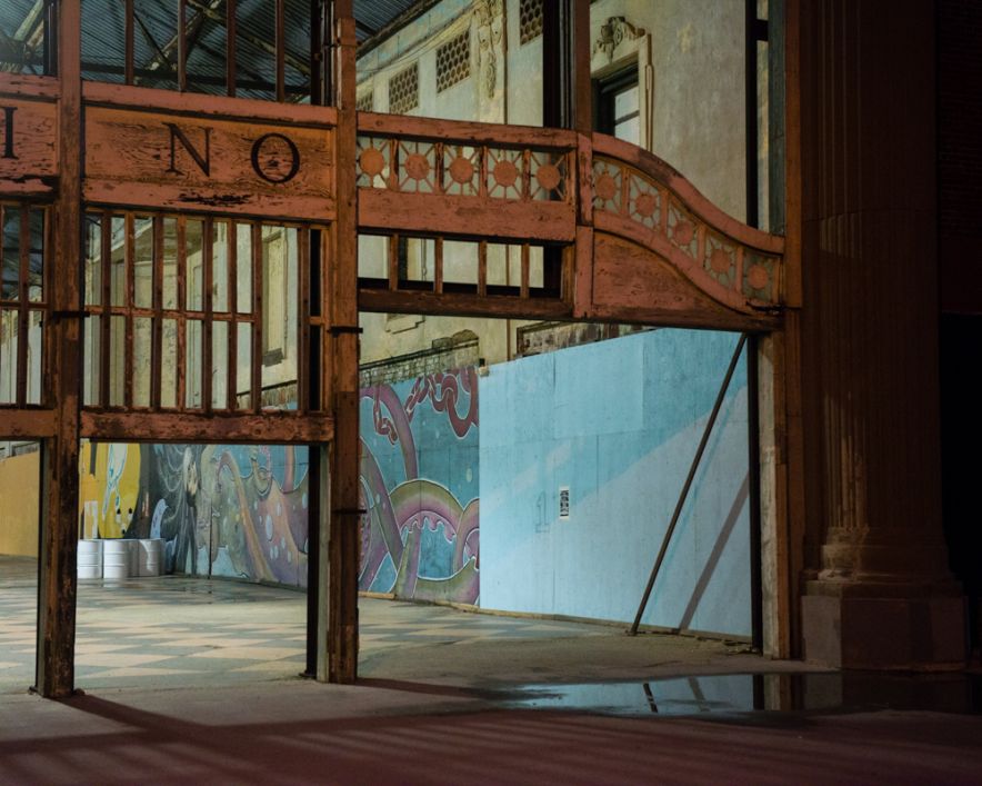
Atlantus is a project which began in 2014 in collaboration with Gareth Syvret at the Archisle. The work initiated by the 350th anniversary of Sir George Carteret naming the state New Jersey after his home in 1664. The aim of the project was to compare the cultural differences and similarities of the island and state on either side of the Atlantic Ocean. The project is to connect these two communities in five stories combining both photographs and text. It is a DIY exhibition of a multi-functional newspaper. The story I find the most interesting is the third, my favourite photographs are also in this section. I like the cow image because it is not a typical photograph of a Jersey cow; it is a great deal more interesting because it captures the cow differently. Furthermore I like the story of the cow travelling to the state of New Jersey and the research gone into the work in order to find the people that have been connected to the gift.
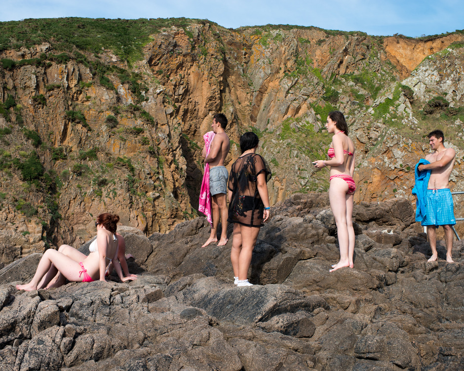
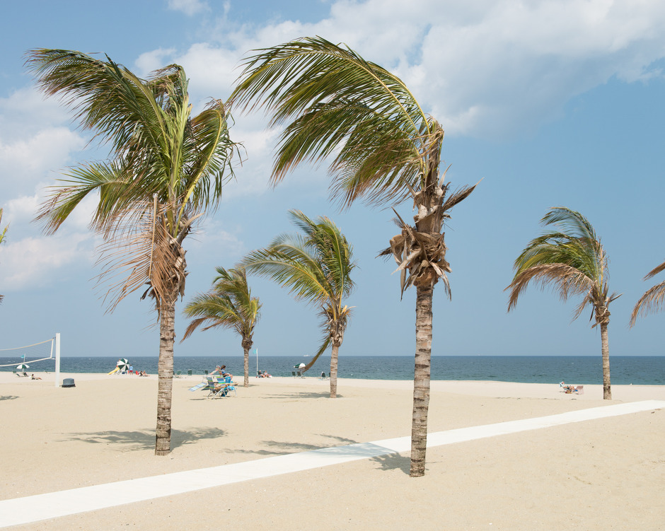
Plemont Bay, St Ouen, Jersey, Channel Islands, 29 June 2014Chapel Beach Club, Sea Bright, New Jersey, United States, 31 July 2014
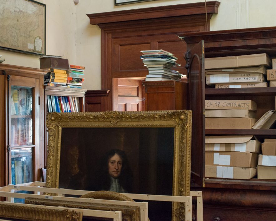
Toft used a combination of portraits, landscapes , still life and archival material. Firstly, Toft used archival material as a crucial part of the narrative, Syvret’s writing has been influenced by the historic photographs. The archive links the project back to the original story, it allows the modern photographs to contrast with the background of the narrative. The landscapes have been included in order to represent the geographical side of the narrative. It compares the two lands and looks at the relationship between the two. In terms of still life photography, Toft photographs the archival records of Sir George Carteret at St. Ouen’s manor library. The point of the images are to outline the context of the project. There are different styles of portraiture that have been used for example, tableaux photography of political leaders and candid photography.
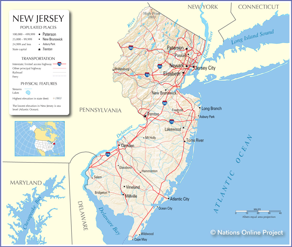
The story told through Atlantus is viewable as a newspaper as well as a pop up display. The images are by Martin Toft and the text is written by Gareth Syvret. The story basically explores the relationship between Jersey and New Jersey, two places; (Old) Jersey a small Island in the British Isles and the other, New Jersey, the 11th Most Populated U.S. State. Toft tells a narrative of this relationship between the themes, places, cultures and peoples of both places, which began 350 Years ago when Jerseyman Sir George Carteret, went over to America and found the territory of New Jersey which later became the State of New Jersey after US independence in 1776.
Text
Syvret’s writing is incorporated into ‘Atlantus’ in order to guide the reader through Toft’s visual story. Each of the five stories are accompanied by a large body of text, approximately 5-6 paragraphs which explain in detail each of the five themes. The introduction by Syvret explores the context and historical value of each of the themes. Small paragraphs of text are also included to explain and add a written narrative to each of the individual images. Text is effectively an aid that Toft uses in ‘Atantus’ to enable to viewer to be better informed of what is being shown. The story would not be able to develop if the text did not act as a bridge. Additionally, image annotations help to link images together. For example in ‘Precious Galinthia’, Toft looks at how the Jersey Cow links New Jersey and Jersey together. The text in this instance, helps to establish a relationship between different images by linking it to a particular storyline/context.
Symbolism
A lot of the meanings that Toft draws into the story are subtle. Toft uses symbolism to develop the storyline and link images together. His meaning are implicit and must be interpreted by the viewer. A form of symbolism used is connecting different images to a common theme. For example in one of the stories, Toft explores the connection of horses in Jersey and New Jersey through three very different images, related to this theme. However it is done in a very subtle and poetic way, whereby the connection is not overly obvious. Over time the story is linked together through images relating together and each time, exploring slightly different themes. The text helps to distinguish these ideas properly.
Toft was required to work with people he had not met before, often visiting them many time to gain their trust and to get the right photos, this simply can’t be done in one shoot.
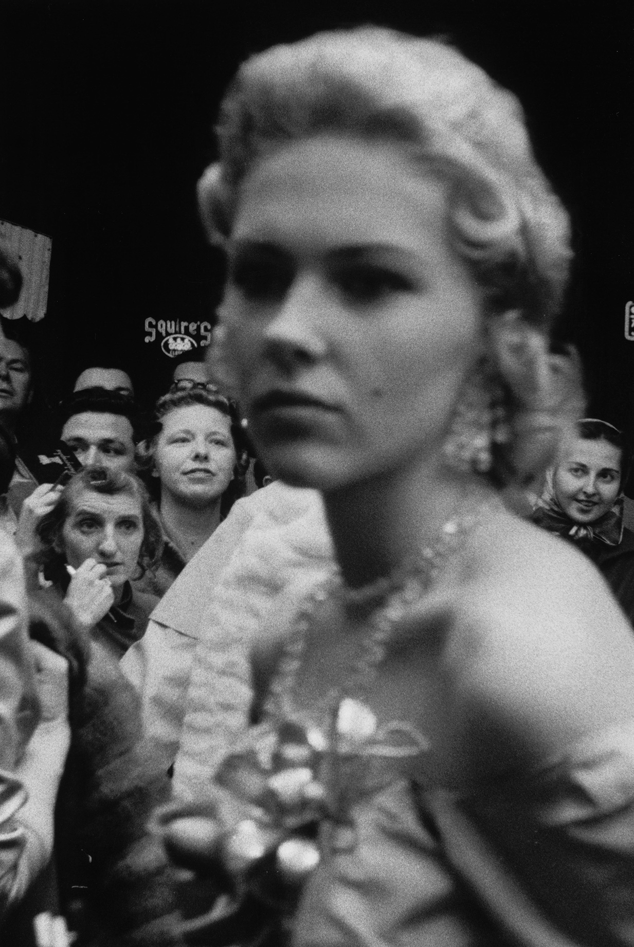
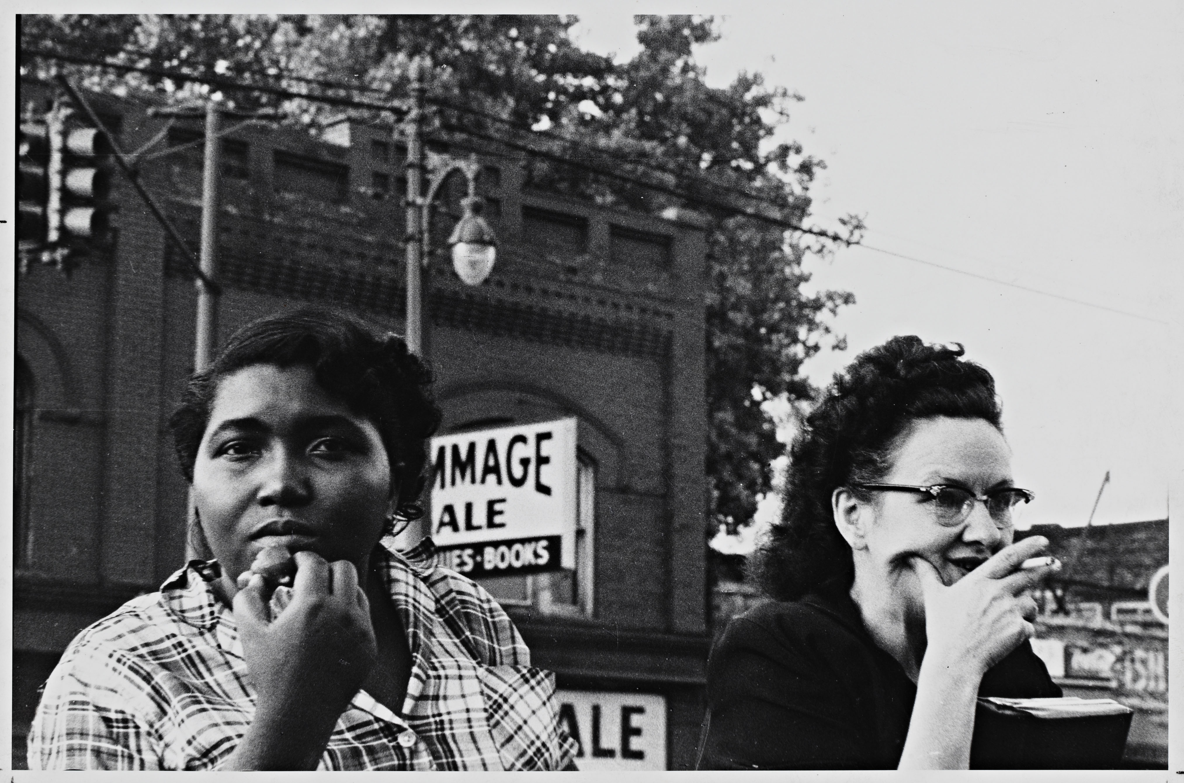
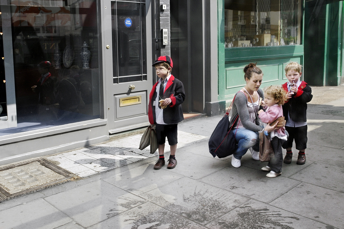
There are three photographic styles that Toft includes to tell to story in ‘Atlantus’, in addition to archival photographs ; ‘Portraits’, ‘Still-Lifes’ and ‘Landscapes’
Portraits
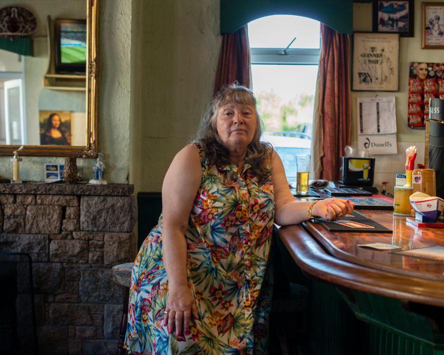
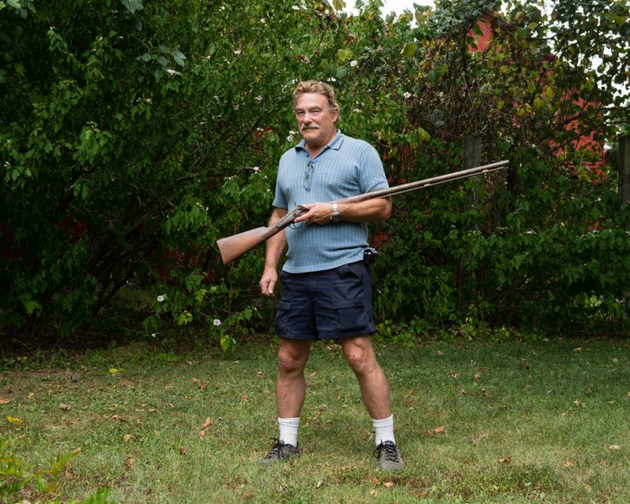
Toft uses portraits as a way of exploring the people that live on both sides of the Atlantic. Toft experiments with different aspects of portraiture, ranging from formal tableaux style photographs of political leaders, for example the Mayor of Carteret, to informal candid style images of subjects engaging in activities. Portraits are used to illustrate the human impact regarding particular themes.
Portrait: Ted Johnson, August 21 2014
Still-lifes
Still-lifes are close-ups of any type of object, images which are not usually photographed for aesthetic purposes. They are an effective way to record and document. Toft uses still-lifes throughout ‘Atlantus’. For example, in the specific story also entitled ‘Atantus’ Toft Photographs the archival records of Sir George Carteret at St Ouens Manor Library. These type of photographs have no aesthetic value, but are merely a form of visual documentation which help to illustrate the context of the storyline
Still-life of the Library of St Ouens Manor, April 9 2014
Landscapes
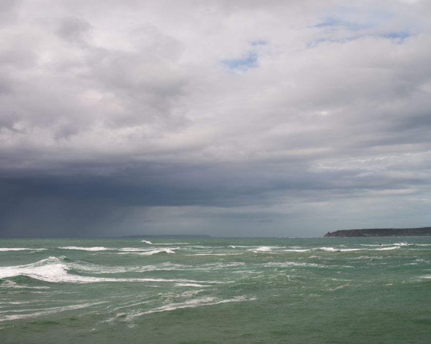
Landscapes are included by Toft in order to show to geographical relationship that Jersey and New Jersey share i.e. coastlines, beaches, landmarks and buildings. The story ‘The Transoceanic Journey’ specifically looks at the geographical similarities and differences of the two locations, and so incorporates many different landscape shots in order to illustrate this connection
Landscape: Atlantic Ocean April 14 2014
Archival Photographs
Toft uses archival photographs as a key component of the narrative. Archive photos are key in highlighting the different themes and context. A great deal of Syvret writing is influenced by the types of archival photographs. These type of images help to direct the narrative back to a historical/contextual basis. In terms of storytelling, I find archives photo are a very good means of providing evidence of a theme, and help to shape the way the viewer conceives the photographer own images.
Context
Artists that have influenced ‘Atlantus’
Alex Soth; images which tell and interesting story about communities
Mikael Subozty; historical/cultural documentary; conceptual forms of presenting his work – videos, slideshows, voice recordings etc.
Steve McCurry; powerful images with strong, deliberate composition to enhance level of drama; close-up portrait images
Robert Frank; observed candid shots
Martin Parr; close-up/still-lifes
Style
‘Atlantus’ is a form is social documentary. Toft’s main focus within ‘Atlantus’, is to explore the different relationship between the people Jersey and New Jersey. All non-portrait images, ‘still-life’, ‘landscapes’ and archival images each time relating this directly back to the study of people. Toft explores the sub-genre of community within the project. He is photographing from a completely outsider perspective, and was required to gain the trust of the people he photographed and worked with.
What I like about ‘Atlantus’
The layout of ‘Atlantus’, both as a newspaper as well as a pop-up display I find to work very well, it is a very innovative and creative concept. In particular I like the pop-up display because it is very different and unusual. The pop-up display has many advantages; firstly it allows all of the images of the narrative to link to as a visual newspaper. Secondly, it is very user friendly and the simplistic format of newspaper that the photographs are printed means that the viewer is able to easily view what is shown without it appearing too intimidating, which can sometime be the case. Lastly, it is very cheap to produce in comparison with printing and framing photographs. This allow ‘Atlantus’ to be printed in mass and distributed to many more areas than an exhibition would enable, meaning that the story can be spread across a wider distribution. The purpose of ‘Atlanus’ is to connect the two places together and so a compact newspaper format I believe is most effective in doing so.
I also like Toft’s use of poetic gestures to connect images. This idea is very subtle and makes the viewer use their own initiative to so e degree to connect the theme. This sense of openness to the images, contextual interpretation makes the narrative more viewer interactive and friendly
What I didn’t like about ‘Atlantus’
The way the newspaper was packaged means that it has been folded into 4. The images are display horizontally, means that in many of the images there is a crease. I find that this disrupt the visual flow of some of the images, and is quite noticeable. When newspaper material is exposed to light it changes colour, turning a yellowish colour, a problem mainly when a pop-up display is created. This can affect how easy the images and text are viewed. At the same time however it can create is vintage effect to the newspaper which I would say is more effective as a newspaper format. I don’t like how the structure of the narrative works in some aspects when viewable as a newspaper. On the first page of ‘The Transoceanic Journey’ for example; there is half a photograph of debris displayed. When viewable as a pop-up display the full image is shown, however the newspapers layout means that in many cases, larger images which take up more than one page in size cannot be fully viewable. This I find, can be very confusing and makes the narrative, to a degree, somewhat difficult to follow.
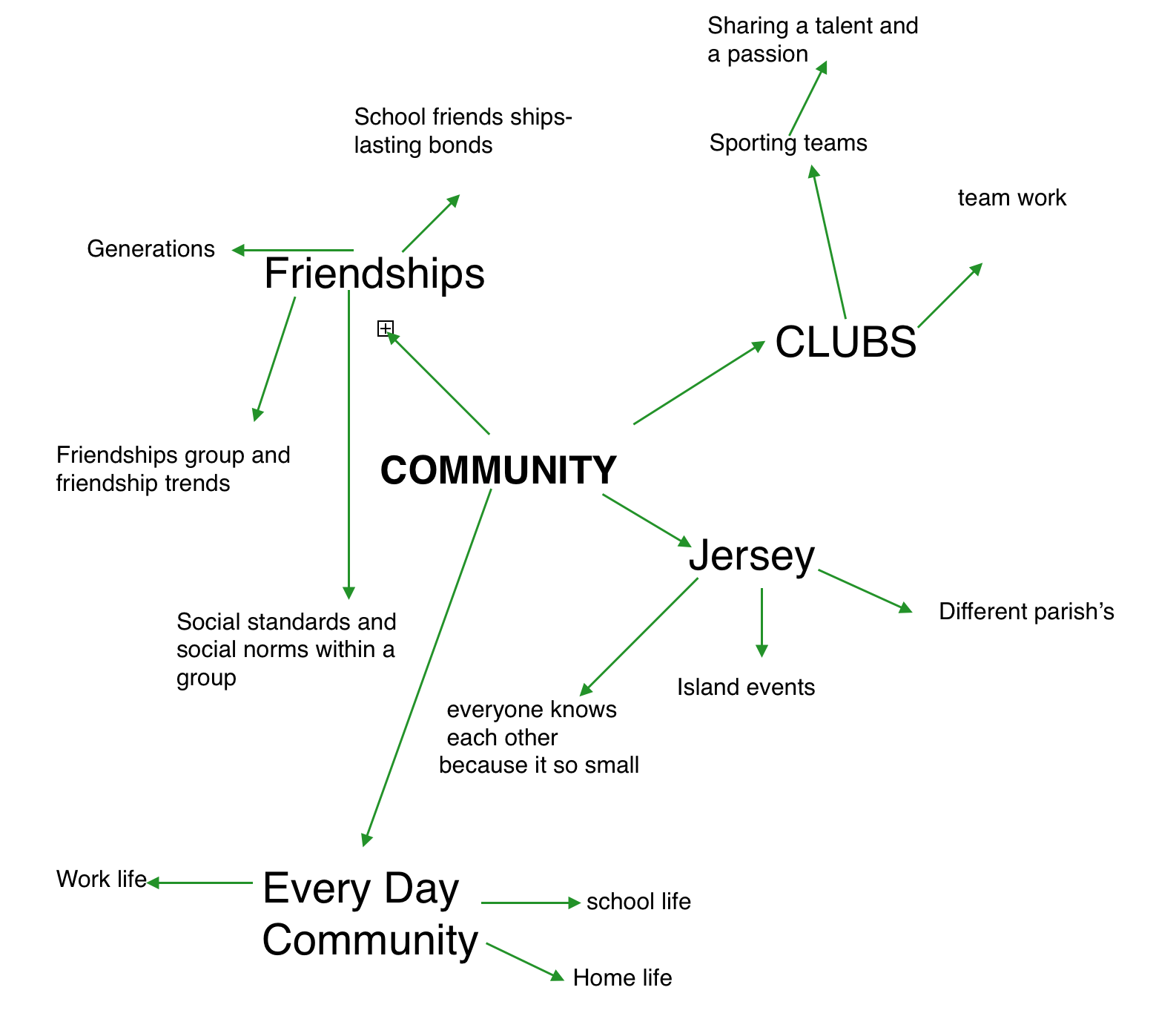
The second theme from ‘Family, Faith and Community’ that I decided to look into was Community. I decided to make a mind map displaying my thoughts about this theme.
My first idea for a photoshoot in response to the theme of community is the idea of everyday life of a teenager. I think this is attractive to me because I am around teenagers everyday and I am very familiar of what they get up too. I usually don’t think anything of these activities however I think they will be interesting to photograph and to compare to the life of an adult. And also compare to the experiences and the activities adults had when they were teens. I would also be interested to investigate the social trends of a friendship group. I find that most friendship groups have similar fashion, hobbies, humour ext. I wish to photograph these trends and present them as my response to community.
My second idea for a community photography shoot is to photograph a community event. I can photograph the activities going on, and try to capture the mood of the people around.
This week my shoot is to ask my mum about what makes her anxious and take photographs of her when i ask her questions about this. Throughout these 4 weeks i will also follow my mum around the house and take photographs of her to try to understand her better. When i take these photographs i will either video record her or voice record her this is so i have different recordings of this conversation. I will also write down the questions that i ask and the response.
WEEK 2
For this week i will follow my dad around and take images of him to show how my mum having anxiety affects him. In this week i will try go to work with him and take some images of his life. In this week i will also take some images of my younger sister and how it affects her.
WEEK 3
In this week i will try to go out with my mum, either when she goes out with some of her friends or when she goes to visit my Nan. In these images this will also show a sense of community which my mum lives in and which she surrounds herself round. On these shoots i will take images of the surroundings as well as the people that my mum meets along the way.
Throughout these weeks i will take other spontaneous images, when occasions come up when i need to take them. I will follow around my family for the next couple of weeks and take photographs of their lives to tell a story of my mums life.
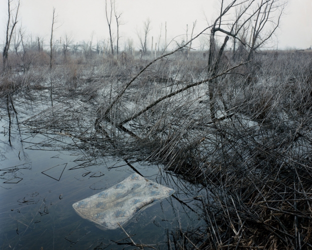
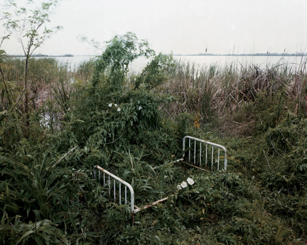
Alec Soth is an American photographer, based in Minneapolis, who makes “large-scale American projects” featuring the Midwestern United States. The project Iam looking to study is his project ‘sleeping by the Mississippi’. SBTM is a photography book made from Soth travelling down the Mississippi and taking photographs in the areas around the river.
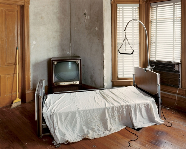
The project contains many fascinating images, all of these images somehow relate to ‘sleeping by the Mississippi’. Some of the images more so than others, the following are some of my favorite images from the project – These images mainly focus around beds and occasionally death, which can be interpenetrated as sleeping beyond life.
My two favorite images are the photographs where you can see bed/mattresses in the water itselfs. This relates extremely closes to the title ‘SLEEPING by the MISSISSIPPI’ as it has bed posts and mattresses which are used for sleeping. Therefore the images show quite clearly a representation of ‘SLEEPING by the Mississippi’. Here are my two favorite images –
Robert Frank produced at publication called ‘The Americans’ during the post-war era. It was first published in 1958 in France, it was considered extremely influential photography. The photographs are distinct in portraying both the low and high strata of American society. Overall the book was a portrait of the time that was viewed contemporary values and loneliness. The project is said to project a new view of America, it went against the typical wholesome photo essays displayed in some magazines. Frank’s work focused on factory workers of Detroit and other individuals or groups of people segregated from the American norm.
Movie Premiere, Hollywood, 1955-56.Robert Frank (U.S.A., b. Switzerland, 1924), Detroit, 1955. Gelatin silver print. Gift of Raymond B. Gary, 1984.492.15.
I like Frank’s work because it represents honesty and truth. It shows a section of society that had gone un-photographed for a great deal of time. They were the outsiders of America, and Frank wanted to capture people at the time that would portray the reality of the country. In articles I have read there has been a mention of the idea of loneliness in his photographs. I think you can see this emotion abundantly clear in the images produced. There is a certain rawness to the photographs which translate the real feelings of these individuals.
George Georgiou
Georgiou’s project is to photograph migrations and topography of London. The aim was to explore the movement of the increasing diversity in a western city. Georgiou wanted to capture the landscape and architecture and the rapid change that the city went through regularly. After spending the last nine years living and working in Eastern Europe, Georgiou was shocked by the speed of change and development that had occurred in the city whilst he was gone. I like these images because they show the city in it’s realness, there is no cover up to what we see everyday. I think the third image is particularly interesting as it’s not typically the image photographers normally want to capture. It shows the mundane regularity of people’s lives, rather than photographing the aesthetically pleasing and beautiful landscapes Georgiou is challenging the way we perceive our environment. He has captured the height of our development the way we travel, communicate and migrate creating a diverse culture.
After watching some very inspirational short films on James Nachtwey’s work, I have developed my views further.
Nachtwey quoted: “I have been a witness, and these pictures are my testimony. The events I have recorded should not be forgotten and must not be repeated”.
I think that this is an extremely powerful statement. James is inciting that he wants to put a stop to all of the problems of the war and he’s using his photograph’s to make a positive change. I truly believe that he wants to make a difference in the world and the fact that he doesn’t change anything about the scene by using the camera as a mere tool, to record the situation is fantastic. Nachtwey himself remains a ‘witness’, all he has to show is what he’s taken. So for me, the ‘testimony’, shows that he has lived through the situation and has viewed a certain moment and wants to present it to the rest of the world.
Here’s a video about his war photography. It includes him working and some interesting information on his practice:
The documentary pictures he displayed were so meaningful and powerful. Behind every single picture there was a message. He focuses on very the very powerful subject of war.
For example, he took various pictures of a homeless Indonesian family living at a train station. They had very poor circumstances and even had to live on the actual rails, extremely close to the passing trains. Also, In an unfortunate event the father lost two of his limbs: his left leg and his left arm. This was due to a train accident and the man was left without a job. Subsequently, he couldn’t further provide for his family and their current situation would’ve worsened. Here’s Nachtwey’s picture, that I’m referring to:
James Nachtwey – Indonesian family portrait.
This series of photograph’s made people realize the family’s situation and subsequently take action. Soon the family were living in substantial conditions. It can take as little as a deteriorating and shocking image to change people’s views. In effect this changed their environment and lifestyle for the better. It surely shows that his documentary picture have the power to make a massive difference, which is amazing.
Nachtwey spoke at a TED talk entitled ‘My Photographs Bear Witness’. He discussed the picture above at @13:07 minutes into the clip. James also talked about various other photographs in the following video:
James Nachtwey produced a very powerful video, on a TED talk It begins at @2:00 minutes. It shows various pictures that he took from around the world. They all focus on one particular subject. It’s about XDR, a drug-resistant strain of Tuberculosis that has begun a worldwide medical crisis. Here’s the video:
Nachtwey’s photography in this film is very raw. He aims to show the negative sides of life and doesn’t sugar-coat anything at all. I also thought that the colours he used to be very effective. James utilised a bright yellow font against a dark background in-between the pictures. The yellow really popped and grabbed my attention. Yellow is the most luminous color in the spectrum. Interestingly, Nachtwey’s choice of bright yellow may have to do with the images being shown. Although the color can be representative of happiness, there are other underlying traits. In particular it represents physical illnesses for example: jaundice, malaria, and in this case TB. It screams the word caution, like in road signs. Insightfully, it’s also has many negative connotation worldwide like: Mexicans used bright yellow to signal death, Jews in the Middle Ages were labeled with yellow before prosecution. Therefore, I believe that Nachtwey chose this color to symbolize the negative effects. He may have chosen it to relate to ideological viewpoints of people and outline how serious and deadly the things he showed were.