Magazine

Statement of Aims 

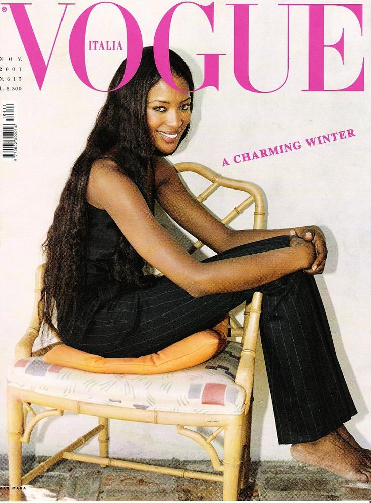
I am going to create a cover for a lifestyle and fashion magazine that aims to empower and support women. I am inspired by mainstream magazines like Vogue and Pride as I intend to merge the styles and conventions of both. I aim to target a demographic audience of primarily women aged 18-35 who enjoy fashion and support some feminist ideologies. 

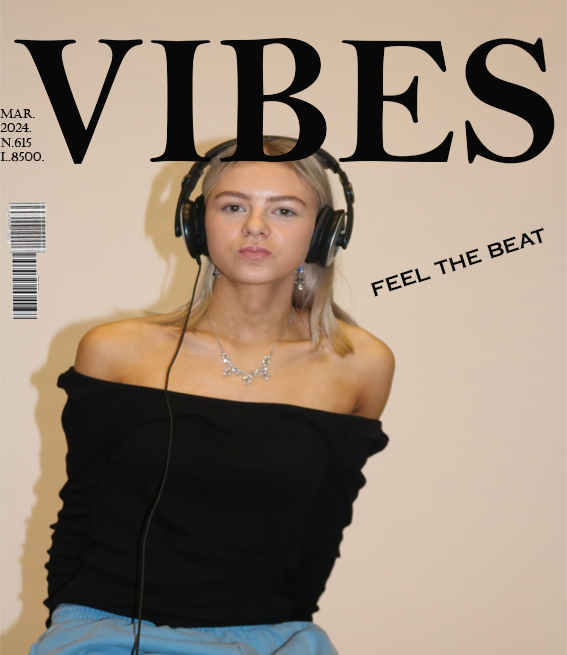
I plan to do this through featuring a female cover star and including coverlines which appeal to audiences of all ages. My intention for my final product is to have one singular cover image of a girl in her late teens (a mid-shot), gently resting her chin on the top of her hand, staring endearingly into the camera.  The direct mode of address creates a captivating atmosphere to engage audiences and appeal to both female and male demographics. Her chin resting on top of her hand conveys an idea of her staring into a mirror admiring herself (as if being looked at through the female gaze). This supports the aims and intended purpose of the magazine of self-empowerment and encourages its readers to do the same. As for my cover star’s image, she will wear a low cut, pink top with her hair free and down and minimal, dainty jewelry. This will portray her as stereotypically feminine and appeal to similar audiences as they may relate to her, linking to personal identity of uses and gratifications theory and attract a younger demographic. I intend to keep the background of my cover image a simple baby pink to provide a clear focus on the cover star and comply with common conventions of such lifestyle and fashion magazines. The price of my magazine comes to £7.50, suggesting it is a well-established and popular magazine which is foregrounded by the strapline “celebrating 15 years of success”. 

My masthead will be called “aura” which symbolizes the supportive and self-empowering atmosphere and audience. The serif fonts represent the magazine as stereotypically feminine and “girly”, which is emphasized through the colour scheme of pinks, white and grey which further connote accepting your femininity and appealing audiences which such ideologies. My cover lines will consist of themes of self-love, famous feminists and topics such as hair stylists, fashion advice and rom-com movie sneak peaks. An example of some of these being the pull quote “spoiler alert!” in relation to an upcoming romantic movie called ‘Taste of Lust’. This suggests that this is an exclusive offer, and fans of the genre must buy the magazine to witness the sneak peek. Another cover line will include mentions of the magazine’s favourite hair stylists, this encourages sales as the reader may possibly admire to have similar hair to the cover star and so will purchase the magazine to achieve that dream. Although many of the cover lines will contain similar content, it creates a well-established representation of the inside of the magazine and will attract their preferred audience and the small variety of content they do cover will attract a wider demographic of new readers and broaden their audience. 

magazine statement of intent

I want to create a magazine cover that follows the layout of the Gentlewoman. I want this to feature Amelie Fitzpatrick. She is an aspiring fashion designer that is determined to change societies perspectives towards ways in which women must present themselves. The issue I have chosen to address is the dehumanisation of women to mere objects with the only purpose is to look a certain way to portray themselves sexually towards men and other active lookers.  

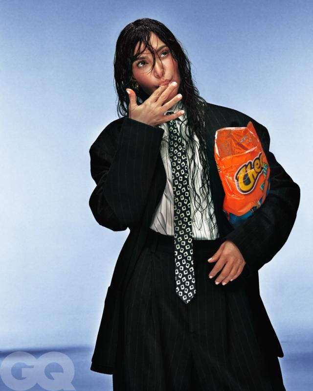
I have chosen to use Amelie Fitzpatrick on the front cover of my magazine as this is a topic she, as well as I, feel extremely passionate towards. This feature will be evident as I will include her full name, as a model credit, in a white and sharp font underneath the main image. I have decided to portray Amelie Fitzpatrick as a person which challenges societies norms and expectations of women to put our views, that gender is fluid and experimentative, across to my audience. In doing so, I will have her wear a suit, have her hair in a low bun and have he wearing no makeup. This representation goes against what other perceive as feminine as this will portray her in a more masculine light. This sort of challenging topic and representation of my magazine cover closely follows the style of The Gentlewoman. This front cover will not only be used to promote my work but also help to promote this ongoing social issue.  

The overall aesthetic of the magazine cover will provide a variety of opportunities for audience engagement, as described by the ‘Uses and Gratification’ theory. My target audience is primarily women who are experimentative with their femininity and that are innovative and open minded. However, this promotional style can be directed to all people of any gender, sexual orientation, and age. This is because, even though my issue will focus more on women representations, it can encourage all sorts of people to venture outside societies ‘norms.’  The challenging and dark atmosphere will offer people opportunities for diversity. At the same time, it will allow my viewers to pave their ways to self-identity, for example, the willingness for them to experiment with their style as well as realising that gender is fluid. This links to Laura Mulvey’s theory that gender is subject to change, and I would like my magazine cover to influence people in helping them find their true selves. My target audience will lean toward reformer personality type however it could also appeal to succeeder personality type.  

My mode of address will be kept quite formal I have decided to do this to keep a more serious tone to my magazine cover. This is to address the serious topic that I have chosen to represent in my cover- female self-discovery and freedom. I want to have my photograph in black and white. This creates a more formal register towards my audience. This formal register and more serious tone will appeal to my target audience. 

Statement Of Intent Magazine Cover

NEA Brief

In my statement of intent, I decided to portray these inspired photographs on my magazine cover. The name I have given my magazine is the „Devoted”.The reason is that my magazine aims to empower those “devoted” people in unusual circumstances, opposing/challenging these stereotypes and gender norms/things that are normalized through the media(target audience).

My magazine genre will be based on fashion and lifestyle. I will be using these specific genres because as I mentioned before in terms of opposing gender norms, I wanted to show these uncommon forms of style, in terms of stereotypes e.g male characters/figures in the media commonly wearing suits, not women (contrast to what women/are portrayed as Kim especially, a packet of crisps contrasts to diet culture/ controversial topic in the 21st century/rise of ED?).

I aimed to tackle topics such as increased discrimination towards stereotypical attitudes with the rise of TikTok and Twitter throughout recent years. I want to bring out the interest and concern for these differences of representation in my magazine.

On the masthead of my magazine cover in the top left corner, I have the lettering “DEVOTED” placed in white and bold text to emphasize the word and make it seen by the reader as one of the most important things to be presented there. As well as the barcode is also presented in a position below the “The Devoted Fashion Awards” box showing that it is a real magazine and its price.

In the middle section placed primarily on the left side, I have written the names of specifically a range of different male figures throughout the pop of media as well as the occasional name of another woman presenting that the fashion and lifestyle magazine is a general focus on males as well as females. The range of names varies from what platform the figure is known from presenting that these “stereotypes” can be presented in many ways with many individuals from different backgrounds showing these specific ideas.

I experimented with the writing of the main individual as well as the names of the following other individuals’ well-known names with a bolder/smaller font. The colour of the font stands out from the image itself as the image plays around with darker tonalities so the contrast appears attractive and appealing to the eye of the viewer.

The top right corner of my magazine cover has the writing “2024 MEN OF THE YEAR ISSUE”. This similarity to my media product model shows that both figures in my media products present this challenge of stereotypes as they both perform similar positions, intense eye contact at the lens presenting unease in the viewer as the character cannot be looked at/objectified (Laura Mulvey’s The Male Gaze) and instead the subject in mine appears confident and open to interpretation of viewers.

In terms of VALS, the type of readers interested in my magazine cover are Innovators (highly self-esteemed people, the image is important to them as an expression of taste, independence, and character. Their consumer choice is directed towards the “finer things in life”) as well as Thinkers (people who are motivated by ideals and they are mature, responsible, well-educated professionals. They are well-informed about what goes on in the world and they are open to new ideas as well as social change).

Magazine statement of intent

I intend to create a magazine cover called Ambrose which means immortal. This magazine will be based on fashion and discuss the new forms of fashion. The masthead ‘Ambrose’ will suggest to the viewers that fashion is never ending and there are new evolving styles that appear all the time. This magazine will be distributed both physically and digitally, so it is accessible for everyone in the target population. 

The target population for this magazine will be mainly women and in their 20s. This is because they enjoy fashion and are always looking for new styles and beauty tips. My secondary audience will be anyone who likes to follow fashion celebrities. Using Young and Rubicam’s theory of psychographics, my target audience will be explorers. This is because they will be interested in all the new products and will want to read my magazine to be the first people to find out about the newest tips and tricks in fashion. 

The Uses and Gratification theory created by Blumer and Katz suggests that people seek specific media to satisfy their own personal needs. This will be useful to promote this magazine because my target audience will look to the magazine as a way of filling their need for the newest fashion, gossip, and drama. By understanding what my target audience is and enjoys, I can tailor the cover and contents of the magazine to fill their craving for fashion/drama. 

The cover will be the main way I will attract my viewers, so it is important that the mis-en-scene is presented in a way that will spark my audience’s attention. I will do this by making my model have a direct address to the audience which will invite them in by making it feel personal. I will scatter the contents around the cover to create a busy and interesting photo which will attract my audience and make them think of what kind of information will be included in the magazine. I will use light colors and a simplistic design to make sure that it will appeal to the psychographic personalities of my target population.  

The Two Step Flow theory offers a valuable insight into the premotion of this magazine. With the understanding that my target population enjoys fashion, using this theory will increase the magazines reach. They will then share the magazine with all their friends and social groups that have the same interests which will influence them to purchase the magazine as well and in turn, boost the popularity of it. 

Magazine Statement of Intent

The demographic of my magazine cover is for the male audience. I have chosen this to try and influence male fashion and how trends are able to vary in many magazines, this cover focusing on street fashion.  

In terms of psychographics, the audience for my magazine cover is seekers. This is because they want to be able to have individuality and show self-discovery, while actively seeking experimentation and self-gratification. This would apply to my magazine cover because I wanted to have my magazine cover help others try and experiment with their fashion and be able to express themselves through the fashion which could be shown on the cover. 

Another psychographic label for my audience would be fun seekers. In the terms of the Young Facts Study, this group of people are the type to ‘work hard, play hard and spend hard.’ This would be the correct labeling for my magazine as the focus is on male fashion, and this group have an intense sense of importance for their physical appearance and being trendy. This group of people consume media more than any other group, which would help them be a target audience for my magazine cover.  

The two-step flow theory can also be applied to my magazine cover. In this theory, it suggests that information curated from media products is from opinionated leaders who pass on interpretations of the message portrayed from the original media content to help spread it to a wider audience. This would apply to my magazine cover as the audience who will view my magazine will be able to spread word of my magazine to other people who have a similar interest in men’s fashion and how it is constantly changing with trends. 

Representation was particularly important in my media product. By using dominant signifiers in my magazine cover, such as various coverlines and the model, I can let my audience further understand what the magazine is about. I found that the model facing away from the cover helps draw attention to the magazine, allowing the audience to create a sense of mystery and grab their attention to draw them into the magazine.  

On the cover of my magazine, I had aimed to focus on street style. This was done by my model wearing more of a street styled outfit to help draw the audience’s attention to this. I had also added coverlines to be focused on how fashion is changing, about how modern fashion is being taken over by more current trends, such as street style. I had chosen to give the cover an orange tint over the image, this was to help draw attention to the magazine as it would be able to help it stand out if it were being displayed among many magazines.