film poster


more detail
do same movie
follow style model
This project is an online marketing campaign that includes two movie posters and three Instagram posts about a coming-of-age teenage melodrama, entitled Age of Summer. These posters will appear in an entertainment magazine for people who are artsy and adventurous. The target audience for my movie will be between the ages of 15-35, with the gender being female as this portrays a buoyant perspective of the world, which links towards the gentlewoman magazine.
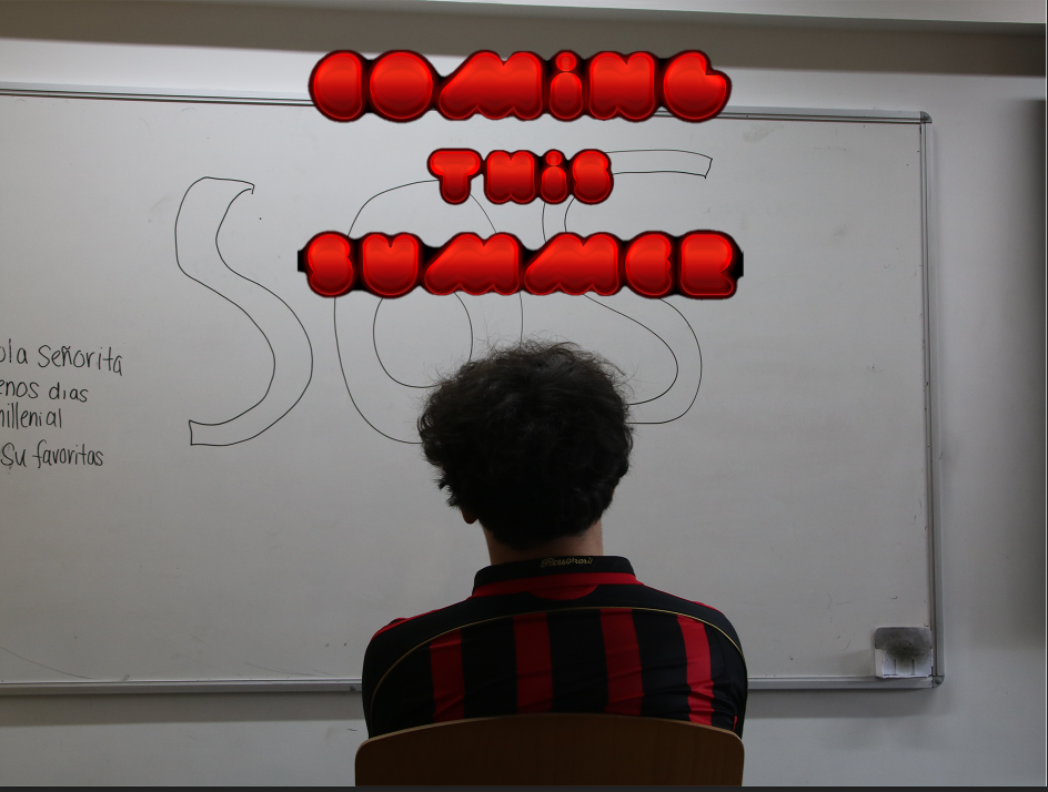
These posters and Instagram posts encourages the theme, coming-of-age, where a group of teenagers are faced with joy, comedy, and difficulties portrayed throughout one summer. A group of protagonists, introverts, extroverts, artistic, social etc… illustrates warmth and kindness through the poses, eager to start summer. The posters contain neon yellow colour we title to stand out towards the audience and indicate the warmth of this film. The title, ‘Age of Summer’ portrays the timeline of a group of teenagers spend one summer together to make last longing memories. This is effective towards my target audience as they would possibly have some resemblance with the main characters and relate to the various personalities within these people. Underneath I have added a heading in smaller font compared to the title ‘It is easy to forget now how spirited and fee we all felt that summer’. This quote indicates that this film may not just be in the theme of a feel-good summer film, but it may also have some sorrow as the word ‘forget’ shows that this was memories that no longer exist within the group. Whereas the other film poster portrays subtle colours such as dark blues and whites to produce calmness within the film. Here we have a single protagonist portrayed on the front cover looking towards the camera (breaking the fourth wall) from a distance. As there is only one character displayed, it makes the audience question where everyone else is and if he has anything to do towards the plot of the film. I have changed up the style of the title with different font and moved the title to the bottom of the poster to not make it as noticeable and let the main character take the lead of the audience’s attention. I have decided to add awards the film has won to display the success this film has had. This once again persuades the audience to watch my film as many critics have agreed that this is worthy of the awards. Underneath the title I have added that it was based on a novel, meaning people who have read the book may want to watch the film to see the similarities between the two or vise versa.
For my Instagram posts I have used the first one to have quotes from expert reviewers to persuade the audience to watch my film. This is because viewing other people’s opinion can alter your perspective of what you view. For example, one of the quotes I have used is ‘the best movie I’ve seen this year’. This makes the audience intrigued to find out if the reviewer is telling the truth, while seeing if they will enjoy it. By adding many quotes within the post surrounding the protagonist of my film creates an overwhelming feeling of FOMO, which allows the audience to want to see the film because they feel like they are missing out on it. For my second Instagram post, I have used another photo to portray the main characters in a fun summer vibe. On the sides of my post there is many top-level reviewers such as the daily mail, guardian etc. As these are well known media companies, it is easier for the audience to think their opinions are trustworthy and agree to watch the film. I am using stars to show the reviewers ratings on what their opinion of the film was, this contained bold colours and a bigger size to grab the attention of the audience. For my last Instagram post, I wanted to achieve the more aesthetically pleasing look to once again grab the viewer’s attention. This post would show the type of theme this film would have to please the audience. I have used a group photo for this post to provide comfort and reassurance for the audience. ‘STREAM NOW’ is added at the side of the post to indicate to the audience the film is available to be seen and is accessible for the audience. It is in capitals to immediately grab the audience’s attention, so they feel pressure to quickly stream my film otherwise they will miss out on the opportunity.
With these film posters and Instagram posts, I wish to allow the audience to gain all aspects of what my film is trying to portray, which is a sense of togetherness, adventure, heart-warming and trust.
