MAGAZINE COVER


Statement of intent
My project will be a cover for an art/intellectual magazine, titled ‘Actorfied’, exploring the unique story of an emerging local actor, and how they challenged the traditional forms of acting. This magazine is devoted to exploring actors, and ideas that break the norm. The demographic of this cover will be teenage/young adult audience who have an interest in theatre, and gripping life stories. In terms of VALs Psychographic descriptors, this magazine will be targeted at Achievers, who can relate to the bravery and success of said actor, and Activators, who seek and take in the new and expressive ideas being portrayed.
The cover will depict the main image being multiple versions of the actor overlapping each other as they circle props and masks around them. Each prop, mask and face will be a different colour representing each of the personalities and varying styles and roles that this actor can portray. I will not focus on making the circle of props/hats symmetrical as this magazine cover tries to embrace imperfections. For sections of each cover line, I will highlight or make certain words stand out so that the main message can be brought out in a much bolder and simpler way. I want the main image to pop out to the viewer, so I will use layering of graphics, probably red paint striking across the background, which will not only separate the image from the background but will also connote an artistic theme. In one of the cover lines, I specifically would like to create a form of binary opposition, where it’ll talk about going against the norm, however the word ‘norm’ will be in a different style compared to the rest of the text on the cover, bringing across the message that being different is the only normal thing. All of this will help in presenting an abstract view on this already predefined world of acting and should help to open the viewer to wider ideas.
The motives for the audience that I am exploiting through this magazine cover is personal identity. According to the Uses and Gratifications theory, personal identity is something that the viewer will be able to see in themselves through the media text, and in this case, the magazine cover could inspire the viewer to experiment and try something new, unorthodox, brave, just like this cover is doing, just like what the actor’s message is trying to bring across. This cover also explores embracing difference, which will be heavily highlighted in the cover lines as well as a wide variety of unusual colours and visuals.


My project is a magazine cover that features up-to-date fashion trends among modern, radical women from the ages 20 to 40. My cover will focus on providing my viewers with the latest information and styles, as well as relevant and eccentric article titles that will be featured in the cover lines. This will allow my readers to gain a sense of social belonging and have their questions feel more relevant.
I aim to create, what Uses and Gratifications Theory states as, a diversion from real life by presenting the latest chic, bold and aesthetic styles. Through this, there will be an opportunity for consumers to reinforce their own styles and identities, this will also create an escapism from the pressure of social expectations and what people see as “the norm”.
Although excessive fashion styles and trends are being seen as more normal, this is only apparent among younger generations, meanwhile older generations still feel the need to conform to what is “normal” for adults, therefore my magazine cover will allow self-discovery and a safe haven for women who want to express themselves through the use of an older model dressed in a more flashy or a traditional dining-out outfit, this will rule out issues with my viewers feeling excluded.
I want to keep the colours on my magazine cover subtle as it’s main purpose is to help those seeking fashion advice and I don’t want to draw my viewers attention away, however I plan to keep some bold fashion elements within the poster such as the model’s clothing. I believe that using black and white for my background image will make my cover stand out more as most magazine covers are very bright and colourful while mine is more toned down and goes against my opposition. It will also create a real vintage and nostalgic feeling and because my target viewers are 20 to 40 years old this feeling is very relevant to them.
I also believe that to dress radical doesn’t mean bright clothing, it has many meanings, an example of this could be monotone clothing with elements such as texture and layering, e.g. gothic style that can be seen as quite radical, dramatic and unusual for adults/my viewers to be dressed in.
Movie Posters.


Instagram Posts.


Statement of Intent.

Statement of Intent
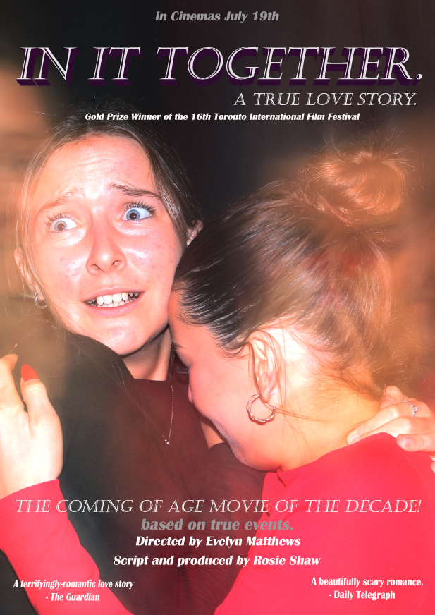
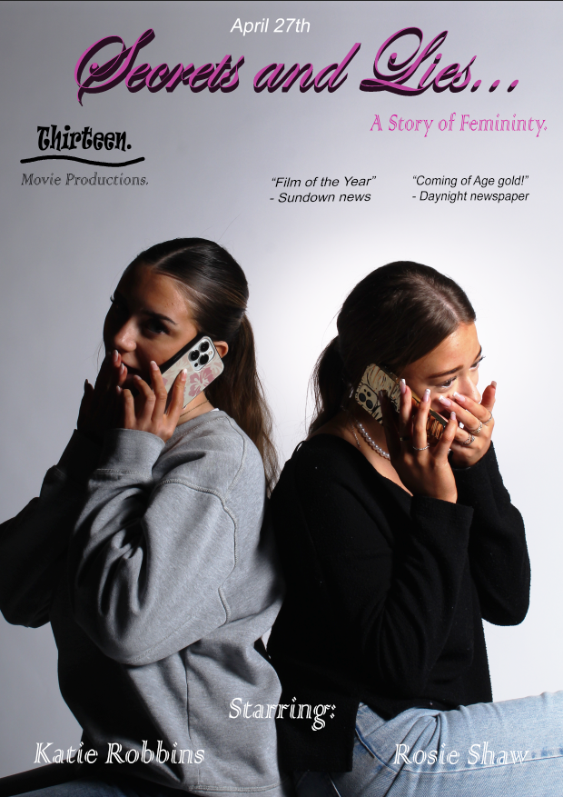
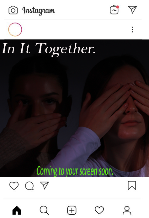
The project we were given was to design 2 movie posters and 3 Instagram posts online marketing campaign that includes the theme of Coming Of Age and focusing on diversity and inclusivity and teenager who chases their dreams. The target audience for my posters are between 15-30 with it being targeted towards both genders however linking to the gentlewomen magazine article my movies main acter is a woman as this portrays the perspective we have on the world.
The story I’m creating tells the story of a young women who was forced into marriage and who was fighter through the years of marriage with this horrible man and she manages to excel and to prove her worth to her husband and to achieve her goals and dreams of becoming an artist. So she steals all of his money and runs away with it to open a gallery where she is able to sell all the paintings she has created after her husband had stolen them from her. This creates a sense of power towards younger women as it shows that you have the power towards people who have done you wrong in your life and shows that you should stick up for yourself and how you should be treated. It shows that as you get older you understand more about rights, and this will hopefully inspire younger women to know how they should be treated and to not give up if they want to pursue something.
I aim to make a movie that promotes self-worth and empowerment of women and aim to tell a message of how powerful women really are. This will bring attention towards women and how the stereotype of a women is very different to what we are like. Promoting this movie is important as I want to get a message across to as many people as I can possibly to expand the knowledge and attention of women and stereotypes I the world and to bring as much attention to it as possible.
In my first movie poster it identifies what women must go through and being trapped away and feeling isolated in a forced marriage that they are not opposed to. This creates questions and intrigues people to watch as they want to know why she is trapped in there and why she is feeling this way. I will also use black and white images for this poster as it promotes the emotions of the movie more as this signifies emotions of the woman’s feelings and focuses on how dark and miserable her life is. The date of the movie’s publishing date is advertised on the front of the poster in large bold letters to promote the movies released date so that people are aware of when its released, this makes it easier for people as they have important information that they need to know clear on the front. This builds up excitement and adrenaline of when the movie is being released.
In my second poster it will have more colourful and bright colours compared to the first poster as this poster will focus on the women getting revenge and having power over her husband. This is different compared to my first poster as this poster focuses more on women and how she is stealing from her husband and taking back what is hers from the start. There will be the date the film is coming out at the bottom of the poster, so it is clear to the readers when he movie is being released so they are aware. There are reviews from different magazine articles on the film as this may influence people to watch as they have clarification and reassurance from other people that the movie is good and is worth the watch.
In my first Instagram post it will have ‘keep an eye out’ throughout the post with a picture of the wife trapped in the box and the husband planning things. This creates suspense as to what is going to happen which may intrigue people to watch the film. The theme of this Instagram post is black and white showing how her life when she was trapped away and being forced to be someone who she isn’t. I will have a ‘in cinemas soon’ in red and bold at the top so that is clear to people and the viewers that the movie will be out soon and that the red is very bold and clear so there is no confusion.
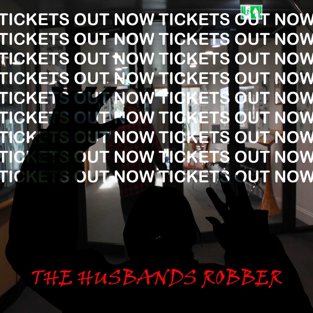
In my second Instagram post I will have ‘TICKETS OUT NOW’ in big bold letters to signify that the movie tickets will be released soon and it lets viewers aware clearly that tickets are out. I will have a cut out photo of an image and made it fully black so you can see the outline of the wife being kidnapped and feeling trapped. The black identifies that she is feeling quite dark and low which is presented in the bold black outlined image. I have the title of the movie in the bottom half of the post in red and bloody text to signify what the movie is like and the effects.
