| Week 1 | Statement of Intent – alter, improve |
| Week 2 | SOF |
| Week 3 | check products |
| Week 4 | improve products of SOF |
| Week 5 | SOF |
All posts by Big Fin
Filters
NEA Brief 2
Style Models:
Final Attempts:


NEA 2
| Week | Mon | Tue | Wed | Thur | Fri | Sat | Sun |
| 1 | |||||||
| 2 | Take photos after school for front cover and contents page or double. Try and edit photos | Edit photos taken to make it look like game character | Add photos to magazine and try complete contents page | Work on front cover | |||
| 3 | |||||||
| 4 | |||||||
| 5 | |||||||
| 6 | |||||||
| 7 |
Genre
Repetition and Difference
Keywords: Levels of verisimilitude – what degree a product references real life, Narrative similarities – structures are usually followed in products, newspapers follow presenting , Character-driven motifs, Iconography, Audience targeting, Representational effects
Genre subversion: Audience needs, contextual influences and Economic influences
NEA
| In Lesson | Out of Lesson | |
| Wed | Make Plan and Finish SOI | Complete SOI – Take Photos for 3 Products |
| Thur | Research gaming mags and ads | Research Different Ads – plan 3 ads – take photos |
| Fri | Submit 1st Draft SOI – plan out ads , start first ad | |
| Sat | Complete 1st Product | |
| Sun | ||
| Mon | Complete 2nd Product | |
| Tue | ||
| Wed | Complete 3rd Product | |
| Thur | ||
| Fri | Submit Production 1 (all products in appropriate media form) |
Statement of Intent
From the set brief I chose, I’m looking to create two media products, one being a double page magazine and the other being a three full-page advert linked to the gaming community, I want the media products I produce to have aspects of an information guide. For example, on local sales, new/best games, new/best consoles, long lasting products or new events. I chose ‘set brief 2′ because personally I’m interested in the gaming industry and the creativity the community has made/put out for their favourite games, like art, costumes, etc. In recent years I feel that there aren’t many gaming magazines available likely due to the internet becoming more advanced. In doing this NEA task, I hope to better my knowledge, I found Albert Banduras Theory of ‘Media Effects’, media language linked to magazines and other theories linked to magazines or video games interesting but quite confusing. As I get Bandura’s theory explores the idea that audience members are passive consumers of content and that these consumers imitate behaviours they see without any thought, I do feel that this doesn’t always apply to media like video games. I think this way because a lot of video games companies produce games with the simple goal of giving consumers something to have fun with, even if they play a game by themselves, with friends or family. So, hopefully in doing brief 2, I will better my own knowledge and understanding of the theories and media language that have been applied to both industries. The target audience I want my NEA products to be aimed toward is teenagers and young adults close to my age, this being 16-19. I feel this’ll be the best age to aim for because most people I know that are similar ages to myself play video games. Both products I create should also be aimed to all genders because video games are usually stereotyped as being an activity that males only do, but its untrue so that’s why I want the products to be aimed for everybody. Personally, I follow different gaming groups on Instagram like IGN, that act like the news for gamers and inform them of upcoming games or products. They also sell their own products on their online website so I could use their page as a reference for my 3 adverts. Personally, I find these accounts very interesting and would like to emulate their way of promoting products but in the style of magazines like GQ or Marketing Week.
Summer Term 2 plan
| Mon | Tue | Wed | Thur | Fri | Sat | Sun | |
| Week 1 | Feedback | Make small plan for production 2, research gaming magazines | Revisit SOI, start front cover | Dr M away | Inset Day | ||
| Week 2 | Start content page | ||||||
| Week 3 | |||||||
| Week 4 | Sports day | Dr M on trip | Dr M on trip | Dr M on trip | |||
| Week 5 | |||||||
| Week 6 | |||||||
| Week 7 | Try to print off productions | FINAL submission |
Magazine Cover
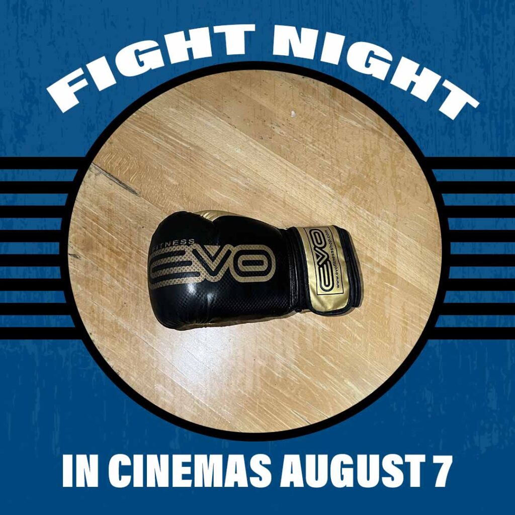
Statement of Intent – Finley Rees
My posters and Instagram posts are promoting the film ‘Fight Night’. A coming-of-age drama set in the early 2000s about a 17-year-old school dropout, that now must find work. During the main character’s childhood, he looked up to his father, a retired professional boxer who doesn’t want his son to have the same life he had. But the character wants to be like his dad. After dropping out, the struggles with his new busy life of work affect his dream of becoming a professional boxer, but he is determined. This determination causes conflict between the two characters. During this disconnection, the main character finds a trainer that supports him through his time of struggle and brings him close to his dream. I chose August 7th as the release date because it’s summer so no school, people will have more free time to go to cinemas hopefully to watch the film.
The target audience is set towards male teenagers/young adults. I chose this age group because the main character is progressing into his early years as an adult, his struggle with identity is intended to resonate with this age group on a personal level because people during this part of their life may not know what they want to do or what kind of person they want to be. I chose males as the target audience because the main character wants to become a boxer and boxing is traditionally considered as a male-dominated sport. The posters will be distributed using both traditional and modern techniques, with a strong focus on using social media like Instagram, etc. and other websites to promote the film. This is because most of the target audience are likely to be on some form of social media, meaning the chances of any promotion for the film will likely reach them.
For my first poster I had the main character posing in a classic boxing stance. The two colors blue and red are used simply to contrast each other. Blue is used to represent that he is the hero of the story or the main character, and red is used to represent the struggles that will surround him throughout the film or that there will be problems he will have to face through the film. I presented the title in the biggest font, so that viewers know clearly what the film is called. Quotes from big companies reviewing the film were underlined (including their names underneath their quote) and the main points were put in bold font so that viewers can easily scan the poster to see what others thought about the film. This can help the viewer decide if they may have interest in watching the film. I also added an age rating at the bottom left, I chose PG 13 as it felt appropriate for the already chosen age range. The release date was put in a bigger font compared to the other texts as it will communicate to the viewer when the film is released in cinemas. And small text surrounds the release date, displaying who was involved with the film’s creation.
The second poster I took inspiration from the traditional rocky posters but put my own style to it. This poster, compared to the first poster, is meant to represent the same themes of struggle but done in a darker way. The main character is surrounded by darkness but is posed in the classic fighting stance to show that he is fighting the darkness away. I kept the main title big, the release date and age rating the same size. Whilst also hazing small text at the bottom displaying who was involved with the films creation but shorter compared to the first.
The Instagram posts were done similarly to the posters but in a shorter way. An Instagram post has a smaller format compared to posters, so the main priority was to display the important information. On both posts I displayed the title in big font and the release date in smaller font. On the first post I put the ratings from the reviews.


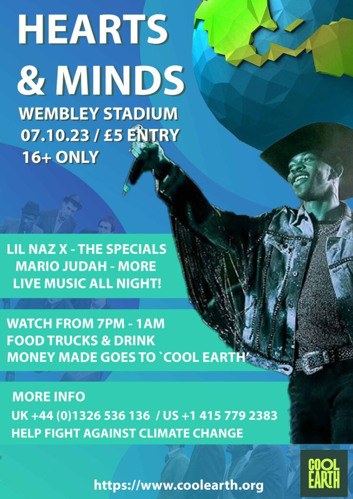
Political Compass – test result

Double page newspaper – style model

Double page newspaper – final

Music Poster – Style Model