All posts by Annabelle

Filters

Author:
Category:

Paper 2 Mock Essay Re-write

Q4. The target audience of GQ can be defined by demographics and psychographics (urban millennials and Gen Z). This audience is targeted through consumerism and notions of ideal images in a similar way to the construction of a mainstream, mass mode of address. The target audience can be defined as specialised by the magazine’s focus
on youth, diversity, alternative fashion and a reference to queer culture. The producers of the magazine have shifted from more mainstream representations of social and cultural developments to more specialised ones. The aesthetic (media language and representation) is part of the selling point
of the magazine which is specific to the print form. Aesthetic is positioned more with alternative magazine styles (eg Kinfolk, Frame) than mainstream (eg Men’s Health) Representations of masculinity appear as fluid, with an interest in fashion and beauty as the norm – though the extent to which this can now be defined as specialised could be evaluated.

The target audience of The Gentlewoman can be defined by demographics and psychographics – the readership is relatively small and has an unusually high average income, distinguishing it from the mass audience. The mode of address is defined as serious but ‘playful’, constructing the audience as intellectual. There is a focus on ‘long form’ journalism as opposed to celebrity-led profiles as well as a focus on literature, environment, design and architecture, suggesting the way
the producers construct a specialised readership. Additionally there is explicit focus on modernist design in the aesthetic of the magazine which differentiates the representations from those aimed at a mass audience. Coverage of mainstream women’s magazine subject areas such as fashion and beauty are constructed to be authentic in opposition to negative consumerism in order to focus on individuality. Moreover The Gentlewoman ‘club’ personifies the brand’s (paradoxical?) attempt to mix consumer luxury and alternative taste to target a specialised audience.

Paper 2 Mock Analysis

QuestionsWhat went well? What could be improved? What I am going to do to make the improvements
1. 7/9Excellent, detailed and accurate use of structuralist ideas to
analyse the unseen source.
Analysis of the cover is detailed and critically engages with
nuanced aspects of ideas related to deconstruction and cultural codes
subject specific terminology throughoutrevise media language terminology
2. 22/25detailed and accurate application of knowledge
and understanding to evaluate theories of regulation, Judgements and conclusions regarding the validity of
theories of regulation are perceptive
further elaborate references to theorists with more detailed specific examples from the textrevise specific examples from television that link to theories
3. 22/25application of knowledge and
understanding of the theoretical framework, analysis of the products that is detailed and
critically engages with the nuanced aspects of the
relationship between social and cultural contexts
deeper understanding of knowledge regarding video game context mind map different aspects of the context and how it correlates to video games
4. 20/25knowledge of the extent to which
magazines survive through targeting specialised
audience, appropriate discussion of the
way producers target audiences.
conclusions that are often
supported by relevant examples
memorise specific and detailed target audience demographics and profiles for magazines

Overall mark = 71/84 = A

Media Theoretical Framework

Media LanguageMedia Representations
– Bathes (semiotics)
– Strauss (Structuralism)
– Todorov (Narratology)
– Neale (Genre)
– Baudrillard (Post-Modernism)
– Gauntlet (identity)
– Butler (Gender performativity)
– hooks (Intersectionality)
– Gilroy (Ethnicity & Post-Colonialism)
– Van Zoonen (Feminist)
– Hall (Representation)
Media AudiencesMedia Industry
– Gerbner (Cultivation)
– Hall (Reception)
– Shirky (End of Audience)
– Jenkins (Fandom)
– Bandura (Media Effects)
– Hesmondalgh (Cultural Industries)
– Curran & Seaton (Power & Media)
– Livingstone & Lunt (Regulation)

Mock Essay Re-Write

Q1.  The Father Christmas is fairly crudely constituted (being iconic with low motivation) by colour, styling, positioning to offer instant recognition, reassurance, benevolence, a warm welcome and a clear focus. The setting further suggests an urban, business-oriented, consumerist Christmas where there is warmth here but nothing particularly spiritual unless the audience identifies a star in the east among the white spots in the sky (which may be stars or snow and add either way to the manufactured ‘magic’). The words provide anchorage through a tagline (“when it comes to Christmas, there’s no place like…Manchester”). This stating of Christmas then sharpens up the snow-covered iconic buildings which add relevance and a familiar Christmas aesthetic. It also draws focus to the pretty lights which draw attention to what most will recognise as a German or continental or merely generic Christmas market.  

Q2.  This city scape is The Public Sphere, iconic buildings, the central shopping area, an economic centre: the commercial heart: it is dark and mysterious also ‘promising’. The representation here may be seen as dangerously bland, as if we are observing a ‘natural’ scene, a kind of Capitalist Realism. Equally it may be seen as ‘gorgeous’: glamour and spectacle this is a classic Barthesian myth, a deliberate confusion of History and Nature: we are to imagine this is what cities are like rather than this is how cities have developed. Additionally, this is a representation of the city as a ‘resort’: a location for consumerist adventure: Christmas as a spending spree with Manchester as a temporary materialist theme park, the political here is disguised as if its meaning came from just how things are. 

Ghost Town is more overtly political, a conscious reproach to Thatcher’s Britain. A booming City and Southeast juxtaposed with the post-industrial collapse of the economy everywhere else drew up lines of opposition across the 1980s. The video provides a guided tour of deprivation anchored by a literate protest lyric and there is also a political message in the multi-racial composition of the band in a Britain beset by the mobilisation of the hard right. Punk had provided access to expression to the disenfranchised and prompted a new kind of political pop that was articulate and working class. 

Paper 1 Mock Analysis

QuestionsWhat went well?What could be improved?What I am going to do to make the improvements
1. 5/9Good analysis of the product that is clear and sometimes
engages with how meanings are constructed
by specific signs.
More perceptive concepts in analysis and diversity in meaningspractice unseen essay questions and focus on including more theoretical frameworks
2. 9/12Good understanding of the theoretical framework that has appropriate explanations of
issues of representation in media products.
use of subject specific
terminology throughout.
revise contextual factors of products and terminology that correlates
3. 9/9Good analysis of the product that is detailed and
critically engages with the feminist theory of male gaze and
how they relate to the CSP.
more theory links and maybe juxtapose to male gazerevise other similar theories to link and/or contrast
4. 16/20Judgements and conclusions regarding the validity of
genre theory are perceptive and fully supported with
detailed reference to specific aspects of the CSP
draw more detailed and perceptive conclusions regarding the theorypractice essays to develop drawing judgements linking theorist and csp’s
5. 6/6good knowledge of key termsa more solidified understanding of termsrevise specific terms
6. 8/9knowledge and understanding of the influences of
social and cultural contexts and subject specific
terminology
use specific data to support pointsmemories both qualitative and quantitative data for newspapers
7. 17/20judgments and conclusions that are
consistently well supported by relevant examples and appropriate evaluation of the extent to which
the film industry demonstrates diversity in production and
distribution.
use specific data to support pointsmemories both qualitative and quantitative data for the film industry

overall mark = 70/84 = A

Genre

Steve Neale:

Suggests threes a corpus containing repertoires (conventions) of different elements o f which you can choose which ones are used.

Genres draw on repertoires from elements and the main tensions are between repetition and sameness versus variation and change.

Products must maintain some element of familiarity through the repetition of genre conventions but also must provoke excitement through difference, for example hybrid genres.

STATEMENT OF INTENT

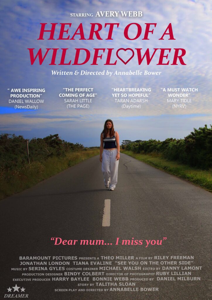
I am producing two products for set brief 3. I have selected this because I am very interested in producing print media, such as posters and magazines. I find the film aspect intriguing and want to develop my skills in both print and film. I have chosen brief 3 because the idea of promoting a romantic coming of age film has many theoretical lenses in which I can investigate. I am particularly interested in exploring gender theories where I can play on stereotypes and explore the male and female gaze. I aim for my NEA product to explore modern views on gender stereotypes and how over time the film industry is changing to appeal to newer contemporary audiences. 

My products target audience will be fans of independent films, who are 13–20-year-old females. They will be teens and young adults who are fans of the coming of age genre specifically as the universal theme of love often appeals to them. According to the Psychographic profiling (Rubicam and Young), I am targeting ‘mainstreamers’ and ‘strugglers.’ In terms of uses and gratifications, I aim to create a product that entertains audiences through the eccentric narrative arc and diegesis and to provide escapism as the audience becomes immersed in the film’s themes of love, excitement, and growth. Furthermore, the register of my products’ text will be rather casual in order to appeal to younger audiences and provide relatability and familiarity. Therefore, my aim is to draw in fans of traditional coming of age movies and provide a unique perspective on the film.  

As I often watch romantic/coming of age movies, I already have an understanding of the genre conventions that often appear, and so I can ensure that they are present in my product to reflect professional works. For example, the posters of ‘Anyone but you’ use lots of bright colours and have the two main protagonists as the dominant signifier, central to the page. In terms of my TikTok videos, I will use signature music and show the key points of the film yet leaving a cliffhanger at the end to entice the audience to want to watch more.  

I want to exploit the opportunities for media convergence between my products through using the same colour schemes and font styles throughout both my videos and posters as well as repeating the same taglines and slogans throughout my products in order to create a sense of unity. My media products will appear consistent, so audiences can recognize my products are from the same campaign.  

NEA

IN LESSONOUT OF LESSON
WEDmake plan and finish SOIcomplete SOI + research film ads
THURsketch plan for posters + edit SOI + come up with storylinecontinue SOI
FRIsubmit first draft SOI and draft postersbrainstorm poster text
SATn/acontinue taking photos
SUNn/asolidify plan
MONbegin editingfinish taking photos and edit poster 2
TUEfinish poster 1edit poster 2
WEDfinish poster 2edit poster 3
THURfinish poster 3final touches
FRIsubmit production 1 (all products in appropriate media form)
MONTUESWEDSTHURSFRISATSUN
WEEK 1feedback + plan product 2edit statement of intentedit photos + begin postersDr M away + continue postersinsettake photos
WEEK 2plan filming edit poster 1edit poster 1edit poster 2edit poster 2
WEEK 3begin filmingedit poster 3edit poster 3final touches postershave finished filming all content
WEEK 4sports daybegin editing clips edit poster 3Dr M HE trip
edit poster 3
Dr M HE Trip
edit poster 3
Dr M HE Trip
edit poster 3
WEEK 5edit tiktok 1edit tiktok 1 edit tiktok 1edit tiktok 2edit tiktok 2
WEEK 6edit tiktok 2 edit tiktok 3edit tiktok 3edit tiktok 3final touches
WEEK 7print productslast editslast editslast editFinal Submission!

Magazine

Statement of Aims 

I am going to create a cover for a lifestyle and fashion magazine that aims to empower and support women. I am inspired by mainstream magazines like Vogue and Pride as I intend to merge the styles and conventions of both. I aim to target a demographic audience of primarily women aged 18-35 who enjoy fashion and support some feminist ideologies. 

I plan to do this through featuring a female cover star and including coverlines which appeal to audiences of all ages. My intention for my final product is to have one singular cover image of a girl in her late teens (a mid-shot), gently resting her chin on the top of her hand, staring endearingly into the camera.  The direct mode of address creates a captivating atmosphere to engage audiences and appeal to both female and male demographics. Her chin resting on top of her hand conveys an idea of her staring into a mirror admiring herself (as if being looked at through the female gaze). This supports the aims and intended purpose of the magazine of self-empowerment and encourages its readers to do the same. As for my cover star’s image, she will wear a low cut, pink top with her hair free and down and minimal, dainty jewelry. This will portray her as stereotypically feminine and appeal to similar audiences as they may relate to her, linking to personal identity of uses and gratifications theory and attract a younger demographic. I intend to keep the background of my cover image a simple baby pink to provide a clear focus on the cover star and comply with common conventions of such lifestyle and fashion magazines. The price of my magazine comes to £7.50, suggesting it is a well-established and popular magazine which is foregrounded by the strapline “celebrating 15 years of success”. 

My masthead will be called “aura” which symbolizes the supportive and self-empowering atmosphere and audience. The serif fonts represent the magazine as stereotypically feminine and “girly”, which is emphasized through the colour scheme of pinks, white and grey which further connote accepting your femininity and appealing audiences which such ideologies. My cover lines will consist of themes of self-love, famous feminists and topics such as hair stylists, fashion advice and rom-com movie sneak peaks. An example of some of these being the pull quote “spoiler alert!” in relation to an upcoming romantic movie called ‘Taste of Lust’. This suggests that this is an exclusive offer, and fans of the genre must buy the magazine to witness the sneak peek. Another cover line will include mentions of the magazine’s favourite hair stylists, this encourages sales as the reader may possibly admire to have similar hair to the cover star and so will purchase the magazine to achieve that dream. Although many of the cover lines will contain similar content, it creates a well-established representation of the inside of the magazine and will attract their preferred audience and the small variety of content they do cover will attract a wider demographic of new readers and broaden their audience.