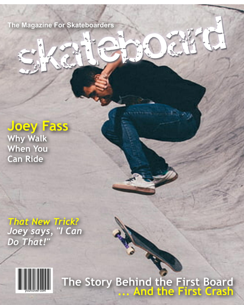
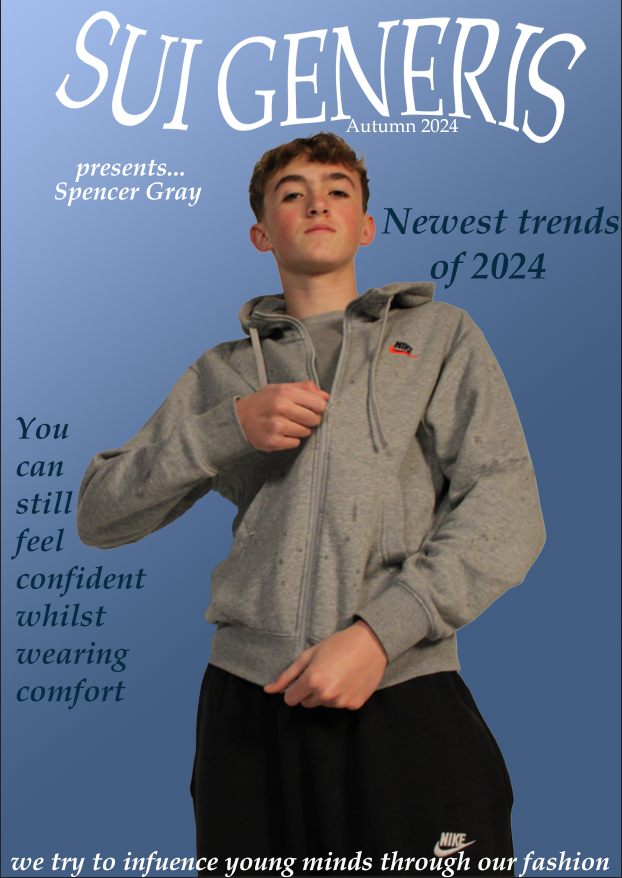
The demographic of my magazine cover is for the male audience. I have chosen this to try and influence male fashion and how trends are able to vary in many magazines, this cover focusing on street fashion.
In terms of psychographics, the audience for my magazine cover is seekers. This is because they want to be able to have individuality and show self-discovery, while actively seeking experimentation and self-gratification. This would apply to my magazine cover because I wanted to have my magazine cover help others try and experiment with their fashion and be able to express themselves through the fashion which could be shown on the cover.
Another psychographic label for my audience would be fun seekers. In the terms of the Young Facts Study, this group of people are the type to ‘work hard, play hard and spend hard.’ This would be the correct labeling for my magazine as the focus is on male fashion, and this group have an intense sense of importance for their physical appearance and being trendy. This group of people consume media more than any other group, which would help them be a target audience for my magazine cover.
The two-step flow theory can also be applied to my magazine cover. In this theory, it suggests that information curated from media products is from opinionated leaders who pass on interpretations of the message portrayed from the original media content to help spread it to a wider audience. This would apply to my magazine cover as the audience who will view my magazine will be able to spread word of my magazine to other people who have a similar interest in men’s fashion and how it is constantly changing with trends.
Representation was particularly important in my media product. By using dominant signifiers in my magazine cover, such as various coverlines and the model, I can let my audience further understand what the magazine is about. I found that the model facing away from the cover helps draw attention to the magazine, allowing the audience to create a sense of mystery and grab their attention to draw them into the magazine.
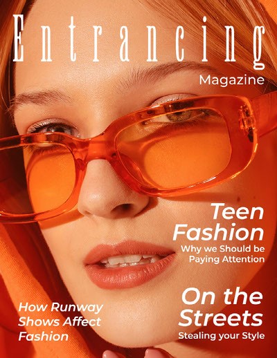
On the cover of my magazine, I had aimed to focus on street style. This was done by my model wearing more of a street styled outfit to help draw the audience’s attention to this. I had also added coverlines to be focused on how fashion is changing, about how modern fashion is being taken over by more current trends, such as street style. I had chosen to give the cover an orange tint over the image, this was to help draw attention to the magazine as it would be able to help it stand out if it were being displayed among many magazines.


