magazine


Statement of Aims
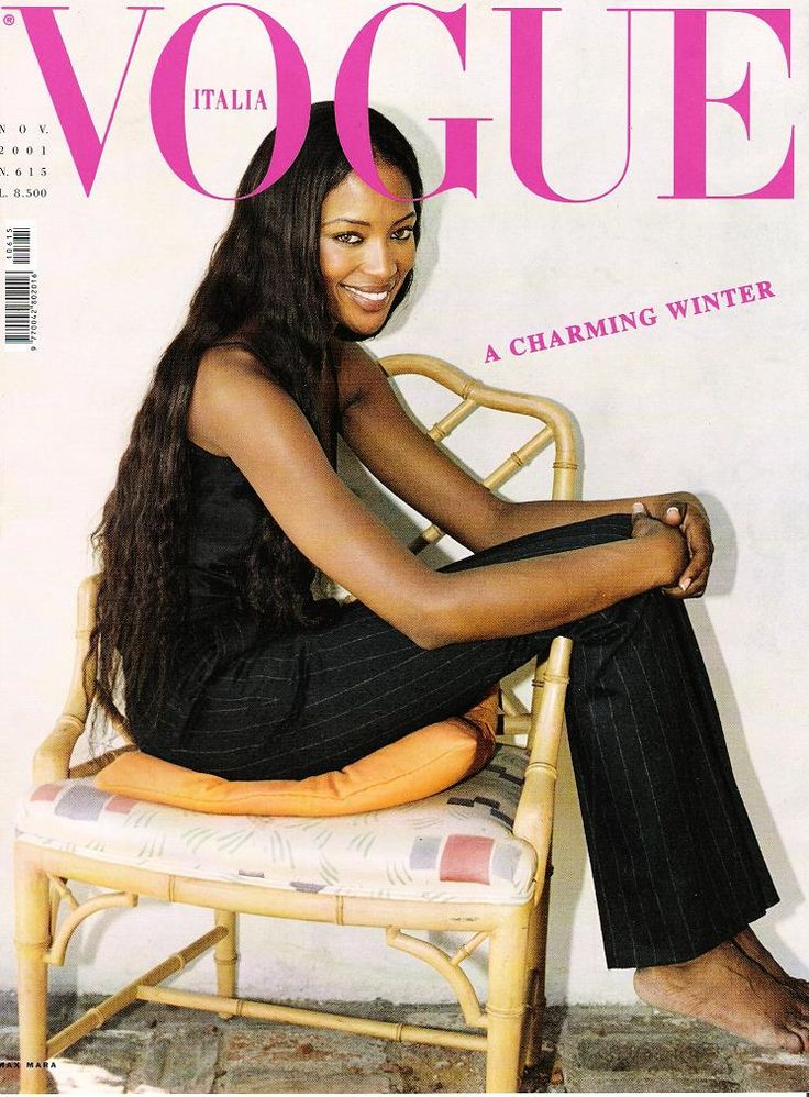
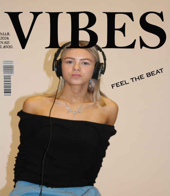
I am going to create a cover for a lifestyle and fashion magazine that aims to empower and support women. I am inspired by mainstream magazines like Vogue and Pride as I intend to merge the styles and conventions of both. I aim to target a demographic audience of primarily women aged 18-35 who enjoy fashion and support some feminist ideologies.
I plan to do this through featuring a female cover star and including coverlines which appeal to audiences of all ages. My intention for my final product is to have one singular cover image of a girl in her late teens (a mid-shot), gently resting her chin on the top of her hand, staring endearingly into the camera. The direct mode of address creates a captivating atmosphere to engage audiences and appeal to both female and male demographics. Her chin resting on top of her hand conveys an idea of her staring into a mirror admiring herself (as if being looked at through the female gaze). This supports the aims and intended purpose of the magazine of self-empowerment and encourages its readers to do the same. As for my cover star’s image, she will wear a low cut, pink top with her hair free and down and minimal, dainty jewelry. This will portray her as stereotypically feminine and appeal to similar audiences as they may relate to her, linking to personal identity of uses and gratifications theory and attract a younger demographic. I intend to keep the background of my cover image a simple baby pink to provide a clear focus on the cover star and comply with common conventions of such lifestyle and fashion magazines. The price of my magazine comes to £7.50, suggesting it is a well-established and popular magazine which is foregrounded by the strapline “celebrating 15 years of success”.
My masthead will be called “aura” which symbolizes the supportive and self-empowering atmosphere and audience. The serif fonts represent the magazine as stereotypically feminine and “girly”, which is emphasized through the colour scheme of pinks, white and grey which further connote accepting your femininity and appealing audiences which such ideologies. My cover lines will consist of themes of self-love, famous feminists and topics such as hair stylists, fashion advice and rom-com movie sneak peaks. An example of some of these being the pull quote “spoiler alert!” in relation to an upcoming romantic movie called ‘Taste of Lust’. This suggests that this is an exclusive offer, and fans of the genre must buy the magazine to witness the sneak peek. Another cover line will include mentions of the magazine’s favourite hair stylists, this encourages sales as the reader may possibly admire to have similar hair to the cover star and so will purchase the magazine to achieve that dream. Although many of the cover lines will contain similar content, it creates a well-established representation of the inside of the magazine and will attract their preferred audience and the small variety of content they do cover will attract a wider demographic of new readers and broaden their audience.
style model


I want to create a magazine cover that follows the layout of the Gentlewoman. I want this to feature Amelie Fitzpatrick. She is an aspiring fashion designer that is determined to change societies perspectives towards ways in which women must present themselves. The issue I have chosen to address is the dehumanisation of women to mere objects with the only purpose is to look a certain way to portray themselves sexually towards men and other active lookers.
I have chosen to use Amelie Fitzpatrick on the front cover of my magazine as this is a topic she, as well as I, feel extremely passionate towards. This feature will be evident as I will include her full name, as a model credit, in a white and sharp font underneath the main image. I have decided to portray Amelie Fitzpatrick as a person which challenges societies norms and expectations of women to put our views, that gender is fluid and experimentative, across to my audience. In doing so, I will have her wear a suit, have her hair in a low bun and have he wearing no makeup. This representation goes against what other perceive as feminine as this will portray her in a more masculine light. This sort of challenging topic and representation of my magazine cover closely follows the style of The Gentlewoman. This front cover will not only be used to promote my work but also help to promote this ongoing social issue.
The overall aesthetic of the magazine cover will provide a variety of opportunities for audience engagement, as described by the ‘Uses and Gratification’ theory. My target audience is primarily women who are experimentative with their femininity and that are innovative and open minded. However, this promotional style can be directed to all people of any gender, sexual orientation, and age. This is because, even though my issue will focus more on women representations, it can encourage all sorts of people to venture outside societies ‘norms.’ The challenging and dark atmosphere will offer people opportunities for diversity. At the same time, it will allow my viewers to pave their ways to self-identity, for example, the willingness for them to experiment with their style as well as realising that gender is fluid. This links to Laura Mulvey’s theory that gender is subject to change, and I would like my magazine cover to influence people in helping them find their true selves. My target audience will lean toward reformer personality type however it could also appeal to succeeder personality type.
My mode of address will be kept quite formal I have decided to do this to keep a more serious tone to my magazine cover. This is to address the serious topic that I have chosen to represent in my cover- female self-discovery and freedom. I want to have my photograph in black and white. This creates a more formal register towards my audience. This formal register and more serious tone will appeal to my target audience.
